

Ash grey is the kind of neutral that instantly makes a layout feel modern, calm, and intentional. It’s soft enough for minimal looks, but still strong enough to hold contrast and typography.
Below are 20 ash grey color palette ideas with HEX codes, plus practical pairing tips for branding, interiors, and UI design.
In this article
Why Ash Grey Palettes Work So Well
Ash grey sits in the sweet spot between cool and warm, so it adapts to many styles—from Scandinavian interiors to high-contrast editorial layouts. It’s also less “flat” than pure grey, which helps designs feel more lived-in and premium.
Because ash grey is naturally understated, it gives your content room to lead. Photography, product shots, and typography tend to look cleaner when the background colors aren’t fighting for attention.
It’s also an easy base for accent colors. Whether you add muted pastels, deep greens, or bright citrus, ash grey keeps the palette cohesive and helps you control contrast for readability.
20+ Ash Grey Color Palette Ideas (with HEX Codes)
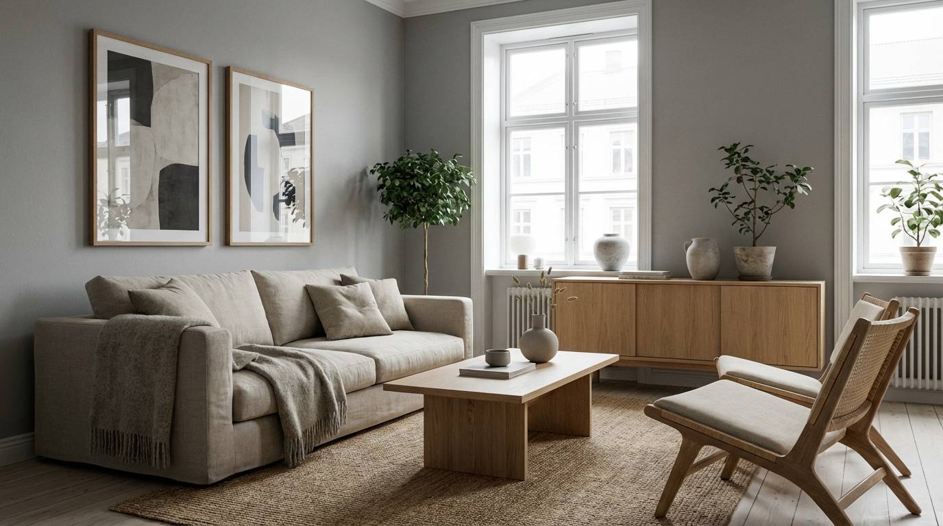
1) Smoke Linen
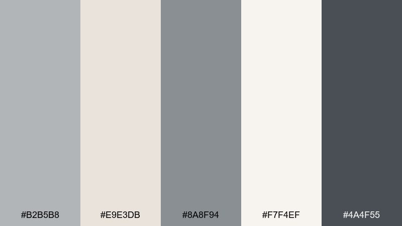
HEX: #b2b5b8 #e9e3db #8a8f94 #f7f4ef #4a4f55
Mood: calm, airy, understated
Best for: scandinavian living room interior
Calm and breathable like morning haze over clean fabric, these tones feel quietly refined. Use it for bright interiors where you want softness without looking washed out. Pair the deeper charcoal with linen whites for contrast, and add natural wood or matte black hardware to keep it grounded. Usage tip: repeat the mid-grey on trims or textiles to tie the room together.
Image example of smoke linen generated using media.io
Media.io is an online AI studio for creating and editing video, image, and audio in your browser.

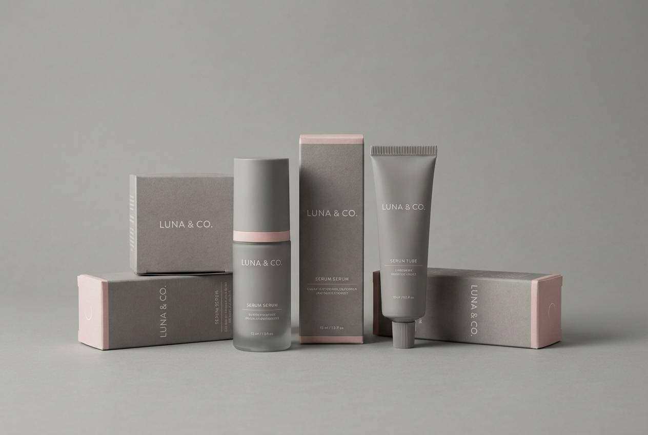
2) Graphite Rose
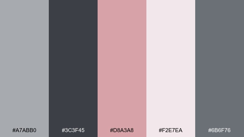
HEX: #a7abb0 #3c3f45 #d8a3a8 #f2e7ea #6b6f76
Mood: modern, romantic, polished
Best for: beauty brand packaging
Polished and slightly romantic, it feels like graphite sketches softened by a blush tint. It works beautifully for beauty packaging, fragrance labels, and premium stationery where you want elegance without glitter. Let the dark graphite carry typography and use the rose tone for seals, icons, or a single hero element. Usage tip: keep the pink area small and intentional for a luxe finish.
Image example of graphite rose generated using media.io
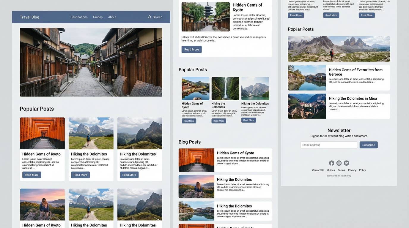
3) Coastal Fog
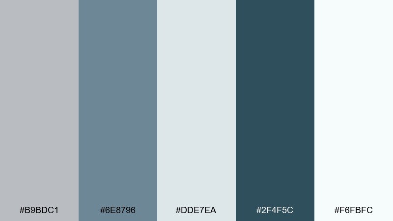
HEX: #b9bdc1 #6e8796 #dde7ea #2f4f5c #f6fbfc
Mood: fresh, coastal, quiet
Best for: travel blog website ui
Fresh and quiet like mist rolling over a shoreline, this mix reads clean and trustworthy. It is a strong fit for travel or wellness sites that need clarity and calm. Pair the slate blue for navigation and buttons, then keep content areas light for effortless readability. Usage tip: reserve the darkest tone for headings so the page stays airy.
Image example of coastal fog generated using media.io
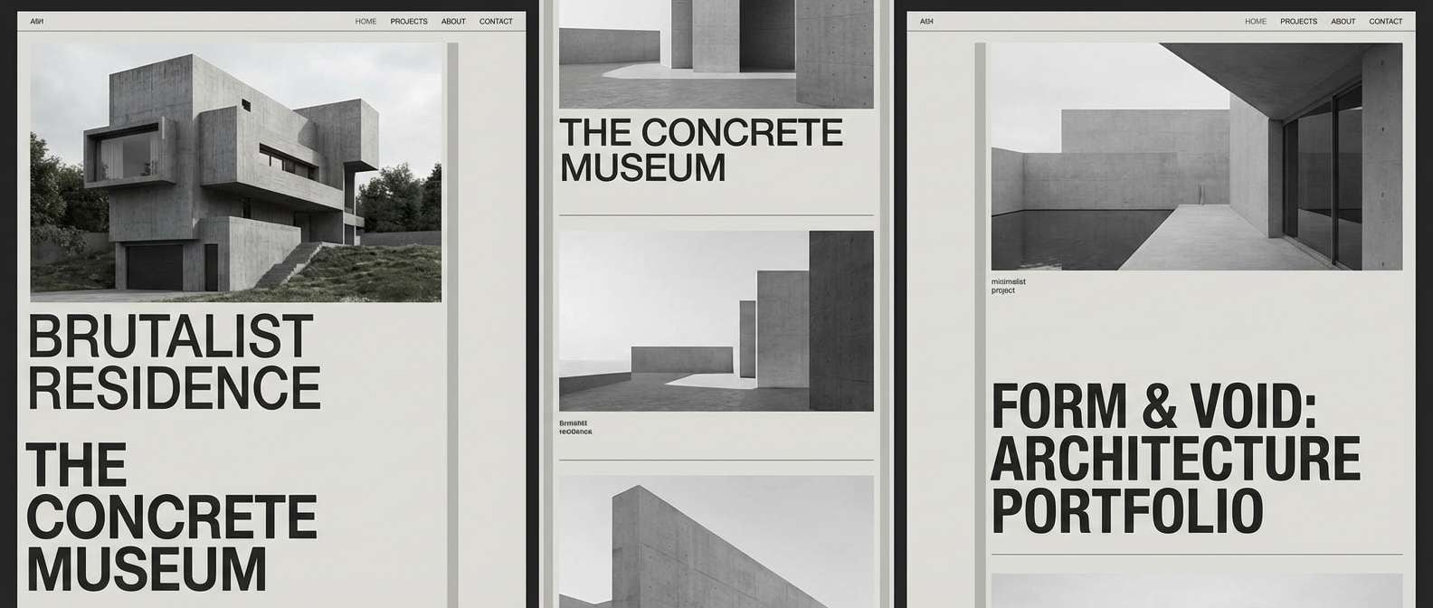
4) Urban Concrete
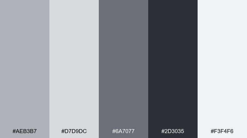
HEX: #aeb3b7 #d7d9dc #6a7077 #2d3035 #f3f4f6
Mood: industrial, confident, minimal
Best for: architecture portfolio website
Industrial and confident, it evokes concrete, steel, and crisp shadows between city blocks. An ash grey color palette like this is ideal for architecture portfolios and product design case studies where imagery should lead. Pair the near-black with clean whites for typography, and keep mid-greys for grids and dividers. Usage tip: apply the darkest tone to a single sticky header to anchor long scrolling pages.
Image example of urban concrete generated using media.io
5) Sage Ash
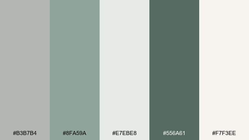
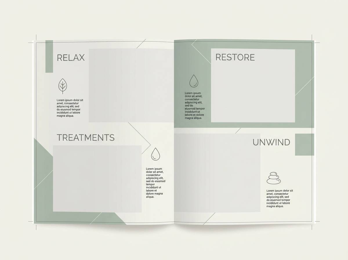
HEX: #b3b7b4 #8fa59a #e7ebe8 #556a61 #f7f3ee
Mood: natural, restorative, soft
Best for: spa brochure design
Restorative and natural, these hues feel like cool stone beside soft herbs. They suit spa brochures, self-care brands, and calm editorial layouts that need a gentle organic touch. Pair the sage and deep green for section headers, then let the off-white carry body text and breathing room. Usage tip: use the mid-grey as a subtle background block behind testimonials or pricing.
Image example of sage ash generated using media.io
6) Steel Blue Mist
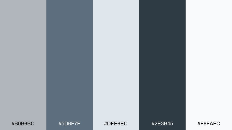
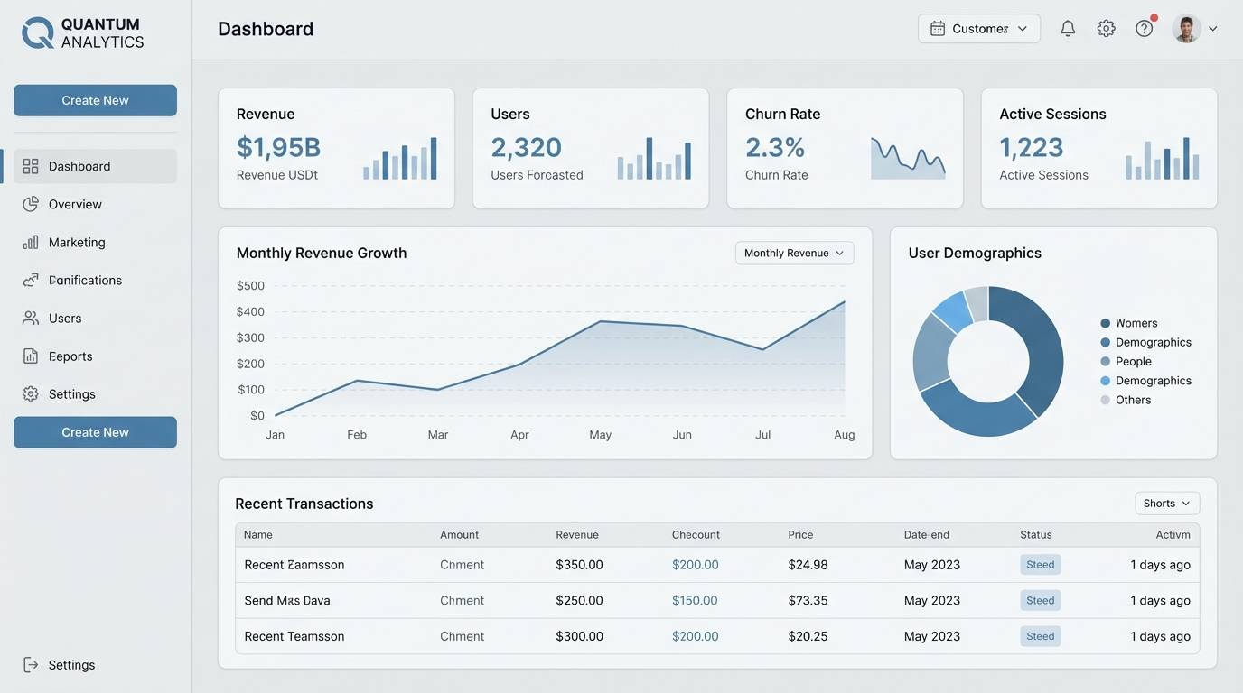
HEX: #b0b6bc #5d6f7f #dfe6ec #2e3b45 #f8fafc
Mood: cool, technical, dependable
Best for: saas dashboard ui
Cool and technical, it brings to mind brushed steel and crisp winter air. It works well for dashboards where you want trust, structure, and long-session comfort. Pair the steel blue for primary actions and the charcoal for charts and key numbers. Usage tip: keep large panels in the palest tint to reduce visual fatigue.
Image example of steel blue mist generated using media.io
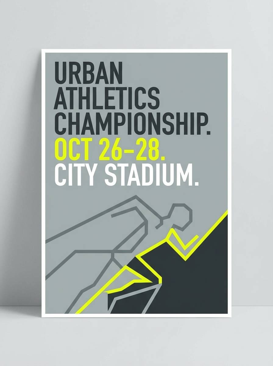
7) Charcoal Citrus
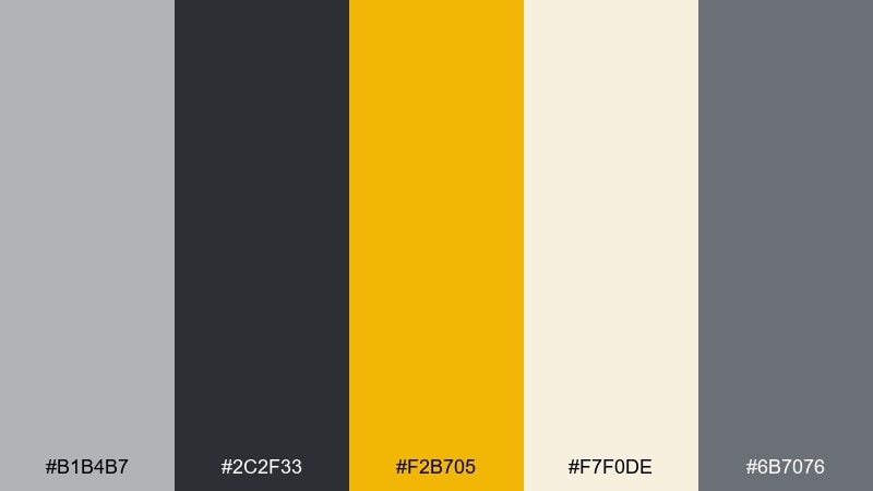
HEX: #b1b4b7 #2c2f33 #f2b705 #f7f0de #6b7076
Mood: bold, energetic, high-contrast
Best for: sports event poster
Bold and punchy, it feels like night streets lit by a single neon sign. These ash grey color combinations shine on posters and social graphics that need instant contrast and a clear call to action. Pair the citrus as a highlight for dates, prices, or buttons, while charcoal handles big type. Usage tip: keep the yellow on one accent level so the design stays premium, not noisy.
Image example of charcoal citrus generated using media.io
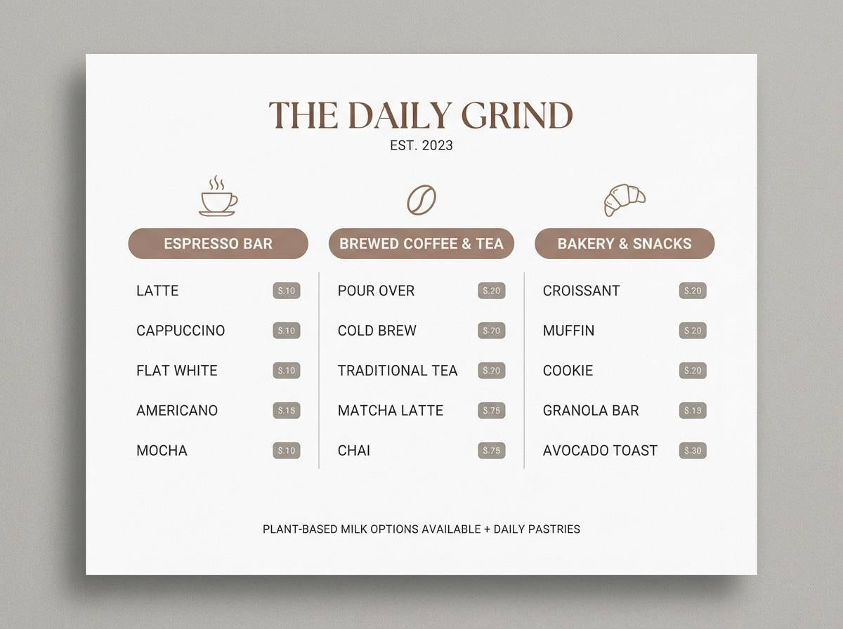
8) Pebble Mocha
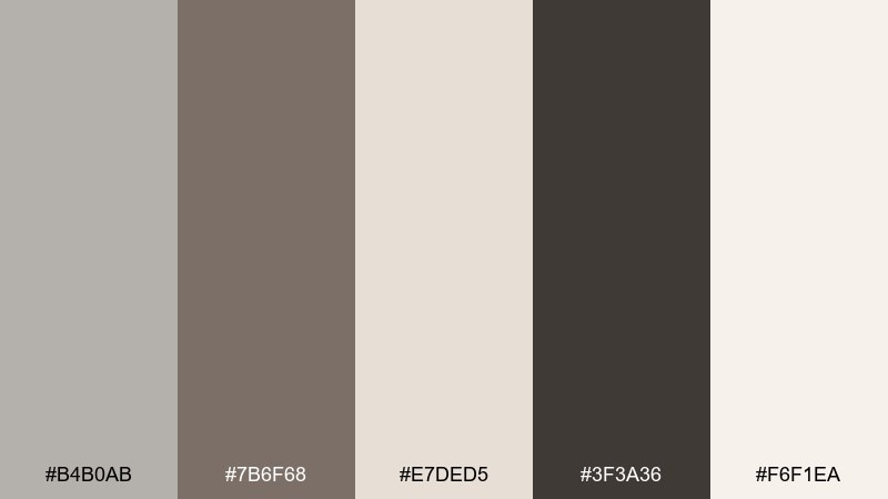
HEX: #b4b0ab #7b6f68 #e7ded5 #3f3a36 #f6f1ea
Mood: cozy, grounded, warm-neutral
Best for: coffee shop menu design
Cozy and grounded, it evokes smooth pebbles, cocoa powder, and warm cafe light. It is a natural choice for menus, artisan labels, and lifestyle branding that leans earthy. Pair the espresso-dark tone for headings and icons, and use the creamy shades for readable sections. Usage tip: add texture through subtle paper grain rather than extra colors.
Image example of pebble mocha generated using media.io
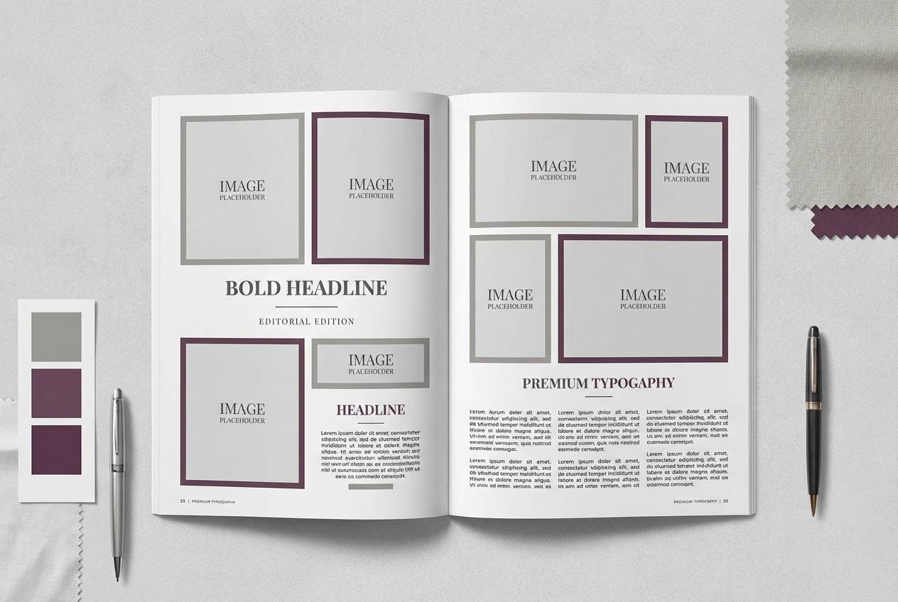
9) Winter Plum
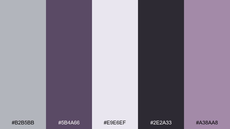
HEX: #b2b5bb #5b4a66 #e9e6ef #2e2a33 #a38aa8
Mood: moody, elegant, editorial
Best for: fashion editorial layout
Moody and elegant, it feels like winter twilight with a hint of plum lipstick. It is perfect for fashion editorials, lookbooks, or portfolio spreads that need drama without harshness. Pair the deep plum for pull quotes and section breaks, and let the light lavender-grey carry margins and captions. Usage tip: keep body text in the dark charcoal for sharp readability in print.
Image example of winter plum generated using media.io
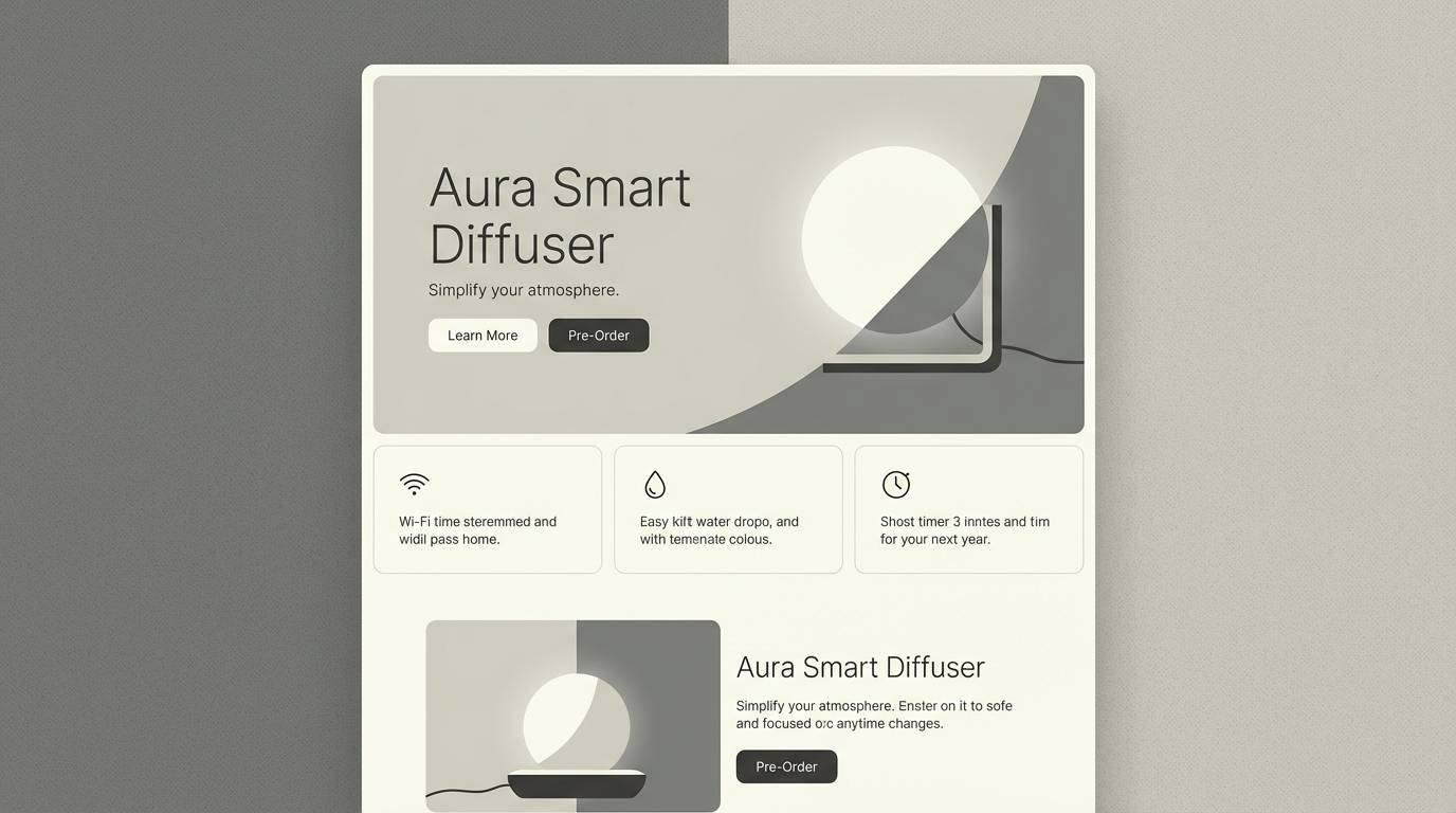
10) Minimal Ivory
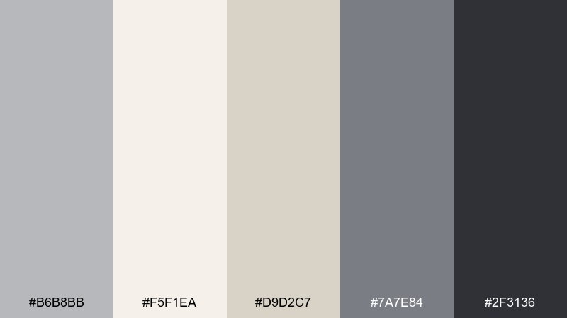
HEX: #b6b8bb #f5f1ea #d9d2c7 #7a7e84 #2f3136
Mood: minimal, gallery-like, timeless
Best for: product landing page ui
Timeless and gallery-clean, these tones look like curated walls and soft spotlights. They work well for product landing pages where photography and copy need space to breathe. Pair the near-black sparingly for headlines and CTAs, and keep the ivory as the main canvas. Usage tip: use the warm beige-grey for subtle cards so sections feel separated without borders.
Image example of minimal ivory generated using media.io
11) Dusty Teal Studio
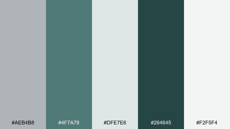
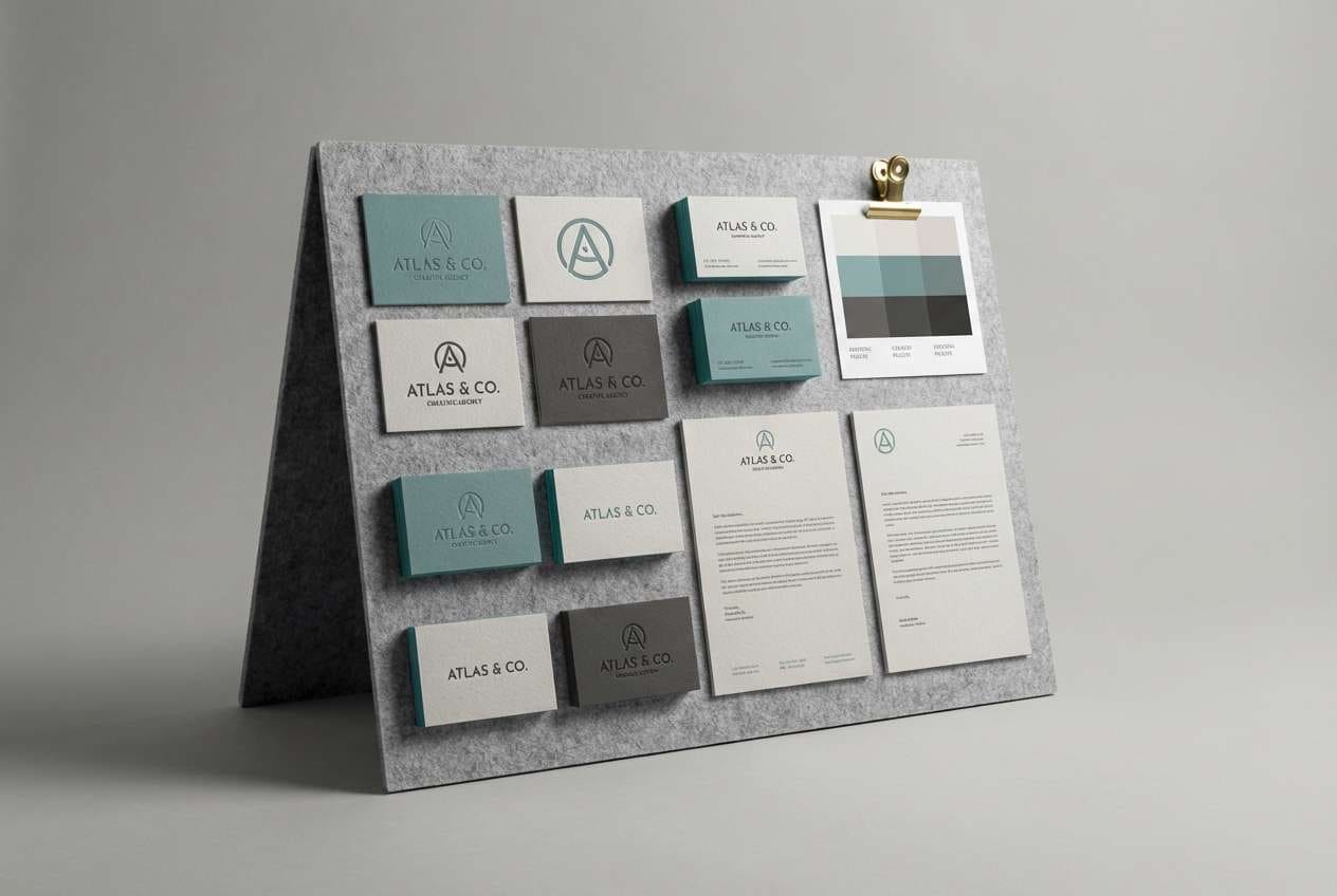
HEX: #aeb4b8 #4f7a78 #dfe7e6 #264645 #f2f5f4
Mood: creative, calm, contemporary
Best for: creative agency branding
Creative and calm, it suggests a quiet studio with teal paint splashes on concrete. It fits agency branding that wants personality while staying professional. Pair teal for logos and key shapes, then use the dark green-charcoal for type and contrast. Usage tip: keep teal in consistent blocks or lines for a cohesive identity system.
Image example of dusty teal studio generated using media.io
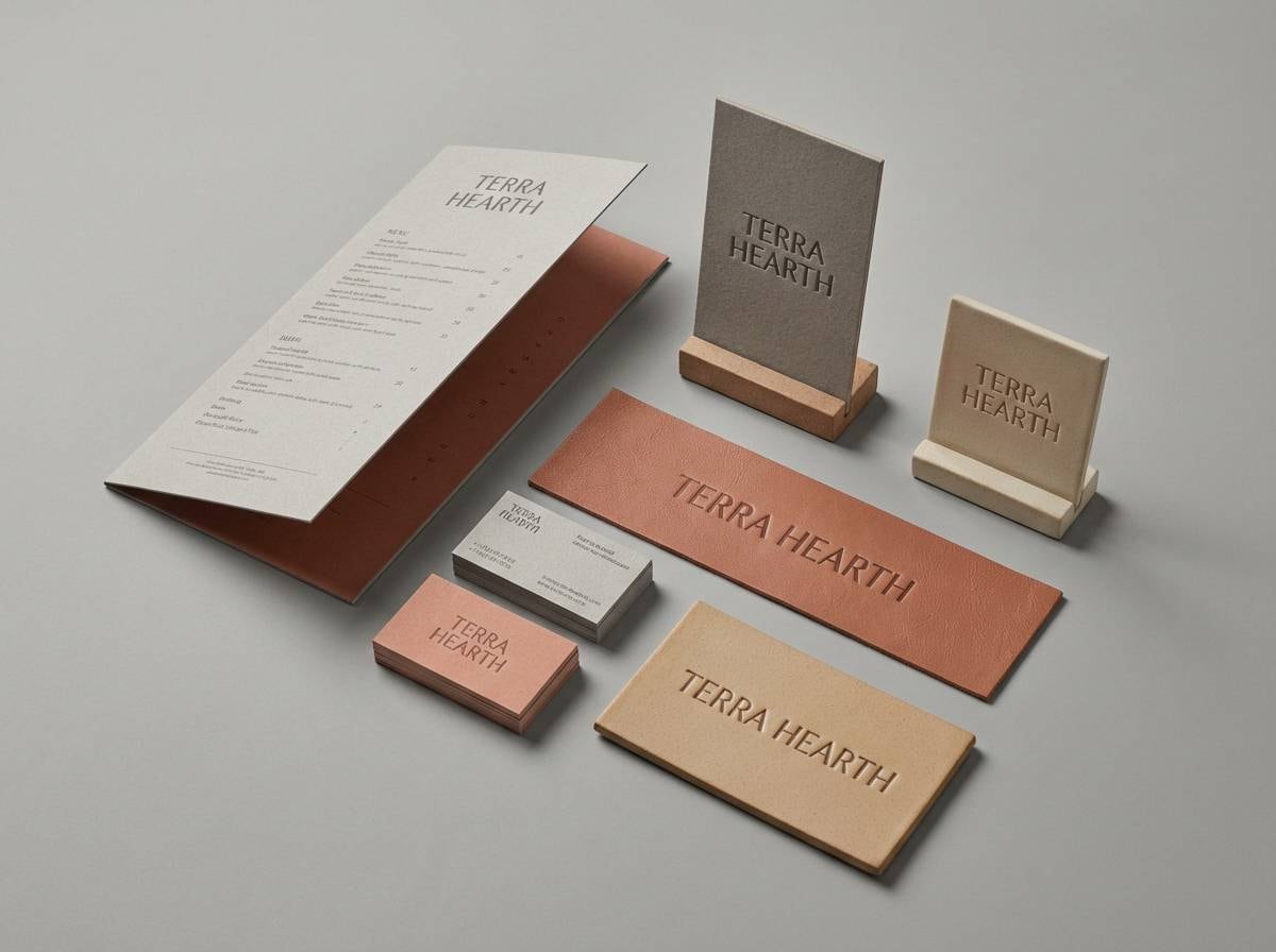
12) Stone Terracotta
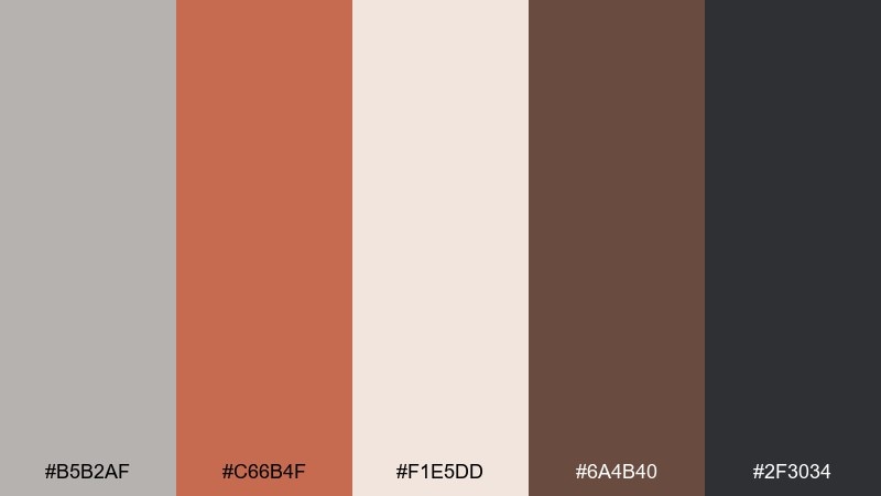
HEX: #b5b2af #c66b4f #f1e5dd #6a4b40 #2f3034
Mood: earthy, architectural, warm
Best for: restaurant brand identity
Earthy and architectural, it recalls kiln-fired clay against cool stone. An ash grey color combination with terracotta feels welcoming for restaurants, ceramics brands, and boutique hospitality. Pair terracotta for logos and highlights, then anchor menus and signage with the charcoal. Usage tip: use the pale blush-beige as a background to soften the contrast in long text sections.
Image example of stone terracotta generated using media.io
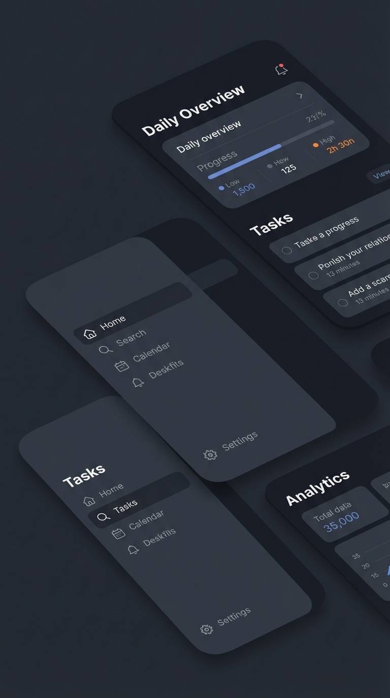
13) Midnight Ash
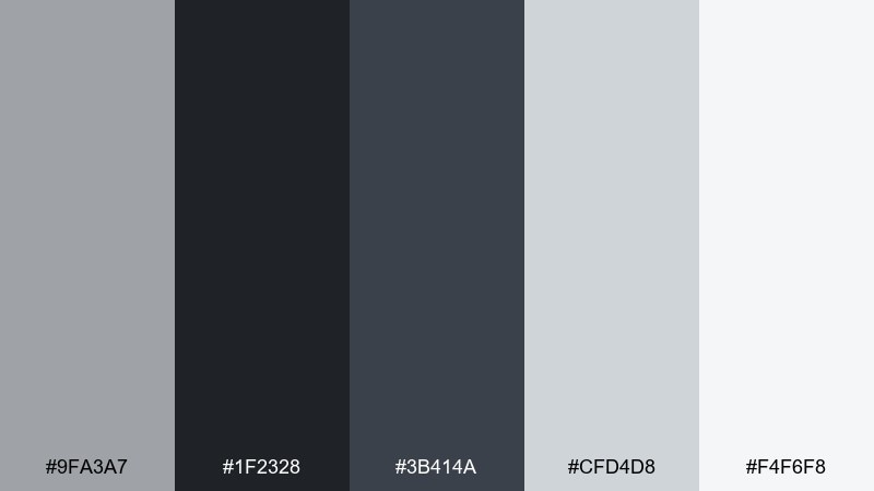
HEX: #9fa3a7 #1f2328 #3b414a #cfd4d8 #f4f6f8
Mood: sleek, dramatic, tech-forward
Best for: dark mode app ui
Sleek and dramatic, it feels like a city skyline after rain. It is built for dark mode interfaces where legibility and hierarchy matter. Pair the near-black for backgrounds, then use the light greys for text and surfaces to keep contrast accessible. Usage tip: reserve the mid-slate for secondary buttons so primary actions stand out.
Image example of midnight ash generated using media.io
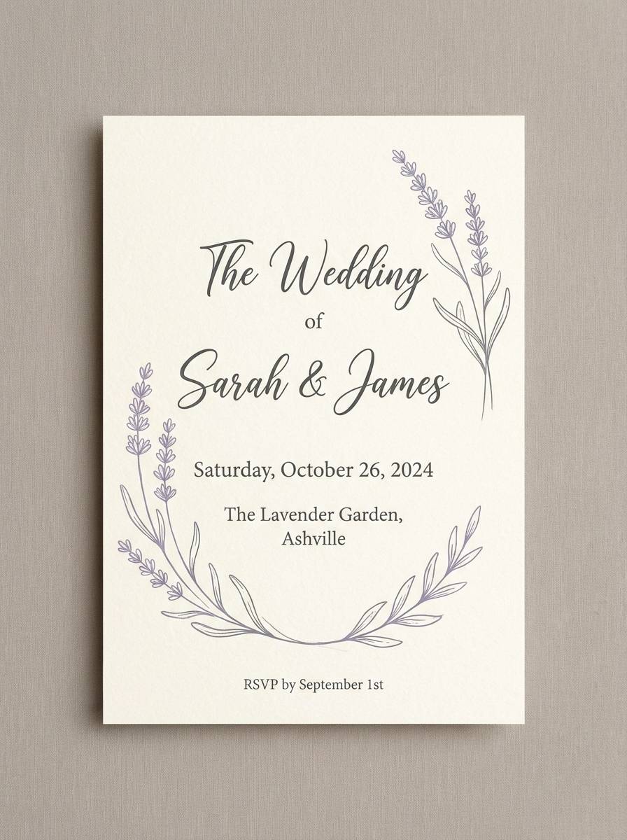
14) Silver Lavender
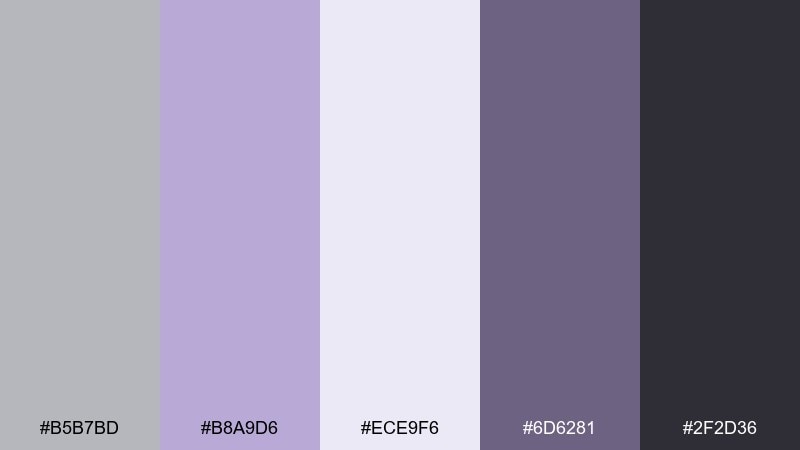
HEX: #b5b7bd #b8a9d6 #ece9f6 #6d6281 #2f2d36
Mood: soft, dreamy, modern
Best for: wedding invitation design
Soft and dreamy, it brings to mind lilac petals dusted with silvery powder. It is a graceful fit for wedding invitations and event stationery that want a modern twist. Pair lavender for names and delicate motifs, and keep the darker violet-grey for small print and RSVP details. Usage tip: use plenty of negative space so the light tones stay crisp in print.
Image example of silver lavender generated using media.io
15) Espresso Slate
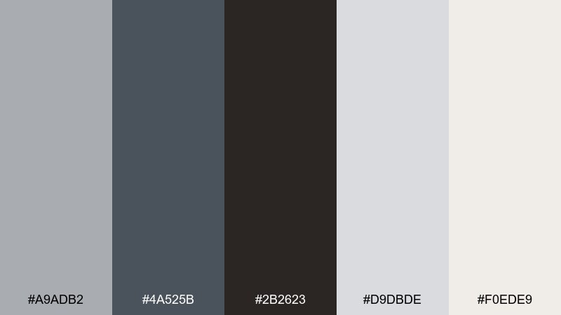
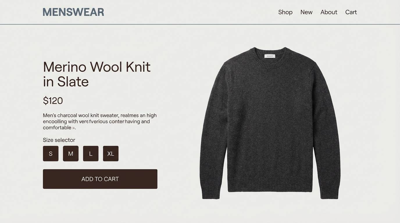
HEX: #a9adb2 #4a525b #2b2623 #d9dbde #f0ede9
Mood: serious, upscale, grounded
Best for: menswear ecommerce product page
Serious and upscale, it feels like slate stone paired with dark espresso leather. It suits menswear ecommerce where materials and craftsmanship should look premium. Pair the espresso for navigation and price emphasis, then use light greys for product detail sections. Usage tip: keep buttons in slate rather than black to maintain a softer, modern edge.
Image example of espresso slate generated using media.io
16) Blush Alloy
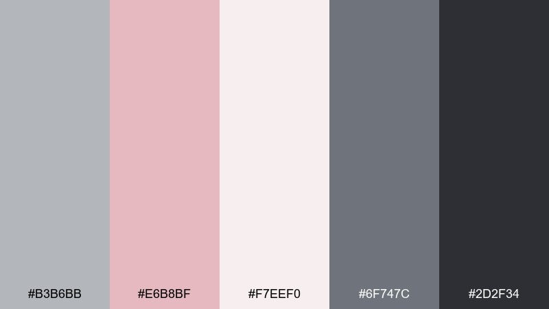
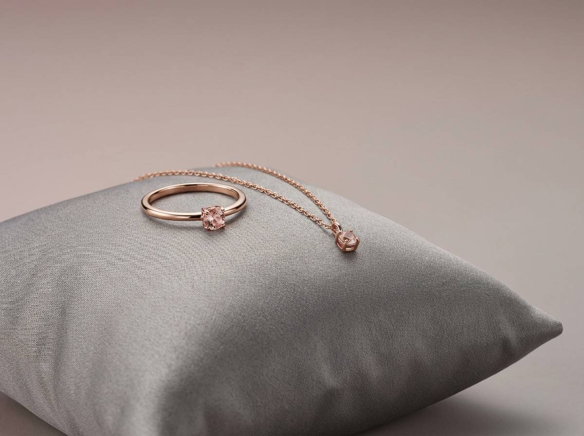
HEX: #b3b6bb #e6b8bf #f7eef0 #6f747c #2d2f34
Mood: soft, premium, contemporary
Best for: jewelry product ad
Soft and premium, it evokes brushed metal warmed by a faint blush glow. An ash grey color palette with this pink tint works especially well for jewelry ads, skincare promos, and gift collections. Pair the blush for a single hero backdrop or banner, then set product names in charcoal for clarity. Usage tip: keep highlights in the palest shade to mimic a clean studio reflection.
Image example of blush alloy generated using media.io
17) Pine Shadow
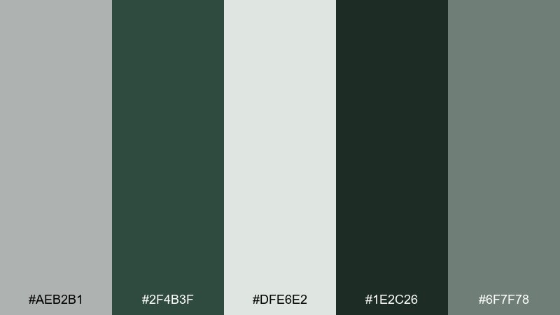
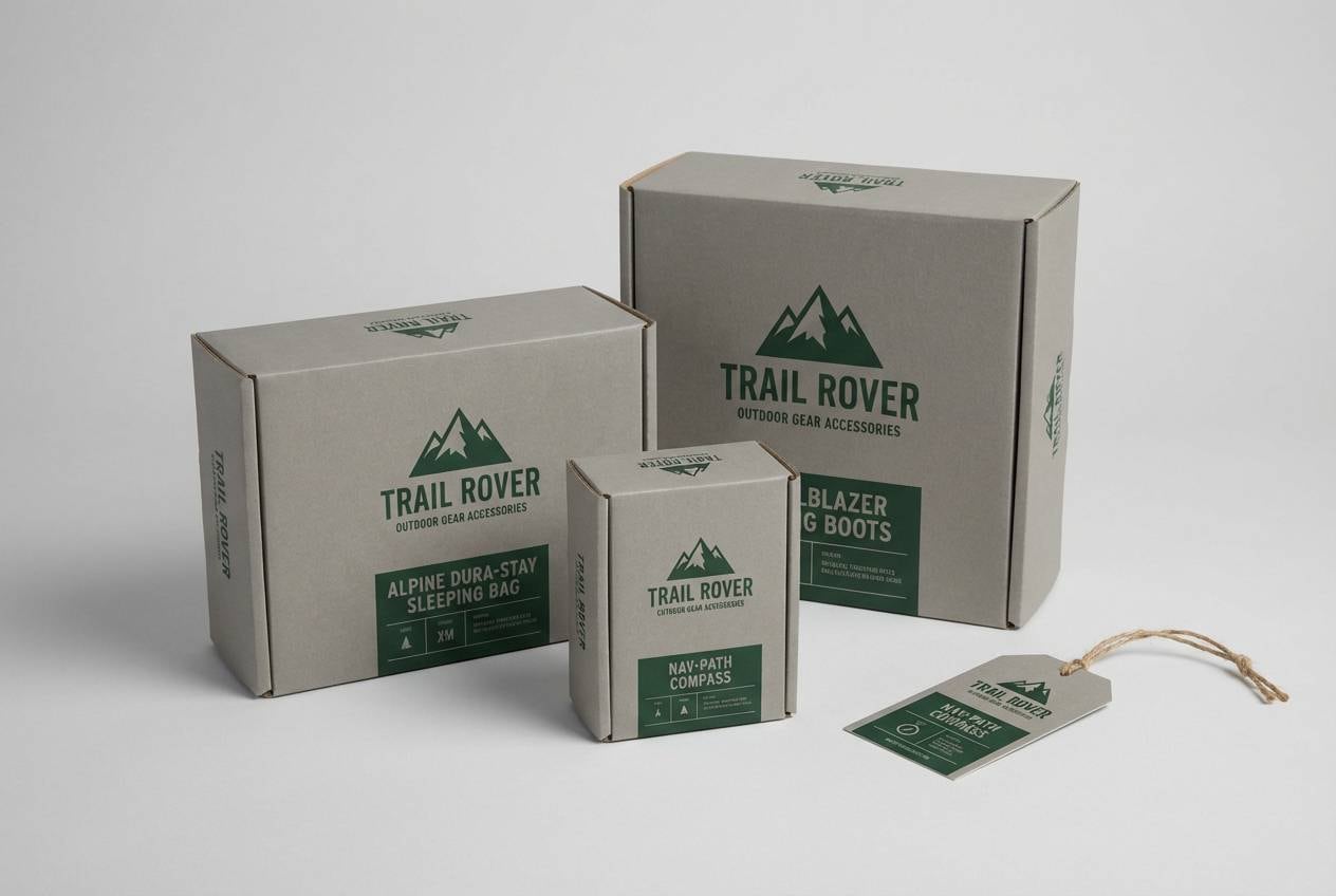
HEX: #aeb2b1 #2f4b3f #dfe6e2 #1e2c26 #6f7f78
Mood: outdoorsy, calm, rugged
Best for: outdoor gear product packaging
Outdoorsy and calm, it feels like pine needles under foggy mountain light. It fits outdoor gear packaging that needs to look durable, not loud. Pair the deep pine for logos and key labels, and use pale greys for clean information blocks. Usage tip: add a single solid pine band to create a strong shelf silhouette.
Image example of pine shadow generated using media.io
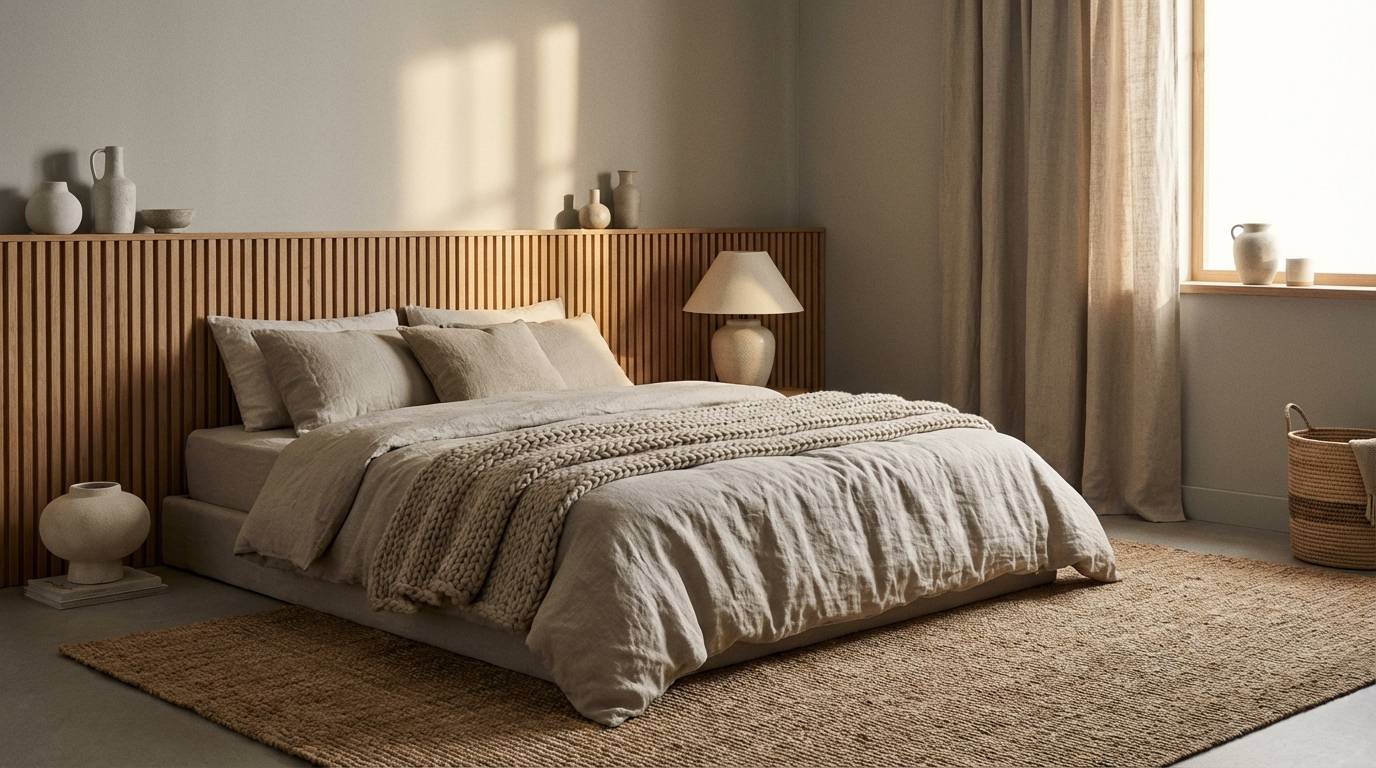
18) Sandstorm Grey
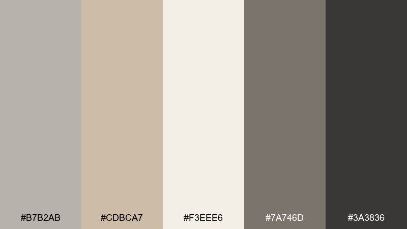
HEX: #b7b2ab #cdbca7 #f3eee6 #7a746d #3a3836
Mood: sun-warmed, neutral, relaxed
Best for: minimal bedroom interior
Sun-warmed and relaxed, it looks like wind-smoothed sand meeting cool stone. It is a great choice for bedrooms and quiet reading corners where you want comfort without heaviness. Pair the deeper greige for textiles and the pale cream for walls to keep the space bright. Usage tip: echo the warm sand tone in one large rug to unify the palette.
Image example of sandstorm grey generated using media.io
19) Ink Pearl
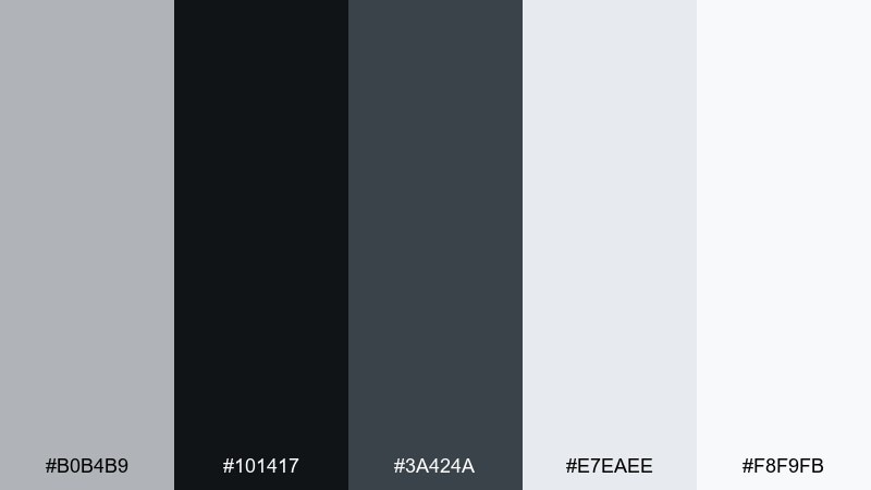
HEX: #b0b4b9 #101417 #3a424a #e7eaee #f8f9fb
Mood: crisp, high-end, editorial
Best for: luxury brand website ui
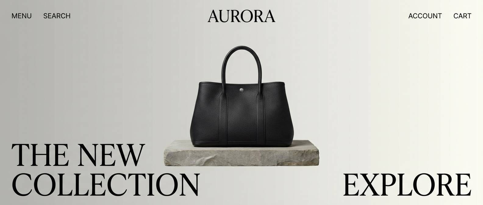
Crisp and high-end, it reads like black ink on pearl paper. It is ideal for luxury websites where whitespace, typography, and image framing do most of the work. Pair the inky black for navigation and headlines, then use the pearl tones for generous margins and content panels. Usage tip: keep borders ultra-light and rely on spacing instead of heavy rules.
Image example of ink pearl generated using media.io
20) Mustard Mechanic
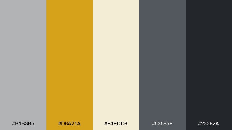
HEX: #b1b3b5 #d6a21a #f4edd6 #53585f #23262a
Mood: retro, confident, industrial
Best for: workshop flyer design
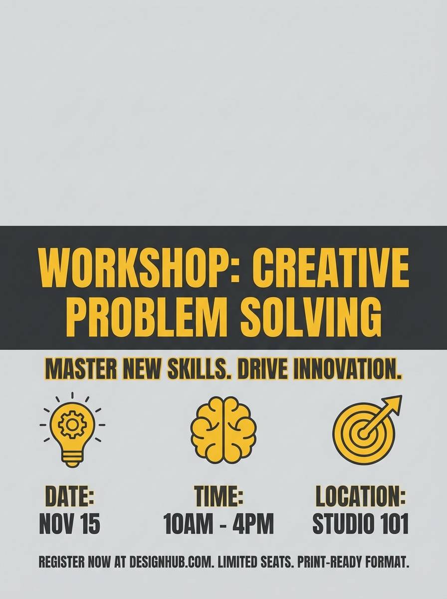
Retro and confident, it feels like vintage machinery with a mustard paint stripe. It is great for workshop flyers, maker events, and bold signage that needs quick readability. Pair mustard for key details like dates and locations, then keep the rest in greys for a clean hierarchy. Usage tip: set type in dark charcoal and use mustard only for emphasis to avoid glare.
Image example of mustard mechanic generated using media.io
What Colors Go Well with Ash Grey?
Ash grey pairs beautifully with crisp whites, charcoal, and near-black for clean contrast, making it a reliable base for modern UI and typography-heavy layouts. If you want a softer look, use warm off-whites and greige shades to keep the palette gentle and natural.
For accents, muted tones like sage, slate blue, dusty teal, lavender, and blush add personality without overpowering the neutral foundation. If you need energy, a controlled pop—mustard or citrus yellow—creates instant hierarchy for CTAs, dates, or key labels.
When in doubt, keep ash grey as the “canvas,” then choose one accent family (cool blues/greens or warm pinks/terracotta) and repeat it consistently across components to maintain cohesion.
How to Use a Ash Grey Color Palette in Real Designs
In web and app design, use the lightest ash-grey tints as page backgrounds, then reserve darker greys for headings, icons, and navigation. This keeps the interface readable, reduces glare, and helps content feel organized without heavy borders.
For branding and print, ash grey works best when you control contrast: let dark tones handle typography and logos, and use softer neutrals for backgrounds and large areas. A single accent color (like blush, teal, or terracotta) can define your brand’s signature without looking loud.
In interiors, repeat one mid-grey across textiles or trim to tie the room together, then add texture (wood, stone, linen, matte metal) instead of extra colors. Ash grey is especially effective when materials do the “decorating.”
Create Ash Grey Palette Visuals with AI
If you already have HEX codes but need real-looking visuals, generate mockups that show how the palette behaves in context—UI screens, packaging, posters, or room interiors. Seeing ash grey next to accents is the fastest way to validate contrast and mood.
With Media.io’s text-to-image tool, you can describe the exact scene (style, lighting, materials, layout) and iterate quickly until the palette feels right. This is helpful for testing multiple accents—like sage vs. blush—without rebuilding designs from scratch.
Try starting with one palette above, then adjust the prompt for different use cases (website hero, brochure, product ad) to build a consistent visual system.
Ash Grey Color Palette FAQs
-
What is ash grey (and how is it different from standard grey)?
Ash grey is a soft, slightly muted grey that often has subtle cool or warm undertones. Compared to a “pure” neutral grey, ash grey tends to feel more natural and less flat, which helps it look more premium in designs. -
Is ash grey warm or cool?
It can be either, depending on the undertone. Many ash greys lean cool (blue/green undertones), but some lean warm (beige/brown undertones). Pair it with ivory to bring out warmth, or with slate/steel blues to emphasize a cooler feel. -
What accent colors look best with ash grey?
Muted accents like sage, slate blue, dusty teal, blush pink, lavender, and terracotta are the easiest matches. For high-contrast emphasis, mustard or citrus yellow works well when used sparingly for CTAs and highlights. -
How do I choose text colors on an ash grey background?
Use near-black or charcoal for body text on light ash-grey backgrounds, and off-white or very light grey for text on dark ash-grey backgrounds. Always check contrast (especially in UI) to keep reading comfortable and accessible. -
Does ash grey work for minimalist branding?
Yes. Ash grey supports minimal branding by keeping the visual tone calm while still providing enough structure for typography, grids, and product photography. Add one consistent accent color to create a recognizable brand signature. -
Which ash grey palettes are best for UI design?
Try Coastal Fog, Steel Blue Mist, Urban Concrete, Ink Pearl, or Midnight Ash. These sets include clear light-to-dark steps that help build hierarchy for backgrounds, cards, borders, and primary actions. -
Can I generate ash grey palette mockups from a prompt?
Yes. With a text-to-image tool like Media.io, you can generate palette-based visuals such as dashboards, posters, packaging, or interiors by describing the scene and specifying the vibe (minimal, editorial, cozy, tech-forward).
Next: Red Pink Color Palette


