

Shamrock green (#00A86B) sits right in the sweet spot between fresh mint and deep emerald, making it easy to style across digital and print work.
Below are modern shamrock green color palette ideas with HEX codes—ranging from crisp neutrals to playful pastels and high-contrast dark mode mixes.
In this article
- Why Shamrock Green Palettes Work So Well
-
- lucky mint and cream
- clover and charcoal
- garden party pastels
- evergreen and brass
- shamrock and skyline
- sea glass neutrals
- retro soda shop
- modern irish pub
- botanical watercolor wash
- tech lime contrast
- emerald noir
- soft sage office
- tropical leaf pop
- vintage bookcloth
- spring wedding greens
- athletic field bold
- artisan packaging earthy
- coastal meadow
- classroom cheer
- night market neon
- forest citrus balance
- What Colors Go Well with Shamrock Green?
- How to Use a Shamrock Green Color Palette in Real Designs
- Create Shamrock Green Palette Visuals with AI
Why Shamrock Green Palettes Work So Well
Shamrock green blends the “clean” feel of green with a bright, modern edge—so it reads as energetic without becoming neon. That makes it a strong brand signature color for tech, wellness, food, and lifestyle.
It’s also highly adaptable: pair it with warm neutrals for a premium, heritage vibe, or add pastels for playful seasonal design. In UI, it performs well as a success/active state color while still feeling friendly.
Most importantly, shamrock green supports clear hierarchy. You can let it lead headlines and key actions, then rely on off-whites, grays, or navy to keep layouts structured and readable.
20+ Shamrock Green Color Palette Ideas (with HEX Codes)
1) Lucky Mint and Cream
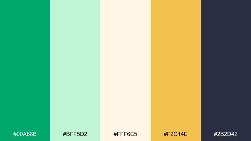
HEX: #00A86B #BFF5D2 #FFF6E5 #F2C14E #2B2D42
Mood: fresh, upbeat, clean
Best for: brand identity and landing pages
Bright and refreshing, it feels like a crisp morning stroll through a spring garden with a warm hit of sunshine. The shamrock green color palette stays modern thanks to creamy off-white and a deep inky anchor. Use the gold as a sparing highlight for buttons, badges, and price tags. For balance, keep most surfaces light and let the green carry the brand signature.
Image example of lucky mint and cream generated using media.io
Media.io is an online AI studio for creating and editing video, image, and audio in your browser.

2) Clover and Charcoal
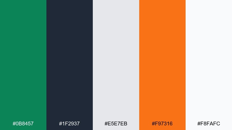
HEX: #0B8457 #1F2937 #E5E7EB #F97316 #F8FAFC
Mood: confident, urban, punchy
Best for: dark mode dashboards and admin UI
Moody charcoal with a crisp green reads like a night cityscape lit by clean signage. The contrast is strong enough for data-heavy screens while still feeling friendly. Pair the orange as a single-purpose alert or call-to-action color rather than a second accent. Tip: reserve the deepest gray for nav and charts, then use light grays to keep tables breathable.
Image example of clover and charcoal generated using media.io

3) Garden Party Pastels
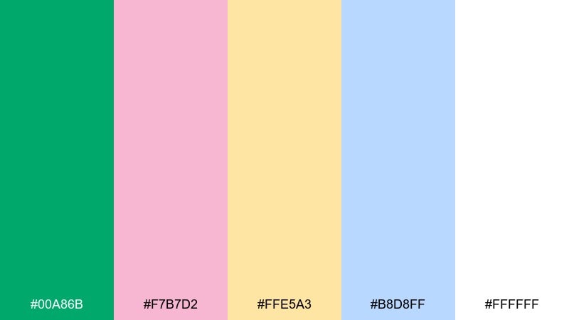
HEX: #00A86B #F7B7D2 #FFE5A3 #B8D8FF #FFFFFF
Mood: playful, airy, sweet
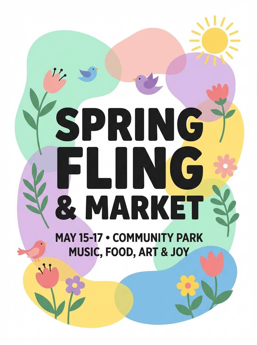
Best for: spring event flyers and social posts
Soft pastels around vivid green feel like confetti, ribbons, and fresh flowers in daylight. Keep the white background dominant so the colors stay light rather than candy-heavy. The pink and sky blue are great for sections and stickers, while the butter yellow works as a gentle highlight. Usage tip: apply the green to headings and key dates to keep legibility high.
Image example of garden party pastels generated using media.io
4) Evergreen and Brass
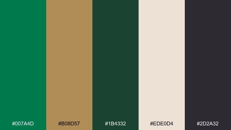
HEX: #007A4D #B08D57 #1B4332 #EDE0D4 #2D2A32
Mood: heritage, refined, cozy
Best for: premium packaging and craft labels
Deep greens with brass tones evoke old libraries, leather goods, and warm candlelight. Use the cream as the label base and let the darker shades frame typography and borders. Brass works best as a foil-like accent for seals, monograms, and small icons. Tip: keep gradients out of it and lean on texture, embossing, or subtle grain instead.
Image example of evergreen and brass generated using media.io
5) Shamrock and Skyline
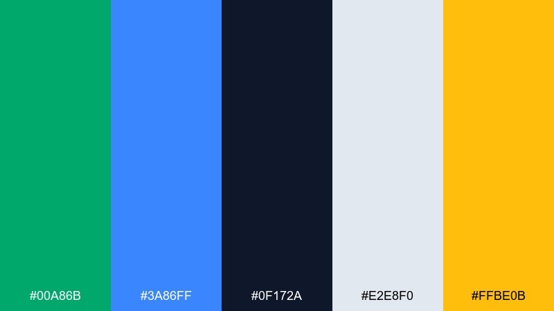
HEX: #00A86B #3A86FF #0F172A #E2E8F0 #FFBE0B
Mood: modern, energetic, techy
Best for: SaaS marketing pages and app onboarding
Crisp blue and bright green feel like clean glass buildings and fresh progress indicators. The navy provides serious structure for headings, while the light gray keeps sections calm. Use the yellow as a micro-accent for highlights, not as a competing hero color. Tip: keep the primary buttons green and use blue for links to separate action from navigation.
Image example of shamrock and skyline generated using media.io
6) Sea Glass Neutrals
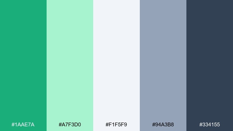
HEX: #1AAE7A #A7F3D0 #F1F5F9 #94A3B8 #334155
Mood: calm, spa-like, minimalist
Best for: wellness brands and editorial web layouts
Muted sea-glass greens and soft grays create a quiet, breathable look. It works beautifully for long-form pages where comfort matters as much as clarity. Pair the darker slate with thin rules, captions, and navigation so the greens can stay gentle. Tip: try subtle section blocks in the pale mint to guide reading without heavy dividers.
Image example of sea glass neutrals generated using media.io
7) Retro Soda Shop
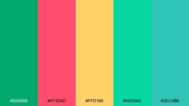
HEX: #00A86B #FF4D6D #FFD166 #06D6A0 #2EC4B6
Mood: retro, bubbly, fun
Best for: cafe menus and playful merch
High-sugar brights and minty green bring back neon signs, striped awnings, and fizzy drinks. Use the warm yellow for backgrounds and keep the hot pink for one or two loud moments like a special item callout. The extra teal gives you a secondary button or pattern color without diluting the vibe. Tip: add simple checker or stripe patterns to make the palette feel intentionally retro.
Image example of retro soda shop generated using media.io
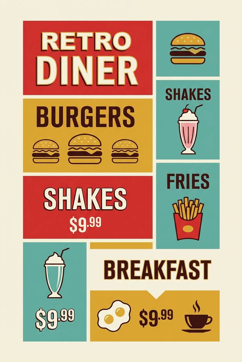
8) Modern Irish Pub
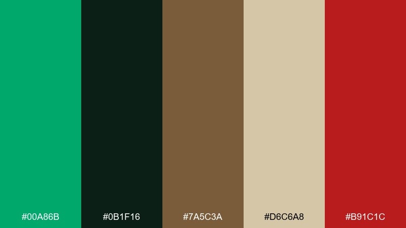
HEX: #00A86B #0B1F16 #7A5C3A #D6C6A8 #B91C1C
Mood: warm, grounded, inviting
Best for: restaurant branding and signage
Dark timber tones with a lively green feel like polished wood, worn leather, and a cozy corner booth. These shamrock green color combinations work best when the beige takes over as the main surface color. Use the red as a rare, appetite-boosting accent for specials or reservation CTAs. Tip: keep typography classic and let the green appear in small brand marks and wayfinding.
Image example of modern irish pub generated using media.io
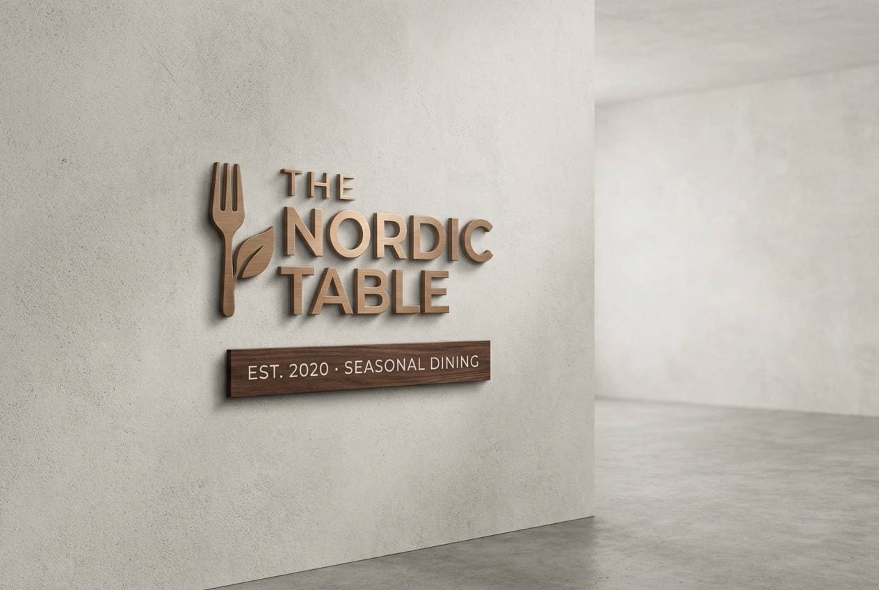
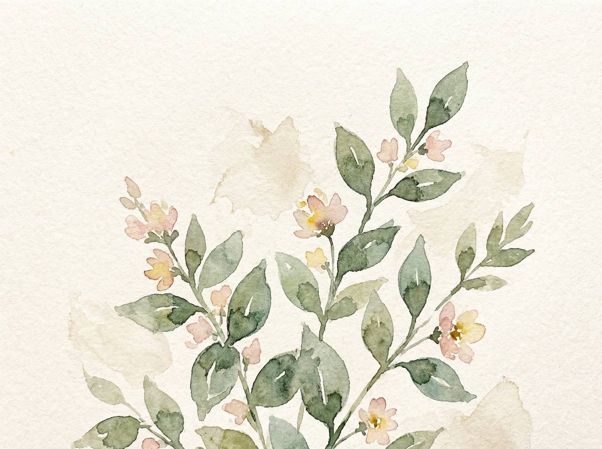
9) Botanical Watercolor Wash
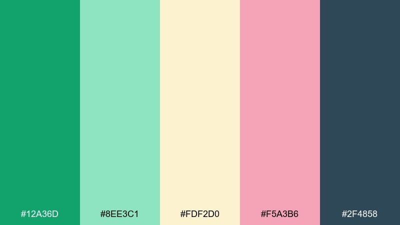
HEX: #12A36D #8EE3C1 #FDF2D0 #F5A3B6 #2F4858
Mood: soft, botanical, romantic
Best for: watercolor prints and spring stationery
Gentle greens and blush tones look like petals pressed into a sketchbook. The navy keeps the sweetness from drifting into overly pastel territory. Use the warm cream as paper color, then layer greens for leaves and borders. Tip: keep edges imperfect and let the colors bleed slightly to sell the watercolor feel.
Image example of botanical watercolor wash generated using media.io
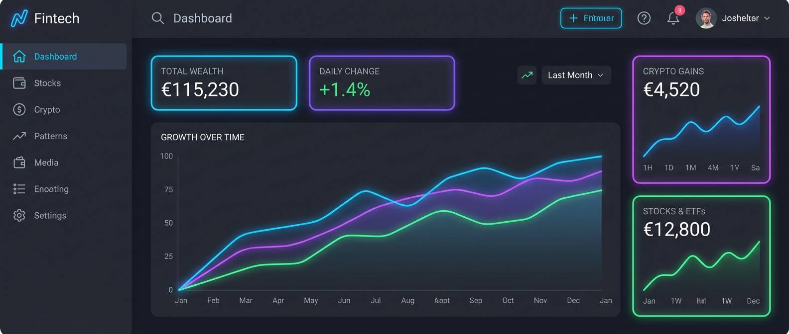
10) Tech Lime Contrast
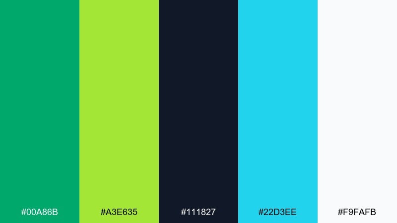
HEX: #00A86B #A3E635 #111827 #22D3EE #F9FAFB
Mood: bold, futuristic, high-contrast
Best for: startup dashboards and data visuals
Electric lime with deep near-black feels like terminals, status lights, and fast-moving charts. Keep the background mostly dark and use green for success states and active navigation. Cyan can support secondary actions, while lime is best reserved for key metrics that need instant attention. Tip: test accessibility early, especially for lime-on-white and cyan-on-green combinations.
Image example of tech lime contrast generated using media.io
11) Emerald Noir
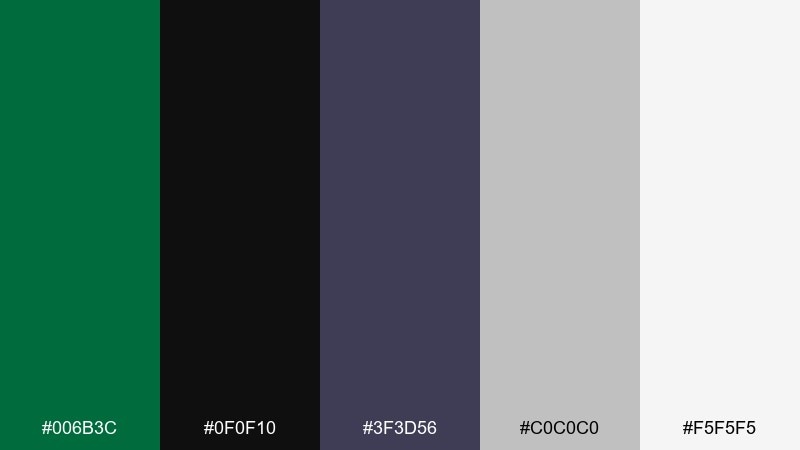
HEX: #006B3C #0F0F10 #3F3D56 #C0C0C0 #F5F5F5
Mood: luxury, dramatic, sleek
Best for: high-end fashion ads and lookbooks
Inky blacks with rich green feel like velvet, spotlight shadows, and glossy editorial pages. Use white and silver for negative space and fine details so everything stays sharp. The green should appear as a controlled statement, like a logo mark or a single headline. Tip: choose one bold typeface and keep the rest minimal to maintain the luxe mood.
Image example of emerald noir generated using media.io
12) Soft Sage Office
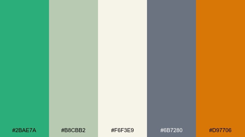
HEX: #2BAE7A #B8CBB2 #F6F3E9 #6B7280 #D97706
Mood: friendly, professional, grounded
Best for: consulting websites and presentation decks
Sage and warm neutrals feel like natural light in a tidy workspace. The palette supports long reading sessions without the harshness of pure white and black. Use the amber as a small emphasis color for icons, highlights, and chart callouts. Tip: keep body text in the soft gray and let the green lead headings and section dividers.
Image example of soft sage office generated using media.io
13) Tropical Leaf Pop
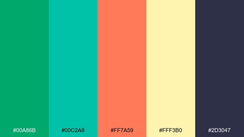
HEX: #00A86B #00C2A8 #FF7A59 #FFF3B0 #2D3047
Mood: sunny, tropical, upbeat
Best for: summer campaigns and travel promos
Bright green and aqua feel like palm leaves against a clear pool, with coral bringing warm sunset energy. Use the pale yellow as a soft background to keep the coral from overpowering the design. The deep indigo is perfect for type and helps the brights stay readable. Tip: pair with large, simple shapes and plenty of breathing room to avoid visual noise.
Image example of tropical leaf pop generated using media.io

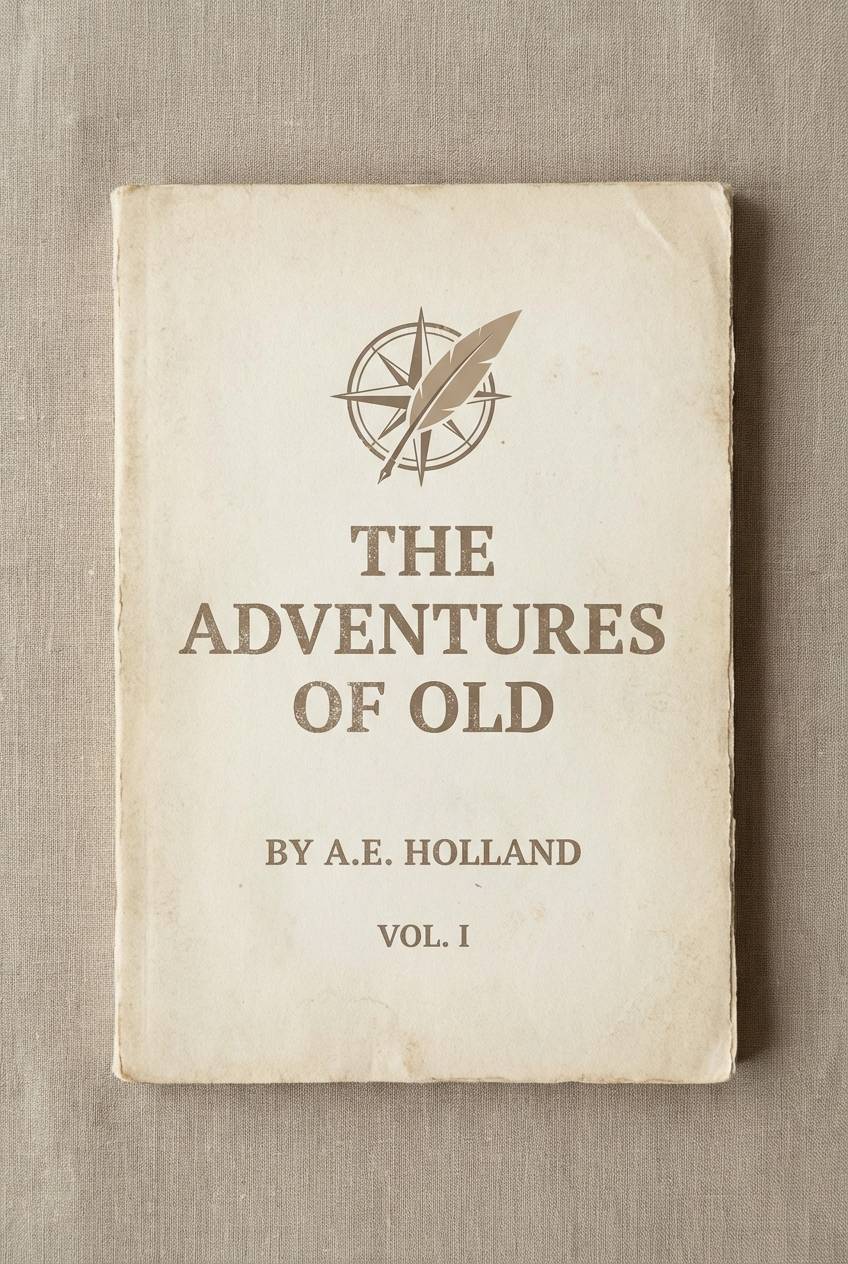
14) Vintage Bookcloth
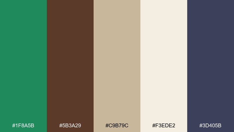
HEX: #1F8A5B #5B3A29 #C9B79C #F3EDE2 #3D405B
Mood: nostalgic, academic, tactile
Best for: book covers and museum programs
Earthy brown and green bring to mind cloth-bound books, paper ephemera, and quiet study halls. Let the warm beige and cream set the base, then use the green for titles and ornaments. The muted indigo helps create hierarchy without stealing attention from the main tones. Tip: add subtle paper texture and classic serif type to complete the vintage feel.
Image example of vintage bookcloth generated using media.io
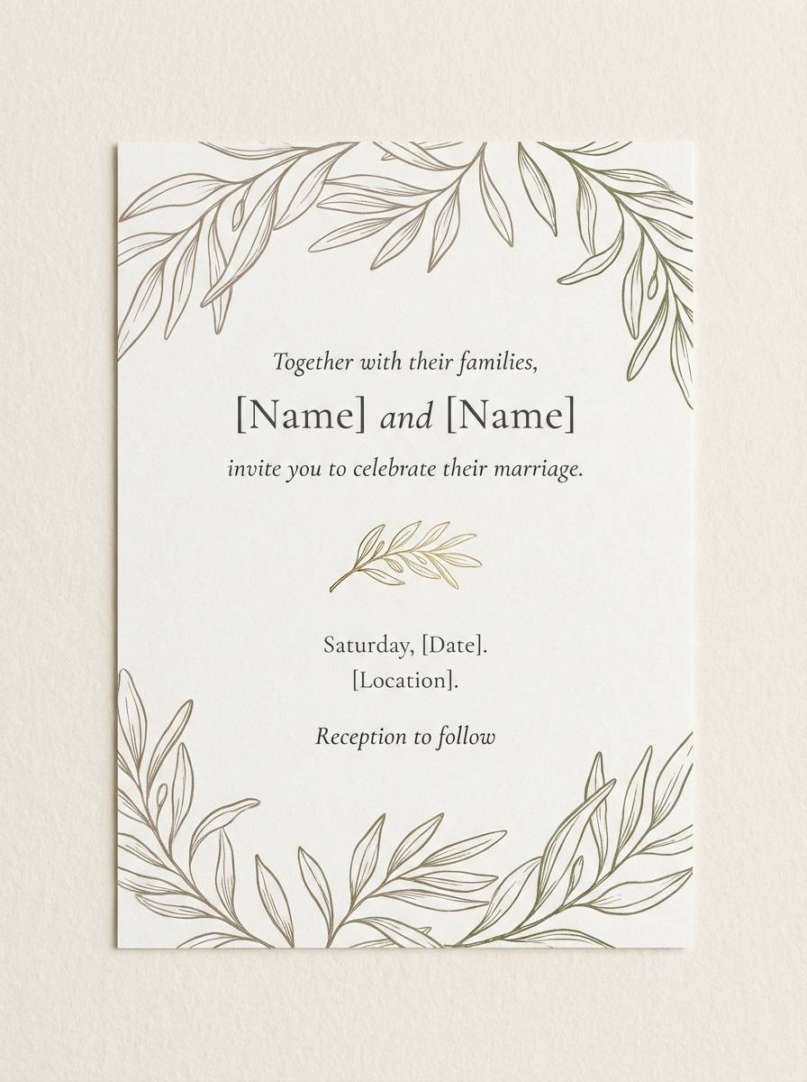
15) Spring Wedding Greens
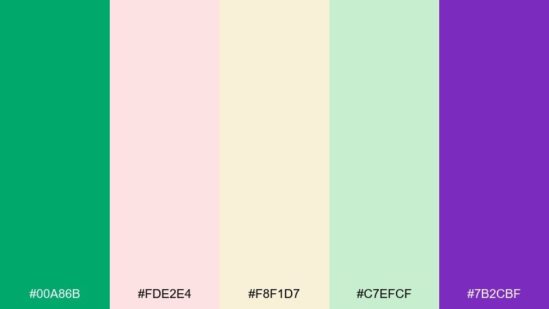
HEX: #00A86B #FDE2E4 #F8F1D7 #C7EFCF #7B2CBF
Mood: romantic, fresh, celebratory
Best for: wedding invitations and day-of stationery
Soft blush, cream, and leafy greens feel like bouquets, ribbons, and outdoor ceremonies. Keep the purple as a tiny flourish for monograms or wax-seal accents so it stays elegant. Use green for foliage motifs and headings, and let cream do the heavy lifting as the paper tone. Tip: stick to thin lines and delicate florals to keep everything light.
Image example of spring wedding greens generated using media.io
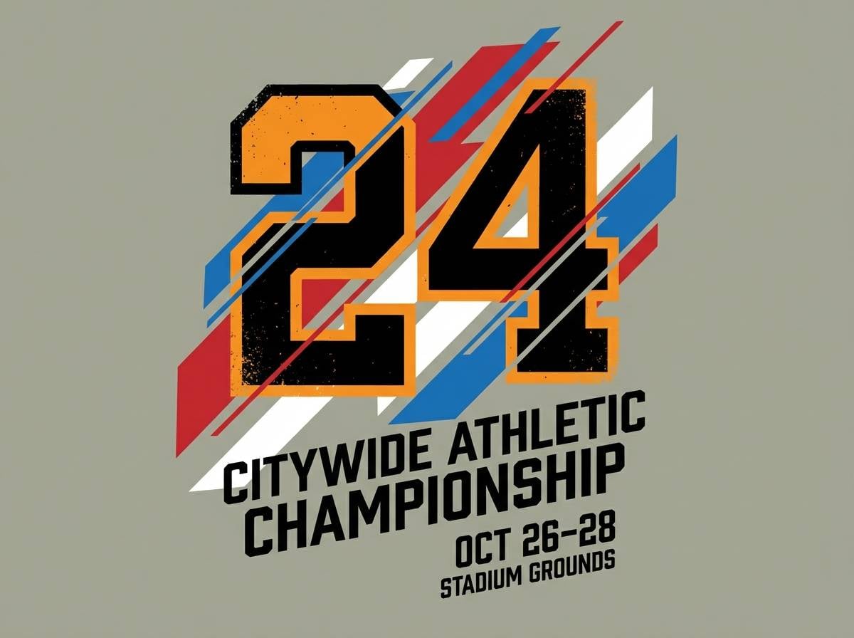
16) Athletic Field Bold
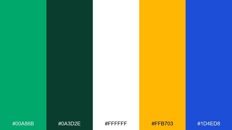
HEX: #00A86B #0A3D2E #FFFFFF #FFB703 #1D4ED8
Mood: sporty, loud, high-energy
Best for: team posters and sports apparel graphics
Punchy green and blue feel like stadium lights and fast motion on a bright field. Use white for strong type contrast and keep the deep green for outlines and shadows. Yellow is best as a quick hit for numbers, sponsor callouts, or key stats. Tip: build designs with bold blocks and strong diagonals for an athletic look.
Image example of athletic field bold generated using media.io
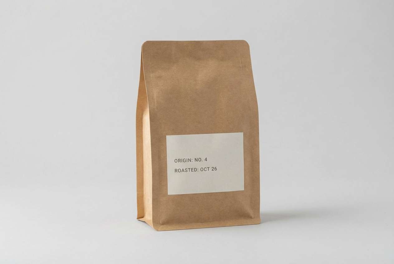
17) Artisan Packaging Earthy
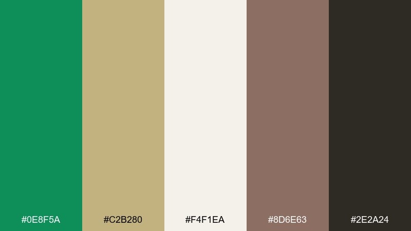
HEX: #0E8F5A #C2B280 #F4F1EA #8D6E63 #2E2A24
Mood: handcrafted, organic, warm
Best for: coffee, tea, and handmade goods packaging
Warm earth tones with a grounded green feel like kraft paper, roasted beans, and workshop shelves. Use the cream as the main label color and keep the darkest brown for typography and barcodes. The tan shade works well for patterns like dots, stamps, and texture overlays. Tip: choose one accent finish, like matte paper or a simple spot color, to keep it authentic.
Image example of artisan packaging earthy generated using media.io
18) Coastal Meadow
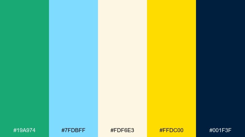
HEX: #19A974 #7FDBFF #FDF6E3 #FFDC00 #001F3F
Mood: breezy, optimistic, outdoorsy
Best for: tourism guides and seasonal newsletters
Sky blue and meadow green feel like a windy shoreline with bright sun on sand. Navy grounds the palette for headlines, maps, and icon sets. Use yellow for emphasis in small doses, like labels or route highlights, to keep it from becoming too loud. Tip: pair with clean, rounded icons for a friendly travel vibe.
Image example of coastal meadow generated using media.io

19) Classroom Cheer
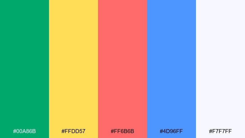
HEX: #00A86B #FFDD57 #FF6B6B #4D96FF #F7F7FF
Mood: cheerful, bright, kid-friendly
Best for: education posters and learning apps
Bold primaries with a fresh green feel like classroom bulletin boards and sticker charts. Keep the off-white as your main background so the bright colors stay readable. Assign each bright color to a category or subject to make the system easy for kids to learn. Tip: use larger type and generous spacing so the design stays calm even with saturated colors.
Image example of classroom cheer generated using media.io

20) Night Market Neon
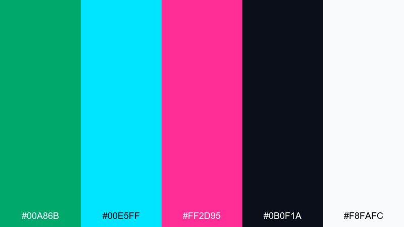
HEX: #00A86B #00E5FF #FF2D95 #0B0F1A #F8FAFC
Mood: neon, nightlife, edgy
Best for: music posters and streamer overlays
Vibrant neon accents against near-black feel like signs glowing in a late-night street market. Use green as the primary highlight, then let cyan support UI elements like toggles and progress bars. Pink is best as a rare spotlight for key titles or featured guests. Tip: add a subtle grain or glow effect, but keep type crisp to avoid muddiness.
Image example of night market neon generated using media.io
21) Forest Citrus Balance
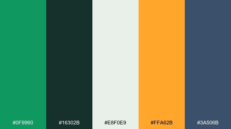
HEX: #0F9960 #16302B #E8F0E9 #FFA62B #3A506B
Mood: balanced, crisp, modern
Best for: mobile app UI and icon systems
Crisp greens with citrus orange feel like a hike that ends with a bright, refreshing drink. The off-white keeps UI surfaces clean, while the deep forest shade adds depth for navigation. Use orange for a single action color like primary buttons to avoid mixed signals. Tip: standardize icon strokes and apply green as the default state, orange as the active state.
Image example of forest citrus balance generated using media.io
What Colors Go Well with Shamrock Green?
Shamrock green pairs naturally with clean neutrals like cream, off-white, and cool light gray—perfect for modern UI, editorial layouts, and minimal branding. Add navy or charcoal when you need structure, contrast, and legible typography.
For warmer, premium combinations, try brass/gold, camel, and deep browns to create a heritage feel that still looks contemporary. These tones work especially well in packaging, hospitality branding, and print collateral.
If you want a punchier look, shamrock green plays well with coral, hot pink, citrus orange, or electric cyan—just keep one bright as the “moment” color so the design stays intentional.
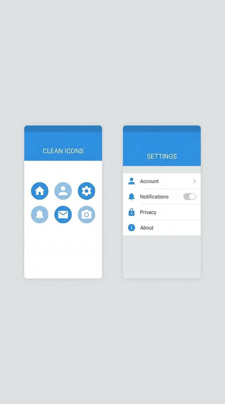
How to Use a Shamrock Green Color Palette in Real Designs
Start by deciding what role shamrock green will play: primary brand color, action/CTA color, or supportive accent. In UI design, it’s often most effective as a consistent “active/success” signal alongside a neutral base.
Build hierarchy with proportion: let backgrounds and large surfaces stay light (or very dark in dashboards), then use shamrock green for headings, primary buttons, or key highlights. This keeps the palette modern while preserving readability.
For print, shamrock green benefits from texture-friendly companions (cream, kraft, brass) and simple typography. Keep accents limited, and use the deepest tone in your palette for body text and small details.
Create Shamrock Green Palette Visuals with AI
If you already have HEX codes, you can turn them into usable design references fast—like brand boards, UI mockups, posters, or packaging concepts. The trick is to describe the layout style (minimal, editorial, neon, watercolor) and your intended format (banner, flyer, onboarding, label).
With Media.io’s text-to-image tool, you can generate quick visual directions for clients or teammates before committing to a full design system. It’s also useful for exploring variations (dark mode, pastel version, premium version) while keeping shamrock green as your anchor.
Use your favorite palette above, paste the prompt style you like, and iterate until the vibe matches your brand.
Shamrock Green Color Palette FAQs
-
What is the HEX code for shamrock green?
A common digital reference for shamrock green is #00A86B. It’s a bright, modern green that sits between mint and emerald. -
Is shamrock green the same as emerald green?
Not exactly. Emerald green is usually deeper and more jewel-toned, while shamrock green is typically brighter and fresher—often used for energetic branding and UI accents. -
What neutral colors pair best with shamrock green?
Cream/off-white, cool light gray, slate, navy, and charcoal are the easiest neutrals to pair with shamrock green because they keep contrast strong and layouts clean. -
What are good accent colors with shamrock green for modern design?
Coral, citrus orange, sunny yellow, cyan, and blush pink can all work. Choose one accent as the “highlight” color and keep the rest of the palette calm to avoid visual overload. -
How do I use shamrock green in a UI color scheme?
Use it for primary actions (buttons), active navigation states, and success messaging, then rely on grays/ink tones for surfaces and text. Always check contrast ratios for accessibility, especially in light mode. -
Does shamrock green work for premium/luxury branding?
Yes—combine it with near-black, deep forest green, cream, and metallic tones (brass/gold or silver). Keep the green as a controlled statement color rather than covering large areas. -
How can I visualize a shamrock green palette quickly?
Generate mockups like brand boards, posters, or UI screens using an AI text-to-image tool. Start with a clear prompt (layout + style + lighting) and keep your HEX palette consistent across iterations.
Next: Coral Pink Color Palette


