

Coral pink sits right between playful pink and warm orange, so it reads friendly, modern, and flattering across digital and print. It can look fresh and airy with creams, or bold and high-impact with deep navies and electric accents.
Below are coral pink color palette ideas with HEX codes you can use for branding, UI, social graphics, packaging, and decor—plus prompts to generate matching visuals with Media.io.
In this article
Why Coral Pink Palettes Work So Well
Coral pink is a “bridge” color: it has the softness people associate with pink, plus the warmth and energy of orange. That mix makes it versatile—cute for lifestyle, refined for beauty, and punchy for promos.
It also plays well with both cool and warm partners. Add navy, charcoal, or teal to sharpen contrast, or lean into creams, beiges, and blush tones to keep everything light and premium.
Most importantly, coral pink creates instant focal points. Used as a highlight for CTAs, pricing, badges, or key decor accents, it pulls attention without needing heavy gradients or noisy effects.
20+ Coral Pink Color Palette Ideas (with HEX Codes)
1) Sunset Sorbet
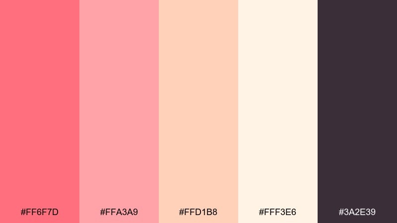
HEX: #FF6F7D #FFA3A9 #FFD1B8 #FFF3E6 #3A2E39
Mood: warm, playful, sunlit
Best for: summer brand boards and social posts
Warm and sunlit like a seaside dessert at golden hour, these tones feel cheerful without turning sugary. Use it for lifestyle branding, promo graphics, and creator templates where you want friendly energy. Pair the coral with creamy off-white for breathing room, then anchor layouts with the deep plum for legibility. Usage tip: reserve the darkest shade for type and icons to keep contrast accessible.
Image example of sunset sorbet generated using media.io
Media.io is an online AI studio for creating and editing video, image, and audio in your browser.

2) Blush Linen
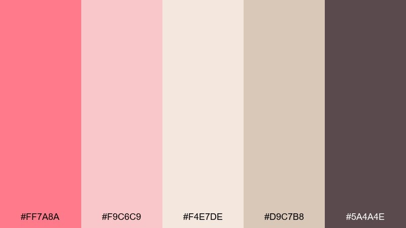
HEX: #FF7A8A #F9C6C9 #F4E7DE #D9C7B8 #5A4A4E
Mood: soft, airy, understated
Best for: minimal packaging and boutique ecommerce
Soft and airy like washed linen in morning light, this mix feels calm and premium. It works beautifully for skincare labels, boutique product pages, and elevated templates where white space matters. Combine the blushes with the warm beige to keep it grounded, then use the cocoa tone for crisp hierarchy. Usage tip: print tests help here because the light neutrals can shift under warm lighting.
Image example of blush linen generated using media.io
3) Tropical Guava
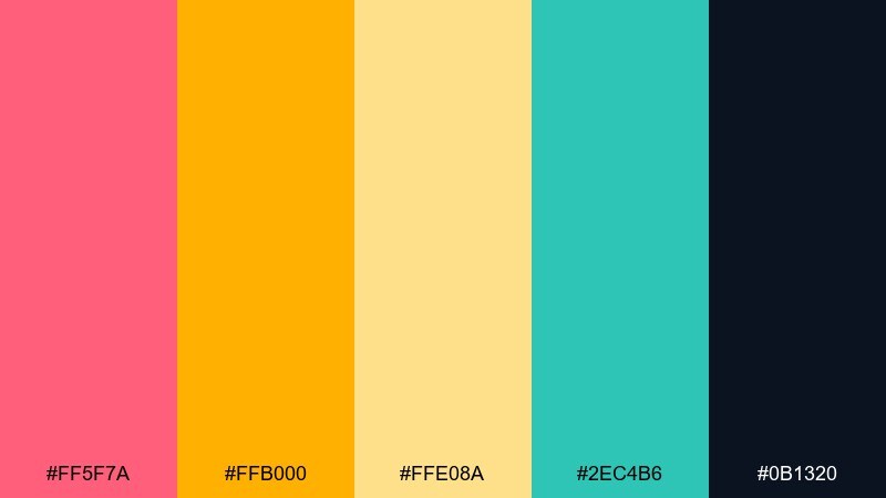
HEX: #FF5F7A #FFB000 #FFE08A #2EC4B6 #0B1320
Mood: tropical, bright, high-energy
Best for: event posters and punchy promos
Tropical and bright, it evokes guava juice, citrus peel, and poolside turquoise. These coral pink color combinations shine on posters, sale banners, and event graphics where you need instant pop. Balance the hot coral with sunny yellow for warmth, then let teal act as the cooling counterpoint. Usage tip: keep the navy for text blocks and add generous margins so the brights do not fight.
Image example of tropical guava generated using media.io

4) Rose Clay Minimal
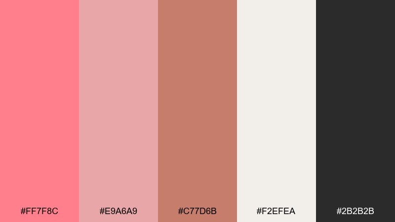
HEX: #FF7F8C #E9A6A9 #C77D6B #F2EFEA #2B2B2B
Mood: earthy, modern, grounded
Best for: interior moodboards and architecture decks
Earthy and modern, these tones feel like sun-warmed clay, plaster walls, and a hint of rose. They fit interior moodboards, architectural presentations, and calm editorial layouts. Pair the coral tint with the off-white to keep things spacious, and use the charcoal to sharpen grids and captions. Usage tip: bring in matte textures to reinforce the grounded, mineral feel.
Image example of rose clay minimal generated using media.io
5) Coral Reef Pop
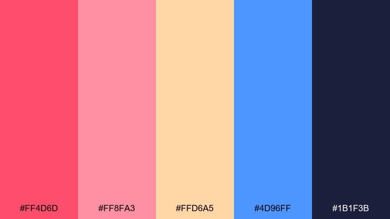
HEX: #FF4D6D #FF8FA3 #FFD6A5 #4D96FF #1B1F3B
Mood: bold, fun, contrasty
Best for: creator thumbnails and ad graphics
Bold and contrasty, it feels like coral reefs against bright ocean light. Use it for thumbnails, digital ads, and punchy cards where you want a lively first impression. The blue is your contrast hero, while peach keeps transitions smooth between coral and light tones. Usage tip: try the blue for CTAs and the coral for highlights so actions stay obvious.
Image example of coral reef pop generated using media.io

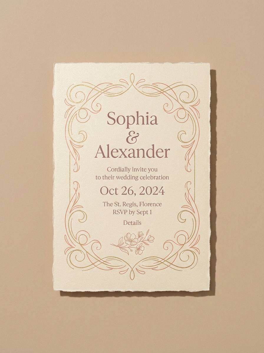
6) Peony Champagne
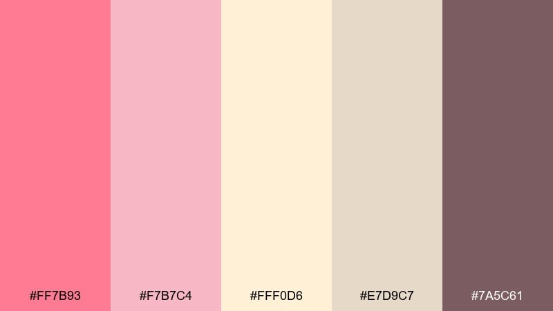
HEX: #FF7B93 #F7B7C4 #FFF0D6 #E7D9C7 #7A5C61
Mood: romantic, refined, celebratory
Best for: wedding invitations and stationery
Romantic and refined, it suggests peony petals, champagne foam, and candlelit tables. These shades work beautifully for invitations, menu cards, and elegant announcements. Pair the soft blush with the creamy champagne for a gentle base, then use the mauve-brown for serif type and monograms. Usage tip: add subtle grain or foil accents to elevate the neutrals without adding new colors.
Image example of peony champagne generated using media.io
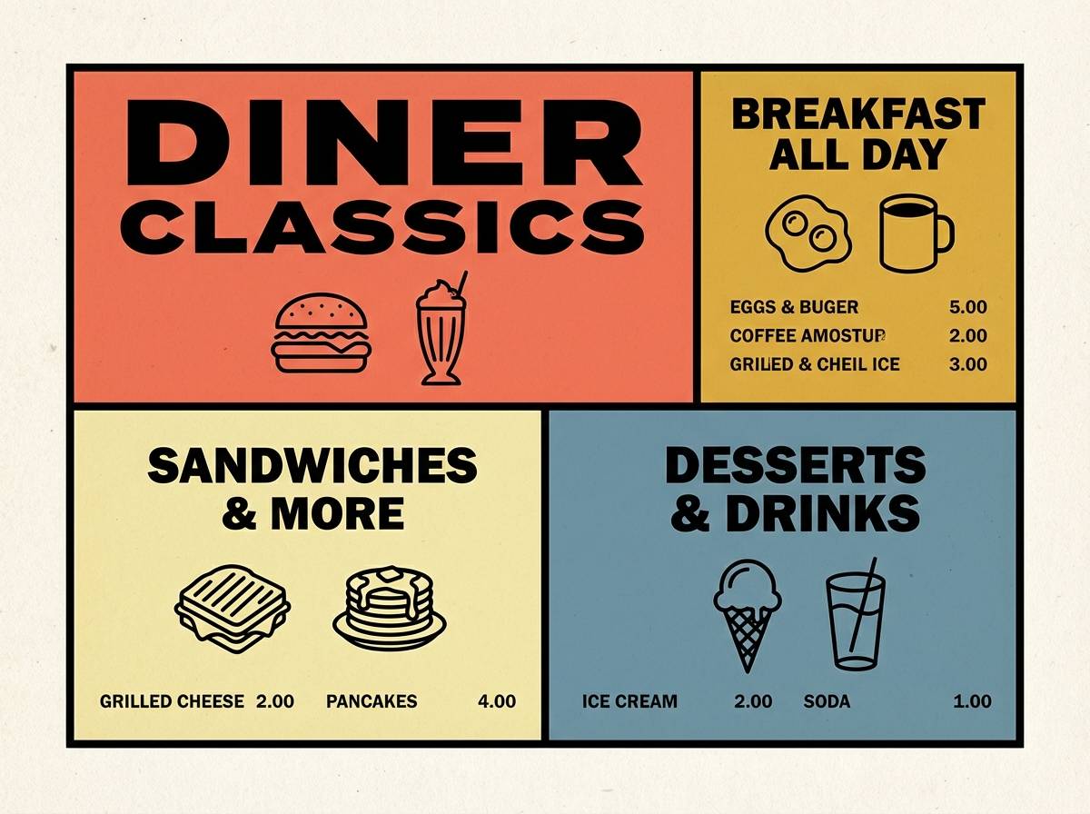
7) Retro Diner
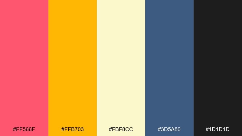
HEX: #FF566F #FFB703 #FBF8CC #3D5A80 #1D1D1D
Mood: nostalgic, upbeat, graphic
Best for: food branding and menu design
Nostalgic and upbeat, it brings to mind neon signs, vinyl booths, and mustard fries on a tray. For a coral pink color palette with personality, this set is great for menus, food trucks, and playful logos. Use the buttery yellow as the main background, then let coral and blue alternate for sections and callouts. Usage tip: keep black for outlines and prices to prevent the retro brights from reducing readability.
Image example of retro diner generated using media.io
8) Seaside Coral
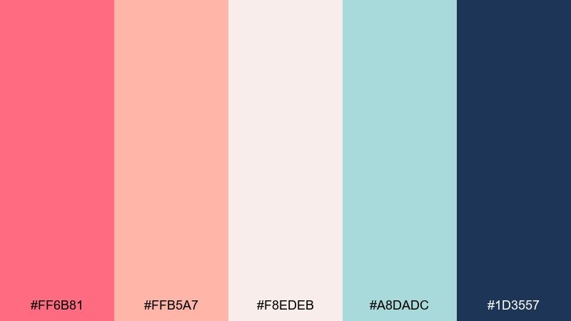
HEX: #FF6B81 #FFB5A7 #F8EDEB #A8DADC #1D3557
Mood: fresh, breezy, coastal
Best for: travel blogs and lifestyle websites
Fresh and breezy, it feels like sea air, sun-faded towels, and a pastel sky. It suits travel blogs, lifestyle landing pages, and gentle hero sections that need warmth without heaviness. Pair the coral and blush as accents against the misty off-white, and use navy for navigation and body text. Usage tip: keep buttons in coral and links in navy to maintain consistent interaction cues.
Image example of seaside coral generated using media.io

9) Desert Bloom
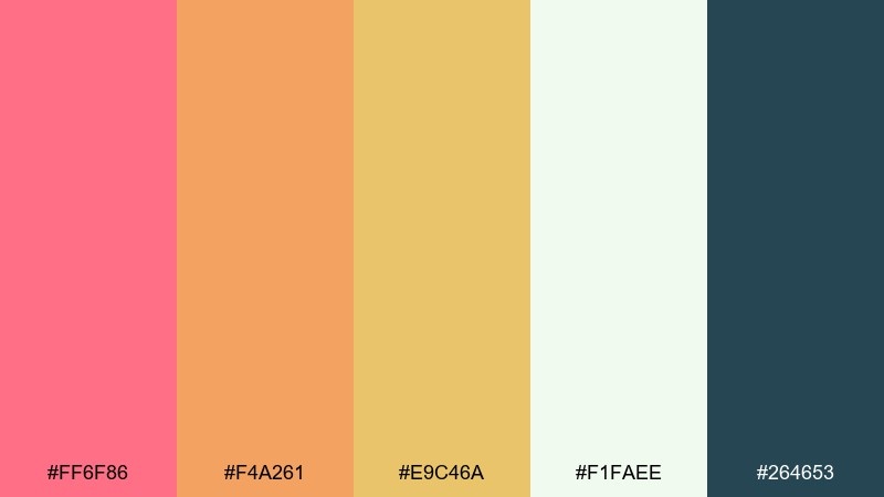
HEX: #FF6F86 #F4A261 #E9C46A #F1FAEE #264653
Mood: sunbaked, optimistic, natural
Best for: brand identities for cafes and makers
Sunbaked and optimistic, it evokes desert flowers against sand and sage shadows. It is a great fit for cafe branding, artisan packaging, and signage that wants warmth and honesty. Pair coral with terracotta for a grounded base, then use the green-blue as a cool anchor for type and stamps. Usage tip: limit the yellow to small highlights so it reads like sunlight rather than a full background.
Image example of desert bloom generated using media.io
10) Ballet Studio
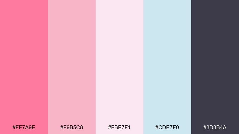
HEX: #FF7A9E #F9B5C8 #FBE7F1 #CDE7F0 #3D3B4A
Mood: delicate, polished, graceful
Best for: beauty tutorials and course slides
Delicate and polished, it feels like satin ribbons, soft blush makeup, and a bright mirrored studio. Use it for beauty lesson decks, wellness guides, and feminine branding that still needs structure. The icy blue adds a clean counterbalance to the pinks, while the smoky violet keeps typography crisp. Usage tip: use the palest pink as your slide background and keep coral to headings and emphasis.
Image example of ballet studio generated using media.io

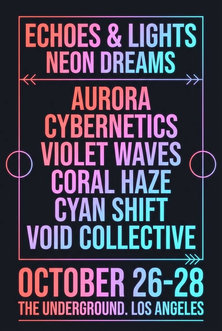
11) Neon Coral Night
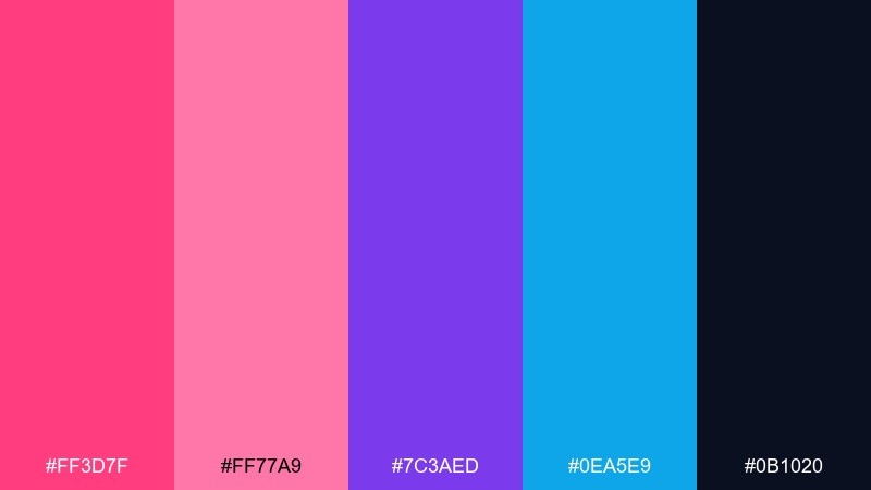
HEX: #FF3D7F #FF77A9 #7C3AED #0EA5E9 #0B1020
Mood: electric, nightlife, futuristic
Best for: music flyers and streaming promos
Electric and nightlife-ready, it suggests neon tubes glowing against midnight streets. These colors work for DJ flyers, streaming promos, and bold creator headers. Pair the hot coral with violet for a futuristic punch, then use cyan sparingly as a sparkle accent. Usage tip: let the near-black dominate backgrounds so the neons feel intentional, not chaotic.
Image example of neon coral night generated using media.io
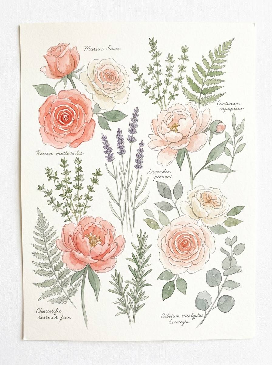
12) Cottage Petals
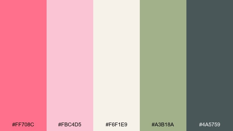
HEX: #FF708C #FBC4D5 #F6F1E9 #A3B18A #4A5759
Mood: cozy, garden-fresh, handmade
Best for: botanical illustrations and craft shops
Cozy and garden-fresh, it recalls cottage roses, herb bundles, and sunlit paper. If you want a coral pink color combination that feels handmade, pair the rosy tones with sage and warm cream. It fits craft shop branding, thank-you cards, and botanical content that needs softness and clarity. Usage tip: keep the gray-green for outlines and small type to avoid harsh black in gentle layouts.
Image example of cottage petals generated using media.io
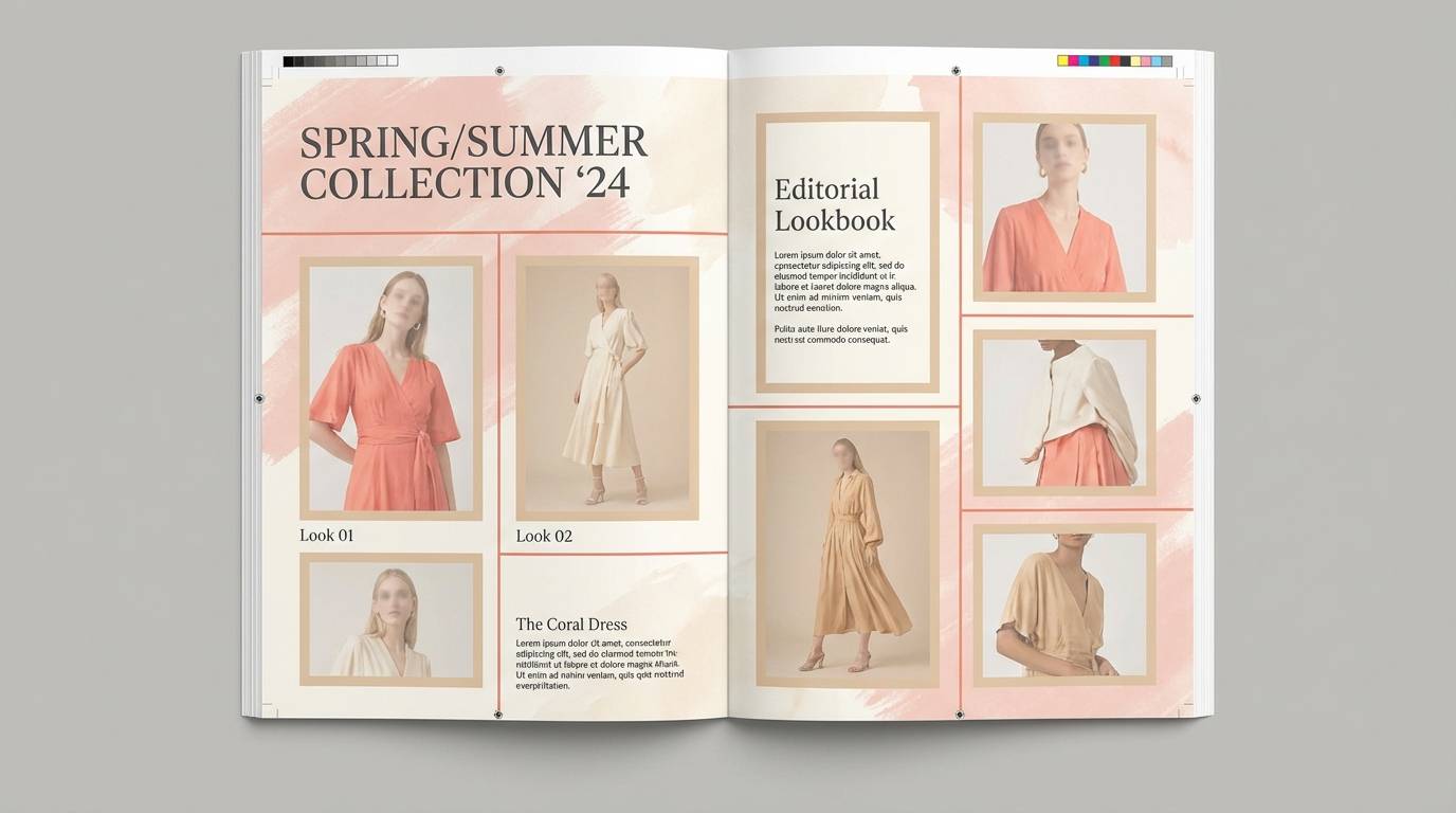
13) Modern Bridal
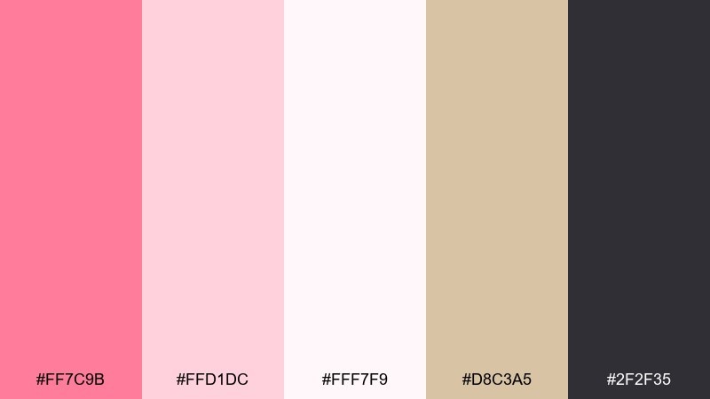
HEX: #FF7C9B #FFD1DC #FFF7F9 #D8C3A5 #2F2F35
Mood: clean, romantic, contemporary
Best for: bridal brands and lookbooks
Clean and contemporary, it feels like blush tulle, ivory satin, and a touch of sand. It is ideal for bridal boutiques, lookbooks, and modern ceremony microsites that need softness with sharp type. Pair the warm beige with the near-white to keep pages airy, and use charcoal for headings and fine rules. Usage tip: limit the stronger coral to CTAs and key details like dates or pricing.
Image example of modern bridal generated using media.io
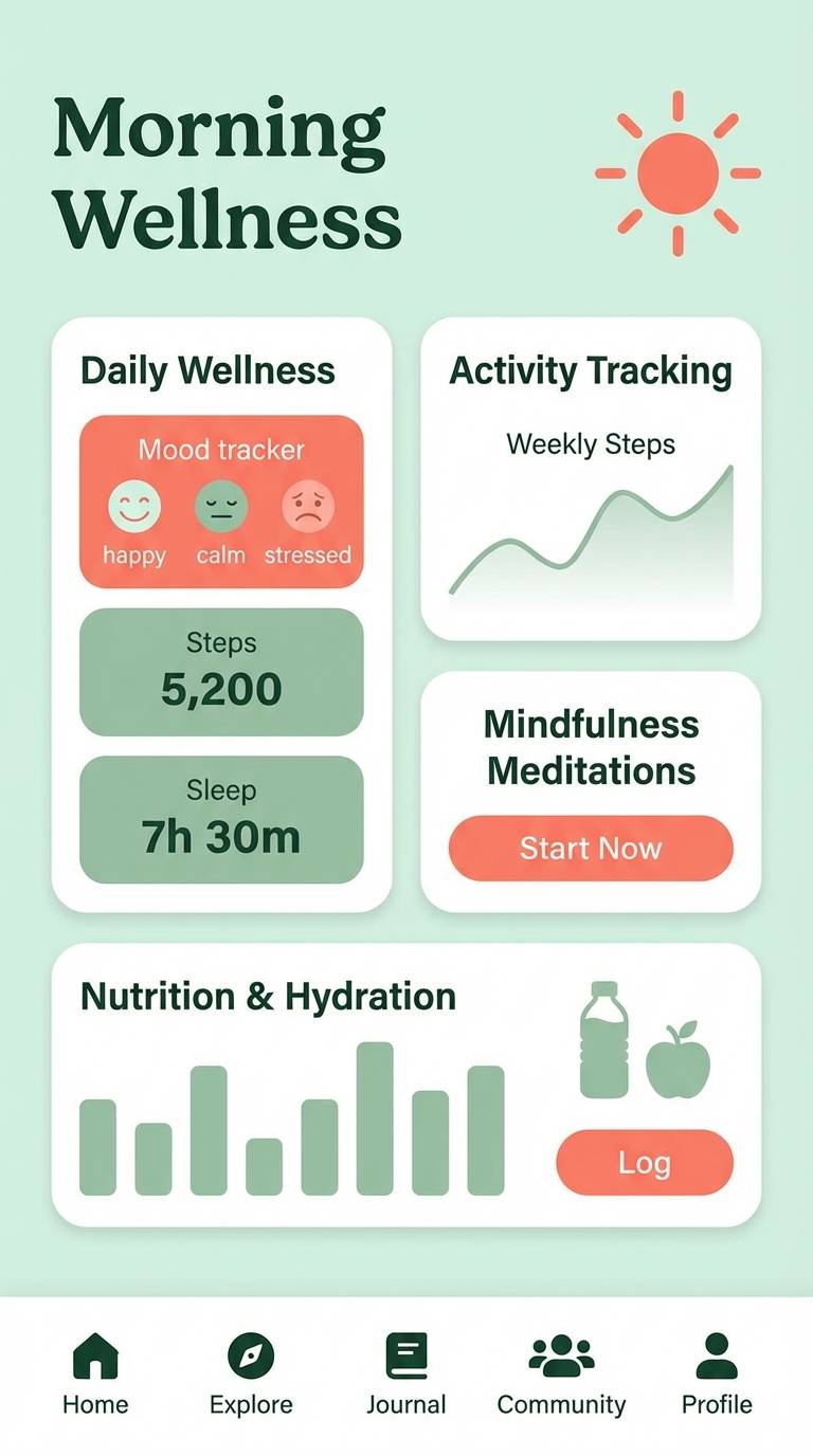
14) Coral and Sage
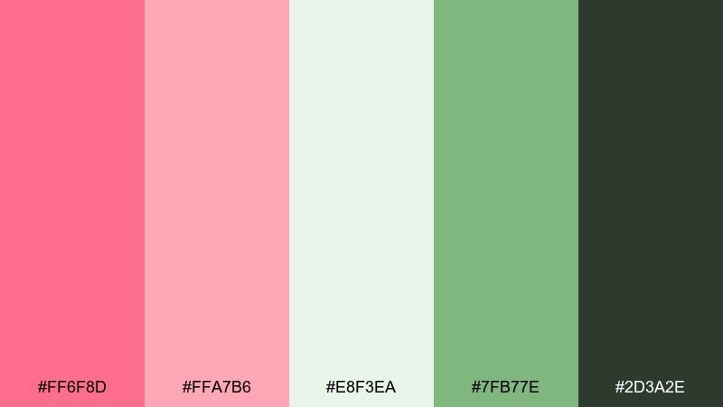
HEX: #FF6F8D #FFA7B6 #E8F3EA #7FB77E #2D3A2E
Mood: balanced, natural, restorative
Best for: wellness apps and eco branding
Balanced and restorative, it brings together petal warmth and leafy calm. These colors are great for eco branding, mindfulness content, and gentle UI where reassurance matters. Pair the deeper sage with coral for clear emphasis, and use the pale mint as your main surface color. Usage tip: keep error states in coral and success states in sage to make status messages intuitive.
Image example of coral and sage generated using media.io
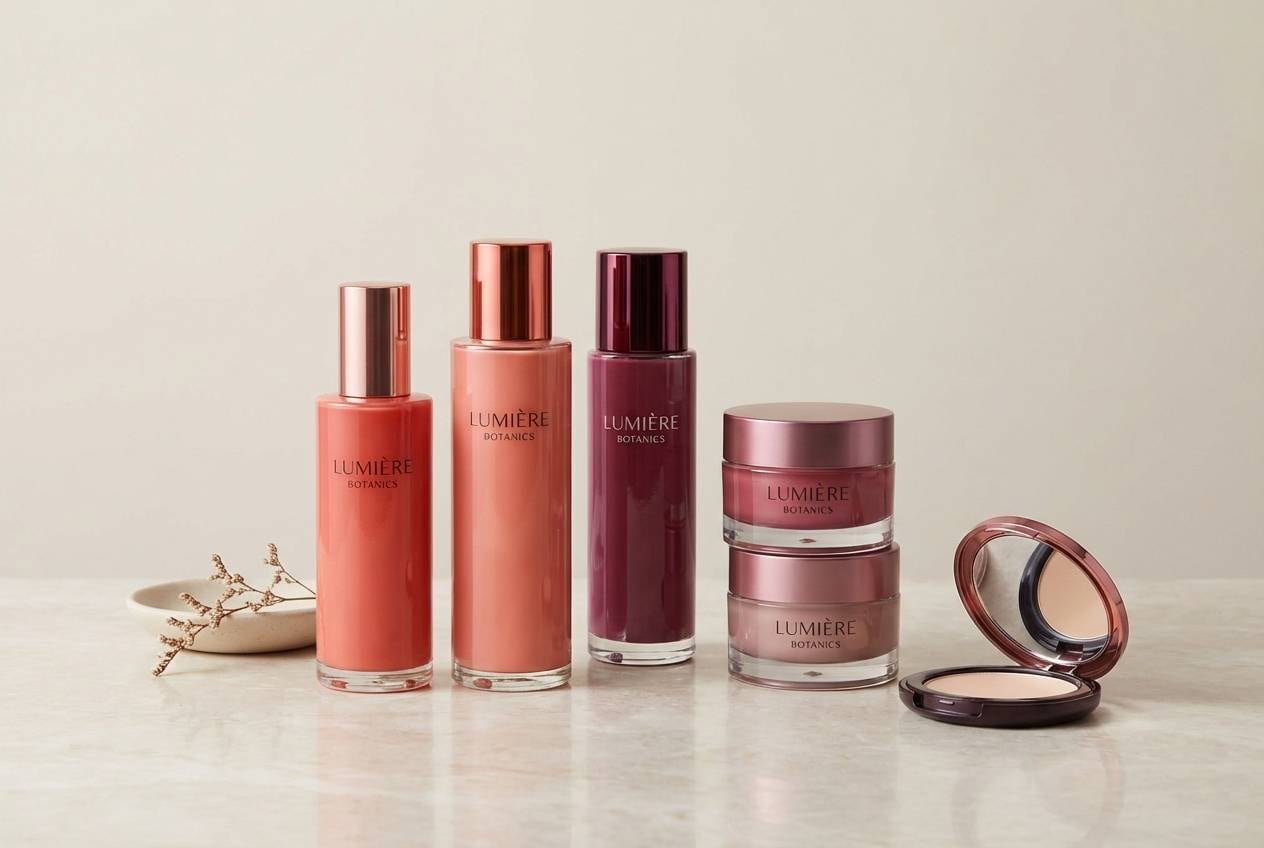
15) Berry Cream
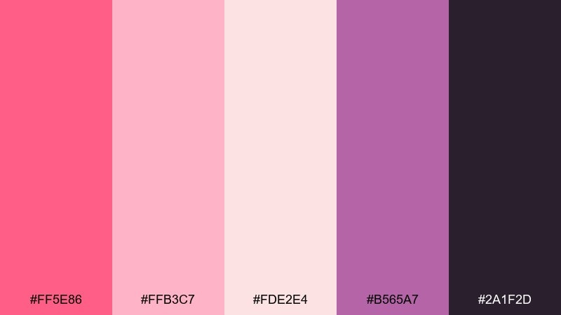
HEX: #FF5E86 #FFB3C7 #FDE2E4 #B565A7 #2A1F2D
Mood: sweet, trendy, expressive
Best for: beauty drops and influencer merch
Sweet and expressive, it suggests berry frosting, glossy lip tint, and a punch of violet. This coral pink color palette is a strong choice for limited drops, influencer merch, and beauty promos that need a modern edge. Pair the soft blushes with deep plum for contrast, and let violet appear in small graphics to keep it special. Usage tip: choose one bold accent per layout, either coral or violet, and let the rest stay creamy.
Image example of berry cream generated using media.io
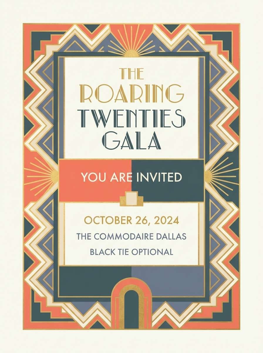
16) Art Deco Coral
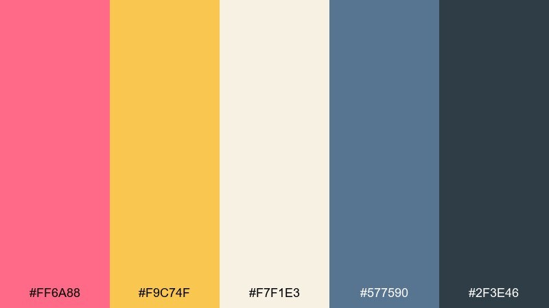
HEX: #FF6A88 #F9C74F #F7F1E3 #577590 #2F3E46
Mood: glam, structured, vintage-modern
Best for: hotel branding and upscale invites
Glam and structured, it evokes art deco tiles, brass details, and a coral-lit lobby. It works for boutique hotel branding, upscale invitations, and elegant posters with geometric motifs. Pair cream with slate-blue for a sophisticated base, then add coral and gold as highlight stripes or borders. Usage tip: repeat geometric lines in the darker tones to keep the deco rhythm consistent.
Image example of art deco coral generated using media.io
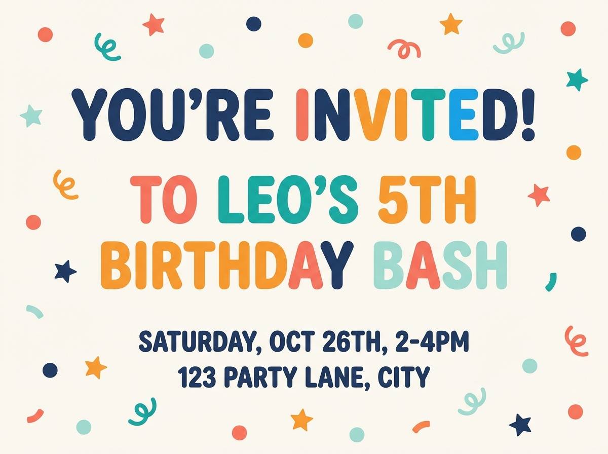
17) Kids Party Punch
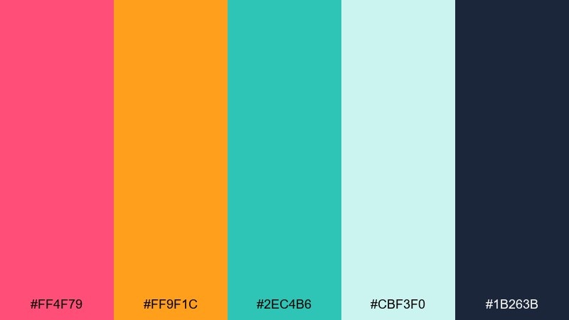
HEX: #FF4F79 #FF9F1C #2EC4B6 #CBF3F0 #1B263B
Mood: cheerful, loud, kid-friendly
Best for: birthday invitations and party flyers
Cheerful and loud, it feels like confetti, fruit punch, and inflatable pool toys. Use it for kids birthday invitations, classroom posters, and playful announcements. The minty aqua keeps the warm shades from overheating, while navy is perfect for names and details. Usage tip: use big blocks of the light aqua behind text so the brights stay decorative, not distracting.
Image example of kids party punch generated using media.io
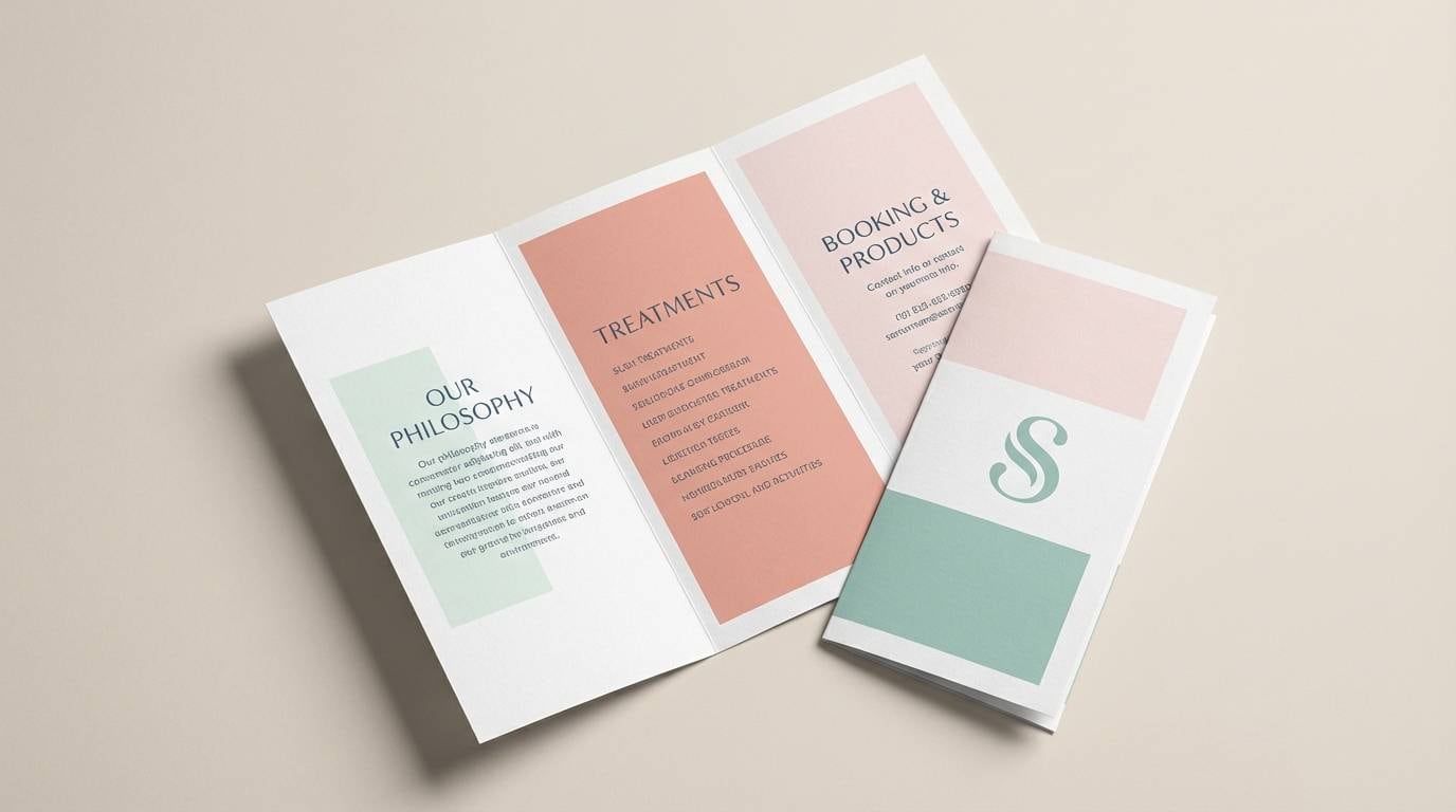
18) Wellness Spa
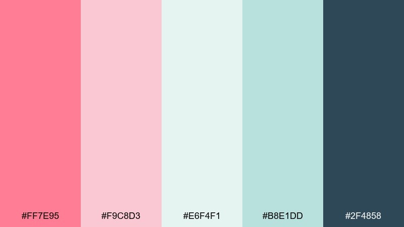
HEX: #FF7E95 #F9C8D3 #E6F4F1 #B8E1DD #2F4858
Mood: calm, clean, nurturing
Best for: spa brochures and self-care content
Calm and nurturing, it reads like rosewater, fresh towels, and a cool misty room. This mix is ideal for spa brochures, self-care newsletters, and gentle product pages. Pair the watery mints with blush as soft accents, then use the deep blue-gray for headings and separators. Usage tip: keep gradients subtle and lean on plenty of whitespace to maintain the relaxed vibe.
Image example of wellness spa generated using media.io
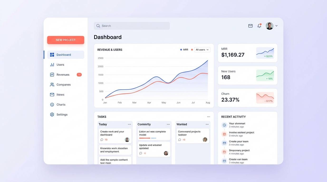
19) Coral Tech UI
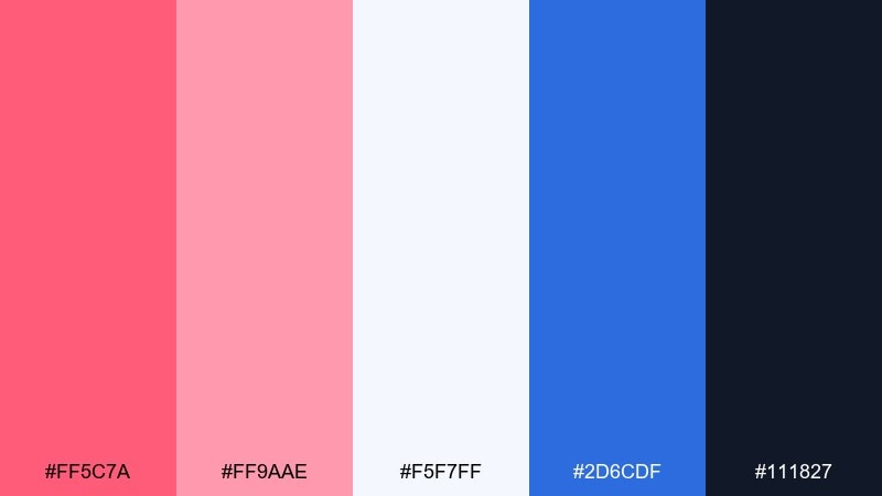
HEX: #FF5C7A #FF9AAE #F5F7FF #2D6CDF #111827
Mood: modern, crisp, energetic
Best for: saas dashboards and mobile-first UI
Modern and crisp, it feels like clean panels with a lively coral highlight. It is a strong fit for SaaS dashboards, onboarding flows, and product marketing pages where clarity matters. Pair the cool blue with coral for primary actions, while the soft pink supports badges and secondary states. Usage tip: use the near-black for body text and keep coral to interactive elements for consistent affordance.
Image example of coral tech ui generated using media.io
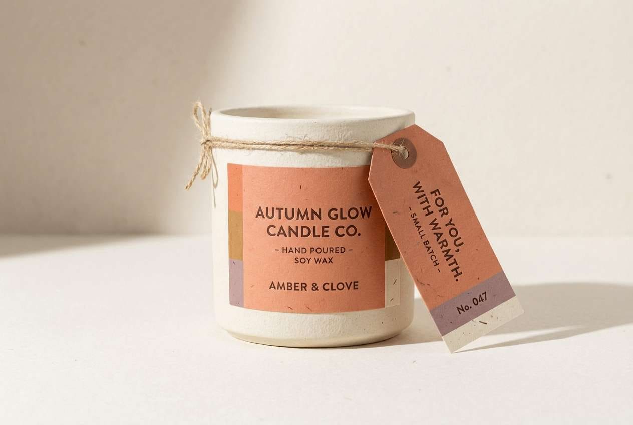
20) Autumn Coral
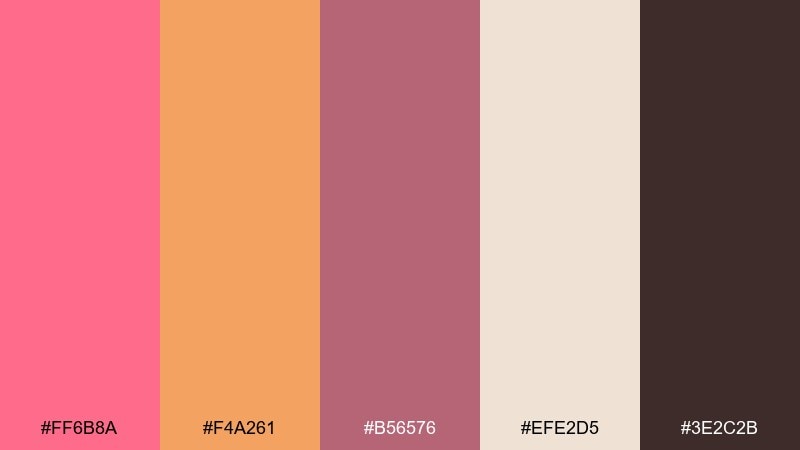
HEX: #FF6B8A #F4A261 #B56576 #EFE2D5 #3E2C2B
Mood: cozy, seasonal, sophisticated
Best for: fall campaigns and handmade goods
Cozy and seasonal, it recalls warm scarves, spiced cider, and dusty florals. Use it for fall campaigns, handmade product tags, and rustic-yet-modern branding. Pair coral with caramel for warmth, then use the deep brown for headlines and fine linework. Usage tip: try the cream as a paper-like base to make the palette feel tactile in print.
Image example of autumn coral generated using media.io
What Colors Go Well with Coral Pink?
Coral pink pairs beautifully with deep anchors like navy, charcoal, espresso, and near-black—these make coral feel more saturated and keep text readable. If you want a softer look, swap in warm gray or cocoa instead of pure black.
For fresh contrast, try cool accents such as teal, seafoam, slate blue, or icy blue. These tones temper coral’s warmth and help UI elements (like buttons and links) feel clearer.
Neutrals are the easiest way to “modernize” coral: cream, off-white, sand, champagne, and linen beige give it space to breathe and keep layouts from turning overly sweet.
How to Use a Coral Pink Color Palette in Real Designs
Start by choosing one role for coral: primary brand highlight, CTA color, or decorative accent. When coral is everywhere, it can feel loud; when it’s targeted, it feels intentional and premium.
Build hierarchy with contrast: reserve the darkest shade for body text and icons, then use coral and blush for headings, badges, and emphasis. In print, test swatches under different lighting since warm papers can shift coral toward orange.
To keep palettes cohesive, repeat coral in small details—rules, bullets, labels, or hover states—while letting neutrals handle the majority of surfaces. This approach keeps the design airy and readable.
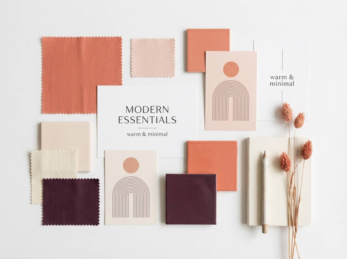
Create Coral Pink Palette Visuals with AI
If you already have HEX codes, you can generate matching visuals (brand boards, invitations, posters, UI mockups) by describing the layout and calling out the palette colors in your prompt. This helps your graphics stay consistent across campaigns.
Use Media.io Text-to-Image to iterate quickly: generate multiple compositions, then pick the version with the cleanest contrast and spacing. Keep prompts specific about style (vector, editorial, realistic studio photo) and aspect ratio.
Coral Pink Color Palette FAQs
-
What is the HEX code for coral pink?
Coral pink doesn’t have a single universal HEX value, but common coral-pink picks include #FF6F7D, #FF6B81, and #FF5C7A. Choose the one that matches your intended warmth (more orange) or softness (more pink). -
Is coral pink warm or cool?
Coral pink is generally warm because it blends pink with orange. You can make it feel cooler by pairing it with blues/teals or warmer by pairing it with terracotta, caramel, and cream. -
What colors complement coral pink best?
Great complementary partners include navy, teal, slate blue, charcoal, and deep plum for contrast, plus cream, champagne, sand, and warm beige for softer, modern neutrals. -
How do I keep coral pink from looking too “sweet”?
Use a darker anchor (navy/charcoal/espresso) for typography, increase white space, and limit coral to highlights like CTAs, headings, or key details. Matte textures and muted neutrals also make coral feel more sophisticated. -
Does coral pink work for UI and SaaS products?
Yes—coral can be an excellent action color when the rest of the UI uses cool neutrals (near-white, pale lavender, soft gray) and strong dark text for readability. Keep coral mainly for interactive elements to maintain clear affordance. -
What’s the best background color with coral pink?
For clean designs, use off-white/cream (#FFF3E6, #F7F1E3) or very light pinks for a gentle look. For bold designs, use near-black/navy (#0B1020, #111827) so coral pops without visual clutter. -
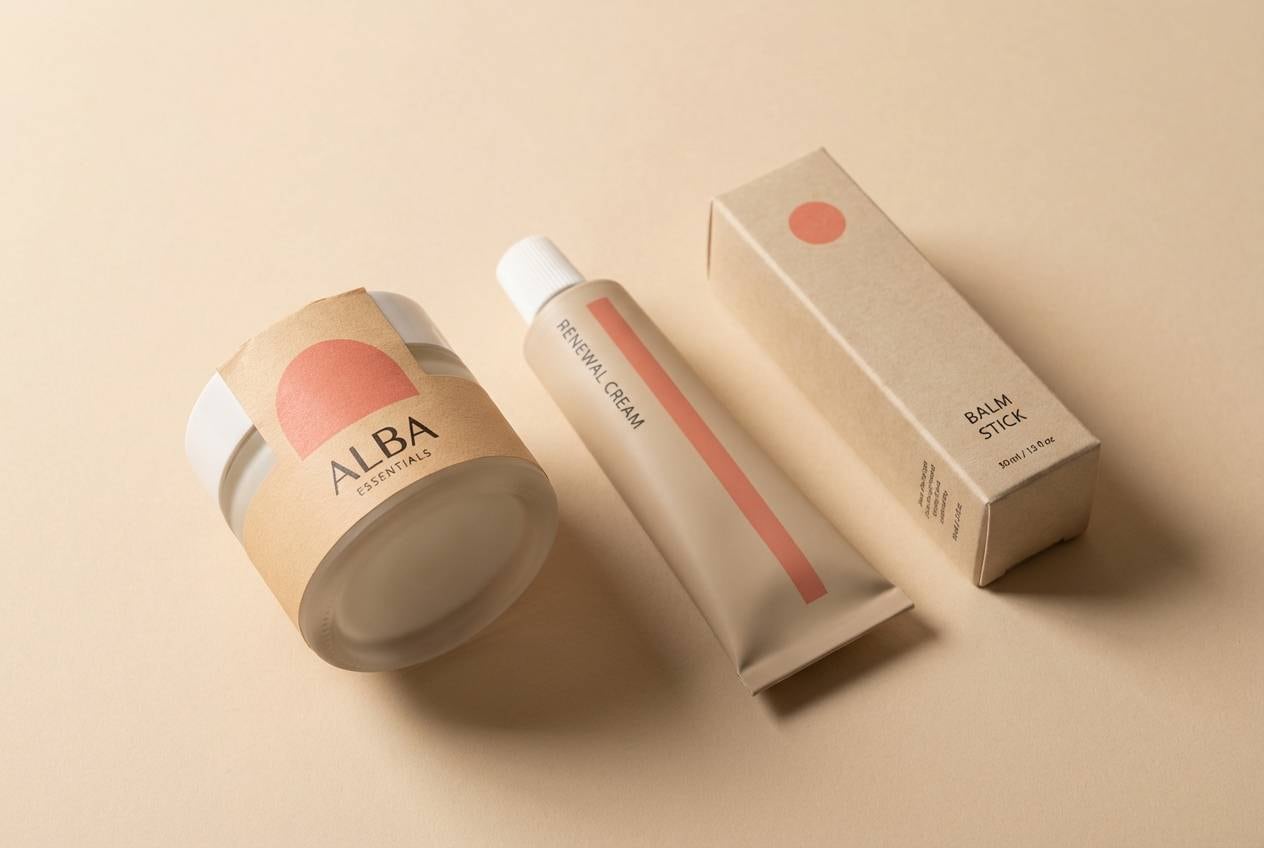
Can I use coral pink in print projects like invitations and packaging?
Absolutely. Run a small print proof first because coral can shift depending on paper and lighting. Pair it with champagne/linen neutrals and a deep type color (cocoa, mauve-brown, or charcoal) for crisp results.
Next: Vivid Color Palette


