

Sepia palettes blend warm browns, antique golds, and creamy paper-like neutrals into a timeless color story. They’re ideal when you want designs to feel grounded, nostalgic, and trustworthy without looking dated.
Below are 20 sepia color palette ideas with HEX codes you can copy for branding, UI, posters, publishing, and packaging—plus AI prompts to generate matching visuals in minutes.
In this article
- Why Sepia Palettes Work So Well
-
- vintage sepia wash
- cocoa and cream counter
- dusty saddle road
- golden archive
- sepia espresso ui
- antique leatherbound
- soft umber minimal
- desert sepia sunset
- museum label neutrals
- copper patina accent
- warm film grain
- maple syrup glow
- old paper and ink
- sunbaked clay studio
- honeyed sepia pastels
- timberline earth
- burnt sienna botanica
- bronze and birch
- quiet sepia monochrome
- mocha shadow contrast
- What Colors Go Well with Sepia?
- How to Use a Sepia Color Palette in Real Designs
- Create Sepia Palette Visuals with AI
Why Sepia Palettes Work So Well
Sepia tones sit in a comfortable middle ground: warmer than grayscale, calmer than bright color. That balance helps designs feel approachable and human, especially for heritage branding, editorial layouts, and product packaging.
Because sepia is naturally low-saturation, it’s excellent for building hierarchy. You can reserve the darkest espresso-browns for headings and CTAs, while parchment and cream shades keep layouts airy and readable.
Sepia also plays well with texture—paper grain, leather, linen, and film noise. If your visuals rely on craft, storytelling, or authenticity, a sepia palette can reinforce that message instantly.
20+ Sepia Color Palette Ideas (with HEX Codes)
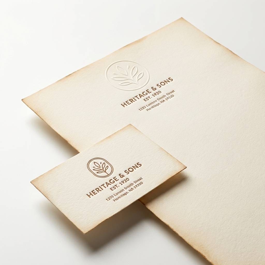
1) Vintage Sepia Wash
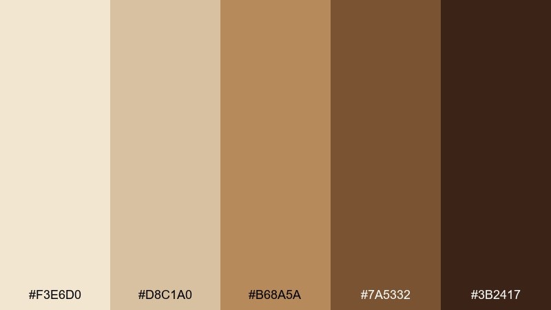
HEX: #F3E6D0 #D8C1A0 #B68A5A #7A5332 #3B2417
Mood: nostalgic and warm
Best for: heritage brand logo and stationery
Nostalgic and warm, like sun-faded photographs and well-loved paper. These tones feel trustworthy on packaging, certificates, and classic wordmarks. Pair with cream stock, subtle texture, and a single dark-brown ink for crisp readability. Tip: keep the deepest shade for headlines and stamps so the lighter browns can breathe.
Image example of vintage sepia wash generated using media.io
Media.io is an online AI studio for creating and editing video, image, and audio in your browser.

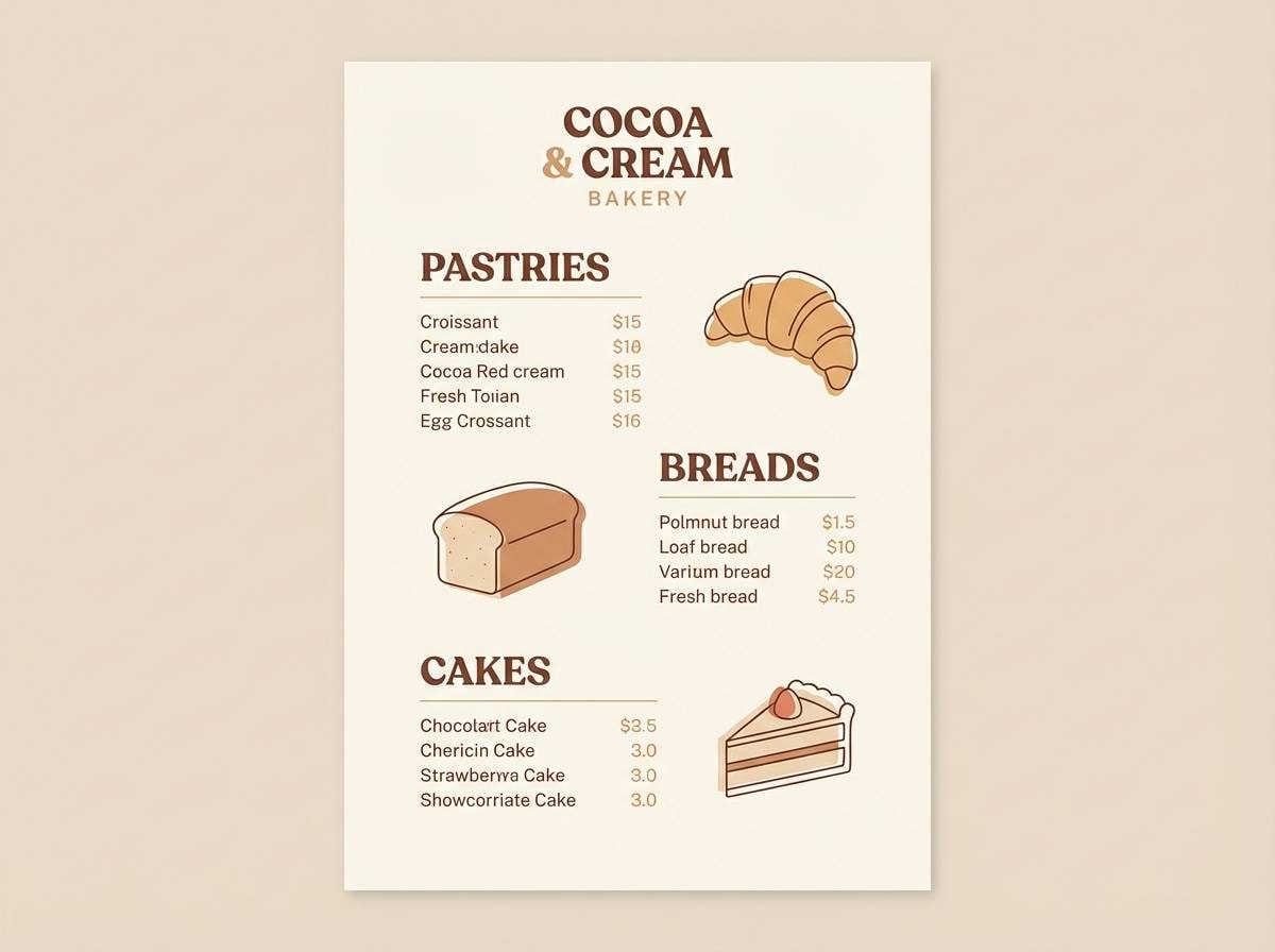
2) Cocoa and Cream Counter
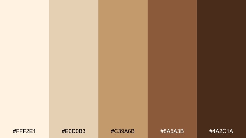
HEX: #FFF2E1 #E6D0B3 #C39A6B #8A5A3B #4A2C1A
Mood: cozy and appetizing
Best for: bakery menu poster
Cozy and appetizing, like frothy cocoa, toasted crust, and warm cafe lighting. These sepia color combinations shine on menus and promos where you want comfort without feeling heavy. Pair with handwritten scripts, simple icons, and plenty of cream space to keep it airy. Tip: use the mid caramel tone for section headers and reserve the dark espresso for prices.
Image example of cocoa and cream counter generated using media.io
3) Dusty Saddle Road
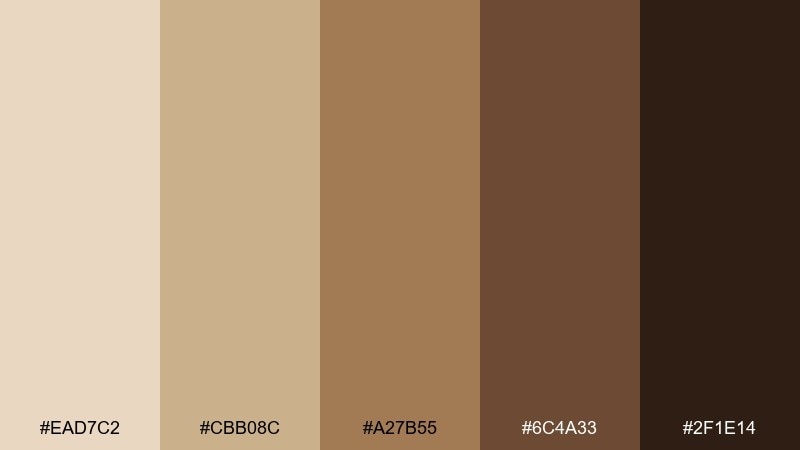
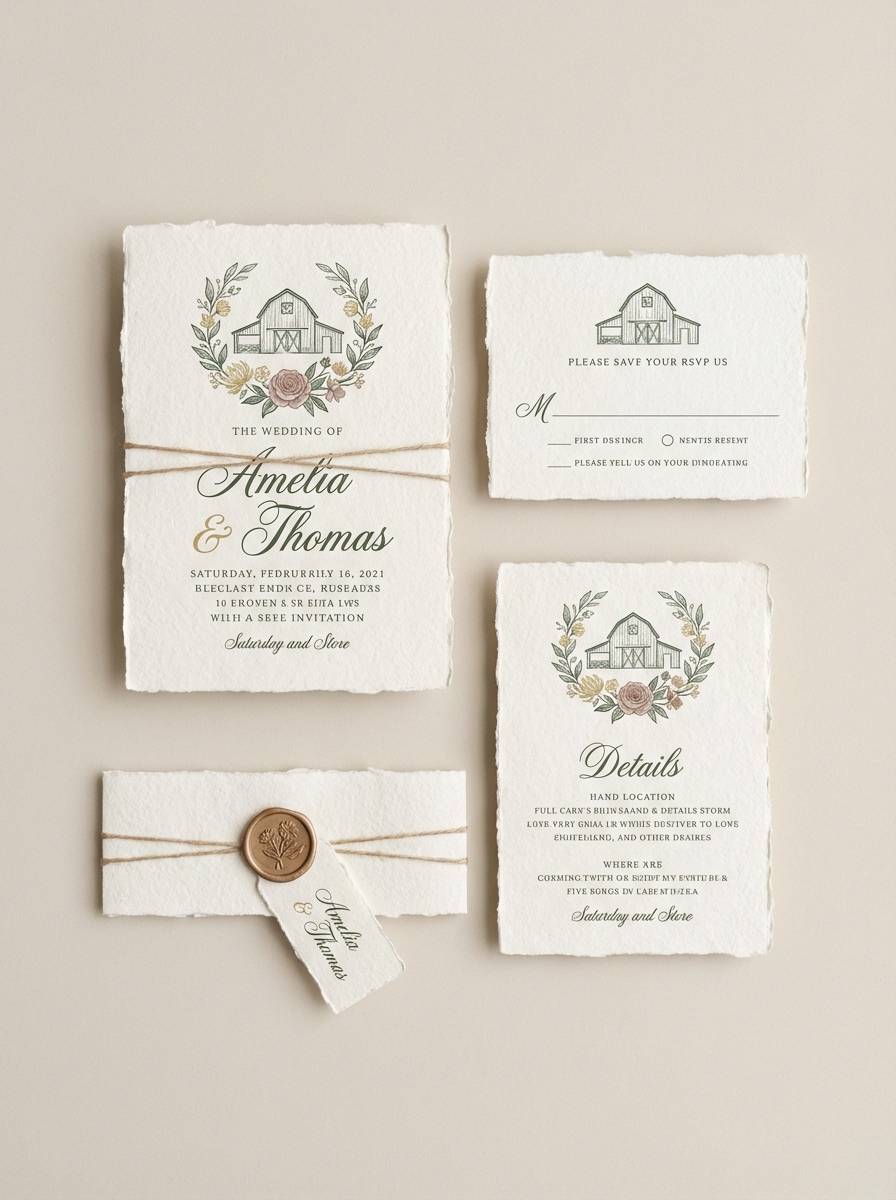
HEX: #EAD7C2 #CBB08C #A27B55 #6C4A33 #2F1E14
Mood: rugged and grounded
Best for: rustic wedding invitation suite
Rugged and grounded, like worn leather, trail dust, and barn wood. It works beautifully for rustic invites, vow cards, and venue signage with a handcrafted feel. Pair with deckled edges, serif type, and a tiny botanical line drawing to soften the weight. Tip: print the darkest shade in small doses to avoid overpowering the softer paper tones.
Image example of dusty saddle road generated using media.io
4) Golden Archive
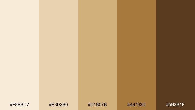
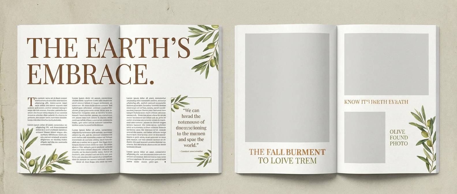
HEX: #F8EBD7 #E8D2B0 #D1B07B #A8793D #5B3B1F
Mood: scholarly and refined
Best for: editorial magazine spread
Scholarly and refined, like gilded page edges and archived documents. The mix of pale parchment and antique gold supports long reads, captions, and pull quotes without strain. Pair with black or deep umber type and a single gold accent line for hierarchy. Tip: keep golds as highlights only so photos and text remain the star.
Image example of golden archive generated using media.io
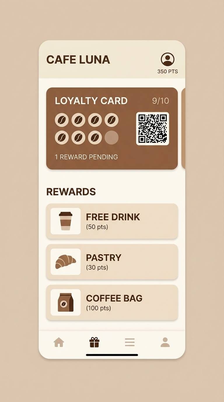
5) Sepia Espresso UI
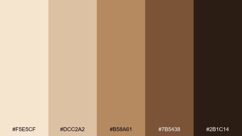
HEX: #F5E5CF #DCC2A2 #B58A61 #7B5438 #2B1C14
Mood: inviting and modern
Best for: cafe loyalty app interface
Inviting and modern, like a polished espresso bar with soft lighting. These browns are strong enough for UI components while still feeling friendly and natural. Pair with off-white backgrounds, rounded cards, and a muted green accent for freshness. Tip: use the darkest tone for primary buttons to maintain contrast on lighter panels.
Image example of sepia espresso ui generated using media.io
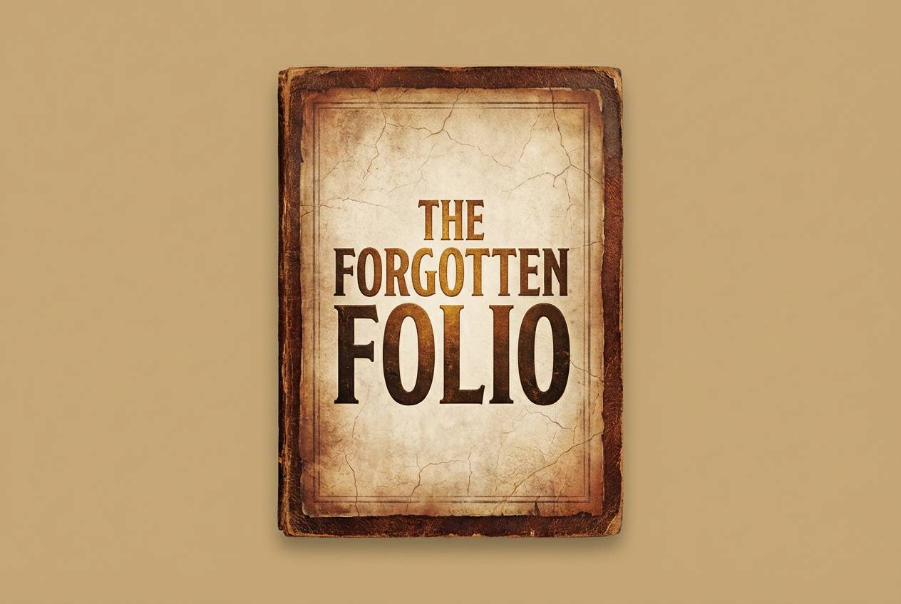
6) Antique Leatherbound
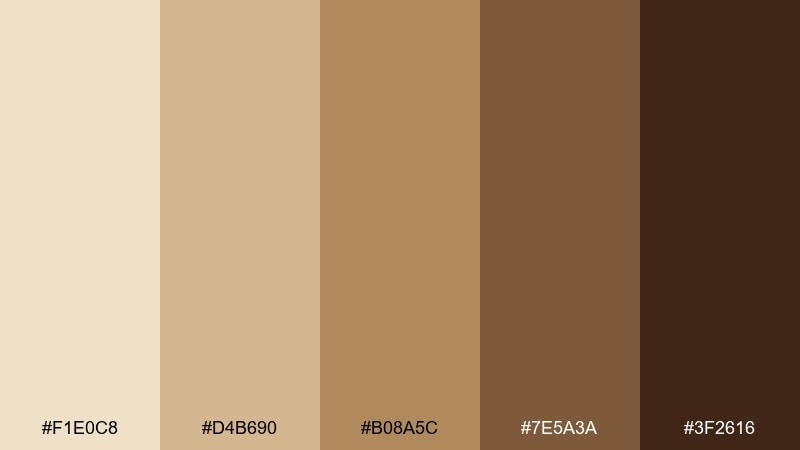
HEX: #F1E0C8 #D4B690 #B08A5C #7E5A3A #3F2616
Mood: classic and tactile
Best for: book cover design
Classic and tactile, like stitched spines and aged leather covers. The contrast between parchment lights and deep browns makes titles pop on shelves and thumbnails. For a timeless look, this sepia color palette pairs well with serif typography, thin border rules, and subtle grain. Tip: keep one mid-brown as the main field color and let the darkest shade frame the edges.
Image example of antique leatherbound generated using media.io
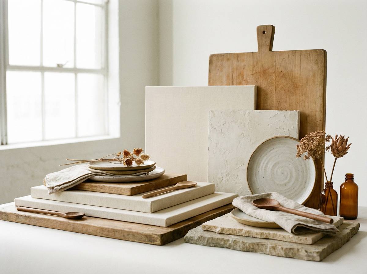
7) Soft Umber Minimal
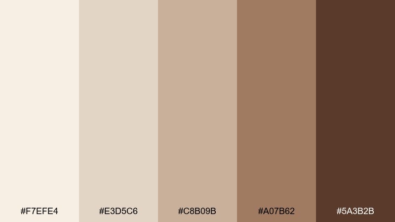
HEX: #F7EFE4 #E3D5C6 #C8B09B #A07B62 #5A3B2B
Mood: calm and understated
Best for: minimalist interior moodboard
Calm and understated, like linen curtains and matte clay walls. These gentle neutrals make an excellent base for interiors, lifestyle branding, and quiet social posts. Pair with charcoal text and natural materials like oak and rattan for a cohesive story. Tip: repeat the palest shade as negative space to keep the board feeling light.
Image example of soft umber minimal generated using media.io
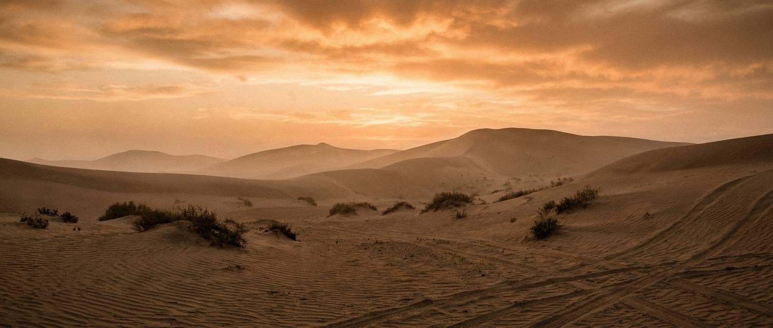
8) Desert Sepia Sunset
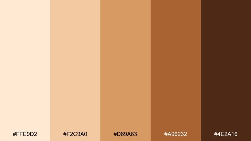
HEX: #FFE9D2 #F2C9A0 #D89A63 #A96232 #4E2A16
Mood: sunlit and adventurous
Best for: travel blog hero banner
Sunlit and adventurous, like dunes at golden hour and wind-worn sandstone. The warm gradient feels energetic in headers, section dividers, and featured images. Pair with clean sans-serif type and a cool blue link color for balance. Tip: apply the brightest shade behind text to keep readability high across devices.
Image example of desert sepia sunset generated using media.io
9) Museum Label Neutrals
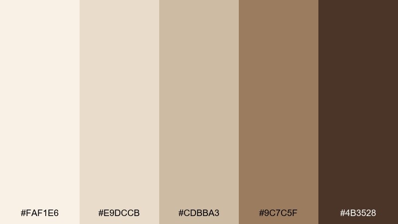
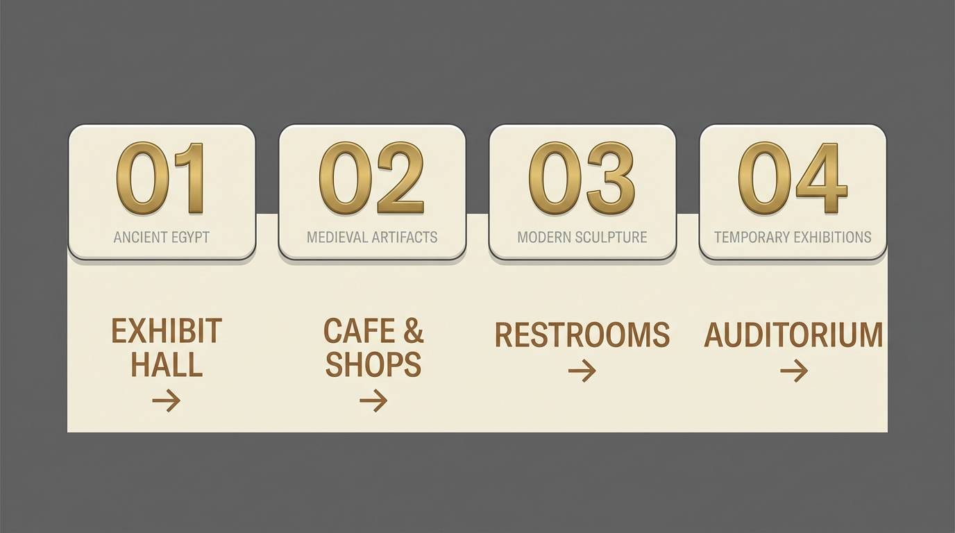
HEX: #FAF1E6 #E9DCCB #CDBBA3 #9C7C5F #4B3528
Mood: quiet and authoritative
Best for: museum exhibit signage system
Quiet and authoritative, like gallery walls and carefully printed placards. This sepia color scheme supports long-form wayfinding and object labels without stealing attention from the exhibits. Pair with generous margins, simple pictograms, and a single accent rule for section changes. Tip: keep body text on the lightest tone and use the darkest brown only for headings and arrows.
Image example of museum label neutrals generated using media.io
10) Copper Patina Accent
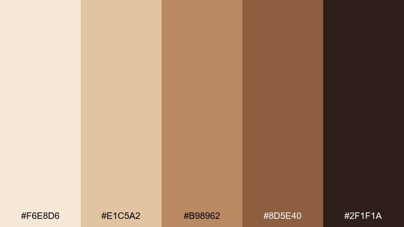
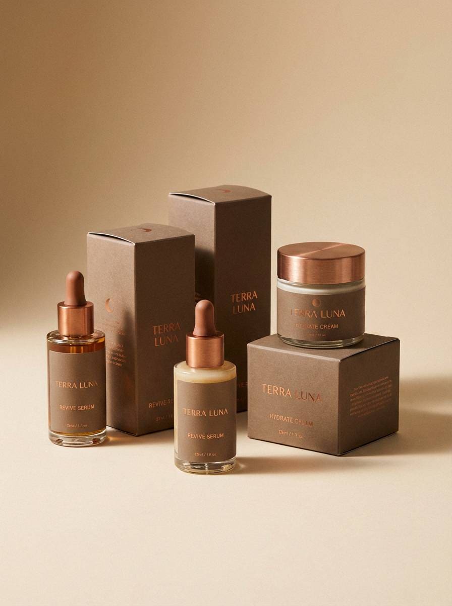
HEX: #F6E8D6 #E1C5A2 #B98962 #8D5E40 #2F1F1A
Mood: premium and polished
Best for: product packaging for skincare
Premium and polished, like copper caps and softly glazed ceramics. The warm mids feel luxurious on boxes, labels, and ingredient callouts without looking overly glossy. Pair with minimal line art and a pale background to highlight the product name. Tip: add a tiny metallic-foil effect only to the accent tone for a high-end finish.
Image example of copper patina accent generated using media.io
11) Warm Film Grain
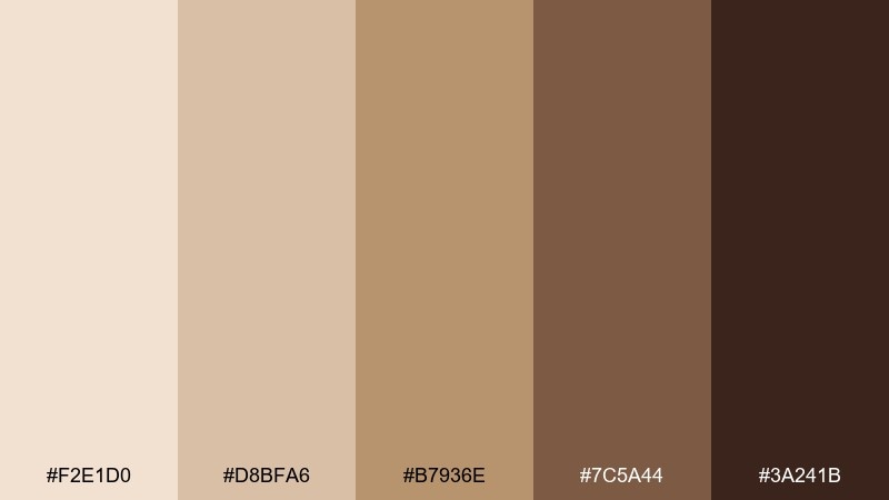
HEX: #F2E1D0 #D8BFA6 #B7936E #7C5A44 #3A241B
Mood: cinematic and intimate
Best for: photo preset landing page UI
Cinematic and intimate, like film grain, darkroom prints, and late-night streetlights. These sepia color combinations are ideal for a landing page that sells presets, workshops, or portfolios. Pair with large photography blocks, subtle dividers, and a single warm highlight for CTAs. Tip: keep the background near the light parchment shade to avoid muddy sections.
Image example of warm film grain generated using media.io
12) Maple Syrup Glow
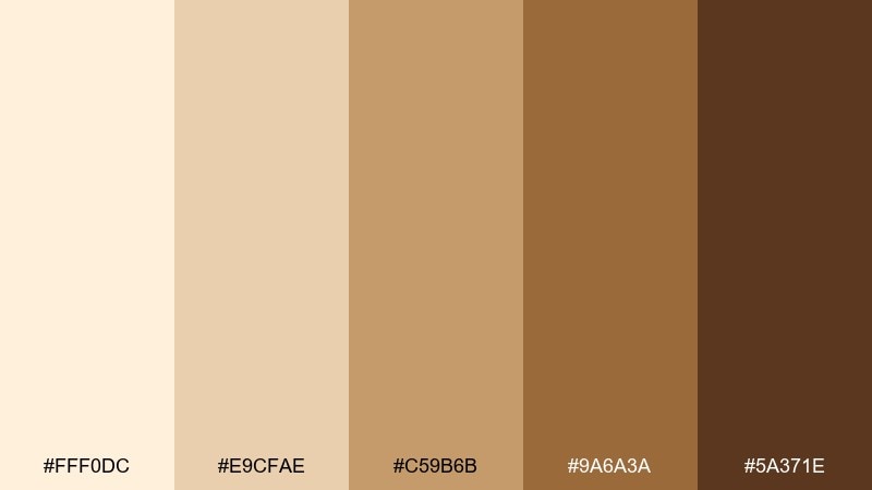
HEX: #FFF0DC #E9CFAE #C59B6B #9A6A3A #5A371E
Mood: sweet and comforting
Best for: food photography backdrop set
Sweet and comforting, like maple drizzle on pancakes and toasted walnuts. The gentle highlights help food colors look richer while keeping shadows soft. Pair with cream linens, simple ceramics, and a dark brown prop for depth. Tip: use the deepest shade sparingly as a shadow card to shape contrast in flat lays.
Image example of maple syrup glow generated using media.io
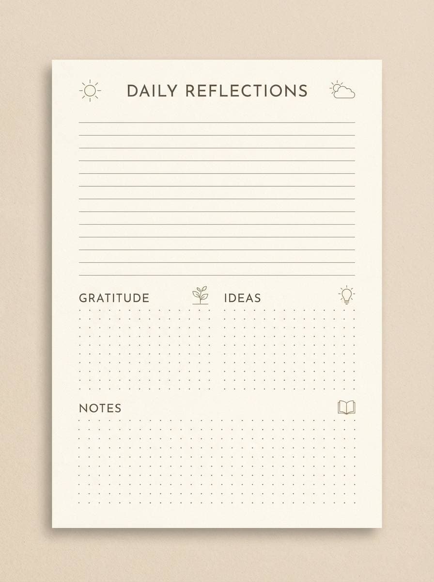
13) Old Paper and Ink
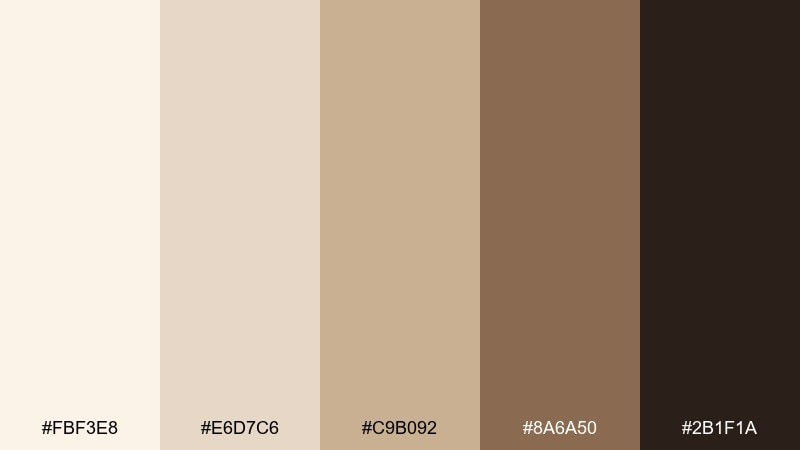
HEX: #FBF3E8 #E6D7C6 #C9B092 #8A6A50 #2B1F1A
Mood: writerly and nostalgic
Best for: journaling template printable
Writerly and nostalgic, like fountain-pen notes on aged paper. These hues keep printable pages readable while adding personality beyond plain grayscale. Pair with dotted grids, small headings, and minimal icons to avoid clutter. Tip: set the lightest shade as the page base and use the darkest tone only for titles and dividers.
Image example of old paper and ink generated using media.io
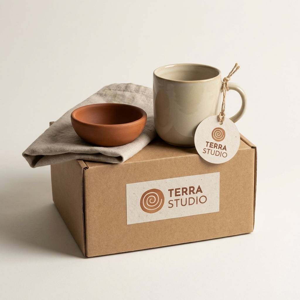
14) Sunbaked Clay Studio
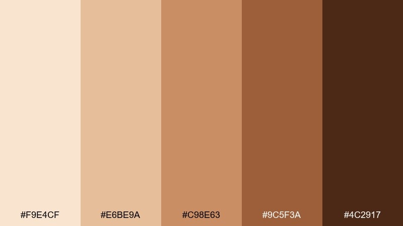
HEX: #F9E4CF #E6BE9A #C98E63 #9C5F3A #4C2917
Mood: artisanal and earthy
Best for: ceramics studio brand kit
Artisanal and earthy, like kiln-fired clay and dusty studio shelves. The warm mids feel handmade, making them strong for logos, tags, and social templates. For a grounded identity, this sepia color palette pairs well with tactile paper, simple monograms, and natural photography. Tip: keep the darkest shade for stamps and seals to make the craft details feel intentional.
Image example of sunbaked clay studio generated using media.io
15) Honeyed Sepia Pastels
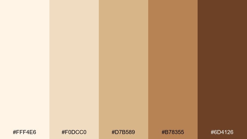
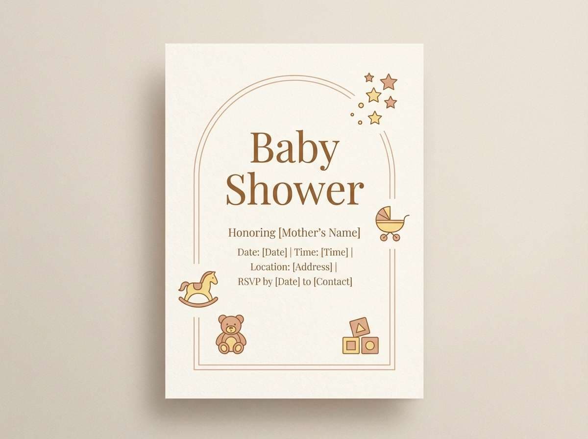
HEX: #FFF4E6 #F0DCC0 #D7B589 #B78355 #6D4126
Mood: gentle and cheerful
Best for: baby shower flyer
Gentle and cheerful, like honey biscuits and soft nursery textiles. The palette stays warm without turning too dark, which helps invitations feel welcoming and light. Pair with rounded sans fonts, tiny stars, and a touch of blush for sweetness. Tip: place key details on the palest tone and use the caramel shade for borders and icons.
Image example of honeyed sepia pastels generated using media.io
16) Timberline Earth
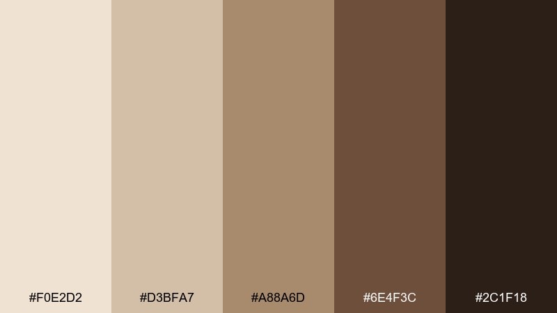
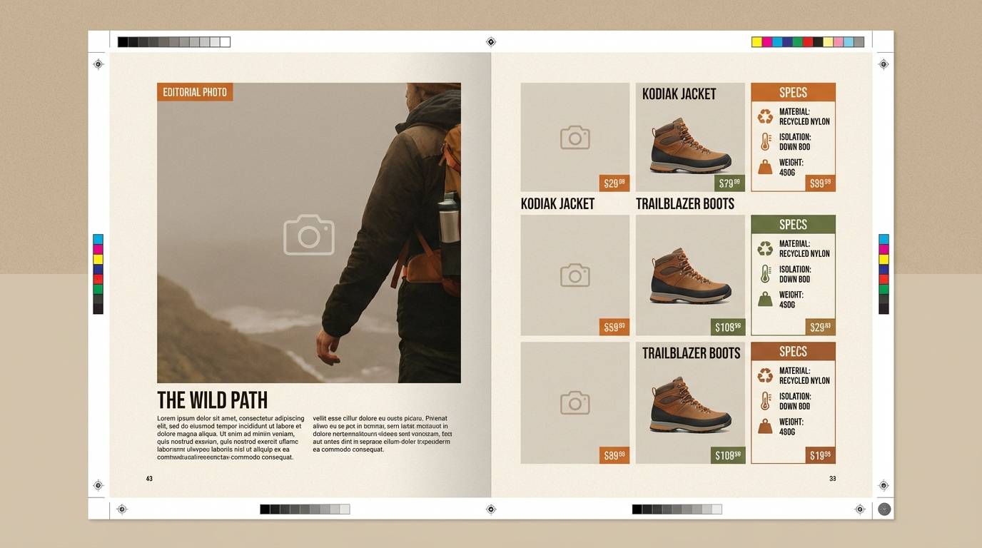
HEX: #F0E2D2 #D3BFA7 #A88A6D #6E4F3C #2C1F18
Mood: outdoorsy and dependable
Best for: outdoor gear catalog spread
Outdoorsy and dependable, like pine bark, canvas straps, and campfire coffee. These earth tones support product grids and spec tables while keeping a rugged edge. Pair with crisp white space, strong headings, and a single safety-orange accent if you need a pop. Tip: use the mid-brown for section bars to separate categories cleanly.
Image example of timberline earth generated using media.io
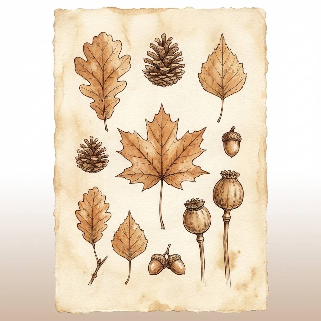
17) Burnt Sienna Botanica
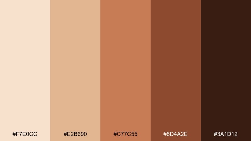
HEX: #F7E0CC #E2B690 #C77C55 #8D4A2E #3A1D12
Mood: seasonal and artistic
Best for: autumn botanical illustration set
Seasonal and artistic, like pressed leaves and cinnamon bark. The warmer sienna notes add energy while still reading as a cohesive neutral family. Pair with soft cream paper and fine ink outlines for a handcrafted print look. Tip: wash the lightest tone across the page first, then layer darker details sparingly for depth.
Image example of burnt sienna botanica generated using media.io
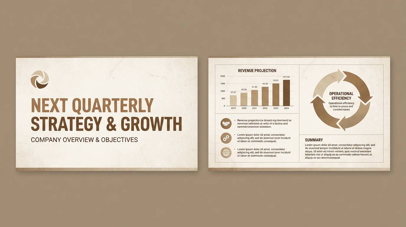
18) Bronze and Birch
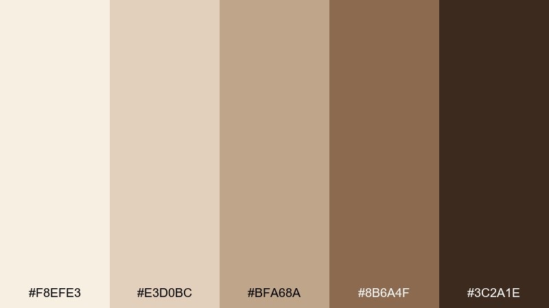
HEX: #F8EFE3 #E3D0BC #BFA68A #8B6A4F #3C2A1E
Mood: professional and steady
Best for: corporate presentation template
Professional and steady, like birch paper and brushed bronze details. This sepia color combination works well for decks that need warmth without losing clarity. Pair with simple charts, thin dividers, and restrained iconography to keep slides clean. Tip: set body text on the lightest background and use the bronze mid-tone for charts and callouts.
Image example of bronze and birch generated using media.io
19) Quiet Sepia Monochrome
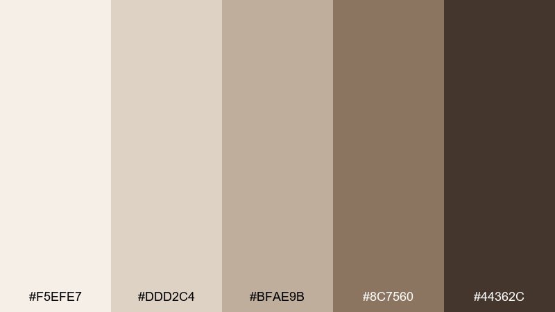
HEX: #F5EFE7 #DDD2C4 #BFAE9B #8C7560 #44362C
Mood: minimal and editorial
Best for: monochrome fashion lookbook
Minimal and editorial, like matte fabric swatches and studio shadows. The stepped browns create clean hierarchy for captions, pricing, and collections. Pair with lots of negative space and one strong headline weight to keep the page modern. Tip: keep photo borders subtle and let the darkest tone anchor section titles.
Image example of quiet sepia monochrome generated using media.io
20) Mocha Shadow Contrast
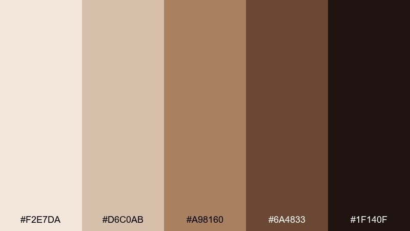
HEX: #F2E7DA #D6C0AB #A98160 #6A4833 #1F140F
Mood: bold and dramatic
Best for: cinematic title card poster
Bold and dramatic, like stage lights cutting through a smoky cafe. The deep mocha shadow gives you instant contrast for large type and strong silhouettes. Pair with condensed fonts and a single light background tone to create a film-poster punch. Tip: add subtle grain in the mid-tones so dark areas do not look flat in print.
Image example of mocha shadow contrast generated using media.io

What Colors Go Well with Sepia?
Sepia pairs naturally with other warm neutrals—cream, ivory, sand, and taupe—because they share similar undertones. This keeps layouts cohesive and makes photography feel more unified.
For contrast, add near-black browns (espresso/umber) for typography and UI states, or introduce a cool counterbalance like muted blue, slate, or dusty teal. Even a small cool accent can make sepia look cleaner and more modern.
If you want a premium feel, use antique gold or copper as a highlight (lines, icons, or foil-like accents) while keeping the main surfaces matte and light.
How to Use a Sepia Color Palette in Real Designs
Start with a light parchment tone as your base background, then assign one mid-brown for surfaces (cards, panels, or large blocks). Reserve the darkest shade for key actions and strong hierarchy—headlines, buttons, stamps, or price tags.
In print work, sepia excels with texture: paper grain, subtle noise, or emboss effects. In digital UI, keep contrast in check by testing text on the lightest shade and using the darkest brown sparingly so screens don’t feel muddy.
For branding systems, build a simple rule: 70% light neutral, 20% mid-brown, 10% dark accent. This keeps the “vintage warmth” while still reading crisp and contemporary.
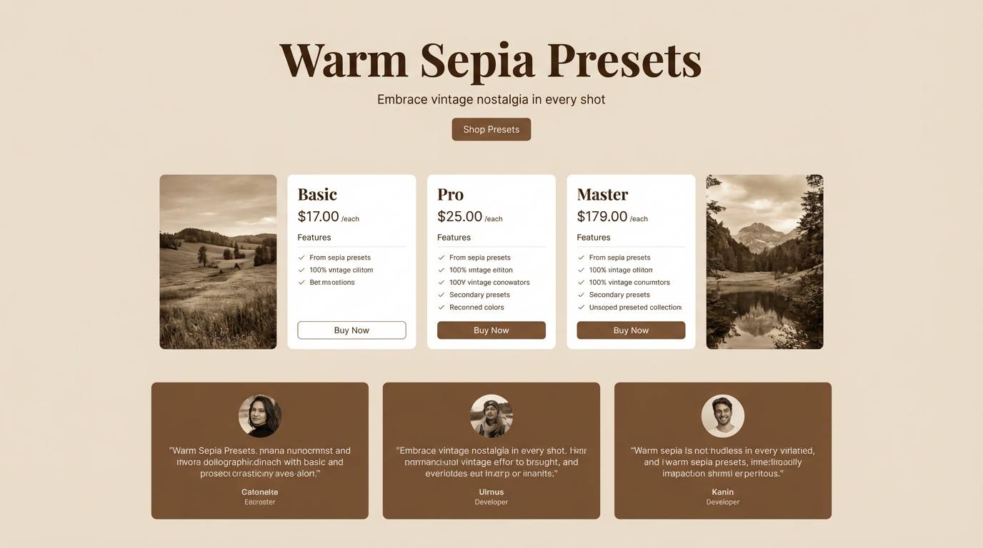
Create Sepia Palette Visuals with AI
If you already have HEX codes, the fastest way to validate a sepia scheme is to generate mock visuals—packaging, posters, UI screens, and moodboards—before you commit to production.
With Media.io’s text-to-image workflow, you can paste a prompt, describe the layout, and iterate quickly on lighting and texture while staying consistent with your sepia tone direction.
Use the example prompts above as templates, then swap the subject (menu, book cover, signage) to match your project.
Sepia Color Palette FAQs
-
What is a sepia color palette?
A sepia palette is a set of warm brown-to-cream tones inspired by vintage photographs, aged paper, leather, and antique ink. It usually includes a light parchment base, mid caramel browns, and a deep espresso shade for contrast. -
Is sepia the same as brown?
Not exactly. “Brown” is broad, while sepia typically has a warmer, slightly golden undertone and is often used as a cohesive, low-saturation family rather than a single color. -
What are good accent colors for sepia designs?
Muted blue/slate, dusty teal, sage green, and charcoal work well as cool counter-accents. For a warmer luxury accent, use antique gold or copper in small doses. -
How do I keep sepia palettes from looking muddy in UI?
Use a very light cream/parchment background, keep large surfaces in mid-tones minimal, and reserve the darkest brown for key components (primary buttons, headings). Always check contrast for text and interactive states. -
Are sepia tones good for branding?
Yes—sepia tones signal heritage, craftsmanship, and trust. They’re especially effective for coffee, skincare, publishing, wedding stationery, museums, and artisanal products. -
How many colors should a sepia palette include?
Five is a practical sweet spot: one light base, two mid shades for surfaces and secondary elements, one dark for typography/CTAs, and one deepest shade for strong emphasis or framing. -
Can I generate sepia-themed mockups with AI?
Yes. Use a consistent prompt style (subject + material/texture + “warm sepia tones” + lighting + composition) and iterate until the shadows and highlights match your intended mood.
Next: Muted Color Palette


