Muted color palettes soften bold hues into calm, modern tones that feel more lived-in than loud. They’re perfect when you want a design to look premium, balanced, and easy on the eyes.
Below are 20+ muted palette ideas (with HEX codes), plus pairing tips and AI prompts you can use to generate matching visuals in seconds.
In this article
- Why Muted Palettes Work So Well
-
- foggy sage morning
- dusty rose linen
- coastal driftwood
- soft slate office
- mushroom taupe mix
- vintage denim wash
- terracotta hush
- lavender smoke
- olive paper craft
- quiet pebble path
- autumn meadow fade
- sea glass calm
- warm putty studio
- cocoa ash
- blush copper minimal
- rainy day bluegray
- antique mint label
- sandstone gallery
- sprig and stone watercolor
- cloudy apricot clay
- plum fog evening
- chalky coral note
- What Colors Go Well with Muted?
- How to Use a Muted Color Palette in Real Designs
- Create Muted Palette Visuals with AI
Why Muted Palettes Work So Well
Muted colors are desaturated tones that feel softer and less intense than their fully saturated versions. This makes them easier to use across large surfaces (backgrounds, cards, packaging) without visual fatigue.
They also create a natural “built-in hierarchy”: light tints can be your canvas, mid-tones can define sections, and deep muted shades can deliver legible text and strong CTAs without looking harsh.
Because muted palettes often resemble real-world materials (linen, stone, clay, foliage), they tend to look timeless and premium—especially in modern branding, UI, and interior mood boards.
20+ Muted Color Palette Ideas (with HEX Codes)
1) Foggy Sage Morning
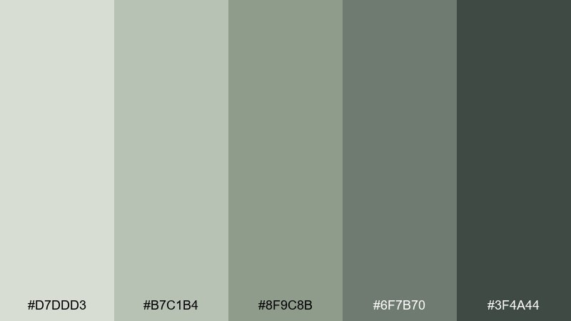
HEX: #D7DDD3 #B7C1B4 #8F9C8B #6F7B70 #3F4A44
Mood: calm and grounded
Best for: wellness branding and landing pages
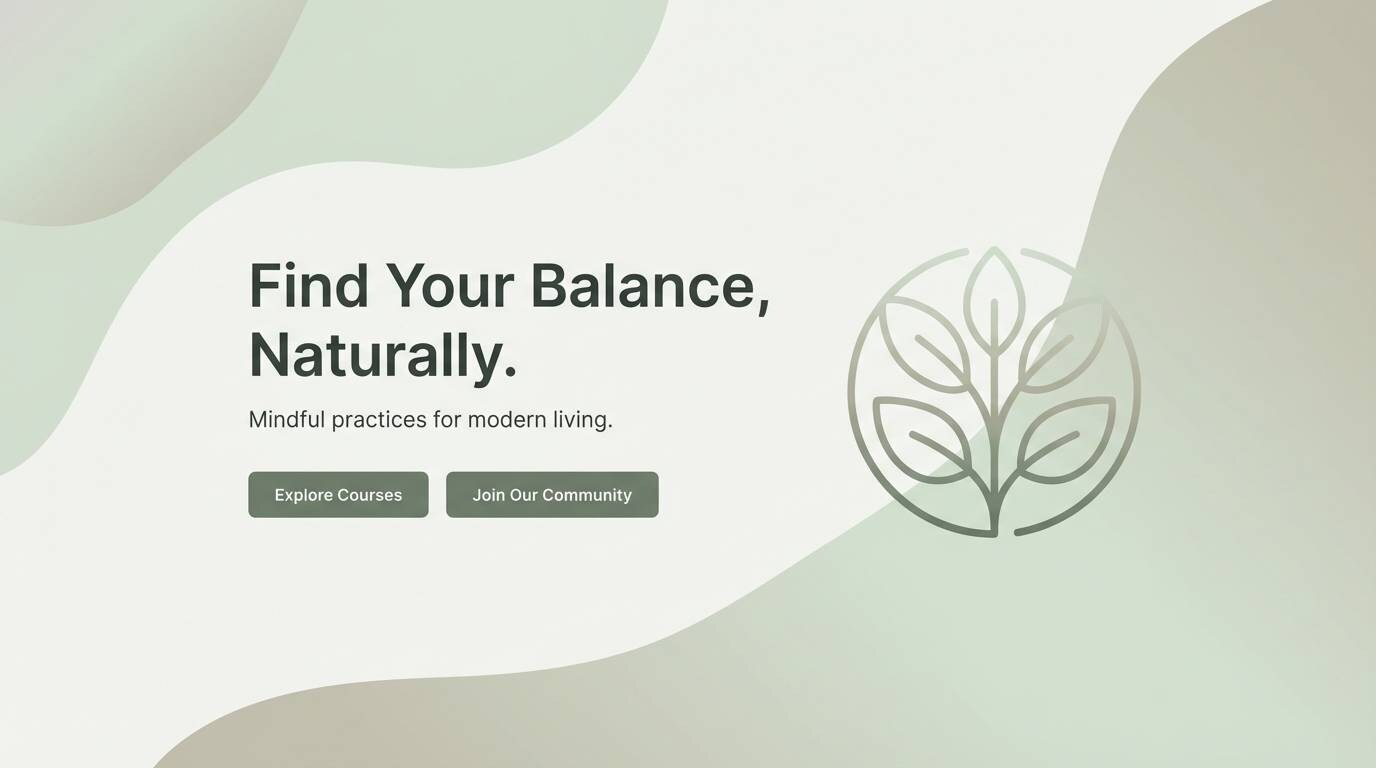
Calm, misty greens feel like an early walk through a botanical garden after rain. Use the pale sage as your background, then build hierarchy with the deeper moss and charcoal. It works beautifully for wellness, skincare, and sustainable brands when paired with off-white space and simple typography. Tip: keep contrast accessible by reserving #3F4A44 for body text and buttons.
Image example of foggy sage morning generated using media.io
Media.io is an online AI studio for creating and editing video, image, and audio in your browser.

2) Dusty Rose Linen
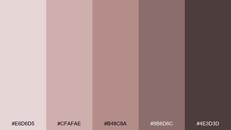
HEX: #E6D6D5 #CFAFAE #B48C8A #8B6D6C #4E3D3D
Mood: soft and romantic
Best for: wedding invitations and stationery
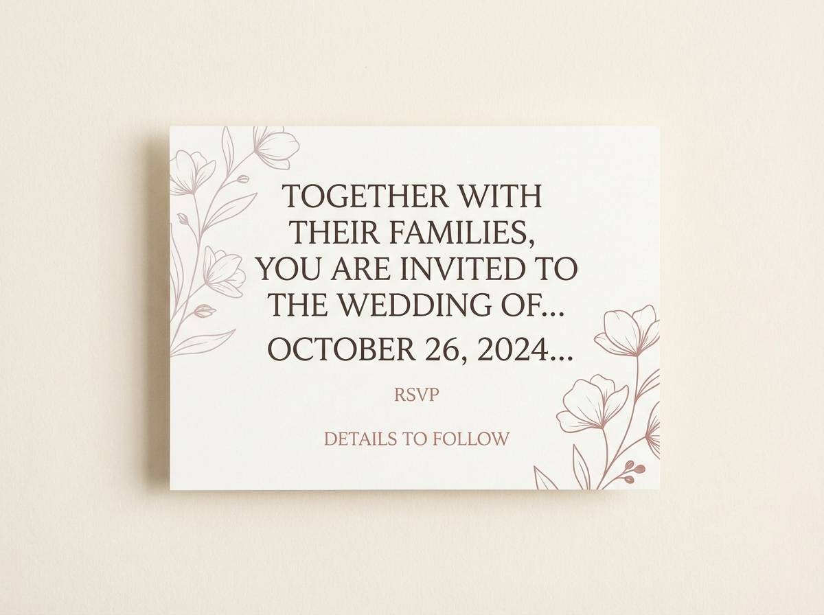
Soft, rosy neutrals evoke linen fabric, pressed petals, and quiet candlelight. Let the blush tones carry the background while the brown-rose shades handle headings and separators. It shines on invitations, menus, and save-the-dates when paired with warm ivory paper and serif type. Tip: print a small swatch test first, since #CFAFAE can shift warmer depending on stock.
Image example of dusty rose linen generated using media.io
3) Coastal Driftwood
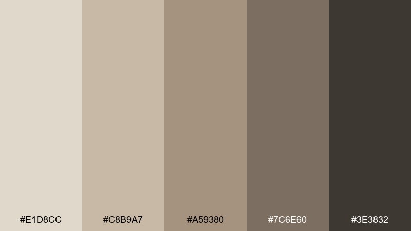
HEX: #E1D8CC #C8B9A7 #A59380 #7C6E60 #3E3832
Mood: warm and weathered
Best for: interior mood boards
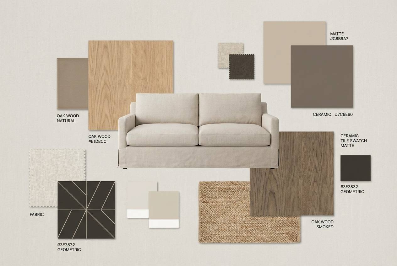
Warm, sun-faded browns bring to mind driftwood, sand, and woven textures. Use the creamy beige for large surfaces, then layer mid-tones for depth in furniture and materials. It suits interiors, lifestyle lookbooks, and boutique hotels when paired with matte black hardware and natural light photography. Tip: add texture first, then color, so the palette stays airy rather than flat.
Image example of coastal driftwood generated using media.io
4) Soft Slate Office
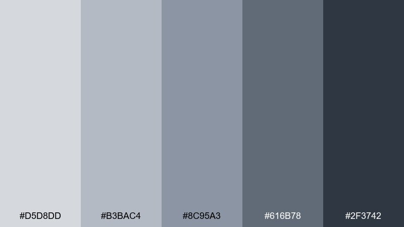
HEX: #D5D8DD #B3BAC4 #8C95A3 #616B78 #2F3742
Mood: professional and cool
Best for: SaaS dashboard UI
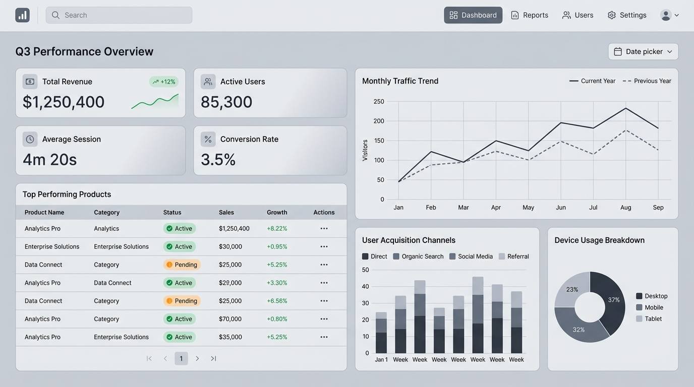
Cool slate blues feel crisp like a glassy skyline on an overcast day. Build a clean interface by using the light gray-blue as the canvas and the deeper slates for navigation and charts. It fits B2B products, analytics tools, and fintech layouts with minimal iconography and clear spacing. Tip: reserve #2F3742 for key labels so your charts stay readable.
Image example of soft slate office generated using media.io
5) Mushroom Taupe Mix
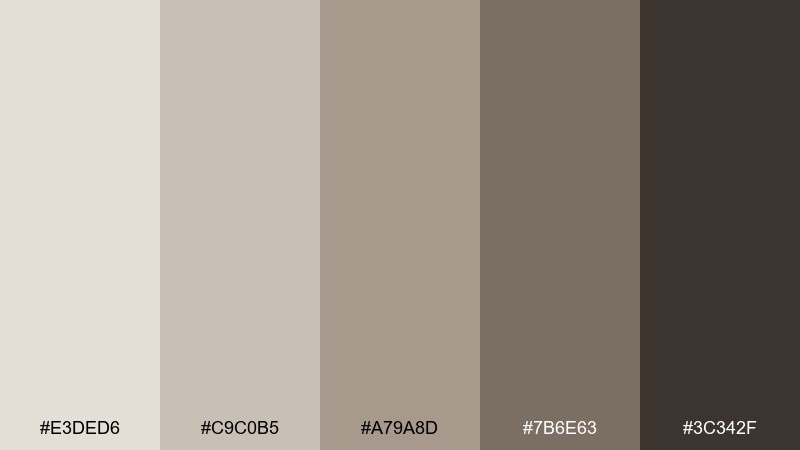
HEX: #E3DED6 #C9C0B5 #A79A8D #7B6E63 #3C342F
Mood: neutral and cozy
Best for: minimal packaging design
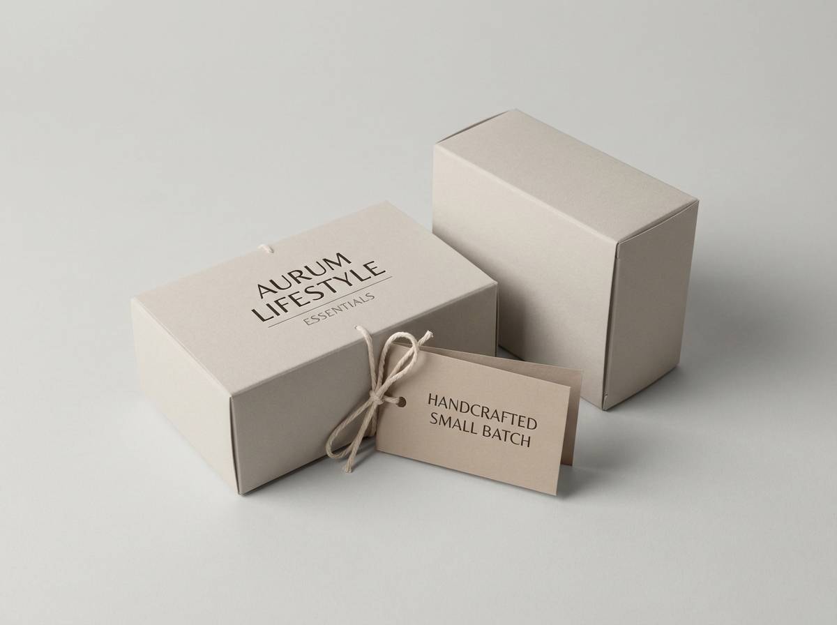
Cozy taupes and mushroom browns feel like ceramics, oat milk, and soft knitwear. Use the light beige as the base, then bring in the mid taupe for panels and ingredient blocks. It works well for coffee, candles, and pantry goods when paired with uncoated paper and simple line icons. Tip: add a single dark stamp in #3C342F for a premium finish.
Image example of mushroom taupe mix generated using media.io
6) Vintage Denim Wash
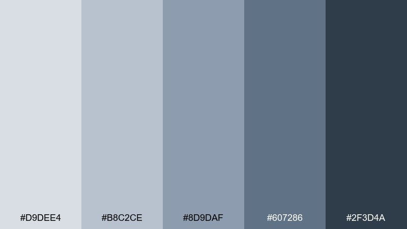
HEX: #D9DEE4 #B8C2CE #8D9DAF #607286 #2F3D4A
Mood: relaxed and timeless
Best for: app onboarding screens
Relaxed denim blues suggest worn-in jackets, calm water, and familiar classics. This muted color palette is great for onboarding flows where you want trust without feeling too corporate. Pair the lighter blues with white space and use the deep navy-gray for primary CTAs and headings. Tip: keep illustrations simple so #8D9DAF stays the visual anchor instead of competing with detail.
Image example of vintage denim wash generated using media.io

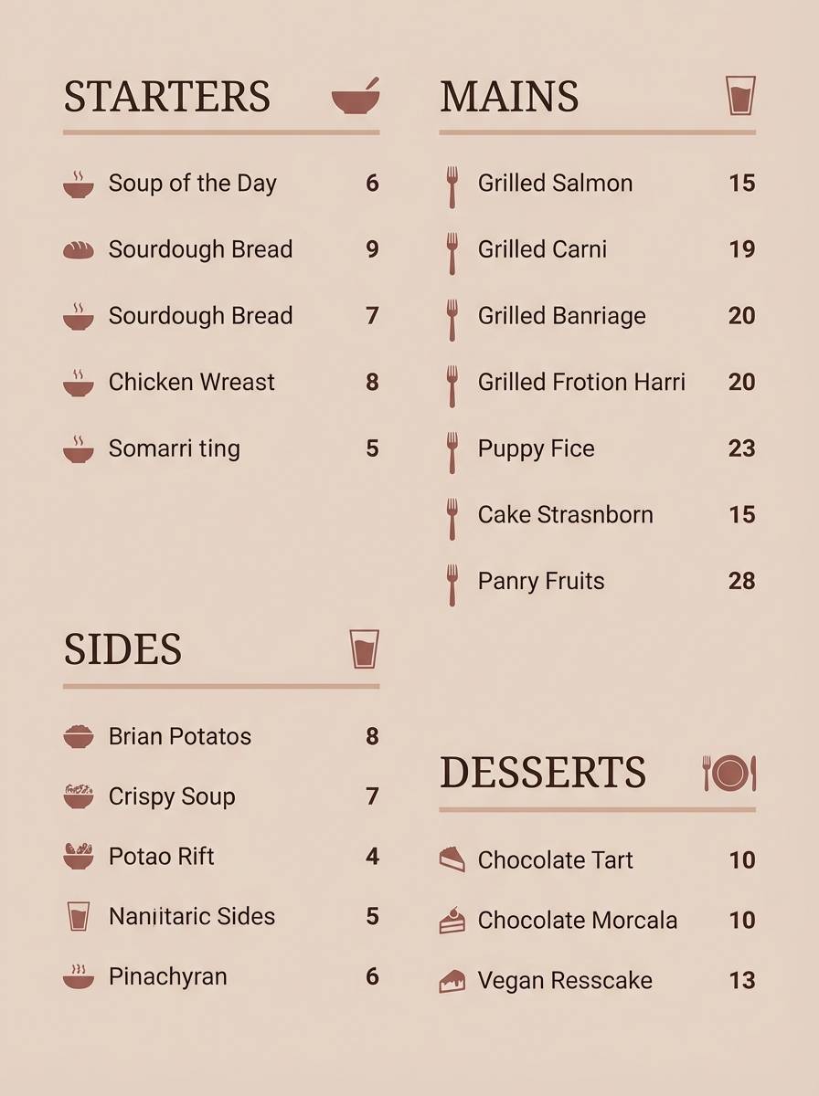
7) Terracotta Hush
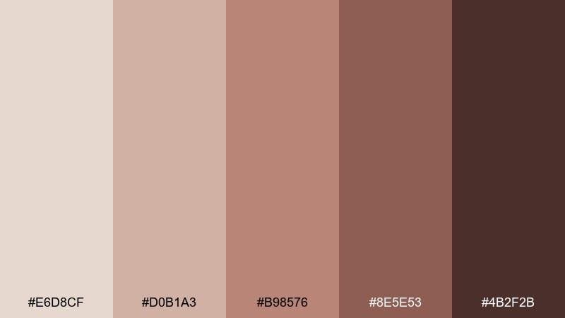
HEX: #E6D8CF #D0B1A3 #B98576 #8E5E53 #4B2F2B
Mood: warm and artisanal
Best for: restaurant menu design
Warm clay tones feel like handmade pottery, brick ovens, and sunlit plaster walls. Use the pale peachy base for the menu background and the richer terracotta for section headers and dividers. It fits Mediterranean, bakery, and farm-to-table brands when paired with kraft textures or subtle grain. Tip: highlight specials with #B98576 blocks so they stand out without shouting.
Image example of terracotta hush generated using media.io
8) Lavender Smoke
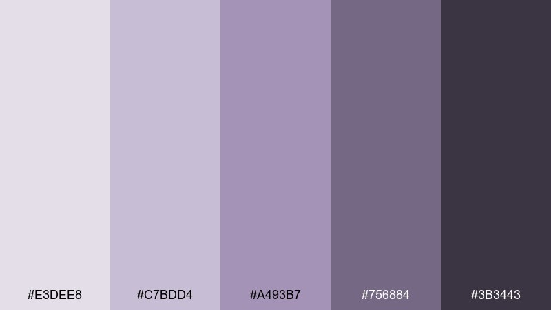
HEX: #E3DEE8 #C7BDD4 #A493B7 #756884 #3B3443
Mood: dreamy and modern
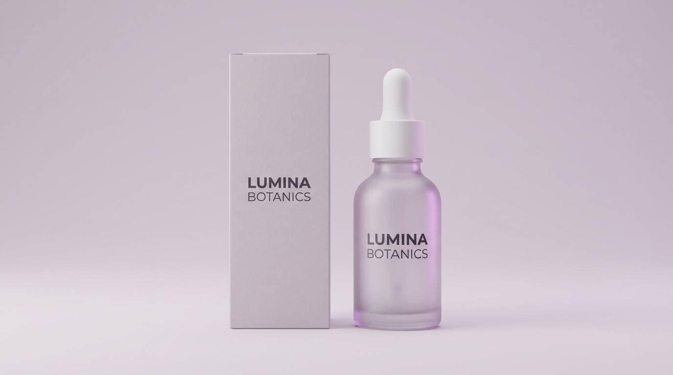
Best for: beauty product ad
Dreamy lavender-grays feel like twilight haze and soft-focus photography. Let the pale lilac carry the background while the smoky purple adds depth for headlines and shadows. It works for beauty ads and fragrance visuals when paired with glossy reflections and minimal copy. Tip: keep one hero product in neutral packaging so the purple stays the mood, not the distraction.
Image example of lavender smoke generated using media.io
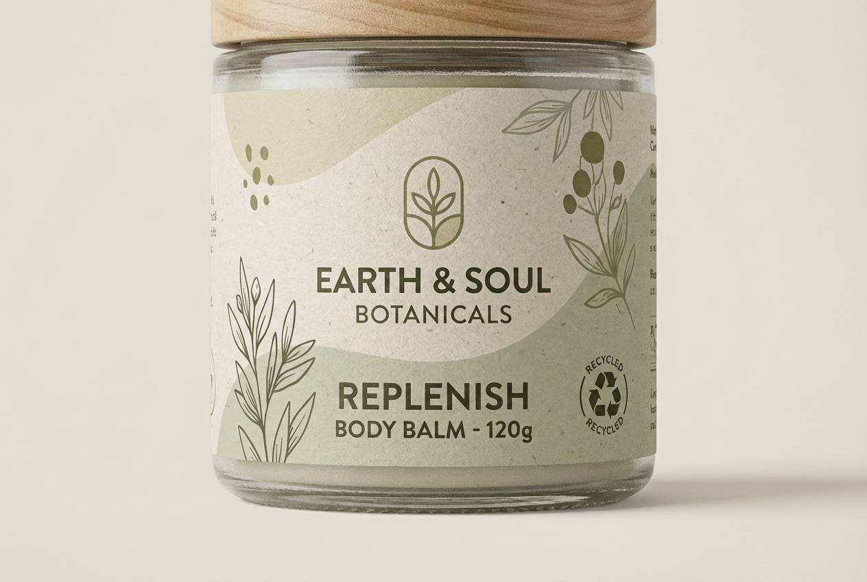
9) Olive Paper Craft
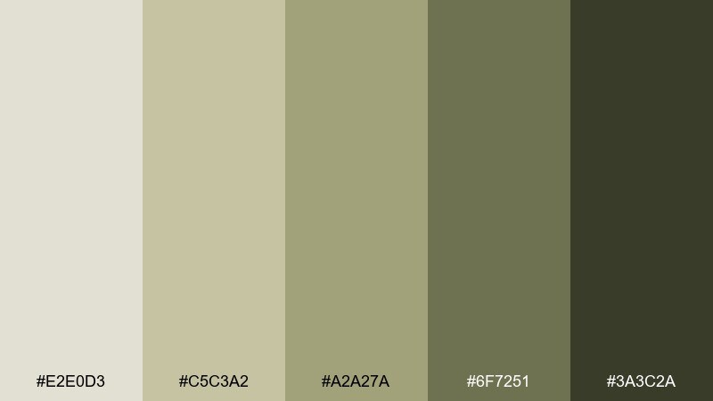
HEX: #E2E0D3 #C5C3A2 #A2A27A #6F7251 #3A3C2A
Mood: earthy and crafted
Best for: eco label design
Earthy olives and dried-grass tones evoke recycled paper, herb bundles, and sunbaked fields. Use the creamy tint for negative space and apply the olive mid-tone for badges and ingredient callouts. It suits eco labels and artisan goods when paired with simple icons and a tactile paper texture. Tip: print the darkest green sparingly to keep the look light and natural.
Image example of olive paper craft generated using media.io
10) Quiet Pebble Path
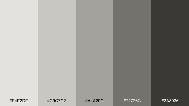
HEX: #E4E2DE #C9C7C2 #A4A29C #74726C #3A3936
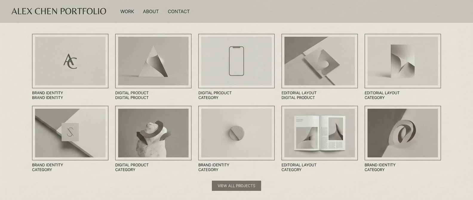
Mood: minimal and balanced
Best for: portfolio website
Minimal pebble grays feel like stone paths, soft shadows, and gallery walls. Use the lightest gray as the page background, then step through mid-grays for cards, borders, and subtle dividers. It fits portfolios and architecture studios when paired with large imagery and tight typographic rhythm. Tip: use #3A3936 for links and hover states to maintain clear focus cues.
Image example of quiet pebble path generated using media.io
11) Autumn Meadow Fade
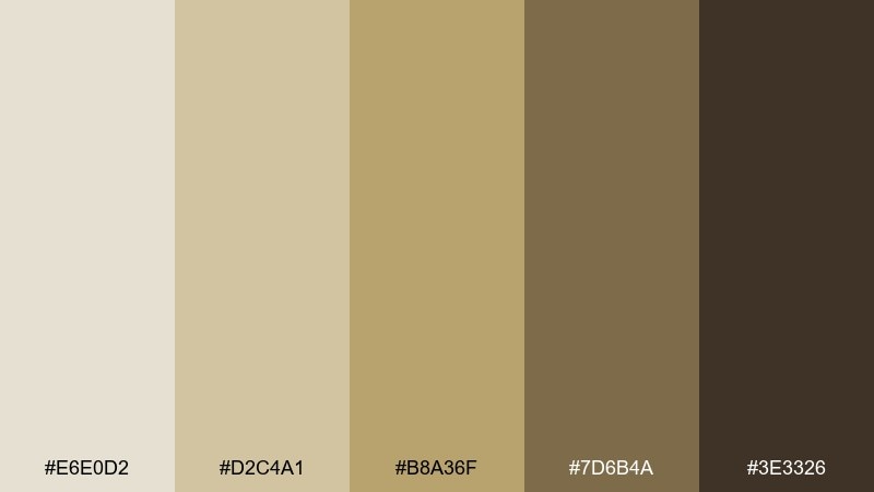
HEX: #E6E0D2 #D2C4A1 #B8A36F #7D6B4A #3E3326
Mood: rustic and sunny
Best for: seasonal social posts
Rustic golden fields and dried leaves come through in these softened yellows and browns. Use the pale cream for backgrounds and the ochre as the main accent for stickers, captions, and highlights. It works for seasonal campaigns, cafes, and makers when paired with warm photography and a touch of grain. Tip: keep text in the deep brown so your posts stay readable on mobile.
Image example of autumn meadow fade generated using media.io

12) Sea Glass Calm
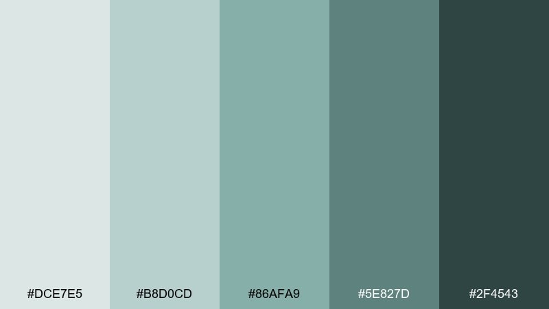
HEX: #DCE7E5 #B8D0CD #86AFA9 #5E827D #2F4543
Mood: fresh and soothing
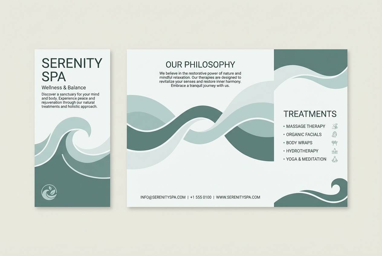
Best for: spa brochure design
Fresh sea-glass greens feel like shoreline treasures and cool water reflections. Use the light aqua as a spacious backdrop, then bring in teal for headings, icons, and calm callouts. It suits spa brochures and self-care brands when paired with soft gradients and airy photography. Tip: keep icons thin and consistent so the palette reads clean rather than busy.
Image example of sea glass calm generated using media.io
13) Warm Putty Studio
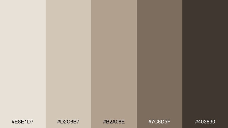
HEX: #E8E1D7 #D2C6B7 #B2A08E #7C6D5F #403830
Mood: studio-neutral and warm
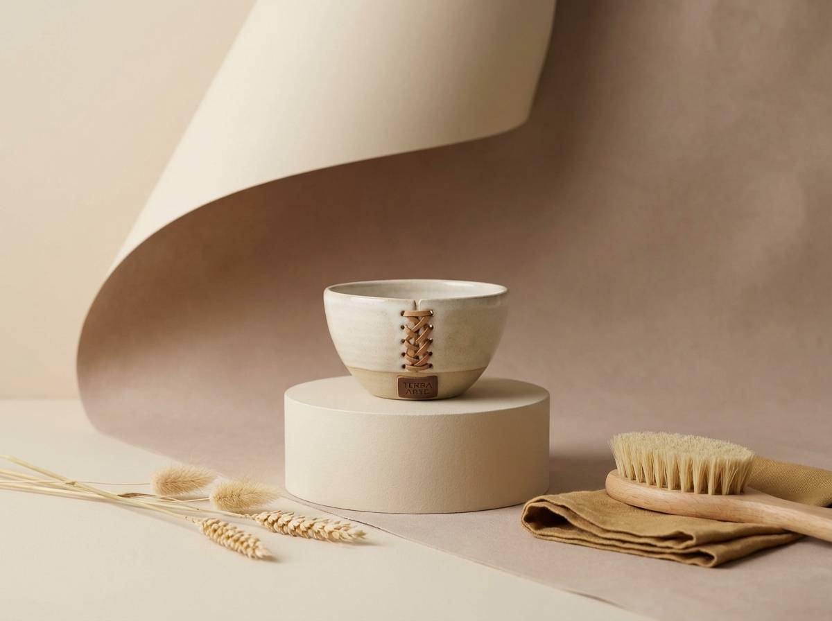
Best for: product photography backdrops
Warm putty neutrals evoke a quiet studio corner with plaster walls and soft lamps. Use the lightest tone as your backdrop and the mid putty for props that add depth without stealing attention. It works for product photography, ceramics, and handmade goods when paired with gentle shadows and natural materials. Tip: keep the darkest brown only for small details like logos or stamps.
Image example of warm putty studio generated using media.io
14) Cocoa Ash
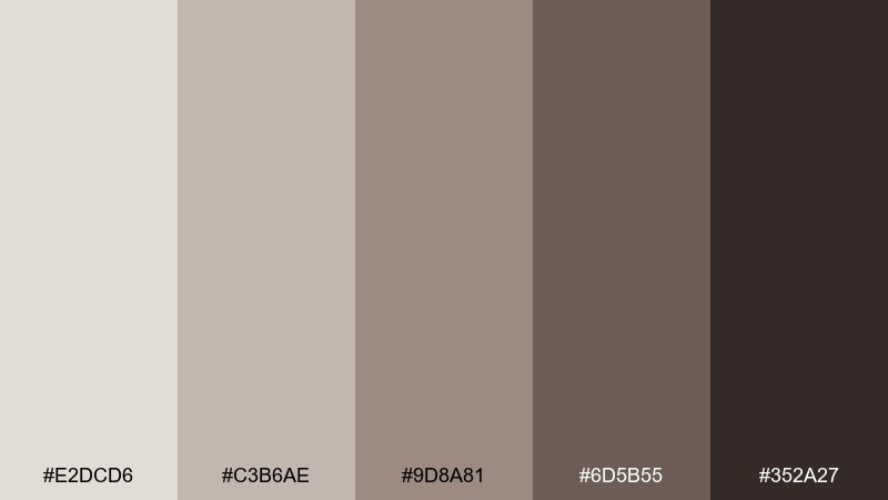
HEX: #E2DCD6 #C3B6AE #9D8A81 #6D5B55 #352A27
Mood: moody and refined
Best for: coffee brand identity
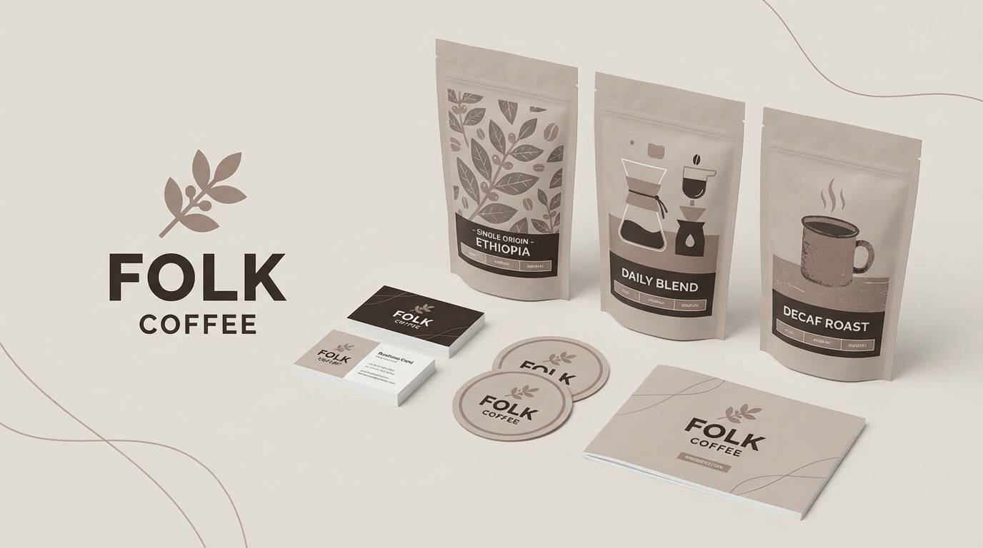
Moody cocoa-browns feel like espresso crema, toasted sugar, and smoky roasts. Use the pale beige for packaging space and the rich browns for logotypes and pattern work. It fits cafes and roasters when paired with cream stock and a single geometric motif. Tip: set secondary text in #6D5B55 to keep the hierarchy clear without harsh contrast.
Image example of cocoa ash generated using media.io
15) Blush Copper Minimal
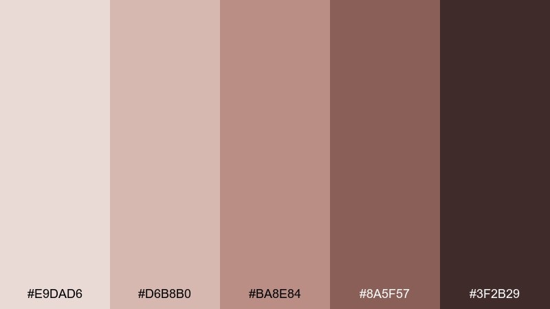
HEX: #E9DAD6 #D6B8B0 #BA8E84 #8A5F57 #3F2B29
Mood: elegant and warm
Best for: minimal poster design
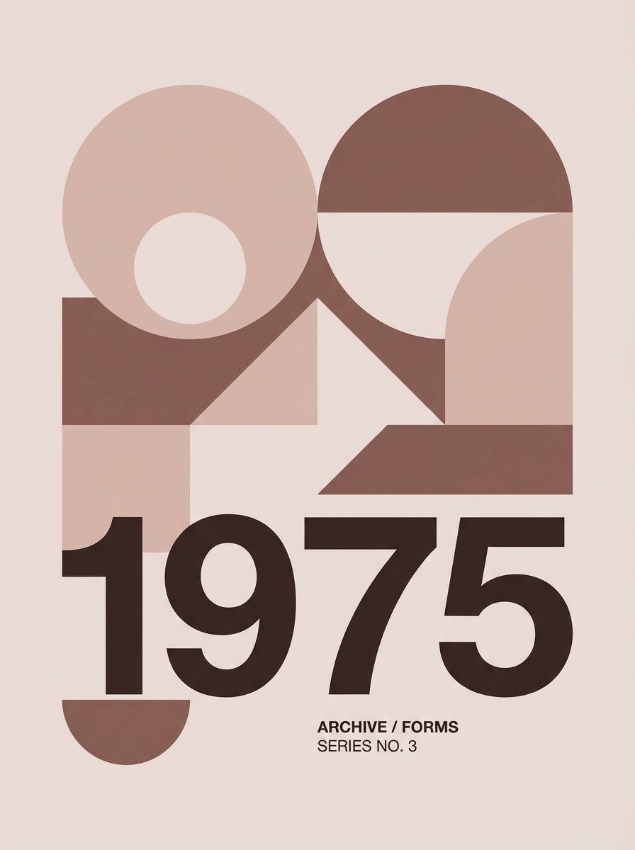
Elegant blush-browns suggest copper patina, soft leather, and evening light. Use the pale blush as the poster field, then create structure with the mid tones for shapes and type blocks. It suits minimal posters and event announcements when paired with generous spacing and one strong typographic weight. Tip: keep imagery monochrome so the warm accents stay cohesive.
Image example of blush copper minimal generated using media.io
16) Rainy Day Bluegray
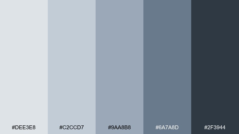
HEX: #DEE3E8 #C2CCD7 #9AA8B8 #6A7A8D #2F3944
Mood: quiet and dependable
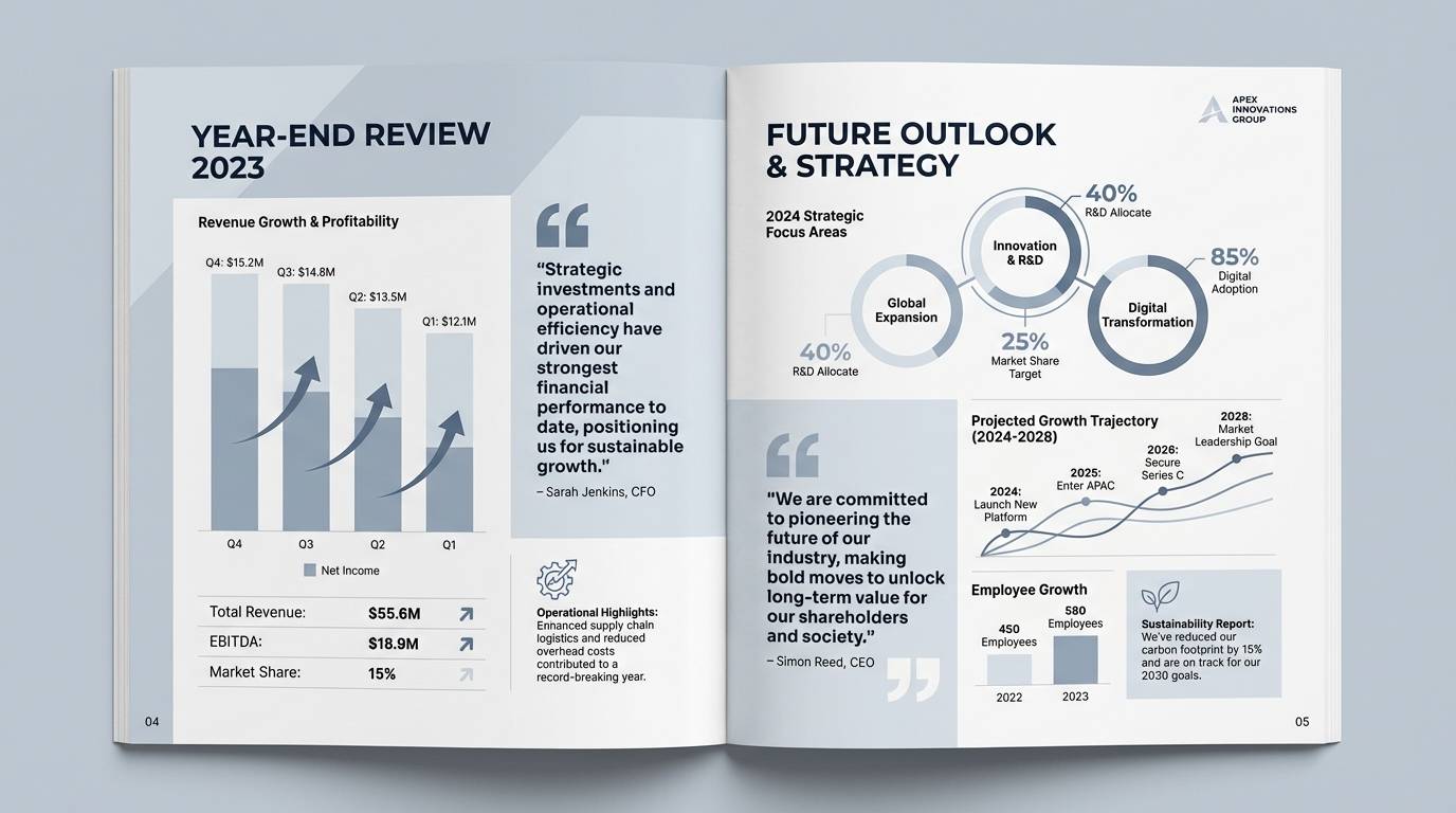
Best for: annual report layout
Quiet blue-grays evoke rainy windows, notebooks, and calm focus. Use the light gray-blue for page backgrounds and the steel mid-tone for charts and callouts. It fits annual reports and corporate storytelling when paired with plenty of margins and a restrained icon set. Tip: standardize your chart colors to two shades so the data reads cleanly.
Image example of rainy day bluegray generated using media.io
17) Antique Mint Label
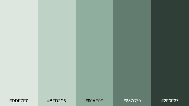
HEX: #DDE7E0 #BFD2C6 #90AE9E #637C70 #2F3E37
Mood: clean and vintage
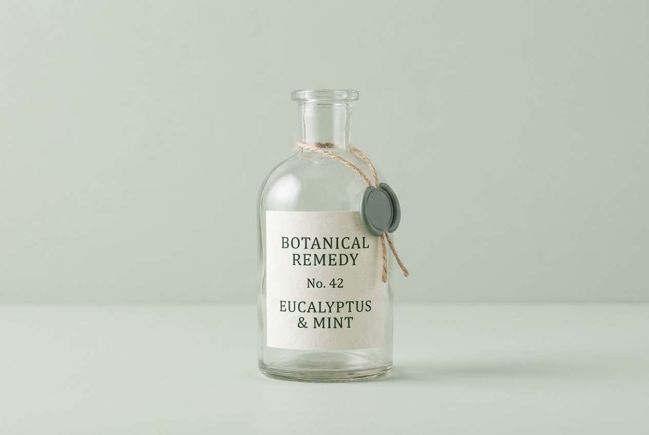
Best for: apothecary label packaging
Clean antique mints feel like glass bottles, herbal tinctures, and old pharmacy shelves. Use the pale mint as your label base and the darker greens for borders, seals, and ingredient lists. It works for apothecary packaging when paired with serif type and fine line illustrations. Tip: add a small cream margin so the green tones do not look overly cool in print.
Image example of antique mint label generated using media.io
18) Sandstone Gallery
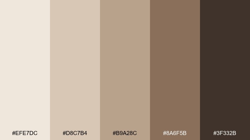
HEX: #EFE7DC #D8C7B4 #B9A28C #8A6F5B #3F332B
Mood: artful and airy
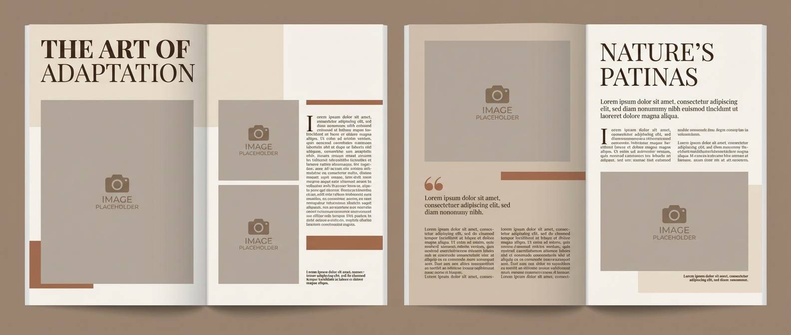
Best for: editorial magazine layout
Artful sandstone neutrals bring to mind museum halls, matte frames, and soft spotlights. Use the creamy tone for negative space and the mid sand for captions, rules, and small blocks. It fits editorial layouts when paired with black-and-white photography and refined serif headlines. Tip: keep accent use to 10 percent so the spread stays gallery-clean.
Image example of sandstone gallery generated using media.io
19) Sprig and Stone Watercolor
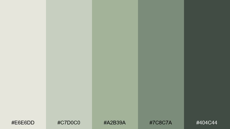
HEX: #E6E6DD #C7D0C0 #A2B39A #7C8C7A #404C44
Mood: botanical and gentle
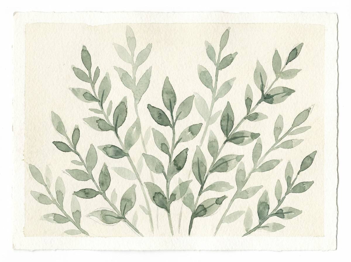
Best for: botanical watercolor illustration
Gentle greens and soft stone neutrals feel like pressed herbs and watercolor washes. Use the pale gray-green as paper tone and build leaves with the mid sage for natural depth. It works for spring illustration sets and blog headers when paired with loose ink outlines and plenty of breathing room. Tip: keep shadows subtle by mixing #7C8C7A with water rather than jumping straight to the darkest green.
Image example of sprig and stone watercolor generated using media.io
20) Cloudy Apricot Clay
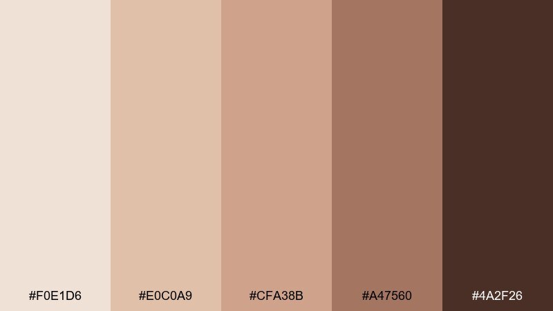
HEX: #F0E1D6 #E0C0A9 #CFA38B #A47560 #4A2F26
Mood: welcoming and soft-warm
Best for: event flyer design
Welcoming apricot-clay tones evoke soft sunsets, terracotta tiles, and cozy community spaces. Use the pale peach as the flyer background and the clay mid-tone for shapes that guide the eye. These muted color combinations work well for workshops and pop-ups when paired with simple icons and bold, readable type. Tip: set all body copy in #4A2F26 to avoid low-contrast text on warm backgrounds.
Image example of cloudy apricot clay generated using media.io

21) Plum Fog Evening
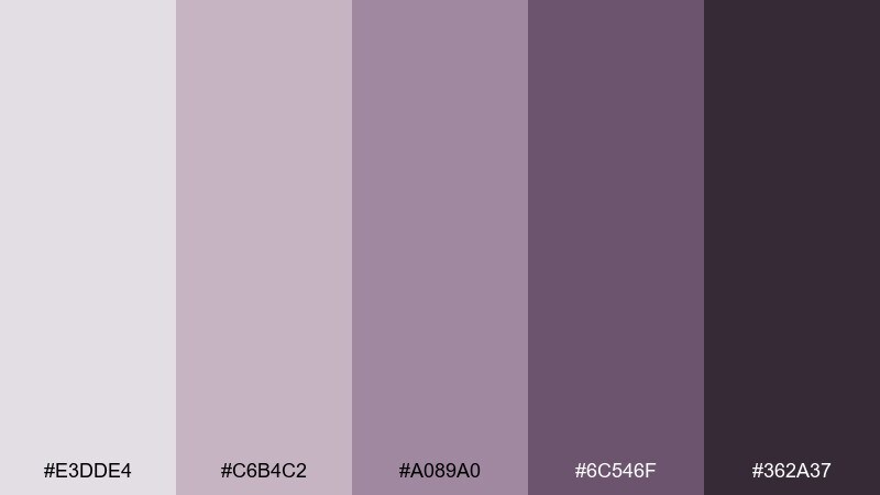
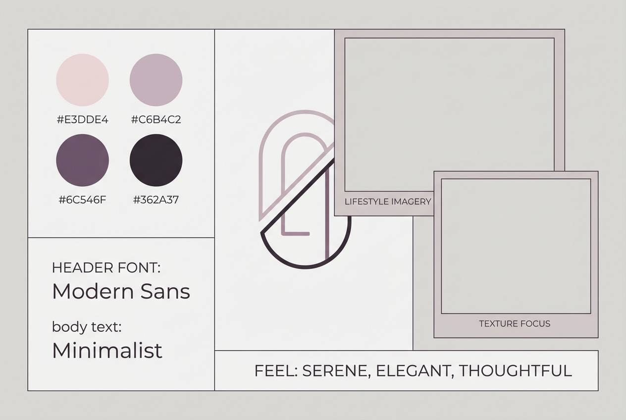
HEX: #E3DDE4 #C6B4C2 #A089A0 #6C546F #362A37
Mood: moody and creative
Best for: brand mood board
Moody plum haze feels like evening streets, velvet textures, and soft neon reflections turned down low. Use the light lilac-gray as a board base and bring in plum for headlines, swatches, and focus elements. These muted color combinations are ideal for creative studios when paired with monochrome photography and one clean sans-serif. Tip: keep the darkest shade for small anchors like logo marks to maintain an elevated feel.
Image example of plum fog evening generated using media.io
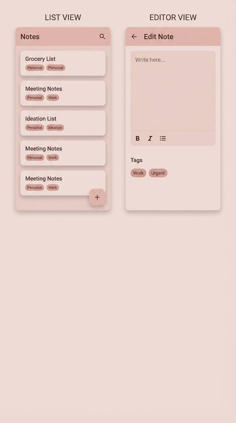
22) Chalky Coral Note
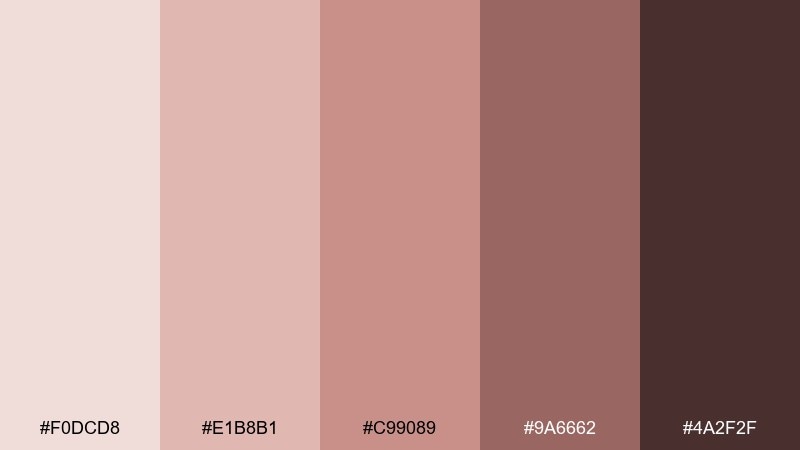
HEX: #F0DCD8 #E1B8B1 #C99089 #9A6662 #4A2F2F
Mood: friendly and understated
Best for: note-taking app UI
Friendly coral-pinks look chalky and soft, like well-loved stationery and tinted paper. Use the light blush as the main canvas and the dusty coral for tags, toggles, and subtle highlights. It fits note-taking and productivity tools when paired with clean icons and plenty of line spacing. Tip: use #4A2F2F for primary text to keep the interface crisp on pale pink backgrounds.
Image example of chalky coral note generated using media.io
What Colors Go Well with Muted?
Muted palettes pair naturally with warm neutrals (ivory, oatmeal, sandstone) and cool neutrals (fog gray, blue-gray, charcoal). These supporting tones keep the overall look calm while still giving you structure.
For accents, choose one deeper muted shade (like a slate, moss, or cocoa) for buttons and key labels. If you want a little energy, add a tiny pop of a clearer hue (mustard, teal, terracotta) but keep it minimal so the palette stays “muted-first.”
In UI and branding, contrast matters: use your darkest muted color for text and interactive states, and keep mid-tones for borders, chips, and secondary surfaces.
How to Use a Muted Color Palette in Real Designs
Start with a light muted tint as your base (backgrounds, paper stock, or main surfaces). Then assign one mid-tone for layout blocks (cards, section panels) and one dark tone for typography and CTAs.
Muted colors shine with texture: grain, linen, recycled paper, soft shadows, and matte finishes make the palette feel intentional rather than washed out. In digital products, subtle gradients and low-contrast dividers can add depth without adding noise.
To keep designs clean, limit yourself to 2–3 active colors per screen or page and let the rest behave as neutrals. This keeps the mood consistent across components, photos, and illustrations.
Create Muted Palette Visuals with AI
If you already have HEX codes, you can generate matching brand scenes, UI mockups, posters, and packaging concepts by describing the layout and specifying your palette as dominant and accent colors.
For best results, mention the design type (e.g., “dashboard UI,” “wedding invitation,” “studio product shot”), call out 2 dominant colors, 1–2 accent colors, and your darkest color for text. Then set an aspect ratio that matches the final output.
Muted Color Palette FAQs
-
What is a muted color palette?
A muted color palette uses desaturated tones (lower intensity) that feel softer and calmer than bright colors, often leaning toward earthy, dusty, or smoky variations. -
Are muted colors the same as pastel colors?
Not exactly. Pastels are typically lighter (more white added), while muted colors are primarily desaturated (less saturation). Many muted palettes include mid and dark tones, not just light tints. -
How do I keep muted designs from looking “washed out”?
Use a clear darkest shade for text/CTAs, add gentle texture (grain, paper, shadows), and limit mid-tone usage so there’s enough separation between background, components, and typography. -
What muted colors work best for modern branding?
Sage greens, slate blue-grays, taupes, and terracotta clays are popular because they feel natural, premium, and versatile across packaging, web design, and social templates. -
How many colors should I use in a muted UI palette?
As a starting point: 1 light background tint, 1 mid-tone surface color, 1–2 accents for highlights, and 1 dark color for text and primary buttons. -
Do muted palettes print well?
Yes, but they can shift depending on paper stock and ink. Always run a small proof, and consider adding a cream margin or warmer neutral to prevent cool muted tones from feeling flat. -
Can Media.io help me visualize muted palette concepts?
Yes. You can use Media.io’s text-to-image tool to generate posters, brand mockups, UI screens, and product scenes by including your palette HEX codes and describing the layout and mood.


