

Sea blue sits right between ocean-depth blues and green-leaning teals, which makes it one of the easiest “fresh but reliable” bases for modern design.
Below are curated sea blue color palette ideas with HEX codes, mood notes, and practical pairing tips for UI, branding, and print.
In this article
- Why Sea Blue Palettes Work So Well
-
- tidal glass
- harbor night
- seafoam sand
- coral buoy
- deep current
- dune mist
- glacier bay
- kelp & pearl
- sailcloth white
- lagoon punch
- stormy pier
- tropical shade
- marina rose
- aquarium light
- vintage nautical
- blueprint reef
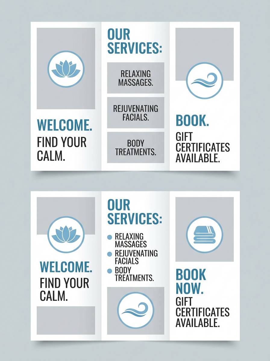
- calm spa stone
- seaside citrus
- pebble shore
- ocean editorial
- seagrass blossom
- poseidon gold
- What Colors Go Well with Sea Blue?
- How to Use a Sea Blue Color Palette in Real Designs
- Create Sea Blue Palette Visuals with AI
Why Sea Blue Palettes Work So Well
Sea blue is naturally versatile because it carries both the calm of blue and the vitality of green. That balance helps brands feel trustworthy without looking cold or overly corporate.
It also scales across contexts: deep sea-blue shades create strong hierarchy in navigation and headers, while lighter aqua tints can soften large surfaces like cards, panels, and backgrounds.
In print and packaging, sea blue pairs easily with warm neutrals (sand, cream, stone) for a premium, tactile look—especially on textured stock or matte finishes.
20+ Sea Blue Color Palette Ideas (with HEX Codes)
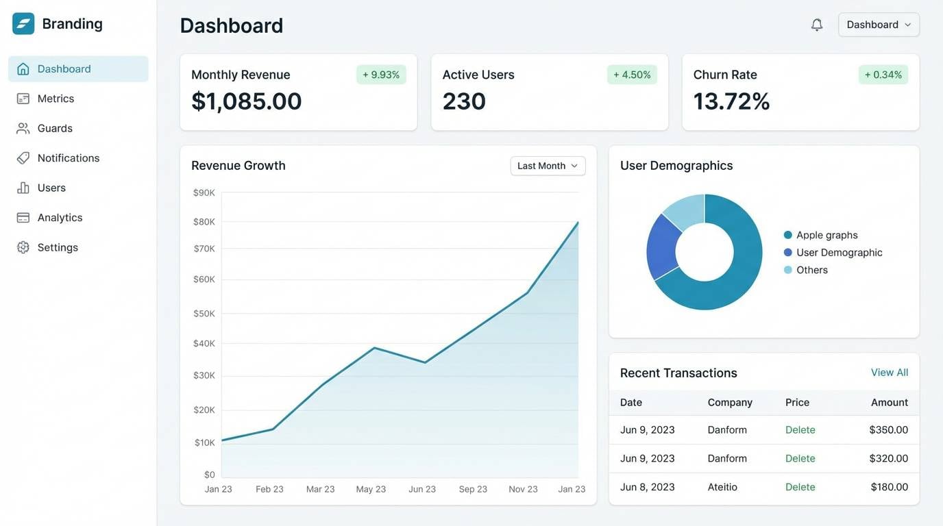
1) Tidal Glass
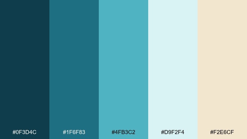
HEX: #0f3d4c #1f6f83 #4fb3c2 #d9f2f4 #f2e6cf
Mood: fresh, coastal, clean
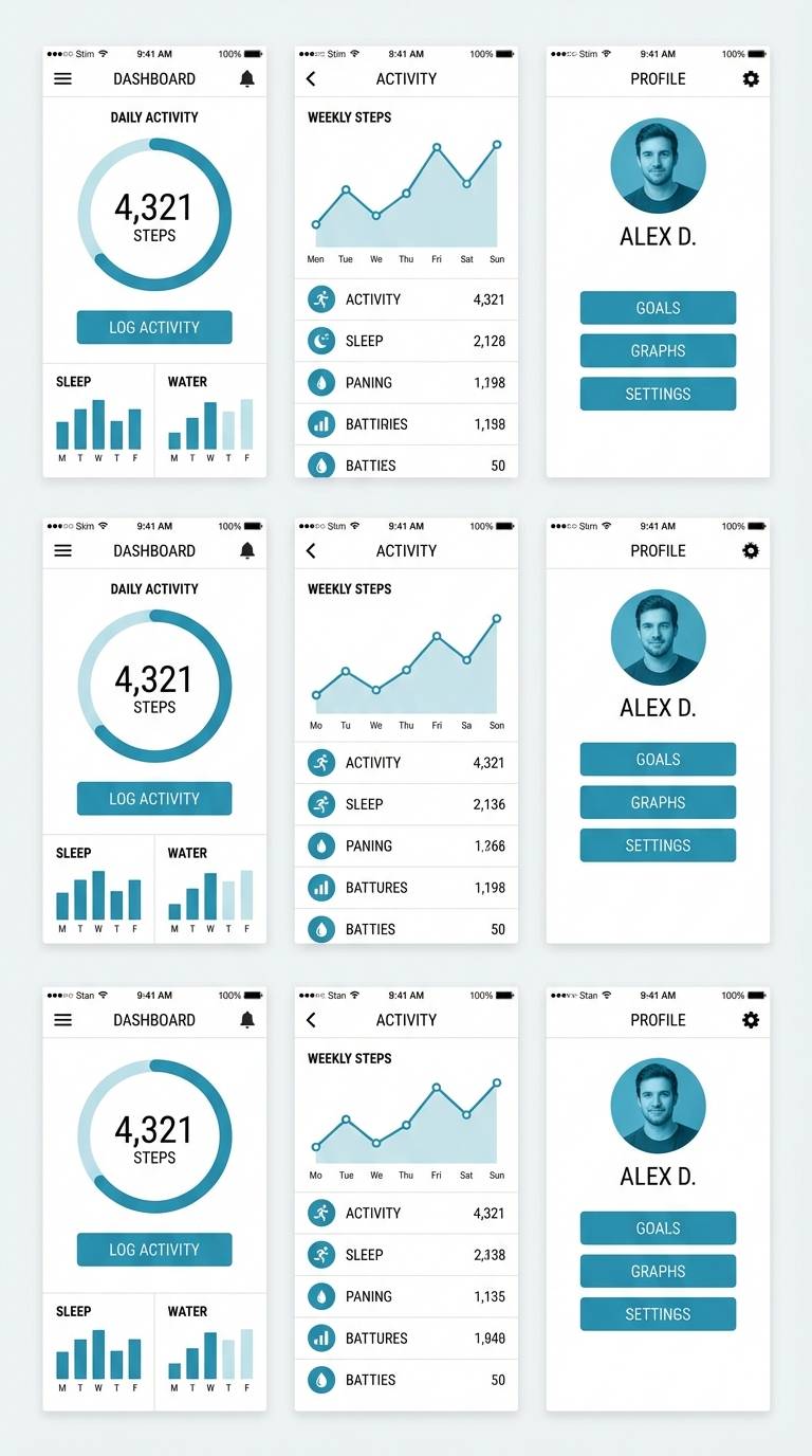
Best for: saas dashboard ui
Fresh and coastal, it feels like sunlight on clear water and sea glass underfoot. Use the deep teal for headers, the brighter aqua for primary actions, and the pale mist as your canvas. Warm sand keeps the mix from turning icy and pairs well with natural textures. Tip: reserve the brightest aqua for one button style to keep hierarchy obvious.
Image example of tidal glass generated using media.io
Media.io is an online AI studio for creating and editing video, image, and audio in your browser.

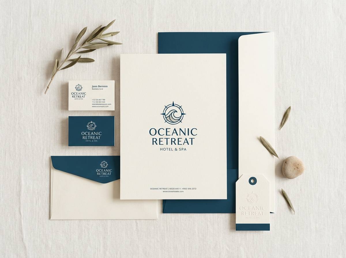
2) Harbor Night
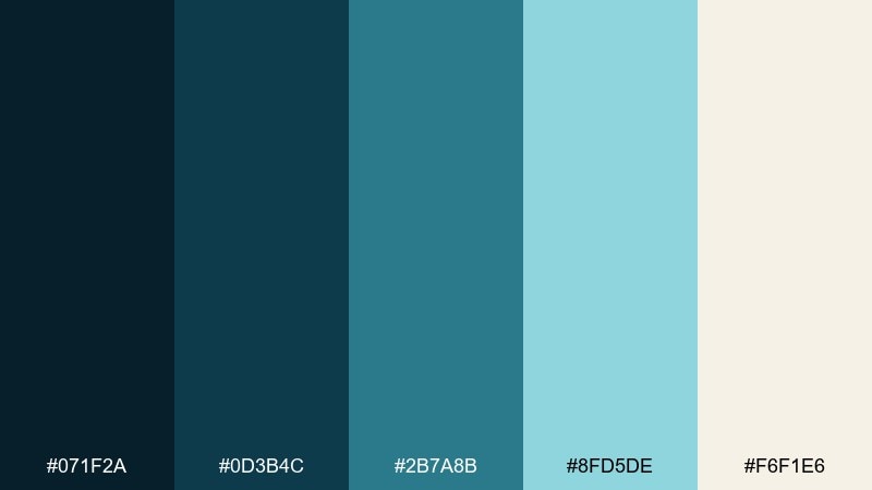
HEX: #071f2a #0d3b4c #2b7a8b #8fd5de #f6f1e6
Mood: moody, elegant, nautical
Best for: luxury hotel branding
Moody and refined, it evokes harbor lights reflecting on dark water. Anchor the identity with inky navy and deep teal, then lift it with airy aqua highlights. The warm off-white keeps premium materials like paper and linen feeling inviting. Tip: use the pale aqua sparingly on logos and signage so it reads like a glow, not a fill.
Image example of harbor night generated using media.io
3) Seafoam Sand
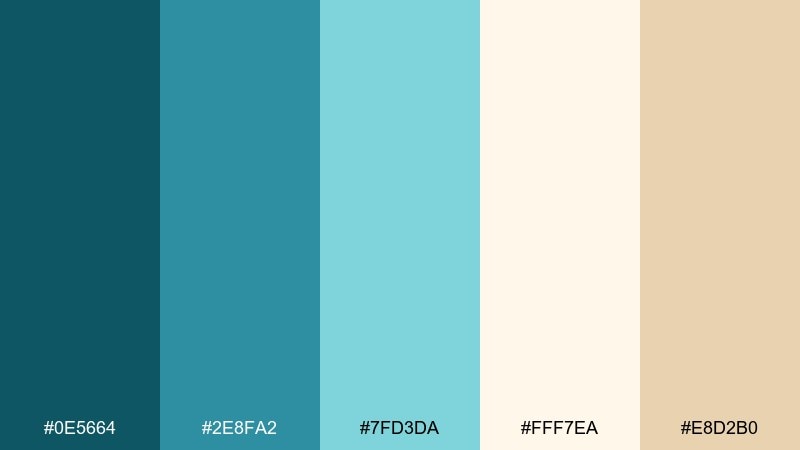
HEX: #0e5664 #2e8fa2 #7fd3da #fff7ea #e8d2b0
Mood: relaxed, sunny, beachy
Best for: wellness landing page
Relaxed and sunny, it reads like gentle waves rolling onto warm sand. The mid sea blues work beautifully for calm section bands and icon fills, while seafoam keeps components light. Pair it with soft photography and rounded corners for a restorative feel. Tip: set body text in a near-black, not the darkest teal, to preserve readability.
Image example of seafoam sand generated using media.io
4) Coral Buoy
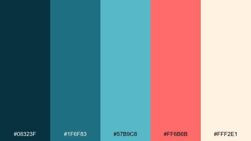
HEX: #08323f #1f6f83 #57b9c8 #ff6b6b #fff2e1
Mood: playful, bold, modern
Best for: summer event poster
Playful and punchy, it feels like bright coral buoys against open water. These sea blue color combinations shine when coral is treated as a true accent against clean creams and cool teals. Keep type large and simple so the contrast reads from a distance. Tip: limit coral to one headline and a callout badge for maximum pop.
Image example of coral buoy generated using media.io
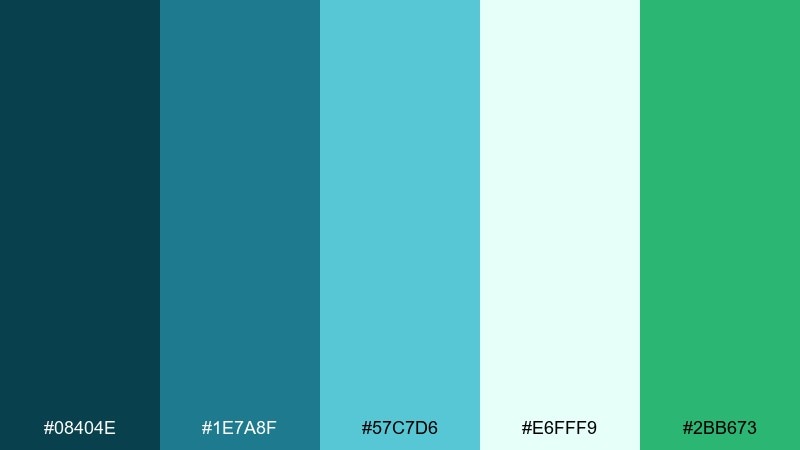
5) Deep Current
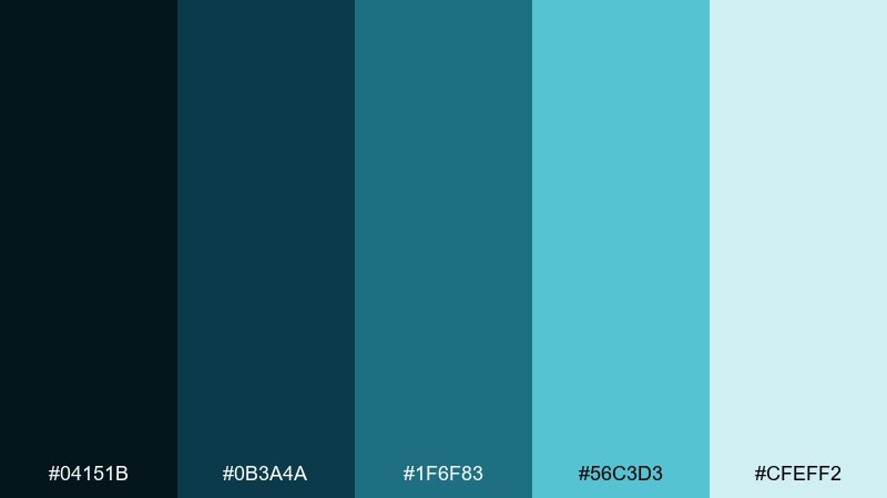
HEX: #04151b #0b3a4a #1f6f83 #56c3d3 #cfeff2
Mood: sleek, technical, focused
Best for: cybersecurity product page
Sleek and technical, it suggests deep currents and quiet power. Use the near-black as your foundation, then layer sea blue tones for navigation and data visuals. The pale cyan keeps tables and panels feeling breathable, not heavy. Tip: apply the brightest cyan only to interactive states like hover and focus rings.
Image example of deep current generated using media.io

6) Dune Mist
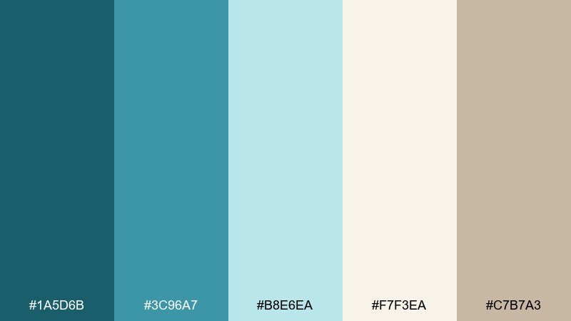
HEX: #1a5d6b #3c96a7 #b8e6ea #f7f3ea #c7b7a3
Mood: soft, airy, understated
Best for: interior design mood board
Soft and airy, it brings to mind fog over dunes and weathered driftwood. The muted teal works well as a paint swatch or textile cue, while misty cyan keeps the board light. Add the warm stone neutral to balance cooler materials like glass and chrome. Tip: keep contrast high in labels so your swatches stay the hero.
Image example of dune mist generated using media.io
7) Glacier Bay
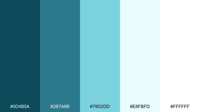
HEX: #0d4b5a #2b7a8b #79d2dd #e8fbfd #ffffff
Mood: crisp, minimal, modern
Best for: health app ui
Crisp and minimal, it looks like glacial water under bright daylight. Keep the interface mostly white and use the sea blues to define navigation and progress states. The pale cyan is perfect for background fills behind charts and micro-panels. Tip: pair with a single neutral gray for text so the blues stay clean, not muddy.
Image example of glacier bay generated using media.io
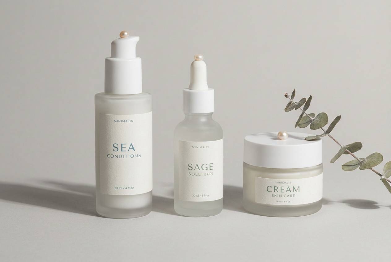
8) Kelp & Pearl
HEX: #0a2e36 #0f5866 #5fb8c4 #f3f2ee #8a9b7a
Mood: earthy, calm, organic
Best for: eco skincare packaging
Earthy and calm, it feels like kelp forests and pearly shells. Use the sea-blue midtone for the main label color and let the soft pearl read as a natural base. The muted green plays nicely with botanical ingredients and recycled materials. Tip: print the darkest shade for small type to avoid low-contrast blur on textured paper.
Image example of kelp & pearl generated using media.io
9) Sailcloth White
HEX: #0b3a44 #1f6f83 #97dbe3 #ffffff #d9d6cf
Mood: nautical, tidy, classic
Best for: corporate presentation slides
Tidy and classic, it recalls crisp sailcloth and polished deck hardware. Keep most slides white, then use sea blue for section dividers and key metrics. The light cyan is ideal for subtle charts and table row fills without stealing focus. Tip: stick to one bold blue for all headings to make decks feel cohesive fast.
Image example of sailcloth white generated using media.io
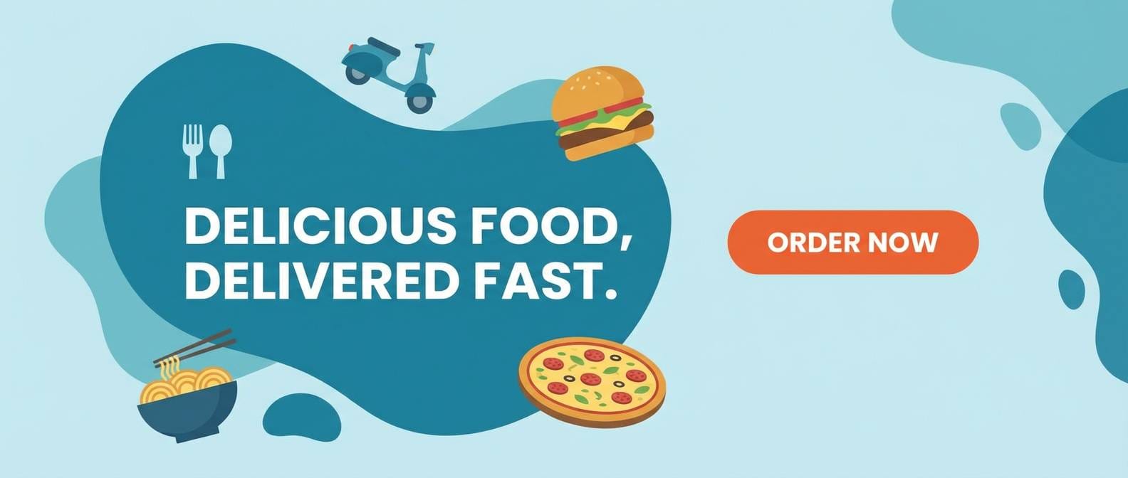
10) Lagoon Punch
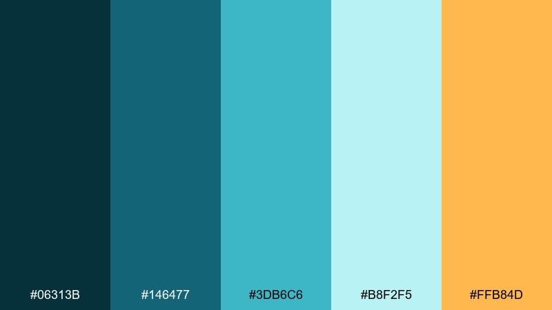
HEX: #06313b #146477 #3db6c6 #b8f2f5 #ffb84d
Mood: energetic, youthful, sunny
Best for: food delivery app promo banner
Energetic and sunny, it feels like a lagoon splash with a citrus twist. The warm orange is a natural CTA accent against clean sea-blue gradients. Keep typography bold and spacing generous so the palette stays fresh rather than loud. Tip: use orange only for the primary button and discount badge to guide the eye.
Image example of lagoon punch generated using media.io
11) Stormy Pier
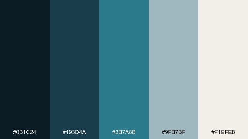
HEX: #0b1c24 #193d4a #2b7a8b #9fb7bf #f1efe8
Mood: stormy, mature, grounded
Best for: financial app ui
Stormy and grounded, it suggests wet timber and rolling clouds over the pier. Use the charcoal and deep teal for trustworthy navigation, then bring in the mid sea-blue for key actions. The cool gray-blue supports charts without turning the UI too bright. Tip: reserve the lightest neutral for cards so content stays readable on dark sections.
Image example of stormy pier generated using media.io
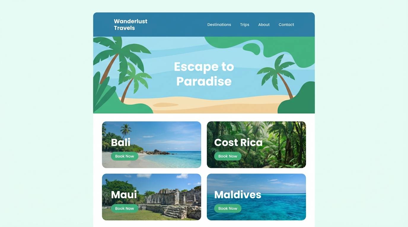
12) Tropical Shade
HEX: #08404e #1e7a8f #57c7d6 #e6fff9 #2bb673
Mood: tropical, lively, refreshing
Best for: travel agency homepage
Lively and refreshing, it brings to mind shaded palms and bright water. Keep the layout airy with minty off-white, then use sea-blue for navigation and feature blocks. The green accent works best as a secondary highlight for price tags or availability chips. Tip: pair with high-saturation photos, but keep overlays semi-opaque so text remains crisp.
Image example of tropical shade generated using media.io
13) Marina Rose
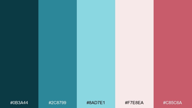
HEX: #0b3a44 #2c8799 #8ad7e1 #f7e8ea #c85c6a
Mood: romantic, modern, polished
Best for: beauty brand social posts
Romantic and polished, it feels like soft blush light at the marina. These sea blue color combinations look sophisticated when rose is kept muted and used for small highlights. Let the pale blush act as negative space while aqua supports product callouts and icons. Tip: use consistent margin and type scale so the color contrast does the storytelling.
Image example of marina rose generated using media.io
14) Aquarium Light
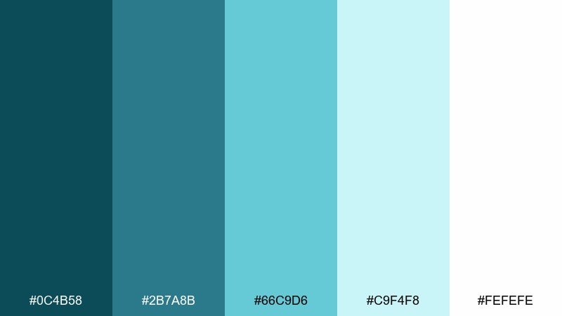
HEX: #0c4b58 #2b7a8b #66c9d6 #c9f4f8 #fefefe
Mood: bright, friendly, open
Best for: customer support ui
Bright and friendly, it resembles aquarium light dancing across glass. Use the mid sea-blue as the primary brand color and let the lighter tints carry backgrounds and badges. White space is essential here, especially around form fields and help content. Tip: choose one tint for info banners and keep all other highlights neutral for clarity.
Image example of aquarium light generated using media.io
15) Vintage Nautical
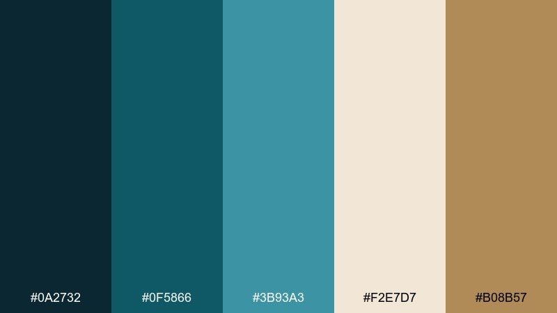
HEX: #0a2732 #0f5866 #3b93a3 #f2e7d7 #b08b57
Mood: vintage, warm, artisanal
Best for: coffee shop menu
Warm and vintage, it recalls old maps, rope, and sun-faded paint. The deep blue-green works well for menu headings, while sand and tan keep the paper feeling handcrafted. Add the brass-like brown for dividers and price highlights without overpowering the type. Tip: avoid pure black and use the darkest teal for body text to soften the look.
Image example of vintage nautical generated using media.io
16) Blueprint Reef
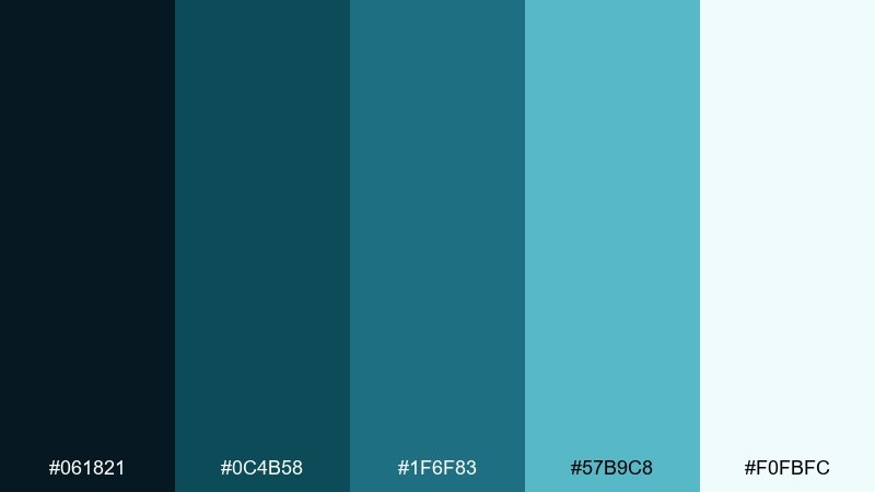
HEX: #061821 #0c4b58 #1f6f83 #57b9c8 #f0fbfc
Mood: structured, smart, contemporary
Best for: data visualization dashboard
Structured and smart, it feels like a blueprint overlaid on reef water. Use the dark base for high-contrast charts and the brighter sea blues for series colors and key markers. Keep the background nearly white so dense data does not feel heavy. Tip: assign one hue to each metric and keep it consistent across all views for faster scanning.
Image example of blueprint reef generated using media.io
17) Calm Spa Stone
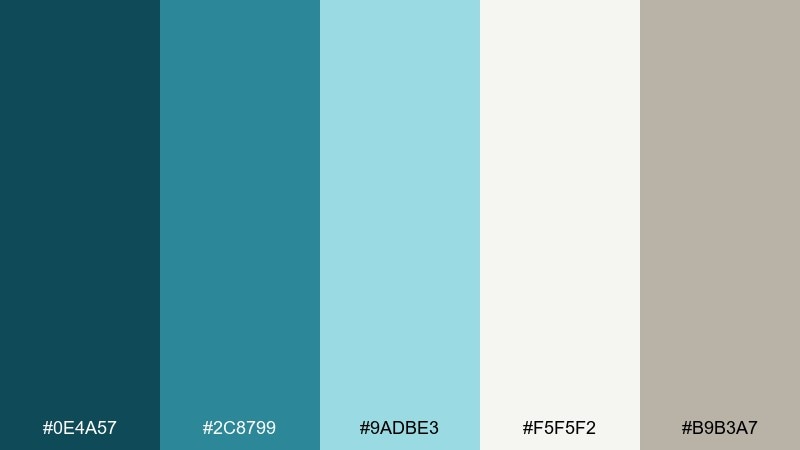
HEX: #0e4a57 #2c8799 #9adbe3 #f5f5f2 #b9b3a7
Mood: calming, clean, spa-like
Best for: spa brochure
Calming and clean, it suggests cool water over smooth stone. The sea-blue midtones are perfect for section headers and service highlights, while the soft gray keeps whitespace warm. Pair it with thin-line icons and plenty of breathing room for a premium spa feel. Tip: use the light aqua as a background wash behind testimonials to create gentle emphasis.
Image example of calm spa stone generated using media.io
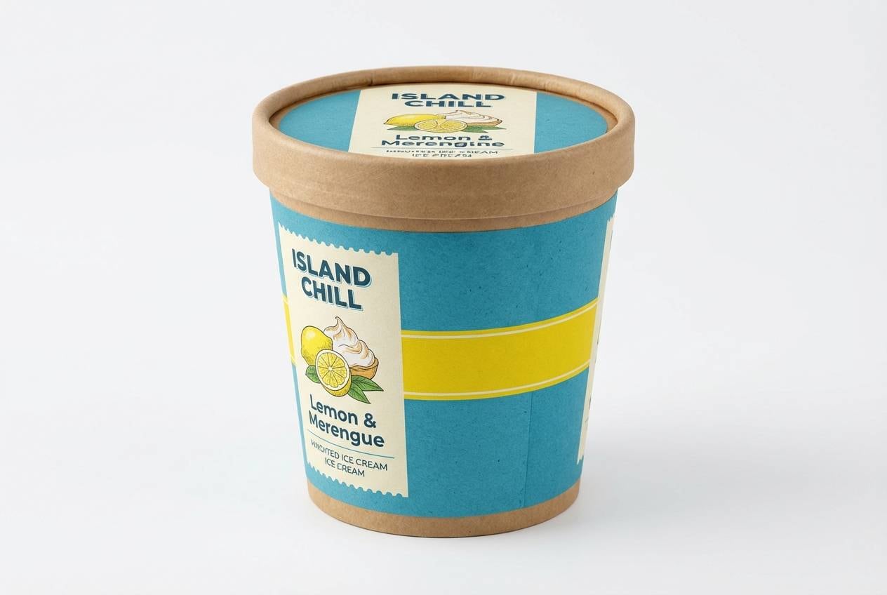
18) Seaside Citrus
HEX: #0b3a44 #1f6f83 #76d1dc #fff7e6 #ffd166
Mood: cheerful, summery, inviting
Best for: ice cream packaging
Cheerful and summery, it feels like seaside treats under a bright sky. The creamy base keeps the design appetizing, while sea blues add freshness and trust. Citrus yellow is best as a small flavor marker or lid stripe for instant shelf recognition. Tip: keep the darkest teal for ingredient text to avoid legibility issues on light creams.
Image example of seaside citrus generated using media.io
19) Pebble Shore
HEX: #0a2b33 #145b6a #4fb3c2 #d7e1e3 #8a7f76
Mood: neutral, balanced, modern
Best for: architecture portfolio site
Neutral and balanced, it resembles pebbles on a cool shoreline. Use the deep teal for navigation and the lighter aqua for hover states, then let the grays handle typography and grids. The warm stone note keeps the palette from feeling overly corporate. Tip: apply the aqua as a thin underline or rule rather than a big block for a sharp editorial look.
Image example of pebble shore generated using media.io
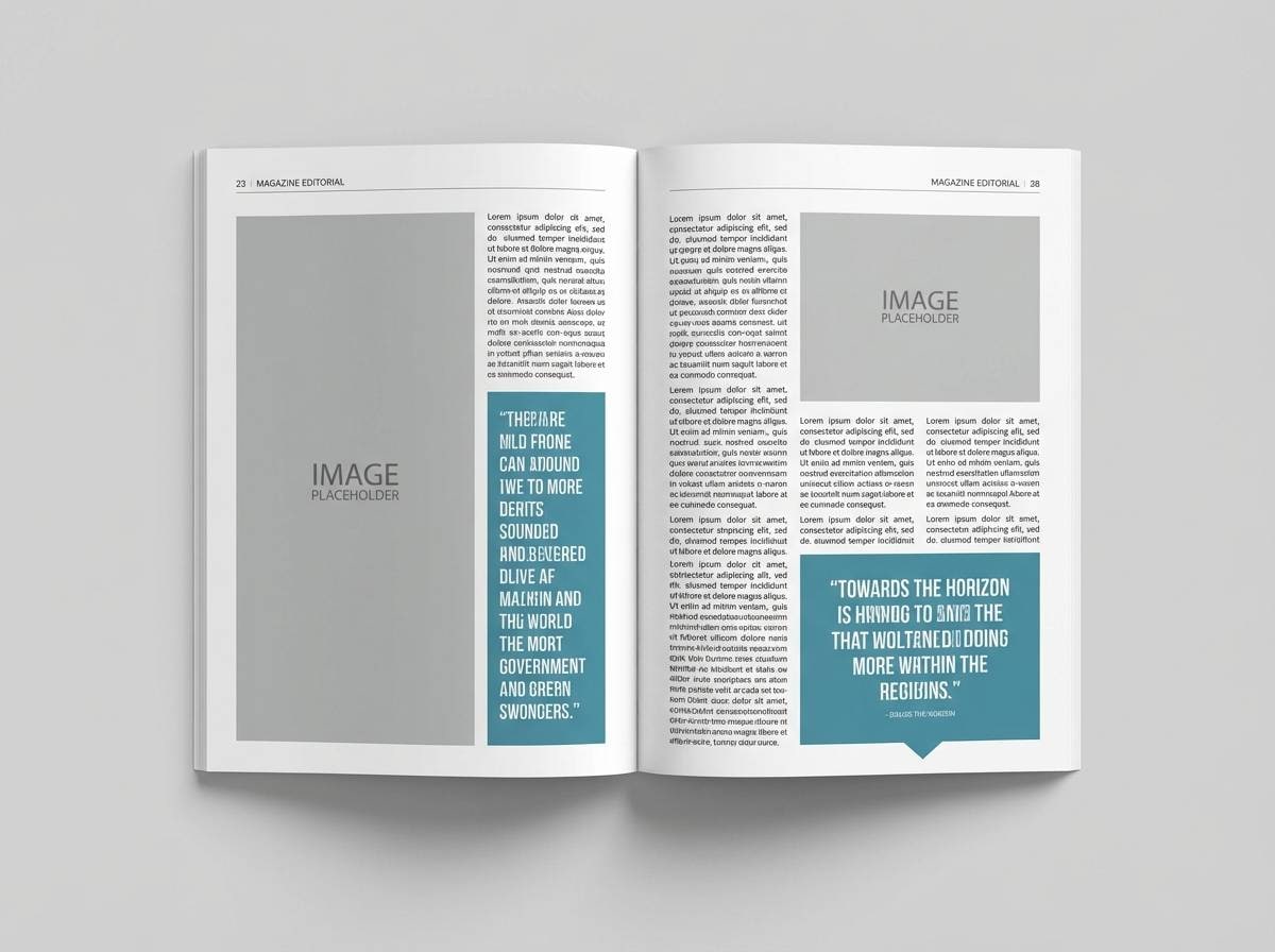
20) Ocean Editorial
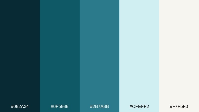
HEX: #082a34 #0f5866 #2b7a8b #cfeff2 #f7f5f0
Mood: editorial, refined, intelligent
Best for: magazine feature layout
Refined and intelligent, it reads like a long-form ocean feature with airy margins. Use the darker sea blues for pull quotes and section markers, keeping body text in near-black for comfort. The pale cyan is excellent for sidebars and data callouts. Tip: keep accent usage consistent across spreads to make the layout feel intentional rather than decorative.
Image example of ocean editorial generated using media.io
21) Seagrass Blossom
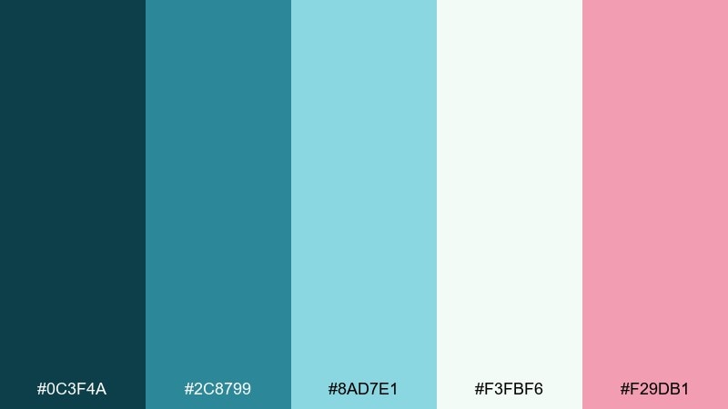
HEX: #0c3f4a #2c8799 #8ad7e1 #f3fbf6 #f29db1
Mood: light, floral, uplifting
Best for: spring wedding invitation
Light and uplifting, it suggests seagrass swaying beside soft blossoms. A balanced sea blue color palette like this works best when pink stays delicate and the blues do the heavy lifting. Use the pale mint-white for paper space and keep the darkest teal for names and key details. Tip: choose a slightly textured stock so the airy tints feel less digital.
Image example of seagrass blossom generated using media.io

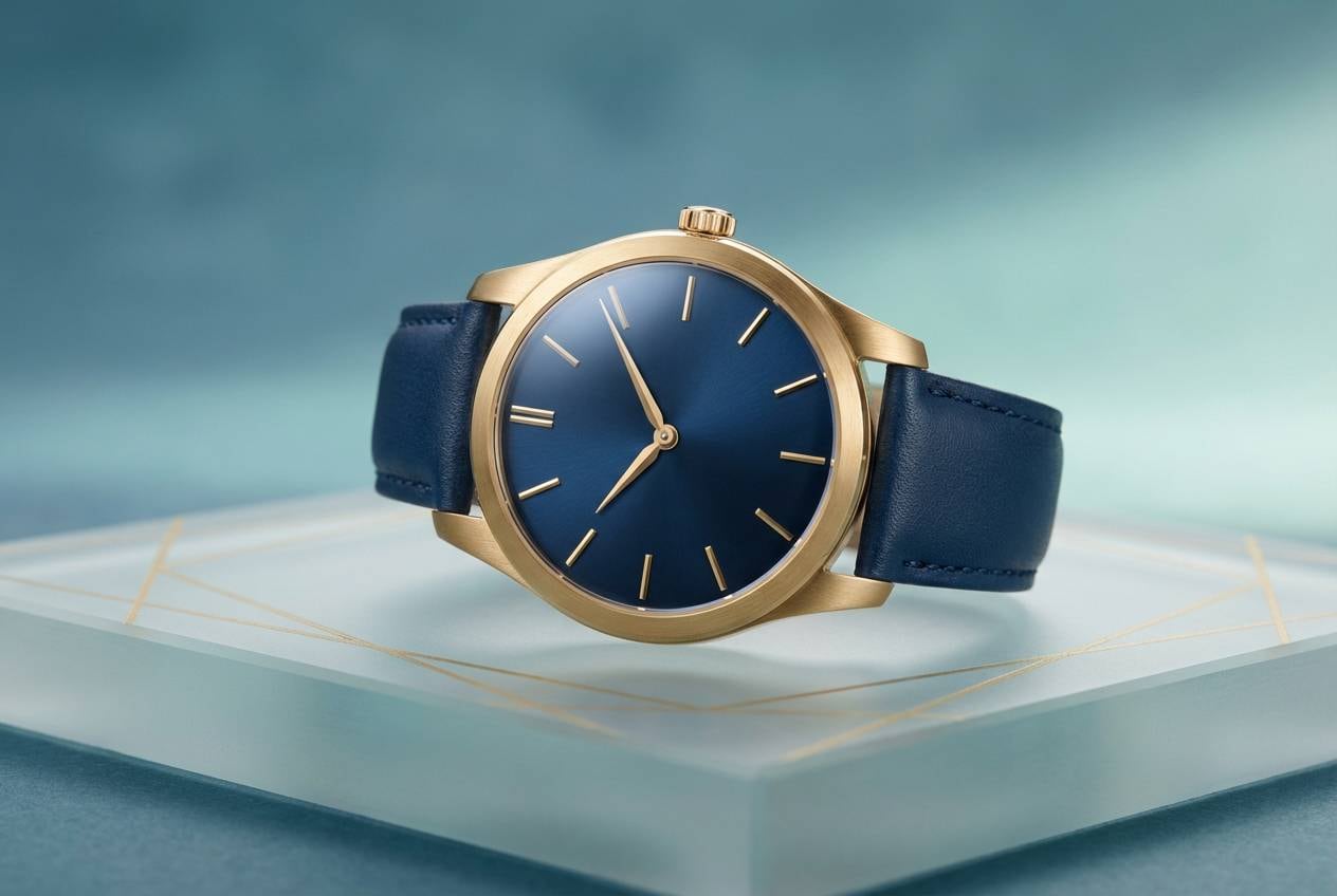
22) Poseidon Gold
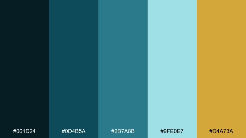
HEX: #061d24 #0d4b5a #2b7a8b #9fe0e7 #d4a73a
Mood: premium, dramatic, confident
Best for: watch product ad
Premium and dramatic, it feels like deep water with a flash of metal. Sea blue color combinations become instantly luxe when gold is used as a restrained highlight against darker tones. Keep backgrounds clean and let reflections and gradients do the work around the product. Tip: use gold only for one small detail, like a line, badge, or price, to avoid looking gaudy.
Image example of poseidon gold generated using media.io
What Colors Go Well with Sea Blue?
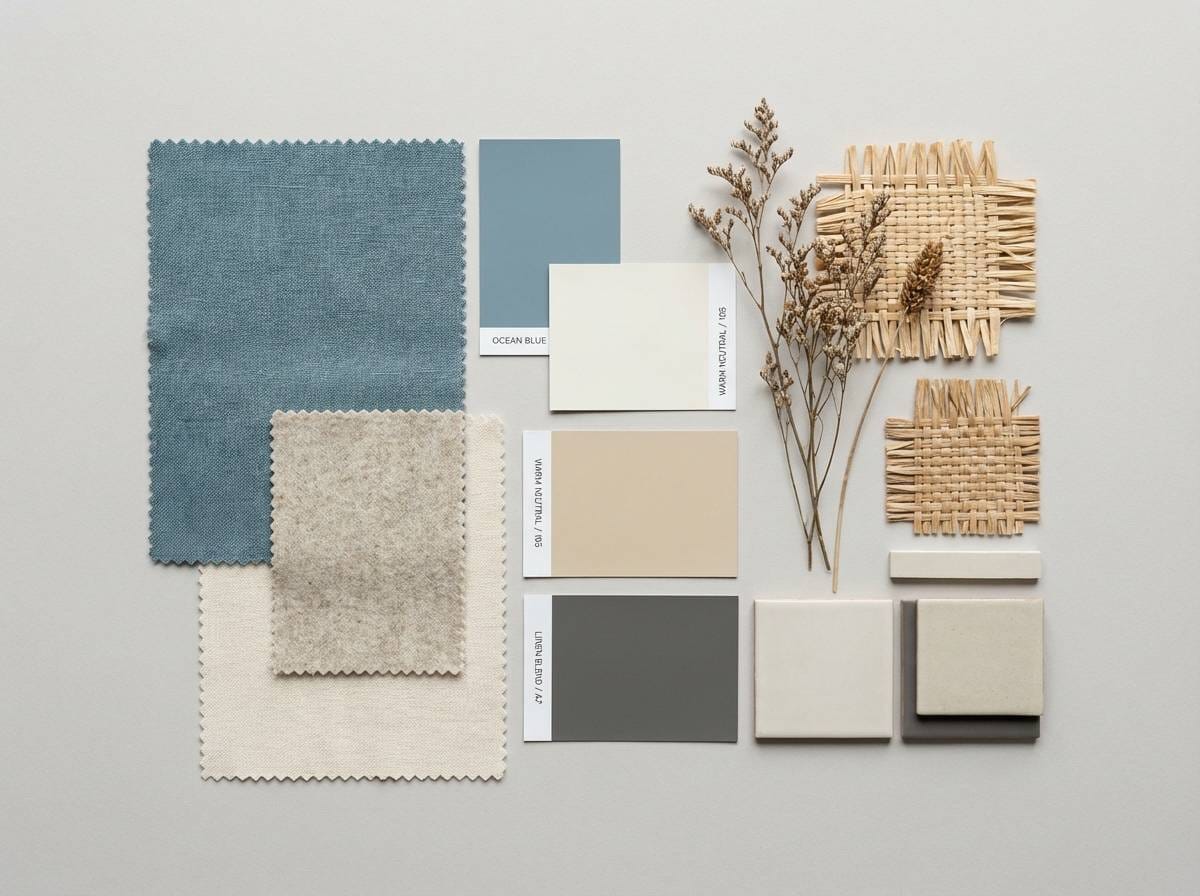
Warm neutrals like sand, cream, and soft beige make sea blue feel coastal and approachable. This is a strong route for packaging, hospitality, and lifestyle brands.
For modern UI, pair sea blue with crisp whites and cool grays to keep layouts legible and structured. Add one bright accent (citrus yellow or coral) for clear CTAs.
If you want a premium feel, combine darker sea-blue shades with metallic notes (gold or brass) and keep the highlight color restrained so it reads intentional.
How to Use a Sea Blue Color Palette in Real Designs
Start with roles, not swatches: pick one sea-blue midtone as your “brand primary,” a darker shade for headers/navigation, and a light tint for surfaces like cards or section backgrounds.
Use accents sparingly for hierarchy. One warm accent can define CTAs, badges, or key data points, while neutrals handle typography and spacing so screens don’t feel overly saturated.
For print, test contrast early. Sea-blue inks can shift on uncoated paper, so keep small text on the darkest shade and reserve lighter tints for large areas and patterns.
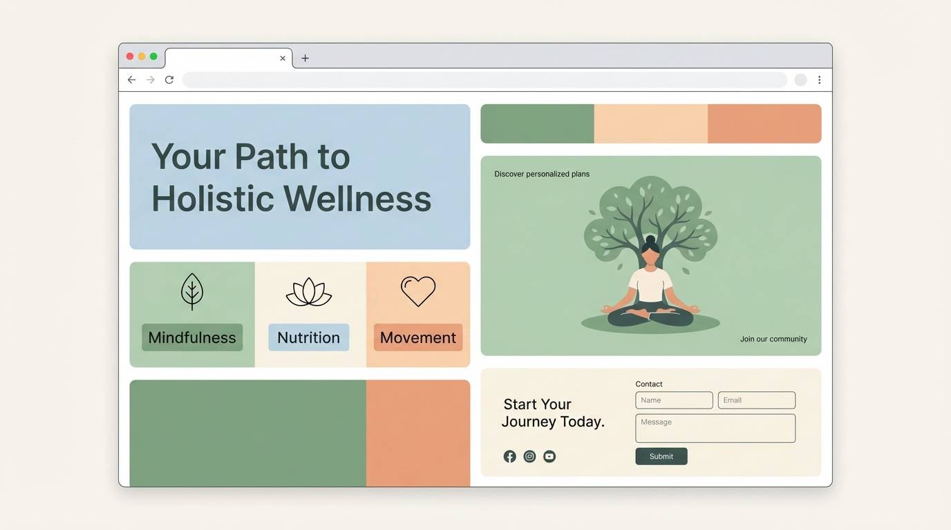
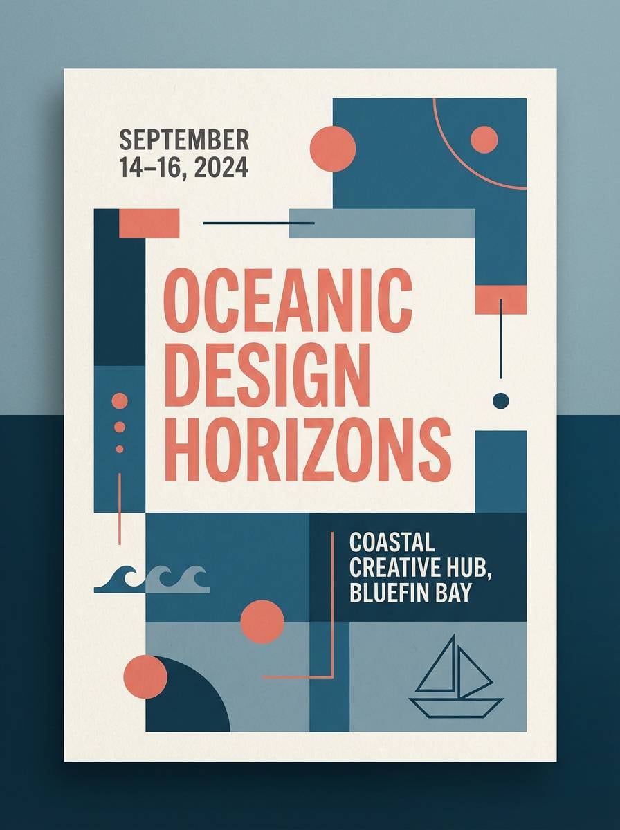
Create Sea Blue Palette Visuals with AI
If you’re building a mood board, UI mockup, or packaging concept, generating a few consistent visuals can help you validate the palette faster than swapping swatches in isolation.
With Media.io’s text-to-image, you can turn each palette’s prompt into on-brand examples (posters, dashboards, product ads) and iterate on style while keeping your sea-blue tones consistent.
Export the best options, then reuse the same palette across your design system for cohesive UI states, marketing creatives, and print collateral.
Sea Blue Color Palette FAQs
-
What is a sea blue color palette?
A sea blue color palette is a coordinated set of blues and blue-greens (teal/aqua) inspired by ocean water, typically mixed with light tints and a warm neutral (like sand or cream) for balance. -
Is sea blue more blue or green?
Sea blue usually sits between blue and green. Some palettes lean teal/green (more tropical), while others lean blue/navy (more nautical). The surrounding neutrals and accents can push the perception either way. -
What accent colors work best with sea blue?
Coral, citrus yellow, warm orange, blush pink, and metallic gold are common accents. The key is to use the accent as a small, high-contrast highlight so sea blue remains the main identity color. -
How do I keep sea blue UIs from feeling “cold”?
Add a warm off-white/cream background, include a warm accent (like sand, tan, or soft orange), and keep typography in a neutral near-black or dark gray instead of the deepest teal. -
Which sea blue palette is best for dark mode?
Look for palettes with a near-black base plus a bright cyan for interactive states (for example, Deep Current). This keeps contrast strong while preserving the sea-blue character. -
Do sea blue colors print well?
Yes, but results depend on paper and finish. On uncoated stock, sea-blue inks can look softer or greener; for small text, use the darkest shade, and proof your midtones before large print runs. -
How can I generate mockups using a sea blue palette?
Use Media.io text-to-image prompts (like the examples above) to generate UI screens, posters, or product shots, then iterate by specifying “sea blue accents,” “clean white base,” and your intended format ratio.


