

Emerald green is a jewel-tone classic: rich enough to feel premium, but flexible enough for modern UI, interiors, and wedding details.
Below are 20 curated emerald green color palette ideas with HEX codes, plus practical pairing tips and AI prompts you can reuse to generate visuals fast.
In this article
- Why Emerald Green Palettes Work So Well
-
- deep forest luxe
- botanical cream
- art deco emerald
- coastal teal mist
- midnight marble
- sage and emerald calm
- citrus grove pop
- copper patina
- velvet wine accent
- minimal ink and emerald
- dusty rose garden
- golden olive heritage
- neon mint edge
- rainy day greens
- desert cactus chic
- winter pine glow
- peacock jewel box
- stone and moss neutral
- tropical leaf splash
- modern emerald ui
- What Colors Go Well with Emerald Green?
- How to Use a Emerald Green Color Palette in Real Designs
- Create Emerald Green Palette Visuals with AI
Why Emerald Green Palettes Work So Well
Emerald green sits in a sweet spot: it reads as natural (plants, forests) while also feeling polished and “designed” like a gemstone. That dual personality makes it easy to use across industries—from wellness to finance.
It also supports strong contrast. Deep emeralds can anchor layouts like a near-neutral, while lighter mint and aqua tints create airy space for modern interfaces, photography overlays, and readable typography.
Finally, emerald pairs beautifully with warm metals and soft neutrals. Gold, sand, cream, blush, and copper can instantly shift the mood from minimal to luxurious without changing your core green.
20+ Emerald Green Color Palette Ideas (with HEX Codes)
1) Deep Forest Luxe
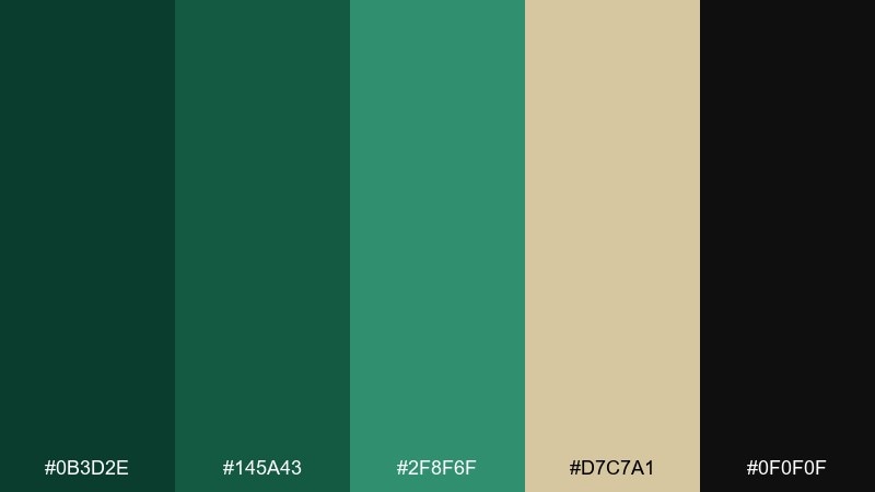
HEX: #0b3d2e #145a43 #2f8f6f #d7c7a1 #0f0f0f
Mood: luxurious and grounded
Best for: premium branding and packaging
Luxurious and grounded, like a candlelit lodge wrapped in evergreen shadows. The deep greens feel expensive, while warm sand softens the contrast and black adds authority. Use it for upscale labels, fragrance boxes, or boutique hotel collateral. Pair with uncoated paper and subtle gold foil, then reserve the light beige for typography to keep the look crisp.
Image example of deep forest luxe generated using media.io
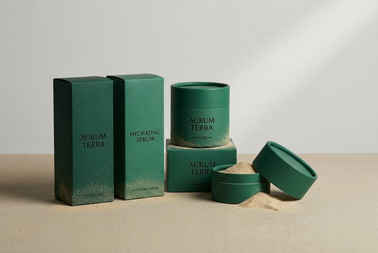
Media.io is an online AI studio for creating and editing video, image, and audio in your browser.

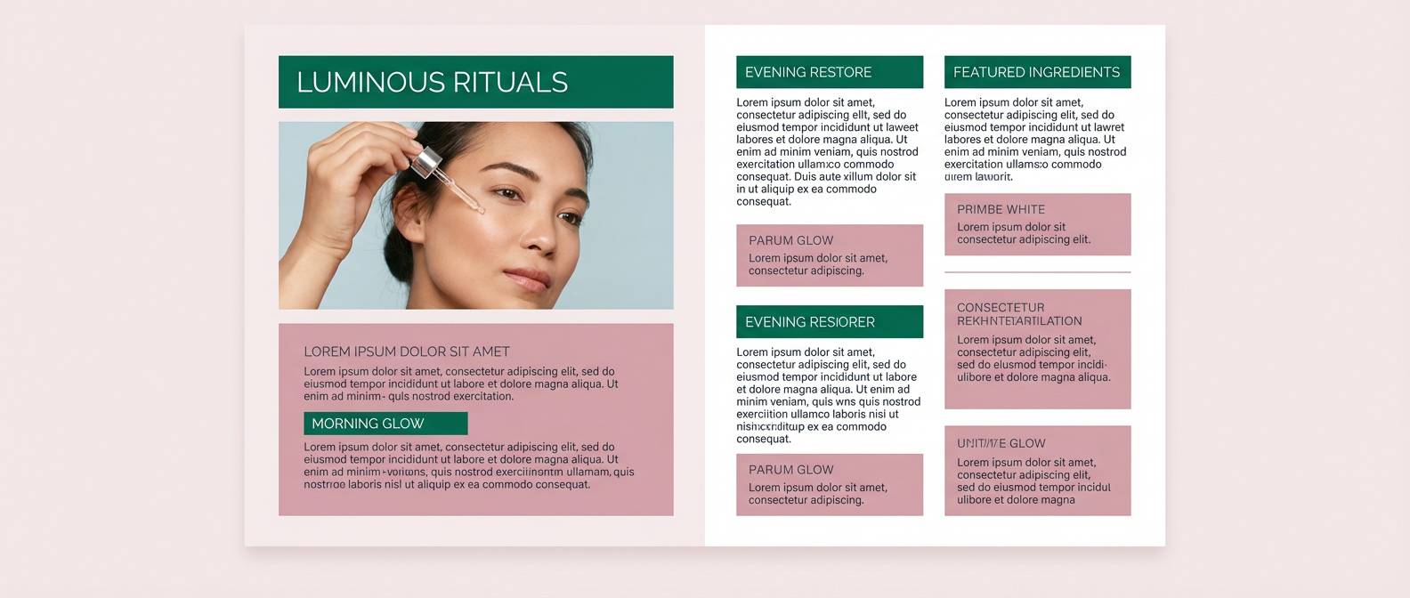
2) Botanical Cream
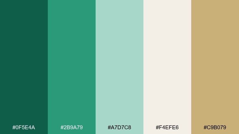
HEX: #0f5e4a #2b9a79 #a7d7c8 #f4efe6 #c9b079
Mood: fresh and restorative
Best for: spa menus and wellness websites
Fresh and restorative, like eucalyptus steam against soft linen. Cool greens stay airy thanks to the minty tint and creamy off-white, with a quiet antique-gold note for warmth. It works beautifully for wellness brands, apothecary labels, and calming landing pages. Keep the cream as the main background and use the darker green for headlines to maintain a gentle, readable hierarchy.
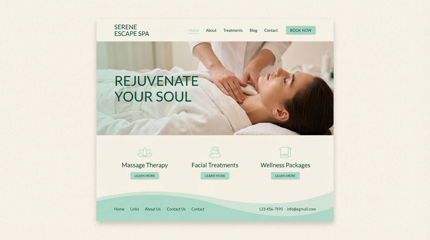
Image example of botanical cream generated using media.io
3) Art Deco Emerald
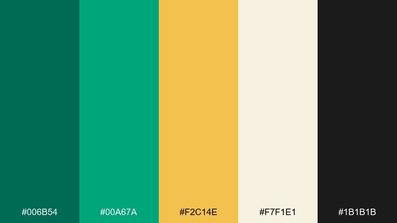
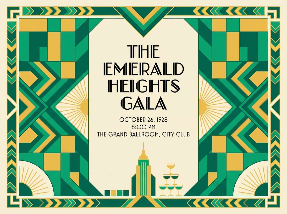
HEX: #006b54 #00a67a #f2c14e #f7f1e1 #1b1b1b
Mood: glamorous and geometric
Best for: event posters and gala invitations
Glamorous and geometric, like a theater marquee with polished brass. The emerald-to-teal greens feel energetic, while gold and black bring classic art deco drama. These emerald green color combinations shine on invitations, posters, and signage where you want instant impact. Use thin linework in gold over the dark green, and keep the cream for negative space so the design does not get heavy.
Image example of art deco emerald generated using media.io
4) Coastal Teal Mist
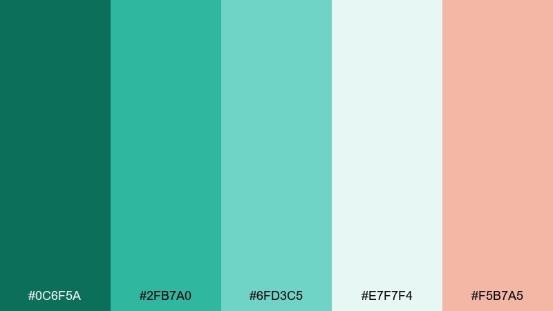
HEX: #0c6f5a #2fb7a0 #6fd3c5 #e7f7f4 #f5b7a5
Mood: bright and breezy
Best for: summer social graphics
Bright and breezy, like sea glass and salty air on a pale morning. The teal-leaning greens keep things playful, and the soft coral adds a friendly pop without shouting. Try it for beach event promos, travel posts, and lighthearted brand stories. Use coral only for calls to action, and let the misty near-white carry the background for a clean, modern feel.
Image example of coastal teal mist generated using media.io

5) Midnight Marble
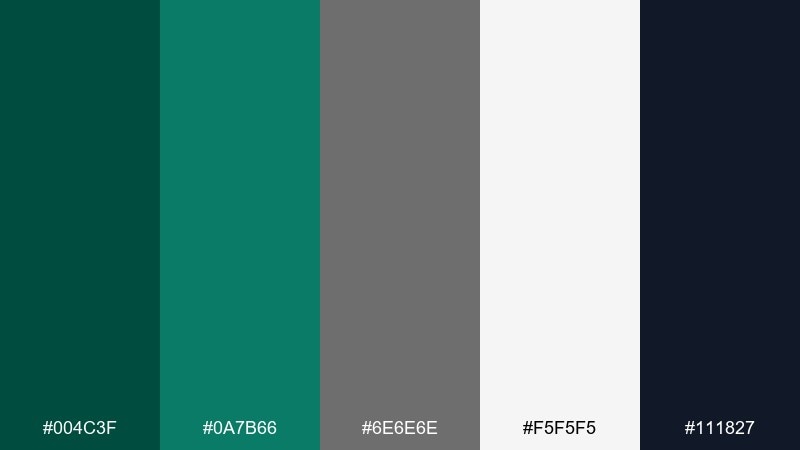
HEX: #004c3f #0a7b66 #6e6e6e #f5f5f5 #111827
Mood: sleek and modern
Best for: tech presentations and pitch decks
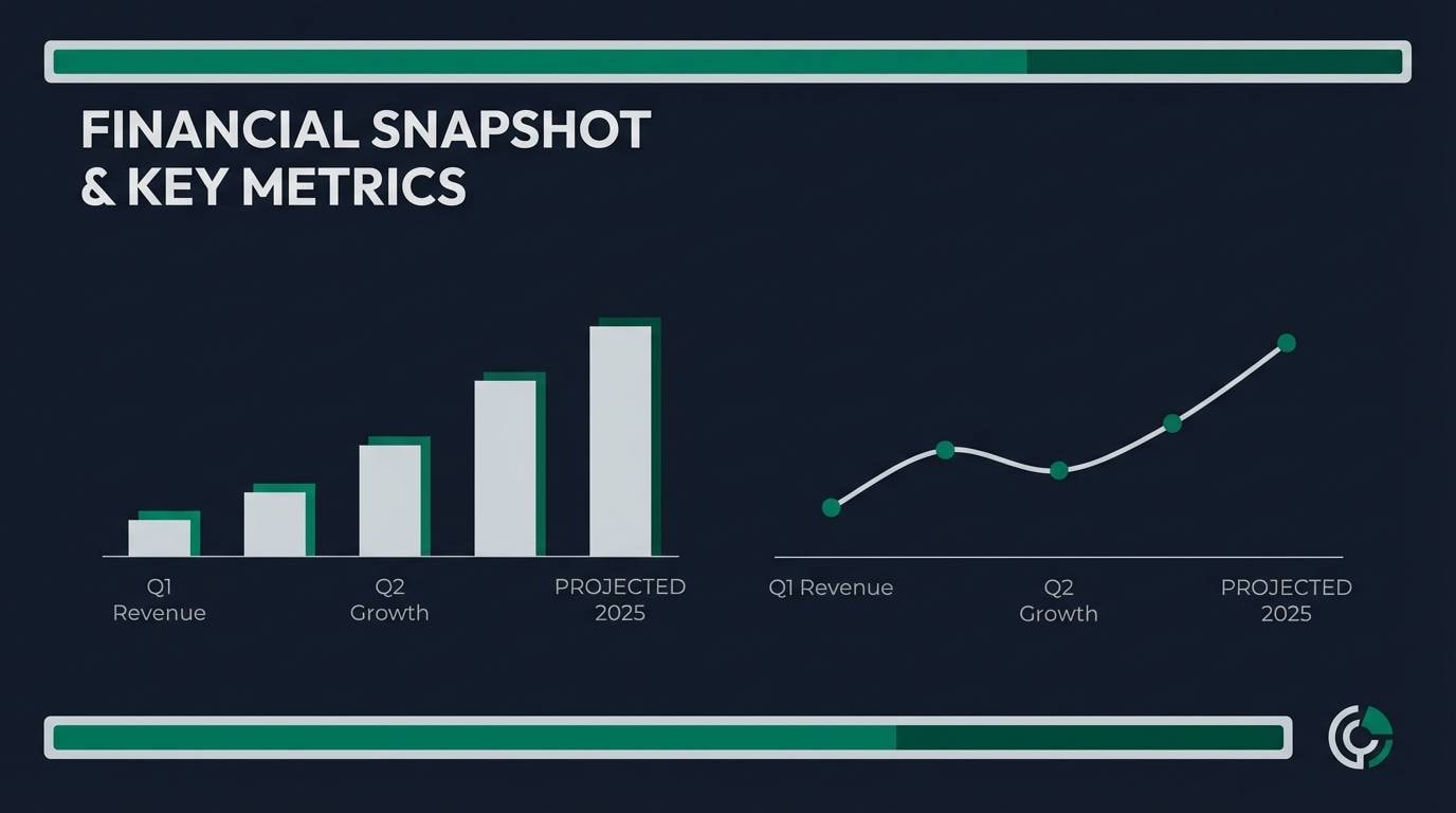
Sleek and modern, like dark stone with a polished edge. The near-black navy and charcoal keep it serious, while the emerald notes add confidence and clarity. It is ideal for SaaS decks, product one-pagers, and executive reports. Use the white and light gray for charts, then highlight key metrics with the brighter green to guide attention.
Image example of midnight marble generated using media.io
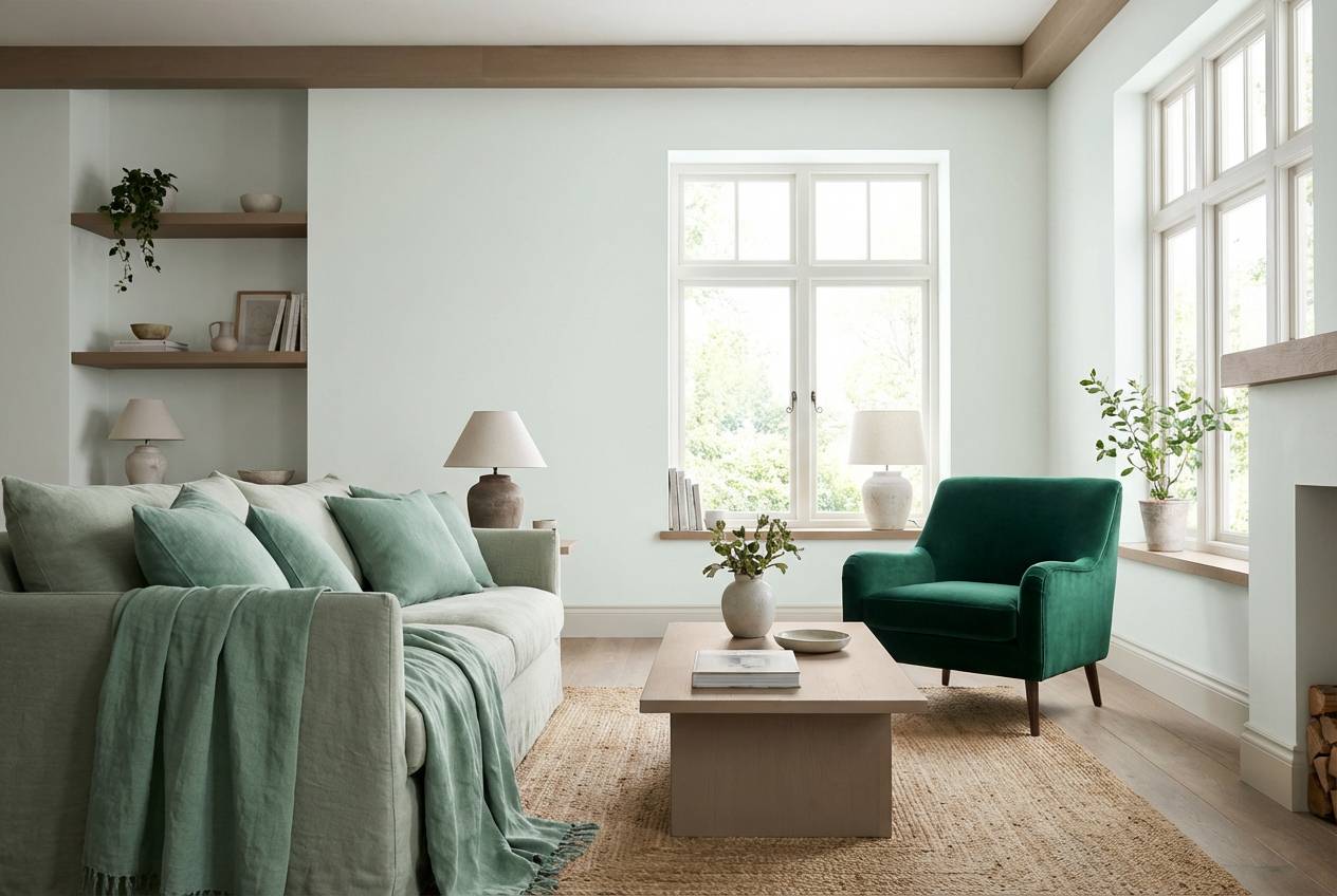
6) Sage and Emerald Calm
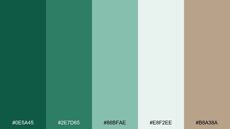
HEX: #0e5a45 #2e7d65 #86bfae #e8f2ee #b8a38a
Mood: calm and balanced
Best for: home interiors and lifestyle blogs
Calm and balanced, like dried herbs next to a glossy leaf. The softened sage tones make emerald feel more livable, and the warm taupe keeps the mix cozy. Use it for interior mood boards, blog headers, and soft product photography backdrops. A helpful tip is to repeat the taupe in textures like wood or linen so the greens read intentional, not cold.
Image example of sage and emerald calm generated using media.io
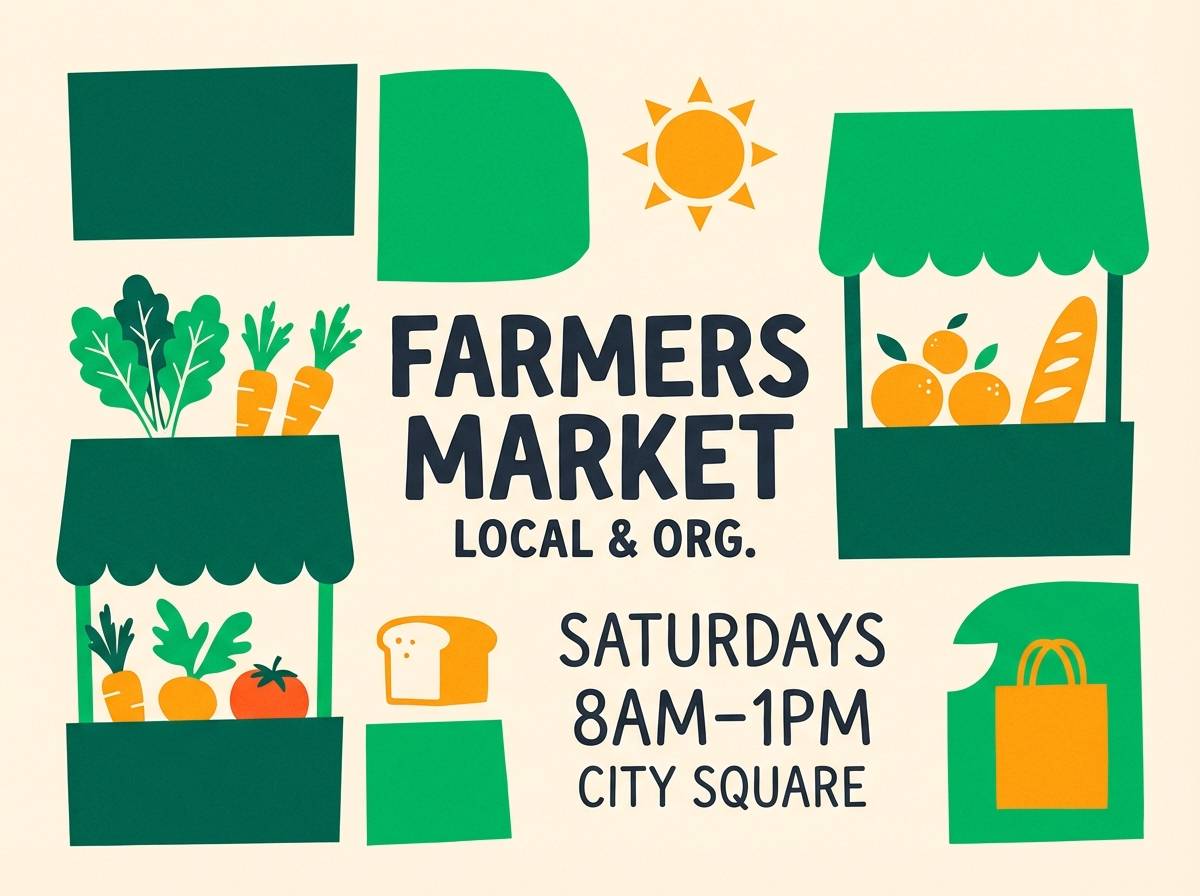
7) Citrus Grove Pop
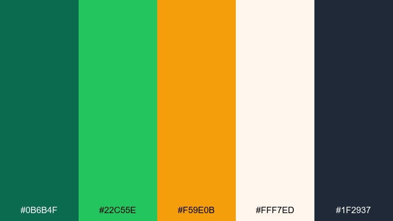
HEX: #0b6b4f #22c55e #f59e0b #fff7ed #1f2937
Mood: zesty and upbeat
Best for: food branding and farmers market posters
Zesty and upbeat, like fresh limes and orange peel on a cutting board. The vivid green feels energetic, and the warm amber adds appetite appeal without turning overly rustic. Great for juice labels, cafe menus, and market flyers that need instant shelf visibility. Keep the dark slate for text and outlines, and use the pale cream to avoid oversaturating the layout.
Image example of citrus grove pop generated using media.io
8) Copper Patina
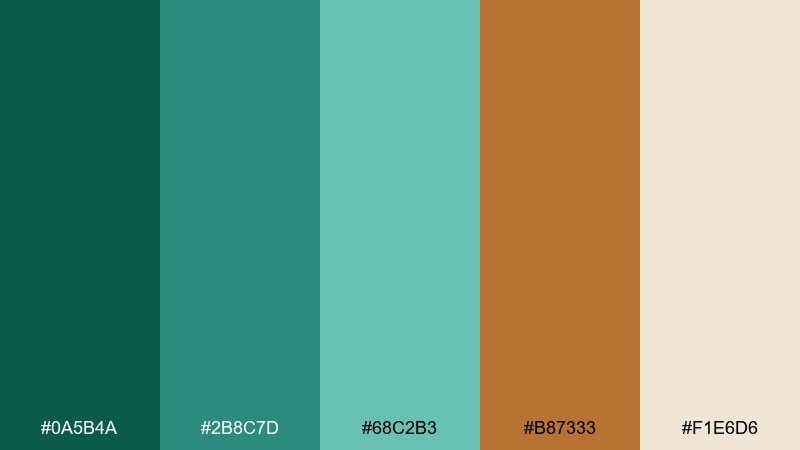
HEX: #0a5b4a #2b8c7d #68c2b3 #b87333 #f1e6d6
Mood: artisanal and warm
Best for: coffee packaging and craft labels
Artisanal and warm, like oxidized metal and hand-thrown ceramics. Patina greens feel tactile next to the copper accent, while the creamy base keeps everything approachable. Use it for craft product labels, roastery bags, and workshop branding. A strong move is to print copper as a spot color or foil, then keep the teal tones for background patterns and seals.
Image example of copper patina generated using media.io
9) Velvet Wine Accent
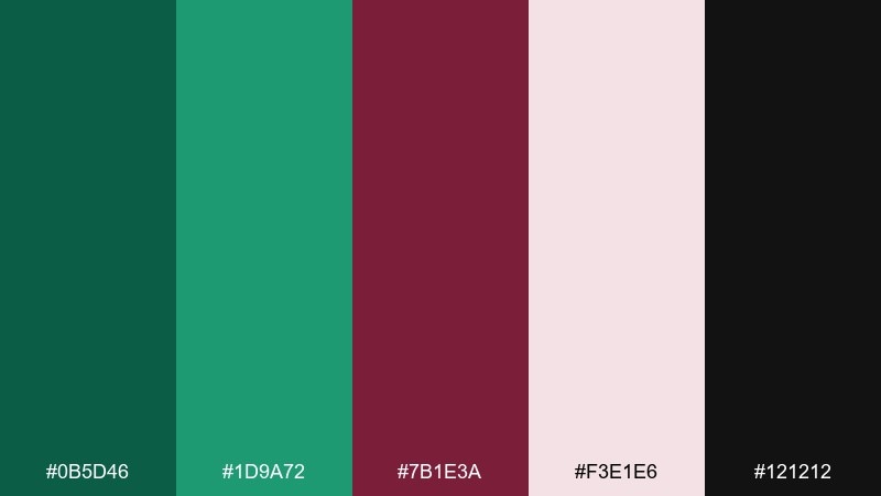
HEX: #0b5d46 #1d9a72 #7b1e3a #f3e1e6 #121212
Mood: romantic and moody
Best for: evening wedding stationery
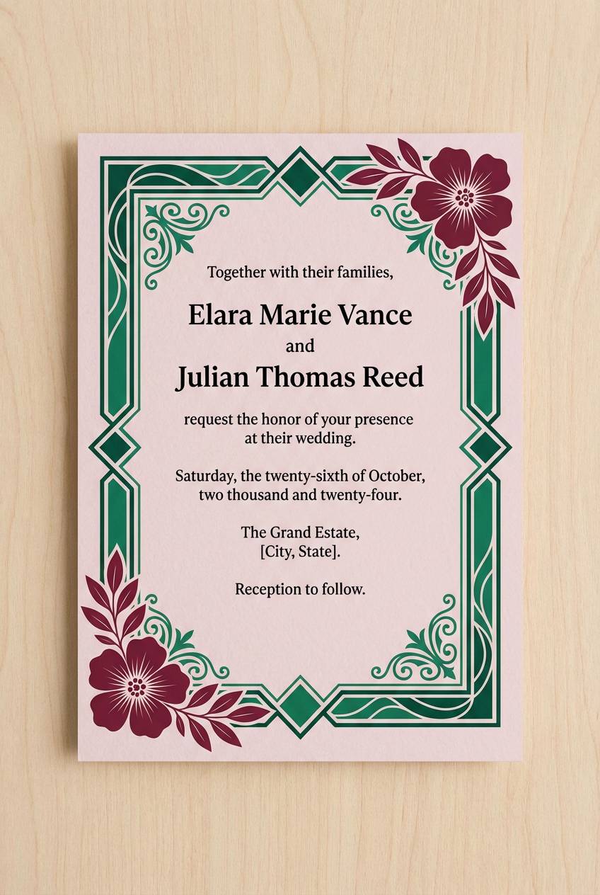
Romantic and moody, like velvet drapes and a deep red bouquet under low light. Emerald greens feel richer next to wine, and the blush tint keeps the palette from turning too heavy. Ideal for winter weddings, cocktail events, and upscale dinner invitations. Use black sparingly for typography, and let blush create breathing room around ornate details.
Image example of velvet wine accent generated using media.io
10) Minimal Ink and Emerald
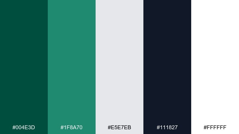
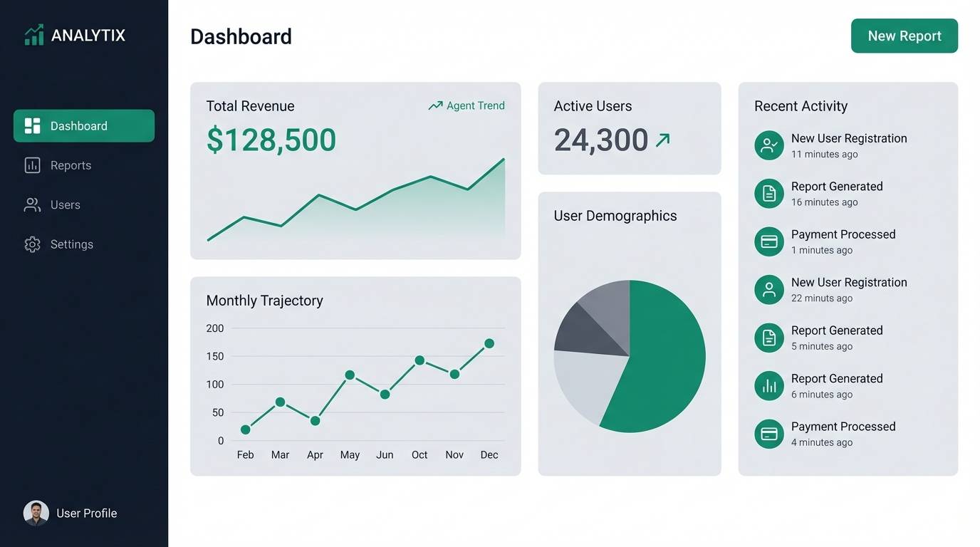
HEX: #004e3d #1f8a70 #e5e7eb #111827 #ffffff
Mood: clean and confident
Best for: dashboards and product UI
Clean and confident, like ink on bright paper with a sharp green highlighter. The dark base supports strong contrast, and the emerald accent adds a premium, trustworthy vibe. Use this emerald green color palette for analytics dashboards, finance apps, and admin tools where clarity matters most. Tip: reserve the brighter green for success states and primary buttons, and keep secondary actions in gray to avoid visual noise.
Image example of minimal ink and emerald generated using media.io
11) Dusty Rose Garden
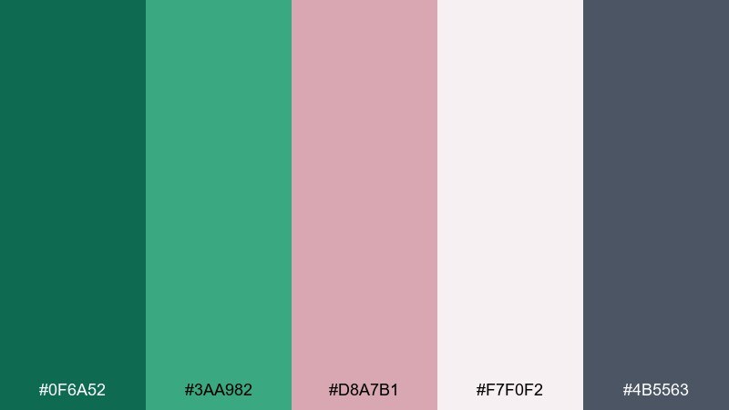
HEX: #0f6a52 #3aa982 #d8a7b1 #f7f0f2 #4b5563
Mood: soft and modern romantic
Best for: beauty branding and lookbooks
Soft and modern romantic, like rose petals on a rain-washed leaf. The muted pink makes the greens feel gentler, and slate gray keeps everything editorial. Perfect for skincare brands, beauty lookbooks, and lifestyle newsletters. Use the off-pink as the dominant field color, then add emerald as a confident accent for badges, pricing, or section headers.
Image example of dusty rose garden generated using media.io
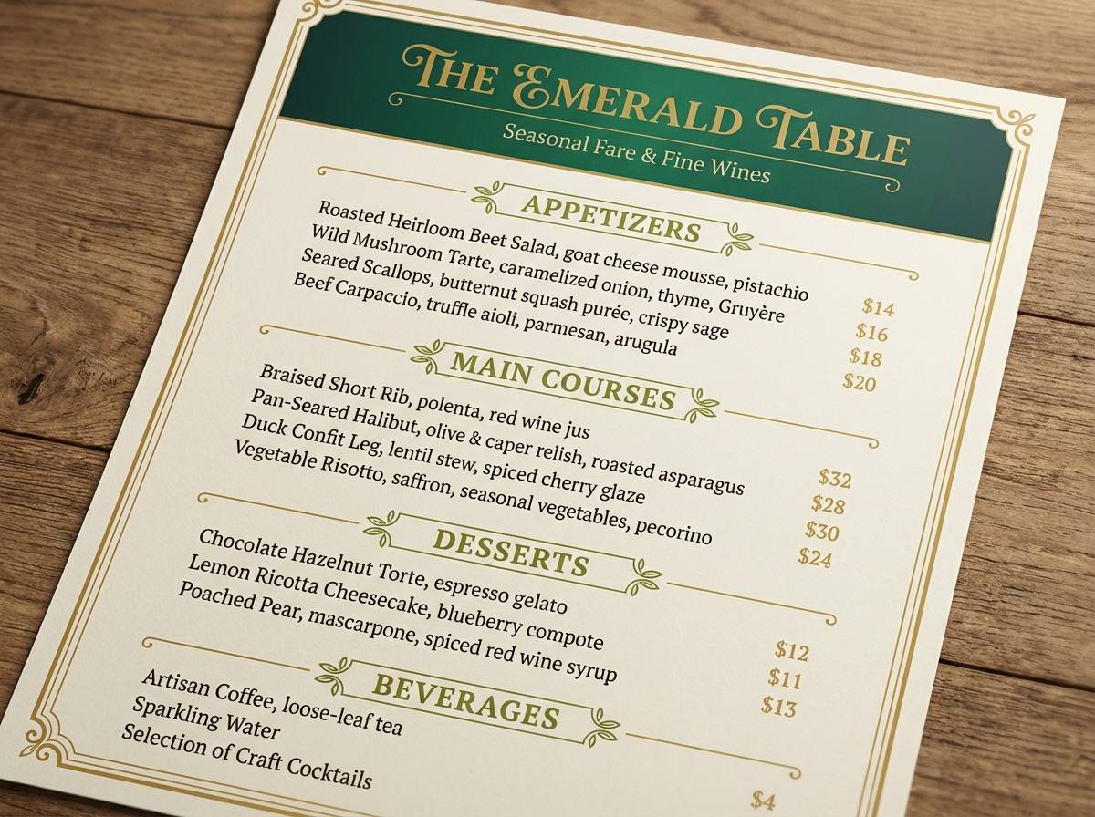
12) Golden Olive Heritage
HEX: #0b5a45 #2f7d62 #8a9b2f #d4af37 #f3efe4
Mood: heritage and elevated
Best for: restaurant menus and artisan brands
Heritage and elevated, like vintage apothecary glass and warm brass fixtures. Olive brings an earthy twist to emerald, and the gold adds an unmistakably premium finish. Use it for restaurant menus, olive oil labels, and heritage-inspired brand marks. A practical tip is to keep gold in small doses for rules and icons, letting the greens do the heavy lifting for backgrounds and panels.
Image example of golden olive heritage generated using media.io
13) Neon Mint Edge
HEX: #007a5e #3ef0c6 #0f172a #e2e8f0 #a3ffec
Mood: futuristic and bold
Best for: music posters and tech launches
Futuristic and bold, like glowing signage reflected on wet pavement. The neon mint punches through the dark navy, while the pale tints keep gradients and overlays looking clean. Great for launch pages, nightlife posters, and modern motion graphics. Use the bright mint only for focal elements such as dates or buttons, and keep most text in the light gray for legibility.
Image example of neon mint edge generated using media.io

14) Rainy Day Greens
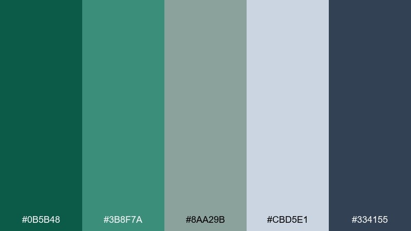
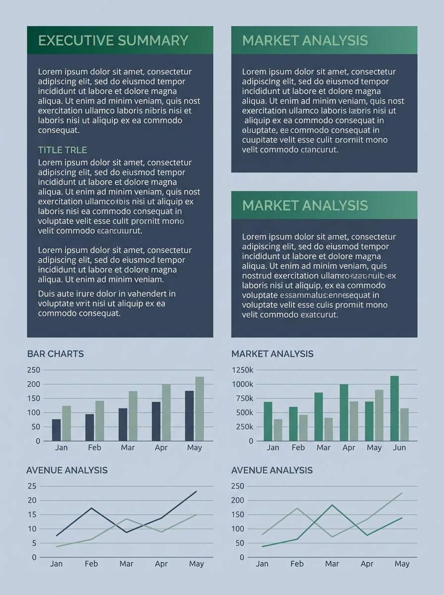
HEX: #0b5b48 #3b8f7a #8aa29b #cbd5e1 #334155
Mood: quiet and thoughtful
Best for: reports and educational slides
Quiet and thoughtful, like rain on window glass and muted city trees. Desaturated greens pair naturally with cool grays, creating a professional tone that still feels human. Use it for annual reports, case studies, and educational decks where you want calm focus. Tip: keep charts mostly gray and reserve the darker green for one key series so insights stand out instantly.
Image example of rainy day greens generated using media.io
15) Desert Cactus Chic
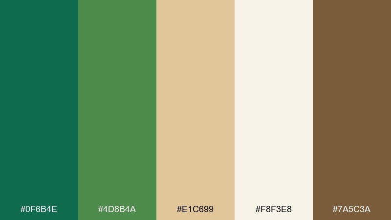
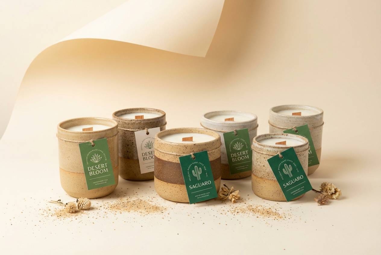
HEX: #0f6b4e #4d8b4a #e1c699 #f8f3e8 #7a5c3a
Mood: earthy and sun-warmed
Best for: boho interiors and handmade goods
Earthy and sun-warmed, like cactus shadows across sand-colored clay. The greens lean natural rather than jewel-like, and the browns make the palette feel grounded and handmade. Use it for boho decor shops, ceramic branding, and artisan market signage. Try adding texture like paper grain or terracotta patterns so the warm neutrals feel intentional, not plain.
Image example of desert cactus chic generated using media.io
16) Winter Pine Glow
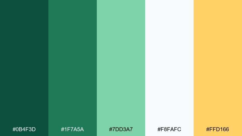
HEX: #0b4f3d #1f7a5a #7dd3a7 #f8fafc #ffd166
Mood: festive and bright
Best for: holiday promos and greeting cards
Festive and bright, like pine needles lit by soft string lights. The cool greens feel seasonal without going overly traditional, and the warm yellow adds a friendly glow. Use it for holiday email headers, greeting cards, and seasonal landing pages. Keep the yellow as a highlight for stars or badges, and let the pale near-white stay dominant for a clean winter feel.
Image example of winter pine glow generated using media.io

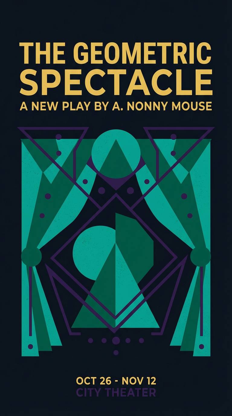
17) Peacock Jewel Box
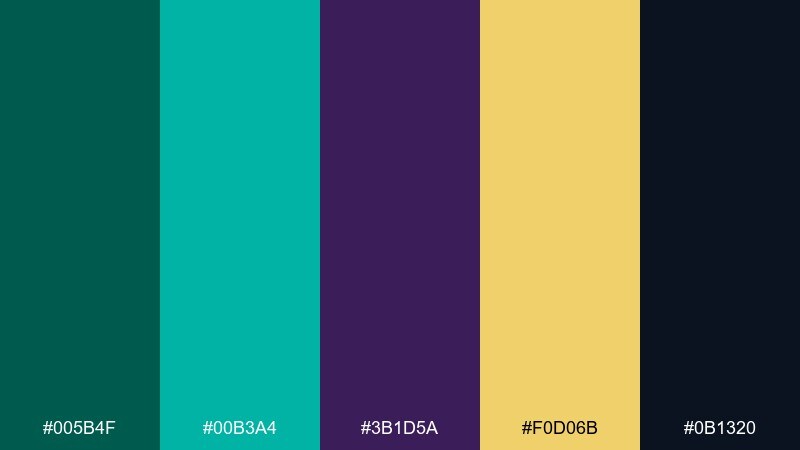
HEX: #005b4f #00b3a4 #3b1d5a #f0d06b #0b1320
Mood: dramatic and jewel-toned
Best for: theater posters and creative branding
Dramatic and jewel-toned, like peacock feathers in a dark velvet box. Teal and emerald sparkle against inky black, while purple and gold add theatrical flair. It suits performance posters, podcast cover art, and bold brand identities. Use black as the stage, then place gold only where you need sparkle, like a logo mark or headline underline.
Image example of peacock jewel box generated using media.io
18) Stone and Moss Neutral
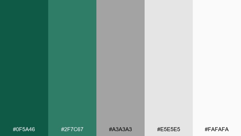
HEX: #0f5a46 #2f7c67 #a3a3a3 #e5e5e5 #fafafa
Mood: minimal and natural
Best for: architecture portfolios
Minimal and natural, like moss on smooth concrete after rain. The restrained greens feel sophisticated against layered grays and soft white, making layouts look airy and intentional. Use it for architecture portfolios, case study pages, and clean product catalogs. Tip: keep most surfaces neutral and use mossy green only for navigation states and section markers.
Image example of stone and moss neutral generated using media.io
19) Tropical Leaf Splash
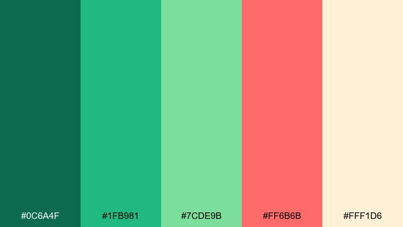
HEX: #0c6a4f #1fb981 #7cde9b #ff6b6b #fff1d6
Mood: playful and tropical
Best for: summer party flyers
Playful and tropical, like a leafy cocktail garnish with a bright fruit twist. The greens stay lively thanks to the minty lift, and the coral-red adds instant fun for headlines and stickers. Great for party flyers, festival schedules, and seasonal promos that need to feel upbeat. Use the creamy background to keep the neon energy controlled, and limit the coral to one or two focal spots.
Image example of tropical leaf splash generated using media.io

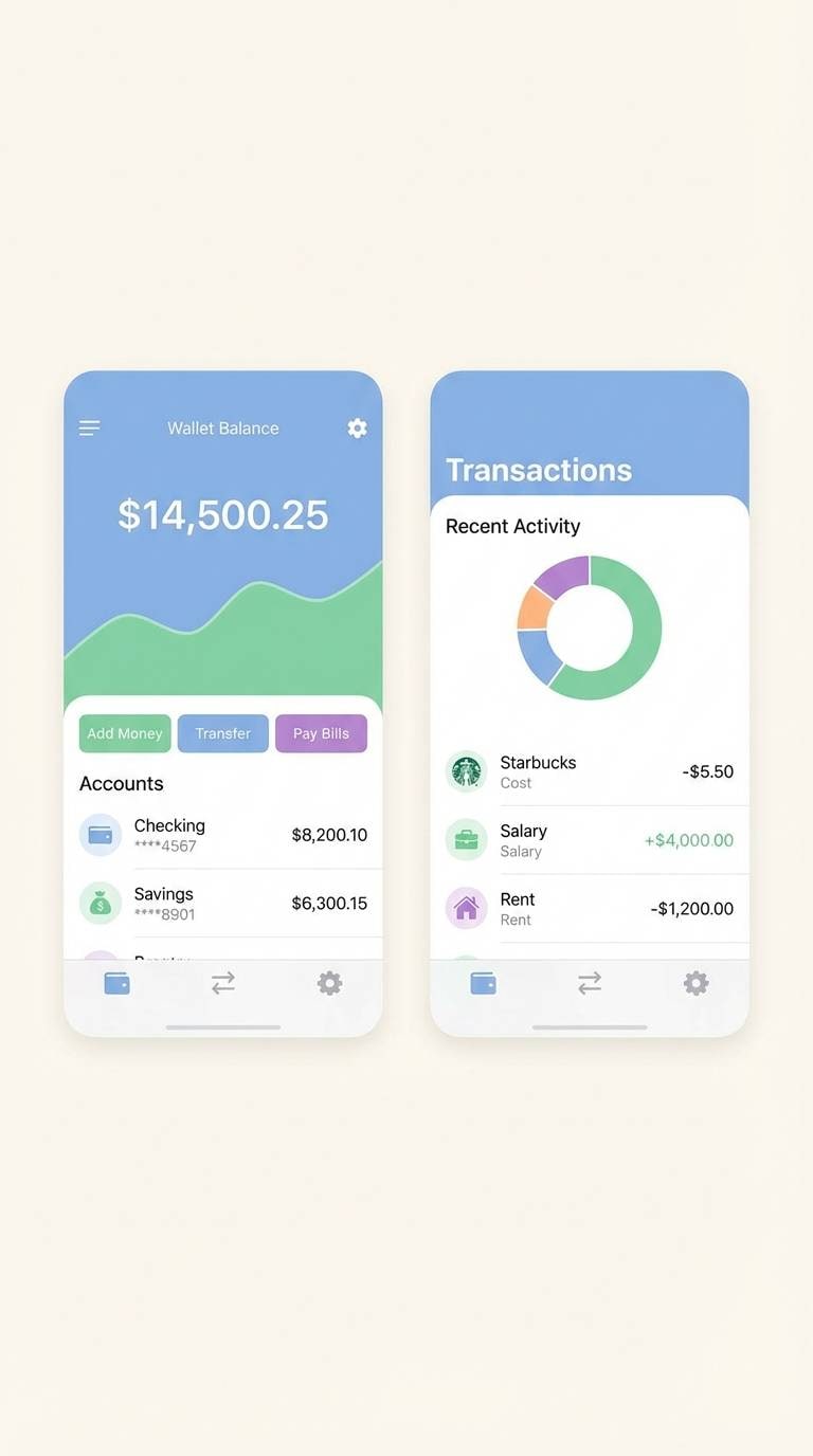
20) Modern Emerald UI
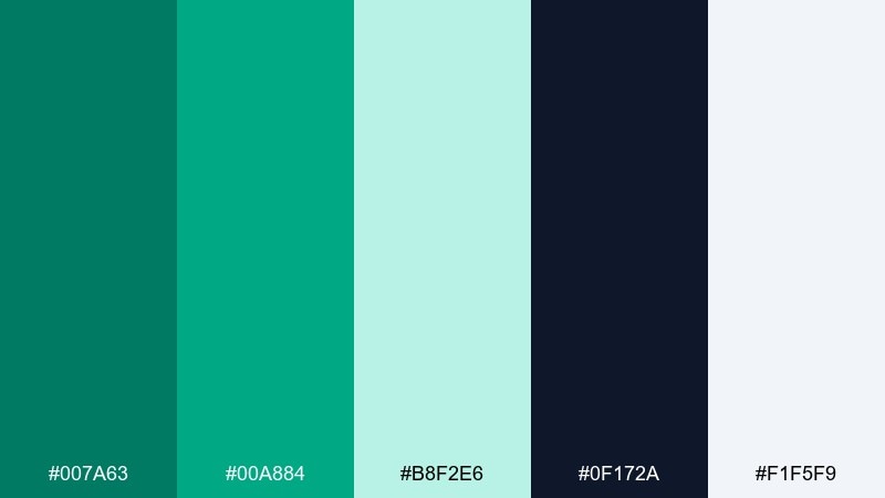
HEX: #007a63 #00a884 #b8f2e6 #0f172a #f1f5f9
Mood: crisp and tech-forward
Best for: mobile app UI and fintech
Crisp and tech-forward, like a clean interface with confident green highlights. The deep navy anchors the layout, and the aqua tint makes panels feel light and friendly. Use these emerald green color combinations for fintech apps, booking flows, and modern dashboards that need trust plus speed. Tip: keep backgrounds in the pale blue-gray, then apply the strongest green only to primary actions to protect accessibility contrast.
Image example of modern emerald ui generated using media.io
What Colors Go Well with Emerald Green?
Emerald green pairs naturally with warm neutrals like cream, sand, and taupe, which keep the jewel tone from feeling too heavy. This is a go-to approach for interiors, packaging, and wedding stationery.
For a premium look, add metallics (gold, brass, copper) and deep anchors like black, charcoal, or inky navy. These pairings make emerald feel sharper and more authoritative.
For modern contrast, try soft pinks (blush or dusty rose), bright accents (coral or amber), or cool tints (mint and pale aqua). The key is to use the accent sparingly so emerald stays the hero.
How to Use a Emerald Green Color Palette in Real Designs
Start by choosing your “base” role for emerald: either a dark foundation (headers, sidebars, backgrounds) or a focused accent (buttons, badges, highlights). Keeping emerald in one clear role makes the palette feel intentional.
Balance saturation with breathing room. Pair deep emerald tones with light backgrounds (off-white, misty gray, pale aqua) to protect readability and keep layouts from turning dense.
Finally, test contrast for text and UI states. Emerald can look darker than expected on screens, so confirm legibility for body text and ensure your primary CTA color has enough contrast against its background.
Create Emerald Green Palette Visuals with AI
If you already have HEX codes, you can turn them into real-looking mockups (packaging, posters, UI screens, invites) by using a consistent prompt template and swapping colors and objects.
Media.io makes it simple to generate emerald green palette visuals directly in your browser—use the prompts above as starting points, then iterate for different styles (minimal, editorial, festive, or luxe).
Emerald Green Color Palette FAQs
-
What is the best neutral to pair with emerald green?
Cream and warm off-white are the easiest neutrals with emerald green because they soften the jewel tone and keep designs bright. For a more modern feel, use pale gray or blue-gray. -
Does emerald green work well with gold?
Yes. A green and gold palette is a classic luxury combination—use gold as a small accent (lines, icons, foil details) and let emerald handle larger areas like backgrounds or panels. -
What colors complement emerald green for weddings?
Popular emerald wedding colors include blush, champagne/cream, black, and metallic gold. For a winter mood, add wine or burgundy; for summer, add coral in small doses. -
Is emerald green a good branding color?
Emerald reads as premium, confident, and trustworthy, which is why it works for beauty, hospitality, and fintech brands. Pair it with clean neutrals and a dark anchor (charcoal or navy) for a polished system. -
How do I keep an emerald green palette from looking too dark?
Increase the amount of light background color (cream, near-white, pale gray), then reserve deep emerald for headers and key blocks. Add one lighter green tint (mint/aqua) to create depth without heaviness. -
What’s a safe text color on emerald green backgrounds?
Most deep emerald backgrounds pair best with white or very light off-white text. For lighter emeralds, use near-black or deep charcoal and verify contrast for accessibility. -
Can I generate emerald green palette mockups with AI?
Yes—use Media.io’s text-to-image tool and include your emerald green HEX codes in the prompt along with the design type (UI, packaging, invitation, poster) and lighting/style notes.
Next: Christmas Color Palette


