

Peach is a warm, flattering hue that can feel soft and modern at the same time—perfect for brands that want approachability without looking childish.
Below are peach color palette ideas you can use in UI, invitations, packaging, and social graphics, each with ready-to-copy HEX codes and a prompt you can recreate in Media.io.
In this article
- Why Peach Palettes Work So Well
-
- sunlit apricot
- blush linen
- coral sorbet
- desert peachstone
- rosy sandstone
- peach mint gelato
- vintage nectar
- peachy skyline
- terracotta peach
- champagne peach
- peach orchid glow
- seaside peach
- peach cocoa comfort
- peach sage studio
- peach neon pop
- sunset peach fade
- peach graphite minimal
- peach floral sketch
- peach copper luxe
- peach berry parfait
- What Colors Go Well with Peach?
- How to Use a Peach Color Palette in Real Designs
- Create Peach Palette Visuals with AI
Why Peach Palettes Work So Well
Peach sits between pink and orange, so it carries warmth and friendliness while staying softer than pure orange. That balance makes it easy to use for welcoming interfaces, lifestyle branding, and feel-good marketing.
It also pairs naturally with both neutrals (cream, sand, gray, charcoal) and bold accents (teal, cobalt, violet). With the right dark text color, peach can stay light and airy without sacrificing readability.
Finally, peach reads “human” and “premium” depending on saturation and contrast—pastel peach feels gentle and calm, while deeper coral-peach can feel energetic and conversion-friendly for CTAs.
20+ Peach Color Palette Ideas (with HEX Codes)
1) Sunlit Apricot
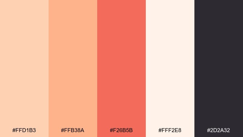
HEX: #ffd1b3 #ffb38a #f26b5b #fff2e8 #2d2a32
Mood: bright, airy, welcoming
Best for: landing pages, lifestyle branding, email headers
Bright and airy like morning light on fresh fruit, these tones feel upbeat without getting loud. Use the soft cream as your main canvas and let the apricot and warm coral carry buttons or key highlights. Charcoal adds the contrast needed for readable type and crisp UI elements. For a polished finish, keep gradients subtle and reserve the coral for one strong call to action.
Image example of sunlit apricot generated using media.io

Media.io is an online AI studio for creating and editing video, image, and audio in your browser.

2) Blush Linen
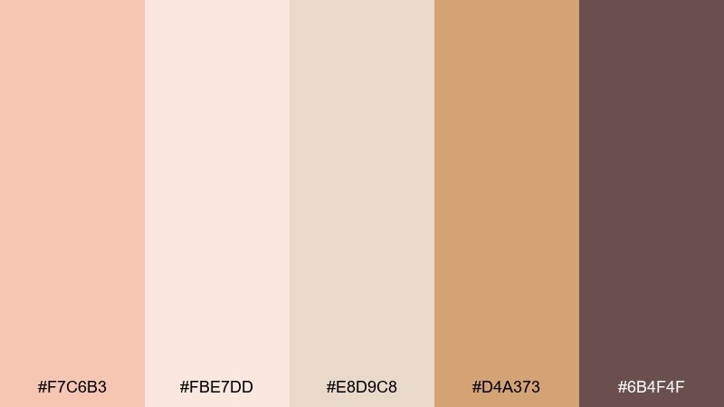
HEX: #f7c6b3 #fbe7dd #e8d9c8 #d4a373 #6b4f4f
Mood: soft, romantic, classic
Best for: wedding stationery, boutique cards, thank you notes
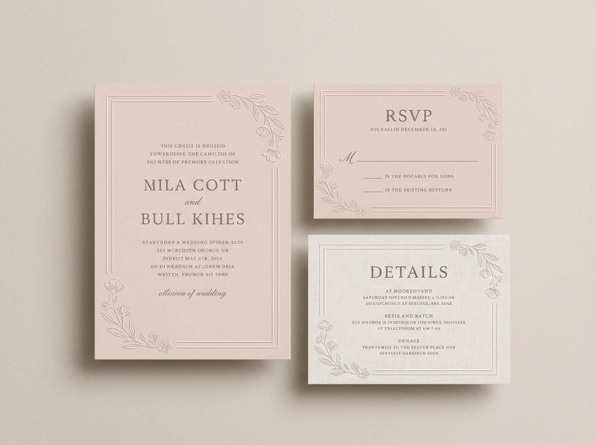
Soft and romantic like linen fabric and dried florals, this mix leans timeless rather than trendy. Use the blush and cream as generous negative space, then anchor details with the cocoa brown for elegant typography. The warm tan works beautifully for borders, monograms, and small illustrations. Tip: choose an off-white paper texture and keep metallic foil minimal to avoid overpowering the gentle hues.
Image example of blush linen generated using media.io
3) Coral Sorbet
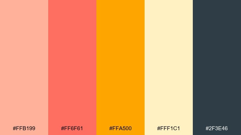
HEX: #ffb199 #ff6f61 #ffa500 #fff1c1 #2f3e46
Mood: playful, juicy, energetic
Best for: social ads, summer promos, food and drink graphics
Playful and juicy like a frozen dessert on a sunny day, this set is built for attention. These peach color combinations shine when you pick one hero warm tone and let the pale lemon act as breathing room. Deep slate keeps headlines legible and stops the brights from feeling childish. Usage tip: limit the orange to icons or small bursts so the coral stays the star.
Image example of coral sorbet generated using media.io

4) Desert Peachstone
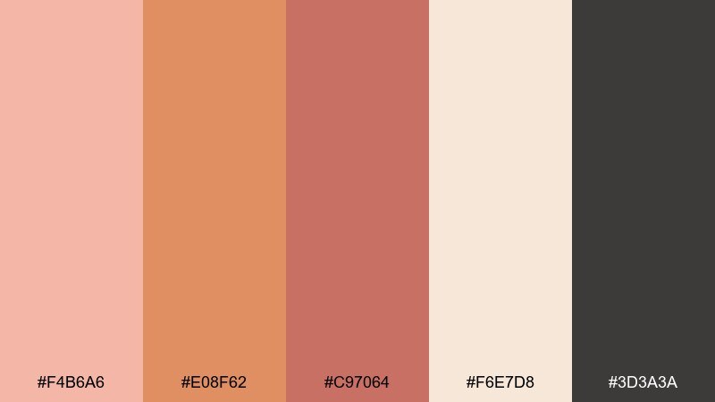
HEX: #f4b6a6 #e08f62 #c97064 #f6e7d8 #3d3a3a
Mood: earthy, sunbaked, grounded
Best for: interior moodboards, rustic branding, artisan labels
Earthy and sunbaked like canyon stone at golden hour, these shades feel grounded and tactile. Pair the creamy sand with the deeper clay notes for a natural, handcrafted look. The near-black works best for type, stamped marks, and thin line art. Tip: add subtle grain or paper texture to amplify the desert vibe without clutter.
Image example of desert peachstone generated using media.io
5) Rosy Sandstone
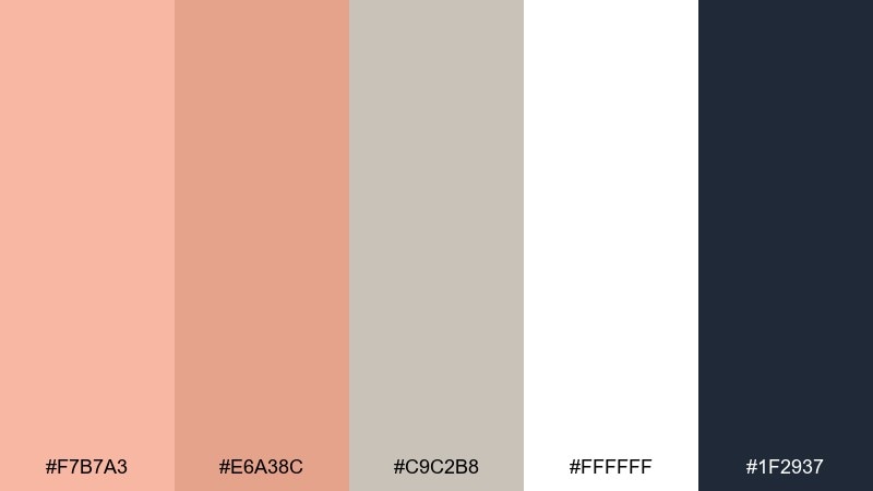
HEX: #f7b7a3 #e6a38c #c9c2b8 #ffffff #1f2937
Mood: clean, modern, refined
Best for: skincare packaging, minimal product ads, ecommerce
Clean and refined like polished stone with a rosy tint, this palette reads premium and modern. Use white and light neutrals for the pack base, then bring in the rosy shades for labels or seals. Deep navy-black is ideal for ingredient lists and small print that needs sharp clarity. Tip: matte finishes and plenty of spacing make these tones feel more luxurious.
Image example of rosy sandstone generated using media.io
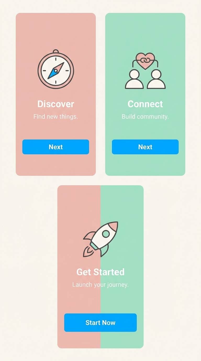
6) Peach Mint Gelato
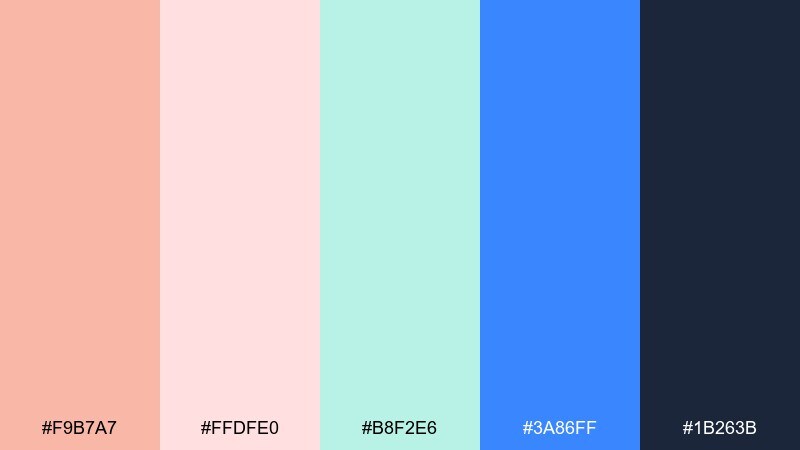
HEX: #f9b7a7 #ffdfe0 #b8f2e6 #3a86ff #1b263b
Mood: fresh, youthful, airy
Best for: app onboarding screens, wellness UI, friendly SaaS
Fresh and youthful like gelato in a pastel shop, these tones feel light but still lively. The mint and blush create a soothing base for panels and onboarding steps, while the vivid blue is perfect for active states. Deep navy keeps text readable and gives the interface structure. Tip: use the blue sparingly for emphasis so the pastel mood stays calm.
Image example of peach mint gelato generated using media.io
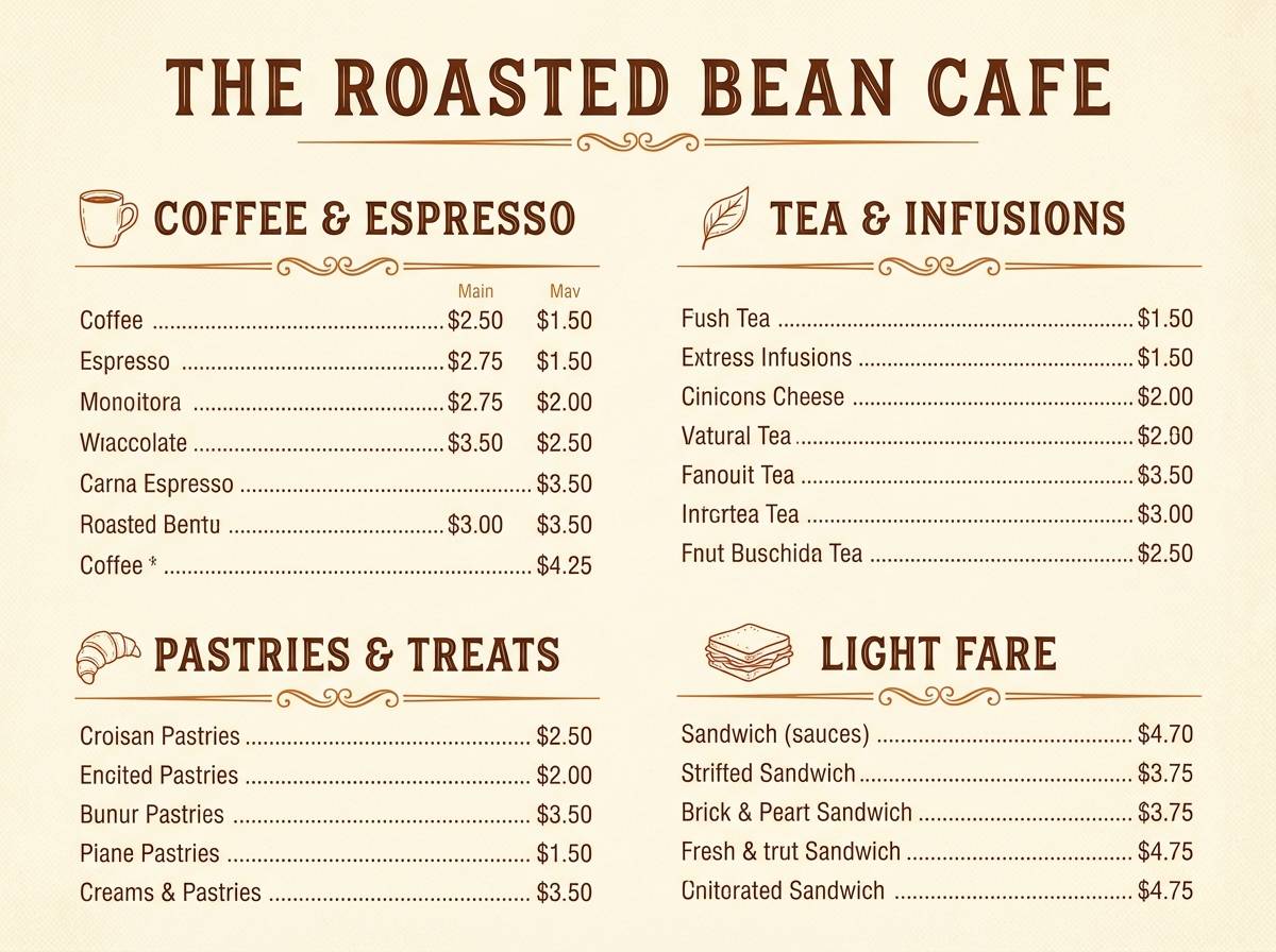
7) Vintage Nectar
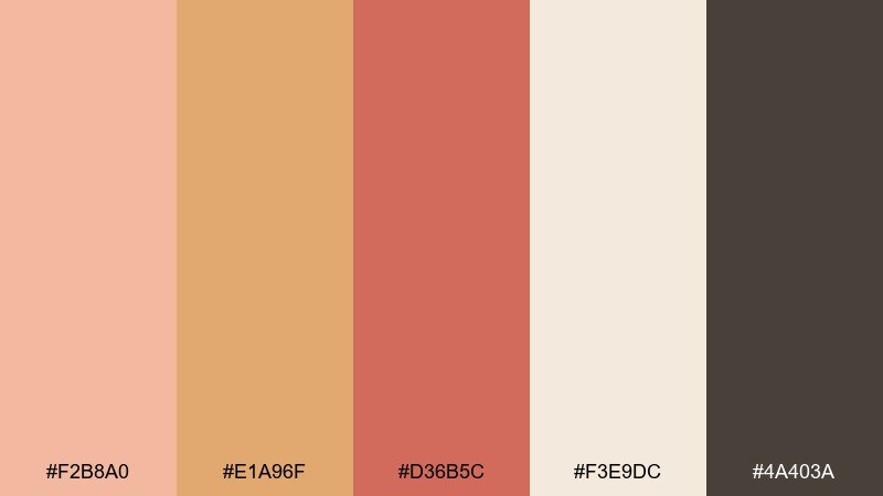
HEX: #f2b8a0 #e1a96f #d36b5c #f3e9dc #4a403a
Mood: warm, nostalgic, handcrafted
Best for: cafe menus, retro labels, artisanal product inserts
Warm and nostalgic like a well-loved recipe card, this mix feels handcrafted and comforting. Creamy beige makes an inviting base for menus, while the deeper nectarine and clay tones add hierarchy to headings. Brown works beautifully for vintage line drawings and small badge marks. Tip: pair with a classic serif and slightly muted imagery to keep the retro mood consistent.
Image example of vintage nectar generated using media.io
8) Peachy Skyline
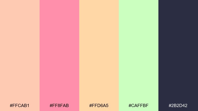
HEX: #ffcab1 #ff8fab #ffd6a5 #caffbf #2b2d42
Mood: optimistic, modern, breezy
Best for: event posters, festival branding, upbeat announcements
Optimistic and breezy like a city sky at dusk, these brights feel modern and friendly. Let the dark indigo handle type and logos, then use the pink and peach tones for large shapes and gradients. The minty green is a great secondary accent for dates, QR codes, or small stickers. Tip: keep shapes geometric to avoid a too-cute pastel vibe.
Image example of peachy skyline generated using media.io

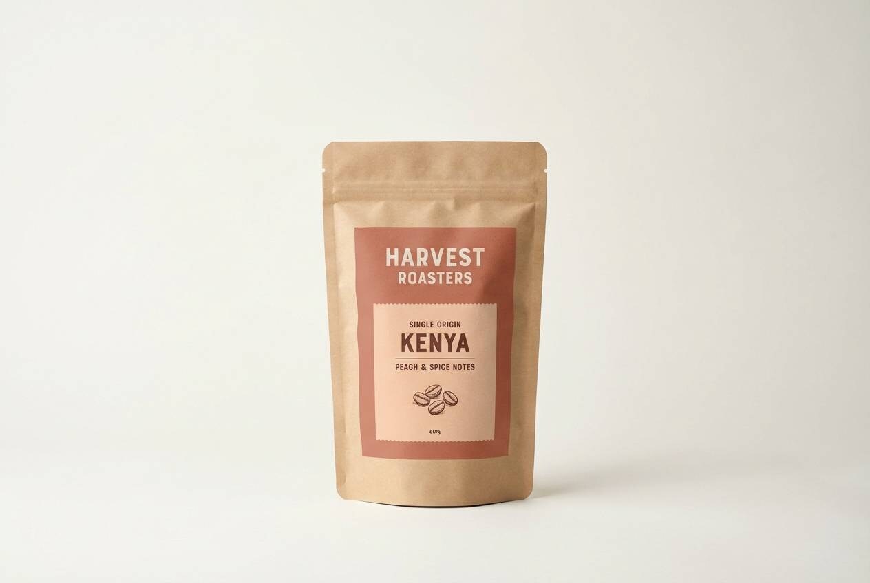
9) Terracotta Peach
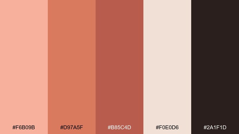
HEX: #f6b09b #d97a5f #b85c4d #f0e0d6 #2a1f1d
Mood: rustic, earthy, bold
Best for: pottery brands, coffee packaging, craft market signage
Rustic and earthy like terracotta pots, this set brings depth and warmth. The lighter blush-beige softens layouts, while the brick and clay shades add strong visual weight for headers and badges. Near-black keeps details crisp and works well for stamp-style logos. Tip: use the deeper tones on uncoated stock for a tactile, artisan finish.
Image example of terracotta peach generated using media.io
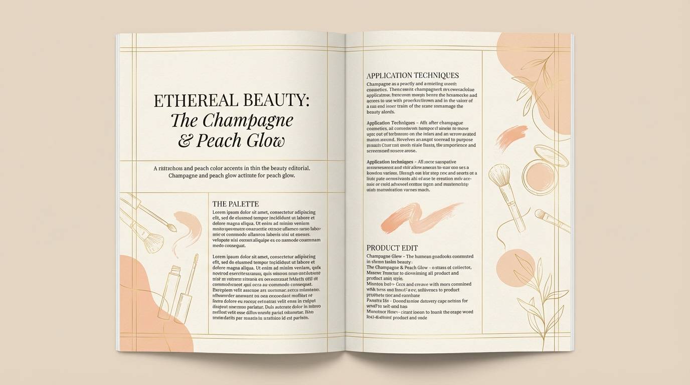
10) Champagne Peach
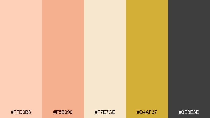
HEX: #ffd0b8 #f5b090 #f7e7ce #d4af37 #3e3e3e
Mood: elegant, celebratory, upscale
Best for: beauty lookbooks, premium invites, editorial layouts
Elegant and celebratory like champagne bubbles in warm light, these hues feel instantly upscale. This peach color combination works best when the cream and champagne tones dominate and the gold is treated as a highlight. Use the dark gray for refined type, thin rules, and captions. Tip: keep the gold to small accents like icons or section dividers to avoid a heavy metallic look.
Image example of champagne peach generated using media.io
11) Peach Orchid Glow
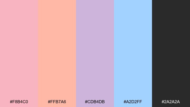
HEX: #f8b4c0 #ffb7a6 #cdb4db #a2d2ff #2a2a2a
Mood: dreamy, creative, expressive
Best for: boutique branding, creator kits, beauty socials
Dreamy and expressive like neon orchids under soft light, this mix feels creative without going off the rails. Use the peach and blush for backgrounds and cards, then add lavender for secondary accents and tags. Sky blue is a crisp counterpoint for links or highlights, while charcoal keeps everything readable. Tip: choose one cool accent per layout so the pastels do not compete.
Image example of peach orchid glow generated using media.io
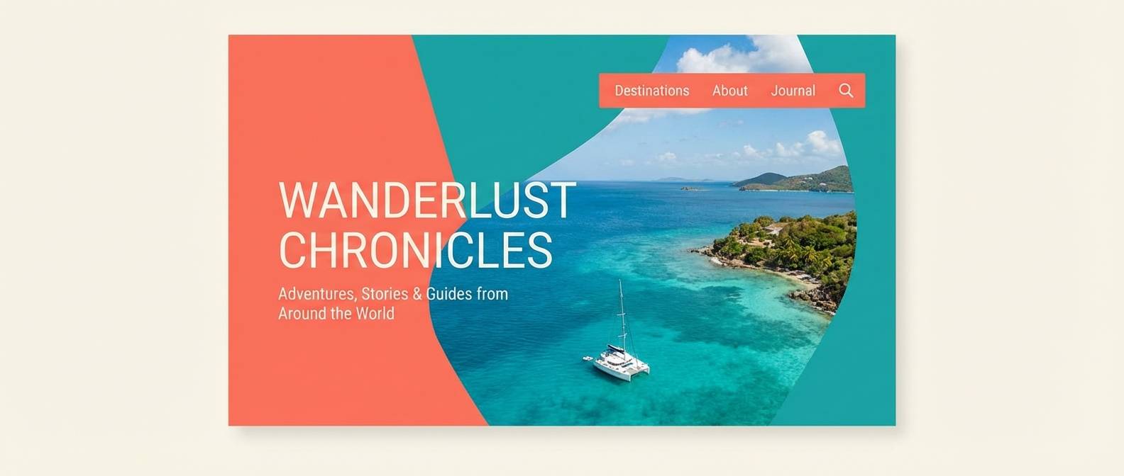
12) Seaside Peach
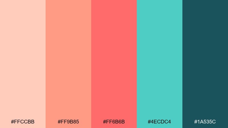
HEX: #ffccbb #ff9b85 #ff6b6b #4ecdc4 #1a535c
Mood: sunny, coastal, refreshing
Best for: travel headers, summer landing pages, blog banners
Sunny and coastal like a boardwalk at noon, this set feels refreshing and bright. Coral and warm peach carry the energy, while teal adds that ocean splash for contrast. Deep sea green is ideal for navigation and headings, keeping the design crisp. Tip: pair with simple iconography and lots of whitespace to keep it breezy, not busy.
Image example of seaside peach generated using media.io
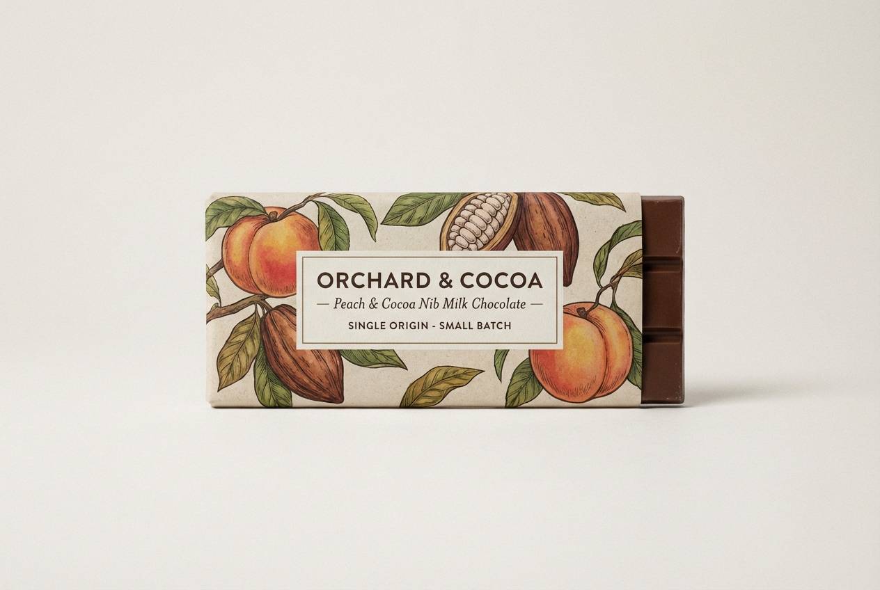
13) Peach Cocoa Comfort
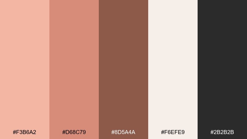
HEX: #f3b6a2 #d68c79 #8d5a4a #f6efe9 #2b2b2b
Mood: cozy, grounded, inviting
Best for: chocolate packaging, cafe promos, cozy seasonal ads
Cozy and grounded like cocoa with a swirl of cream, this palette feels inviting and familiar. The light neutral keeps layouts soft, while the cocoa brown adds rich depth for labels and headers. Use the mid peach tone to warm up icons and small highlights without looking sugary. Tip: a subtle vignette and matte paper effect amplify the comfort-food mood.
Image example of peach cocoa comfort generated using media.io
14) Peach Sage Studio
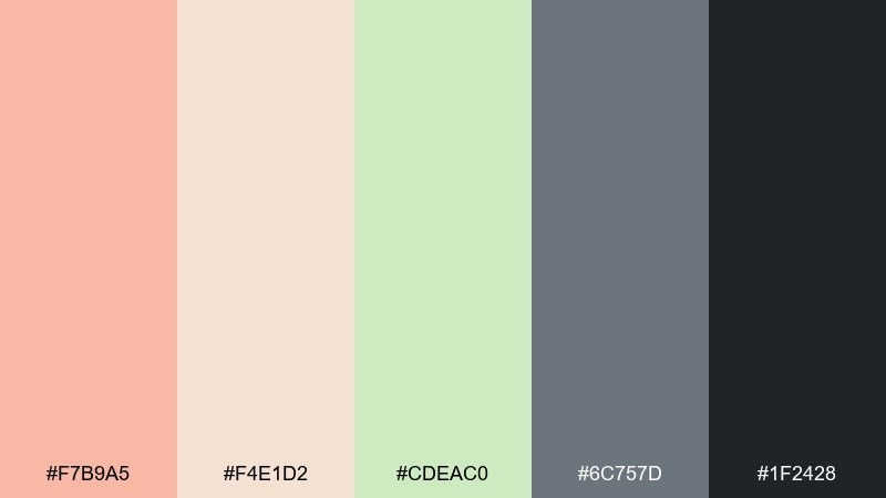
HEX: #f7b9a5 #f4e1d2 #cdeac0 #6c757d #1f2428
Mood: calm, modern, creative
Best for: presentation templates, studio branding, mood decks
Calm and modern like a tidy studio with plants by the window, these tones balance warmth and restraint. This peach color palette pairs especially well with sage green for section breaks, diagrams, and gentle highlights. Use slate gray for subtitles and UI-like labels, then keep the darkest shade for headlines. Tip: stick to soft shapes and consistent spacing to maintain the serene rhythm.
Image example of peach sage studio generated using media.io
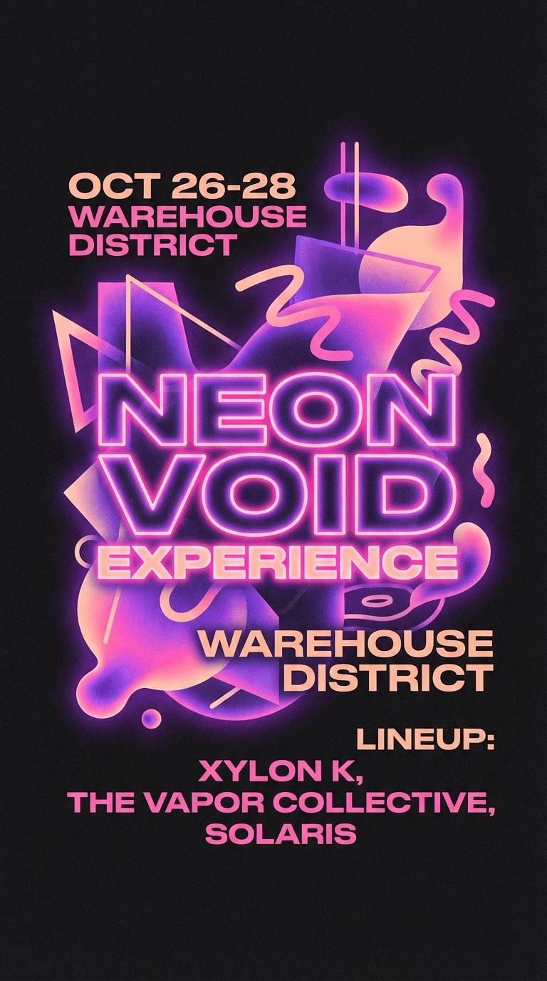
15) Peach Neon Pop
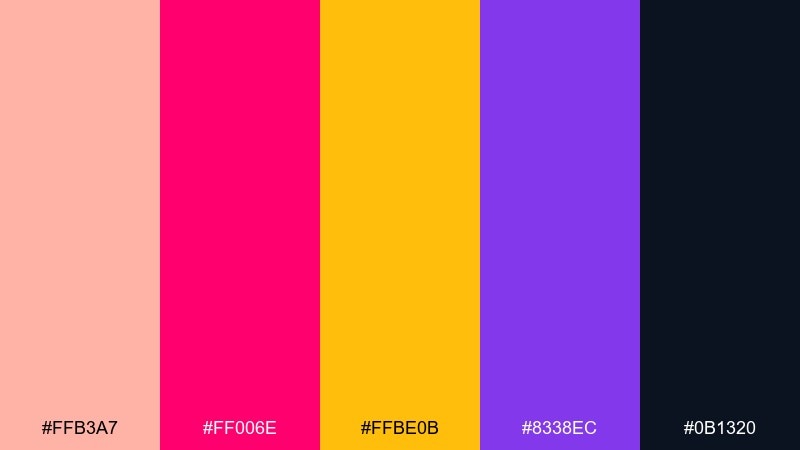
HEX: #ffb3a7 #ff006e #ffbe0b #8338ec #0b1320
Mood: bold, nightlife, high-energy
Best for: music flyers, party posters, creator announcements
Bold and electric like club lights on a warm night, this mix is made for impact. The deep inky base lets the neon pink and violet punch through without washing out your text. Use the peach tone to soften edges and tie warm and cool accents together. Tip: keep typography large and simple so the colors do the talking.
Image example of peach neon pop generated using media.io
16) Sunset Peach Fade
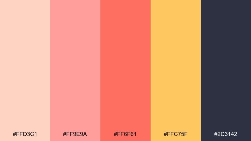
HEX: #ffd3c1 #ff9e9a #ff6f61 #ffc75f #2d3142
Mood: glowing, optimistic, cinematic
Best for: video thumbnails, hero banners, gradient backgrounds
Glowing and cinematic like a sunset that lingers, these shades are perfect for gradients and soft fades. Use the pale peach as your start color, then transition through coral and golden amber for warmth. Deep blue-gray makes a strong overlay for text and helps gradients feel more intentional. Tip: add a subtle grain layer to prevent banding on large background areas.
Image example of sunset peach fade generated using media.io

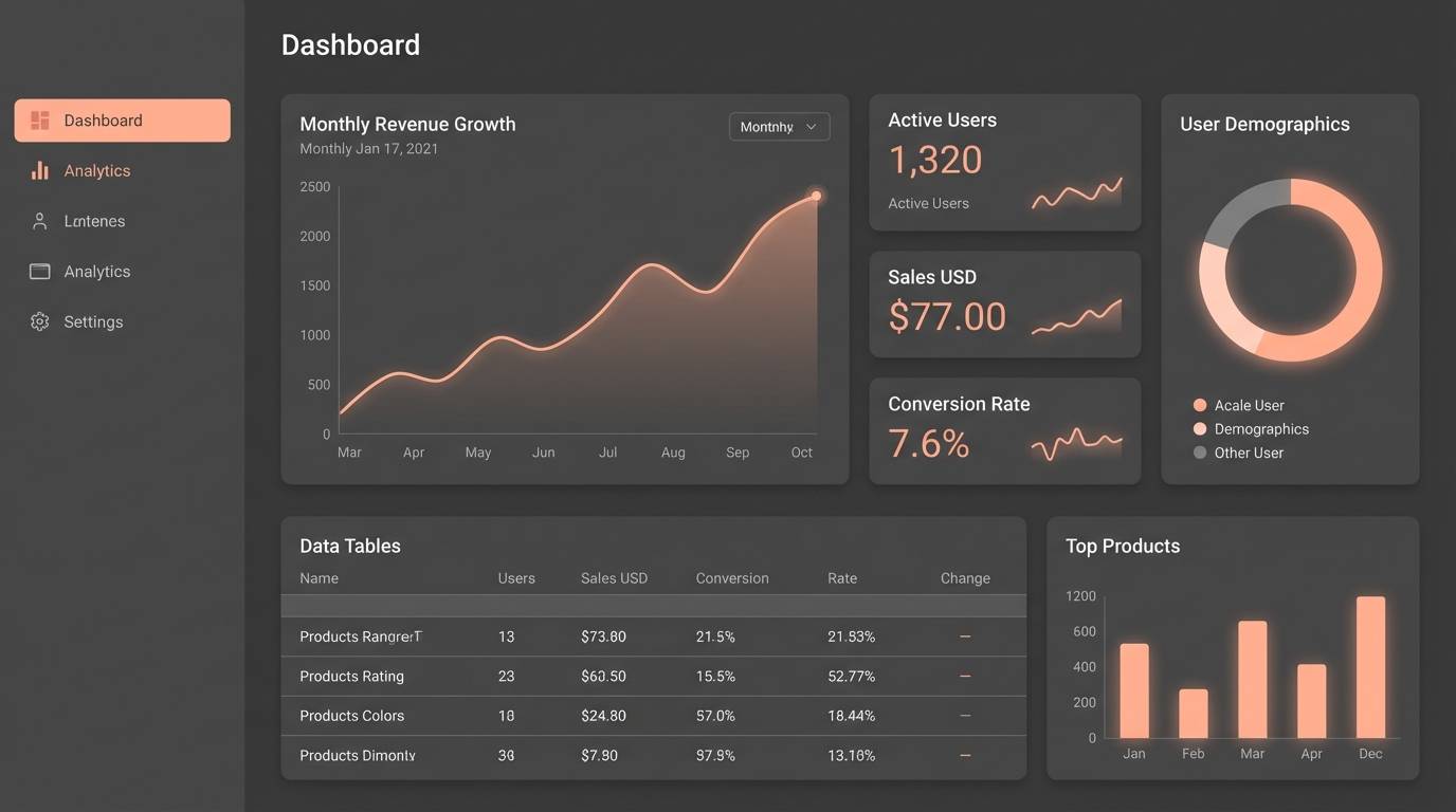
17) Peach Graphite Minimal
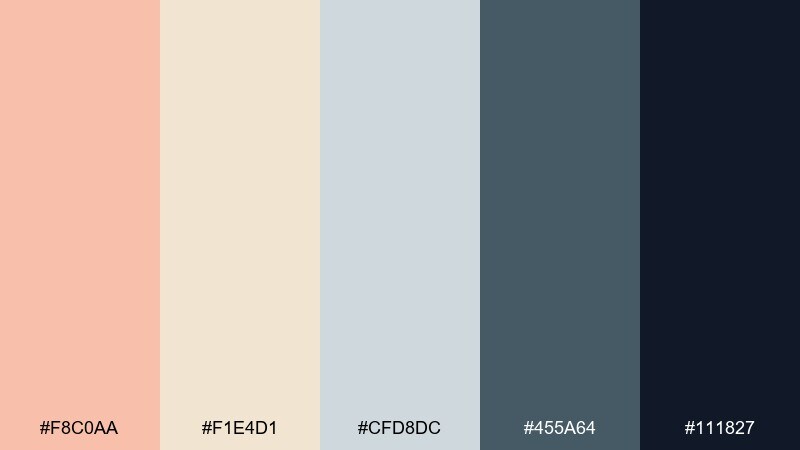
HEX: #f8c0aa #f1e4d1 #cfd8dc #455a64 #111827
Mood: minimal, sleek, professional
Best for: dashboards, fintech UI, modern websites
Minimal and sleek like a graphite sketch warmed by a soft wash, this set feels professional and controlled. Let the grays carry structure for panels, tables, and dividers, then use the peach tone as a friendly highlight. The dark navy keeps contrast high for accessibility and data-heavy screens. Tip: use peach only for active states and key metrics to maintain clarity.
Image example of peach graphite minimal generated using media.io
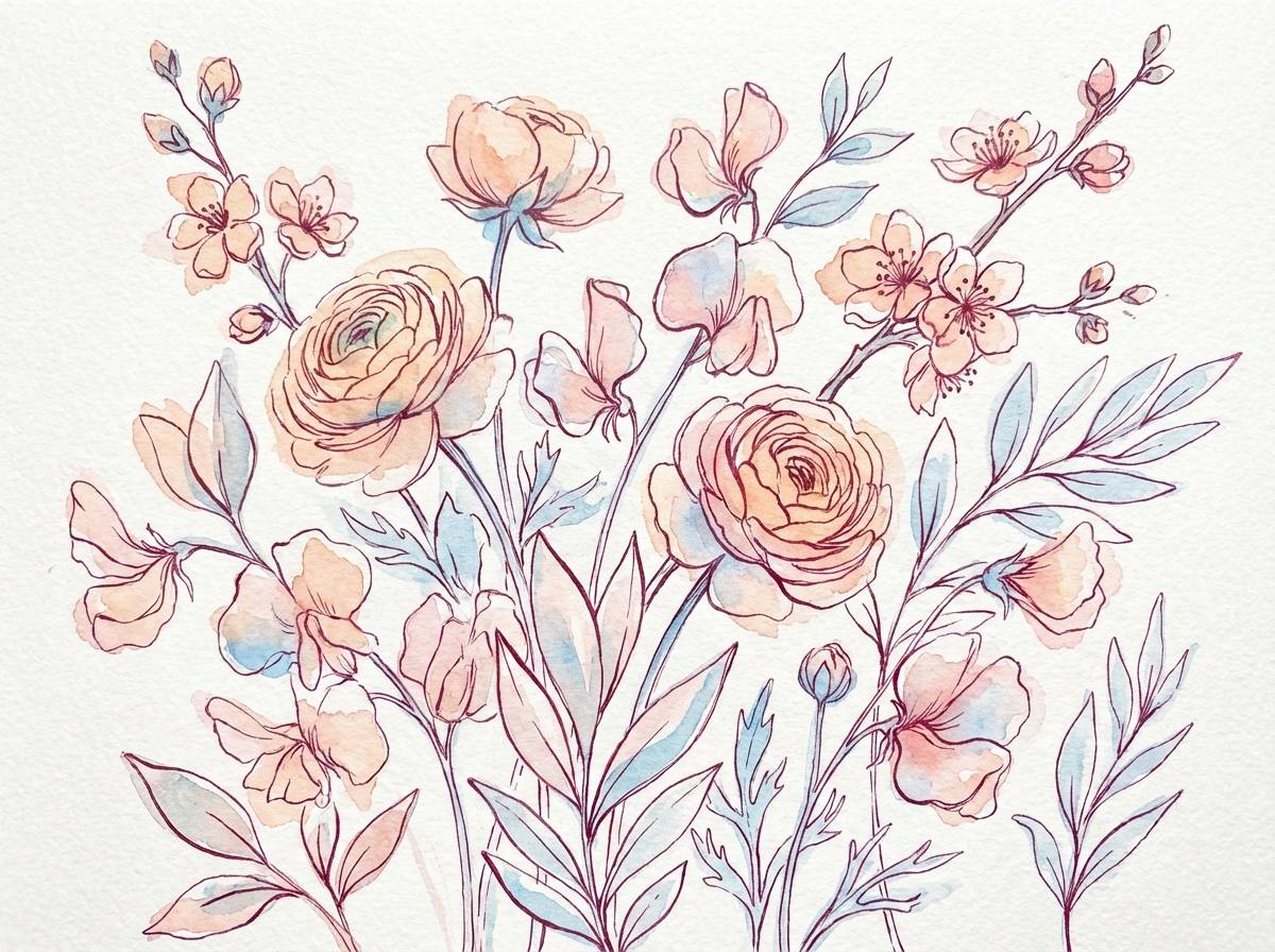
18) Peach Floral Sketch
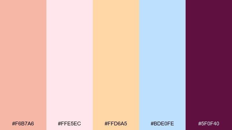
HEX: #f6b7a6 #ffe5ec #ffd6a5 #bde0fe #5f0f40
Mood: gentle, springlike, artistic
Best for: botanical illustrations, greeting cards, seasonal prints
Gentle and springlike like a floral sketch washed with watercolor, these hues feel airy and artistic. The soft pink and cream create a light background for petals, while the sky blue adds freshness to leaves and shadows. The deep berry shade gives you a strong ink-like line color for outlines and lettering. Tip: keep saturation low in large fills and save the berry for final details.
Image example of peach floral sketch generated using media.io
19) Peach Copper Luxe
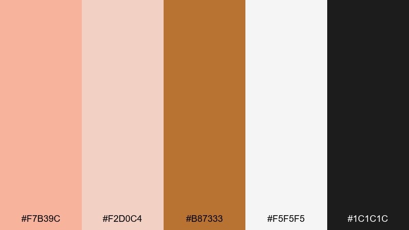
HEX: #f7b39c #f2d0c4 #b87333 #f5f5f5 #1c1c1c
Mood: luxurious, warm, polished
Best for: jewelry ads, premium product pages, gift packaging
Luxurious and warm like copper catching a spotlight, this mix feels polished and gift-ready. A peach color palette like this works best with lots of white space and crisp black type for a high-end look. Use copper as a metallic accent for borders, icons, or foil-like highlights rather than big blocks. Tip: keep product photography clean and let the warm accent guide the eye to the price or call to action.
Image example of peach copper luxe generated using media.io

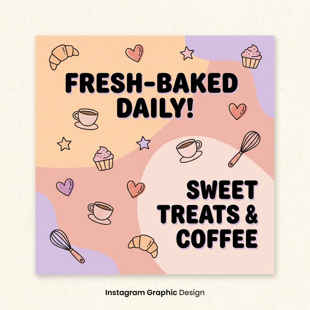
20) Peach Berry Parfait
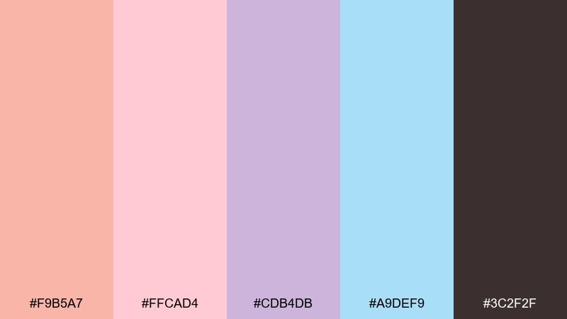
HEX: #f9b5a7 #ffcad4 #cdb4db #a9def9 #3c2f2f
Mood: sweet, playful, friendly
Best for: bakery posts, dessert menus, cute brand graphics
Sweet and playful like layers in a parfait glass, these pastels feel friendly and approachable. Use the peach and blush as the main fill colors, then sprinkle in lavender for variety across sections. The light blue is great for small callouts and stickers, while the warm brown keeps text readable. Tip: pair with rounded type and simple illustrated icons for a cheerful, cohesive look.
Image example of peach berry parfait generated using media.io
What Colors Go Well with Peach?
Neutrals are the easiest match: cream, off-white, warm gray, sand, and charcoal help peach feel grown-up and readable. If you need strong contrast for UI text, use deep navy or near-black rather than pure black for a softer look.
For bolder pairings, peach loves teal and sea green (fresh contrast), cobalt or bright blue (modern energy), and lavender/violet (dreamy, creative). Gold or copper accents can instantly push peach toward an elegant, premium vibe.
If your peach is very light, balance it with one darker anchor color and keep saturation controlled. That simple rule prevents “too pastel” layouts and makes the palette feel intentional.
How to Use a Peach Color Palette in Real Designs
In branding, treat peach as a personality color: use it for hero backgrounds, packaging panels, or label blocks, then rely on a dark anchor (charcoal/navy) for logos and typography. This keeps warmth without sacrificing clarity.
In UI, reserve peach for high-value moments—primary buttons, active states, badges, or key metrics. Let whites and cool grays handle most surfaces so the interface stays clean and accessible.
For print (invites, menus, inserts), peach works best with paper-like neutrals and plenty of breathing room. Add texture (grain, linen, uncoated stock) to make the palette feel tactile rather than flat.
Create Peach Palette Visuals with AI
If you have HEX codes but need real visuals—posters, hero banners, product mockups, or brand boards—AI image generation can help you prototype quickly. Start with a clear layout type (poster, UI screen, packaging shot) and a few style constraints (minimal, editorial, watercolor).
To keep results consistent, reuse the same prompt structure and only swap the color adjectives (peach, apricot, coral) or add one contrasting accent (teal, cobalt, lavender). That way, your designs stay cohesive across a whole campaign.
When you like an output, generate variations for different aspect ratios (square for social, wide for headers, vertical for stories) while keeping your peach palette as the constant brand signal.
Peach Color Palette FAQs
-
What is a peach color palette?
A peach color palette is a set of coordinated shades built around peach (a warm tint between pink and orange), usually paired with neutrals for balance and one or two accent colors for contrast. -
Is peach a good color for branding?
Yes. Peach can signal warmth, friendliness, and modern softness—popular for beauty, lifestyle, wellness, food, and boutique brands. Pair it with a dark anchor color for strong, professional typography. -
What colors complement peach best?
Top complements include teal/sea green, deep navy, charcoal, warm beige, and soft lavender. The best choice depends on whether you want a coastal, minimal, or dreamy look. -
How do I keep peach from looking too “cute” in design?
Use more neutral space (white/cream/gray), limit bright accents, and add a strong dark text color (navy/charcoal). Matte textures and clean typography also make peach feel more premium. -
What text color works best on peach backgrounds?
Deep navy, charcoal, or near-black typically offers the best readability on peach. For lighter peach tints, medium-dark grays can work, but always check contrast for accessibility. -
Can I use peach in UI and dashboards?
Yes—use peach as an accent for primary buttons, highlights, and active states while keeping most surfaces neutral. This maintains clarity and prevents color fatigue in data-heavy screens. -
How can I generate peach palette images quickly?
Use Media.io’s text-to-image generator with a clear design format (UI mockup, poster, packaging shot) and include your peach tone and one contrasting accent in the prompt, then iterate for variations.


