Olive drab is a grounded, muted green that feels practical, modern, and easy to live with. It’s a go-to base color for brands and layouts that need a natural tone without looking overly “bright green.”
Below are 20+ olive drab color palette ideas with HEX codes, plus real design use cases—from outdoor gear and packaging to UI and editorial work.
In this article
- Why Olive Drab Palettes Work So Well
-
- field jacket neutrals
- woodland & cream
- brass hardware
- desert canvas
- mossy minimal ui
- rainy trail
- vintage military
- olive + terracotta
- sage office calm
- charcoal contrast
- golden hour olive
- dried herb kitchen
- forest cabin
- modern camo pop
- dusty rose olive
- coastal olive drift
- autumn orchard
- steel & olive
- linen and leather
- night ops accent
- botanical ink
- museum labels
- What Colors Go Well with Olive Drab?
- How to Use a Olive Drab Color Palette in Real Designs
- Create Olive Drab Palette Visuals with AI
Why Olive Drab Palettes Work So Well
Olive drab sits in a sweet spot between green and neutral, which makes it a stable foundation for many design styles. It reads “natural” and “reliable” without shouting for attention, so it plays well with typography and photography.
Because it’s muted, olive drab tends to reduce glare and visual fatigue in UI, long-form editorial, and signage. That softness helps you build hierarchy with value (light/dark) rather than relying on high saturation.
It also pairs easily with warm materials and finishes—kraft paper, brass, leather, linen, and wood—making it a strong choice for packaging, lifestyle branding, and outdoorsy aesthetics.
20+ Olive Drab Color Palette Ideas (with HEX Codes)
1) Field Jacket Neutrals
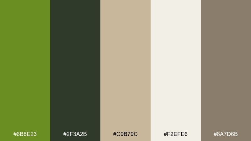
HEX: #6B8E23 #2F3A2B #C9B79C #F2EFE6 #8A7D6B
Mood: rugged, grounded, practical
Best for: outdoor apparel branding and hangtag design
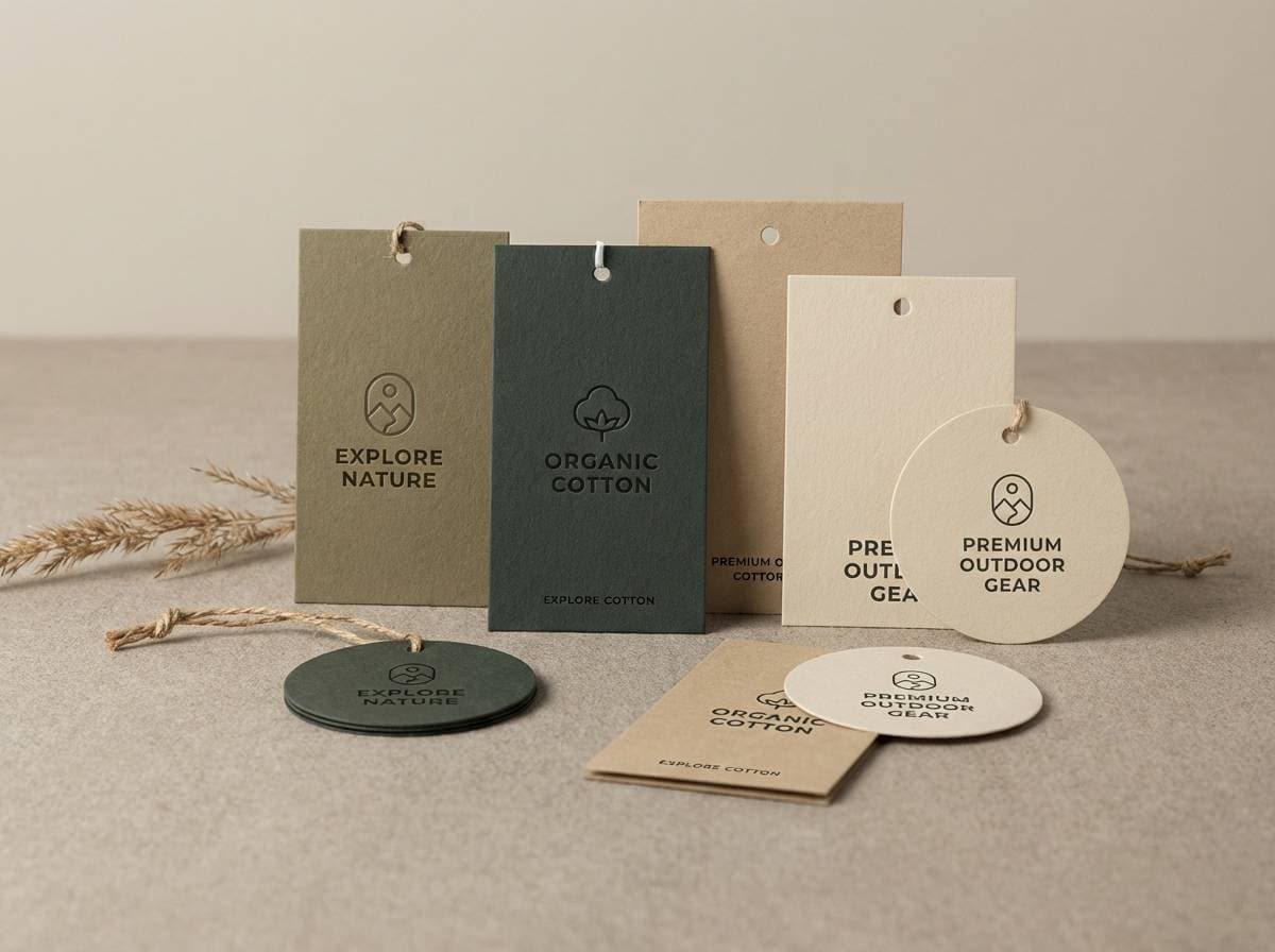
Rugged and grounded like a well-worn field jacket on a cool morning. The dark green base reads confident against canvas beige and warm oat neutrals, making it great for heritage logos and workwear packaging. For a clean olive drab color palette, keep type in deep charcoal and use the light cream as your negative space. Tip: print the green with a slight matte finish to preserve the earthy feel.
Image example of field jacket neutrals generated using media.io
Media.io is an online AI studio for creating and editing video, image, and audio in your browser.

2) Woodland & Cream
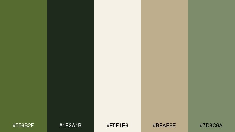
HEX: #556B2F #1E2A1B #F5F1E6 #BFAE8E #7D8C6A
Mood: calm, natural, airy
Best for: rustic wedding invitations and stationery
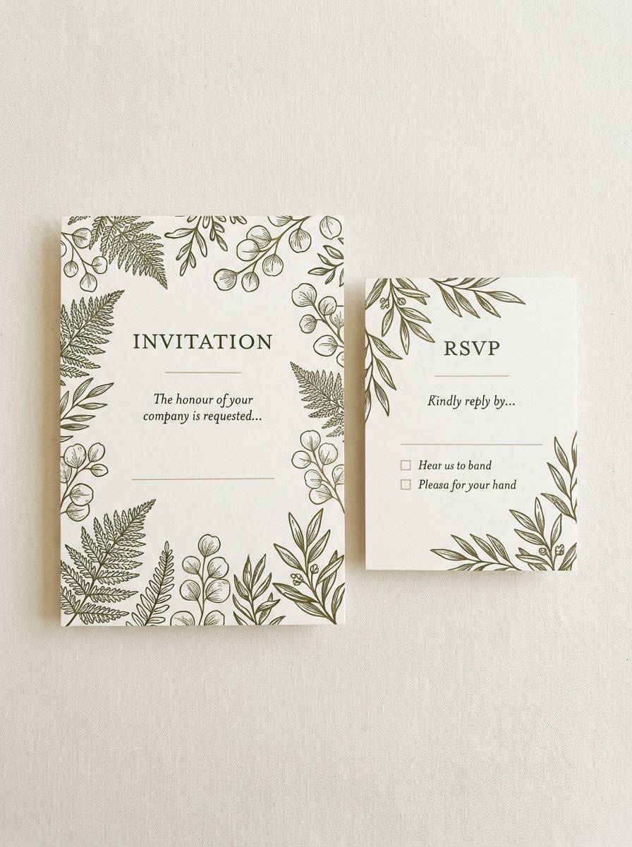
Calm woodland greens meet soft cream, like sunlight filtering through leaves. The contrast stays gentle, which keeps invitation layouts readable while still feeling organic. Pair the olive tones with uncoated paper textures and thin serif typography for a refined rustic look. Tip: use the cream as the main background and reserve the darkest green for names and key details.
Image example of woodland & cream generated using media.io
3) Brass Hardware
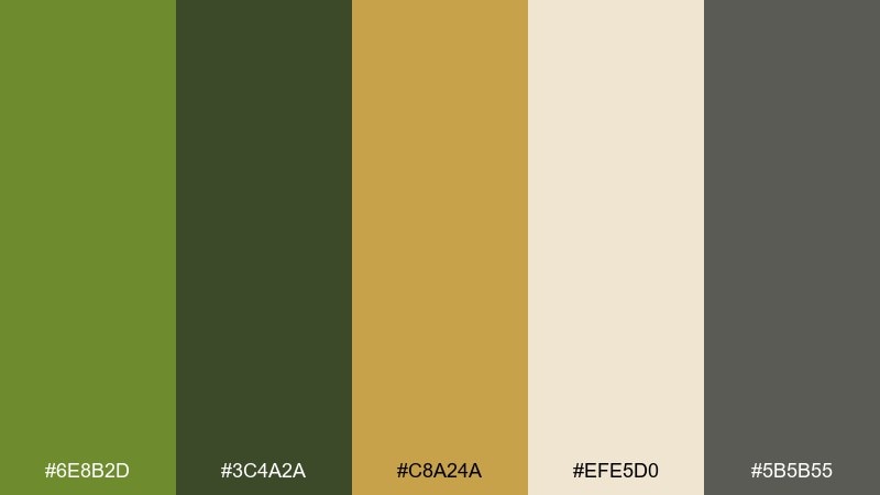
HEX: #6E8B2D #3C4A2A #C8A24A #EFE5D0 #5B5B55
Mood: heritage, sturdy, elevated
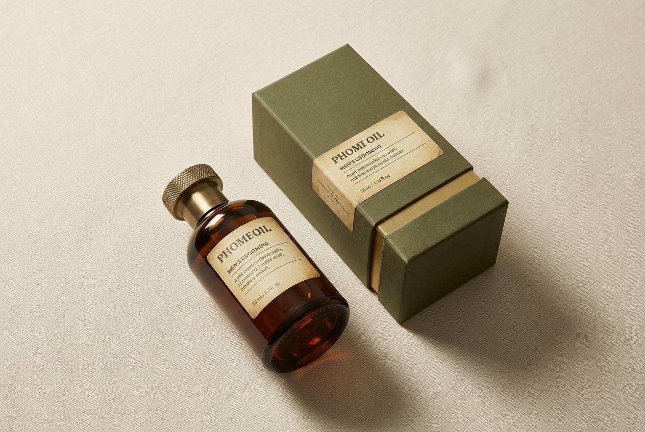
Best for: mens grooming packaging and product ads
Heritage and sturdy, like brushed brass on weathered canvas. The golden brass accent gives the green depth without turning flashy, perfect for premium labels and bottle graphics. Use the light parchment tone to frame key copy and let the brass appear only in seals, rules, or small icons. Tip: keep the gray-green as a secondary background to prevent the gold from overpowering.
Image example of brass hardware generated using media.io
4) Desert Canvas
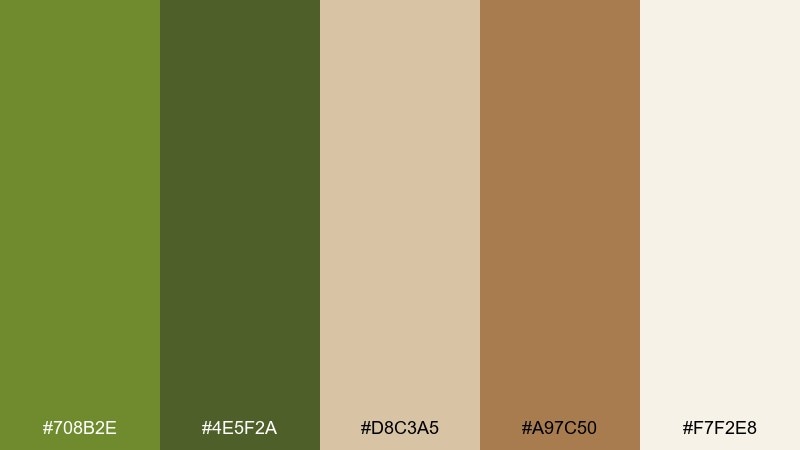
HEX: #708B2E #4E5F2A #D8C3A5 #A97C50 #F7F2E8
Mood: sun-baked, earthy, relaxed
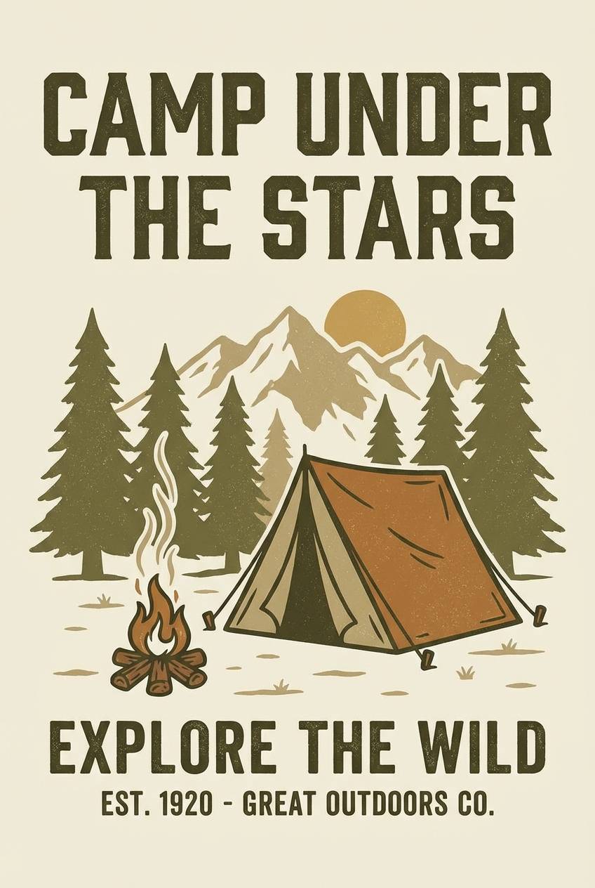
Best for: travel posters and campsite flyers
Sun-baked and earthy, like canvas tents and dusty trails at noon. Olive green holds the layout together while tan and saddle brown add warmth for a vintage travel feel. Keep headlines in the darker olive for strong legibility and use the cream for open space around illustrations. Tip: add subtle grain to unify the poster colors and soften hard edges.
Image example of desert canvas generated using media.io
5) Mossy Minimal UI
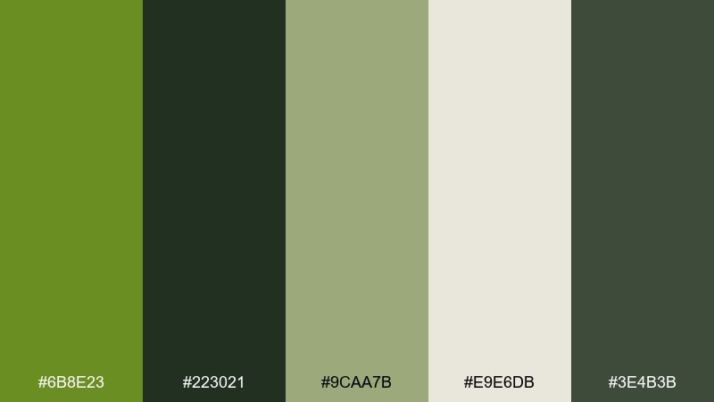
HEX: #6B8E23 #223021 #9CAA7B #E9E6DB #3E4B3B
Mood: focused, modern, low-glare
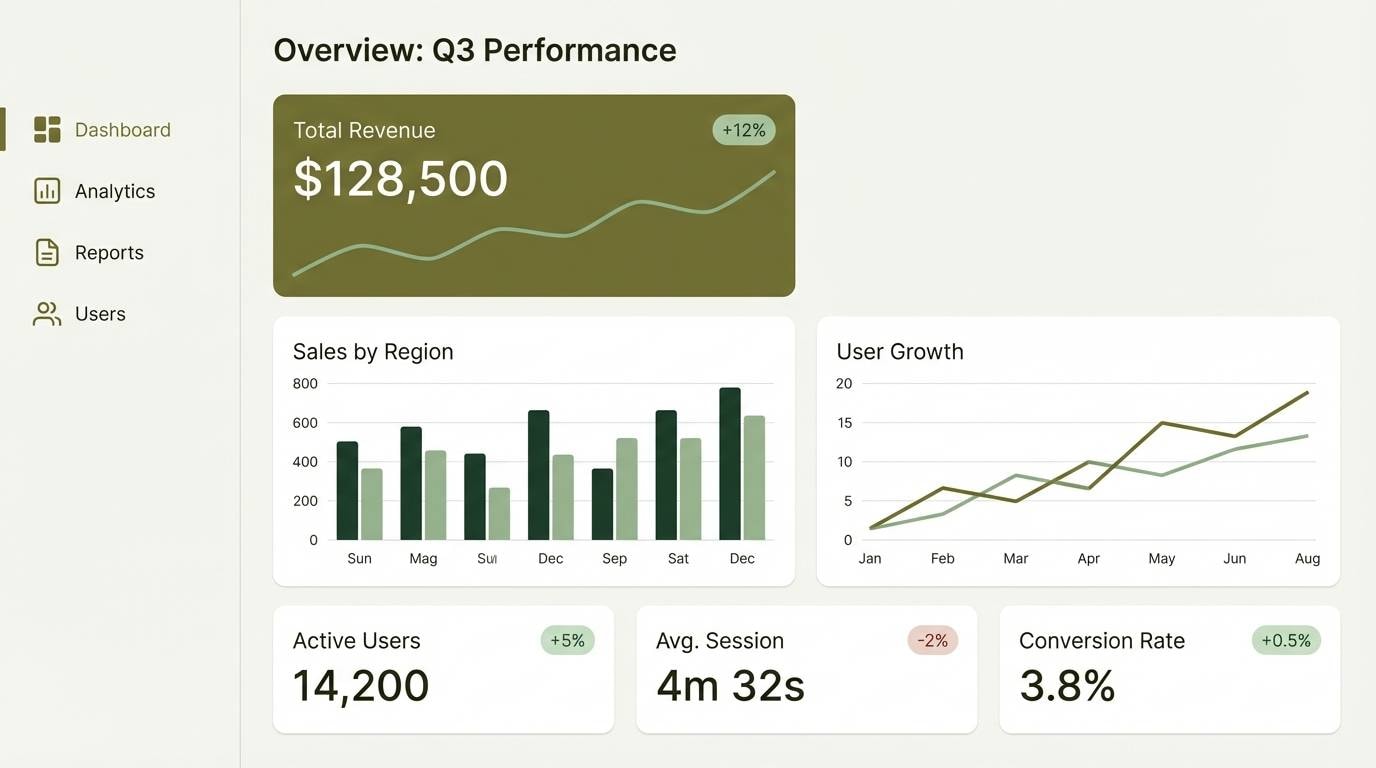
Best for: analytics dashboard UI mockups
Focused and modern, like a mossy trail mapped with clean lines. This olive drab color scheme works especially well for dashboards because it feels low-glare while still offering clear hierarchy. Pair the deep greens with soft off-white surfaces, then reserve the mid-sage for secondary buttons and chart fills. Tip: keep saturation moderate and rely on spacing and weight for emphasis.
Image example of mossy minimal ui generated using media.io
6) Rainy Trail
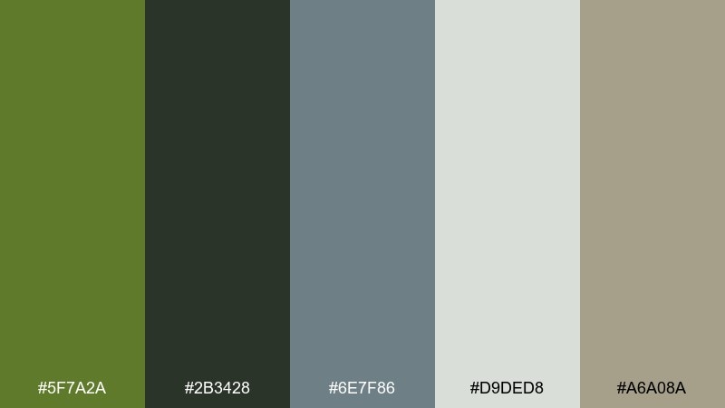
HEX: #5F7A2A #2B3428 #6E7F86 #D9DED8 #A6A08A
Mood: cool, muted, reflective
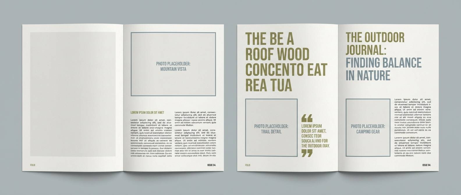
Best for: outdoor blog editorial layouts
Cool and muted, like a rainy trail with wet stone and foggy air. The blue-gray note adds calm structure beside the greens, making long-form reading feel steady and uncluttered. Use the pale gray-green as page background and keep the darkest tone for body text and navigation. Tip: use the cool gray as dividers and captions to avoid harsh black lines.
Image example of rainy trail generated using media.io
7) Vintage Military
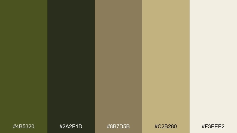
HEX: #4B5320 #2A2E1D #8B7D5B #C2B280 #F3EEE2
Mood: nostalgic, utilitarian, bold
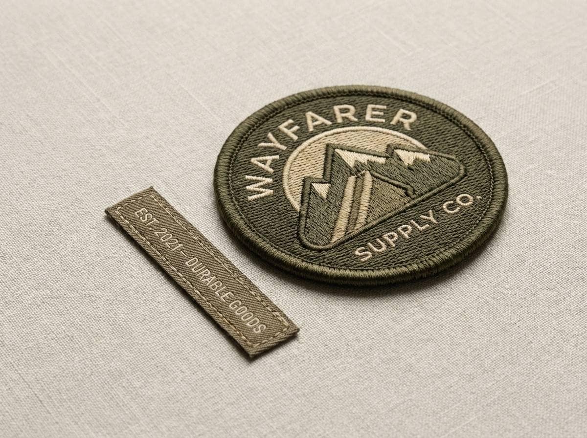
Best for: heritage brand logos and patches
Nostalgic and utilitarian, like faded uniforms and stitched insignias. The deep olive base feels authoritative, while khaki and sand tones bring approachability for modern rebrands. Pair it with blocky sans fonts, badges, or stitched textures for authentic detailing. Tip: keep the lightest cream for breathing room around marks and patches.
Image example of vintage military generated using media.io
8) Olive + Terracotta
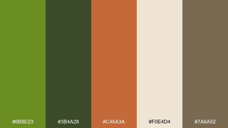
HEX: #6B8E23 #3B4A28 #C46A3A #F0E4D4 #7A6A52
Mood: warm, artisanal, inviting
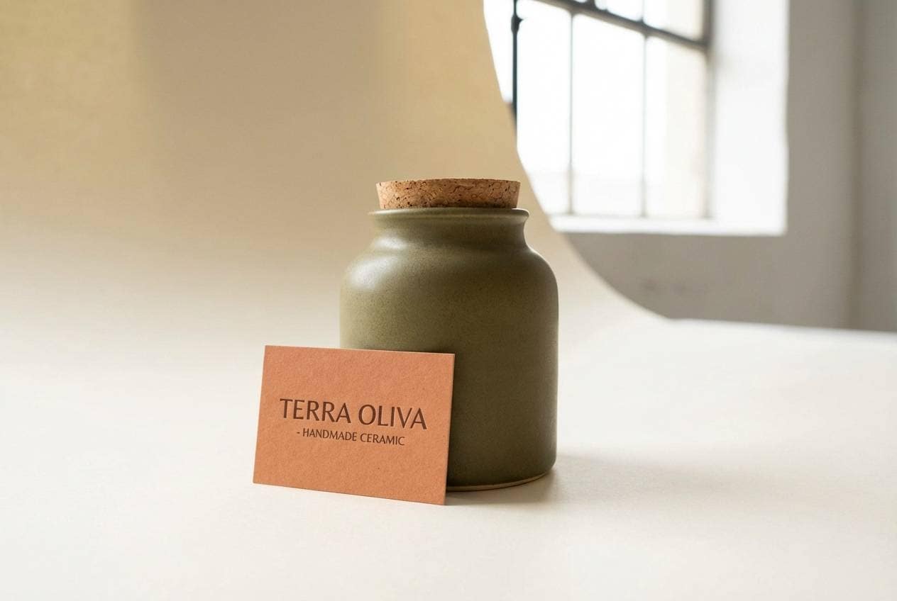
Best for: ceramic product ads and lifestyle packaging
Warm and artisanal, like hand-thrown clay beside fresh herbs. The terracotta accent energizes the greens without clashing, creating an olive drab color combination that feels handcrafted and friendly. Use terracotta sparingly for calls to action or product seals, and let the cream act as your calm canvas. Tip: echo the clay tone in small illustrative strokes to tie the layout together.
Image example of olive + terracotta generated using media.io
9) Sage Office Calm
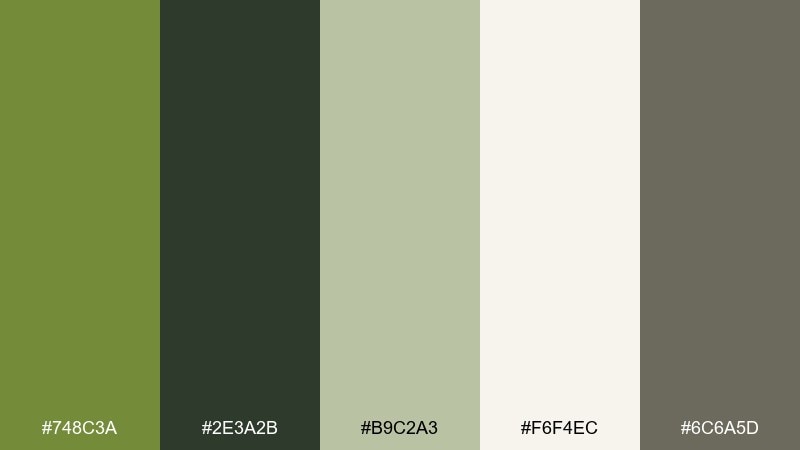
HEX: #748C3A #2E3A2B #B9C2A3 #F6F4EC #6C6A5D
Mood: calm, professional, reassuring
Best for: presentation templates and corporate one-pagers
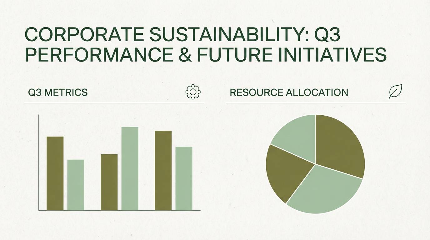
Calm and professional, like a quiet office with plants by the window. The soft sage keeps slides feeling approachable, while the deep green anchors headings and charts. Pair with warm off-white for backgrounds and use the muted gray for footnotes and dividers. Tip: keep charts to two main fills so the palette stays clean and consistent.
Image example of sage office calm generated using media.io
10) Charcoal Contrast
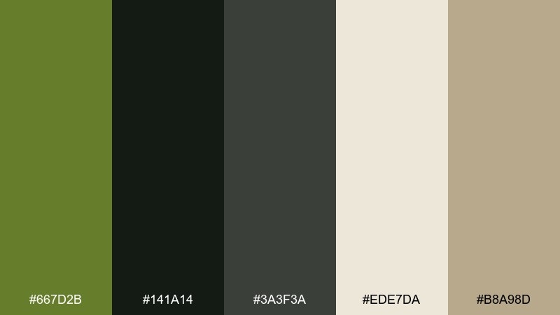
HEX: #667D2B #141A14 #3A3F3A #EDE7DA #B8A98D
Mood: sleek, confident, high-contrast
Best for: streetwear lookbooks and posters
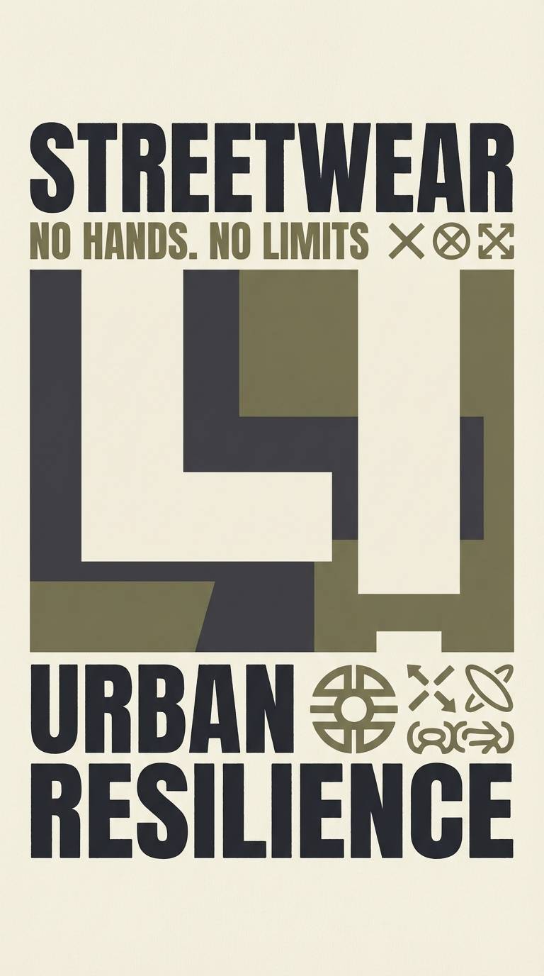
Sleek and confident, like charcoal ink on rugged fabric. The near-black and olive tones create strong contrast for editorial typography and bold poster layouts. Use the cream as a headline block or margin space, and bring in tan only for secondary info to avoid visual noise. Tip: choose one oversized type element so the dark palette feels intentional, not heavy.
Image example of charcoal contrast generated using media.io
11) Golden Hour Olive
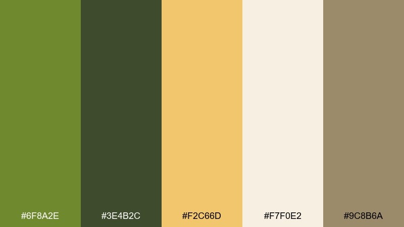
HEX: #6F8A2E #3E4B2C #F2C66D #F7F0E2 #9C8B6A
Mood: sunlit, optimistic, warm
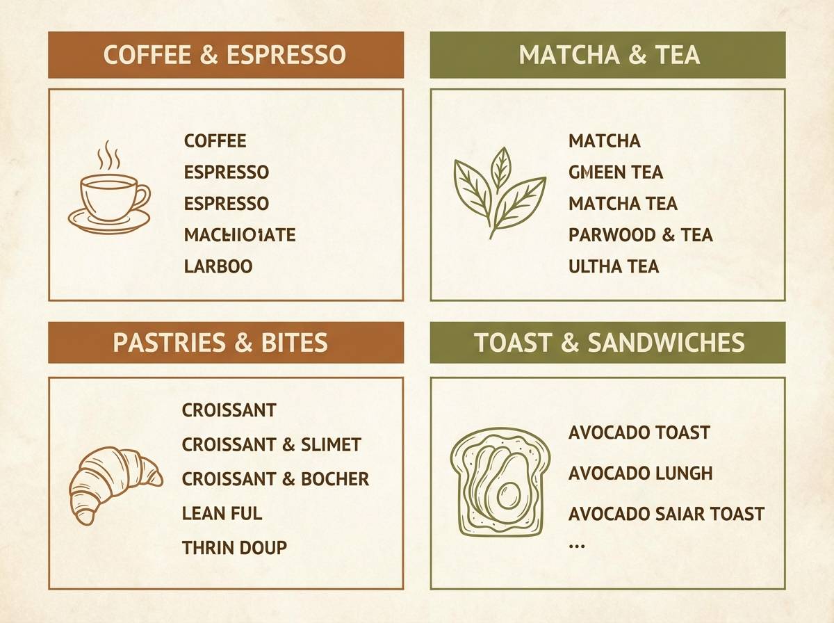
Best for: cafe branding and menu design
Sunlit and optimistic, like golden hour hitting olive groves. The buttery yellow lifts the greens and works beautifully for friendly food brands and modern menus. Pair the darkest olive with clean sans typography, then use the yellow for highlights like prices or section headers. Tip: keep the warm cream as the main background to maintain a bright, welcoming tone.
Image example of golden hour olive generated using media.io
12) Dried Herb Kitchen
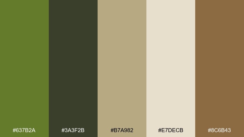
HEX: #637B2A #3A3F2B #B7A982 #E7DECB #8C6B43
Mood: cozy, rustic, appetizing
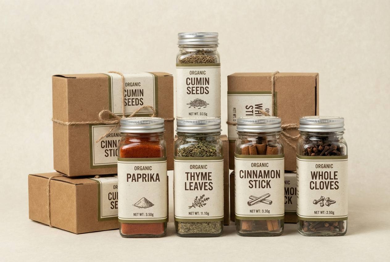
Best for: spice label systems and pantry packaging
Cozy and rustic, like dried herbs in glass jars and warm wood shelves. The olive and brown tones read appetizing without leaning sugary, which suits spices, sauces, and savory goods. Pair with simple label layouts and plenty of cream space for ingredient text. Tip: keep the darkest tone for product names so the system stays consistent across flavors.
Image example of dried herb kitchen generated using media.io
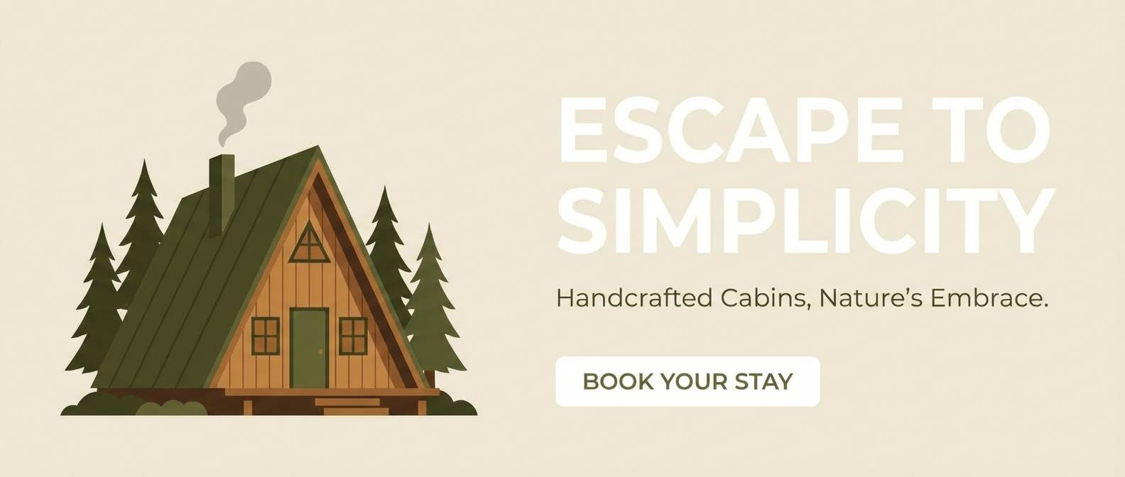
13) Forest Cabin
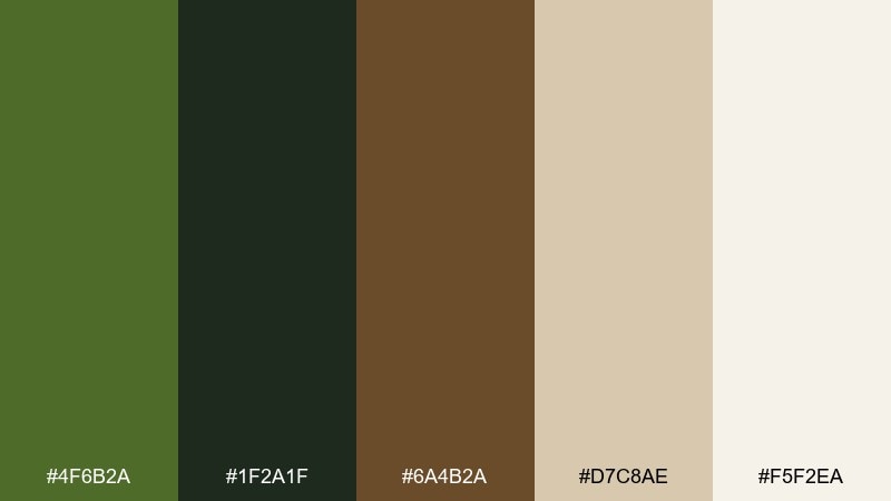
HEX: #4F6B2A #1F2A1F #6A4B2A #D7C8AE #F5F2EA
Mood: warm, woodsy, comforting
Best for: cabin rental websites and hero banners
Warm and woodsy, like pine shadows against cedar boards. The brown brings a lodge-like comfort while olive keeps the design grounded and modern. Use the cream for large sections and reserve the deepest green for navigation, buttons, and key text. Tip: add a subtle paper or woodgrain overlay at low opacity to enhance the cozy vibe.
Image example of forest cabin generated using media.io
14) Modern Camo Pop
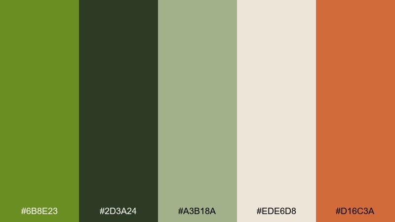
HEX: #6B8E23 #2D3A24 #A3B18A #EDE6D8 #D16C3A
Mood: urban, energetic, tactical
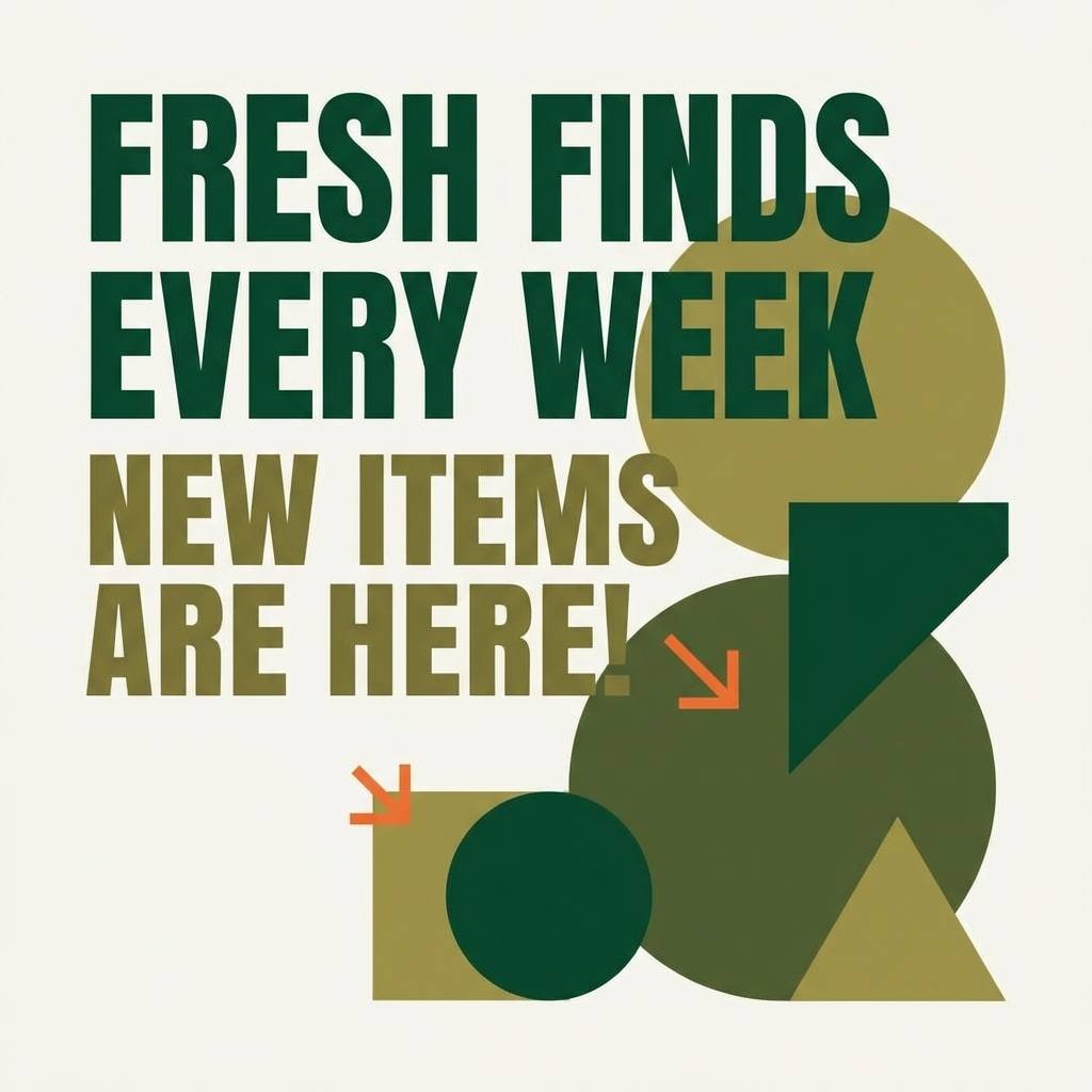
Best for: sneaker drops and social promo graphics
Urban and energetic, like modern camo with a punchy accent. The orange-coral adds movement for promos and drop announcements while the greens keep everything cohesive. Pair with bold type and simple shapes, letting the accent color call attention to dates or prices. Tip: keep the accent under 10 percent of the layout so it stays sharp, not loud.
Image example of modern camo pop generated using media.io
15) Dusty Rose Olive
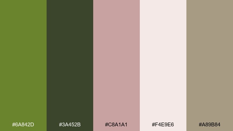
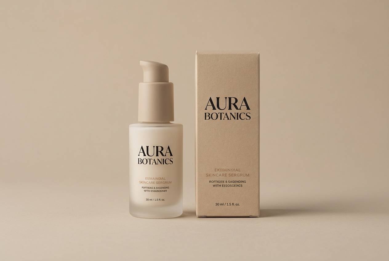
HEX: #6A842D #3A452B #C8A1A1 #F4E9E6 #A89B84
Mood: soft, romantic, modern
Best for: beauty branding and pastel product labels
Soft and romantic, like pressed flowers tucked into a travel journal. Dusty rose smooths out the green, giving you a contemporary balance for beauty and wellness designs. Use rose for gentle highlights and keep olive for structure, especially in typography and frames. Tip: pick one warm neutral for the background and avoid adding extra pastels that dilute the mood.
Image example of dusty rose olive generated using media.io
16) Coastal Olive Drift
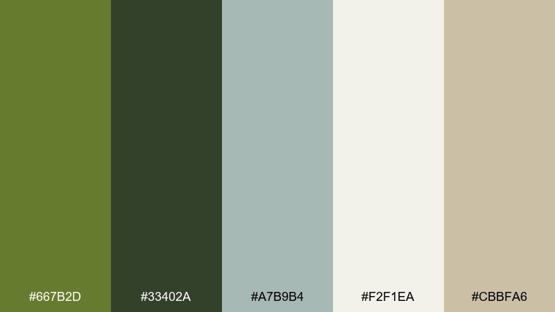
HEX: #667B2D #33402A #A7B9B4 #F2F1EA #CBBFA6
Mood: fresh, breezy, muted
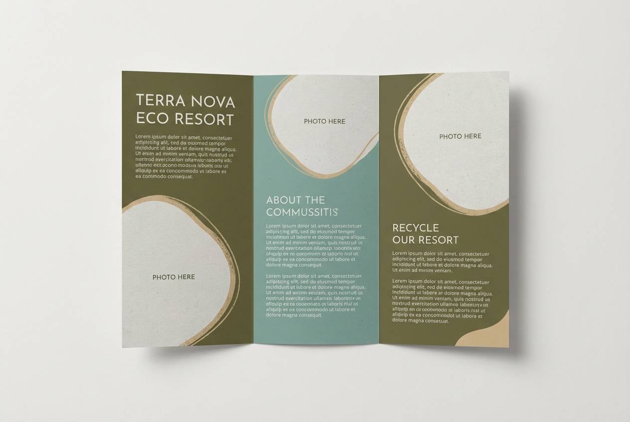
Best for: eco resort branding and brochures
Fresh and breezy, like dune grass and driftwood under pale sky. The sea-glass blue-green keeps the palette airy, while olive adds a grounded, eco-forward base. Pair with lots of whitespace and calm photography, using the darker green for headings and icon strokes. Tip: keep the blue-green for secondary panels so it reads as a quiet accent, not a competing theme.
Image example of coastal olive drift generated using media.io
17) Autumn Orchard
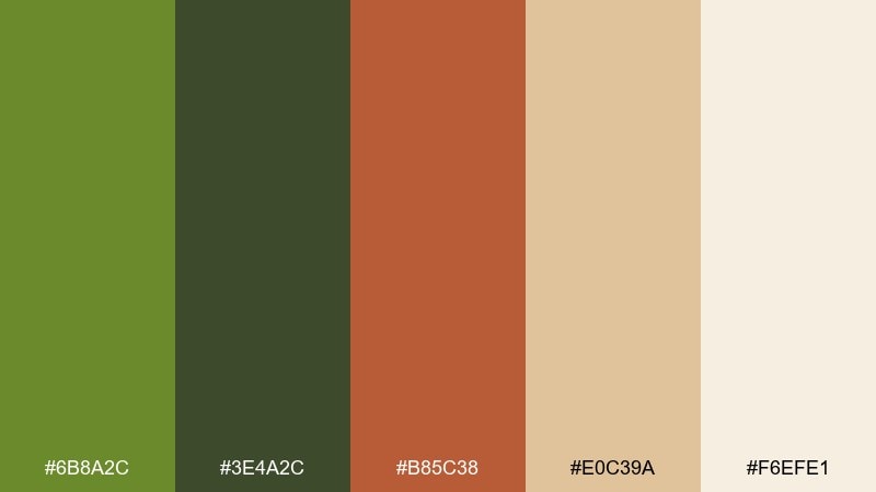
HEX: #6B8A2C #3E4A2C #B85C38 #E0C39A #F6EFE1
Mood: harvest, cozy, inviting
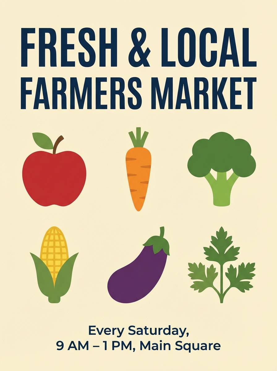
Best for: farmers market posters and labels
Harvest-cozy, like apples, leaves, and spiced cider. The warm rust accent brings a seasonal lift while olive keeps the design feeling grounded and natural. Pair with hand-drawn illustrations and chunky type for market signs, then use the cream for readable pricing blocks. Tip: repeat the rust color in small stamps or icons to tie the layout together.
Image example of autumn orchard generated using media.io
18) Steel & Olive
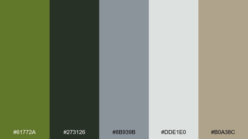
HEX: #61772A #273126 #8B939B #DDE1E0 #B0A38C
Mood: technical, clean, understated
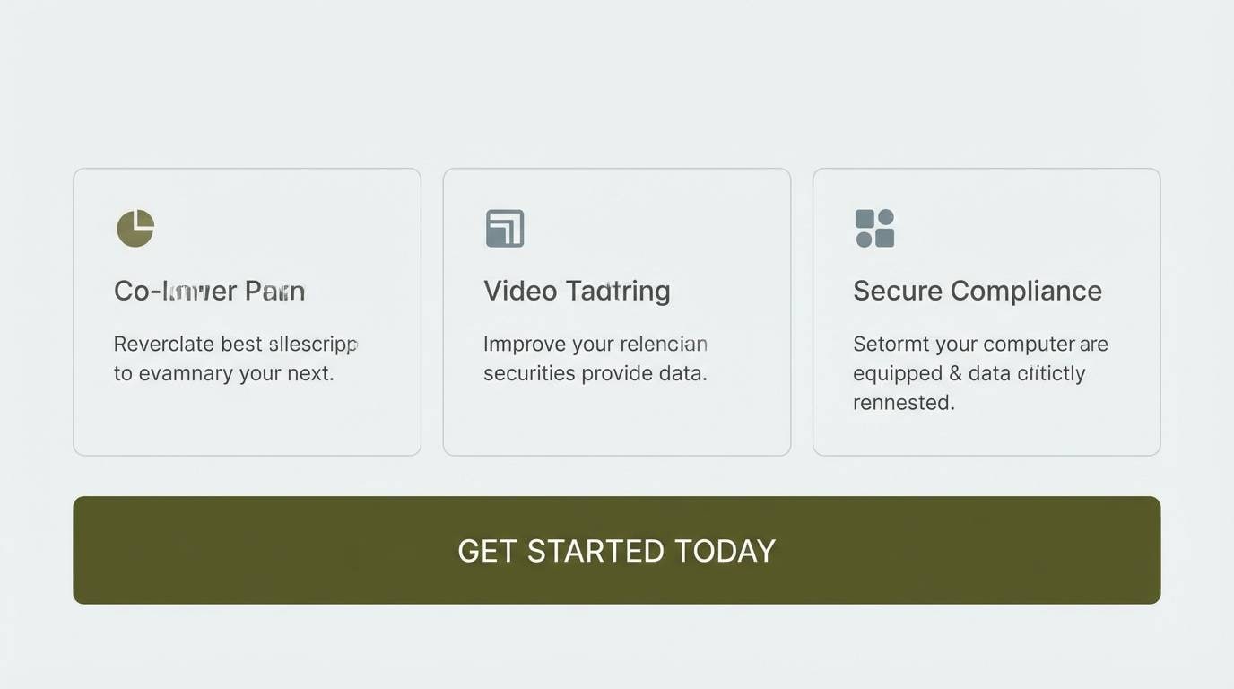
Best for: SaaS landing pages and feature sections
Technical and clean, like brushed steel next to matte paint. The cool gray adds structure that makes UI sections feel organized and modern. Use olive for primary buttons and key highlights, then rely on the steel gray for cards, borders, and secondary text. Tip: keep contrast accessible by pairing the darkest green with the lightest gray for small type.
Image example of steel & olive generated using media.io
19) Linen and Leather
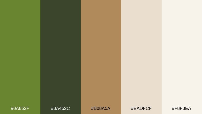
HEX: #6A852F #3A452C #B08A5A #EADFCF #F8F3EA
Mood: artisan, warm, tactile
Best for: handmade goods packaging and tags
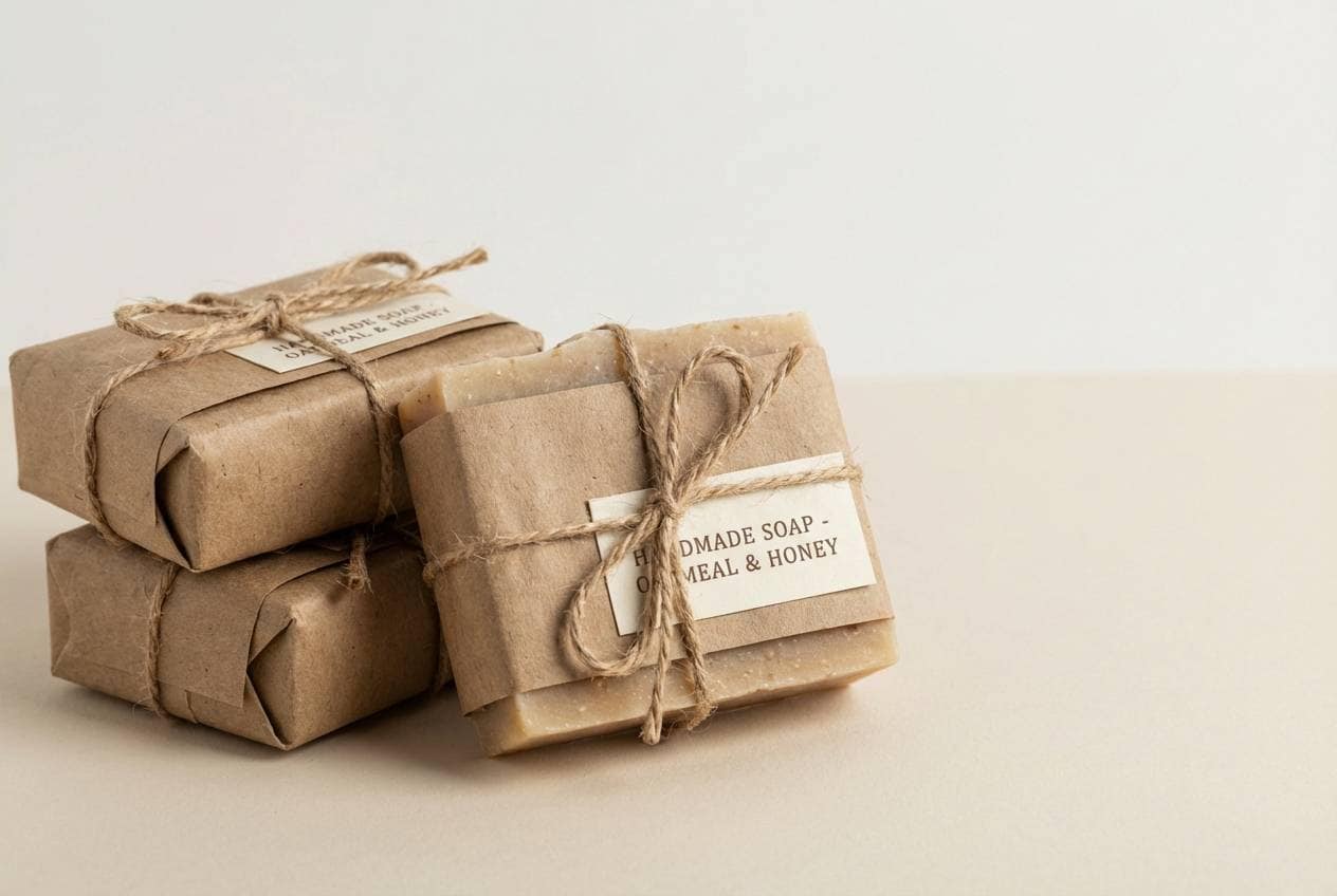
Artisan and tactile, like linen thread and worn leather. The caramel brown makes the greens feel warmer, perfect for handcrafted products and small-batch labels. Pair with simple stamp-style logos and let the light cream do most of the work as a background. Tip: choose one brown shade for all callouts so your packaging system stays cohesive.
Image example of linen and leather generated using media.io
20) Night Ops Accent
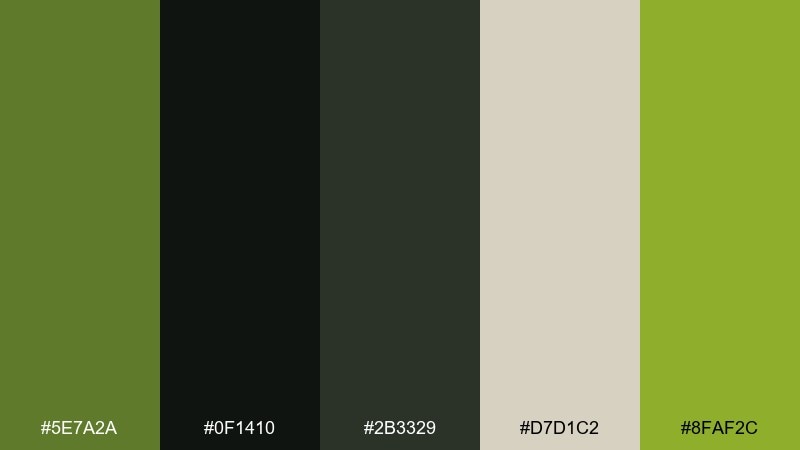
HEX: #5E7A2A #0F1410 #2B3329 #D7D1C2 #8FAF2C
Mood: dramatic, stealthy, modern
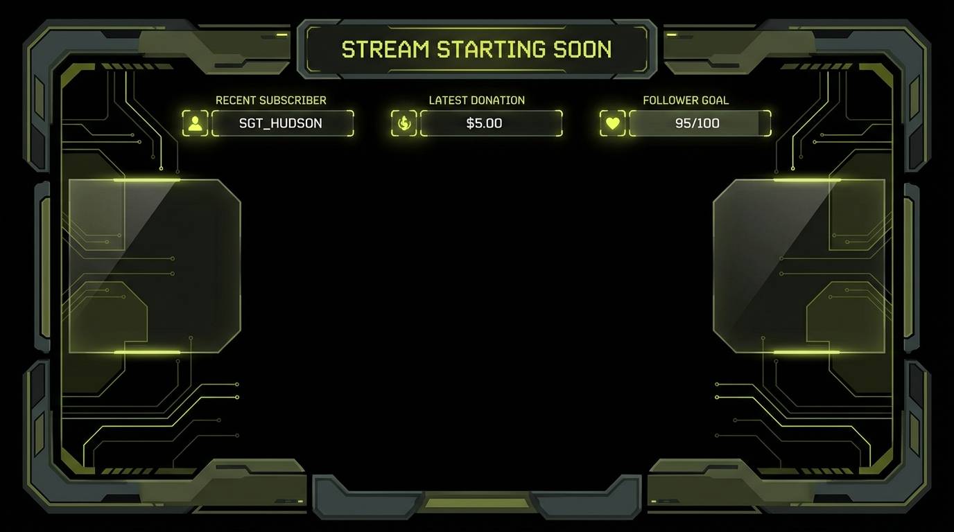
Best for: gaming overlays and streamer graphics
Dramatic and stealthy, like night-vision gear with a neon edge. The near-black foundation makes the bright yellow-green pop for alerts, highlights, and callouts. Keep most surfaces dark and use the pale neutral only for small text areas to avoid glare. Tip: reserve the brightest accent for interactive states so it reads instantly.
Image example of night ops accent generated using media.io
21) Botanical Ink
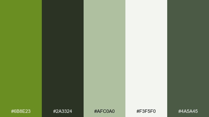
HEX: #6B8E23 #2A3324 #AFC0A0 #F3F5F0 #4A5A45
Mood: botanical, clean, contemporary
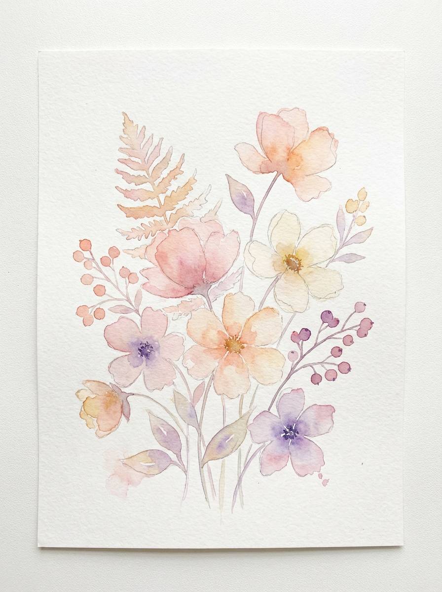
Best for: watercolor botanical prints and wall art
Botanical and clean, like fresh leaves rendered in ink wash. The soft sage tints keep the greens from feeling heavy, making it ideal for airy illustrations and print sets. Pair with minimal captions and wide margins, letting the mid-sage handle secondary shapes. Tip: limit your watercolor layers so the light background stays luminous.
Image example of botanical ink generated using media.io
22) Museum Labels
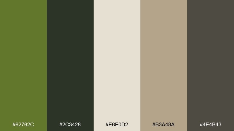
HEX: #62762C #2C3428 #E6E0D2 #B3A48A #4E4B43
Mood: quiet, curated, timeless
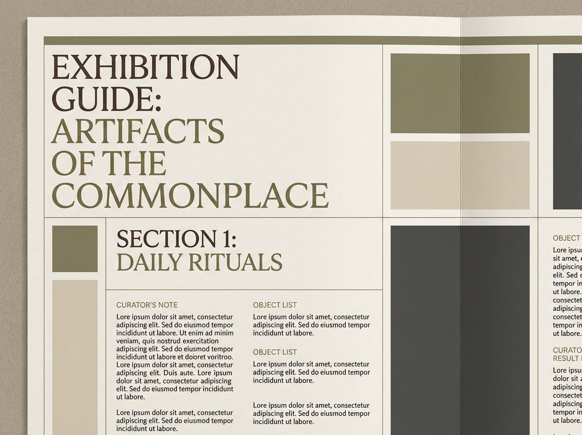
Best for: exhibition signage and catalog design
Quiet and curated, like museum label cards beside natural artifacts. The muted greens feel scholarly without turning cold, while the warm neutral tones keep pages approachable. Pair with classic typography and generous spacing, using the darkest neutral for body copy and captions. Tip: keep color usage restrained and let the grid do the heavy lifting for hierarchy.
Image example of museum labels generated using media.io
What Colors Go Well with Olive Drab?
Olive drab pairs naturally with warm neutrals like cream, oat, sand, and khaki, which keep the palette readable and calm. These combos are ideal for packaging, editorial layouts, and brand systems that need a grounded tone.
For more contrast, add near-black charcoal, deep forest green, or steel gray. These darker anchors help olive drab look more modern, especially in UI and poster design.
If you want an accent that feels intentional, try brass/gold, terracotta, dusty rose, or a muted teal. Keep the accent color limited so olive stays the dominant “base” rather than competing for attention.
How to Use a Olive Drab Color Palette in Real Designs
Start by assigning roles: olive drab as the primary brand color, a light warm neutral as the background, and a dark green/charcoal for text. This setup maintains legibility while still delivering the earthy mood.
In UI, use olive for primary buttons and active states, then rely on grays for borders, cards, and secondary text. In print, olive drab looks best with matte finishes and subtle texture (kraft, uncoated paper, or soft grain overlays).
For marketing layouts, reserve brighter accents (rust, coral, or yellow) for small high-impact elements like price tags, badges, or CTAs. That balance keeps the palette modern instead of muddy.
Create Olive Drab Palette Visuals with AI
If you already have HEX codes, you can quickly turn them into realistic mockups (labels, posters, UI screens, or product shots) by describing the scene and specifying olive drab as the dominant tone. This is especially useful for testing how your palette behaves across different materials and lighting.
To keep results consistent, reuse the same prompt structure and only swap the palette name, surface texture, or design type. You’ll get a cohesive “set” of visuals that match your brand direction.
When you’re ready, generate olive drab palette images in seconds and iterate until the mood and contrast feel right.
Olive Drab Color Palette FAQs
-
What is the HEX code for olive drab?
A common olive drab reference is #6B8E23, but olive drab varies across palettes (some versions skew darker, grayer, or more yellow-green). -
Is olive drab the same as olive green?
Not exactly. Olive drab is typically more muted and “dusty,” with less saturation than many olive greens, making it feel more utilitarian and neutral. -
What colors pair best with olive drab for a modern look?
Try pairing olive drab with warm cream backgrounds and charcoal/near-black typography, then add a restrained accent like brass, terracotta, or steel gray. -
How do I keep olive drab palettes from looking muddy?
Increase value contrast (use a lighter cream and a darker green/charcoal), limit the number of mid-tones, and keep accent colors small and deliberate. -
Does olive drab work for UI and dashboards?
Yes. Olive drab can feel low-glare and professional in UI, especially when paired with off-white surfaces and cool grays for dividers, cards, and secondary text. -
What’s a good accent color for olive drab?
Terracotta/rust, brass gold, muted teal, dusty rose, and bright yellow-green all work well—choose one accent and keep it under control for a clean hierarchy. -
Can I generate palette mockups from these HEX codes?
Yes. Use an AI image generator to describe your design (packaging, poster, UI, labels) and specify olive drab as the dominant tone, then refine lighting, texture, and typography style for consistency.


