Moonlight palettes capture the calm of night skies, cool stone, and soft foggy light—perfect when you want a modern look without loud saturation.
Below are 20+ curated moonlight color palette ideas with HEX codes, plus practical pairing tips for UI, branding, posters, and packaging.
In this article
- Why Moonlight Palettes Work So Well
-
- silver drift
- lunar mist
- night harbor
- velvet eclipse
- frosted slate
- starlit linen
- blue hour whisper
- pearl shadow
- indigo quiet
- cloudlit quartz
- moonstone denim
- ashen lilac
- arctic ink
- dusk orchid
- winter spruce
- smoky topaz
- tidepool steel
- candlelit fog
- nocturne teal
- granite bloom
- glacier scroll
- quiet meteor
- What Colors Go Well with Moonlight?
- How to Use a Moonlight Color Palette in Real Designs
- Create Moonlight Palette Visuals with AI
Why Moonlight Palettes Work So Well
Moonlight tones sit in a sweet spot: cool, quiet, and readable. Because they lean on grays, blue-grays, and softened purples, they create hierarchy without fighting your typography or imagery.
They also scale beautifully across mediums. The same palette can feel minimal in UI, premium on packaging, or cinematic in posters—depending on how you place contrast and texture.
Most importantly, moonlight palettes make accents feel intentional. When your base is restrained, a single bright cyan, coral, lime, or metallic can guide attention instantly.
20+ Moonlight Color Palette Ideas (with HEX Codes)
1) Silver Drift
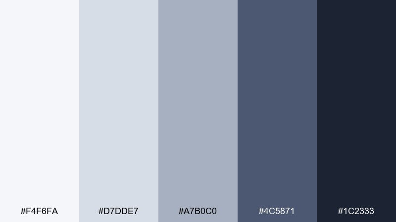
HEX: #F4F6FA #D7DDE7 #A7B0C0 #4C5871 #1C2333
Mood: calm, airy, modern
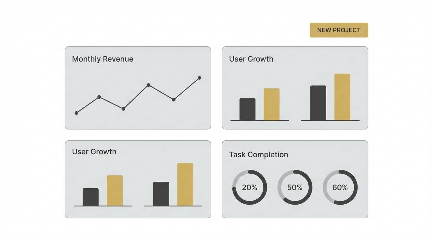
Best for: SaaS dashboard UI
Calm and airy like clouds sliding across a bright night sky, these tones feel polished without going cold. The moonlight color palette works beautifully for SaaS dashboards where readability matters and contrast needs to stay gentle. Pair it with a single vivid accent like electric cyan for key actions and keep neutrals dominant for data-heavy screens. Tip: reserve the deepest navy for navigation so cards and tables stay light.
Image example of silver drift generated using media.io
Media.io is an online AI studio for creating and editing video, image, and audio in your browser.

2) Lunar Mist
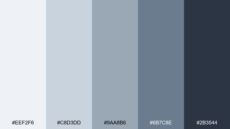
HEX: #EEF2F6 #C8D3DD #9AA8B6 #6B7C8E #2B3544
Mood: soft, quiet, refined
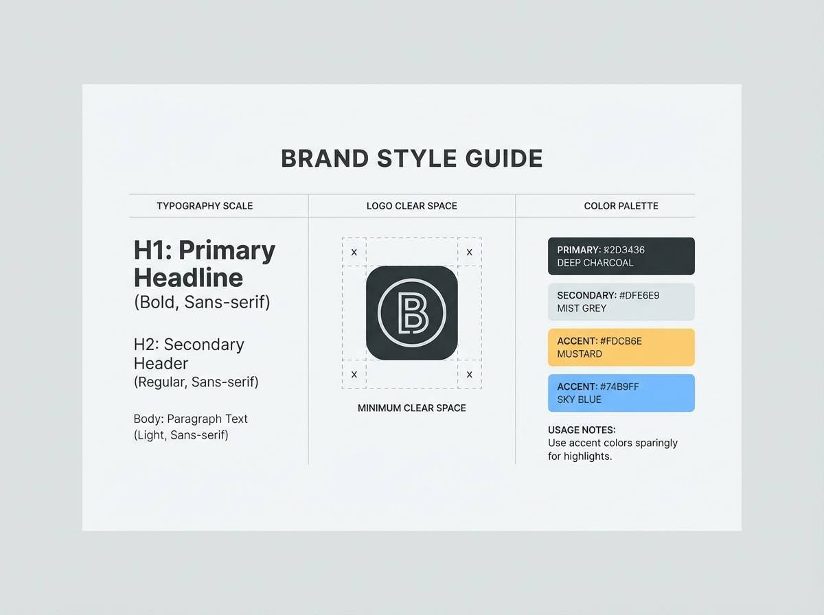
Best for: minimal brand style guide
Soft and quiet like mist over pavement at midnight, this mix reads refined and restrained. It suits a minimal brand style guide where typography and spacing do the heavy lifting. Pair it with warm paper textures or a subtle off-white background to avoid a sterile feel. Tip: use the mid slate as your primary text color for a gentler contrast than pure black.
Image example of lunar mist generated using media.io
3) Night Harbor
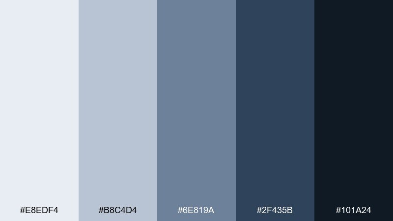
HEX: #E8EDF4 #B8C4D4 #6E819A #2F435B #101A24
Mood: deep, steady, nautical
Best for: tech conference landing page
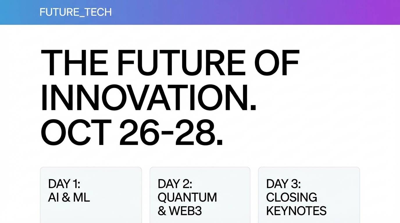
Deep and steady like dock lights reflecting on still water, these blues feel confident and grounded. They fit a tech conference landing page where you want authority without aggressive saturation. Pair with crisp white space and a bright lime or aqua highlight for buttons and links. Tip: keep hero gradients subtle so speaker headshots stay natural.
Image example of night harbor generated using media.io
4) Velvet Eclipse
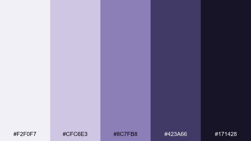
HEX: #F2F0F7 #CFC6E3 #8C7FB8 #423A66 #171428
Mood: dramatic, velvety, luxe
Best for: beauty product ad creative
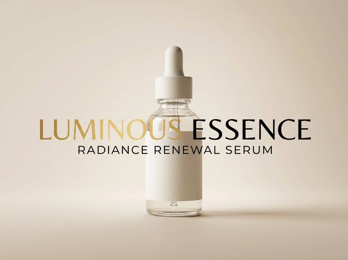
Dramatic and velvety like an eclipse fading into violet, this set feels luxe and editorial. As a moonlight color scheme, it shines in beauty ads where you want depth, softness, and premium cues at once. Pair with metallic silver typography or a dusty rose accent for a more romantic finish. Tip: keep the darkest purple for headlines to prevent small text from looking heavy.
Image example of velvet eclipse generated using media.io
5) Frosted Slate
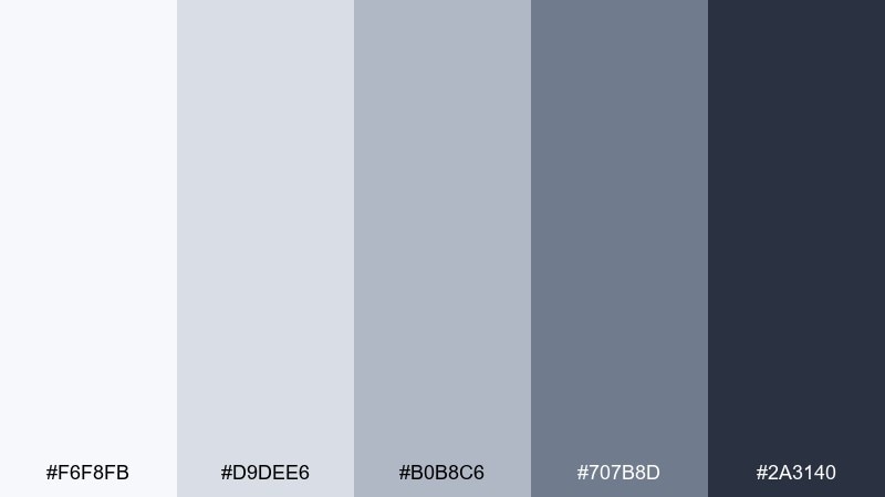
HEX: #F6F8FB #D9DEE6 #B0B8C6 #707B8D #2A3140
Mood: clean, structured, professional
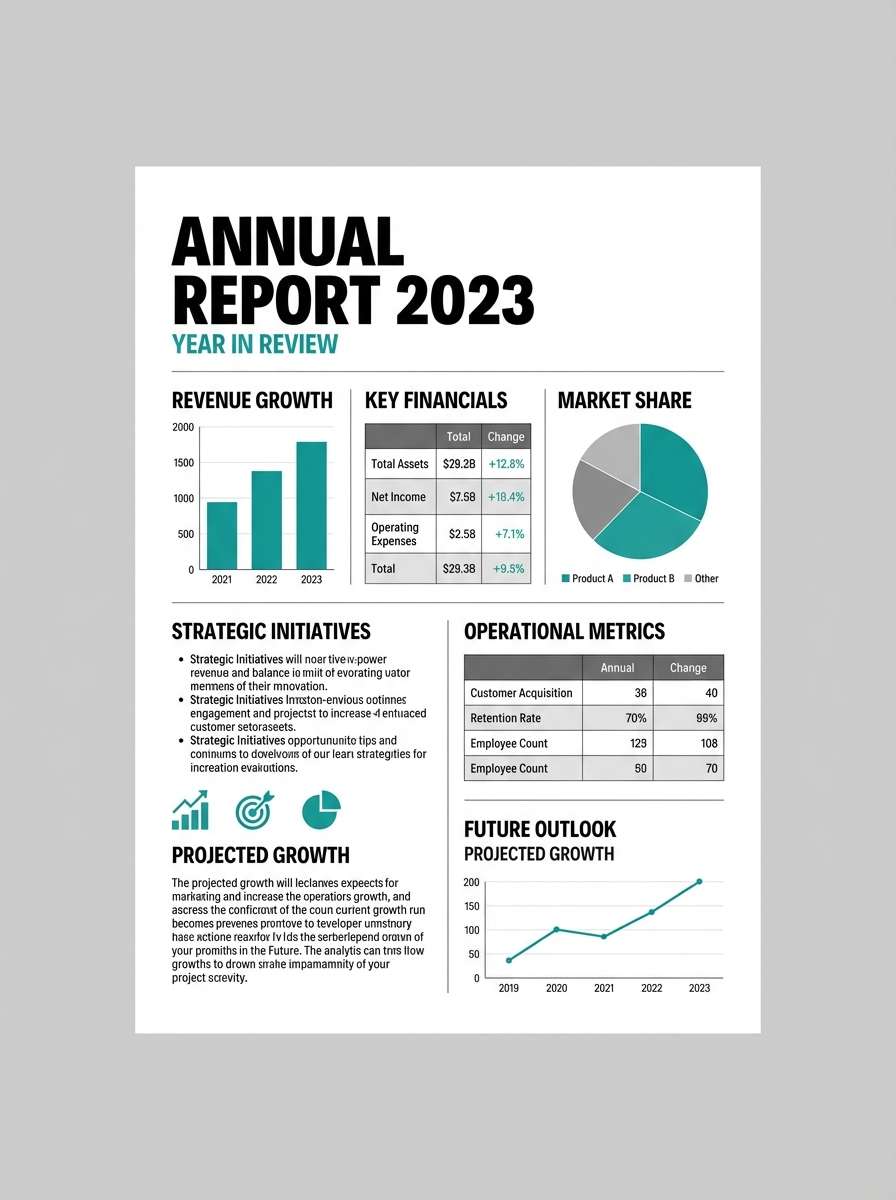
Best for: corporate annual report layout
Clean and structured like frost on stone, these grays feel dependable and modern. They work well for an annual report where charts, tables, and captions need a disciplined hierarchy. Pair with one saturated accent, such as cobalt, to guide attention without turning busy. Tip: use the lightest gray for section dividers instead of heavy rules.
Image example of frosted slate generated using media.io
6) Starlit Linen
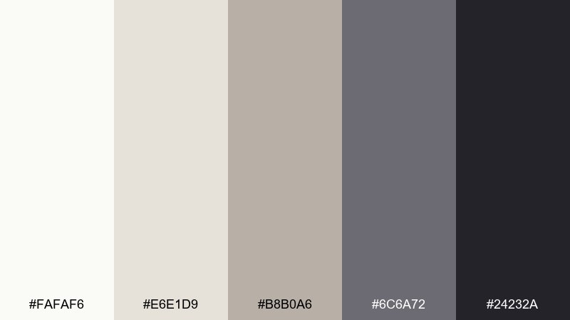
HEX: #FAFAF6 #E6E1D9 #B8B0A6 #6C6A72 #24232A
Mood: cozy, understated, elegant
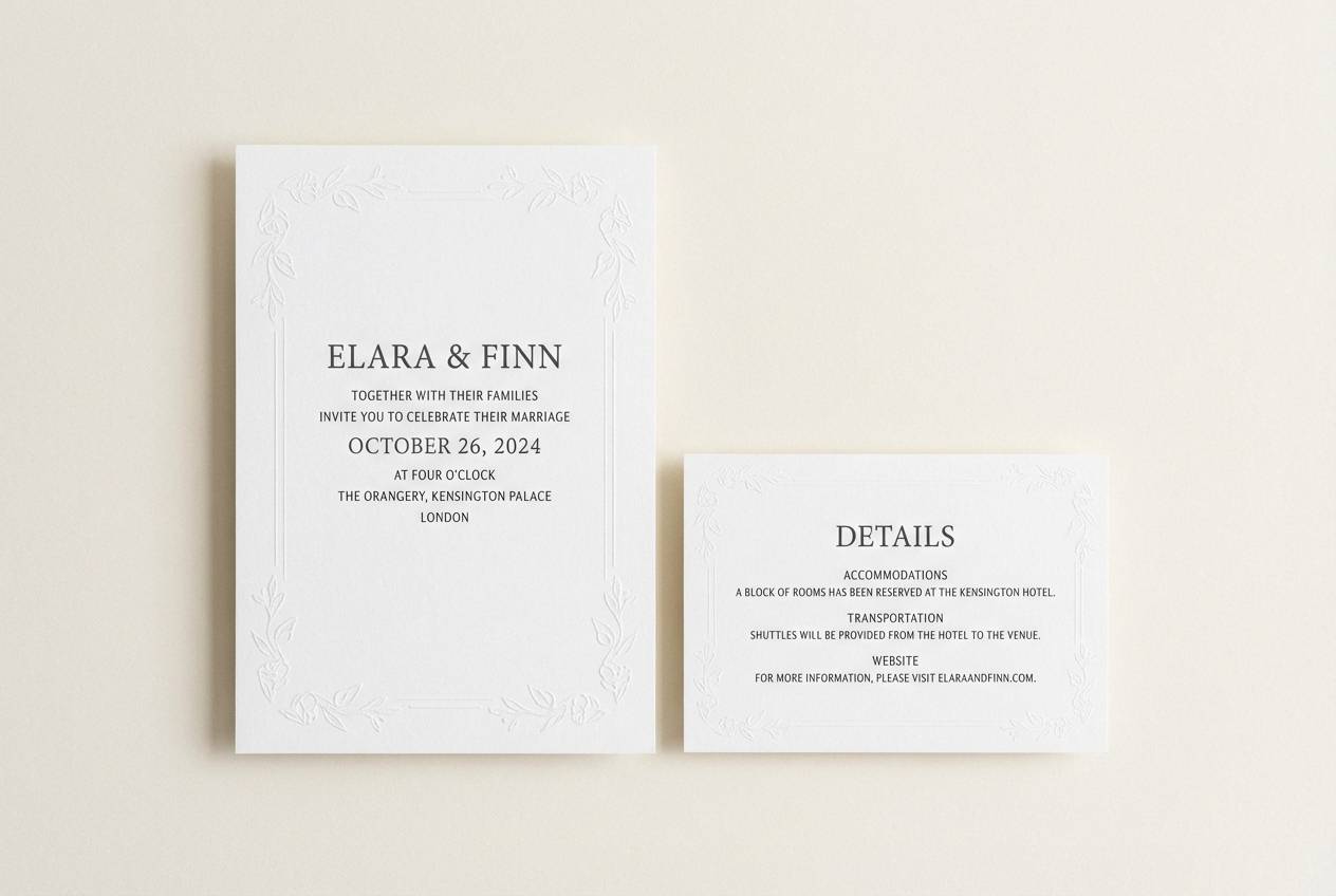
Best for: wedding invitation suite
Cozy and understated like linen under starlight, these neutrals feel intimate and timeless. They are ideal for a wedding invitation suite that wants elegance without heavy contrast. Pair with warm gold foil details or a soft sage accent for a natural lift. Tip: print the darkest tone in small amounts so the paper texture stays the star.
Image example of starlit linen generated using media.io
7) Blue Hour Whisper
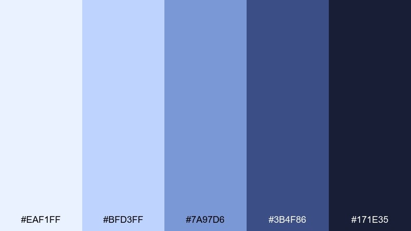
HEX: #EAF1FF #BFD3FF #7A97D6 #3B4F86 #171E35
Mood: dreamy, bright, cinematic
Best for: music poster design
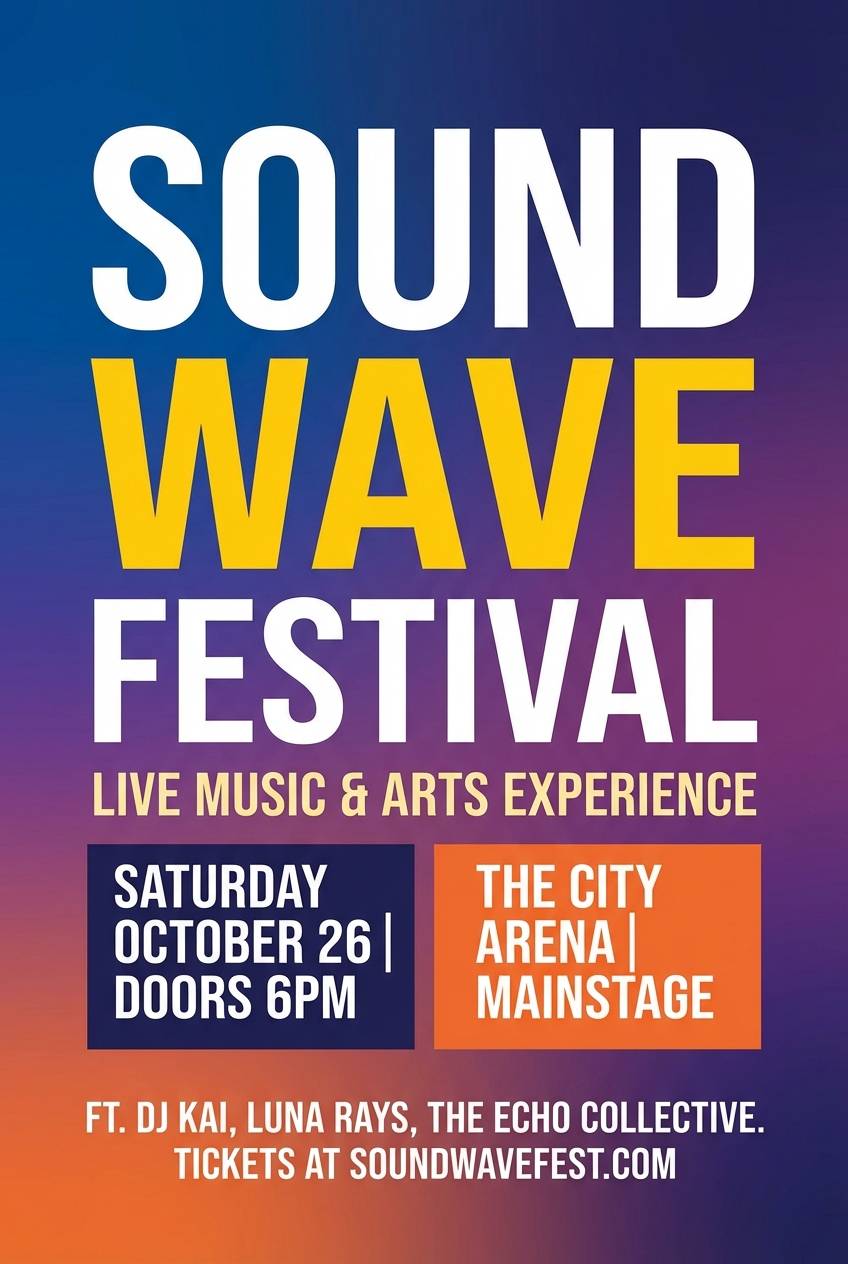
Dreamy and cinematic like the blue hour right before night fully arrives, this range feels vibrant yet controlled. These moonlight color combinations are great for music posters because they support bold type and glowing gradients without looking neon. Pair with white text and a small punch of coral for ticket info and callouts. Tip: keep gradients directional so the layout still reads at a distance.
Image example of blue hour whisper generated using media.io
8) Pearl Shadow
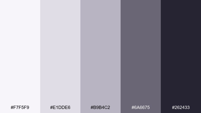
HEX: #F7F5F9 #E1DDE6 #B9B4C2 #6A6675 #262433
Mood: soft, poised, minimal
Best for: skincare packaging labels
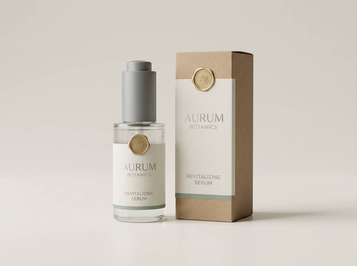
Soft and poised like a pearl catching a faint shadow, these tones feel clean and premium. They suit skincare labels where you want calm, clinical trust without looking harsh. Pair with a muted blush accent and plenty of negative space for an elevated shelf presence. Tip: use the mid mauve-gray for secondary copy to keep the label readable at small sizes.
Image example of pearl shadow generated using media.io
9) Indigo Quiet
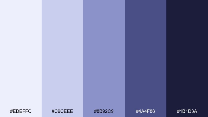
HEX: #EDEFFC #C9CEEE #8B92C9 #4A4F86 #1B1D3A
Mood: thoughtful, serene, intelligent
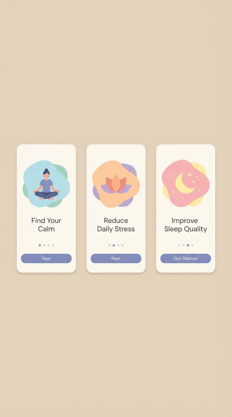
Best for: meditation app onboarding UI
Thoughtful and serene like an indigo horizon, these colors support a slow, quiet rhythm. They work well for onboarding screens where you need reassurance and clear steps without shouting. Pair with a warm cream background and subtle illustrations for approachability. Tip: keep your primary button in the brighter periwinkle for an inviting, low-stress call to action.
Image example of indigo quiet generated using media.io
10) Cloudlit Quartz
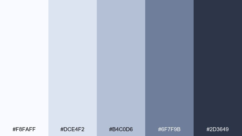
HEX: #F8FAFF #DCE4F2 #B4C0D6 #6F7F9B #2D3649
Mood: fresh, balanced, polished
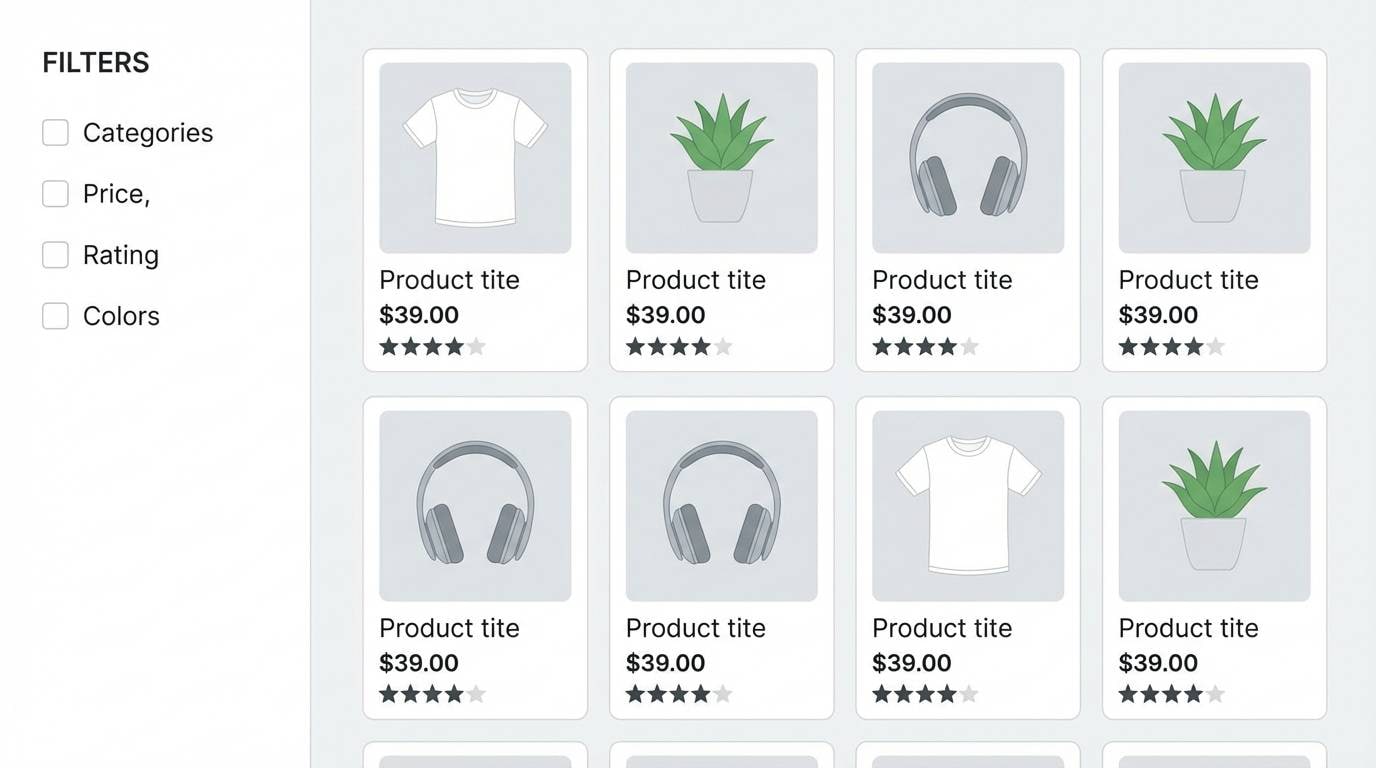
Best for: ecommerce product grid UI
Fresh and balanced like quartz under a thin veil of clouds, these blues and grays feel instantly polished. They are a strong fit for ecommerce grids where product photography should lead and UI should recede. Pair with warm neutrals for backgrounds and a single saturated badge color for sales and new tags. Tip: keep borders in the palest tone and rely on spacing for structure.
Image example of cloudlit quartz generated using media.io
11) Moonstone Denim
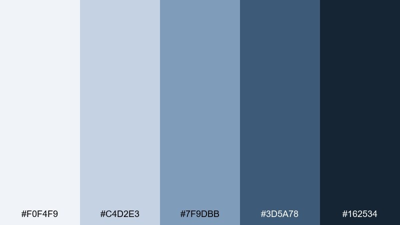
HEX: #F0F4F9 #C4D2E3 #7F9DBB #3D5A78 #162534
Mood: casual, confident, crisp
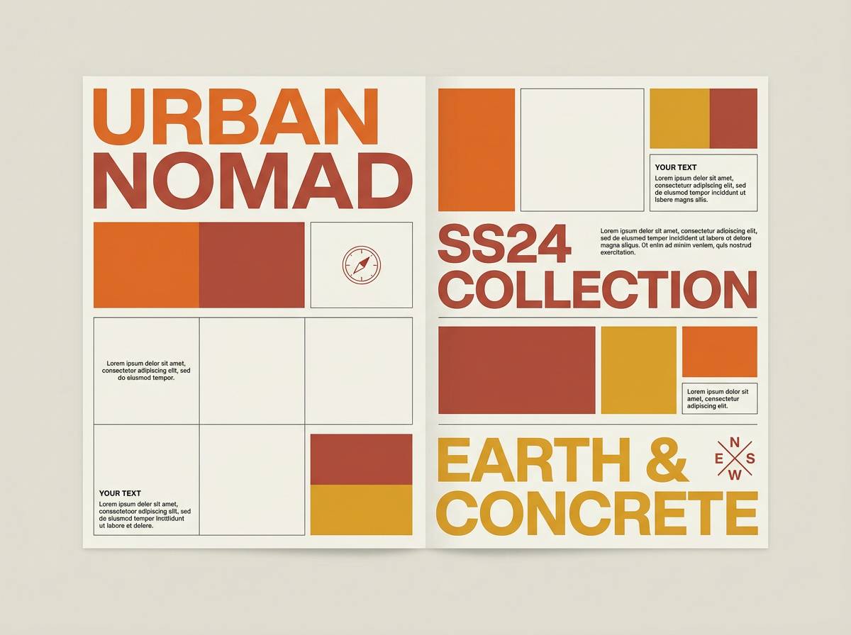
Best for: streetwear lookbook layout
Casual and confident like worn denim under cool light, this mix feels crisp and wearable. It suits a streetwear lookbook where you want strong headers and a modern grid without loud color. Pair with monochrome photography and a sharp white for spacing and captions. Tip: use the mid blue for section tabs to keep navigation clear but understated.
Image example of moonstone denim generated using media.io
12) Ashen Lilac
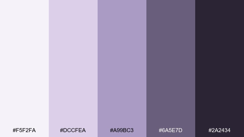
HEX: #F5F2FA #DCCFEA #A99BC3 #6A5E7D #2A2434
Mood: romantic, muted, artistic
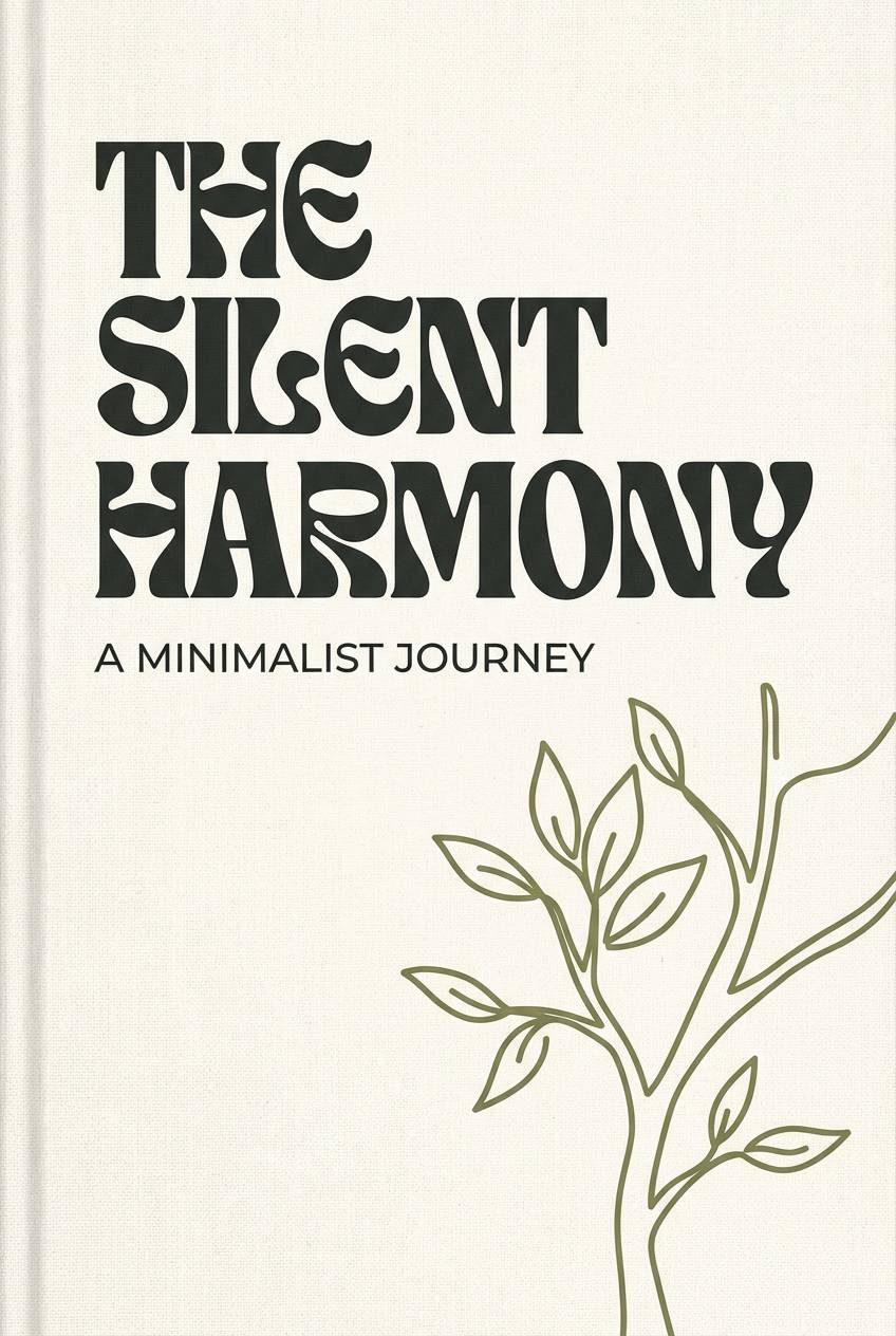
Best for: book cover design
Romantic and muted like lilac petals pressed into ash-gray paper, these tones feel literary and modern. They are ideal for a contemporary fiction cover that needs emotion without bright color. Pair with creamy off-white type and a small copper accent for author name or series mark. Tip: keep the background in the light lavender so dark titles stay crisp.
Image example of ashen lilac generated using media.io
13) Arctic Ink
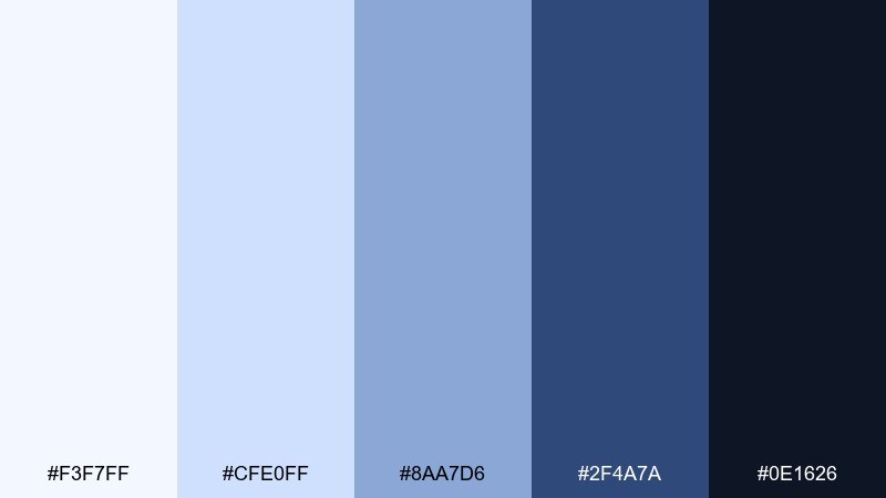
HEX: #F3F7FF #CFE0FF #8AA7D6 #2F4A7A #0E1626
Mood: bold, chilly, high-contrast
Best for: cybersecurity brand identity
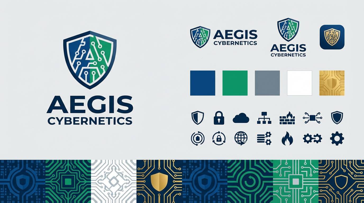
Bold and chilly like arctic air against dark ink, this set brings instant clarity and authority. The moonlight color palette is a strong match for cybersecurity branding, where sharp contrast signals trust and precision. Pair with geometric patterns and a bright cyan highlight to modernize the look. Tip: use the near-black for backgrounds and let the pale blues carry icons and key metrics.
Image example of arctic ink generated using media.io
14) Dusk Orchid
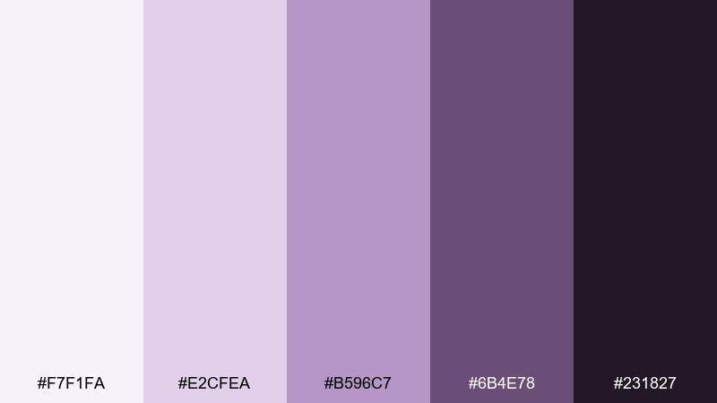
HEX: #F7F1FA #E2CFEA #B596C7 #6B4E78 #231827
Mood: moody, floral, sophisticated
Best for: restaurant menu design
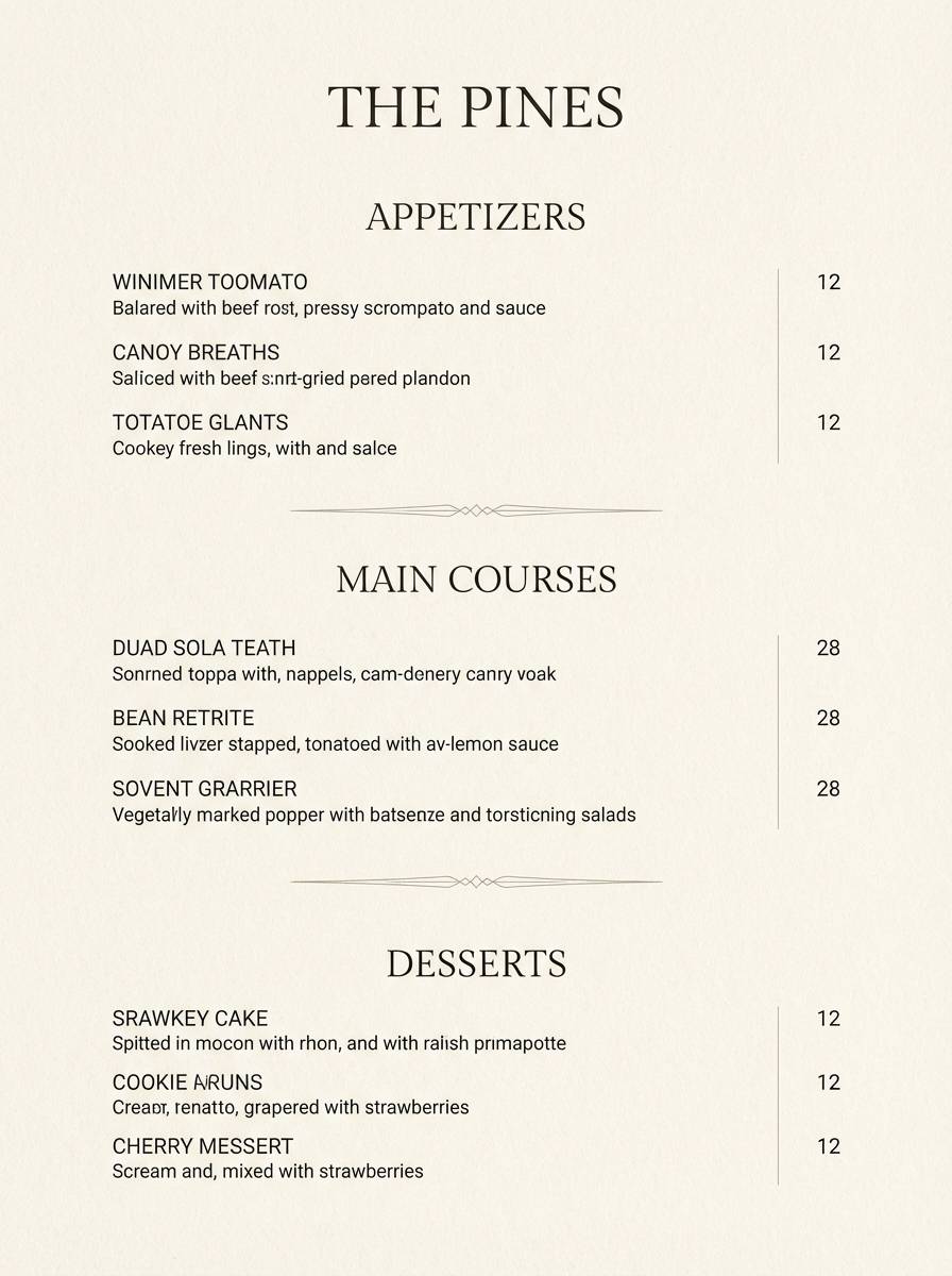
Moody and floral like orchids after sunset, these purples feel sophisticated and slightly mysterious. They suit upscale menus where you want atmosphere without sacrificing readability. Pair with warm ivory paper tones and a charcoal type color for body copy. Tip: keep the darkest shade for section headers and use the mid orchid for dividers and icons.
Image example of dusk orchid generated using media.io
15) Winter Spruce
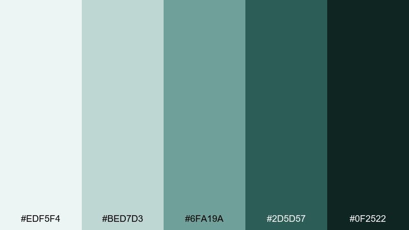
HEX: #EDF5F4 #BED7D3 #6FA19A #2D5D57 #0F2522
Mood: cool, evergreen, grounded
Best for: outdoor brand packaging
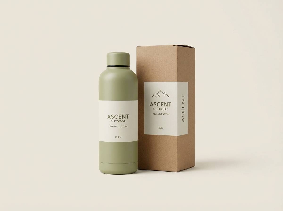
Cool and grounded like spruce needles under moonlit snow, this palette feels natural and resilient. It works for outdoor packaging where you want sustainability cues and a premium, quiet confidence. Pair with kraft textures, matte finishes, and minimal iconography. Tip: keep the light aqua as negative space so the deep green never overwhelms the label.
Image example of winter spruce generated using media.io
16) Smoky Topaz
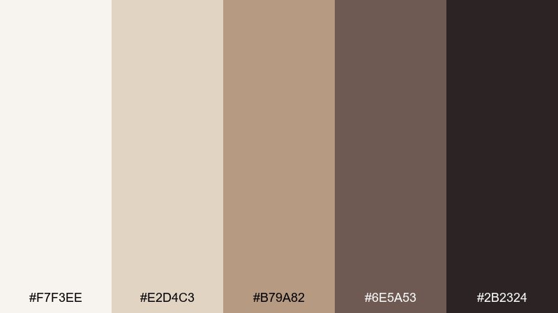
HEX: #F7F3EE #E2D4C3 #B79A82 #6E5A53 #2B2324
Mood: warm, smoky, vintage
Best for: coffee shop brand kit
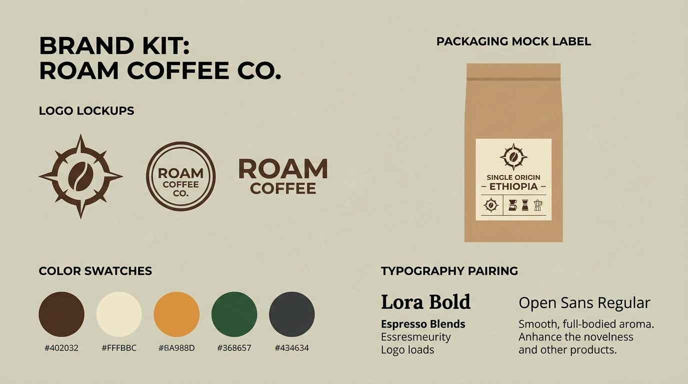
Warm and smoky like topaz glowing in low light, these tones bring a vintage comfort. They fit a coffee shop brand kit where you want warmth without going overly rustic. Pair with deep espresso photography and a clean sans serif to keep it contemporary. Tip: use the sandy beige for backgrounds and reserve the darkest brown for stamps and marks.
Image example of smoky topaz generated using media.io
17) Tidepool Steel
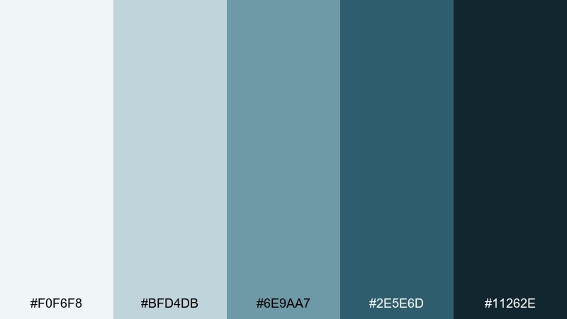
HEX: #F0F6F8 #BFD4DB #6E9AA7 #2E5E6D #11262E
Mood: cool, aquatic, contemporary
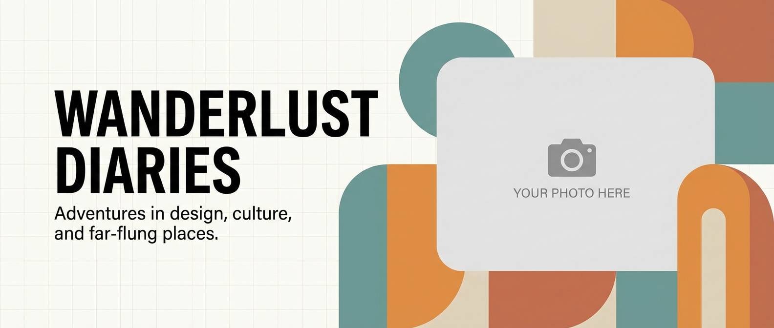
Best for: travel blog header graphics
Cool and aquatic like tidepools at night, these blue-greens feel contemporary and clean. They are great for travel header graphics where you want freshness and calm without pastel sweetness. Pair with airy photography and white type, then add a single sunset coral for emphasis. Tip: keep overlays transparent so ocean shots do not turn muddy.
Image example of tidepool steel generated using media.io
18) Candlelit Fog
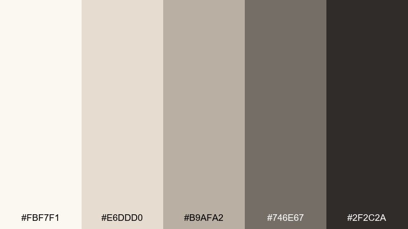
HEX: #FBF7F1 #E6DDD0 #B9AFA2 #746E67 #2F2C2A
Mood: gentle, nostalgic, intimate
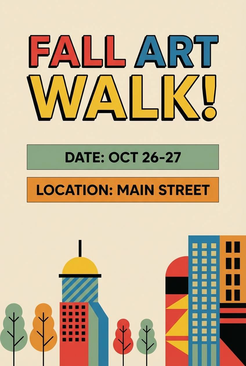
Best for: event flyer design
Gentle and nostalgic like candlelight diffused through fog, these neutrals feel intimate and welcoming. They work for event flyers that need to read clearly while still feeling warm. Pair with a small berry or forest accent for dates and location callouts. Tip: use the near-black only for the main headline and keep body text in the softened charcoal.
Image example of candlelit fog generated using media.io
19) Nocturne Teal
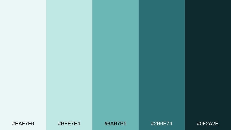
HEX: #EAF7F6 #BFE7E4 #6AB7B5 #2B6E74 #0F2A2E
Mood: mysterious, fresh, modern
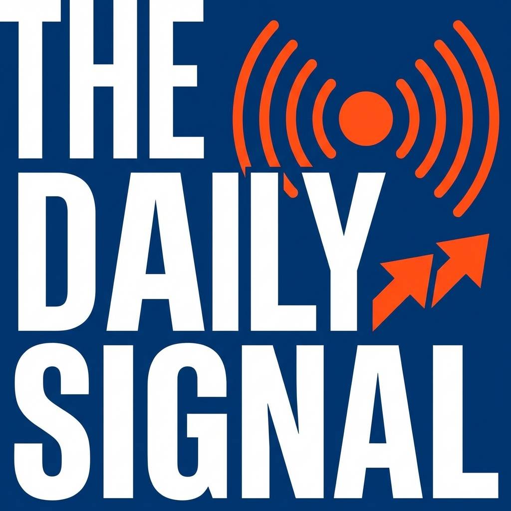
Best for: podcast cover art
Mysterious and fresh like teal light cutting through the dark, this set feels modern and energetic. These moonlight color combinations give podcast cover art a crisp silhouette and strong legibility at small sizes. Pair with bold white type and a single neon-lime detail for instant scroll-stopping contrast. Tip: keep backgrounds simple so the title stays readable in thumbnail views.
Image example of nocturne teal generated using media.io
20) Granite Bloom
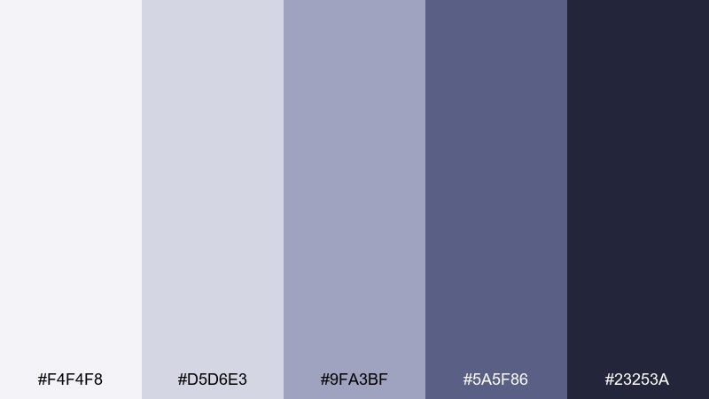
HEX: #F4F4F8 #D5D6E3 #9FA3BF #5A5F86 #23253A
Mood: cool, floral-urban, balanced
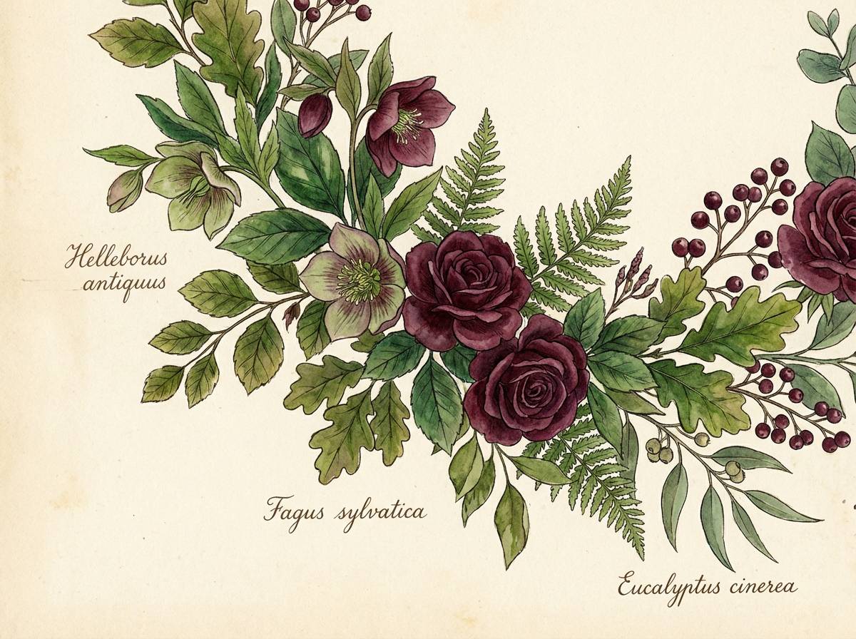
Best for: watercolor botanical poster
Cool and balanced like small blooms pushing through granite cracks, these tones mix softness with strength. They are a great base for watercolor botanicals where petals, shadows, and paper grain need room to breathe. Pair with a dusty blush wash if you want a hint of warmth without changing the overall mood. Tip: paint the darkest tone sparingly as stem shadows for depth.
Image example of granite bloom generated using media.io
21) Glacier Scroll
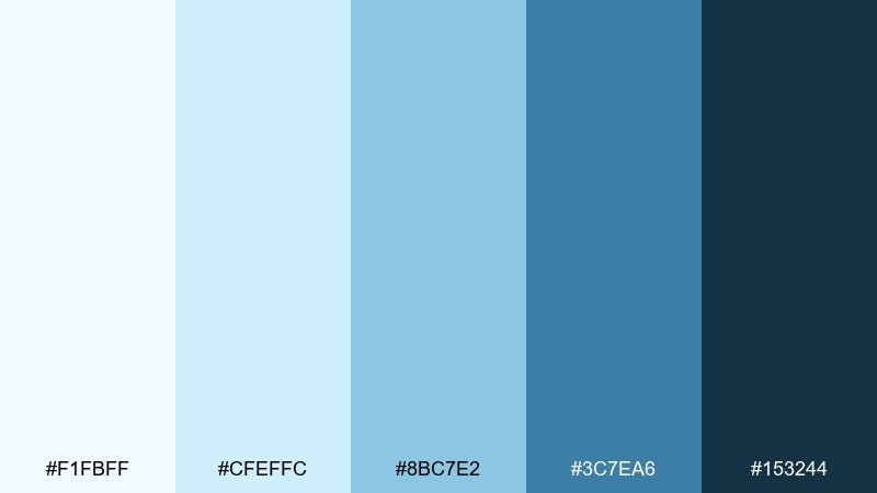
HEX: #F1FBFF #CFEFFC #8BC7E2 #3C7EA6 #153244
Mood: bright, crisp, optimistic
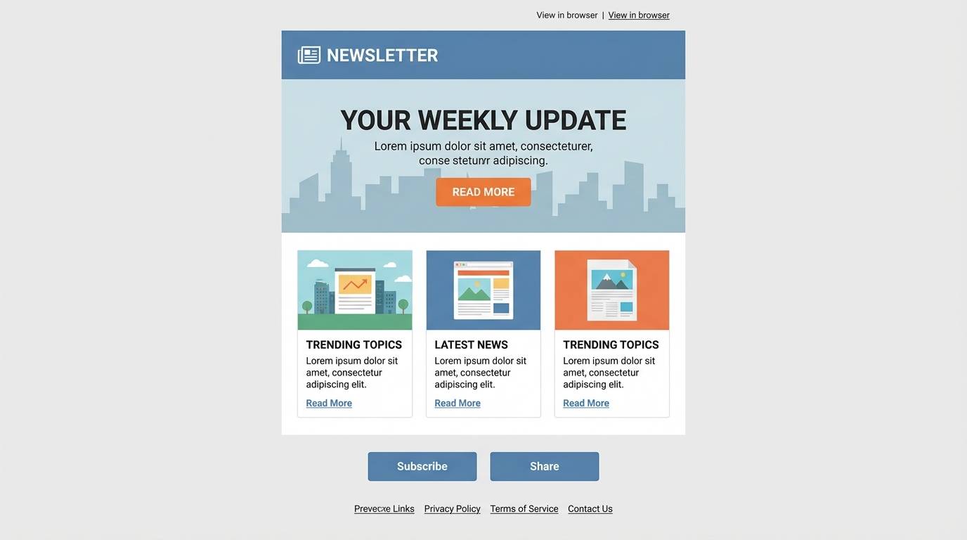
Best for: newsletter template UI
Bright and crisp like glacier water under clear night air, these blues feel optimistic and clean. They are ideal for newsletter templates where headings, links, and cards need a consistent hierarchy. Pair with a warm off-white for the main background and keep accent usage minimal for a tidy inbox look. Tip: use the mid blue for links and reserve the deepest tone for headings only.
Image example of glacier scroll generated using media.io
22) Quiet Meteor
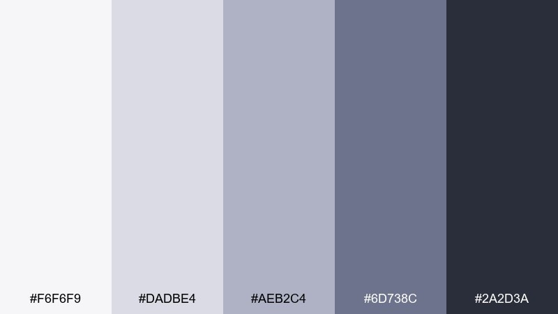
HEX: #F6F6F9 #DADBE4 #AEB2C4 #6D738C #2A2D3A
Mood: subtle, technical, modern
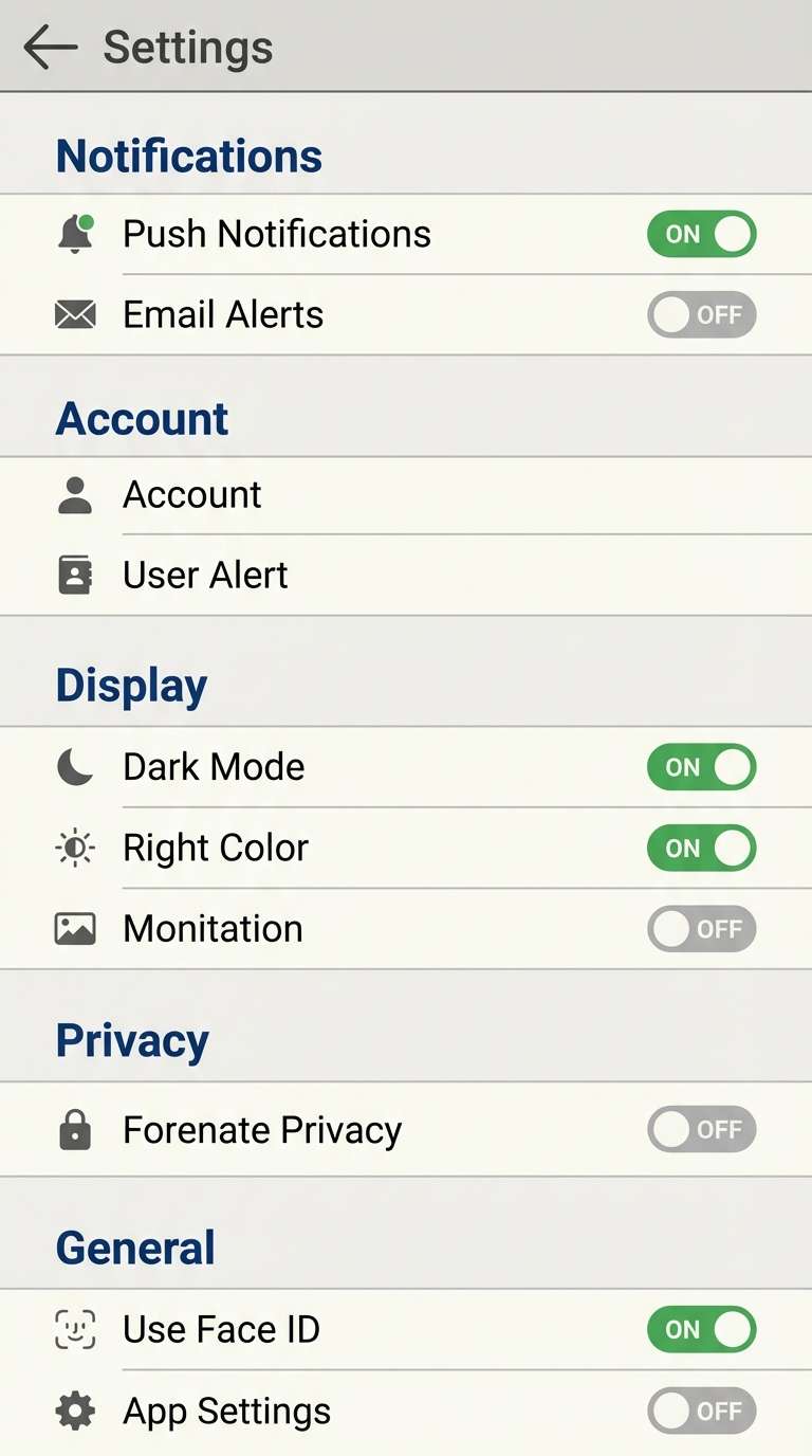
Best for: app settings screen UI
Subtle and technical like a meteor trail fading into gray, these tones keep interfaces feeling calm. They are perfect for settings screens where toggles and labels must be clear without visual noise. Pair with one bright system color for states like success or warning, and keep surfaces nearly neutral. Tip: differentiate sections using tint and spacing rather than heavy borders.
Image example of quiet meteor generated using media.io
What Colors Go Well with Moonlight?
Moonlight bases (cool grays, blue-grays, soft lavender, deep navy) pair best with accents that add temperature contrast. Warm metals like champagne gold or copper instantly make moonlight palettes feel premium and less sterile.
For modern digital work, try a single bright highlight: electric cyan, aqua, lime, or coral. Keep it limited to interactive states (buttons, links, tags) so the interface stays calm and readable.
For print, moonlight pairs nicely with tactile neutrals—ivory paper, kraft textures, and soft charcoal type. This keeps the design grounded while still feeling airy.
How to Use a Moonlight Color Palette in Real Designs
Start with a light moonlit tint for backgrounds, then reserve mid-tones for surfaces (cards, panels, secondary blocks). Use your darkest navy/charcoal as a framing color for navigation, headers, or key typographic anchors.
When you need depth, lean on subtle gradients and transparent overlays rather than heavy shadows. Moonlight palettes look best when transitions feel like haze, fog, or glass.
If you’re designing for accessibility, test contrast early. Often, a mid-slate text color can be more comfortable than pure black while still meeting readable contrast on off-white or pale blue backgrounds.
Create Moonlight Palette Visuals with AI
If you already have HEX codes, the fastest way to validate a moonlight scheme is to generate mock visuals—posters, UI screens, labels, or brand boards—and see how the tones behave with typography and imagery.
With Media.io’s text-to-image tools, you can iterate quickly: try different layouts, lighting styles, and compositions while keeping the same moonlight mood.
Use prompts that describe the design format (UI, packaging, poster), the mood (misty, calm, cinematic), and the layout constraints (no device frame, plain background) for clean results.
Moonlight Color Palette FAQs
-
What is a moonlight color palette?
A moonlight palette is a set of cool, subdued tones—often blue-grays, soft lavenders, misty off-whites, and deep navy—designed to feel calm, modern, and night-inspired. -
Are moonlight palettes good for UI design?
Yes. Moonlight tones are naturally readable and reduce visual noise, which makes them great for dashboards, settings screens, onboarding flows, and newsletter templates—especially when paired with one clear accent color for actions. -
What accent color works best with moonlight tones?
High-impact accents like cyan, aqua, lime, or coral work well because they pop against cool neutrals. For a premium print feel, metallics like silver, champagne gold, or copper are strong options. -
How do I keep a moonlight scheme from feeling too cold?
Add a small amount of warmth via paper-like off-whites, beige neutrals, or warm metals. Texture also helps (grain, soft gradients, matte finishes) to make the palette feel more human. -
Which moonlight palette is best for branding?
For minimal branding, try Lunar Mist or Frosted Slate. For a more distinctive, luxe identity, Velvet Eclipse or Arctic Ink offers stronger contrast and a more memorable mood. -
Can I use moonlight colors for packaging and labels?
Absolutely. Soft grays and blue-grays communicate cleanliness and trust (great for skincare), while moonlit greens and teals can signal nature and performance (great for outdoor or wellness products). -
How can I preview moonlight palettes before designing?
Generate quick mockups (UI screens, posters, labels, brand boards) with AI to see how your HEX colors behave with real typography and imagery, then refine contrast and accent placement.
Next: Bohemian Color Palette


