

Rose gold and burgundy is a refined pairing: one tone brings warm metallic blush, the other adds deep, wine-like contrast. Together, they create palettes that feel romantic, premium, and timeless.
Below are 20+ rose gold burgundy color palette ideas with HEX codes, plus practical ways to apply them across weddings, branding, packaging, and UI.
In this article
- Why Rose Gold Burgundy Palettes Work So Well
-
- champagne velvet
- garnet blush
- antique rosewood
- wine and pearl
- copper merlot
- dusty mauve evening
- plum truffle
- rose champagne glow
- burgundy smoke
- cranberry silk
- mocha rose
- blush noir
- vintage brocade
- spiced sangria
- petal and port
- rose gold minimal ui
- luxe wedding suite
- autumn winery
- modern boutique branding
- romantic editorial spread
- candlelit date night
- What Colors Go Well with Rose Gold Burgundy?
- How to Use a Rose Gold Burgundy Color Palette in Real Designs
- Create Rose Gold Burgundy Palette Visuals with AI
Why Rose Gold Burgundy Palettes Work So Well
Rose gold brings warmth and a soft metallic glow, while burgundy adds depth, seriousness, and instant contrast. That balance makes the scheme feel luxurious without becoming overly flashy.
Because both hues sit in a warm family, they blend smoothly across gradients, photography, and print stocks. You can keep the look airy with cream and blush, or go dramatic with near-black accents.
This pairing also scales well from minimal UI accents to full wedding suites: use rose gold as a controlled highlight and let burgundy carry hierarchy in type, buttons, and focal elements.
20+ Rose Gold Burgundy Color Palette Ideas (with HEX Codes)
1) Champagne Velvet
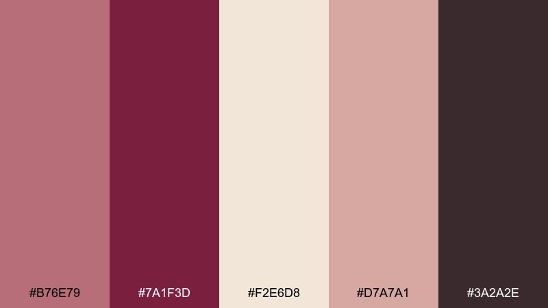
HEX: #B76E79 #7A1F3D #F2E6D8 #D7A7A1 #3A2A2E
Mood: soft luxury
Best for: wedding invitation suite design
Soft luxury with a candlelit glow, like champagne foam against velvet drapery. Creamy ivory keeps the look airy while burgundy adds depth for headings and monograms. Pair with delicate serif typography and plenty of whitespace for an upscale feel. Usage tip: foil-stamp the rose gold tone and print burgundy as flat ink for clean contrast.
Image example of champagne velvet generated using media.io
Media.io is an online AI studio for creating and editing video, image, and audio in your browser.

2) Garnet Blush
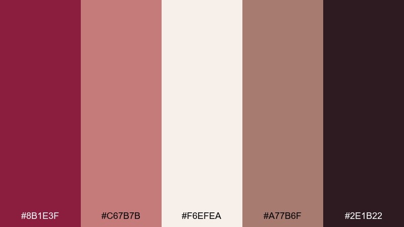
HEX: #8B1E3F #C67B7B #F6EFEA #A77B6F #2E1B22
Mood: romantic and bold
Best for: beauty product ad creative
Romantic and bold, like garnet lipstick softened by a rosy blush. Use the deep wine shade for hero text and the pale blush as a breathable backdrop. Warm taupe ties the tones together and keeps skin-centric visuals flattering. Usage tip: limit the darkest shade to 10 to 15 percent of the layout so the ad still feels luminous.
Image example of garnet blush generated using media.io
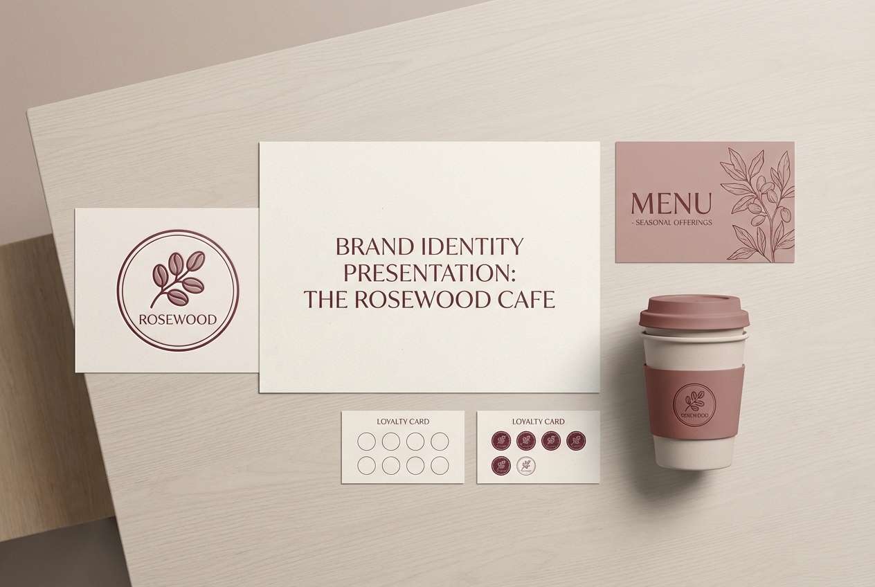
3) Antique Rosewood
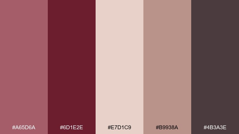
HEX: #A65D6A #6D1E2E #E7D1C9 #B9938A #4B3A3E
Mood: vintage warmth
Best for: boutique cafe brand identity
Vintage warmth comes through like antique rosewood furniture and worn-in leather. The muted rose reads friendly for logos, while burgundy anchors menus and packaging labels. Add the sandy blush tone to keep everything approachable and not too formal. Usage tip: use textured paper stock to amplify the heritage vibe without adding visual clutter.
Image example of antique rosewood generated using media.io
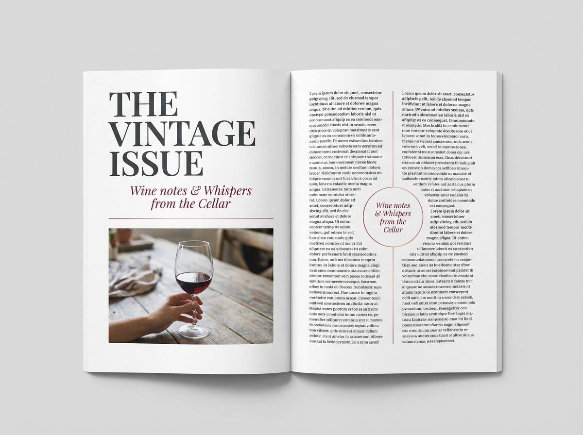
4) Wine and Pearl
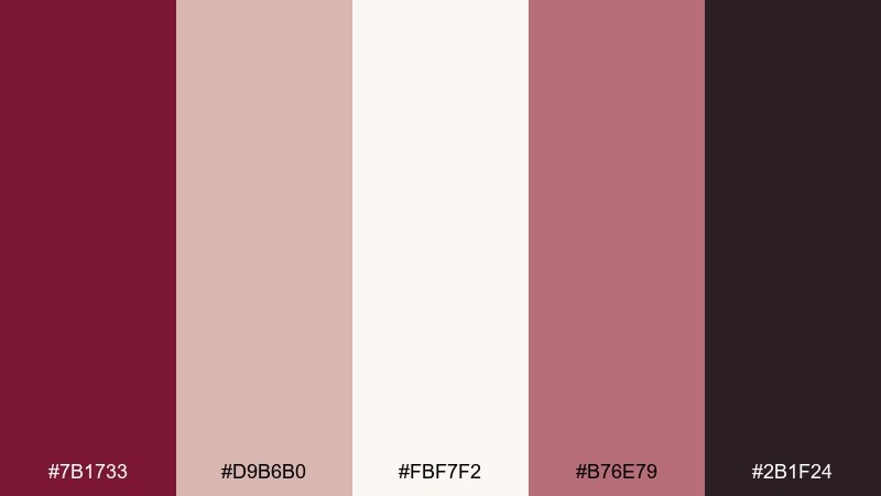
HEX: #7B1733 #D9B6B0 #FBF7F2 #B76E79 #2B1F24
Mood: classic elegance
Best for: editorial magazine layout
Classic elegance with a pearly sheen, like red wine beside a strand of pearls. Keep pearl white as the page base, then use wine for pull quotes and section dividers. Rose gold works beautifully as a small accent in icons and drop caps. Usage tip: reserve the darkest tone for typography only to maintain crisp readability in print.
Image example of wine and pearl generated using media.io
5) Copper Merlot
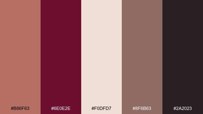
HEX: #B86F63 #6E0E2E #F0DFD7 #8F6B63 #2A2023
Mood: rich and moody
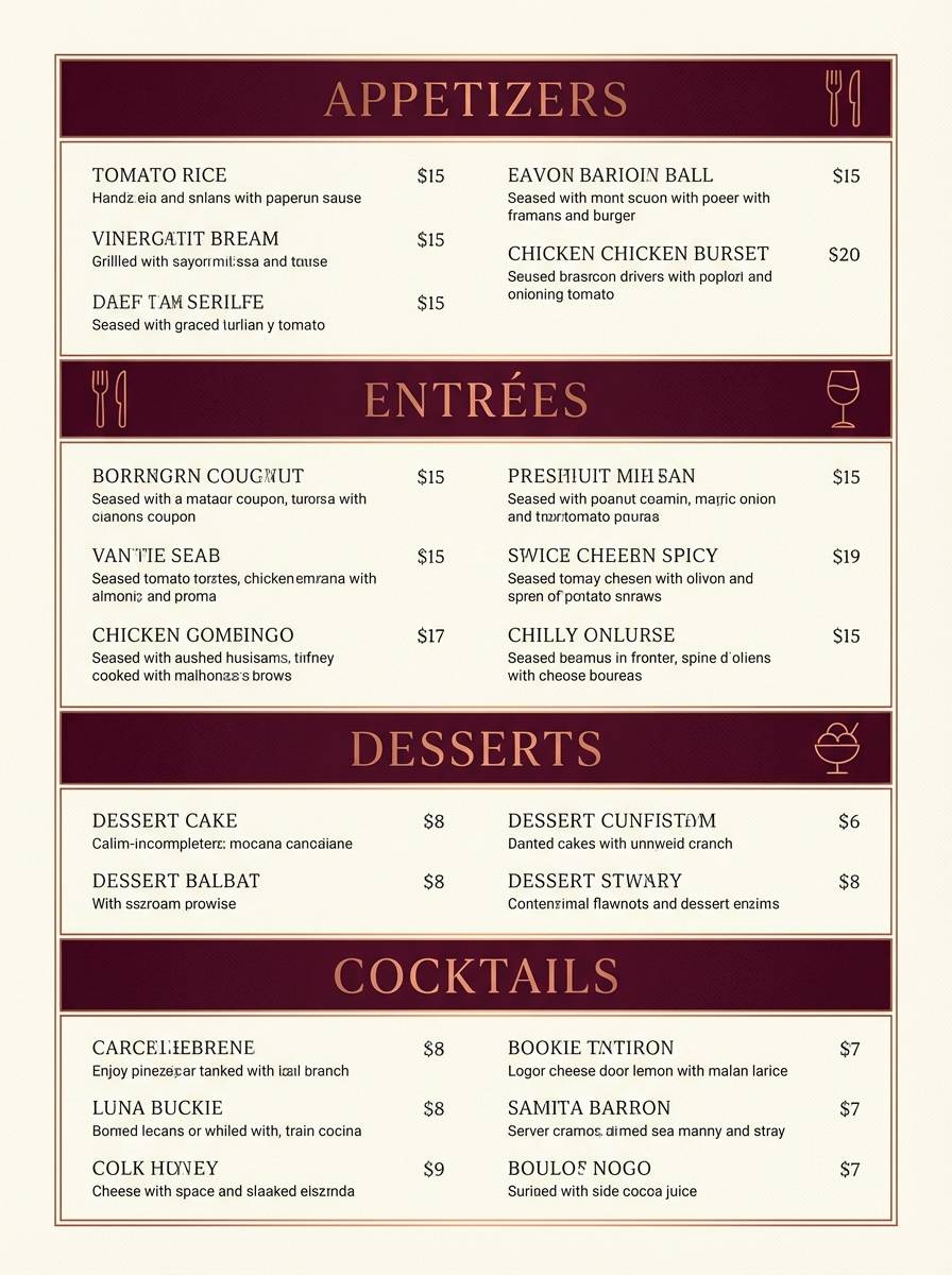
Best for: restaurant menu design
Rich and moody, like copper cookware in a dim merlot-lit kitchen. The warm copper tone is ideal for section headers, while burgundy brings appetite-ready drama to key dishes. Balance it with soft cream blocks so the layout stays readable and modern. Usage tip: highlight specials with copper rules and keep body text on the lightest background for contrast.
Image example of copper merlot generated using media.io
6) Dusty Mauve Evening
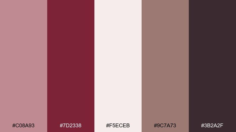
HEX: #C08A93 #7D2338 #F5ECEB #9C7A73 #3B2A2F
Mood: calm romance
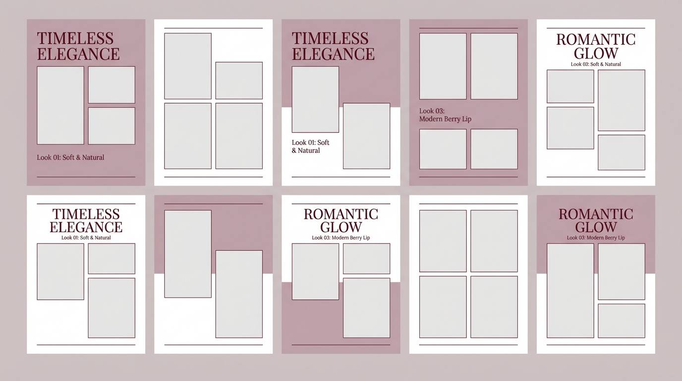
Best for: bridal makeup lookbook
Calm romance, like dusk settling over mauve silk. Light blush tones create a flattering canvas for photography, while burgundy adds structure to titles and chapter tabs. Taupe keeps the palette grounded and avoids overly sweet pinks. Usage tip: use burgundy sparingly for page numbers and callouts so the lookbook stays airy.
Image example of dusty mauve evening generated using media.io
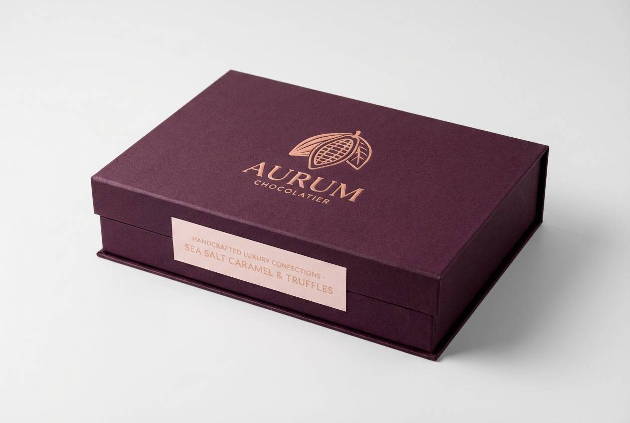
7) Plum Truffle
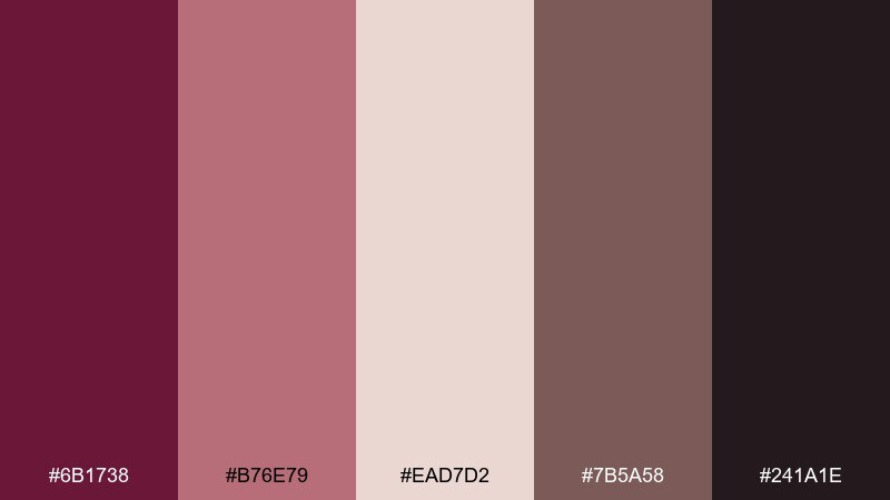
HEX: #6B1738 #B76E79 #EAD7D2 #7B5A58 #241A1E
Mood: decadent
Best for: chocolate packaging design
Decadent and cozy, like plum filling and dark truffle dust. The deep plum-burgundy reads premium on boxes, while rose gold adds a confectionery sparkle for seals and borders. Use the pale blush as negative space so labels feel crisp on shelf. Usage tip: emboss the darkest shade and keep the rose gold to small brand marks to avoid looking brassy.
Image example of plum truffle generated using media.io
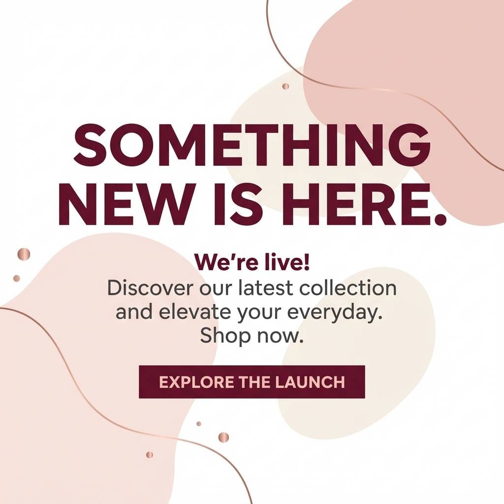
8) Rose Champagne Glow
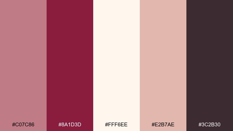
HEX: #C07C86 #8A1D3D #FFF6EE #E2B7AE #3C2B30
Mood: celebratory
Best for: social media launch post template
Celebratory and bright, like rose champagne bubbles catching warm light. Keep the creamy tone as the main background, then use burgundy for punchy headlines and CTA buttons. The gentle blush shades are perfect for overlays and highlight chips behind text. Usage tip: add a subtle grain texture to soften flat gradients and keep the post feeling premium.
Image example of rose champagne glow generated using media.io
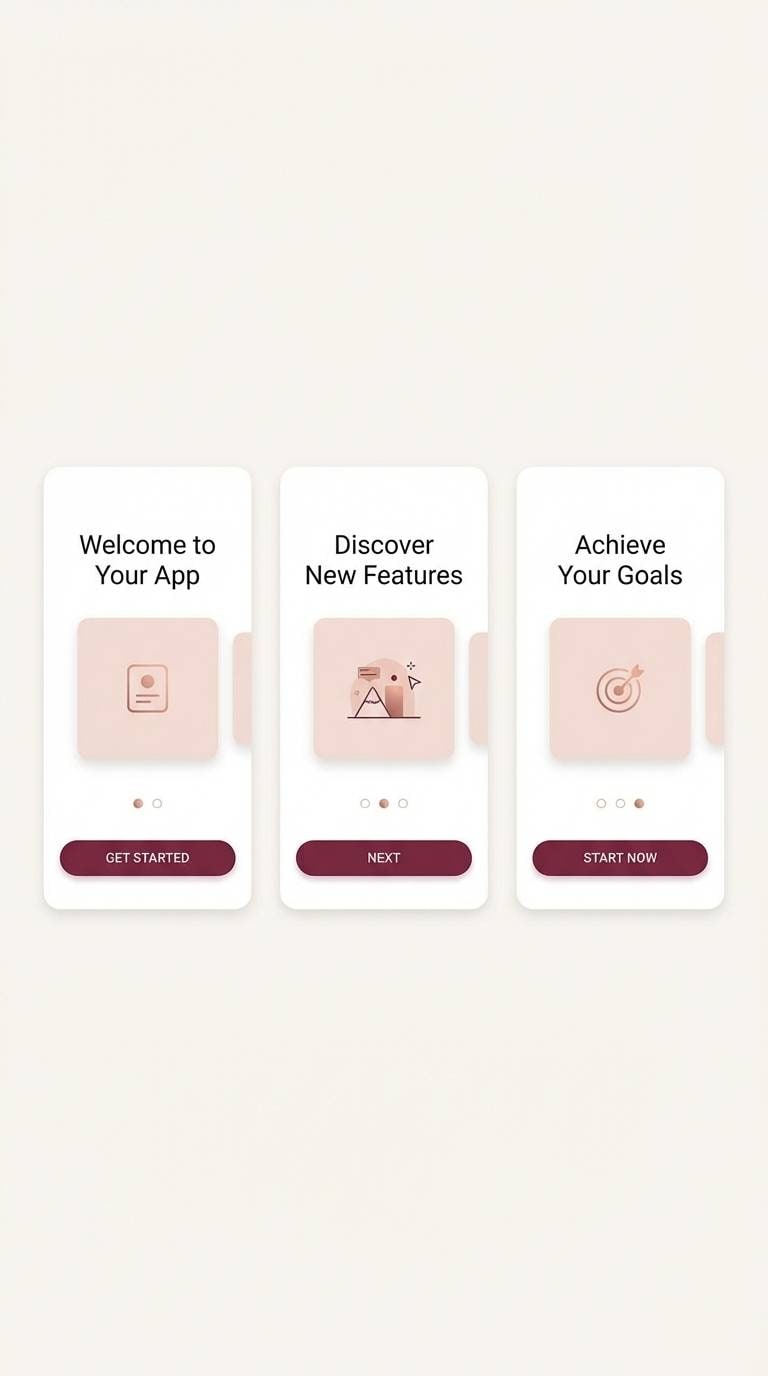
9) Burgundy Smoke
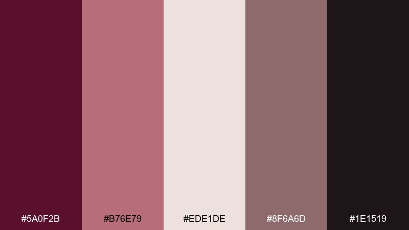
HEX: #5A0F2B #B76E79 #EDE1DE #8F6A6D #1E1519
Mood: dramatic and modern
Best for: app onboarding UI screens
Dramatic and modern, like burgundy smoke fading into soft blush haze. Use the near-black tone for text and icons, then reserve rose gold for micro-interactions and highlights. The pale background keeps onboarding screens welcoming even with a moody accent. Usage tip: ensure buttons meet contrast by pairing burgundy fills with the lightest text color.
Image example of burgundy smoke generated using media.io
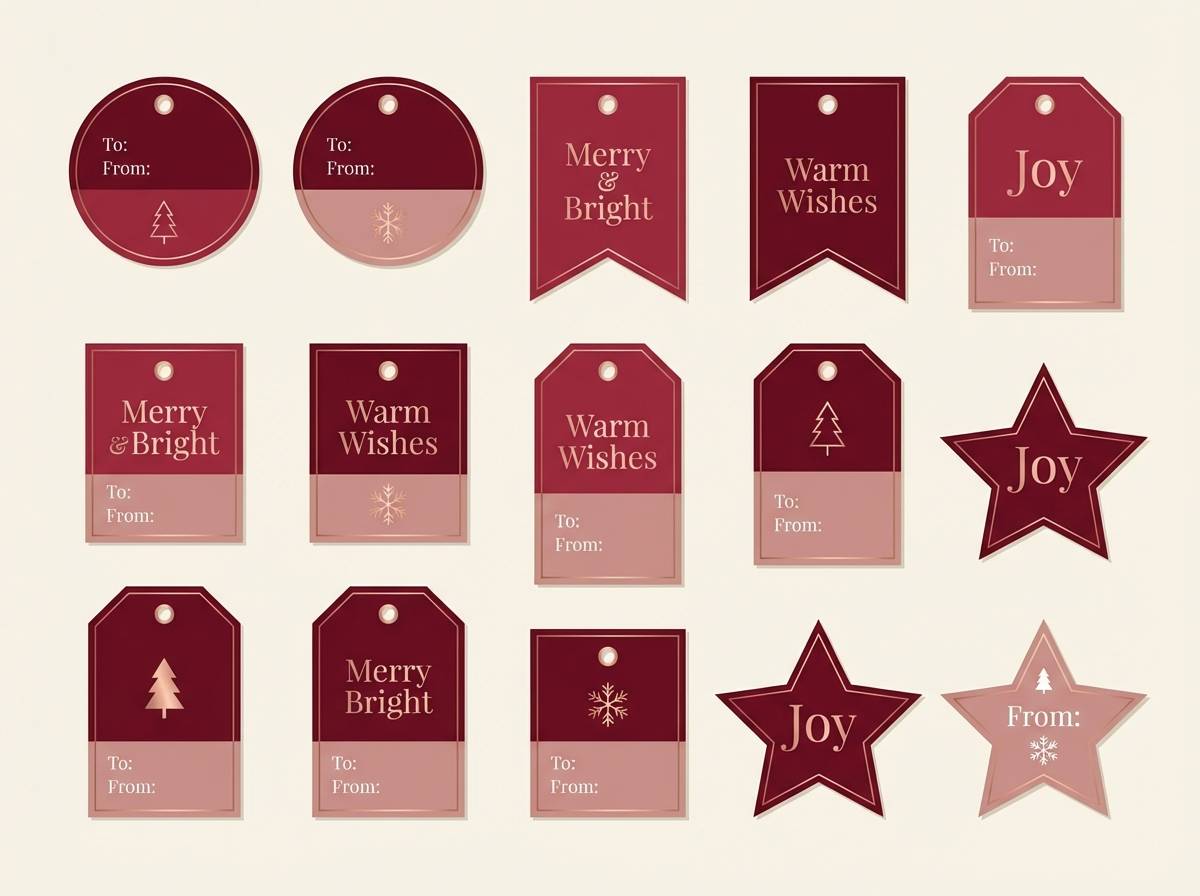
10) Cranberry Silk
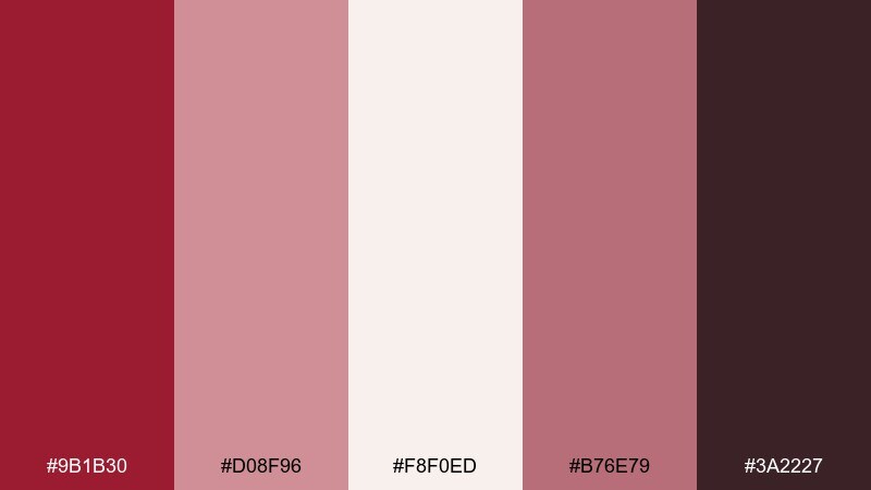
HEX: #9B1B30 #D08F96 #F8F0ED #B76E79 #3A2227
Mood: festive polish
Best for: holiday gift tag set
Festive polish, like cranberry silk ribbon tied on a cream box. The bright wine shade adds seasonal energy, while blush and pearl tones keep it refined rather than loud. Rose gold works best as thin outlines, hole reinforcements, or small icons. Usage tip: print the tags on warm white stock and keep burgundy for names to maximize legibility.
Image example of cranberry silk generated using media.io
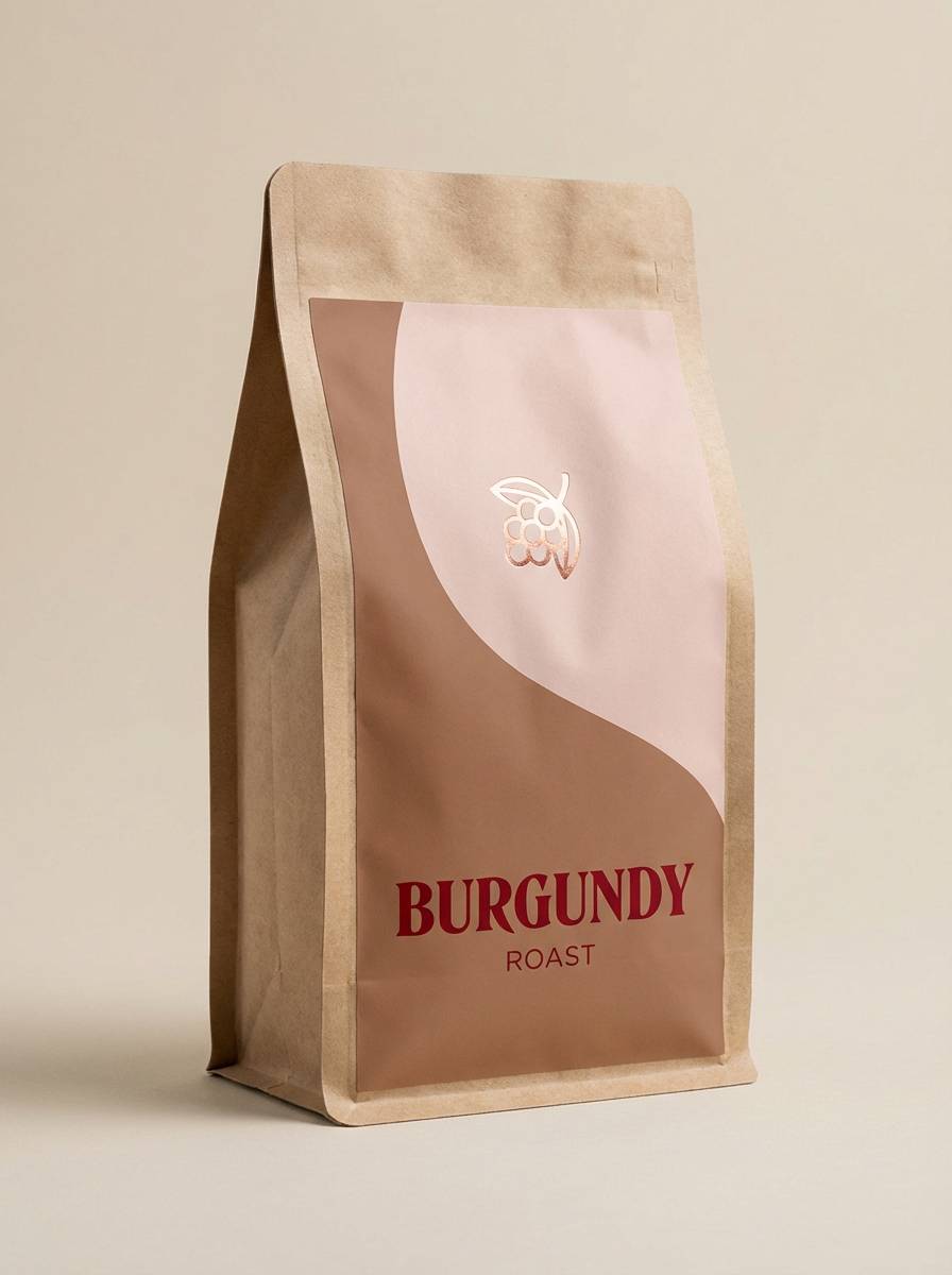
11) Mocha Rose
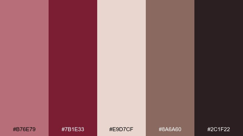
HEX: #B76E79 #7B1E33 #E9D7CF #8A6A60 #2C1F22
Mood: grounded elegance
Best for: coffee brand packaging
Grounded elegance with a cozy cafe feel, like mocha foam topped with a rosy tint. Use the mocha neutral for background bands and the burgundy for roast names and strength badges. The blush shade softens the look and pairs well with matte finishes. Usage tip: keep rose gold as a small badge or stamp so the bag stays modern and not overly ornate.
Image example of mocha rose generated using media.io
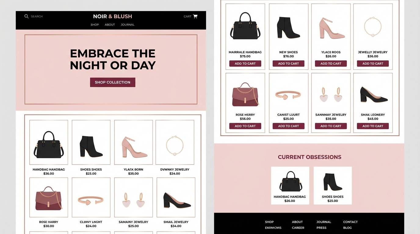
12) Blush Noir
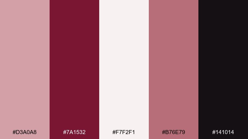
HEX: #D3A0A8 #7A1532 #F7F2F1 #B76E79 #141014
Mood: fashion-forward
Best for: luxury ecommerce homepage UI
Fashion-forward and sleek, like blush satin against a noir runway backdrop. The inky near-black makes product grids feel sharp, while soft blush keeps the interface approachable. Use rose gold for price highlights, subtle dividers, and hover states. Usage tip: avoid large rose gold blocks in UI and keep it to thin strokes for a premium finish.
Image example of blush noir generated using media.io
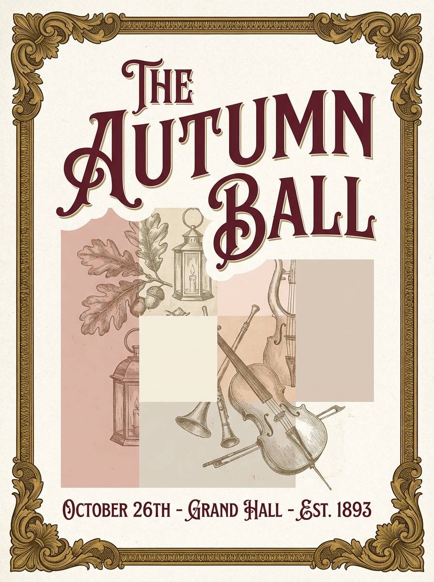
13) Vintage Brocade
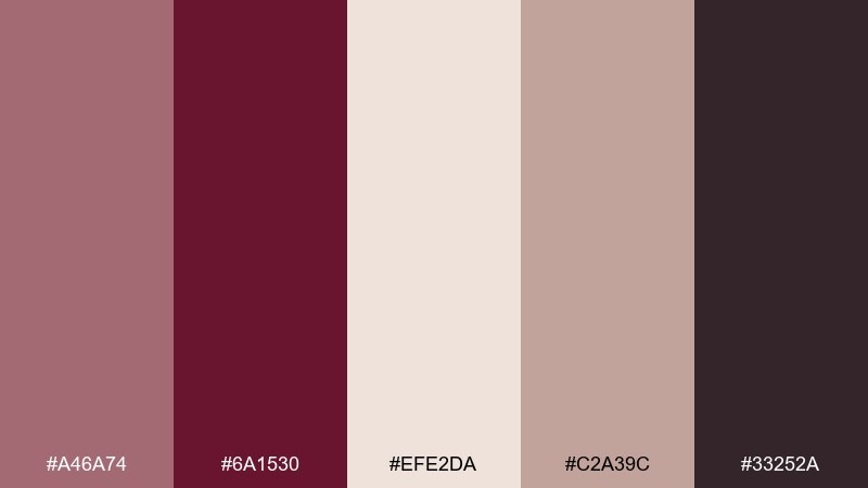
HEX: #A46A74 #6A1530 #EFE2DA #C2A39C #33252A
Mood: ornate heritage
Best for: event poster design
Ornate heritage, like vintage brocade woven with faded rose threads. Use burgundy for the headline and borders to frame the poster with authority. The warm neutrals soften the composition and work well with engraved-style illustrations. Usage tip: add subtle patterning in the lightest shade, but keep text areas plain for readability.
Image example of vintage brocade generated using media.io
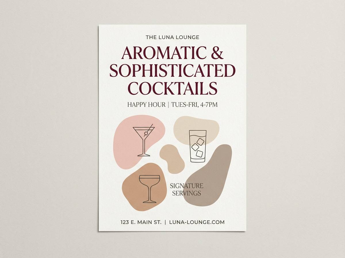
14) Spiced Sangria
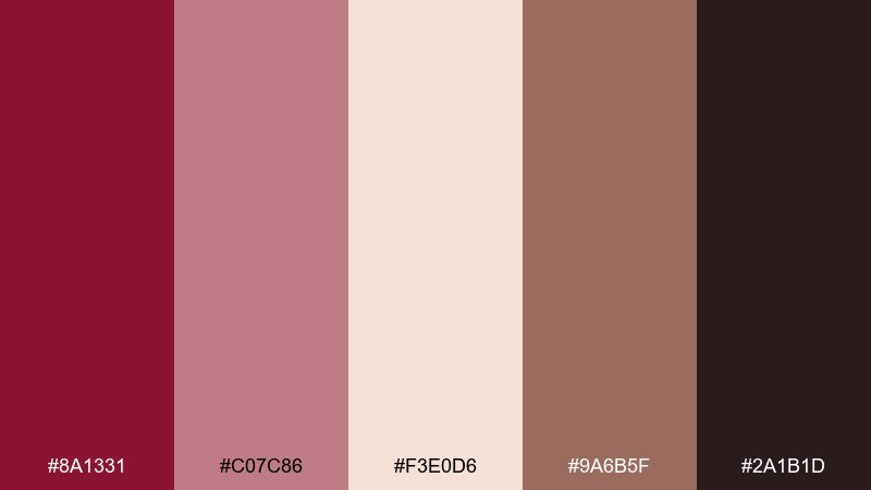
HEX: #8A1331 #C07C86 #F3E0D6 #9A6B5F #2A1B1D
Mood: warm and appetizing
Best for: cocktail bar flyer
Warm and appetizing, like spiced sangria served in low amber light. The burgundy tone is perfect for bold drink names, while blush and peachy neutrals keep the flyer inviting. Add the cocoa brown for icons and small details to prevent the design from feeling too sweet. Usage tip: use a simple two-column layout and let burgundy carry the hierarchy.
Image example of spiced sangria generated using media.io
15) Petal and Port
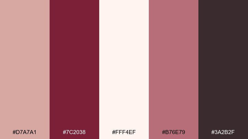
HEX: #D7A7A1 #7C2038 #FFF4EF #B76E79 #3A2B2F
Mood: tender and romantic
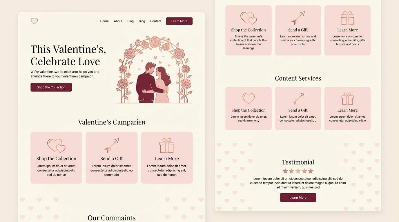
Best for: valentines day landing page UI
Tender and romantic, like petals floating on a glass of port. Keep the background creamy to maintain a soft, welcoming feel, then use port burgundy for CTAs and key headers. Rose gold makes an elegant accent for icons, rating stars, or subtle section dividers. Usage tip: pair rounded UI components with generous padding to match the gentle tone.
Image example of petal and port generated using media.io
16) Rose Gold Minimal UI
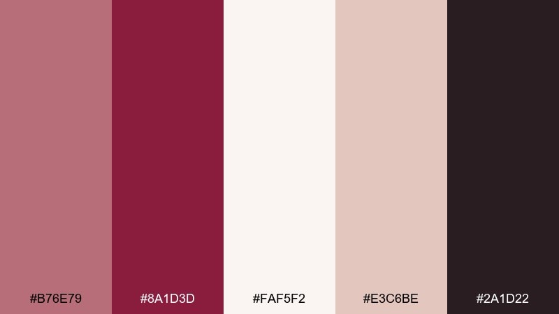
HEX: #B76E79 #8A1D3D #FAF5F2 #E3C6BE #2A1D22
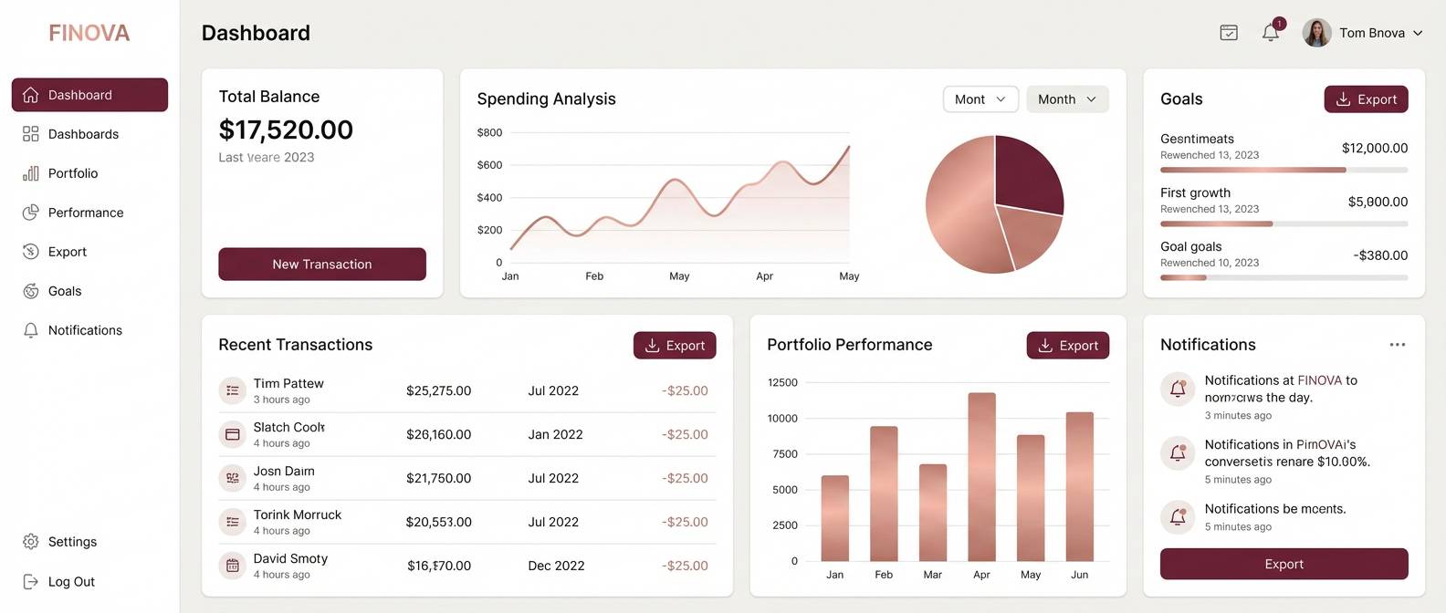
Mood: clean and premium
Best for: finance dashboard UI
Clean and premium, like brushed metal details on a minimalist desk. This rose gold burgundy color palette works well when most surfaces stay near-white and accents do the heavy lifting. Use burgundy for primary actions and rose gold for selected states, charts, and badges. Usage tip: keep data visualizations limited to two highlight colors and use neutrals for the rest.
Image example of rose gold minimal ui generated using media.io
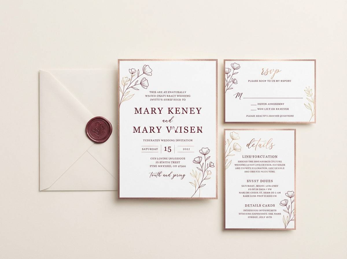
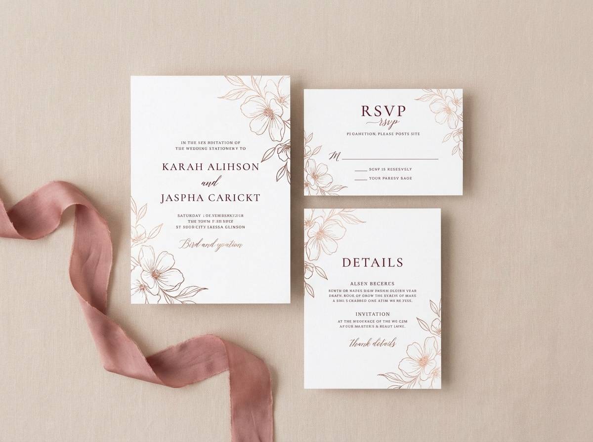
17) Luxe Wedding Suite
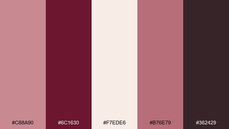
HEX: #C88A90 #6C1630 #F7EDE6 #B76E79 #362429
Mood: formal romance
Best for: wedding stationery mockups
Formal romance, like a grand ballroom softened with blush florals. Rose gold and burgundy feel timeless together, especially with creamy paper tones in the mix. For rose gold burgundy color combinations, pair burgundy typography with rose gold linework and keep backgrounds warm, not stark white. Usage tip: use one statement element, like a crest or monogram, and let the rest stay understated.
Image example of luxe wedding suite generated using media.io
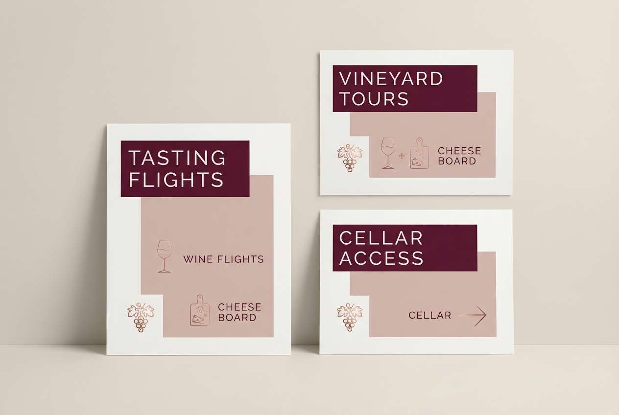
18) Autumn Winery
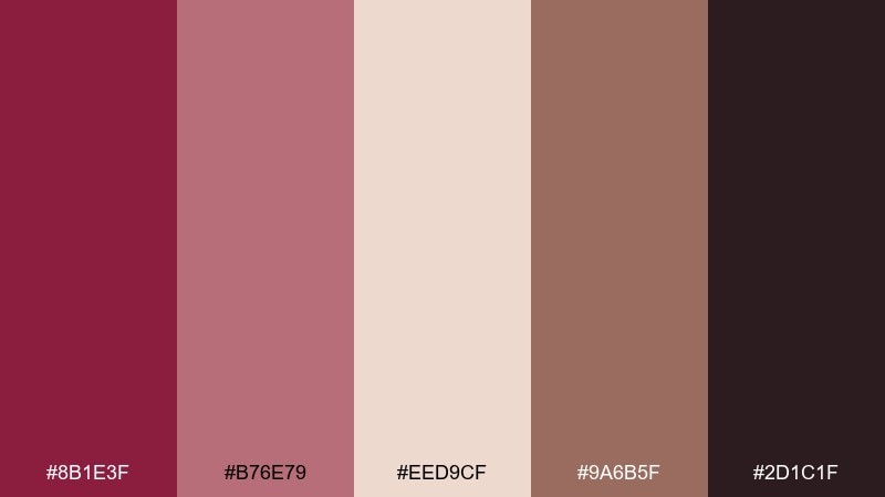
HEX: #8B1E3F #B76E79 #EED9CF #9A6B5F #2D1C1F
Mood: earthy romance
Best for: winery tasting room signage
Earthy romance, like autumn vines and oak barrels warmed by late sunlight. The burgundy tone carries signage headers beautifully, while blush and clay neutrals soften the overall contrast. Add rose gold only as a small directional accent or emblem for a refined touch. Usage tip: keep wayfinding symbols simple and bold so they remain legible from a distance.
Image example of autumn winery generated using media.io
19) Modern Boutique Branding
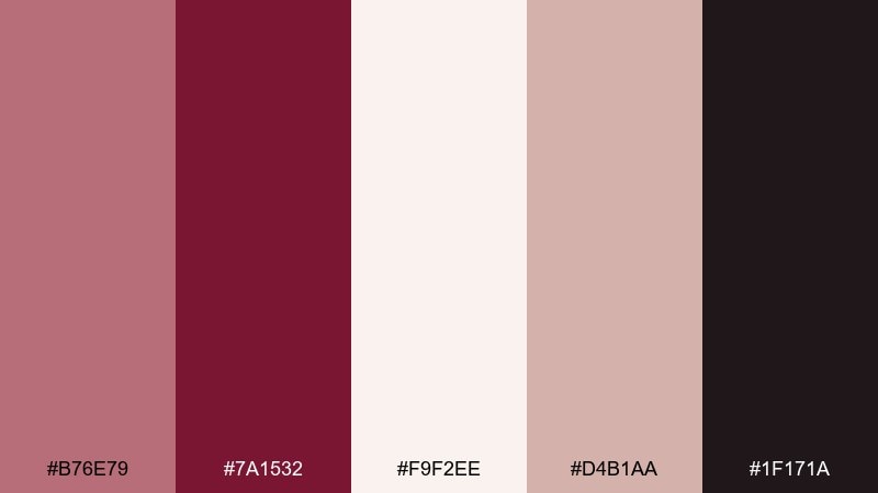
HEX: #B76E79 #7A1532 #F9F2EE #D4B1AA #1F171A
Mood: chic and confident
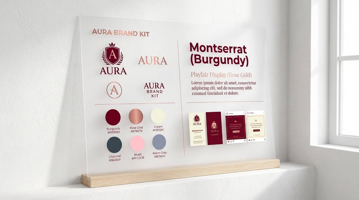
Best for: brand kit presentation
Chic and confident, like a modern boutique interior with warm metallic details. This rose gold burgundy color palette shines in brand kits where neutrals dominate and accents feel intentional. Use burgundy for the logo mark and rose gold for secondary graphics, patterns, and social highlights. Usage tip: set a strict accent rule, such as one rose gold element per page, to keep the brand looking expensive.
Image example of modern boutique branding generated using media.io
20) Romantic Editorial Spread
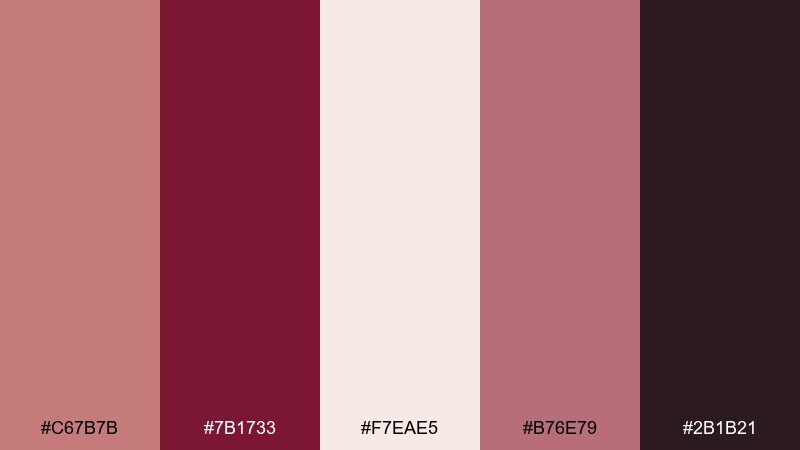
HEX: #C67B7B #7B1733 #F7EAE5 #B76E79 #2B1B21
Mood: editorial romance
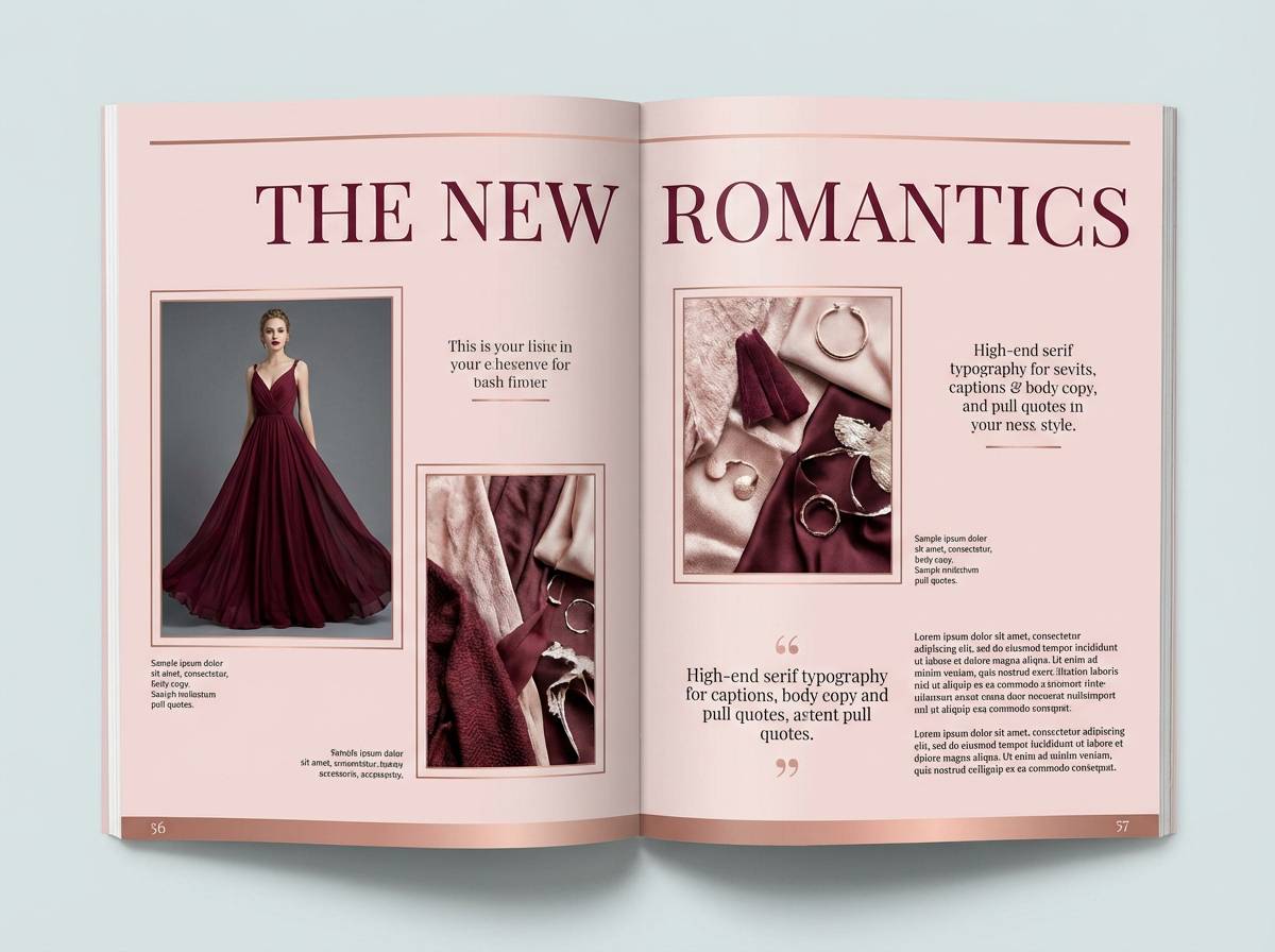
Best for: fashion editorial page design
Editorial romance, like a soft-focus fashion story set in a historic hotel. The blush background supports large photography and keeps pages bright, while burgundy adds strong typographic hierarchy. For rose gold burgundy color combinations, use rose gold as a thin accent rule or small caption marker rather than a block fill. Usage tip: keep captions in the dark neutral to avoid competing with the imagery.
Image example of romantic editorial spread generated using media.io
21) Candlelit Date Night
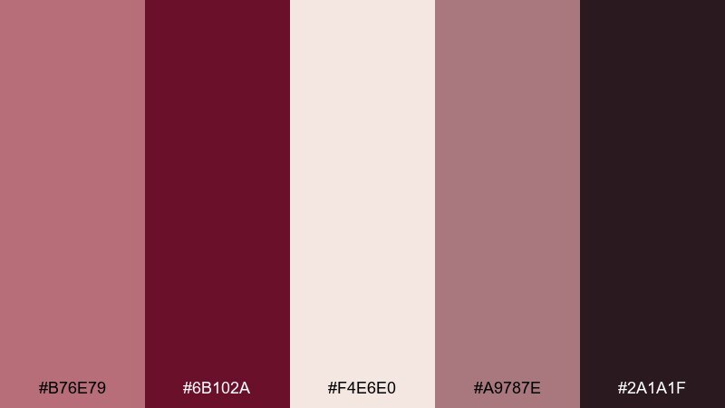
HEX: #B76E79 #6B102A #F4E6E0 #A9787E #2A1A1F
Mood: intimate
Best for: restaurant promo poster
Intimate and inviting, like candlelight reflecting off rose-toned glassware. Use the deep burgundy for the main offer and the light blush for background breathing room. A muted mauve helps transitions between sections without harsh lines. Usage tip: keep the poster to one hero headline, one date line, and a clear CTA for maximum impact.
Image example of candlelit date night generated using media.io
What Colors Go Well with Rose Gold Burgundy?
Soft neutrals like ivory, pearl white, warm beige, and blush help rose gold feel luminous and keep burgundy from becoming too heavy. These bases are especially useful for invitations, packaging labels, and editorial layouts where readability matters.
For deeper contrast, add espresso brown, plum, charcoal, or near-black to sharpen typography and UI components. If you want a fresher twist, muted sage or dusty olive can cool the warmth slightly without clashing.
In general, treat rose gold as the accent and let neutrals do the “background work,” while burgundy carries the hierarchy for titles, buttons, and key highlights.
How to Use a Rose Gold Burgundy Color Palette in Real Designs
Start with a light neutral as the main canvas, then assign burgundy to primary elements (headlines, CTAs, key dividers). Add rose gold last as a controlled highlight for icons, borders, badges, or foil-like details.
In print, rose gold looks best as a metallic finish (foil, emboss, spot UV) rather than a large flat fill; burgundy can stay as ink for crisp legibility. In UI, keep rose gold to thin strokes and states (hover/selected) so the interface stays clean.
To avoid “muddy” warmth, separate similar pink-browns with clear value contrast: pair the darkest shade with the lightest background and reserve mid-tones for secondary blocks.
Create Rose Gold Burgundy Palette Visuals with AI
If you want to preview how these HEX combinations look on a poster, brand kit, packaging mockup, or UI screen, generate quick concept visuals before committing to final production.
With Media.io’s text-to-image tool, you can paste a prompt (like the examples above), iterate on layout style, and keep your palette consistent for a cohesive look across assets.
Rose Gold Burgundy Color Palette FAQs
-
What does a rose gold burgundy color palette communicate?
It typically communicates romance, luxury, and warmth. Rose gold adds a soft metallic elegance, while burgundy contributes depth and sophistication, making the combo popular for weddings, beauty, premium packaging, and upscale UI accents. -
Is rose gold burgundy a good wedding color palette?
Yes. It’s timeless and flattering across paper goods, florals, and attire. Use ivory or warm white as the base, burgundy for typography and structure, and rose gold as foil or small decorative linework. -
How do I keep rose gold from looking too pink or too copper?
Anchor it with warm neutrals (ivory, beige, taupe) and limit rose gold to accents. If it feels too pink, add more burgundy/charcoal; if it feels too copper, shift supporting neutrals cooler (pearl, dusty mauve). -
What are the best background colors for burgundy text?
Warm ivory, pearl white, and very pale blush tend to give the cleanest readability while keeping the overall palette soft. Avoid mid-tone blush backgrounds behind burgundy body text unless the font size is large. -
Can I use rose gold and burgundy in UI design without hurting accessibility?
Yes, but treat rose gold as a highlight, not a body-text color. Use burgundy or near-black for text and ensure buttons and key controls meet contrast guidelines by pairing dark fills with very light text. -
What accent colors pair well with rose gold burgundy?
Great accents include sage/olive (muted contrast), espresso brown (warm depth), charcoal/near-black (modern sharpness), and pearl white (clean lift). Choose one accent family and keep it consistent to avoid visual noise. -
How can I quickly visualize rose gold burgundy palette ideas for my project?
Generate mockups with an AI image tool using prompts like “brand kit presentation,” “wedding invitation suite,” or “app onboarding UI,” then iterate while keeping your HEX colors consistent for a unified look.
Next: Desert Color Palette


