

Desert color palettes balance warm neutrals (sand, beige, taupe) with sun-baked accents (terracotta, adobe, ochre) for designs that feel grounded and modern.
Whether you’re building a UI, a brand system, or print stationery, desert tones give you natural harmony plus enough contrast to keep typography and key elements crisp.
In this article
- Why Desert Palettes Work So Well
-
- sunlit dunes
- adobe sunrise
- canyon dusk
- sagebrush trail
- desert rose clay
- salt flat minimal
- terracotta market
- ocher ridge
- mirage blue accent
- mesa shadow
- sienna and stone
- prickly pear bloom
- warm taupe path
- sunset over sand
- night oasis
- copper canyon
- dusty lavender horizon
- agave stone
- painted canyon strata
- sandstone noir
- What Colors Go Well with Desert?
- How to Use a Desert Color Palette in Real Designs
- Create Desert Palette Visuals with AI
Why Desert Palettes Work So Well
Desert tones are naturally “pre-balanced”: soft light sands create generous whitespace, while clay and canyon browns add structure without the harshness of pure black.
They also map well to real materials—paper, leather, wood, stone—so branding and packaging feel tactile and believable, even in flat digital layouts.
Most desert color palettes include a clear hierarchy (light base, midtone support, dark anchor), which makes it easier to maintain contrast across headings, body text, buttons, and data visuals.
20+ Desert Color Palette Ideas (with HEX Codes)
1) Sunlit Dunes
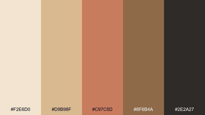
HEX: #F2E6D0 #D9B98F #C97C5D #8F6B4A #2E2A27
Mood: airy, sun-washed, calm
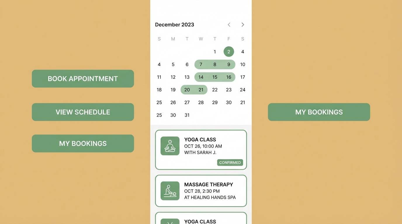
Best for: clean UI dashboards and analytics screens
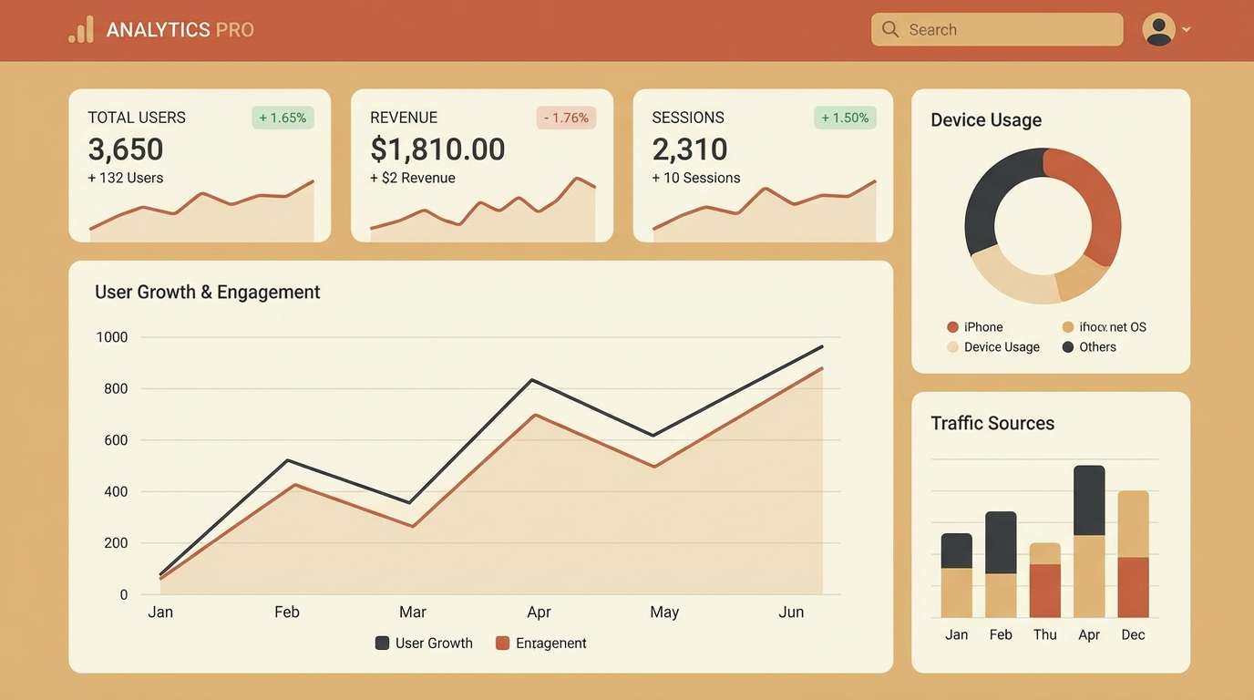
Airy sand and warm clay tones evoke noon light across rolling dunes. Use the pale beige as the main canvas, then bring in terracotta for buttons and highlights. Deep brown keeps charts and text readable without feeling harsh. Usage tip: reserve the darkest shade for headings and key metrics to keep hierarchy crisp.
Image example of sunlit dunes generated using media.io
Media.io is an online AI studio for creating and editing video, image, and audio in your browser.

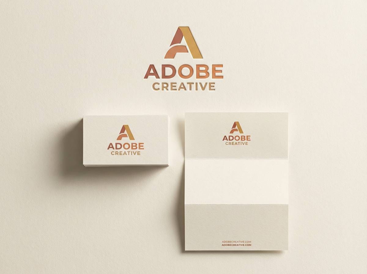
2) Adobe Sunrise
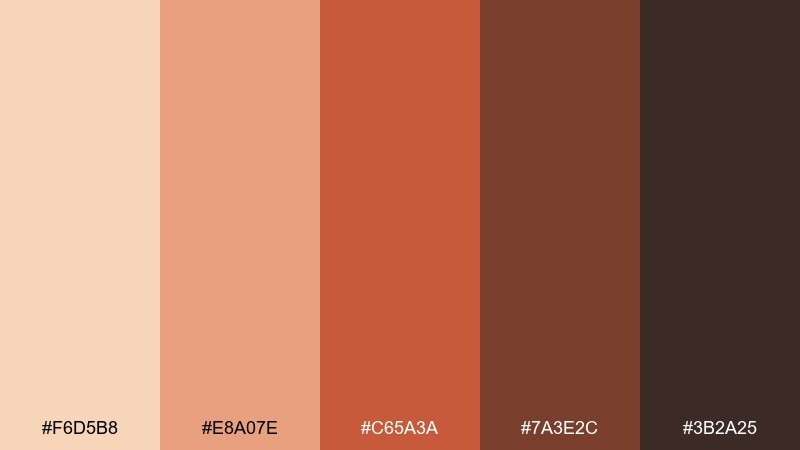
HEX: #F6D5B8 #E8A07E #C65A3A #7A3E2C #3B2A25
Mood: bold, welcoming, handcrafted
Best for: brand identity for cafes, studios, and makers
Bold adobe warmth and sunrise blush create an inviting, handcrafted feel. Pair the peach and coral midtones for primary brand blocks, then anchor everything with the espresso brown. It shines on logos, labels, and social templates where you want a friendly, earthy punch. Usage tip: keep backgrounds light and let the burnt orange do the heavy lifting for emphasis.
Image example of adobe sunrise generated using media.io
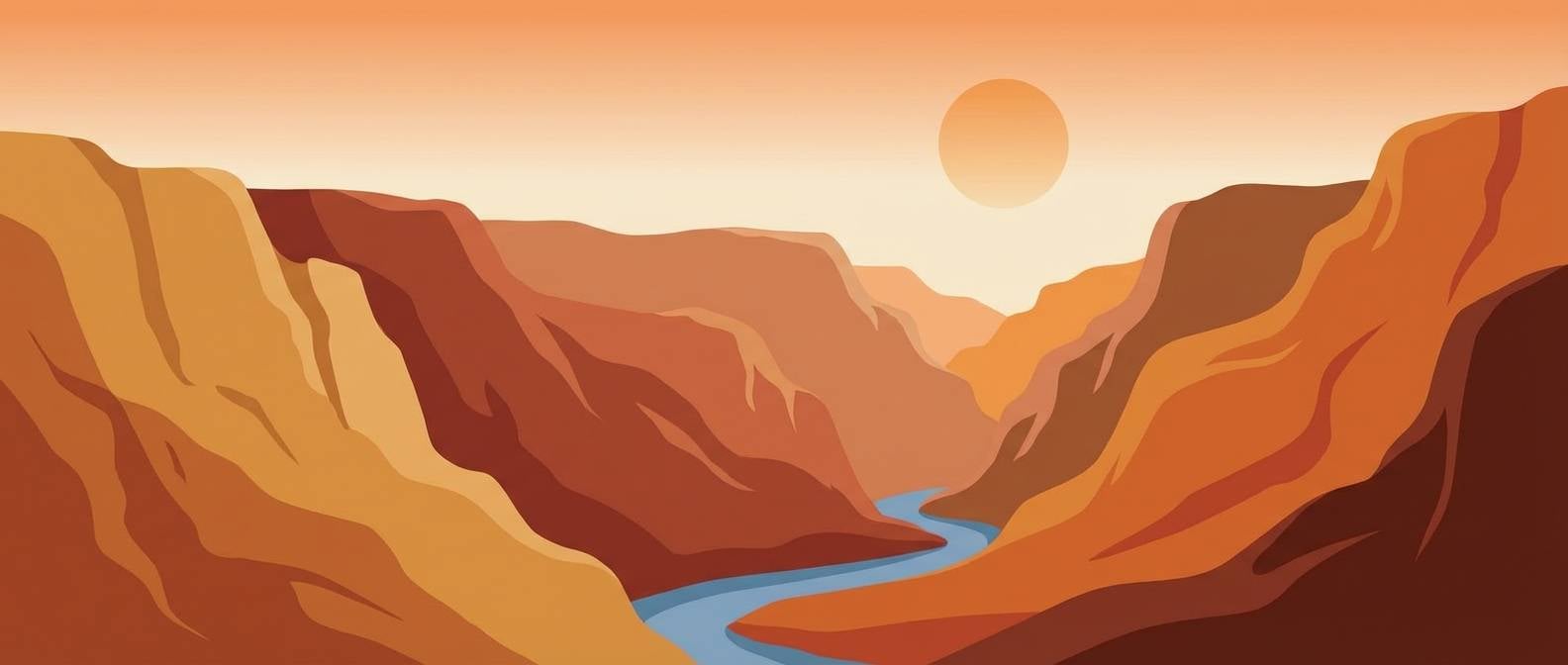
3) Canyon Dusk
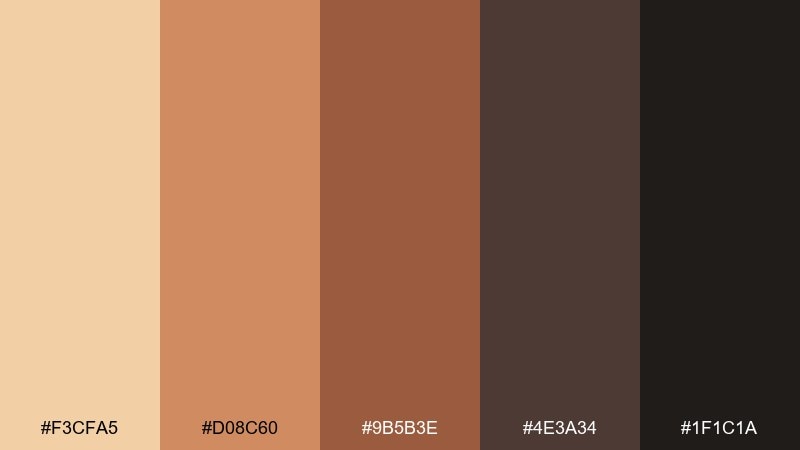
HEX: #F3CFA5 #D08C60 #9B5B3E #4E3A34 #1F1C1A
Mood: moody, cinematic, grounded
Best for: website hero sections and photo overlays
Moody canyon browns and dusk-shadow neutrals feel cinematic and grounded. Use the light sand as your type-safe overlay, then build depth with the chestnut and charcoal. This mix works especially well with landscape photography, leather textures, or matte paper finishes. Usage tip: add a soft gradient from sand to deep brown for smoother transitions on headers.
Image example of canyon dusk generated using media.io

4) Sagebrush Trail
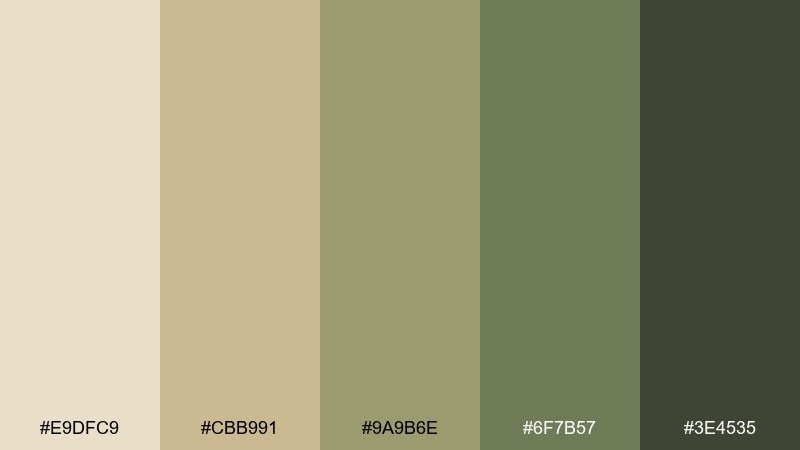
HEX: #E9DFC9 #CBB991 #9A9B6E #6F7B57 #3E4535
Mood: natural, restorative, outdoorsy
Best for: eco packaging and sustainable product labels
Natural sage and sandy neutrals evoke a quiet trail lined with scrub and stone. Let the pale khaki handle backgrounds and whitespace, then use sage as your signature brand color. The deeper olive keeps typography and ingredients lists sharp without turning stark black. Usage tip: print the greens on uncoated stock to get a softer, premium feel.
Image example of sagebrush trail generated using media.io
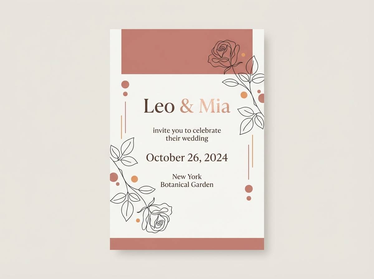
5) Desert Rose Clay
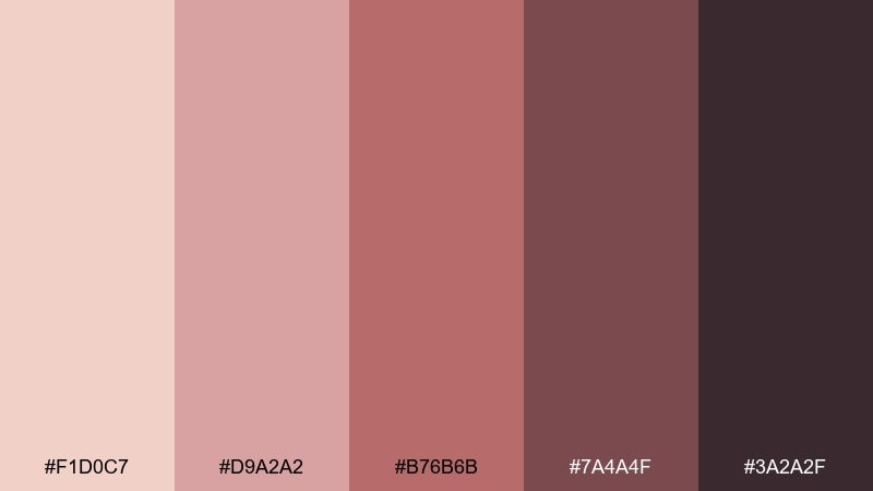
HEX: #F1D0C7 #D9A2A2 #B76B6B #7A4A4F #3A2A2F
Mood: romantic, muted, artisanal
Best for: wedding invitations and event stationery
Romantic rose-clay hues feel like sun-faded petals against warm stone. Use the blush tones for the main card and icons, then bring in the wine-brown for names and key details. It pairs beautifully with serif typography, textured paper, and subtle line art. Usage tip: keep embellishments minimal so the muted reds stay elegant rather than sweet.
Image example of desert rose clay generated using media.io
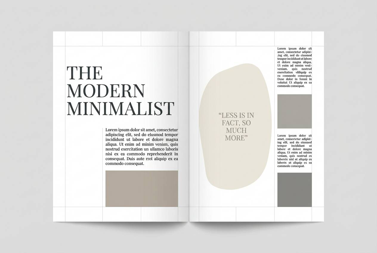
6) Salt Flat Minimal
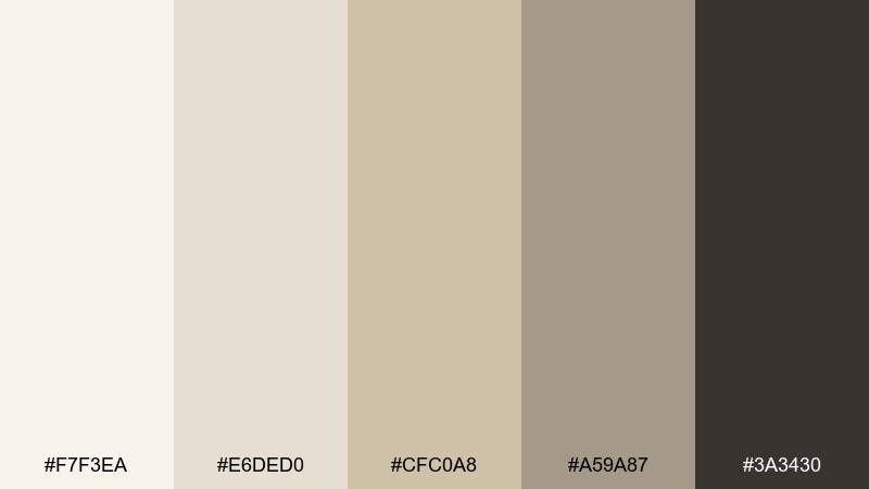
HEX: #F7F3EA #E6DED0 #CFC0A8 #A59A87 #3A3430
Mood: minimal, airy, modern
Best for: editorial layouts and minimalist portfolios
Minimal off-whites and soft taupes suggest wide open flats under bright sky. These desert color combinations are ideal for editorial spacing, where subtle contrast keeps pages calm and premium. Use the near-black sparingly for pull quotes, captions, and thin rules to maintain a light touch. Usage tip: add one accent photo per spread and let the neutrals do the organizing.
Image example of salt flat minimal generated using media.io
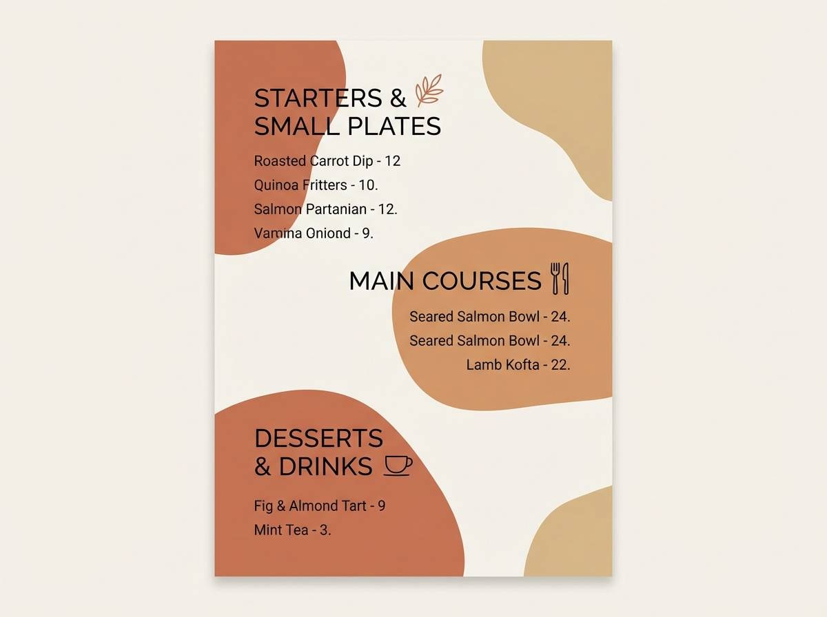
7) Terracotta Market
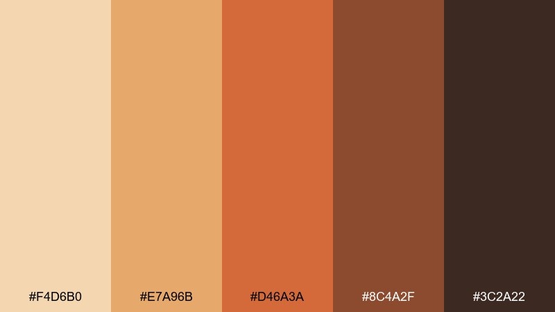
HEX: #F4D6B0 #E7A96B #D46A3A #8C4A2F #3C2A22
Mood: lively, spicy, sociable
Best for: restaurant menus and food branding
Lively terracotta and toasted caramel bring the energy of a bustling open-air market. Use the sandy beige for menu backgrounds, then let the orange-brown shades highlight sections and specials. The deep cocoa tone adds readability for long lists and pricing. Usage tip: keep icon strokes in the darkest shade to prevent the warmer tones from blurring together.
Image example of terracotta market generated using media.io
8) Ocher Ridge
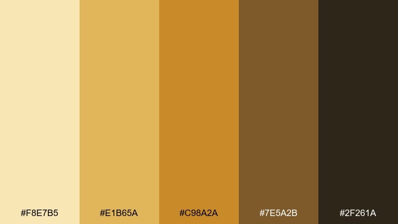
HEX: #F8E7B5 #E1B65A #C98A2A #7E5A2B #2F261A
Mood: sunny, confident, energetic
Best for: skincare product ads and e-commerce banners
Sunny ocher and honeyed gold feel bright without turning neon. Use the light butter tone as a clean backdrop, then apply the amber shades to callouts and price badges. The dark brown helps text stand out, especially on mobile banners. Usage tip: pair with simple sans-serif type and one hero product photo to keep it modern.
Image example of ocher ridge generated using media.io
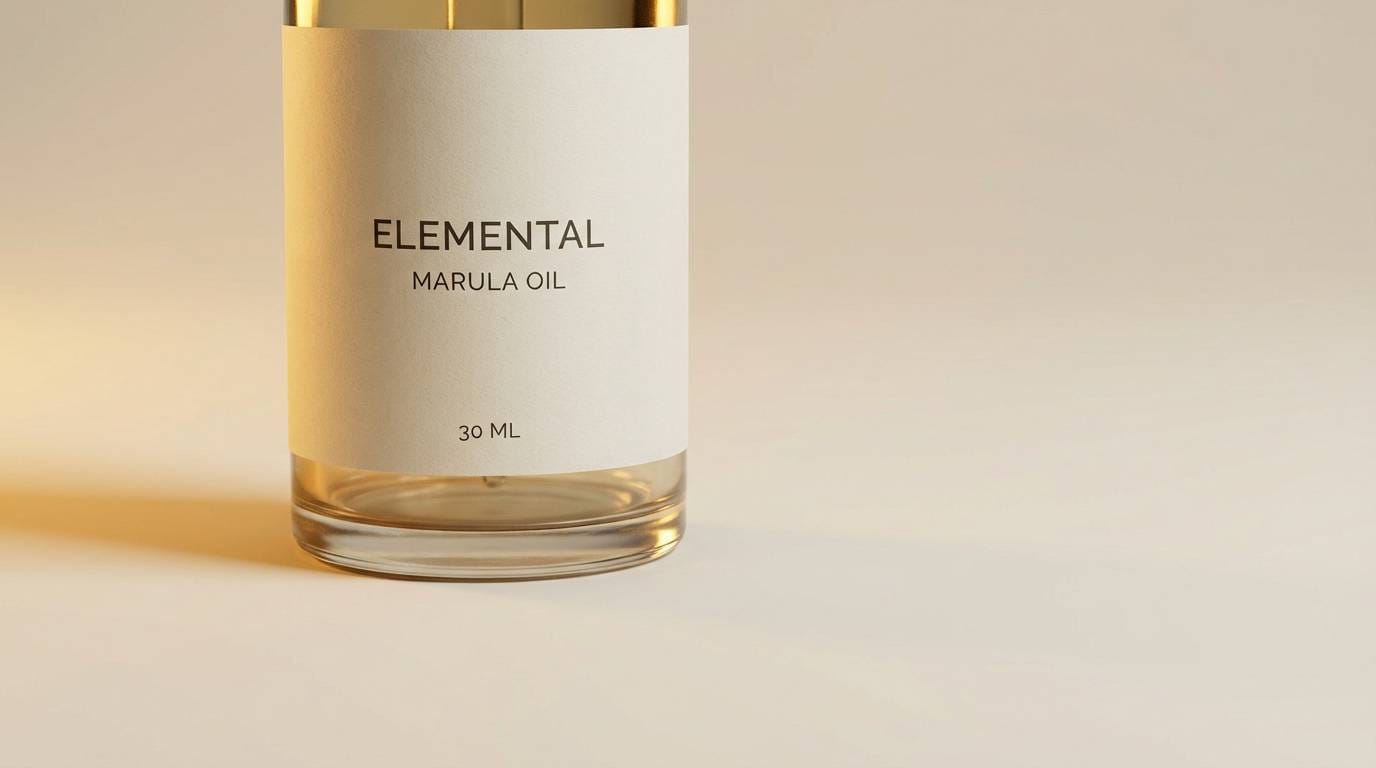
9) Mirage Blue Accent
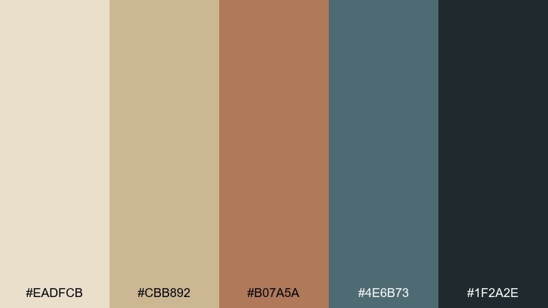
HEX: #EADFCB #CBB892 #B07A5A #4E6B73 #1F2A2E
Mood: fresh, balanced, contemporary
Best for: app onboarding and feature walkthroughs
Fresh teal against warm sand evokes a mirage shimmer on the horizon. This desert color palette works best when the teal is treated as the single accent for buttons, links, and progress states. Keep body text in the deep slate so screens stay readable on light backgrounds. Usage tip: limit teal to one UI component style to avoid a busy look.
Image example of mirage blue accent generated using media.io
10) Mesa Shadow
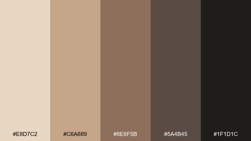
HEX: #E8D7C2 #C6A689 #8E6F5B #5A4B45 #1F1D1C
Mood: cozy, refined, timeless
Best for: interior styling concepts and moodboards
Cozy mesa browns and stone neutrals feel timeless and lived-in. Use the light beige for walls or large surfaces, then layer the mid browns through textiles, wood, and decor. The near-black shade adds modern edge in metal accents or thin frames. Usage tip: mix matte finishes with one subtle sheen to keep the room from feeling flat.
Image example of mesa shadow generated using media.io
11) Sienna and Stone
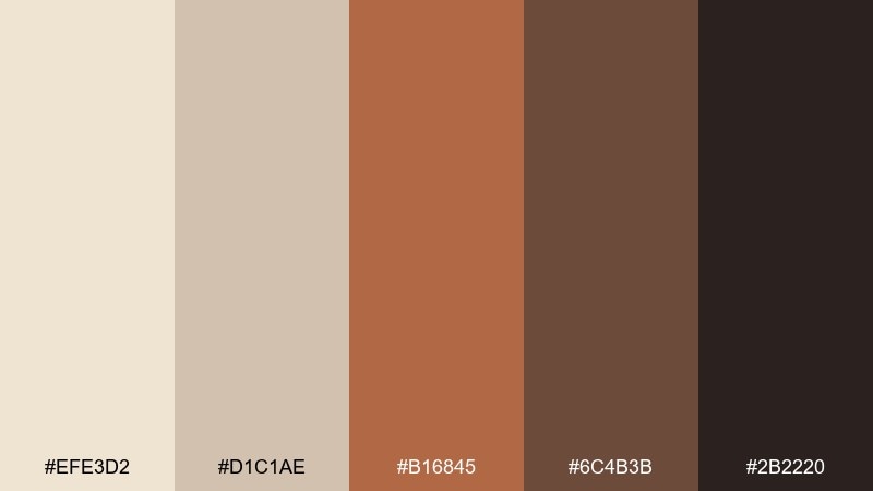
HEX: #EFE3D2 #D1C1AE #B16845 #6C4B3B #2B2220
Mood: heritage, warm, trustworthy
Best for: coffee packaging and craft labels
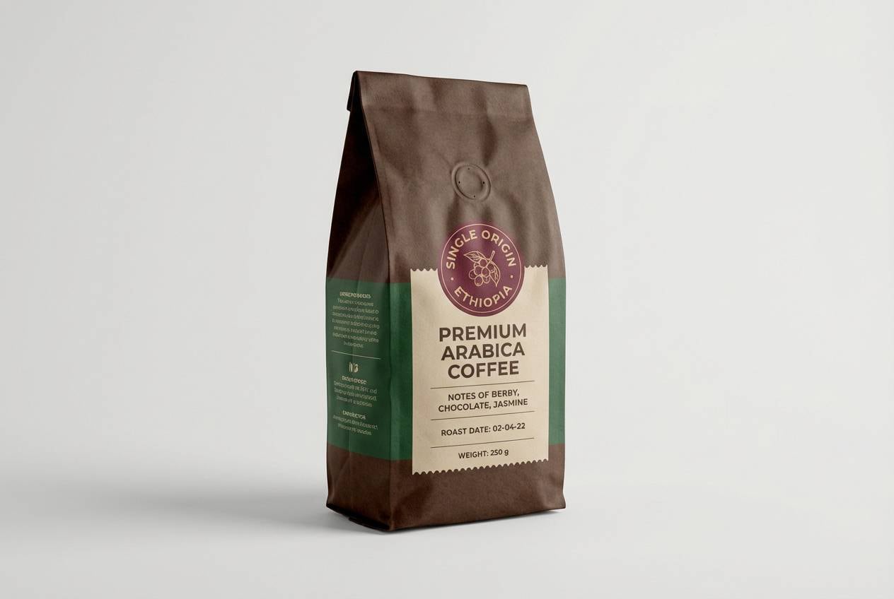
Heritage sienna with soft stone neutrals suggests roasted warmth and quality. Keep the light tones for label backgrounds and whitespace, then use sienna for badges and key flavor notes. The dark espresso color is perfect for typography and barcodes while still feeling cohesive. Usage tip: try a single accent badge in sienna to guide the eye on crowded shelves.
Image example of sienna and stone generated using media.io
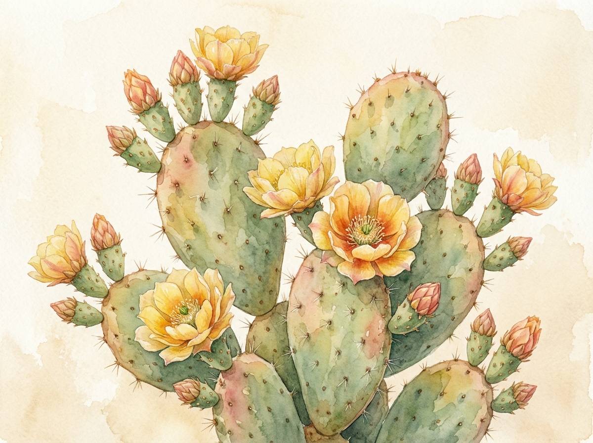
12) Prickly Pear Bloom
HEX: #F2D7D0 #E7A3B2 #C56B7C #7A6A64 #3B3030
Mood: playful, soft, artistic
Best for: botanical illustrations and spring collections
Playful cactus bloom pinks soften the rugged feel of dusty neutrals. Use the pale blush as paper tone, then layer the rose and berry shades in petals and accents. The muted taupe helps stems, shadows, and outlines look natural rather than cartoonish. Usage tip: keep edges slightly imperfect to enhance the hand-painted vibe.
Image example of prickly pear bloom generated using media.io
13) Warm Taupe Path
HEX: #F4EDE3 #D9CFC3 #BDAA98 #8A7766 #4A3D35
Mood: calm, professional, understated
Best for: presentation decks and workshop materials
Calm taupes and warm neutrals create a quiet, professional base. Use the lightest tone for slides and handouts, then rely on mid taupe for dividers and callout boxes. The deep brown keeps headings and data tables legible without looking severe. Usage tip: add one accent graphic per slide and let the neutrals carry the structure.
Image example of warm taupe path generated using media.io
14) Sunset Over Sand
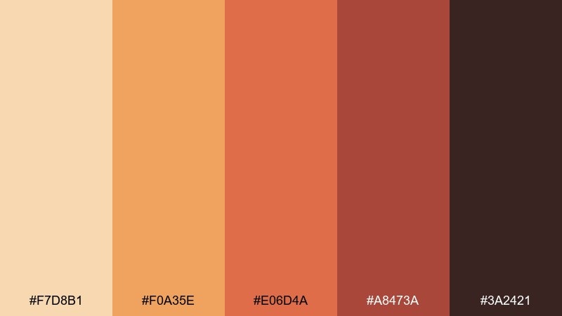
HEX: #F7D8B1 #F0A35E #E06D4A #A8473A #3A2421
Mood: dramatic, adventurous, upbeat
Best for: travel posters and event flyers
Dramatic sunset oranges over soft sand feel adventurous and upbeat. This desert color combination pops when you use the bright orange for the focal element and keep everything else supportive. Pair it with bold display type and simple shapes for a modern travel look. Usage tip: give the orange generous breathing room so it reads as intentional, not loud.
Image example of sunset over sand generated using media.io
15) Night Oasis
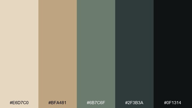
HEX: #E6D7C0 #BFA481 #6B7C6F #2F3B3A #0F1314
Mood: cool, luxe, calming
Best for: spa websites and wellness booking UI
Cool greens and deep charcoal evoke a quiet oasis after dark. Use the warm sand as the background to keep the interface friendly, then let the greens guide navigation states and tabs. The almost-black shade is strong enough for text while staying sophisticated. Usage tip: add subtle gradients in the greens for a more premium, relaxing feel.
Image example of night oasis generated using media.io
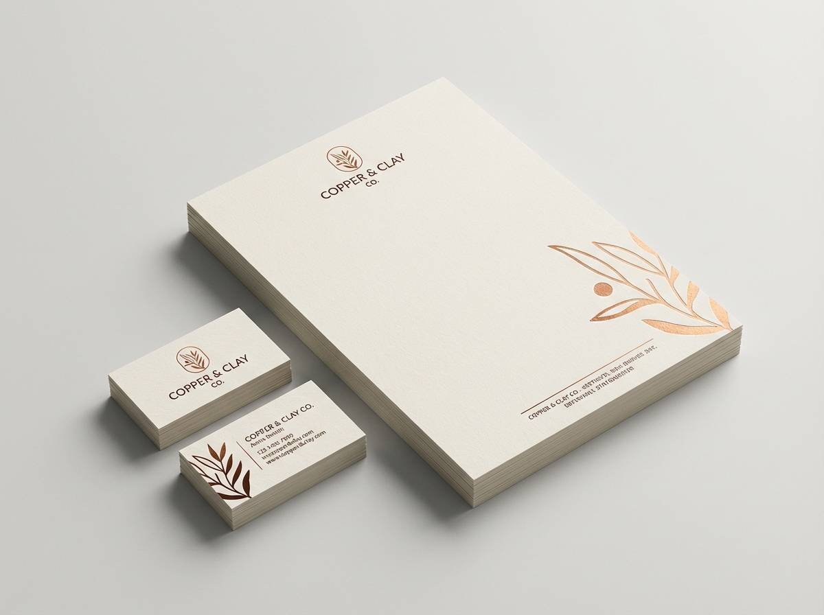
16) Copper Canyon
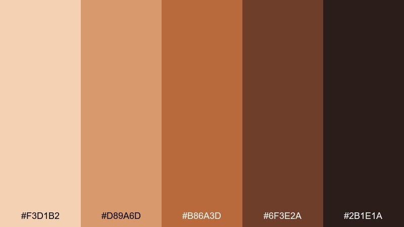
HEX: #F3D1B2 #D89A6D #B86A3D #6F3E2A #2B1E1A
Mood: rugged, premium, confident
Best for: logo marks and boutique stationery
Rugged copper and canyon browns feel premium and confident. Use the soft peach as negative space, then build your mark with copper and deep brown for a strong silhouette. It pairs nicely with embossed paper, foil accents, and monogram-style typography. Usage tip: test the copper tone in one-ink prints to ensure it stays rich, not muddy.
Image example of copper canyon generated using media.io
17) Dusty Lavender Horizon
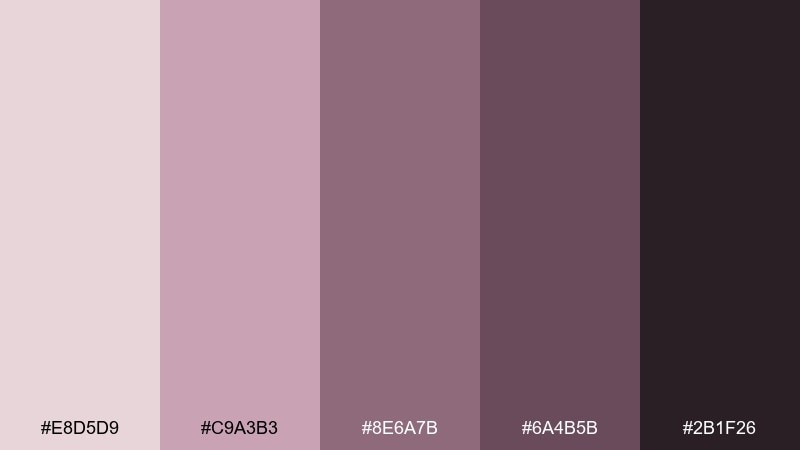
HEX: #E8D5D9 #C9A3B3 #8E6A7B #6A4B5B #2B1F26
Mood: dreamy, modern, artistic
Best for: fashion lookbooks and creative editorials
Dreamy lavender dust and muted plum feel like a hazy horizon at twilight. Use the pale mauve for page backgrounds, then lean on plum for headlines and section markers. It complements black-and-white photography and minimalist layouts especially well. Usage tip: keep body text dark and avoid mid-purple for long paragraphs to protect readability.
Image example of dusty lavender horizon generated using media.io
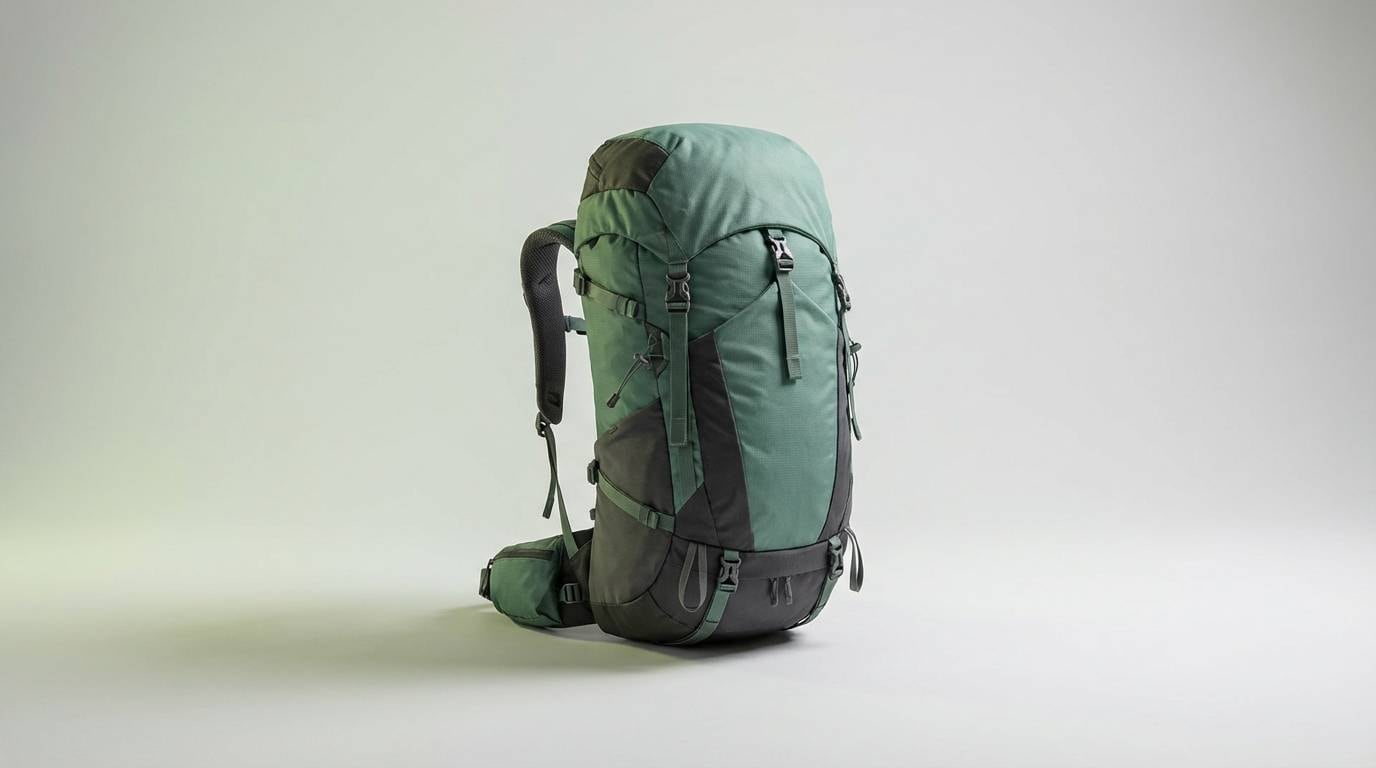
18) Agave Stone
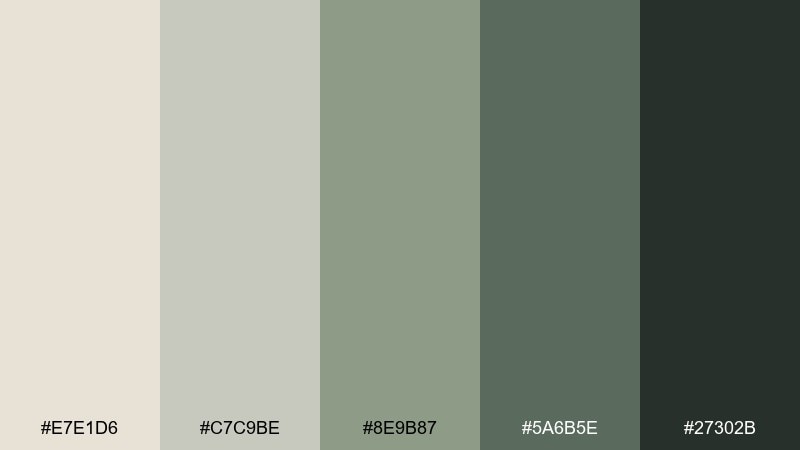
HEX: #E7E1D6 #C7C9BE #8E9B87 #5A6B5E #27302B
Mood: fresh, sturdy, outdoors
Best for: outdoor gear ads and product pages
Fresh agave greens with stone neutrals feel sturdy and outdoorsy. Use the light gray-beige for clean product backdrops, then highlight features in the mid green. The dark forest shade works great for technical specs and navigation bars. Usage tip: pair with sharp product photography and thin line icons for a modern, functional look.
Image example of agave stone generated using media.io
19) Painted Canyon Strata
HEX: #F0D6C1 #D2A07F #A96A4E #7A6A5A #3A2E26
Mood: artful, earthy, layered
Best for: vector illustrations and brand pattern systems
Artful strata tones feel like layered rock bands painted by time. This desert color palette is perfect for geometric illustrations, icons, and repeatable brand patterns. Pair the warm midtones with generous off-white space so the composition stays light. Usage tip: use the gray-brown as a neutral bridge between the warmer stripes.
Image example of painted canyon strata generated using media.io
20) Sandstone Noir
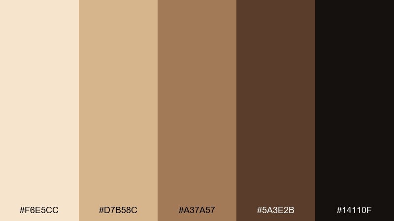
HEX: #F6E5CC #D7B58C #A37A57 #5A3E2B #14110F
Mood: luxury, high-contrast, dramatic
Best for: luxury product ads and premium landing pages
Luxury sandstone with near-black contrast feels dramatic and high-end. Use the pale sand for a clean studio look, then let the deep noir drive typography and premium cues. The mid browns add warmth to shadows, packaging details, and secondary text. Usage tip: keep contrast intentional by limiting gradients and using crisp edges around the darkest elements.
Image example of sandstone noir generated using media.io

What Colors Go Well with Desert?
Desert tones pair easily with crisp off-whites and warm grays for a clean base, then benefit from one cool counterpoint like teal, slate, or dusty blue to refresh the warmth.
For richer compositions, add deep espresso/charcoal as an anchor color for typography, icons, and rules—this keeps contrast strong without breaking the earthy mood.
If you want a softer, modern twist, muted mauve or dusty lavender complements terracotta and sand particularly well, creating a sunset-to-twilight range that still feels natural.
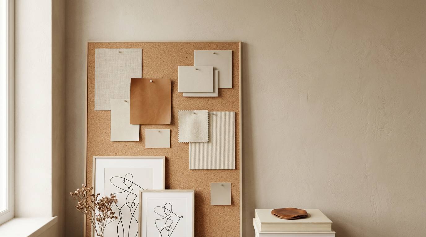
How to Use a Desert Color Palette in Real Designs
Start with the lightest sand tone as your background, then assign one midtone (clay, adobe, or ochre) as your “brand accent” for buttons, badges, and highlights.
Use the darkest shade for headings and high-importance UI states (active nav, key metrics, price), and keep body copy in a near-black/brown to maintain readability.
In print, desert palettes look best with texture: uncoated stock, subtle grain, or matte finishes. In digital, use soft shadows and minimal gradients so the warmth feels intentional, not muddy.
Create Desert Palette Visuals with AI
If you need fast mockups—menus, onboarding screens, packaging, or editorial spreads—you can generate desert-themed visuals from a single prompt and iterate in minutes.
Describe the layout (poster, UI, label), specify your desert tones (sand, terracotta, sage), and keep the background clean so the palette reads clearly.
Once you have an image you like, you can reuse it across your brand kit to keep color, lighting, and mood consistent.
Desert Color Palette FAQs
-
What is a desert color palette?
A desert color palette is a set of warm, earthy tones inspired by sand, clay, rock, and sunset light—often built from beige/sand neutrals plus terracotta, ochre, brown, and an optional cool accent like teal or sage. -
Which HEX colors are most “desert”?
Common desert HEX families include sandy beiges (like #F2E6D0), terracotta/clay oranges (like #C97C5D), ochres/golds (like #C98A2A), and deep canyon browns (like #2E2A27 or #14110F) for contrast. -
How do I keep contrast readable in desert UI designs?
Use the lightest sand tone for backgrounds, reserve the darkest brown/charcoal for text, and keep accent colors (terracotta/teal) for buttons and interactive states. Avoid setting long paragraphs in midtones. -
What’s the best accent color to pair with desert tones?
Muted teal, slate blue, or sage green are the most reliable accents because they balance warm sands and clays while still feeling natural and calm. -
Are desert palettes good for branding?
Yes—desert tones communicate warmth, craft, heritage, and approachability. They work especially well for cafes, studios, wellness brands, outdoor products, and premium packaging when paired with clean typography. -
How many colors should a desert palette include?
Five colors is a practical standard: a light base, two midtones for surfaces and components, one accent, and one dark anchor for type and structure. -
Can I use desert colors for luxury designs?
Yes—choose pale sandstone with near-black (like Sandstone Noir), keep edges crisp, limit gradients, and use restrained accents (foil/copper details or a single badge color) to maintain a premium feel.


