

A red pink color palette blends the urgency of red with the charm of pink, giving you a range that can feel bold, romantic, or ultra-modern depending on contrast and saturation.
Below are 20+ ready-to-use red and pink color pairings (with HEX codes), plus practical guidance for UI, branding, and print so your designs stay readable and balanced.
In this article
- Why Red Pink Palettes Work So Well
-
- rose cherry pop
- blush velvet
- sunset sorbet
- cranberry cream
- peony daydream
- neon rose night
- raspberry mocha
- strawberry milk
- flamingo punch
- mauve modern
- vintage valentine
- coral rosewood
- cherry blossom minimal
- rouge bouquet
- pink pepper studio
- berry gradient ui
- rose gold editorial
- poppy fuchsia festival
- dusty rose retreat
- scarlet petal wedding
- ruby blush contrast
- What Colors Go Well with Red Pink?
- How to Use a Red Pink Color Palette in Real Designs
- Create Red Pink Palette Visuals with AI
Why Red Pink Palettes Work So Well
Red brings intensity, urgency, and confidence, while pink adds softness, warmth, and approachability. Together, they create a versatile spectrum that can shift from playful to premium with just a few adjustments.
Because the hues are closely related, red-pink pairings feel naturally cohesive, which helps branding look intentional. Add a dark anchor (charcoal, navy, or espresso) and you immediately improve readability and hierarchy.
These palettes also scale well across digital and print: pale blushes make clean backgrounds, mid-pinks work as UI accents, and deep rouges can carry headlines, buttons, and focal details without looking harsh.
20+ Red Pink Color Palette Ideas (with HEX Codes)
1) Rose Cherry Pop
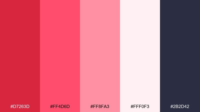
HEX: #D7263D #FF4D6D #FF8FA3 #FFF0F3 #2B2D42
Mood: bold, playful, high-contrast
Best for: social media promo graphics
Bold and bubbly like cherry soda with a rosy glow, this mix feels energetic without turning chaotic. Use the deep navy as your anchor for headlines and buttons, then let the bright reds carry the calls to action. Pair it with clean white space and simple icons to keep it modern. Tip: reserve the hottest pink for small highlights so the design stays readable.
Image example of rose cherry pop generated using media.io

Media.io is an online AI studio for creating and editing video, image, and audio in your browser.

2) Blush Velvet
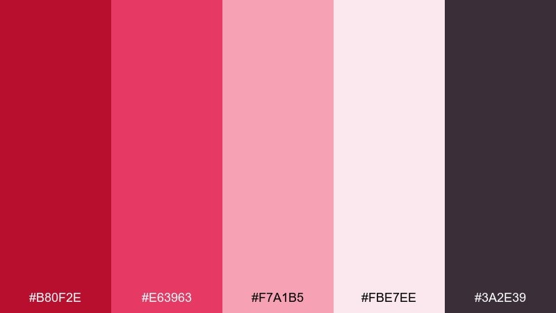
HEX: #B80F2E #E63963 #F7A1B5 #FBE7EE #3A2E39
Mood: romantic, soft, luxe
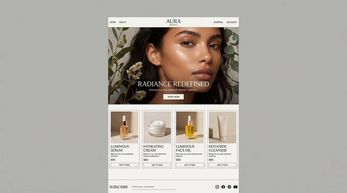
Best for: beauty brand landing page UI
Soft and velvety like a satin lipstick swipe, these tones read premium and intimate. As a red pink color scheme, it works best when the deepest wine shade is used for primary text and navigation. Pair the blush and powder tints with plenty of spacing and thin dividers for a clean, elevated feel. Tip: keep buttons in the mid-rose hue for contrast that still feels gentle.
Image example of blush velvet generated using media.io
3) Sunset Sorbet
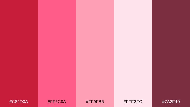
HEX: #C81D3A #FF5C8A #FF9FB5 #FFE3EC #7A2E40
Mood: warm, sunny, inviting
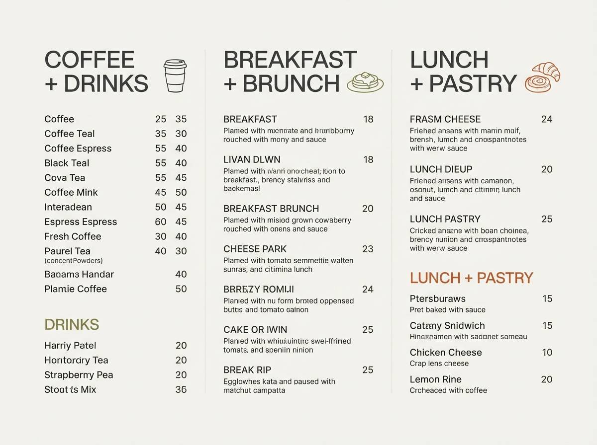
Best for: cafe menu design
Warm and appetizing like sorbet at golden hour, the colors feel friendly and upbeat. This red pink color combination shines on menus when you use the creamy pastel as the base and the deeper reds for section headers. Pair with dark cocoa text for clarity, and add small line icons to keep it light. Tip: limit the bright pink to price tags or special callouts so it stays tasteful.
Image example of sunset sorbet generated using media.io
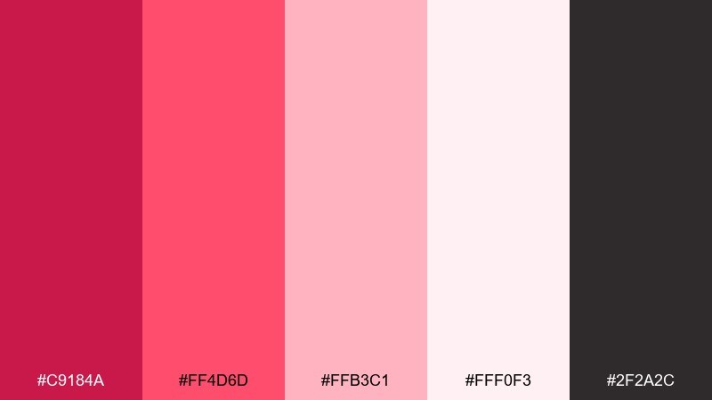
4) Cranberry Cream
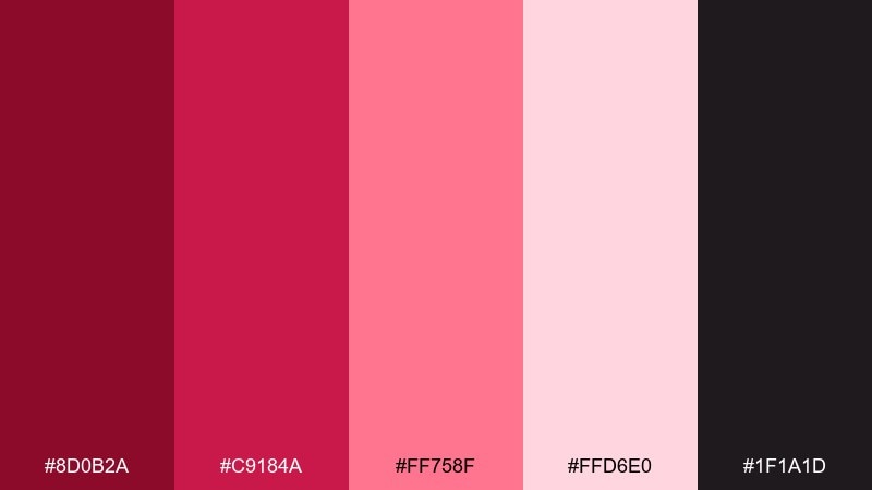
HEX: #8D0B2A #C9184A #FF758F #FFD6E0 #1F1A1D
Mood: rich, cozy, wintery
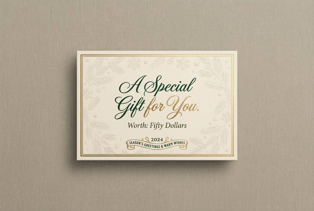
Best for: holiday gift card design
Rich and cozy like cranberry sauce with whipped cream, this set feels festive but refined. Use the near-black for type and borders so the pinks stay crisp and readable. Pair with subtle patterns like dots or thin stripes for a seasonal touch without going kitsch. Tip: keep the background in the pale blush and reserve the dark red for a single bold focal element.
Image example of cranberry cream generated using media.io
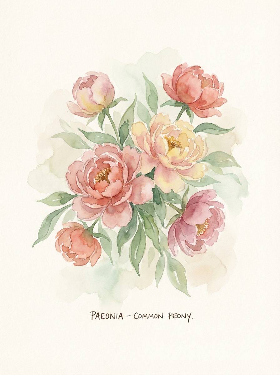
5) Peony Daydream
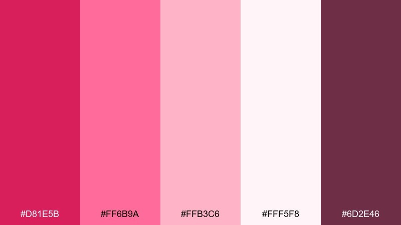
HEX: #D81E5B #FF6B9A #FFB3C6 #FFF5F8 #6D2E46
Mood: floral, airy, dreamy
Best for: watercolor botanical poster
Airy and petal-soft like peonies in spring, these tones feel calm and romantic. Let the off-white tint carry most of the space, then layer mid-pinks for petals and accents. Pair with muted brown or charcoal lettering to avoid a sugary look. Tip: use the deeper berry as a thin outline or shadow to add depth without darkening the piece.
Image example of peony daydream generated using media.io
6) Neon Rose Night
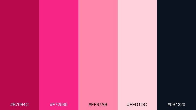
HEX: #B7094C #F72585 #FF87AB #FFD1DC #0B1320
Mood: electric, nightlife, edgy
Best for: club event poster
Electric and late-night, it evokes neon signage glowing against a dark street. Use the inky navy as the background and keep most text in pale pink for legibility. Pair with sharp sans-serif typography and a simple grid to keep the energy controlled. Tip: make one neon hue the only spotlight element to avoid visual noise.
Image example of neon rose night generated using media.io
7) Raspberry Mocha
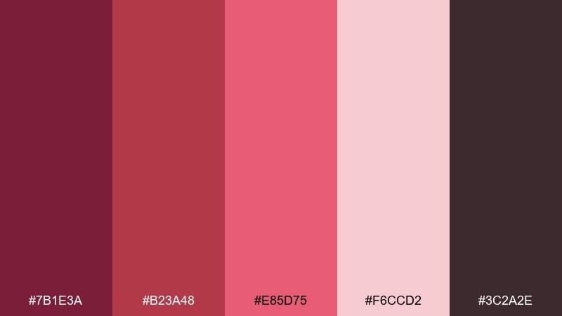
HEX: #7B1E3A #B23A48 #E85D75 #F6CCD2 #3C2A2E
Mood: earthy, mature, comforting
Best for: coffee packaging label
Earthy and comforting like raspberry syrup stirred into mocha, these shades feel grounded and tasteful. Use the cocoa browns for typography and the muted rose for brand blocks or seals. Pair with cream paper textures or minimal line art to emphasize warmth. Tip: keep the label background light so the darker tones read premium instead of heavy.
Image example of raspberry mocha generated using media.io
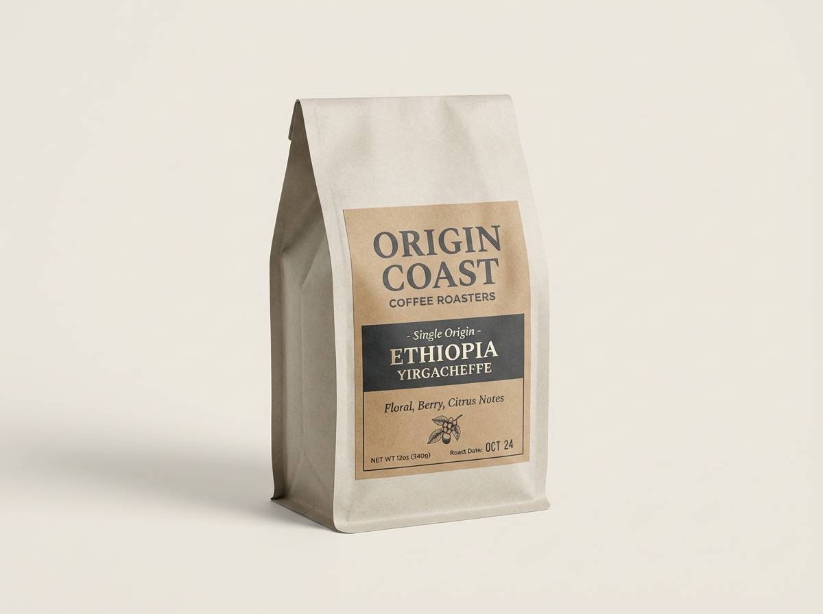
8) Strawberry Milk
HEX: #C1123F #FF477E #FFB5C8 #FFF1F5 #4A2C3A
Mood: sweet, youthful, clean
Best for: skincare product ad
Sweet and clean like strawberry milk in a glass bottle, the palette feels fresh and approachable. This red pink color palette works especially well for skincare when you keep the lightest tint as the background and use the mid-pink for key claims. Pair with warm gray or deep mauve text for a softer contrast than pure black. Tip: use one strong red accent only for the primary buy button or price point.
Image example of strawberry milk generated using media.io
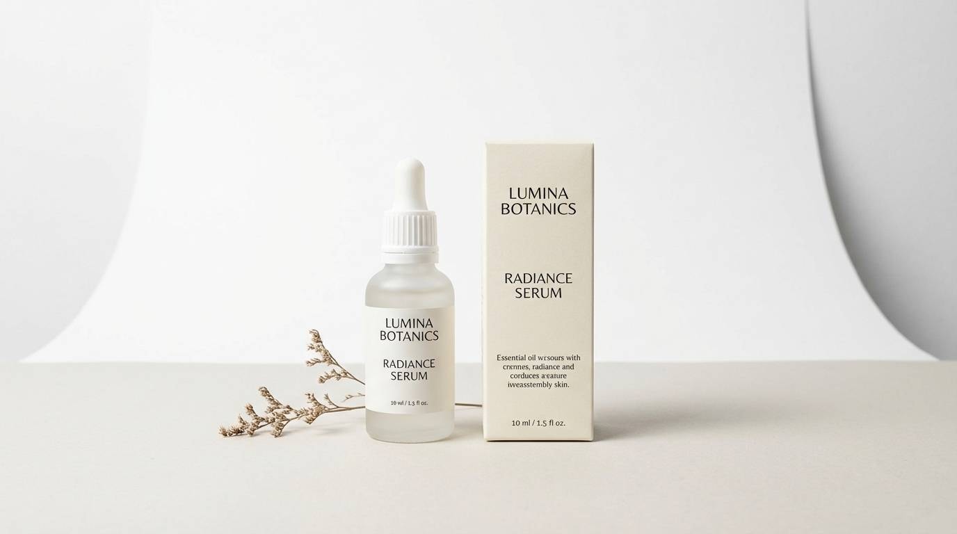
9) Flamingo Punch
HEX: #A4133C #D9204C #FF5D8F #FFB3D1 #2D1B23
Mood: tropical, energetic, fun
Best for: summer party flyer
Tropical and punchy, it brings to mind flamingo feathers and fruity drinks by the pool. Use the darker burgundy for event details and the vivid pink for the headline to create instant hierarchy. Pair with simple wave shapes or confetti dots on a pale pink background for a breezy vibe. Tip: keep body text dark and tight for readability against the bright accents.
Image example of flamingo punch generated using media.io

10) Mauve Modern
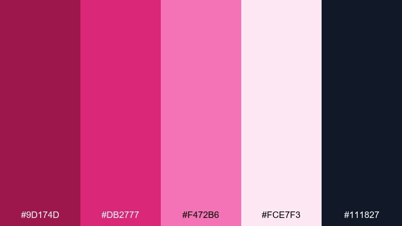
HEX: #9D174D #DB2777 #F472B6 #FCE7F3 #111827
Mood: modern, polished, confident
Best for: SaaS dashboard UI
Polished and contemporary, it feels like tinted glass over a dark, modern workspace. These red pink color combinations are strongest when the charcoal runs the UI foundation and the rose tones become status, charts, and primary actions. Pair with plenty of neutral grays and thin borders to keep everything crisp. Tip: use the brightest pink sparingly for alerts or a single key metric.
Image example of mauve modern generated using media.io

11) Vintage Valentine
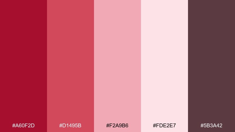
HEX: #A60F2D #D1495B #F2A9B6 #FDE2E7 #5B3A42
Mood: nostalgic, charming, soft
Best for: valentines day card
Nostalgic and sweet like a faded postcard, these tones feel timeless rather than sugary. Use the dusty blush as the main paper color, and keep the stronger reds for small hearts and titles. Pair with serif type or hand-lettered accents for a warm, vintage finish. Tip: add a thin cocoa border to frame the design and keep the pinks from floating.
Image example of vintage valentine generated using media.io

12) Coral Rosewood
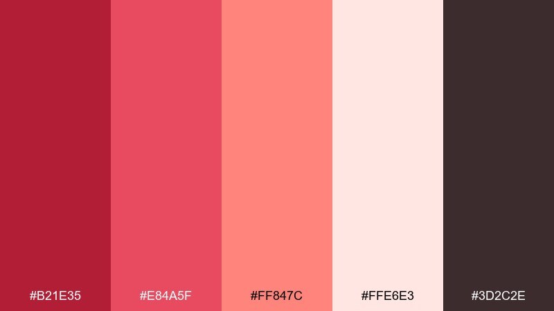
HEX: #B21E35 #E84A5F #FF847C #FFE6E3 #3D2C2E
Mood: warm, artisanal, welcoming
Best for: restaurant brand kit
Warm and artisanal, it evokes coral glaze, rosewood tables, and candlelight. Use the creamy tint as a base and bring in coral for highlights that feel friendly and appetizing. Pair with charcoal typography and natural paper textures to keep the brand grounded. Tip: avoid using two saturated hues side by side; separate them with light space or thin rules.
Image example of coral rosewood generated using media.io
13) Cherry Blossom Minimal
HEX: #C9184A #FF4D6D #FFB3C1 #FFF0F3 #2F2A2C
Mood: minimal, airy, gentle
Best for: wedding website UI
Airy and minimal like cherry blossoms drifting across a clean page, this set feels calm and elegant. Keep most surfaces in the palest blush and use the darker tones for navigation and key dates. Pair with thin line dividers and generous margins to maintain a refined rhythm. Tip: choose one accent shade for links so the site feels cohesive from page to page.
Image example of cherry blossom minimal generated using media.io
14) Rouge Bouquet
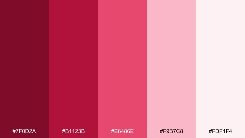
HEX: #7F0D2A #B1123B #E6486E #F9B7C8 #FDF1F4
Mood: romantic, dramatic, floral
Best for: floral shop poster
Romantic and dramatic, it feels like a bouquet wrapped in silk ribbon under warm lighting. Use the light blush as the paper tone and set product names in the deep rouge for a classic feel. Pair with delicate line drawings of flowers to reinforce the theme without clutter. Tip: keep the brightest pink to small tags like new arrivals or seasonal specials.
Image example of rouge bouquet generated using media.io
15) Pink Pepper Studio

HEX: #A4043A #D81159 #FF6F91 #FFDDE7 #22223B
Mood: creative, punchy, stylish
Best for: creative agency homepage UI
Punchy and stylish, it suggests pink pepper spice with a crisp editorial edge. Let the deep indigo handle text and navigation, then use the saturated magenta for primary actions and section anchors. Pair with plenty of white space and bold type weights to emphasize confidence. Tip: keep gradients subtle and short so the interface stays professional.
Image example of pink pepper studio generated using media.io
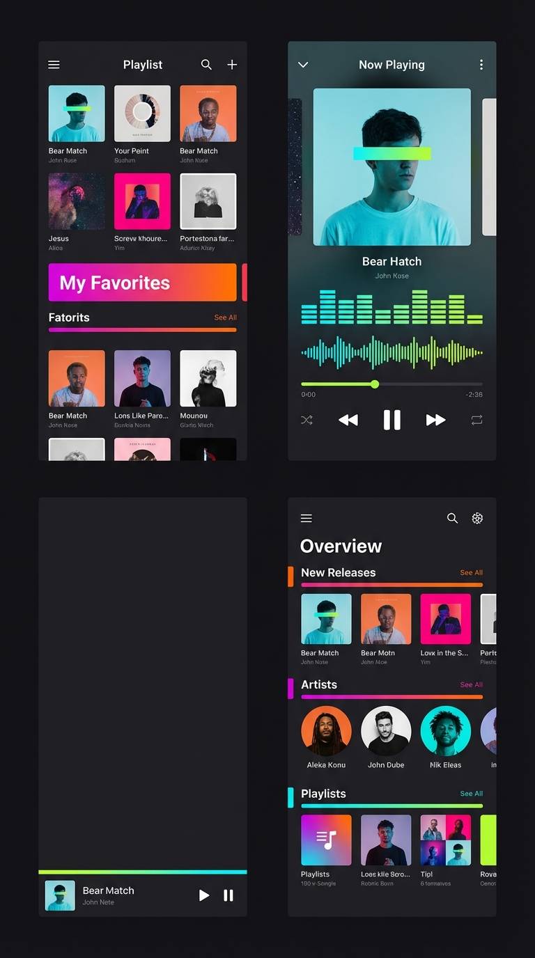
16) Berry Gradient UI
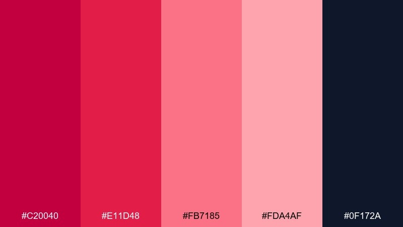
HEX: #C20040 #E11D48 #FB7185 #FDA4AF #0F172A
Mood: sleek, digital, vibrant
Best for: music app UI screens
Sleek and digital, it feels like a berry neon gradient pulsing with sound. Use the darkest shade for background panels so the pinks can glow as progress bars and active states. Pair with soft gray typography and consistent spacing to keep the screens scannable. Tip: apply the brightest tint only on the currently playing element to guide attention.
Image example of berry gradient ui generated using media.io
17) Rose Gold Editorial
HEX: #AD1457 #EC407A #F8BBD0 #FFF7FA #2D2A32
Mood: editorial, refined, airy
Best for: magazine layout spread
Refined and airy, it recalls rose-gold foil on creamy paper with soft blush shadows. Use the near-white as the page base and reserve the mid-rose for pull quotes and section markers. Pair with a charcoal body font and generous leading for that true print-like calm. Tip: keep accent rules thin and consistent to avoid a scrapbook feel.
Image example of rose gold editorial generated using media.io
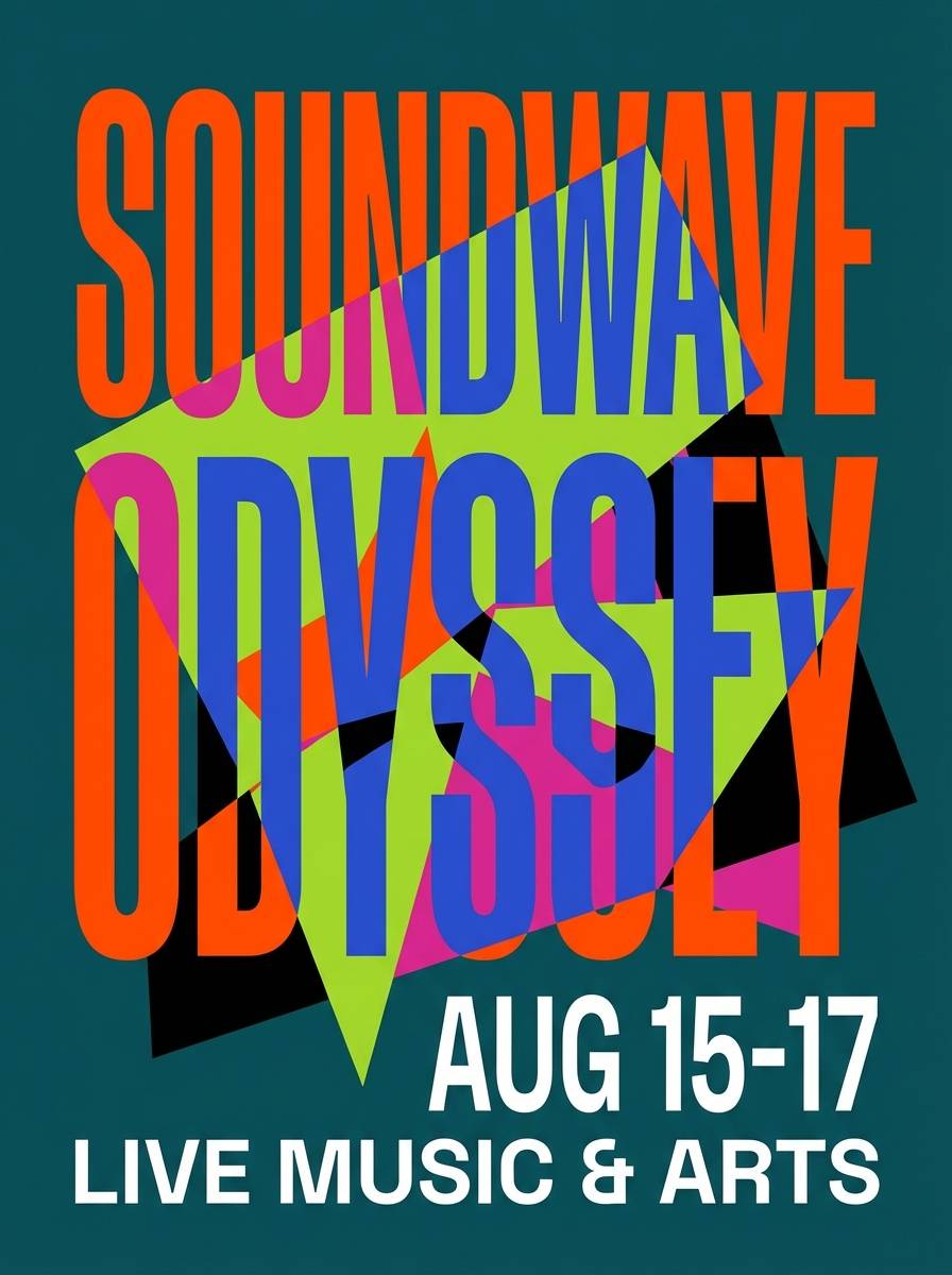
18) Poppy Fuchsia Festival
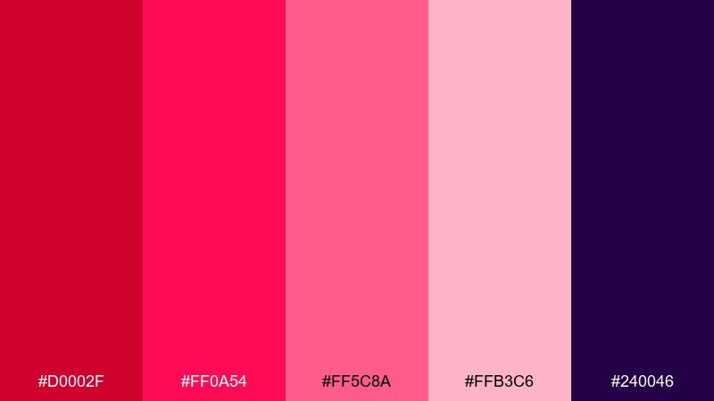
HEX: #D0002F #FF0A54 #FF5C8A #FFB3C6 #240046
Mood: festive, loud, energetic
Best for: music festival poster
Festive and loud, it feels like poppy petals and fuchsia lights at a packed stage. Use the deep purple as a grounding background and layer hot pinks for the lineup hierarchy. Pair with bold condensed typography and simple shape bursts to communicate energy fast. Tip: keep secondary info in the lightest pink so it stays readable without competing with the headline.
Image example of poppy fuchsia festival generated using media.io
19) Dusty Rose Retreat
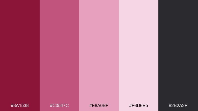
HEX: #8A1538 #C0547C #E8A0BF #F6D6E5 #2B2A2F
Mood: calm, muted, restorative
Best for: wellness retreat brochure
Calm and muted, it evokes dried rose petals, soft linens, and quiet mornings. Use the light dusty tints as large background fields, then bring in the deeper rose for headings and section tabs. Pair with minimal photography frames and plenty of negative space to keep the brochure serene. Tip: keep contrast consistent by using the charcoal for all body text.
Image example of dusty rose retreat generated using media.io
20) Scarlet Petal Wedding
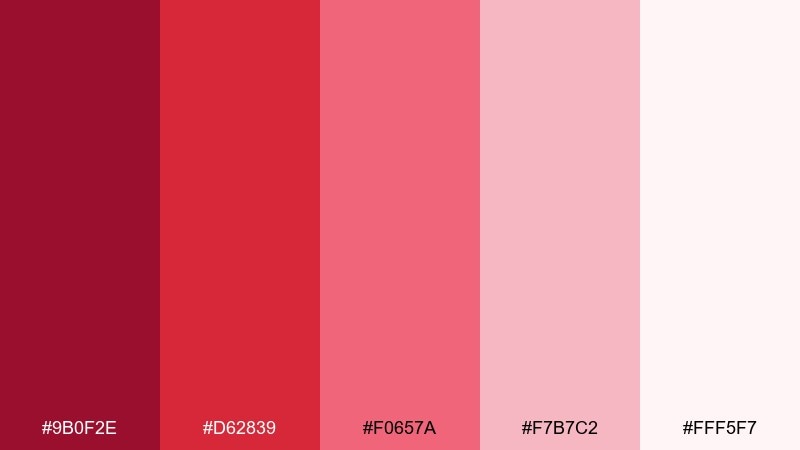
HEX: #9B0F2E #D62839 #F0657A #F7B7C2 #FFF5F7
Mood: elegant, celebratory, romantic
Best for: wedding invitation suite
Elegant and celebratory, it suggests scarlet petals scattered over blush stationery. Use the off-white as your paper base and keep the strongest red for names or a single monogram element. Pair with classic serif typography and thin rules for a timeless look. Tip: print the mid-pink for envelopes or details cards to add warmth without overwhelming the main invite.
Image example of scarlet petal wedding generated using media.io
21) Ruby Blush Contrast
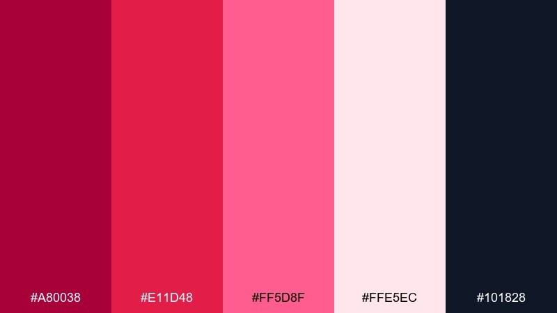
HEX: #A80038 #E11D48 #FF5D8F #FFE5EC #101828
Mood: confident, clean, high-contrast
Best for: app onboarding screens
Confident and clean, it feels like ruby gloss against a crisp blush backdrop. Keep onboarding backgrounds pale and let the ruby tone drive progress indicators and primary buttons. Pair with dark slate text and simple illustrations so the screens stay focused. Tip: test contrast on small captions, and switch to the slate for any fine print.
Image example of ruby blush contrast generated using media.io

What Colors Go Well with Red Pink?
Neutrals are the easiest win: soft whites, blush-tinted off-whites, warm grays, and deep charcoal help red and pink look intentional instead of overwhelming. In most layouts, a dark neutral for text will keep contrast stable across components.
For a richer, more premium feel, pair red pink with wine, cocoa brown, or deep plum. These darker companions echo the warmth in red and the softness in pink while adding depth for headlines, borders, and UI chrome.
If you want extra pop, try a small amount of cool contrast like deep navy or indigo. Used sparingly, cooler anchors make the pinks look brighter and more modern without turning the palette into a rainbow.
How to Use a Red Pink Color Palette in Real Designs
Start by assigning roles: pick one light tint for backgrounds, one mid-tone for UI accents, and one deep shade for text or key focal elements. This keeps your design system consistent across pages, ads, or print pieces.
Control saturation and spacing. Red and pink can feel “loud” when large blocks of saturated color touch each other, so separate strong hues with off-white space, thin rules, or a dark anchor shade.
Always test accessibility in UI: buttons, links, captions, and error states should remain readable on both light and dark surfaces. If needed, shift tiny text to charcoal/navy while reserving hot pinks for icons, badges, and highlights.
Create Red Pink Palette Visuals with AI
If you already have HEX codes, you can turn them into fast concept visuals—posters, UI mockups, brand boards, or packaging scenes—by describing your layout and style while keeping the palette consistent.
With Media.io’s text-to-image workflow, you can iterate quickly: adjust typography style, composition, and contrast while keeping your red pink color scheme stable for A/B testing and client reviews.
When prompting, specify “plain background,” “no hands,” and “clean grid” for modern design comps, then call out where you want the darkest shade used (text, borders, or background panels) to protect readability.
Red Pink Color Palette FAQs
-
What does a red pink color palette communicate in branding?
It usually signals energy + warmth: red adds urgency and confidence, while pink adds friendliness and care. Depending on saturation, it can read playful (bright pinks) or premium (deep wine + blush). -
How do I keep red and pink from looking too “Valentine’s”?
Use a dark anchor (charcoal, navy, espresso), reduce saturation, and add lots of off-white space. Dusty roses and berry tones feel more modern and less holiday-coded than pure hot pink. -
What are the best neutral colors with red pink palettes?
Off-white, cream, warm gray, and charcoal are the most reliable. For UI, charcoal or deep navy typically gives better text contrast than pure black against blush backgrounds. -
Can I use red pink palettes in professional UI design?
Yes—treat red/pink as accent colors for actions, charts, and states, and build the foundation with neutrals. Keep the brightest pink for one key action or highlight to avoid visual noise. -
Which red pink combination works best for print like invitations or brochures?
Look for softer backgrounds (blush/off-white) with one strong red used sparingly for names, headings, or a monogram. Palettes like Scarlet Petal Wedding or Dusty Rose Retreat are designed for that balance. -
How can I generate red pink palette mockups quickly?
Use a text-to-image tool and include your intended format (poster, UI mockup, brand board) plus style cues (minimal, editorial, bold). Then iterate prompts while keeping your color palette consistent. -
What’s the easiest way to maintain readability with red and pink?
Assign roles: light background, mid-tone accents, and dark text. Test small text on mobile sizes, and switch body copy to charcoal/navy if any pink background reduces contrast.
Next: Carnival Color Palette


