

A great carnival color palette mixes high-saturation brights with at least one grounding dark (or neutral) so your design feels festive without becoming noisy.
Below are ready-to-use carnival color schemes with HEX codes, plus practical tips for posters, UI, social templates, packaging, and event graphics.
In this article
- Why Carnival Palettes Work So Well
-
- confetti pop
- big top sunset
- carousel pastels
- cotton candy nights
- lemonade stand
- fireworks on velvet
- ticket booth neutrals
- juggler jazz
- ferris wheel sky
- candy apple shine
- masked parade
- ribbon dance
- sparkler citrus
- balloon bouquet
- roller rink retro
- night market lanterns
- popcorn and brass
- prism face paint
- confetti minimal
- streamers and cream
- ringmaster chic
- mauve spotlight
- What Colors Go Well with Carnival?
- How to Use a Carnival Color Palette in Real Designs
- Create Carnival Palette Visuals with AI
Why Carnival Palettes Work So Well
Carnival palettes are designed for attention: punchy hues, clear contrast, and quick readability that works across posters, tickets, signage, and digital ads.
They also balance emotion and structure. Bright accents create excitement, while a dark navy/charcoal (or a soft neutral) keeps typography and layout stable.
That mix makes carnival color combinations flexible: you can go neon for nightlife, pastel for kids parties, or modern-minimal for brand decks—without losing the “celebration” vibe.
20+ Carnival Color Palette Ideas (with HEX Codes)
1) Confetti Pop
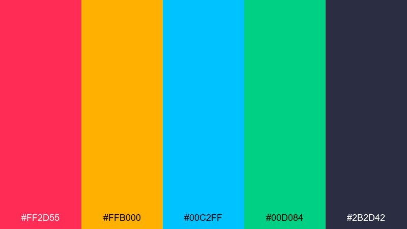
HEX: #FF2D55 #FFB000 #00C2FF #00D084 #2B2D42
Mood: electric, playful, high-energy
Best for: festival poster design
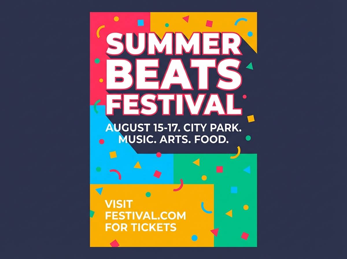
Electric and playful, these tones feel like confetti bursting under bright lights. Use the deep slate as your type anchor, then let the hot pink and citrus yellow carry headlines and icons. The aqua and mint work best as secondary blocks or pattern fills to keep layouts lively without looking chaotic. Tip: keep one color per text tier so the hierarchy stays readable from a distance.
Image example of confetti pop generated using media.io
Media.io is an online AI studio for creating and editing video, image, and audio in your browser.

2) Big Top Sunset
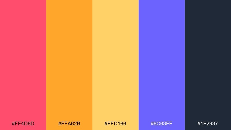
HEX: #FF4D6D #FFA62B #FFD166 #6C63FF #1F2937
Mood: warm, dramatic, celebratory
Best for: event flyer design
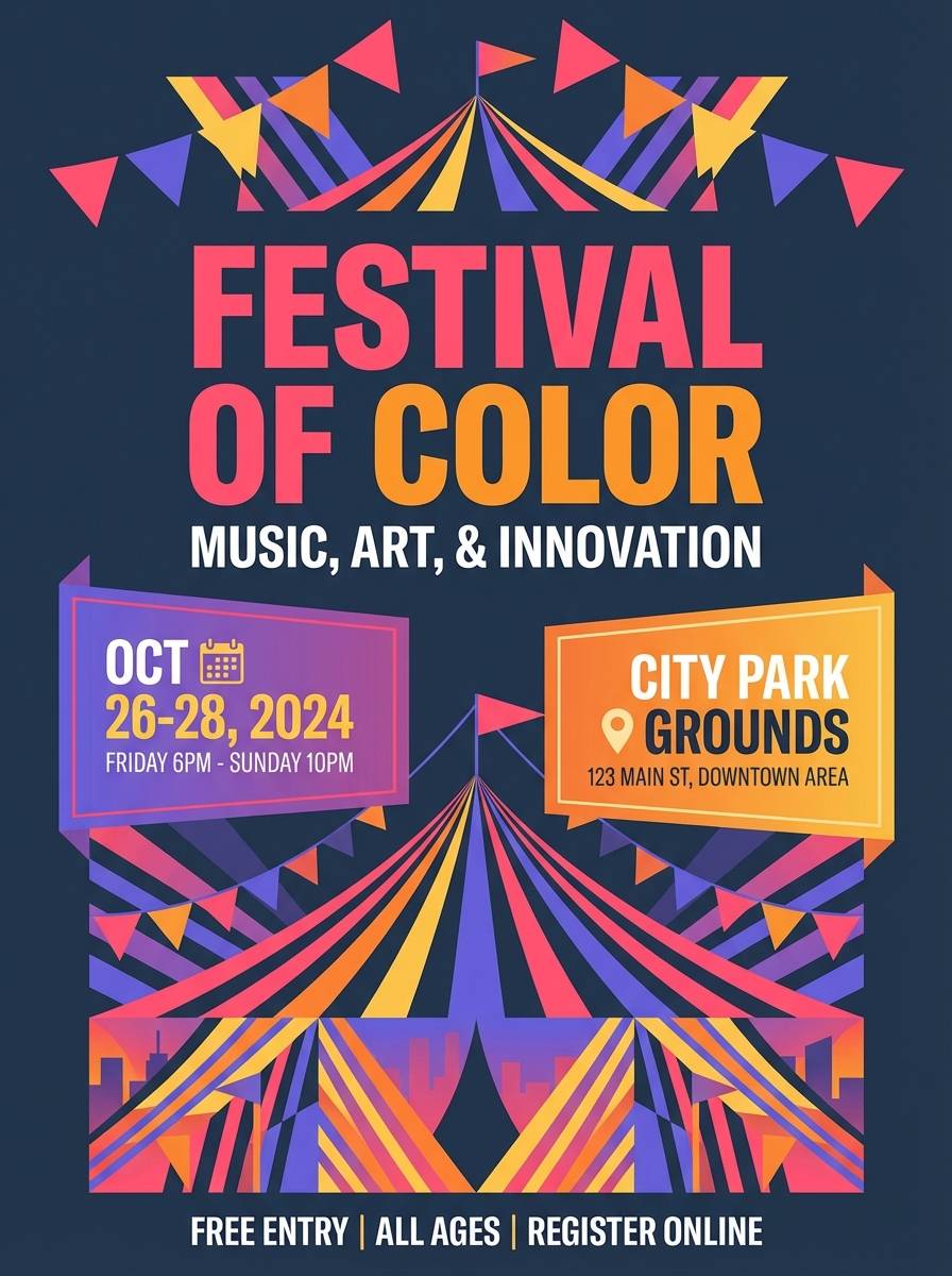
Warm and dramatic, it evokes sunset stripes across a tent canopy. Pair the violet with the charcoal for titles and dates, then use coral and orange for attention-grabbing callouts. The soft gold helps transition between saturated areas and keeps gradients or overlays looking intentional. Tip: reserve coral for the single primary action so the flyer has one clear focal point.
Image example of big top sunset generated using media.io
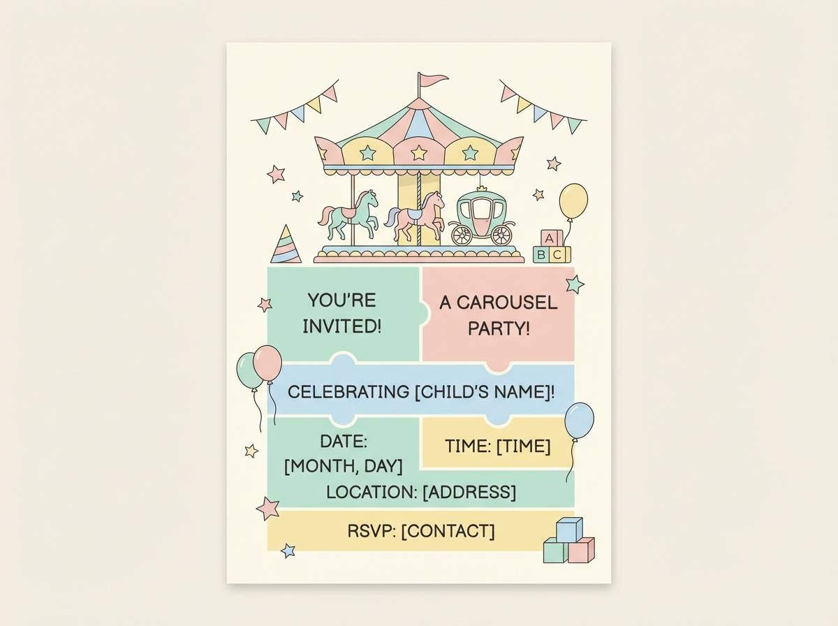
3) Carousel Pastels
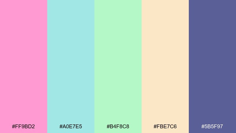
HEX: #FF9BD2 #A0E7E5 #B4F8C8 #FBE7C6 #5B5F97
Mood: sweet, soft, nostalgic
Best for: kids party invitation design
Sweet and nostalgic, these pastels recall painted horses and ribbon trims. Use the muted indigo for names and key details so the soft shades do not wash out. Mint and aqua make friendly background panels, while blush and cream work for borders, stickers, and icons. Tip: add plenty of white space so the invitation stays airy and easy to scan.
Image example of carousel pastels generated using media.io
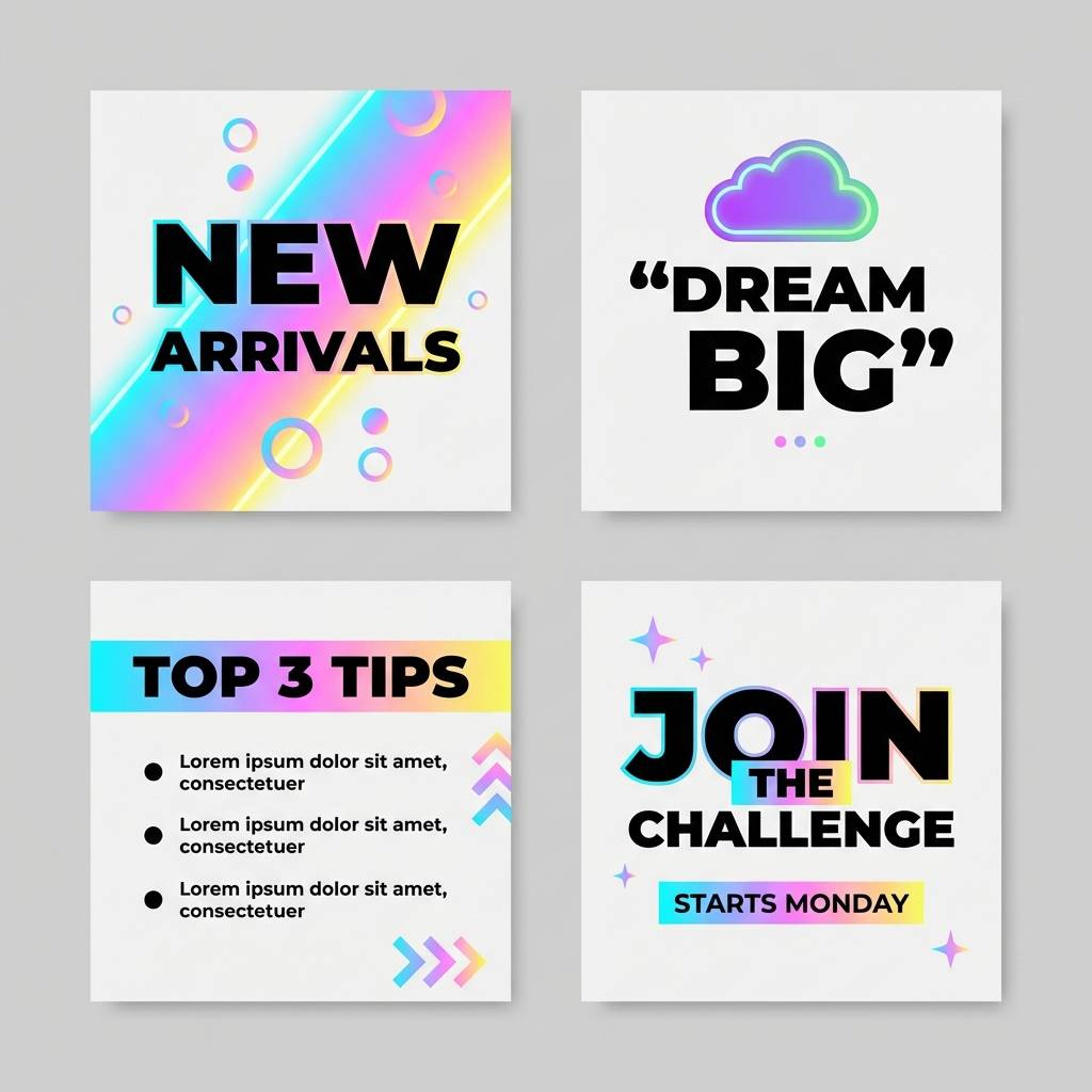
4) Cotton Candy Nights
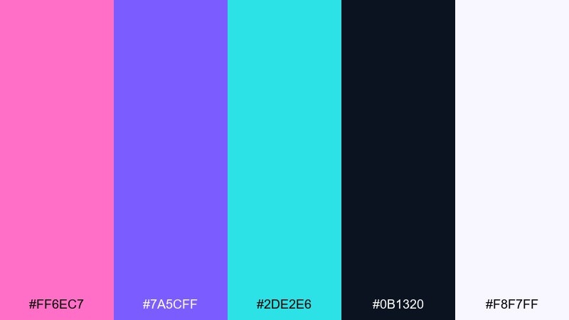
HEX: #FF6EC7 #7A5CFF #2DE2E6 #0B1320 #F8F7FF
Mood: neon, dreamy, night-time
Best for: social media template design
Neon and dreamy, it feels like cotton candy glowing against a night sky. Let the near-black handle backgrounds and use white for body text to keep posts crisp. Pink and violet are ideal for stickers, frames, and headline emphasis, while cyan adds a sharp highlight for buttons and links. Tip: avoid using all three brights at full strength in one tile; pick two and keep the third as a tiny accent.
Image example of cotton candy nights generated using media.io
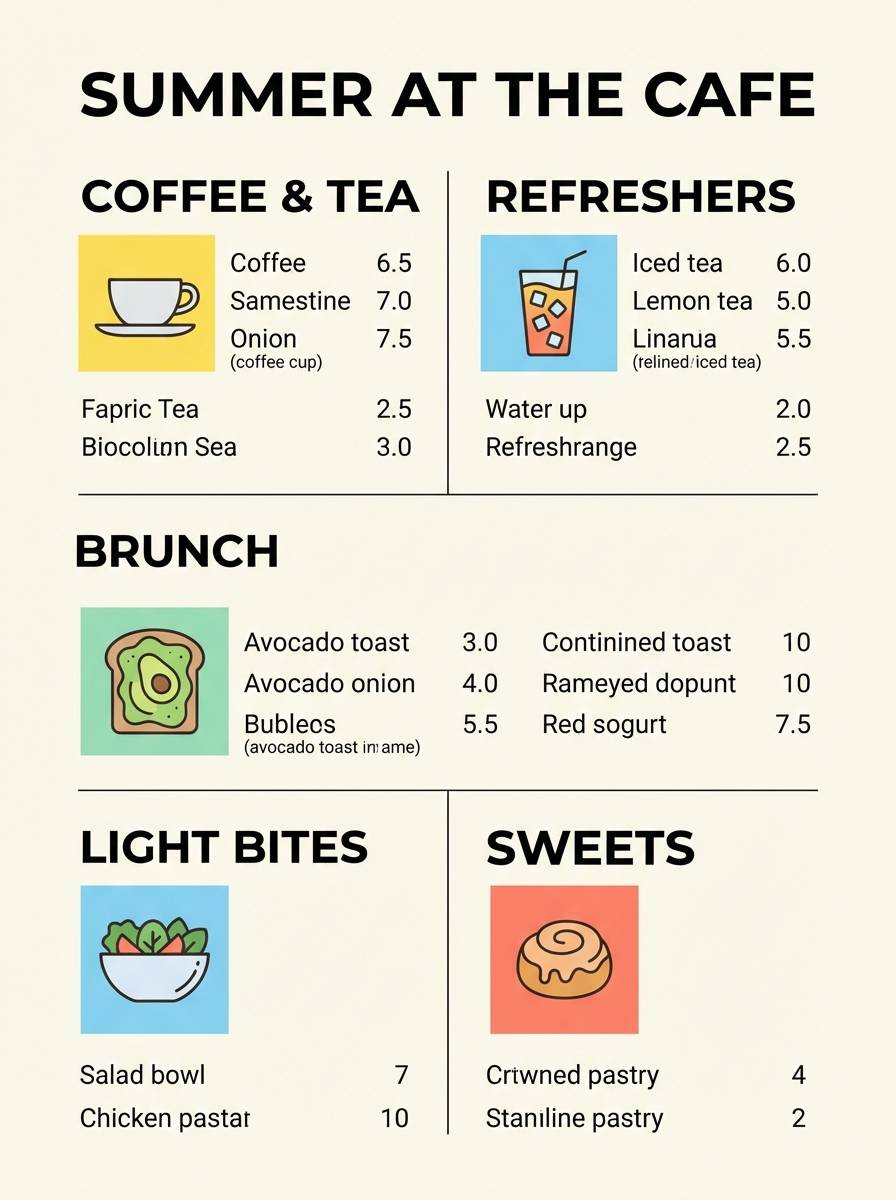
5) Lemonade Stand
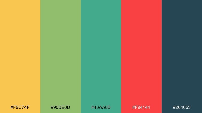
HEX: #F9C74F #90BE6D #43AA8B #F94144 #264653
Mood: fresh, sunny, upbeat
Best for: summer menu design
Fresh and sunny, it brings to mind citrus slices, paper cups, and hand-painted signs. Use the deep teal for headings and pricing to keep the menu readable, then sprinkle red as a spicy highlight for specials. The green-teal pair works beautifully for section dividers and simple iconography. Tip: keep yellow mostly in the background or small badges so it does not overpower food photography.
Image example of lemonade stand generated using media.io
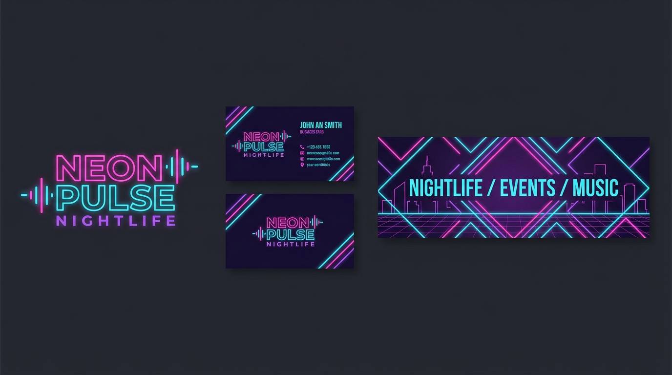
6) Fireworks on Velvet
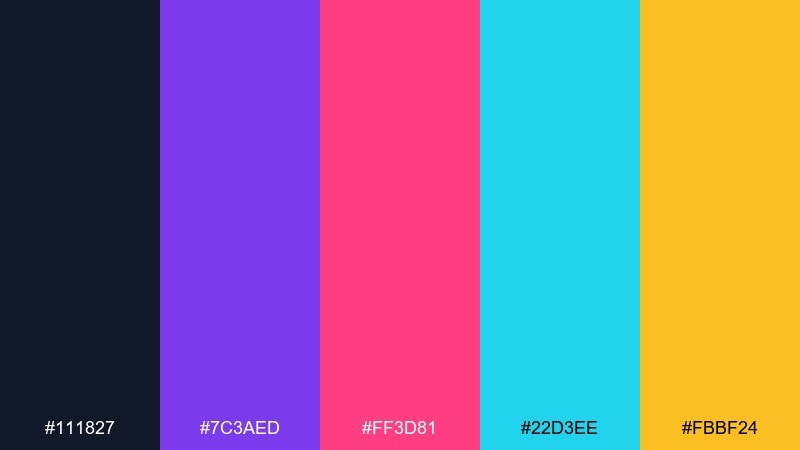
HEX: #111827 #7C3AED #FF3D81 #22D3EE #FBBF24
Mood: bold, glamorous, night-time
Best for: nightlife branding kit
Bold and glamorous, it reads like fireworks snapping over velvet darkness. This carnival color palette works best when the ink-dark base takes up most of the space, letting the brights feel premium rather than loud. Pair purple with pink for hero moments, then use cyan and gold as small sparks on icons, dividers, and hover states. Tip: apply gold only to the highest-value elements like badges or limited-time tags.
Image example of fireworks on velvet generated using media.io
7) Ticket Booth Neutrals
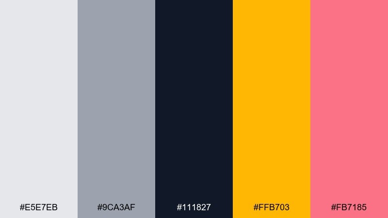
HEX: #E5E7EB #9CA3AF #111827 #FFB703 #FB7185
Mood: clean, modern, friendly
Best for: ui dashboard design
Clean and modern, it feels like crisp tickets, punched edges, and bright stamp marks. Build your UI with light gray surfaces and charcoal text, then reserve amber for primary actions. The soft rose works well for alerts, status chips, and small data highlights without shouting. Tip: keep accents under 10 percent of the screen to preserve a calm, professional layout.
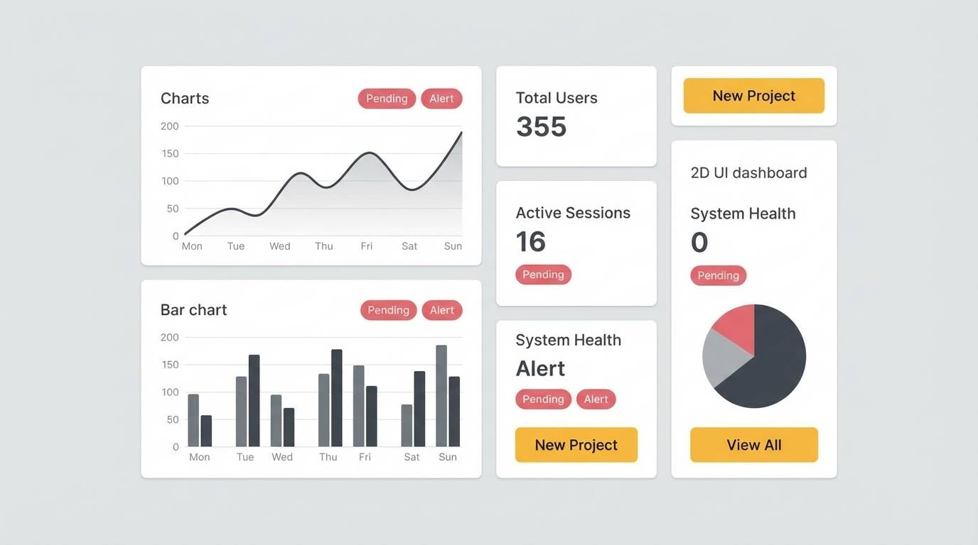
Image example of ticket booth neutrals generated using media.io
8) Juggler Jazz
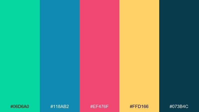
HEX: #06D6A0 #118AB2 #EF476F #FFD166 #073B4C
Mood: rhythmic, upbeat, retro-modern
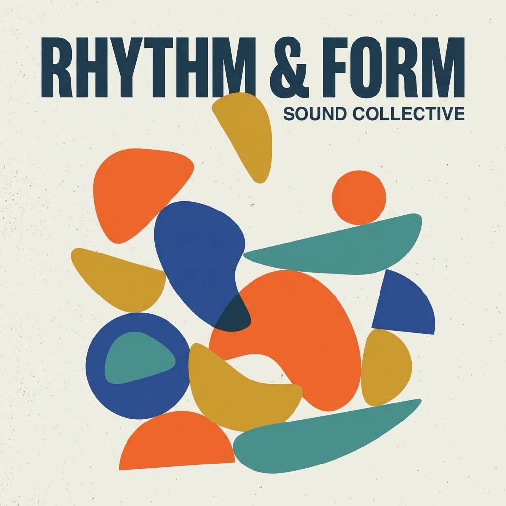
Best for: album cover design
Rhythmic and upbeat, it suggests juggling pins in motion to a brass-band groove. Use the dark teal as a grounding stage, then layer blue and green as mid-tones for shapes and textures. Pink and gold are perfect for title typography and small high-contrast highlights. Tip: add subtle grain to the darker areas so saturated colors blend smoothly in print.
Image example of juggler jazz generated using media.io
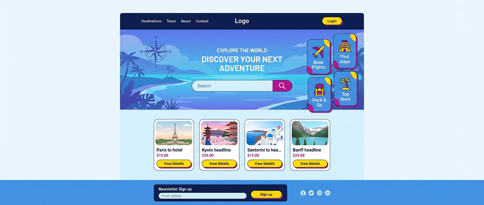
9) Ferris Wheel Sky
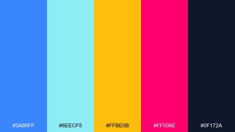
HEX: #3A86FF #8EECF5 #FFBE0B #FF006E #0F172A
Mood: airy, bright, adventurous
Best for: travel landing page ui
Airy and adventurous, it feels like a high ride with sky reflections and bright bulbs. Use the navy for navigation and footer areas, then let blue lead your content sections for trust and clarity. Yellow and magenta are strongest as micro-accents for badges, price tags, and CTA states. Tip: test magenta on small text sizes, and switch to navy if contrast drops.
Image example of ferris wheel sky generated using media.io
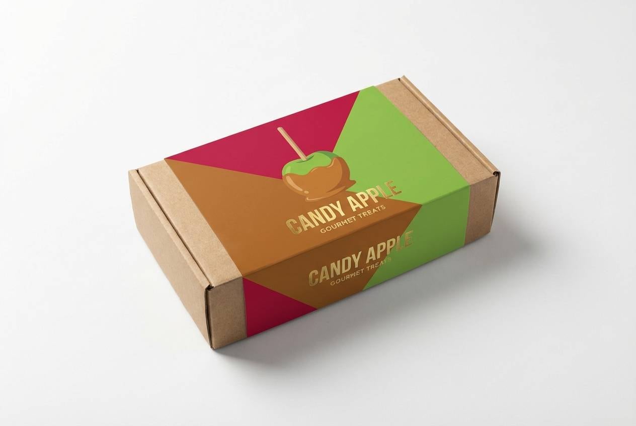
10) Candy Apple Shine
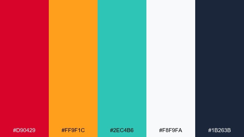
HEX: #D90429 #FF9F1C #2EC4B6 #F8F9FA #1B263B
Mood: glossy, bold, appetizing
Best for: product packaging mockup
Glossy and bold, it evokes a candy apple glaze with a crisp bite underneath. These carnival color combinations pop best when white space stays generous and the navy is used for ingredient text and legal lines. Use red for the hero panel and orange for flavor cues, while teal adds a modern freshness to seals and icons. Tip: print-test the red on matte stock to avoid losing detail in shadows.
Image example of candy apple shine generated using media.io
11) Masked Parade
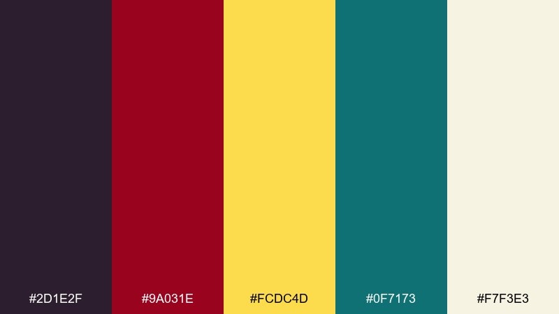
HEX: #2D1E2F #9A031E #FCDC4D #0F7173 #F7F3E3
Mood: mysterious, ornate, dramatic
Best for: editorial magazine layout
Mysterious and ornate, it recalls masks, brocade, and stage curtains. Use the deep plum for headline bars and pull quotes, then keep body copy on the warm cream for an editorial feel. Gold adds luxe section markers, while teal makes a refined accent for links, captions, and infographics. Tip: limit the red to one statement element per spread so the layout stays elegant.
Image example of masked parade generated using media.io
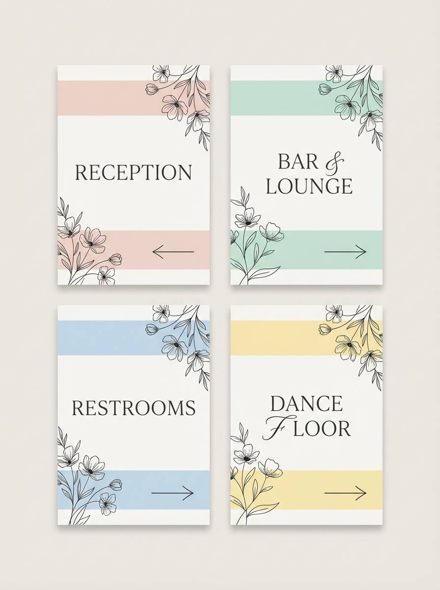
12) Ribbon Dance
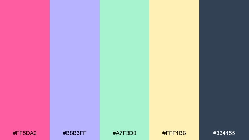
HEX: #FF5DA2 #B8B3FF #A7F3D0 #FFF1B6 #334155
Mood: romantic, light, whimsical
Best for: wedding reception signage
Romantic and light, it looks like satin ribbons drifting through warm air. The slate keeps names and directions crisp, while blush and lavender soften the overall tone. Mint and butter-yellow work as subtle background washes and floral line art. Tip: choose one pastel as the dominant panel color and keep the others to borders and small motifs.
Image example of ribbon dance generated using media.io
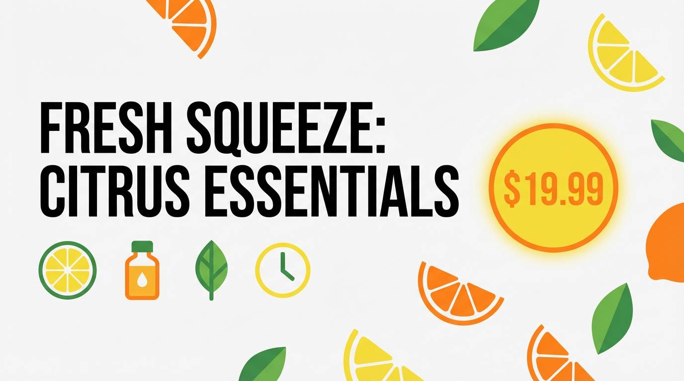
13) Sparkler Citrus
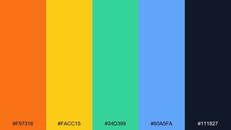
HEX: #F97316 #FACC15 #34D399 #60A5FA #111827
Mood: bright, optimistic, energetic
Best for: ecommerce banner design
Bright and optimistic, it feels like citrus zest with sparkler fizz. Use charcoal as the steady base for product names and pricing, then layer orange and yellow for urgency cues. Green and blue are great for trust elements like shipping icons, ratings, and secondary buttons. Tip: keep yellow behind dark text only, and avoid placing it behind white type.
Image example of sparkler citrus generated using media.io
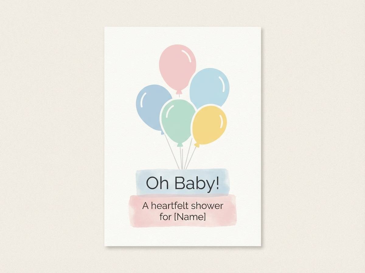
14) Balloon Bouquet
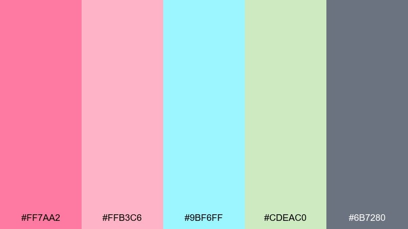
HEX: #FF7AA2 #FFB3C6 #9BF6FF #CDEAC0 #6B7280
Mood: gentle, cheerful, airy
Best for: baby shower card design
Gentle and cheerful, it evokes balloons drifting in soft daylight. Use the mid-gray for names, dates, and RSVP info so the pale tones stay legible. Pink and blush feel best as large shapes, while aqua and soft green can highlight icons and borders. Tip: add a thin gray outline around pastel illustrations to keep edges crisp after printing.
Image example of balloon bouquet generated using media.io
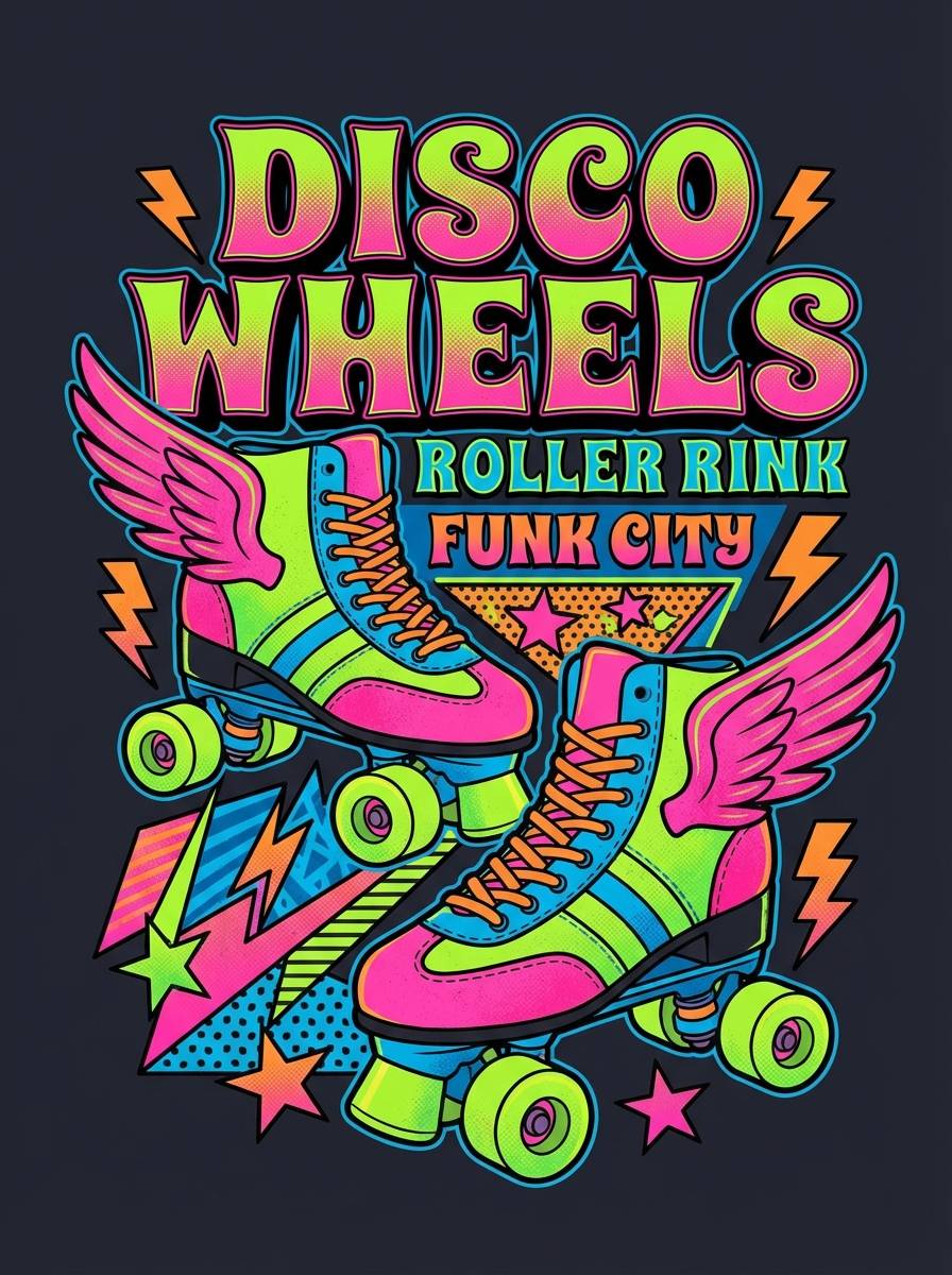
15) Roller Rink Retro
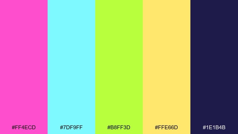
HEX: #FF4ECD #7DF9FF #B8FF3D #FFE66D #1E1B4B
Mood: retro, loud, fun
Best for: apparel graphic tee design
Retro and loud, it channels rink lights, arcade tokens, and glossy skates. The deep indigo is the best base for tees, letting neon accents feel intentional and punchy. Use cyan for outlines and highlights, then pick either pink or lime as the headline color to avoid visual overload. Tip: convert neons to spot colors for screen printing to keep them vivid on fabric.
Image example of roller rink retro generated using media.io
16) Night Market Lanterns
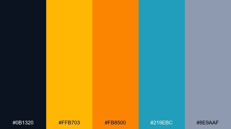
HEX: #0B1320 #FFB703 #FB8500 #219EBC #8E9AAF
Mood: moody, warm, urban
Best for: restaurant branding
Moody and warm, it suggests lantern glow against a late-night street. Use the inky base for menus and signage, then let amber and orange define your signature brand marks. The blue adds modern contrast for links and icons, while the cool gray supports secondary text. Tip: keep orange for food highlights and amber for brand accents so the system stays consistent.
Image example of night market lanterns generated using media.io
17) Popcorn and Brass
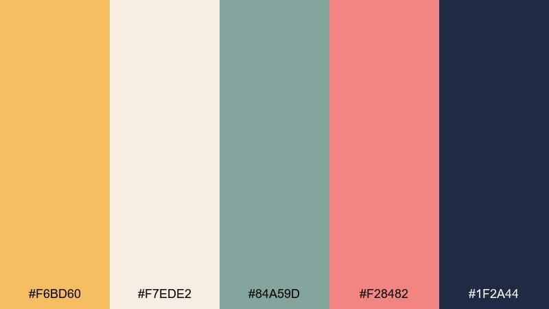
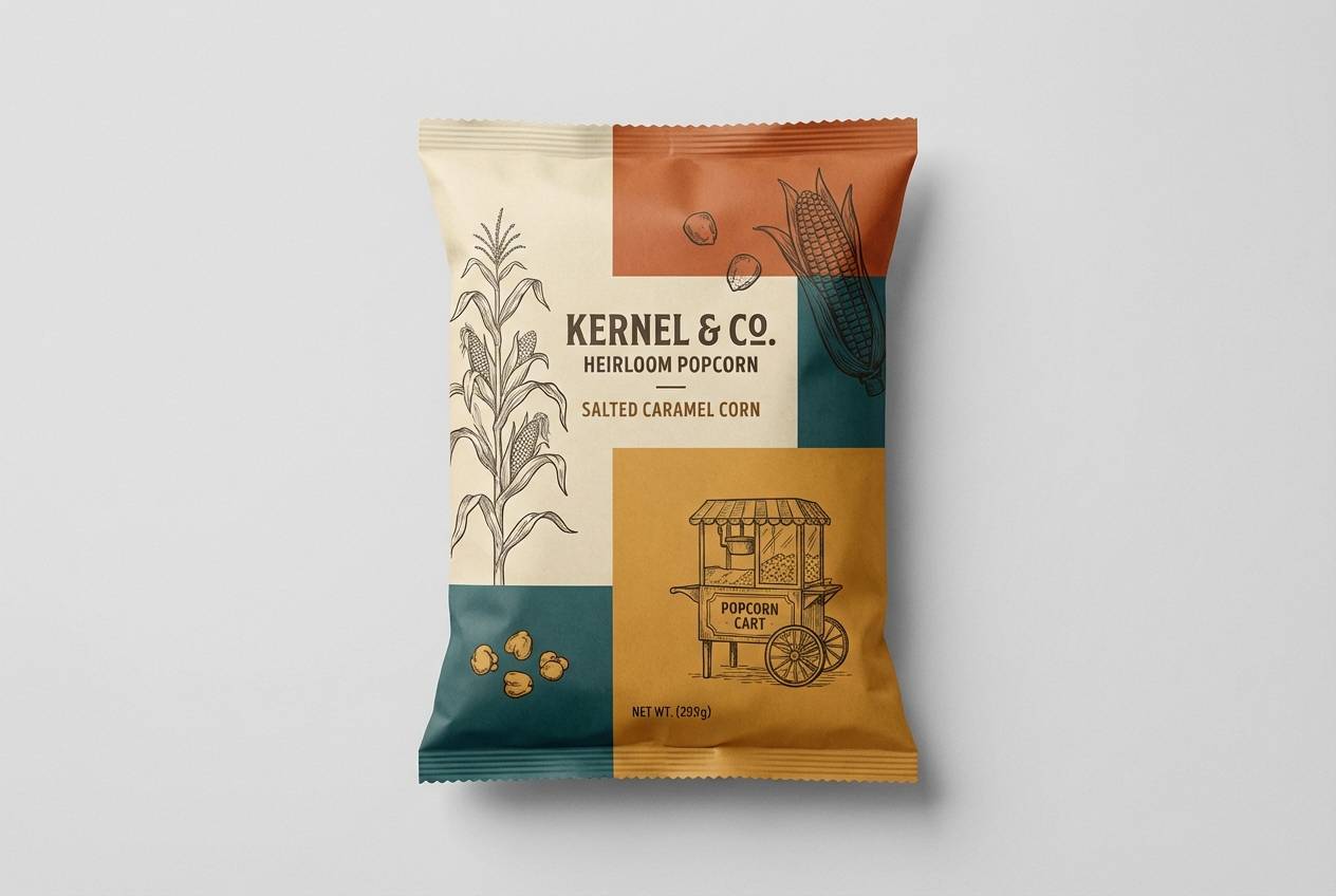
HEX: #F6BD60 #F7EDE2 #84A59D #F28482 #1F2A44
Mood: cozy, vintage, inviting
Best for: snack food packaging
Cozy and vintage, it feels like buttery popcorn with a hint of brass-band nostalgia. Use the deep navy for nutrition text and barcodes, then build the front panel with warm gold and cream. Sage keeps the look grounded and helps pink read as a friendly flavor accent rather than candy-bright. Tip: add a thin navy keyline around light areas to prevent the pack from looking washed out on shelf.
Image example of popcorn and brass generated using media.io
18) Prism Face Paint
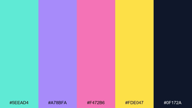
HEX: #5EEAD4 #A78BFA #F472B6 #FDE047 #0F172A
Mood: artsy, vibrant, expressive
Best for: makeup product ad
Artsy and expressive, it looks like face paint catching light in a prism. Keep the navy as your backdrop to make the pastels glow with high-end contrast. Pink and lavender work beautifully for hero gradients, while teal and yellow add quick sparkle to badges and shade names. Tip: these carnival color combinations are strongest when you keep typography minimal and let color do the storytelling.
Image example of prism face paint generated using media.io
19) Confetti Minimal
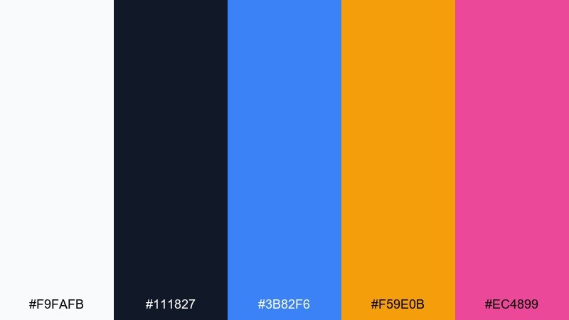
HEX: #F9FAFB #111827 #3B82F6 #F59E0B #EC4899
Mood: minimal, crisp, confident
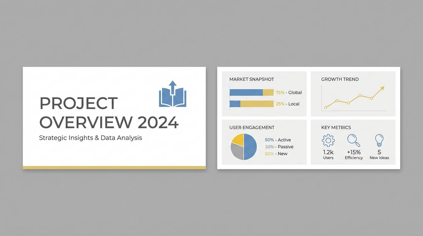
Best for: presentation template design
Minimal and crisp, it feels like a clean white stage with a few perfectly placed confetti pieces. Use black for text and structure, then assign blue to charts and links for consistency across slides. Amber and pink should be reserved for callouts, section dividers, and one key metric per slide. Tip: if you need a festive deck that still reads corporate, this carnival color palette delivers with disciplined accents.
Image example of confetti minimal generated using media.io
20) Streamers and Cream
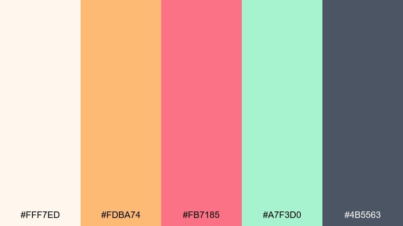
HEX: #FFF7ED #FDBA74 #FB7185 #A7F3D0 #4B5563
Mood: soft, friendly, approachable
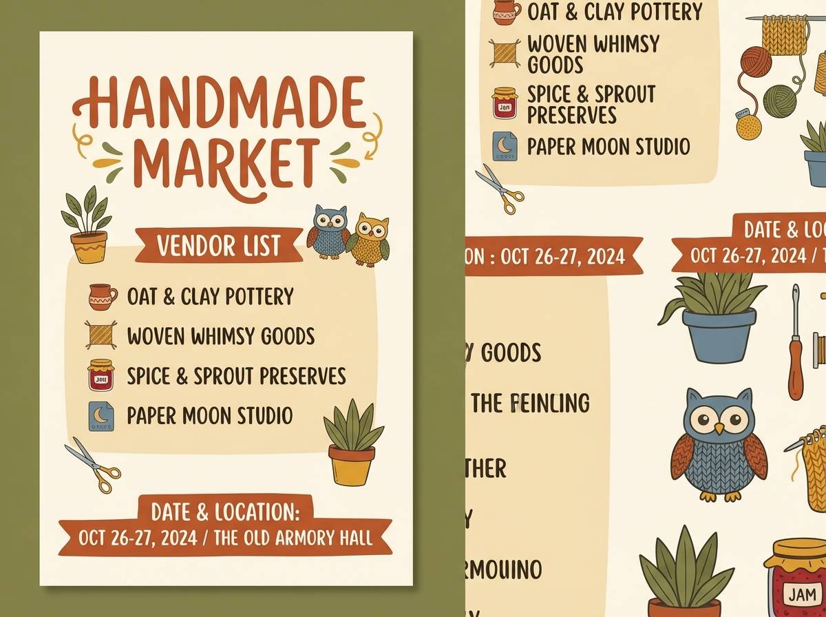
Best for: handmade market poster
Soft and friendly, it brings to mind paper streamers against warm cream. Use the charcoal-gray for headers and vendor details, then let peach and rose handle badges and section titles. Mint is perfect for subtle background bands and simple illustrations without turning the design too sweet. Tip: keep contrast strong on body copy by avoiding peach behind small text.
Image example of streamers and cream generated using media.io
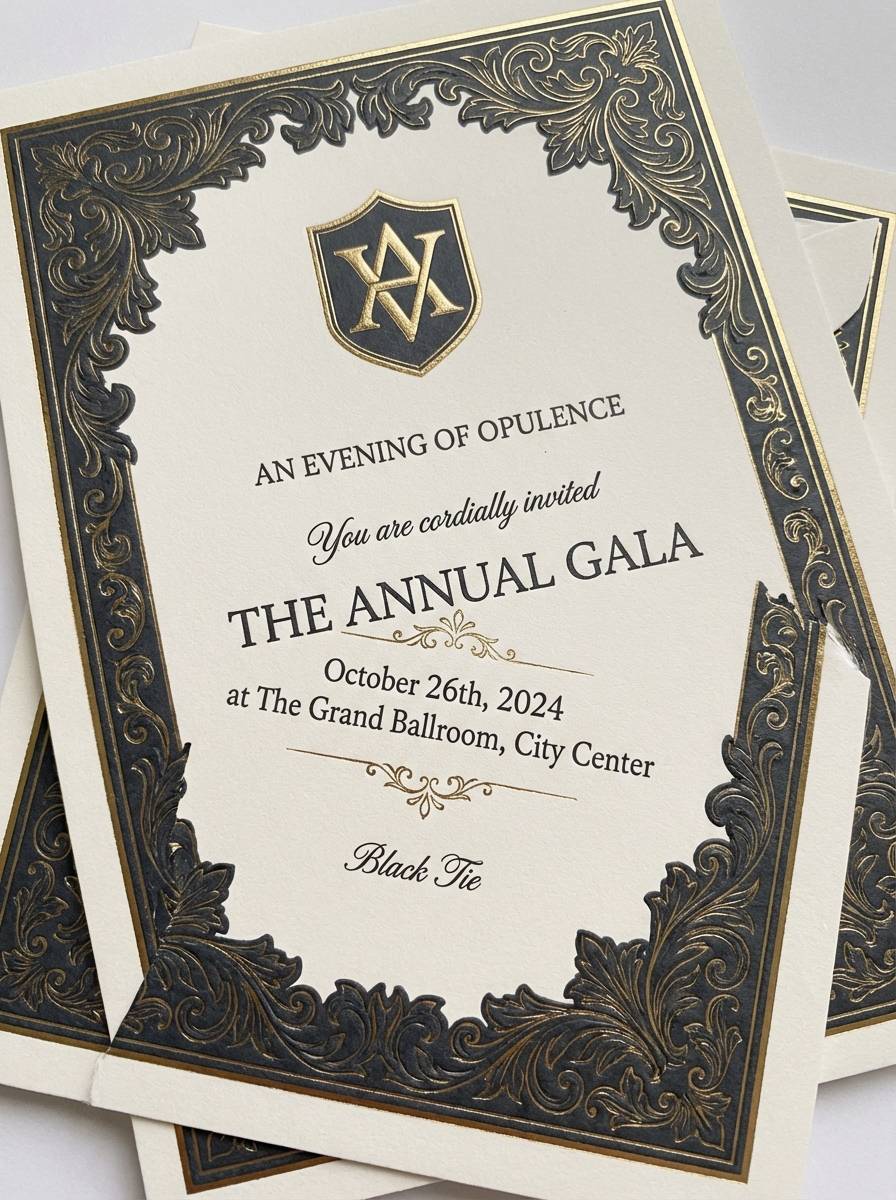
21) Ringmaster Chic
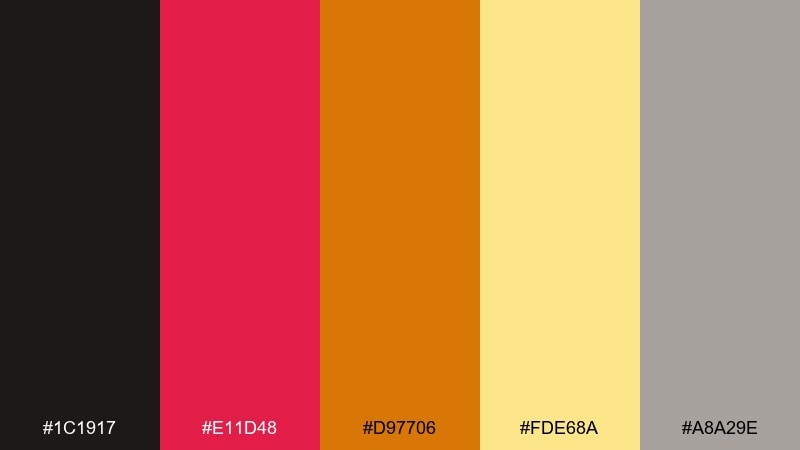
HEX: #1C1917 #E11D48 #D97706 #FDE68A #A8A29E
Mood: bold, classic, theatrical
Best for: luxury event invitation
Bold and theatrical, it recalls a ringmaster jacket with gold trim. Use near-black for the background or border to make the warm metals feel upscale. Red should be limited to a crest, monogram, or one key line, while amber and pale gold carry ornament and rules. Tip: choose one serif for headlines and keep the rest simple so the invitation feels premium, not busy.
Image example of ringmaster chic generated using media.io
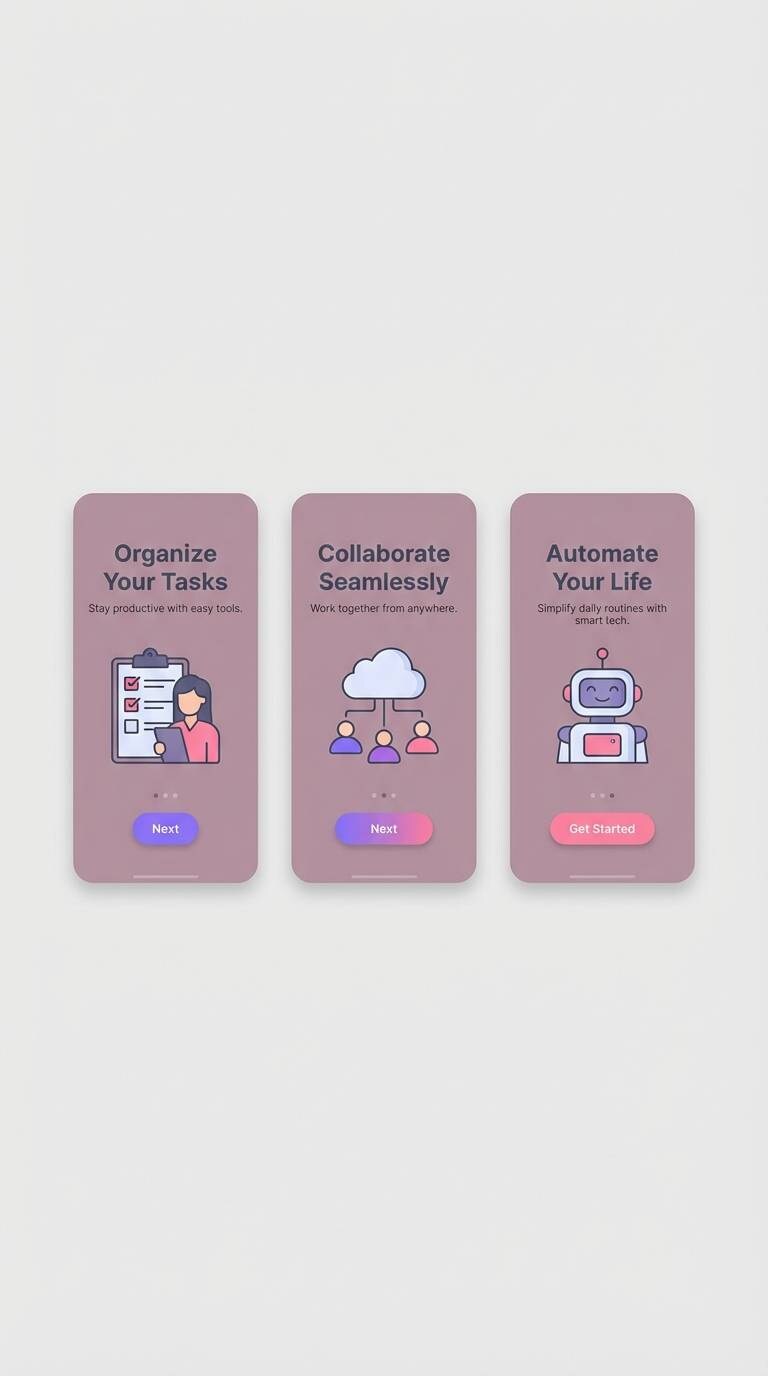
22) Mauve Spotlight
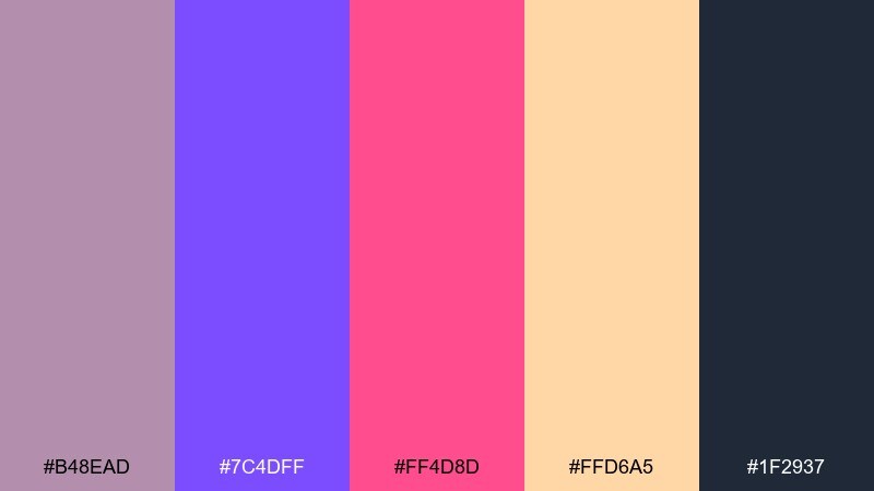
HEX: #B48EAD #7C4DFF #FF4D8D #FFD6A5 #1F2937
Mood: modern, theatrical, slightly romantic
Best for: mobile app onboarding ui
Modern and theatrical, it feels like a mauve spotlight fading into neon accents. Keep the slate for body text and navigation, and use mauve as the primary surface color for cards and panels. Violet and pink shine as progress indicators and feature highlights, while the soft peach warms illustrations. Tip: if your screens start to look too sweet, swap large pink areas for mauve and keep pink to icons only.
Image example of mauve spotlight generated using media.io
What Colors Go Well with Carnival?
Carnival colors pair best when you mix “lights” (hot pink, lemon, cyan) with a “base” (navy, charcoal, deep plum) to keep contrast strong and text readable.
For a classic carnival feel, try red + gold + navy; for modern nightlife, go neon pink + violet + inky black; for family-friendly themes, use pastel pink + mint + cream with a muted indigo for type.
If you’re building a brand system, assign one primary, one secondary, and one accent color, then keep neutrals consistent across layouts for a cohesive look.
How to Use a Carnival Color Palette in Real Designs
Start with hierarchy: choose a dark neutral for body text, then reserve your brightest hue for the single most important element (headline, price badge, or primary CTA).
Use color blocking to avoid clutter—large, simple panels feel more “designed” than sprinkling every bright color everywhere. Patterns (confetti, stripes, tickets) work best when the palette is limited to 2–3 brights plus one base.
Always check contrast, especially with yellow and pastel backgrounds. If small text feels weak, switch it to charcoal/navy or add a subtle outline/shadow for print.
Create Carnival Palette Visuals with AI
Want to see these HEX codes in action before you commit to a design? Generate instant poster layouts, UI mockups, packaging, or social templates using AI—then refine until the mood feels right.
With Media.io, you can turn a short prompt into consistent visuals, explore multiple color arrangements, and keep your carnival color scheme on-brand across formats.
Carnival Color Palette FAQs
-
What is a carnival color palette?
A carnival color palette is a festive mix of bright, high-contrast colors (like pink, yellow, cyan, and red) balanced with a dark or neutral anchor (like navy, charcoal, cream, or gray) to keep designs readable. -
What are classic carnival colors?
Classic carnival colors often include red, gold/yellow, navy/black, and white/cream—think tents, tickets, and bold signage. Modern versions add neon pink, violet, and electric blue for extra energy. -
How do I keep carnival colors from looking chaotic?
Use one dark base for most text/background, pick 1–2 hero brights, and keep the rest as small accents. Limiting accents to under ~10–15% of the layout usually makes the design feel intentional. -
Which carnival palette is best for UI design?
Try “Ticket Booth Neutrals” or “Confetti Minimal” for UI. They rely on structured neutrals for surfaces and typography, with controlled accent colors for buttons, status chips, and highlights. -
Which carnival palette works best for night events?
“Fireworks on Velvet” and “Cotton Candy Nights” are ideal for nightlife. Dark bases make neon accents feel premium, and contrast stays strong on screens. -
Are carnival palettes good for print?
Yes—just watch saturation and contrast. Print-test bright reds/pinks, keep small text on dark neutrals, and consider adding outlines/keylines around light areas to avoid a washed-out look. -
How can I generate carnival-themed graphics quickly?
Use Media.io’s text-to-image tool: describe the design type (poster, flyer, UI, packaging), style (flat vector, minimal, premium), and include your carnival color scheme direction. Generate variations until the layout and color balance feel right.


