

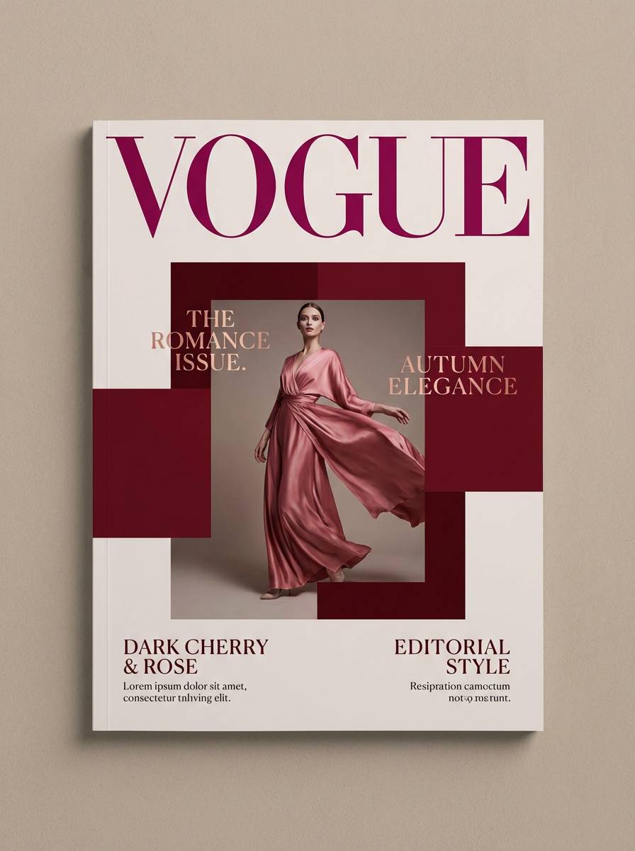
Red magenta is a high-impact color family that sits between confident red and expressive fuchsia—perfect when you want designs to feel bold, modern, and emotionally charged.
Below are 20 curated red magenta color palette ideas with HEX codes, plus quick guidance on where each set shines in branding, UI, posters, and packaging.
In this article
- Why Red Magenta Palettes Work So Well
-
- velvet orchid glow
- neon berry punch
- rosewood theater
- berry soda pop
- crimson bougainvillea
- raspberry truffle
- magenta metro ui
- wild hibiscus sunset
- garnet lipstick
- dragon fruit cream
- cherry amaranth editorial
- romantic peony nights
- cabernet disco
- silk magenta minimal
- crimson plum wedding
- pop art fuchsia
- midnight magenta noir
- coralberry boutique
- electric raspberry poster
- sangria bloom packaging
- What Colors Go Well with Red Magenta?
- How to Use a Red Magenta Color Palette in Real Designs
- Create Red Magenta Palette Visuals with AI
Why Red Magenta Palettes Work So Well
Red magenta palettes combine the urgency of red with the playful, creative energy of pink—so they naturally draw the eye and feel emotionally “alive.” That makes them ideal for campaigns, product moments, and interfaces that need strong visual hierarchy.
They’re also flexible: deep wine and cherry shades can feel premium and cinematic, while brighter magentas read youthful, energetic, and nightlife-ready. With a soft blush or off-white, you can keep the intensity controlled and modern.
Most importantly, these palettes create contrast fast. A near-black berry base plus a hot magenta accent can guide attention to headlines, CTAs, and key UI states without needing lots of extra decoration.
20+ Red Magenta Color Palette Ideas (with HEX Codes)
1) Velvet Orchid Glow
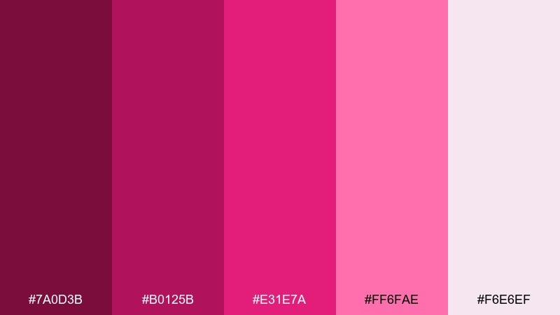
HEX: #7A0D3B #B0125B #E31E7A #FF6FAE #F6E6EF
Mood: luxurious, romantic, velvety
Best for: beauty brand packaging and product ads
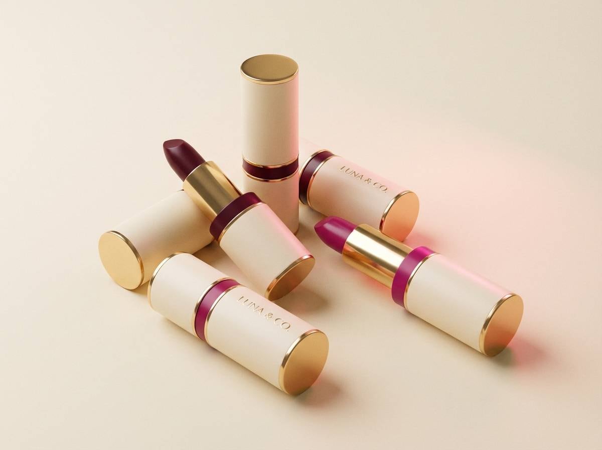
Luxurious and romantic, these tones feel like velvet petals under warm studio lights. The deep wine and hot magenta create instant premium contrast, while the blush and soft cream keep it approachable. Use it on cosmetic boxes, fragrance labels, or hero banners where you want a confident glow. Tip: let the cream act as breathing room, then place magenta on logos or key claims for high-impact readability.
Image example of velvet orchid glow generated using media.io
Media.io is an online AI studio for creating and editing video, image, and audio in your browser.

2) Neon Berry Punch
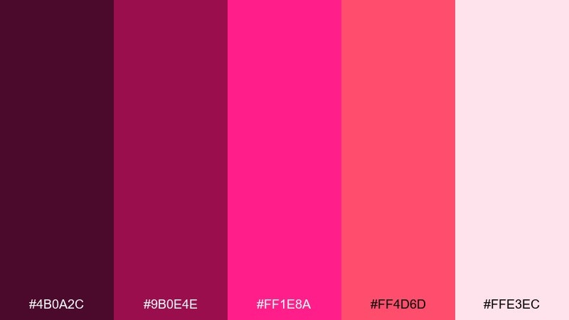
HEX: #4B0A2C #9B0E4E #FF1E8A #FF4D6D #FFE3EC
Mood: energetic, playful, nightlife
Best for: event posters and social promos
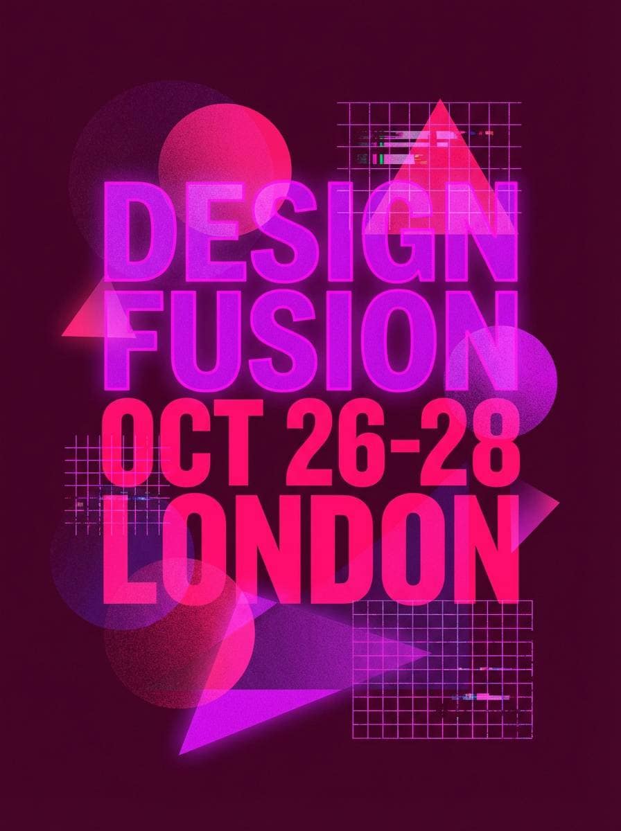
Energetic and playful, it reads like neon signage and berry soda fizz. The punchy pinks pop hard against the dark base, so headlines and dates feel impossible to miss. Use it for club flyers, DJ lineups, or short-form social graphics, then keep body text on pale pink for clarity. Tip: reserve the brightest pink for one focal element, like the event title, to avoid visual noise.
Image example of neon berry punch generated using media.io
3) Rosewood Theater
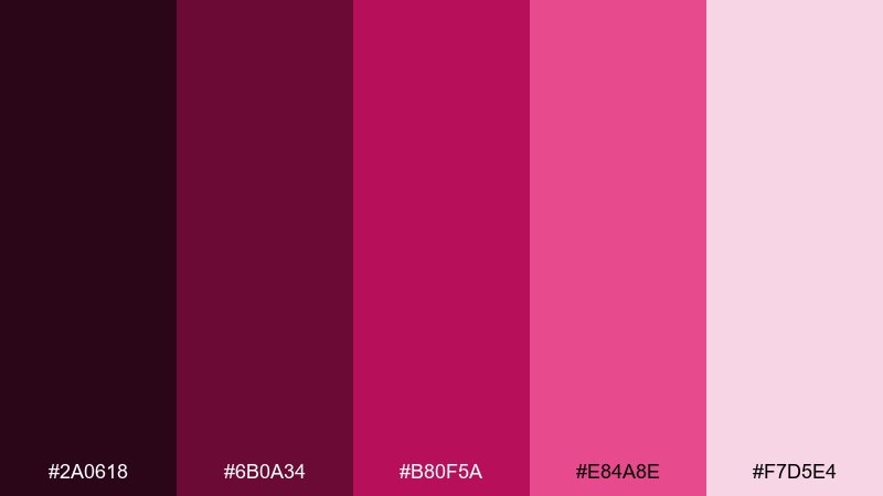
HEX: #2A0618 #6B0A34 #B80F5A #E84A8E #F7D5E4
Mood: dramatic, cinematic, elegant
Best for: editorial covers and film posters
Dramatic and cinematic, these shades feel like curtain velvet and stage lights. The near-black cherry gives depth, while magenta and rose add spotlight energy for titles and pull quotes. For a red magenta color palette that leans premium, pair it with matte black type and plenty of negative space. Tip: use the pale pink only for small highlights so the composition stays moody and editorial.
Image example of rosewood theater generated using media.io
4) Berry Soda Pop
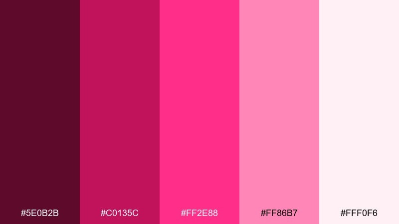
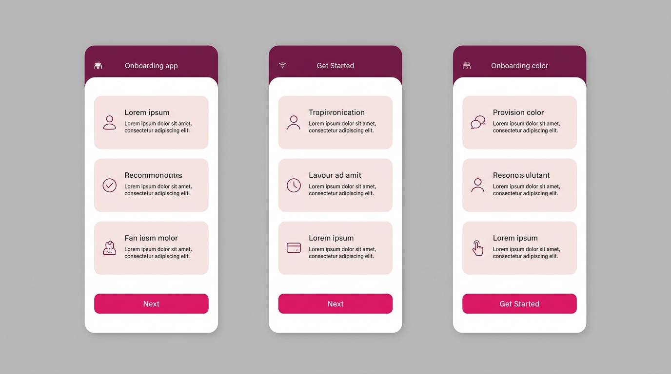
HEX: #5E0B2B #C0135C #FF2E88 #FF86B7 #FFF0F6
Mood: sweet, bubbly, youthful
Best for: app onboarding screens and promo banners
Sweet and bubbly, it evokes sparkling drinks and candy-coated energy. The vivid pink works beautifully for CTA buttons, while the blush and near-white keep screens friendly. Pair it with charcoal text and simple icons to avoid feeling overly sugary. Tip: use the dark berry as your primary navigation color for contrast and accessibility.
Image example of berry soda pop generated using media.io
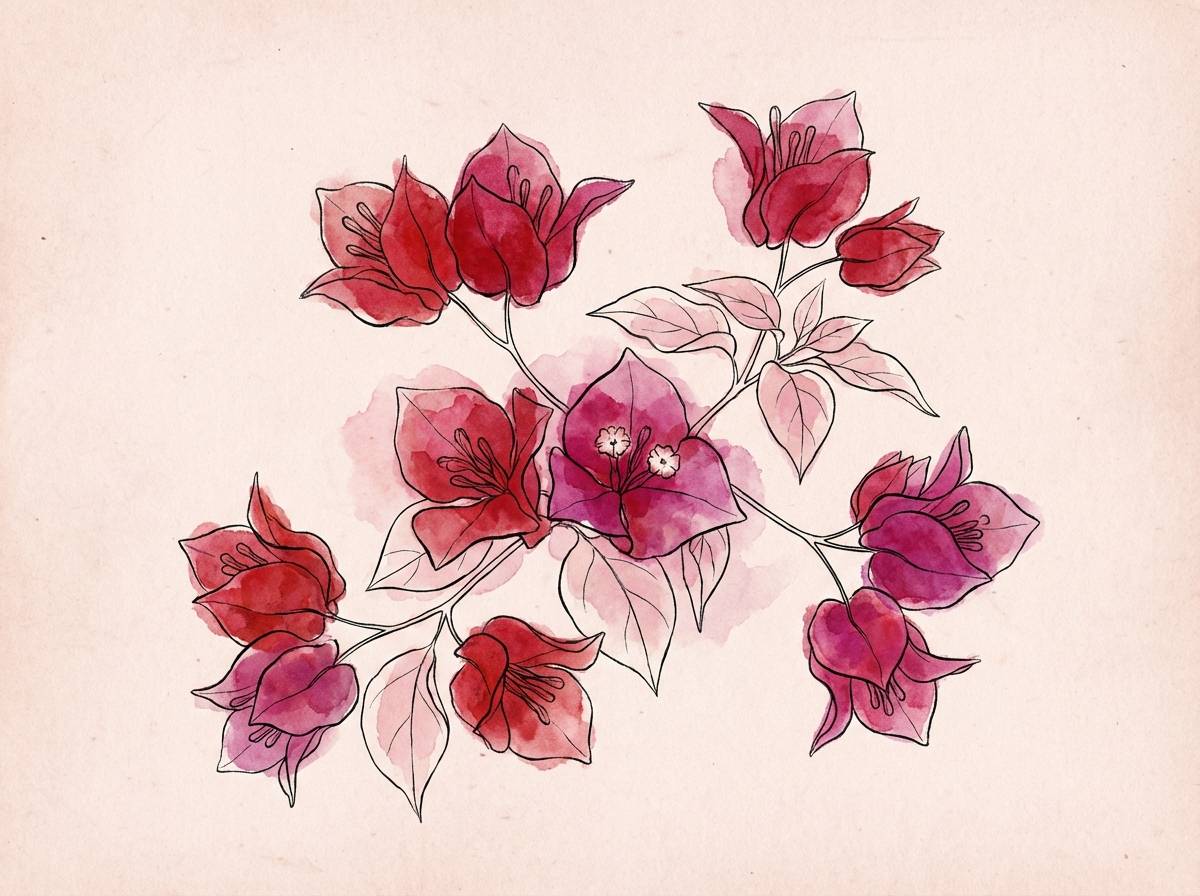
5) Crimson Bougainvillea
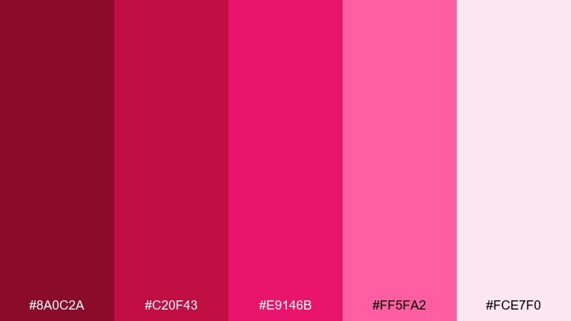
HEX: #8A0C2A #C20F43 #E9146B #FF5FA2 #FCE7F0
Mood: floral, sunlit, bold
Best for: spring campaign illustrations and banners
Floral and sunlit, these tones resemble bougainvillea blooms against warm air. The crimson and magenta deliver bold petals, while soft pink and a pale blush background keep it airy. Use it in spring launches, wellness promos, or boutique banners with hand-drawn line art. Tip: keep outlines in the darkest shade so the florals stay crisp on light backgrounds.
Image example of crimson bougainvillea generated using media.io
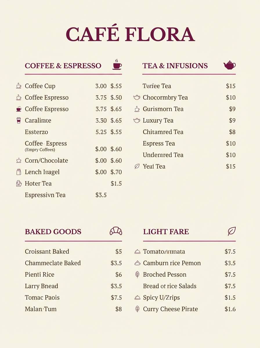
6) Raspberry Truffle
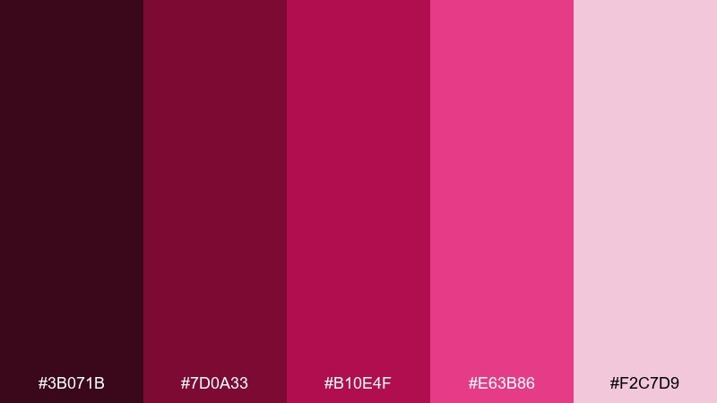
HEX: #3B071B #7D0A33 #B10E4F #E63B86 #F2C7D9
Mood: rich, cozy, dessert-like
Best for: bakery branding and menu design
Rich and cozy, it feels like chocolate ganache with a raspberry swirl. The deep cocoa-berry shades make elegant headers, and the warm pinks soften the overall tone for menus. Pair it with cream paper textures and small gold accents for an upscale patisserie vibe. Tip: keep food photography warm and slightly desaturated so the magenta details do not overpower.
Image example of raspberry truffle generated using media.io
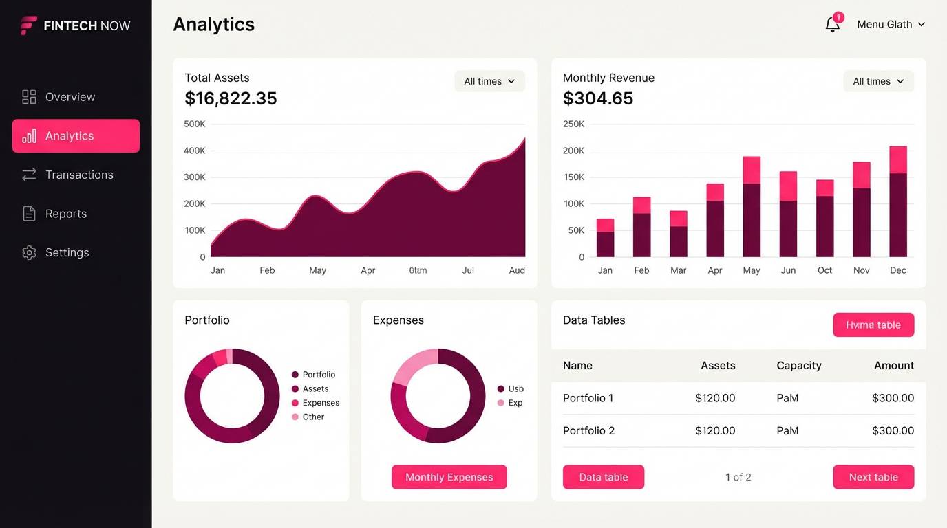
7) Magenta Metro UI
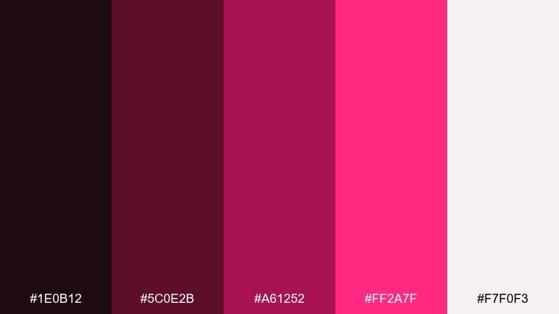
HEX: #1E0B12 #5C0E2B #A61252 #FF2A7F #F7F0F3
Mood: sleek, urban, high-contrast
Best for: dashboard UI and fintech apps
Sleek and urban, the contrast reads like city lights on wet pavement. The near-black base grounds complex interfaces, while the hot magenta becomes a clear accent for active states and notifications. Pair it with soft off-white surfaces to reduce eye strain during long sessions. Tip: use the bright pink sparingly for one action color so users learn the hierarchy fast.
Image example of magenta metro ui generated using media.io
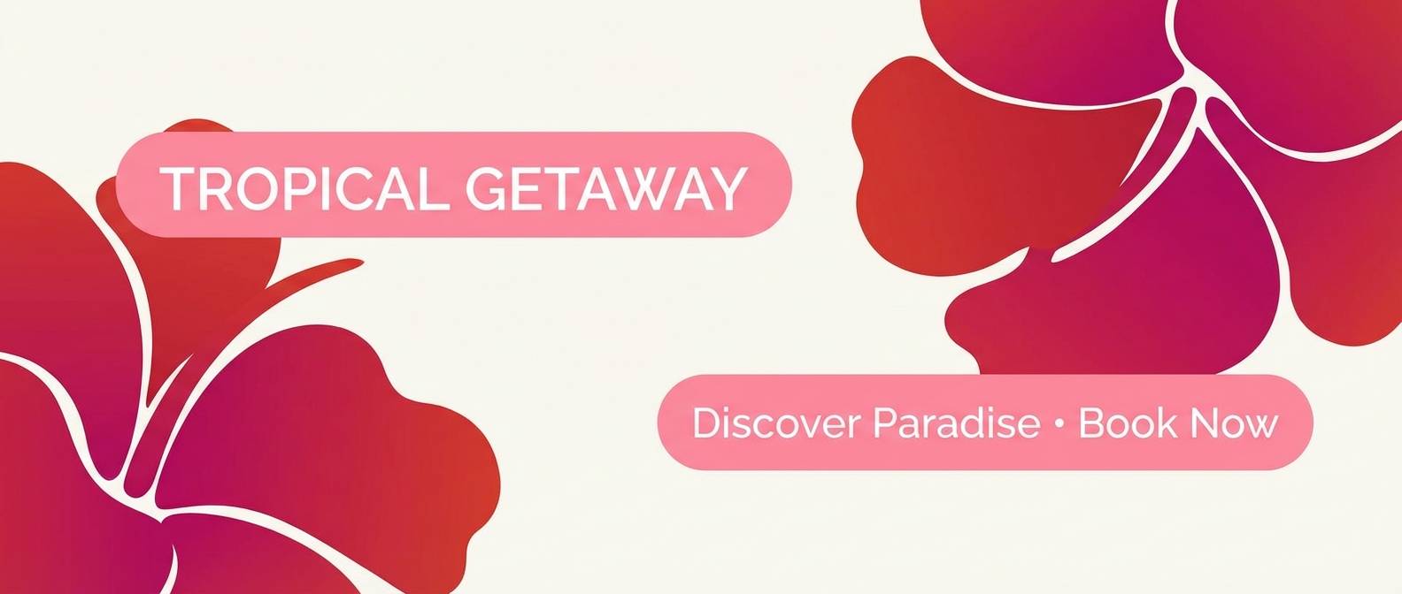
8) Wild Hibiscus Sunset
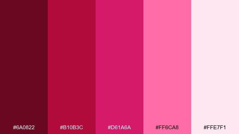
HEX: #6A0822 #B10B3C #D61A6A #FF6CA8 #FFE7F1
Mood: tropical, radiant, expressive
Best for: travel banners and resort promos
Tropical and radiant, it looks like hibiscus petals catching the last light of day. The warm crimson and bright magenta make a confident red magenta color scheme for bold headlines and energetic calls to action. Pair it with sandy neutrals or clean white so the tones stay sun-kissed instead of heavy. Tip: place the lightest pink behind text blocks to keep readability strong on image-heavy layouts.
Image example of wild hibiscus sunset generated using media.io
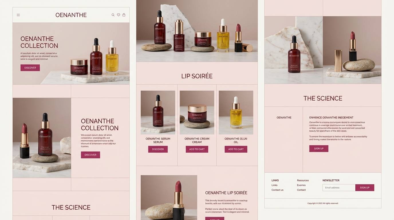
9) Garnet Lipstick
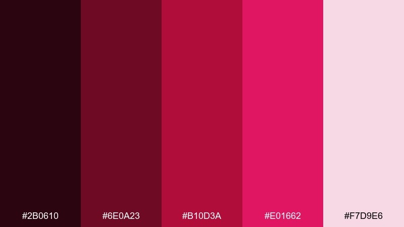
HEX: #2B0610 #6E0A23 #B10D3A #E01662 #F7D9E6
Mood: sensual, confident, classic
Best for: beauty editorials and product pages
Sensual and confident, these shades channel a classic lipstick swipe. The garnet base supports elegant typography, while the bright berry shade draws attention to price tags and key benefits. Pair it with soft skin-tone neutrals and simple serif type for a timeless feel. Tip: keep buttons in the mid-tone berry so they stand out without looking neon.
Image example of garnet lipstick generated using media.io
10) Dragon Fruit Cream
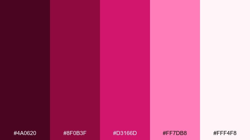
HEX: #4A0620 #8F0B3F #D3166D #FF7DB8 #FFF4F8
Mood: fresh, creamy, modern
Best for: cafe packaging and smoothie labels
Fresh and creamy, it feels like dragon fruit folded into whipped yogurt. The saturated magenta brings flavor-forward energy, while the soft near-white keeps the label clean and modern. Pair it with simple black line icons and rounded type to push a friendly, health-conscious vibe. Tip: place nutrition info on the pale background and reserve the darkest shade for ingredient names.
Image example of dragon fruit cream generated using media.io
11) Cherry Amaranth Editorial
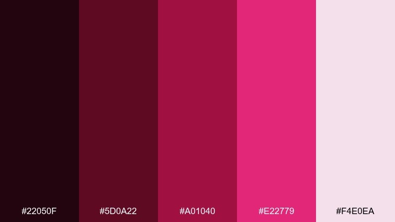
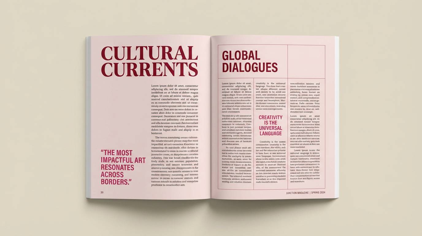
HEX: #22050F #5D0A22 #A01040 #E22779 #F4E0EA
Mood: refined, moody, print-ready
Best for: magazine spreads and lookbooks
Refined and moody, it reads like cherry ink on textured paper. The deep shadows make layouts feel expensive, and the bright amaranth adds a punch for section markers. Pair it with warm grays and generous margins for a print-first rhythm. Tip: use the light blush as your background to reduce heavy ink coverage while keeping the palette cohesive.
Image example of cherry amaranth editorial generated using media.io
12) Romantic Peony Nights
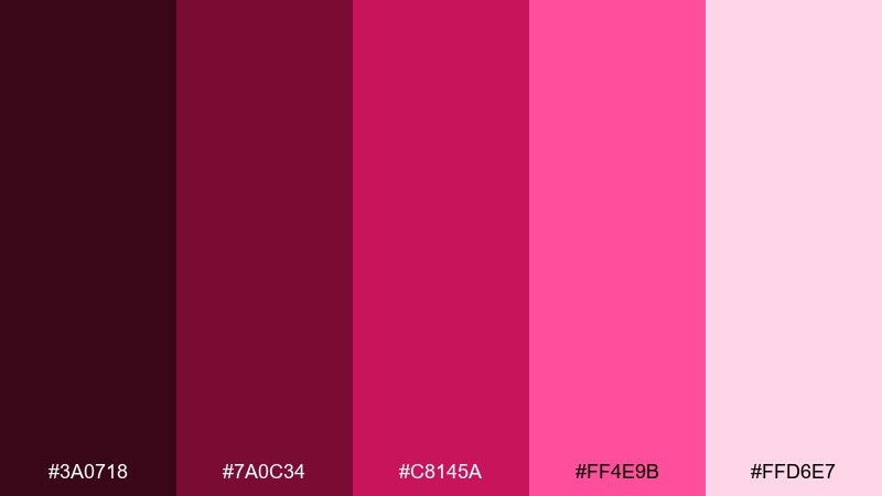
HEX: #3A0718 #7A0C34 #C8145A #FF4E9B #FFD6E7
Mood: romantic, dreamy, evening
Best for: wedding invitations and save the dates
Romantic and dreamy, it feels like peonies at dusk with candlelight in the background. The darker shades are perfect for monograms and borders, while the bright pink brings celebratory sparkle. These red magenta color combinations pair beautifully with ivory stock and foil details in gold or rose gold. Tip: keep the brightest pink for tiny flourishes, like separators or RSVP accents, to maintain elegance.
Image example of romantic peony nights generated using media.io

13) Cabernet Disco
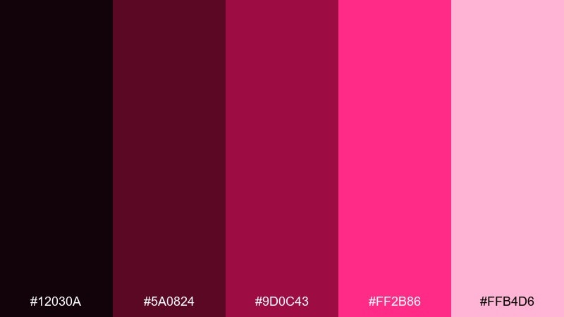
HEX: #12030A #5A0824 #9D0C43 #FF2B86 #FFB4D6
Mood: bold, glossy, nightlife
Best for: album covers and nightlife branding
Bold and glossy, it suggests cabernet sparkle and mirror-ball highlights. The near-black and cabernet tones create a strong base, letting the bright pink feel like a spotlight. For punchy red magenta color combinations, add chrome textures and tight typography for a modern club identity. Tip: keep backgrounds dark and use the light pink only for secondary text to preserve the dramatic mood.
Image example of cabernet disco generated using media.io
14) Silk Magenta Minimal
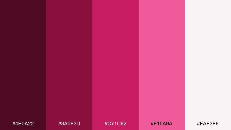
HEX: #4E0A22 #8A0F3D #C71C62 #F15A9A #FAF3F6
Mood: clean, soft, refined
Best for: minimal brand guidelines and decks
Clean and soft, it feels like silk fabric with a subtle sheen. The mid magenta and rose tones work well for charts, callouts, and section dividers without overwhelming the page. Pair it with warm off-white backgrounds and charcoal text for a calm, polished system. Tip: use a single magenta tone as your signature accent across slides to keep consistency.
Image example of silk magenta minimal generated using media.io
15) Crimson Plum Wedding
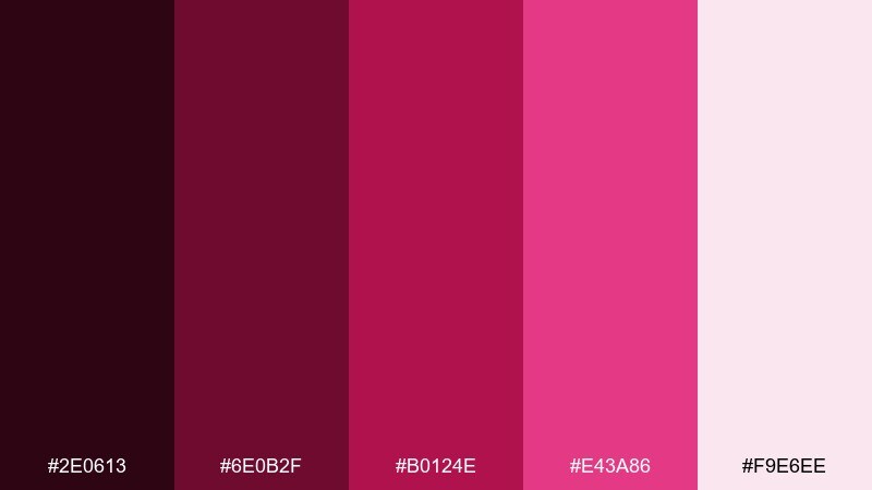
HEX: #2E0613 #6E0B2F #B0124E #E43A86 #F9E6EE
Mood: formal, intimate, romantic
Best for: wedding stationery and signage
Formal and intimate, these tones echo plum wine, roses, and evening toasts. The deep shades give invitations a classic backbone, while the brighter pink adds warmth for modern couples. Pair it with textured paper, soft florals, and black ink for a crisp finish. Tip: use the lightest blush for large areas like programs so the darker tones can shine in headings.
Image example of crimson plum wedding generated using media.io
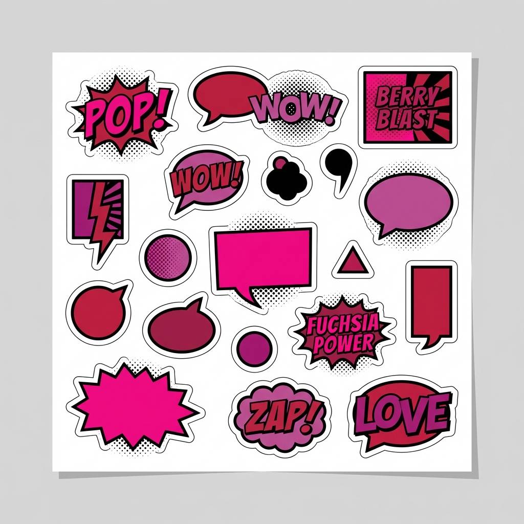
16) Pop Art Fuchsia
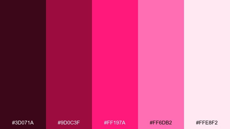
HEX: #3D071A #9D0C3F #FF197A #FF6DB2 #FFE8F2
Mood: bold, graphic, playful
Best for: sticker packs and bold illustrations
Bold and graphic, it screams pop art panels and punchy comic shapes. The hot fuchsia makes perfect fills for stickers, while the deep berry anchors outlines and typography. Pair it with clean white and thick black strokes to keep the look crisp and intentional. Tip: limit gradients and lean into flat color blocks for maximum impact.
Image example of pop art fuchsia generated using media.io
17) Midnight Magenta Noir
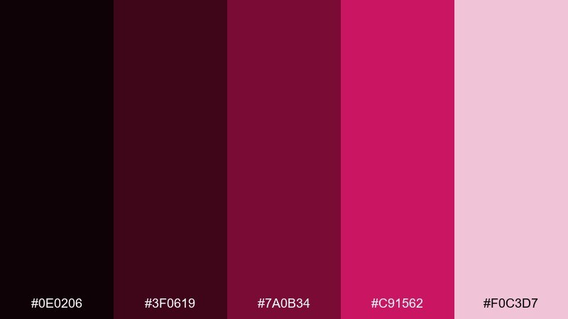
HEX: #0E0206 #3F0619 #7A0B34 #C91562 #F0C3D7
Mood: mysterious, luxe, nocturnal
Best for: premium branding and landing pages
Mysterious and luxe, it feels like a midnight lounge with a single magenta spotlight. The near-black base makes metallic effects and photography feel richer, while the bright tone guides attention to buttons and links. For a red magenta color palette that stays sophisticated, keep surfaces dark and use blush as a soft glow behind key sections. Tip: choose one accent shade for interactivity and keep all other highlights muted for a controlled noir look.
Image example of midnight magenta noir generated using media.io
18) Coralberry Boutique
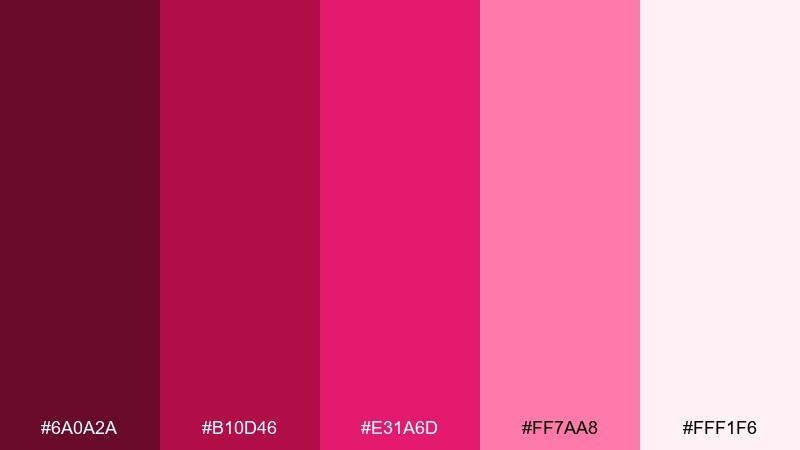
HEX: #6A0A2A #B10D46 #E31A6D #FF7AA8 #FFF1F6
Mood: friendly, trendy, boutique
Best for: fashion ecommerce banners
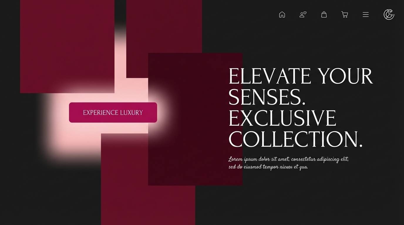
Friendly and trendy, it evokes boutique racks, tissue paper, and glossy shopping bags. The deeper red-pink tones work well for navigation and sale tags, while the pale blush keeps product photos clean. Pair it with warm neutrals and minimal sans-serif type for a modern storefront feel. Tip: use the coral-pink tone for hover states so the interface feels lively but consistent.
Image example of coralberry boutique generated using media.io
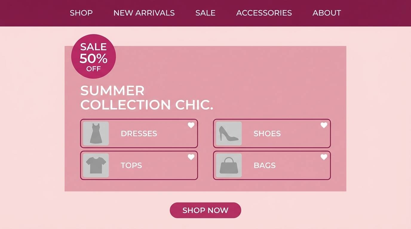
19) Electric Raspberry Poster
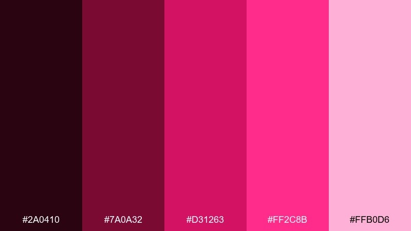
HEX: #2A0410 #7A0A32 #D31263 #FF2C8B #FFB0D6
Mood: electric, loud, modern
Best for: tech conference posters
Electric and loud, it feels like laser light cutting through dark air. The high contrast between near-black and bright raspberry makes titles and speaker names jump from a distance. Pair it with geometric grids and minimal icons for a tech-forward look. Tip: keep long paragraphs in the light pink on dark backgrounds to maintain readability while staying on-theme.
Image example of electric raspberry poster generated using media.io
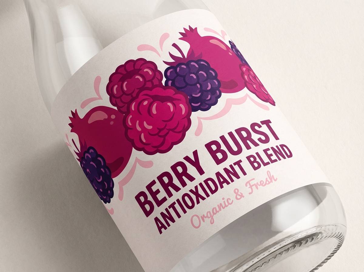
20) Sangria Bloom Packaging
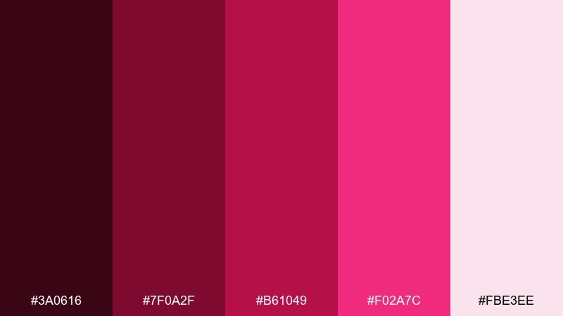
HEX: #3A0616 #7F0A2F #B61049 #F02A7C #FBE3EE
Mood: lush, crafted, artisanal
Best for: artisan food packaging and labels
Lush and crafted, it brings to mind sangria berries and hand-pressed labels. The darker shades make great type colors on paper textures, while the vivid pink adds a modern twist for badges and flavor notes. If you want red magenta color combinations that feel artisanal, pair them with kraft neutrals and simple stamp-like icons. Tip: keep the brightest pink to small label seals so the design still feels handmade.
Image example of sangria bloom packaging generated using media.io
What Colors Go Well with Red Magenta?
Red magenta pairs effortlessly with soft neutrals like cream, ivory, blush, and warm gray—these give the eyes a rest and make saturated accents look intentional rather than overwhelming.
For contrast and a premium feel, use dark anchors such as near-black cherry, espresso, charcoal, or deep plum. This combination works especially well for luxury branding, editorial layouts, and dark-mode UI.
If you want something fresher, add cool balancing tones like pale lavender, icy lilac, or muted teal as small accents. Keep these secondary so the red magenta remains the “hero” color.
How to Use a Red Magenta Color Palette in Real Designs
Start with role assignment: choose one dark shade for text/nav, one mid magenta for brand identity, one bright pink for CTAs, and one pale blush/cream for backgrounds. This keeps hierarchy clear across pages and formats.
In print and packaging, red magenta looks strongest when paired with paper texture and restrained accents (foil gold/rose-gold, matte black, or kraft neutrals). Let the brightest shade appear as a seal, badge, or key claim.
For UI, prioritize accessibility by placing body text on the lightest tone and using the brightest magenta only for interactive states. A controlled accent color makes dashboards and apps feel faster to understand.
Create Red Magenta Palette Visuals with AI
If you already have HEX codes, you can quickly turn them into polished visuals—posters, labels, UI mockups, or brand boards—by describing the scene and referencing the palette mood.
Use prompts that specify lighting (studio, neon, sunset), material (paper, silk, glossy), and layout style (minimal grid, editorial, pop art). This helps the generator keep your red magenta scheme consistent across outputs.
When you find a palette above that matches your project, generate a few variations and keep the best elements—background, typography, and accent placement—then iterate.
Red Magenta Color Palette FAQs
-
What is a red magenta color palette?
A red magenta color palette is a set of coordinated shades that blend red’s warmth with magenta’s pink-purple energy—typically ranging from deep wine/berry tones to bright fuchsia accents and soft blush backgrounds. -
Is magenta closer to red or purple?
Magenta sits between red and purple. Many “red magenta” palettes lean warmer (more red) by adding cherry, raspberry, or crimson tones, while keeping fuchsia highlights for pop. -
What neutral colors work best with red magenta?
Off-white, cream, blush, and warm gray are the easiest neutrals for red magenta. They soften saturation and keep layouts clean, especially for UI, packaging, and editorial pages. -
What dark colors pair well with red magenta?
Near-black cherry, charcoal, espresso, and deep plum pair well because they preserve contrast and make bright magenta accents feel more premium and legible. -
How do I keep a red magenta scheme from looking too loud?
Limit the brightest magenta to one focal role (CTA, headline, or badge), use a pale blush/cream as the main background, and rely on deep berry tones for structure and typography. -
Are red magenta palettes good for websites and apps?
Yes—especially for beauty, lifestyle, events, and modern brands. Use dark anchors for navigation, light surfaces for content, and bright magenta only for interactive states to maintain accessibility. -
Can I generate red magenta palette images with AI?
Yes. With Media.io Text-to-Image, you can generate posters, packaging mockups, UI screens, and brand visuals by describing the style and mood, then iterating until the red magenta tones match your design direction.


