

Pink, red, and orange sit close on the color wheel, so they naturally blend into gradients that feel warm, modern, and full of momentum.
From soft blush-to-peach UIs to high-contrast festival posters, a pink red orange color palette can shift from romantic to electric just by changing saturation and adding a dark anchor.
In this article
Why Pink Red Orange Palettes Work So Well
Pink-red-orange palettes feel cohesive because they’re analogous hues, so the eye reads them as one “warm family” rather than competing colors. That makes them perfect for gradients, overlays, and bold accent systems.
They’re also emotionally flexible: blush and peach can feel friendly and comforting, while saturated reds and oranges deliver urgency, appetite appeal, and high energy. You can dial the vibe from calm to loud without changing the overall direction.
With one grounding neutral (cream, deep plum, charcoal), these warm tones become easier to use in real layouts—keeping text readable while letting the palette stay expressive.
20+ Pink Red Orange Color Palette Ideas (with HEX Codes)
1) Sunset Sorbet
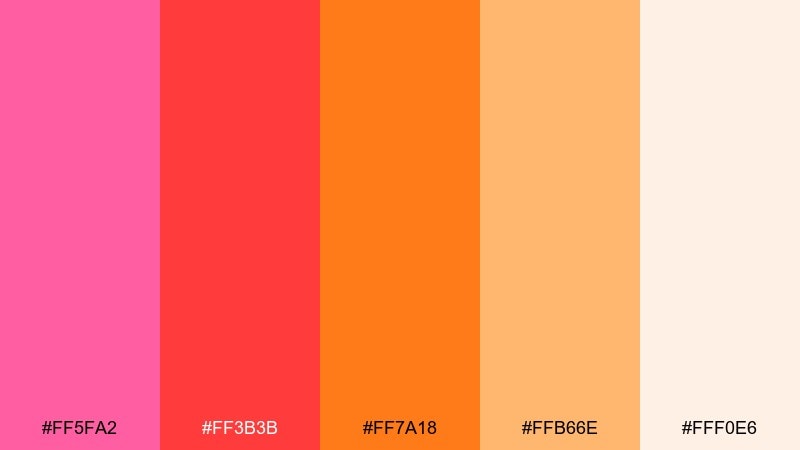
HEX: #ff5fa2 #ff3b3b #ff7a18 #ffb66e #fff0e6
Mood: playful, warm, optimistic
Best for: summer drink poster design
Playful sunset tones that feel like sorbet melting at golden hour. Use it for summer posters, menus, and upbeat social creatives where warmth should lead. Pair with soft off-white space and rounded sans typography to keep it airy. Tip: use #ff3b3b for headlines and reserve #ffb66e for background gradients.
Image example of sunset sorbet generated using media.io
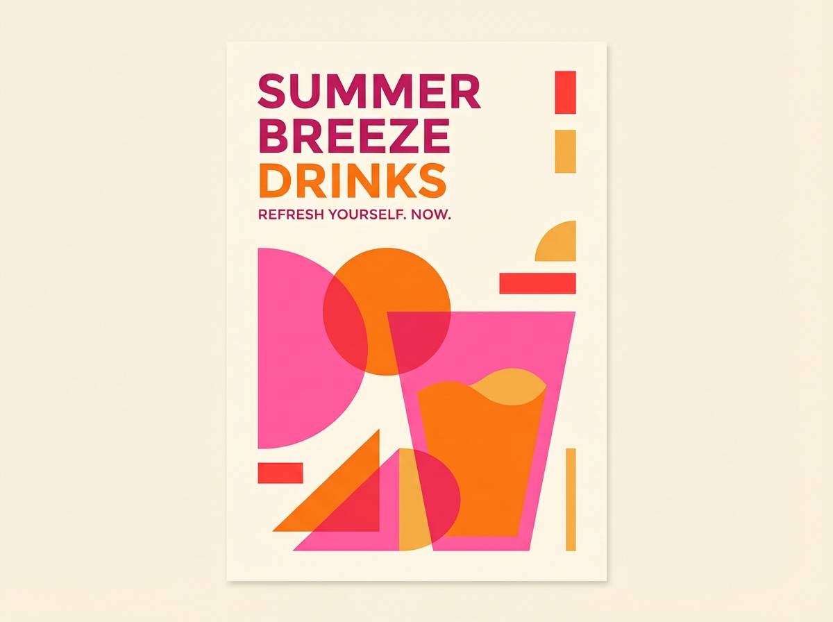
Media.io is an online AI studio for creating and editing video, image, and audio in your browser.

2) Rose Ember
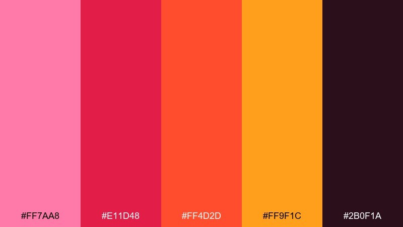
HEX: #ff7aa8 #e11d48 #ff4d2d #ff9f1c #2b0f1a
Mood: dramatic, spicy, luxe
Best for: beauty product packaging
Smoky rose and ember orange create a luxe, spicy vibe with a night-out edge. It works beautifully on premium packaging, cosmetics labels, and bold ecommerce thumbnails. Balance the intensity with deep #2b0f1a for type and borders, and let #ff9f1c act as a gleaming highlight. Tip: add matte finishes to reds and a spot-gloss on the orange for contrast.
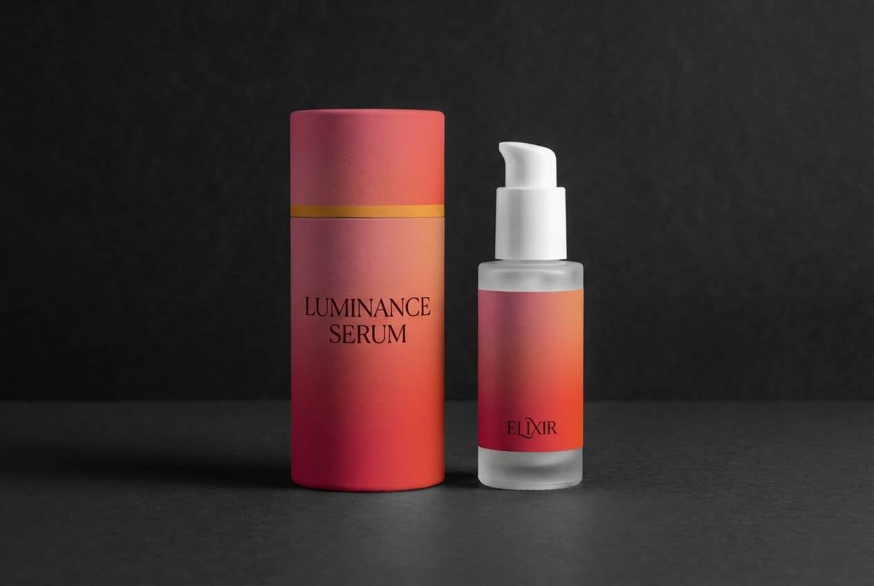
Image example of rose ember generated using media.io
3) Coral Pop
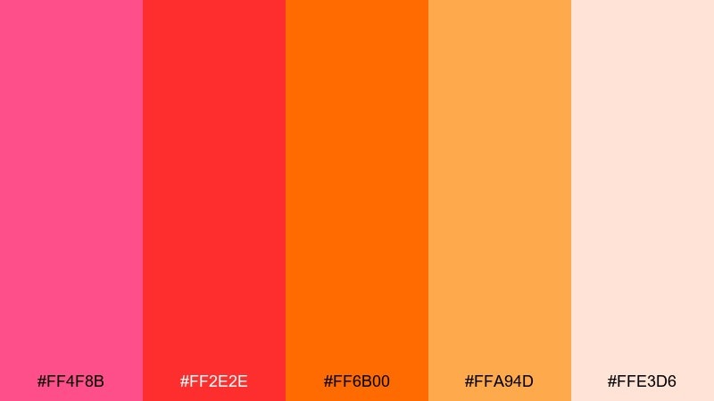
HEX: #ff4f8b #ff2e2e #ff6b00 #ffa94d #ffe3d6
Mood: bold, energetic, pop-art
Best for: event flyer graphics
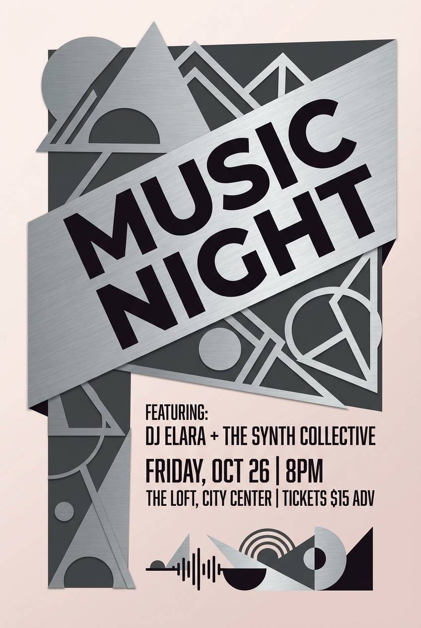
Bold and punchy, like neon coral lights over a warm street festival. This pink red orange color palette shines on event flyers, nightlife promos, and punchy hero banners. Pair it with clean cream backgrounds and strong grid layouts so the saturated tones do not fight each other. Tip: keep body copy in #ff2e2e only at large sizes and use #ffe3d6 for breathing room.
Image example of coral pop generated using media.io
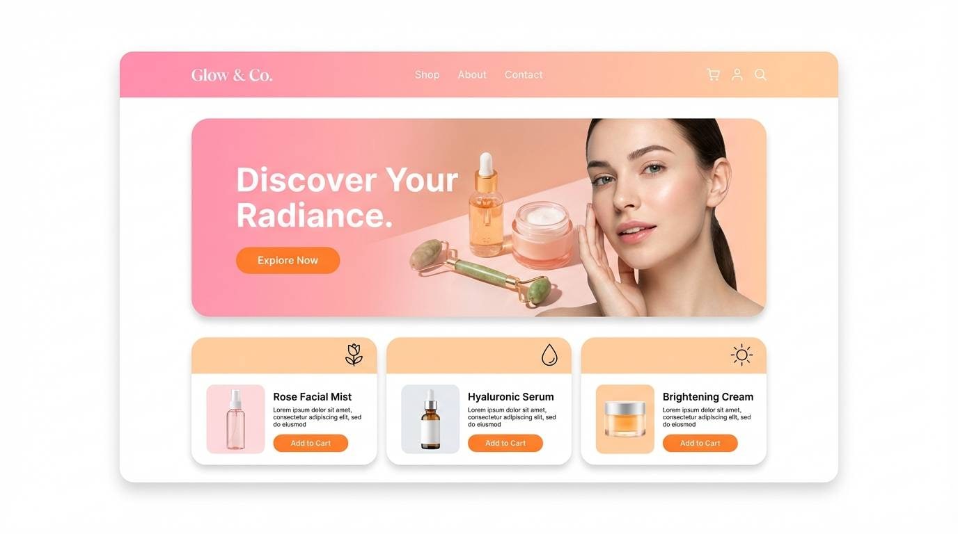
4) Tangerine Blush
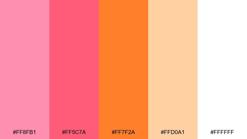
HEX: #ff8fb1 #ff5c7a #ff7f2a #ffd0a1 #ffffff
Mood: soft, friendly, fresh
Best for: skincare landing page UI
Soft blush and tangerine feel like fresh skincare and morning light. Use it for landing pages, onboarding screens, and lifestyle brands that want warmth without shouting. Pair with plenty of #ffffff space and light gray dividers, then use #ff7f2a only for primary CTAs. Tip: keep gradients subtle by blending #ffd0a1 into #ff8fb1 at low contrast.
Image example of tangerine blush generated using media.io
5) Flamingo Citrus
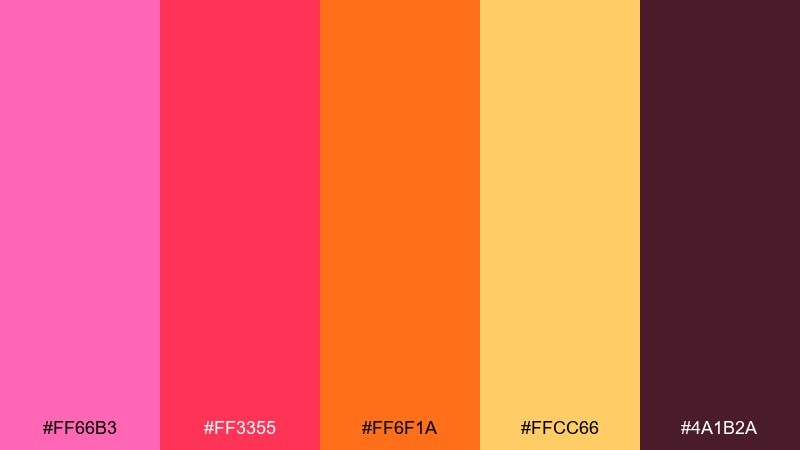
HEX: #ff66b3 #ff3355 #ff6f1a #ffcc66 #4a1b2a
Mood: tropical, vibrant, confident
Best for: social media ad creatives
Tropical and vibrant, like flamingo feathers against citrus slices. It is ideal for scroll-stopping social ads, creator thumbnails, and promotional banners that need confident contrast. Pair with deep #4a1b2a for readable text and use #ffcc66 as a warm spotlight behind products or headlines. Tip: limit #ff3355 to key highlights so the layout stays punchy, not busy.
Image example of flamingo citrus generated using media.io

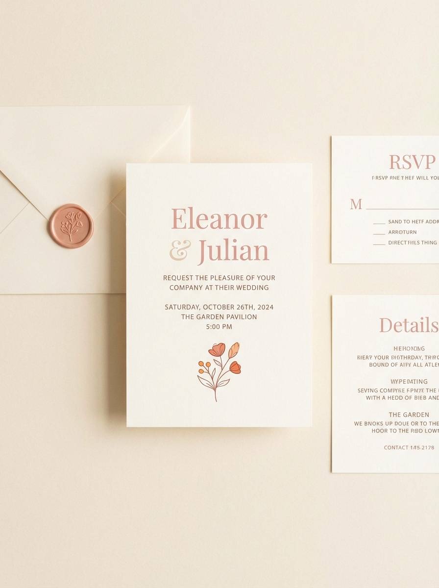
6) Peachy Heat
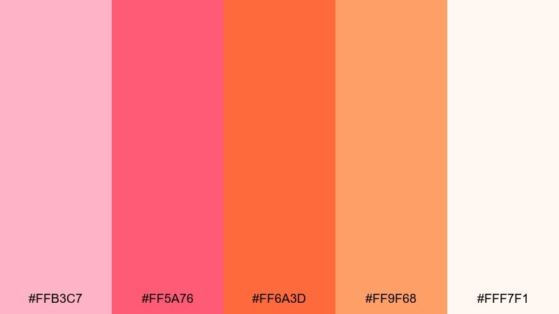
HEX: #ffb3c7 #ff5a76 #ff6a3d #ff9f68 #fff7f1
Mood: cozy, romantic, approachable
Best for: wedding invitation set
Cozy peach and warm rose read as romantic without feeling overly sweet. It suits wedding invitations, RSVP cards, and elegant announcement designs where softness matters. Pair with cream paper textures and delicate serif type, using #ff6a3d sparingly for monograms or seals. Tip: print tests help, since #ffb3c7 can shift depending on paper warmth.
Image example of peachy heat generated using media.io
7) Retro Aperitif
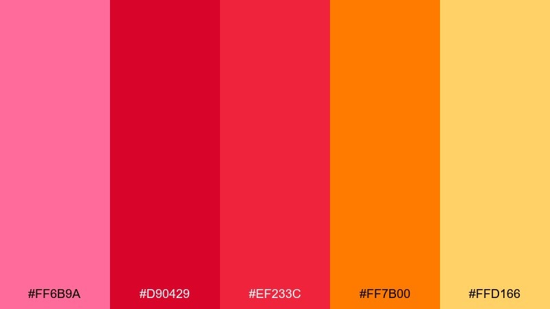
HEX: #ff6b9a #d90429 #ef233c #ff7b00 #ffd166
Mood: retro, lively, editorial
Best for: restaurant menu design
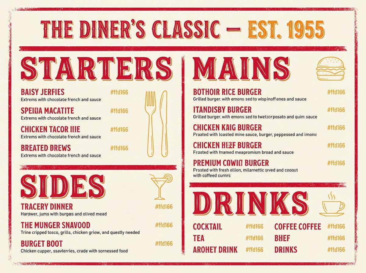
Retro aperitif energy, like a vintage bar sign glowing in early evening. This pink red orange color scheme works especially well for restaurant menus, cocktail lists, and food branding with a playful edge. Pair it with textured off-white and classic condensed type to lean into the throwback feel. Tip: use #ffd166 for section headers to guide scanning and keep reds for dish highlights.
Image example of retro aperitif generated using media.io
8) Fiesta Bouquet
HEX: #ff4d9d #ff3d3d #ff8c1a #ffcf33 #7c2a4d
Mood: festive, bright, youthful
Best for: birthday party invitation
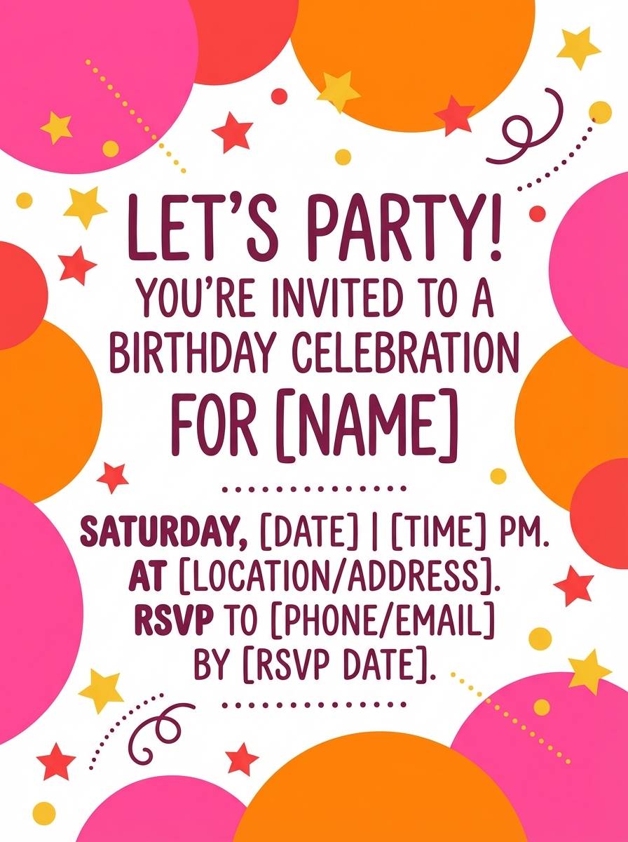
Festive tones that feel like paper banners, confetti, and bright bouquet ribbons. Great for birthday invites, party announcements, and fun family event graphics. Pair with a clean white background and let #7c2a4d anchor the typography so it stays readable. Tip: keep shapes simple and large to avoid color noise when printed small.
Image example of fiesta bouquet generated using media.io
9) Dawn Gradient
HEX: #ff9ac6 #ff6b8a #ff6f61 #ff8f3f #ffe9dd
Mood: dreamy, gentle, uplifting
Best for: wellness app onboarding UI
Dreamy dawn hues that feel like a calm sky shifting from blush to warm peach. Ideal for wellness onboarding, meditation flows, and gentle lifestyle UI where gradients can carry emotion. Pair with thin-line icons and neutral gray text, keeping #ff6b8a for key moments like progress and badges. Tip: apply #ffe9dd as the default canvas to reduce eye strain.
Image example of dawn gradient generated using media.io
10) Papaya Punch
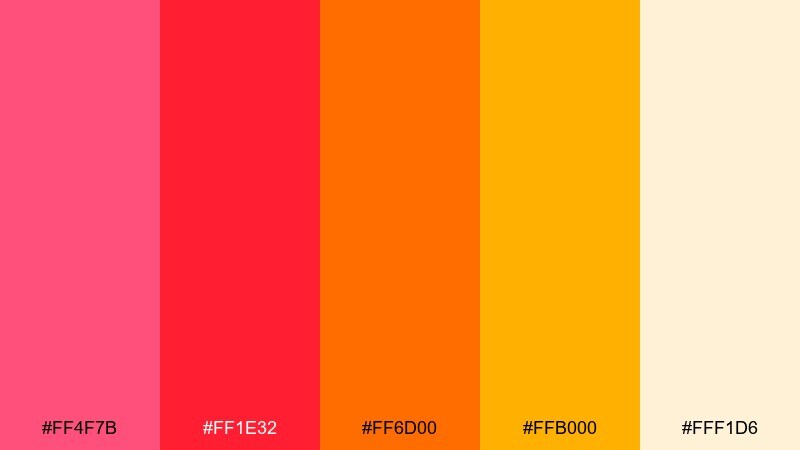
HEX: #ff4f7b #ff1e32 #ff6d00 #ffb000 #fff1d6
Mood: punchy, upbeat, sporty
Best for: fitness promo banner
Punchy and upbeat, like a papaya smoothie after a workout. Use it for fitness promos, sports event banners, and energetic email headers that need a fast hit of color. Pair with bold sans fonts and plenty of cream space so #ff1e32 does not overpower. Tip: reserve #ffb000 for badges and price tags to pull the eye.
Image example of papaya punch generated using media.io

11) Saffron Rose
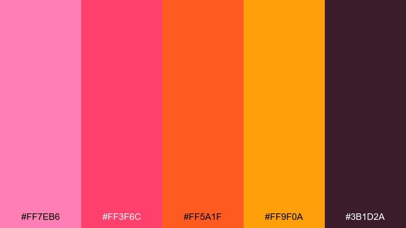
HEX: #ff7eb6 #ff3f6c #ff5a1f #ff9f0a #3b1d2a
Mood: confident, warm, polished
Best for: startup branding kit
Confident saffron and rose feel polished, modern, and a little daring. This pink red orange color palette fits startup branding, pitch decks, and hero sections where you want warmth with authority. Pair with lots of negative space and deep #3b1d2a for headlines and logo marks. Tip: keep #ff9f0a for highlights only, so the system stays premium rather than playful.
Image example of saffron rose generated using media.io
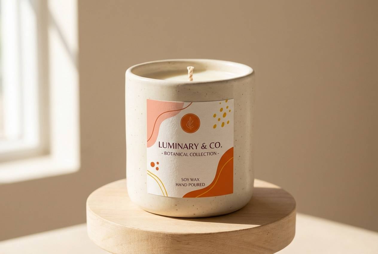
12) Warm Clay
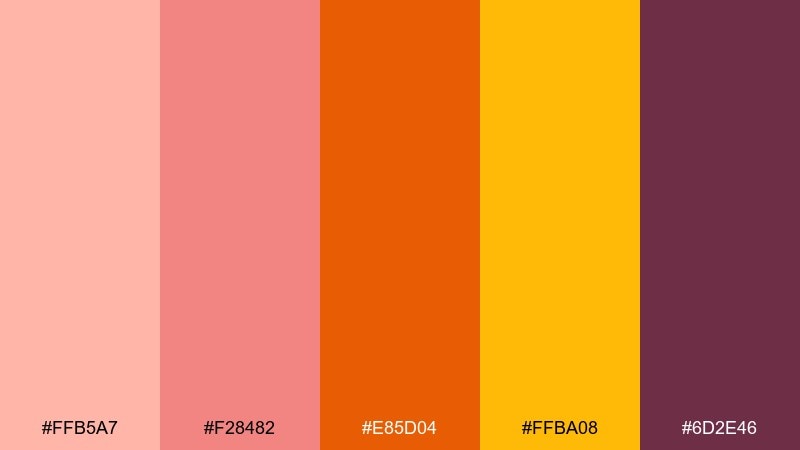
HEX: #ffb5a7 #f28482 #e85d04 #ffba08 #6d2e46
Mood: earthy, artisanal, grounded
Best for: handmade candle label design
Earthy clay and kiln-fired orange bring an artisanal, grounded feel. Perfect for handmade labels, craft packaging, and small-batch product stories. Pair with textured paper, simple iconography, and dark #6d2e46 for ingredient lists. Tip: use #ffb5a7 as a soft label base to make the brighter orange pop without glare.
Image example of warm clay generated using media.io
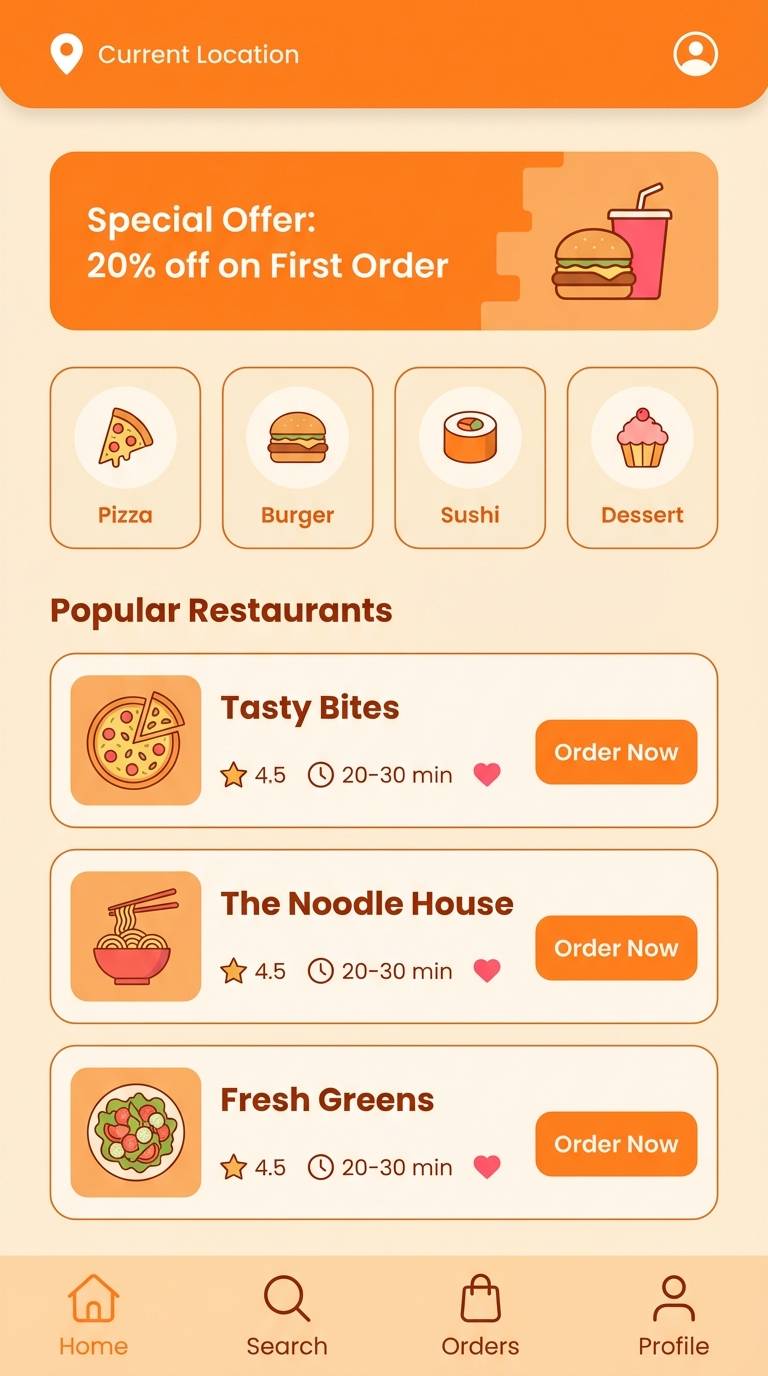
13) Melon Marmalade
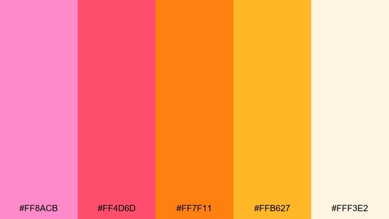
HEX: #ff8acb #ff4d6d #ff7f11 #ffb627 #fff3e2
Mood: cheerful, juicy, modern
Best for: food delivery app UI
Cheerful and juicy, like melon slices with a glossy marmalade sheen. Great for food delivery UI, category chips, and appetizing promo cards. Pair with white or cream surfaces and use #ff7f11 for primary actions to signal urgency without harshness. Tip: keep #ff8acb as an accent for rewards and favorites so the interface stays clean.
Image example of melon marmalade generated using media.io
14) Raspberry Zest
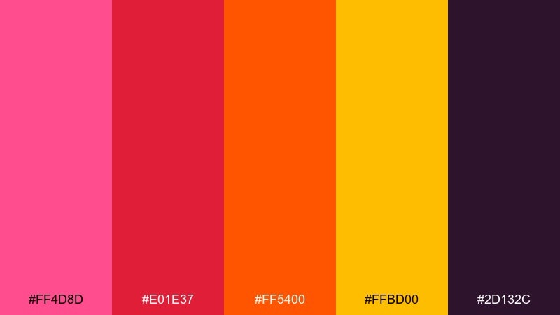
HEX: #ff4d8d #e01e37 #ff5400 #ffbd00 #2d132c
Mood: bold, edgy, high-contrast
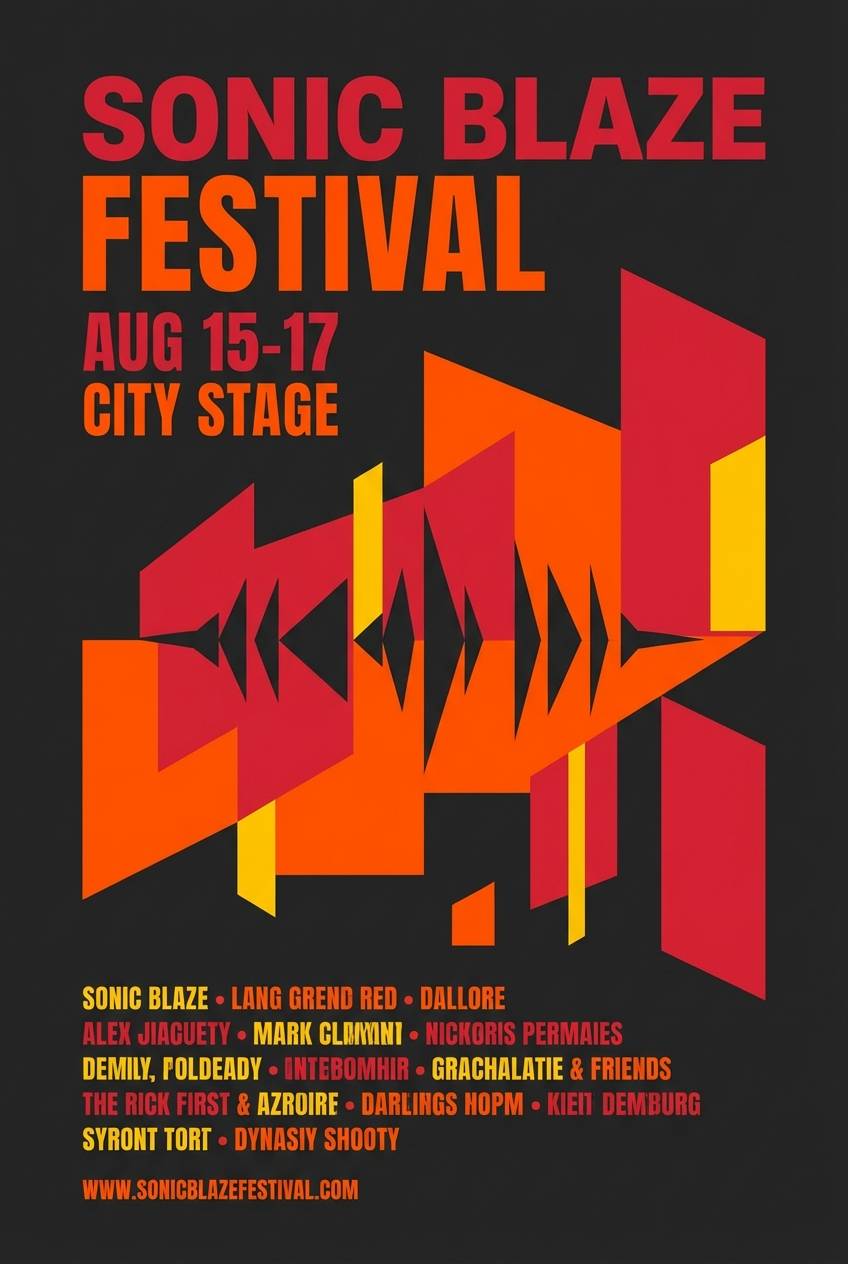
Best for: music festival poster
Raspberry and zest orange hit with high contrast, like stage lights cutting through night air. Use it for music posters, album promo graphics, and merch drops that need punch and legibility. Pair with deep #2d132c for backgrounds and let #ffbd00 spotlight key details like dates and ticket info. Tip: limit gradients here and lean on sharp blocks for a modern, gritty look.
Image example of raspberry zest generated using media.io
15) Festival Neon
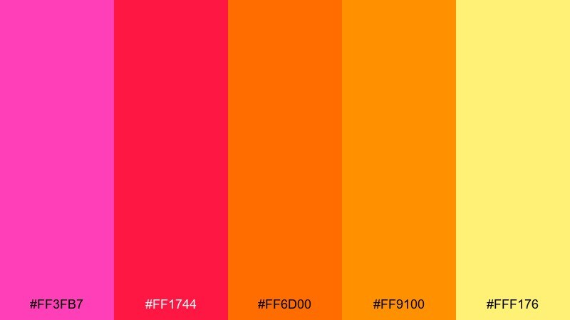
HEX: #ff3fb7 #ff1744 #ff6d00 #ff9100 #fff176
Mood: electric, celebratory, youthful
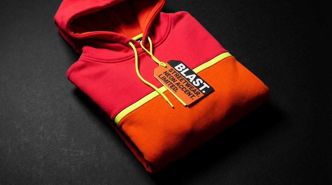
Best for: streetwear product ad
Electric neon warmth that feels like lights, beats, and late-night energy. These pink red orange color combinations are made for streetwear ads, limited drops, and bold promo creatives. Pair with black or charcoal backgrounds for maximum pop, and keep typography simple to avoid visual clutter. Tip: use #fff176 sparingly as a glow accent around prices or drop dates.
Image example of festival neon generated using media.io
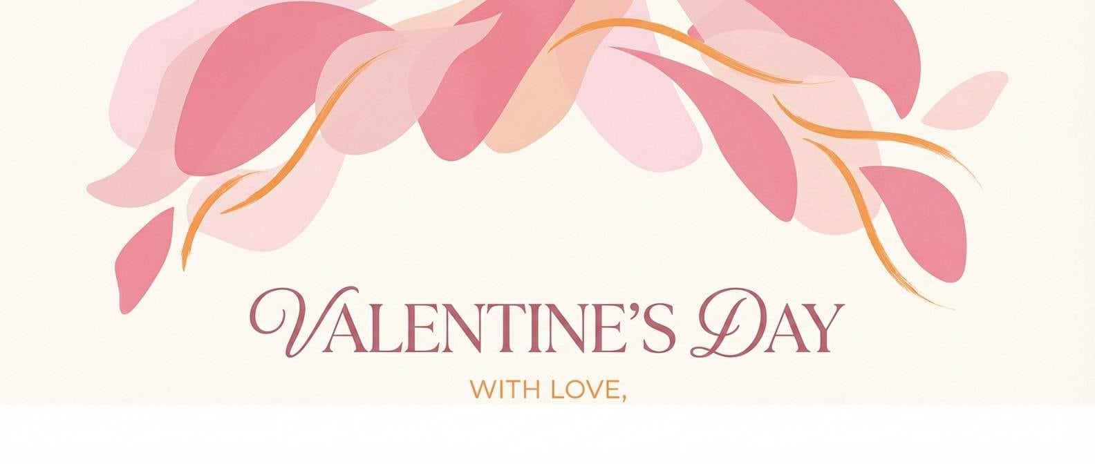
16) Soft Petal Glow
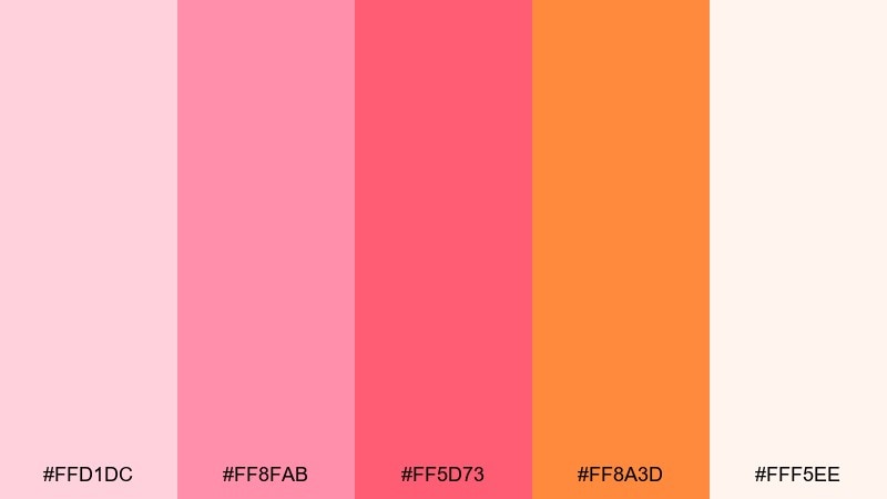
HEX: #ffd1dc #ff8fab #ff5d73 #ff8a3d #fff5ee
Mood: tender, airy, romantic
Best for: valentines day email header
Tender petal pinks with a gentle orange glow feel airy and romantic. Great for seasonal email headers, gift guides, and soft lifestyle banners. Pair with light cream whitespace and thin serif accents, keeping #ff5d73 for emphasis lines or buttons. Tip: avoid heavy shadows and use subtle outlines so the softness stays intact.
Image example of soft petal glow generated using media.io
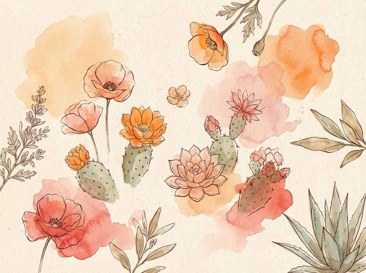
17) Desert Bloom
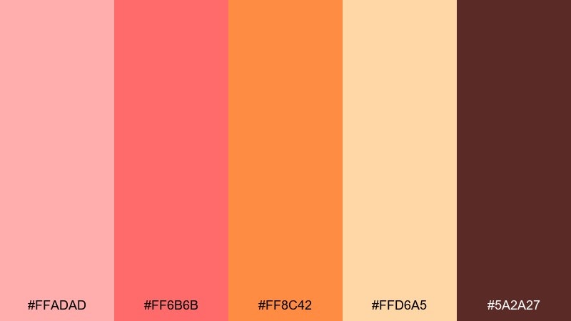
HEX: #ffadad #ff6b6b #ff8c42 #ffd6a5 #5a2a27
Mood: sunbaked, natural, calming
Best for: botanical watercolor illustration
Sunbaked warmth that evokes desert blooms and dusty petals after rain. Use it for botanical illustrations, apothecary-style labels, and calm lifestyle editorials. Pair with natural paper textures and use #5a2a27 for ink lines and captions. Tip: keep #ffd6a5 as the wash layer to unify the palette across elements.
Image example of desert bloom generated using media.io
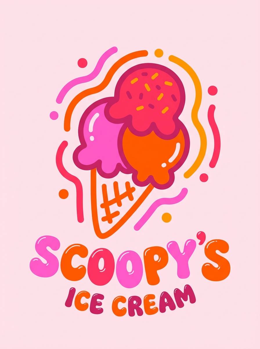
18) Candy Heatwave
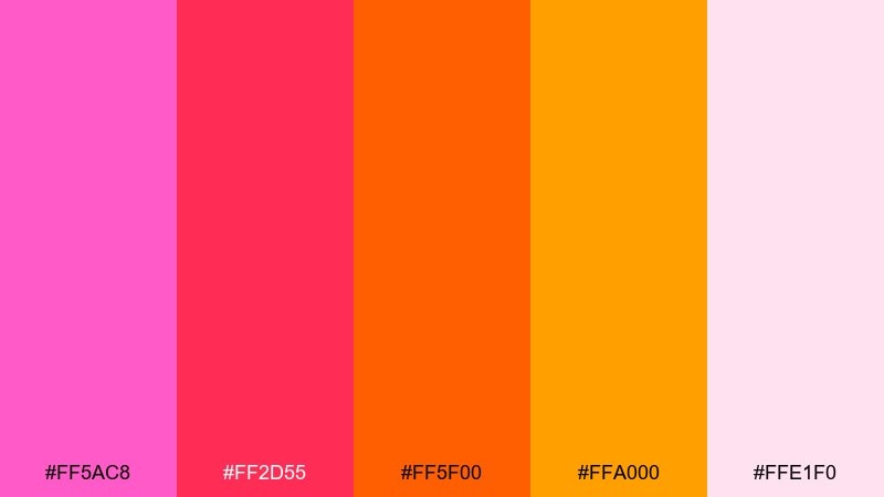
HEX: #ff5ac8 #ff2d55 #ff5f00 #ffa000 #ffe1f0
Mood: sweet, bold, glossy
Best for: ice cream brand poster
Sweet and glossy, like candy coatings in a summer heatwave. A pink red orange color combination like this is perfect for ice cream posters, snack branding, and playful retail signage. Pair with a pale pink backdrop and keep shapes rounded to reinforce the sugary vibe. Tip: use #ffa000 for flavor callouts and keep #ff2d55 for the brand mark.
Image example of candy heatwave generated using media.io
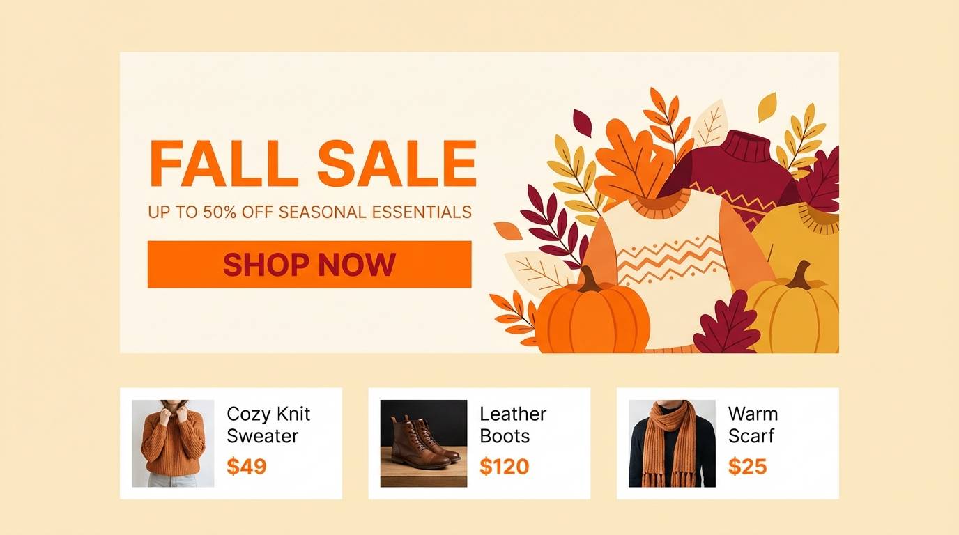
19) Autumn Spritz
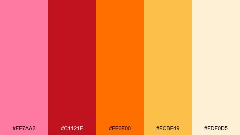
HEX: #ff7aa2 #c1121f #ff6f00 #fcbf49 #fdf0d5
Mood: cozy, seasonal, inviting
Best for: fall sale homepage hero
Cozy seasonal warmth, like an autumn spritz served at sunset. Use it for fall sales, homepage heroes, and seasonal lookbooks where you want inviting color without going too dark. Pair with creamy #fdf0d5 backgrounds and let #c1121f handle the strongest CTAs. Tip: keep product photos neutral so the warm accents do the heavy lifting.
Image example of autumn spritz generated using media.io
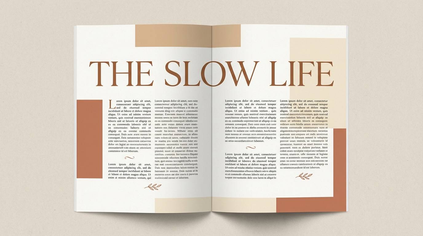
20) Studio Sunrise
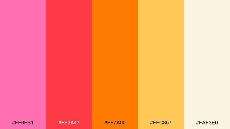
HEX: #ff6fb1 #ff3a47 #ff7a00 #ffc857 #faf3e0
Mood: clean, modern, radiant
Best for: editorial magazine layout
Clean studio warmth that feels like sunrise light bouncing off a white cyclorama. Great for editorial layouts, magazine spreads, and portfolio case studies that need a radiant accent set. Pair with black text, thin rules, and a strict grid so the colors feel intentional rather than loud. Tip: use #ff6fb1 for pull quotes and #ffc857 for section tabs to guide the reader.
Image example of studio sunrise generated using media.io
What Colors Go Well with Pink Red Orange?
Neutrals are the easiest match: warm white, cream, sand, and light gray give saturated pink-red-orange room to breathe. For typography, deep plum, espresso brown, or near-black tends to look more refined than pure black.
For contrast, try cool opposites in small doses—teal, cyan, or blue can sharpen the warmth and make CTAs or key details stand out. If you want a fresher, modern pop, a touch of neon green can work as a sparing highlight.
Metallics also pair well: gold leans luxurious with ember oranges, while silver can modernize hot pinks. Keep the metal as an accent so the warm palette stays the main story.
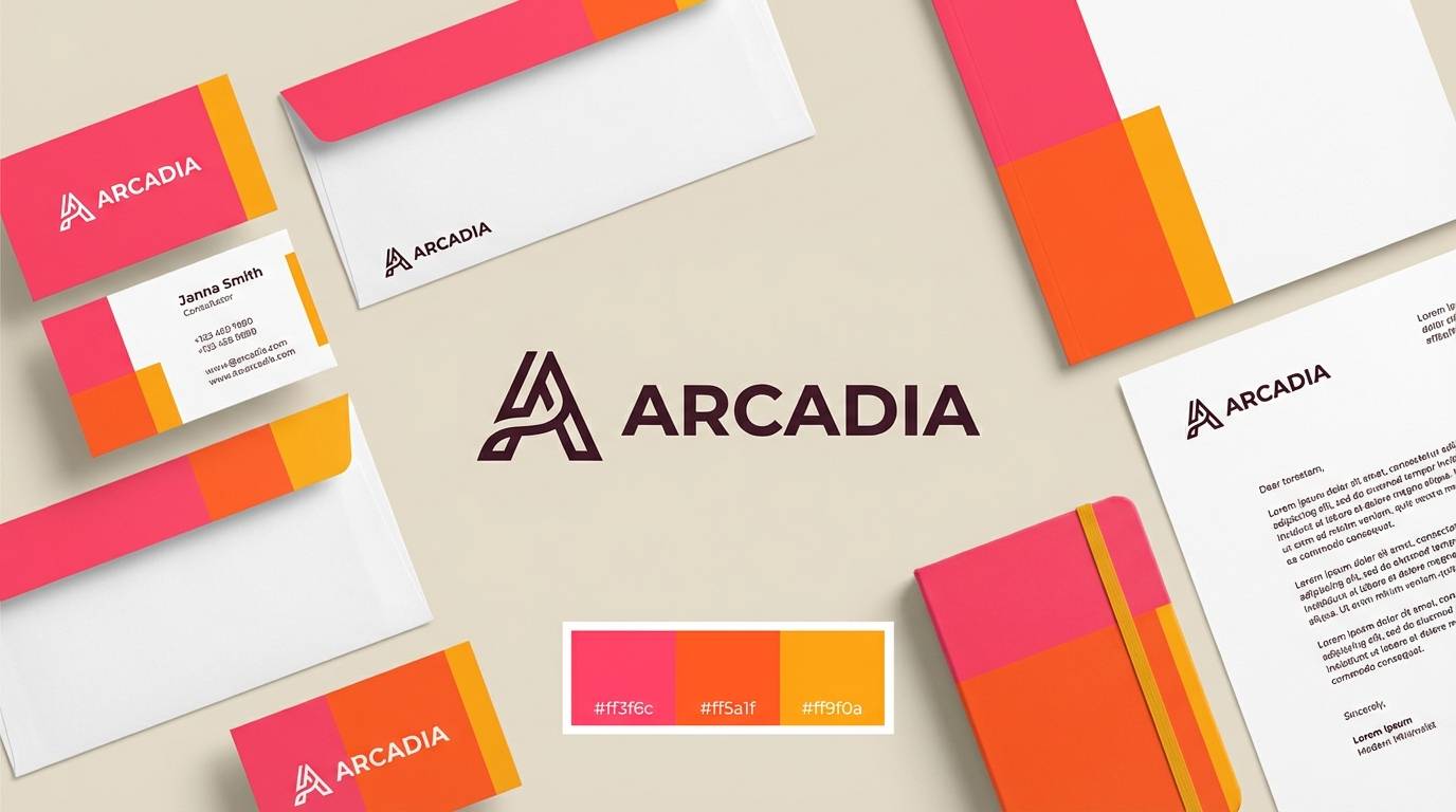
How to Use a Pink Red Orange Color Palette in Real Designs
Choose one role for each warm color: a dominant base (often peach/cream), a primary accent (orange or hot pink), and one “power” color (red) reserved for focal points. This avoids the common issue where everything feels equally loud.
In UI, lean on tinted neutrals (#fff0e6, #ffe9dd, #faf3e0) for backgrounds and cards, then use orange for primary actions and pink for secondary highlights like badges or empty states. Keep body text dark (plum/charcoal) to protect readability.
In posters and packaging, use big, simple shapes and consistent spacing so the palette looks intentional. If you add gradients, keep them subtle (low contrast) unless the design is explicitly “neon” or nightlife-themed.
Create Pink Red Orange Palette Visuals with AI
If you have HEX codes and a vibe in mind (sunset, coral pop, ember luxe), you can turn them into on-brand visuals fast with AI—social ads, product mockups, posters, or UI-style hero sections.
Start by describing the layout (poster, landing page, packaging), then specify your dominant colors and a dark text color for legibility. Reuse the same prompt structure to generate a consistent set of assets across campaigns.
When you get a strong result, iterate with small changes: swap the background neutral, reduce one saturated color, or move the highlight color to only the CTA and key labels.
Pink Red Orange Color Palette FAQs
-
What does a pink red orange color palette communicate?
It usually signals warmth, energy, and optimism. Softer blush-peach mixes feel friendly and romantic, while saturated red-orange combinations feel urgent, celebratory, and attention-grabbing. -
How do I keep pink, red, and orange from looking too loud together?
Use a tinted neutral (cream/off-white) as the main background, pick one dominant warm color, and reserve the strongest red for small areas like headlines, price tags, or buttons. -
What’s the best text color on pink red orange backgrounds?
Deep plum, espresso, or near-black typically reads better than pure black because it harmonizes with warm hues. For very dark backgrounds, use warm white instead of stark white for a softer look. -
Are pink red orange palettes good for branding?
Yes—especially for food, beauty, lifestyle, events, and modern DTC brands. Add one grounding dark (plum/brown) and a neutral system so the brand stays usable across web, print, and product. -
What accent color pairs well with pink red orange?
Teal or blue works as a high-contrast complementary accent, while gold adds a premium feel. If you want a trend-forward edge, use neon green very sparingly as a highlight. -
How can I generate matching visuals for a specific palette quickly?
Use a text-to-image tool and include the HEX codes (or the dominant colors) plus the design type (poster, packaging, UI). Keep the same composition notes and only vary the subject to build a consistent set. -
Do these colors print well for invitations and packaging?
They can, but print shifts are common—pinks may dull and oranges may intensify depending on paper warmth. Do a quick test print, and consider slightly reducing saturation for large ink areas.


