

A rainy day color palette is built around misty grays, softened blues, and muted warm neutrals—tones that feel calm, modern, and easy to design with.
Below are 20 curated rainy day color schemes (with HEX codes) you can use for UI, branding, packaging, and print—plus AI prompts to generate matching visuals in Media.io.
In this article
- Why Rainy Day Palettes Work So Well
-
- misty sidewalk
- umbrella noir
- puddle reflection
- cloudbreak tea
- wet asphalt
- cozy windowlight
- drizzle garden
- harbor fog
- slate and spruce
- metro raincoat
- candle in the storm
- rainy day minimal
- cocoa and concrete
- soft thunder
- paperboat pastels
- monsoon poster
- rainwashed denim
- stormy bloom
- lighthouse after rain
- night bus window
- What Colors Go Well with Rainy Day?
- How to Use a Rainy Day Color Palette in Real Designs
- Create Rainy Day Palette Visuals with AI
Why Rainy Day Palettes Work So Well
Rainy day colors are naturally subdued, which makes them feel polished and “designed” even in simple layouts. Because the hues are lower in saturation, typography and spacing do more of the heavy lifting—perfect for modern, minimal visuals.
These palettes also create instant depth. Soft grays and slate blues form reliable background layers, while one warmer note (taupe, caramel, terracotta) prevents the design from feeling cold or overly corporate.
Most importantly, rainy day schemes are flexible across mediums. They translate cleanly from screens to print, and they pair well with monochrome photography, textures, and calm gradients.
20+ Rainy Day Color Palette Ideas (with HEX Codes)
1) Misty Sidewalk
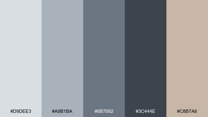
HEX: #D9DEE3 #A9B1BA #6B7682 #3C444E #C8B7A6
Mood: quiet, misty, grounded
Best for: minimal SaaS dashboard UI
Quiet and misty like early footsteps on a damp sidewalk, these tones feel clean without turning cold. Use the light gray as your canvas, then build hierarchy with slate and charcoal for navigation and charts. The warm taupe keeps the interface human and prevents the palette from feeling overly industrial. Tip: reserve the deepest charcoal for key CTAs and active states to keep contrast crisp.
Image example of misty sidewalk generated using media.io
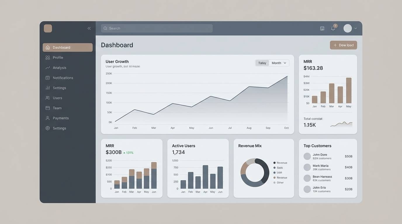
Media.io is an online AI studio for creating and editing video, image, and audio in your browser.

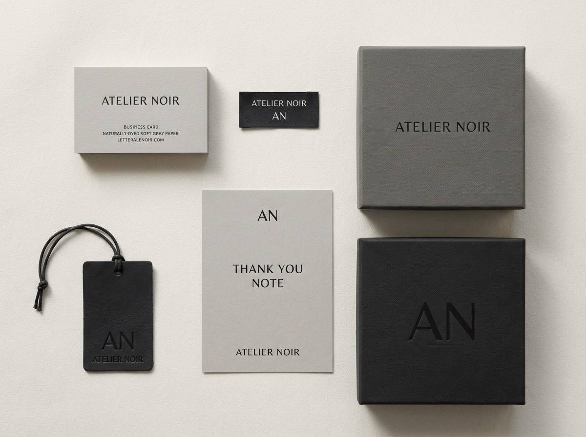
2) Umbrella Noir
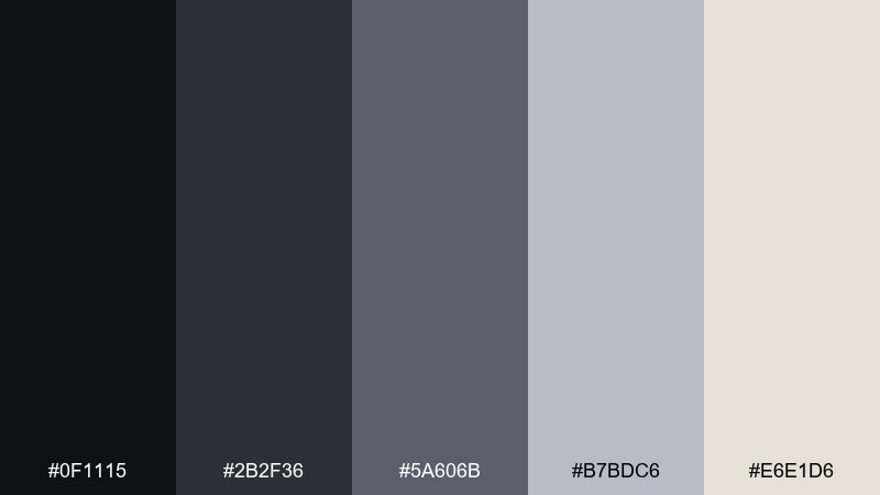
HEX: #0F1115 #2B2F36 #5A606B #B7BDC6 #E6E1D6
Mood: cinematic, sleek, high-contrast
Best for: luxury fashion branding
Cinematic and sleek, it evokes glossy umbrellas and city lights reflected in wet streets. Let the near-black and graphite anchor logos, labels, and typography for a premium feel. Pale gray and warm off-white create breathing room for editorial layouts and product photography. Tip: pair with a single metallic foil or spot varnish for tactile contrast without adding new colors.
Image example of umbrella noir generated using media.io
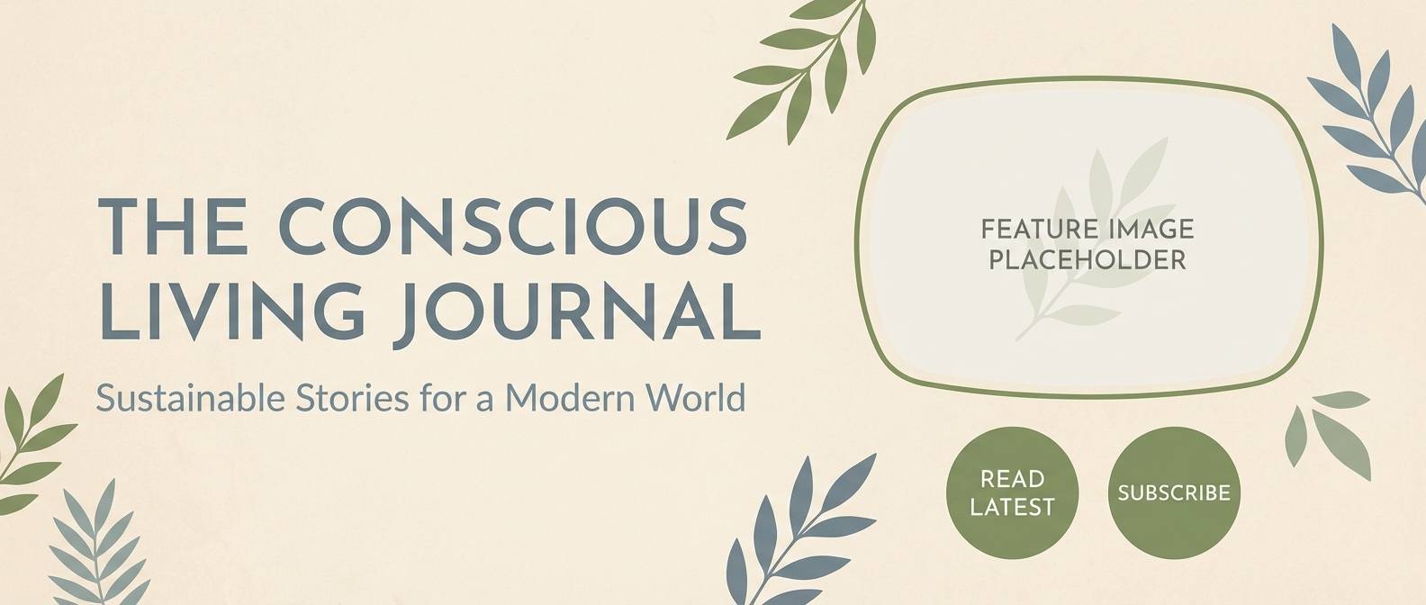
3) Puddle Reflection
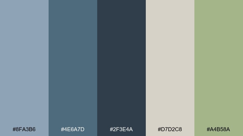
HEX: #8FA3B6 #4E6A7D #2F3E4A #D7D2C8 #A4B58A
Mood: fresh, reflective, airy
Best for: eco lifestyle blog header
Fresh and reflective, it feels like pale sky mirrored in a puddle with a hint of new leaves. These rainy day color combinations work well for blog headers where you want calm structure plus a soft organic accent. Use the blue-grays for type and overlays, then bring in the mossy green for buttons or tags. Tip: keep the beige as your background to maintain warmth and readability.
Image example of puddle reflection generated using media.io
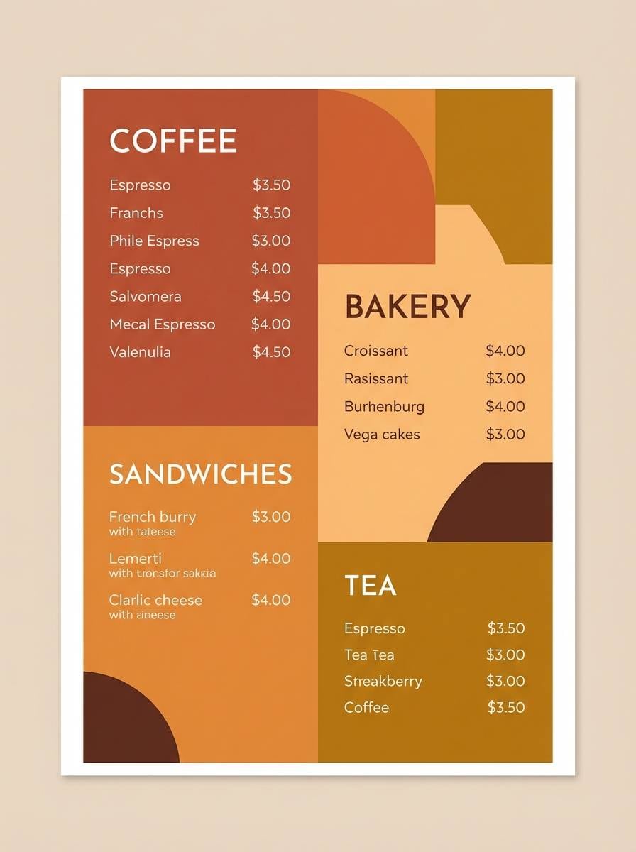
4) Cloudbreak Tea
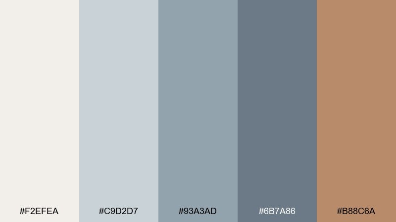
HEX: #F2EFEA #C9D2D7 #93A3AD #6B7A86 #B88C6A
Mood: cozy, gentle, welcoming
Best for: cafe menu design
Cozy and gentle, it brings to mind warm tea by the window while clouds slowly lift. The creamy base supports long-form text, while cool grays add structure for sections and prices. A muted caramel accent is perfect for highlights like seasonal specials or icons. Tip: use the caramel sparingly so the menu stays calm and premium rather than busy.
Image example of cloudbreak tea generated using media.io
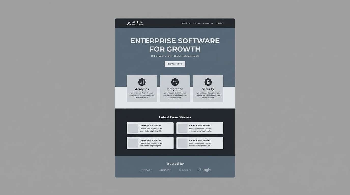
5) Wet Asphalt
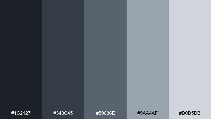
HEX: #1C2127 #343C45 #59636E #9AA4AF #D0D5DB
Mood: urban, steady, professional
Best for: B2B landing page UI
Urban and steady, it captures the dependable look of wet asphalt under overcast light. Use the darker grays for hero headers and navigation to signal confidence and security. Lighter neutrals keep forms and feature blocks readable, especially on long pages. Tip: add generous spacing and rounded corners to soften the palette and avoid a heavy feel.
Image example of wet asphalt generated using media.io
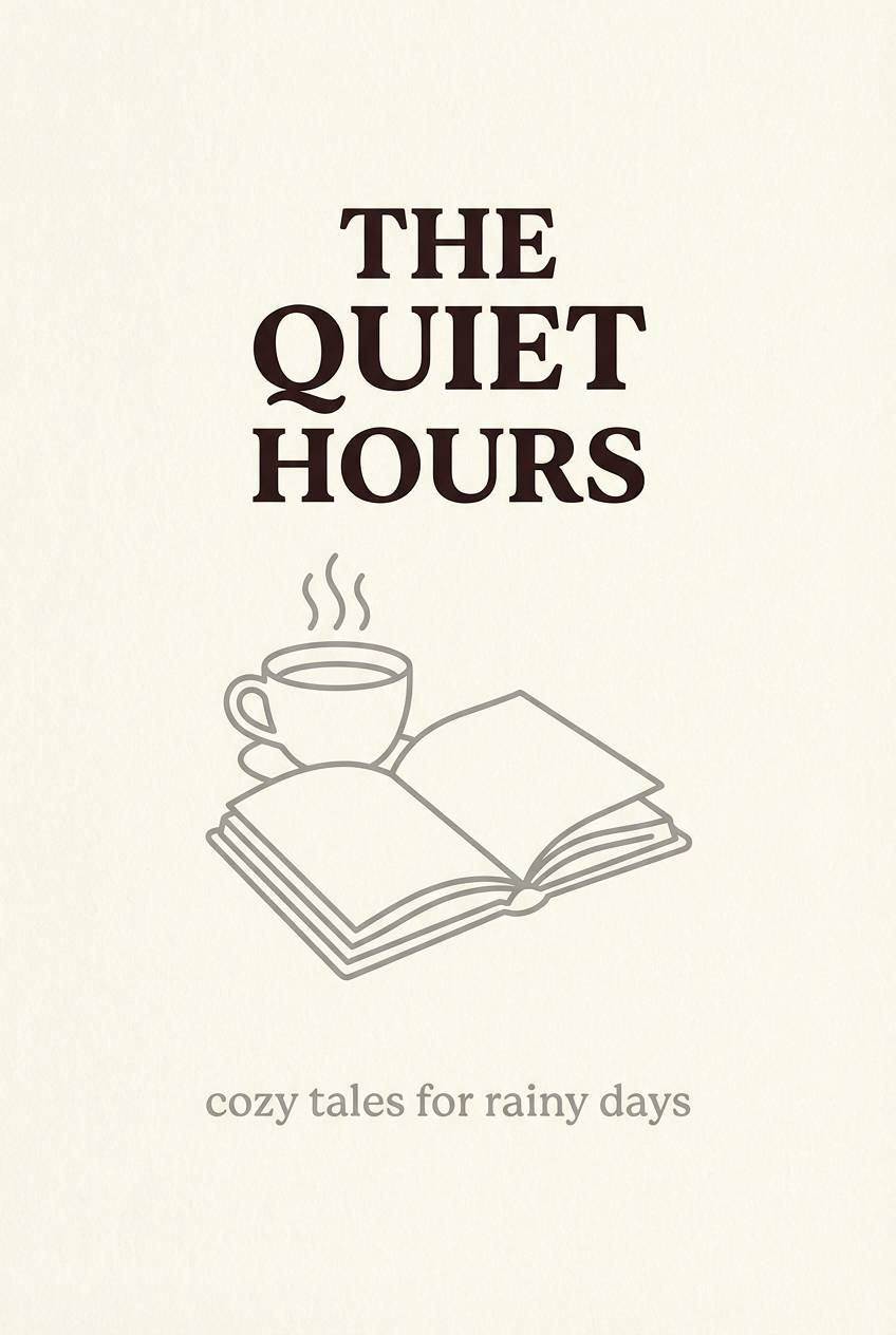
6) Cozy Windowlight
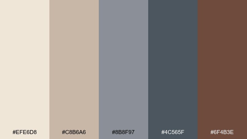
HEX: #EFE6D8 #C8B6A6 #8B8F97 #4C565F #6F4B3E
Mood: warm, introspective, comforting
Best for: book cover design
Warm and introspective, it feels like windowlight hitting a worn armchair on a drizzly afternoon. Pair the creamy beige with soft gray for legible title typography and subtle texture. The deep espresso tone adds literary weight for author names or spine elements. Tip: try a paper-grain overlay so the neutrals look tactile instead of flat.
Image example of cozy windowlight generated using media.io
7) Drizzle Garden
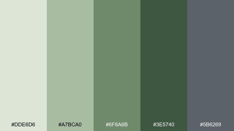
HEX: #DDE6D6 #A7BCA0 #6F8A6B #3E5740 #5B6269
Mood: botanical, calm, restorative
Best for: botanical illustration poster
Botanical and restorative, it suggests rain-darkened leaves and stone paths after a light drizzle. These rainy day color combinations are ideal for nature-forward posters, wellness brands, and packaging that needs a grounded green story. Use the pale sage as negative space and the deep forest tone for stems, headings, or borders. Tip: keep the cool gray as a shadow color to preserve depth without adding black.
Image example of drizzle garden generated using media.io
8) Harbor Fog
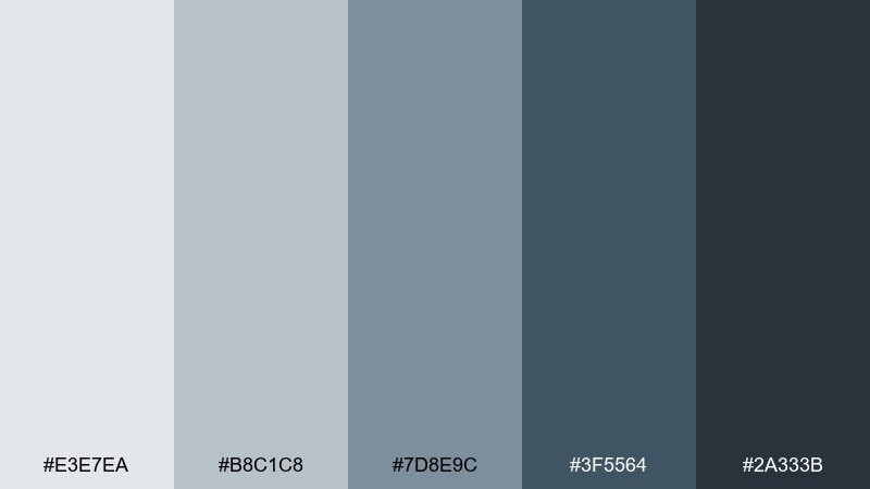
HEX: #E3E7EA #B8C1C8 #7D8E9C #3F5564 #2A333B
Mood: cool, nautical, composed
Best for: travel brochure layout
Cool and composed, it evokes a quiet harbor wrapped in fog with muted steel-blue depth. The light tones make photo spreads feel airy, while deeper blues add confident headings and dividers. It pairs naturally with monochrome photography and simple map icons. Tip: use the darkest shade for small text only when you can maintain comfortable line spacing.
Image example of harbor fog generated using media.io
9) Slate and Spruce
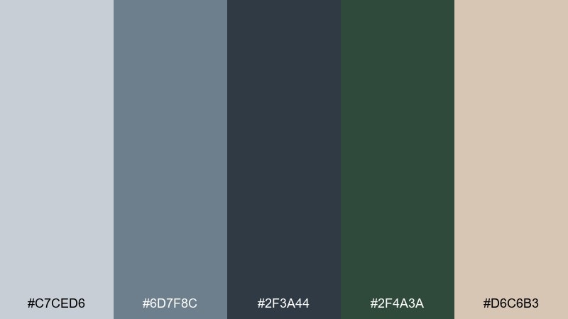
HEX: #C7CED6 #6D7F8C #2F3A44 #2F4A3A #D6C6B3
Mood: outdoorsy, grounded, modern
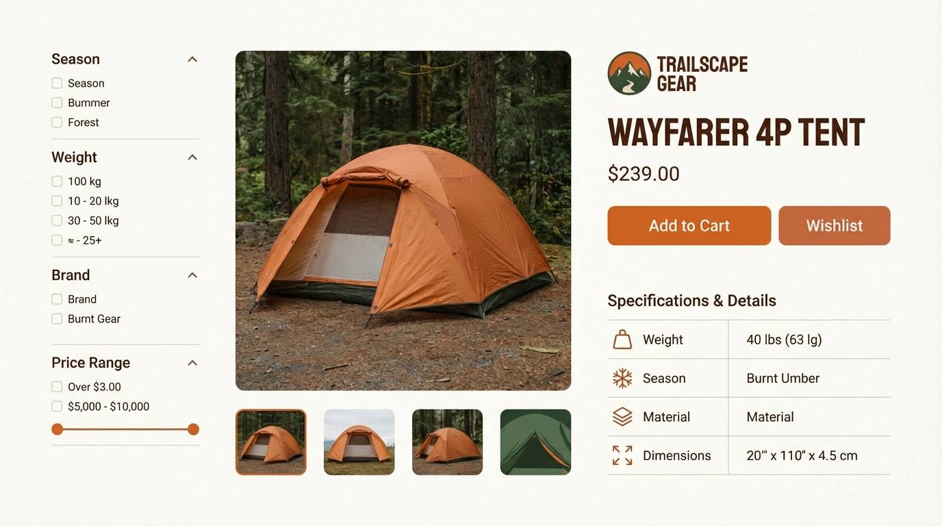
Best for: outdoor gear product page
Outdoorsy and grounded, it feels like slate rock and spruce needles after a steady shower. Use the slate family for product specs and UI components, then bring in spruce green for primary buttons or badges. The warm sand tone softens the overall temperature and works well behind lifestyle photos. Tip: keep green to a few key actions so it reads as intentional, not decorative.
Image example of slate and spruce generated using media.io
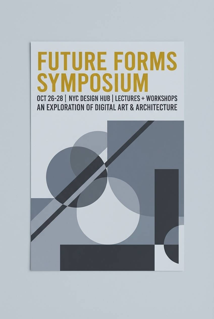
10) Metro Raincoat
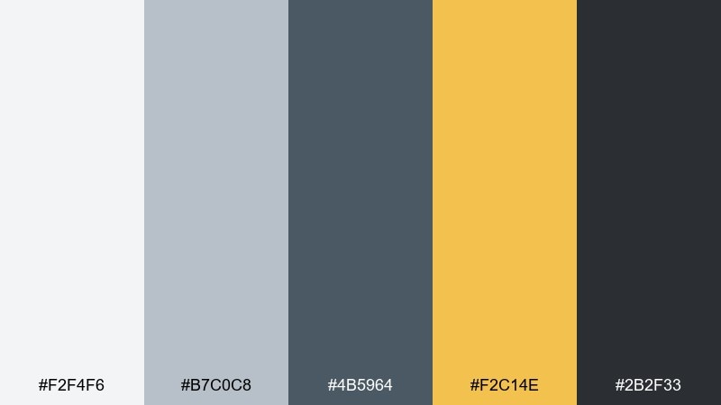
HEX: #F2F4F6 #B7C0C8 #4B5964 #F2C14E #2B2F33
Mood: modern, energetic, commuter-chic
Best for: event poster design
Modern and commuter-chic, it brings the pop of a raincoat against a gray platform. This rainy day color scheme is great when you need a neutral base with one optimistic accent that grabs attention fast. Use yellow for the event title and key details, while the grays handle background blocks and supporting text. Tip: keep the yellow in large shapes and headings so it stays vibrant without feeling noisy.
Image example of metro raincoat generated using media.io
11) Candle in the Storm
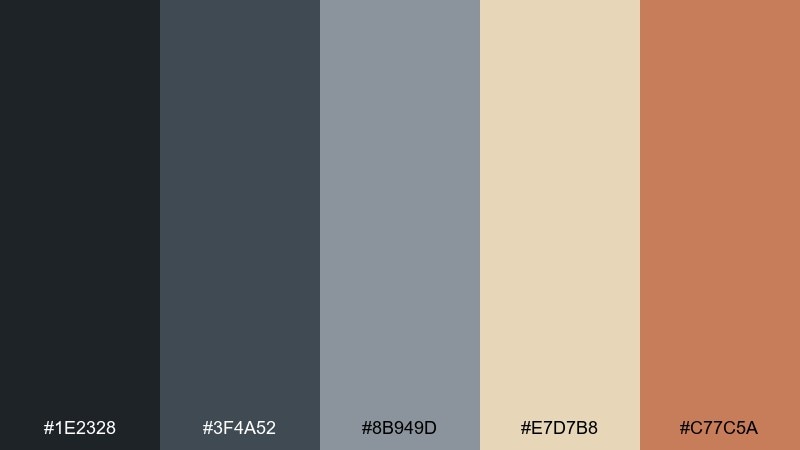
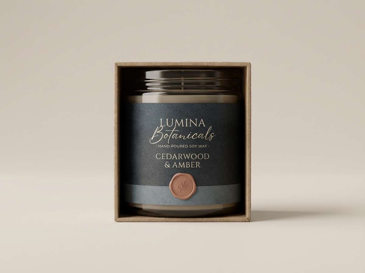
HEX: #1E2328 #3F4A52 #8B949D #E7D7B8 #C77C5A
Mood: moody, intimate, warm-glow
Best for: artisan candle packaging
Moody and intimate, it feels like a candle flame warming up a stormy room. Use charcoal and slate for the label base, then let the waxy cream bring a soft glow to typography. A muted terracotta works beautifully for seals, scent notes, or small pattern details. Tip: choose matte paper and keep the terracotta to small areas to maintain a calm, upscale look.
Image example of candle in the storm generated using media.io
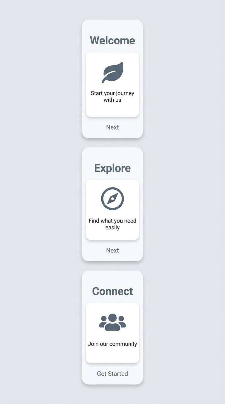
12) Rainy Day Minimal
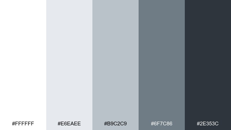
HEX: #FFFFFF #E6EAEE #B9C2C9 #6F7C86 #2E353C
Mood: clean, airy, straightforward
Best for: mobile app onboarding UI
Clean and airy, it suggests bright overcast light with crisp edges. Use white and pale gray for screens that need clarity, then step down into slate for headers and progress indicators. The darkest tone is ideal for primary text and icon strokes. Tip: add a single subtle gradient between the two lightest colors to keep flat screens from feeling sterile.
Image example of rainy day minimal generated using media.io
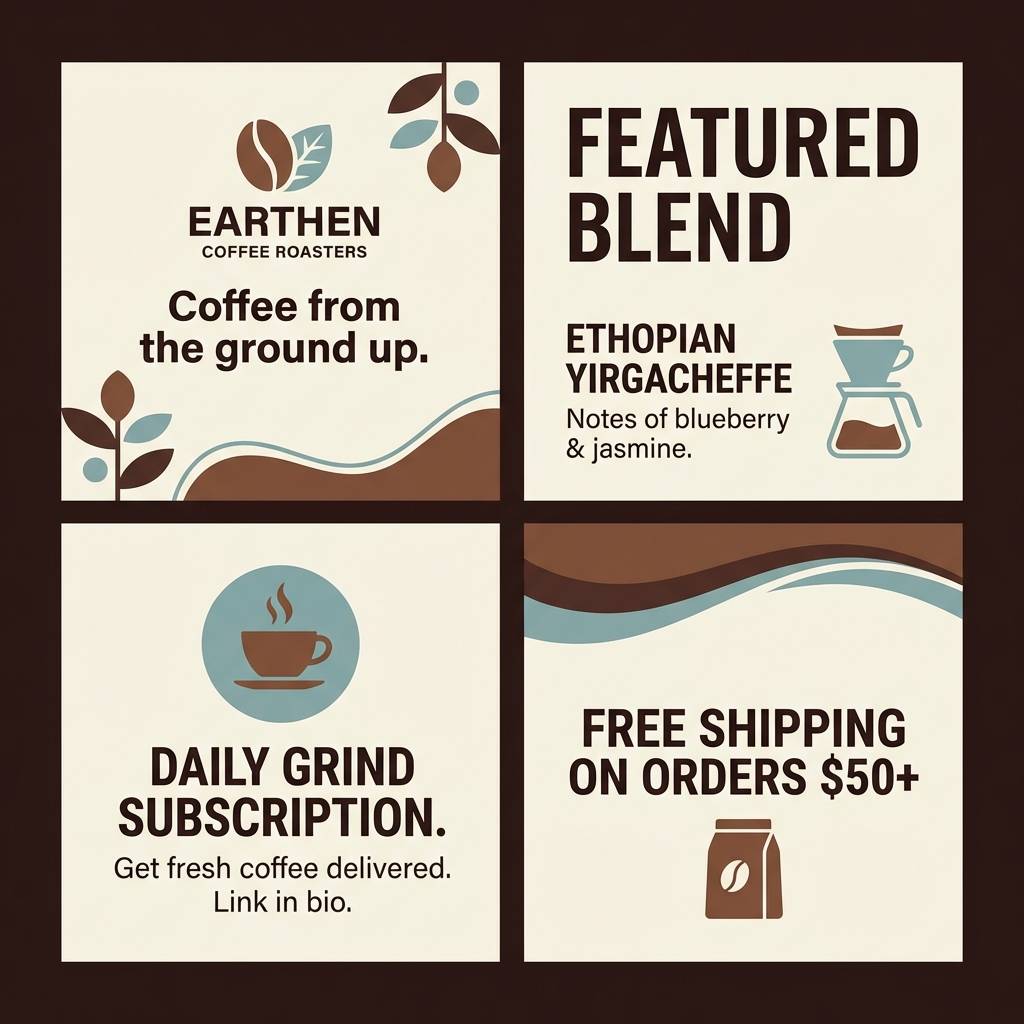
13) Cocoa and Concrete
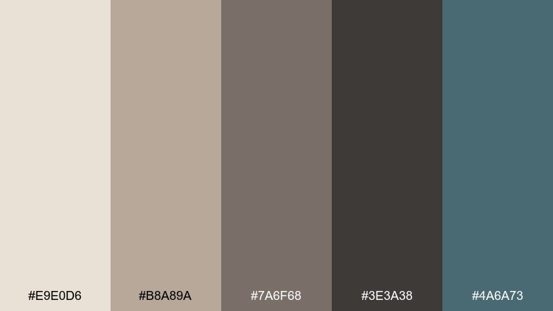
HEX: #E9E0D6 #B8A89A #7A6F68 #3E3A38 #4A6A73
Mood: earthy, urban, cozy-modern
Best for: coffee brand social templates
Earthy and urban, it feels like cocoa warmth set against concrete walls and rainy-blue shadows. The creamy beige is perfect for backgrounds and story templates, while cocoa browns add brand character. A muted blue-green gives you a cooler counterpoint for stickers, prices, or callouts. Tip: use consistent type weights so the palette reads intentional rather than rustic.
Image example of cocoa and concrete generated using media.io
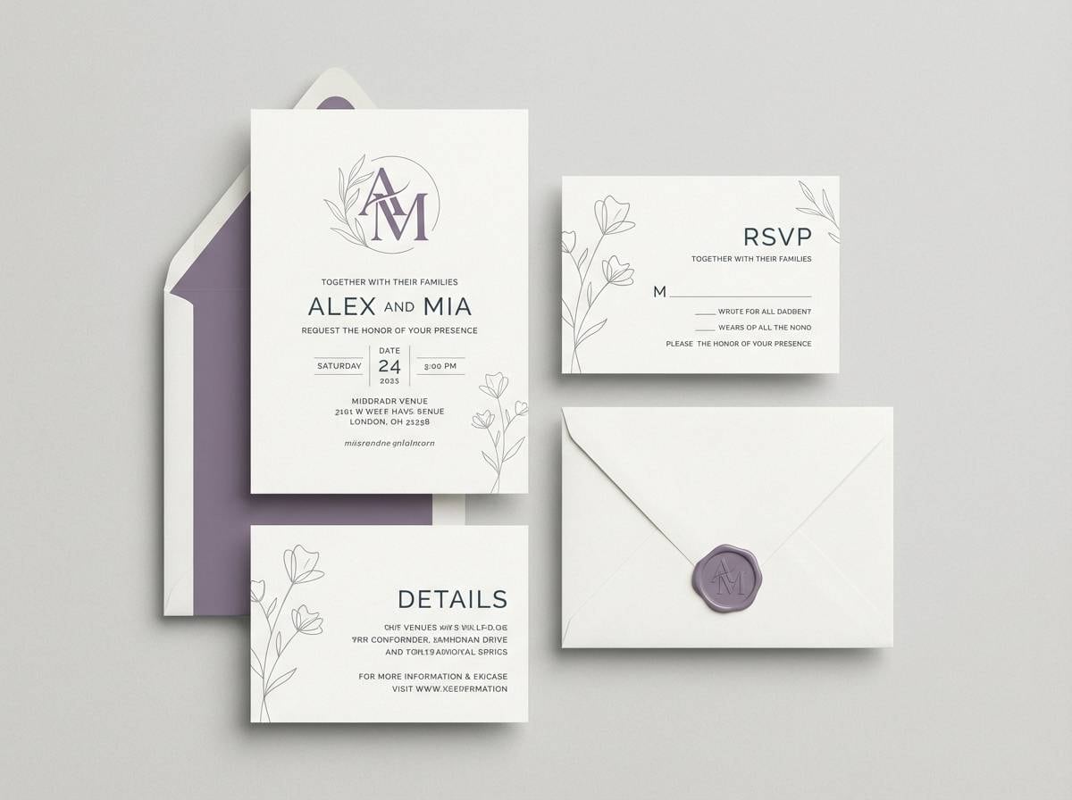
14) Soft Thunder
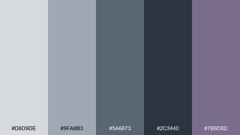
HEX: #D6D9DE #9FA8B3 #5A6673 #2C3440 #7B6D8D
Mood: stormy, elegant, slightly dreamy
Best for: wedding invitation suite
Stormy and elegant, it evokes distant thunder softened by mist and a hint of twilight violet. A rainy day color palette like this suits modern invitations where you want romance without sugary pastels. Use the light gray as paper tone, slate for type, and violet for monograms or wax-seal graphics. Tip: print violet as a spot color to keep it rich and consistent across pieces.
Image example of soft thunder generated using media.io
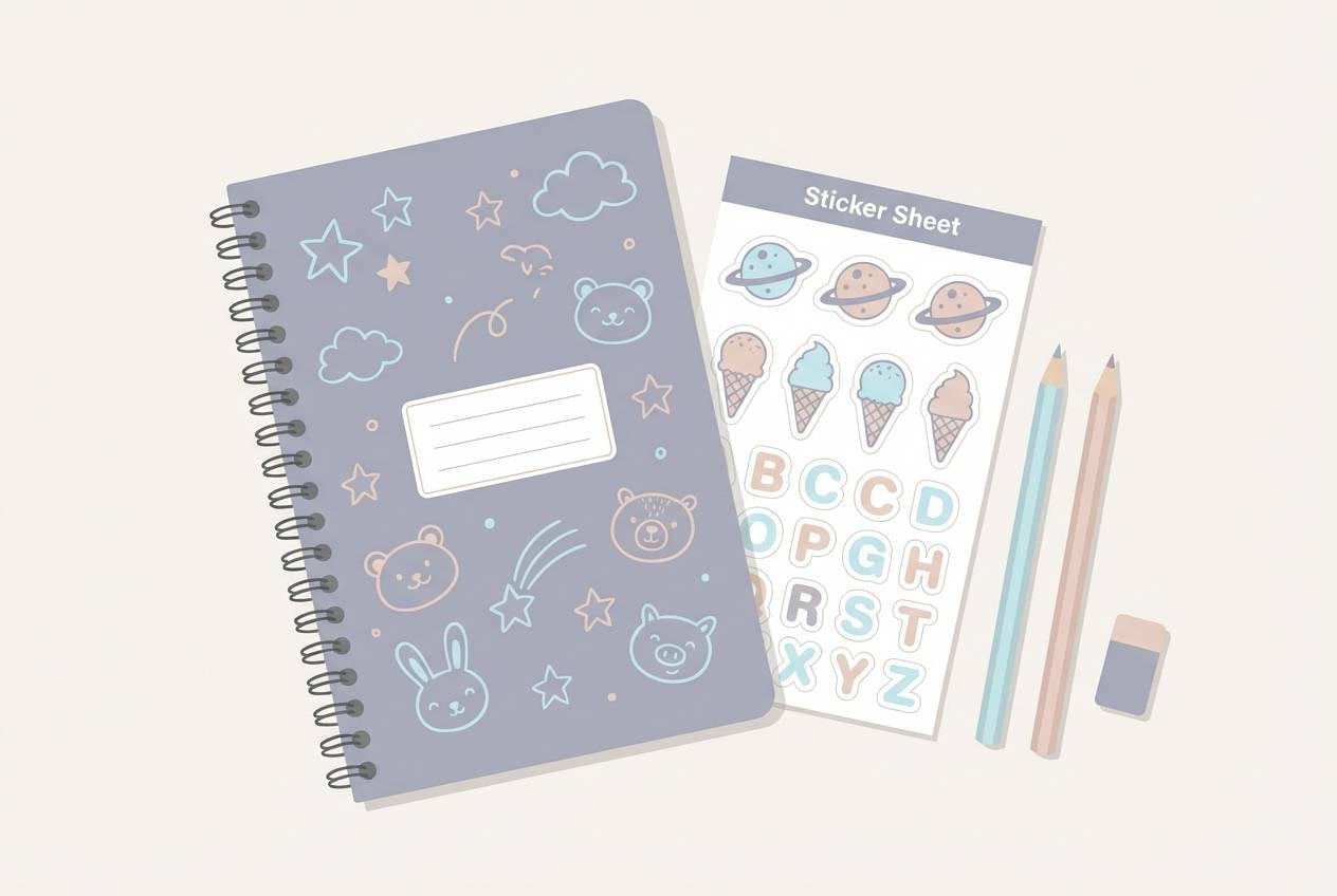
15) Paperboat Pastels
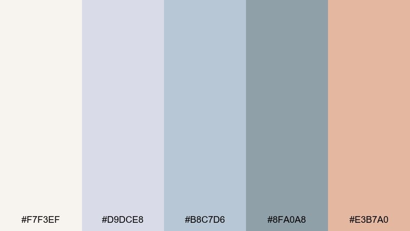
HEX: #F7F3EF #D9DCE8 #B8C7D6 #8FA0A8 #E3B7A0
Mood: soft, nostalgic, playful-calm
Best for: kids stationery set
Soft and nostalgic, it feels like folded paper boats floating through gentle puddles. Use the blush accent for small illustrations and stickers, while the blue-grays keep the set calm and easy on the eyes. It pairs nicely with simple doodles, rounded typography, and lots of whitespace. Tip: keep outlines in the mid gray-blue so artwork stays light rather than harsh.
Image example of paperboat pastels generated using media.io
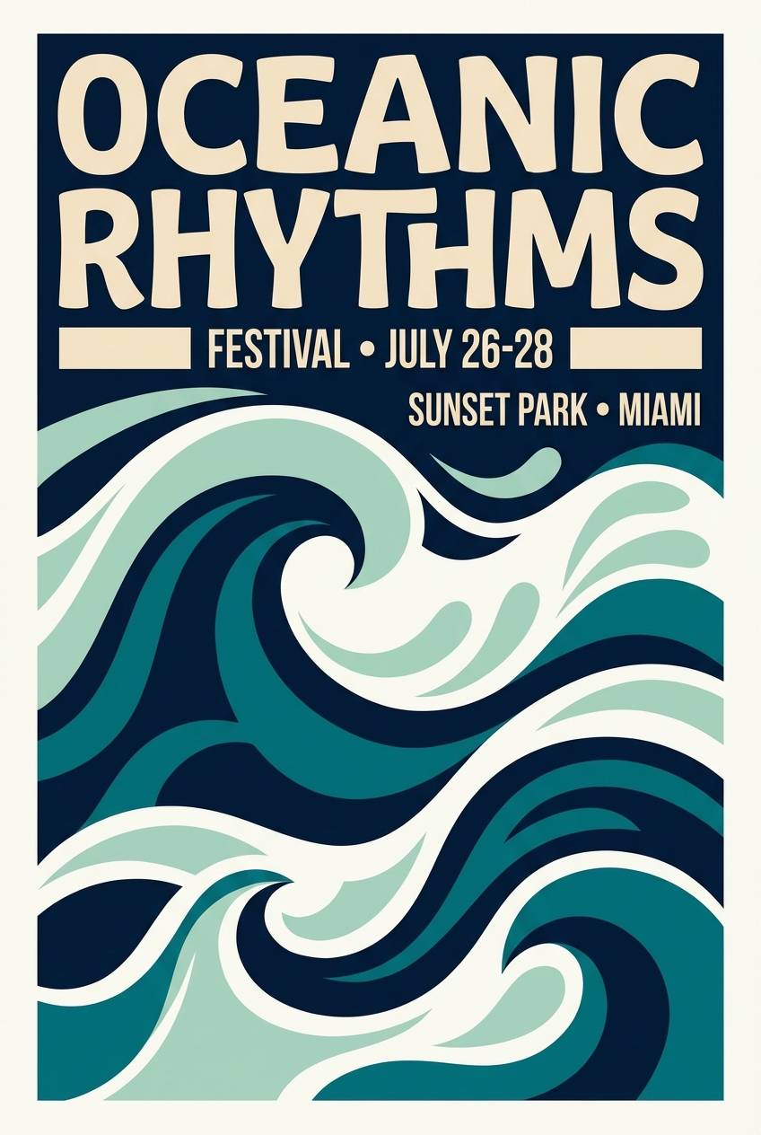
16) Monsoon Poster
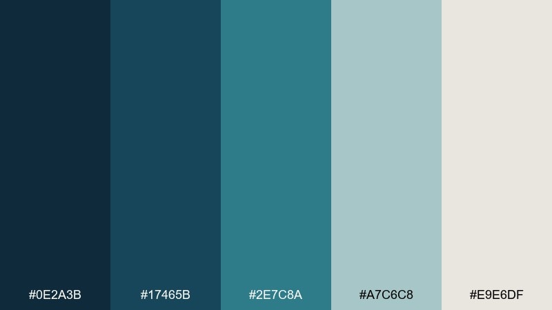
HEX: #0E2A3B #17465B #2E7C8A #A7C6C8 #E9E6DF
Mood: bold, coastal, rain-soaked
Best for: music festival flyer
Bold and rain-soaked, it channels monsoon skies meeting coastal water. The deep blues set a dramatic stage for big type, while teal adds movement for shapes and gradients. Pale seafoam and warm off-white keep the flyer readable even with dense information. Tip: use a two-color gradient between teal and navy for a dynamic background without adding extra hues.
Image example of monsoon poster generated using media.io
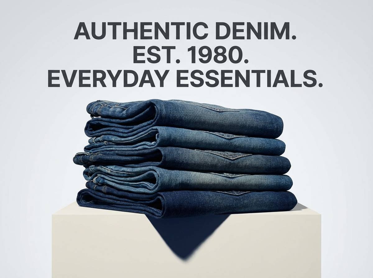
17) Rainwashed Denim
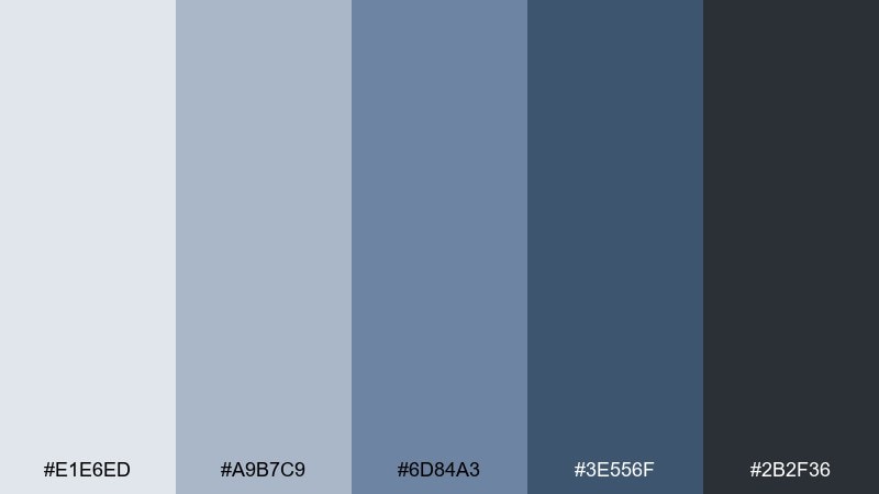
HEX: #E1E6ED #A9B7C9 #6D84A3 #3E556F #2B2F36
Mood: casual, dependable, cool-toned
Best for: denim product ad
Casual and dependable, it looks like denim darkened by rain but still crisp. Use the pale blue-gray for background space and the mid denims for blocks and badges. The deep navy and charcoal make product names and pricing pop without shouting. Tip: keep typography monochrome and let the denim tones do the storytelling.
Image example of rainwashed denim generated using media.io
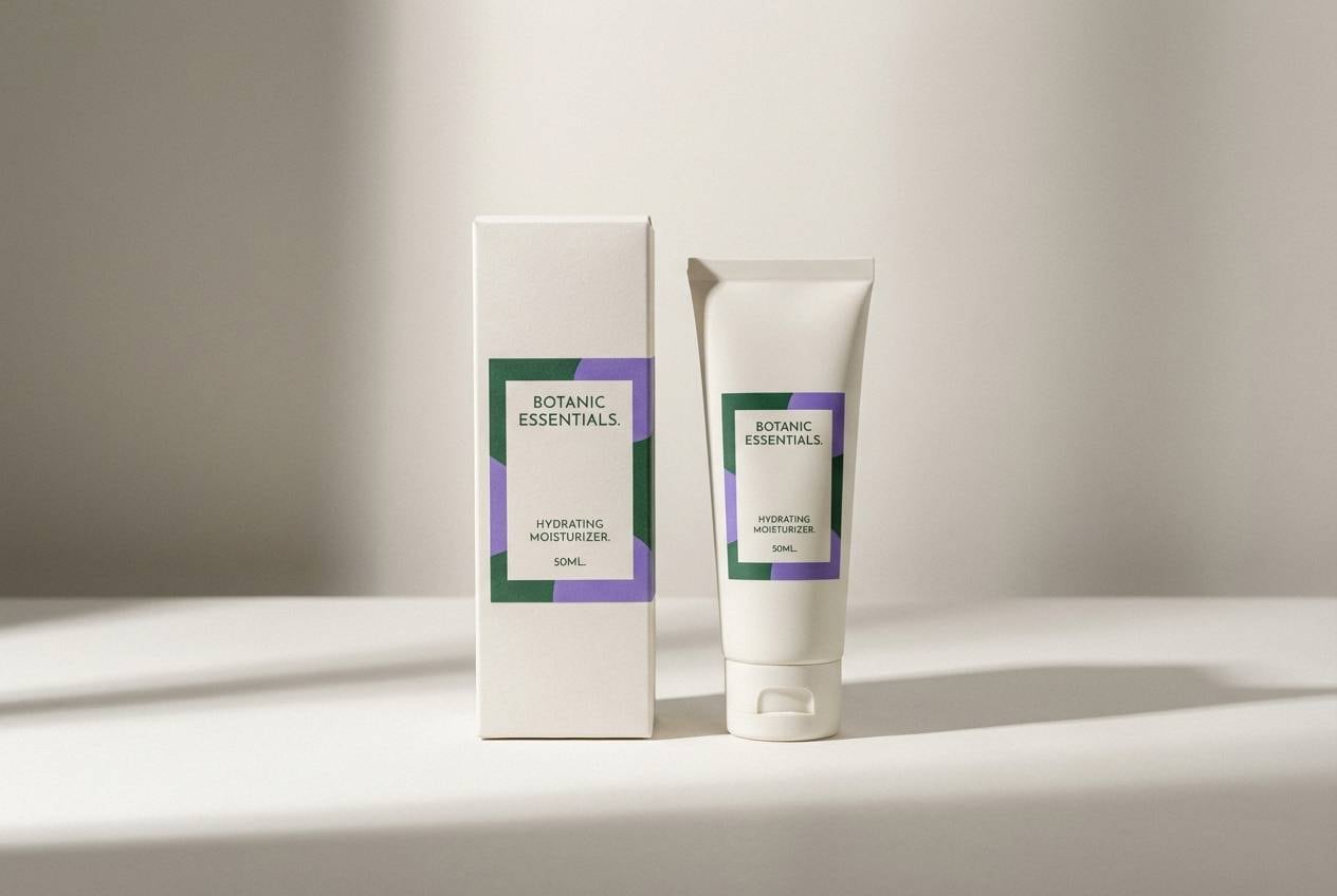
18) Stormy Bloom
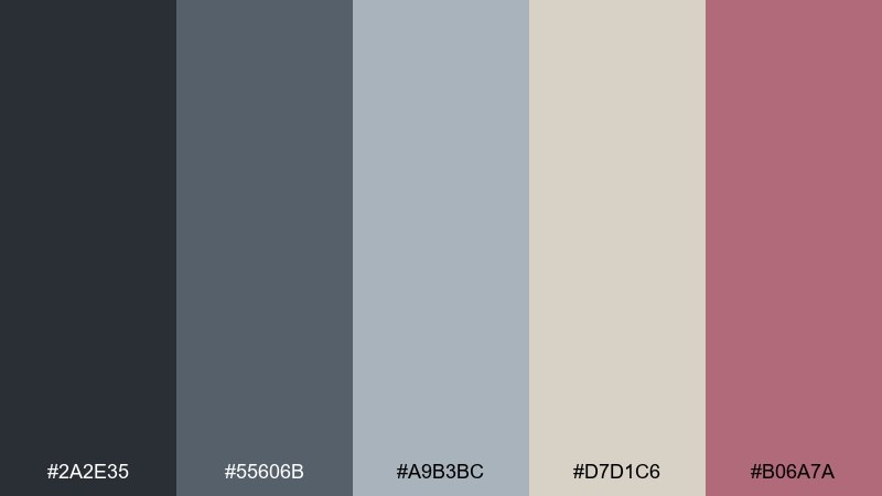
HEX: #2A2E35 #55606B #A9B3BC #D7D1C6 #B06A7A
Mood: romantic, modern, slightly dramatic
Best for: cosmetics packaging
Romantic and slightly dramatic, it feels like petals against a stormy sky. A rainy day color palette with a dusty rose accent is perfect for beauty packaging that wants softness without losing edge. Use the grays for the base label system, then let the rose carry shade names or seals. Tip: print the rose on a warm beige background to keep it sophisticated rather than sugary.
Image example of stormy bloom generated using media.io
19) Lighthouse After Rain
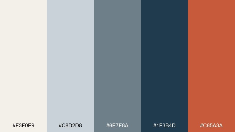
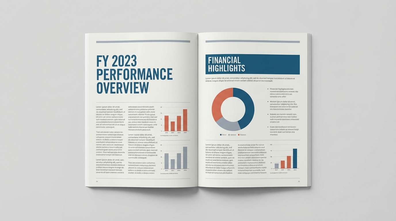
HEX: #F3F0E9 #C8D2D8 #6E7F8A #1F3B4D #C65A3A
Mood: nautical, hopeful, crisp
Best for: nonprofit annual report
Nautical and hopeful, it suggests a lighthouse beam cutting through lingering rain. Use the off-white for long reading comfort, then set headings in deep ocean blue for authority. The muted orange-red makes a strong accent for charts, callouts, and key metrics. Tip: keep the accent to one or two data series so graphs remain instantly readable.
Image example of lighthouse after rain generated using media.io
20) Night Bus Window
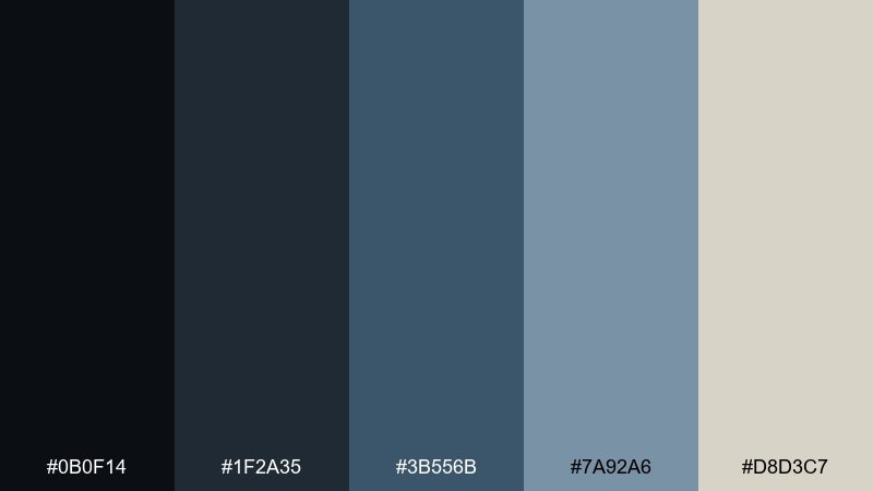
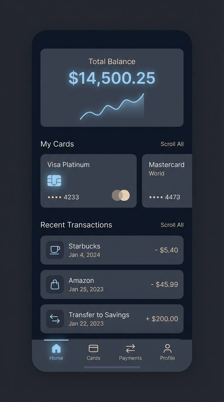
HEX: #0B0F14 #1F2A35 #3B556B #7A92A6 #D8D3C7
Mood: nocturnal, reflective, techy-calm
Best for: fintech app dark mode UI
Nocturnal and reflective, it feels like streetlights streaking across a bus window at night. Use near-black and deep blue as the foundation for dark mode, then lift surfaces with slate and misty blue for cards. The warm light neutral works well for highlights and friendly empty states. Tip: use the misty blue for focus rings to maintain accessibility without harsh neon.
Image example of night bus window generated using media.io
What Colors Go Well with Rainy Day?
Rainy day palettes pair best with other muted tones: soft whites, fog grays, slate blues, and desaturated greens. These keep your composition calm and readable, especially for UI and editorial design.
For contrast, add one warm accent like caramel, terracotta, dusty rose, or muted orange-red. Warm accents work especially well when the base is cool (blue-gray/charcoal), because they create focus without shouting.
If you want a more premium look, combine stormy neutrals with near-black plus an off-white (instead of pure white). That subtle warmth feels more tactile in print and more comfortable on screen.
How to Use a Rainy Day Color Palette in Real Designs
Start with a light “overcast” background (misty gray or warm off-white), then pick one mid-tone for structure (cards, sections, dividers) and one deep tone for text and navigation. This keeps hierarchy clear even when colors are subtle.
Use accents intentionally: reserve the brightest or warmest color for primary buttons, key metrics, or titles. In rainy day schemes, a small accent goes a long way, so you can keep the overall mood cohesive.
Finally, lean on texture and imagery. Grain, paper overlays, and monochrome photography make muted palettes feel rich—without needing extra saturation.
Create Rainy Day Palette Visuals with AI
If you want palette-matching mockups (posters, packaging, UI screens), generate them with AI using a consistent prompt style and your chosen rainy day HEX direction (misty, slate, charcoal, plus one warm highlight).
In Media.io, you can iterate quickly: adjust “dominant colors,” swap the accent (yellow vs terracotta), and keep the same layout prompt to compare options side by side.
Once you like the look, export the visuals for presentations, mood boards, or client approvals—then build your final design system around the winning palette.
Rainy Day Color Palette FAQs
-
What is a rainy day color palette?
A rainy day color palette is a set of muted, low-saturation tones inspired by overcast skies and wet surfaces—typically foggy grays, slate blues, charcoal neutrals, and one soft warm accent like taupe or terracotta. -
Are rainy day colors good for UI design?
Yes. Rainy day palettes are excellent for UI because they create clear hierarchy with grays and deep text colors, while staying easy on the eyes. Add one accent color for primary actions to maintain focus. -
How do I keep a rainy palette from looking dull?
Use contrast through value (light vs dark), not saturation. Add one warm accent, introduce subtle gradients between light neutrals, and apply texture (grain, paper, blur) to create depth. -
What accent colors work best with stormy neutrals?
Muted warm accents work best: caramel, terracotta, dusty rose, and muted orange-red. For a more energetic take, a mustard yellow accent can pop against cool grays. -
Can I use rainy day palettes for print branding?
Absolutely. These palettes translate well to print because they rely on stable neutrals and controlled accents. Off-white (instead of pure white) often looks more premium on paper. -
What’s the best background color in a rainy day scheme?
Choose a light misty gray or warm off-white for comfortable reading and flexible layering. Then use slate/charcoal for headings and UI components to keep contrast consistent. -
How can I generate rainy day themed visuals quickly?
Use an AI image generator and keep your prompt consistent (layout + subject + “dominant misty gray/slate/charcoal” + one warm accent). Media.io lets you iterate fast and export visuals for mood boards or design comps.


