

A green burgundy color palette pairs grounded, natural greens with rich wine reds, creating a look that’s both calming and premium. It’s a go-to for brands and spaces that want warmth without losing sophistication.
Below are 20+ curated green burgundy palette ideas with HEX codes, plus practical pairing tips for UI, print, and interiors.
In this article
- Why Green Burgundy Palettes Work So Well
-
- vineyard evergreen
- botanical velvet
- modern library
- autumn terrace
- garnet garden party
- heritage plaid
- espresso moss
- winter holly night
- clay and cabernet
- art deco conservatory
- soft fern merlot
- mountain lodge
- minimal ink and ivy
- rustic orchard
- regal theater
- sage wine spritz
- campus classic
- blooming burgundy
- deep canopy and rosewood
- quiet museum
- cedar and cranberry
- What Colors Go Well with Green Burgundy?
- How to Use a Green Burgundy Color Palette in Real Designs
- Create Green Burgundy Palette Visuals with AI
Why Green Burgundy Palettes Work So Well
Green brings steadiness and a natural calm, while burgundy adds depth, romance, and a sense of heritage. Together, they create contrast that feels mature rather than loud.
This pairing also performs well across materials: greens read earthy on matte papers and walls, while burgundy looks luxurious in foil, embossing, velvet textures, and glossy accents.
Because both hues can skew dark, adding warm neutrals (cream, beige, oat) keeps layouts readable and rooms breathable—without losing the “moody premium” vibe.
20+ Green Burgundy Color Palette Ideas (with HEX Codes)
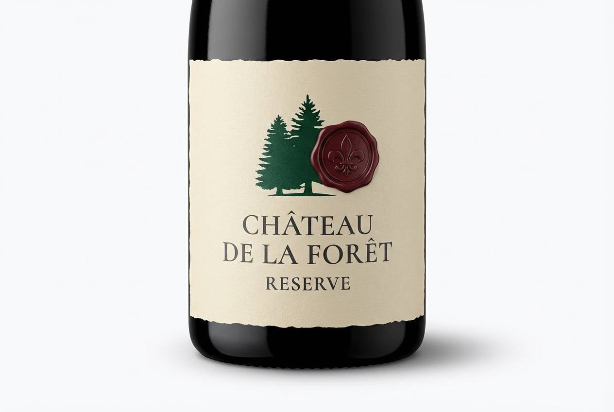
1) Vineyard Evergreen
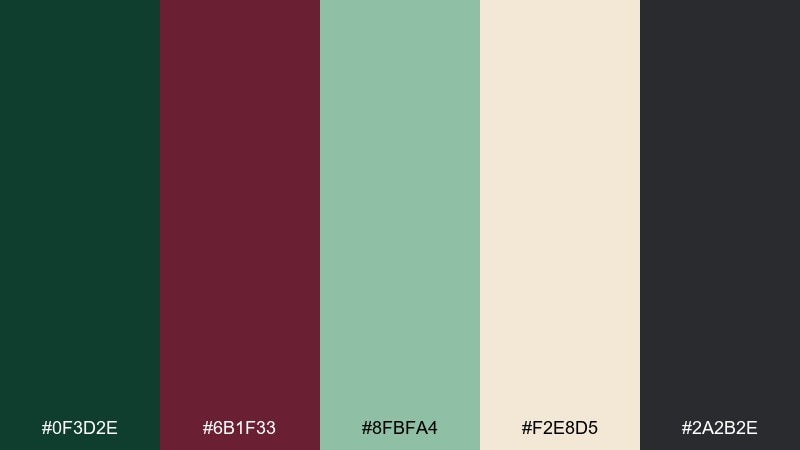
HEX: #0f3d2e #6b1f33 #8fbfa4 #f2e8d5 #2a2b2e
Mood: earthy, refined, premium
Best for: wine label branding
Earthy and refined, it feels like shaded vines, oak barrels, and a velvet tasting room. Use the deep green for backgrounds and the burgundy for seals, monograms, or a central mark. Cream keeps typography readable, while charcoal sharpens details like borders and barcodes. Tip: emboss the burgundy and keep the green matte for a luxe contrast.
Image example of vineyard evergreen generated using media.io
Media.io is an online AI studio for creating and editing video, image, and audio in your browser.

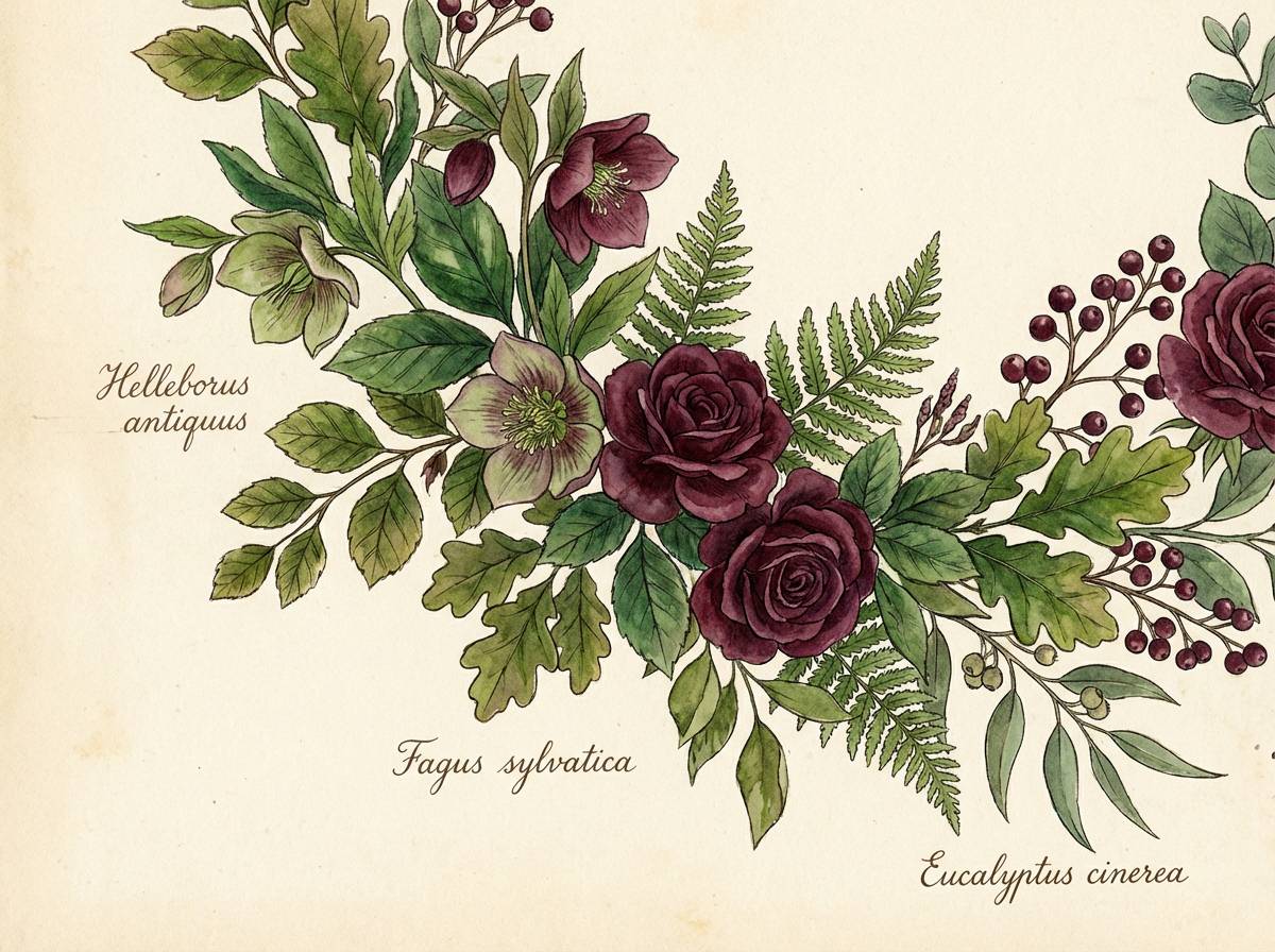
2) Botanical Velvet
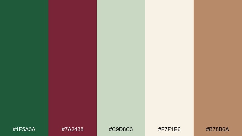
HEX: #1f5a3a #7a2438 #c9d8c3 #f7f1e6 #b78b6a
Mood: lush, romantic, handmade
Best for: botanical watercolor illustration
Lush and romantic, it evokes pressed leaves, velvet petals, and warm studio paper. The soft minty green works beautifully for foliage washes, while burgundy anchors florals and berries. Add cream as your paper base and bring in tan for stems or vintage labels. Tip: keep burgundy in small clusters so the greens stay airy and botanical.
Image example of botanical velvet generated using media.io
3) Modern Library
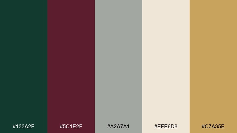
HEX: #133a2f #5c1e2f #a2a7a1 #efe6d8 #c7a35e
Mood: quiet, intellectual, modern
Best for: UI dashboard design
Quiet and intellectual, it brings to mind leather spines, green reading lamps, and brass details. For UI, treat the dark green as your main surface and reserve burgundy for alerts, toggles, or key metrics. The warm cream and soft gray keep tables and charts breathable, while gold can highlight badges. Tip: test contrast on burgundy buttons and keep label text in cream for clarity in this green burgundy color combinations set.
Image example of modern library generated using media.io

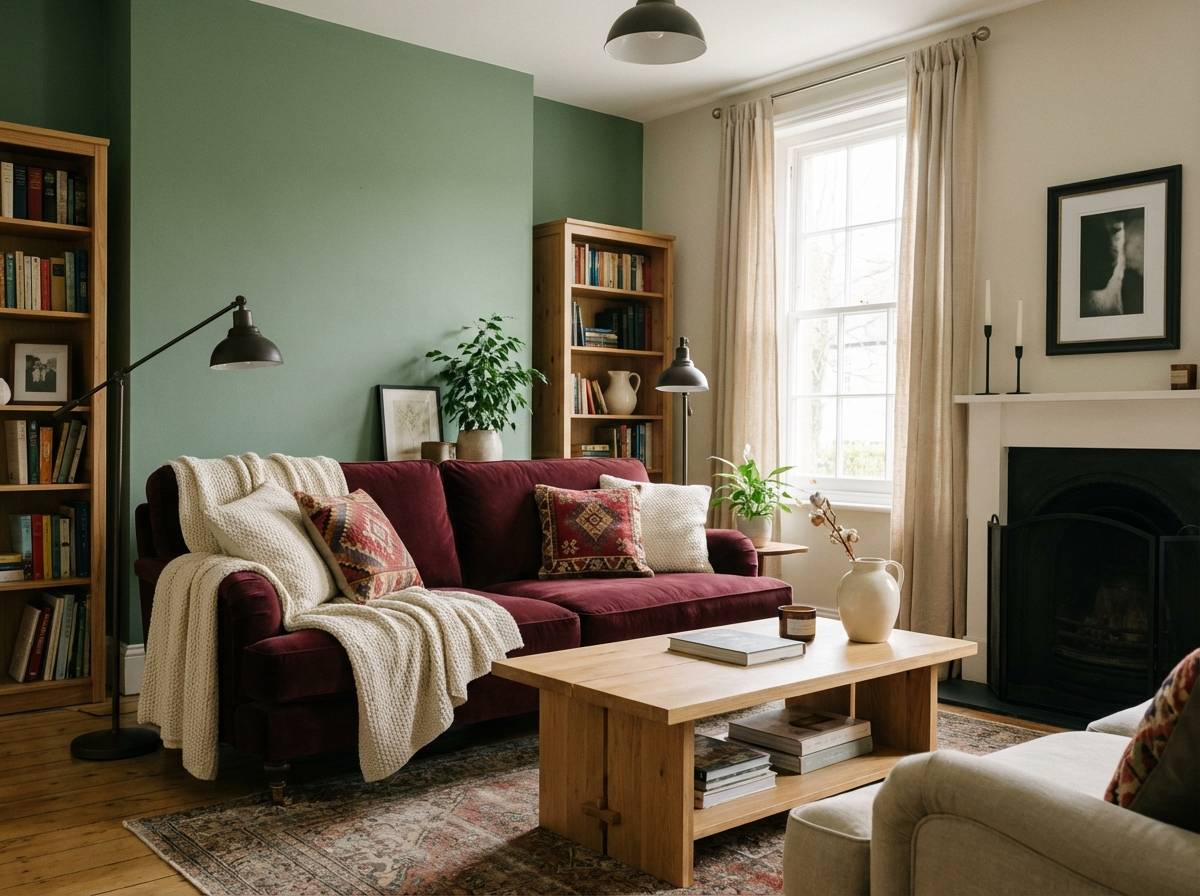
4) Autumn Terrace
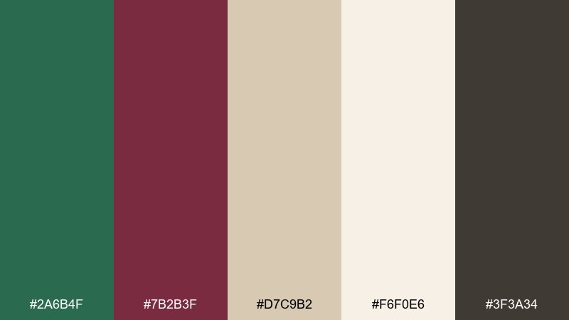
HEX: #2a6b4f #7b2b3f #d7c9b2 #f6f0e6 #3f3a34
Mood: cozy, seasonal, welcoming
Best for: living room interior styling
Cozy and seasonal, it feels like late-afternoon light on linen curtains and a glass of red by the window. Use the green on an accent wall or sofa, then pull burgundy in through cushions, throws, or artwork. Beige and cream make the room feel open, while the dark neutral grounds wood or metal finishes. Tip: repeat burgundy in two small spots rather than one big piece to keep the space balanced.
Image example of autumn terrace generated using media.io
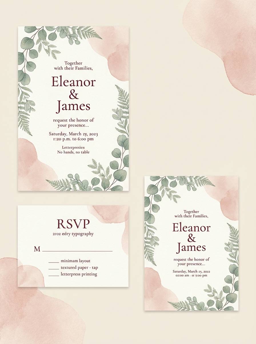
5) Garnet Garden Party
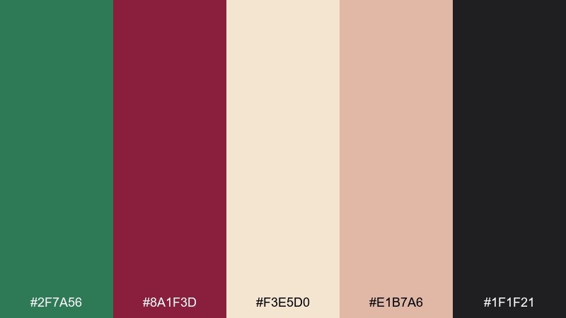
HEX: #2f7a56 #8a1f3d #f3e5d0 #e1b7a6 #1f1f21
Mood: festive, romantic, elegant
Best for: wedding invitation suite
Festive and romantic, it suggests candlelit greenery, garnet ribbons, and soft blush paper. Set the invitation on warm cream, then use burgundy for names and the main headline to create instant elegance. Green works best as foliage motifs or a thin border, while black adds crisp hierarchy. Tip: foil the burgundy and keep the green as a flat ink for a polished green burgundy color palette look.
Image example of garnet garden party generated using media.io
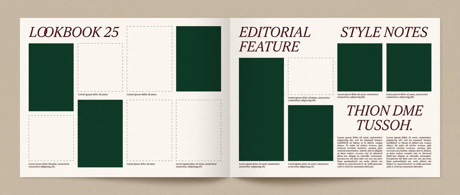
6) Heritage Plaid
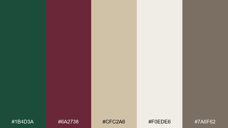
HEX: #1b4d3a #6a2738 #cfc2a6 #f0ede6 #7a6f62
Mood: classic, tailored, warm
Best for: fashion lookbook editorial
Classic and tailored, it recalls wool coats, vintage plaid, and old-world craftsmanship. Use the forest green as the dominant block color and bring burgundy in as headings or pull quotes. The oat and warm off-white are ideal for margins and negative space, keeping spreads calm and readable. Tip: keep photos slightly desaturated so the palette stays cohesive across pages.
Image example of heritage plaid generated using media.io
7) Espresso Moss
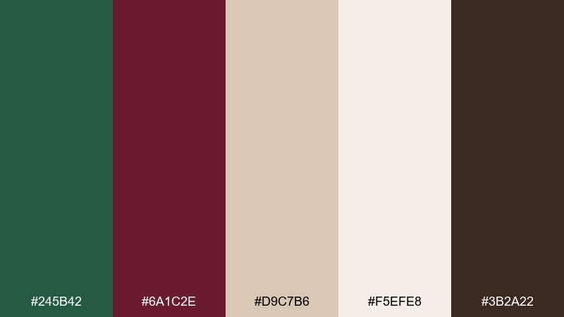
HEX: #245b42 #6a1c2e #d9c7b6 #f5efe8 #3b2a22
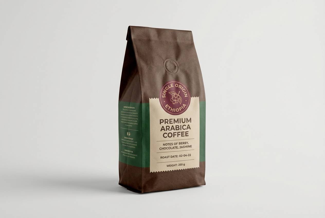
Mood: rich, cozy, artisanal
Best for: coffee packaging design
Rich and cozy, it feels like espresso crema, mossy stone, and dark cherry notes. Put the deep brown on the bag base, then use green for origin details and burgundy for roast level or a stamp-style badge. The light neutrals keep small text readable and help the colors feel handcrafted rather than heavy. Tip: limit glossy ink to the burgundy so the green reads earthy in this green burgundy color combination.
Image example of espresso moss generated using media.io
8) Winter Holly Night
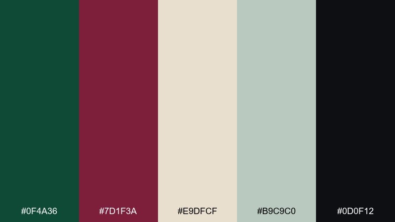
HEX: #0f4a36 #7d1f3a #e9dfcf #b9c9c0 #0d0f12
Mood: festive, moody, wintry
Best for: holiday greeting card design
Festive and moody, it brings in holly leaves, mulled wine, and a night sky outside frosted windows. Use the near-black for the background, then layer green foliage shapes with burgundy berries for depth. Cream and pale gray-green are perfect for lettering and subtle snow textures. Tip: add a thin cream outline around burgundy elements so they pop on dark backdrops.
Image example of winter holly night generated using media.io

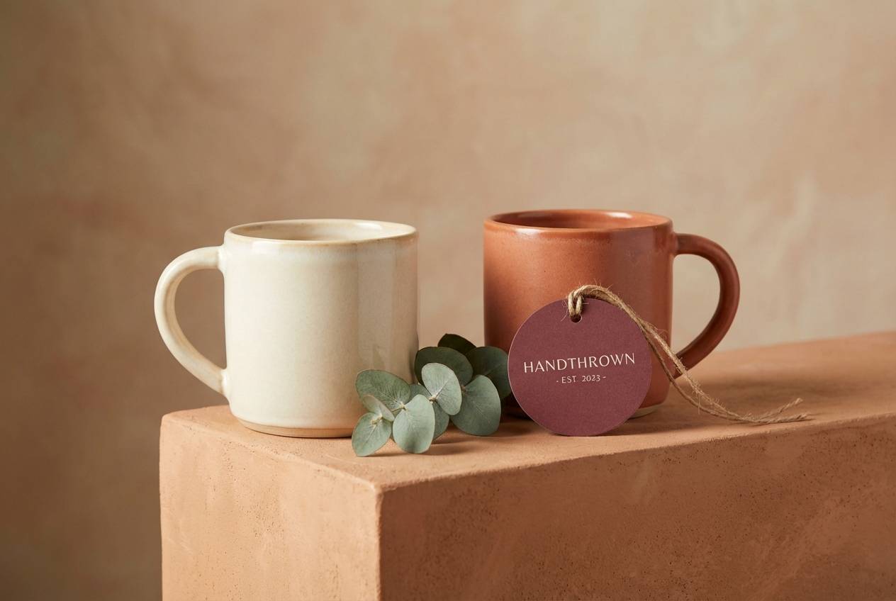
9) Clay and Cabernet
HEX: #2c6f55 #6f2236 #d7b8a6 #f4eadf #6a5b52
Mood: artisanal, warm, grounded
Best for: ceramics product ad
Artisanal and grounded, it suggests hand-thrown clay, vineyard evenings, and warm kiln tones. Use the blush clay shade for product backdrops and let burgundy act as the hero accent on labels or props. Green works well for small botanical styling or a brand mark, tying the set to nature. Tip: keep the gray-brown for text and shadows so the ad stays soft, not harsh.
Image example of clay and cabernet generated using media.io
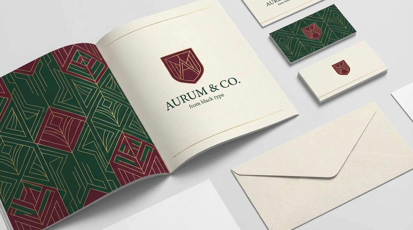
10) Art Deco Conservatory
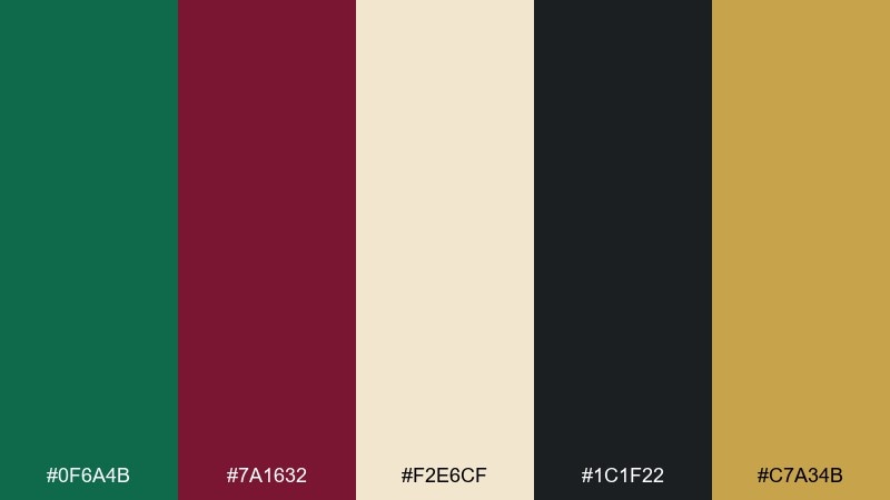
HEX: #0f6a4b #7a1632 #f2e6cf #1c1f22 #c7a34b
Mood: glamorous, structured, bold
Best for: brand identity system
Glamorous and structured, it feels like a conservatory with geometric railings and gilded trims. Use black and green as the foundation, then bring burgundy in for signature marks or premium product tiers. Cream keeps the system approachable, while gold can serve as the sparkle for lines, icons, or separators. Tip: apply one gold accent per layout to keep these green burgundy color combinations looking intentional, not busy.
Image example of art deco conservatory generated using media.io
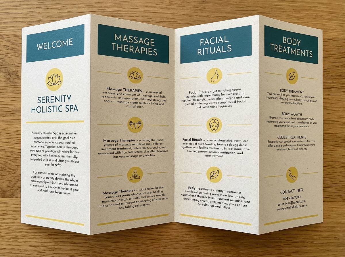
11) Soft Fern Merlot
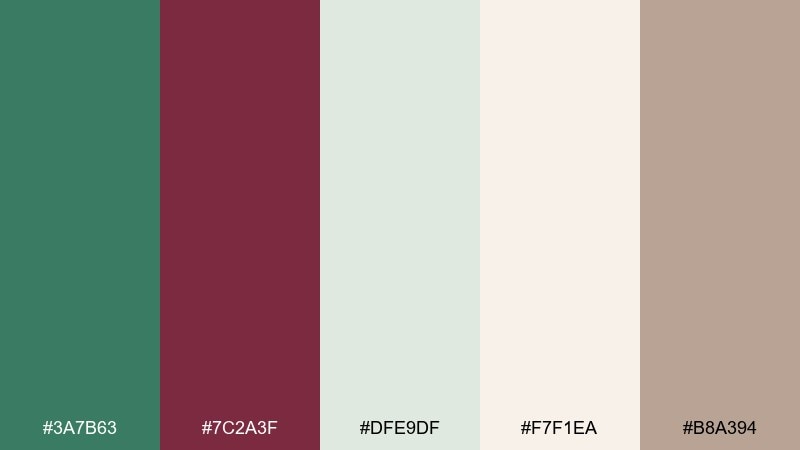
HEX: #3a7b63 #7c2a3f #dfe9df #f7f1ea #b8a394
Mood: calming, airy, gentle
Best for: spa brochure design
Calming and airy, it evokes fern fronds, rosewood oil, and quiet morning light. Use the pale greens for large fields and whitespace, then add merlot as a restrained accent for section headers. Cream and warm taupe keep the layout soft and premium without turning sugary. Tip: keep merlot at under 10 percent coverage for a serene, wellness-first feel.
Image example of soft fern merlot generated using media.io
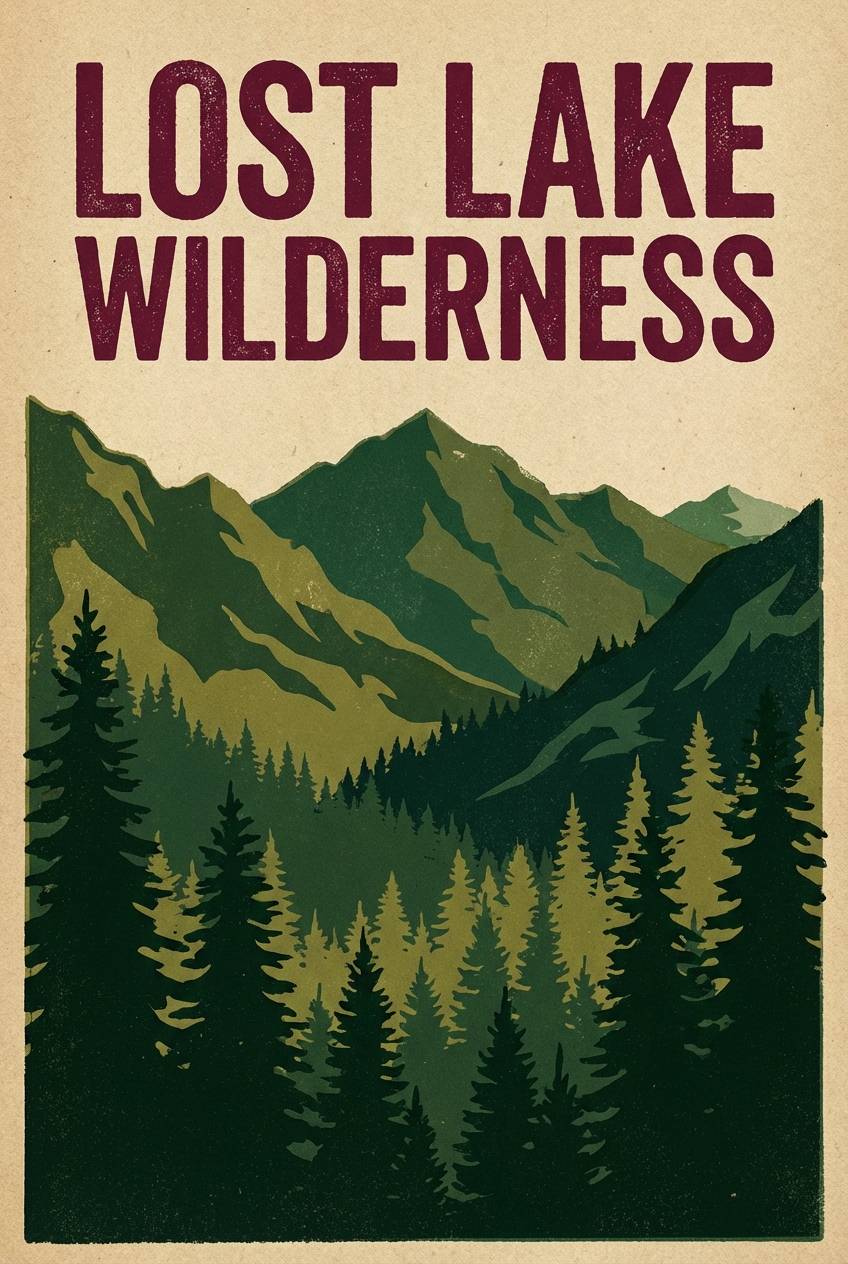
12) Mountain Lodge
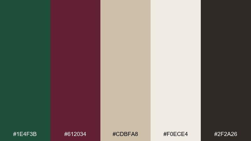
HEX: #1e4f3b #612034 #cdbfa8 #f0ece4 #2f2a26
Mood: rugged, cozy, outdoorsy
Best for: travel poster design
Rugged and cozy, it recalls pine forests, wool blankets, and a crackling fireplace after a hike. Use green for the landscape illustration and burgundy for the title treatment to create a vintage travel vibe. The warm neutrals work as the poster stock and help the dark tones feel inviting. Tip: add subtle grain and keep outlines in near-black so the artwork stays crisp from a distance.
Image example of mountain lodge generated using media.io
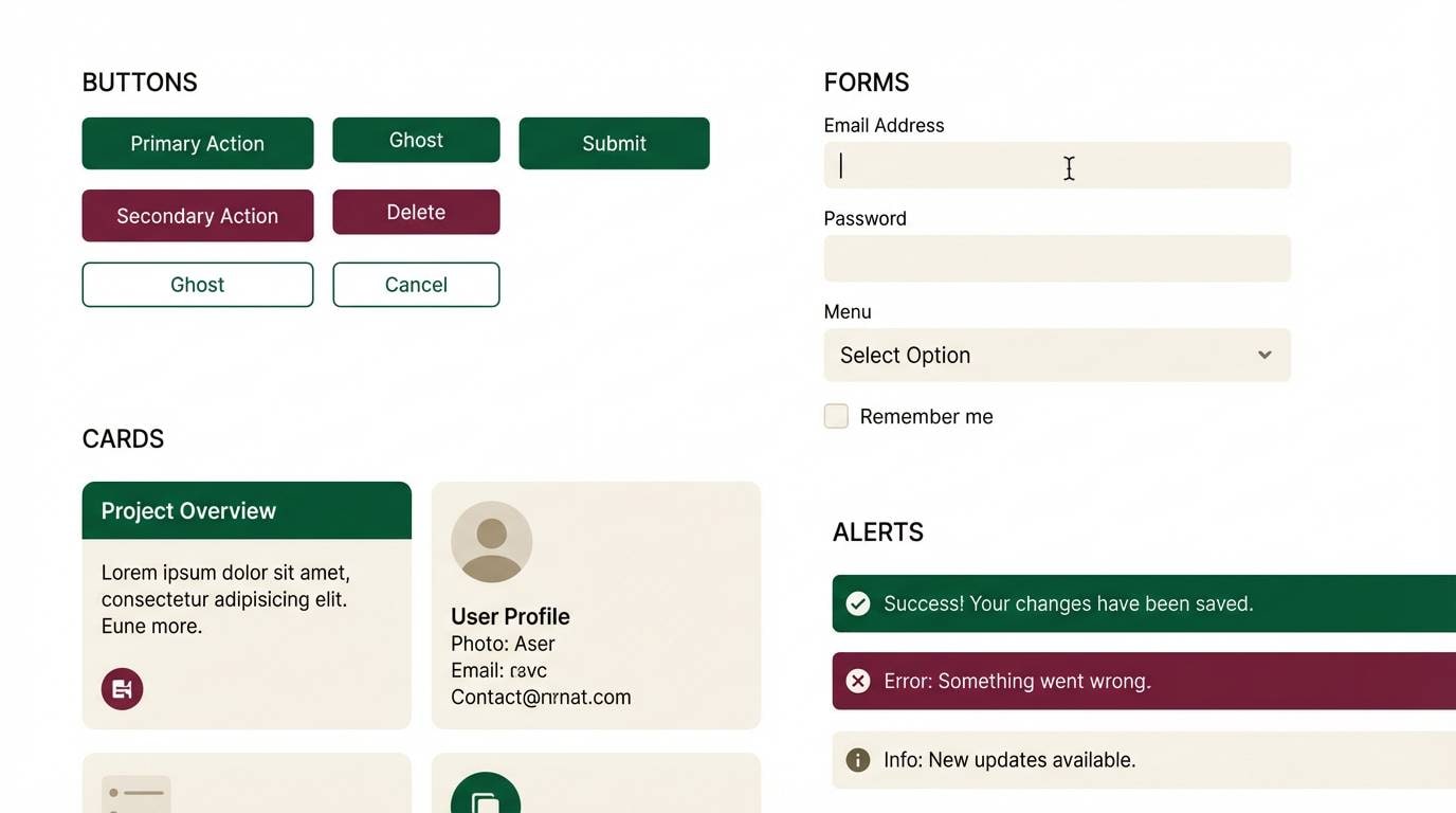
13) Minimal Ink and Ivy
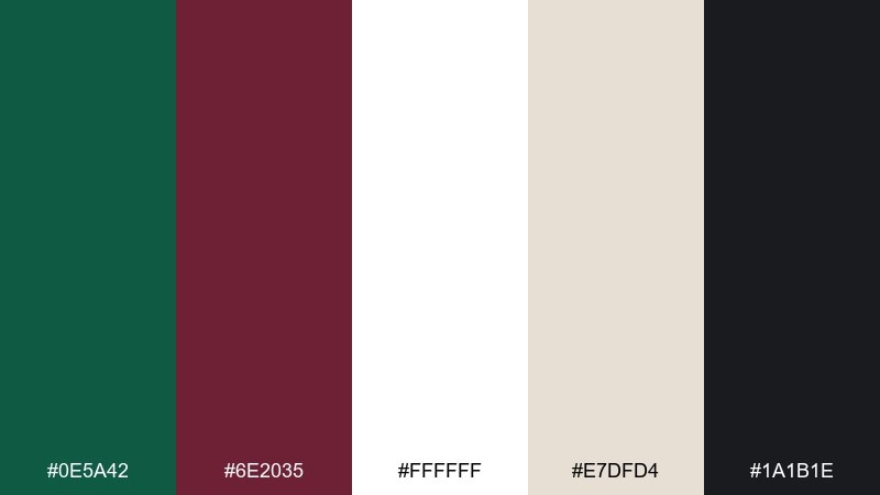
HEX: #0e5a42 #6e2035 #ffffff #e7dfd4 #1a1b1e
Mood: clean, confident, contemporary
Best for: SaaS UI kit
Clean and confident, it feels like crisp white space with ivy creeping along sharp typography. Use white as the main canvas, then bring in green for primary actions and burgundy for secondary states like warnings or selected tabs. The warm off-white keeps panels from feeling sterile, while near-black handles body text and icons. Tip: define a consistent rule for button states so the green burgundy color scheme stays predictable across the kit.
Image example of minimal ink and ivy generated using media.io
14) Rustic Orchard
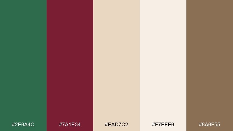
HEX: #2e6a4c #7a1e34 #ead7c2 #f7efe6 #8a6f55
Mood: wholesome, rustic, friendly
Best for: farmers market flyer
Wholesome and rustic, it brings to mind apple crates, handwritten signage, and crisp air. Use the beige as the flyer base, then add green for headers and section dividers. Burgundy works nicely for price circles or featured produce callouts without feeling aggressive. Tip: pair it with a condensed serif for headlines and a simple sans for details to keep everything readable.
Image example of rustic orchard generated using media.io
15) Regal Theater
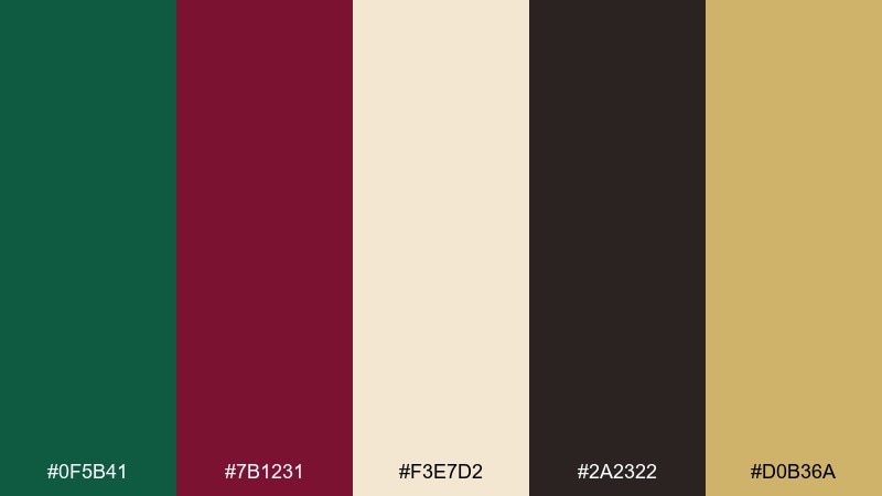
HEX: #0f5b41 #7b1231 #f3e7d2 #2a2322 #d0b36a
Mood: dramatic, elegant, grand
Best for: gala event poster
Dramatic and grand, it feels like velvet curtains, stage lights, and gold program details. Set a dark green field as the backdrop and let burgundy carry the headline for high contrast. Cream and gold create a premium hierarchy for dates and venue details, while deep brown-black keeps small type sharp. Tip: use gold sparingly as a line or icon so the green burgundy color palette reads elegant, not ornate.
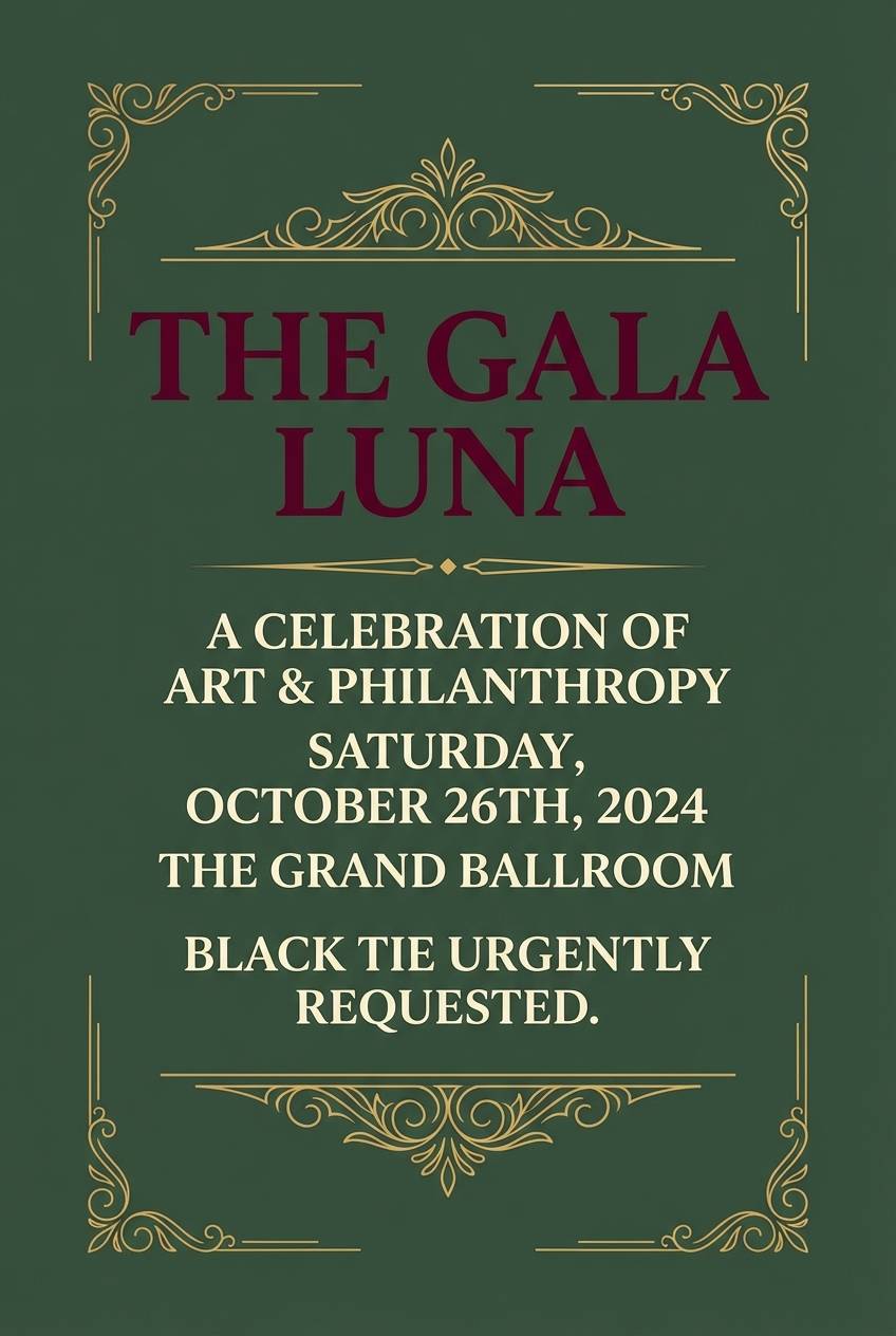
Image example of regal theater generated using media.io
16) Sage Wine Spritz
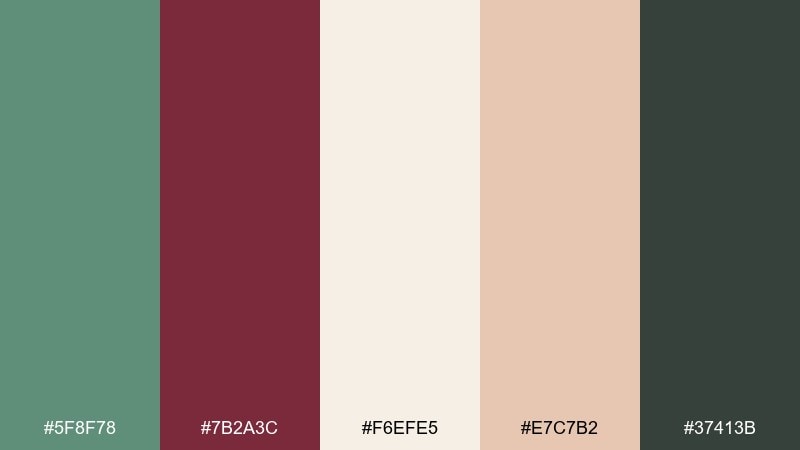
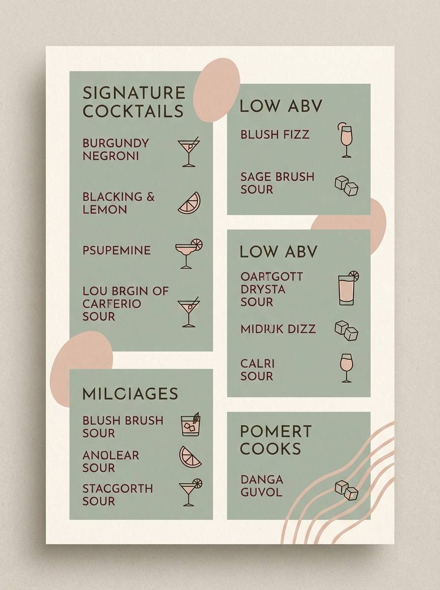
HEX: #5f8f78 #7b2a3c #f6efe5 #e7c7b2 #37413b
Mood: fresh, social, stylish
Best for: cocktail menu design
Fresh and social, it feels like a breezy patio with herb garnish and a ruby spritz in hand. Use the soft sage for menu sections and the burgundy for drink names or featured specials. Cream keeps the page light, while blush adds warmth for illustrations or tasting notes. Tip: use a dark gray-green for prices so the burgundy stays reserved for highlights.
Image example of sage wine spritz generated using media.io
17) Campus Classic
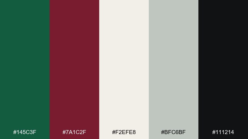
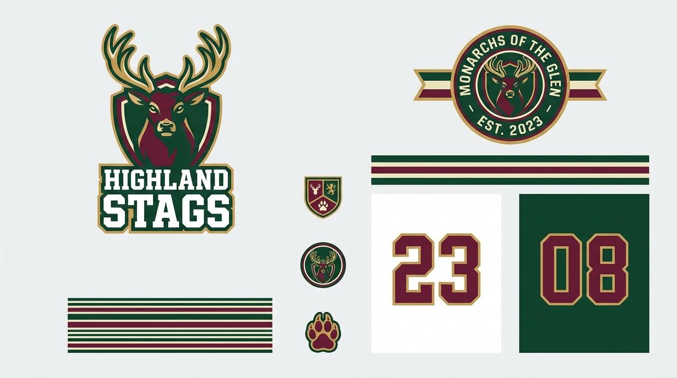
HEX: #145c3f #7a1c2f #f2efe8 #bfc6bf #111214
Mood: bold, spirited, traditional
Best for: sports team branding
Bold and spirited, it suggests pennants, marching bands, and crisp varsity jackets. Use the green as the primary jersey color and burgundy as the secondary stripe or number outline for punch. Light neutrals help with merch and web uses, while near-black is ideal for lockups and embroidery. Tip: set clear rules for when burgundy replaces black so marks stay consistent across gear.
Image example of campus classic generated using media.io
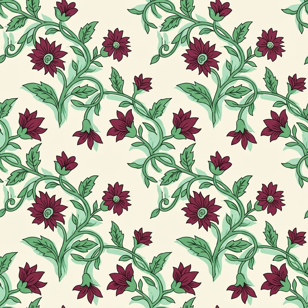
18) Blooming Burgundy
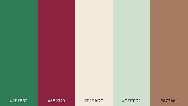
HEX: #2f7b57 #8b2340 #f4eadc #cfe0d1 #a77a61
Mood: floral, charming, decorative
Best for: textile pattern design
Floral and charming, it brings to mind cottage blooms, leaf vines, and sun-warmed fabric. Use the cream as the ground, then build repeating green stems with burgundy blossoms for a classic motif. Soft mint helps add depth without overcomplicating the pattern, and tan keeps it earthy. Tip: scale your burgundy flowers slightly larger than the green leaves so the pattern reads clearly from afar.
Image example of blooming burgundy generated using media.io
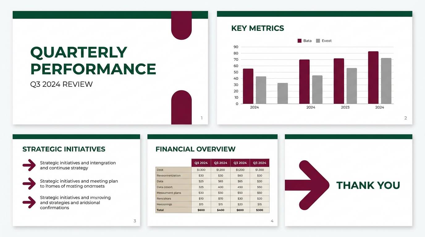
19) Deep Canopy and Rosewood
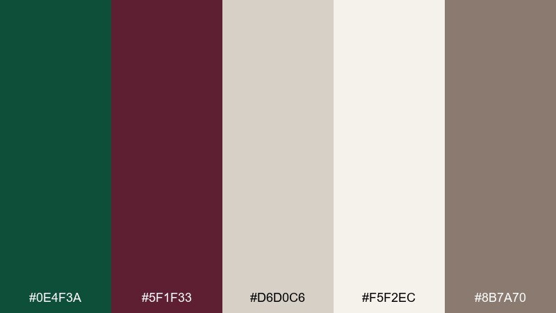
HEX: #0e4f3a #5f1f33 #d6d0c6 #f5f2ec #8b7a70
Mood: moody, modern, understated
Best for: presentation deck template
Moody and understated, it feels like a forest canopy with polished rosewood furniture. Use the deep green for section dividers and title slides, then add burgundy for key takeaways and small chart highlights. The light neutrals keep slides readable in bright rooms, and warm gray supports secondary text. Tip: keep charts mostly neutral and use burgundy only for the one data series you want remembered.
Image example of deep canopy and rosewood generated using media.io
20) Quiet Museum
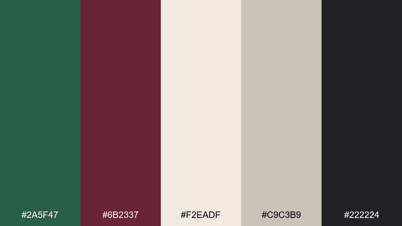
HEX: #2a5f47 #6b2337 #f2eadf #c9c3b9 #222224
Mood: curated, calm, sophisticated
Best for: magazine layout design
Curated and calm, it feels like gallery walls, framed prints, and quiet footsteps on stone. Use cream as the page base, then anchor your grid with dark green section labels and burgundy for standout quotes. Warm gray is perfect for captions and rules, while near-black carries body copy with comfortable contrast. Tip: keep color blocks small and let typography do most of the work for a museum-like finish.
Image example of quiet museum generated using media.io
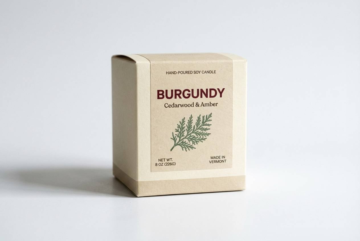
21) Cedar and Cranberry
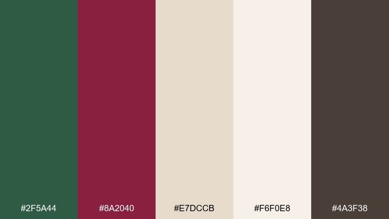
HEX: #2f5a44 #8a2040 #e7dccb #f6f0e8 #4a3f38
Mood: warm, rustic, nostalgic
Best for: candle packaging design
Warm and nostalgic, it evokes cedar shelves, cranberry preserves, and soft amber light. Use the cedar green for the outer box and burgundy for scent names or wax seal graphics. Cream and beige help the design feel giftable, while the dark brown anchors ingredient lists and barcodes. Tip: add a tiny burgundy pattern band so the box looks premium without becoming loud.
Image example of cedar and cranberry generated using media.io
What Colors Go Well with Green Burgundy?
Warm neutrals are the easiest win: cream, off-white, oat, beige, and warm gray keep green and burgundy from feeling too heavy. They also improve readability in web and print when both main hues are deep.
For a more premium look, add metallic gold or brass tones sparingly (lines, icons, badges). Charcoal or near-black is great for typography and structure, especially in dashboards and editorial layouts.
If you want a softer, more romantic direction, introduce blush or clay tones. They bridge the gap between forest/olive greens and wine/burgundy reds without competing for attention.
How to Use a Green Burgundy Color Palette in Real Designs
Start with a clear hierarchy: let green be the “environment” color (backgrounds, large blocks, walls) and burgundy be the “signal” color (headlines, stamps, highlights). This prevents the palette from turning muddy.
Balance saturation with texture and finish. Matte greens feel natural and stable, while burgundy becomes a standout when used in glossy ink, foil, velvet-like gradients, or small accent shapes.
For digital UI, check contrast early—burgundy buttons can fail accessibility if paired with dark text. Cream/white labels often read best, while charcoal works for body copy on light neutrals.
Create Green Burgundy Palette Visuals with AI
If you want to preview a green burgundy color scheme on real use cases—labels, posters, invitations, UI, or interiors—AI mockups help you validate mood and contrast before committing to production.
With Media.io’s text-to-image tool, you can paste a prompt, specify your style (vector, studio photo, watercolor), and generate multiple palette-ready concepts in minutes.
Green Burgundy Color Palette FAQs
-
What does a green burgundy color palette communicate?
It typically signals grounded luxury—green adds calm and nature, while burgundy adds richness, tradition, and romance. Together, they often feel premium, cozy, and slightly moody. -
Is forest green and burgundy a good combination for branding?
Yes. Forest green can serve as a stable primary brand color, and burgundy works well as a distinctive accent for seals, highlights, product tiers, or premium variations of a logo system. -
What neutral colors pair best with green and burgundy?
Cream, warm off-white, beige, oat, and warm gray are the safest neutrals. They keep layouts light and readable while letting the deep hues feel intentional rather than heavy. -
How do I keep green burgundy designs from looking too dark?
Increase the amount of light neutral space, reduce burgundy coverage, and use charcoal for text instead of pure black on dark backgrounds. You can also choose softer greens (sage/fern) for large areas. -
What accent colors can I add to a green burgundy palette?
Gold/brass adds a premium edge, blush/clay adds softness, and muted mint or pale gray-green adds air. Use accents in small doses so they don’t compete with burgundy’s visual weight. -
Is a green burgundy palette suitable for UI design?
Yes, especially for dashboards and editorial-style interfaces. Use green for primary actions and surfaces, burgundy for alerts or highlights, and test contrast to ensure button and text accessibility. -
Which season does green and burgundy fit best?
It’s most associated with autumn and winter (harvest, wine, holly, velvet tones), but it can work year-round when balanced with airy neutrals and lighter greens.
Next: Beige Blue Color Palette


