

Pine green is a deep, evergreen shade that instantly signals nature, stability, and premium craft. It can feel rustic and cozy, sleek and modern, or bright and energetic depending on your accents.
Below are pine green color palette ideas with HEX codes you can use for branding, UI, print, packaging, and event design—plus AI prompts to generate matching visuals in Media.io.
In this article
- Why Pine Green Palettes Work So Well
-
- forest cabin
- alpine mist
- moss and clay
- northern lights poster
- citrus trail accents
- heritage label
- minimal ui dark pine
- botanical watercolor study
- spa serenity
- autumn market
- emerald ink editorial
- coastal pine
- stone fireplace interior
- tech startup gradient
- vintage travel badge
- winter wedding stationery
- berry grove contrast
- artisan soap packaging
- classroom chalkboard
- gallery wall neutrals
- What Colors Go Well with Pine Green?
- How to Use a Pine Green Color Palette in Real Designs
- Create Pine Green Palette Visuals with AI
Why Pine Green Palettes Work So Well
Pine green sits in the “trust + nature” sweet spot: it feels grounded like a forest tone, yet refined enough for premium branding. That dual personality makes it versatile across outdoorsy, wellness, artisan, and tech aesthetics.
Because it’s naturally darker, pine green also creates strong hierarchy—great for headers, logos, and UI navigation. Pair it with soft off-whites for readability, or introduce a bright accent to make CTAs pop.
In print, pine green reads rich and intentional on uncoated stocks, kraft textures, and creamy papers. It’s an easy way to make designs feel tactile and elevated without relying on heavy visuals.
20+ Pine Green Color Palette Ideas (with HEX Codes)
1) Forest Cabin
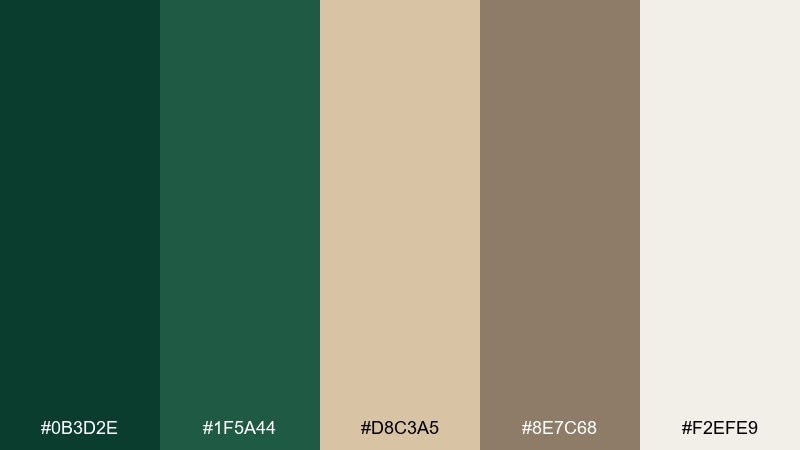
HEX: #0B3D2E #1F5A44 #D8C3A5 #8E7C68 #F2EFE9
Mood: earthy, cozy, grounded
Best for: cabin rentals, outdoor brands, rustic logos
Earthy and cozy, like cedar walls and a pine-lined trail after rain. The deep green anchors the look, while warm tans and soft off-white keep it welcoming instead of heavy. Use it for hospitality branding, coffee packaging, or a rustic web header, and pair with textured paper or woodgrain patterns. Tip: reserve the darkest green for headings and marks to keep contrast crisp.
Image example of forest cabin generated using media.io
Media.io is an online AI studio for creating and editing video, image, and audio in your browser.

2) Alpine Mist
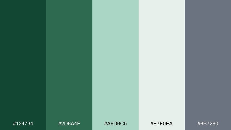
HEX: #124734 #2D6A4F #A9D6C5 #E7F0EA #6B7280
Mood: fresh, airy, calm
Best for: wellness apps, clean websites, minimalist packaging
Fresh and airy, like fog drifting across a mountain ridge. Soft minty tones lighten the deep green so screens feel calm and breathable. It works beautifully in wellness UI, skincare labels, and modern landing pages paired with light gray typography. Tip: use the pale green as a background wash and keep buttons in the mid green for clarity.
Image example of alpine mist generated using media.io
3) Moss and Clay
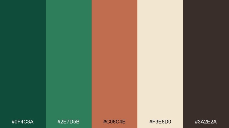
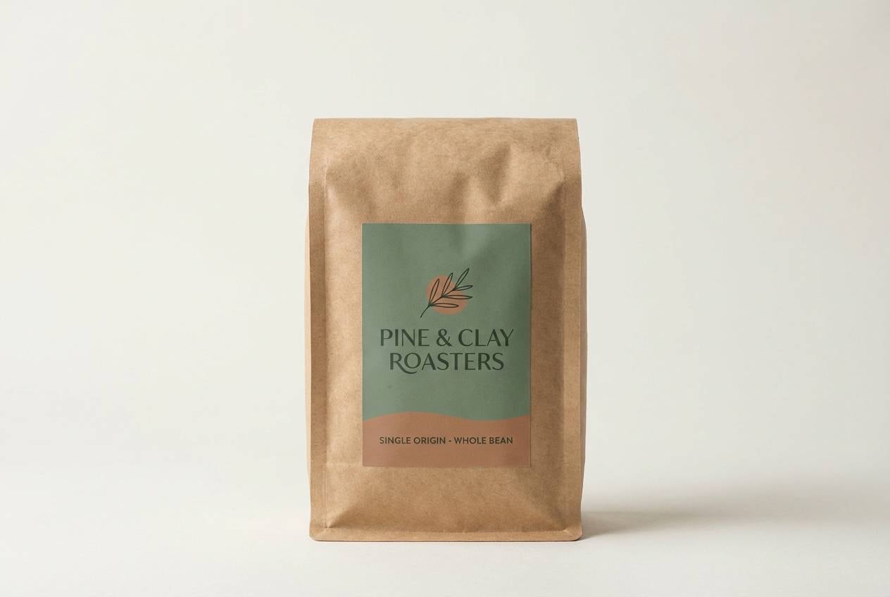
HEX: #0F4C3A #2E7D5B #C06C4E #F3E6D0 #3A2E2A
Mood: artisan, earthy, tactile
Best for: craft coffee, ceramics studios, handmade goods
Artisan and tactile, like moss on stone and sun-baked clay pots. These tones create a pine green color palette that feels handmade, not corporate, thanks to the clay accent and soft cream. Use it for craft packaging, pottery branding, or a cozy ecommerce shop, and pair with serif headlines and natural textures. Tip: keep the clay as a small highlight so the greens stay dominant.
Image example of moss and clay generated using media.io
4) Northern Lights Poster
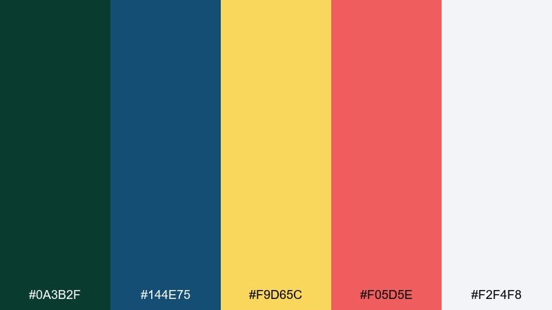
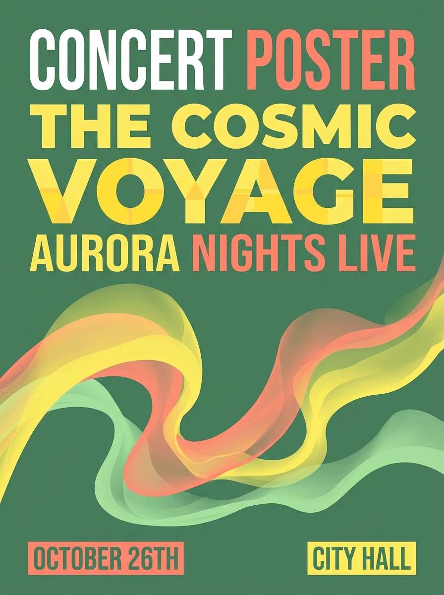
HEX: #0A3B2F #144E75 #F9D65C #F05D5E #F2F4F8
Mood: bold, playful, high-contrast
Best for: event posters, music flyers, social graphics
Bold and electric, like aurora streaks cutting through a dark sky. The cool blue deepens the green, while yellow and coral add instant energy for headlines and callouts. It shines on posters, festival flyers, and announcement tiles when paired with chunky sans-serif type. Tip: let the off-white breathe around the brights so the layout stays readable.
Image example of northern lights poster generated using media.io
5) Citrus Trail Accents
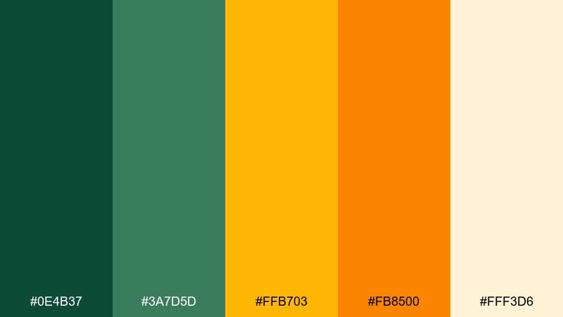
HEX: #0E4B37 #3A7D5D #FFB703 #FB8500 #FFF3D6
Mood: optimistic, sporty, sunny
Best for: outdoor promos, fitness campaigns, seasonal banners
Optimistic and sporty, like sunrise on a trailhead with a bright energy bar in hand. These pine green color combinations pop because the citrus tones are warm and punchy against steady greens. Use them for outdoor promos, fitness banners, or seasonal hero sections, and pair with clean icons and strong contrast type. Tip: choose one orange as your primary accent and keep the other for hover states or badges.
Image example of citrus trail accents generated using media.io

6) Heritage Label
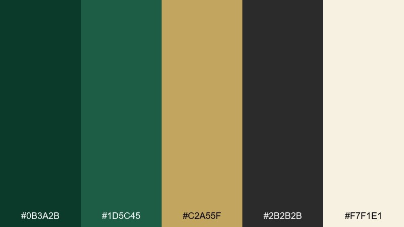
HEX: #0B3A2B #1D5C45 #C2A55F #2B2B2B #F7F1E1
Mood: classic, premium, traditional
Best for: spirits labels, gourmet foods, vintage branding
Classic and premium, like an old apothecary label with gold foil details. The muted gold adds heritage warmth, while near-black gives the design weight for stamps and borders. It suits spirits labels, specialty foods, and boutique branding when paired with engraved-style type or fine linework. Tip: use the cream as the label base to make the green and gold feel elevated.
Image example of heritage label generated using media.io
7) Minimal UI Dark Pine
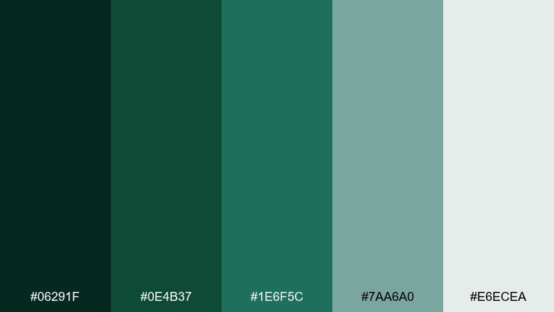
HEX: #06291F #0E4B37 #1E6F5C #7AA6A0 #E6ECEA
Mood: sleek, modern, focused
Best for: dashboards, finance apps, dark mode interfaces
Sleek and focused, like a night-mode workspace lit by a soft desk lamp. The near-black green gives depth without going fully gray, while the muted teal keeps charts and toggles legible. It works best for dashboards, finance apps, and productivity tools paired with plenty of spacing and clear hierarchy. Tip: keep body text on the light gray and use the mid greens only for key states.
Image example of minimal ui dark pine generated using media.io
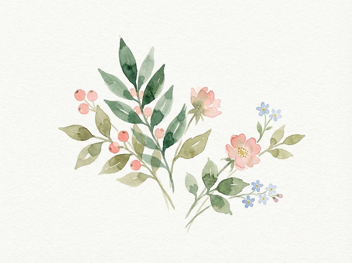
8) Botanical Watercolor Study
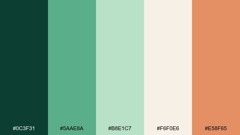
HEX: #0C3F31 #5AAE8A #B8E1C7 #F6F0E6 #E58F65
Mood: soft, natural, painterly
Best for: botanical prints, spring invites, eco blogs
Soft and painterly, like pressed leaves painted with a gentle wash. The creamy paper tone keeps the greens delicate, while the muted coral adds a floral hint without turning sugary. Use it for botanical prints, spring invitations, or eco-focused blog visuals paired with hand-drawn line art. Tip: apply the coral sparingly in small blooms or section dividers to avoid overpowering the greens.
Image example of botanical watercolor study generated using media.io
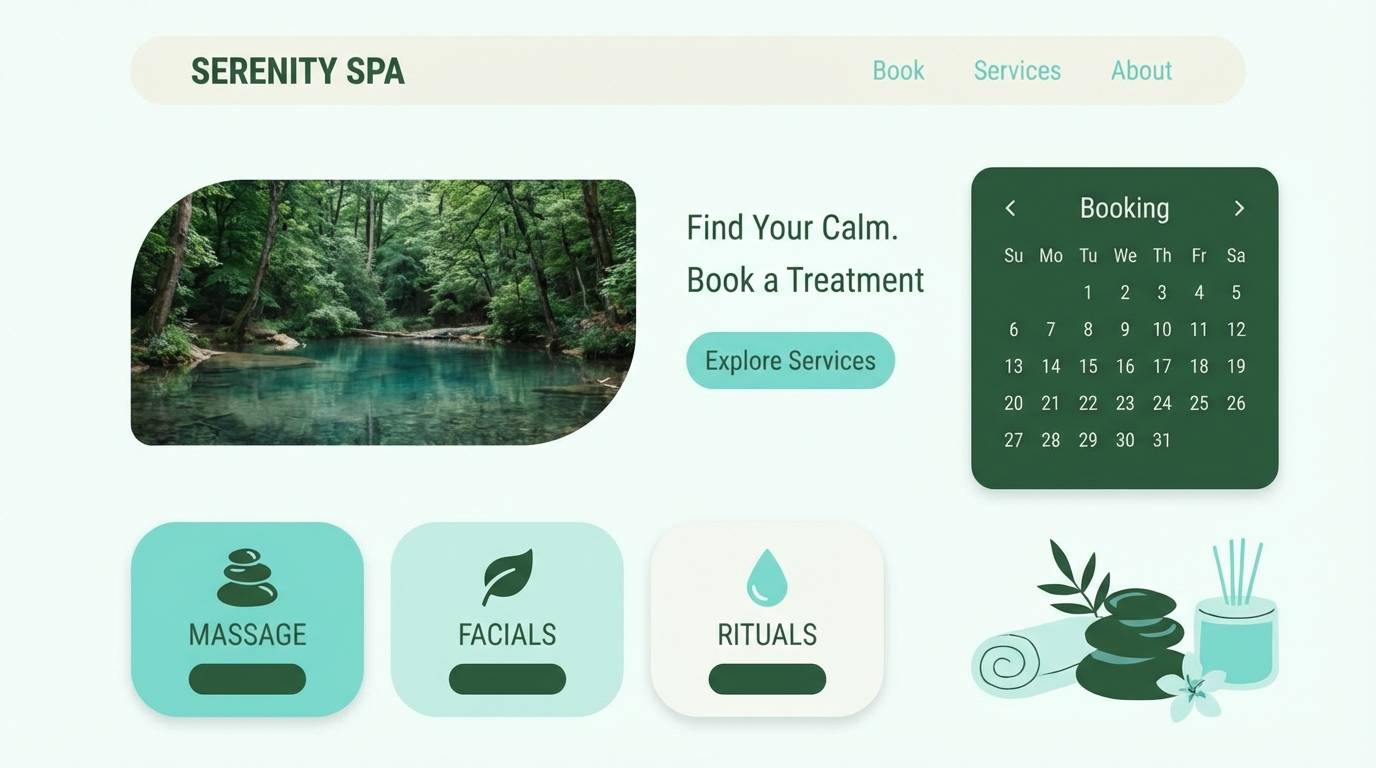
9) Spa Serenity
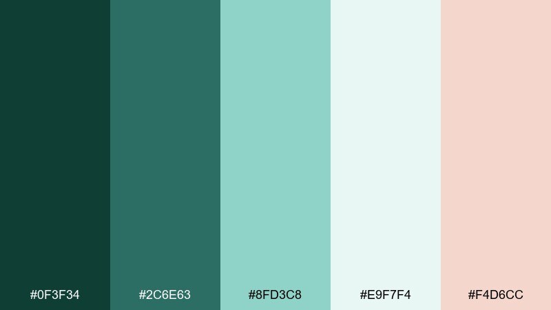
HEX: #0F3F34 #2C6E63 #8FD3C8 #E9F7F4 #F4D6CC
Mood: soothing, clean, gentle
Best for: spa menus, meditation apps, skincare UI
Soothing and clean, like warm steam and eucalyptus in a quiet room. The aqua tints make the greens feel lighter, and the blush tone adds a human touch for highlights. It fits spa menus, meditation apps, and skincare UI paired with rounded components and soft shadows. Tip: use the blush only for success or feature moments so the interface stays tranquil.
Image example of spa serenity generated using media.io
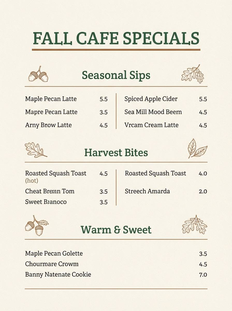
10) Autumn Market
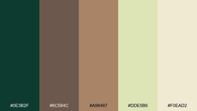
HEX: #0E3B2F #6C584C #A98467 #DDE5B6 #F0EAD2
Mood: harvest, warm, nostalgic
Best for: farmers market branding, fall menus, food photography overlays
Harvest-warm and nostalgic, like kraft paper bags and late-season produce. Brown and tan give the greens a wholesome, homemade feel that works beautifully for food storytelling. Use it for farmers market branding, fall menus, or recipe cards, and pair with handwritten accents or slab serifs. Tip: keep the pale green for backgrounds so the darker tones read as appetizing rather than heavy.
Image example of autumn market generated using media.io
11) Emerald Ink Editorial
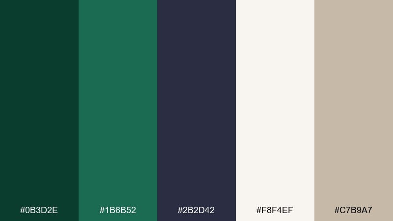
HEX: #0B3D2E #1B6B52 #2B2D42 #F8F4EF #C7B9A7
Mood: editorial, refined, moody
Best for: magazines, lookbooks, premium blog layouts
Refined and moody, like dark ink on textured paper in a quiet studio. This pine green color palette pairs deep greens with inky navy and soft cream for a confident editorial rhythm. Use it for magazine spreads, lookbooks, and premium blog layouts, and pair with elegant serif titles plus generous margins. Tip: set long reads on the cream background and keep the darkest tones for pull quotes and rules.
Image example of emerald ink editorial generated using media.io
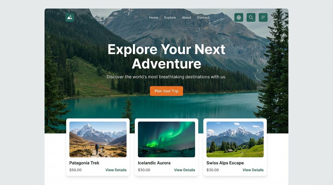
12) Coastal Pine
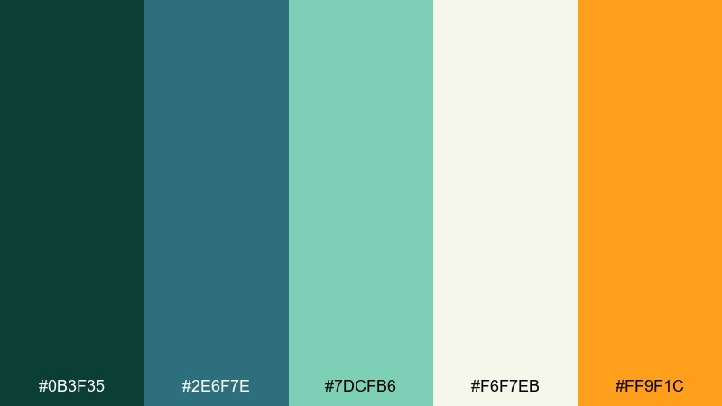
HEX: #0B3F35 #2E6F7E #7DCFB6 #F6F7EB #FF9F1C
Mood: breezy, adventurous, bright
Best for: travel brands, surf shops, summer landing pages
Breezy and adventurous, like a coastal forest meeting bright ocean air. Teal and seafoam lighten the greens, while the orange accent adds a sunlit spark for buttons and badges. It works well for travel brands, surf retail, and summer landing pages paired with bold photography and simple icon sets. Tip: keep orange for one primary action color so the palette stays fresh, not loud.
Image example of coastal pine generated using media.io
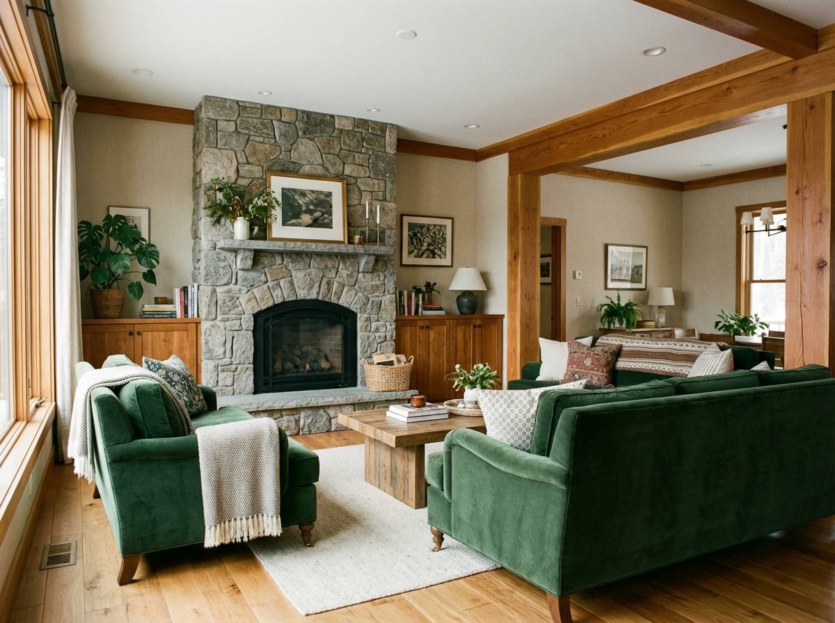
13) Stone Fireplace Interior
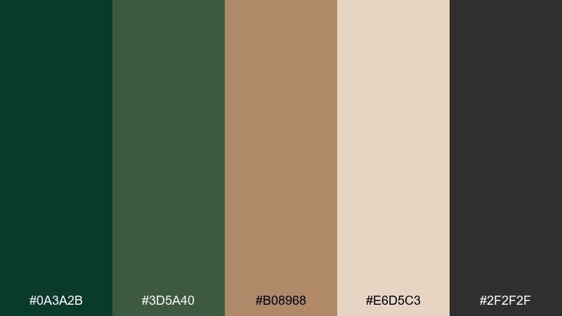
HEX: #0A3A2B #3D5A40 #B08968 #E6D5C3 #2F2F2F
Mood: cozy, grounded, masculine
Best for: interior styling, home brands, mood boards
Cozy and grounded, like a stone hearth with evergreen boughs nearby. The charcoal and camel tones make the greens feel mature and architectural rather than playful. Use it for interior styling decks, home goods branding, or listing graphics, and pair with matte finishes and warm lighting. Tip: add the camel as a repeat accent in textiles to keep the room from skewing too dark.
Image example of stone fireplace interior generated using media.io
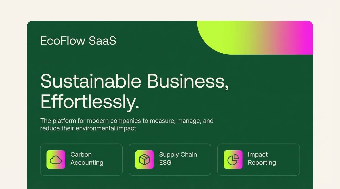
14) Tech Startup Gradient
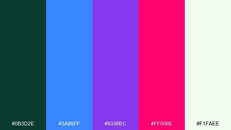
HEX: #0B3D2E #3A86FF #8338EC #FF006E #F1FAEE
Mood: vibrant, modern, energetic
Best for: SaaS marketing, app onboarding, tech pitch decks
Vibrant and modern, like neon gradients cutting across a dark evergreen base. This pine green color scheme is ideal when you want stability from green but still need startup energy from saturated blue, violet, and pink. Use it for SaaS hero sections, app onboarding screens, or pitch decks, and pair with geometric shapes and minimal line icons. Tip: apply the brights as gradient bands or small UI highlights so the layout stays polished.
Image example of tech startup gradient generated using media.io
15) Vintage Travel Badge
HEX: #0D3C2D #2B7A5E #D9B08C #F3E9DC #3E5C76
Mood: retro, outdoorsy, curated
Best for: patch designs, stickers, adventure merch
Retro and outdoorsy, like a well-worn patch on a canvas backpack. The dusty peach softens the greens, and the steel blue adds a quiet vintage twist for outlines and shadows. Use it for badge designs, stickers, and adventure merch, and pair with simplified mountains, trees, or compass icons. Tip: keep shapes flat and limit gradients to preserve the vintage look.
Image example of vintage travel badge generated using media.io
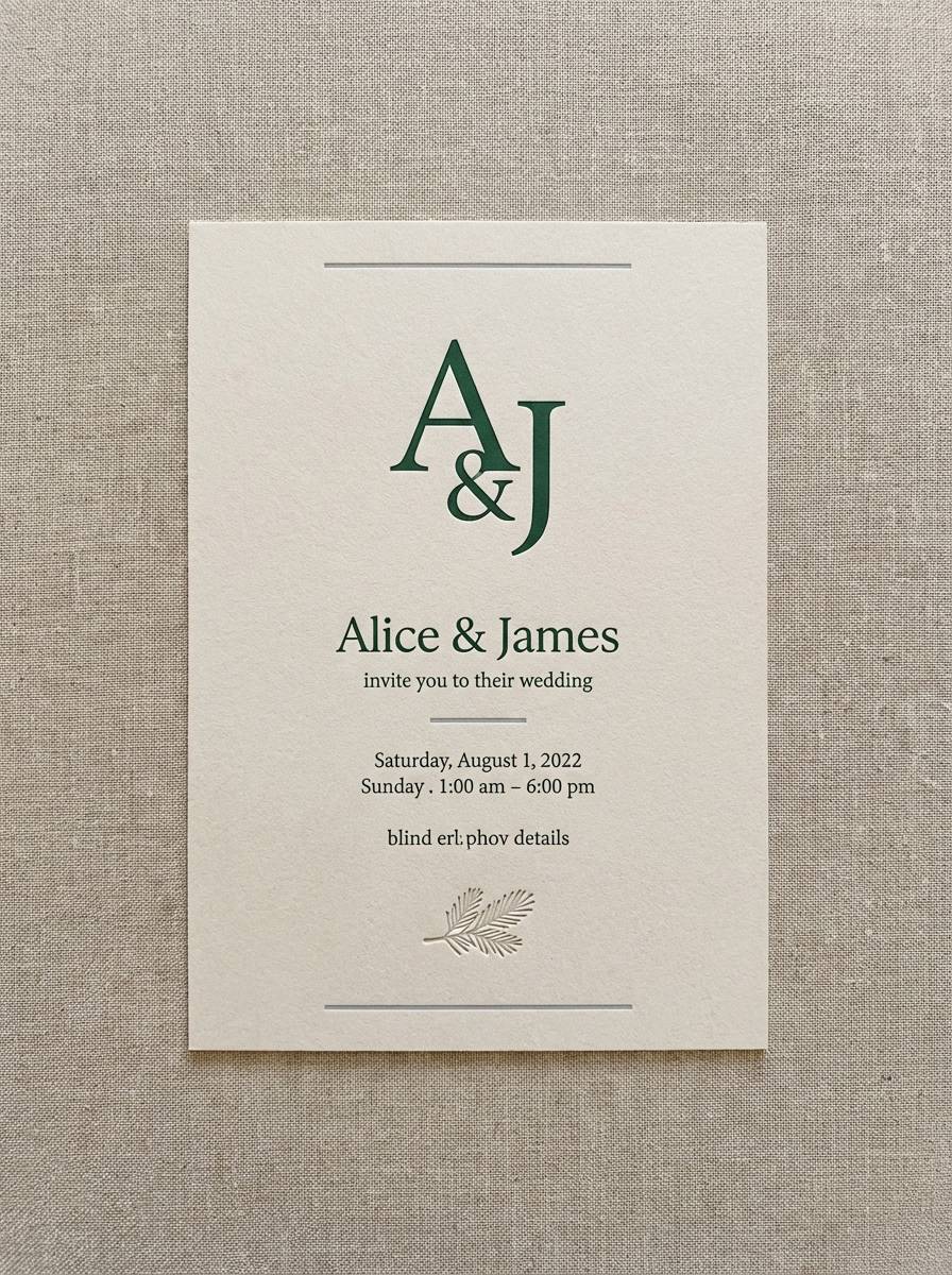
16) Winter Wedding Stationery
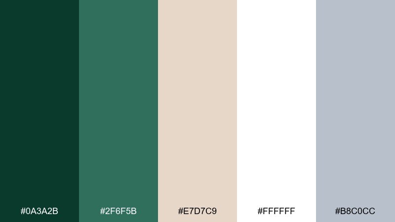
HEX: #0A3A2B #2F6F5B #E7D7C9 #FFFFFF #B8C0CC
Mood: elegant, quiet, wintery
Best for: wedding invites, save the dates, formal events
Elegant and quiet, like evergreens against fresh snow. The creamy blush-beige keeps the greens romantic, while cool gray adds a crisp winter edge for small details. Use it for wedding stationery, formal invitations, and event signage paired with refined serif type and thin rules. Tip: print the darkest green for names and headings, and keep gray for secondary info to maintain hierarchy.
Image example of winter wedding stationery generated using media.io
17) Berry Grove Contrast
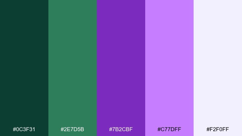
HEX: #0C3F31 #2E7D5B #7B2CBF #C77DFF #F2F0FF
Mood: bold, creative, unexpected
Best for: beauty branding, creator kits, modern posters
Bold and unexpected, like deep forest shade with ripe berries peeking through. These pine green color combinations feel contemporary because violet adds contrast without the harshness of pure red. Use them for beauty branding, creator templates, or modern posters, and pair with clean sans-serif type and lots of negative space. Tip: keep purple for standout elements like price tags, feature labels, or hero shapes.
Image example of berry grove contrast generated using media.io
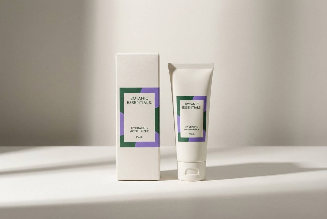
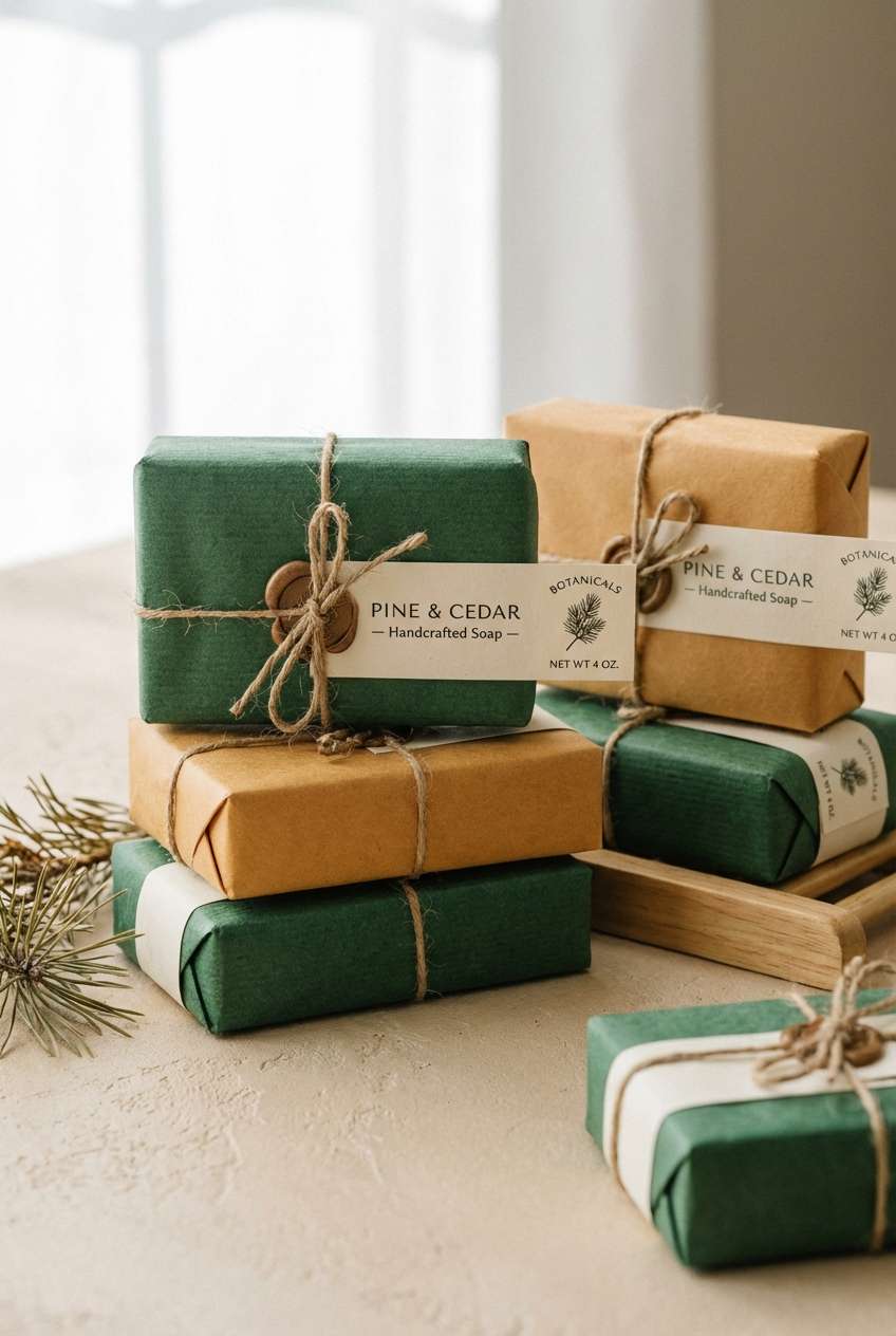
18) Artisan Soap Packaging
HEX: #0B3D2E #1F6F54 #E0C097 #F7F3EA #B85C38
Mood: handcrafted, warm, inviting
Best for: soap labels, bath products, market booths
Handcrafted and warm, like a small-batch soap bar wrapped in paper and twine. The terracotta note adds a cozy spice that keeps the greens from feeling too formal. Use it for bath product labels, farmers market signage, or eco packaging, and pair with kraft textures and simple botanical icons. Tip: try the cream as the primary label base to keep ingredients easy to read.
Image example of artisan soap packaging generated using media.io
19) Classroom Chalkboard
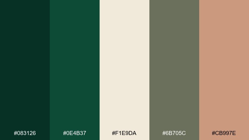
HEX: #083126 #0E4B37 #F1E9DA #6B705C #CB997E
Mood: academic, friendly, calm
Best for: lesson slides, course branding, worksheets
Academic and calm, like a chalkboard in a bright classroom. The off-white and sage tones keep the dark greens readable while adding a softer, approachable feel. Use it for lesson slides, course branding, and printable worksheets paired with clear typography and simple diagrams. Tip: keep backgrounds light and use the deepest green for headers and key terms to avoid eye strain.
Image example of classroom chalkboard generated using media.io
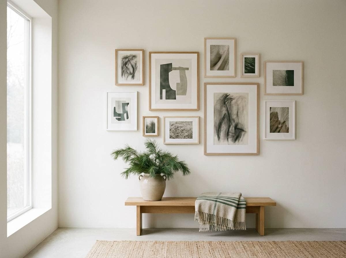
20) Gallery Wall Neutrals
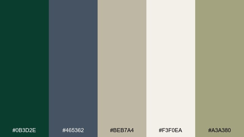
HEX: #0B3D2E #465362 #BEB7A4 #F3F0EA #A3A380
Mood: quiet, modern, curated
Best for: interior mood boards, art sites, portfolio layouts
Quiet and curated, like a modern gallery wall with natural frames. The cool slate balances the green, while warm neutrals keep everything soft and sophisticated. Use it for portfolio layouts, art websites, or interior mood boards paired with minimal typography and generous whitespace. Tip: use the slate for captions and navigation so the green can stay the hero accent.
Image example of gallery wall neutrals generated using media.io
What Colors Go Well with Pine Green?
Warm neutrals like cream, tan, camel, and kraft paper tones make pine green feel inviting and natural—ideal for packaging, hospitality, and interiors. They also help dark greens avoid looking overly formal or heavy.
For higher contrast, pair pine green with brights like citrus yellow, orange, coral, or vivid pink. These accents add instant energy for buttons, badges, and headlines while the green keeps the overall system grounded.
Cool companions (slate, steel blue, teal, and soft gray) steer pine green toward modern UI and editorial layouts. They’re especially useful for navigation, captions, and secondary typography.
How to Use a Pine Green Color Palette in Real Designs
In branding, treat pine green as the anchor: use it for the logo, top-level headers, and key backgrounds, then assign one accent color to CTAs and highlights. This keeps the identity cohesive and easy to scale across assets.
In UI, pine green works best when paired with light backgrounds (off-white, mint, pale gray) or handled as a dark mode base with muted teals for states. Maintain accessibility by testing contrast for body text and interactive components.
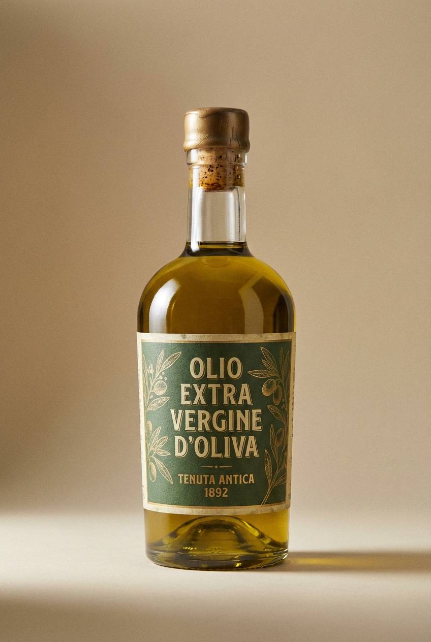
For print and packaging, pine green looks premium on uncoated or textured stocks, especially with cream label bases and small metallic accents. Keep saturated brights limited to stamps, seals, or callouts so the greens remain dominant.
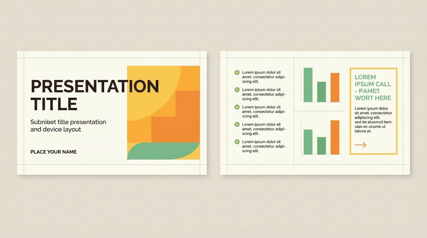
Create Pine Green Palette Visuals with AI
If you want to preview how a pine green color scheme looks on a brand board, UI hero, label, or poster, generate quick concept visuals with AI. It’s a fast way to validate mood, contrast, and composition before committing to a full design.
Use the included prompts as a starting point, then swap in your product type, layout style, and aspect ratio. You can iterate variations for different seasons, campaigns, or client directions in minutes.
When you like a result, keep the same palette and prompt structure to build a consistent series—great for ads, landing pages, and social templates.
Pine Green Color Palette FAQs
-
What HEX code is pine green?
Pine green varies by brand, but it’s typically a dark evergreen green. In this article, examples of pine green anchors include #0B3D2E, #0E4B37, and #0A3A2B. -
What colors complement pine green best?
Warm neutrals (cream, tan, camel), muted golds, and earthy terracottas complement pine green for a natural premium look. For bolder contrast, try citrus yellow, coral, or vivid pink as small accents. -
Is pine green good for branding?
Yes. Pine green communicates reliability and nature, so it works well for outdoor brands, wellness, artisan goods, hospitality, and premium labels—especially when paired with a clear accent color. -
How do I use pine green in a website UI without making it feel dark?
Use pine green for navigation, headings, and primary buttons, but keep most surfaces light (off-white, pale mint, light gray). Reserve the darkest green for emphasis so spacing and contrast keep the UI breathable. -
What accent color should I use with pine green for CTAs?
Pick one high-visibility accent and use it consistently: orange (#FF9F1C or #FB8500), yellow (#FFB703), or pink (#FF006E). Limit accents to interactive elements and badges to avoid visual noise. -
Does pine green work for weddings and formal stationery?
It does—especially for winter or botanical themes. Pair pine green with white, cream, blush-beige, and a cool gray for an elegant, legible invitation suite. -
Can I generate pine green palette mockups quickly?
Yes. Use Media.io’s text-to-image generator with a layout-focused prompt (brand board, label, UI hero, poster), then iterate by changing only the accent color or background tone to explore variations fast.


