

Purple mauve sits right between soft romance and modern sophistication, making it one of the easiest “pretty but grown-up” hues to design with.
Below are 20 curated purple mauve color palette ideas with HEX codes, plus practical pairing tips for branding, UI, weddings, posters, and interiors.
In this article
- Why Purple Mauve Palettes Work So Well
-
- dusk orchid
- vintage mauve rose
- plum latte
- lavender smoke
- mulberry velvet
- heather clay
- mauve quartz
- twilight lilac
- berry mist
- orchid ink
- dusty grape linen
- rosewood mauve
- amethyst blush
- soft fig cream
- mauve monochrome studio
- wildflower evening
- modern mauve minimal
- mauve and sage calm
- mauve neon pop
- mauve copper luxe
- What Colors Go Well with Purple Mauve?
- How to Use a Purple Mauve Color Palette in Real Designs
- Create Purple Mauve Palette Visuals with AI
Why Purple Mauve Palettes Work So Well
Purple mauve is naturally versatile: it can read soft and airy in pastel tints, or premium and dramatic when pushed into deeper plum and wine tones. That range makes it useful for both minimalist UI and expressive editorial layouts.
It also plays nicely with neutrals. Cream, ivory, taupe, and charcoal help mauve feel grounded, while metallics like gold or copper instantly add an elevated, “giftable” finish.
Finally, mauve is flattering in real-world contexts—skin tones, florals, fabric textures, and product packaging tend to look cohesive against mauve backgrounds, especially when contrast is handled intentionally.
20+ Purple Mauve Color Palette Ideas (with HEX Codes)
1) Dusk Orchid
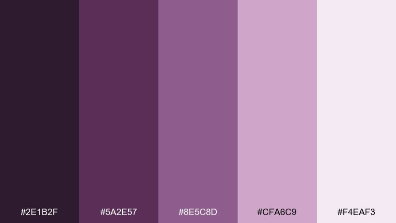
HEX: #2E1B2F #5A2E57 #8E5C8D #CFA6C9 #F4EAF3
Mood: moody, romantic, refined
Best for: beauty branding and hero banners
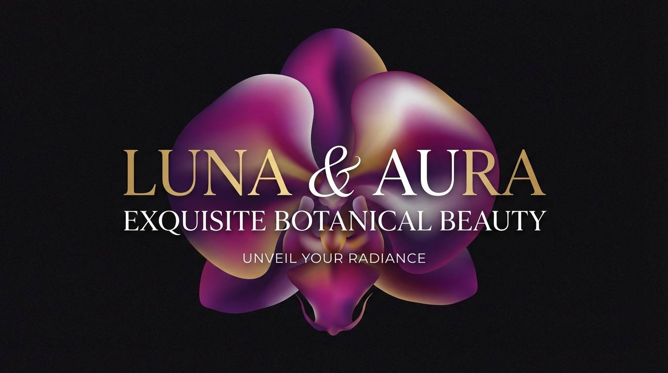
Moody orchid shadows and velvety petals set a refined, romantic tone. Use the deep plum as your headline color and let the softer mauves carry backgrounds and highlights. Pair with warm ivory for breathing room and a touch of metallic gold for premium cues. Tip: keep contrast high by reserving the darkest shade for key text and buttons.
Image example of dusk orchid generated using media.io
Media.io is an online AI studio for creating and editing video, image, and audio in your browser.

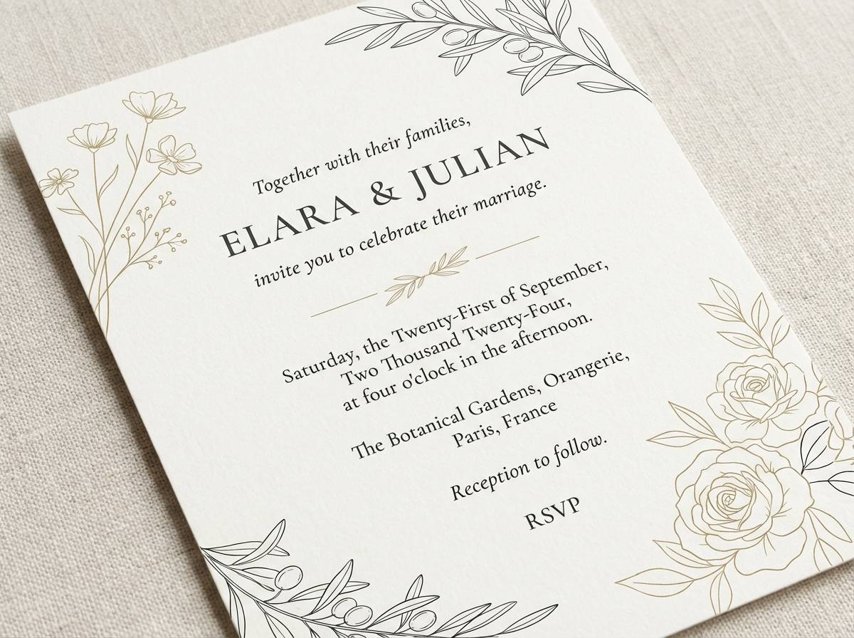
2) Vintage Mauve Rose
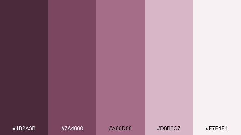
HEX: #4B2A3B #7A4660 #A66D88 #D8B6C7 #F7F1F4
Mood: soft, nostalgic, warm
Best for: wedding invitations and stationery
Soft rose ink and dusty mauve paper vibes make the palette feel nostalgic and warm. Let the medium mauve handle headings while the pale blush becomes your invitation base. Creamy off-white keeps it airy, and a muted wine shade adds formality for names and dates. Tip: use a thin border in the darkest color to frame the layout without making it heavy.
Image example of vintage mauve rose generated using media.io
3) Plum Latte
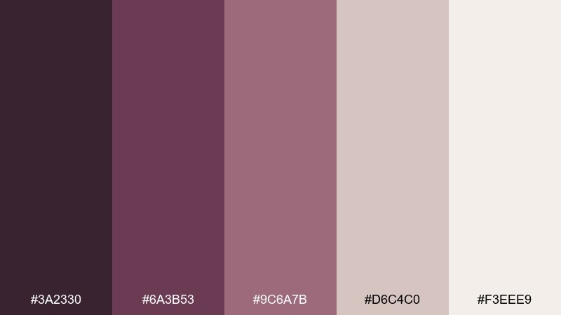
HEX: #3A2330 #6A3B53 #9C6A7B #D6C4C0 #F3EEE9
Mood: cozy, earthy, calm
Best for: cafe menus and lifestyle posts
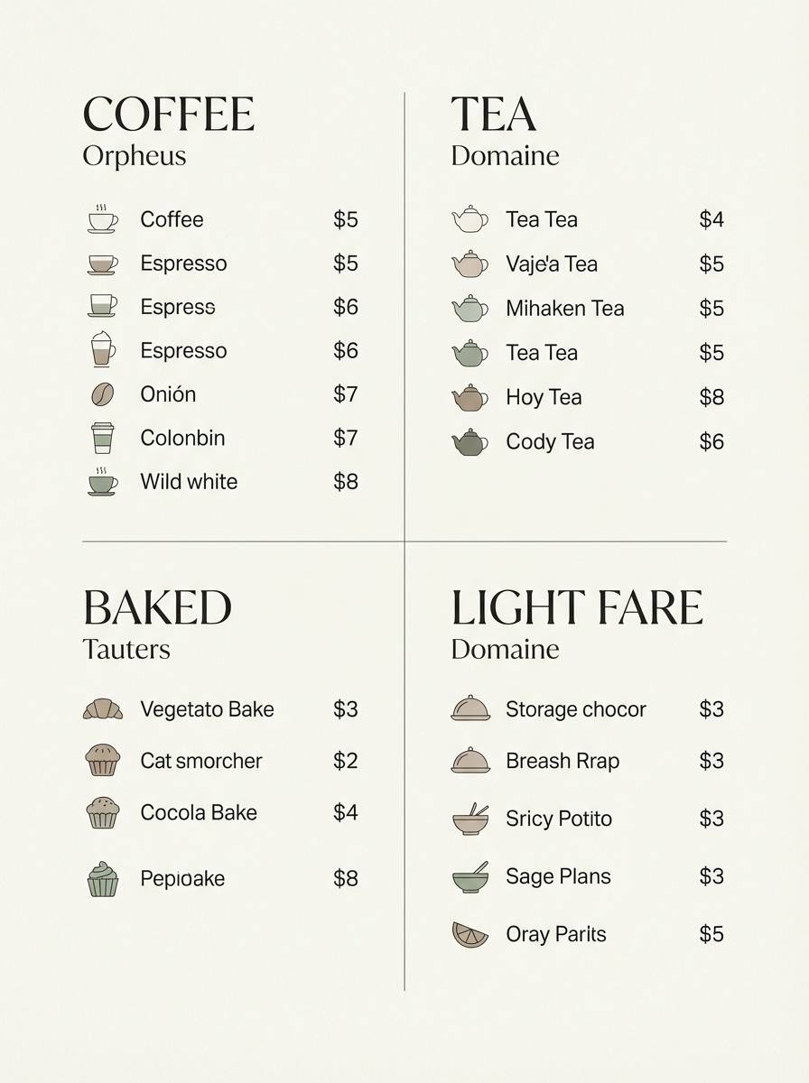
Cozy plum undertones mixed with latte neutrals create an earthy, calm feel. Use the beige-taupe as your main canvas and bring in the plum shades for section headers and price highlights. It pairs beautifully with kraft textures, soft photography, and warm lighting. Tip: keep accent usage to one plum shade per page to avoid muddiness.
Image example of plum latte generated using media.io
4) Lavender Smoke
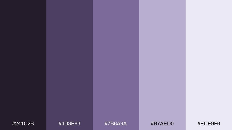
HEX: #241C2B #4D3E63 #7B6A9A #B7AED0 #ECE9F6
Mood: cool, airy, modern
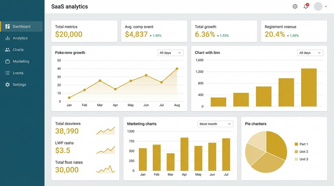
Best for: SaaS dashboard UI
Cool lavender haze and smoky indigo make the tones feel modern and quietly techy. This purple mauve color combination works best with generous whitespace and crisp type for a clean product look. Use the near-black for navigation and the pale lavender for cards and surfaces, then reserve the mid-tone for active states. Tip: add a subtle 1px border using the light-mid shade to separate panels without harsh lines.
Image example of lavender smoke generated using media.io
5) Mulberry Velvet
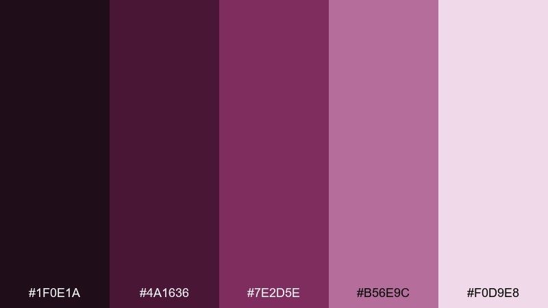
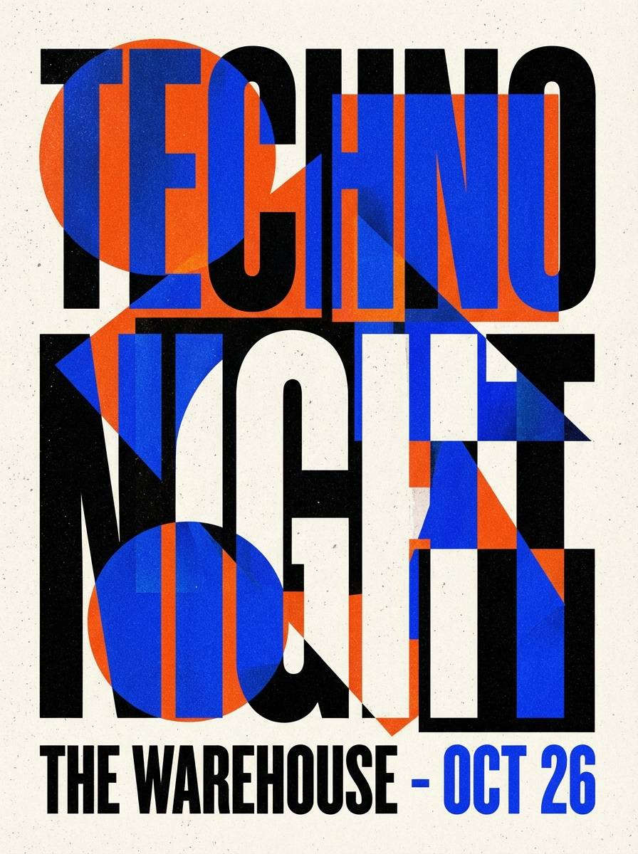
HEX: #1F0E1A #4A1636 #7E2D5E #B56E9C #F0D9E8
Mood: luxurious, dramatic, bold
Best for: nightlife posters and event promos
Velvet mulberry and deep wine shadows bring a bold, dramatic mood. Use the darkest shade for the backdrop and let the rosy mauves glow through typography and geometric accents. It pairs well with chrome gradients, subtle grain, and high-contrast photography overlays. Tip: keep body text on the pale blush to maintain legibility on dark layouts.
Image example of mulberry velvet generated using media.io
6) Heather Clay
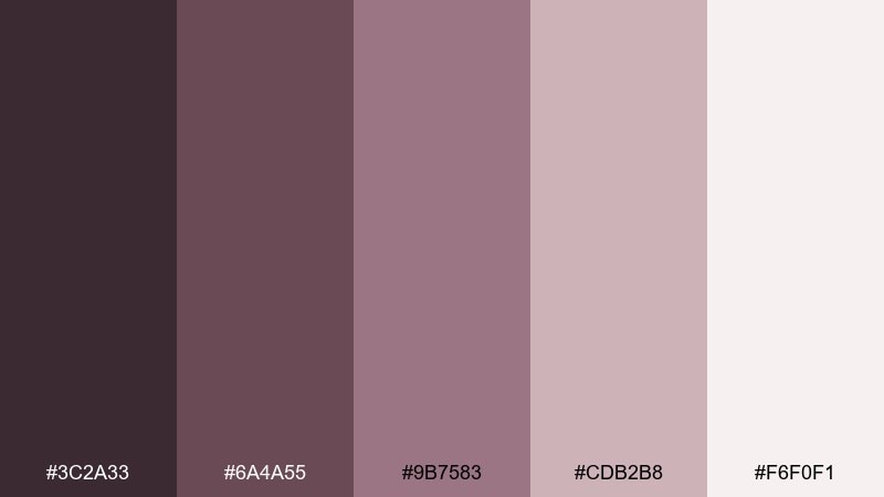
HEX: #3C2A33 #6A4A55 #9B7583 #CDB2B8 #F6F0F1
Mood: natural, muted, grounded
Best for: home decor lookbooks
Heathered mauve mixed with clay neutrals feels grounded and natural, like linen and dried florals. Use the lightest tone for pages and margins, then layer mid-tones for headings and callouts. It pairs nicely with walnut wood, matte ceramics, and soft gray photography. Tip: apply the darkest shade sparingly for captions and separators to keep the look gentle.
Image example of heather clay generated using media.io
7) Mauve Quartz
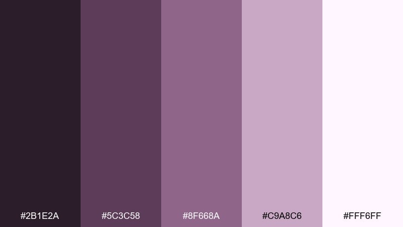
HEX: #2B1E2A #5C3C58 #8F668A #C9A8C6 #FFF6FF
Mood: dreamy, polished, feminine
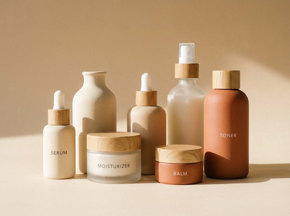
Best for: skincare packaging
Dreamy quartz-like mauves feel polished and softly feminine. The pale lilac-white gives you a clean base, while the mid mauve can define labels and ingredient blocks. Add matte black or deep aubergine typography for a premium contrast that still feels gentle. Tip: use one accent band in the richer mauve to make product variants easy to scan.
Image example of mauve quartz generated using media.io
8) Twilight Lilac
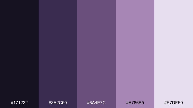
HEX: #171222 #3A2C50 #6A4E7C #A786B5 #E7DFF0
Mood: cinematic, calm, sophisticated
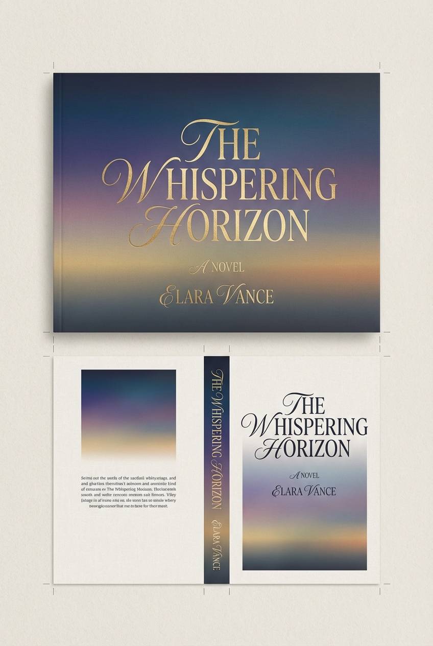
Best for: book covers and film posters
Twilight purples and lilac fog evoke a cinematic, late-evening calm. Use the near-black for the background, then set titles in the pale lilac for crisp readability. The mid purples work well for gradients, vignette effects, and subtle illustration overlays. Tip: add a single warm neutral detail (like parchment) to keep the cover from feeling cold.
Image example of twilight lilac generated using media.io
9) Berry Mist
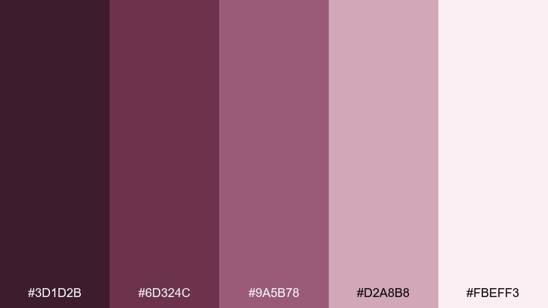
HEX: #3D1D2B #6D324C #9A5B78 #D2A8B8 #FBEFF3
Mood: sweet, modern, approachable
Best for: social media quote templates
Berry mist tones feel sweet and approachable, like a soft sunrise filter. The blushy background shade keeps posts bright, while the berry shades add structure for headings and emphasis. Pair with clean sans-serif type, rounded shapes, and small white icons for a modern look. Tip: keep the darkest berry for a single focal element per slide, such as a highlight bar.
Image example of berry mist generated using media.io
10) Orchid Ink
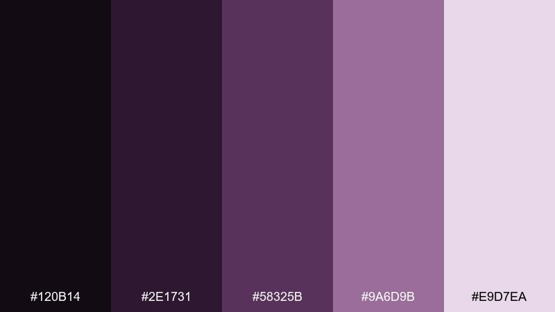
HEX: #120B14 #2E1731 #58325B #9A6D9B #E9D7EA
Mood: inky, elegant, high-contrast
Best for: luxury logo systems
Inky orchid shadows create an elegant, high-contrast atmosphere. Use the deepest tone for monograms and logotype, then bring in mid mauve for supporting marks and patterns. It pairs especially well with off-white paper stock and subtle embossing. Tip: test the mid-tone on small icons to ensure it stays distinct against the light background.
Image example of orchid ink generated using media.io
11) Dusty Grape Linen
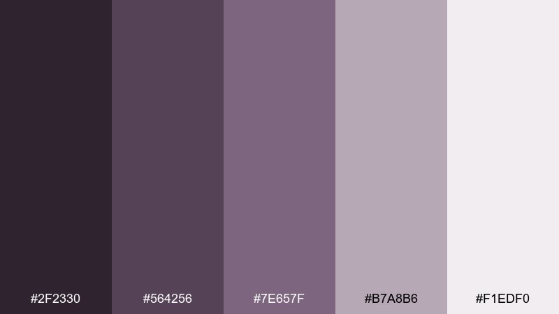
HEX: #2F2330 #564256 #7E657F #B7A8B6 #F1EDF0
Mood: quiet, minimal, airy
Best for: portfolio websites
Dusty grape on linen-like neutrals gives a quiet, minimal vibe that feels expensive without shouting. Use the off-white as the page base, then apply the mid grape for links and small interface accents. It pairs well with charcoal text and generous spacing to keep the design breathable. Tip: add a faint hover underline in the light-mid shade for a soft, modern interaction.
Image example of dusty grape linen generated using media.io
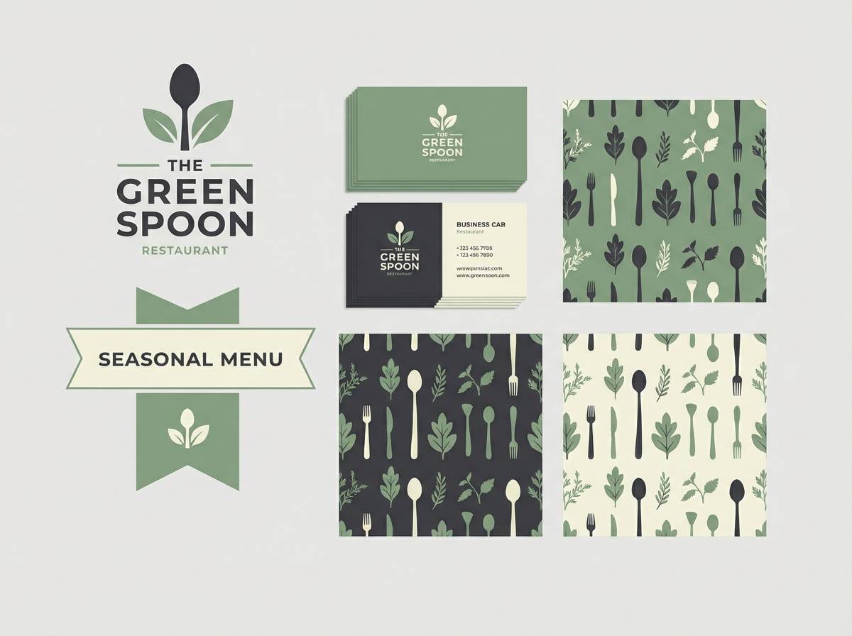
12) Rosewood Mauve
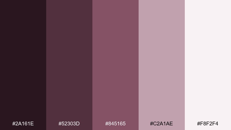
HEX: #2A161E #52303D #845165 #C2A1AE #F8F2F4
Mood: classic, intimate, warm
Best for: restaurant branding
Rosewood warmth and mauve undertones feel classic and intimate, like candlelight on polished wood. Use the mid rosewood for menus and packaging accents, and keep the light blush for negative space. It pairs smoothly with cream paper, deep green herbs, and copper foils. Tip: set body copy in a near-black to keep the overall look refined and readable.
Image example of rosewood mauve generated using media.io
13) Amethyst Blush
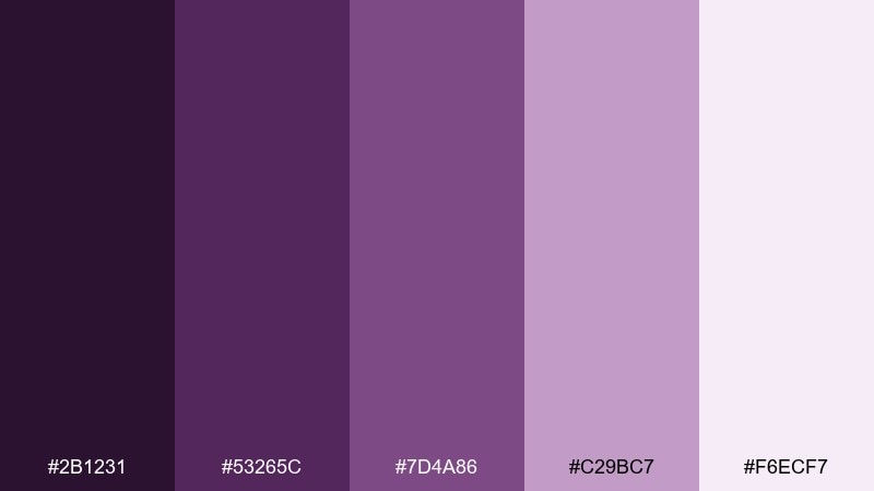
HEX: #2B1231 #53265C #7D4A86 #C29BC7 #F6ECF7
Mood: uplifting, creative, playful
Best for: creator thumbnails and banners
Amethyst energy softened by blush highlights feels uplifting and creative. These purple mauve color combinations shine when you add crisp white type and a bold shape behind the headline. Pair with a small pop of lime or aqua for modern contrast, but keep it to one accent element. Tip: use the deepest purple only for outlines and shadows to avoid overpowering faces or icons.
Image example of amethyst blush generated using media.io

14) Soft Fig Cream
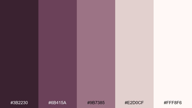
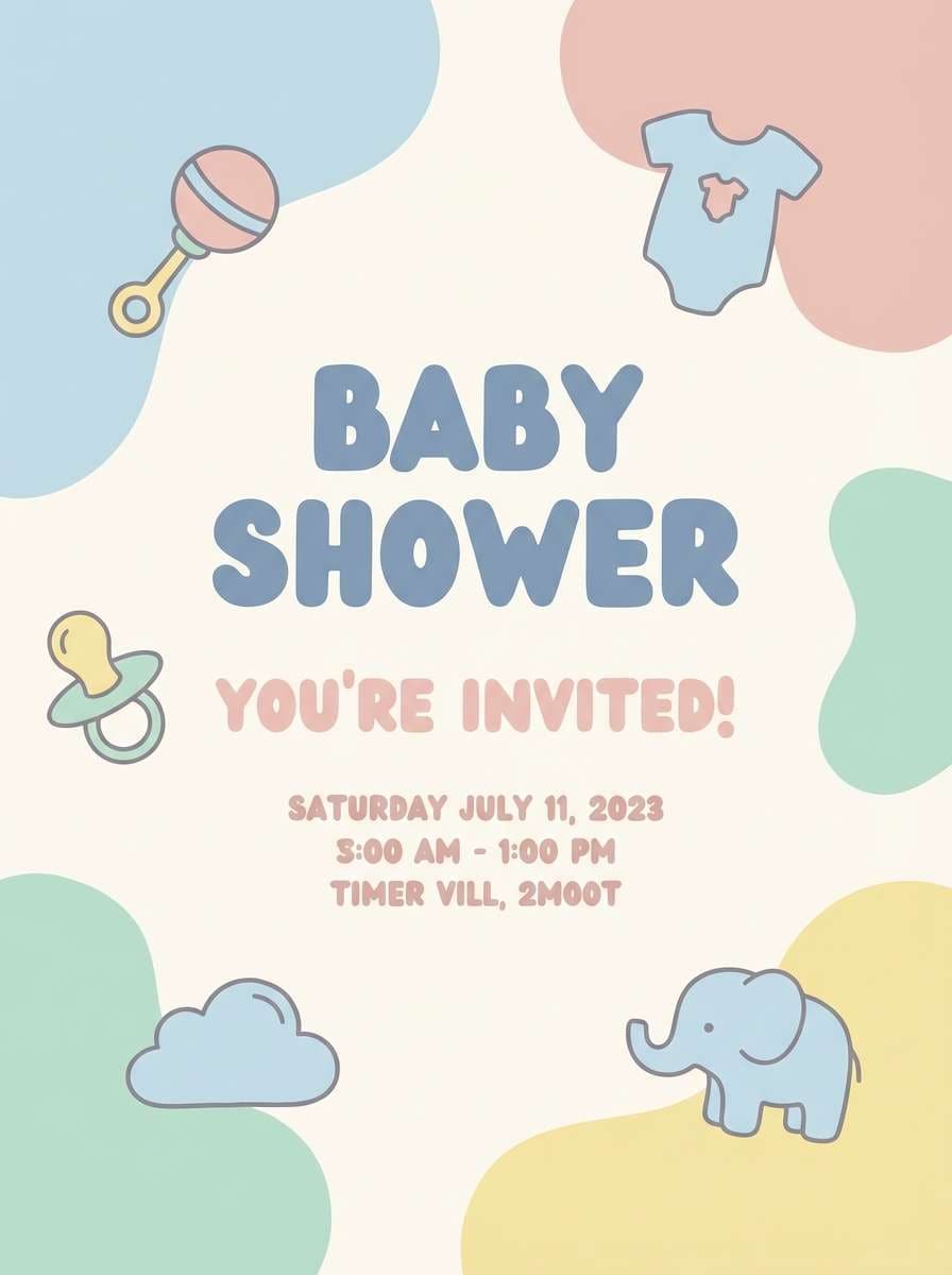
HEX: #3B2230 #6B415A #9B7385 #E2D0CF #FFF8F6
Mood: gentle, cozy, comforting
Best for: baby shower flyers
Soft fig and whipped-cream neutrals create a gentle, comforting mood. Use the cream shade as a friendly background and layer dusty mauves for headings, icons, and small illustrations. It pairs well with hand-drawn stars, soft gradients, and rounded typography. Tip: keep the darkest fig only for dates and key info to maintain a tender feel.
Image example of soft fig cream generated using media.io
15) Mauve Monochrome Studio
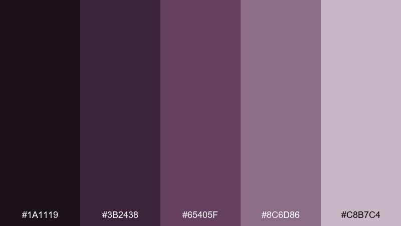
HEX: #1A1119 #3B2438 #65405F #8C6D86 #C8B7C4
Mood: sleek, editorial, controlled
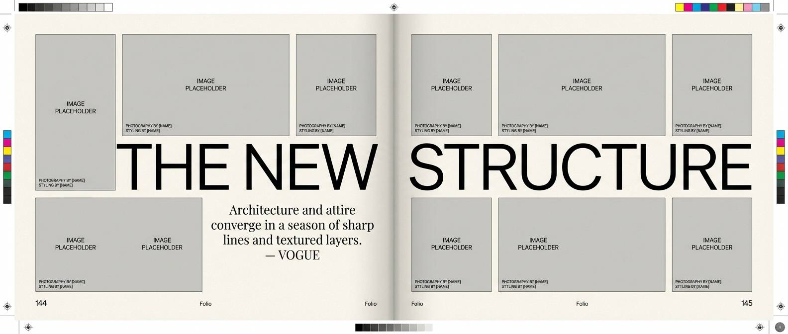
Best for: fashion editorial layouts
Sleek monochrome mauves feel editorial and controlled, like studio lighting and matte fabrics. Use the darkest two tones for headlines and pull quotes, then set body text on the lightest background for clarity. This mix pairs nicely with black-and-white photography and sharp grid systems. Tip: keep accent blocks to the mid mauve so the page stays cohesive.
Image example of mauve monochrome studio generated using media.io
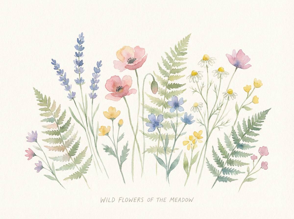
16) Wildflower Evening
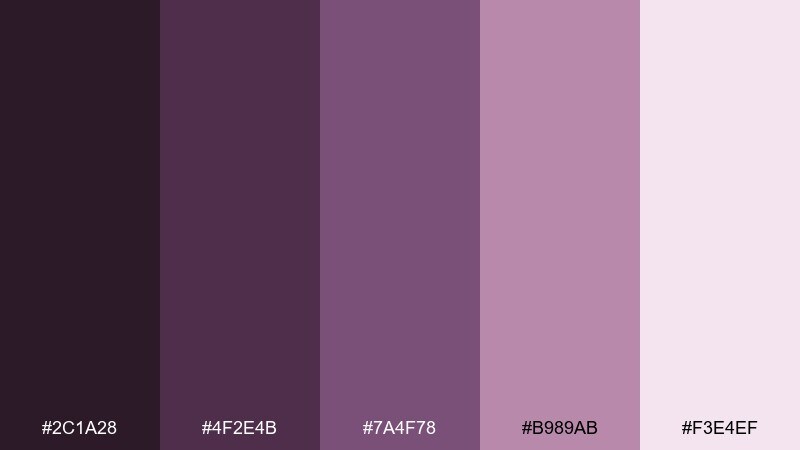
HEX: #2C1A28 #4F2E4B #7A4F78 #B989AB #F3E4EF
Mood: romantic, botanical, serene
Best for: spring botanical illustrations
Romantic wildflower dusk tones evoke pressed petals and soft twilight air. The pale pink-lilac works as watercolor paper, while the mid mauves bring depth to petals and shadows. Pair with sage green linework or warm cream highlights to keep the composition lively. Tip: layer washes from light to dark to avoid muddy purples in delicate florals.
Image example of wildflower evening generated using media.io
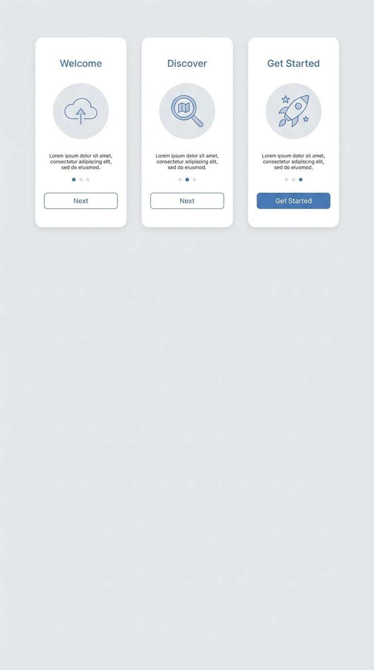
17) Modern Mauve Minimal
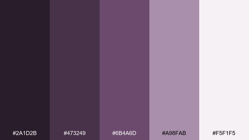
HEX: #2A1D2B #473249 #6B4A6D #A98FAB #F5F1F5
Mood: clean, modern, understated
Best for: app onboarding screens
Clean mauve neutrals with understated depth feel modern and confident. This purple mauve color palette is ideal for onboarding where you need gentle color without distracting from copy. Pair with crisp white, simple icons, and a single contrasting accent like teal for primary CTAs. Tip: use the lightest shade for backgrounds and reserve the darkest for button text to keep contrast accessible.
Image example of modern mauve minimal generated using media.io
18) Mauve and Sage Calm
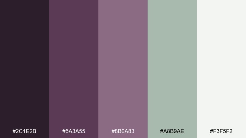
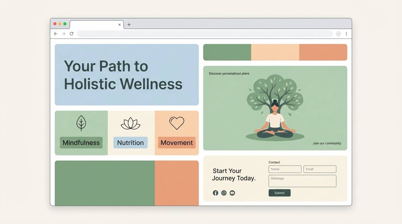
HEX: #2C1E2B #5A3A55 #8B6A83 #A8B9AE #F3F5F2
Mood: calm, balanced, spa-like
Best for: wellness landing pages
Calm mauve meets gentle sage for a balanced, spa-like feel. Use the near-white as the main page background, then apply sage for secondary sections and mauve for headings and CTAs. It pairs well with soft gradients, rounded cards, and minimal photography overlays. Tip: keep buttons in mauve and reserve sage for supportive highlights to avoid competing actions.
Image example of mauve and sage calm generated using media.io
19) Mauve Neon Pop
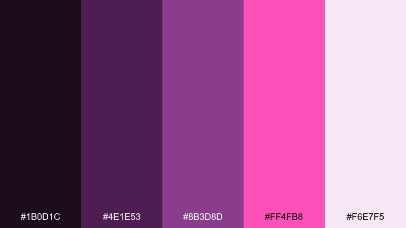
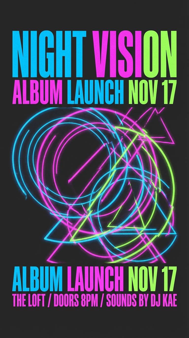
HEX: #1B0D1C #4E1E53 #8B3D8D #FF4FB8 #F6E7F5
Mood: bold, playful, electric
Best for: music promo ads
Electric mauve tones with a neon pop feel bold and playful, like nightlife lights in a haze. These purple mauve color combinations work when you keep the background dark and let the bright accent do the talking. Pair with condensed typography, sharp shapes, and minimal copy for impact. Tip: use the neon only for one focal element (like the date) so it stays punchy.
Image example of mauve neon pop generated using media.io
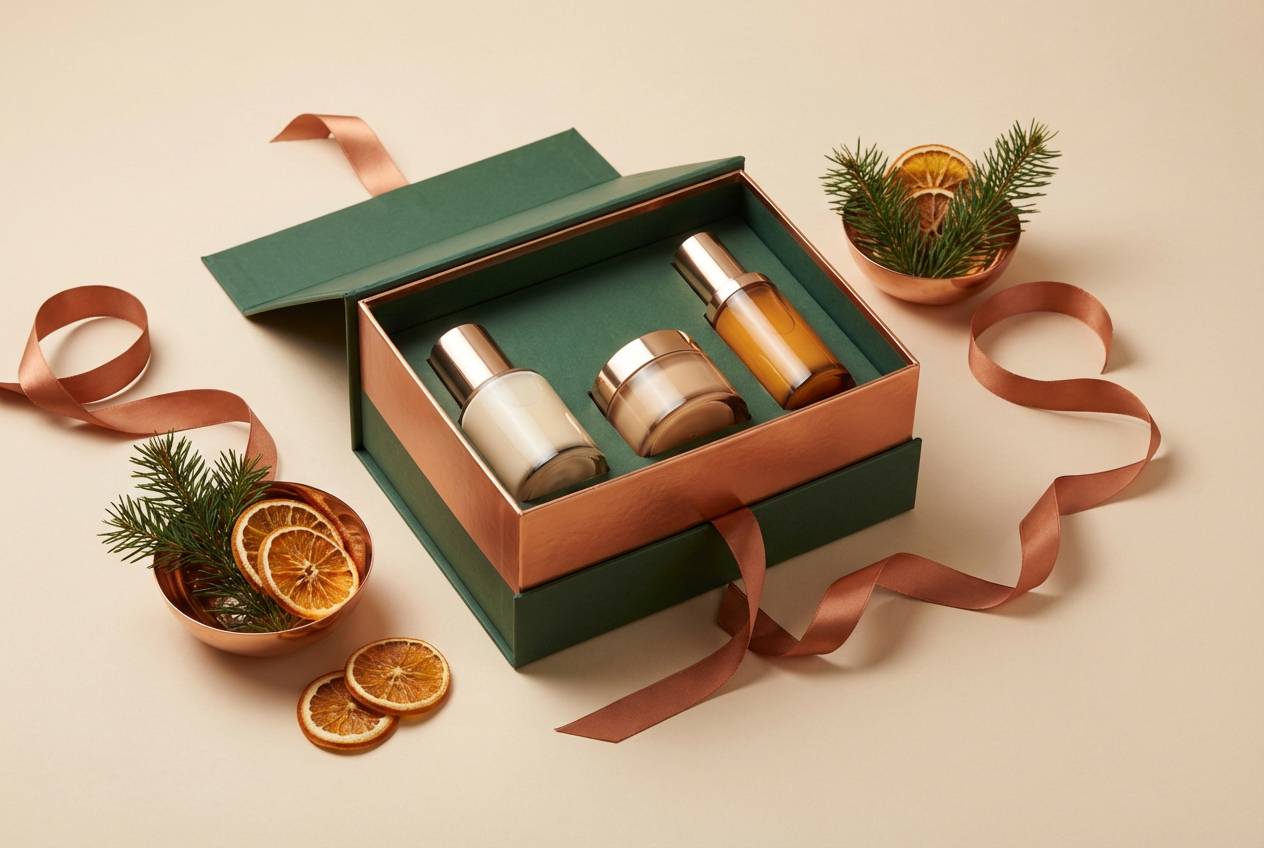
20) Mauve Copper Luxe
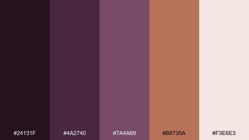
HEX: #24131F #4A2740 #7A4A69 #B8735A #F3E6E3
Mood: opulent, warm, festive
Best for: holiday product ads
Opulent mauve with copper warmth feels festive and upscale, like satin ribbon and metallic foil. Use the copper shade for callouts and badges, then ground the layout with deep plum typography. It pairs well with creamy backgrounds and soft shadowing for a premium ad look. Tip: add subtle gradient highlights on copper elements to mimic real metal without overdoing shine.
Image example of mauve copper luxe generated using media.io
What Colors Go Well with Purple Mauve?
Neutrals are the safest pairing: ivory, cream, warm gray, taupe, and soft beige keep purple mauve feeling calm and premium. For text, charcoal or near-black usually reads cleaner than pure black on mauve-heavy layouts.
For contrast accents, look for cool complements and fresh “pop” colors. Teal, sage, mint, aqua, and even a small touch of lime can modernize mauve, especially in UI where you need a clear primary action.
Metallics work beautifully with mauve’s rosy undertones. Gold pushes it romantic and luxe; copper makes it festive and warm; silver/chrome makes it feel more nightlife and tech-forward.
How to Use a Purple Mauve Color Palette in Real Designs
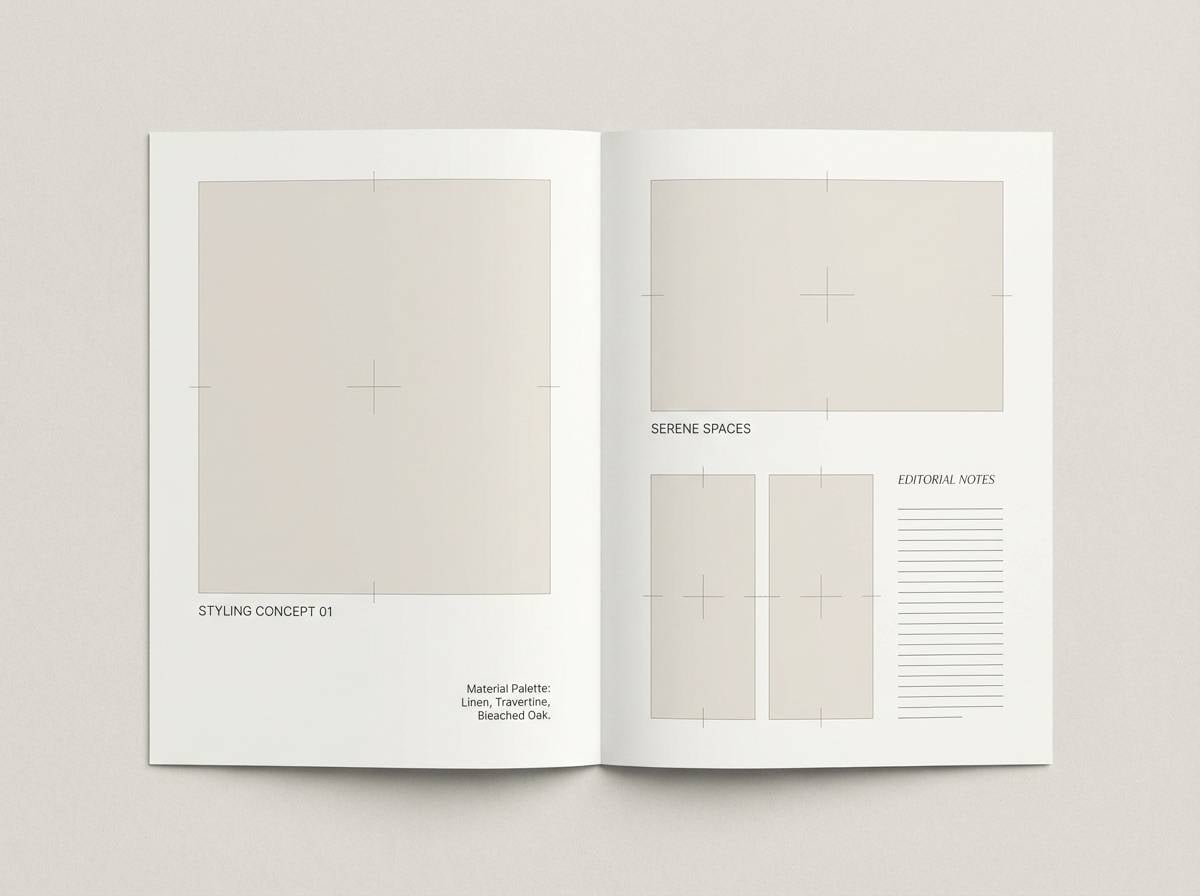
Start by assigning roles: one light shade for background, one mid shade for UI surfaces or secondary blocks, and one dark shade for readable typography. This prevents mauve from turning “muddy” when everything is mid-tone.
Use the deepest plum/wine tone sparingly for hierarchy—navigation, headlines, and primary buttons—then let softer mauves do the atmospheric work in gradients, cards, and section fills.
If you add an accent (like hot pink, teal, or copper), keep it to one or two components: CTA buttons, badges, or key dates. The design feels intentional when the accent is the loudest thing on the page.
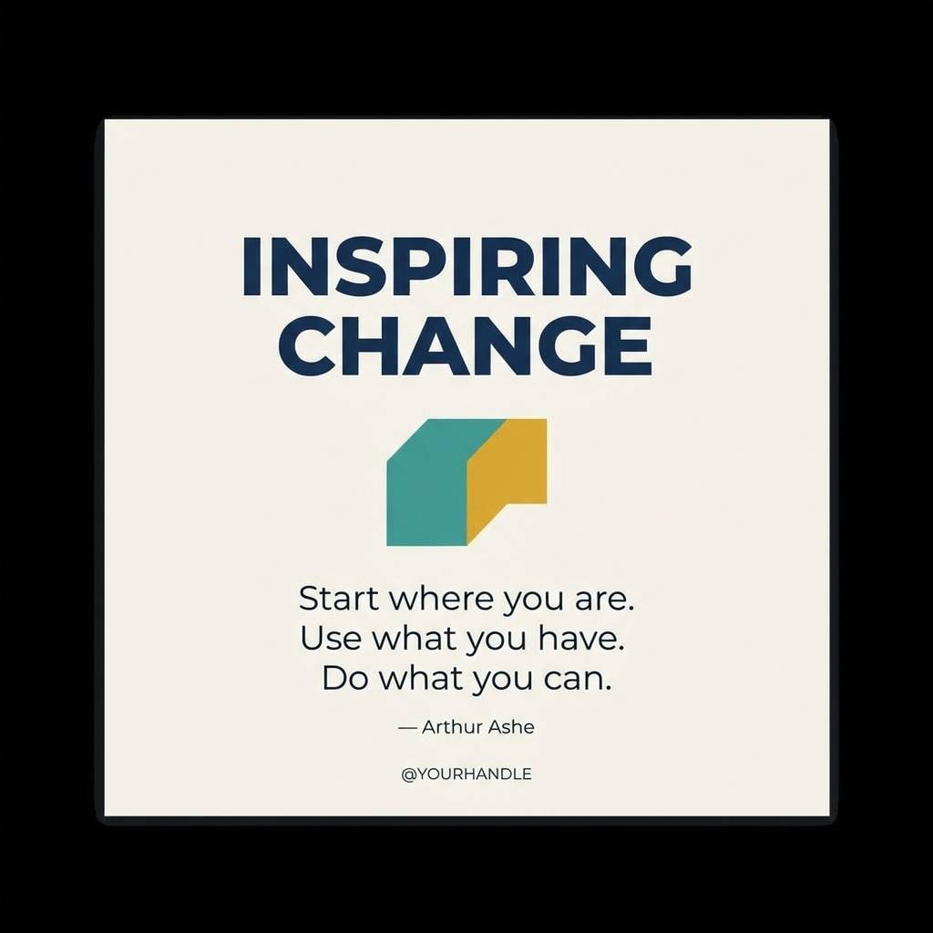
Create Purple Mauve Palette Visuals with AI
If you already have HEX codes, you can turn them into real mockups fast by generating UI screens, posters, packaging, and social templates that match your palette’s mood.
With Media.io Text to Image, paste a prompt (like the examples above), then iterate on layout, typography, and texture until the palette looks right in context.
Once you like the direction, generate variations (light vs. dark mode, different accents, different ratios) to quickly build a consistent visual system.
Purple Mauve Color Palette FAQs
-
What is a purple mauve color?
Purple mauve is a muted purple with pink/rose undertones and a grayish softness. It sits between lavender and dusty rose, making it feel romantic but still modern and easy to balance with neutrals. -
Is mauve warm or cool?
Mauve can lean warm or cool depending on the mix of pink (warmer) vs. blue/gray (cooler). Warm mauves pair well with cream, tan, and gold; cool mauves pair well with crisp white, slate, and silver. -
What are the best neutral pairings for purple mauve?
Ivory, off-white, warm gray, taupe, and soft beige are the most reliable neutrals for mauve. For readable typography, charcoal or deep plum often looks smoother than pure black. -
What accent colors make purple mauve pop?
Teal, aqua, sage, mint, and hot pink create strong contrast accents with mauve. Use accents in small doses (CTAs, badges, highlights) so they stay punchy and don’t fight the base palette. -
How do I keep purple mauve designs from looking muddy?
Make sure you include a true light (background) and a true dark (text/buttons) in the palette. Avoid using multiple mid mauves in large blocks, and rely on spacing, borders, and a single accent to maintain clarity. -
Does purple mauve work for UI and product design?
Yes—especially for wellness, beauty, lifestyle, and modern SaaS interfaces. Use a pale mauve/near-white for surfaces, reserve darker plum tones for navigation and text, and test contrast to meet accessibility needs. -
Can I generate purple mauve palette mockups with AI?
Yes. With Media.io Text to Image, you can generate posters, UI mockups, packaging, and brand boards using prompts, then iterate quickly by adjusting lighting, texture, typography, and aspect ratio.
Next: Hot Pink Color Palette


