

Purple maroon sits at the intersection of rich wine reds and deep plum purples, making it feel both luxurious and grounded. It’s a versatile base for branding, UI, and print because it can read warm, cool, classic, or modern depending on what you pair with it.
Below are 20+ purple maroon color palette ideas with HEX codes, mood notes, and practical pairing tips you can apply to real layouts—from dark-mode dashboards to wedding invitations.
In this article
- Why Purple Maroon Palettes Work So Well
-
- velvet plum lounge
- crimson iris interface
- autumn mulberry editorial
- port wine and sandstone
- berry brass packaging
- lavender cabernet wedding
- dusty amethyst workspace
- royal fig and fog
- plum truffle cafe
- rose jam social posts
- midnight dahlia app
- warm merlot gradient
- orchid clay botanical
- vintage velvet poster
- cinder plum minimal
- raspberry ink notebook
- mauve brick brochure
- garnet lilac ecommerce
- sable violet night sky
- blush oxblood zen
- heirloom plum and pearl
- studio maroon accent set
- soft garnet minimal ui
- What Colors Go Well with Purple Maroon?
- How to Use a Purple Maroon Color Palette in Real Designs
- Create Purple Maroon Palette Visuals with AI
Why Purple Maroon Palettes Work So Well
Purple maroon palettes feel premium because they combine the depth of burgundy with the sophistication of purple. That depth instantly adds hierarchy—great for hero sections, packaging labels, and editorial covers.
They also play nicely with both warm and cool companions. Creams, blushes, sand tones, foggy grays, and brass-like accents can soften the intensity without losing the “luxury” signal.
In digital design, purple maroon gives you contrast without harshness. Compared with pure black, it keeps dark mode interfaces more inviting while still letting accents and near-whites stand out cleanly.
20+ Purple Maroon Color Palette Ideas (with HEX Codes)
1) Velvet Plum Lounge
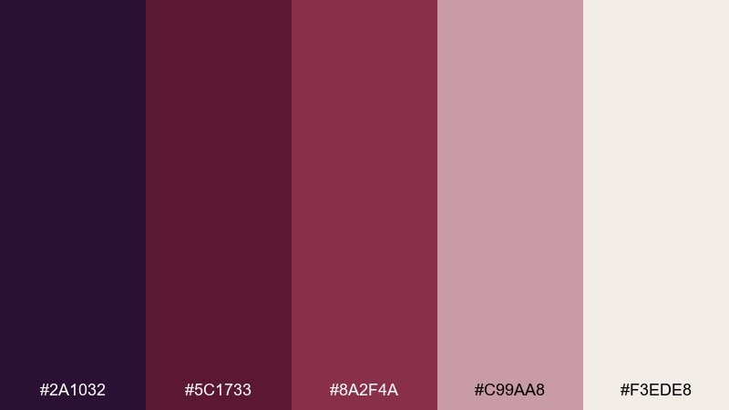
HEX: #2a1032 #5c1733 #8a2f4a #c99aa8 #f3ede8
Mood: moody, plush, intimate
Best for: cocktail bar branding, menus, nightlife posters
Moody velvet tones and candlelit plum shadows set a late-night, upscale vibe. The deep base works best as a background, while blush and ivory keep typography readable and refined. Pair it with warm metallic accents like brass or antique gold to lean into the lounge feel. Usage tip: reserve the darkest shade for large blocks and use the softest tint for spacing and breathing room.
Image example of velvet plum lounge generated using media.io
Media.io is an online AI studio for creating and editing video, image, and audio in your browser.

2) Crimson Iris Interface
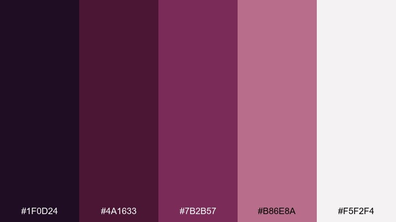
HEX: #1f0d24 #4a1633 #7b2b57 #b86e8a #f5f2f4
Mood: sleek, high-contrast, modern
Best for: dashboard UI, app onboarding, dark mode components
Sleek dark tones with an iris-leaning accent evoke a polished, tech-forward mood. This purple maroon color scheme shines in dark UI where buttons and highlights need to pop without going neon. Pair it with cool grays for dividers and use the near-white for text and cards to avoid eye strain. Usage tip: keep accent usage under 10 percent so the interface stays premium, not loud.
Image example of crimson iris interface generated using media.io
3) Autumn Mulberry Editorial
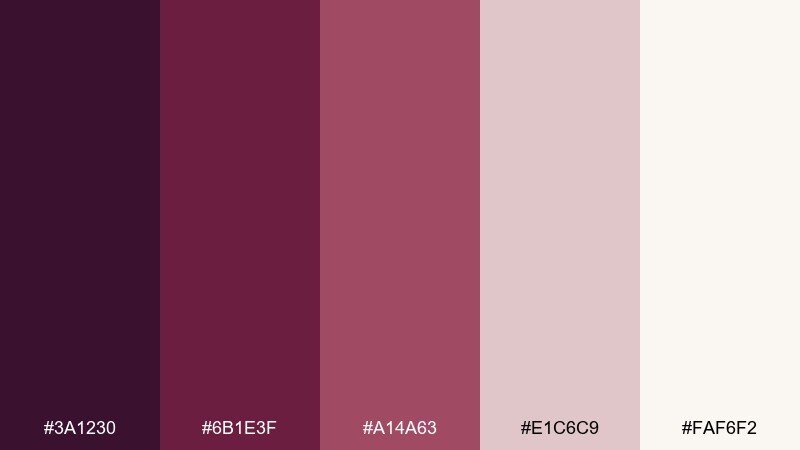
HEX: #3a1230 #6b1e3f #a14a63 #e1c6c9 #faf6f2
Mood: warm, literary, sophisticated
Best for: magazine layouts, book covers, editorials
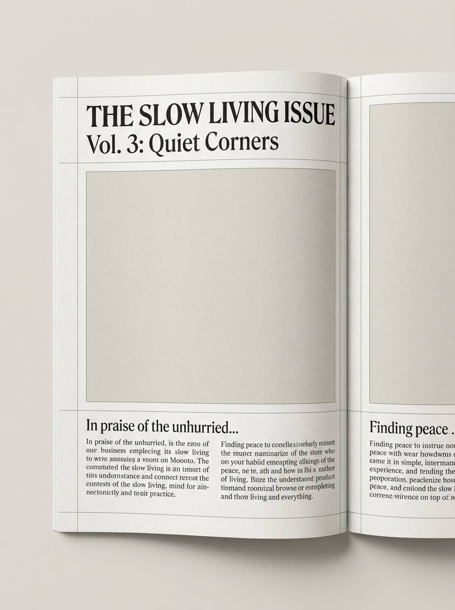
Warm mulberry and dusty blush feel like a well-worn hardcover and a glass of spiced wine. Use the deeper shades for headlines and pull quotes, then let the pale neutrals carry body text and margins. Pair with a serif typeface and subtle paper textures for a print-first finish. Usage tip: keep images slightly desaturated so the palette stays cohesive across spreads.
Image example of autumn mulberry editorial generated using media.io
4) Port Wine and Sandstone
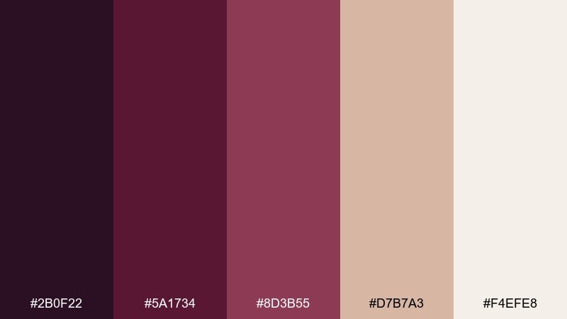
HEX: #2b0f22 #5a1734 #8d3b55 #d7b7a3 #f4efe8
Mood: grounded, cozy, artisan
Best for: interior mood boards, boutique hospitality, lifestyle branding
Grounded port tones against sandstone neutrals evoke cozy rooms, clay pottery, and soft lamplight. The warm beige makes an ideal canvas for photography, while the darker reds and purples anchor logos and headings. Pair with natural materials like walnut, leather, and linen for an artisan feel. Usage tip: use the sandstone shade for large backgrounds and let the deepest tone define structure and frames.
Image example of port wine and sandstone generated using media.io
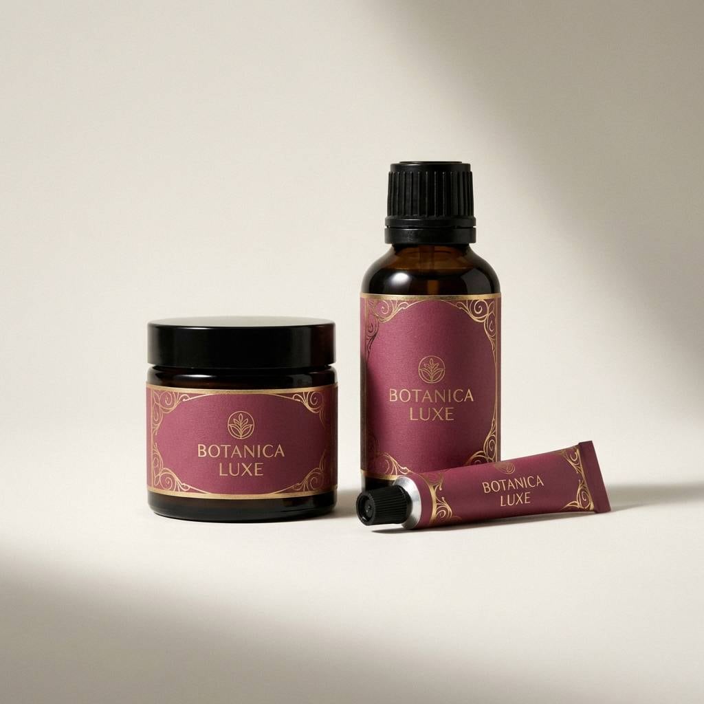
5) Berry Brass Packaging
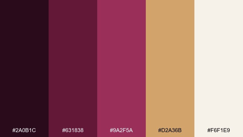
HEX: #2a0b1c #631838 #9a2f5a #d2a36b #f6f1e9
Mood: luxurious, bold, giftable
Best for: beauty packaging, premium labels, holiday gift sets
Luxurious berry depth with a brass-like accent feels instantly giftable and high-end. These purple maroon color combinations work especially well when the metallic note is treated as a highlight on caps, seals, or foil stamping. Pair with creamy off-white for legible ingredient panels and to keep the design from getting too heavy. Usage tip: apply the gold tone sparingly so it reads as premium detailing, not a full background color.
Image example of berry brass packaging generated using media.io
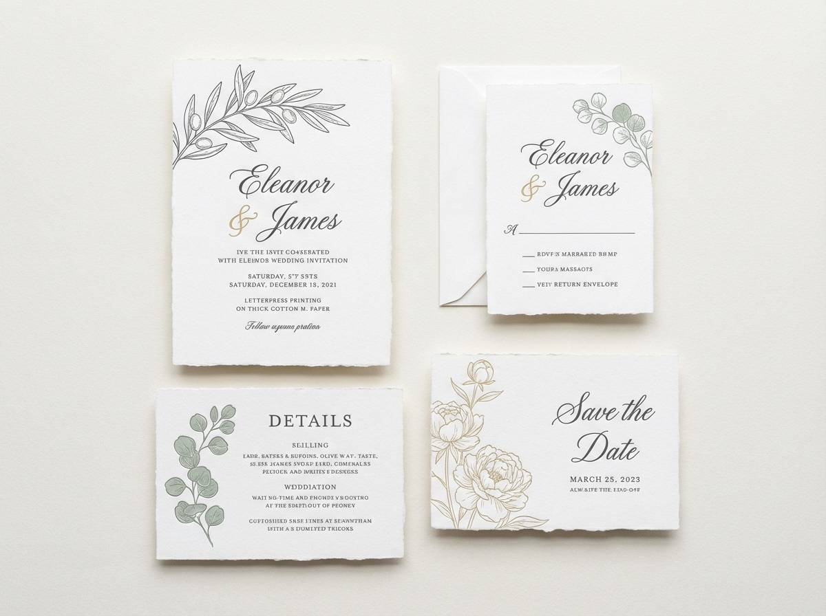
6) Lavender Cabernet Wedding
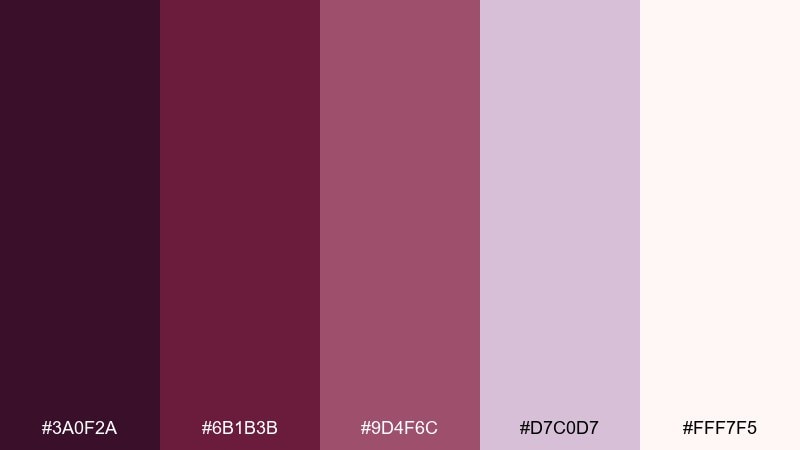
HEX: #3a0f2a #6b1b3b #9d4f6c #d7c0d7 #fff7f5
Mood: romantic, elegant, softly dramatic
Best for: wedding invitations, RSVP cards, ceremony programs
Romantic cabernet depth softened by lavender haze suggests roses at dusk and satin ribbons. Use the deepest shade for names and key details, then lean on the pale blush for breathable whitespace. Pair with a warm gray or soft gold ink if you want a classic, formal finish. Usage tip: print the dark tones in rich black plus a hint of magenta to keep them from turning muddy.
Image example of lavender cabernet wedding generated using media.io
7) Dusty Amethyst Workspace
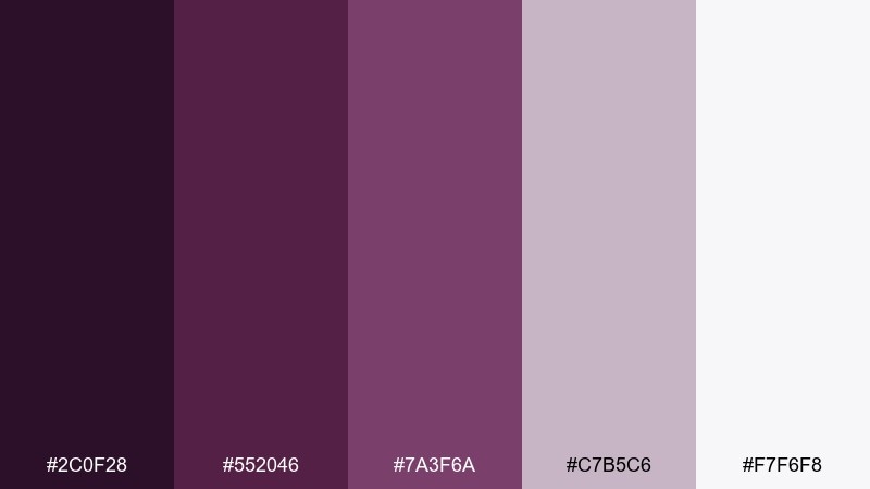
HEX: #2c0f28 #552046 #7a3f6a #c7b5c6 #f7f6f8
Mood: calm, professional, thoughtful
Best for: slide decks, reports, corporate templates
Calm amethyst with dusty neutrals feels measured and smart, like a well-edited strategy deck. The mid-tone purple is ideal for section headers, while the near-white keeps charts and tables crisp. Pair with charcoal text for accessibility and add thin lines in the pale mauve to separate content blocks. Usage tip: keep backgrounds light and use the darkest shade only for emphasis on key numbers.
Image example of dusty amethyst workspace generated using media.io
8) Royal Fig and Fog
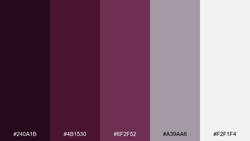
HEX: #240a1b #4b1530 #6f2f52 #a39aa6 #f2f1f4
Mood: fashion-forward, quiet luxury, cool
Best for: fashion lookbooks, brand guidelines, photography overlays
Royal fig tones wrapped in foggy neutrals give a quiet-luxury, runway-ready mood. The cool gray-lilac keeps layouts airy, letting product photography stay the hero. Pair with minimal sans-serif type and generous margins for a high-fashion feel. Usage tip: place text on the fog shade rather than directly on dark imagery to maintain contrast and consistency.
Image example of royal fig and fog generated using media.io
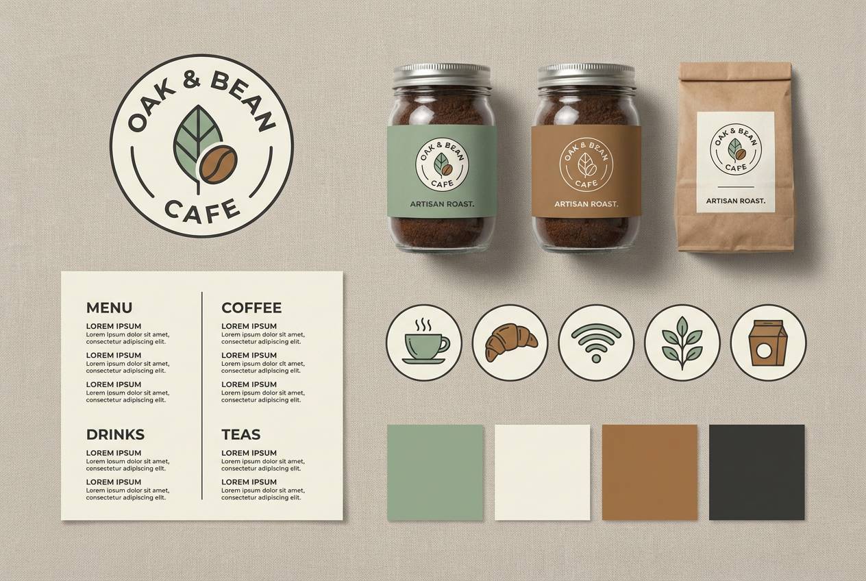
9) Plum Truffle Cafe
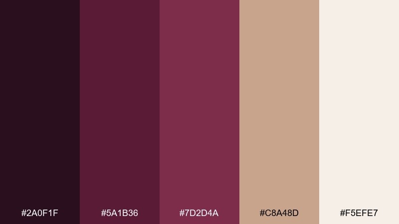
HEX: #2a0f1f #5a1b36 #7d2d4a #c8a48d #f5efe7
Mood: inviting, handcrafted, warm
Best for: cafe branding, coffee labels, menu boards
Plum and truffle browns feel like fresh espresso, cocoa dust, and warm wood counters. Use the creamy neutral for menus so small text stays readable, then bring the richer tones into headings and icons. Pair with kraft textures or subtle grain to emphasize the handcrafted side. Usage tip: keep one accent color for callouts, like specials or seasonal drinks, to guide the eye.
Image example of plum truffle cafe generated using media.io
10) Rose Jam Social Posts
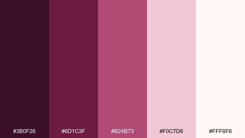
HEX: #3b0f26 #6d1c3f #b24b73 #f0c7d6 #fff6f6
Mood: playful, trendy, sweet
Best for: instagram templates, promo tiles, creator branding
Sweet rose-jam tones bring a playful, modern glow that still feels grown-up. The soft pinks are perfect for backgrounds and gradients, while the deeper shades frame headlines and price tags. Pair with clean rounded type and minimal stickers or doodles to keep it fresh. Usage tip: build a two-tone gradient for story backgrounds and reserve the darkest color for CTAs.
Image example of rose jam social posts generated using media.io
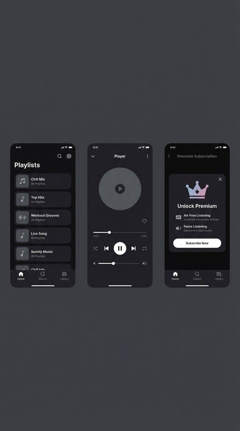
11) Midnight Dahlia App
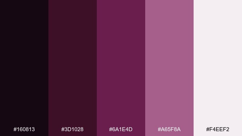
HEX: #160813 #3d1028 #6a1e4d #a65f8a #f4eef2
Mood: dramatic, sleek, premium
Best for: music apps, subscription paywalls, dark UI themes
Midnight florals and deep berry shadows create a dramatic, premium feel. Use the near-white for primary text and the mauve highlight for toggles, links, and active states. Pair with subtle gradients and soft shadows to avoid flat blocks of darkness. Usage tip: test contrast on the darkest background and bump the light text slightly warmer for better legibility.
Image example of midnight dahlia app generated using media.io
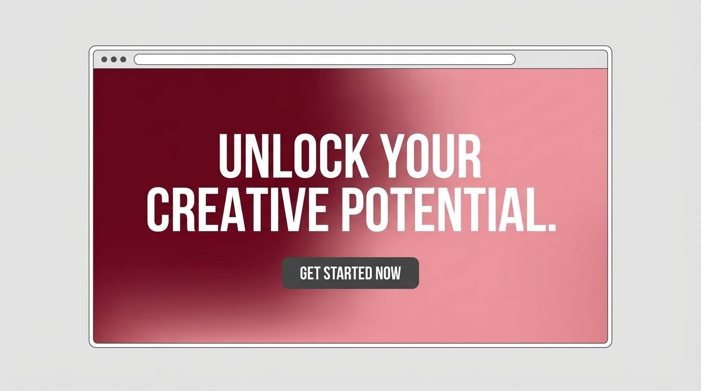
12) Warm Merlot Gradient
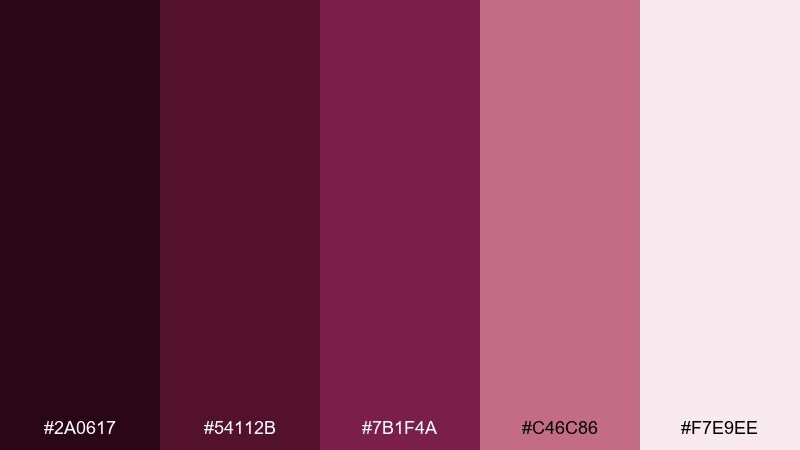
HEX: #2a0617 #54112b #7b1f4a #c46c86 #f7e9ee
Mood: rich, modern, cinematic
Best for: website hero sections, gradient backgrounds, campaign landing pages
Rich merlot fades into soft pink like a cinematic sunset behind velvet curtains. A purple maroon color combination like this is ideal for gradient-led heroes, where depth can guide the viewer toward a headline. Pair it with simple white typography and a single secondary accent, such as cool gray, to keep it contemporary. Usage tip: set the gradient angle consistently across pages so the brand feels unified.
Image example of warm merlot gradient generated using media.io
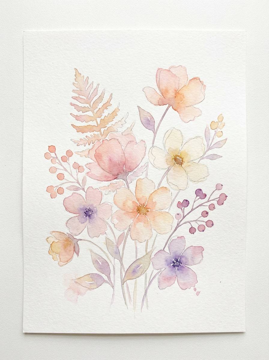
13) Orchid Clay Botanical
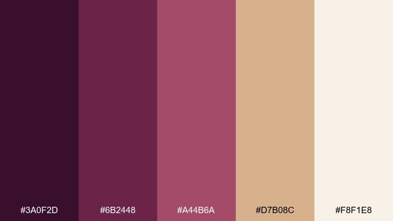
HEX: #3a0f2d #6b2448 #a44b6a #d7b08c #f8f1e8
Mood: organic, soft, artistic
Best for: botanical illustrations, skincare branding, spring stationery
Organic orchid and clay tones feel like pressed petals and sun-warmed terracotta. The earthy tan balances the purples, making it great for labels, patterns, and gentle brand marks. Pair with hand-drawn line art and plenty of negative space for an airy, artisanal result. Usage tip: use the light cream as paper tone and layer translucent washes for depth.
Image example of orchid clay botanical generated using media.io
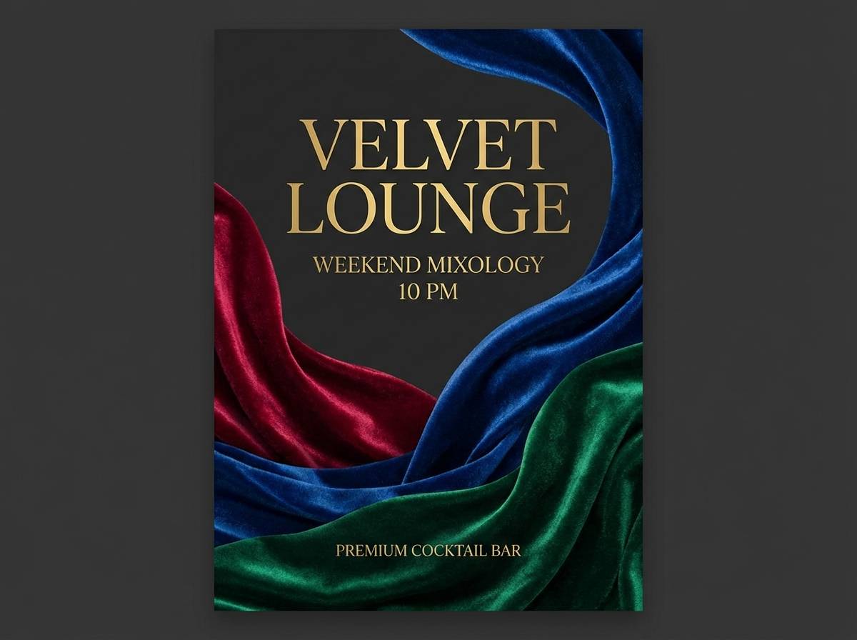
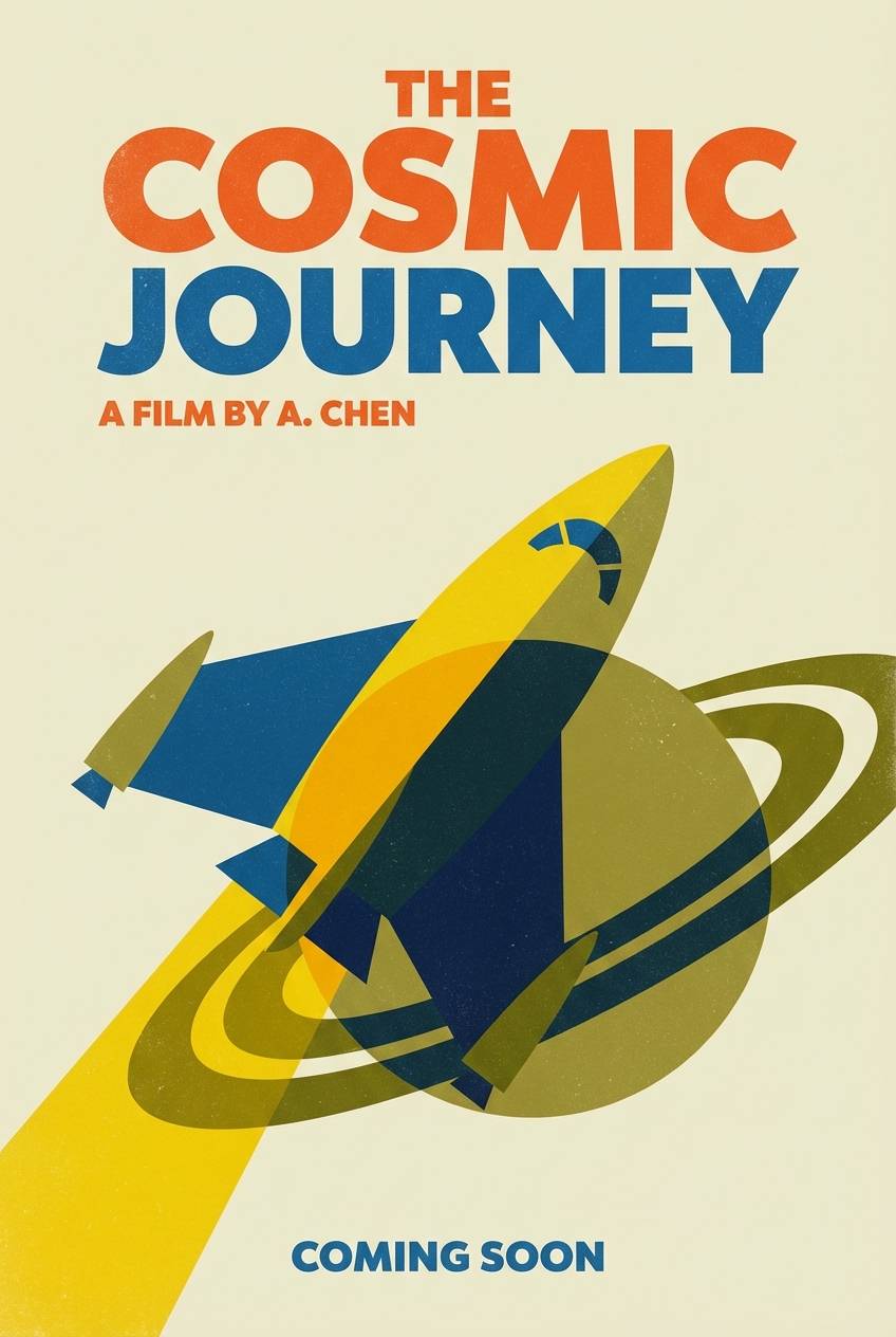
14) Vintage Velvet Poster
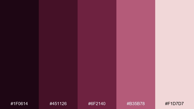
HEX: #1f0614 #451126 #6f2140 #b35b78 #f1d7d7
Mood: retro, dramatic, artsy
Best for: film posters, concert flyers, event promotions
Retro velvet reds and purples evoke classic cinema curtains and vinyl records. Use the light rose as a background tint for text blocks, then stack darker tones for bold titles and frames. Pair with condensed display fonts and subtle grain to lean into the vintage mood. Usage tip: limit your palette use to two main colors per poster and keep the rest for accents and hierarchy.
Image example of vintage velvet poster generated using media.io
15) Cinder Plum Minimal
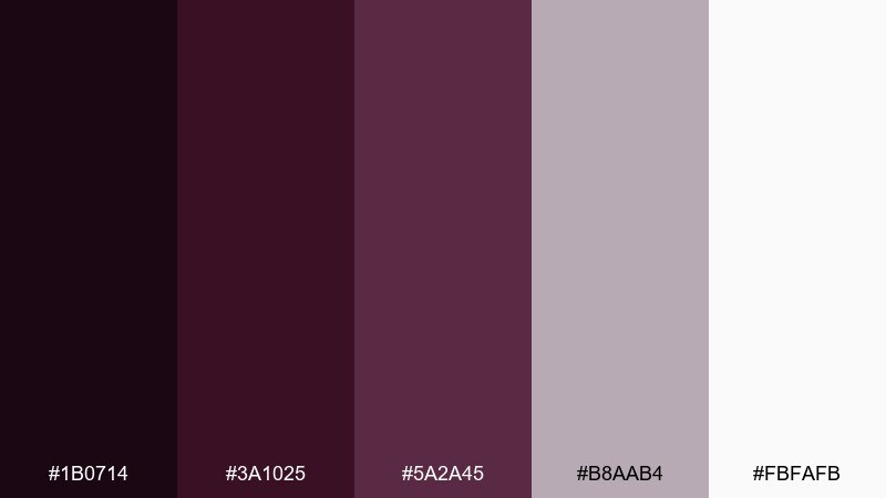
HEX: #1b0714 #3a1025 #5a2a45 #b8aab4 #fbfafb
Mood: minimal, refined, contemporary
Best for: minimal logos, brand marks, monochrome identities
Cinder-dark plum with quiet mauve neutrals feels refined and contemporary. The restrained contrast makes it ideal for logo systems that need to translate across web, print, and embossing. Pair with a single neutral like warm white and use spacing as a design element. Usage tip: test your darkest shade in one-color applications to ensure it holds up on uncoated paper.
Image example of cinder plum minimal generated using media.io
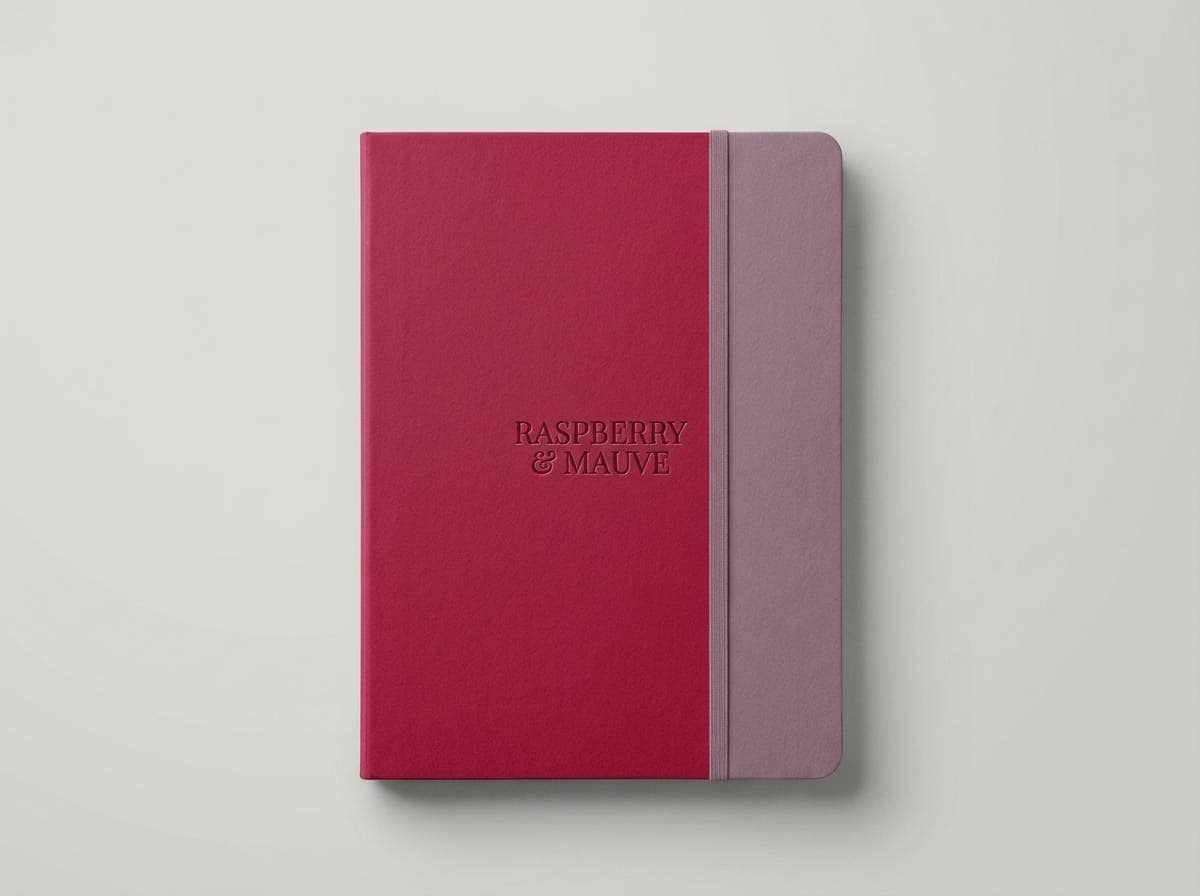
16) Raspberry Ink Notebook
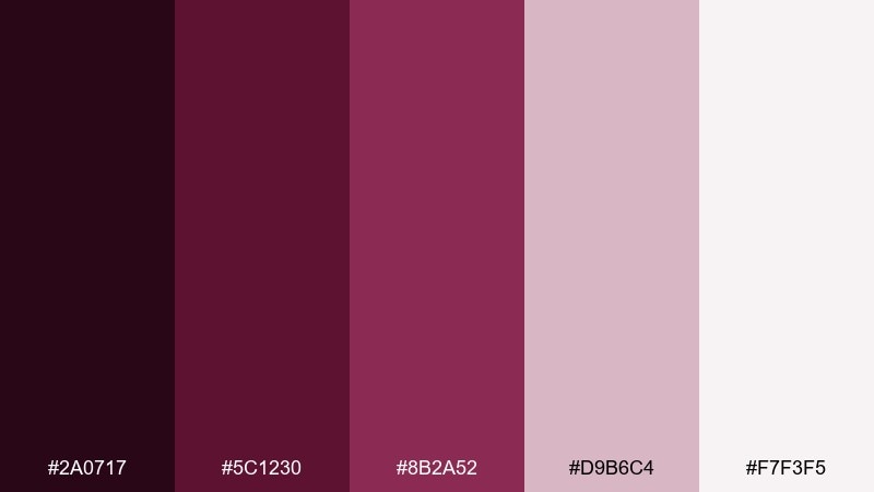
HEX: #2a0717 #5c1230 #8b2a52 #d9b6c4 #f7f3f5
Mood: creative, tactile, cozy
Best for: stationery, notebook covers, journaling brands
Raspberry ink tones feel like fresh pen strokes on soft paper, perfect for a cozy creative brand. The pale mauve and near-white work well for patterns, ruled lines, and subtle cover details. Pair with matte finishes and debossing to emphasize the tactile vibe. Usage tip: keep the darkest shade for titles and spines so the product reads clearly from a distance.
Image example of raspberry ink notebook generated using media.io
17) Mauve Brick Brochure
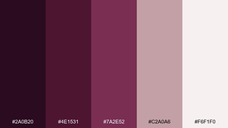
HEX: #2a0b20 #4e1531 #7a2e52 #c2a0a6 #f6f1f0
Mood: urban, polished, trustworthy
Best for: real estate brochures, architecture portfolios, service brands
Urban mauve and brick tones feel structured and trustworthy, like city stone warmed by evening light. Use the mid-tone for section bands and the pale neutral for content-heavy pages. Pair with clean grids and monochrome photography for a modern portfolio look. Usage tip: add a single thin rule line in the light mauve to keep multi-page layouts consistent.
Image example of mauve brick brochure generated using media.io

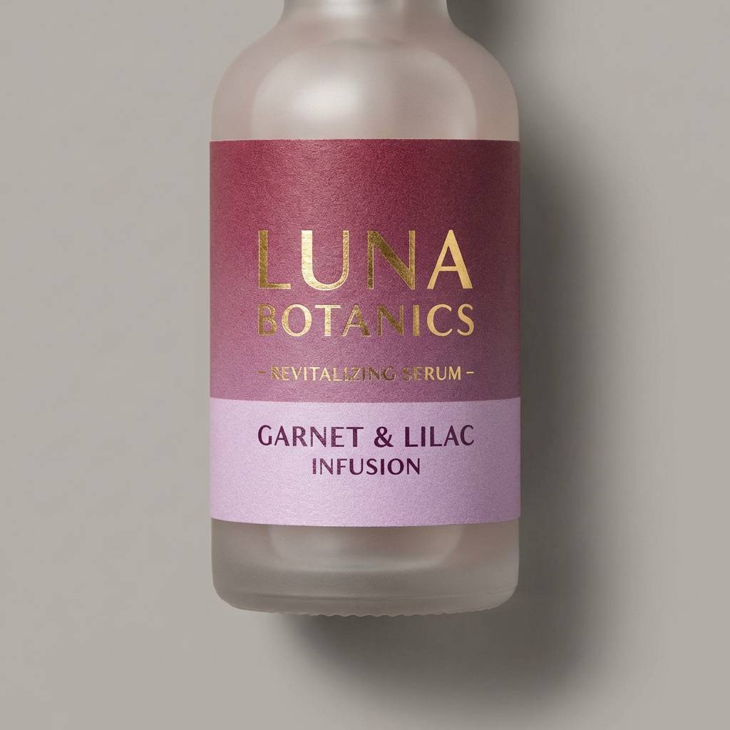
18) Garnet Lilac Ecommerce
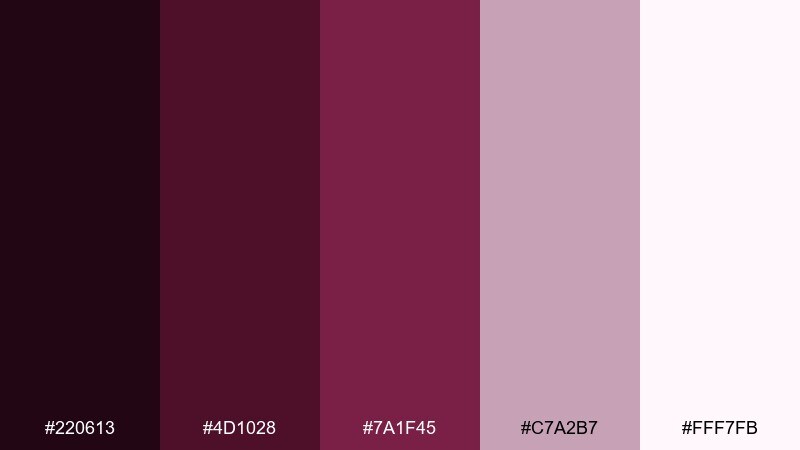
HEX: #220613 #4d1028 #7a1f45 #c7a2b7 #fff7fb
Mood: clean, upscale, conversion-friendly
Best for: beauty ecommerce, product listing banners, promo ads
Clean garnet depth with airy lilac highlights feels upscale without overwhelming the page. This purple maroon color palette is strong for ecommerce because it frames product shots and keeps CTAs clear on light backgrounds. Pair with simple iconography and plenty of white space to maintain a premium, conversion-friendly look. Usage tip: keep buttons in the mid-tone and use the lightest shade for hover states to show subtle interaction.
Image example of garnet lilac ecommerce generated using media.io
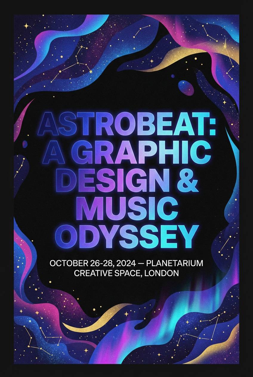
19) Sable Violet Night Sky
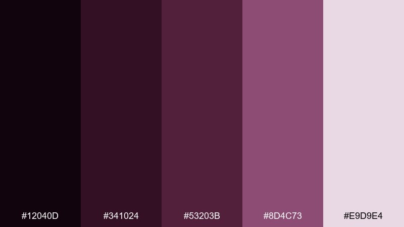
HEX: #12040d #341024 #53203b #8d4c73 #e9d9e4
Mood: mysterious, immersive, nocturnal
Best for: event flyers, album artwork, nightlife promotions
Sable violet shades feel like a night sky over the city, mysterious and immersive. Use the palest tint for dates and venue details, then let the deeper tones carry large typography and abstract shapes. Pair with subtle star-like speckles or grain to enhance depth without adding clutter. Usage tip: keep all small text on the lightest color so it stays readable in low-contrast prints.
Image example of sable violet night sky generated using media.io
20) Blush Oxblood Zen
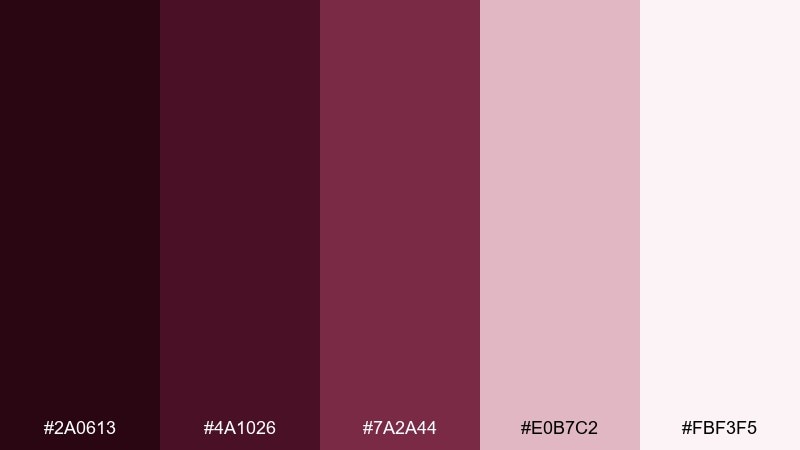
HEX: #2a0613 #4a1026 #7a2a44 #e0b7c2 #fbf3f5
Mood: calming, modern, spa-like
Best for: wellness branding, yoga studios, skincare identity
Calming blush layered over oxblood depth feels like a quiet spa room with soft textiles. The palette supports gentle, minimal branding where warmth is important but the layout still needs clarity. Pair with off-white backgrounds, thin line icons, and muted photography for a soothing system. Usage tip: use the blush tint for panels and the mid-tone for subtle highlights like badges and links.
Image example of blush oxblood zen generated using media.io
21) Heirloom Plum and Pearl
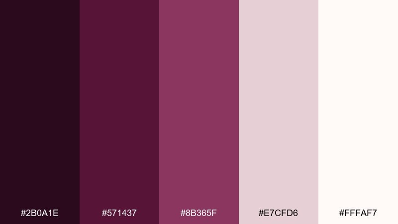
HEX: #2b0a1e #571437 #8b365f #e7cfd6 #fffaf7
Mood: classic, heirloom, romantic
Best for: jewelry branding, artisan packaging, boutique labels
Heirloom plum and pearl tones feel classic, like vintage velvet boxes and soft satin linings. Use the pearl shades for backgrounds and product info, then bring plum forward for logos and seals. Pair with delicate linework and subtle emboss effects for a handcrafted finish. Usage tip: keep the mid-tone for secondary text so the darkest shade stays special for marks and headings.
Image example of heirloom plum and pearl generated using media.io
22) Studio Maroon Accent Set
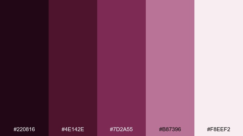
HEX: #220816 #4e142e #7d2a55 #b87396 #f8eef2
Mood: creative, energetic, studio-ready
Best for: creator media kits, podcast covers, channel branding
Studio-ready maroon accents and bright mauve highlights feel energetic and confident. These tones are easy to apply to cover art, where strong contrast helps titles stand out at thumbnail size. Pair with bold sans-serif type and simple geometric shapes to keep the design punchy. Usage tip: set your title in the lightest tint and outline it subtly with the mid-tone to improve small-screen readability.
Image example of studio maroon accent set generated using media.io

23) Soft Garnet Minimal UI
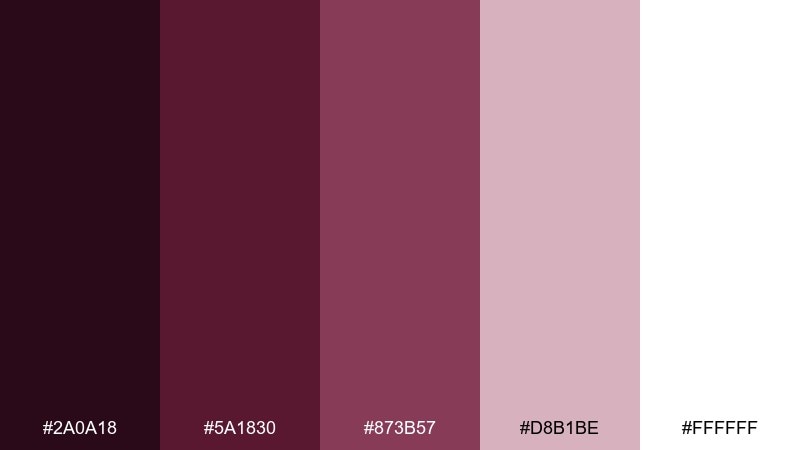
HEX: #2a0a18 #5a1830 #873b57 #d8b1be #ffffff
Mood: soft, clean, approachable
Best for: light UI themes, settings screens, SaaS marketing pages
Soft garnet with lots of white space feels approachable, clean, and easy on the eyes. It is one of those purple maroon color combinations that works beautifully for light-mode products where you want warmth without visual noise. Pair with cool gray borders and keep the mid-tone for primary buttons and active tabs. Usage tip: use the blush tint as a background for alerts and helper text so feedback feels friendly, not harsh.
Image example of soft garnet minimal ui generated using media.io
What Colors Go Well with Purple Maroon?
Warm neutrals are the easiest win: ivory, cream, blush, sand, and soft taupe keep purple maroon from feeling too heavy and make typography more readable. They also translate well across print stocks and screen backgrounds.
For crisp contrast, bring in cool grays or near-white tints for UI surfaces, dividers, and card backgrounds. If you want a premium accent, brass, antique gold, or muted copper tones add “finish” without fighting the base color.
When you need energy, use a controlled pop: mauve-pink highlights, dusty lavender, or a berry accent works better than neon. Keep that accent limited so the purple maroon remains the anchor.
How to Use a Purple Maroon Color Palette in Real Designs
Start with role assignment: pick one dark purple maroon for backgrounds or headline blocks, one mid-tone for buttons and key UI states, and one light neutral for text areas and spacing. This keeps the system consistent and prevents muddy layouts.
In print, avoid over-inking large areas with the darkest shades unless you’ve tested on the final paper. Using the lightest tint as the “paper tone” and reserving the deepest color for titles, seals, and frames often looks more refined.
For branding, pair purple maroon with simple type and generous whitespace. It reads confident on its own—your design will look more expensive when you let it breathe.
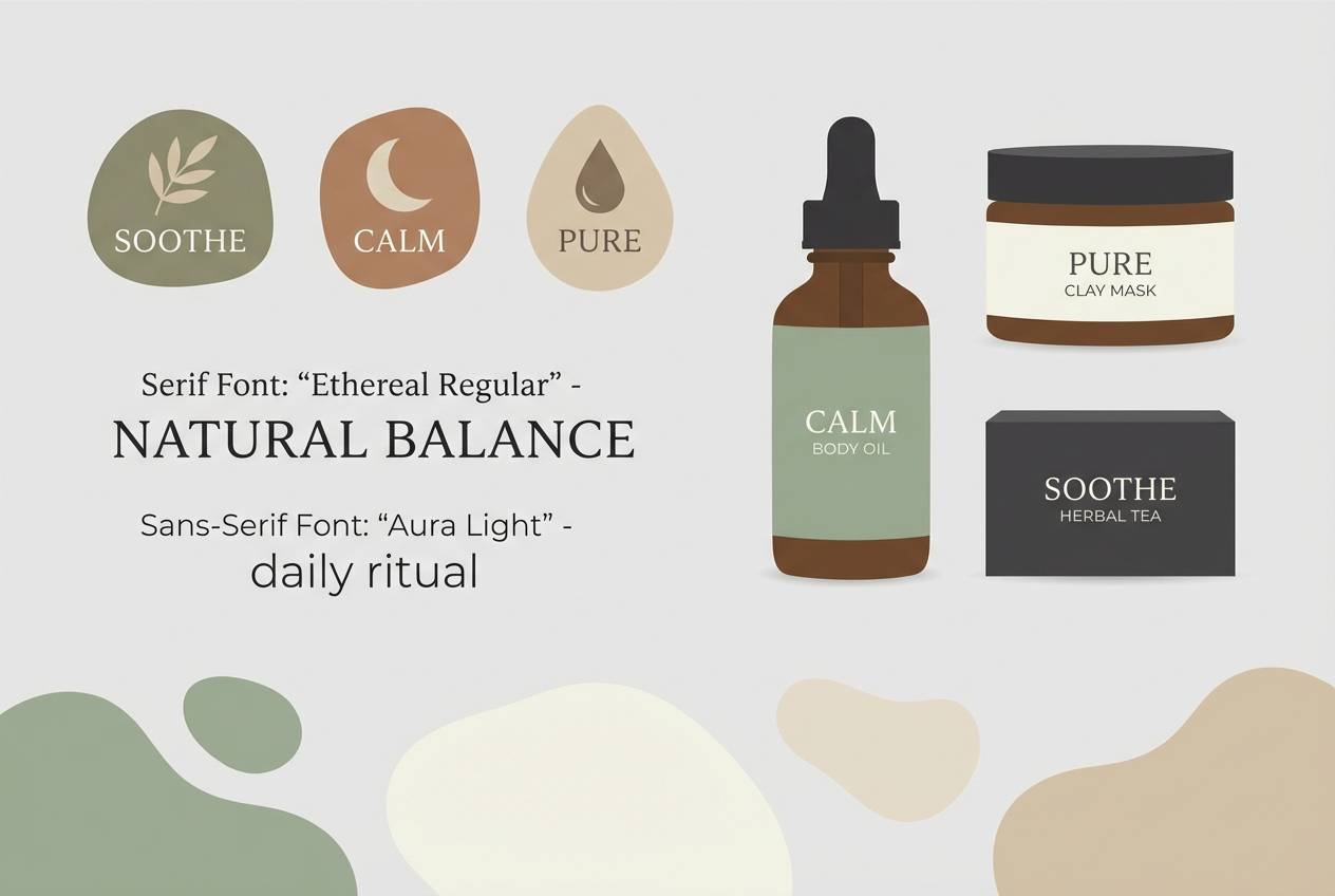
Create Purple Maroon Palette Visuals with AI
If you already have HEX codes, you can turn them into on-brand mockups faster by generating visuals that match the palette’s mood—like dark dashboards, wedding suites, packaging, or posters. This helps stakeholders see the color story in context, not just as swatches.
With Media.io’s AI image generation, you can iterate on prompts and layout styles while keeping your purple maroon direction consistent. It’s especially useful for exploring multiple brand routes before committing to a final system.
Generate a few variations per palette (minimal, textured, high-contrast) and compare readability, contrast, and overall vibe. Then lock the winners into your brand guide or UI kit.
Purple Maroon Color Palette FAQs
-
What is a purple maroon color palette used for?
Purple maroon palettes are commonly used for premium branding, dark-mode UI, editorial design, and packaging because they create depth and a sophisticated, romantic feel while staying readable with light neutrals. -
Which neutral colors pair best with purple maroon?
Ivory, cream, warm white, blush, sand, and soft taupe pair best because they lighten the palette and improve contrast for text-heavy layouts in both print and digital. -
Is purple maroon better for dark mode or light mode?
It works for both. In dark mode, use purple maroon as the background with near-white text and restrained accents. In light mode, keep backgrounds white/cream and use purple maroon for buttons, headings, and highlights. -
How do I keep purple maroon from looking muddy in print?
Test on the actual paper stock, avoid flooding large areas with the darkest tone, and consider slightly warming or magenta-shifting the mix so deep purples don’t flatten. Using lighter neutrals for backgrounds also helps. -
What accent colors make purple maroon look more modern?
Cool grays, foggy lilacs, clean near-whites, and controlled mauve/rose highlights feel modern. Metallic accents like brass or antique gold can also modernize the look when used sparingly. -
How many colors should I use from a purple maroon palette in a UI?
A practical approach is 3–5: one base background, one surface color, one primary text color, one brand/CTA color, and one subtle border or state tint. Keep the bold accent under about 10% of the interface for a premium feel. -
Can I generate purple maroon palette mockups with AI?
Yes. Use Media.io’s text-to-image tool to generate posters, packaging, invitations, or UI screens that match your chosen HEX direction, then iterate the prompt to refine typography, texture, and contrast.
Next: Xanadu Color Palette


