

Purple brown palettes blend the richness of plum, aubergine, and mulberry with the steady warmth of cocoa, mocha, and espresso. The result feels modern yet grounded—perfect when you want color with maturity.
Below are 20 purple brown color palette ideas with HEX codes, plus image prompts you can recreate for branding, UI, print, and seasonal graphics.
In this article
- Why Purple Brown Palettes Work So Well
-
- mulberry mocha
- plum truffle
- heather walnut
- orchid espresso
- lilac cocoa mist
- amethyst bark
- dusty mauve cedar
- grape chestnut
- rosewood violet
- aubergine latte
- fig leather
- boysenberry clay
- vintage plum suede
- berry brownstone
- smoky iris cocoa
- cacao bloom
- twilight raisin
- soft wisteria umber
- cinnamon plum glaze
- deep purple sienna
- What Colors Go Well with Purple Brown?
- How to Use a Purple Brown Color Palette in Real Designs
- Create Purple Brown Palette Visuals with AI
Why Purple Brown Palettes Work So Well
Purple brings emotion and depth—often reading as creative, premium, or romantic—while brown adds stability, warmth, and a natural “material” feel (wood, leather, coffee, chocolate). Together, they create a confident palette that still feels approachable.
This pairing is also flexible across seasons: deeper plums with espresso lean autumn/winter, while lilac with cocoa and creamy neutrals can feel fresh for spring packaging or clean UI layouts.
From a practical design perspective, purple-brown schemes offer strong contrast options without relying on harsh black. That makes typography and UI states feel softer, more editorial, and less sterile.
20+ Purple Brown Color Palette Ideas (with HEX Codes)
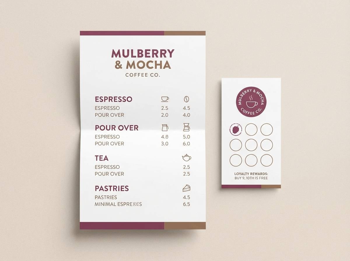
1) Mulberry Mocha
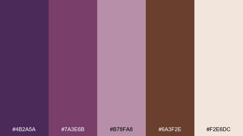
HEX: #4B2A5A #7A3E6B #B78FA8 #6A3F2E #F2E6DC
Mood: cozy, romantic, grounded
Best for: coffee shop branding and menus
Cozy and romantic like berry jam on warm toast, with mocha depth to keep it grounded. It works beautifully on menus, loyalty cards, and café signage where you want comfort without looking dated. Pair the cream as your main background, then use mulberry for headers and the mocha brown for prices or dividers. Tip: keep body text in the darkest purple for readability, and use the dusty pink as a soft highlight.
Image example of mulberry mocha generated using media.io
Media.io is an online AI studio for creating and editing video, image, and audio in your browser.

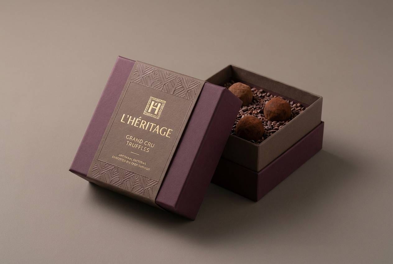
2) Plum Truffle
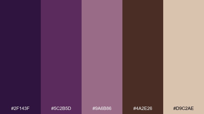
HEX: #2F143F #5C2B5D #9A6B86 #4A2E26 #D9C2AE
Mood: luxury, intimate, night-out
Best for: fine chocolate packaging and labels
Luxurious and intimate, like velvet lighting in a boutique chocolatier. This purple brown color palette shines on matte boxes, foil stamps, and premium labels where contrast matters. Let the deep plum carry the logo, keep the truffle brown for supporting text, and use the warm beige for breathing room. Tip: add a tiny metallic accent in print, but keep digital versions flat for a modern feel.
Image example of plum truffle generated using media.io
3) Heather Walnut
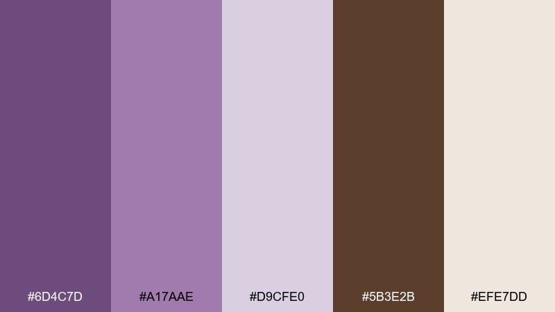
HEX: #6D4C7D #A17AAE #D9CFE0 #5B3E2B #EFE7DD
Mood: calm, airy, natural
Best for: wellness blogs and lifestyle sites
Calm and airy like heather fields under soft clouds, warmed by walnut undertones. It fits wellness blogs, gentle lifestyle brands, and calming landing pages where the vibe should feel human. Use the pale neutrals for sections, then bring in heather for headings and walnut for CTAs. Tip: keep buttons in walnut with off-white text for a subtle but clear click target.
Image example of heather walnut generated using media.io
4) Orchid Espresso
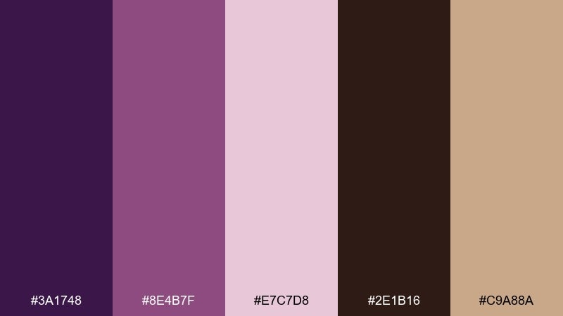
HEX: #3A1748 #8E4B7F #E7C7D8 #2E1B16 #C9A88A
Mood: dramatic, chic, confident
Best for: evening event posters and tickets
Dramatic and chic, like orchids against a dim espresso bar. The high contrast makes it strong for event posters, tickets, and social graphics where you need instant impact. Keep backgrounds dark, use orchid for key type, and soften transitions with blush. Tip: reserve the tan shade for small details like dates and separators so it reads premium, not busy.
Image example of orchid espresso generated using media.io

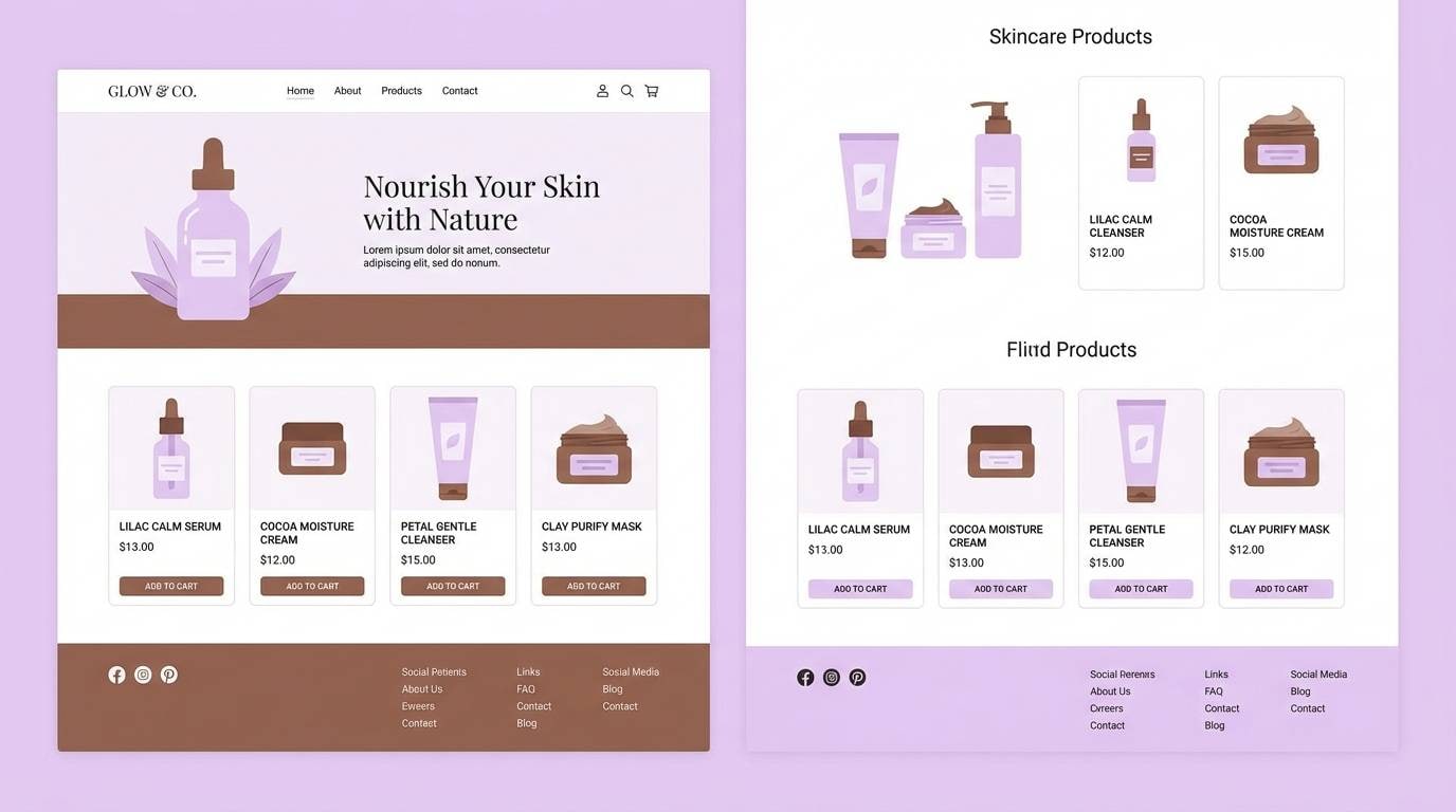
5) Lilac Cocoa Mist
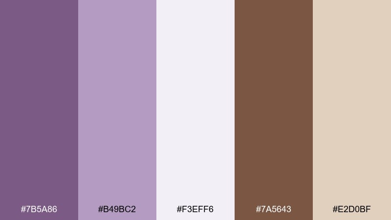
HEX: #7B5A86 #B49BC2 #F3EFF6 #7A5643 #E2D0BF
Mood: soft, clean, comforting
Best for: skincare product pages and ads
Soft and clean like lilac steam in a warm bath, with cocoa tones adding comfort. It works well for skincare pages, gentle product ads, and minimalist ecommerce where the background should feel fresh. Use the misty off-white as the main canvas, then bring lilac into badges and section headers. Tip: keep one brown tone for prices and add-to-cart buttons to anchor the page.
Image example of lilac cocoa mist generated using media.io
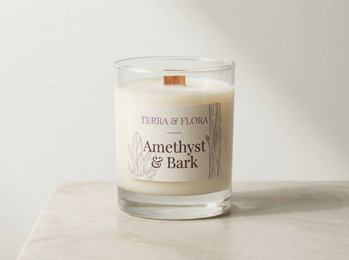
6) Amethyst Bark
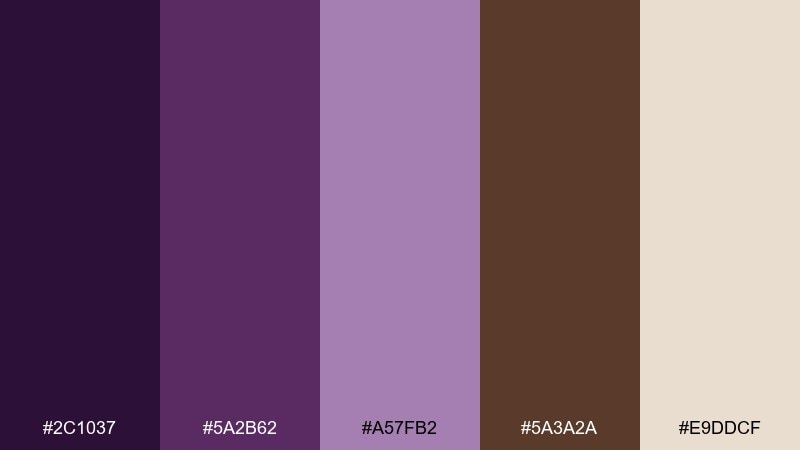
HEX: #2C1037 #5A2B62 #A57FB2 #5A3A2A #E9DDCF
Mood: moody, earthy, artistic
Best for: handcrafted candle labels
Moody and earthy like amethyst stones beside rough bark and dried herbs. These purple brown color combinations feel especially right for handcrafted labels and small-batch packaging. Let the light neutral carry the label background, then use the darkest purple for the brand name and bark brown for scent notes. Tip: add small line icons in the mid purple to keep the label detailed but uncluttered.
Image example of amethyst bark generated using media.io
7) Dusty Mauve Cedar
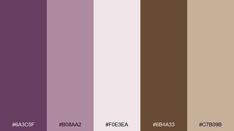
HEX: #6A3C5F #B08AA2 #F0E3EA #6B4A33 #C7B09B
Mood: vintage, warm, welcoming
Best for: rustic wedding invitations
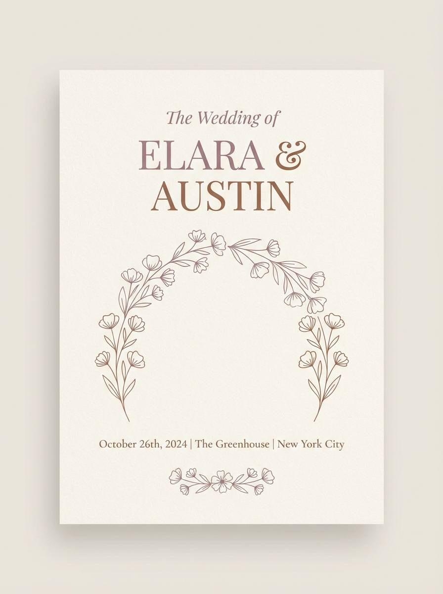
Vintage and welcoming, like pressed flowers tucked into a cedar keepsake box. It suits rustic weddings, vow books, and save-the-dates where you want warmth without going overly pink. Use the pale blush as the paper base, then set names in mauve and details in cedar. Tip: keep decorative flourishes thin and minimal so the palette stays airy.
Image example of dusty mauve cedar generated using media.io
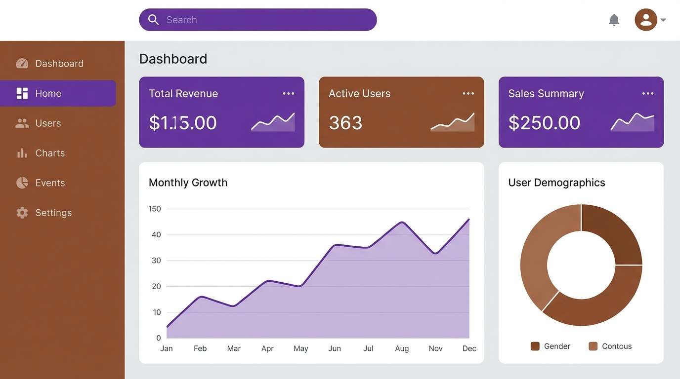
8) Grape Chestnut
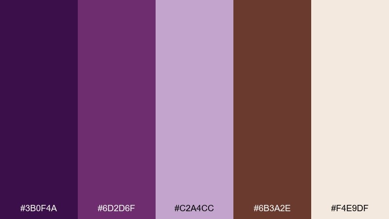
HEX: #3B0F4A #6D2D6F #C2A4CC #6B3A2E #F4E9DF
Mood: bold, elegant, modern
Best for: dashboard UI and data cards
Bold and elegant, like ripe grapes against polished chestnut wood. A purple brown color scheme like this helps dashboards feel premium while staying readable. Use the off-white for surfaces, keep grape for active states and key metrics, and reserve chestnut for secondary buttons or tags. Tip: limit the mid-lavender to charts and highlights so your data stays the focus.
Image example of grape chestnut generated using media.io
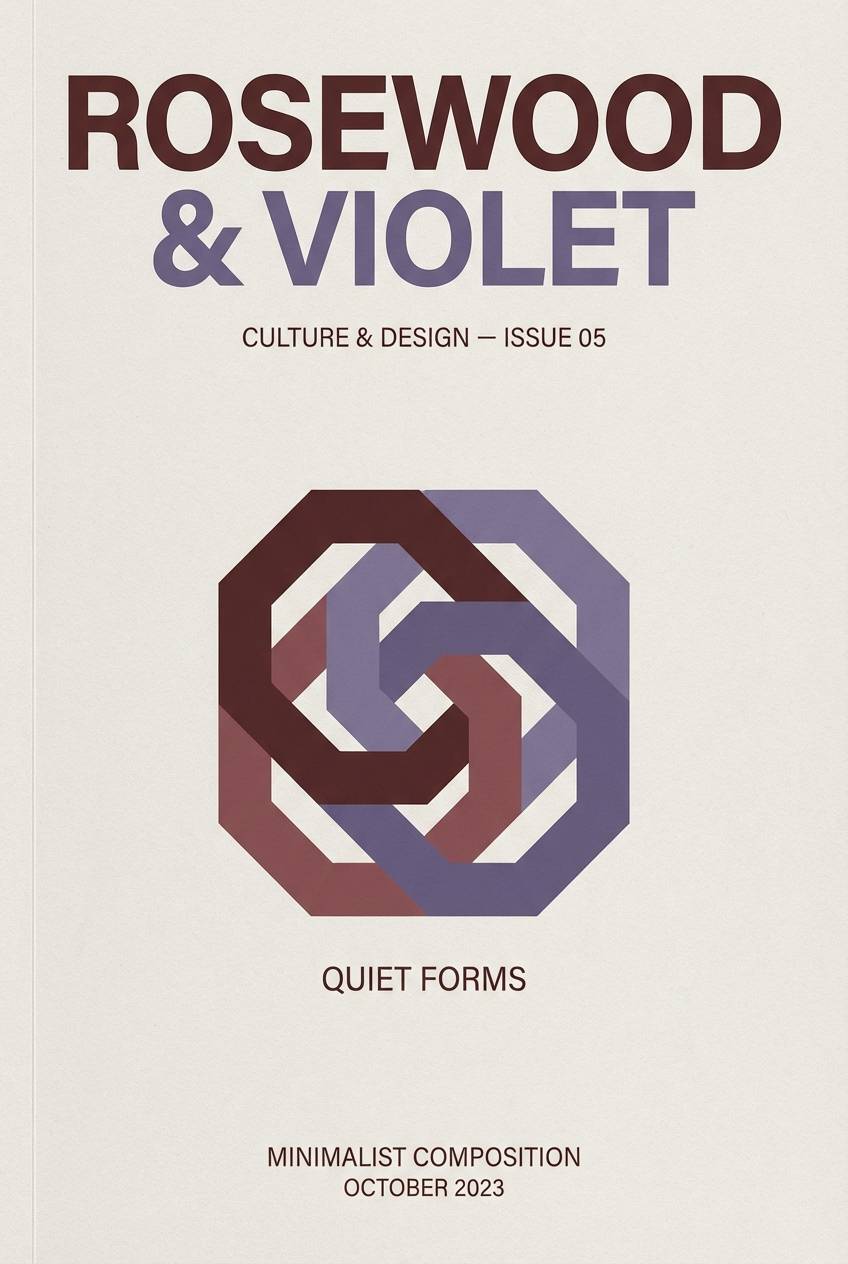
9) Rosewood Violet
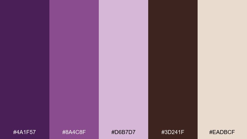
HEX: #4A1F57 #8A4C8F #D6B7D7 #3D241F #EADBCF
Mood: romantic, classic, refined
Best for: book covers and editorial headers
Romantic and classic, like rosewood furniture in a quiet reading room. It fits book covers, editorial headers, and culture newsletters that need a refined tone. Pair the darkest violet with the deep brown for typography, and let the pale neutral open up the layout. Tip: use the light lavender sparingly behind pull quotes to create hierarchy without heavy boxes.
Image example of rosewood violet generated using media.io
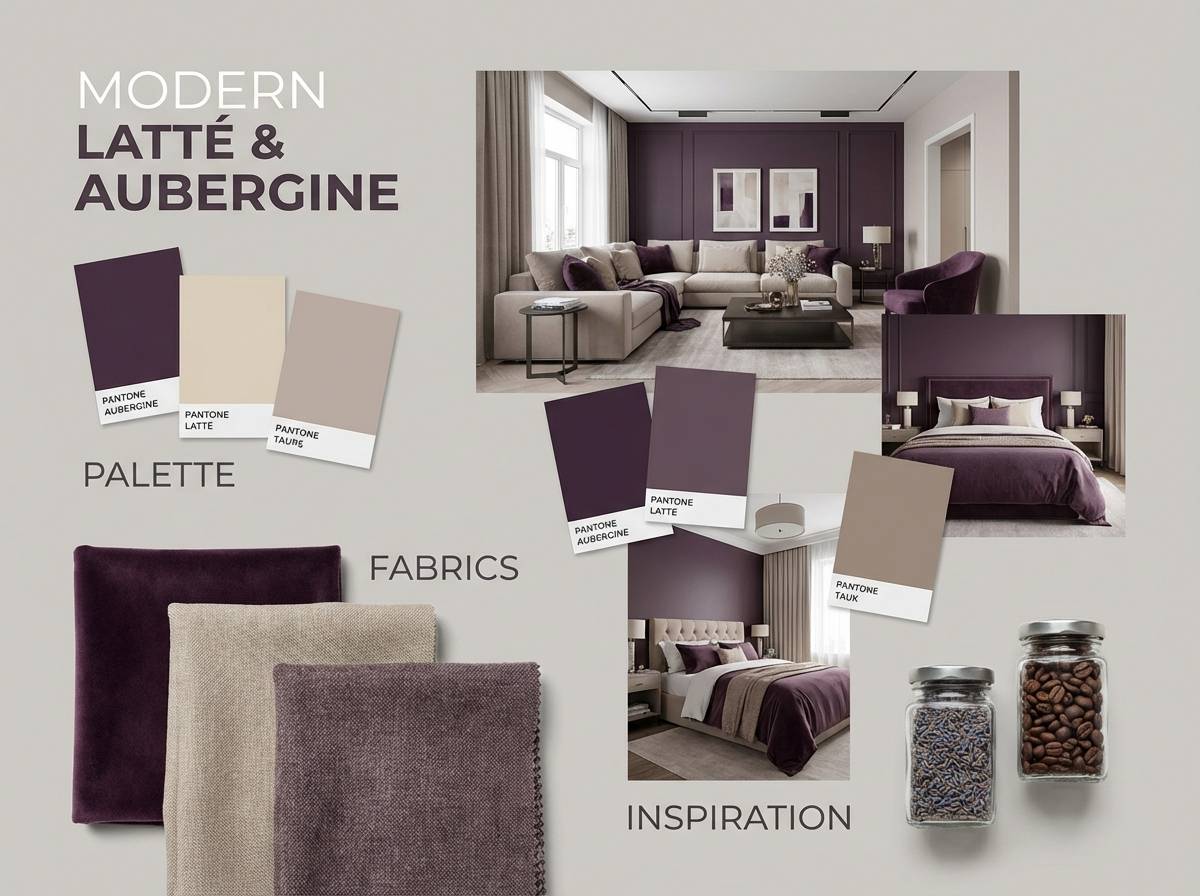
10) Aubergine Latte
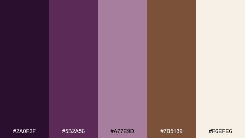
HEX: #2A0F2F #5B2A56 #A77E9D #7B5139 #F6EFE6
Mood: smooth, sophisticated, cozy
Best for: interior design mood boards
Smooth and sophisticated like an aubergine wall with creamy latte lighting. It is ideal for interior mood boards, textile selections, and cozy home-styling presentations. Keep the cream as your base and use aubergine for big swatches, then bring in brown for wood and leather notes. Tip: add texture in the visuals (linen, walnut grain) rather than adding more colors.
Image example of aubergine latte generated using media.io
11) Fig Leather
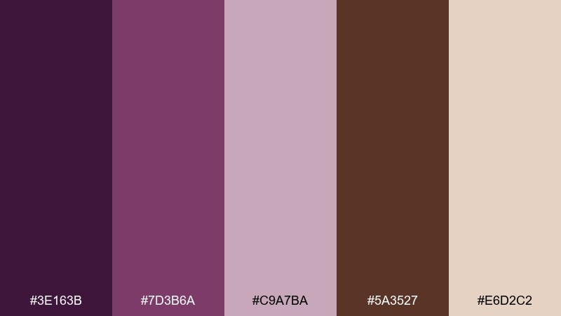
HEX: #3E163B #7D3B6A #C9A7BA #5A3527 #E6D2C2
Mood: heritage, tactile, premium
Best for: boutique fashion lookbooks
Heritage and tactile, like ripe figs beside worn leather. A purple brown color palette like this feels premium on lookbooks, hang tags, and brand guidelines for boutique fashion. Use the leather brown for headings and rules, then layer fig and mauve in photography overlays and section titles. Tip: keep margins generous so the darker tones feel deliberate, not heavy.
Image example of fig leather generated using media.io
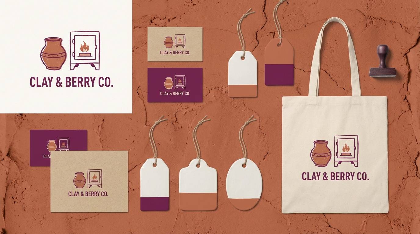
12) Boysenberry Clay
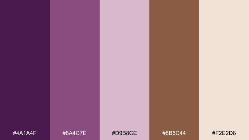
HEX: #4A1A4F #8A4C7E #D9B8CE #8B5C44 #F2E2D6
Mood: earthy, playful, handmade
Best for: ceramics studio branding
Earthy and playful, like boysenberry glaze on warm clay pottery. It suits ceramics studios, craft markets, and handmade product tags where you want color without losing authenticity. Use the clay brown as the foundation, then add boysenberry for stamps, icons, and small patterns. Tip: keep backgrounds light and textured so the palette reads artisanal rather than loud.
Image example of boysenberry clay generated using media.io
13) Vintage Plum Suede
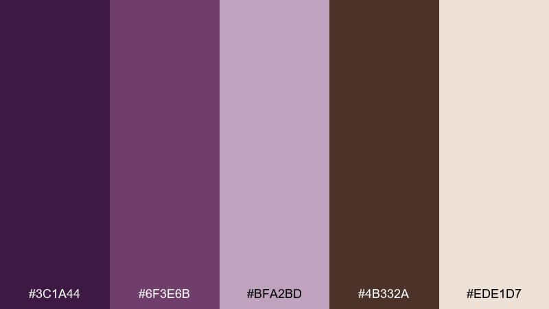
HEX: #3C1A44 #6F3E6B #BFA2BD #4B332A #EDE1D7
Mood: nostalgic, muted, classy
Best for: restaurant menus and signage
Nostalgic and muted, like plum suede against aged wood. It works well for restaurants that want a classic mood with modern typography. Put the light neutral behind menu sections, then use the deep plum for dish titles and the brown for details and icons. Tip: avoid pure black; the darkest plum gives you contrast with a softer finish.
Image example of vintage plum suede generated using media.io
14) Berry Brownstone
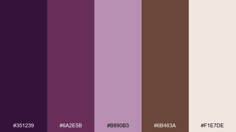
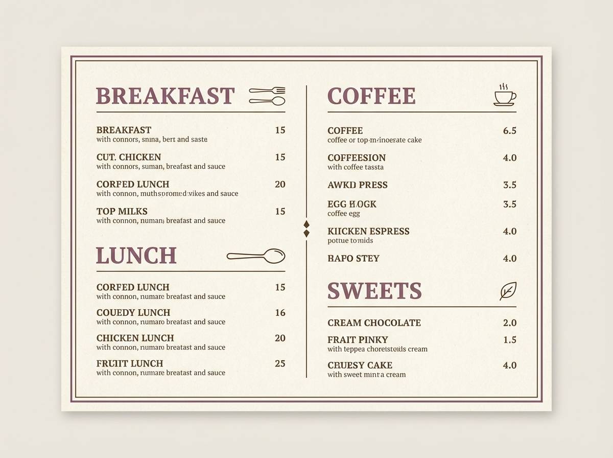
HEX: #351239 #6A2E5B #B890B3 #6B463A #F1E7DE
Mood: urban, warm, understated
Best for: real estate brochures and flyers
Urban and understated, like berry-toned dusk between brownstone buildings. It is a solid fit for real estate brochures, neighborhood guides, and property flyers that need warmth and trust. Use the neutral as the main page color, keep brown for body text, and let berry shades highlight amenities and key numbers. Tip: keep photos natural and slightly warm to match the palette.
Image example of berry brownstone generated using media.io
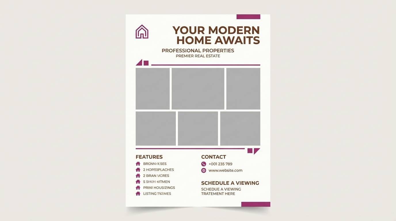
15) Smoky Iris Cocoa
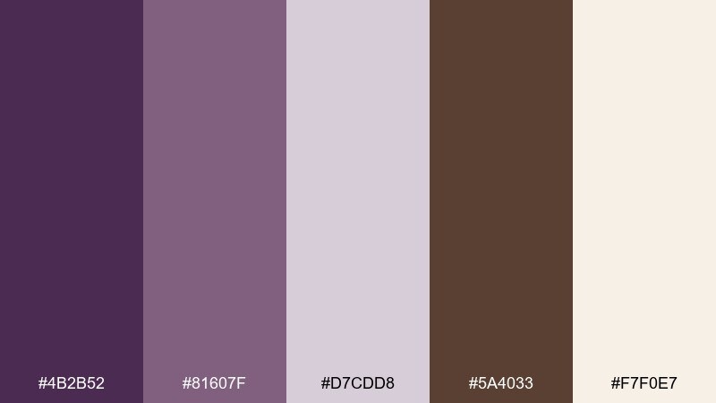
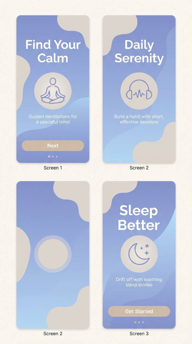
HEX: #4B2B52 #81607F #D7CDD8 #5A4033 #F7F0E7
Mood: soft, minimal, serene
Best for: meditation apps and onboarding screens
Soft and serene like smoky iris petals fading into cocoa shadows. It is great for meditation apps, onboarding screens, and calm UI states where the user should feel supported. Use the palest shade for backgrounds and reserve cocoa for primary actions, then bring in iris for focus rings and progress steps. Tip: keep gradients subtle and lean on spacing for a truly quiet look.
Image example of smoky iris cocoa generated using media.io
16) Cacao Bloom
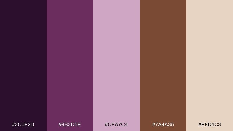
HEX: #2C0F2D #6B2D5E #CFA7C4 #7A4A35 #E8D4C3
Mood: rich, floral, modern
Best for: perfume ads and gift sets
Rich and floral, like dark cacao wrapped in blooming petals. These purple brown color combinations are made for perfume ads and gift sets that need elegance without going cold. Use the deep plum for headlines, keep the warm beige for negative space, and bring in brown for product details. Tip: add one soft spotlight gradient behind the bottle to make the colors feel luminous.
Image example of cacao bloom generated using media.io

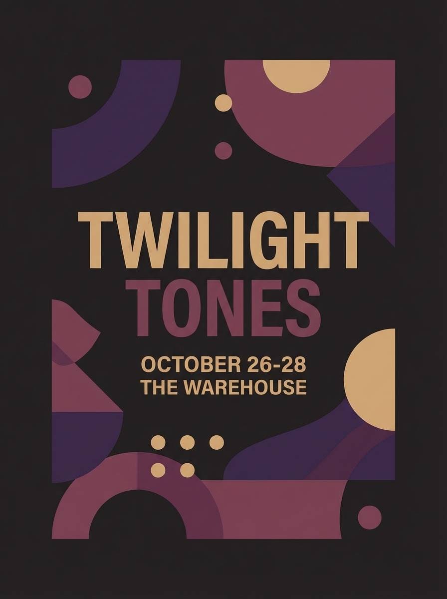
17) Twilight Raisin
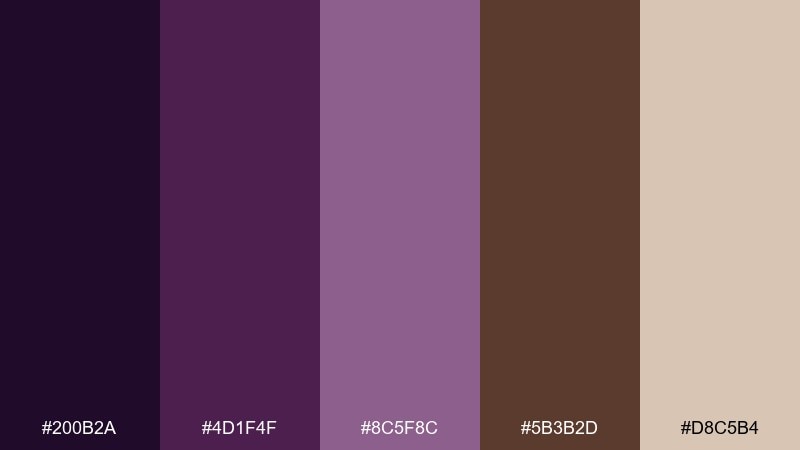
HEX: #200B2A #4D1F4F #8C5F8C #5B3B2D #D8C5B4
Mood: mysterious, cinematic, bold
Best for: music posters and album promos
Mysterious and cinematic, like twilight haze with a raisin-deep glow. It is ideal for music posters, album promos, and nightlife social graphics where bold contrast matters. Keep the darkest shade for the background, then use the mid purple for type and the tan for small date lines. Tip: use large letterforms and plenty of tracking so the dark tones stay crisp.
Image example of twilight raisin generated using media.io
18) Soft Wisteria Umber
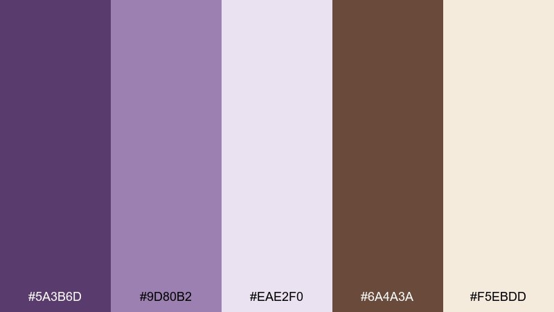
HEX: #5A3B6D #9D80B2 #EAE2F0 #6A4A3A #F5EBDD
Mood: gentle, botanical, springlike
Best for: botanical illustrations and stationery
Gentle and springlike, like wisteria vines over warm umber soil. It is perfect for stationery, greeting cards, and botanical artwork where you want softness with structure. Use the pale lilac as the paper tone, then build florals in layered purples with umber for stems and outlines. Tip: keep outlines thin and let watercolor texture create depth instead of heavy shading.
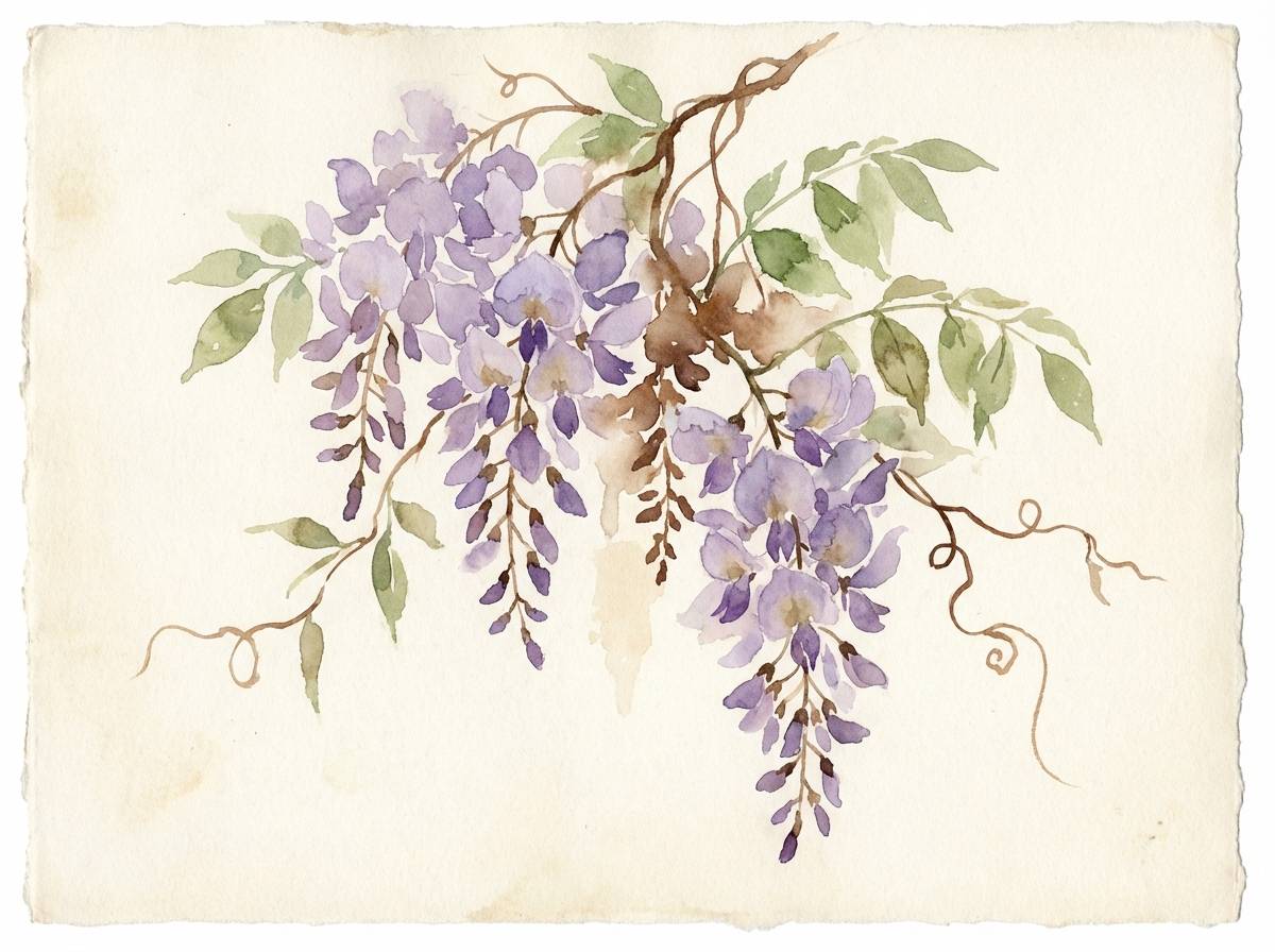
Image example of soft wisteria umber generated using media.io
19) Cinnamon Plum Glaze
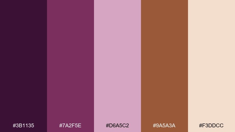
HEX: #3B1135 #7A2F5E #D6A5C2 #9A5A3A #F3DDCC
Mood: sweet, festive, inviting
Best for: bakery packaging and seasonal promos
Sweet and festive, like cinnamon glaze over plum-filled pastries. It works for bakery packaging, seasonal promos, and warm social templates that should feel inviting at a glance. Use the soft peach as the base, then add plum for headlines and cinnamon for badges like limited time. Tip: keep the brightest accent for one callout per design to avoid a sugary overload.
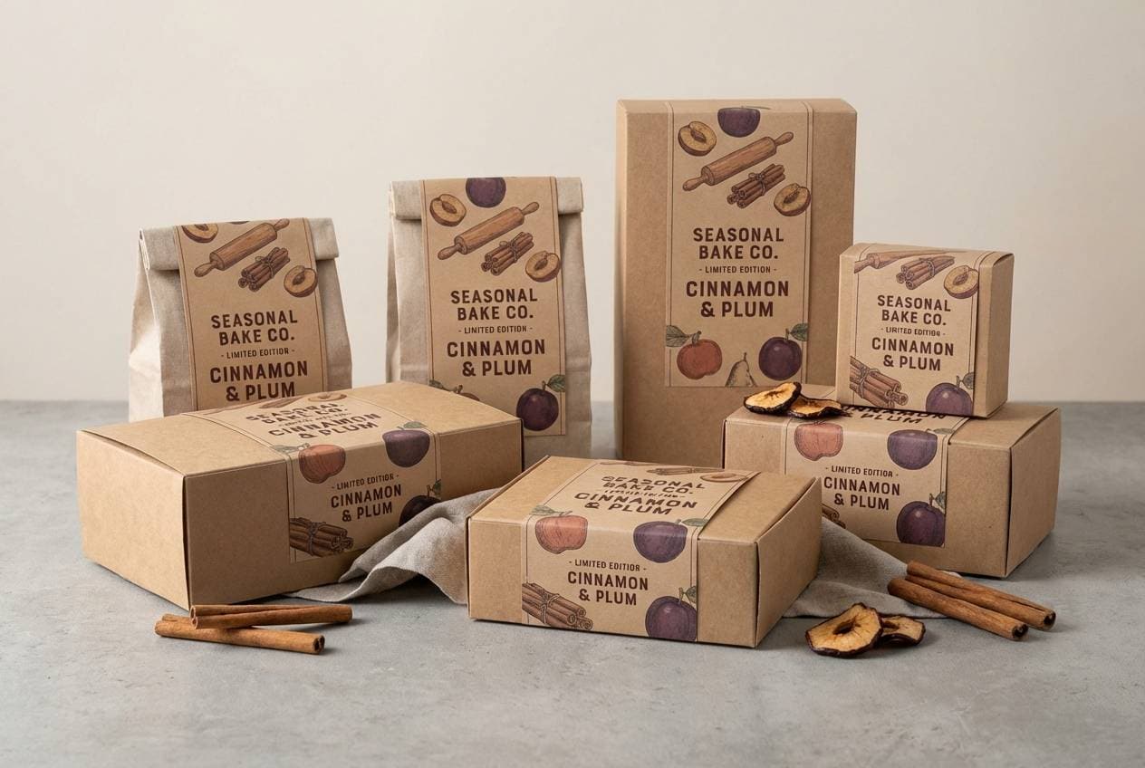
Image example of cinnamon plum glaze generated using media.io
20) Deep Purple Sienna
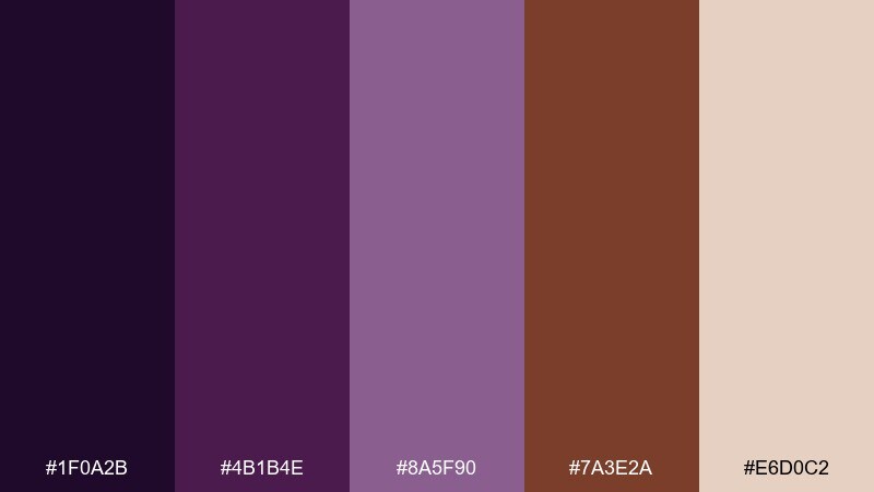
HEX: #1F0A2B #4B1B4E #8A5F90 #7A3E2A #E6D0C2
Mood: confident, grounded, refined
Best for: brand guidelines and logo systems
Confident and grounded, like deep purple velvet paired with sun-baked sienna. These tones are strong for brand guidelines, logo systems, and pitch decks that need authority without looking harsh. Use the pale neutral for pages, keep the darkest purple as the primary brand color, and let sienna handle supporting highlights. Tip: test small text in the dark purple first; it often reads cleaner than pure brown.
Image example of deep purple sienna generated using media.io
What Colors Go Well with Purple Brown?
Warm neutrals are the easiest match: cream, oatmeal, sand, and soft beige keep purple-brown schemes breathable and help dark plums feel less heavy. They also make product photography and UI layouts look clean and intentional.
For contrast, try muted greens (sage, olive) or deep blue-grays (slate, ink). These add freshness without fighting the earthy base, especially in interiors, lifestyle branding, and dashboards.
If you need a pop accent, use a small dose of metallics (gold/bronze in print) or a soft peach/blush highlight. Keep accents minimal so the palette stays premium rather than busy.
How to Use a Purple Brown Color Palette in Real Designs
Start by choosing one “hero” dark (plum/aubergine) and one grounding brown (mocha/espresso). Use a light neutral as the main background so type, icons, and images have room to breathe.
For UI, reserve the darkest tone for key text and nav, then use mid purples for active states and charts. Browns work well for primary buttons, tags, or dividers because they feel tactile and trustworthy.
For print and packaging, lean into material cues: matte finishes, paper texture, and subtle grain. Purple-brown palettes look best when the design system uses spacing and typography hierarchy instead of extra colors.
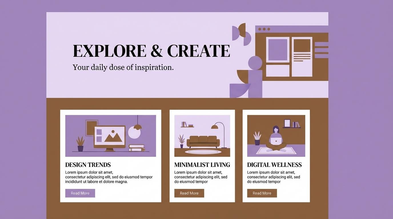
Create Purple Brown Palette Visuals with AI
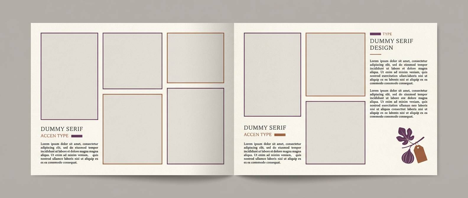
If you want to preview how a purple brown color palette will look on a menu, label, landing page, or poster, generate quick mockups from a text prompt. This helps you validate contrast, mood, and composition before you commit to a full design.
In Media.io, paste one of the prompts above, then tweak keywords like “matte,” “soft diffused lighting,” “flat UI,” or the aspect ratio to match your platform. Keep your HEX palette nearby so you can iterate consistently across assets.
Once you have a few variations, pick the version with the clearest hierarchy: light background for readability, deep purple for brand character, and brown for grounding details and calls-to-action.
Purple Brown Color Palette FAQs
-
What does a purple brown color palette communicate?
It typically communicates richness and creativity (purple) paired with warmth and reliability (brown). Together, they often feel premium, grounded, and slightly romantic—great for brands that want sophistication without looking cold. -
Is purple and brown a good combination for branding?
Yes—especially for boutique, food and beverage (coffee/chocolate), wellness, and editorial-style brands. Use a light neutral to keep the identity modern, and reserve deep purple/brown for logos, headings, and key accents. -
How do I keep purple brown designs from looking too dark?
Use a cream, beige, or off-white as the dominant background and treat plum/espresso as accent colors. Also increase whitespace and avoid overusing the darkest shades in large blocks. -
What are the best accent colors for purple brown palettes?
Soft beige/cream, blush/peach, muted sage/olive, and slate/blue-gray work well. Metallic gold or bronze can be a strong print accent when used sparingly. -
Which purple brown palette is best for UI design?
Options like Grape Chestnut and Smoky Iris Cocoa are especially UI-friendly because they include a clean off-white base plus clear mid-tones for highlights, charts, and active states. -
Can I use purple brown palettes for weddings and invitations?
Absolutely—Dusty Mauve Cedar and similar muted combinations feel warm and timeless. Pair with thin line art and airy spacing to keep the stationery elegant. -
How can I generate purple brown palette mockups quickly?
Use Media.io text-to-image: choose a design type (menu, label, UI, poster), paste a prompt, and iterate by adjusting descriptors like “matte,” “minimal,” or “soft lighting,” while keeping your HEX colors consistent across versions.


