

Lavender blue sits right between calm blue and dreamy purple, which makes it a flexible base for modern UI, branding, and interior color planning.
Below are 20 curated lavender blue color palette ideas with ready-to-copy HEX codes, plus practical pairing tips and AI prompts you can reuse in Media.io.
In this article
- Why Lavender Blue Palettes Work So Well
-
- misty lilac morning
- periwinkle latte
- neon orchid pop
- dusty denim bouquet
- moonlit gradient
- icy silver veil
- coastal haze
- royal amethyst night
- soft nursery cloud
- studio lavender
- retro arcade bloom
- ceramic lavender
- violet ink & paper
- snowy iris
- solar flare accent
- evening spa stones
- garden twilight
- tech lavender grid
- silver linings
- candy vapor
- What Colors Go Well with Lavender Blue?
- How to Use a Lavender Blue Color Palette in Real Designs
- Create Lavender Blue Palette Visuals with AI
Why Lavender Blue Palettes Work So Well
Lavender blue feels soothing but still “designed,” which is why it works across wellness, SaaS, beauty, and editorial layouts. It has the trust of blue, with the personality and softness of purple.
It also plays nicely with both cool and warm neutrals. Pair it with silver and white for a crisp, minimal look, or introduce cream, caramel, and gold to make it feel more human and premium.
Most importantly, lavender blue supports clear hierarchy. Dark indigo or charcoal anchors text and navigation, while lighter tints create spacious cards, gradients, and backgrounds without looking stark.
20+ Lavender Blue Color Palette Ideas (with HEX Codes)
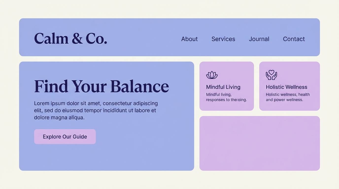
1) Misty Lilac Morning
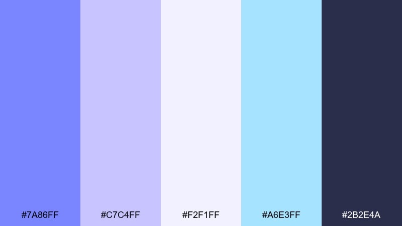
HEX: #7A86FF #C7C4FF #F2F1FF #A6E3FF #2B2E4A
Mood: airy, calm, fresh
Best for: wellness brand landing page UI
Airy and optimistic like early light through sheer curtains, these tones feel clean without turning cold. Use the deep indigo as your type and nav anchor, then let the periwinkle and lilac carry hero sections and cards. Pair with soft whites and subtle gradients to keep the interface spacious. Usage tip: reserve the aqua for links and micro-interactions so it reads as intentional, not decorative.
Image example of misty lilac morning generated using media.io
Media.io is an online AI studio for creating and editing video, image, and audio in your browser.

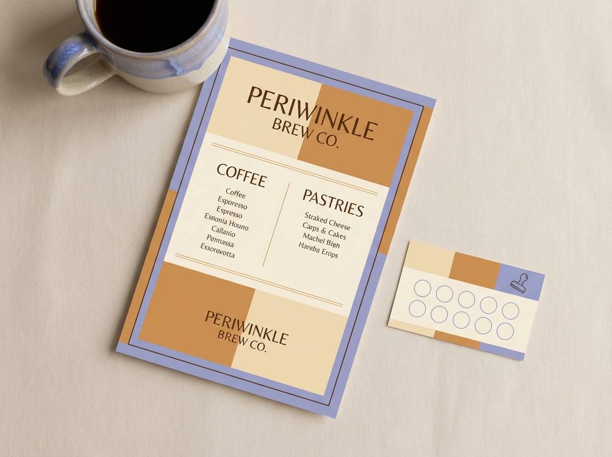
2) Periwinkle Latte
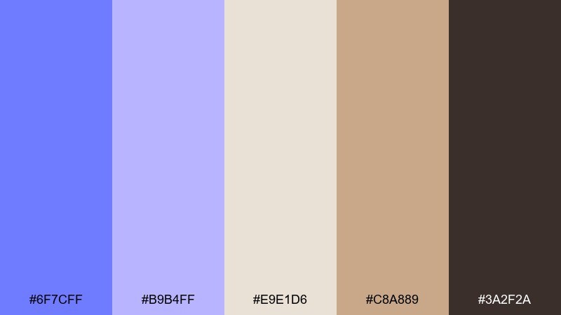
HEX: #6F7CFF #B9B4FF #E9E1D6 #C8A889 #3A2F2A
Mood: cozy, modern, approachable
Best for: coffee shop branding and menus
Cozy and modern, this mix feels like a warm latte beside a cool-toned window seat. The periwinkle top notes add personality, while the cream and caramel shades keep the look grounded and appetizing. These lavender blue color combinations shine on menus, loyalty cards, and packaging stickers when paired with a clean serif. Usage tip: print the darkest brown as your primary text color to avoid a washed-out menu under warm lighting.
Image example of periwinkle latte generated using media.io
3) Neon Orchid Pop
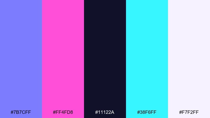
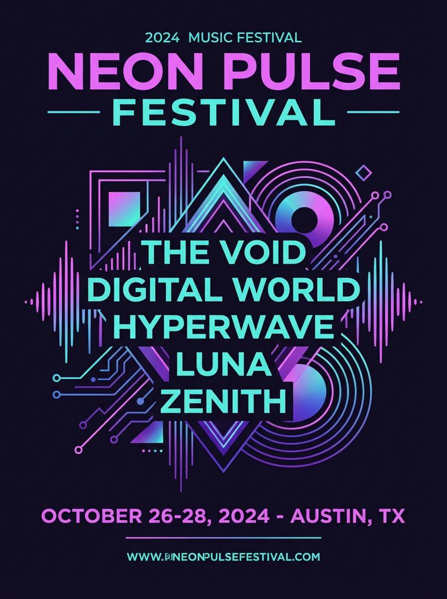
HEX: #7B7CFF #FF4FD8 #11122A #38F6FF #F7F2FF
Mood: bold, energetic, nightlife
Best for: music festival poster
Bold and electric like club lights bouncing off haze, this palette is built for impact. Let the near-black carry the typography, then hit key info with neon orchid and aqua for instant hierarchy. The pale lavender-white is ideal for breathing room around dates and venue details. Usage tip: keep the neon colors to 20 to 30 percent coverage so the poster stays readable from a distance.
Image example of neon orchid pop generated using media.io
4) Dusty Denim Bouquet
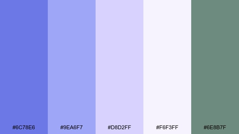
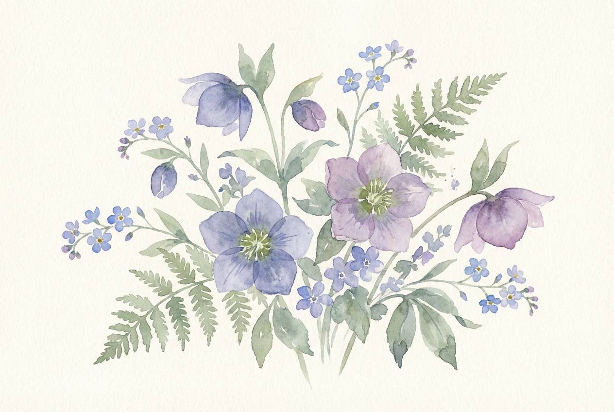
HEX: #6C78E6 #9EA6F7 #D8D2FF #F6F3FF #6E8B7F
Mood: romantic, soft, botanical
Best for: watercolor spring botanical illustration
Romantic and gentle, these dusty blues and lilacs evoke pressed flowers in a sketchbook. The muted green adds a natural counterpoint that keeps the overall look from feeling too sweet. Use the palest tint as paper tone, then layer mid-tones for petals and shadows. Usage tip: limit hard edges and let the denim shade appear only in the deepest shadows for a true watercolor feel.
Image example of dusty denim bouquet generated using media.io
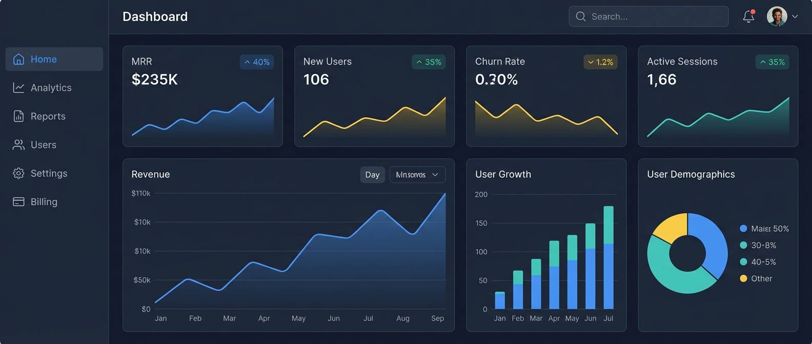
5) Moonlit Gradient
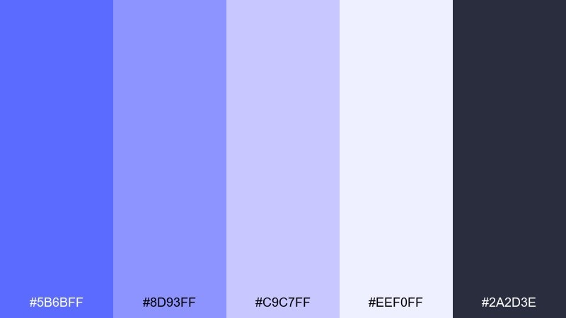
HEX: #5B6BFF #8D93FF #C9C7FF #EEF0FF #2A2D3E
Mood: sleek, focused, night-mode
Best for: SaaS dashboard UI mockup
Sleek and focused like moonlight on glass, these tones feel premium and efficient. Use the charcoal for the frame and navigation, then build cards with gentle lavender gradients for depth without clutter. This lavender blue color scheme works especially well with subtle dividers and soft shadows. Usage tip: apply the brightest tint only to key metrics or active states so users always know what matters most.
Image example of moonlit gradient generated using media.io
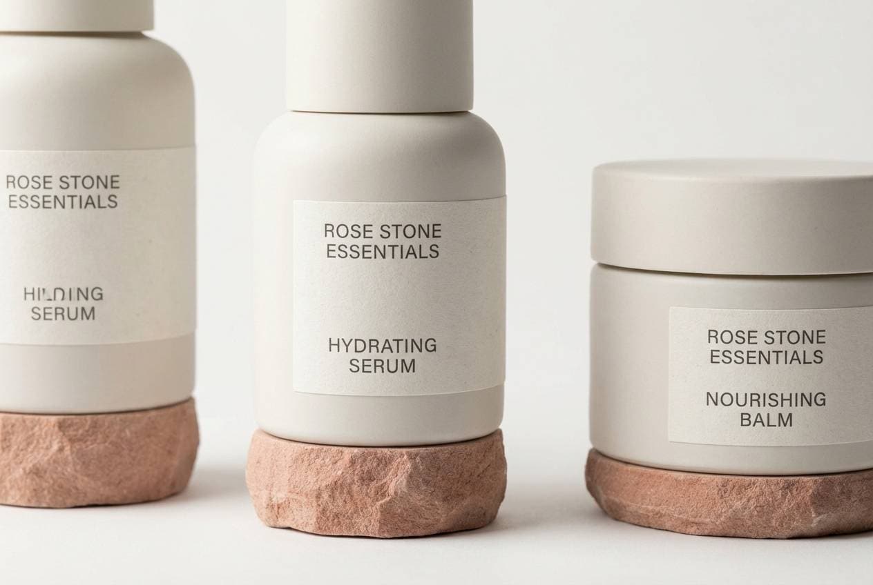
6) Icy Silver Veil
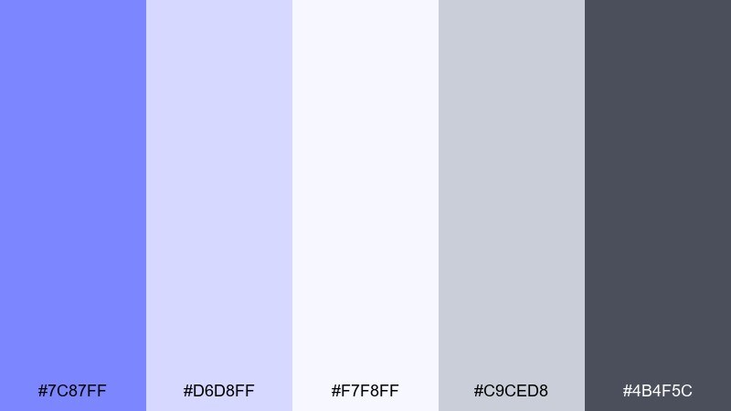
HEX: #7C87FF #D6D8FF #F7F8FF #C9CED8 #4B4F5C
Mood: minimal, crisp, refined
Best for: minimal product packaging for skincare
Minimal and crisp, these shades feel like cool air and polished metal. The silvery neutrals make the periwinkle read as clean and clinical rather than playful, which is ideal for skincare. Pair with thin sans-serif typography and plenty of negative space for a premium shelf presence. Usage tip: use the graphite tone for ingredient lists to keep small text sharp in print.
Image example of icy silver veil generated using media.io
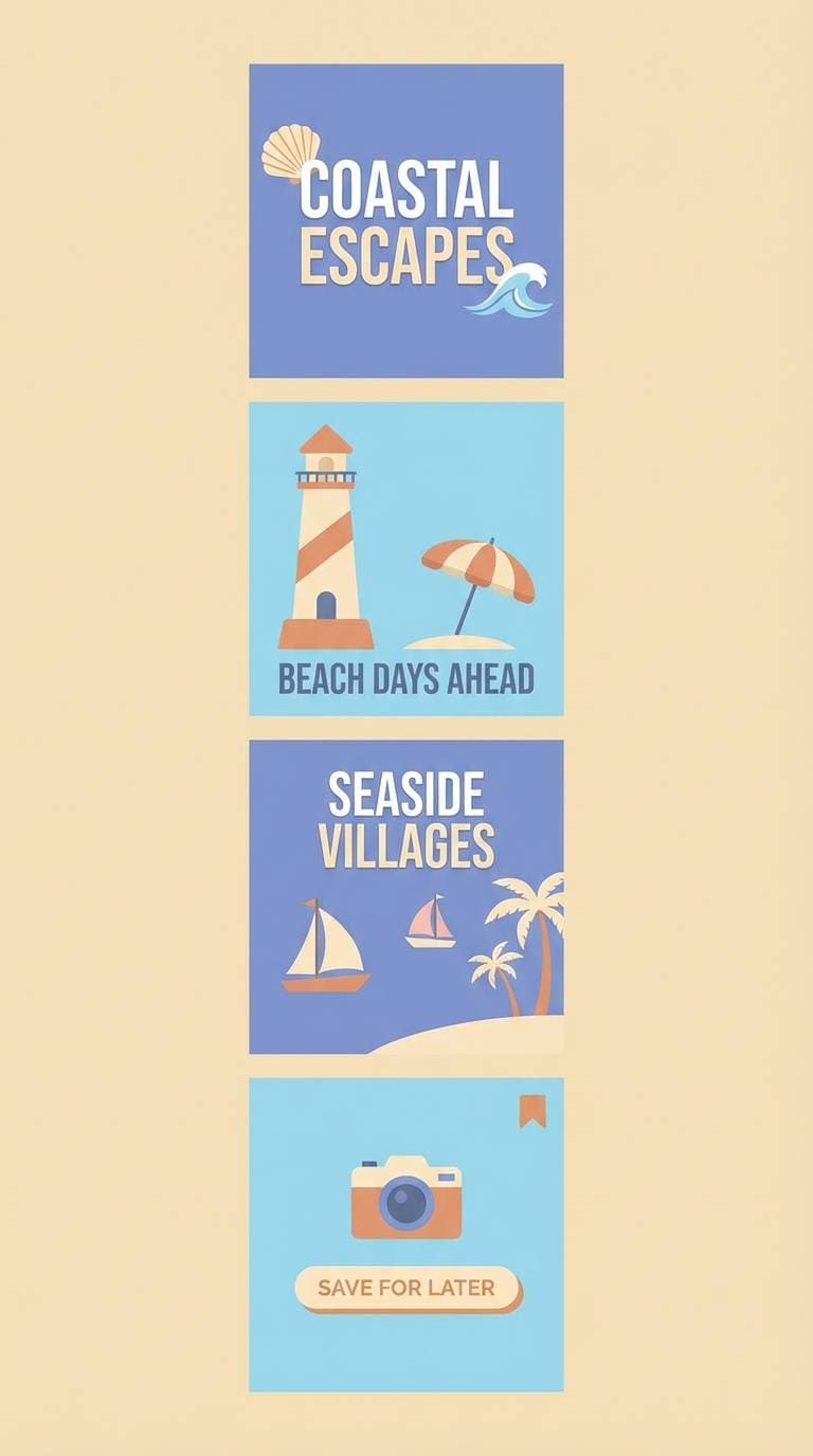
7) Coastal Haze
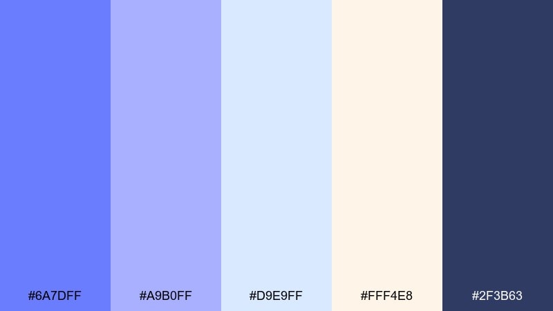
HEX: #6A7DFF #A9B0FF #D9E9FF #FFF4E8 #2F3B63
Mood: breezy, bright, travel-ready
Best for: travel social media carousel
Breezy and light, these colors feel like sea mist over a pastel sunrise. The warm cream balances the cool tones so your posts stay friendly and human. For a high-performing layout, keep text in the deep navy and use the lighter blues for panels and map-like shapes. Usage tip: try one strong accent banner per slide to keep the lavender blue color combination from feeling overly soft.
Image example of coastal haze generated using media.io
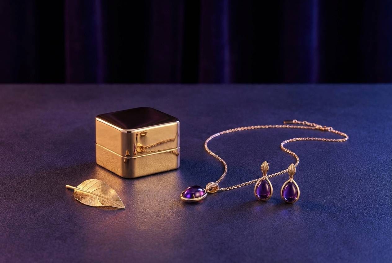
8) Royal Amethyst Night
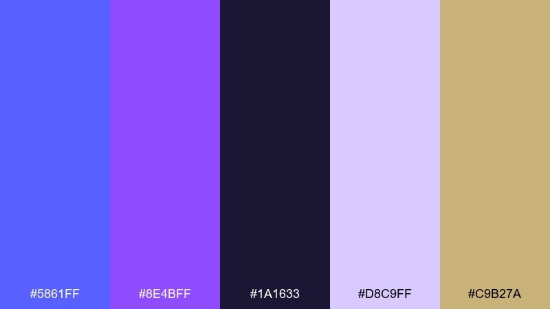
HEX: #5861FF #8E4BFF #1A1633 #D8C9FF #C9B27A
Mood: luxurious, dramatic, jewel-toned
Best for: luxury jewelry product ad
Luxurious and dramatic, these jewel tones evoke velvet boxes and evening spotlights. The near-black base amplifies shine, while the pale lilac keeps the composition from getting too heavy. Gold works best as a small highlight on logos, borders, or pricing to suggest craftsmanship. Usage tip: add a single amethyst gradient behind the product to create depth without distracting from the jewelry.
Image example of royal amethyst night generated using media.io
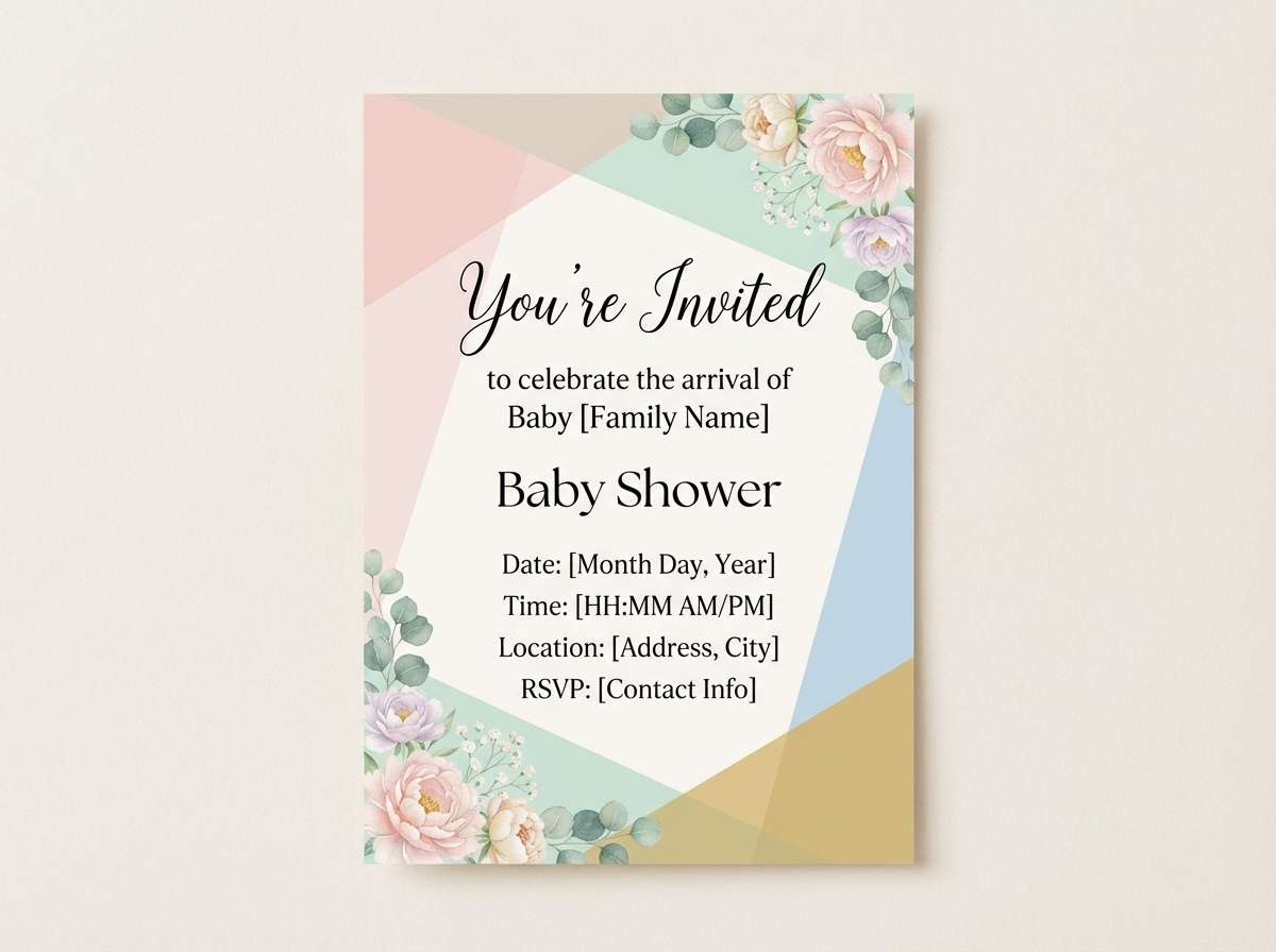
9) Soft Nursery Cloud
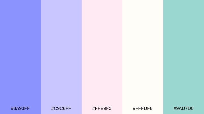
HEX: #8A93FF #C9C6FF #FFE9F3 #FFFDF8 #9AD7D0
Mood: sweet, gentle, comforting
Best for: baby shower invitation
Sweet and comforting, these pastels feel like cotton blankets and quiet lullabies. The blush and mint keep the blues playful, making it easy to design something gender-neutral without looking generic. Use the off-white as the main background and keep copy in a soft gray or muted navy for readability. Usage tip: add tiny star or cloud line art in the light lavender to create texture without visual noise.
Image example of soft nursery cloud generated using media.io
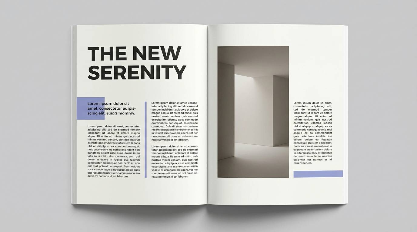
10) Studio Lavender
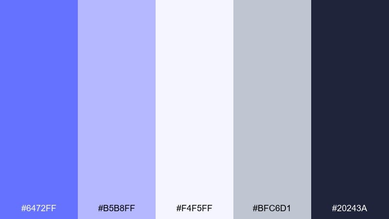
HEX: #6472FF #B5B8FF #F4F5FF #BFC6D1 #20243A
Mood: editorial, clean, contemporary
Best for: editorial magazine spread layout
Editorial and contemporary, these tones feel like a crisp studio shoot and a well-spaced grid. The cool grays help the lavender-blue hues read as sophisticated rather than cute. Use the dark navy for headlines and captions, then pull periwinkle into pull quotes and section markers. Usage tip: keep the mid-tone lavender to thin rules and small blocks so the layout stays airy.
Image example of studio lavender generated using media.io
11) Retro Arcade Bloom
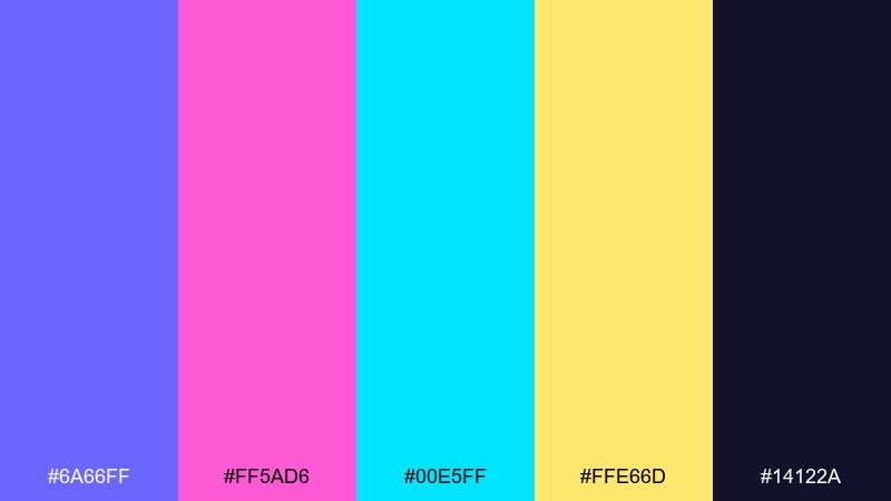
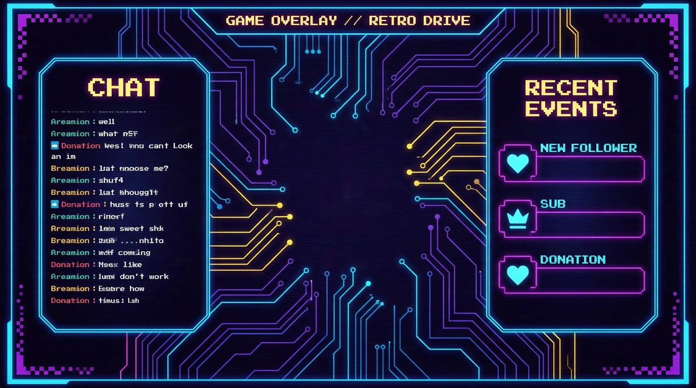
HEX: #6A66FF #FF5AD6 #00E5FF #FFE66D #14122A
Mood: playful, retro, high-contrast
Best for: gaming stream overlay UI
Playful and retro, this set channels arcade cabinets and synthwave energy. Use the dark base as the overlay frame, then assign each neon to a clear role like alerts, chat highlights, and buttons. Yellow works best as a sparing accent to prevent visual fatigue. Usage tip: keep your main text in off-white and reserve neon for icons and active states so the UI stays readable during fast gameplay.
Image example of retro arcade bloom generated using media.io
12) Ceramic Lavender
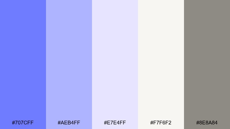
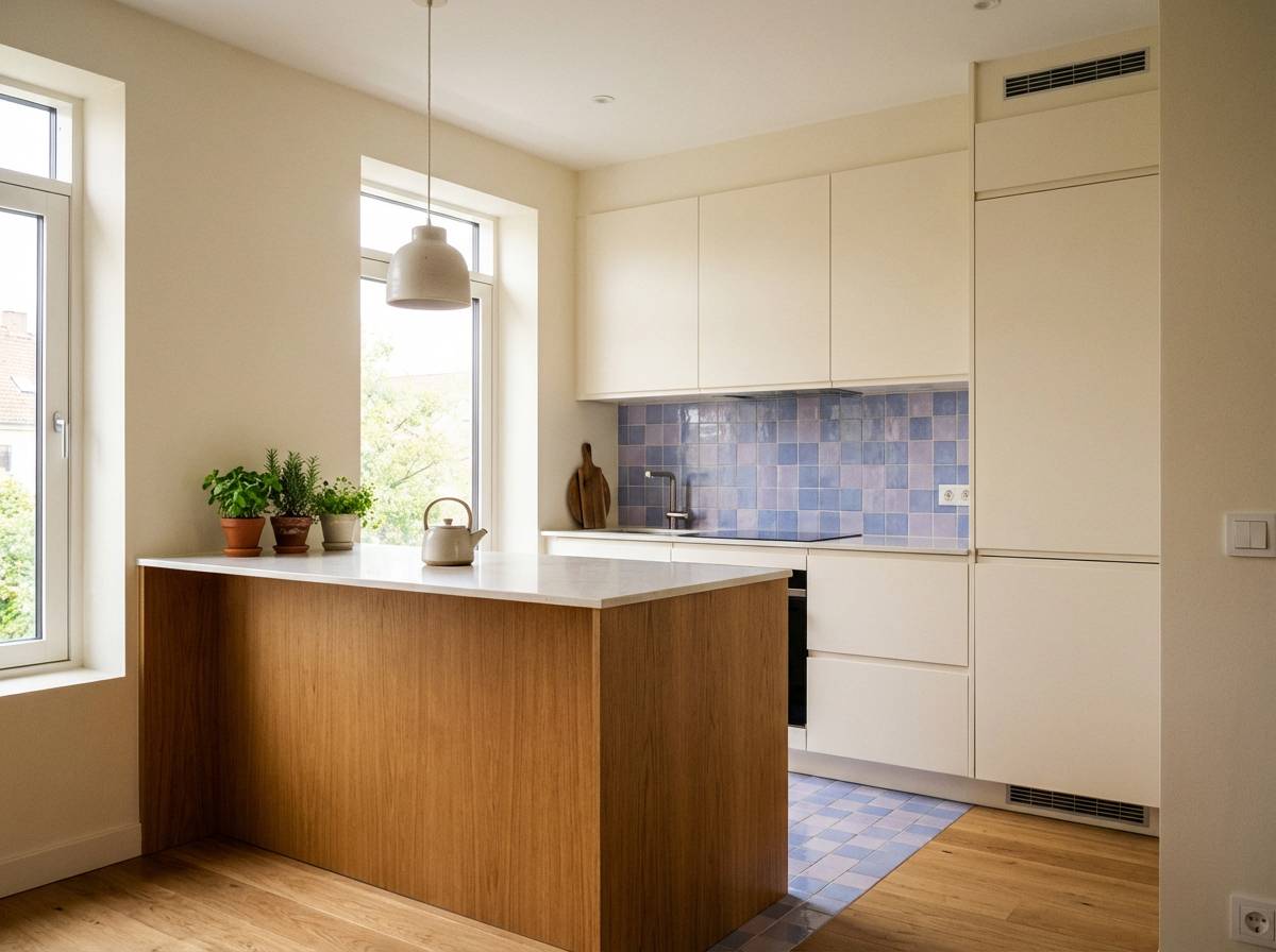
HEX: #707CFF #AEB4FF #E7E4FF #F7F6F2 #8E8A84
Mood: soft, modern, homey
Best for: kitchen interior color planning
Soft and homey like glazed tile and morning light, these hues bring calm to busy spaces. The warm off-white keeps the cool tones from feeling sterile, while the greige adds a practical, lived-in finish. This lavender blue color palette is a strong pick for cabinets, backsplash accents, or a feature wall when paired with light wood. Usage tip: sample the mid periwinkle on a single wall first, then repeat it in small decor pieces to tie the room together.
Image example of ceramic lavender generated using media.io
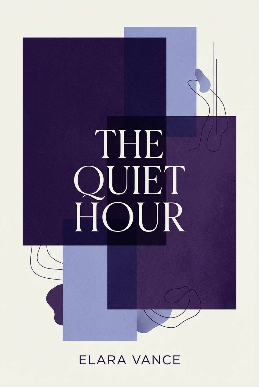
13) Violet Ink & Paper
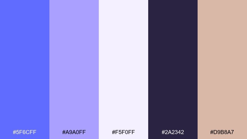
HEX: #5F6CFF #A9A0FF #F5F0FF #2A2342 #D9B8A7
Mood: literary, moody, artistic
Best for: book cover design
Literary and slightly moody, these tones feel like fountain pen ink on textured paper. The dark violet grounds the design, while the pale lavender provides a quiet backdrop for titles. A muted blush accent can soften the edges and add warmth without breaking the mood. Usage tip: set the title in the darkest tone and introduce the blush only in a small emblem or subtitle line.
Image example of violet ink & paper generated using media.io
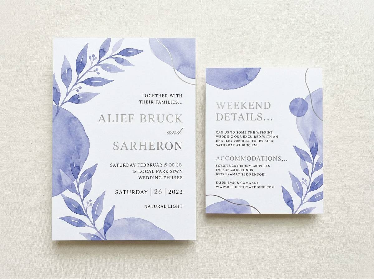
14) Snowy Iris
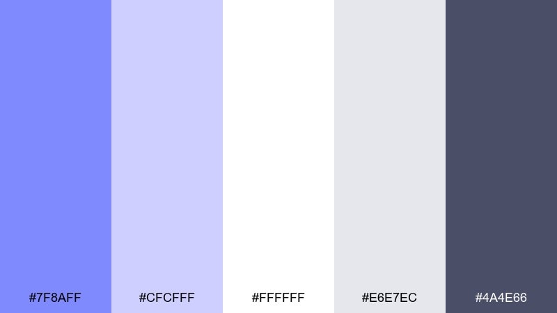
HEX: #7F8AFF #CFCFFF #FFFFFF #E6E7EC #4A4E66
Mood: clean, elegant, wintery
Best for: wedding website and stationery
Clean and elegant, these hues evoke snowy petals and crisp satin. The pure white and soft silver make the periwinkle feel refined, perfect for modern wedding details. Use charcoal for body copy and keep periwinkle to headings, monograms, or thin rules for a timeless look. Usage tip: apply the lightest lavender as a subtle background wash to avoid stark white screens on mobile.
Image example of snowy iris generated using media.io
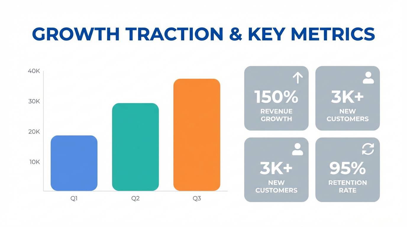
15) Solar Flare Accent
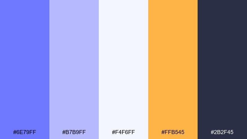
HEX: #6E79FF #B7B9FF #F4F6FF #FFB545 #2B2F45
Mood: confident, upbeat, tech-friendly
Best for: startup pitch deck slides
Confident and upbeat, this mix feels like a clear sky with a warm spark of sunlight. The orange accent adds urgency for calls to action, while the lavender-blue range keeps the deck modern and trustworthy. Use the darkest shade for headings and the lightest tint for slide backgrounds to maintain contrast. Usage tip: reserve orange for one element per slide, such as key numbers or action titles, to avoid competing focal points.
Image example of solar flare accent generated using media.io
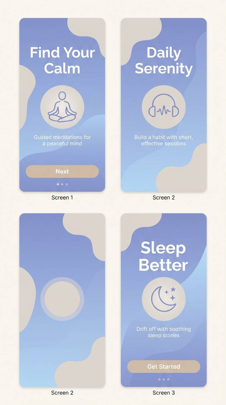
16) Evening Spa Stones
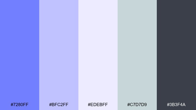
HEX: #7280FF #BFC2FF #EDEBFF #C7D7D9 #3B3F4A
Mood: soothing, grounded, quiet
Best for: meditation app onboarding UI
Soothing and grounded, these tones feel like warm steam and smooth stones at dusk. The muted blue-lavender shades set a calm pace, while the gray-green keeps the look natural and less sugary. Use large soft gradients for onboarding screens and keep buttons in the darker slate for clear action. Usage tip: add gentle blur or grain textures behind cards to create depth without increasing contrast.
Image example of evening spa stones generated using media.io
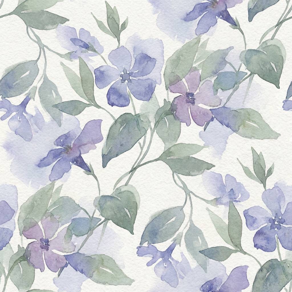
17) Garden Twilight
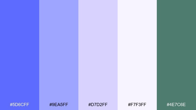
HEX: #5D6CFF #9EA5FF #D7D2FF #F7F3FF #4E7C6E
Mood: dreamy, floral, serene
Best for: watercolor floral pattern
Dreamy and serene, these colors suggest twilight blooms and cool garden shade. The gentle green keeps the florals believable and adds a fresh counterbalance to the lilac tints. Use the lightest tone as the base paper, then alternate mid periwinkle and sage for repeating motifs. Usage tip: keep outlines minimal and let color overlaps create the pattern rhythm.
Image example of garden twilight generated using media.io
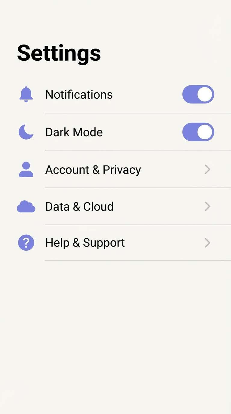
18) Tech Lavender Grid
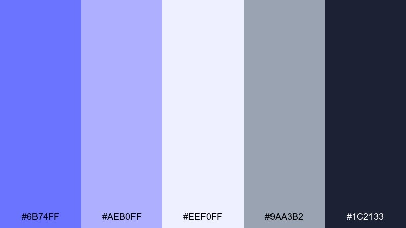
HEX: #6B74FF #AEB0FF #EEF0FF #9AA3B2 #1C2133
Mood: structured, modern, precise
Best for: 2D app settings UI mockup
Structured and modern, this set feels like a clean grid and a well-tuned system. The cool neutrals keep the periwinkle from becoming overly playful, which is great for settings screens and utility flows. Use the darkest tone for text and toggles, then rely on the pale lavender for section backgrounds. Usage tip: make active states a shade darker than the default periwinkle so contrast remains obvious in low brightness mode.
Image example of tech lavender grid generated using media.io
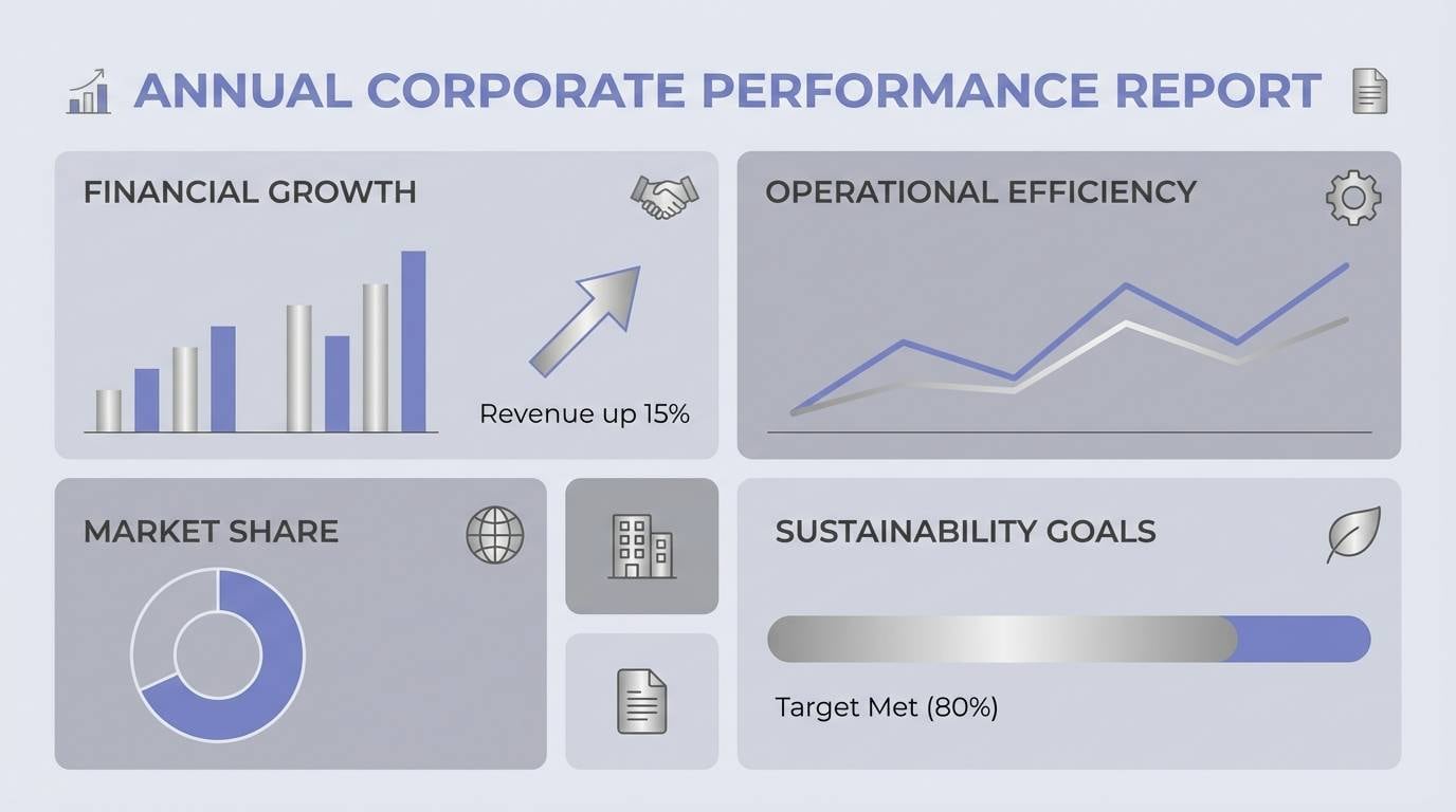
19) Silver Linings
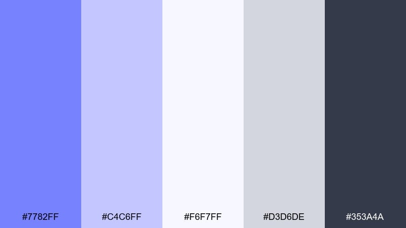
HEX: #7782FF #C4C6FF #F6F7FF #D3D6DE #353A4A
Mood: professional, calm, data-ready
Best for: corporate report infographics
Professional and calm, these cool tones feel like clear insights and tidy spreadsheets. The silvers support charts and tables, while the periwinkle adds just enough color to guide attention. Use dark slate for axes and labels, then assign periwinkle to primary data series for quick scanning. Usage tip: keep background fills very light so printed pages do not lose detail under office lighting.
Image example of silver linings generated using media.io
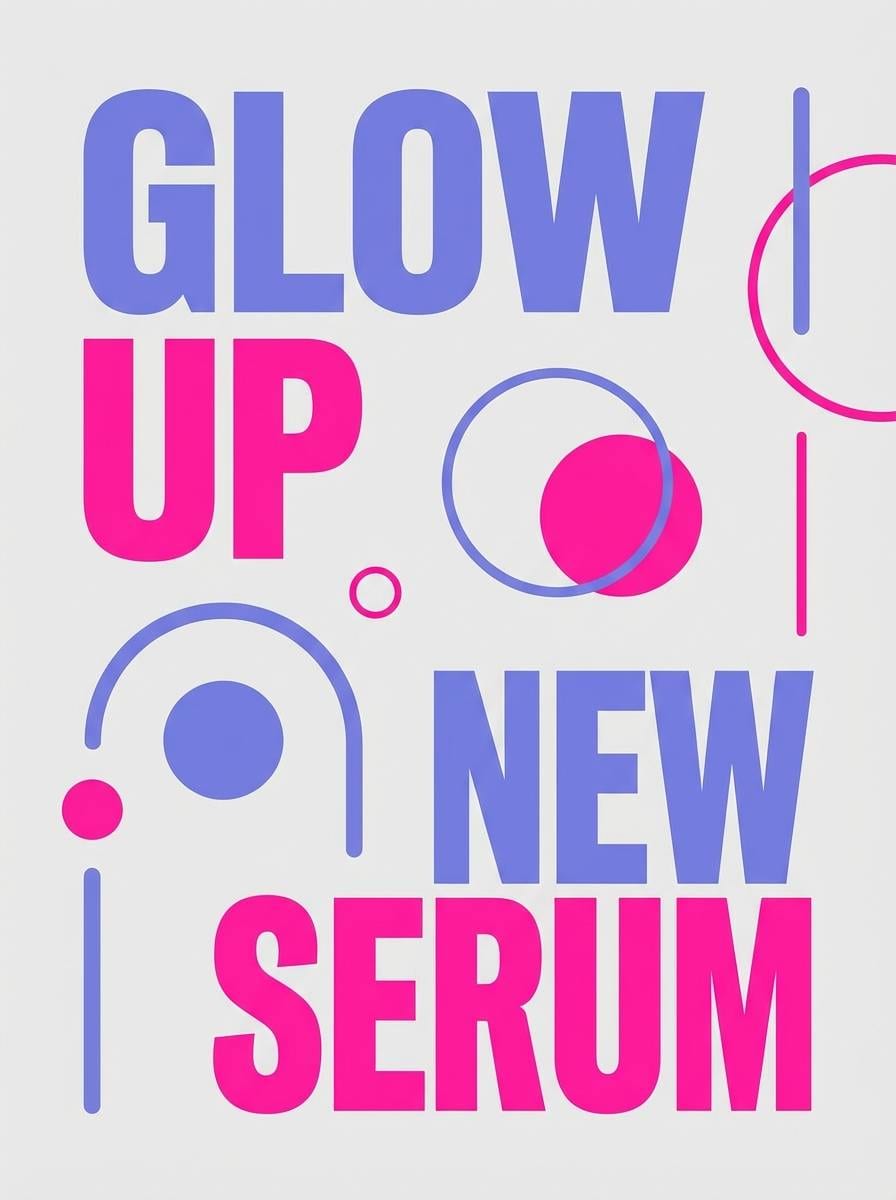
20) Candy Vapor
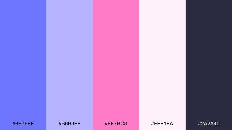
HEX: #6E76FF #B6B3FF #FF7BC8 #FFF1FA #2A2A40
Mood: sweet, trendy, pop
Best for: beauty product promo poster
Sweet and trendy, these tones feel like candy gloss and soft neon signage. The bright pink makes the cooler hues feel playful, ideal for beauty drops and limited editions. These lavender blue color combinations work best with bold sans typography and plenty of negative space so the colors look intentional, not noisy. Usage tip: keep the background near-white blush and place the darkest tone behind prices for instant legibility.
Image example of candy vapor generated using media.io
What Colors Go Well with Lavender Blue?
Lavender blue pairs beautifully with crisp neutrals like white, silver, and cool gray when you want a minimal, airy look. This combination is especially effective for skincare packaging, dashboards, and editorial grids.
For warmer, more inviting designs, combine lavender blue with cream, caramel, blush, or soft beige. These tones keep lavender blue from feeling too icy and work well for cafes, lifestyle brands, and wedding details.
If you need higher contrast, add deep indigo, charcoal, or near-black for text and structure. For accents, neon pink, aqua, or amber-orange can create bold focal points without losing the palette’s modern feel.
How to Use a Lavender Blue Color Palette in Real Designs
Start with a dark anchor color for typography and navigation, then use lavender blue mid-tones for key surfaces like cards, headers, or section backgrounds. This keeps readability strong while still letting the hue define the brand.
Use the palest tints as background “air” and reserve saturated accents for calls to action, links, and micro-interactions. Lavender blue shines when you control coverage and assign each color a job.
In print and interiors, test lavender blue under the lighting where it will live. It can shift cooler in daylight and slightly grayer under warm bulbs, so pairing it with a neutral (silver/greige/cream) helps it stay balanced.
Create Lavender Blue Palette Visuals with AI
If you want to see these swatches in real layouts, generate quick mockups using Media.io’s text-to-image tool. You can turn any palette into UI screens, posters, packaging, or interior previews in minutes.
Copy a prompt from the examples above, then swap in your use case (like “mobile app onboarding” or “wedding invite”), aspect ratio, and any style cues (flat, watercolor, studio shot). Keep one clear subject and a simple background for the cleanest results.
Once you have visuals you like, you can iterate fast by changing just one variable at a time—accent color, background tint, or typography style—until the palette feels exactly right.
Lavender Blue Color Palette FAQs
-
What is lavender blue, and how is it different from periwinkle?
Lavender blue is a soft blue with a noticeable purple/lavender undertone. Periwinkle is closely related and often slightly more purple-leaning; in practice, designers use the terms interchangeably, but “lavender blue” usually reads a touch cooler and calmer. -
Is lavender blue a good choice for UI design?
Yes—especially for wellness, productivity, and modern SaaS brands. Use a dark navy/charcoal for text and controls, keep lavender blue for surfaces and highlights, and ensure contrast meets accessibility guidelines. -
What neutral colors pair best with lavender blue?
White, silver, cool gray, and graphite are the easiest neutrals for a clean, refined look. For warmer styling, choose cream, greige, and soft beige to prevent the palette from feeling too icy. -
What accent colors look good with lavender blue?
For bold accents, try neon pink, aqua/cyan, or warm amber/orange. For softer accents, blush pink and muted sage work well—especially in floral, wedding, or interior themes. -
How do I keep lavender blue from looking “too pastel”?
Add a strong dark anchor (indigo, slate, near-black) and limit the light tints to backgrounds. Then introduce one saturated accent (like aqua or orange) in small, intentional areas for hierarchy. -
Does lavender blue print accurately?
It can shift depending on paper and lighting. For print, keep a neutral gray or deep navy in the palette, avoid ultra-light tints for small text, and always run a test proof before large production. -
Can I generate lavender blue palette mockups with Media.io?
Yes. Use Media.io’s AI text-to-image tool, paste a prompt (like the ones above), and specify a layout style (UI mockup, packaging, poster) plus an aspect ratio to quickly visualize your palette in context.


