

Blue neon green is a high-voltage pairing that instantly feels futuristic, energetic, and attention-grabbing. It’s a go-to look for cyberpunk UI, nightlife graphics, and modern branding that needs contrast and clarity.
Below are 20 blue neon green color palette ideas with HEX codes, plus ready-to-use AI prompts you can run in Media.io to generate matching visuals for posters, dashboards, packaging, and more.
In this article
- Why Blue Neon Green Palettes Work So Well
-
- arcade current
- neon tidepool
- metro glow
- stadium laser
- hologram nights
- deep sea signal
- circuit sprint
- ice rink pop
- urban detox
- neon botanical
- synthwave office
- gallery pop
- minimal edge
- retro sportswear
- night market signage
- clean tech packaging
- aquarium glass
- polar aurora
- streetwear contrast
- data pulse
- What Colors Go Well with Blue Neon Green?
- How to Use a Blue Neon Green Color Palette in Real Designs
- Create Blue Neon Green Palette Visuals with AI
Why Blue Neon Green Palettes Work So Well
Blue brings structure, trust, and a “tech” baseline, while neon green adds urgency and motion. Together, they create instant hierarchy: blue can hold the layout, and green can highlight what matters most.
Because the hues sit far apart in perceived brightness, the combo reads clearly on dark backgrounds—perfect for dashboards, posters, and UI states like success, active, and verified. With the right neutrals, it stays bold without becoming chaotic.
The key is restraint: use neon green as an accent rather than a fill color, and keep spacing generous. When you balance glow-like colors with clean whites or muted grays, the palette feels modern instead of noisy.
20+ Blue Neon Green Color Palette Ideas (with HEX Codes)
1) Arcade Current
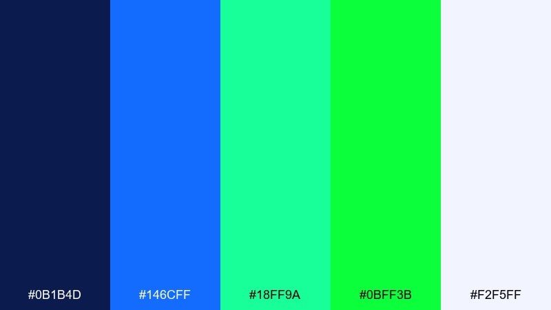
HEX: #0B1B4D #146CFF #18FF9A #0BFF3B #F2F5FF
Mood: electric, playful, futuristic
Best for: gaming app ui
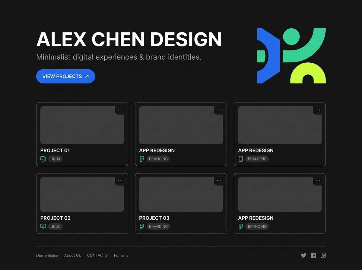
Electric and playful like an arcade hallway lit by LEDs, this mix balances deep blue with crisp neon hits. Use it for game menus, loyalty screens, and button states where you want instant energy. Pair the brightest green for primary CTAs and keep the navy for readable panels. Tip: reserve the near-white for text and spacing so the neons do not overwhelm the interface.
Image example of arcade current generated using media.io
Media.io is an online AI studio for creating and editing video, image, and audio in your browser.

2) Neon Tidepool
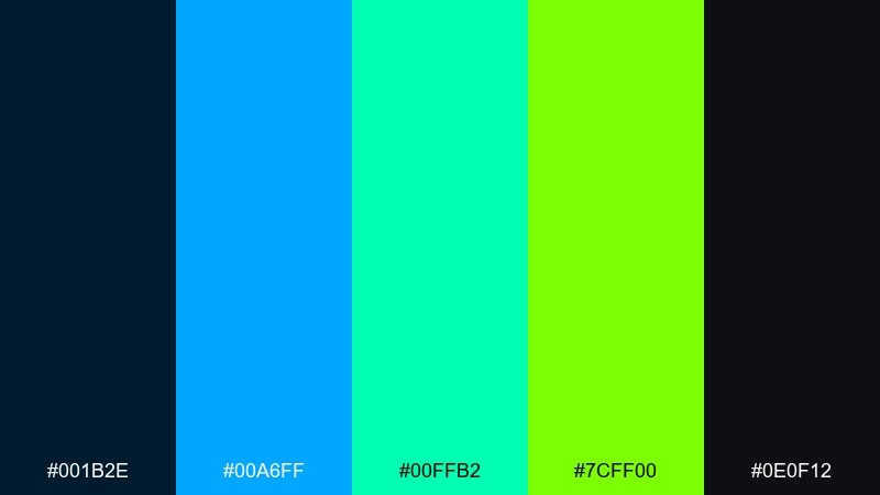
HEX: #001B2E #00A6FF #00FFB2 #7CFF00 #0E0F12
Mood: cool, kinetic, high-contrast
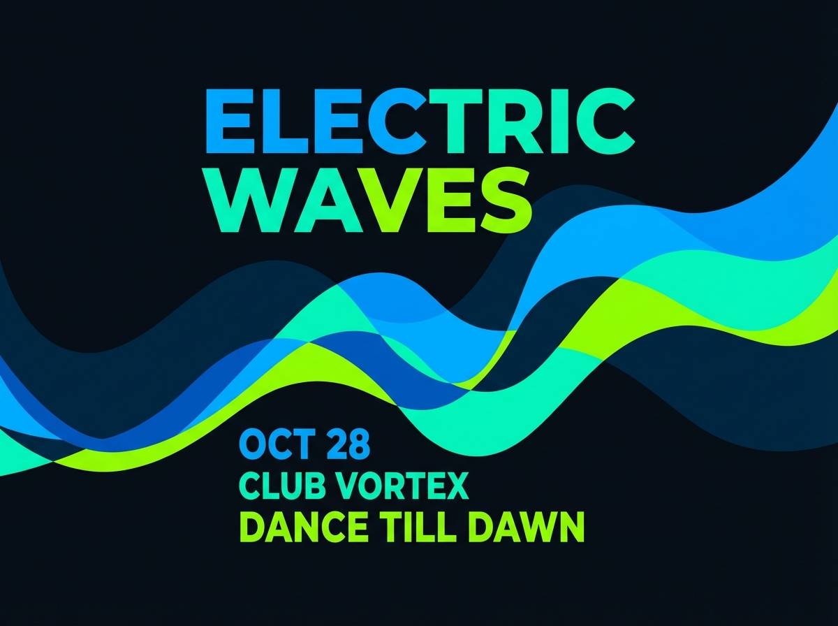
Best for: nightclub event poster
Cool and kinetic like waves catching club lights, these tones feel loud without getting messy. It works best for nightlife posters, DJ lineups, and high-impact social graphics. Let the bright blue carry headlines, then use the lime-green as a punchy underline or ticket detail. Tip: keep plenty of dark space so the type stays sharp from a distance.
Image example of neon tidepool generated using media.io
3) Metro Glow
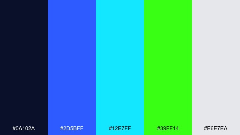
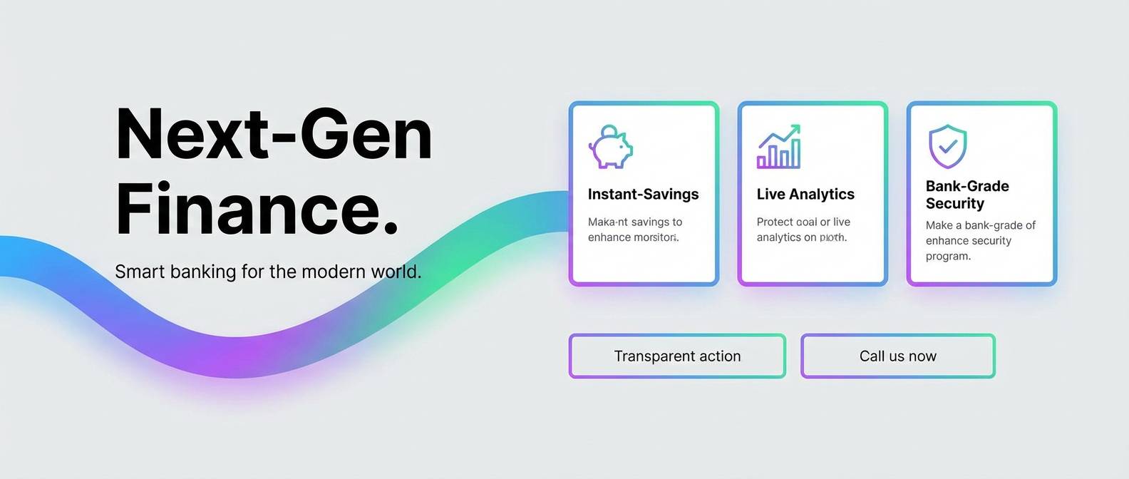
HEX: #0A102A #2D5BFF #12E7FF #39FF14 #E6E7EA
Mood: urban, sleek, energetic
Best for: fintech landing page
Sleek and urban like a metro platform at midnight, the blues read polished while the green feels ultra-modern. As a blue neon green color palette, it is ideal for fintech hero sections, product highlights, and pricing tables. Pair it with neutral grays for trust, then use the neon green only for key metrics and success states. Tip: apply the cyan as a soft glow or gradient bridge between blue and green to keep transitions smooth.
Image example of metro glow generated using media.io
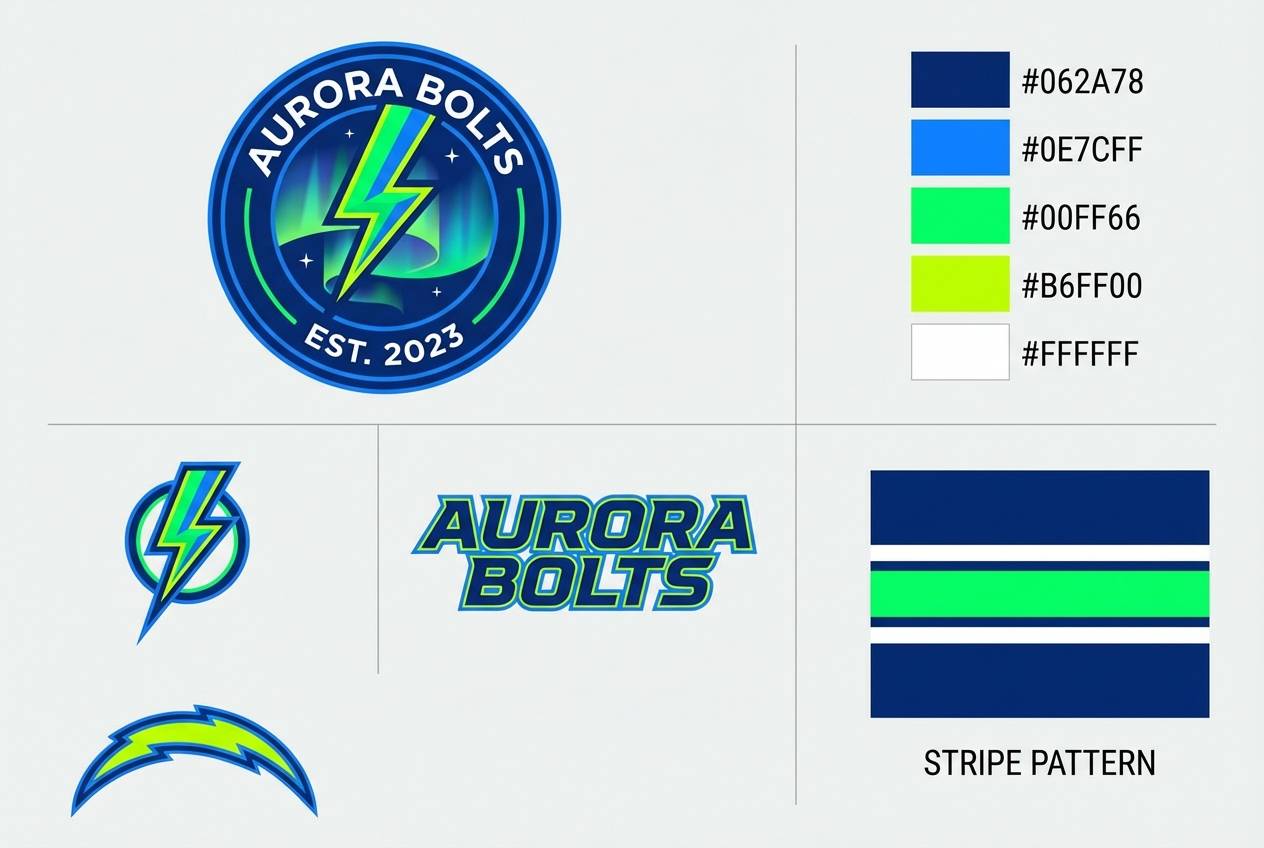
4) Stadium Laser
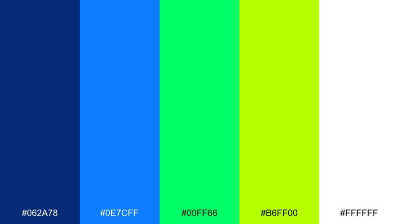
HEX: #062A78 #0E7CFF #00FF66 #B6FF00 #FFFFFF
Mood: competitive, bold, punchy
Best for: sports team branding
Bold and competitive like laser lights cutting through a packed arena, this set is built for impact. Use it for sports logos, sponsor lockups, and energetic merch graphics. Keep the pure white for clean separation and print-friendly areas, while the greens handle highlights and trims. Tip: test the lime against the blue at small sizes so stripes and outlines stay crisp.
Image example of stadium laser generated using media.io
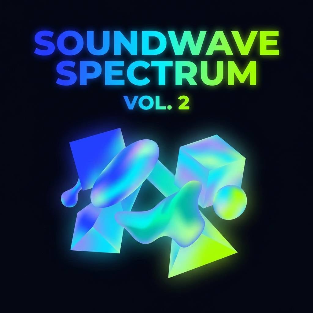
5) Hologram Nights
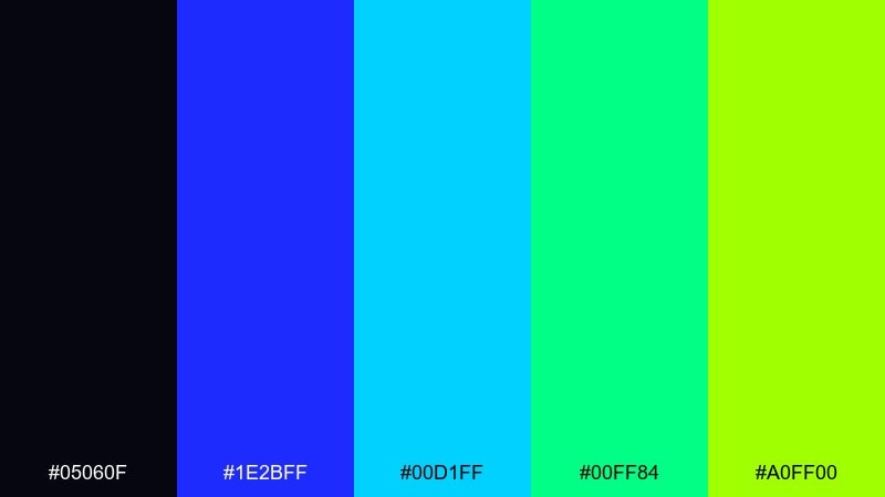
HEX: #05060F #1E2BFF #00D1FF #00FF84 #A0FF00
Mood: cyber, luminous, nocturnal
Best for: album cover design
Luminous and nocturnal like a hologram flickering in a dark room, the palette feels futuristic and glossy. These blue neon green color combinations shine on album covers, playlist art, and motion-ready graphics. Use the deep near-black as the canvas, then layer cyan and blue for depth before dropping in neon green as the focal punch. Tip: add subtle grain or light bloom so the neons feel intentional rather than harsh.
Image example of hologram nights generated using media.io
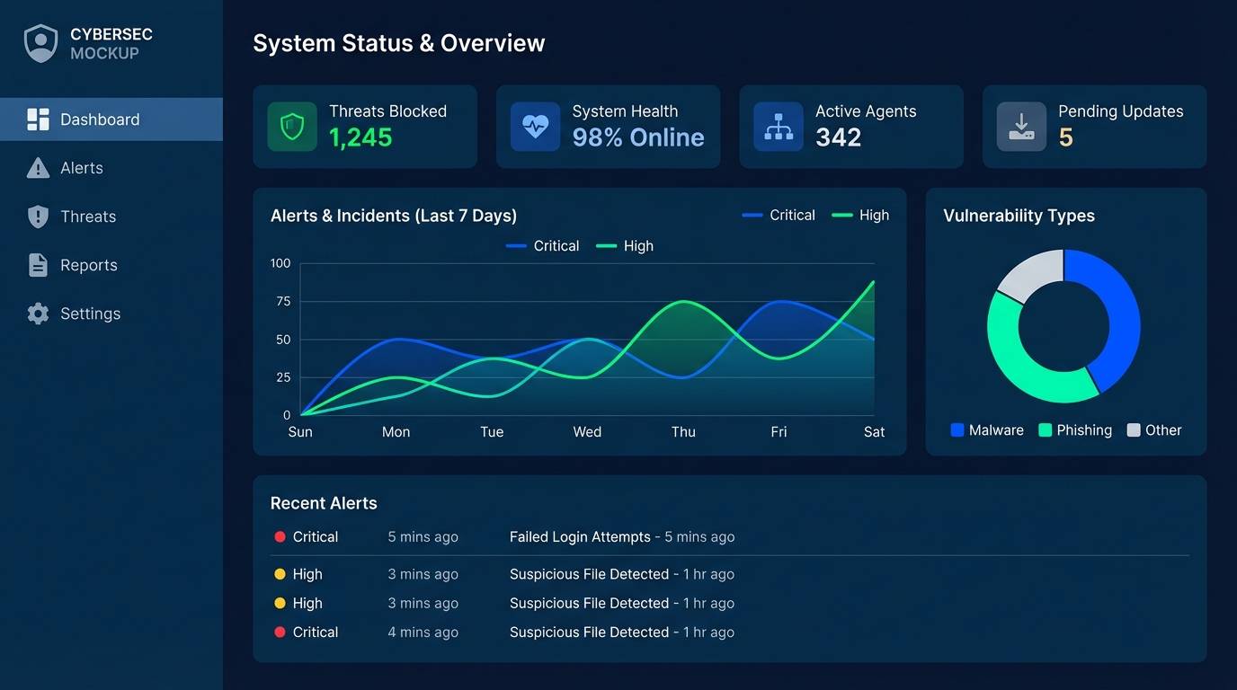
6) Deep Sea Signal
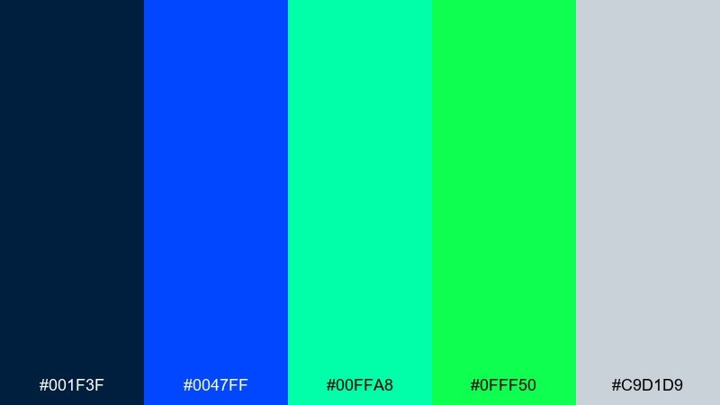
HEX: #001F3F #0047FF #00FFA8 #0FFF50 #C9D1D9
Mood: clean, techy, confident
Best for: security software ui
Clean and tech-forward like sonar blips on a dark ocean map, these tones communicate control and clarity. They work well for security dashboards, admin tables, and alert states. Keep the brighter green for verified and safe statuses, and lean on the muted gray for text-heavy surfaces. Tip: use the mint as a hover color to soften interactions without losing contrast.
Image example of deep sea signal generated using media.io
7) Circuit Sprint
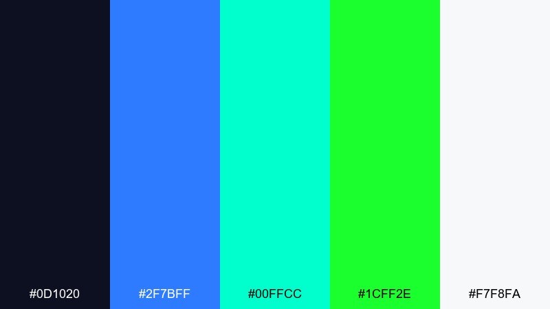
HEX: #0D1020 #2F7BFF #00FFCC #1CFF2E #F7F8FA
Mood: fast, sporty, modern
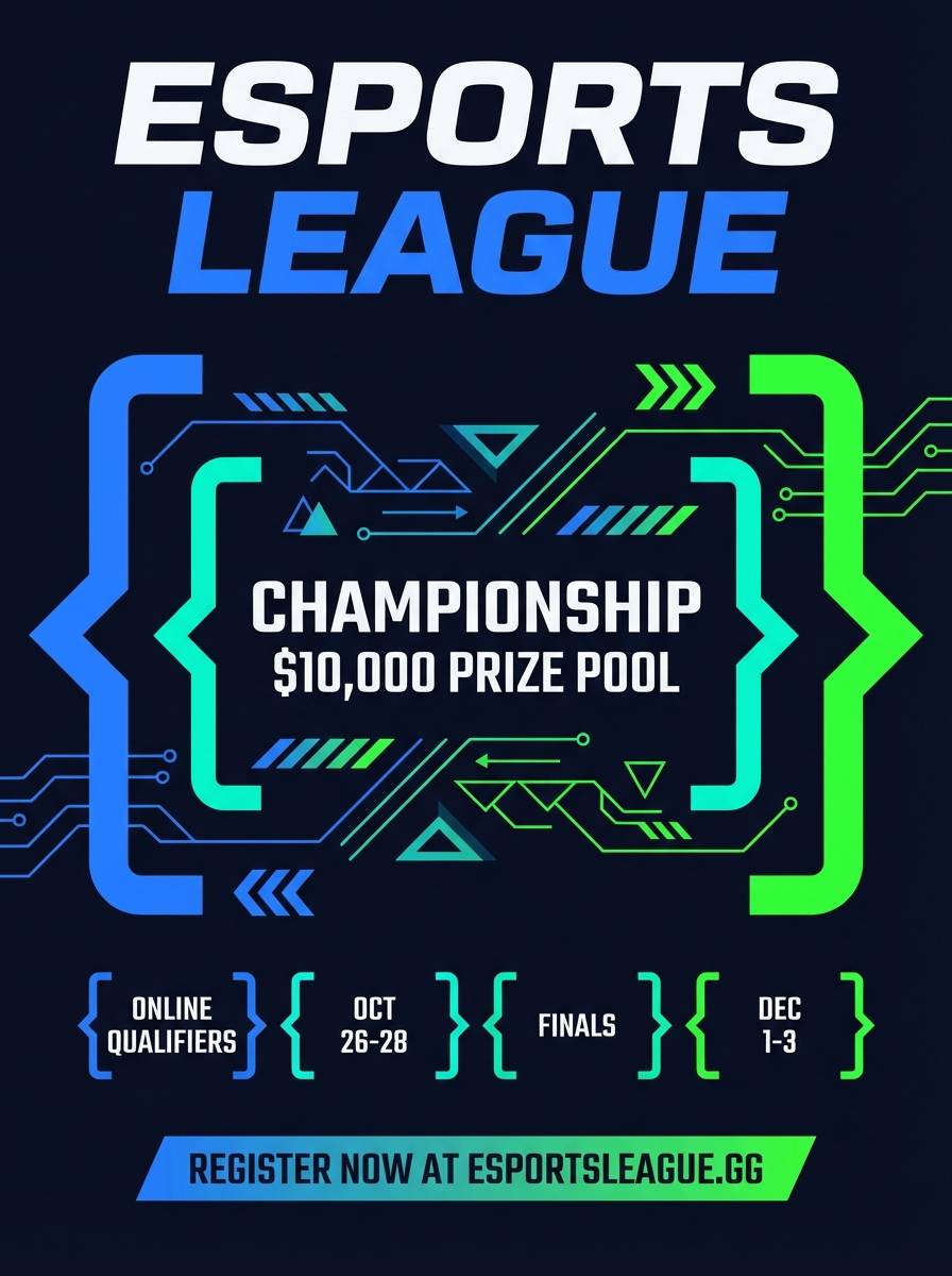
Best for: esports tournament flyer
Fast and sporty like a circuit board turning into a racetrack, the contrast feels sharp and modern. A blue neon green color scheme like this is great for esports flyers, bracket graphics, and hype posts. Let the blue own the headline hierarchy, then use the bright green as score callouts or prize highlights. Tip: keep body copy in off-white and avoid long paragraphs on dark fills.
Image example of circuit sprint generated using media.io
8) Ice Rink Pop
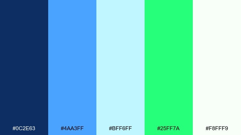
HEX: #0C2E63 #4AA3FF #BFF6FF #25FF7A #F8FFF9
Mood: fresh, airy, upbeat
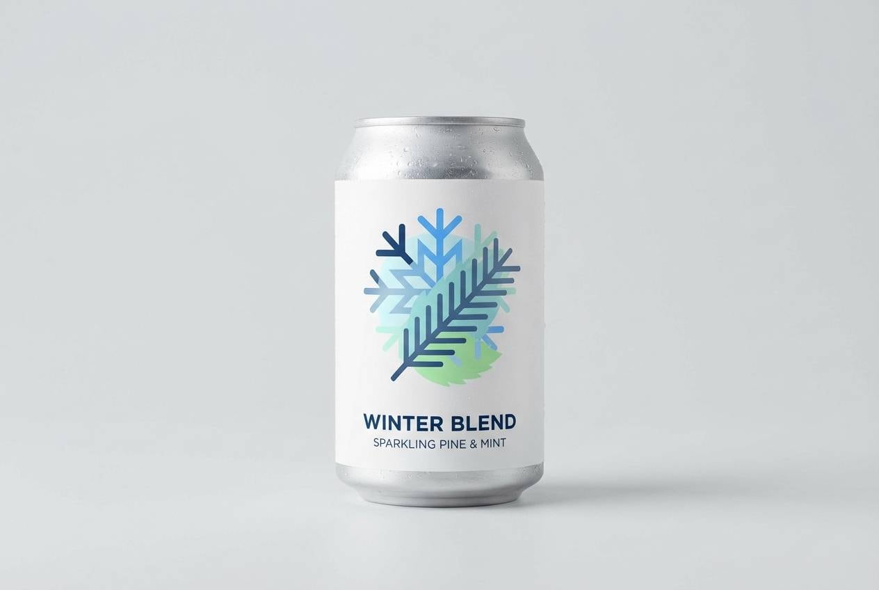
Best for: winter beverage product ad
Fresh and airy like cold air under arena lights, the icy blues keep everything crisp. It is a strong fit for beverage ads, seasonal promos, and clean lifestyle branding that still wants a neon edge. Pair the soft cyan with white space for a chilled look, then use the green as a small spark on badges or flavor cues. Tip: keep shadows gentle so the palette stays light rather than turning heavy and techy.
Image example of ice rink pop generated using media.io
9) Urban Detox
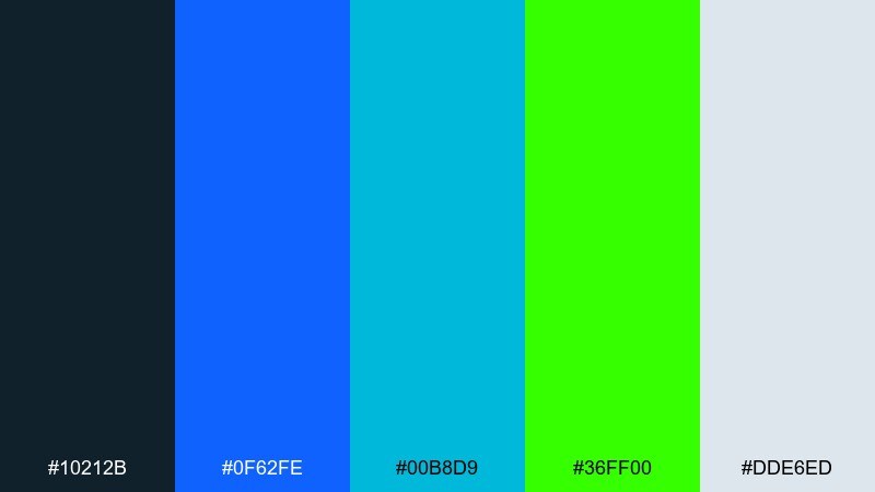
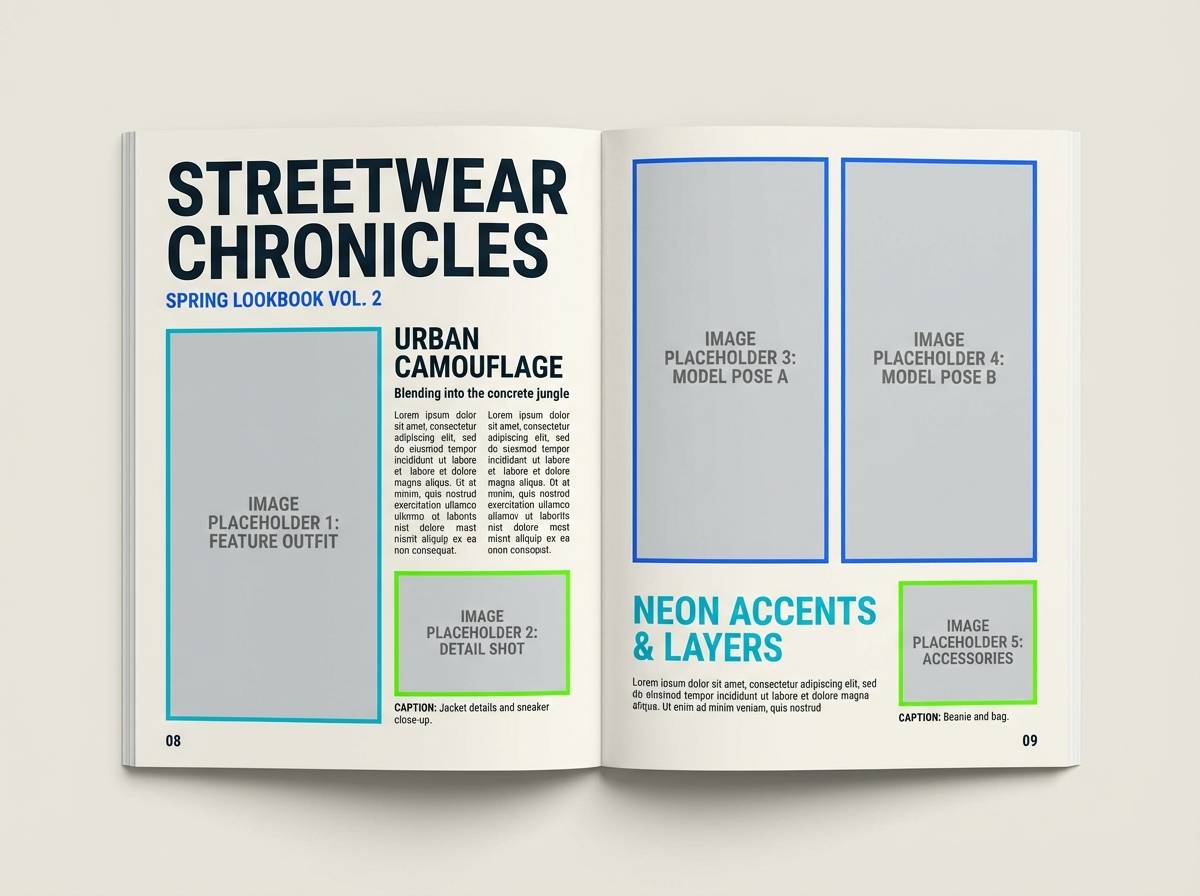
HEX: #10212B #0F62FE #00B8D9 #36FF00 #DDE6ED
Mood: street, crisp, confident
Best for: streetwear lookbook editorial
Crisp and streetwise like clean typography on a night city wall, these tones feel modern and controlled. A blue neon green color combination works especially well for lookbooks, drop announcements, and price overlays. Anchor layouts with the dark slate and let the neon green mark sizes, tags, or limited-run cues. Tip: keep margins generous so the bright accents read as premium instead of noisy.
Image example of urban detox generated using media.io
10) Neon Botanical
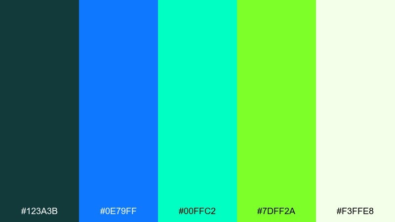
HEX: #123A3B #0E79FF #00FFC2 #7DFF2A #F3FFE8
Mood: lush, modern, refreshing
Best for: botanical poster illustration
Lush and refreshing like greenhouse leaves under modern grow lights, the greens feel alive against cool blues. Use it for botanical posters, eco-tech branding, or wellness graphics that want a futuristic twist. Pair the pale green-white with plenty of breathing room, and keep the neon leaf tone for focal stems and titles. Tip: limit the darkest teal to outlines so the illustration stays light.
Image example of neon botanical generated using media.io
11) Synthwave Office
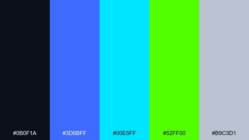
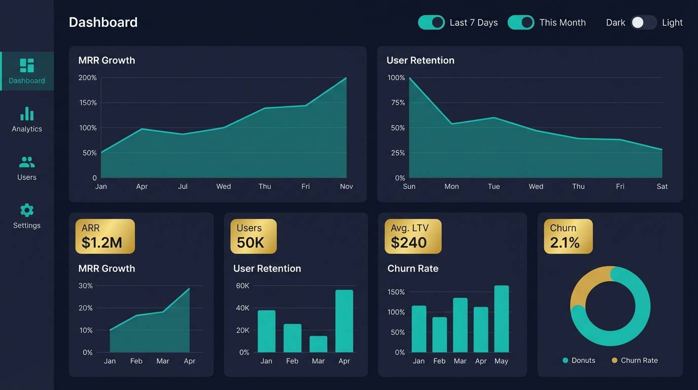
HEX: #0B0F1A #3D6BFF #00E5FF #52FF00 #B9C3D1
Mood: focused, modern, high-energy
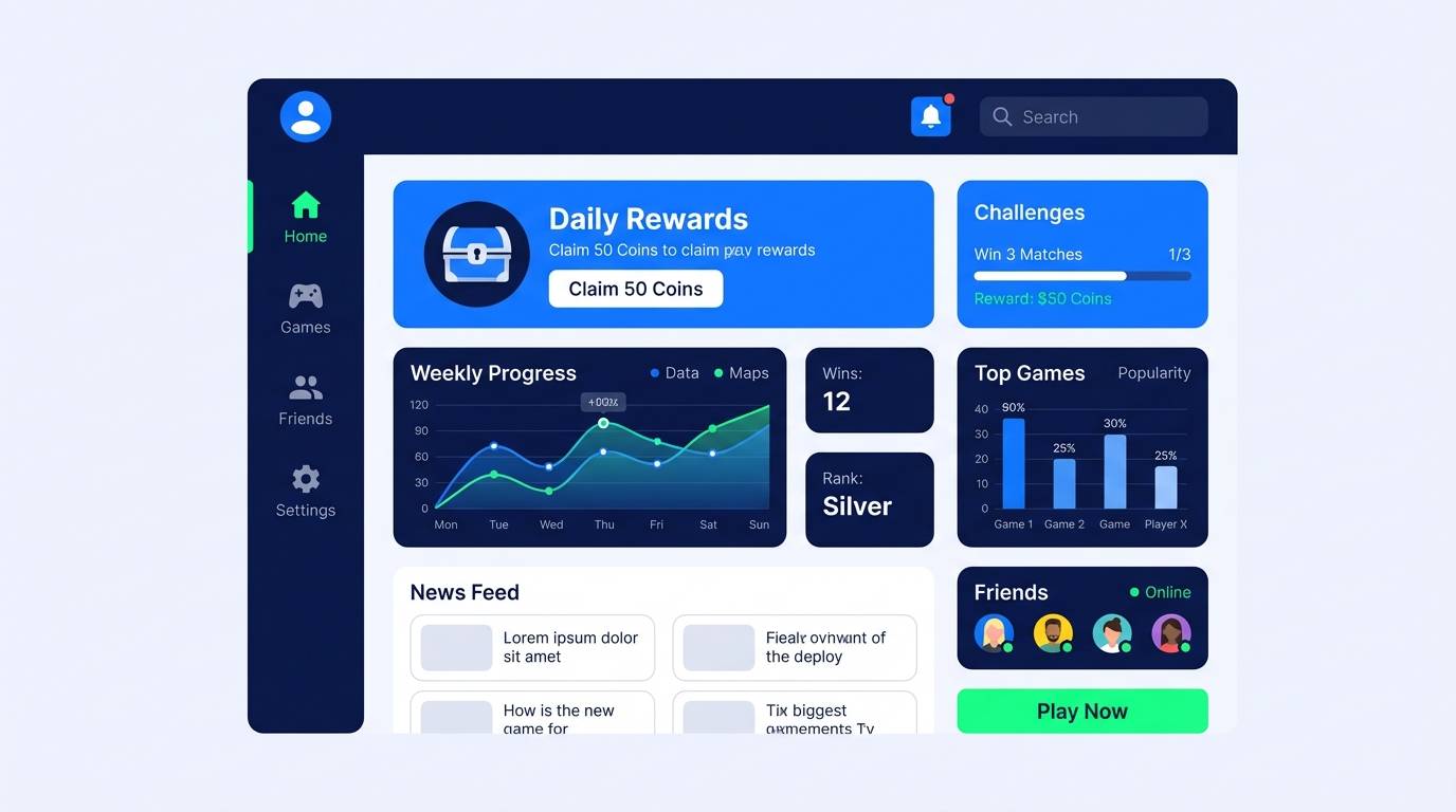
Best for: saas dashboard ui
Focused and modern like a late-night sprint in a bright workspace, the contrast keeps dashboards readable. It is great for SaaS navigation, analytics panels, and notification styling. Use blue for structure, cyan for secondary highlights, and neon green for success and active states. Tip: keep charts mostly blue and cyan, then reserve green for one data series to avoid clutter.
Image example of synthwave office generated using media.io
12) Gallery Pop
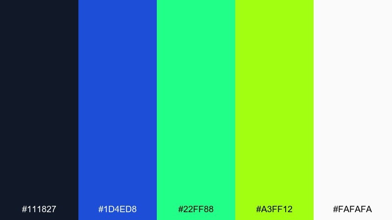
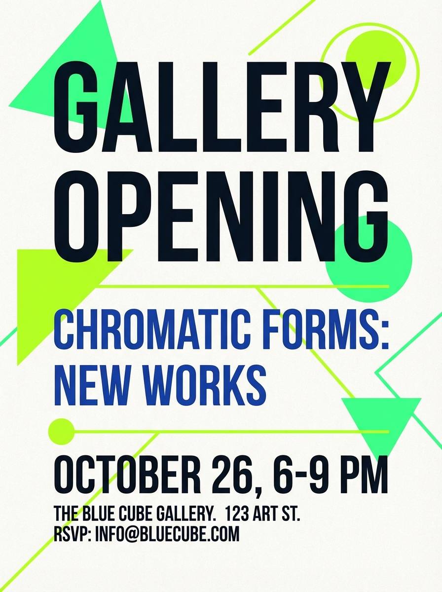
HEX: #111827 #1D4ED8 #22FF88 #A3FF12 #FAFAFA
Mood: bold, clean, contemporary
Best for: art gallery invitation
Contemporary and bold like a minimalist gallery wall lit by a neon sign, it feels modern without losing elegance. As a blue neon green color palette, it suits invitations, opening-night cards, and event signage that needs crisp hierarchy. Keep the off-white dominant, then use the blues for type and the greens for dates or RSVP cues. Tip: print-test the brightest green on uncoated stock to ensure it stays vivid.
Image example of gallery pop generated using media.io
13) Minimal Edge
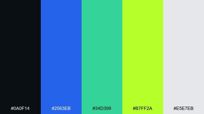
HEX: #0A0F14 #2563EB #34D399 #B7FF2A #E5E7EB
Mood: minimal, sharp, modern
Best for: portfolio website ui
Minimal and sharp like a dark-mode portfolio with a single glowing accent, this set feels precise. Use it for creative portfolios, case study pages, and crisp navigation states. Pair the soft gray with generous line height, then use the lime only for links, toggles, and key labels. Tip: keep hover transitions subtle so the neon reads premium, not flashy.
Image example of minimal edge generated using media.io
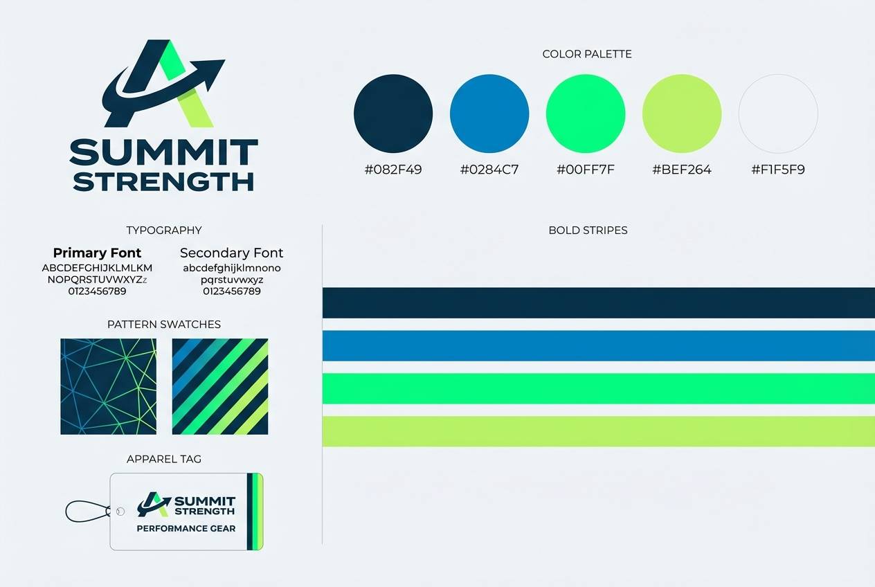
14) Retro Sportswear
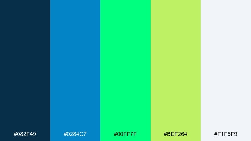
HEX: #082F49 #0284C7 #00FF7F #BEF264 #F1F5F9
Mood: sporty, nostalgic, bright
Best for: athletic apparel branding
Sporty and slightly nostalgic like vintage warmups with a neon twist, the greens feel lively and wearable. It works well for apparel branding, hang tags, and social posts for new drops. Use the sky-blue for big color blocks and keep the softer lime as a secondary accent on patterns. Tip: when printing on fabric, bump the contrast by outlining text in the deep teal.
Image example of retro sportswear generated using media.io
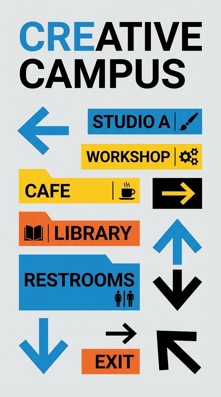
15) Night Market Signage
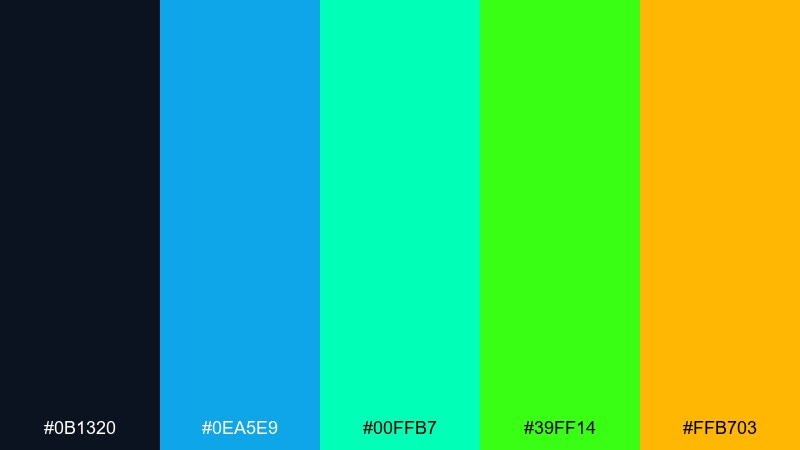
HEX: #0B1320 #0EA5E9 #00FFB7 #39FF14 #FFB703
Mood: lively, gritty, vibrant
Best for: wayfinding signage design
Lively and gritty like street signs under buzzing lights, this mix adds warmth without losing the neon edge. It is ideal for wayfinding, venue signage, and bold directional graphics. Pair the amber as a secondary highlight for arrows and icons, while the greens handle urgency and callouts. Tip: keep backgrounds dark and use thick strokes so the signs stay legible at speed.
Image example of night market signage generated using media.io
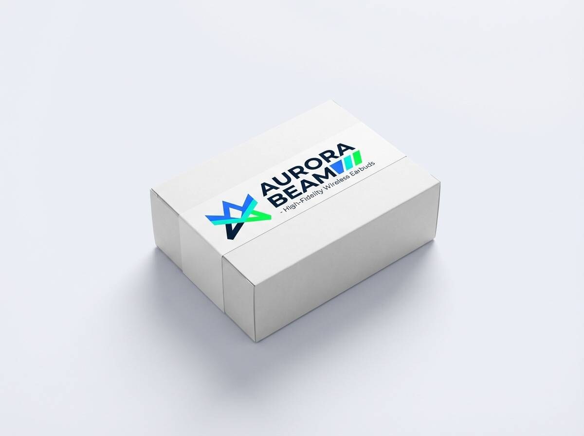
16) Clean Tech Packaging
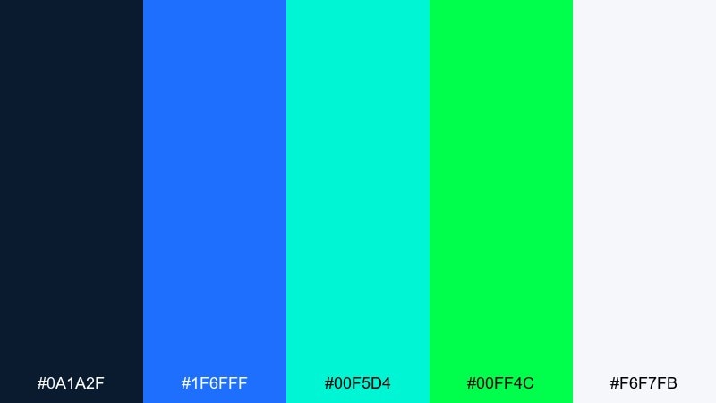
HEX: #0A1A2F #1F6FFF #00F5D4 #00FF4C #F6F7FB
Mood: clean, innovative, premium
Best for: tech gadget packaging
Clean and premium like a new device unboxed under bright studio lights, the colors feel modern and trustworthy. These blue neon green color combinations fit gadget packaging, product stickers, and feature callouts. Use the off-white for the main box, blue for brand marks, and neon green for small spec badges. Tip: keep neon areas matte in print to avoid glare that can reduce readability.
Image example of clean tech packaging generated using media.io
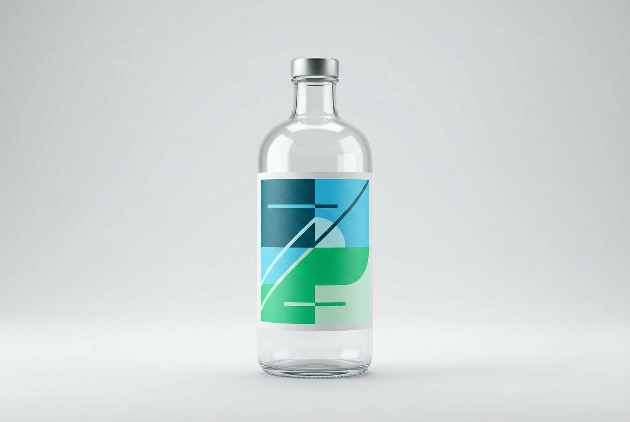
17) Aquarium Glass
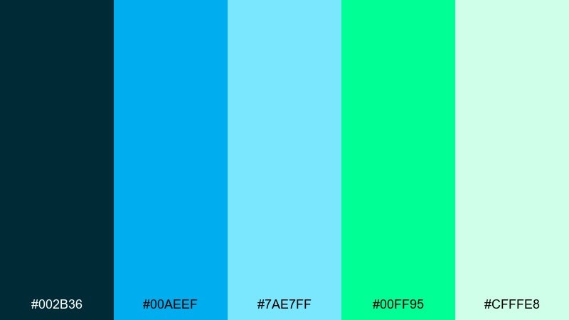
HEX: #002B36 #00AEEF #7AE7FF #00FF95 #CFFFE8
Mood: watery, calm, luminous
Best for: beverage label design
Watery and luminous like light refracting through glass, this set feels clean and refreshing. Use it for beverage labels, spa branding, or anything that wants a cool aquatic vibe. Pair the pale mint with lots of negative space, and use the neon green sparingly on seals or flavor notes. Tip: keep typography in the deep teal for consistent readability across bright backgrounds.
Image example of aquarium glass generated using media.io
18) Polar Aurora
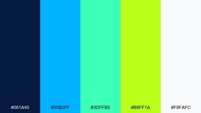
HEX: #061A40 #00B2FF #3DFFB5 #B8FF1A #F8FAFC
Mood: crisp, radiant, optimistic
Best for: youtube thumbnail graphic
Crisp and radiant like an aurora cutting through winter sky, the bright greens feel magical against the blue. It is a solid choice for thumbnails, headers, and bold social graphics that need instant pop. Pair the near-white for big type blocks and use the aqua for gradients that soften the neon. Tip: keep one main focal color per tile so the design reads clearly at small sizes.
Image example of polar aurora generated using media.io

19) Streetwear Contrast
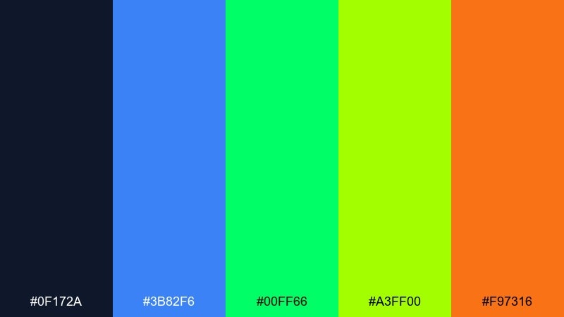
HEX: #0F172A #3B82F6 #00FF66 #A3FF00 #F97316
Mood: edgy, loud, youthful
Best for: streetwear product ad
Edgy and loud like a limited drop poster on a city corner, the orange adds heat to the cool neons. Use it for streetwear ads, product highlights, and fast-scrolling social campaigns. Pair the orange for price tags or urgency, while the neon greens handle brand accents and trim lines. Tip: keep the background deep and the typography bold to avoid vibrating contrast.
Image example of streetwear contrast generated using media.io
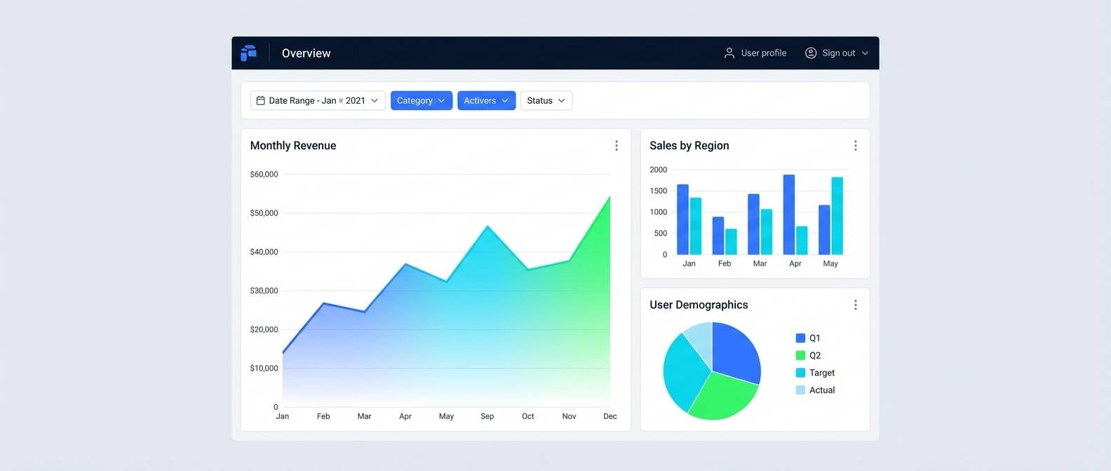
20) Data Pulse
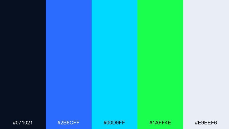
HEX: #071021 #2B6CFF #00D9FF #1AFF4E #E9EEF6
Mood: analytical, bright, high-tech
Best for: data visualization ui
Analytical and high-tech like a live monitoring wall, the palette keeps attention on the numbers. It works beautifully for charts, dashboards, and real-time status screens. Use the blues for structure and series colors, then reserve the neon green for thresholds, peaks, and key callouts. Tip: keep grid lines subtle in pale gray so the data stays the hero.
Image example of data pulse generated using media.io
What Colors Go Well with Blue Neon Green?
Neutrals are the easiest match: near-black, charcoal, cool grays, and clean whites help neon accents stay readable and intentional. They also prevent “vibrating” edges that can happen when bright colors touch too often.
Cyan and aqua work as bridge hues between blue and neon green, making gradients and glows feel smoother. For extra punch, warm accents like amber or orange can add urgency for prices, warnings, or directional cues.
If you want a calmer version, swap pure neon green for mint or seafoam while keeping the same blues. You’ll keep the modern vibe, but the palette becomes more UI-friendly for long viewing.
How to Use a Blue Neon Green Color Palette in Real Designs
Start with a dark base (navy or near-black), then build structure using blue for primary UI elements like headers, buttons, and key sections. Use neon green only where you need instant attention: CTAs, active states, success badges, or one highlighted data series.
For posters and social graphics, treat neon green like a highlighter pen—underline dates, emphasize ticket info, or create a single focal element. Keep plenty of negative space so the message reads from a distance.
For print (packaging, merch, signage), test saturation and contrast early. Neon-like greens can shift on different stocks, so pairing them with white space and thick typography helps preserve clarity.
Create Blue Neon Green Palette Visuals with AI
Want to see these palettes in action before you design? Generate quick mockups—dashboards, posters, packaging, or thumbnails—using AI so you can evaluate contrast and composition in minutes.
With Media.io’s Text to Image, paste one of the prompts above (or tweak it for your project) and iterate fast. It’s a practical way to explore blue neon green color combinations across different styles and layouts.
Once you have a direction, you can refine typography, spacing, and accent usage so the neon stays premium and readable.
Blue Neon Green Color Palette FAQs
-
What vibe does a blue neon green color palette create?
It creates a futuristic, energetic, high-contrast vibe that feels tech-forward and attention-grabbing—great for cyberpunk visuals, nightlife promos, and modern UI. -
Is blue and neon green a good combination for UI design?
Yes, especially in dark-mode interfaces. Use blue for structure and keep neon green for small accents like CTAs, success states, toggles, or key metrics to avoid visual fatigue. -
What background color works best with blue neon green?
Deep navy, near-black, or charcoal typically works best because it increases contrast and makes the neon tones feel like glow accents instead of flat fills. -
How do I keep neon green from overwhelming the design?
Limit neon green to 5–10% of the layout, surround it with neutrals (white/gray/dark slate), and avoid placing neon green next to other highly saturated colors in large areas. -
What colors pair well as neutrals with blue neon green palettes?
Cool grays, off-white, and soft silver tones pair well. They maintain a clean, modern look and improve legibility for text-heavy areas. -
Can I use blue neon green palettes for print projects?
Yes, but you should test prints because “neon” effects depend on ink, stock, and lighting. Use thick typography, strong separation (white space), and consider spot colors if you need maximum vibrancy. -
How can I generate blue neon green visuals quickly?
Use Media.io’s AI image generator: choose a palette, paste a prompt (like a dashboard, poster, or packaging mockup), and iterate variations until the contrast and mood match your brand.
Next: Pink Gold Color Palette


