

Pink gold is where soft blush meets warm metallic glow, giving designs a premium feel without turning cold or overly flashy.
From weddings and beauty packaging to dashboards and social ads, these pink gold color palettes help you balance romance, warmth, and contrast—while keeping HEX codes ready for quick use.
In this article
- Why Pink Gold Palettes Work So Well
-
- champagne blush
- rose gold minimal
- antique rose brass
- petal copper glow
- dusty pink luxe
- peony pearl shine
- ballet gold balance
- sunset rose metal
- mauve midas
- vintage powder gold
- modern nude rose
- blush terracotta gold
- sakura champagne
- rose quartz gilding
- flamingo foil
- warm pink patina
- soft coral aurum
- berry bronze elegance
- pink sand gold
- orchid gold dust
- blush gold interface
- gilded strawberry milk
- heirloom pink gold
- What Colors Go Well with Pink Gold?
- How to Use a Pink Gold Color Palette in Real Designs
- Create Pink Gold Palette Visuals with AI
Why Pink Gold Palettes Work So Well
Pink gold palettes feel both emotional and elevated: pink adds softness and approachability, while gold introduces warmth and a “finished” look that reads as premium.
They’re also naturally versatile across styles—minimal, vintage, playful, or editorial—because the metallic-like accent can be dialed up or down without changing the core mood.
Most importantly, pink gold schemes can keep contrast accessible when anchored by a deep cocoa/charcoal shade, making them practical for UI, print typography, and brand systems.
20+ Pink Gold Color Palette Ideas (with HEX Codes)
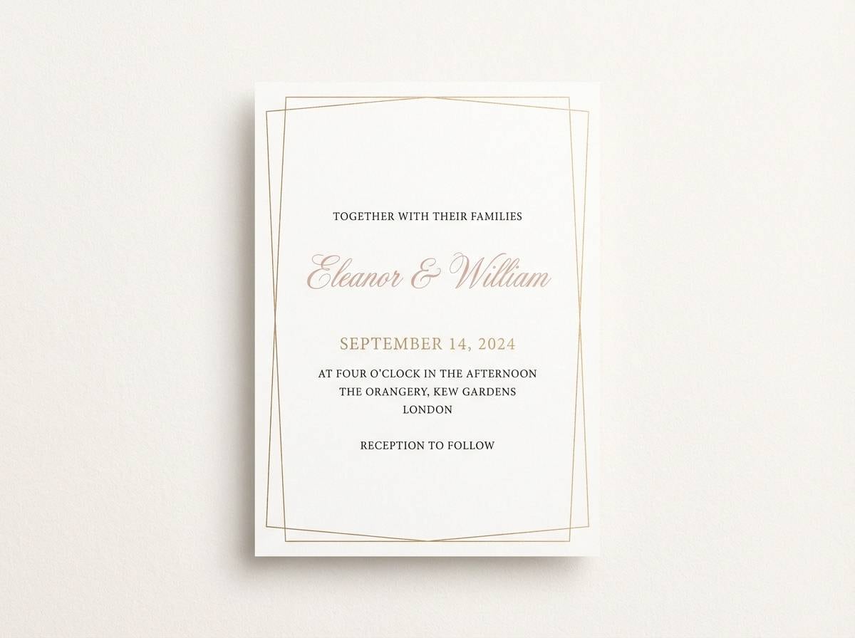
1) Champagne Blush
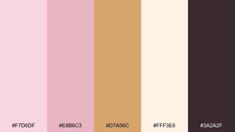
HEX: #F7D6DF #E8B6C3 #D7A56C #FFF3E6 #3A2A2F
Mood: airy, romantic, polished
Best for: wedding invitations and event stationery
Airy romance meets a polished champagne glow, like soft petals against a candlelit toast. These tones suit invitations, menus, and day-of signage where you want elegance without feeling overly formal. Pair with warm white paper textures and a charcoal type color to keep readability crisp. Tip: reserve the gold shade for borders, monograms, or tiny icons so the blush stays the hero.
Image example of champagne blush generated using media.io
Media.io is an online AI studio for creating and editing video, image, and audio in your browser.

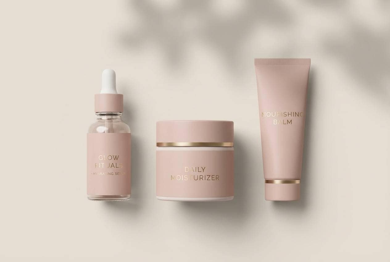
2) Rose Gold Minimal
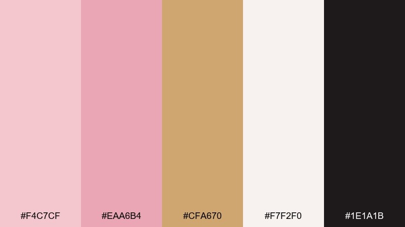
HEX: #F4C7CF #EAA6B4 #CFA670 #F7F2F0 #1E1A1B
Mood: minimal, modern, clean
Best for: beauty brand identity and packaging
Minimal and modern, this mix feels like a sleek vanity with a warm metallic glint. It works beautifully for cosmetics, skincare labels, and premium unboxing moments where restraint reads as luxury. Combine with lots of negative space and simple black typography to keep it contemporary. Tip: print the gold as foil or a muted metallic ink, while using the blush tones as flat fills for consistency.
Image example of rose gold minimal generated using media.io
3) Antique Rose Brass
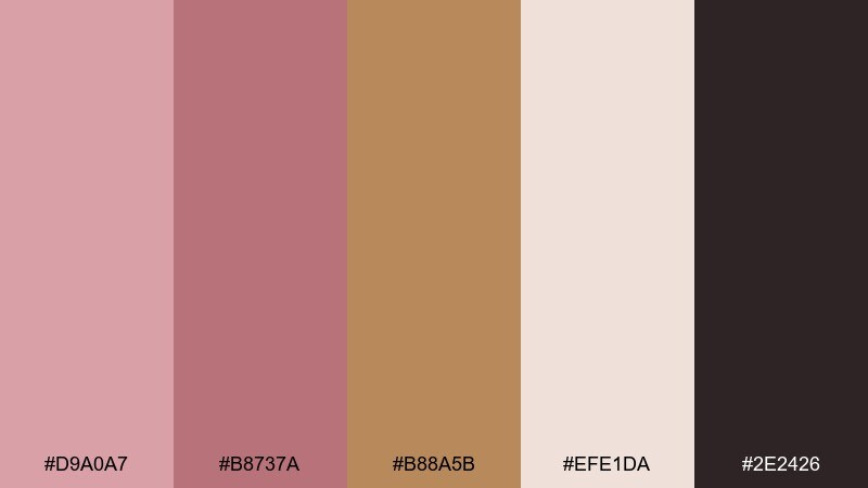
HEX: #D9A0A7 #B8737A #B88A5B #EFE1DA #2E2426
Mood: vintage, moody, sophisticated
Best for: editorial layouts and fashion lookbooks
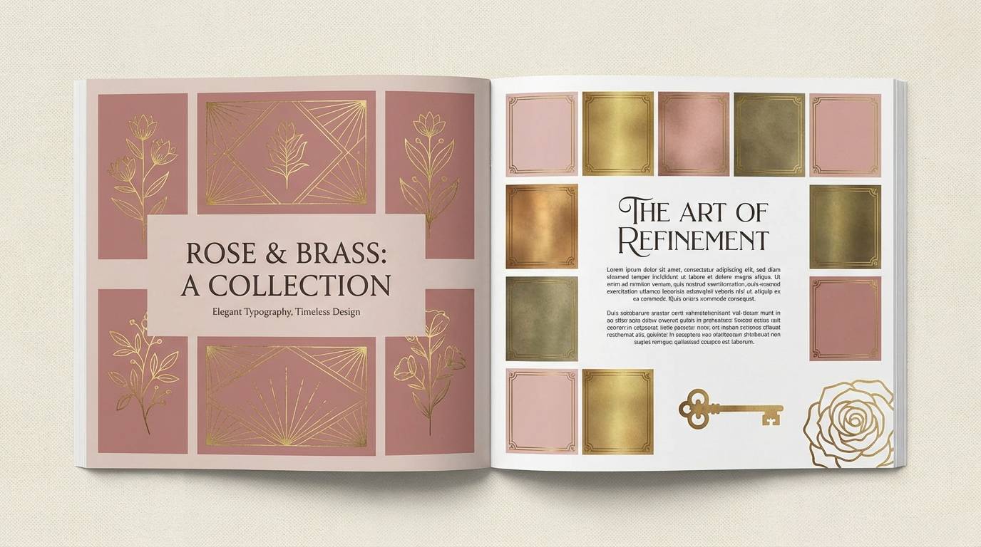
Vintage and sophisticated, it evokes antique velvet, brass fixtures, and a softly lit dressing room. Use it for editorial spreads, lookbooks, or portfolio pages that need warmth without sacrificing contrast. Pair with off-white margins and deep espresso text to keep the layout refined. Tip: let the darker rose take the lead in headlines while brass is best as a thin rule line or small pull-quote mark.
Image example of antique rose brass generated using media.io
4) Petal Copper Glow
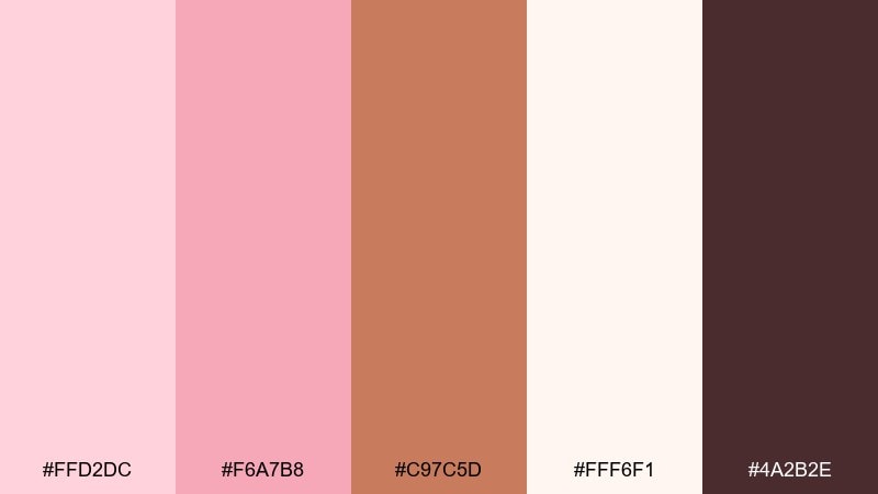
HEX: #FFD2DC #F6A7B8 #C97C5D #FFF6F1 #4A2B2E
Mood: warm, inviting, radiant
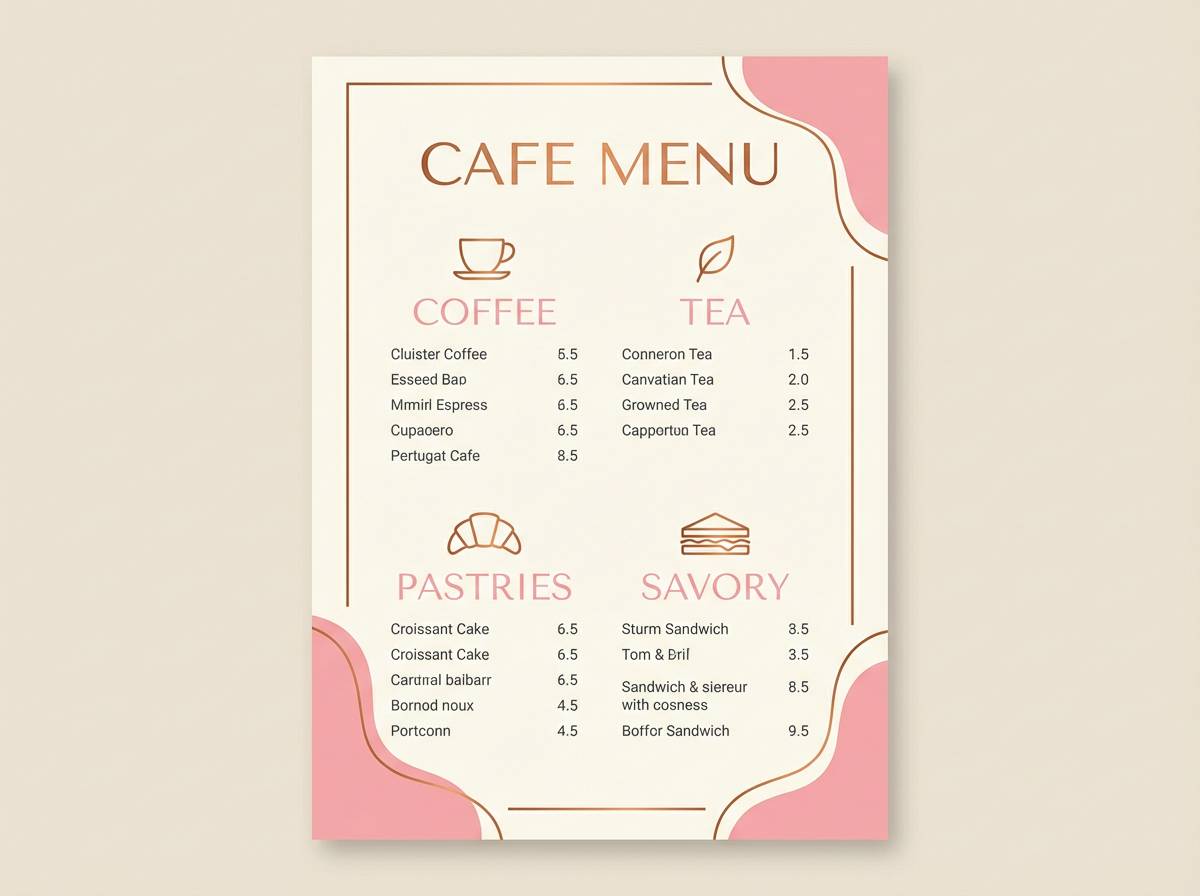
Best for: cafe branding and menu design
Warm and radiant, it feels like copper light hitting pink petals at golden hour. It fits cafes, dessert brands, and menus that aim for cozy and welcoming rather than stark and modern. Pair with cream backgrounds and a dark cocoa accent for legible pricing and headers. Tip: use the copper shade as the primary highlight color for buttons, icons, or menu section dividers.
Image example of petal copper glow generated using media.io
5) Dusty Pink Luxe
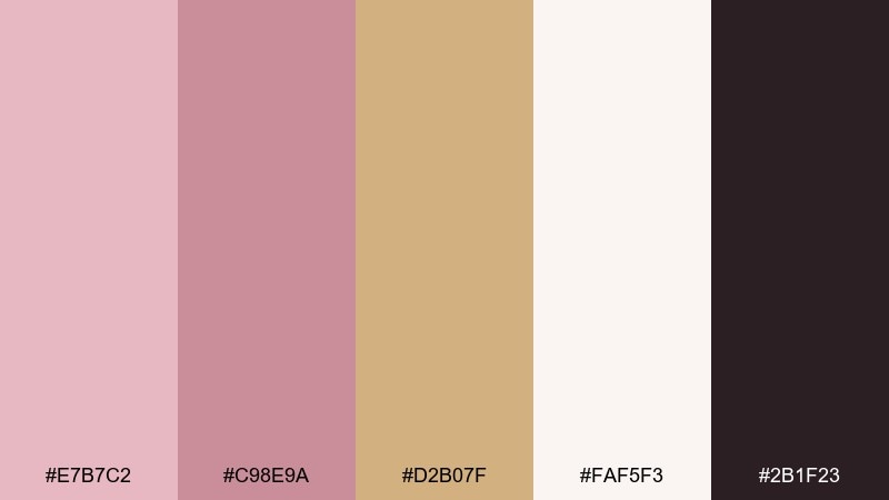
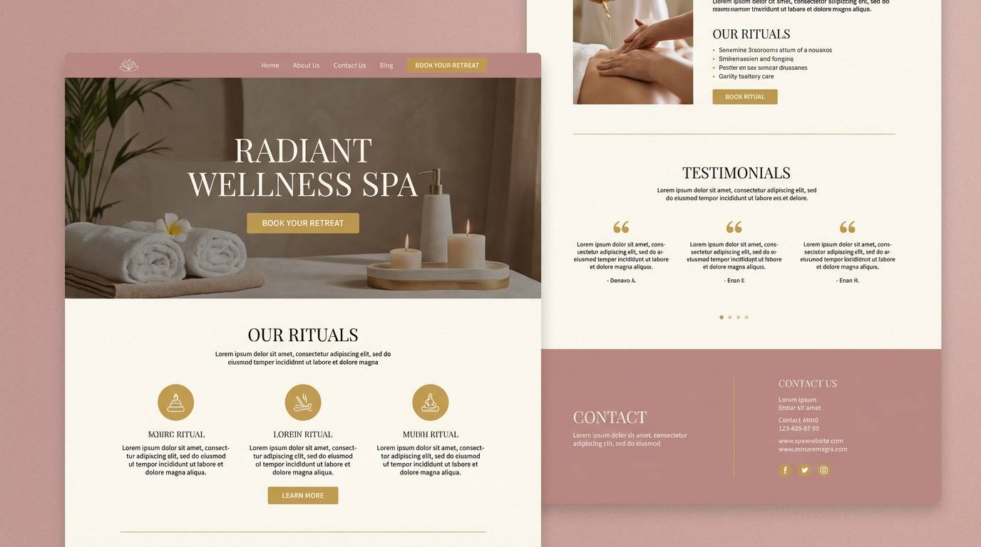
HEX: #E7B7C2 #C98E9A #D2B07F #FAF5F3 #2B1F23
Mood: luxurious, calm, upscale
Best for: spa websites and service pages
Luxurious calm comes through like a plush robe and a quiet spa lobby. These muted tones are ideal for service pages, gift cards, and soothing web sections where you want trust and softness. Pair with plenty of warm neutrals and keep the darkest shade for body text and form labels. Tip: use the gold tone sparingly for selected states, ratings, or subtle separators so it feels premium, not shiny.
Image example of dusty pink luxe generated using media.io
6) Peony Pearl Shine
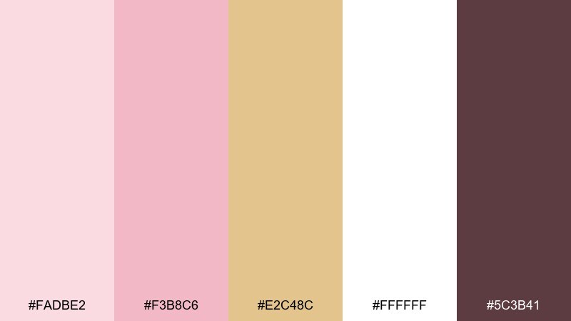
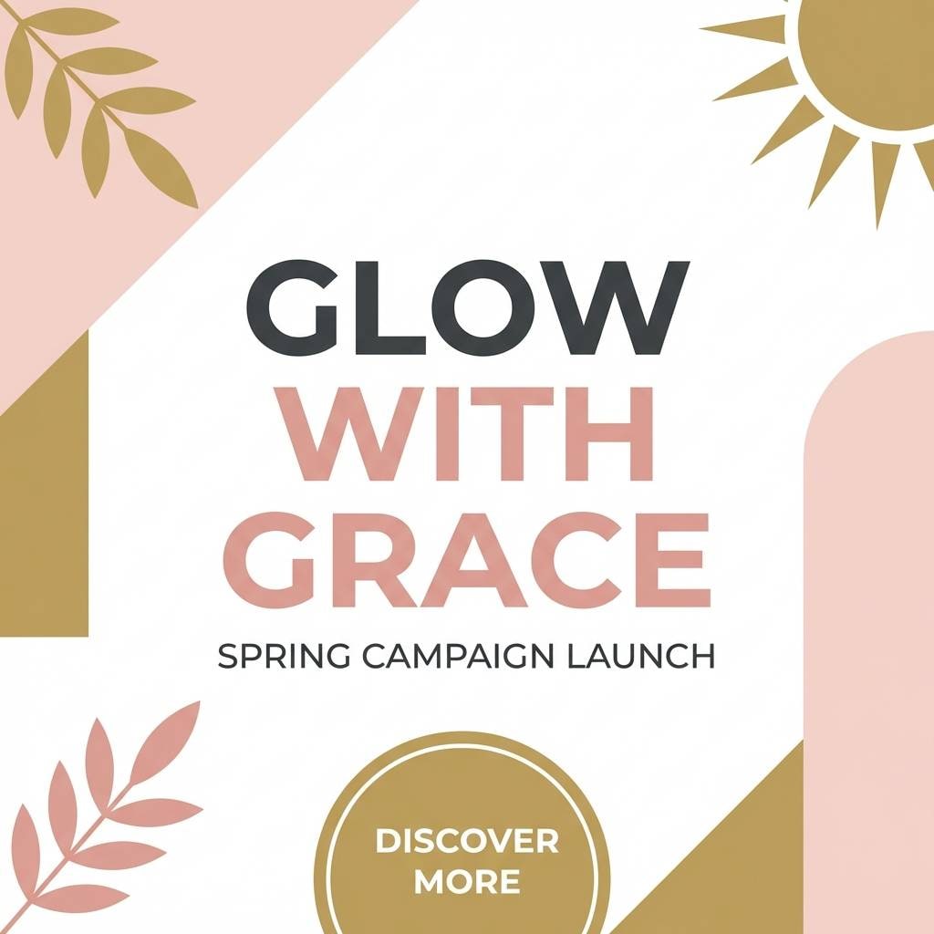
HEX: #FADBE2 #F3B8C6 #E2C48C #FFFFFF #5C3B41
Mood: fresh, delicate, bright
Best for: spring campaigns and social posts
Fresh and delicate, it brings to mind peonies, pearls, and soft daylight. It is great for spring promos, lifestyle social posts, and carousel graphics that need a bright but gentle vibe. Pair with clean white space and a plum-brown text color for contrast that still feels warm. Tip: keep gradients subtle, moving from pearl white into blush for a polished, airy finish.
Image example of peony pearl shine generated using media.io
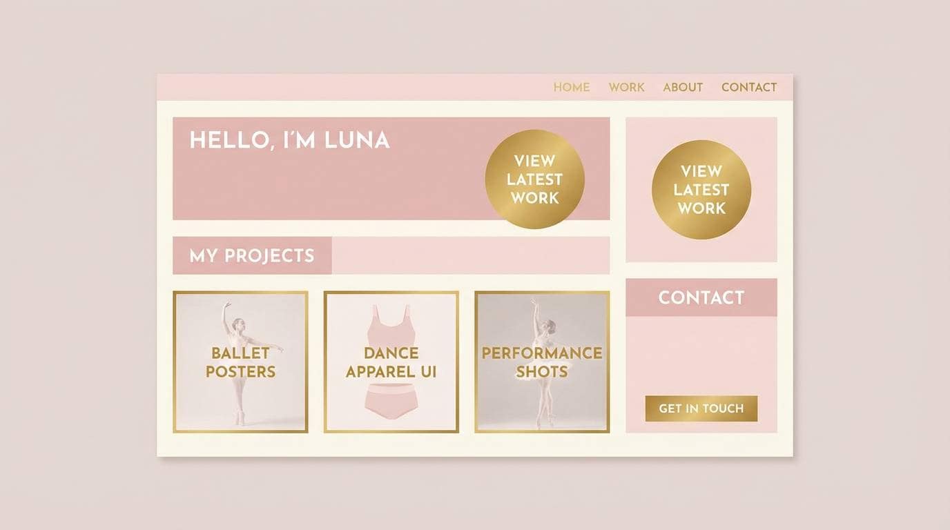
7) Ballet Gold Balance
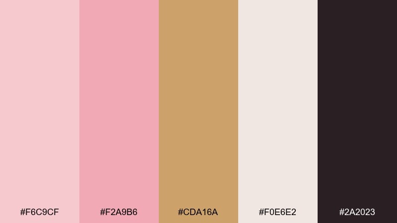
HEX: #F6C9CF #F2A9B6 #CDA16A #F0E6E2 #2A2023
Mood: soft, graceful, balanced
Best for: portfolio sites and personal branding
Soft and graceful, it reads like ballet slippers with a subtle gilded sheen. Use it on personal sites, creator kits, or portfolio pages when you want warmth without losing professionalism. Pair with warm gray neutrals and a near-black for headings to keep structure clear. Tip: apply the brightest pink as a hover state while the gold stays for badges or small emphasis details.
Image example of ballet gold balance generated using media.io
8) Sunset Rose Metal
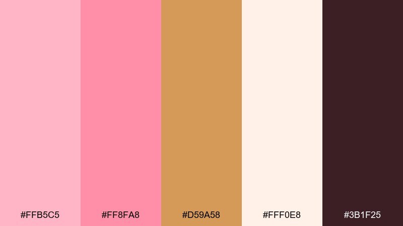
HEX: #FFB5C5 #FF8FA8 #D59A58 #FFF0E8 #3B1F25
Mood: bold, playful, energetic
Best for: product launches and promo banners
Bold and energetic, it feels like a sunset reflection on rose metal. These shades pop on promo banners, launch pages, and limited-edition drops that need immediate attention. Pair with soft peachy whites to avoid harsh contrast and keep the deep berry-brown for headlines. Tip: limit the brightest pink to one primary call-to-action per section to keep the page from feeling loud.
Image example of sunset rose metal generated using media.io

9) Mauve Midas
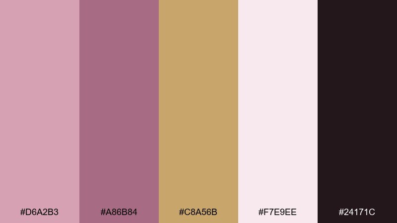
HEX: #D6A2B3 #A86B84 #C8A56B #F7E9EE #24171C
Mood: dramatic, elegant, artistic
Best for: luxury blog headers and hero sections
Dramatic and elegant, it suggests mauve silk with a Midas touch. This set is strong for hero sections, blog headers, and feature cards where you want an elevated, editorial feel. Pair with pale pink backgrounds and keep the darkest tone for typography and icons. Tip: use the gold for underlines or small UI chips so it reads as intentional accent, not decoration.
Image example of mauve midas generated using media.io
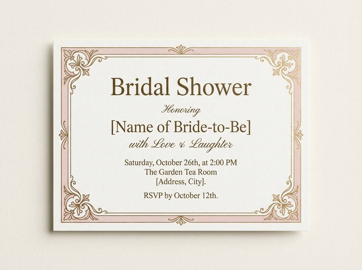
10) Vintage Powder Gold
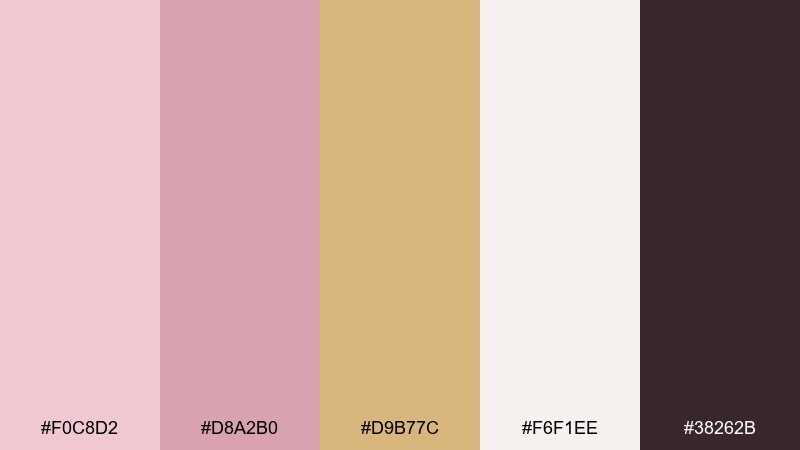
HEX: #F0C8D2 #D8A2B0 #D9B77C #F6F1EE #38262B
Mood: nostalgic, gentle, refined
Best for: bridal shower invites and thank you cards
Nostalgic and gentle, it recalls powder compacts, pressed flowers, and old-world stationery. It is a lovely choice for bridal showers, thank you cards, and classic celebration designs. Pair with soft ivory and a deep brown for type to keep the composition grounded. Tip: add a thin gold frame or corner ornaments for a vintage finish without cluttering the layout.
Image example of vintage powder gold generated using media.io
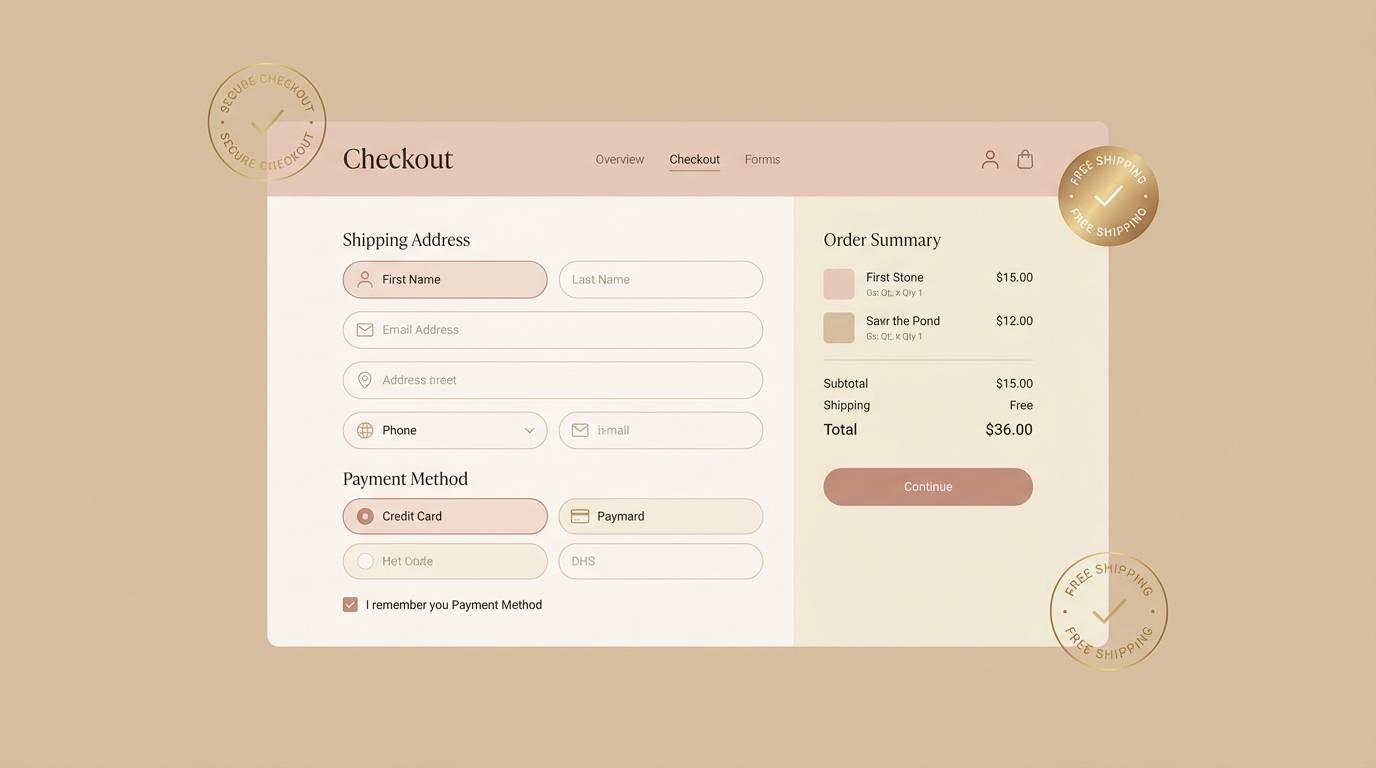
11) Modern Nude Rose
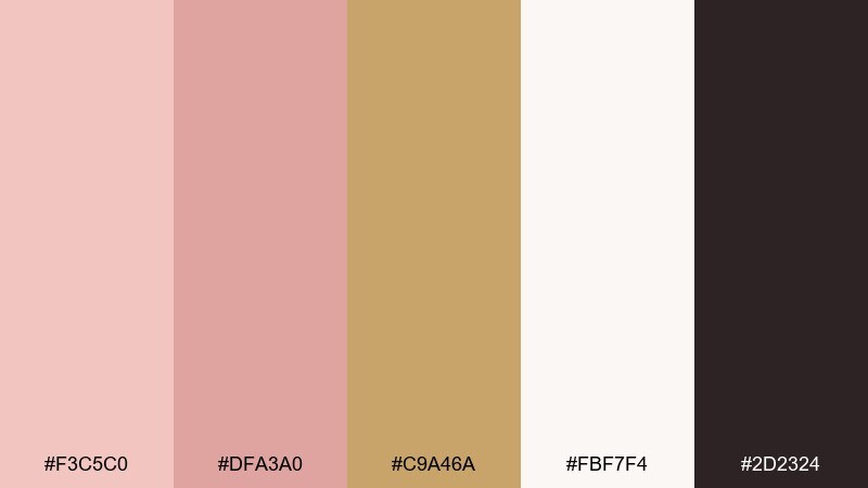
HEX: #F3C5C0 #DFA3A0 #C9A46A #FBF7F4 #2D2324
Mood: neutral, modern, approachable
Best for: ecommerce UI and checkout flows
Neutral and approachable, it feels like nude rose makeup with a soft gilded highlight. It performs well in ecommerce UI, especially checkout and account screens where calm visuals improve trust. Pair with warm whites and keep the near-black for form text, errors, and icons. Tip: use the gold tone for success states or loyalty badges, and keep primary buttons in the stronger rose for clear hierarchy.
Image example of modern nude rose generated using media.io
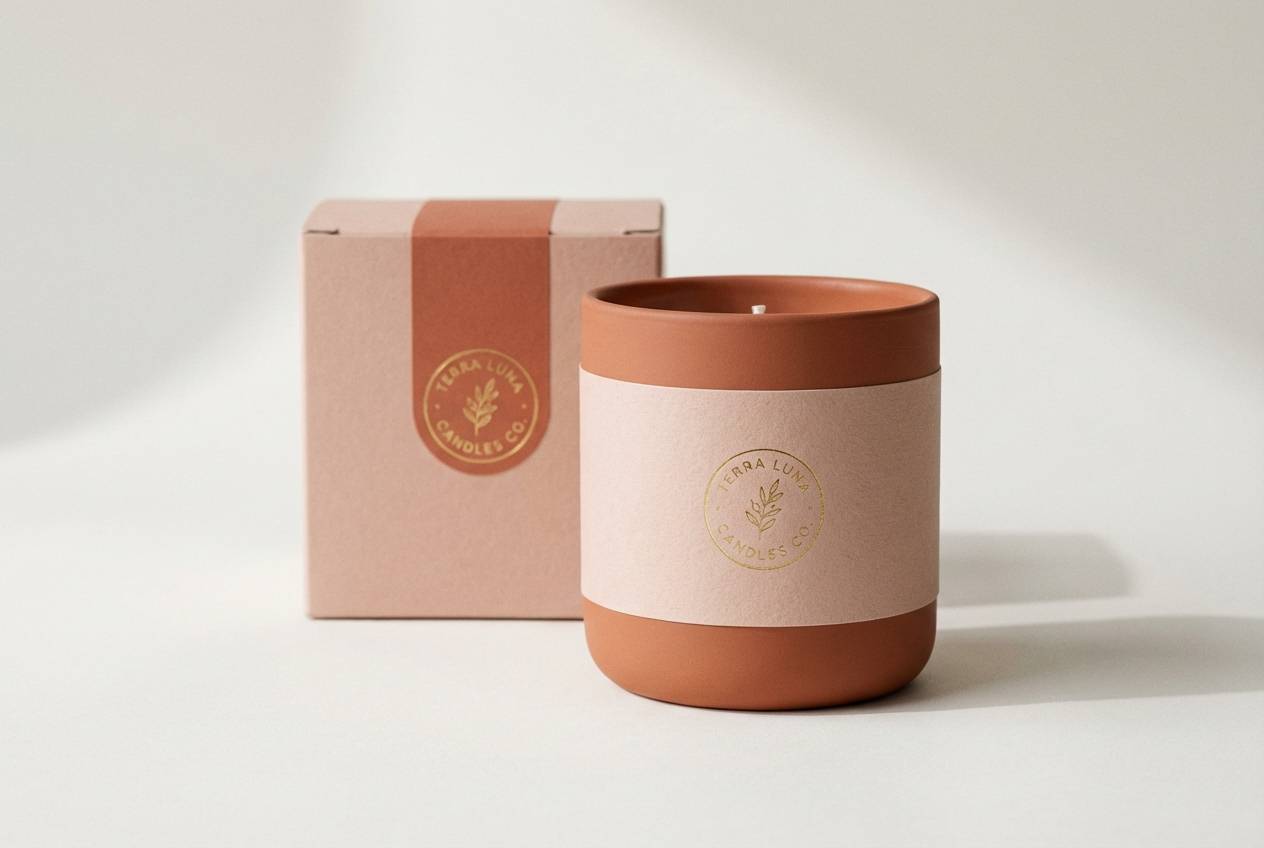
12) Blush Terracotta Gold
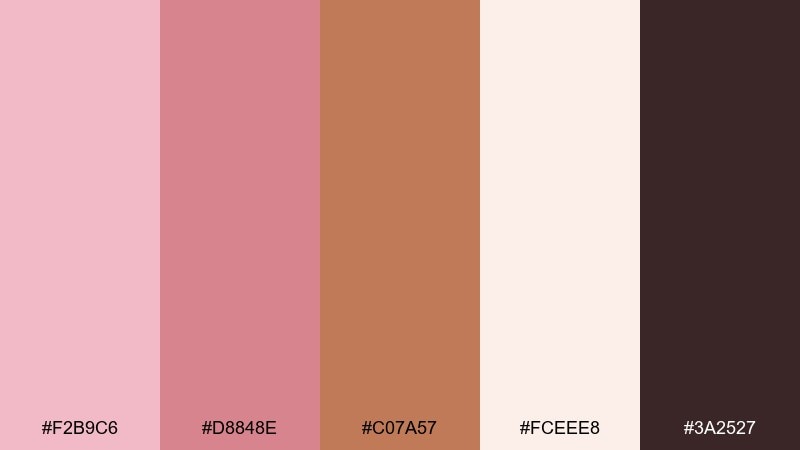
HEX: #F2B9C6 #D8848E #C07A57 #FCEEE8 #3A2527
Mood: earthy, warm, handcrafted
Best for: ceramics brands and artisan packaging
Earthy warmth comes through like blush clay, terracotta glaze, and a hint of gilding. It is perfect for artisan brands, ceramics packaging, and handmade product labels that want a grounded, tactile feel. Pair with recycled-paper textures and a dark brown for clear ingredient or care instructions. Tip: keep the gold as a small stamp mark or seal so it feels handcrafted rather than flashy.
Image example of blush terracotta gold generated using media.io
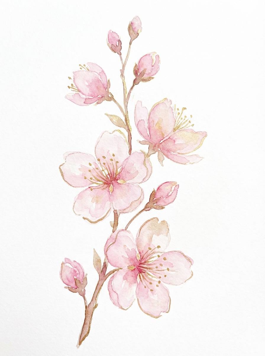
13) Sakura Champagne
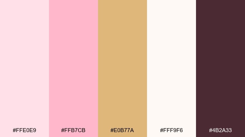
HEX: #FFE0E9 #FFB7CB #E0B77A #FFF9F6 #4B2A33
Mood: dreamy, springtime, light
Best for: botanical illustrations and seasonal posters
Dreamy springtime energy, like sakura blooms drifting through champagne light. Use it for illustrated posters, botanical assets, and seasonal promo art where softness matters. Pair with warm whites and a deep plum-brown for outlines and type. Tip: keep the illustration linework in the darkest shade, then wash in the lighter pinks so the gold reads as a gentle highlight.
Image example of sakura champagne generated using media.io
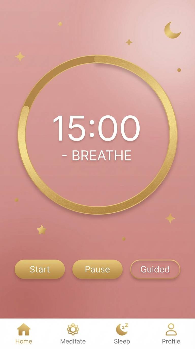
14) Rose Quartz Gilding
HEX: #F6C3D4 #E49BB8 #D1B06C #F9F3F6 #2C1C22
Mood: serene, romantic, premium
Best for: wellness apps and meditation UI
Serene and premium, it suggests rose quartz crystals catching soft gilded light. As a pink gold color palette, it fits wellness apps, meditation timers, and calming onboarding screens. Pair with gentle gradients and high-contrast text in the darkest shade to maintain accessibility. Tip: keep gold for micro-interactions like progress rings or subtle highlights, and let the pinks carry the background mood.
Image example of rose quartz gilding generated using media.io
15) Flamingo Foil
HEX: #FF9FB8 #FF6F9A #CDA564 #FFEFF4 #3C1C28
Mood: fun, glossy, confident
Best for: beauty ads and influencer promo graphics
Fun and glossy, it feels like flamingo lipstick with a foil shimmer. These pink gold color combinations are ideal for beauty ads, influencer promo graphics, and bold announcement tiles. Pair with soft blush backgrounds so the hot pink reads as the focal point, and keep the dark tone for text. Tip: use gold only for key price tags or a small logo lockup to prevent the design from looking busy.
Image example of flamingo foil generated using media.io
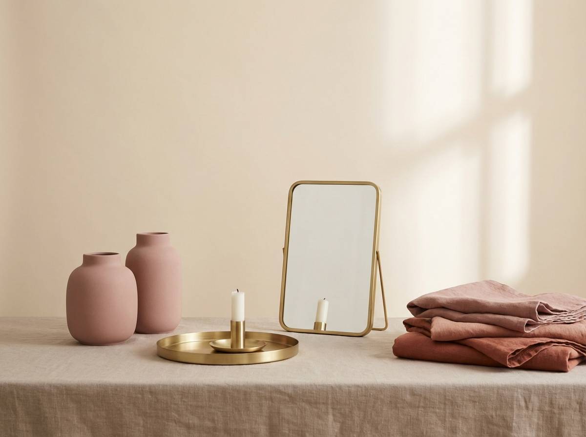
16) Warm Pink Patina
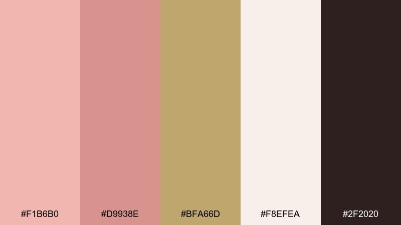
HEX: #F1B6B0 #D9938E #BFA66D #F8EFEA #2F2020
Mood: cozy, lived-in, comforting
Best for: interior mood boards and home decor shops
Cozy and lived-in, it brings to mind warm pink plaster and brass with a gentle patina. Use it for home decor branding, interior mood boards, and product category pages where comfort is the message. Pair with linen-like neutrals and keep the darkest tone for navigation and product names. Tip: use the gold shade as a consistent accent for icons and dividers to unify the layout.
Image example of warm pink patina generated using media.io
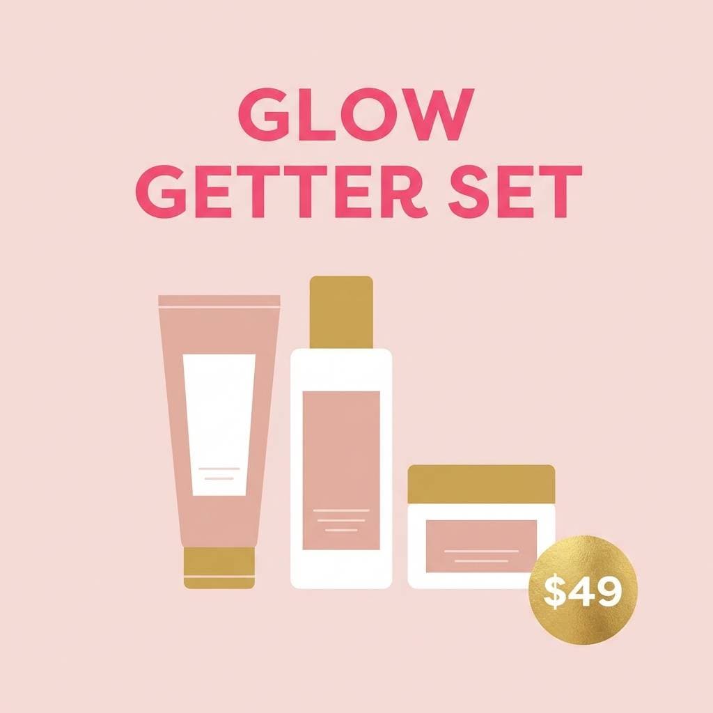
17) Soft Coral Aurum
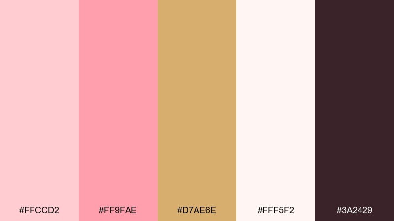
HEX: #FFCCD2 #FF9FAE #D7AE6E #FFF5F2 #3A2429
Mood: uplifting, friendly, sunny
Best for: newsletter templates and marketing emails
Uplifting and sunny, it reads like soft coral sorbet with a warm aurum glow. It is great for newsletters, marketing emails, and promotional sections where you want cheerful energy without neon intensity. Pair with lots of white space and dark text for accessibility in long reads. Tip: keep the coral for headings and buttons, and use the gold only as a thin accent rule or small badge.
Image example of soft coral aurum generated using media.io
18) Berry Bronze Elegance
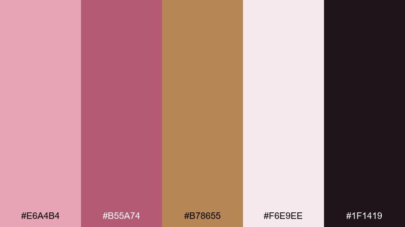
HEX: #E6A4B4 #B55A74 #B78655 #F6E9EE #1F1419
Mood: elegant, bold, evening
Best for: cocktail party invites and posters
Elegant and evening-ready, it evokes berry lipstick, bronze jewelry, and low ambient lighting. It works especially well for cocktail invites, event posters, and nightlife branding that needs depth. Pair with pale blush for breathing room and use the near-black for type and QR codes. Tip: set the bronze as a single spotlight accent, like a date badge or thin border, to keep it classy.
Image example of berry bronze elegance generated using media.io
19) Pink Sand Gold

HEX: #F3C1B9 #E3A199 #D5B06A #FDF6F0 #2B1E1E
Mood: sun-kissed, relaxed, natural
Best for: travel brands and resort landing pages
Sun-kissed and relaxed, it feels like pink sand beaches with a golden horizon. These tones are strong for resort landing pages, travel promos, and lifestyle photography overlays. Pair with creamy neutrals and keep the darkest shade for navigation and captions so text stays readable over images. Tip: use the gold as a consistent highlight for links and small icons to add polish without competing with photos.
Image example of pink sand gold generated using media.io
20) Orchid Gold Dust
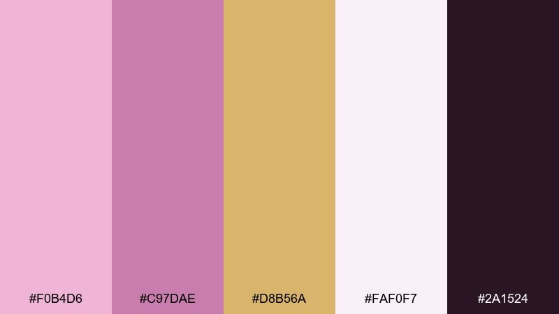
HEX: #F0B4D6 #C97DAE #D8B56A #FAF0F7 #2A1524
Mood: creative, lush, glamorous
Best for: music cover art and creative posters
Creative and lush, it brings orchid blooms and a soft gold-dust sparkle to mind. Use it for cover art, creative posters, or campaign key visuals that need glamour without harsh contrast. Pair with pale lavender-pink backgrounds and keep the darkest tone for typography and barcodes. Tip: try a subtle grain texture on the gold areas to make the metallic feel more organic in print and digital.
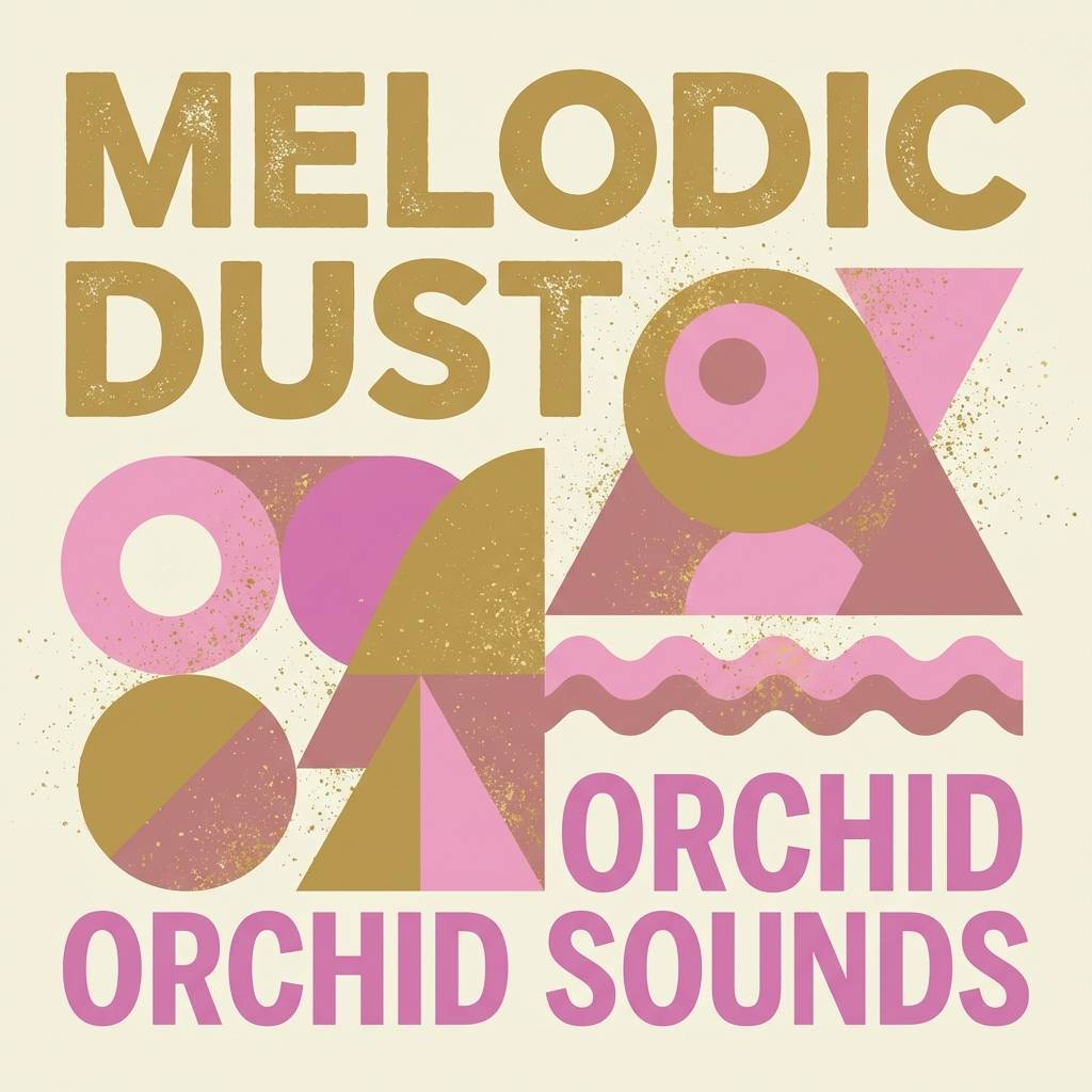
Image example of orchid gold dust generated using media.io
21) Blush Gold Interface
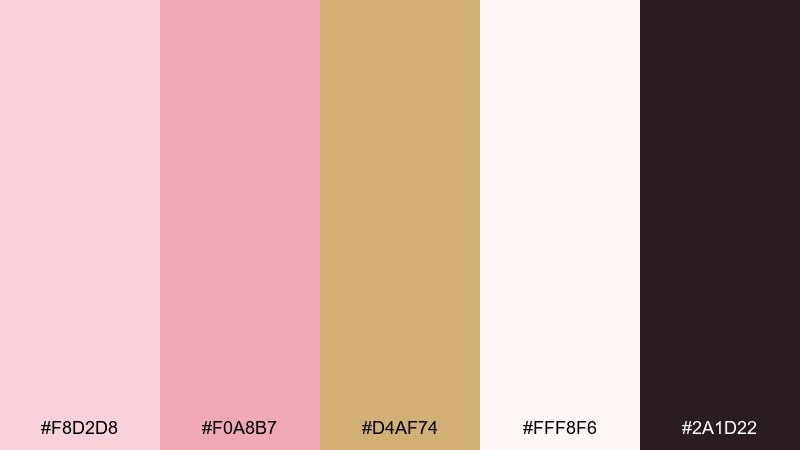
HEX: #F8D2D8 #F0A8B7 #D4AF74 #FFF8F6 #2A1D22
Mood: friendly, modern, soft-tech
Best for: SaaS dashboards and analytics UI
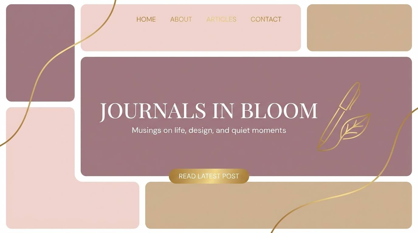
Friendly modern softness, like blush glass with a warm metallic edge, gives dashboards a more human feel. This pink gold color palette works well for SaaS analytics UI when you want calm surfaces and clear hierarchy. Pair with lots of off-white panels and keep the darkest shade for charts and labels for contrast. Tip: use the gold for active tabs or key KPIs only, so attention lands where it matters.
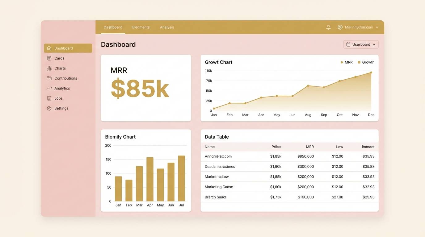
Image example of blush gold interface generated using media.io
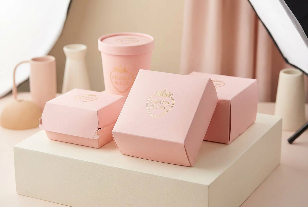
22) Gilded Strawberry Milk
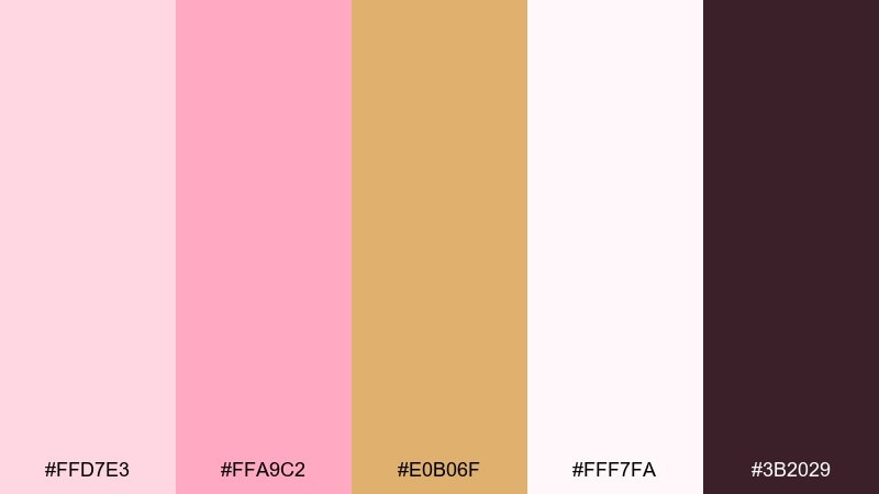
HEX: #FFD7E3 #FFA9C2 #E0B06F #FFF7FA #3B2029
Mood: sweet, playful, trendy
Best for: dessert packaging and cafe promos
Sweet and playful, it resembles strawberry milk with a gilded rim. These pink gold color combinations are perfect for dessert packaging, cafe promos, and limited seasonal flavors. Pair with creamy whites and keep the deep plum-brown for ingredient text and small legal lines. Tip: if you need a premium twist, apply the gold to the logo mark only and keep the rest matte.
Image example of gilded strawberry milk generated using media.io
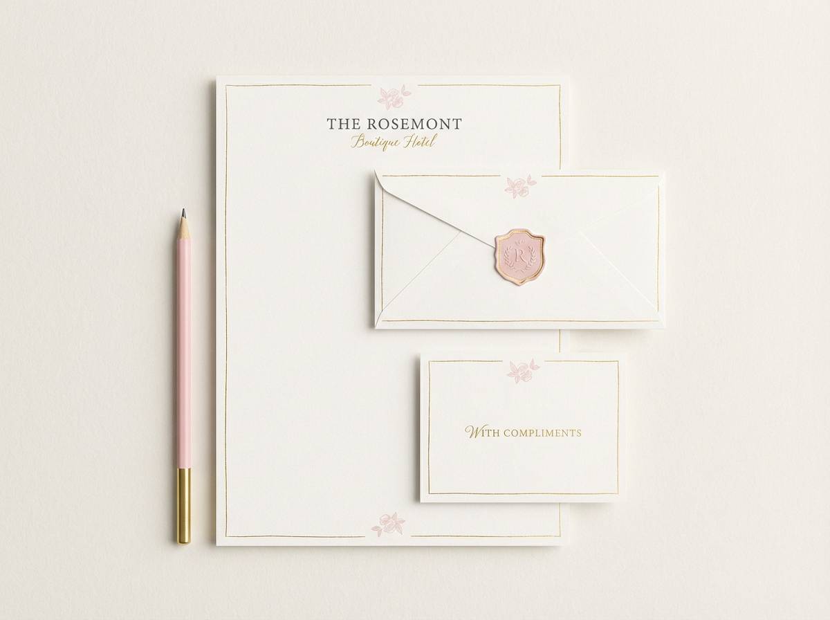
23) Heirloom Pink Gold
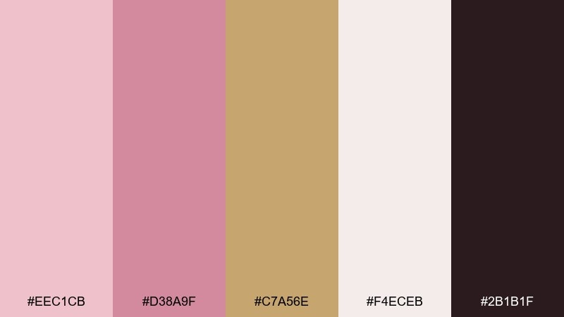
HEX: #EEC1CB #D38A9F #C7A56E #F4ECEB #2B1B1F
Mood: timeless, graceful, heritage
Best for: boutique hotel branding and stationery
Timeless and graceful, it suggests heirloom roses, polished brass, and thick cotton paper. This set makes a strong pink gold color combination for boutique hotels, stationery suites, and loyalty cards. Pair with warm neutrals and understated serif typography to emphasize heritage. Tip: keep the gold tone consistent across print finishes so every touchpoint feels cohesive.
Image example of heirloom pink gold generated using media.io
What Colors Go Well with Pink Gold?
Pink gold pairs especially well with warm neutrals like cream, ivory, beige, and taupe—these support the blush tones and make the gold feel naturally luminous instead of harsh.
For contrast, choose deep warm darks such as cocoa, espresso, charcoal-brown, or near-black. They stabilize the palette for typography, icons, and UI elements where readability matters.
If you want extra personality, add muted greens (sage/olive), dusty blues, or plum-browns as supporting accents—keep them desaturated so the pink-and-gold relationship remains the focus.
How to Use a Pink Gold Color Palette in Real Designs
Start by assigning roles: pick one primary pink for major surfaces, a lighter blush/white for backgrounds, a dark neutral for text, and treat the gold as an accent rather than a base color.
In branding and print, gold works best as “micro-luxury”—thin borders, seals, monograms, or small badges. In UI, use it for active states, key metrics, or progress accents so attention lands intentionally.
When designing at scale, keep consistency by limiting gold to one finish (foil-like, matte metallic, or flat mustard-gold) so your system doesn’t look mixed across pages and assets.
Create Pink Gold Palette Visuals with AI
If you already have HEX codes but need real visuals—mockups, banners, posters, packaging, or UI—AI generation can help you explore styles quickly without rebuilding layouts from scratch.
Use short prompts that mention “blush pink + champagne gold accents” and specify the design type (invitation, dashboard, product ad). Then refine lighting, texture, and typography to match your brand tone.
When you get a design you like, reuse the same prompt structure across variants to keep campaigns cohesive while still creating fresh creative.
Pink Gold Color Palette FAQs
-
What is a pink gold color palette?
A pink gold color palette blends blush/rose tones with warm gold or champagne accents, usually anchored by a light neutral (like ivory) and a dark neutral (like cocoa) for readable contrast. -
Is pink gold the same as rose gold?
They’re closely related. Rose gold usually leans more metallic copper-rose, while “pink gold” can range from soft blush with champagne gold to brighter pinks with warm gold accents. -
What background color works best with pink gold?
Warm whites (ivory, cream) and soft blush-tinted whites make pink gold feel smooth and premium. Bright cool white can work too, but it may make gold look flatter or less warm. -
What text color should I use on blush or pink gold backgrounds?
Use deep warm darks like espresso, cocoa, or near-black for body text and UI labels. They keep contrast strong while matching the palette’s warmth better than pure black. -
How do I keep gold accents from looking cheap?
Use gold sparingly (borders, icons, badges), keep it consistent across the design system, and avoid too many gold elements competing at once. In print, consider a single foil/metallic finish for cohesion. -
Are pink gold palettes good for UI and apps?
Yes—especially for wellness, beauty, lifestyle, and modern SaaS brands. Add an off-white surface color and a dark neutral for charts and text to maintain accessibility and hierarchy. -
Can I generate pink gold design mockups with AI?
Yes. In your prompt, specify the design format (packaging, invitation, dashboard), mention blush/rose + champagne gold accents, and add details like “clean layout” or “premium studio lighting” for better control.


