

Orange and turquoise is a modern classic: one hue brings heat and momentum, the other adds clarity and calm. Together, they create contrast that feels energetic without becoming aggressive.
Below are 20+ orange turquoise color palette ideas with HEX codes, plus practical tips for branding, UI, print, and interiors.
In this article
- Why Orange Turquoise Palettes Work So Well
-
- citrus lagoon
- sunset reef
- retro beach club
- desert oasis
- coral tide
- copper seafoam
- tropical market
- clay and aqua
- mango mint
- terracotta surf
- neon boardwalk
- spa sunrise
- vintage postcard
- adobe poolside
- saffron bay
- apricot marina
- canyon current
- peachy aquarium
- burnt orange lagoon
- soft sand shore
- seaside spritz
- harbor claylight
- What Colors Go Well with Orange Turquoise?
- How to Use a Orange Turquoise Color Palette in Real Designs
- Create Orange Turquoise Palette Visuals with AI
Why Orange Turquoise Palettes Work So Well
Orange and turquoise sit on opposite sides of the warm–cool spectrum, so they naturally create clear visual separation. That contrast helps interfaces, posters, and brand systems feel structured and easy to scan.
Emotionally, orange signals action, friendliness, and warmth, while turquoise reads as fresh, clean, and coastal. The pairing can shift from loud and playful to calm and premium depending on saturation and how much neutral space you add.
Practically, it’s easy to build hierarchy: reserve orange for primary emphasis (CTAs, key numbers, feature labels) and let turquoise handle supporting structure (navigation, tags, dividers, secondary buttons).
20+ Orange Turquoise Color Palette Ideas (with HEX Codes)
1) Citrus Lagoon
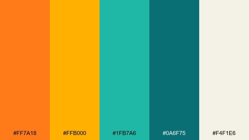
HEX: #ff7a18 #ffb000 #1fb7a6 #0a6f75 #f4f1e6
Mood: bright, coastal, energetic
Best for: travel landing page UI
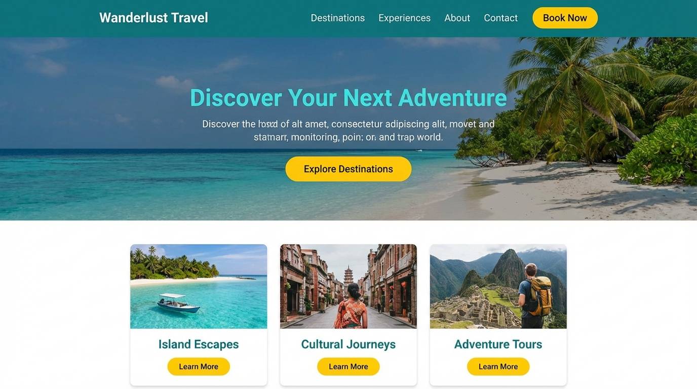
Bright and breezy like sunlit fruit by clear water, these tones feel upbeat without turning harsh. This orange turquoise color combination works best with plenty of white space and simple icon shapes. Pair it with soft cream backgrounds and keep the deep teal for headlines or CTAs. Usage tip: reserve the brightest orange for one primary action to avoid visual noise.
Image example of citrus lagoon generated using media.io
Media.io is an online AI studio for creating and editing video, image, and audio in your browser.

2) Sunset Reef
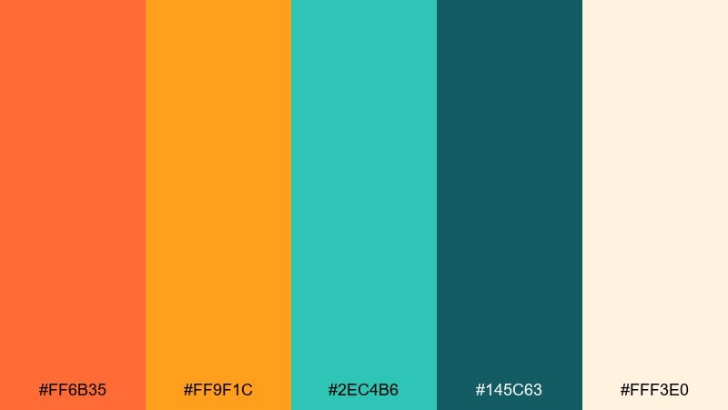
HEX: #ff6b35 #ff9f1c #2ec4b6 #145c63 #fff3e0
Mood: warm, summery, optimistic
Best for: summer event poster
Warm sunset orange against reefy turquoise creates a lively, festival-ready feel. The creamy off-white keeps the contrast readable for large type and schedules. Use the darker teal for text blocks and outlines so bright elements stay crisp. Usage tip: add a subtle grain texture to flatten gradients and make the poster feel more tactile.
Image example of sunset reef generated using media.io

3) Retro Beach Club
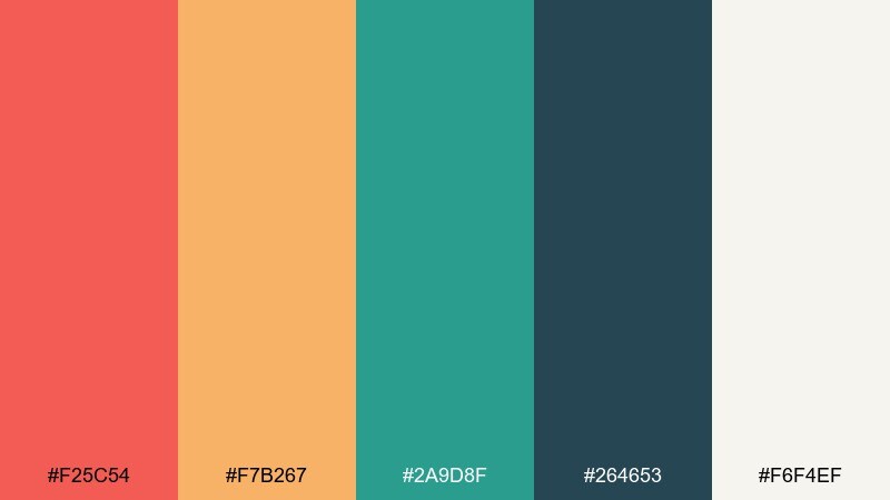
HEX: #f25c54 #f7b267 #2a9d8f #264653 #f6f4ef
Mood: retro, playful, confident
Best for: brand identity moodboard
Playful retro warmth meets cool seawater tones for a look that feels both nostalgic and modern. The navy-teal anchor color adds structure for logos, monograms, and packaging type. Use the peachy orange for highlights and the softer apricot for secondary blocks. Usage tip: keep shapes chunky and rounded to match the vintage vibe.
Image example of retro beach club generated using media.io
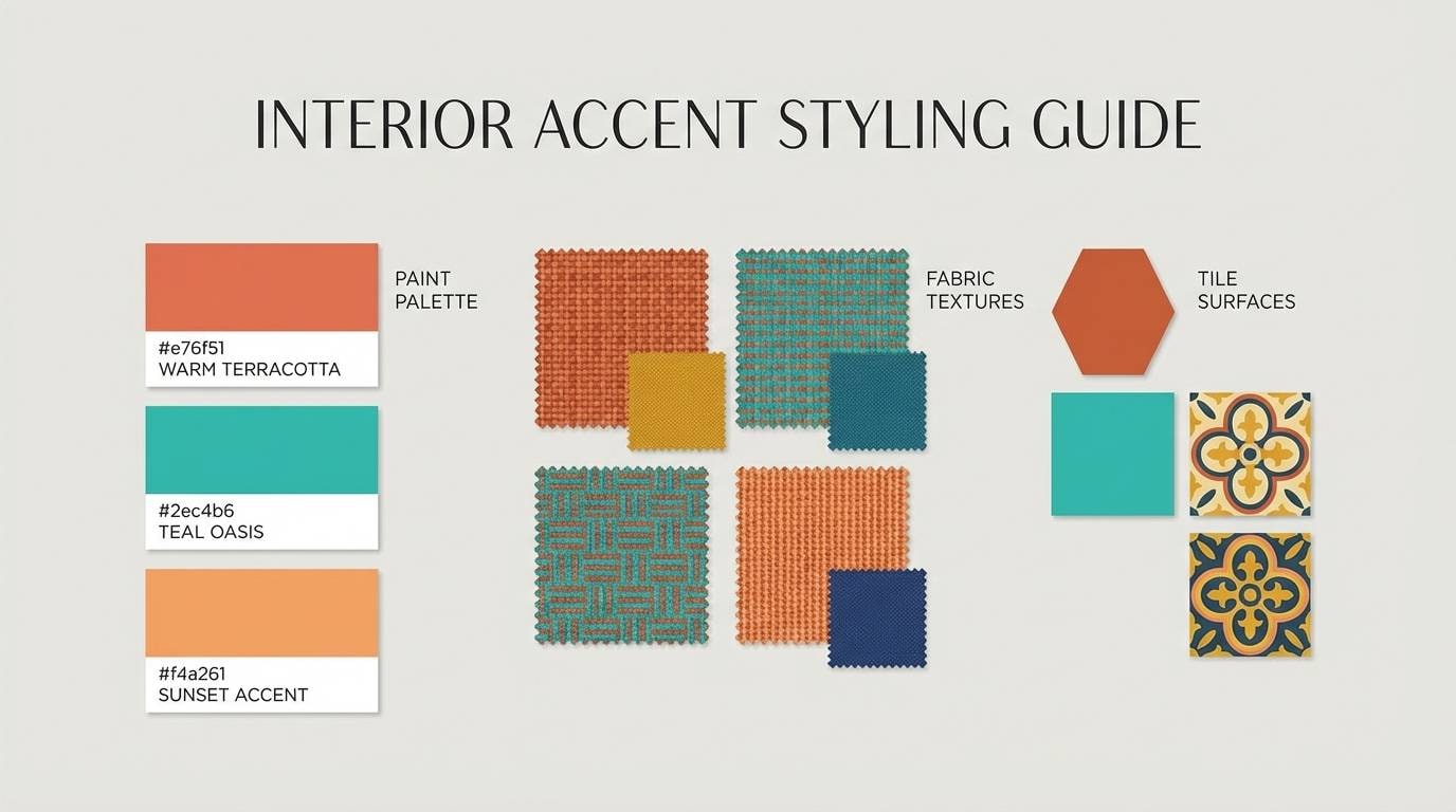
4) Desert Oasis

HEX: #e76f51 #f4a261 #2ec4b6 #0f4c5c #ede7da
Mood: earthy, refreshing, balanced
Best for: interior accent styling guide
Earthy desert oranges paired with cool oasis teal feel grounded yet refreshing. The sandy neutral is ideal for walls, web backgrounds, or large surfaces, while teal reads best on smaller accents like pillows, tiles, or buttons. Bring in matte black hardware or dark wood to deepen the contrast. Usage tip: repeat teal at least three times in a room or layout for a cohesive rhythm.
Image example of desert oasis generated using media.io
5) Coral Tide
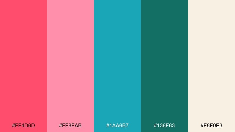
HEX: #ff4d6d #ff8fab #1aa6b7 #136f63 #f8f0e3
Mood: romantic, fresh, modern
Best for: wedding invitation suite
Romantic coral and crisp turquoise feel like petals drifting over water, soft but still contemporary. Keep the blush tones for large fields and use the deeper green-teal for names and key details to maintain legibility. A warm ivory paper texture pairs beautifully with these hues. Usage tip: add a thin turquoise rule line to frame the invitation and sharpen the layout.
Image example of coral tide generated using media.io
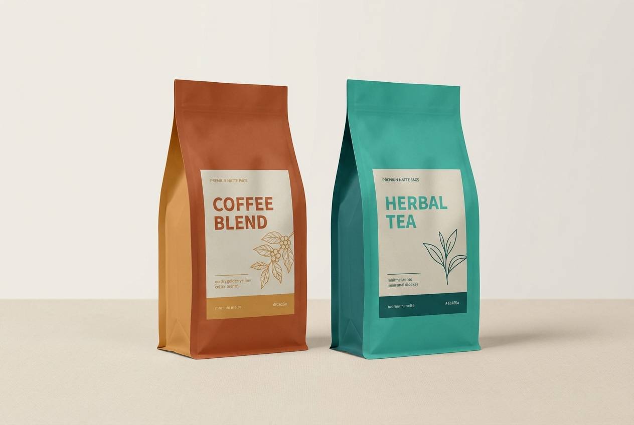
6) Copper Seafoam
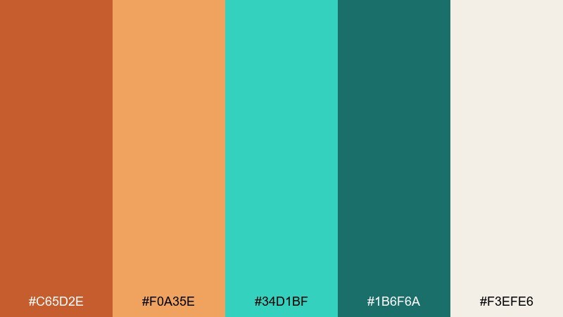
HEX: #c65d2e #f0a35e #34d1bf #1b6f6a #f3efe6
Mood: crafted, premium, inviting
Best for: coffee and tea packaging
Crafted copper warmth with seafoam freshness gives a small-batch, premium feel. These orange turquoise color combinations shine on matte labels with foil details, especially when the dark teal is used for type. Pair with cream stock and minimal illustrations to keep it upscale. Usage tip: use copper as the brand mark color and reserve seafoam for flavor variants.
Image example of copper seafoam generated using media.io
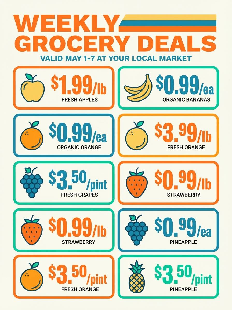
7) Tropical Market
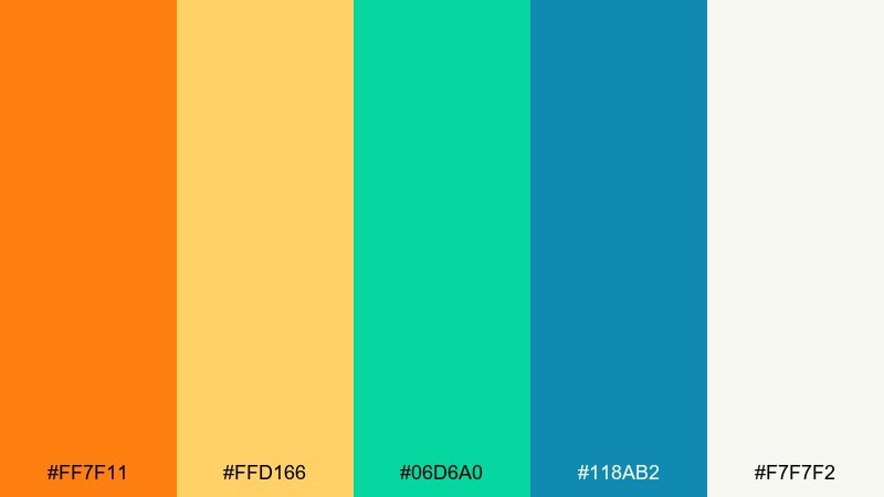
HEX: #ff7f11 #ffd166 #06d6a0 #118ab2 #f7f7f2
Mood: lively, friendly, bold
Best for: grocery promo flyer
Lively fruit-stand energy jumps out with punchy orange and fresh minty greens. The airy off-white keeps crowded pricing and product callouts readable. Use the blue-teal for banners and category labels to organize the hierarchy. Usage tip: limit the yellow to badges and price highlights so the page stays clean.
Image example of tropical market generated using media.io
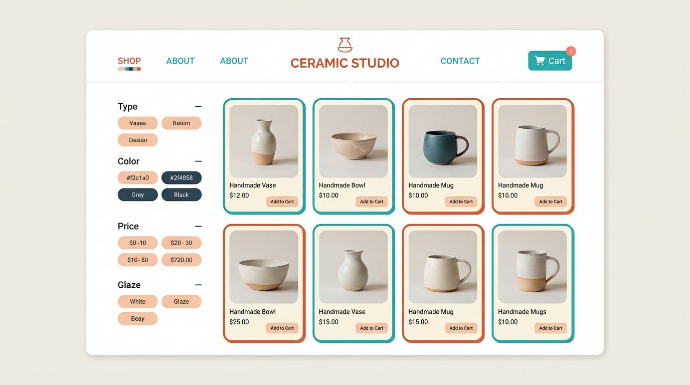
8) Clay and Aqua
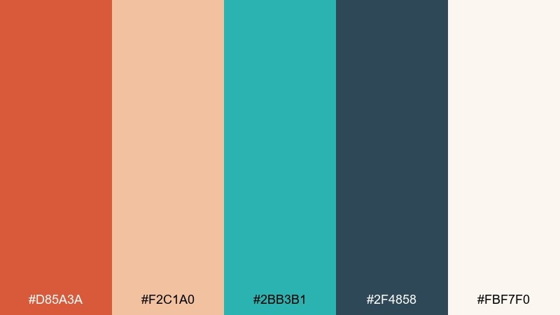
HEX: #d85a3a #f2c1a0 #2bb3b1 #2f4858 #fbf7f0
Mood: soft, modern, artisanal
Best for: ceramics shop ecommerce
Soft clay tones with watery aqua feel handmade and modern at the same time. Use the pale peach as the page background, then let aqua highlight add-to-cart states and small UI chips. The deep slate adds a reliable base for navigation and product names. Usage tip: shoot product photos on warm cream so the palette reads consistent across listings.
Image example of clay and aqua generated using media.io
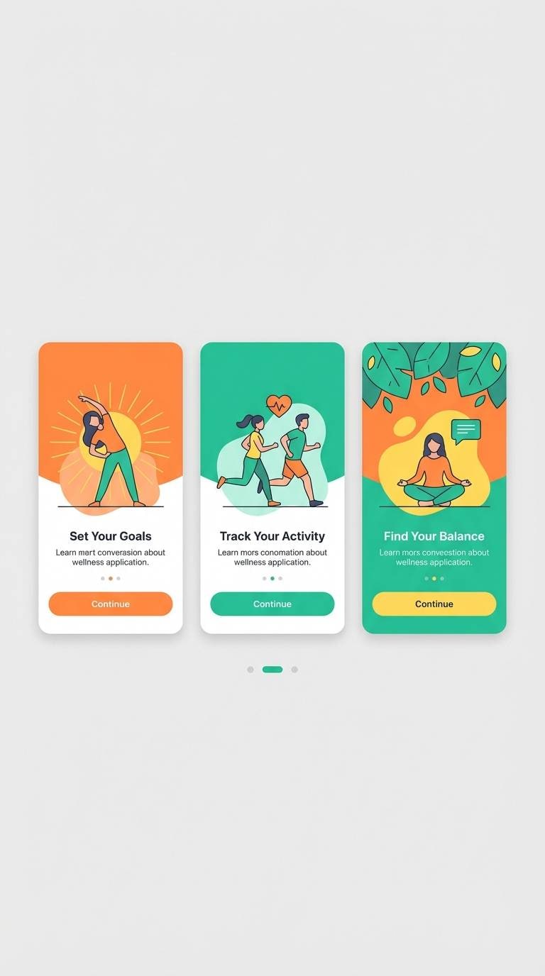
9) Mango Mint
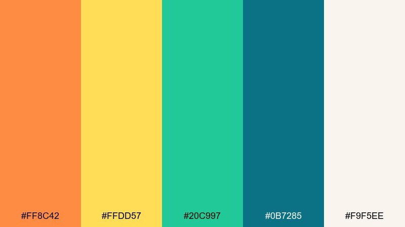
HEX: #ff8c42 #ffdd57 #20c997 #0b7285 #f9f5ee
Mood: zesty, clean, youthful
Best for: wellness app onboarding UI
Zesty mango with cool mint feels like a fresh start, perfect for upbeat onboarding screens. Keep the background warm and light so illustrations and steps feel calm, not loud. Use the darker teal for progress indicators and body text. Usage tip: set orange only on the primary button, then let mint handle secondary actions.
Image example of mango mint generated using media.io
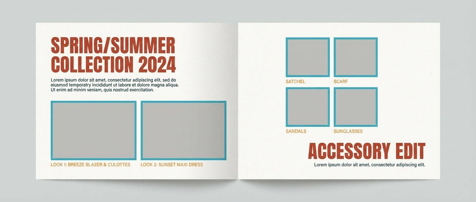
10) Terracotta Surf
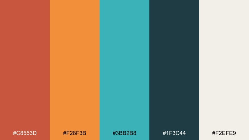
HEX: #c8553d #f28f3b #3bb2b8 #1f3c44 #f2efe9
Mood: adventurous, grounded, coastal
Best for: outdoor brand lookbook
Grounded terracotta and surfy turquoise feel adventurous, like trail dust meeting ocean air. Use the charcoal-teal for body copy and let the brighter orange lead section headers. A warm off-white makes full-bleed photography feel sunlit and cohesive. Usage tip: apply turquoise as a repeating stitch line or divider motif across spreads.
Image example of terracotta surf generated using media.io
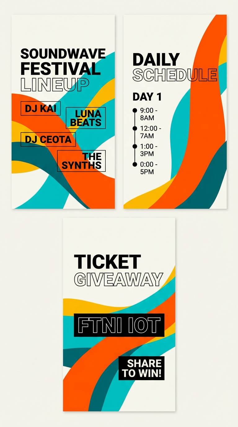
11) Neon Boardwalk
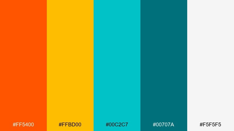
HEX: #ff5400 #ffbd00 #00c2c7 #00707a #f5f5f5
Mood: bold, high-contrast, electric
Best for: music festival social story
Bold boardwalk energy pops with high-contrast orange and cyan-leaning turquoise. The clean white gives type room to breathe, while the darker teal stabilizes the overall look. Keep shapes oversized and use limited text to maintain impact on small screens. Usage tip: use orange for the date and turquoise for the location to create instant hierarchy.
Image example of neon boardwalk generated using media.io
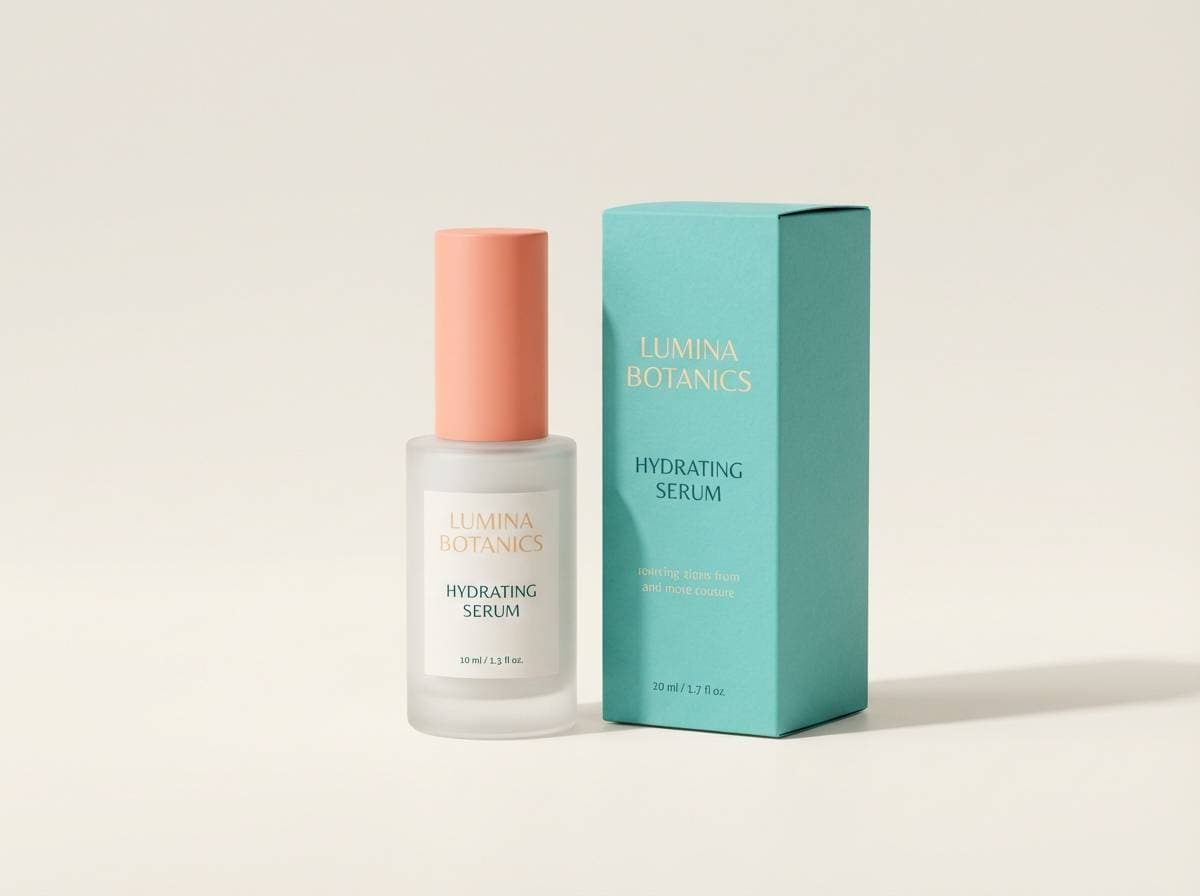
12) Spa Sunrise
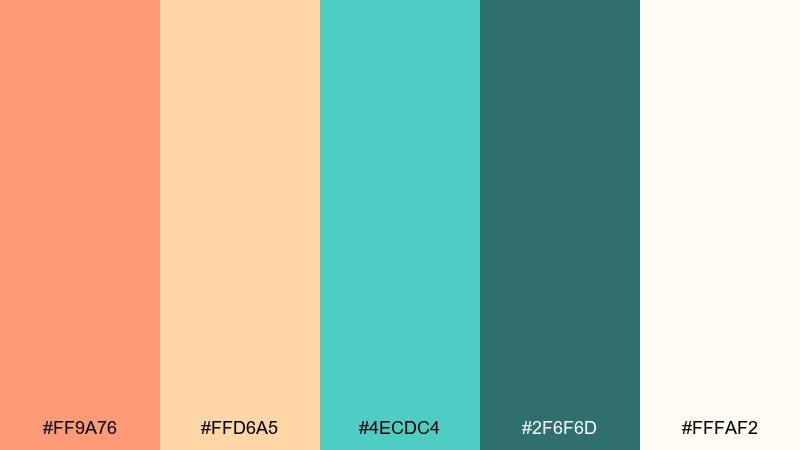
HEX: #ff9a76 #ffd6a5 #4ecdc4 #2f6f6d #fffaf2
Mood: calm, airy, restorative
Best for: skincare product ad
Soft sunrise peach and tranquil aqua create a calming, spa-like atmosphere. Use the lightest cream as the background and keep shadows gentle for a clean premium finish. The deeper teal is perfect for ingredient callouts and small headings. Usage tip: let one pastel dominate the composition and use the other as a thin accent band.
Image example of spa sunrise generated using media.io
13) Vintage Postcard

HEX: #e07a5f #f2cc8f #81b29a #3d405b #f4f1de
Mood: nostalgic, muted, charming
Best for: travel blog header
Muted postcard warmth and sea-glass green feel nostalgic and approachable. As an orange turquoise color palette, it works best with slightly textured backgrounds and classic serif headlines. The indigo anchor color keeps navigation and overlays readable on photos. Usage tip: add a thin border frame to mimic printed postcards and unify the header.
Image example of vintage postcard generated using media.io

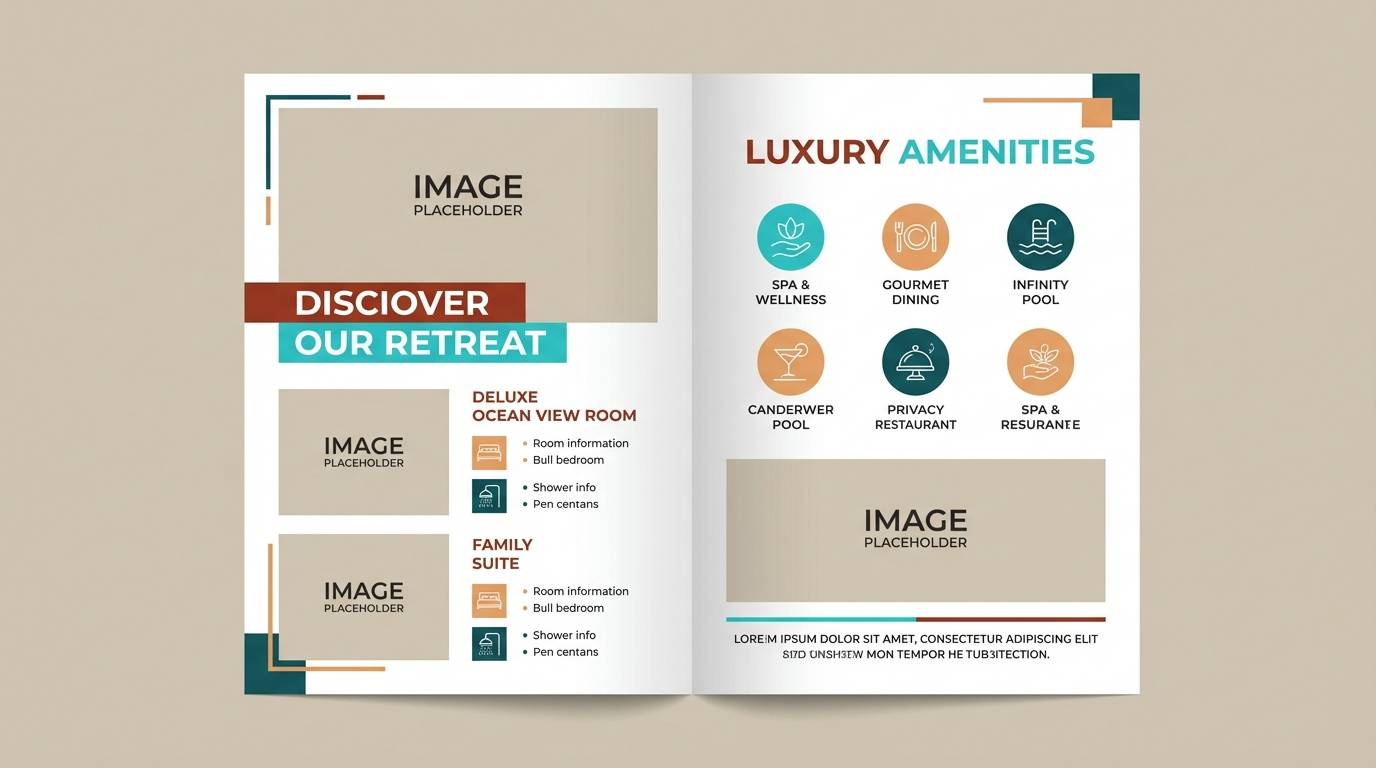
14) Adobe Poolside
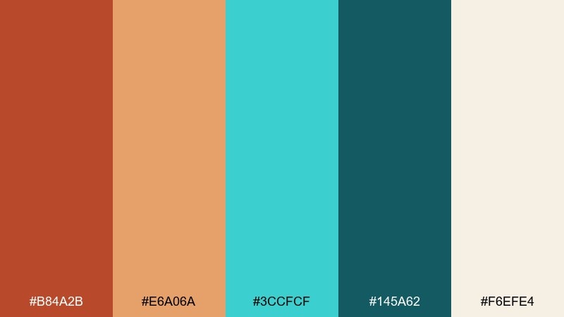
HEX: #b84a2b #e6a06a #3ccfcf #145a62 #f6efe4
Mood: sun-baked, stylish, relaxed
Best for: hotel brochure spread
Sun-baked adobe warmth paired with pool water teal feels instantly resort-ready. Use the cream as the main canvas, then place teal as captions and small icons for amenities. The richer orange reads well in section titles and pull quotes. Usage tip: keep photos bright and warm so teal accents feel like refreshing highlights.
Image example of adobe poolside generated using media.io
15) Saffron Bay
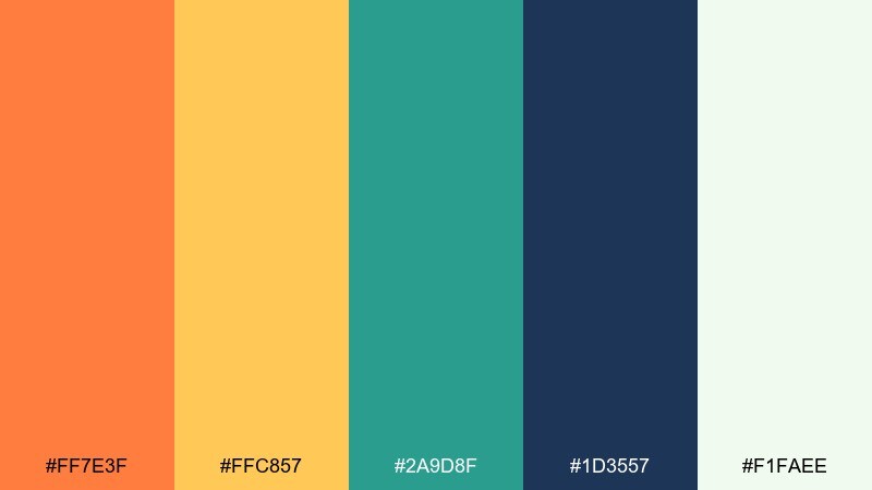
HEX: #ff7e3f #ffc857 #2a9d8f #1d3557 #f1faee
Mood: crisp, confident, contemporary
Best for: SaaS dashboard UI
Crisp saffron and calm bay teal feel contemporary, perfect for data-heavy screens. Use the deep navy for typography and charts, then keep teal for positive states and orange for alerts. The near-white background keeps grids and tables readable. Usage tip: apply orange only to critical KPIs so attention stays purposeful.
Image example of saffron bay generated using media.io
16) Apricot Marina
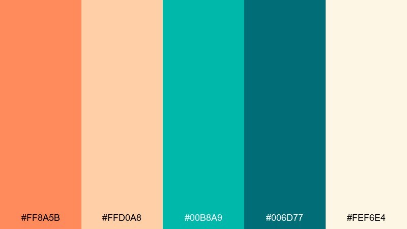
HEX: #ff8a5b #ffd0a8 #00b8a9 #006d77 #fef6e4
Mood: light, friendly, breezy
Best for: newsletter template
Breezy apricot and marina teal feel friendly, like weekend plans by the harbor. Keep the pale apricot for section backgrounds and use teal buttons for consistent clicks. The deeper teal is strong enough for headings without looking heavy. Usage tip: add small teal dividers between modules to make long emails easier to scan.
Image example of apricot marina generated using media.io
17) Canyon Current
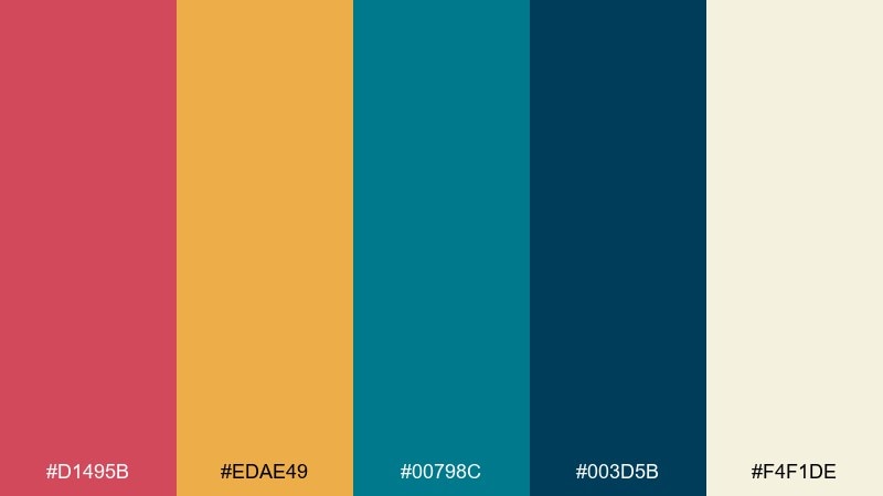
HEX: #d1495b #edae49 #00798c #003d5b #f4f1de
Mood: dramatic, outdoorsy, bold
Best for: adventure tour poster
Dramatic canyon reds and golden orange meet a strong river-teal current for a bold outdoor feel. Use the dark blue for large type and map-like linework to keep the layout grounded. The golden orange is perfect for badges like 'new route' or 'limited seats'. Usage tip: build contrast with big color blocks instead of gradients for better print consistency.
Image example of canyon current generated using media.io

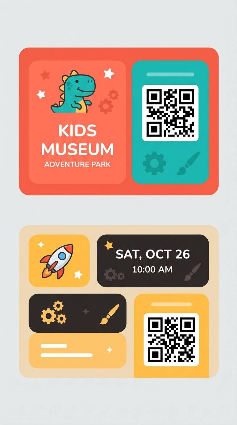
18) Peachy Aquarium
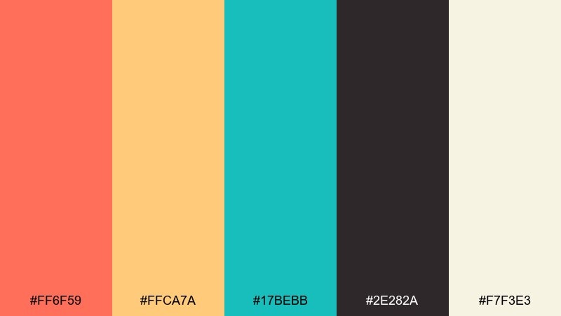
HEX: #ff6f59 #ffca7a #17bebb #2e282a #f7f3e3
Mood: curious, playful, kid-friendly
Best for: kids museum tickets UI
Playful peach and bright aquarium teal feel curious and kid-friendly. Keep the near-black for text and barcode elements so tickets remain scannable. Use warm yellow as the supporting highlight for icons and small labels. Usage tip: round corners and increase padding to make the design feel welcoming and easy to tap.
Image example of peachy aquarium generated using media.io
19) Burnt Orange Lagoon
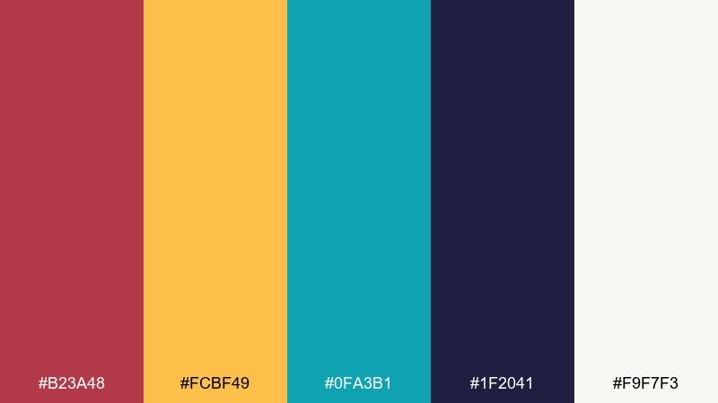
HEX: #b23a48 #fcbf49 #0fa3b1 #1f2041 #f9f7f3
Mood: moody, modern, punchy
Best for: podcast cover art
Moody burnt orange and bright lagoon teal create a punchy, modern contrast that stands out in a feed. These orange turquoise color combinations work best with bold typography and simple shapes that read at thumbnail size. Let the deep indigo carry the title while teal becomes the signature accent. Usage tip: keep one large focal shape and avoid thin lines that disappear on mobile.
Image example of burnt orange lagoon generated using media.io

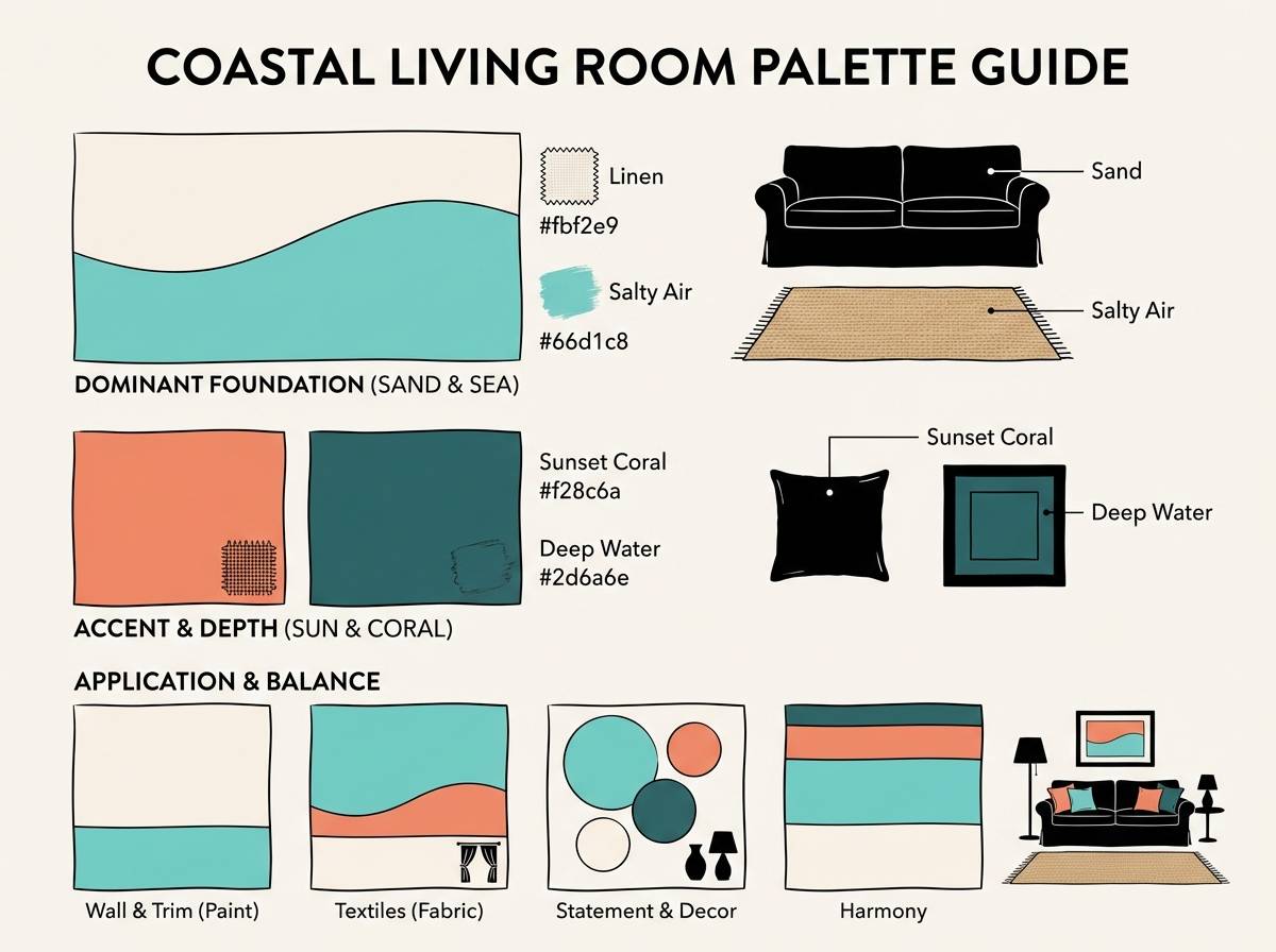
20) Soft Sand Shore
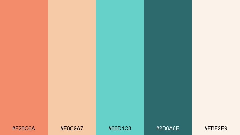
HEX: #f28c6a #f6c9a7 #66d1c8 #2d6a6e #fbf2e9
Mood: soft, airy, comforting
Best for: coastal living room palette guide
Soft sand and gentle sea-glass teal feel comforting, like a quiet morning shoreline. As an orange turquoise color palette, it suits relaxed interiors where warm textiles meet cool painted accents. Pair it with light oak, woven textures, and brushed brass for a cozy coastal finish. Usage tip: use teal in small doses on ceramics or art to keep the room light.
Image example of soft sand shore generated using media.io
21) Seaside Spritz
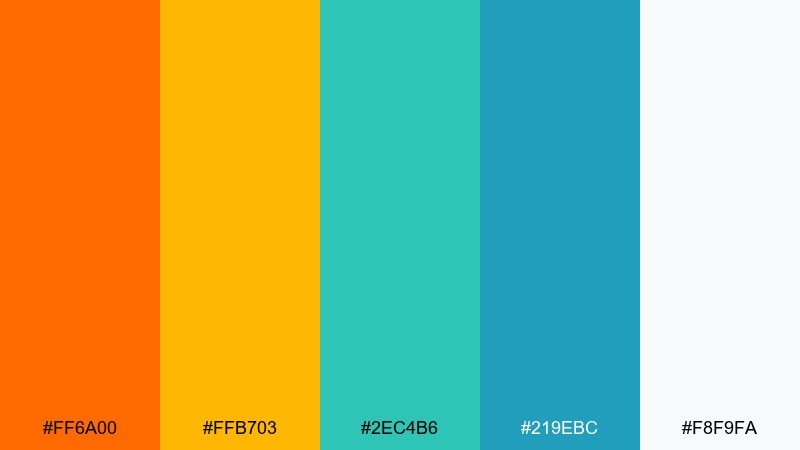
HEX: #ff6a00 #ffb703 #2ec4b6 #219ebc #f8f9fa
Mood: sparkling, fun, social
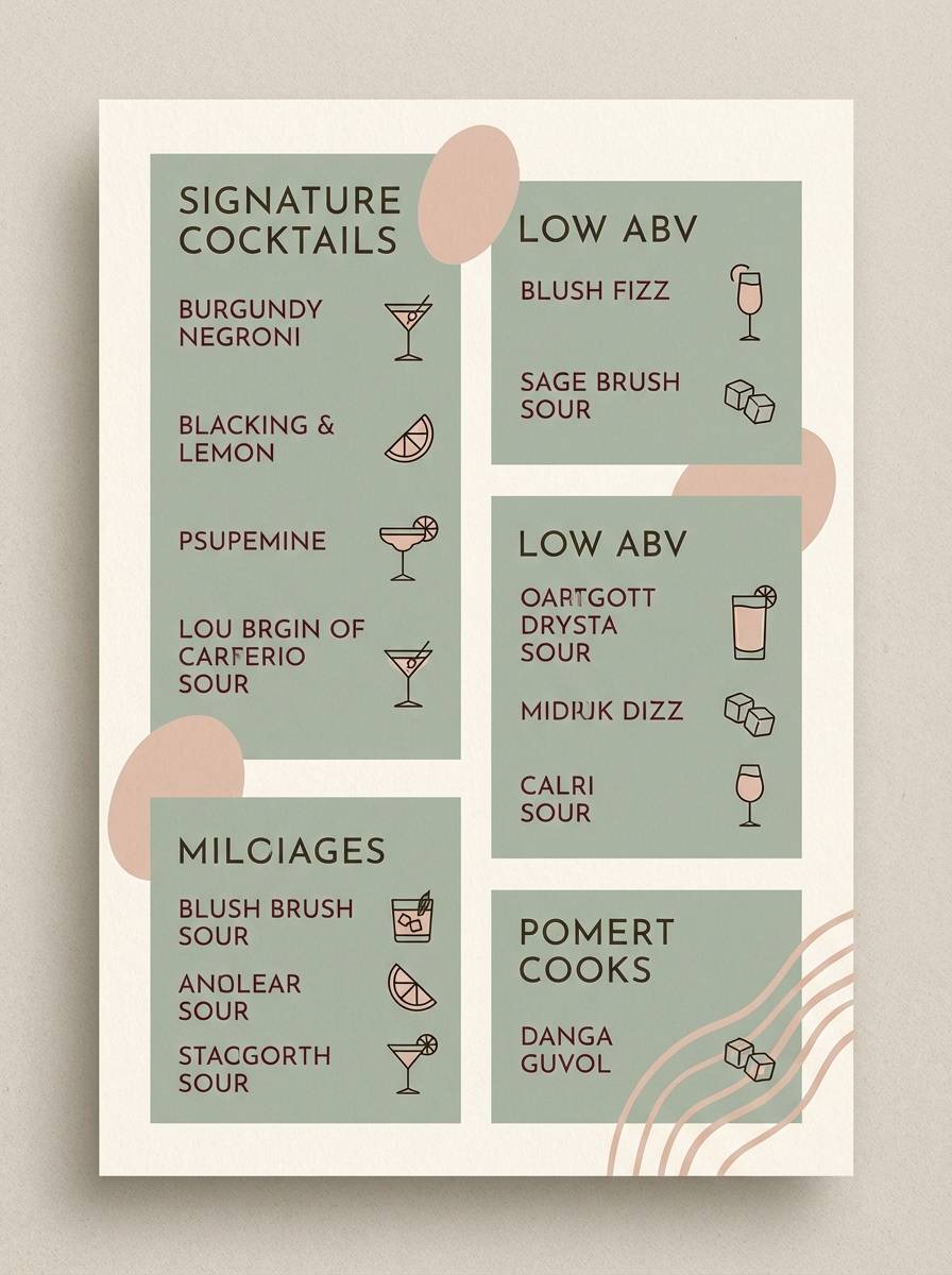
Best for: cocktail menu design
Sparkling citrus and coastal blues feel like a fizzy spritz by the water. Use the light gray-white as the menu base and keep turquoise for section headers to guide the eye. Orange works best for featured drinks and price markers. Usage tip: add small line icons in teal to keep the design playful without clutter.
Image example of seaside spritz generated using media.io
22) Harbor Claylight
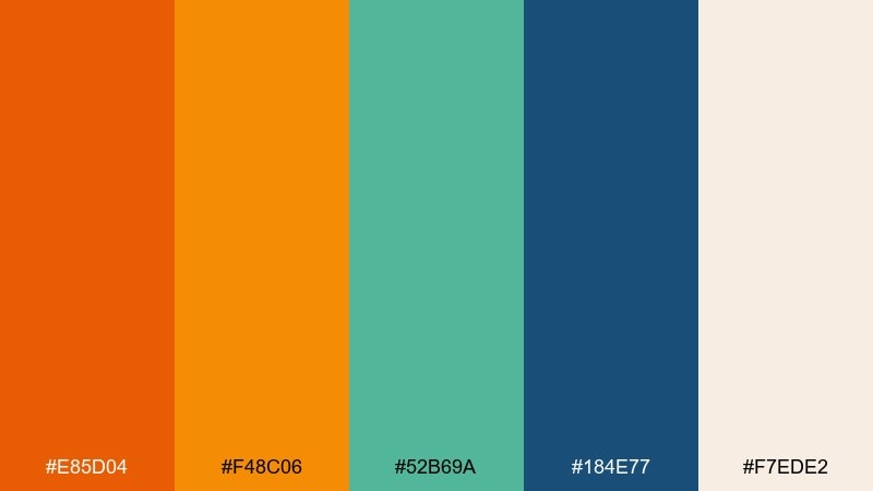
HEX: #e85d04 #f48c06 #52b69a #184e77 #f7ede2
Mood: confident, practical, nautical
Best for: startup pitch deck slides
Confident orange with nautical teal feels practical and persuasive, ideal for storytelling. Use navy as the text foundation and let teal handle charts and callout boxes. Keep orange for key metrics and section dividers so it signals momentum. Usage tip: stick to one accent per slide to avoid competing highlights.
Image example of harbor claylight generated using media.io

What Colors Go Well with Orange Turquoise?
Neutrals make this duo easier to use: warm whites (cream, ivory), sandy beige, and soft greige keep the palette breathable while preserving the orange/turquoise contrast. For modern UI, near-white backgrounds also improve readability and accessibility.
For a stronger foundation, add a deep anchor like navy, indigo, or charcoal-teal. These darker tones stabilize bright accents, help with long-form text, and give you a reliable “always readable” color for headers and icons.
If you want extra pop, add a controlled third accent like golden yellow for badges or coral/peach for softer warmth. Keep that third accent to small areas so orange and turquoise remain the main story.
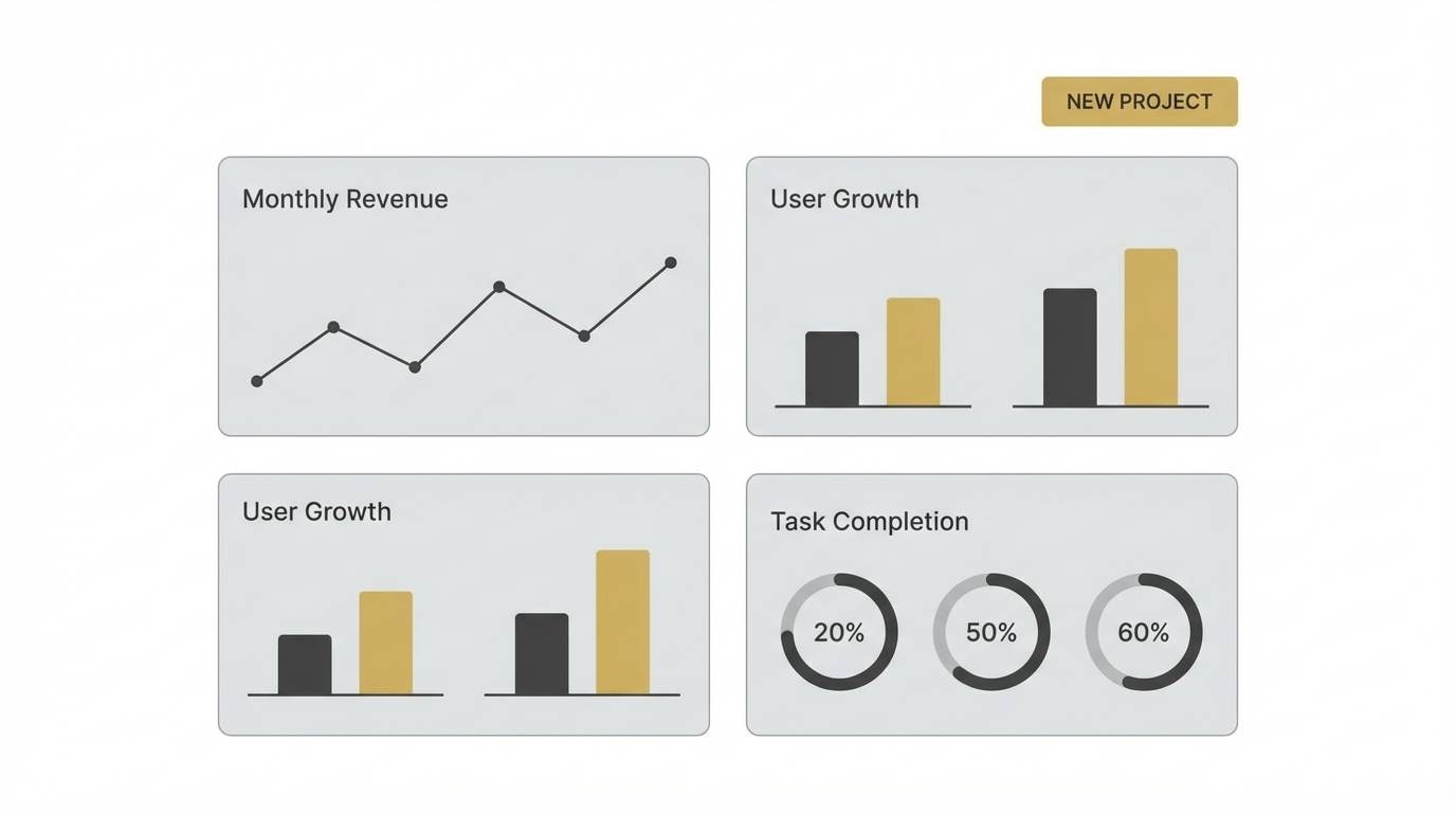
How to Use a Orange Turquoise Color Palette in Real Designs
Start with roles, not just colors: pick one dominant background neutral, one primary brand color (often turquoise for calm clarity), and reserve orange for the single strongest emphasis (primary CTA, key metric, sale tag). This prevents a “two primaries fighting” effect.
In UI design, use turquoise for navigation states, chips, links, and positive feedback, while orange flags urgency (errors, warnings, limited offers) or key actions. In print, keep large areas slightly muted (cream/off-white) and let saturated orange or turquoise appear in headlines, shapes, and callouts.
For interiors, think in materials: orange can live in textiles (rugs, throws, art) and turquoise in ceramics, tile, or painted furniture. Repeat the cooler hue in small doses to create rhythm without making the room feel busy.
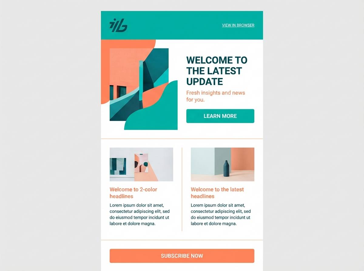
Create Orange Turquoise Palette Visuals with AI
If you already have HEX codes, you can turn them into ready-to-share mockups (posters, UI screens, packaging, and moodboards) by describing the layout and injecting your exact colors. This helps you validate contrast and hierarchy before committing to production.
With Media.io’s text-to-image tool, you can iterate quickly: test different ratios (story, square, poster), swap textures (paper, grain, matte labels), and generate multiple variations that stay consistent with your brand palette.
Orange Turquoise Color Palette FAQs
-
What vibe does an orange turquoise color scheme create?
Most orange turquoise palettes feel energetic yet refreshing—orange adds warmth and momentum, while turquoise adds clarity and calm. Adjust saturation to move from playful (bright citrus + aqua) to premium (burnt orange + deep teal + cream). -
How do I keep orange and turquoise from looking too loud?
Use a neutral base (cream, warm white, light beige) for most of the surface area and assign roles: turquoise for structure (navigation, sections) and orange for one main highlight (CTA or key callout). Limiting highly saturated areas is the fastest fix. -
What’s the best text color with orange turquoise backgrounds?
For readability, use deep navy, charcoal, or dark teal for body text. On dark teal blocks, use off-white/cream text; on orange blocks, test near-black or deep navy for sufficient contrast. -
Which industries work best with orange + turquoise branding?
Travel, wellness, food and beverage, outdoor/adventure, events, and playful tech products commonly benefit from the warm/cool contrast. With muted versions (terracotta + sea-glass), it also suits artisanal and lifestyle brands. -
Can I use orange turquoise palettes in a SaaS dashboard UI?
Yes—use navy/near-white for the main interface, turquoise for positive states and active navigation, and reserve orange for alerts or critical KPIs. This keeps attention purposeful and reduces visual fatigue. -
What neutrals pair best with orange turquoise colors?
Warm neutrals such as ivory, cream, sand, and beige blend naturally with orange and keep turquoise from feeling too cold. For a sharper modern look, use very light gray-white plus a dark navy anchor. -
How can I quickly preview these palettes in real layouts?
Generate mockups (posters, onboarding screens, packaging labels, invitation suites) using a text-to-image tool and paste in the exact HEX codes from the palette. This lets you test hierarchy, contrast, and balance before designing the final asset.


