

Golden yellow sits right between playful sunshine and premium warmth, which is why it shows up everywhere from food packaging to modern UI accents.
Below are curated golden yellow color palette ideas (with HEX codes) you can copy for branding, web design, social graphics, and print.
In this article
- Why Golden Yellow Palettes Work So Well
-
- sunlit honey
- marigold minimal
- retro mustard
- citrus and cream
- golden hour neutrals
- saffron and charcoal
- prairie bloom
- art deco gold
- warm sandstone
- lemon zest pop
- autumn harvest
- botanical ochre
- cozy cabin
- modern museum
- festival lights
- soft kids room
- gourmet bakery
- luxe spa
- tech dashboard glow
- evening lanterns
- sunny citrus market
- sunflower studio
- What Colors Go Well with Golden Yellow?
- How to Use a Golden Yellow Color Palette in Real Designs
- Create Golden Yellow Palette Visuals with AI
Why Golden Yellow Palettes Work So Well
Golden yellow feels energetic without being as sharp as neon yellow, making it easier to use across digital and print. It naturally draws attention, so it’s great for highlights, labels, and calls to action.
It also pairs beautifully with both warm neutrals (cream, tan, cocoa) and cool anchors (slate, charcoal, deep teal). That flexibility helps you keep designs modern while still feeling inviting.
When used intentionally (as an accent, not everywhere), golden yellow can read as optimistic, premium, or nostalgic—depending on the supporting neutrals and contrast level.
20+ Golden Yellow Color Palette Ideas (with HEX Codes)
1) Sunlit Honey
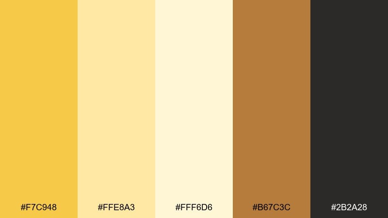
HEX: #F7C948 #FFE8A3 #FFF6D6 #B67C3C #2B2A28
Mood: radiant, cozy, welcoming
Best for: brand identity and food packaging
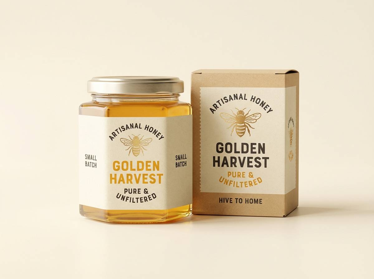
Radiant and cozy, like late-morning light on honeyed toast. The bright gold pops against soft creams, while the toasted brown adds a handcrafted feel. It works beautifully for cafés, artisanal labels, and warm lifestyle branding. Pair it with simple typography and keep the darkest tone for text to preserve readability.
Image example of sunlit honey generated using media.io
Media.io is an online AI studio for creating and editing video, image, and audio in your browser.

2) Marigold Minimal
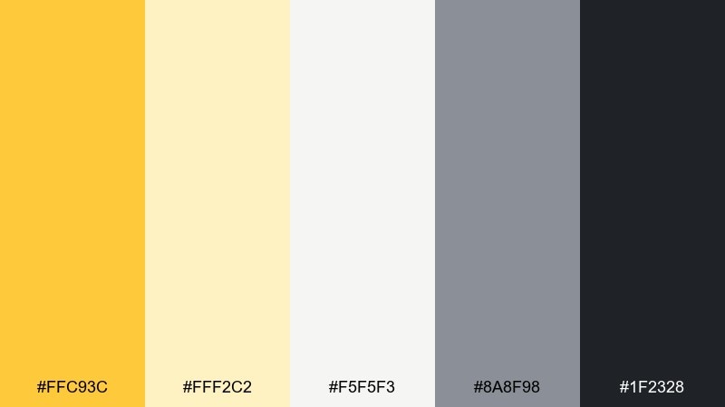
HEX: #FFC93C #FFF2C2 #F5F5F3 #8A8F98 #1F2328
Mood: clean, modern, upbeat
Best for: startup landing pages and UI accents
Clean and upbeat, like marigold petals against crisp paper. The bright yellow reads best as an accent, while off-white and gray keep layouts calm. This golden yellow color palette is ideal for CTAs, badges, and highlights in modern interfaces. Use the charcoal for body text and reserve the yellow for one primary action per screen.
Image example of marigold minimal generated using media.io

3) Retro Mustard
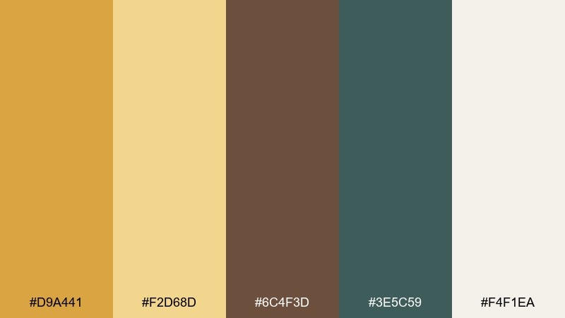
HEX: #D9A441 #F2D68D #6C4F3D #3E5C59 #F4F1EA
Mood: vintage, earthy, relaxed
Best for: posters and retro branding
Vintage and earthy, like a well-loved record sleeve from the 70s. Mustard yellow feels grounded when paired with cocoa brown and that dusty teal. It suits posters, merch, and boutique branding that leans nostalgic without looking dated. Keep the cream as breathing room and let teal act as a secondary accent for balance.
Image example of retro mustard generated using media.io
4) Citrus and Cream
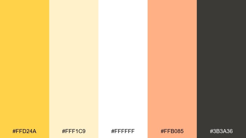
HEX: #FFD24A #FFF1C9 #FFFFFF #FFB085 #3B3A36
Mood: fresh, bright, friendly
Best for: beauty product ads and social graphics
Fresh and friendly, like citrus slices on a bright kitchen counter. The creamy whites make the yellow feel airy, while the soft peach adds a flattering warmth. Great for skincare promos, wellness posts, and cheerful seasonal campaigns. Use yellow for key headlines, then echo the peach in small icons or shapes to keep it cohesive.
Image example of citrus and cream generated using media.io
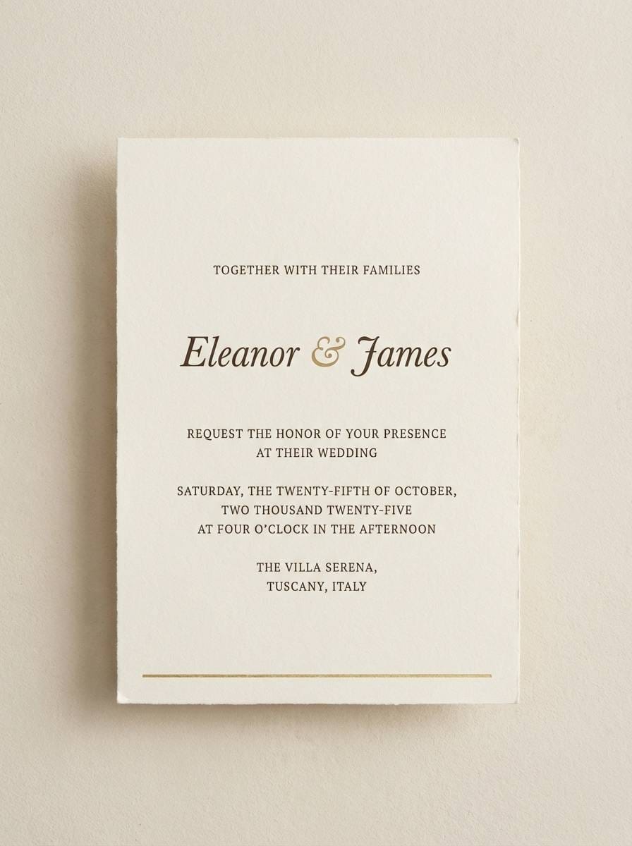
5) Golden Hour Neutrals
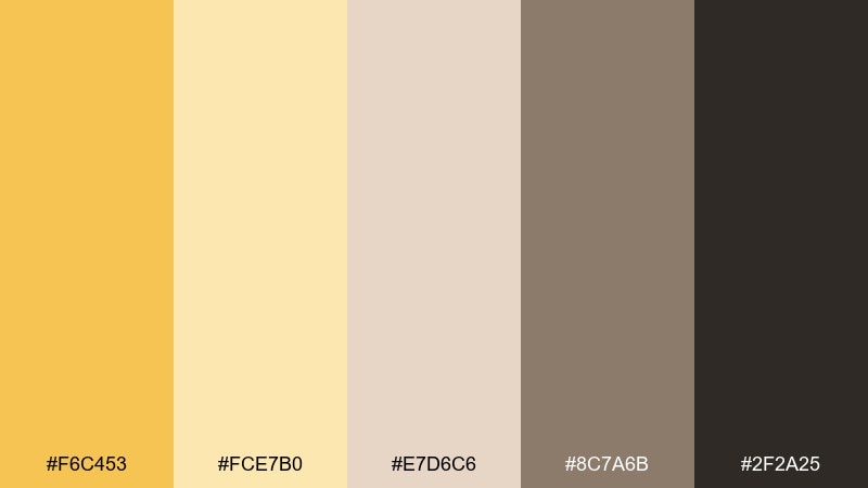
HEX: #F6C453 #FCE7B0 #E7D6C6 #8C7A6B #2F2A25
Mood: soft, nostalgic, natural
Best for: wedding stationery and invitations
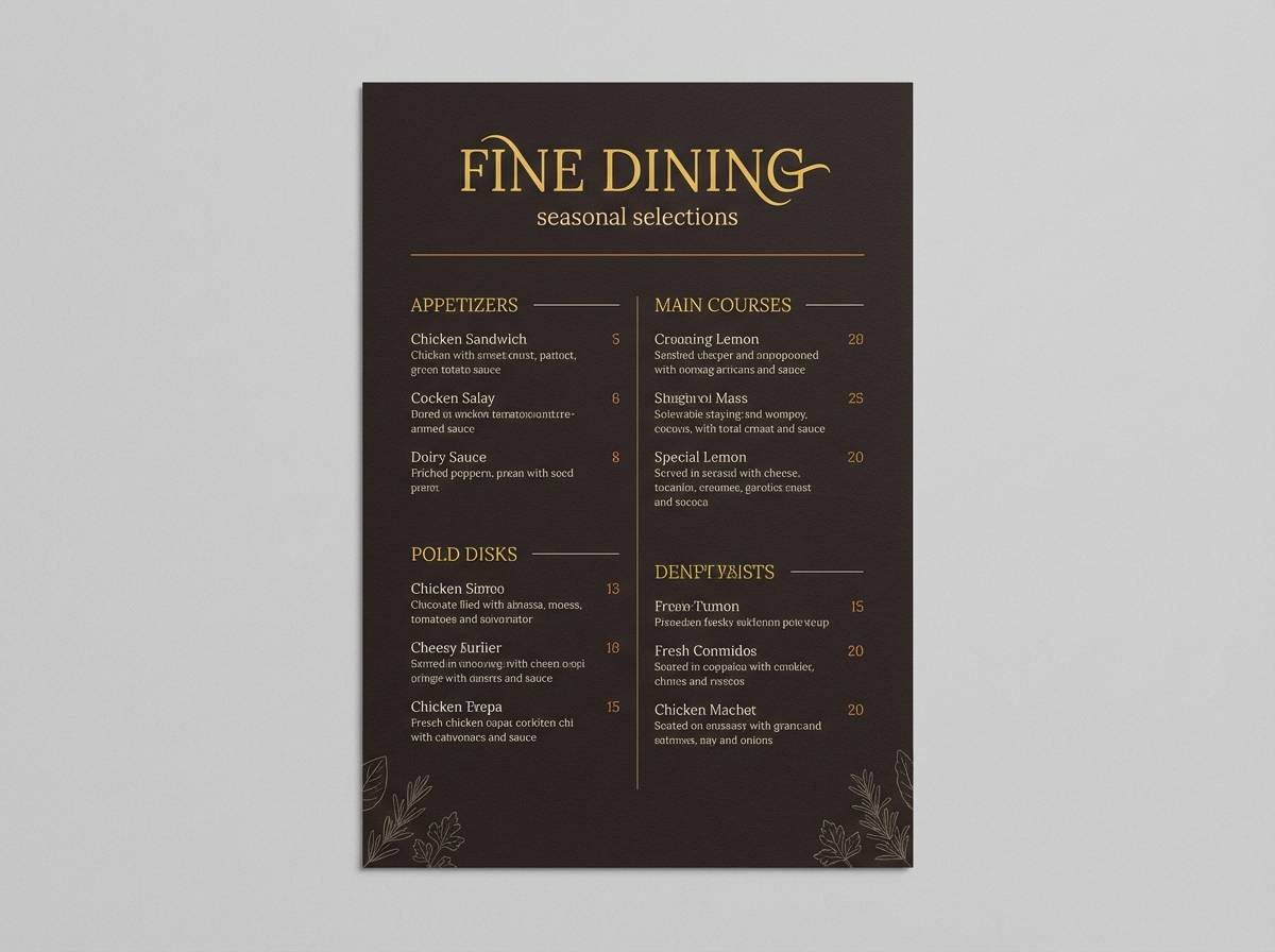
Soft and nostalgic, like golden hour light drifting across linen. The warm neutrals keep the yellow refined rather than loud, making it perfect for elegant print. It shines on invitations, menus, and day-of signage with a tactile vibe. Try pairing serif headers with generous spacing, and use the deep brown for small details like rules and monograms.
Image example of golden hour neutrals generated using media.io
6) Saffron and Charcoal
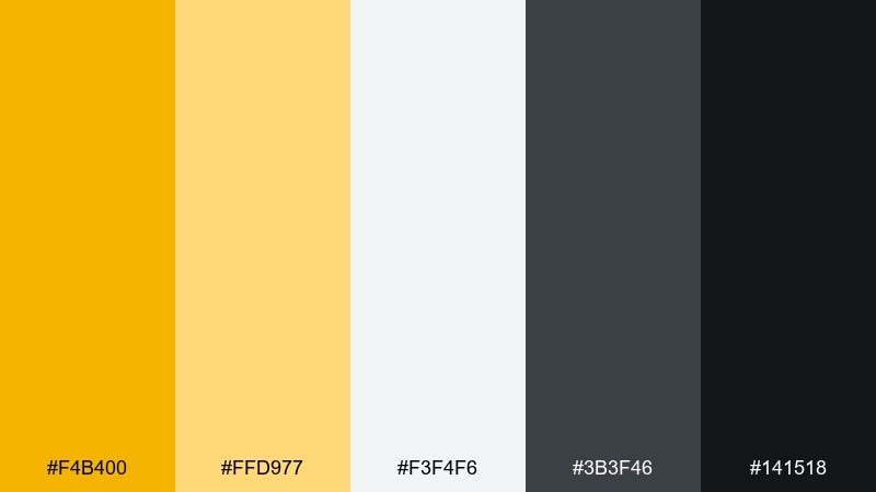
HEX: #F4B400 #FFD977 #F3F4F6 #3B3F46 #141518
Mood: bold, high-contrast, confident
Best for: tech branding and call-to-action design
Bold and confident, like saffron ink on dark paper. The contrast between charcoal and bright yellow makes interactions feel crisp and decisive. These golden yellow color combinations work especially well for buttons, banners, and brand marks that need instant attention. Keep large backgrounds neutral and use yellow in tight, intentional blocks to avoid glare.
Image example of saffron and charcoal generated using media.io
7) Prairie Bloom
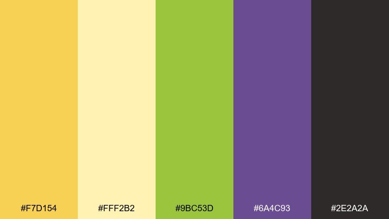
HEX: #F7D154 #FFF2B2 #9BC53D #6A4C93 #2E2A2A
Mood: playful, sunny, botanical
Best for: spring illustrations and kids posters
Playful and sunny, like wildflowers scattered across an open field. The yellow feels extra alive next to fresh green and a touch of violet. It fits spring campaigns, classroom prints, and cheerful editorial illustrations. Let yellow and cream carry the background, then drop in green for leaves and violet sparingly for focal points.
Image example of prairie bloom generated using media.io
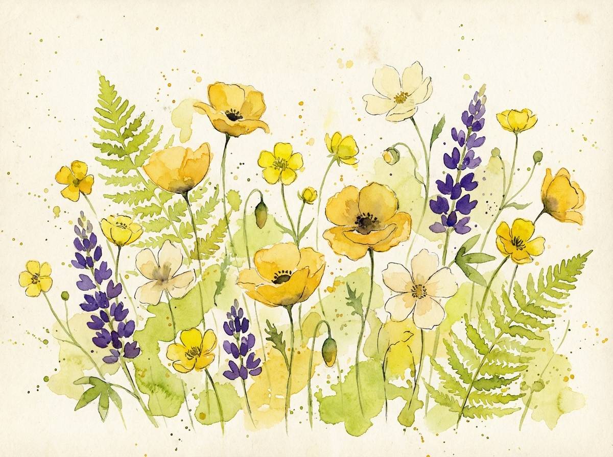
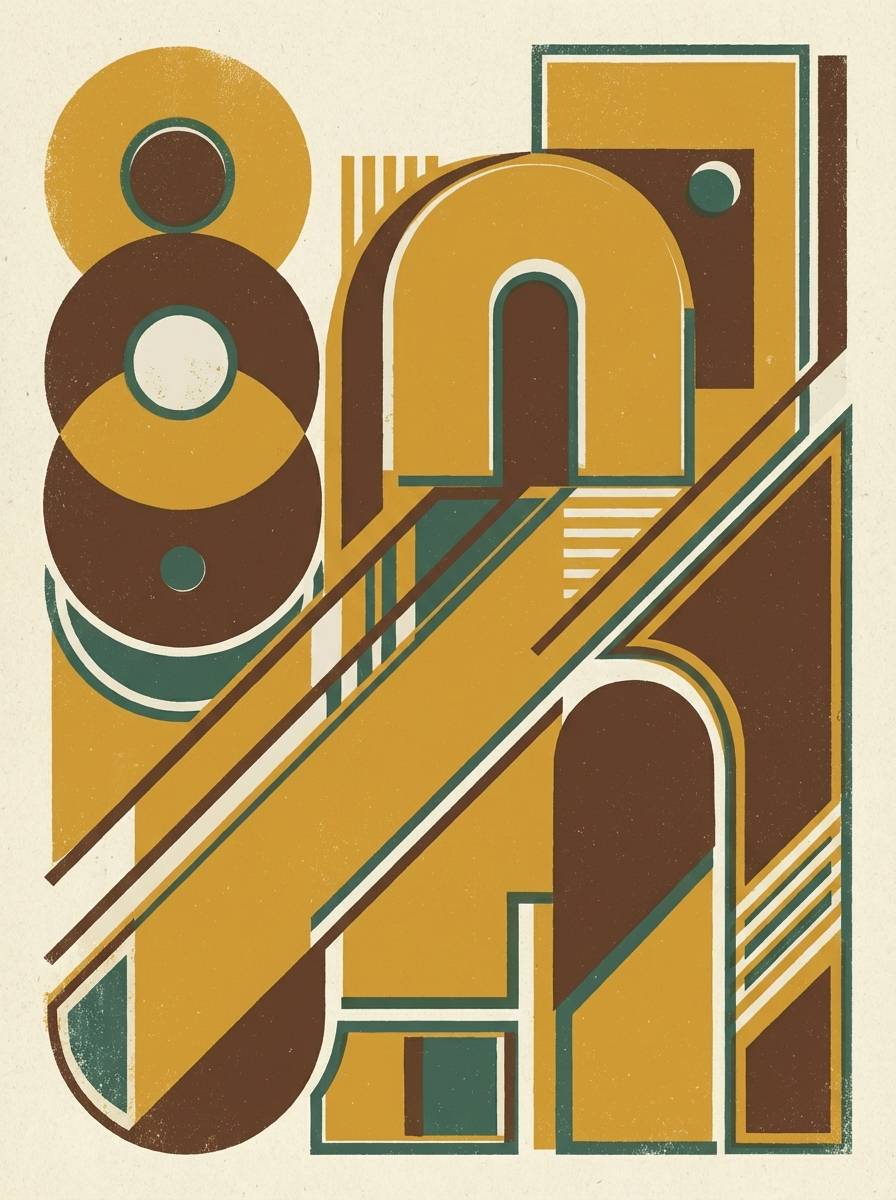
8) Art Deco Gold
HEX: #D4AF37 #F7E7A1 #0F0F10 #2B2E34 #E9E5DD
Mood: glamorous, dramatic, upscale
Best for: event posters and luxury branding
Glamorous and dramatic, like a theatre marquee in the Art Deco era. Metallic-feeling gold reads luxe against inky black and deep graphite. It is a strong fit for gala posters, premium packaging, and high-end hospitality. Use thin linework, geometric motifs, and keep cream as a quiet buffer so the dark tones do not feel heavy.
Image example of art deco gold generated using media.io

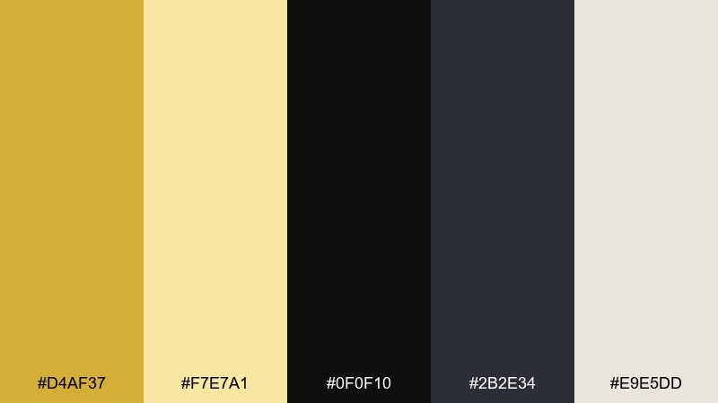
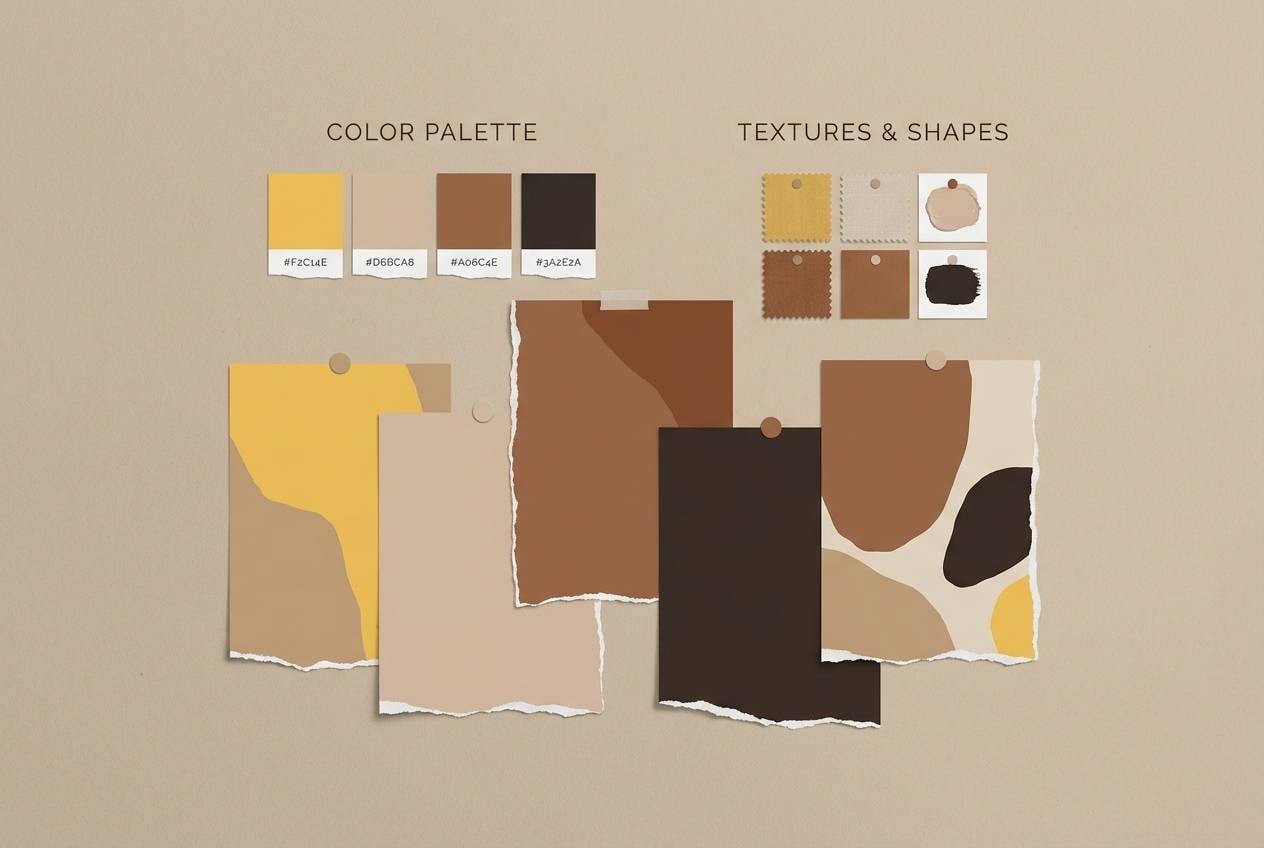
9) Warm Sandstone
HEX: #F2C14E #F8E5B5 #D6BCA6 #A06C4E #3A2E2A
Mood: grounded, rustic, sunbaked
Best for: interior mood boards and lifestyle blogs
Grounded and sunbaked, like sandstone warmed by desert light. The yellow sits comfortably among clay and cocoa tones for a natural, lived-in look. Great for interior palettes, home décor content, and earthy lifestyle photography overlays. Use the deeper brown for text and outlines, and keep the lighter tans as background panels or cards.
Image example of warm sandstone generated using media.io
10) Lemon Zest Pop
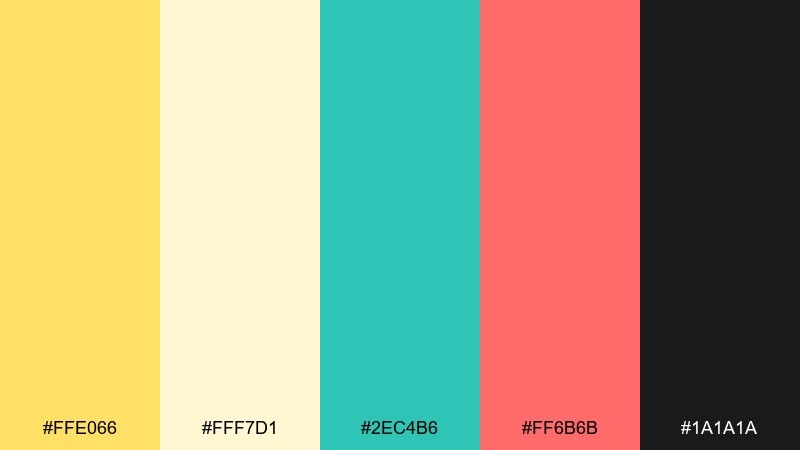
HEX: #FFE066 #FFF7D1 #2EC4B6 #FF6B6B #1A1A1A
Mood: energetic, youthful, punchy
Best for: social ads and summer promos
Energetic and punchy, like lemonade with a bright twist. The vivid yellow feels modern next to minty teal, while coral adds a playful spark. Ideal for short-form ads, promo banners, and creator thumbnails that need instant impact. Keep black for strong type, and limit coral to small bursts so yellow stays the hero.
Image example of lemon zest pop generated using media.io

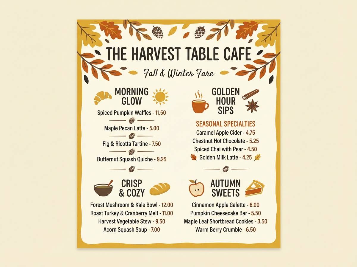
11) Autumn Harvest
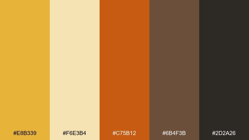
HEX: #E8B339 #F6E3B4 #C75B12 #6B4F3B #2D2A26
Mood: cozy, seasonal, hearty
Best for: fall marketing and café menus
Cozy and hearty, like a market stall full of pumpkins and baked spice. Warm gold pairs naturally with burnt orange and rich brown for a seasonal feel. This golden yellow color palette is perfect for autumn campaigns, café menus, and rustic packaging. Use the cream for menu backgrounds and keep the darkest shade for prices and small copy.
Image example of autumn harvest generated using media.io
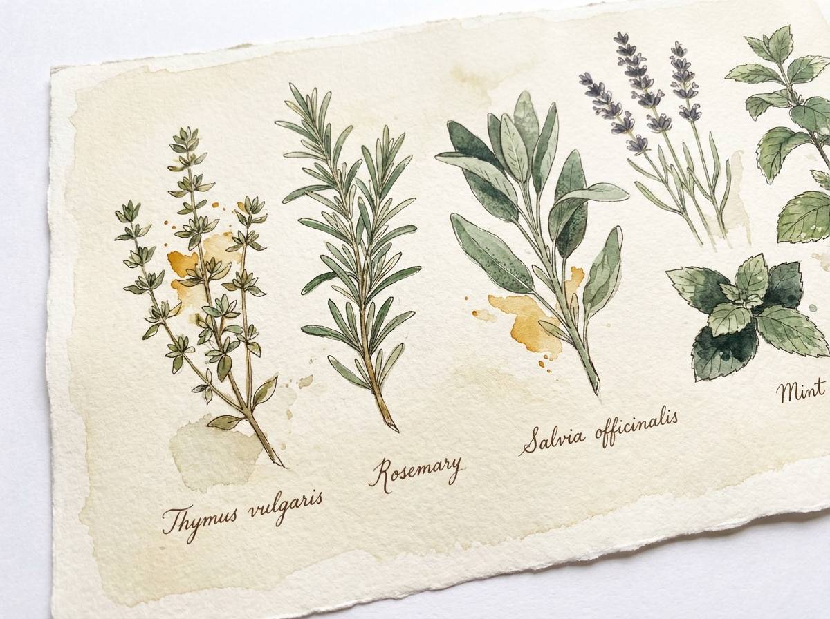
12) Botanical Ochre
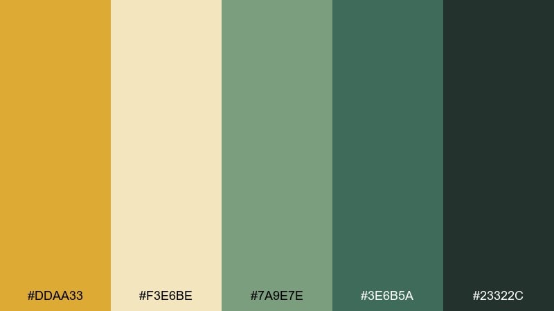
HEX: #DDAA33 #F3E6BE #7A9E7E #3E6B5A #23322C
Mood: calm, organic, herbaceous
Best for: eco packaging and botanical illustrations
Calm and organic, like pressed leaves beside a jar of dried herbs. Ochre feels earthy when supported by muted greens and a deep forest anchor. It fits eco-forward packaging, apothecary labels, and botanical illustration sets. Use the light beige as the paper tone, then bring in ochre for highlights on leaves and borders.
Image example of botanical ochre generated using media.io
13) Cozy Cabin
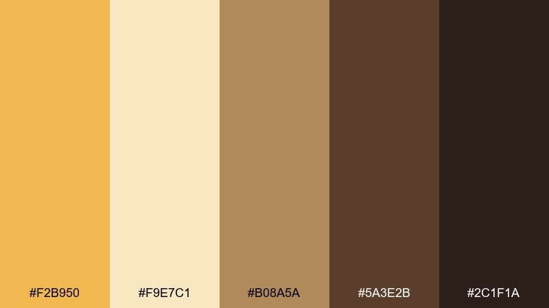
HEX: #F2B950 #F9E7C1 #B08A5A #5A3E2B #2C1F1A
Mood: warm, rustic, intimate
Best for: outdoor brands and lodge-style websites
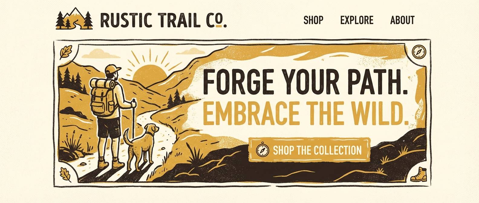
Warm and intimate, like lamplight inside a cabin after a long hike. The yellow reads more like a glow than a spotlight when paired with wood browns. Great for outdoor brands, lodge rentals, and handmade goods. Keep the light cream for page backgrounds and use the darkest brown sparingly for strong headings and icons.
Image example of cozy cabin generated using media.io
14) Modern Museum
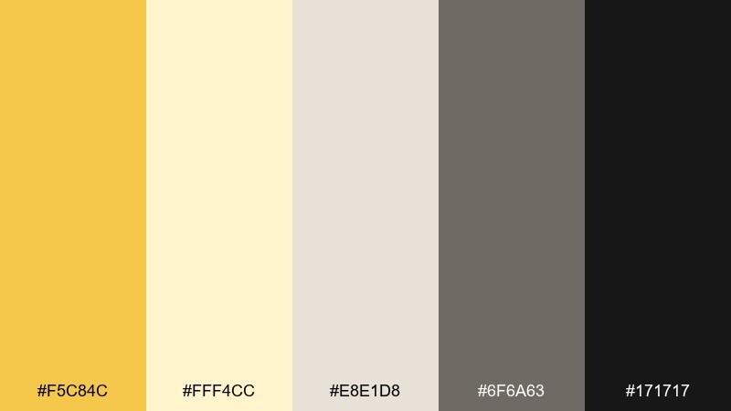
HEX: #F5C84C #FFF4CC #E8E1D8 #6F6A63 #171717
Mood: quiet, curated, contemporary
Best for: editorial layouts and portfolio sites
Quiet and curated, like gallery walls lit by warm track lights. The yellow is refined here, supported by stone-like neutrals and a clean black. It works well for editorial spreads, designer portfolios, and minimal product pages. Use yellow to spotlight section labels or tags, and keep large areas in the warm grays for a museum-like calm.
Image example of modern museum generated using media.io
15) Festival Lights
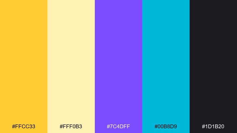
HEX: #FFCC33 #FFF0B3 #7C4DFF #00B8D9 #1D1B20
Mood: vibrant, celebratory, night-time
Best for: concert flyers and event promos
Vibrant and celebratory, like string lights glowing over a night crowd. Bright yellow becomes electric when paired with vivid violet and cyan on a dark base. Perfect for concert flyers, nightlife promos, and punchy digital banners. Keep the background nearly black and use yellow as the main headline color for maximum legibility.
Image example of festival lights generated using media.io
16) Soft Kids Room
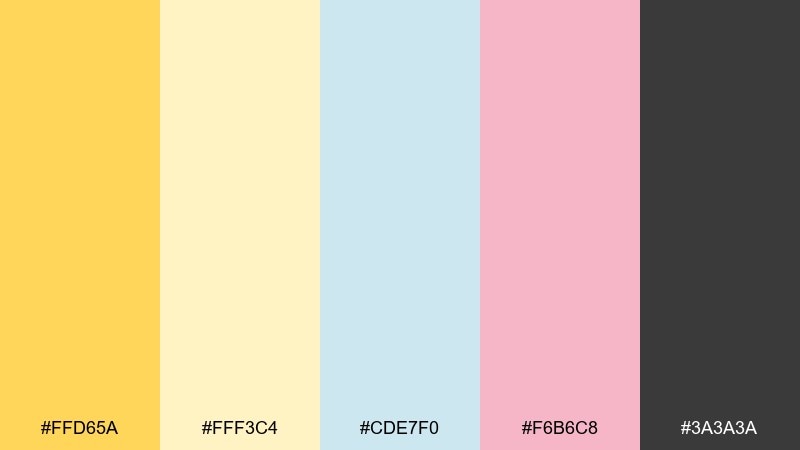
HEX: #FFD65A #FFF3C4 #CDE7F0 #F6B6C8 #3A3A3A
Mood: gentle, playful, comforting
Best for: nursery prints and kids apps
Gentle and comforting, like a sunbeam in a pastel-painted room. The buttery yellow stays soft thanks to airy blue and blush pink. Great for nursery art, kids learning apps, and friendly onboarding screens. Use yellow for cheerful highlights and keep the dark gray only for essential text so everything feels light.
Image example of soft kids room generated using media.io
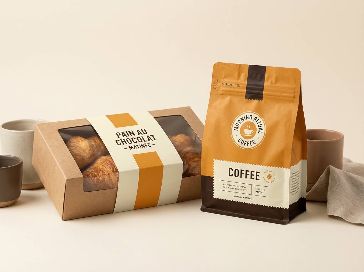
17) Gourmet Bakery
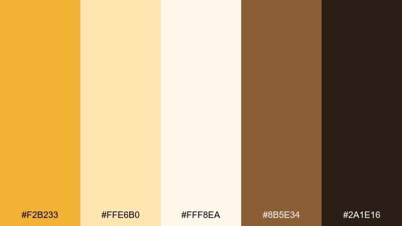
HEX: #F2B233 #FFE6B0 #FFF8EA #8B5E34 #2A1E16
Mood: sweet, warm, inviting
Best for: bakery menus and product labels
Sweet and inviting, like butter pastry fresh from the oven. The golden tone feels delicious alongside creamy whites and caramel brown. Ideal for bakery menus, coffee bags, and dessert labels with a handmade touch. Try using the darkest shade for stamp-style marks, and keep the light cream as the main canvas for readability.
Image example of gourmet bakery generated using media.io
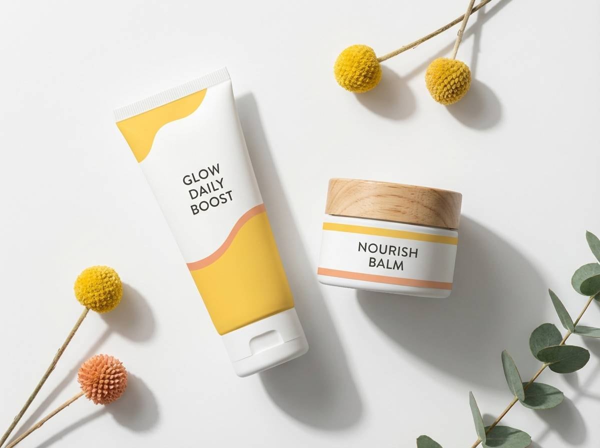
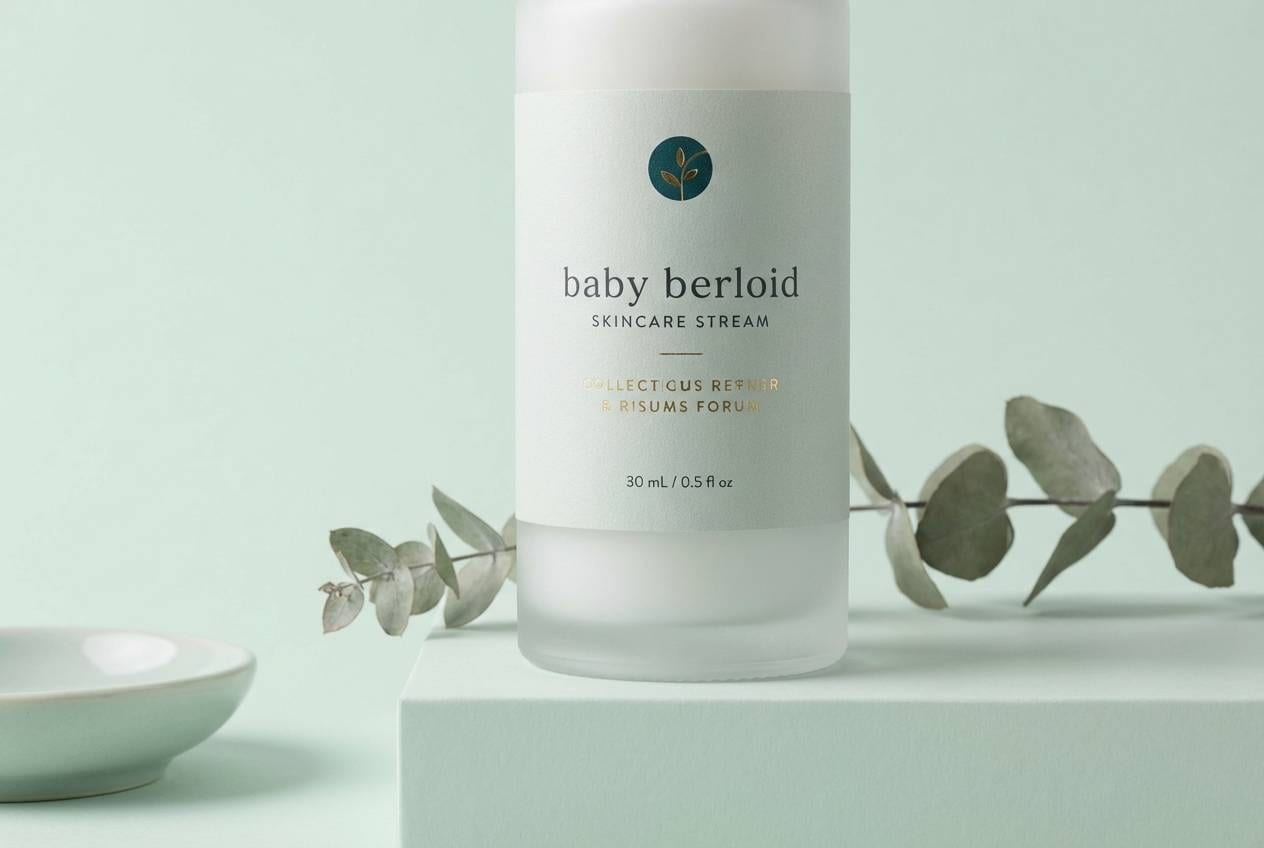
18) Luxe Spa
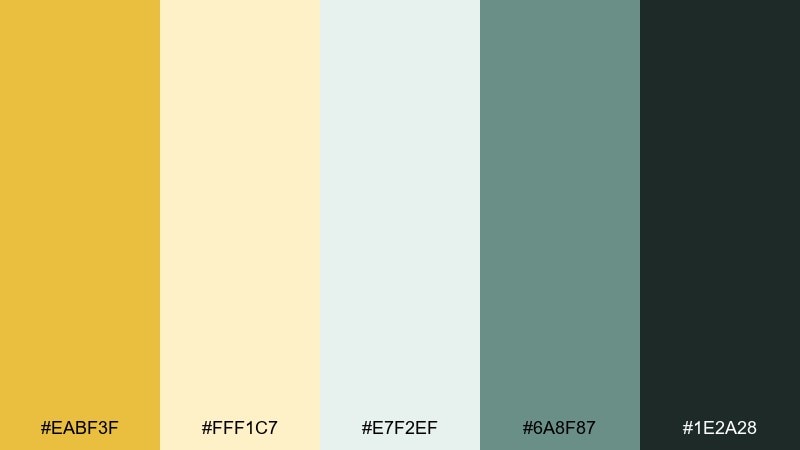
HEX: #EABF3F #FFF1C7 #E7F2EF #6A8F87 #1E2A28
Mood: serene, polished, restorative
Best for: spa branding and skincare packaging
Serene and polished, like a candlelit treatment room with warm reflections. The soft gold adds a premium glow to cool, clean spa greens. It is a strong fit for wellness brands, premium skincare, and calm email templates. Use the pale mint as the primary background, and reserve the gold for accents like seals, dividers, and key benefits.
Image example of luxe spa generated using media.io
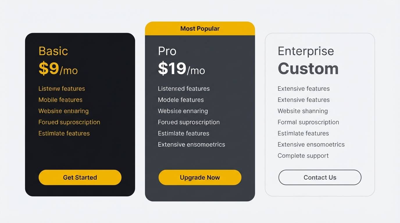
19) Tech Dashboard Glow
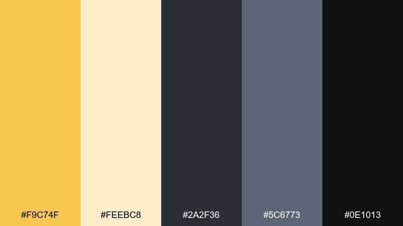
HEX: #F9C74F #FEEBC8 #2A2F36 #5C6773 #0E1013
Mood: focused, sleek, data-driven
Best for: analytics dashboards and SaaS UI
Focused and sleek, like indicator lights on a high-end console. The warm yellow brings clarity to dark UI without feeling harsh, especially beside layered grays. For a golden yellow color combination that stays readable, use yellow only for highlights such as active states and key metrics. Keep charts mostly neutral, then let one yellow series guide the eye to the main story.
Image example of tech dashboard glow generated using media.io
20) Evening Lanterns
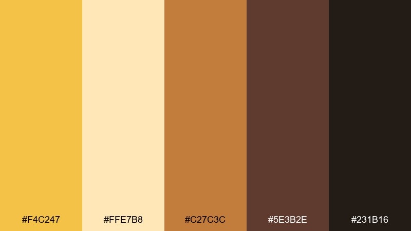
HEX: #F4C247 #FFE7B8 #C27C3C #5E3B2E #231B16
Mood: moody, warm, cinematic
Best for: restaurant branding and menu design
Moody and cinematic, like lantern light spilling onto a night street. The warm gold feels richer when layered with copper and deep espresso browns. These golden yellow color combinations are a strong match for restaurants, cocktail bars, and menu systems that want drama without losing warmth. Use the light beige only for small breathing spaces, and let the darkest tone carry most text for a premium look.
Image example of evening lanterns generated using media.io
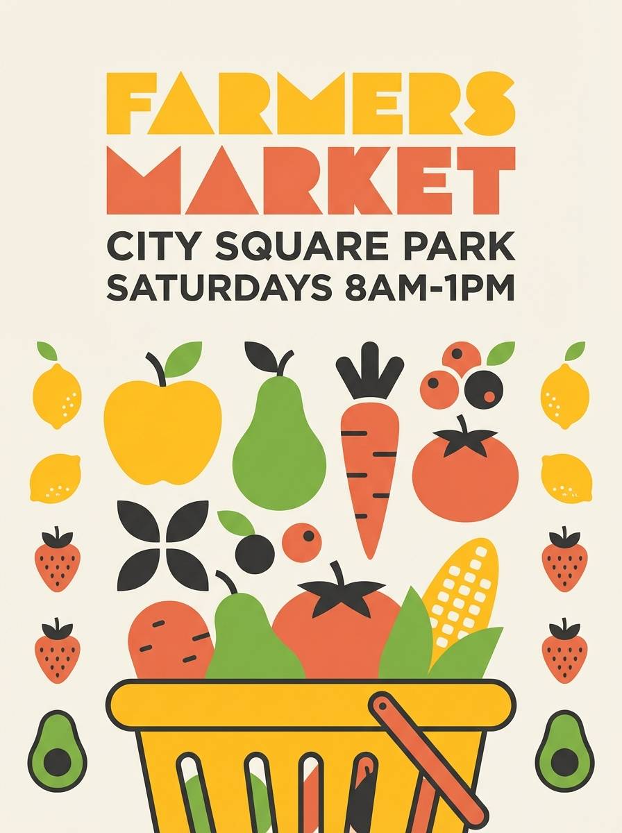
21) Sunny Citrus Market
HEX: #FFC533 #FFF0B8 #7CB342 #E76F51 #2E2E2E
Mood: lively, fresh, street-market
Best for: farmers market posters and signage
Lively and fresh, like fruit crates stacked in a sunny market aisle. Yellow reads energetic beside leafy green, while the warm coral brings a friendly, local feel. Great for posters, stall signage, and community event promotions. Keep the layout simple with big blocks of color, and use the dark gray for clear pricing and dates.
Image example of sunny citrus market generated using media.io
22) Sunflower Studio
HEX: #F8C537 #FFE9A8 #F7F7F7 #B0B7C3 #22262B
Mood: bright, airy, professional
Best for: creative portfolios and presentation decks
Bright and airy, like a sunflower-filled studio with white walls. The yellow feels optimistic, while cool grays keep the overall design polished. Ideal for portfolios, pitch decks, and clean brand guidelines pages. Use yellow as a chapter marker and keep most slides neutral so the accent remains special.
Image example of sunflower studio generated using media.io

What Colors Go Well with Golden Yellow?
Golden yellow pairs best with grounding neutrals like cream, warm beige, and cocoa because they keep the palette soft and readable. This is a reliable direction for packaging, editorial layouts, and print.
For modern contrast, combine golden yellow with charcoal, slate, or near-black. The darker base makes yellow feel sharp and premium—ideal for UI, tech branding, and signage.
If you want a fresher look, introduce cool accents like teal, mint, or dusty blue. Keep them secondary so yellow remains the main attention color.
How to Use a Golden Yellow Color Palette in Real Designs
Treat golden yellow as a “spotlight” color: buttons, badges, icons, or key product highlights. Too much yellow across large backgrounds can cause glare and reduce perceived quality.
Lock in readable typography by using your darkest shade (charcoal or deep brown) for body text, and reserve yellow for short headings or emphasis. In print, try subtle textures (linen, grain) to make warm palettes feel more tactile.
Build hierarchy with neutrals first (backgrounds, cards, whitespace), then add yellow last as the accent that guides the eye through the layout.
Create Golden Yellow Palette Visuals with AI
If you already have HEX codes but need matching mockups, posters, or UI scenes, generating on-brand visuals with AI can speed up concepting and testing.
Start with a simple prompt (subject + background + dominant HEX codes + style), then refine lighting and composition to match your brand tone—cozy, luxe, minimal, or bold.
Use Media.io Text-to-Image to quickly turn any palette above into consistent, reusable visuals for ads, websites, and presentations.
Golden Yellow Color Palette FAQs
-
What HEX code is a modern golden yellow?
A popular modern golden yellow is #F7C948. It’s warm, saturated, and reads clearly as an accent without looking neon. -
Is golden yellow good for UI design?
Yes—use it for CTAs, highlights, active states, and small badges. Pair it with off-white and charcoal (or deep gray) so text and components stay readable. -
What neutral colors go best with golden yellow?
Cream, warm ivory, tan, stone gray, and cocoa brown are the easiest neutrals to pair with golden yellow for a balanced, premium look. -
What is the best dark pairing for golden yellow?
Charcoal or near-black provides the strongest contrast and makes golden yellow feel crisp and confident. It’s a common choice for tech, signage, and bold branding. -
How do I keep a golden yellow palette from feeling too bright?
Limit yellow coverage (10–20% of the layout), keep backgrounds neutral, and use a darker text color. Soft creams and warm grays also reduce glare compared to pure white. -
Does golden yellow work well for print?
It does, especially when supported by warm neutrals and deep browns. For invitations, menus, or packaging, golden yellow often looks best as a highlight rather than a full-page fill. -
Can I use golden yellow with teal or blue?
Yes—teal, cyan, and dusty blue create a fresh, modern contrast. Keep cool colors as secondary accents so golden yellow remains the main attention color.
Next: Slate Gray Color Palette


