

Ginger is a warm, spicy orange-brown that instantly adds comfort, craft, and personality to a layout. It can read rustic and handmade, or modern and premium, depending on what you pair it with.
Below are 20 ginger color palette ideas with HEX codes, plus practical pairing guidance for branding, UI, packaging, and interiors.
In this article
- Why Ginger Palettes Work So Well
-
- spiced linen
- apricot hearth
- copper sage
- autumn clay ui
- burnt caramel navy
- terracotta rose
- maple matcha
- desert dusk poster
- vintage spice editorial
- modern amber dashboard
- canyon sunset
- rustic bistro menu
- warm minimal interior
- gingerbread holiday invite
- clay eucalyptus
- saffron denim
- pumpkin latte social
- museum wayfinding
- soft ochre wedding suite
- bold spice gradient ui
- What Colors Go Well with Ginger?
- How to Use a Ginger Color Palette in Real Designs
- Create Ginger Palette Visuals with AI
Why Ginger Palettes Work So Well
Ginger sits in the orange-brown range, which makes it feel warm, human, and familiar—like toasted spice, clay, leather, or baked goods. That natural association helps designs feel approachable without looking childish.
It’s also an excellent “accent workhorse.” On light neutrals, ginger becomes an energetic CTA or logo highlight; next to deep browns, navies, or green-blacks, it turns richer and more premium.
Because ginger is inherently earthy, it pairs easily with creams, tans, warm grays, and muted greens—giving you a cohesive palette that still has contrast for hierarchy and readability.
20+ Ginger Color Palette Ideas (with HEX Codes)
1) Spiced Linen
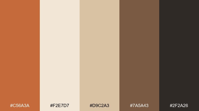
HEX: #C56A3A #F2E7D7 #D9C2A3 #7A5A43 #2F2A26
Mood: cozy, natural, artisanal
Best for: lifestyle branding and packaging
Cozy and kitchen-warm, these tones feel like toasted spice, linen napkins, and wood shelves. The soft cream and tan keep the orange-brown grounded and premium. Use the deep espresso for type and barcodes, and reserve the ginger tone for logos or seals. Pair with uncoated paper and minimal iconography for a handcrafted finish.
Image example of spiced linen generated using media.io
Media.io is an online AI studio for creating and editing video, image, and audio in your browser.

2) Apricot Hearth
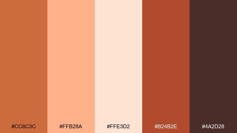
HEX: #CC6C3C #FFB28A #FFE3D2 #B24B2E #4A2D28
Mood: welcoming, homey, upbeat
Best for: cafe menus and food branding
Welcoming and lively, it evokes apricot jam, warm ovens, and candlelit tables. The peachy highlight makes the warm mid-tones feel friendly rather than heavy. For a ginger color combination that still reads modern, keep backgrounds light and use the darkest brown for headings. Add subtle grain or stipple textures to reinforce a crafted, culinary vibe.
Image example of apricot hearth generated using media.io
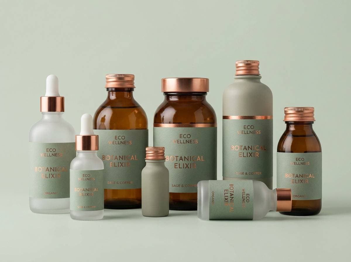
3) Copper Sage
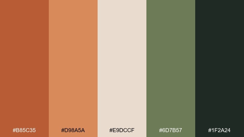
HEX: #B85C35 #D98A5A #E9DCCF #6D7B57 #1F2A24
Mood: earthy, balanced, refined
Best for: wellness brands and eco products
Earthy and calm, it brings to mind copper cookware beside fresh garden herbs. The muted sage tempers the warmth and adds a nature-forward signal. Use the cream as breathing room and lean on the deep green-black for trustworthy headlines. A small sage accent line or icon set helps keep the palette feeling fresh and not overly rustic.
Image example of copper sage generated using media.io
4) Autumn Clay UI
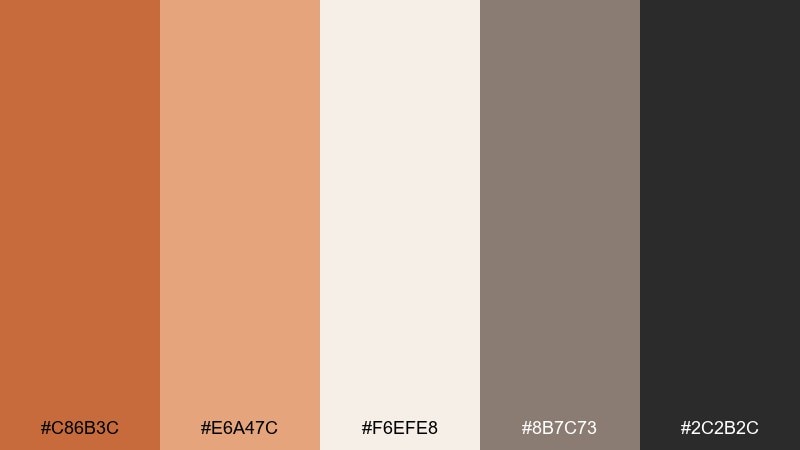
HEX: #C86B3C #E6A47C #F6EFE8 #8B7C73 #2C2B2C
Mood: modern, warm, minimal
Best for: mobile app UI and dashboards
Modern and warm, it feels like matte clay, soft light, and clean stoneware. The pale base keeps screens airy while the ginger hue adds just enough energy for calls to action. Use the gray-brown for secondary text and borders to avoid harsh contrast. Tip: keep buttons in the mid-orange and reserve the darkest near-black for primary navigation and titles.
Image example of autumn clay ui generated using media.io
5) Burnt Caramel Navy
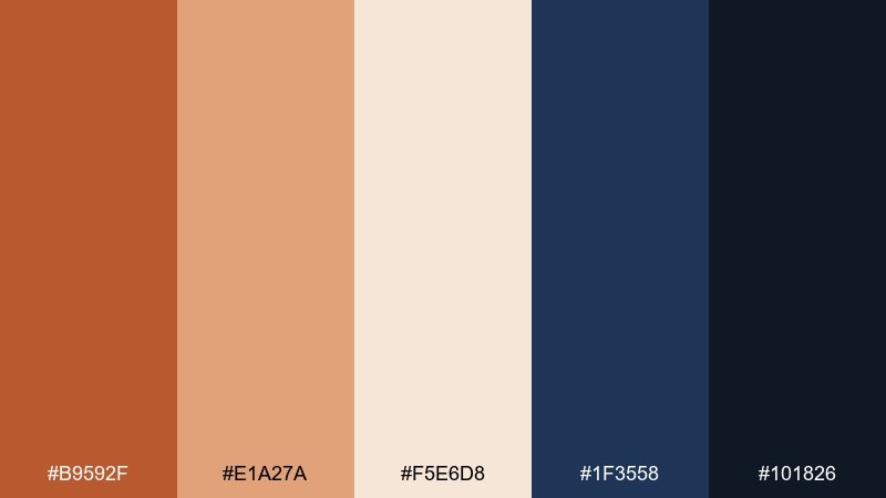
HEX: #B9592F #E1A27A #F5E6D8 #1F3558 #101826
Mood: bold, confident, polished
Best for: tech branding and hero sections
Bold and polished, it reads like burnt caramel against a night-sky suit. The navy brings instant structure, while the warm tints keep the look approachable. For ginger color combinations that pop on web, place the warm tones on light backgrounds and use navy for sections, footers, and dense copy. Add a thin caramel underline or gradient highlight to make CTAs feel premium without shouting.
Image example of burnt caramel navy generated using media.io

6) Terracotta Rose
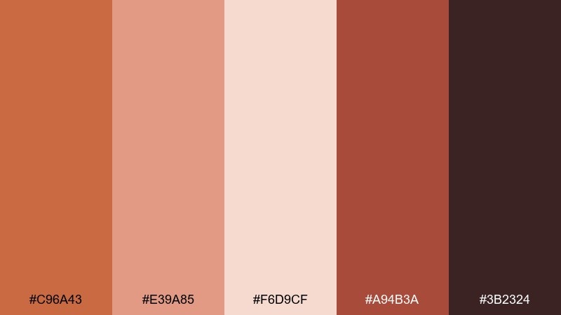
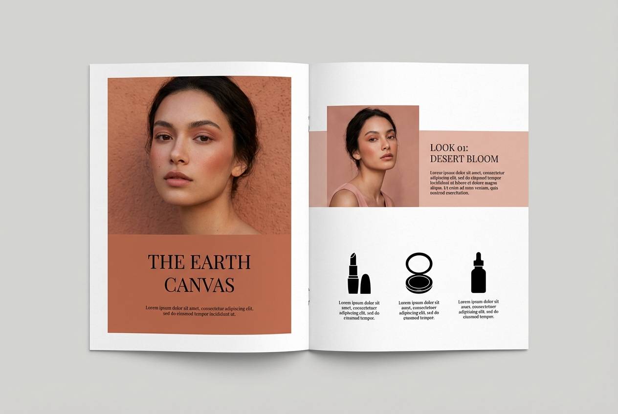
HEX: #C96A43 #E39A85 #F6D9CF #A94B3A #3B2324
Mood: romantic, soft, artistic
Best for: beauty campaigns and lookbooks
Romantic and softly sunbaked, it suggests terracotta walls with a blush of rose petals. The pastel pink brings a gentle glow that flatters skincare and cosmetics visuals. Keep typography in the deep cocoa to maintain elegance and readability. Try using the lightest blush as a negative-space background for product callouts and ingredient lists.
Image example of terracotta rose generated using media.io
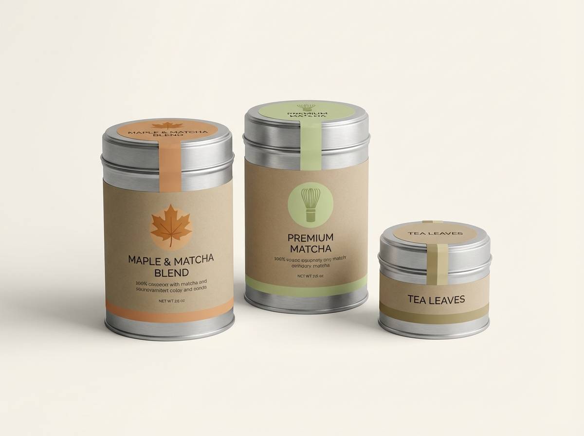
7) Maple Matcha
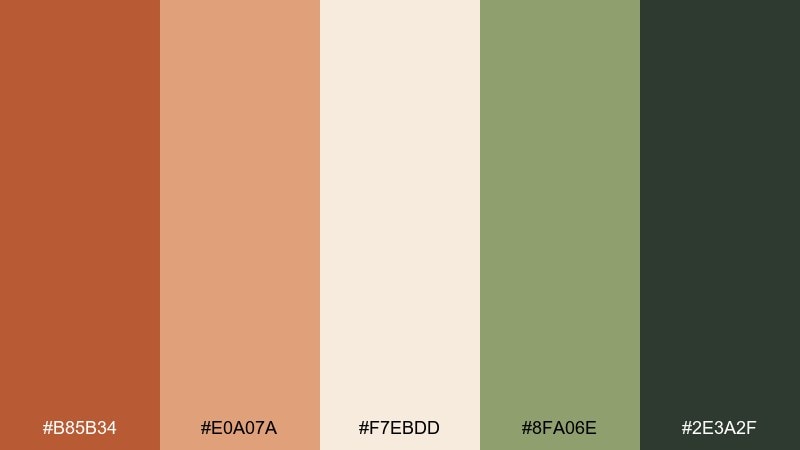
HEX: #B85B34 #E0A07A #F7EBDD #8FA06E #2E3A2F
Mood: grounded, fresh, cozy
Best for: tea brands and cafe interiors
Grounded yet fresh, it feels like maple syrup alongside a matcha whisk and ceramic cups. The green tones cool the warmth and make the palette feel contemporary. Use the creamy tint for walls, menus, or landing pages, then bring in the darker green for signage and accessibility-friendly text. A small maple-orange accent works well on loyalty stamps or highlights without overwhelming the space.
Image example of maple matcha generated using media.io
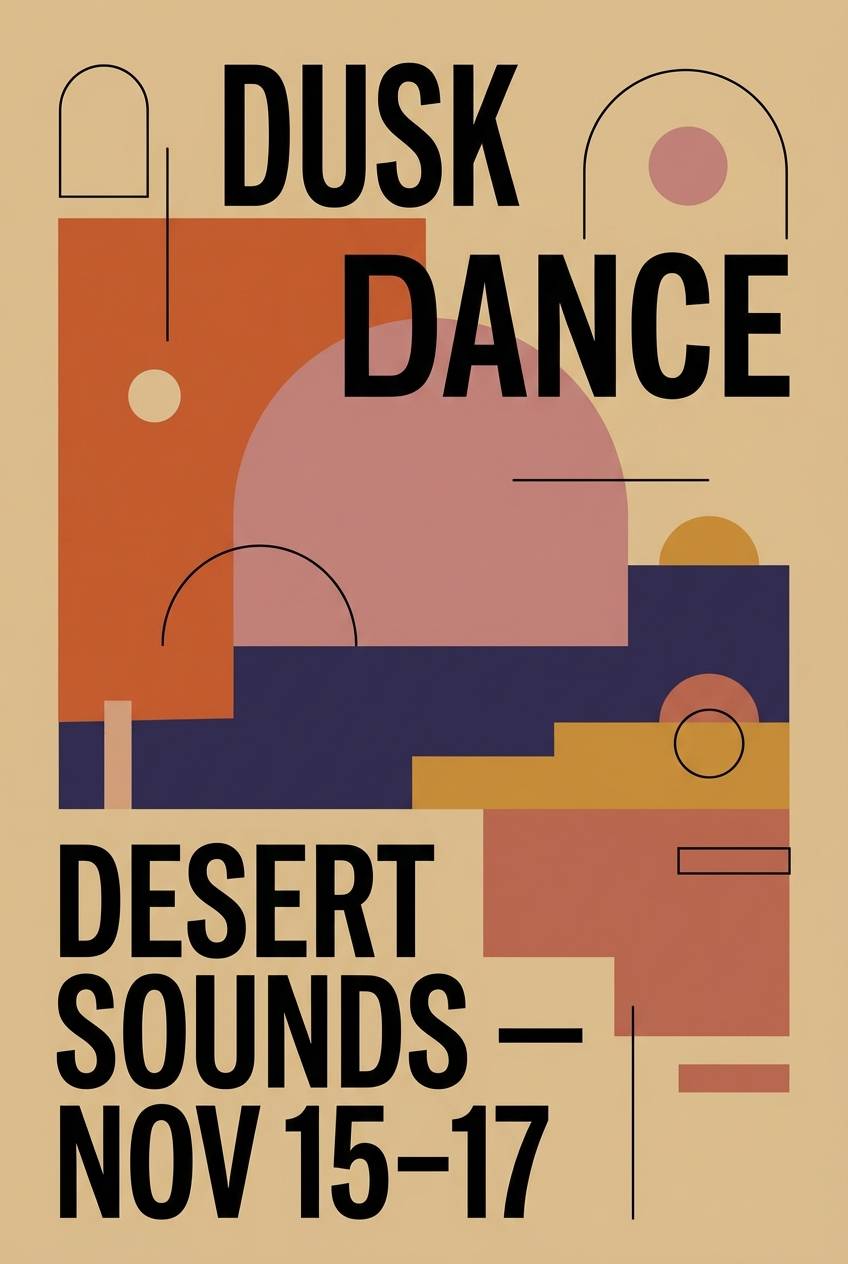
8) Desert Dusk Poster
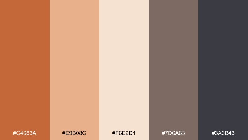
HEX: #C4683A #E9B08C #F6E2D1 #7D6A63 #3A3B43
Mood: cinematic, muted, atmospheric
Best for: event posters and album artwork
Cinematic and muted, it recalls desert dusk with dust in the air and a darkening horizon. The warm highlights keep the mood inviting while the charcoal-lilac adds mystery. Use large blocks of the pale sand for breathing room, then set titles in the near-black for drama. Tip: add subtle gradients between the mid tones to create depth without introducing extra colors.
Image example of desert dusk poster generated using media.io
9) Vintage Spice Editorial
HEX: #B85D33 #D7A07E #EFE2D6 #6E5C4F #2B2421
Mood: heritage, warm, literary
Best for: magazine layouts and book covers
Heritage and literary, it evokes worn leather, old paper, and spiced tea in a quiet library. The restrained warmth makes long-form layouts feel inviting and easy on the eyes. This ginger color palette works beautifully with serif typography and generous margins. Use the darker brown for pull quotes and section headers, and keep imagery slightly desaturated for a cohesive vintage finish.
Image example of vintage spice editorial generated using media.io
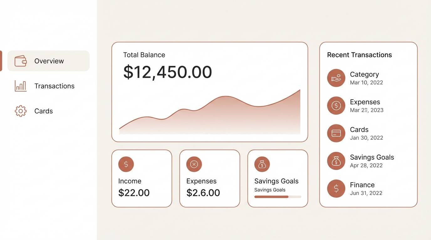
10) Modern Amber Dashboard
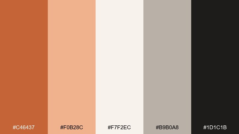
HEX: #C46437 #F0B28C #F7F2EC #B9B0A8 #1D1C1B
Mood: clean, friendly, contemporary
Best for: SaaS UI systems and data apps
Clean and friendly, it feels like warm amber light in a bright studio. The neutral grays keep charts and tables calm while the orange accent guides attention. Use this ginger color scheme for primary buttons, progress states, and small data highlights rather than full backgrounds. Tip: pair the accent with rounded components and ample spacing to keep the interface approachable.
Image example of modern amber dashboard generated using media.io

11) Canyon Sunset
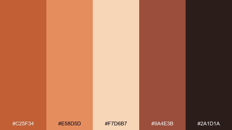
HEX: #C25F34 #E58D5D #F7D6B7 #9A4E3B #2A1D1A
Mood: adventurous, warm, bold
Best for: outdoor brands and travel content
Adventurous and bold, it brings to mind canyon walls glowing at sunset. The lighter peach helps the darker reds feel energetic rather than heavy. Use the brightest mid-tone for badges, price tags, or route highlights in travel maps. Pair with wide landscape photography and keep text in the deep brown for strong readability.
Image example of canyon sunset generated using media.io

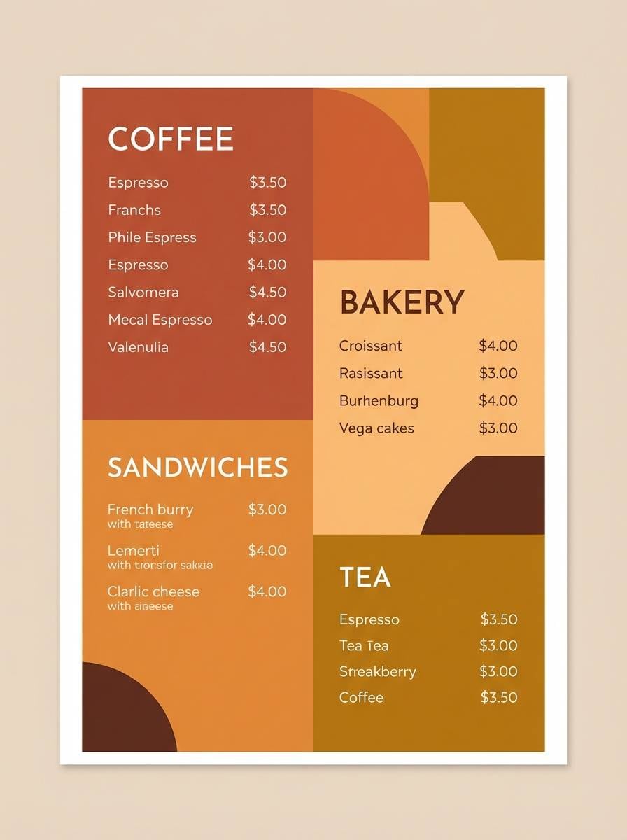
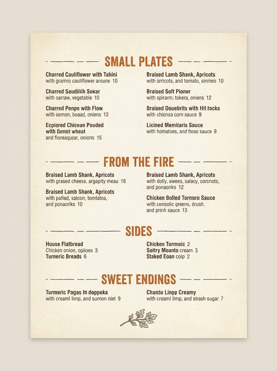
12) Rustic Bistro Menu
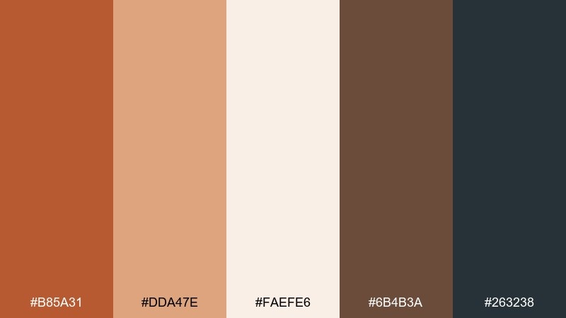
HEX: #B85A31 #DDA47E #FAEFE6 #6B4B3A #263238
Mood: rustic, inviting, grounded
Best for: restaurant menus and signage
Rustic and inviting, it feels like a bistro chalkboard warmed by candlelight. The blue-gray adds an unexpected, modern counterpoint to the toasted oranges. For ginger color combinations in print, keep the paper tone near the creamy white and use the charcoal for body copy. A single warm accent bar behind section titles makes the menu easier to scan at a glance.
Image example of rustic bistro menu generated using media.io
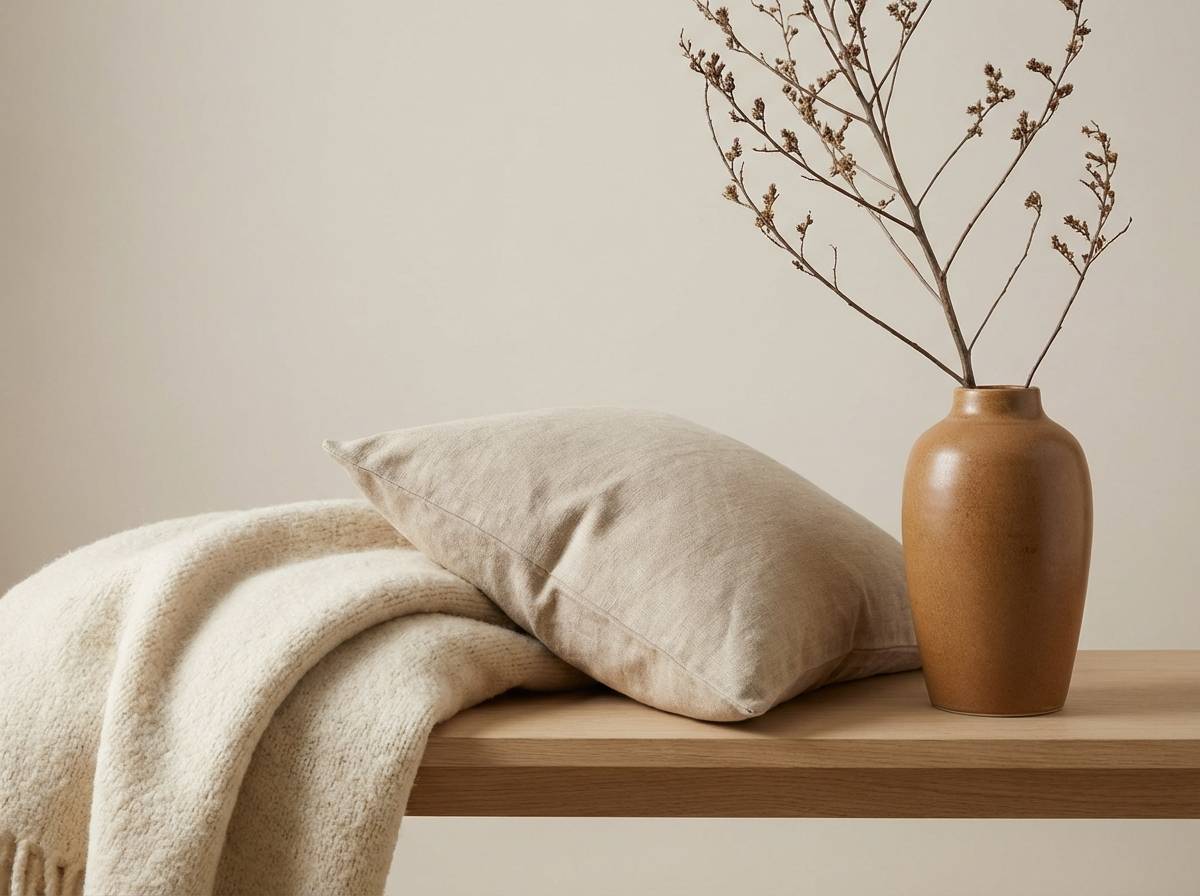
13) Warm Minimal Interior
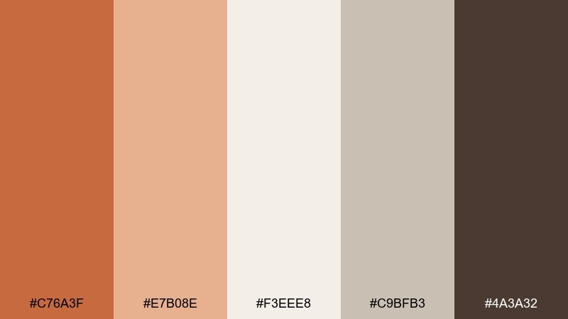
HEX: #C76A3F #E7B08E #F3EEE8 #C9BFB3 #4A3A32
Mood: calm, airy, elevated
Best for: interior design boards and home brands
Calm and airy, it suggests sunlit plaster, soft textiles, and a hint of baked spice. The pale neutrals do most of the work, letting the warm accent feel intentional and high-end. Use the mid ginger tone on throw pillows, vases, or small UI highlights rather than large walls or full-width banners. Pair with natural oak, travertine, and matte black hardware for a balanced look.
Image example of warm minimal interior generated using media.io
14) Gingerbread Holiday Invite
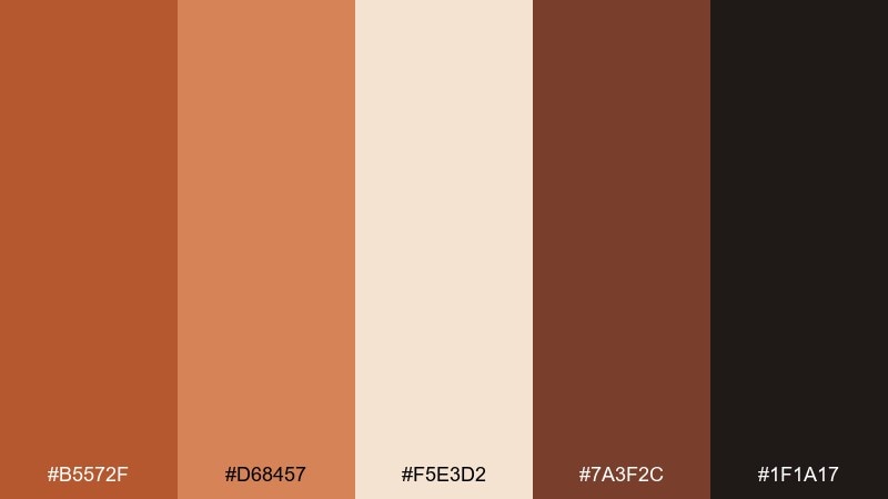
HEX: #B5572F #D68457 #F5E3D2 #7A3F2C #1F1A17
Mood: festive, nostalgic, cozy
Best for: holiday invitations and seasonal promos
Festive and nostalgic, it evokes gingerbread edges, brown sugar, and warm lights in winter. The creamy tint keeps layouts bright while the deeper browns add a baked, cozy weight. A ginger color palette like this works best with simple ornaments and plenty of whitespace so it does not feel busy. Tip: use the darkest shade for names and dates, and keep decorative flourishes in the mid tones.
Image example of gingerbread holiday invite generated using media.io

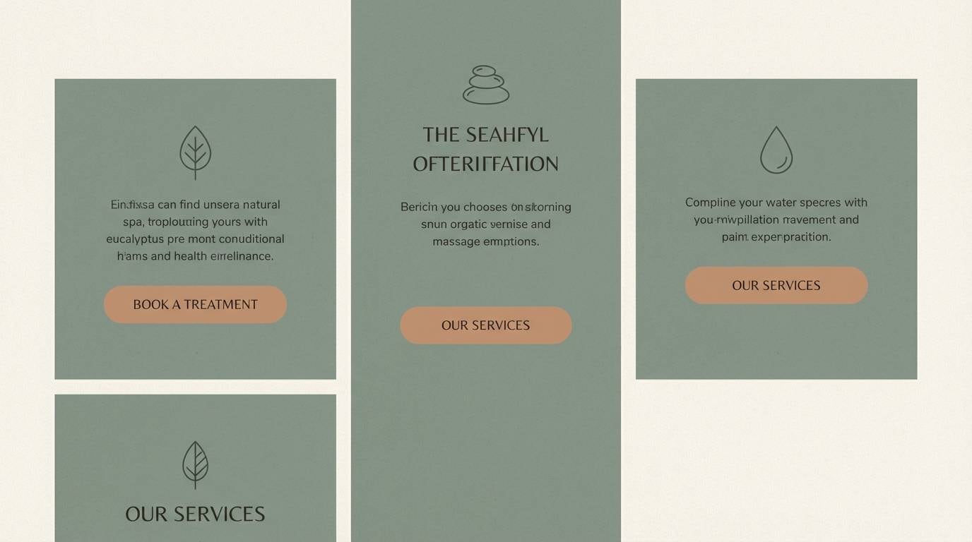
15) Clay Eucalyptus
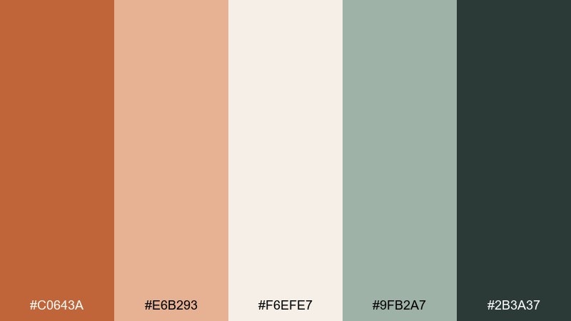
HEX: #C0643A #E6B293 #F6EFE7 #9FB2A7 #2B3A37
Mood: spa-like, soothing, modern
Best for: spa branding and wellness websites
Soothing and spa-like, it feels like warm clay masks paired with fresh eucalyptus steam. The cool green-gray keeps the warmth from becoming too sweet and supports a clean, modern vibe. Use the pale base for page backgrounds and section dividers, then add the ginger tone for icons and key benefits. Pair with soft photography, rounded sans-serif type, and subtle line art for a calming system.
Image example of clay eucalyptus generated using media.io
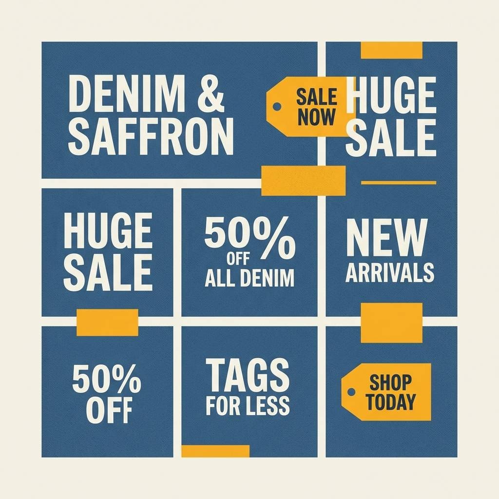
16) Saffron Denim
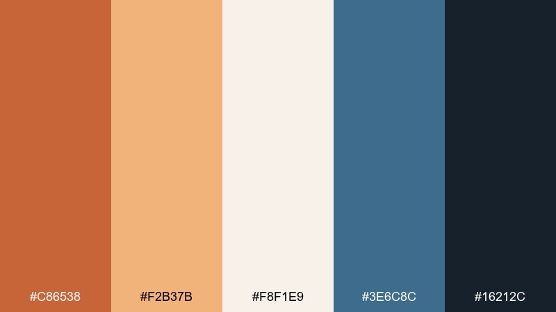
HEX: #C86538 #F2B37B #F8F1E9 #3E6C8C #16212C
Mood: confident, creative, crisp
Best for: fashion branding and social graphics
Confident and creative, it resembles saffron warmth contrasted with worn denim. The cool blues give the palette structure and make the orange feel sharper and more editorial. Use the light neutral as a canvas for product shots and set headlines in the deep navy for punch. A small saffron highlight on price, size, or drops helps your layout feel intentional and trendy.
Image example of saffron denim generated using media.io
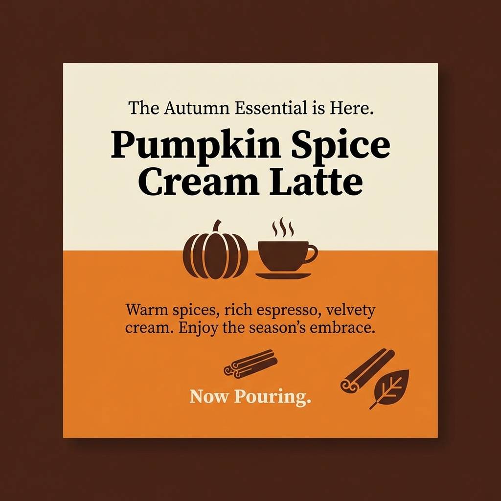
17) Pumpkin Latte Social
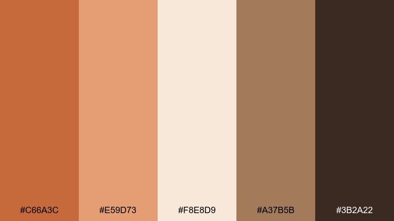
HEX: #C66A3C #E59D73 #F8E8D9 #A37B5B #3B2A22
Mood: sweet, friendly, seasonal
Best for: social media content and cafe promos
Sweet and friendly, it calls up pumpkin latte foam, cinnamon dust, and soft knit textures. The creamy peach keeps the warm browns from feeling too dark on small screens. For a quick ginger color combination in social posts, use the mid-orange for stickers and the deepest brown for captions. Tip: keep contrast high on text overlays by placing copy on the lightest tint.
Image example of pumpkin latte social generated using media.io
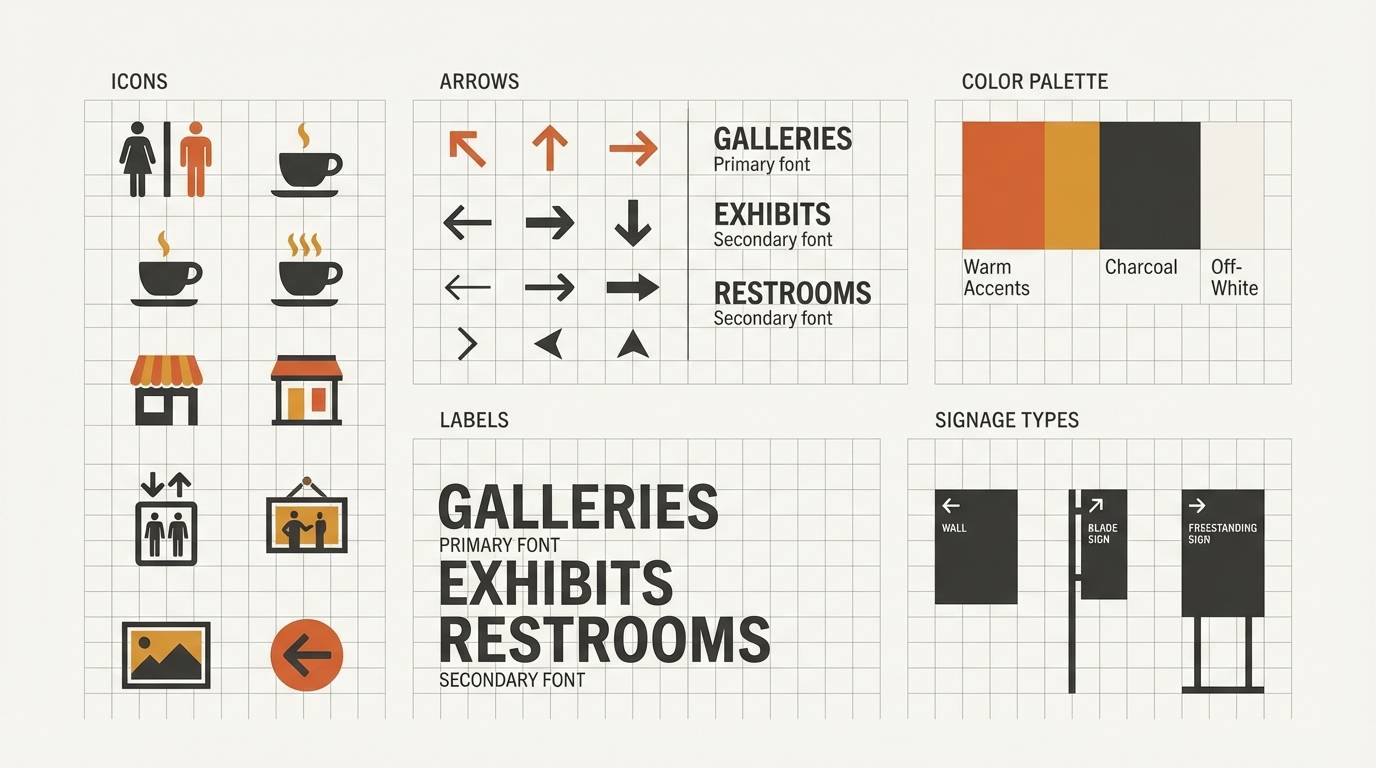
18) Museum Wayfinding
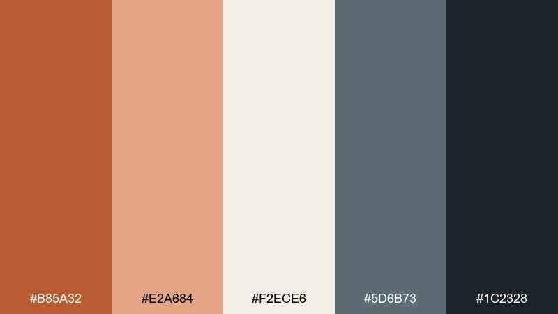
HEX: #B85A32 #E2A684 #F2ECE6 #5D6B73 #1C2328
Mood: structured, calm, institutional
Best for: wayfinding systems and signage
Structured and calm, it feels like quiet galleries with warm spotlights on stone walls. The cool slate adds authority and makes directional graphics easier to read. Use the ginger tone sparingly for floor markers, category labels, or feature exhibits, and keep the slate for navigation. Tip: maintain consistent icon stroke weights so the warm accent reads as a system, not decoration.
Image example of museum wayfinding generated using media.io
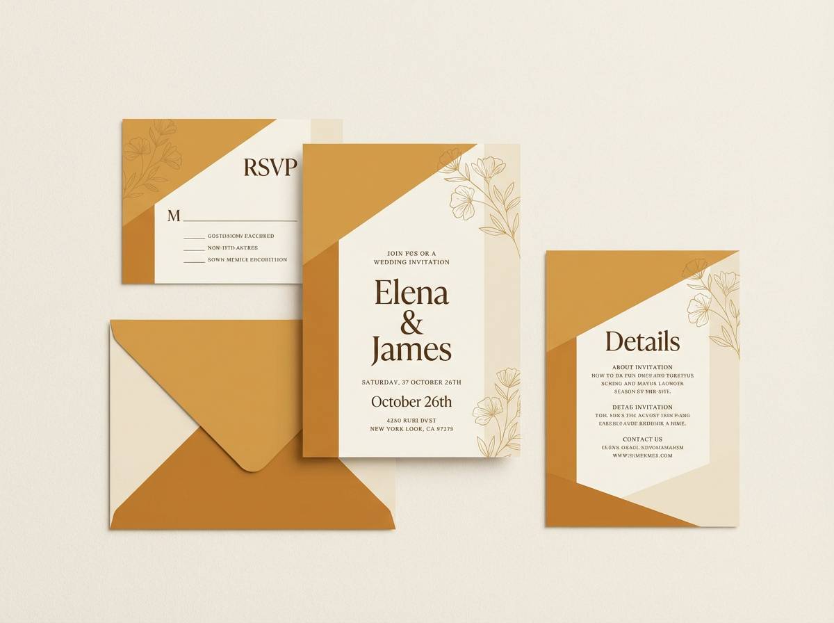
19) Soft Ochre Wedding Suite
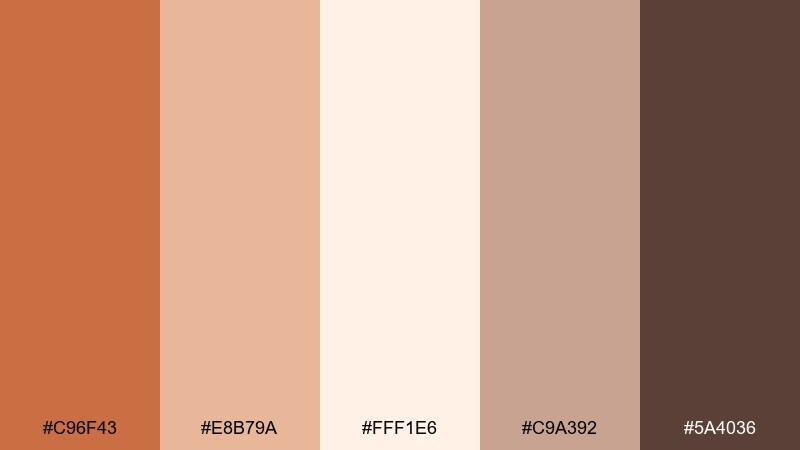
HEX: #C96F43 #E8B79A #FFF1E6 #C9A392 #5A4036
Mood: romantic, elegant, warm
Best for: wedding stationery and RSVP sets
Romantic and elegant, it suggests soft ochre silk, candlelight, and handwritten vows. The pale blush-cream keeps invitations airy while the warm accent brings personality. Use the deeper cocoa for names and details to ensure legibility, especially on textured stock. Pair with minimal floral line art and gold foil accents for a timeless finish.
Image example of soft ochre wedding suite generated using media.io
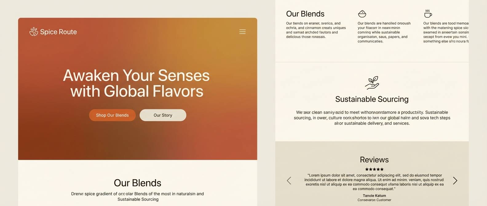
20) Bold Spice Gradient UI
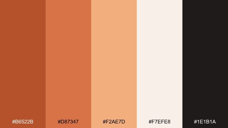
HEX: #B6522B #D87347 #F2AE7D #F7EFE8 #1E1B1A
Mood: energetic, punchy, modern
Best for: landing pages and CTA components
Energetic and punchy, it feels like a warm gradient glow on a dark stage. The stacked oranges create natural hierarchy for buttons, badges, and progress states. Use the off-white as a buffer for text blocks so the warm spectrum stays readable. Tip: apply the three warm tones as a subtle left-to-right gradient in hero banners, then keep the rest of the UI neutral.
Image example of bold spice gradient ui generated using media.io
What Colors Go Well with Ginger?
Ginger pairs best with warm neutrals like cream, oatmeal, sand, and tan because they amplify its cozy character while keeping the overall look light. These combinations are ideal for packaging, editorial layouts, and calm landing pages.
For contrast and structure, add cool anchors such as navy, slate, or deep green-black. Those darker hues keep ginger from feeling overly rustic and improve readability for navigation, headings, and dense copy.
If you want a softer, more romantic direction, blend ginger with blush, dusty rose, or peach tints. This keeps the palette warm while adding a gentle “glow” that works especially well for beauty, weddings, and lifestyle brands.
How to Use a Ginger Color Palette in Real Designs
Use ginger as an accent first: buttons, tags, icons, highlights, and small brand marks. When it’s used sparingly against light neutrals, it feels intentional and premium rather than overpowering.
Balance ginger with a strong dark “text color” (espresso, charcoal, navy, or deep green-black) to maintain accessible contrast. This is especially important in UI, dashboards, and menus where clarity matters more than mood.
In print and interiors, let texture do part of the work—uncoated paper, subtle grain, natural wood, or stone finishes. Ginger tones look richer when they appear alongside tactile materials and soft lighting.
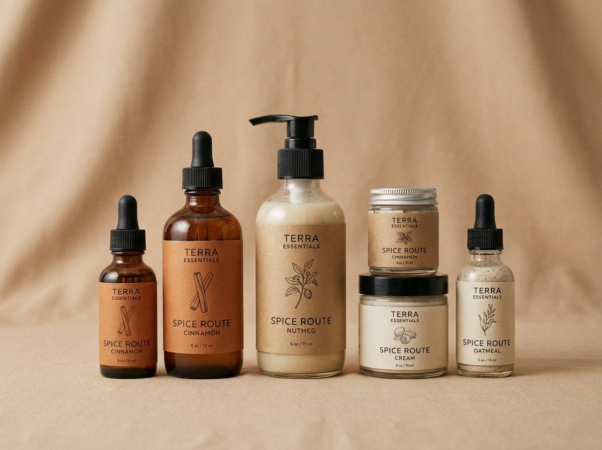
Create Ginger Palette Visuals with AI
Want to see these ginger palettes applied to real designs like packaging, UI screens, posters, or invitations? Generate on-brand mockups quickly by describing the scene, layout, and lighting in a prompt.
With Media.io, you can iterate fast: keep the same composition, swap colors, and test multiple moods (cozy, modern, cinematic) without rebuilding assets from scratch.
Start with one palette above, paste its vibe into your prompt, and specify where the ginger accent should appear (CTA button, label seal, headline block, or background gradient).
Ginger Color Palette FAQs
-
What is a “ginger” color in design?
Ginger is typically a warm orange-brown that sits between terracotta and caramel. It’s often used to evoke spice, clay, leather, warmth, and handmade craft. -
Is ginger a good brand color?
Yes—ginger is memorable without being neon, and it works well for lifestyle, food, wellness, and premium craft brands. It’s especially effective as an accent color paired with creams and a dark neutral for typography. -
What colors complement ginger the most?
Top complements include cream and sand (for warmth), navy and slate (for strong contrast), and muted sage or eucalyptus (for an earthy, modern balance). -
How do I keep a ginger palette from looking too “rustic”?
Add cool structure colors like navy, blue-gray, or deep green-black, and use clean typography and generous whitespace. Keeping backgrounds light and ginger as a controlled accent also makes the look more modern. -
Can ginger work in UI design?
Absolutely. Use ginger for CTAs, active states, badges, and small highlights, while relying on off-whites and warm grays for surfaces. Pair with charcoal or near-black for accessible text contrast. -
What’s the best background color for ginger text or buttons?
For readability and a premium feel, use very light warm neutrals (cream, linen, off-white). If ginger is used on a dark background, choose a lighter ginger tint and verify contrast for accessibility. -
How can I generate ginger palette mockups quickly?
Use Media.io Text-to-Image: describe the design type (packaging, poster, dashboard), mention “ginger and warm neutral palette,” and specify where the accent should appear (logo, button, label). Iterate by swapping prompts while keeping the same palette.
Next: Beige Gray Color Palette


