

Cherry blossom tones capture that soft, floating feeling of spring—light pinks, airy whites, and gentle neutrals that instantly read as elegant and calm.
Below are 20+ cherry blossom color palette ideas with HEX codes, plus real-world use cases for branding, weddings, UI, and more.
In this article
- Why Cherry Blossom Palettes Work So Well
-
- petal whisper
- sakura latte
- blush and bone
- rosewater gray
- tea garden
- dawn kimono
- pastel hanami
- peony mist
- cotton candy ink
- minimal blossom
- vintage sakura
- maroon stem
- foggy orchard
- pearl blossom
- sunset petals
- spring stationery
- cherry cream
- orchid breeze
- terracotta bloom
- midnight festival
- blooming interface
- silk petal evening
- What Colors Go Well with Cherry Blossom?
- How to Use a Cherry Blossom Color Palette in Real Designs
- Create Cherry Blossom Palette Visuals with AI
Why Cherry Blossom Palettes Work So Well
Cherry blossom palettes sit in a sweet spot: soft enough to feel gentle and welcoming, yet structured enough to look modern when you add cool grays, taupes, or a deep maroon accent.
They’re naturally versatile because the “blossom” look isn’t just pink—it’s a range of pale tints, creamy whites, and muted shadows that create depth without needing loud color.
With the right dark anchor (wine, plum, or near-black), cherry blossom color combinations can stay readable and premium across print, web, and UI.
20+ Cherry Blossom Color Palette Ideas (with HEX Codes)
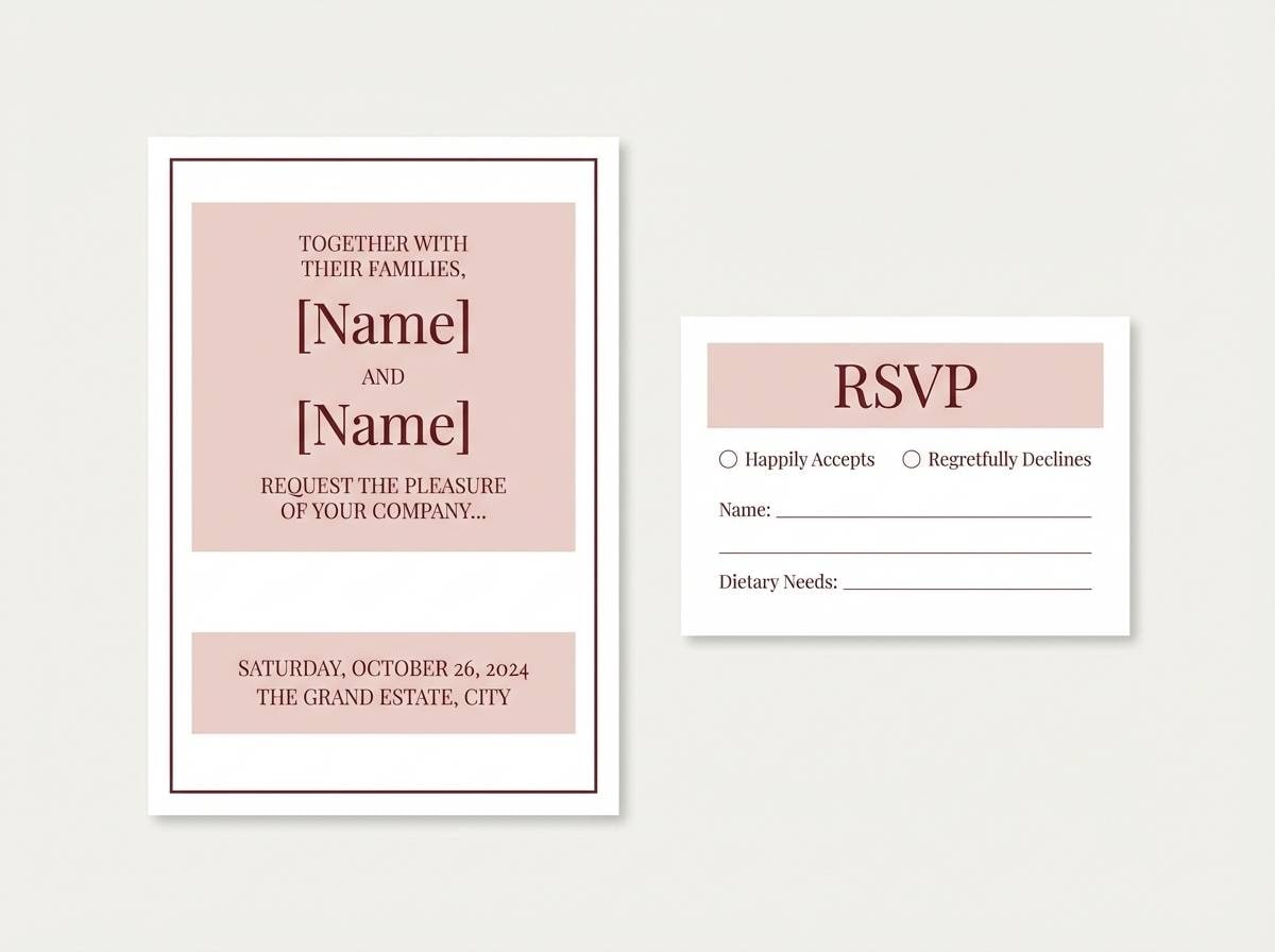
1) Petal Whisper
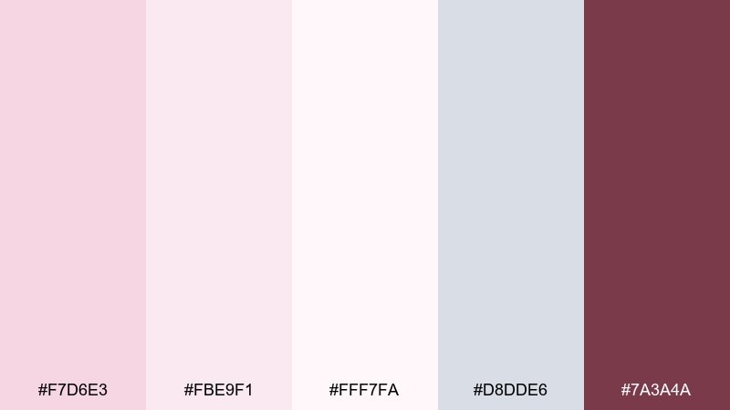
HEX: #F7D6E3 #FBE9F1 #FFF7FA #D8DDE6 #7A3A4A
Mood: airy, tender, refined
Best for: wedding invitations and RSVP cards
Airy petals and powdered sugar highlights set a tender, refined mood. The blush and near-white tones keep layouts romantic while the cool gray adds structure. Use the deep wine accent for names, monograms, or a thin border to avoid overwhelming the softness. Pair with serif type and plenty of negative space for a premium finish.
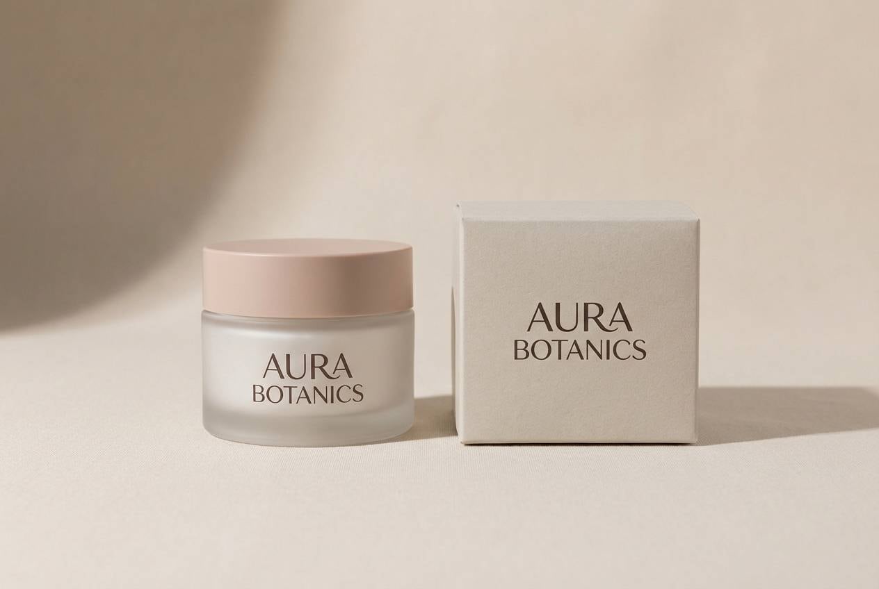
Image example of petal whisper generated using media.io
Media.io is an online AI studio for creating and editing video, image, and audio in your browser.

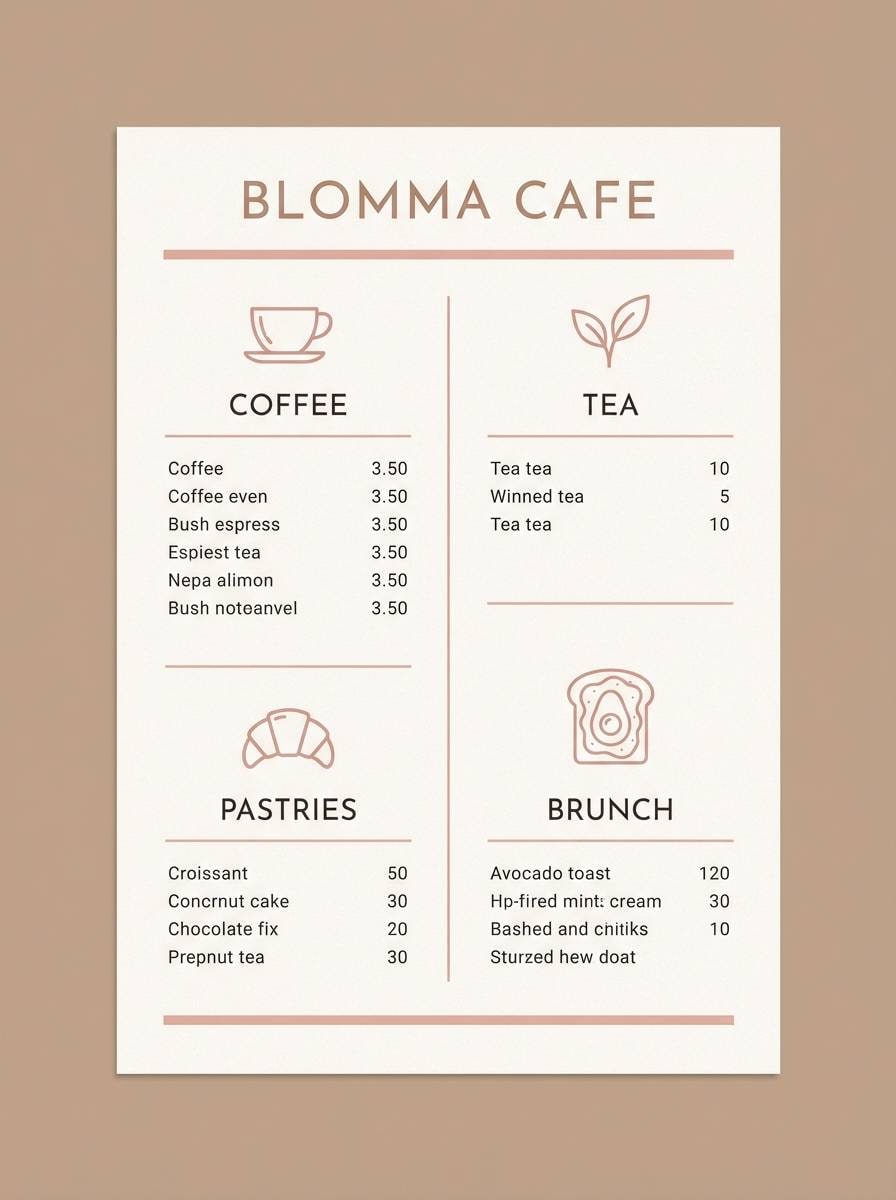
2) Sakura Latte
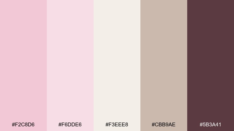
HEX: #F2C8D6 #F6DDE6 #F3EEE8 #CBB9AE #5B3A41
Mood: cozy, creamy, understated
Best for: cafe menu design and seasonal signage
Cozy, creamy tones feel like a warm latte with a floral finish. The beige and oatmeal notes keep text readable while blush adds a welcoming charm. Bring in the deep cocoa shade for headings and pricing to anchor the layout. Pair with kraft textures or simple line icons for an approachable cafe vibe.
Image example of sakura latte generated using media.io
3) Blush and Bone
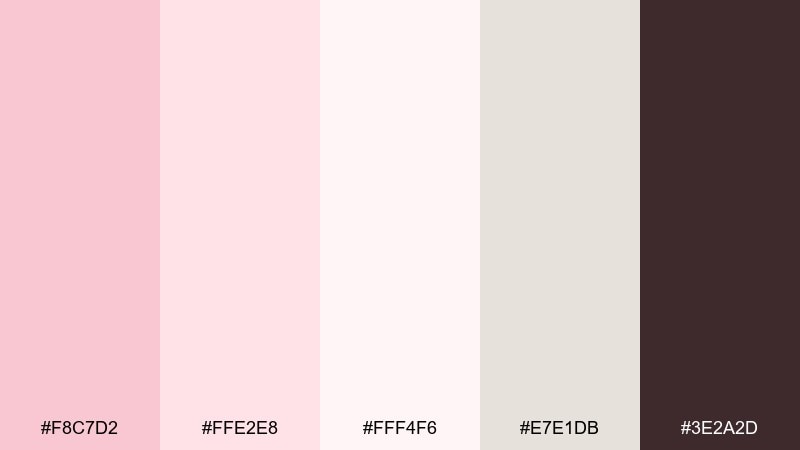
HEX: #F8C7D2 #FFE2E8 #FFF4F6 #E7E1DB #3E2A2D
Mood: clean, modern, softly romantic
Best for: beauty brand identity and packaging
Clean, modern softness comes through like blush on porcelain. The pale layers keep labels feeling light while the warm bone neutral prevents the pink from turning too sweet. For a cherry blossom color palette that still feels premium, use the espresso tone for logos and ingredient lists. A matte finish with subtle embossing works especially well here.
Image example of blush and bone generated using media.io
4) Rosewater Gray
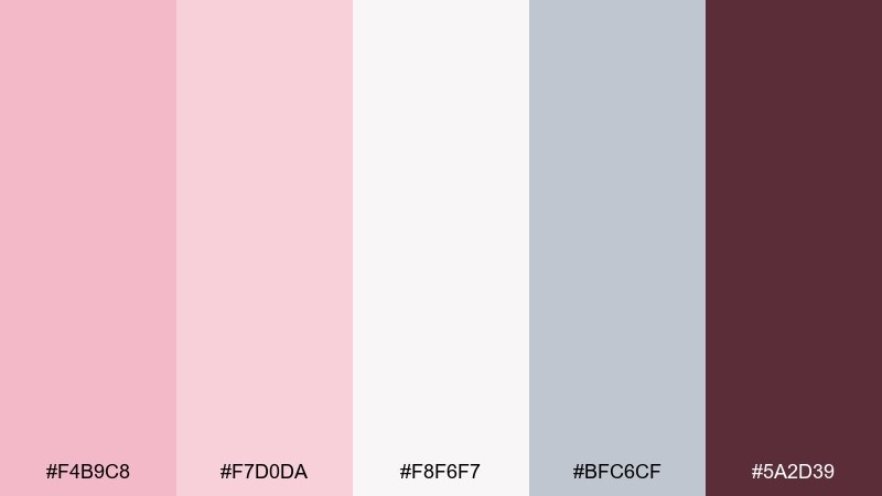
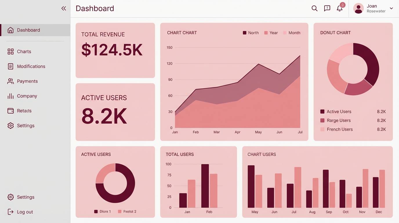
HEX: #F4B9C8 #F7D0DA #F8F6F7 #BFC6CF #5A2D39
Mood: calm, polished, slightly urban
Best for: dashboard UI and analytics screens
Calm rosewater tones over cool gray feel polished and slightly urban. Use the lightest pink as background panels, then reserve the stronger blush for active states and highlights. The slate gray supports data-heavy sections without fighting the soft theme. Add the burgundy as a sparing alert or key metric color to keep contrast intentional.
Image example of rosewater gray generated using media.io
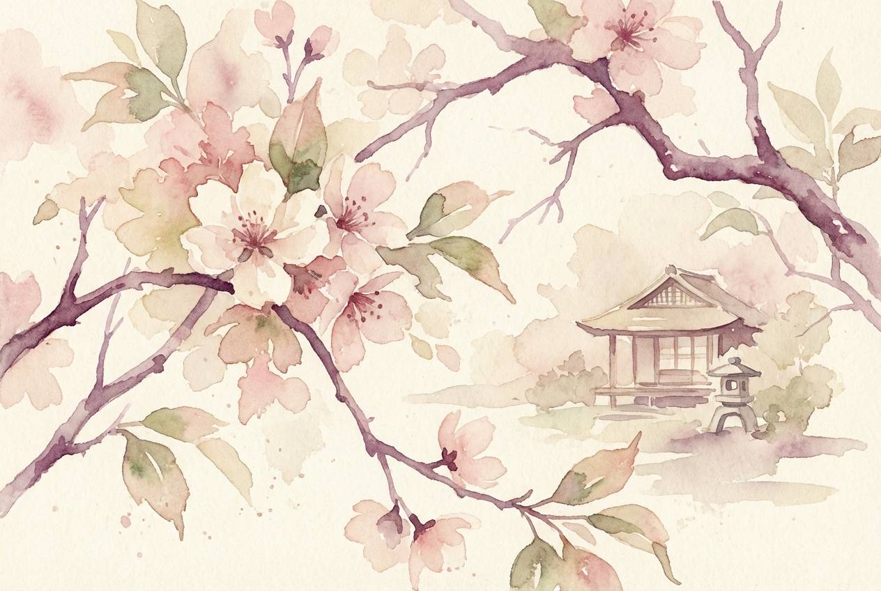
5) Tea Garden
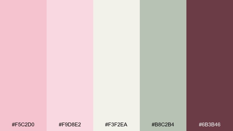
HEX: #F5C2D0 #F9D8E2 #F3F2EA #B8C2B4 #6B3B46
Mood: fresh, botanical, gentle
Best for: watercolor floral prints and spring illustrations
Fresh, botanical softness reads like a quiet tea garden in bloom. The green-gray note adds leafiness and keeps the pinks from feeling one-note. Use the cream as paper tone, then layer washes of blush for petals and the plum shade for branch detail. It pairs beautifully with hand-lettered captions and loose brush textures.
Image example of tea garden generated using media.io
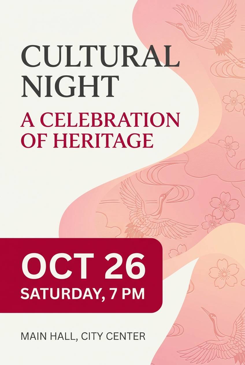
6) Dawn Kimono
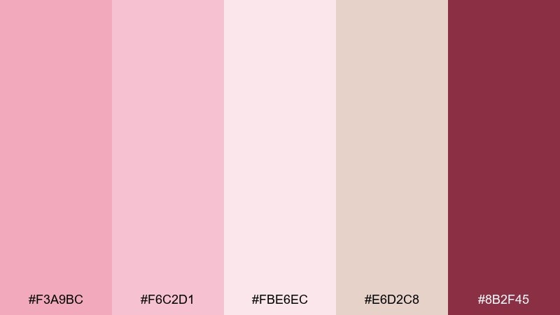
HEX: #F3A9BC #F6C2D1 #FBE6EC #E6D2C8 #8B2F45
Mood: elegant, traditional, sunrise-warm
Best for: event posters for cultural nights
Elegant sunrise warmth evokes silk fabric and early spring air. The rose and blush tones create instant energy, while the muted sand keeps the composition grounded. Use the deep crimson as a focal color for titles or date blocks so the poster reads from a distance. Pair with minimal patterns or a subtle wave motif to keep it tasteful.
Image example of dawn kimono generated using media.io
7) Pastel Hanami
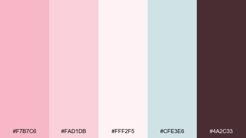
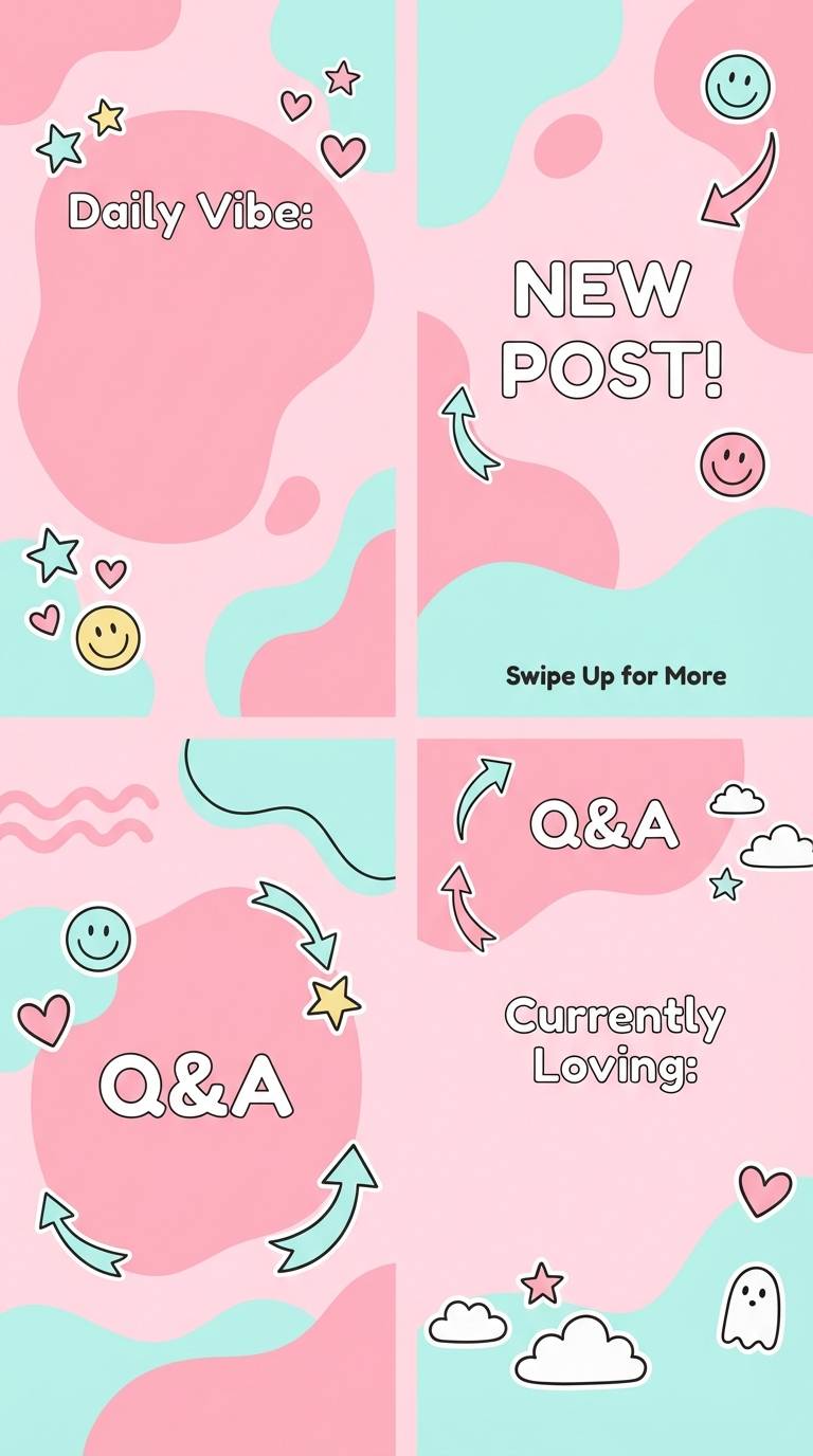
HEX: #F7B7C6 #FAD1DB #FFF2F5 #CFE3E6 #4A2C33
Mood: playful, breezy, picnic-light
Best for: social media templates and story backgrounds
Playful, breezy pastels feel like a picnic under drifting petals. The aqua-tinted light blue adds sparkle and keeps the palette from skewing too warm. Use the near-white for text-heavy slides and the dark cocoa for captions to maintain readability on mobile. A simple sticker-style illustration set pairs nicely with these tones.
Image example of pastel hanami generated using media.io
8) Peony Mist
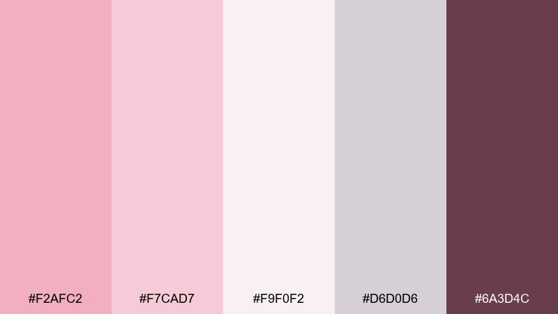
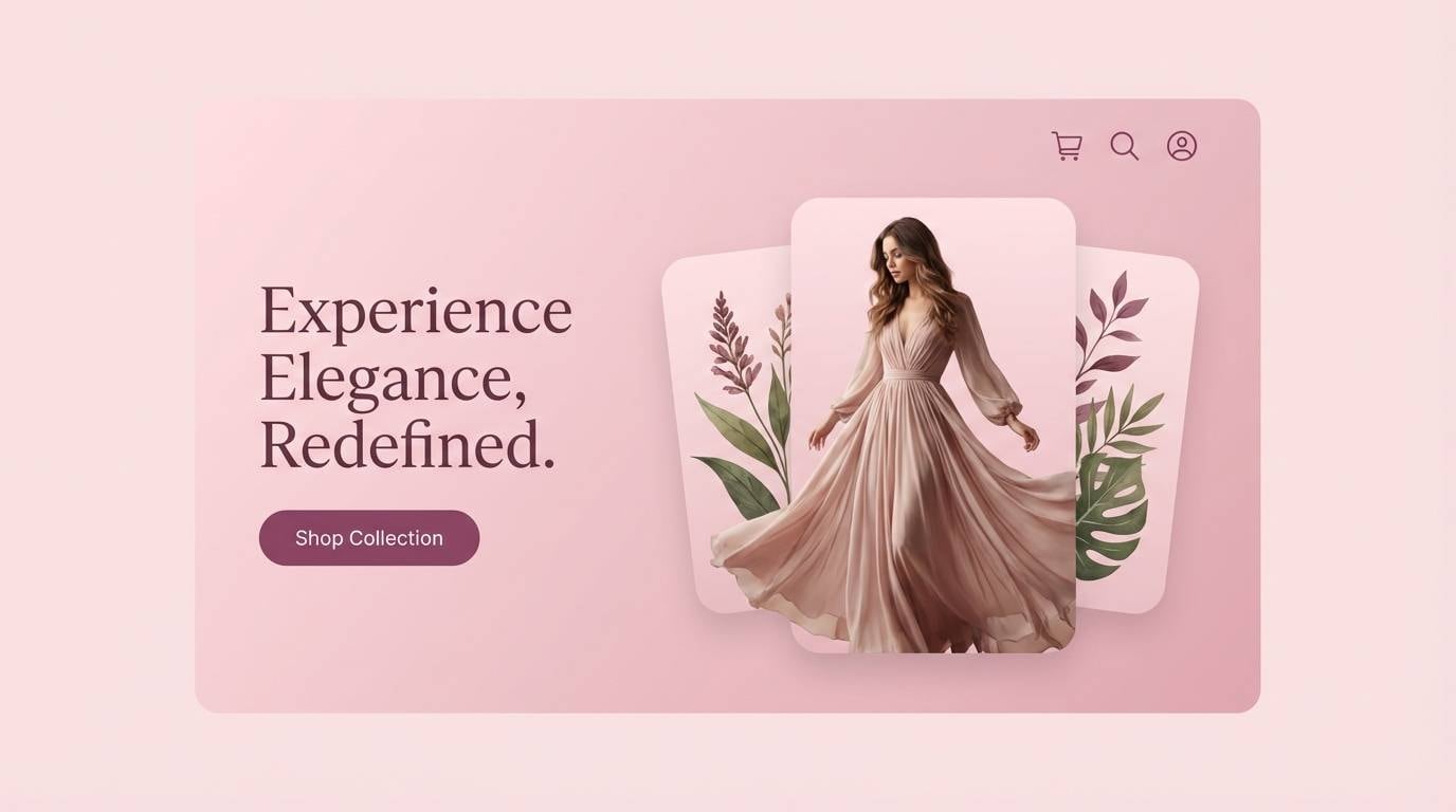
HEX: #F2AFC2 #F7CAD7 #F9F0F2 #D6D0D6 #6A3D4C
Mood: dreamy, misty, romantic
Best for: soft landing pages and hero sections
Dreamy mist and gentle bloom create a romantic first impression. The layered pinks work well for gradients, while the cool lilac-gray keeps buttons and dividers crisp. If you want cherry blossom color combinations that still feel modern, keep the plum tone for primary CTAs and icons only. Add plenty of line-height and rounded corners to match the softness.
Image example of peony mist generated using media.io
9) Cotton Candy Ink
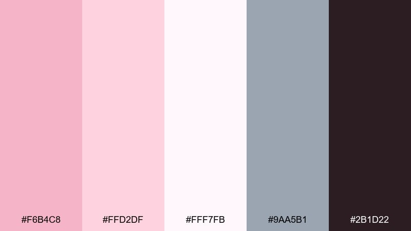
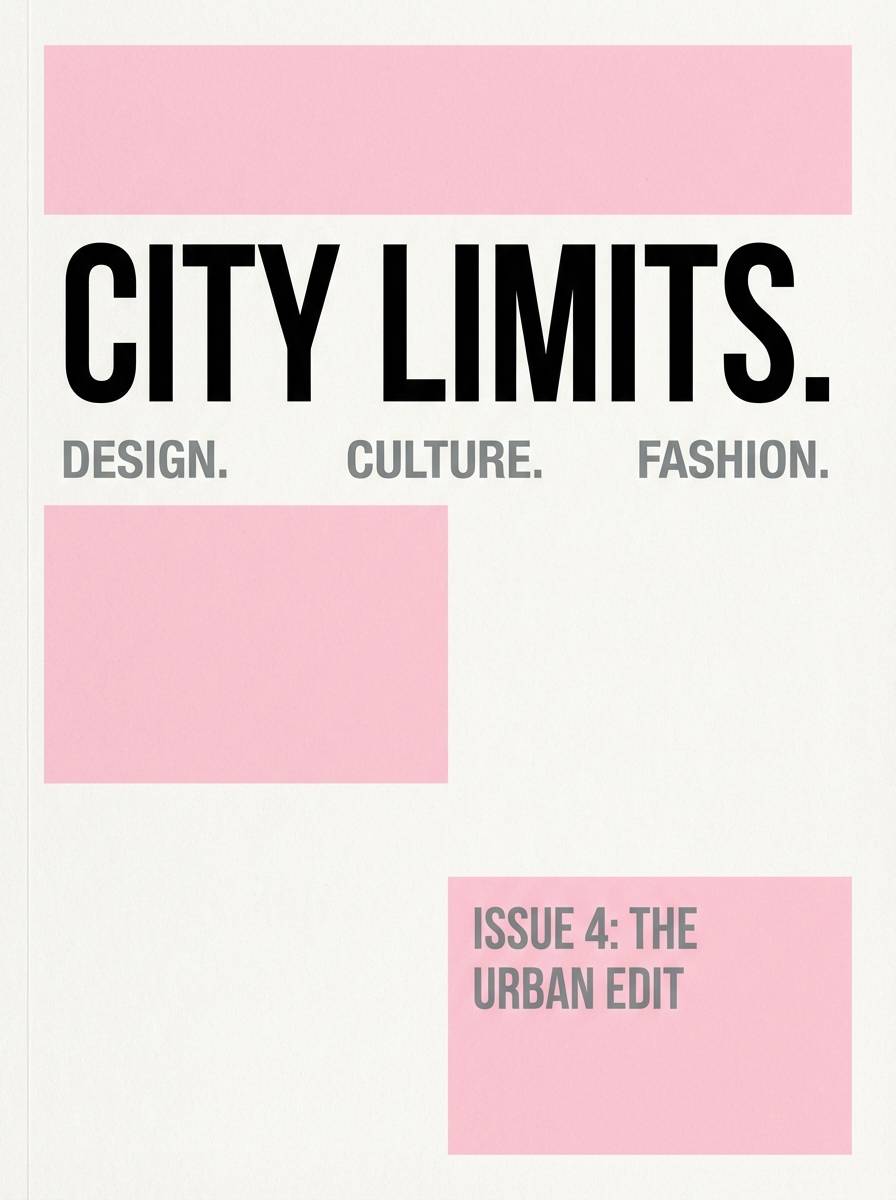
HEX: #F6B4C8 #FFD2DF #FFF7FB #9AA5B1 #2B1D22
Mood: sweet, graphic, high-contrast
Best for: editorial covers and magazine layouts
Sweet blush meets inky contrast for a graphic, editorial punch. The near-white tint gives you clean negative space, while the steel gray supports secondary text and grids. For cherry blossom color combinations with edge, use the near-black for headlines and keep body copy on the lightest backgrounds. A single bold sans-serif family will make it feel current and confident.
Image example of cotton candy ink generated using media.io
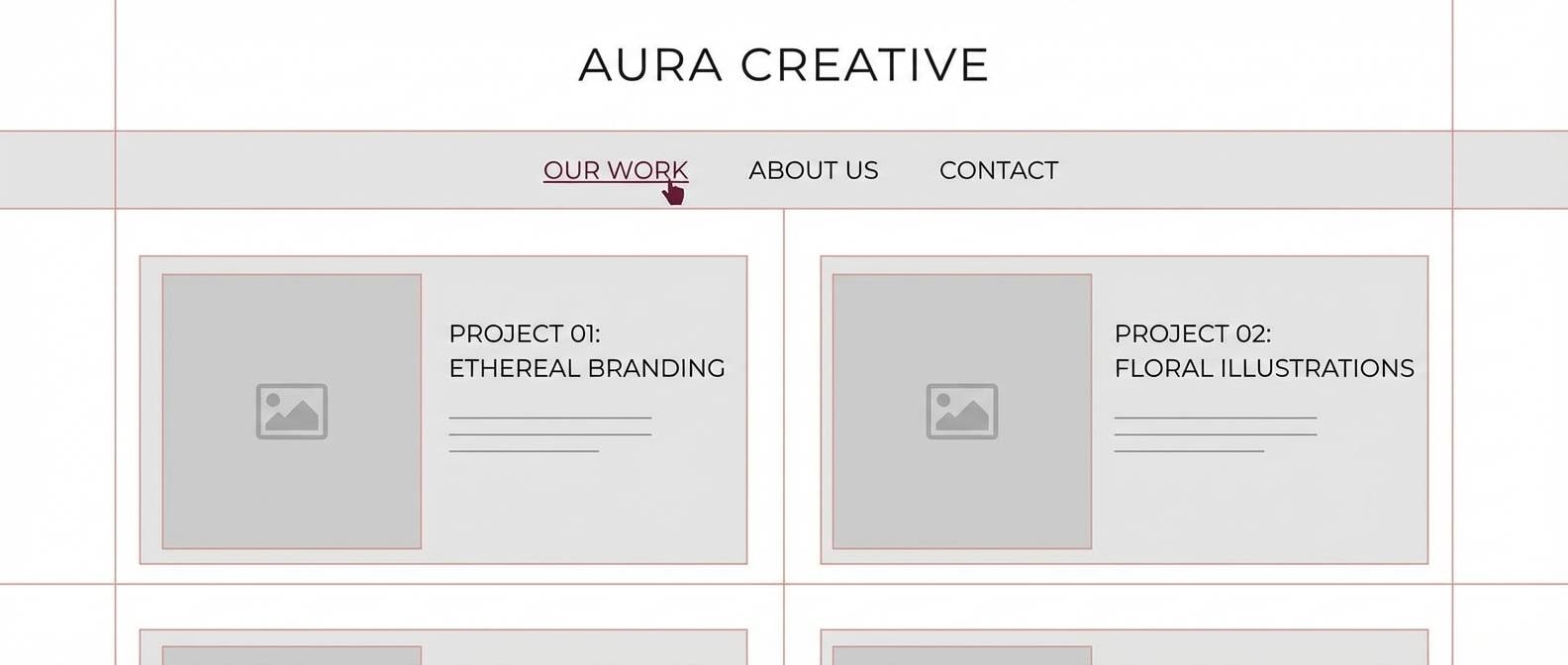
10) Minimal Blossom
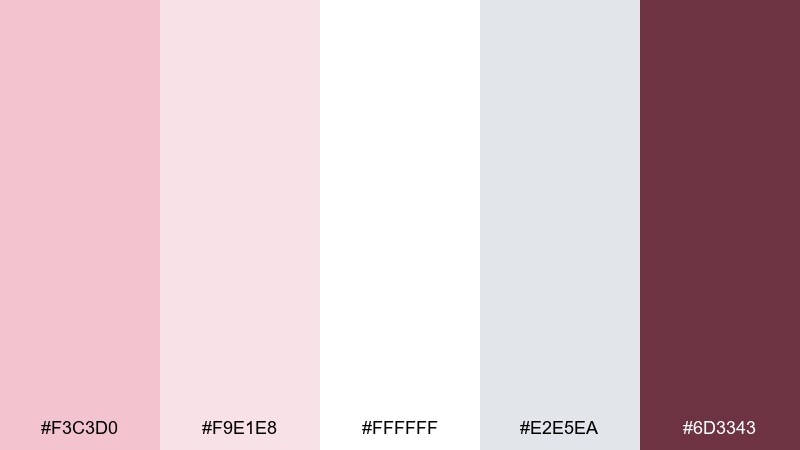
HEX: #F3C3D0 #F9E1E8 #FFFFFF #E2E5EA #6D3343
Mood: minimal, bright, gallery-clean
Best for: portfolio sites and case study pages
Minimal brightness feels like a sunlit gallery wall with a blush tint. White and light gray do the heavy lifting for readability, while pink is best used as a subtle highlight. Keep the wine shade for link states or small separators to avoid making the page feel heavy. Pair with a simple grid and generous margins for a calm, professional look.
Image example of minimal blossom generated using media.io
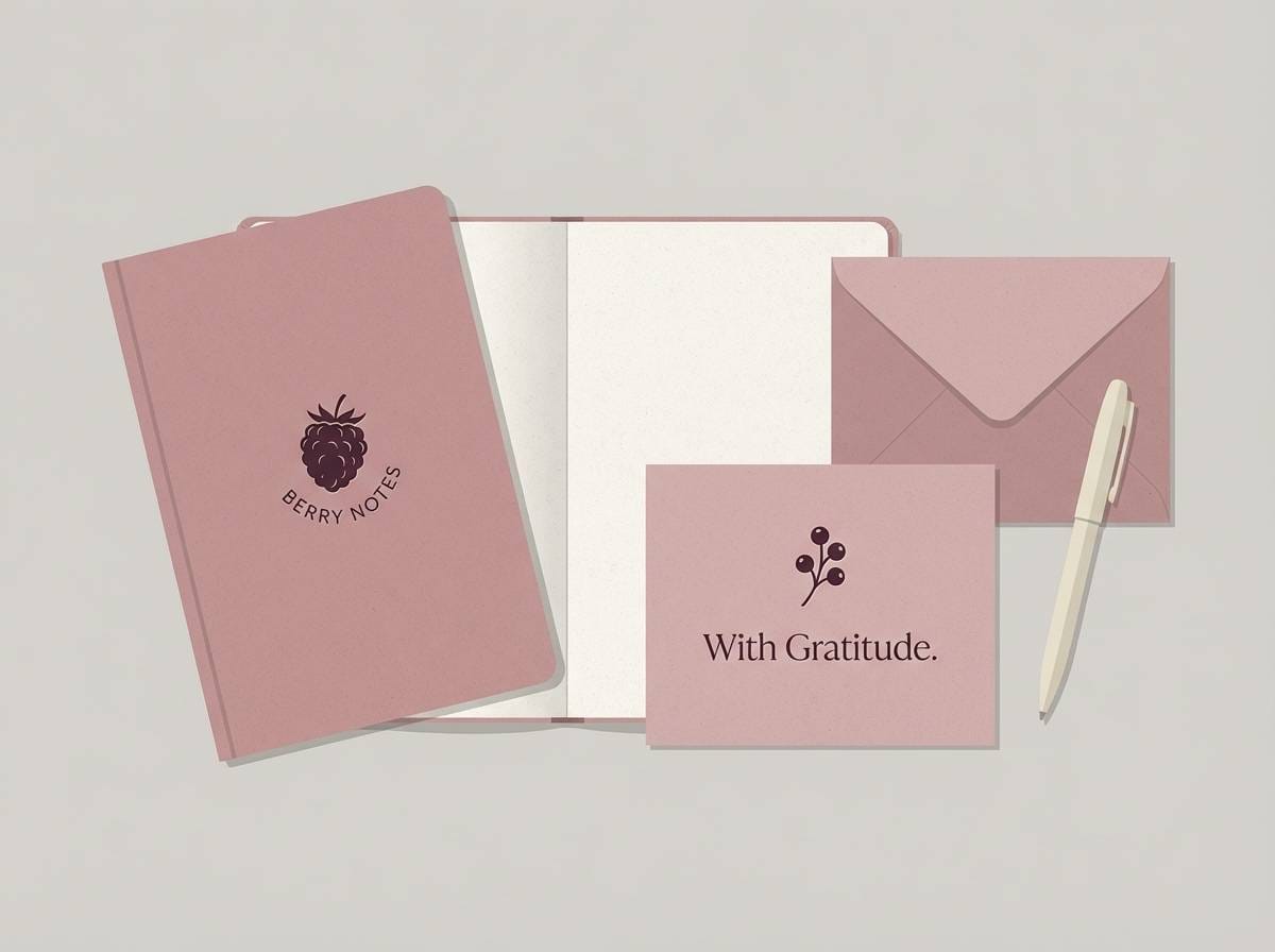
11) Vintage Sakura
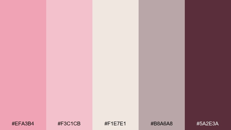
HEX: #EFA3B4 #F3C1CB #F1E7E1 #B8A6A8 #5A2E3A
Mood: nostalgic, dusty, warm
Best for: stationery sets and journal covers
Nostalgic dusty tones evoke pressed flowers tucked into old pages. The warmed neutrals make this palette ideal for paper goods, especially with a subtle grain or recycled stock. Use the taupe-gray for lines and margins to keep writing areas clean and calm. A wax-seal style emblem in the deep berry shade finishes it beautifully.
Image example of vintage sakura generated using media.io
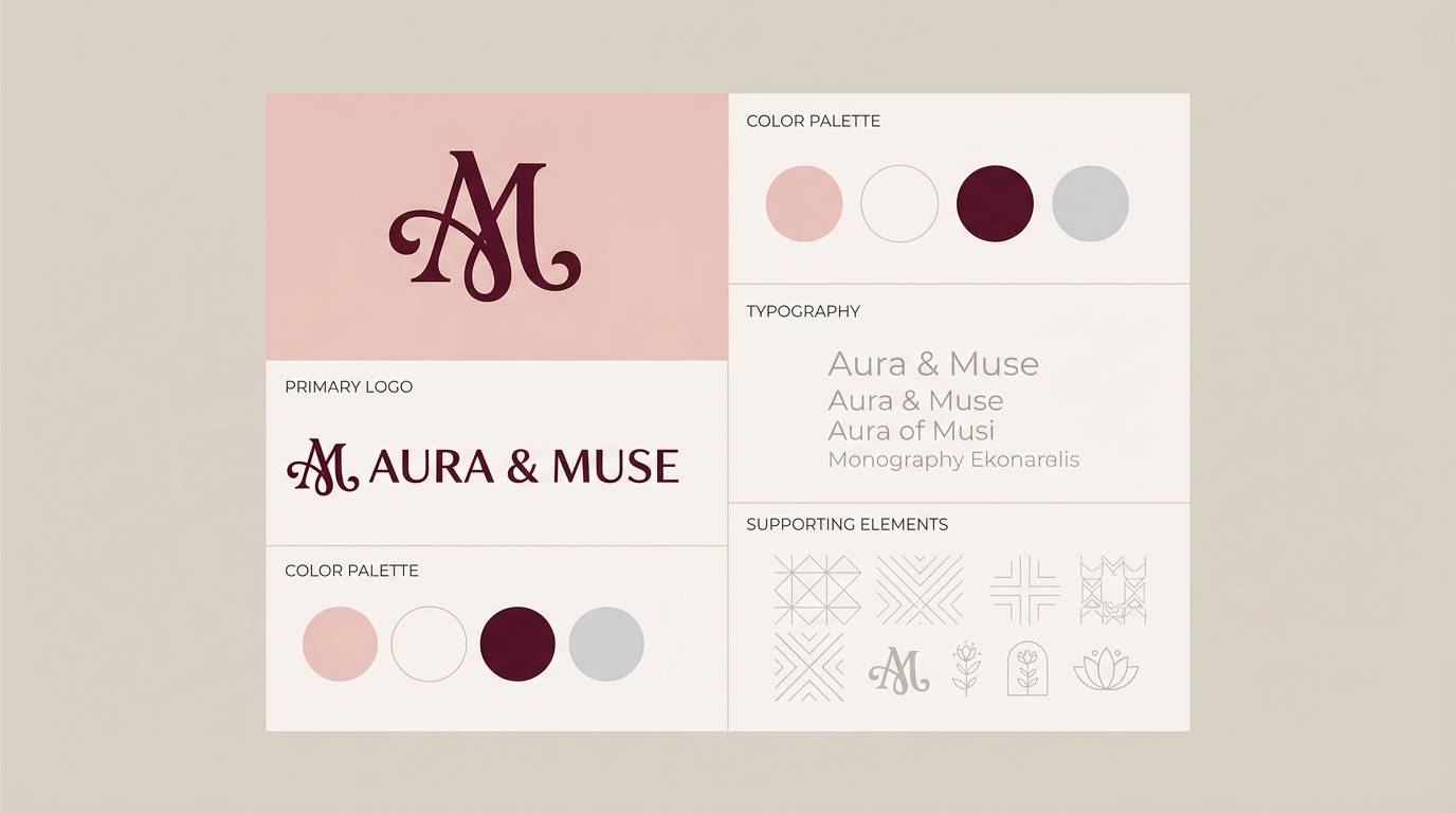
12) Maroon Stem
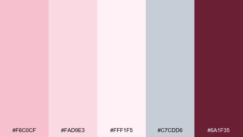
HEX: #F6C0CF #FAD9E3 #FFF1F5 #C7CDD6 #6A1F35
Mood: romantic, grounded, dramatic accents
Best for: logo marks and monogram systems
Romantic softness gets grounded by a dramatic stem-like maroon. The pale tints are perfect for brand backgrounds and applications where you need plenty of breathing room. Reserve the deep maroon for a monogram, seal, or icon so it reads instantly at small sizes. Pair with thin linework and a single secondary neutral to keep the system consistent.
Image example of maroon stem generated using media.io
13) Foggy Orchard
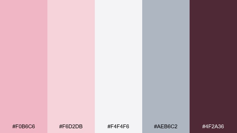
HEX: #F0B6C6 #F6D2DB #F4F4F6 #AEB6C2 #4F2A36
Mood: quiet, cool, early-morning
Best for: presentation decks and keynote themes
Quiet, cool tones resemble an orchard wrapped in early fog. The pale gray-white base keeps slides clean and lets charts breathe. Use blush for section dividers and callouts, then lean on the charcoal-plum for titles to maintain contrast on projectors. Pair with simple icons and thin rules for a crisp, professional deck.
Image example of foggy orchard generated using media.io

14) Pearl Blossom
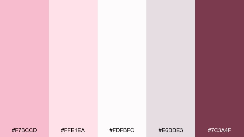
HEX: #F7BCCD #FFE1EA #FDFBFC #E6DDE3 #7C3A4F
Mood: pearly, luminous, elegant
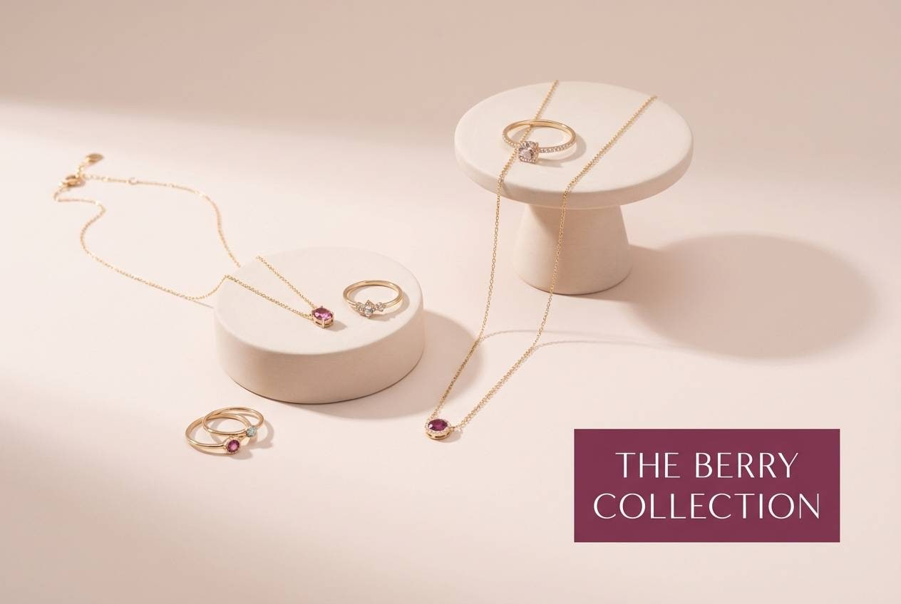
Best for: jewelry product ads and lookbooks
Pearly luminance feels elegant and softly reflective, like satin under studio lights. The lightest shades give you room for product detail, while the mauve-gray adds quiet depth behind typography. Use the berry accent to frame prices or highlight a hero piece without stealing attention. Pair with fine-line borders and minimal copy for a high-end look.
Image example of pearl blossom generated using media.io
15) Sunset Petals
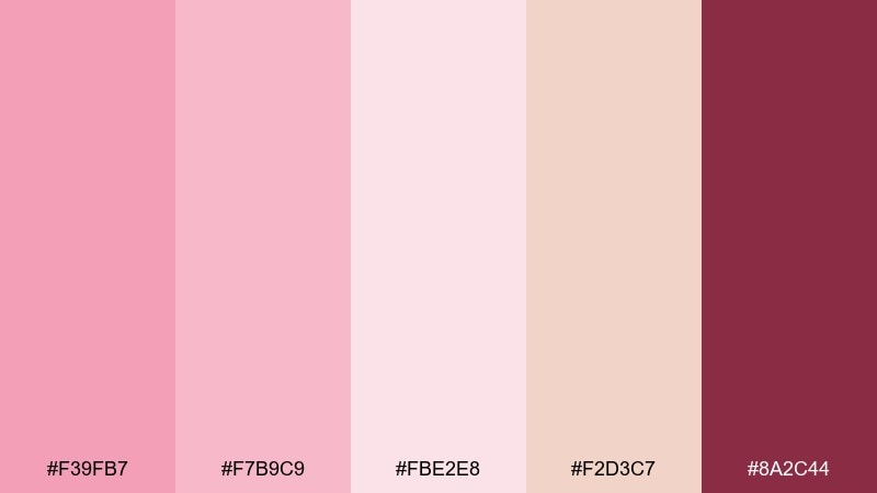
HEX: #F39FB7 #F7B9C9 #FBE2E8 #F2D3C7 #8A2C44
Mood: warm, glowing, celebratory
Best for: spring sale banners and email headers
Warm glow and sunset petals bring a celebratory feel without going neon. The peachy neutral keeps the palette friendly and helps CTAs stand out. If you need a cherry blossom color combination that converts, place the deep raspberry on buttons and limit pink gradients to the header area. Pair with bold, short headlines and generous padding for clarity.
Image example of sunset petals generated using media.io

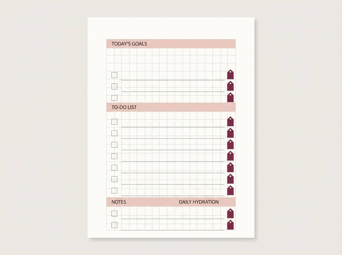
16) Spring Stationery
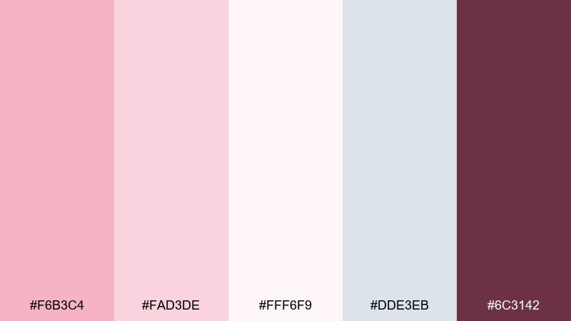
HEX: #F6B3C4 #FAD3DE #FFF6F9 #DDE3EB #6C3142
Mood: light, organized, cheerful
Best for: planner printables and to-do templates
Light, organized tones feel cheerful and easy to work with all week. The near-white and cool gray make checklists readable, while blush adds gentle emphasis to headers. Keep the deep wine shade for due dates or priority tags so your hierarchy stays clear. Pair with dotted lines and rounded boxes for a friendly, printable look.
Image example of spring stationery generated using media.io
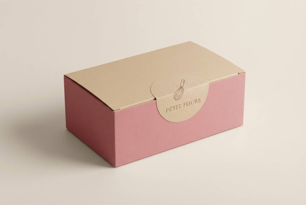
17) Cherry Cream
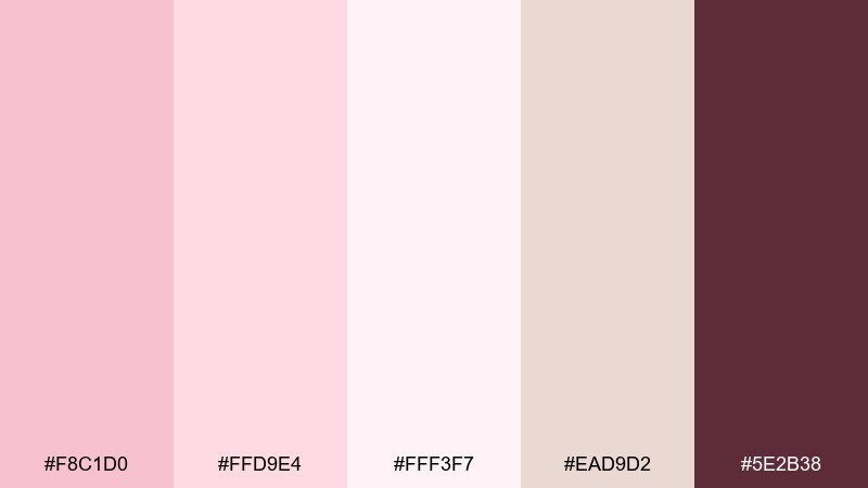
HEX: #F8C1D0 #FFD9E4 #FFF3F7 #EAD9D2 #5E2B38
Mood: sweet, creamy, inviting
Best for: bakery packaging and labels
Sweet, creamy tones evoke frosting swirls and soft paper liners. The warm beige helps the pinks feel edible and natural rather than candy-bright. Use the deep cocoa shade for ingredient text and barcodes so the label stays legible at small sizes. Pair with simple stamp-style icons to keep the packaging charming and affordable.
Image example of cherry cream generated using media.io
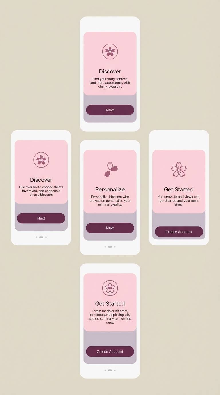
18) Orchid Breeze
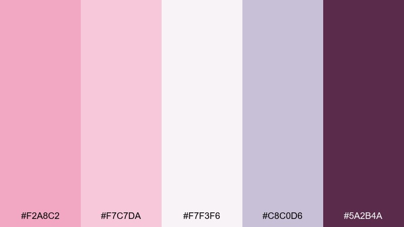
HEX: #F2A8C2 #F7C7DA #F7F3F6 #C8C0D6 #5A2B4A
Mood: fresh, slightly floral, modern
Best for: app onboarding screens
Fresh orchid air meets modern softness with a hint of lilac. The pale base supports clear onboarding copy, while the lavender-gray can define cards and progress steps. Add the deep plum for primary buttons so the action feels confident against the pastel background. A few simple blossom icons will tie it together without feeling themed.
Image example of orchid breeze generated using media.io
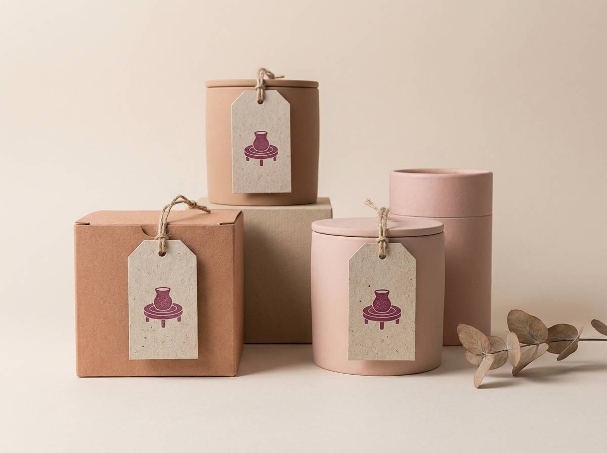
19) Terracotta Bloom
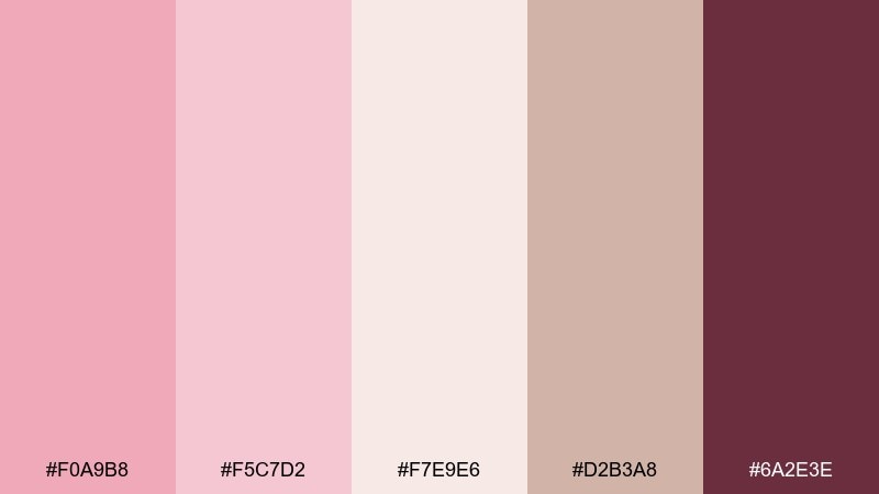
HEX: #F0A9B8 #F5C7D2 #F7E9E6 #D2B3A8 #6A2E3E
Mood: earthy, artisanal, warm
Best for: ceramic brand packaging and product tags
Earthy warmth feels artisanal, like clay tones softened by spring bloom. The terracotta-beige makes the pinks look grounded and mature, ideal for handmade products. Use the deep berry as a small stamp mark or tag string color to add contrast without losing the natural vibe. Pair with uncoated paper textures and minimalist line illustrations.
Image example of terracotta bloom generated using media.io
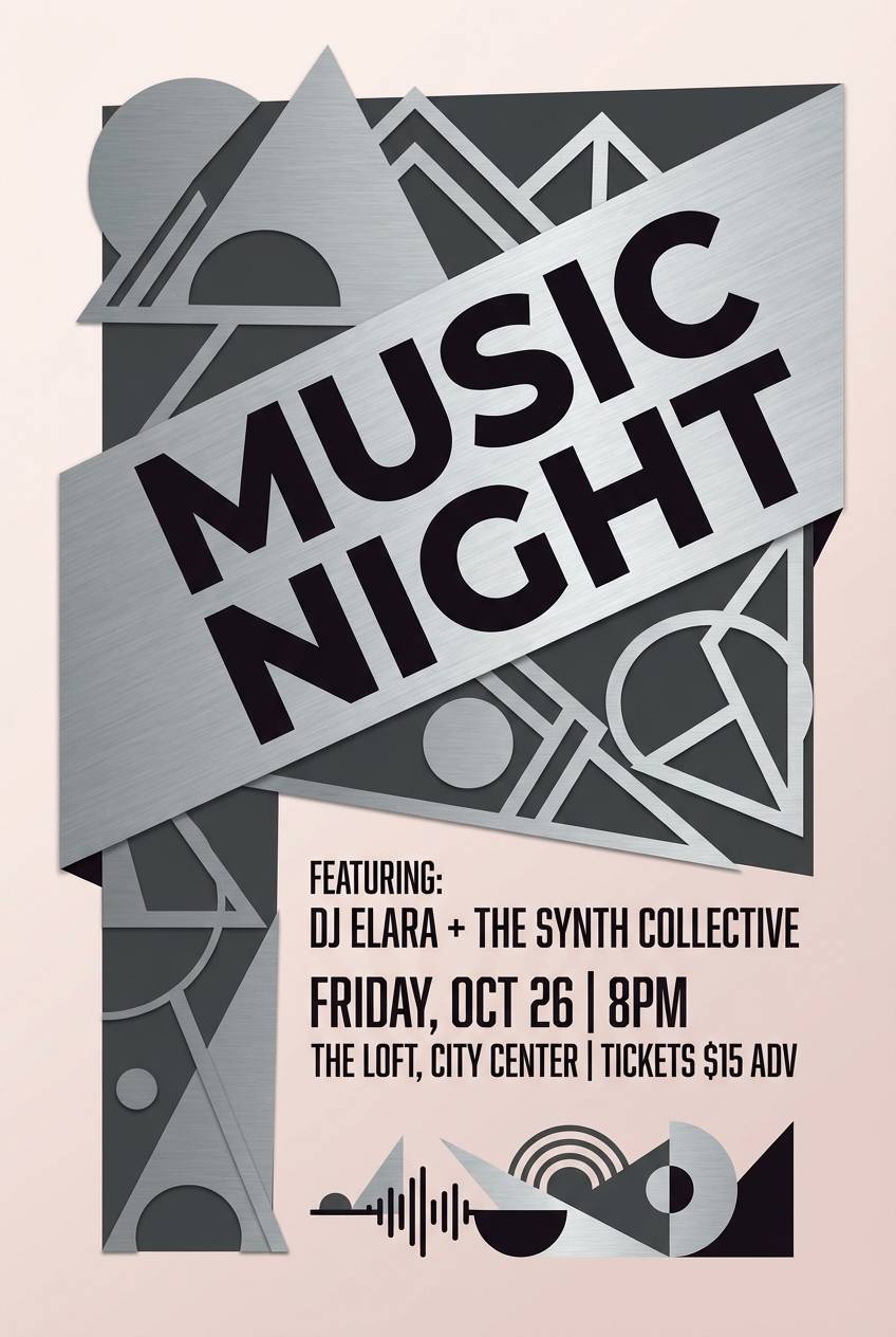
20) Midnight Festival
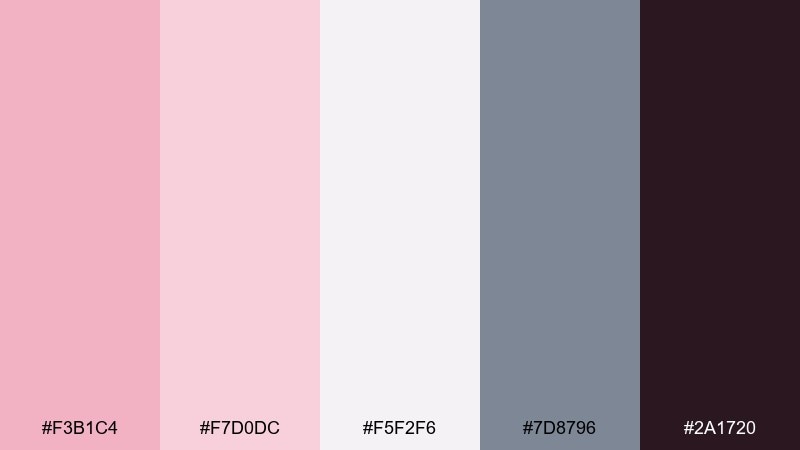
HEX: #F3B1C4 #F7D0DC #F5F2F6 #7D8796 #2A1720
Mood: moody, chic, night-in-spring
Best for: music flyer designs and night event promos
Moody contrast suggests a night festival with petals catching streetlight. The pinks keep it lively while the steel gray and near-black bring club-level drama. Use the darkest shade for type and the lightest tint for negative space so the flyer stays readable. Add a subtle gradient overlay to create depth without introducing extra colors.
Image example of midnight festival generated using media.io
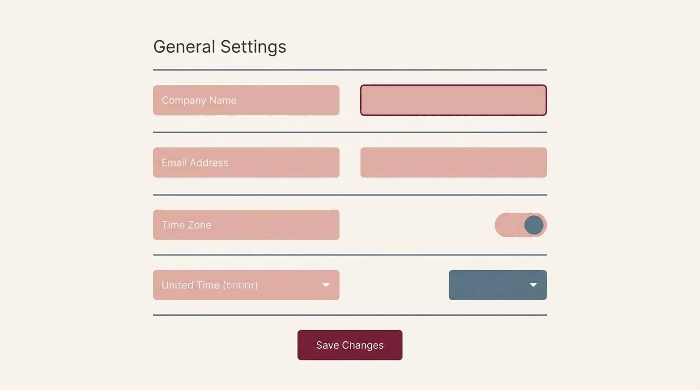
21) Blooming Interface
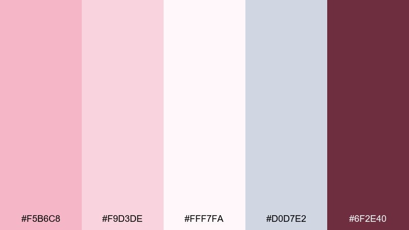
HEX: #F5B6C8 #F9D3DE #FFF7FA #D0D7E2 #6F2E40
Mood: friendly, clear, softly tech
Best for: SaaS settings pages and form UI
Friendly clarity feels softly tech, like a calm settings panel with a blush glow. Light tints work well for input backgrounds, while the cool blue-gray supports borders and toggles. Use the wine shade for focused states, errors, or primary actions to keep accessibility strong. Pair with simple icons and consistent spacing for a trustworthy product feel.
Image example of blooming interface generated using media.io
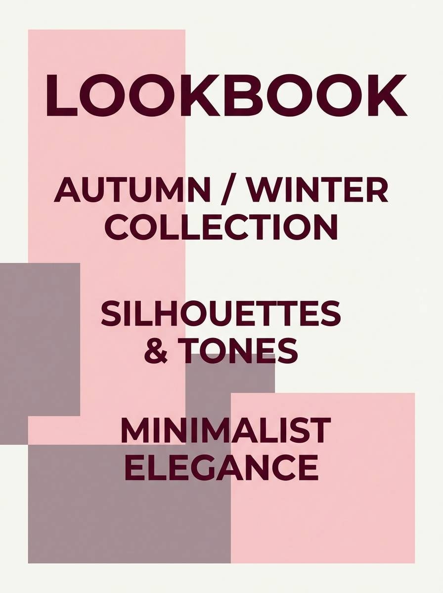
22) Silk Petal Evening
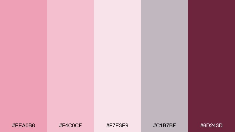
HEX: #EEA0B6 #F4C0CF #F7E3E9 #C1B7BF #6D243D
Mood: luxurious, soft, evening-ready
Best for: fashion lookbooks and boutique ads
Luxurious softness reads like silk petals at dusk. The dusty mauve-gray keeps the palette sophisticated and helps photography overlays feel intentional. For a cherry blossom color palette that suits fashion, use the deep claret for small typographic details and keep the pinks as broad, airy fields. Pair with high-contrast black-and-white imagery for a modern boutique edge.
Image example of silk petal evening generated using media.io
What Colors Go Well with Cherry Blossom?
Cherry blossom pink pairs beautifully with creamy whites and ivory tones, creating a light, romantic base that works across invitations, packaging, and gentle UI.
To modernize it, add cool neutrals like light gray, blue-gray, or soft lilac-gray for structure and legibility—especially in data-heavy layouts or web components.
For contrast, use grounded accents such as maroon, wine, cocoa, or near-black sparingly for headings, buttons, and key details so the palette stays soft but still accessible.
How to Use a Cherry Blossom Color Palette in Real Designs
Start with the lightest tint as your background, then layer mid-pinks for panels, highlights, or decorative shapes. This keeps the design airy and avoids a “flat pink” look.
Choose one dark anchor (maroon/plum/espresso) for typography hierarchy and interactive elements. When the accent is consistent, the palette feels intentional rather than overly sweet.
If you’re designing for screens, test contrast early: reserve deeper shades for buttons and text, and keep large surfaces in near-white or very pale blush to maintain readability.
Create Cherry Blossom Palette Visuals with AI
Want to see these cherry blossom color combinations applied to posters, packaging, or UI mockups? Generate fast concept visuals so you can compare styles before committing to a final design.
With Media.io’s Text to Image, you can paste a prompt, describe the layout, and iterate on mood (minimal, editorial, watercolor, premium) while keeping your palette direction consistent.
Use the prompts above as a starting point, then swap keywords like “wedding invitation,” “dashboard,” or “lookbook” to match your project.
Cherry Blossom Color Palette FAQs
-
What is a cherry blossom color palette?
A cherry blossom color palette typically blends soft pinks (sakura/blush) with airy whites or ivories, then adds a cool neutral (light gray/blue-gray) and a deeper accent (maroon, plum, or espresso) for contrast. -
Is cherry blossom pink good for branding?
Yes—cherry blossom tones can feel premium and modern when paired with clean whites and a dark anchor color. It’s especially strong for beauty, lifestyle, wellness, cafes, and boutique brands. -
What dark accent works best with cherry blossom?
Wine, maroon, plum, and espresso are the most reliable accents. They add readability for headlines and CTAs without overpowering the delicate pink base. -
How do I keep a cherry blossom palette from looking too “cute”?
Reduce saturation, lean on bone/ivory and cool gray surfaces, and use a strong dark neutral for typography. Minimal layouts, generous spacing, and a single modern type family also help. -
Can I use cherry blossom colors for UI design?
Definitely. Use near-white or very pale blush for backgrounds, cool gray for borders and cards, and a deeper wine/plum for primary actions and focus states to maintain accessible contrast. -
What colors go well with cherry blossom besides gray?
Ivory, warm beige, oatmeal, muted sage/green-gray, and lilac-gray all complement cherry blossom pink. Choose based on whether you want the design to feel warmer (beige) or more modern (cool gray/lilac-gray). -
How can I generate cherry blossom palette mockups quickly?
Use Media.io’s AI Text to Image tool with a clear prompt (e.g., “menu design,” “packaging set,” or “dashboard UI”) and specify cherry blossom tones plus your chosen neutrals and dark accent.


