

Pastel green is a go-to color family for designs that need to feel fresh, gentle, and modern without looking loud. It’s especially useful when you want calm backgrounds, clean UI surfaces, or soft branding that still reads as “premium.”
Below are 20 ready-to-use pastel green color palette ideas with HEX codes, mood notes, and practical pairing tips for branding, UI, and print.
In this article
- Why Pastel Green Palettes Work So Well
-
- mint meadow
- seafoam linen
- pistachio cream
- sage whisper
- matcha latte
- spring terrace
- celadon ceramic
- aloe vera glow
- eucalyptus fog
- pear sorbet
- garden party pastels
- bamboo minimal
- coastal greenhouse
- soft fern clay
- dewdrop morning
- herbal apothecary
- retro gelato
- scandinavian sage
- botanical stationery
- aurora pastel greens
- What Colors Go Well with Pastel Green?
- How to Use a Pastel Green Color Palette in Real Designs
- Create Pastel Green Palette Visuals with AI
Why Pastel Green Palettes Work So Well
Pastel green sits in a “safe” zone between color and neutral: it adds life to a layout without overpowering content. That makes it ideal for brands and interfaces that want to feel clean, friendly, and trustworthy.
Because it’s naturally associated with freshness, nature, and balance, pastel green palettes are easy to adapt across industries—from wellness and skincare to finance dashboards and editorial layouts.
Practically, pastel green also pairs well with warm creams, soft blush tones, and deeper green accents. This gives you enough contrast for readability while keeping the overall aesthetic soft.
20+ Pastel Green Color Palette Ideas (with HEX Codes)
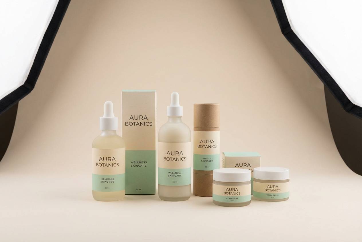
1) Mint Meadow

HEX: #BFE7D2 #EAF7F1 #A9D6C5 #F3E7D6 #6D8F87
Mood: airy, fresh, calm
Best for: wellness brand identity and packaging
Airy and dewy like morning light over a meadow, these minty greens feel instantly calming. Use the pale tones as a clean base, then anchor layouts with the deep eucalyptus accent for legibility. Pair beautifully with warm oatmeal neutrals for labels, boxes, and tissue paper. Tip: keep type in the dark green and let the mint stay for blocks and highlights.
Image example of mint meadow generated using media.io
Media.io is an online AI studio for creating and editing video, image, and audio in your browser.

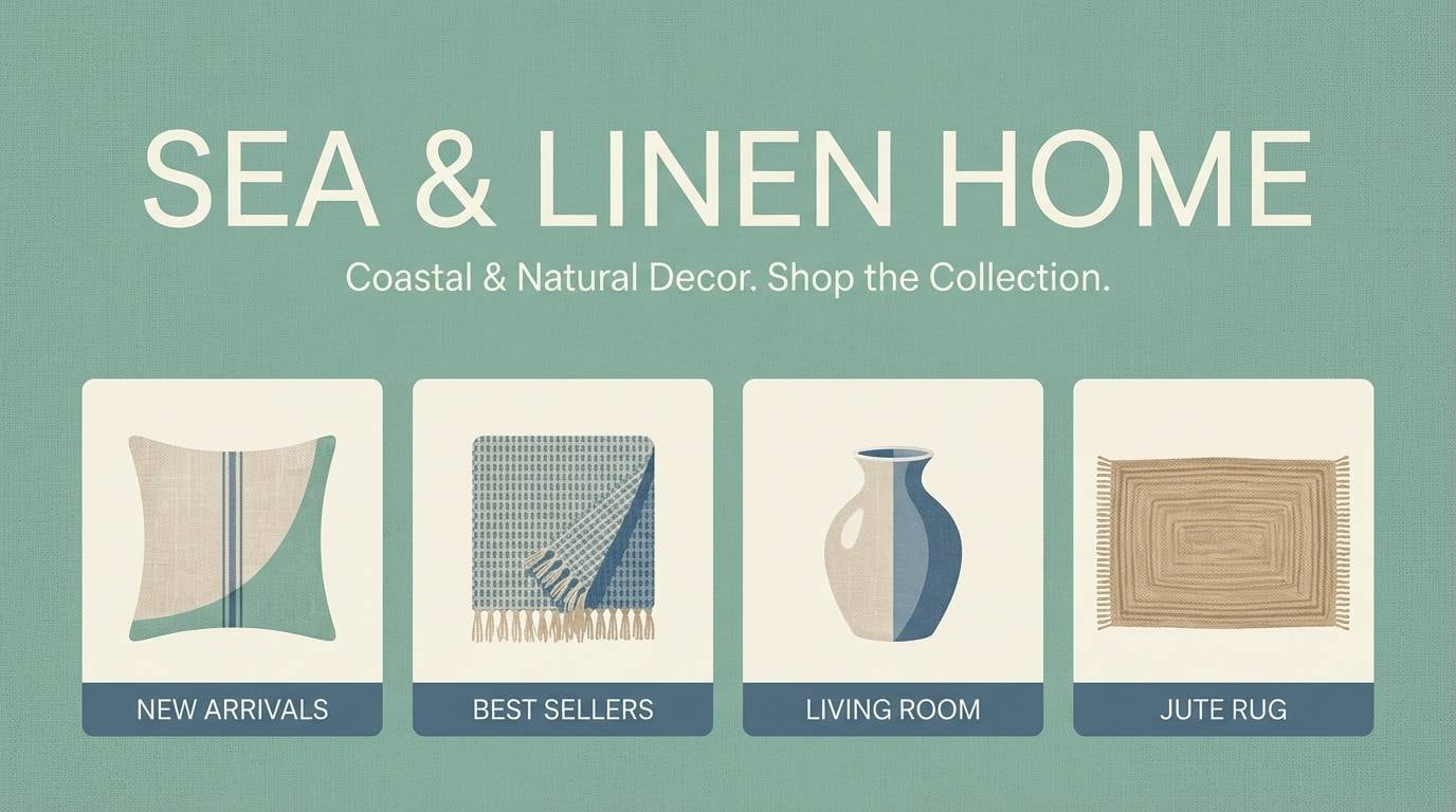
2) Seafoam Linen
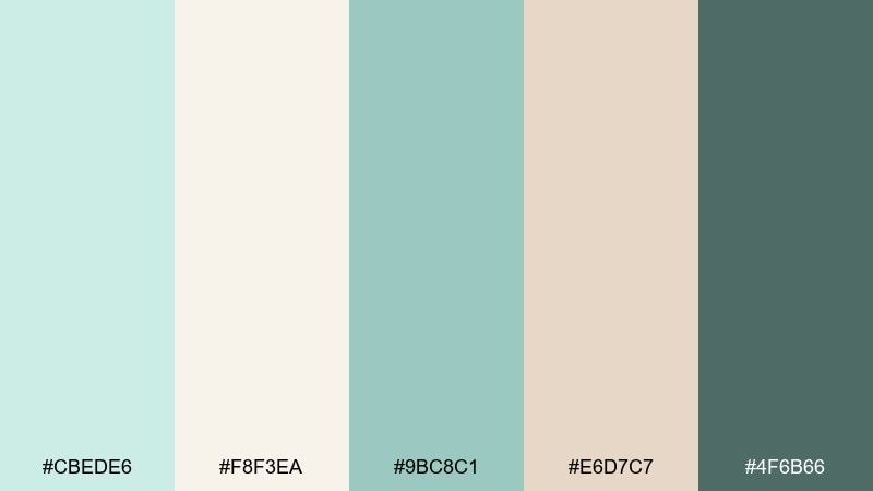
HEX: #CBEDE6 #F8F3EA #9BC8C1 #E6D7C7 #4F6B66
Mood: coastal, relaxed, understated
Best for: home decor e-commerce banners
Coastal and breathable, this seafoam set reads like sun-washed linen and salty air. It works best with plenty of negative space and soft shadows to keep everything feeling light. Use the darker teal-gray for pricing and CTAs so the pastels stay gentle. Tip: add texture overlays like paper grain to make the neutrals feel tactile.
Image example of seafoam linen generated using media.io
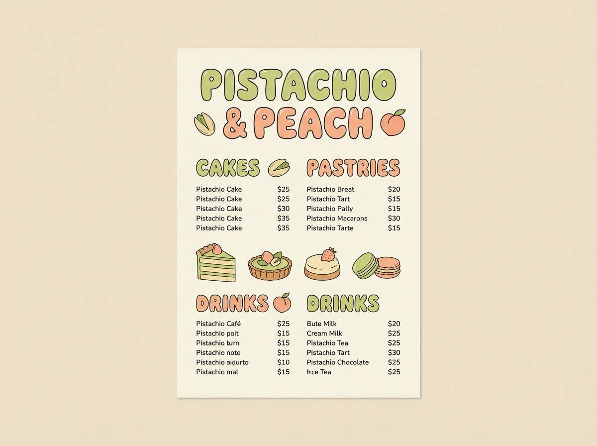
3) Pistachio Cream
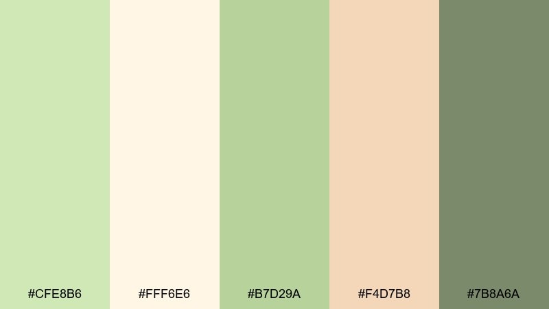
HEX: #CFE8B6 #FFF6E6 #B7D29A #F4D7B8 #7B8A6A
Mood: sweet, sunny, playful
Best for: ice cream shop menu and poster
Sweet and sunny like pistachio gelato on a warm afternoon, these tones feel cheerful without getting loud. The creamy off-white keeps menus readable, while the peachy accent adds appetite appeal. Pair with rounded type and simple iconography for a friendly vibe. Tip: reserve the peach for callouts like new flavors or limited-time badges.
Image example of pistachio cream generated using media.io
4) Sage Whisper
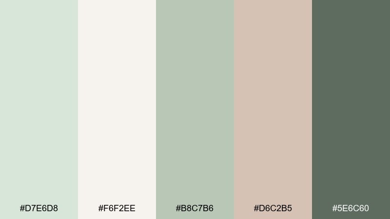
HEX: #D7E6D8 #F6F2EE #B8C7B6 #D6C2B5 #5E6C60
Mood: quiet, elegant, balanced
Best for: wedding invitation suite
Quiet and romantic, these sage notes evoke pressed leaves and soft paper stationery. The warm blush-taupe keeps the greens from feeling cold, making it ideal for formal scripts and monograms. Use the deepest shade for names and headings to avoid low contrast. Tip: emboss or foil in a muted champagne to elevate the look without overpowering the palette.
Image example of sage whisper generated using media.io
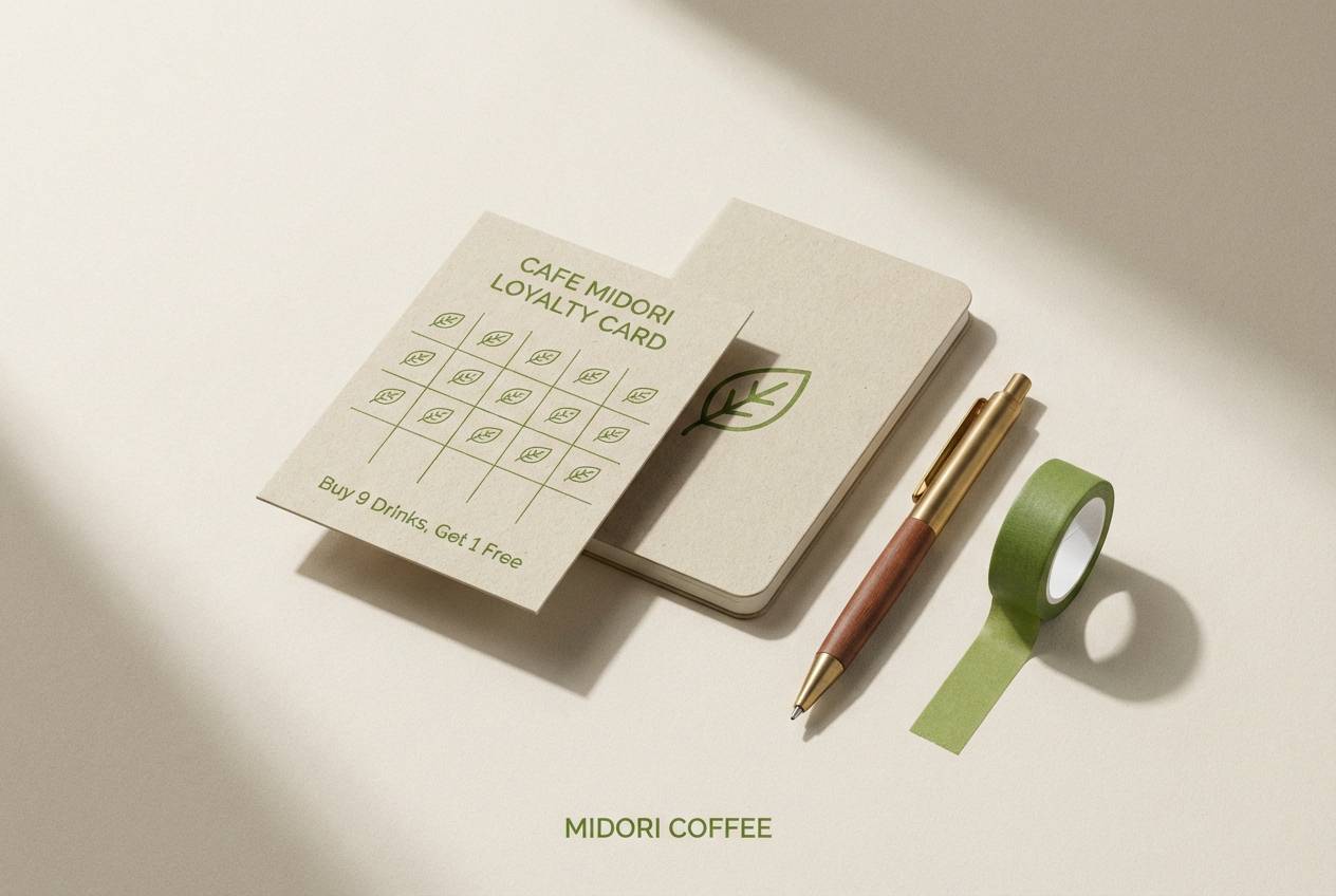
5) Matcha Latte
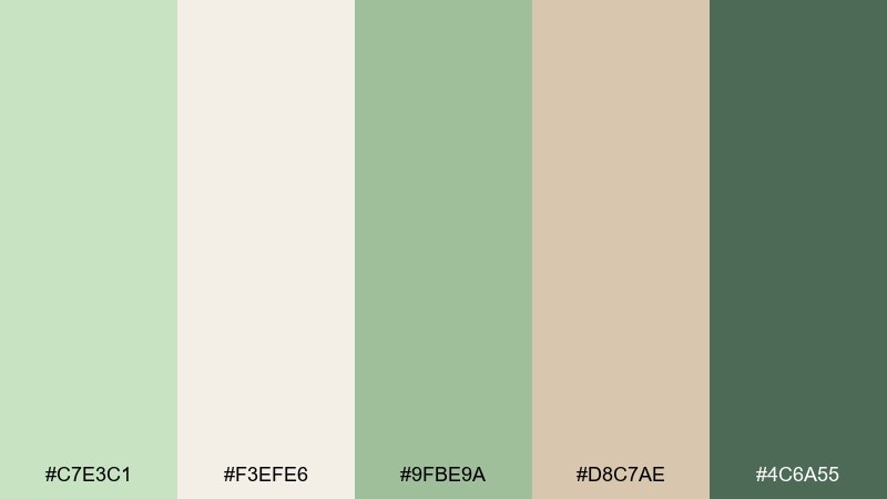
HEX: #C7E3C1 #F3EFE6 #9FBE9A #D8C7AE #4C6A55
Mood: cozy, earthy, modern
Best for: cafe brand kit and loyalty card
Cozy and grounded like a warm matcha latte, this mix blends soft greens with toasted beige. It shines in small-format print where the neutrals keep clutter down and the green feels intentional. Pair with charcoal line art and kraft textures for an approachable craft feel. Tip: keep the darkest green for stamps, icons, and punch marks to maintain clarity.
Image example of matcha latte generated using media.io
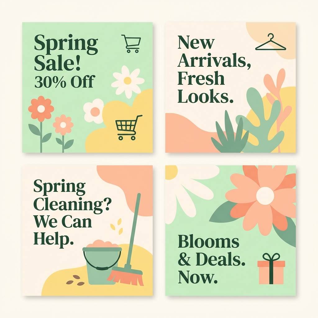
6) Spring Terrace
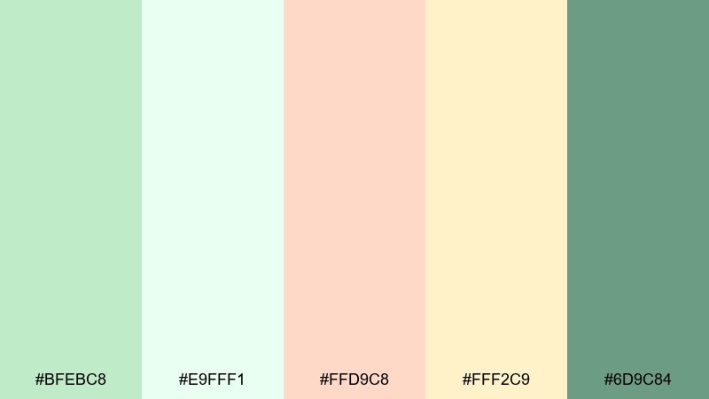
HEX: #BFEBC8 #E9FFF1 #FFD9C8 #FFF2C9 #6D9C84
Mood: bright, optimistic, youthful
Best for: spring social media campaign
Bright and upbeat, these colors feel like tulips on a sunlit terrace after rain. The peach and butter accents add friendly warmth, making posts feel inviting and shareable. Use the mint for backgrounds and the deeper green for headlines and buttons. Tip: keep photo overlays subtle so the pastels stay clean rather than washed out.
Image example of spring terrace generated using media.io
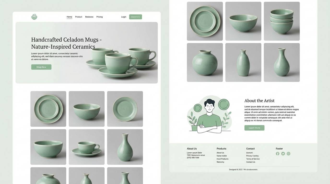
7) Celadon Ceramic
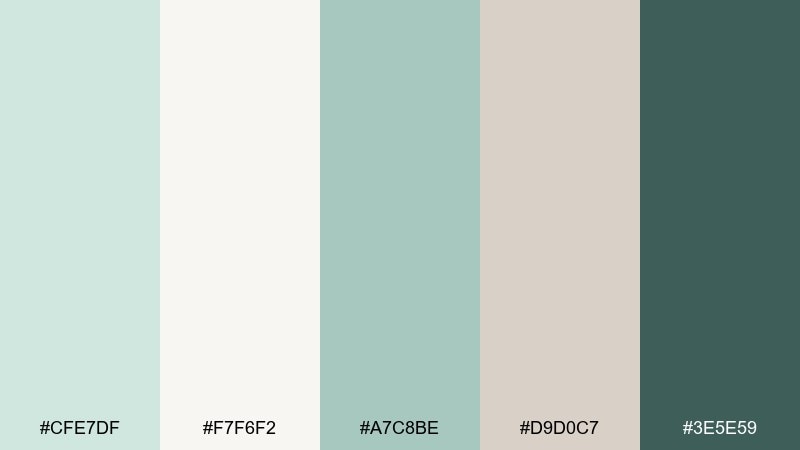
HEX: #CFE7DF #F7F6F2 #A7C8BE #D9D0C7 #3E5E59
Mood: refined, artisanal, serene
Best for: product landing page for ceramics
Refined and artisanal, these celadon tones evoke glazed pottery and a quiet studio shelf. The cool neutrals help product photos feel premium while still soft. Use the deep green as a strong UI anchor for nav, price, and key actions. Tip: combine with thin dividers and generous spacing to echo handcrafted simplicity.
Image example of celadon ceramic generated using media.io
8) Aloe Vera Glow
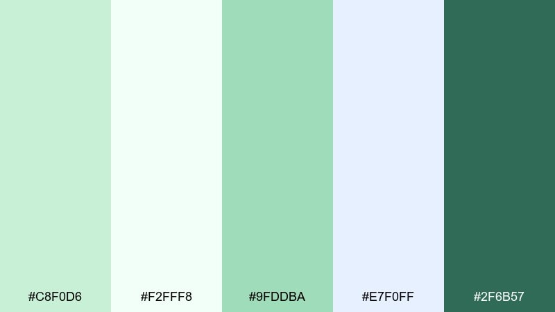
HEX: #C8F0D6 #F2FFF8 #9FDDBA #E7F0FF #2F6B57
Mood: clean, hydrated, clinical-calm
Best for: skincare product ad creative
Clean and hydrated, this set feels like aloe gel, cool water, and bright bathroom light. The icy blue-white keeps it crisp, while the deeper green adds confident contrast for claims and ingredient callouts. Pair with sans-serif typography and simple droplet shapes for a fresh, modern look. Tip: use the darkest tone sparingly to avoid turning the ad too heavy.
Image example of aloe vera glow generated using media.io
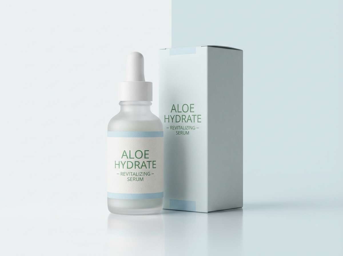
9) Eucalyptus Fog
HEX: #D6E8E1 #F7F4F0 #B2C7BE #C8BDB5 #556864
Mood: misty, spa-like, soothing
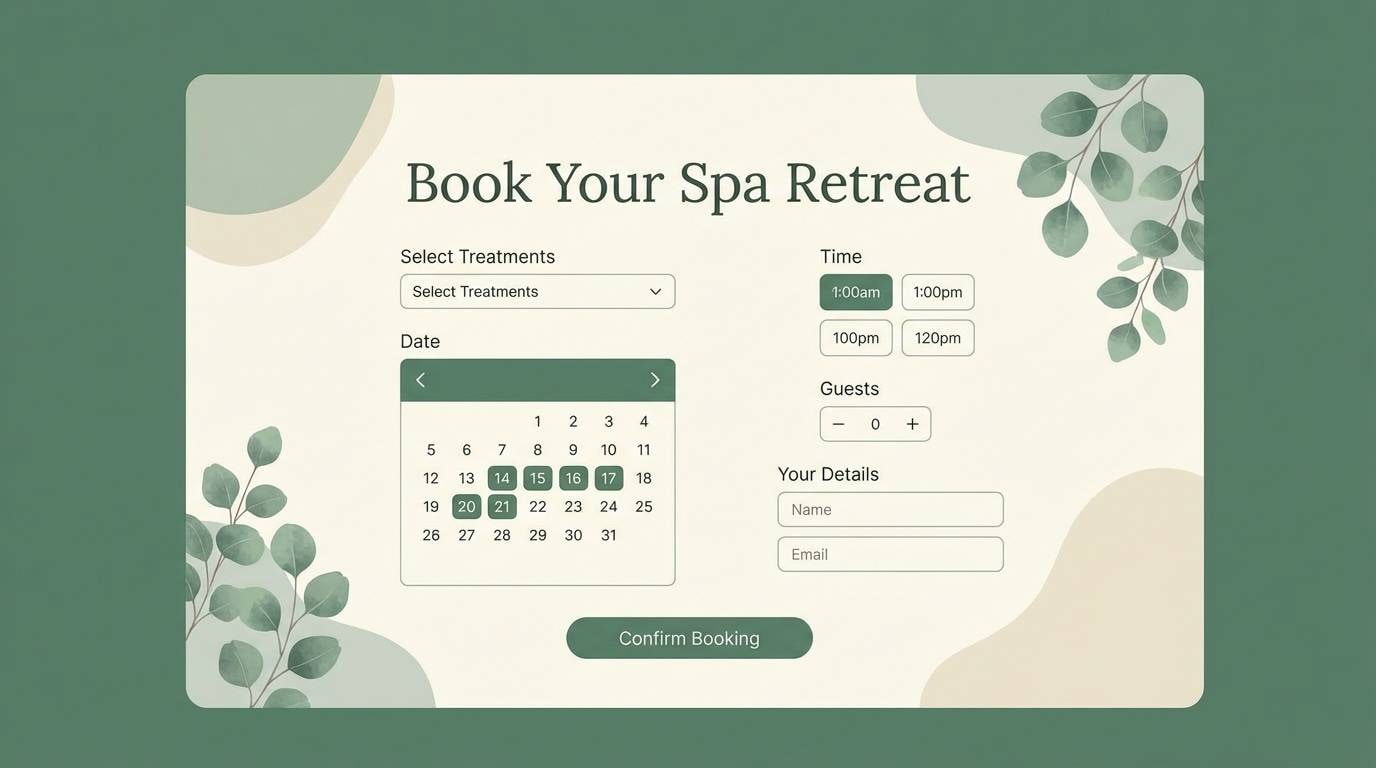
Best for: spa website UI and booking flow
Misty and spa-like, these eucalyptus shades feel like steam, stone, and soft towels. The muted taupe warms up the greens so the interface stays welcoming. This palette works well for calendars and forms where subtle borders matter. Tip: use the deepest tone for focused states and primary buttons to keep the booking flow clear.
Image example of eucalyptus fog generated using media.io
10) Pear Sorbet
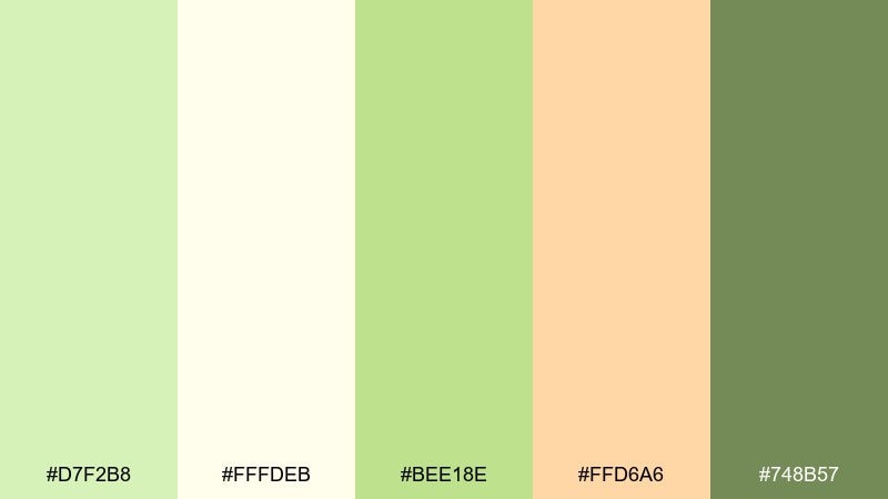
HEX: #D7F2B8 #FFFDEB #BEE18E #FFD6A6 #748B57
Mood: zesty, light, friendly
Best for: summer event flyer
Zesty and light, this set brings to mind pear sorbet, lemonade, and sunlit paper. The buttery cream keeps layouts readable, while the apricot accent adds a fun punch for dates and tickets. Pair with bold headings and simple geometric shapes for quick scanning. Tip: keep body text in the darker olive so the bright greens remain airy.
Image example of pear sorbet generated using media.io

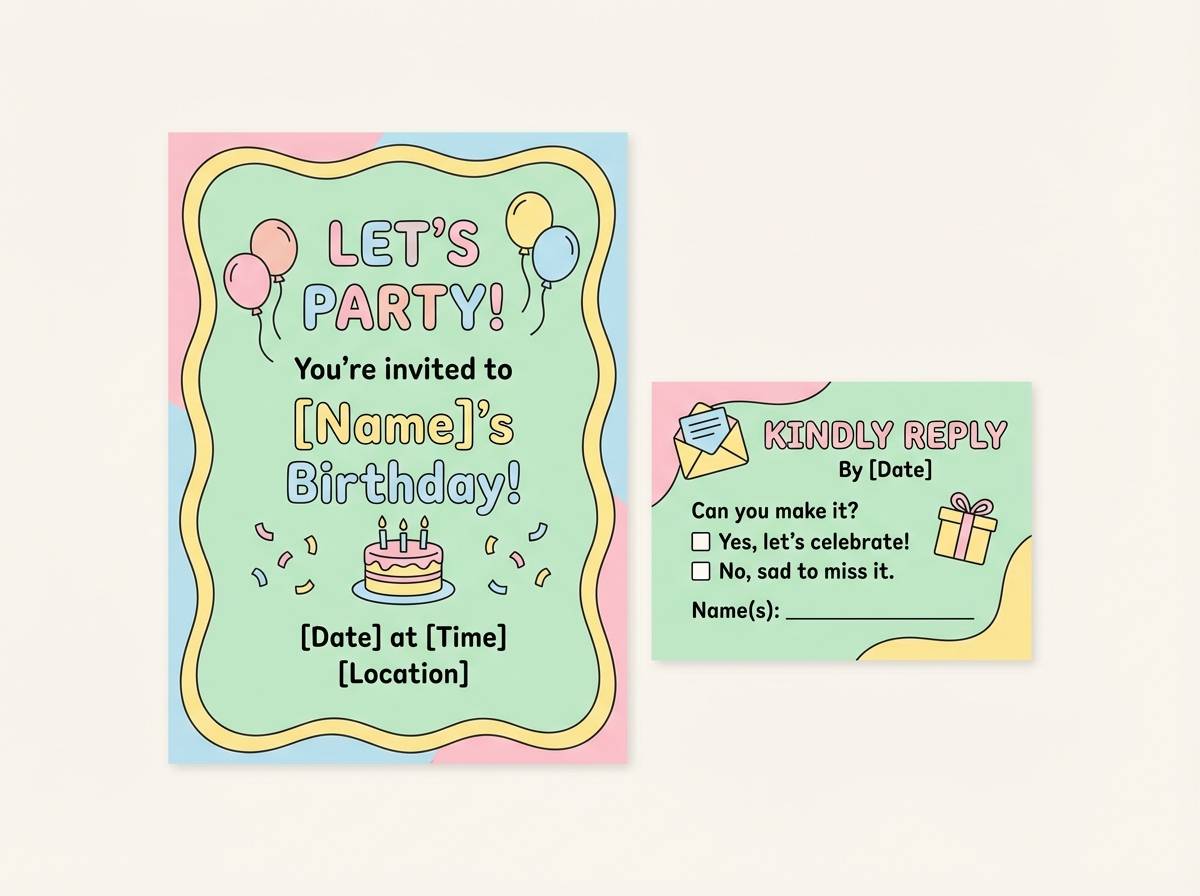
11) Garden Party Pastels
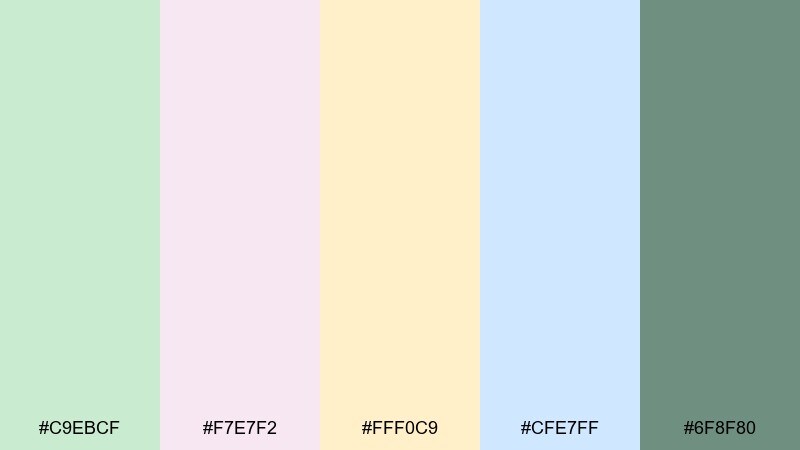
HEX: #C9EBCF #F7E7F2 #FFF0C9 #CFE7FF #6F8F80
Mood: festive, soft, charming
Best for: birthday invitation and RSVP card
Festive and charming, these tones feel like a garden party with pastel balloons and fresh petals. The gentle contrast makes it easy to mix playful illustrations with clean type. Use the green as the main canvas and rotate the pink, butter, and sky accents for sections. Tip: stick to one accent per card side to keep the suite cohesive.
Image example of garden party pastels generated using media.io
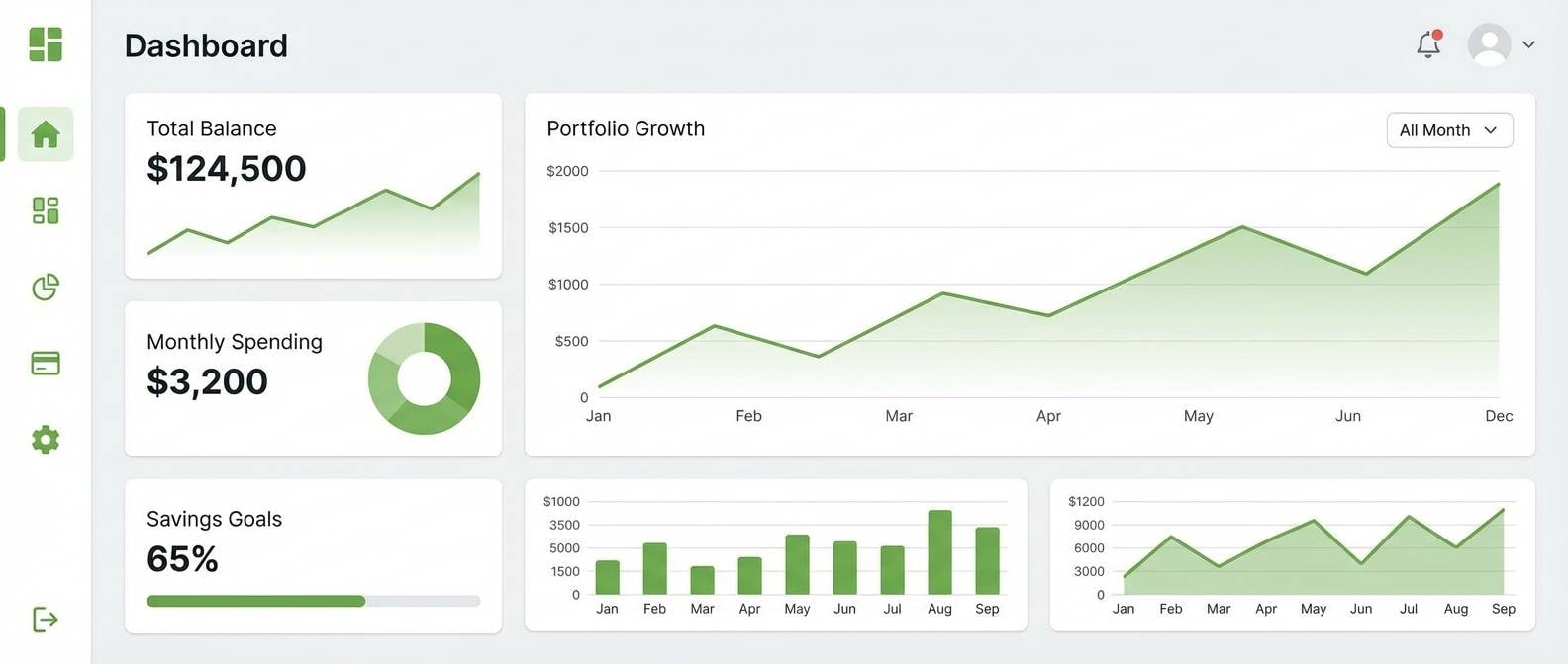
12) Bamboo Minimal
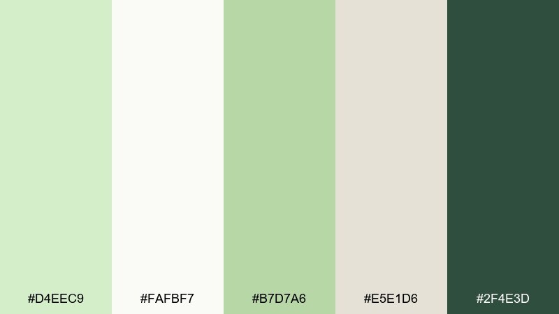
HEX: #D4EEC9 #FAFBF7 #B7D7A6 #E5E1D6 #2F4E3D
Mood: minimal, modern, mindful
Best for: finance dashboard UI
Minimal and mindful, these bamboo-like greens read clean and modern without feeling sterile. As a pastel green color scheme, it supports long sessions on dashboards by keeping contrast soft yet usable. Pair with light gray dividers and reserve the dark green for totals, alerts, and primary actions. Tip: use subtle tint backgrounds for card components instead of hard borders.
Image example of bamboo minimal generated using media.io
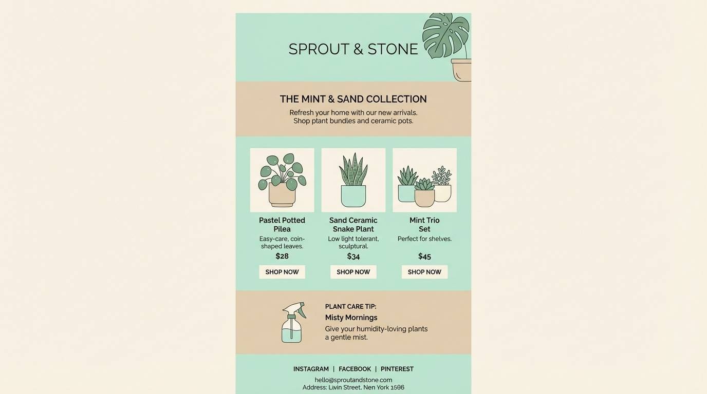
13) Coastal Greenhouse
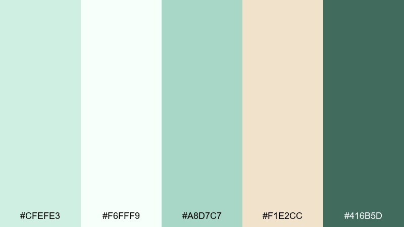
HEX: #CFEFE3 #F6FFF9 #A8D7C7 #F1E2CC #416B5D
Mood: fresh, botanical, breezy
Best for: plant shop email newsletter
Fresh and breezy, these hues evoke a coastal greenhouse with bright glass and leafy cuttings. The warm sand neutral keeps the greens from drifting too cool in email layouts. Use the lightest mint for sections and the deeper green for headings and links. Tip: keep button styles simple so product photography stays the hero.
Image example of coastal greenhouse generated using media.io
14) Soft Fern Clay
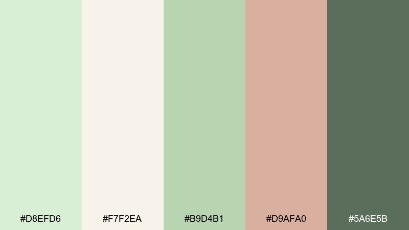
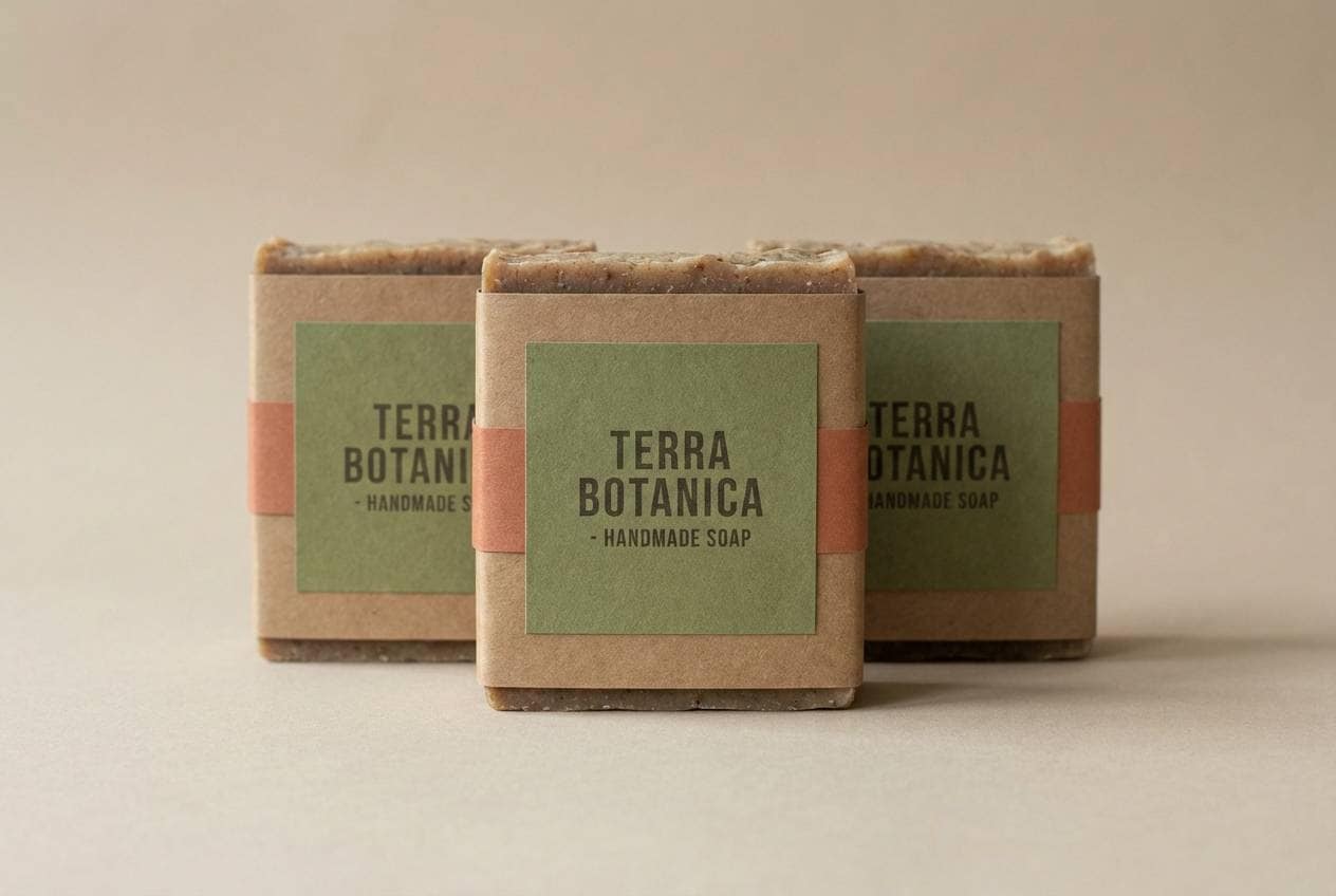
HEX: #D8EFD6 #F7F2EA #B9D4B1 #D9AFA0 #5A6E5B
Mood: natural, warm, artisan
Best for: handmade soap packaging
Natural and warm, this pairing feels like fern fronds against sun-baked clay. These pastel green color combinations work especially well on textured stocks and kraft boxes where the blush note adds handcrafted charm. Pair with simple botanical line drawings and a deep green logo for contrast. Tip: print the blush as a small seal or band to avoid overpowering the calm greens.
Image example of soft fern clay generated using media.io
15) Dewdrop Morning
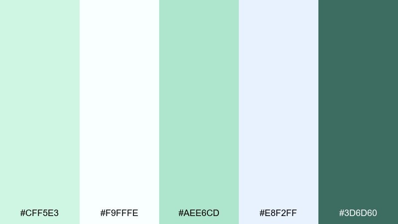
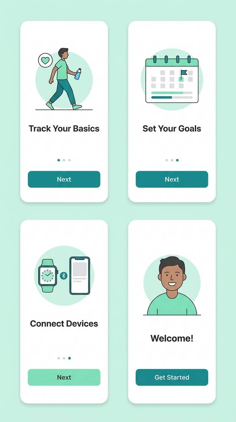
HEX: #CFF5E3 #F9FFFE #AEE6CD #E8F2FF #3D6D60
Mood: crisp, refreshing, light
Best for: health app onboarding screens
Crisp and refreshing, these colors feel like dew drops on glass with a hint of sky. The near-white background keeps onboarding screens bright, while mint and teal guide the eye through steps. Pair with rounded cards and gentle gradients for a modern, friendly vibe. Tip: use the deep teal only for primary CTAs to maintain a calm first impression.
Image example of dewdrop morning generated using media.io
16) Herbal Apothecary
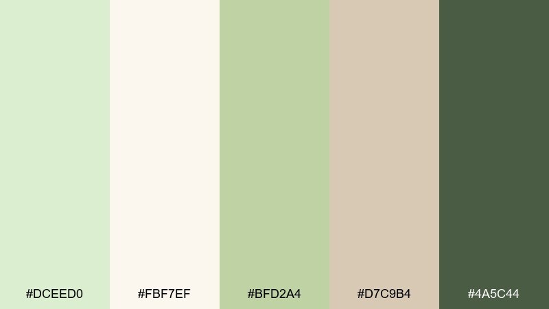
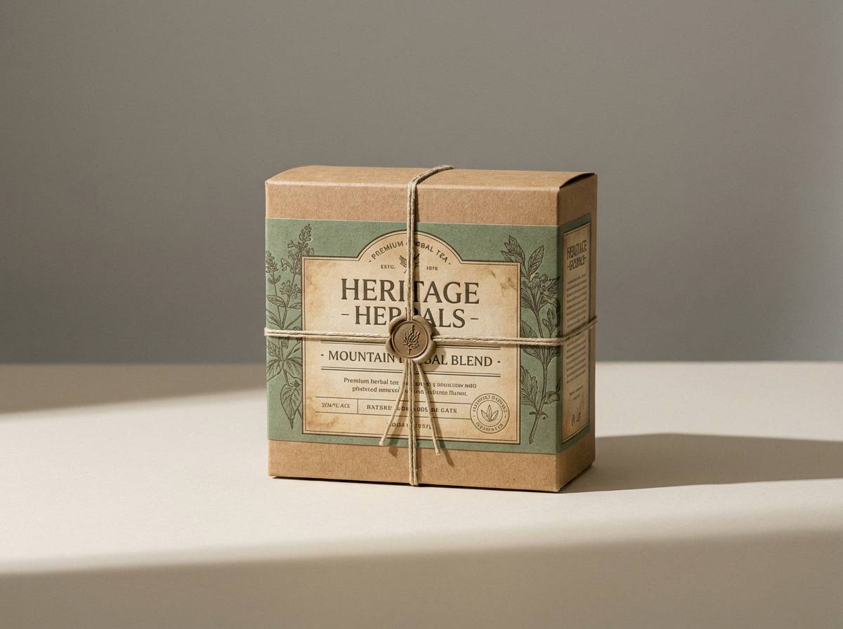
HEX: #DCEED0 #FBF7EF #BFD2A4 #D7C9B4 #4A5C44
Mood: vintage, earthy, trustworthy
Best for: label design for herbal tea
Vintage and earthy, these tones echo dried herbs, paper sachets, and an old apothecary drawer. The warm cream and parchment beige make labels look established and trustworthy. Pair with serif typography, stamp marks, and small botanical engravings. Tip: use the darkest green for ingredient lists to keep fine text sharp.
Image example of herbal apothecary generated using media.io
17) Retro Gelato
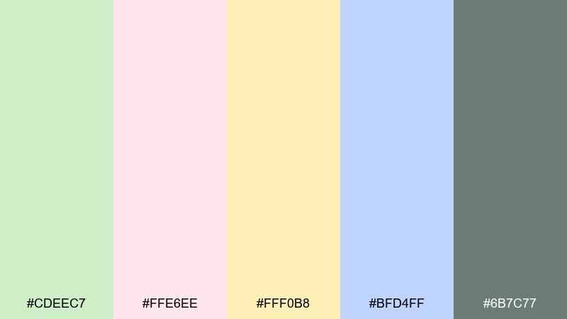
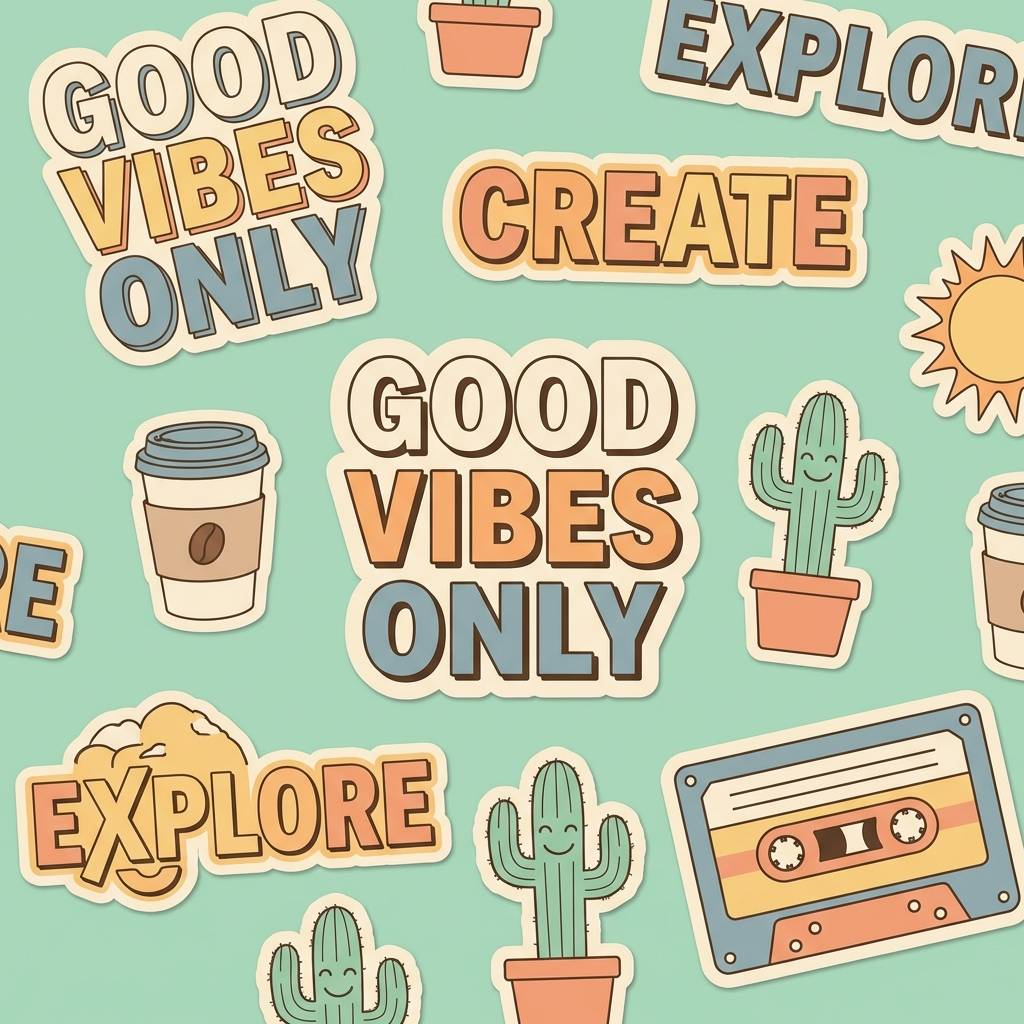
HEX: #CDEEC7 #FFE6EE #FFF0B8 #BFD4FF #6B7C77
Mood: retro, fun, candy-soft
Best for: brand stickers and merch
Retro and candy-soft, these shades look like gelato tubs in a classic freezer case. Pastel green color combinations like this shine on stickers, enamel pins, and tote graphics where playful contrast matters. Pair with chunky sans fonts and simple shapes for a bold, nostalgic punch. Tip: outline illustrations in the slate tone so the pastels stay crisp on print.
Image example of retro gelato generated using media.io
18) Scandinavian Sage
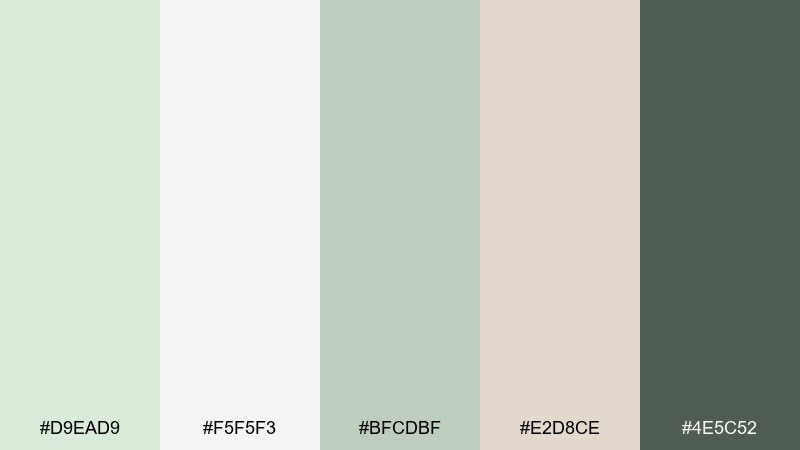
HEX: #D9EAD9 #F5F5F3 #BFCDBF #E2D8CE #4E5C52
Mood: clean, cozy, understated
Best for: interior design moodboard
Clean yet cozy, these Scandinavian-inspired sages feel like painted wood, wool throws, and soft daylight. The cool whites keep everything airy, while the warm greige adds a lived-in touch. Use it for moodboards, paint proposals, and minimalist lookbooks. Tip: balance large sage blocks with plenty of off-white to avoid a heavy room feel.
Image example of scandinavian sage generated using media.io
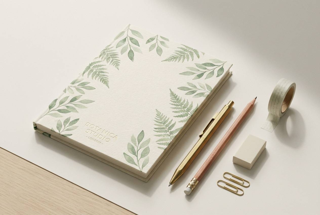
19) Botanical Stationery
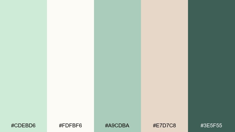
HEX: #CDEBD6 #FDFBF6 #A9CDBA #E7D7C8 #3E5F55
Mood: paper-soft, botanical, tidy
Best for: notebook cover and stationery set
Paper-soft and botanical, this mix suggests a tidy desk with leaf sketches and cream envelopes. The gentle greens work well for covers and patterns, while the dark accent holds titles and logos. Pair with thin line illustrations and subtle repeats to keep it refined. Tip: print patterns in the lightest tint so they do not compete with the main title.
Image example of botanical stationery generated using media.io
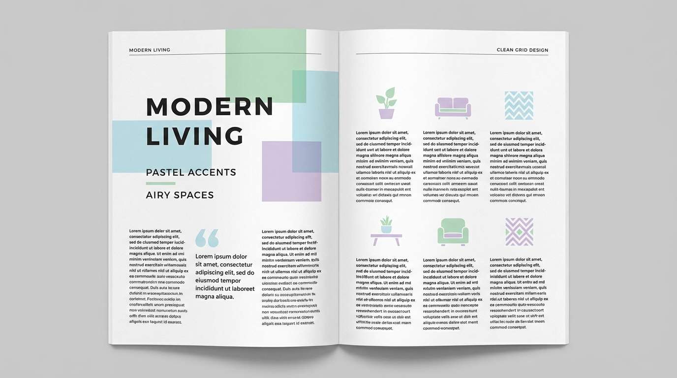
20) Aurora Pastel Greens
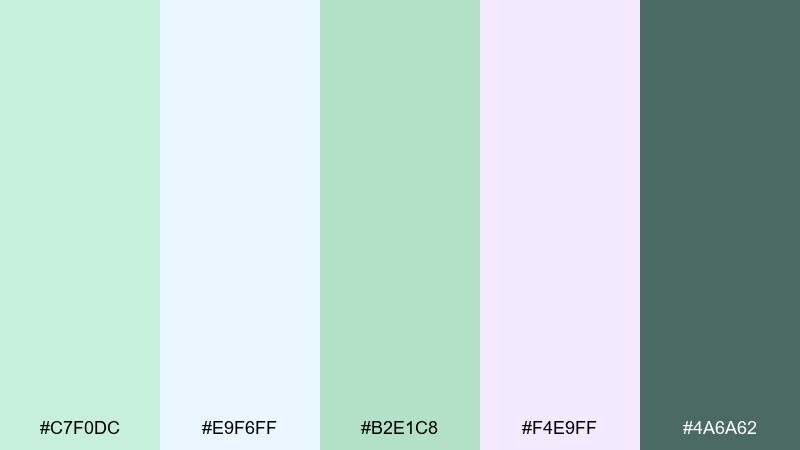
HEX: #C7F0DC #E9F6FF #B2E1C8 #F4E9FF #4A6A62
Mood: dreamy, modern, luminous
Best for: editorial magazine layout
Dreamy and luminous, these tones feel like an aurora glow filtered through soft clouds. The cool lilac and airy blue add a modern edge while the greens keep it grounded. Use for editorial spreads, feature headers, and pull quotes where color needs to support content. Tip: set body text in the deep gray-green and reserve the pastels for section bands and highlights.
Image example of aurora pastel greens generated using media.io
What Colors Go Well with Pastel Green?
Warm neutrals are the easiest match: cream, oatmeal, sand, and greige keep pastel green looking soft and natural. They’re also a reliable choice for print, where subtle greens can shift under different lighting.
For a more modern feel, pair pastel green with cool tints like icy blue, soft periwinkle, or lilac. This keeps the palette airy while still giving you distinct zones for UI sections, editorial sidebars, or highlights.
If you need contrast, bring in deep eucalyptus, pine, or slate green for typography and primary CTAs. This keeps accessibility and readability strong without breaking the calm tone.
How to Use a Pastel Green Color Palette in Real Designs
Start with pastel green as your background or surface color, then layer content on warm off-whites for a clean hierarchy. This approach is especially effective for landing pages, packaging, and social templates where you want a “fresh” first impression.
Use one darker anchor tone for functional clarity: headings, buttons, form focus states, and small text should live in a deeper green/gray. It prevents the design from becoming washed out while preserving the soft mood.
In print, lean on texture to elevate the palette—uncoated paper, subtle grain, embossing, or minimal foil. Pastel greens look best when the materials add depth that the color itself intentionally avoids.
Create Pastel Green Palette Visuals with AI
If you want to see these pastel green palettes applied to real scenes—packaging, UI mockups, flyers, or editorial spreads—generate quick concept visuals with AI. It’s a fast way to validate mood, contrast, and “brand feel” before you commit to production.
With Media.io’s text-to-image tool, you can reuse the prompts above or write your own to match your product, layout format, and aspect ratio. This helps you test multiple directions in minutes.
Pastel Green Color Palette FAQs
-
What does pastel green communicate in design?
Pastel green commonly signals freshness, calm, health, and balance. It’s often used for wellness branding, eco-forward products, and interfaces that aim to reduce visual stress. -
Is pastel green good for UI and app design?
Yes—pastel green works well as a background tint, card surface, or secondary highlight. For accessibility, pair it with a darker green/gray for text and primary buttons to maintain strong contrast. -
What’s the best neutral to pair with pastel green?
Cream and warm off-white are the most dependable pairings. They keep pastel green from looking too cold and help print designs feel more premium and tactile. -
Can pastel green work with pink or peach accents?
Absolutely. Blush, dusty rose, peach, and apricot add warmth and make pastel green feel friendly and inviting—great for invitations, food menus, and social campaigns. -
How do I keep pastel green designs from looking washed out?
Add a dark anchor color (deep eucalyptus, slate green, or charcoal) for typography and key UI elements. Also limit accents to one or two supporting colors per layout for cleaner hierarchy. -
Which pastel green palette is best for packaging?
For skincare or wellness packaging, try Mint Meadow or Aloe Vera Glow. For artisan goods like soap or tea, Soft Fern Clay and Herbal Apothecary add warmth and craft character. -
How can I generate mockups using these palette prompts?
Copy the prompt under any palette’s example image and paste it into Media.io’s AI image generator. Then adjust the subject (your product), layout type (poster/UI/packaging), and aspect ratio to fit your use case.
Next: Tawny Color Palette


