

Pastel gray is the quiet hero of modern design: soft enough to feel calm, but structured enough to look intentional. It’s especially useful when you want a clean, premium mood without the starkness of pure white or the heaviness of dark charcoal.
Below are 20 pastel gray color palette ideas with HEX codes, plus real-world use cases for UI, branding, print, and interiors.
In this article
- Why Pastel Gray Palettes Work So Well
-
- foggy linen
- pearl overcast
- dove and blush
- misty sage studio
- concrete rose
- quiet harbor
- winter paper
- moonstone latte
- dusty iris
- seaside pebble
- chalkboard petals
- soft graphite pop
- hushed terracotta
- silver sprout
- cotton cloud play
- rainy day denim
- lilac ash balance
- minimal museum
- powder steel
- blown glass pastels
- What Colors Go Well with Pastel Gray?
- How to Use a Pastel Gray Color Palette in Real Designs
- Create Pastel Gray Palette Visuals with AI
Why Pastel Gray Palettes Work So Well
Pastel gray sits in a “safe middle” that makes designs feel balanced: it reduces visual noise, supports readability, and lets typography and content lead. That’s why it’s a staple in product UI, editorial layouts, and premium packaging.
Unlike pure gray, pastel gray has more air and softness, which helps interfaces feel friendlier and interiors feel brighter. It also pairs easily with both cool accents (blue-gray, sage, lilac) and warm accents (blush, taupe, terracotta).
Most importantly, pastel gray creates hierarchy without shouting. You can build depth through subtle shade steps, using accent colors sparingly for actions, highlights, or brand signatures.
20+ Pastel Gray Color Palette Ideas (with HEX Codes)
1) Foggy Linen
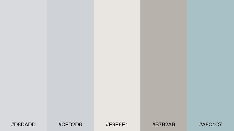
HEX: #d8dadd #cfd2d6 #e9e6e1 #b7b2ab #a8c1c7
Mood: airy, minimal, calm
Best for: 2D UI dashboard for a productivity app
Airy and quiet like morning fog over clean linen, these tones keep everything feeling spacious. Use it for dashboards where readability matters and you want data to feel friendly, not harsh. Pair the warm off-white with cool slate accents for hierarchy, then reserve the muted teal for primary actions. Tip: keep borders at low contrast and let spacing do most of the organizing.
Image example of foggy linen generated using media.io
Media.io is an online AI studio for creating and editing video, image, and audio in your browser.

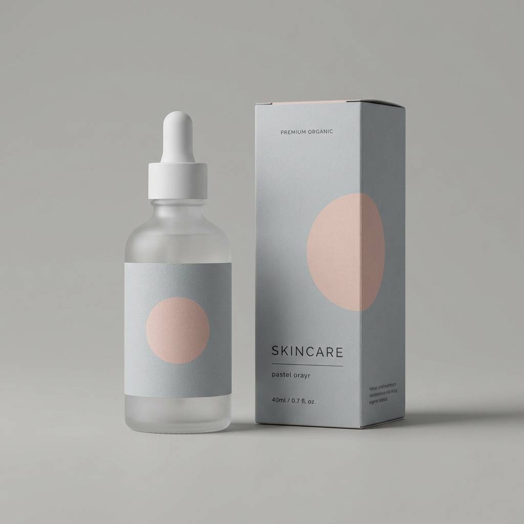
2) Pearl Overcast
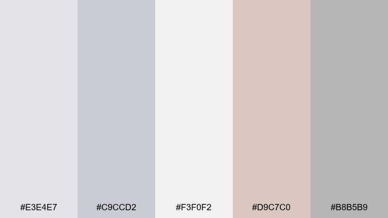
HEX: #e3e4e7 #c9ccd2 #f3f0f2 #d9c7c0 #b8b5b9
Mood: polished, soothing, premium
Best for: skincare packaging and product ads
Polished and soothing, it feels like pearl light on an overcast day with a hint of blush warmth. It works beautifully for skincare and wellness packaging where you want softness without looking childish. Pair the pale gray base with the pink-beige accent for gentle contrast, and keep typography charcoal or near-black for clarity. Tip: use the lightest shade as your label field so ingredients remain easy to scan.
Image example of pearl overcast generated using media.io
3) Dove and Blush
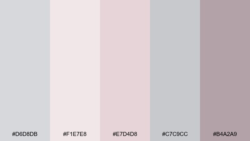
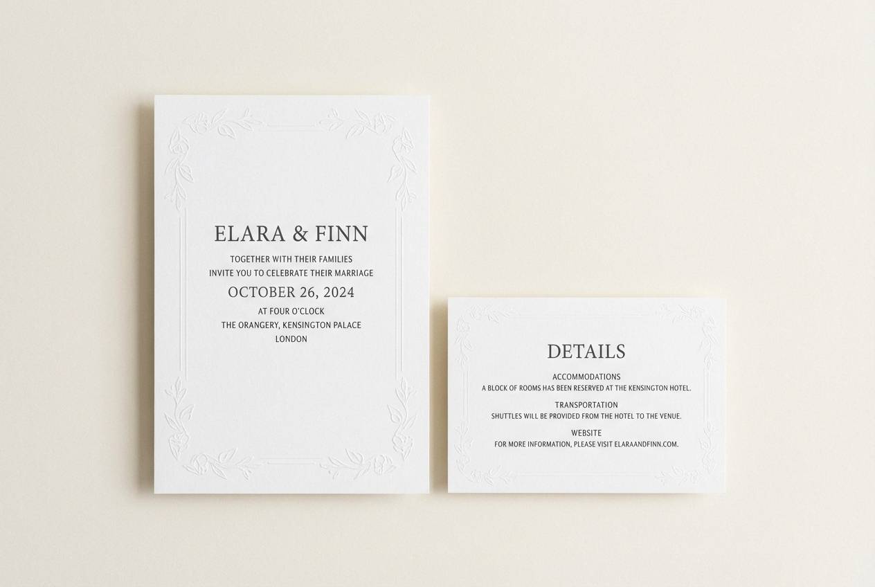
HEX: #d6d8db #f1e7e8 #e7d4d8 #c7c9cc #b4a2a9
Mood: romantic, gentle, refined
Best for: wedding invitation suite and RSVP card
Romantic and gentle, it evokes doves, soft petals, and satin ribbon. This pastel gray color palette is a strong fit for wedding stationery, especially when you want blush without leaning sugary. Pair it with warm white paper stock and a slightly deeper mauve for names and headings. Tip: add a tiny metallic foil detail to elevate the quiet grays.
Image example of dove and blush generated using media.io
4) Misty Sage Studio
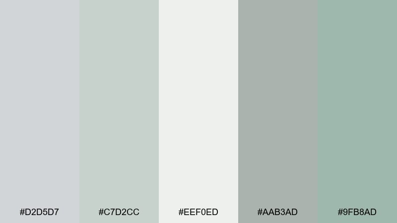
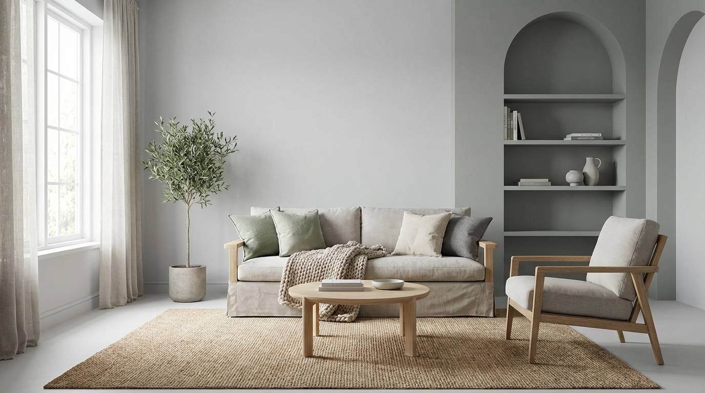
HEX: #d2d5d7 #c7d2cc #eef0ed #aab3ad #9fb8ad
Mood: fresh, grounded, spa-like
Best for: living room interior styling concept
Fresh and grounded, it brings to mind a misty garden outside a bright studio window. The sage-leaning grays are great for interiors, especially Scandinavian or Japandi spaces that want warmth without beige overload. Pair with light oak, brushed steel, and a single deep green plant for depth. Tip: keep fabrics matte so the soft grays read cozy rather than cold.
Image example of misty sage studio generated using media.io
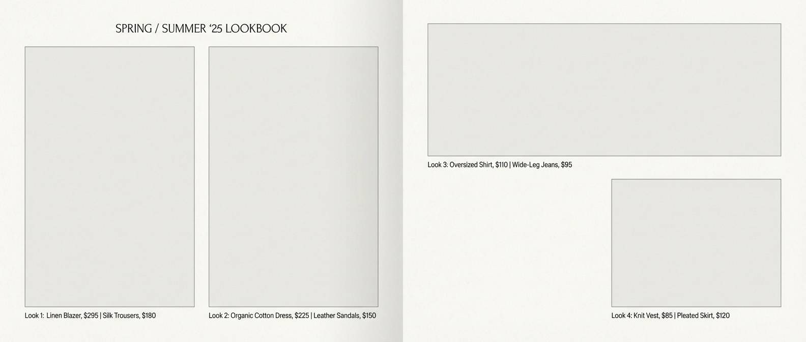
5) Concrete Rose
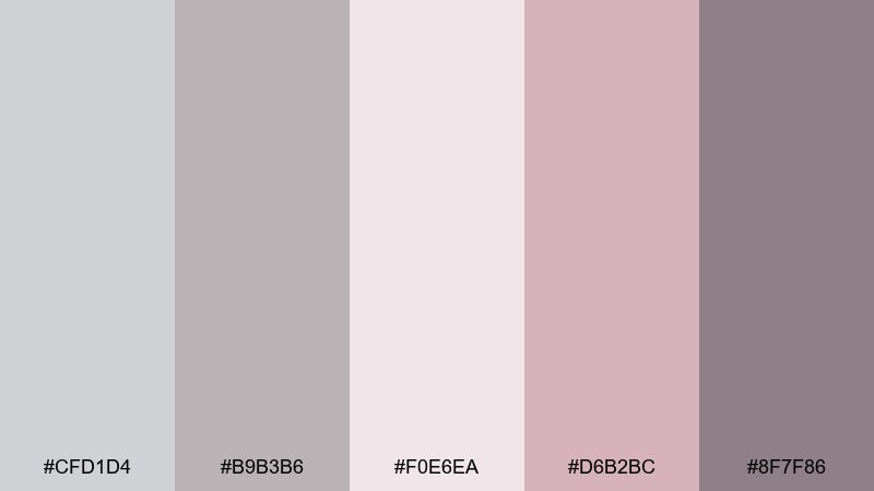
HEX: #cfd1d4 #b9b3b6 #f0e6ea #d6b2bc #8f7f86
Mood: editorial, modern, slightly moody
Best for: fashion lookbook editorial layout
Modern and slightly moody, it feels like concrete softened by a rose-tinted filter. Use it for fashion or lifestyle editorials where you want femininity with edge. Pair the pale blush with the deeper mauve for pull quotes and section dividers, and keep photography high-contrast to avoid a washed look. Tip: set body text on the warm off-white so long reads stay comfortable.
Image example of concrete rose generated using media.io
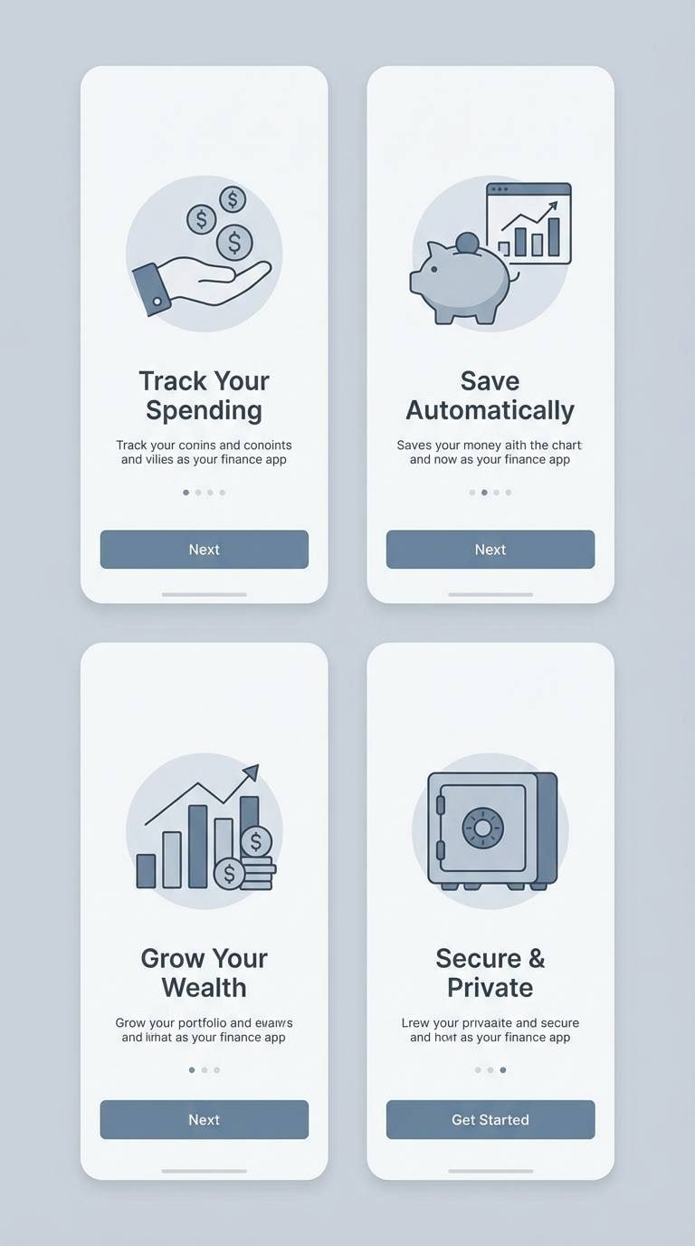
6) Quiet Harbor
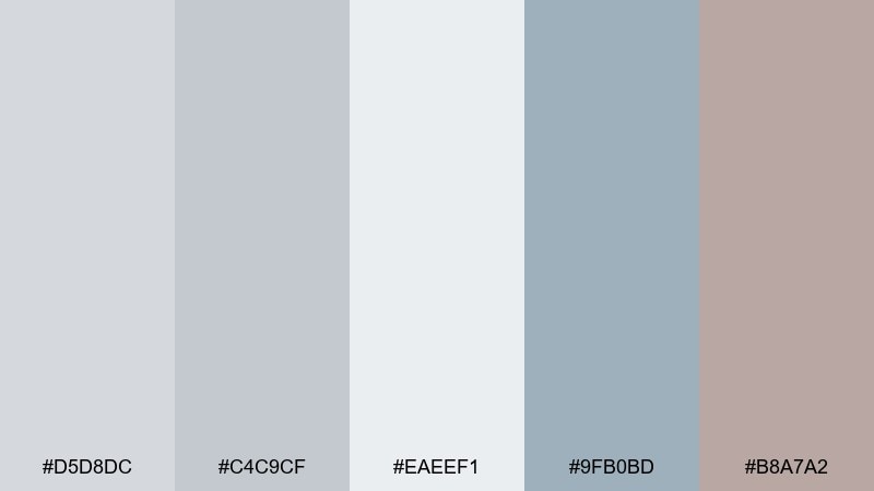
HEX: #d5d8dc #c4c9cf #eaeef1 #9fb0bd #b8a7a2
Mood: cool, steady, reassuring
Best for: app onboarding screens for a finance tool
Cool and steady, it suggests a quiet harbor with steel-blue water and stone docks. These pastel gray color combinations are ideal for finance or utilities where trust and calm matter more than flash. Pair the blue-gray as the primary accent and use the warm taupe only for highlights like badges or callouts. Tip: keep icon strokes slightly thicker so they remain crisp on soft backgrounds.
Image example of quiet harbor generated using media.io
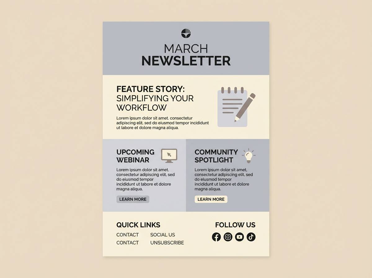
7) Winter Paper
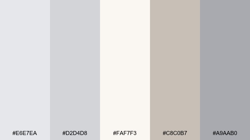
HEX: #e6e7ea #d2d4d8 #faf7f3 #c8c0b7 #a9aab0
Mood: clean, quiet, timeless
Best for: newsletter template and editorial email design
Clean and quiet, it looks like winter light on thick paper and soft pencil marks. It suits newsletters and editorial emails where content should feel curated and easy to skim. Pair the warm cream with the mid-gray for sections, then use the taupe for subtle emphasis on links or tags. Tip: limit accent color usage to one element per block to keep the layout airy.
Image example of winter paper generated using media.io
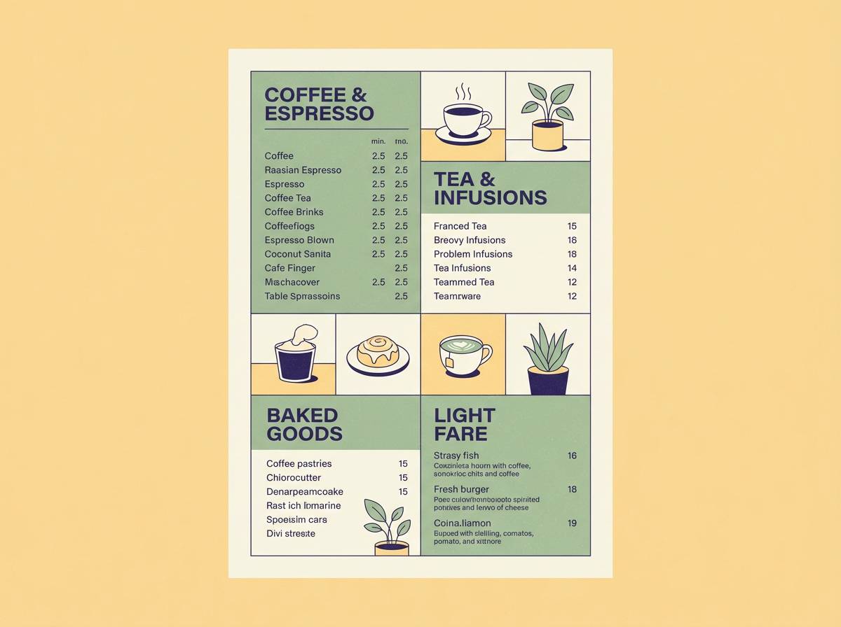
8) Moonstone Latte
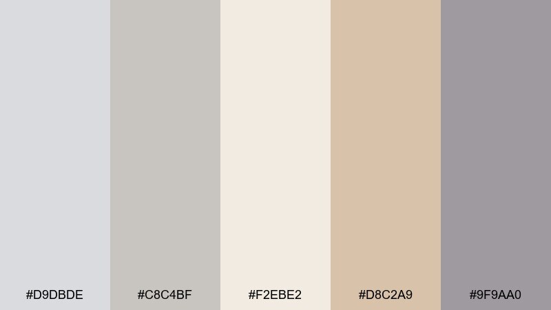
HEX: #d9dbde #c8c4bf #f2ebe2 #d8c2a9 #9f9aa0
Mood: cozy, modern, welcoming
Best for: cafe menu poster design
Cozy and modern, it feels like moonstone shimmer beside a warm latte. The creamy neutral base makes menu items easy to read while the caramel accent adds appetite-friendly warmth. Pair with dark cocoa typography and simple line icons to keep it contemporary. Tip: use the caramel shade for price tags or featured drinks so the hierarchy is instant.
Image example of moonstone latte generated using media.io
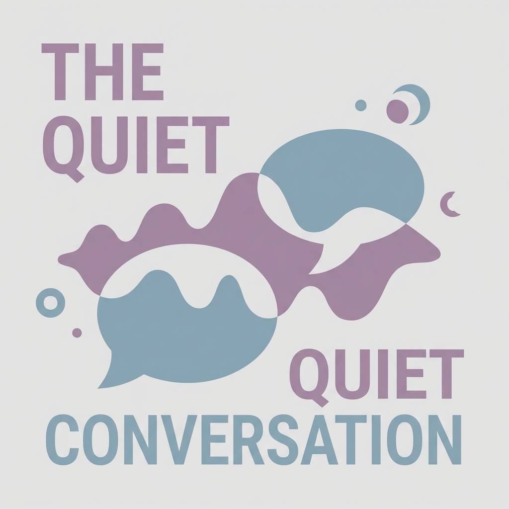
9) Dusty Iris
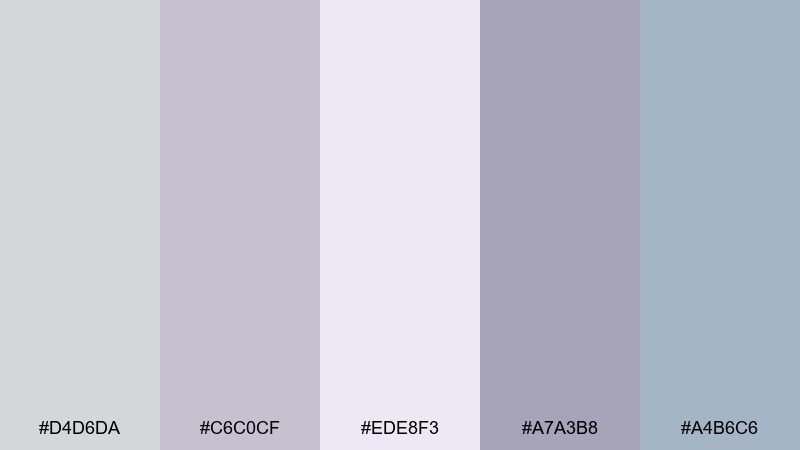
HEX: #d4d6da #c6c0cf #ede8f3 #a7a3b8 #a4b6c6
Mood: dreamy, soft, creative
Best for: podcast cover art for a mindfulness show
Dreamy and soft, it suggests dusty iris petals and pale twilight. Use it for creative brands or audio covers that want calm energy with a hint of color. Pair the lavender-tinted gray with the misty blue for depth, and keep the light lilac for breathing room around titles. Tip: add grain or subtle texture so the pastels feel tactile instead of flat.
Image example of dusty iris generated using media.io
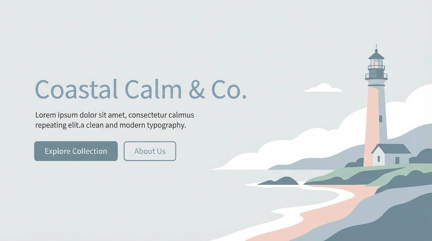
10) Seaside Pebble
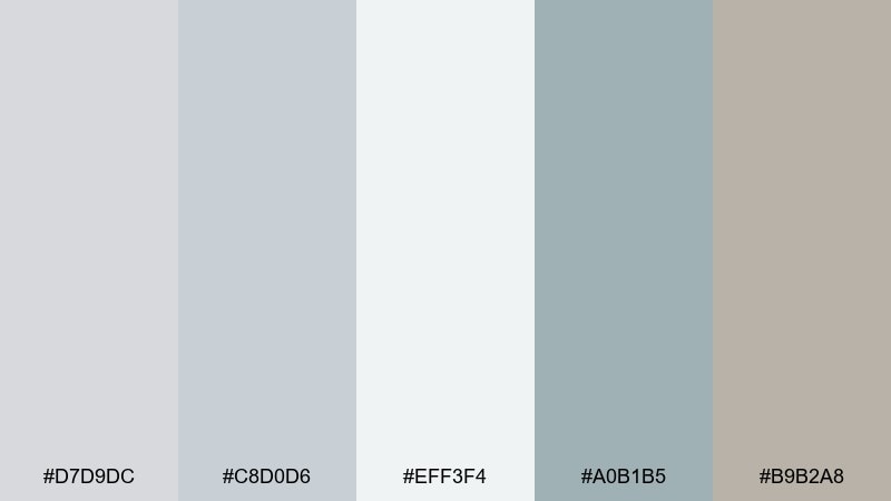
HEX: #d7d9dc #c8d0d6 #eff3f4 #a0b1b5 #b9b2a8
Mood: breezy, clean, coastal
Best for: website landing page hero (2D UI mockup)
Breezy and clean, it evokes pale pebbles and salt air under a bright sky. These tones work well for travel, wellness, and lifestyle sites that need a light touch. Pair the cool sea-gray with warm stone accents to keep the page from feeling sterile. Tip: use the deeper blue-gray for navigation states so interactions feel crisp.
Image example of seaside pebble generated using media.io
11) Chalkboard Petals
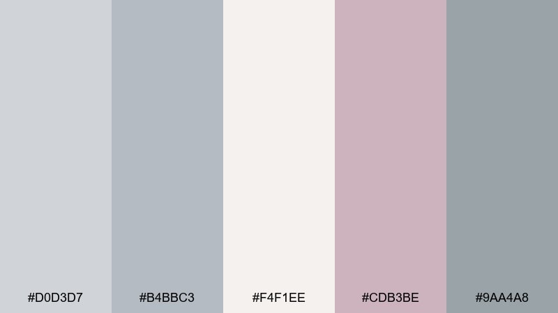
HEX: #d0d3d7 #b4bbc3 #f4f1ee #cdb3be #9aa4a8
Mood: soft, artsy, nostalgic
Best for: watercolor botanical print for wall art
Soft and artsy, it feels like chalk dust mixed with pressed petals in an old sketchbook. The muted mauve brings a romantic note without overpowering the cool grays. Pair with watercolor textures, deckled edges, and plenty of negative space for a gallery-ready look. Tip: keep the darkest tone only for tiny details like stems or labels.
Image example of chalkboard petals generated using media.io
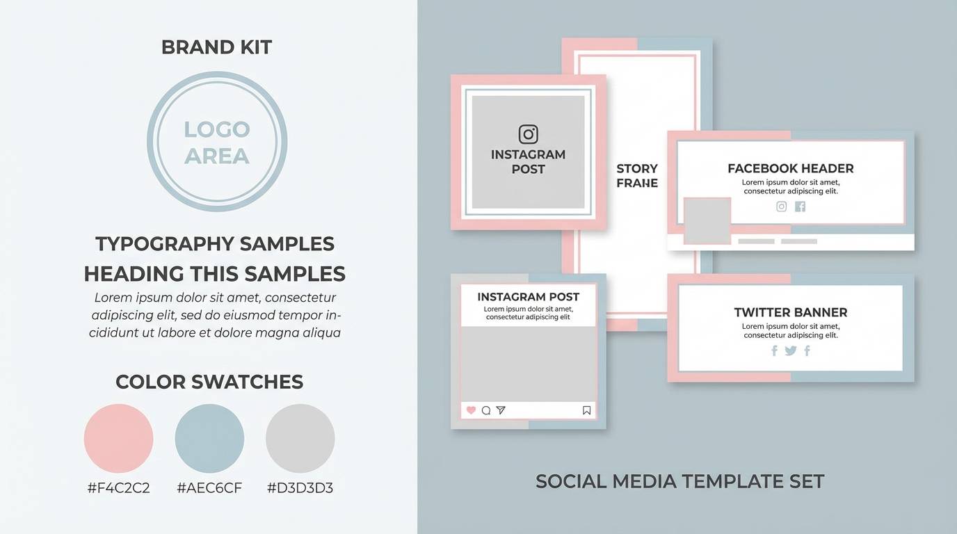
12) Soft Graphite Pop
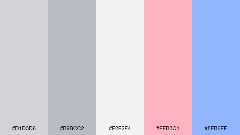
HEX: #d1d3d6 #b9bcc2 #f2f2f4 #ffb3c1 #8fb6ff
Mood: playful, modern, confident
Best for: startup brand kit and social templates
Playful and modern, it feels like graphite sketches brightened with candy-color highlights. This pastel gray color palette is perfect for startups that want a neutral foundation with two punchy accents for personality. Pair the pink for friendly CTAs and the soft blue for informational states, keeping the grays for structure. Tip: apply the accents in small, repeatable components like chips and icons to stay consistent.
Image example of soft graphite pop generated using media.io
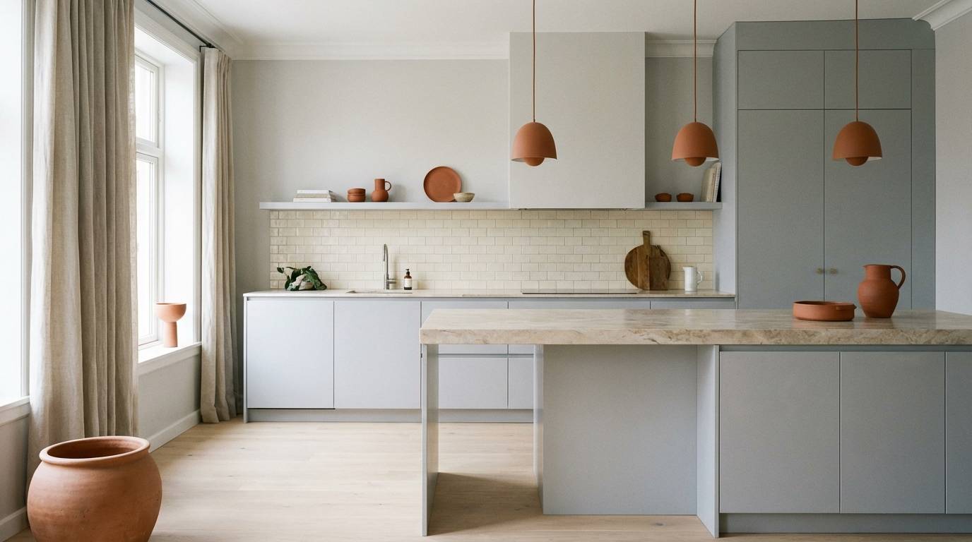
13) Hushed Terracotta
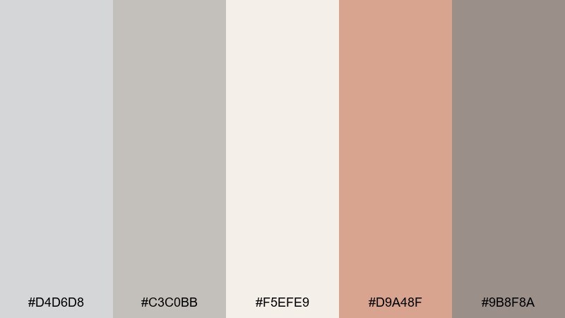
HEX: #d4d6d8 #c3c0bb #f5efe9 #d9a48f #9b8f8a
Mood: warm, earthy, understated
Best for: kitchen interior moodboard concept
Warm and understated, it brings to mind sun-baked clay seen through a soft haze. The terracotta note adds life to gray neutrals, making it great for kitchens, cafés, or handmade product lines. Pair with cream tile, natural stone, and matte black hardware for a balanced contrast. Tip: echo the terracotta twice in the room, then let the grays dominate the larger surfaces.
Image example of hushed terracotta generated using media.io
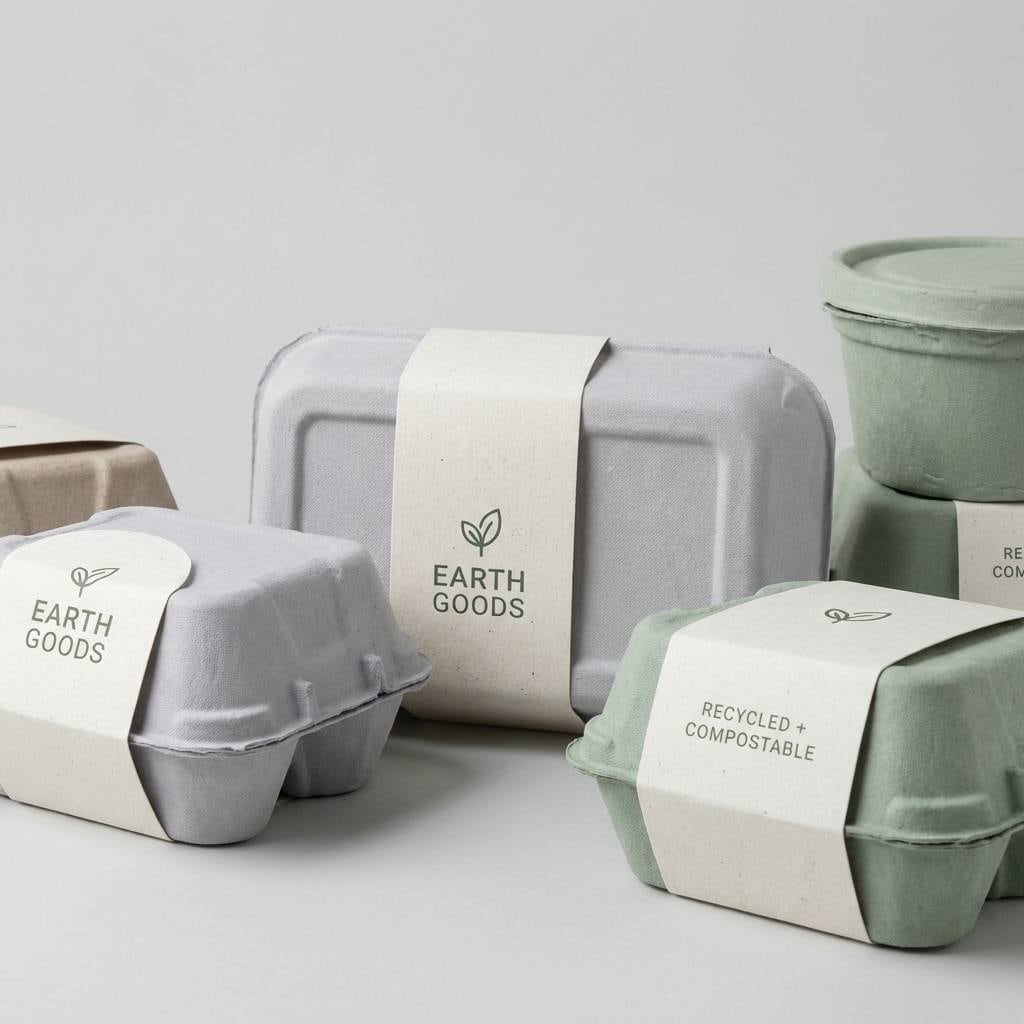
14) Silver Sprout
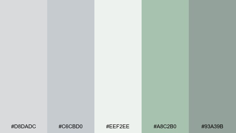
HEX: #d8dadc #c6cbd0 #eef2ee #a8c2b0 #93a39b
Mood: fresh, eco, balanced
Best for: sustainable product label and packaging
Fresh and eco-leaning, it feels like new sprouts against brushed silver. These greens stay muted, so the overall look remains clean and premium rather than loud. Pair with recycled-paper textures, simple icons, and a darker gray for ingredient lists and legal copy. Tip: use the pale mint as a background panel so sustainability claims are easy to spot.
Image example of silver sprout generated using media.io
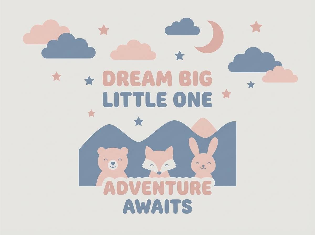
15) Cotton Cloud Play
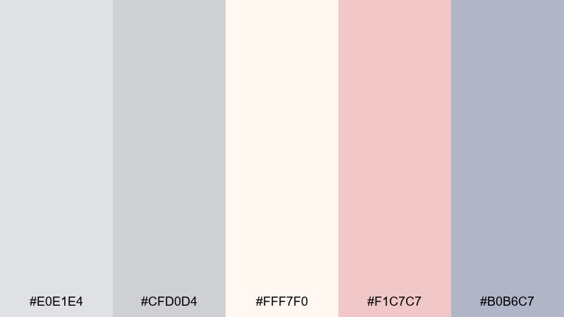
HEX: #e0e1e4 #cfd0d4 #fff7f0 #f1c7c7 #b0b6c7
Mood: sweet, airy, kid-friendly
Best for: nursery poster and baby shower welcome sign
Sweet and airy, it looks like cotton clouds with a gentle sprinkle of blush. The creamy white keeps it soft enough for nurseries, while the dusty blue adds a calm counterbalance. Pair with rounded type, simple animals, and plenty of whitespace for a soothing look. Tip: keep the blush for small highlights so the design stays timeless as kids grow.
Image example of cotton cloud play generated using media.io
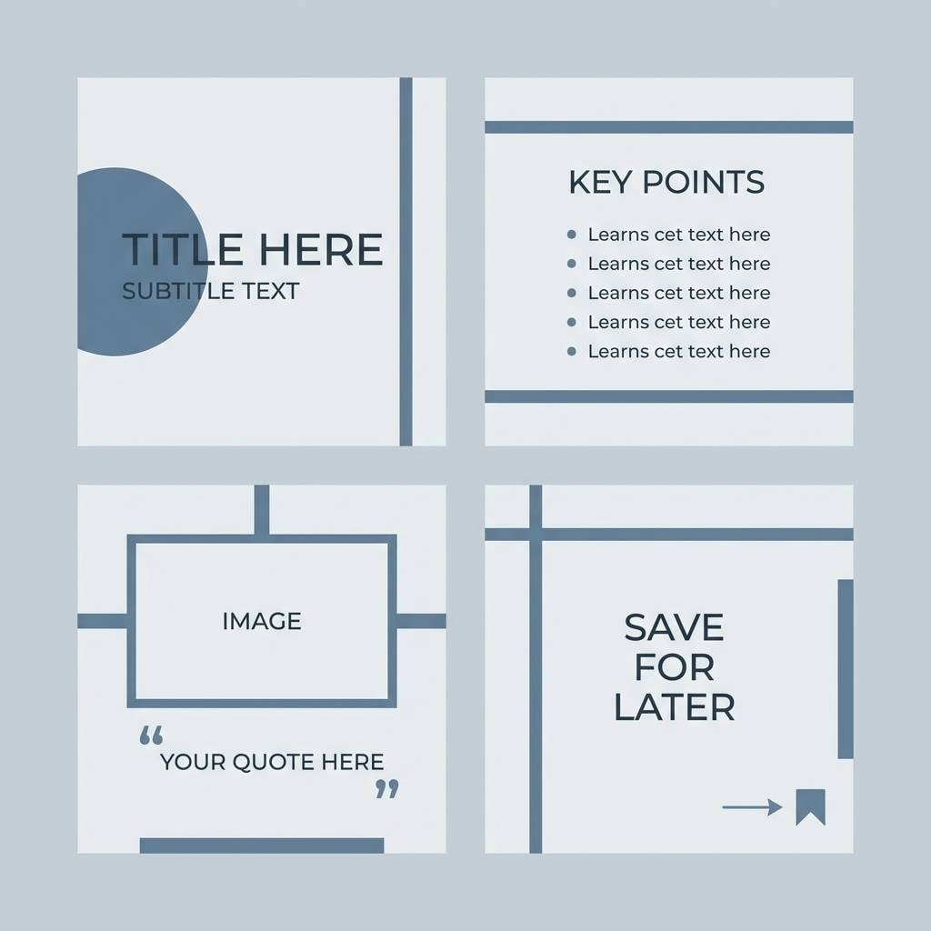
16) Rainy Day Denim
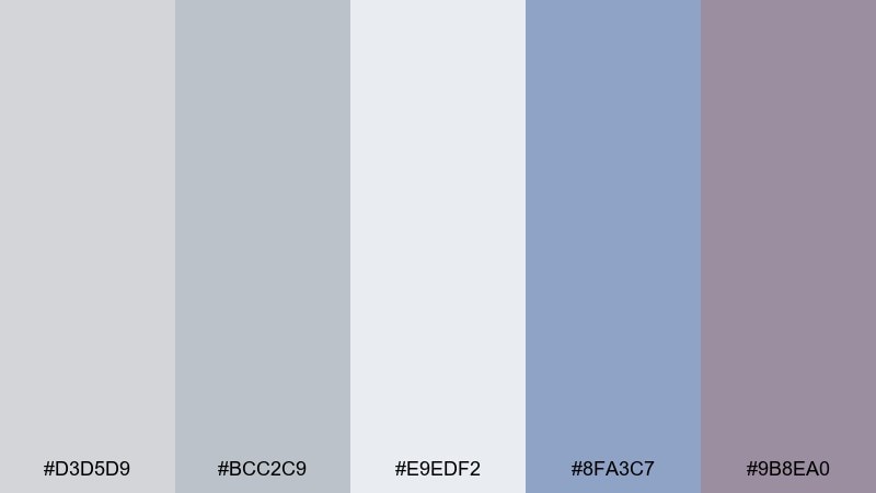
HEX: #d3d5d9 #bcc2c9 #e9edf2 #8fa3c7 #9b8ea0
Mood: relaxed, contemporary, dependable
Best for: Instagram carousel templates for a creator
Relaxed and dependable, it feels like denim under a rainy window. The blue-gray accent adds structure for headlines and dividers, while the mauve keeps it from turning too corporate. Pair with monochrome photos or simple illustrations to maintain a cohesive feed. Tip: build a repeating system of two text sizes and one accent bar to speed up posting.
Image example of rainy day denim generated using media.io
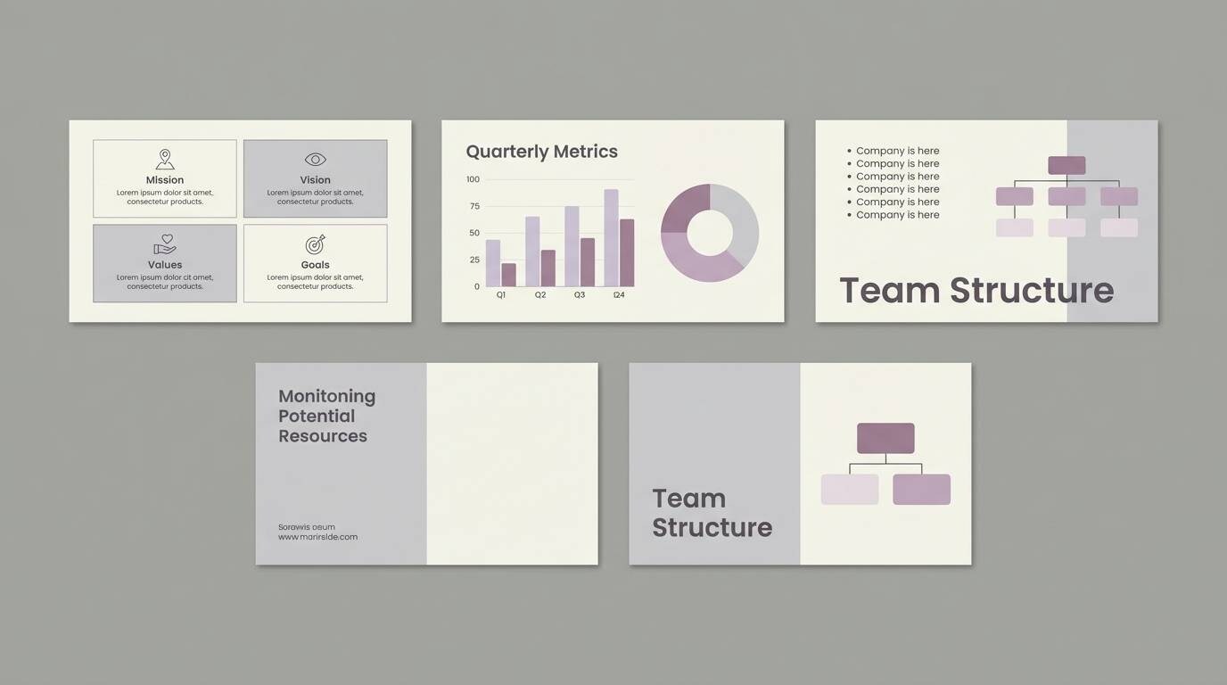
17) Lilac Ash Balance
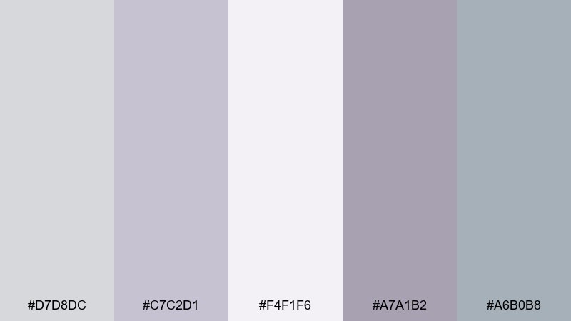
HEX: #d7d8dc #c7c2d1 #f4f1f6 #a7a1b2 #a6b0b8
Mood: calm, professional, gentle
Best for: presentation slide deck for a consultancy
Calm and professional, it resembles lilac ash drifting through soft daylight. It works well for slide decks where you want warmth and authority without stark contrast. Pair the deeper violet-gray for section headers and use the near-white for content-heavy slides. Tip: keep charts mostly monochrome and reserve the lilac tint for key takeaways only.
Image example of lilac ash balance generated using media.io
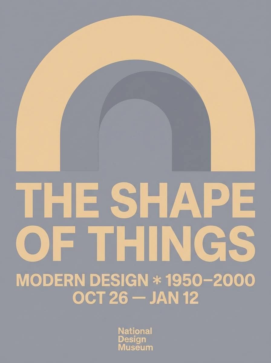
18) Minimal Museum
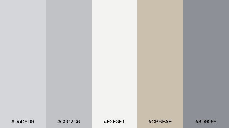
HEX: #d5d6d9 #c0c2c6 #f3f3f1 #cbbfae #8d9096
Mood: gallery-clean, quiet, curated
Best for: exhibition poster and event flyer
Gallery-clean and curated, it recalls concrete walls, soft spotlights, and warm stone plinths. These pastel gray color combinations are excellent for exhibition posters where typography needs to feel intentional and modern. Pair the warm beige as a small frame or date label, and anchor the layout with the deeper steel gray for titles. Tip: choose one oversized type element and let the neutrals do the rest.
Image example of minimal museum generated using media.io
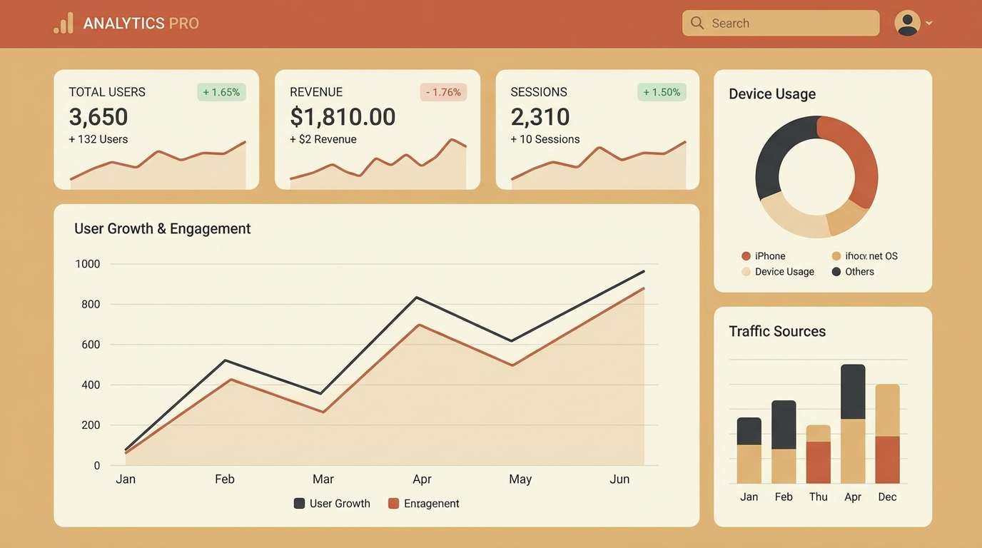
19) Powder Steel
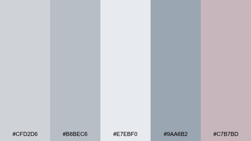
HEX: #cfd2d6 #b8bec6 #e7ebf0 #9aa6b2 #c7b7bd
Mood: sleek, data-forward, modern
Best for: analytics dashboard UI with charts
Sleek and modern, it feels like powder-coated steel with a soft blush reflection. The cool grays keep charts readable, while the muted mauve can highlight alerts or selected states without screaming. Pair with simple bar and line charts, thin gridlines, and generous padding for a calm data experience. Tip: set one consistent accent color per chart type so users learn the system quickly.
Image example of powder steel generated using media.io
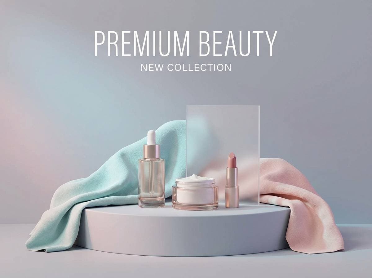
20) Blown Glass Pastels
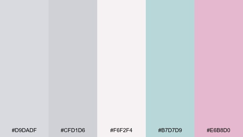
HEX: #d9dadf #cfd1d6 #f6f2f4 #b7d7d9 #e6b8d0
Mood: light, glossy, boutique
Best for: cosmetics product ad and banner
Light and glossy, it brings to mind blown glass catching pastel reflections. The aqua tint freshens the grays, while the pink adds a boutique beauty vibe. Pair with high-key product photography and minimal copy so the colors feel airy rather than busy. Tip: keep shadows soft and neutral so the delicate hues stay true.
Image example of blown glass pastels generated using media.io
What Colors Go Well with Pastel Gray?
Pastel gray pairs beautifully with soft warms like blush, taupe, warm cream, and terracotta—these add approachability and keep the palette from feeling cold. They’re a strong match for packaging, editorial layouts, and home styling.
For a fresher, cleaner look, combine pastel gray with sage, mint, coastal blue-gray, or dusty denim. These accents maintain calmness while adding enough color to create clear UI states and visual hierarchy.
If you want a premium finish, add one deep anchor color (charcoal, espresso, deep navy) for typography and key dividers. Pastel gray is forgiving, so even small amounts of contrast go a long way.
How to Use a Pastel Gray Color Palette in Real Designs
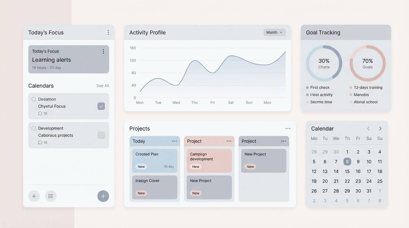
In UI design, use pastel gray as the base surface for backgrounds and cards, then step up contrast slightly for borders and secondary panels. Reserve one accent color for primary actions so the interface stays focused and easy to scan.
For branding and print, pastel gray helps typography look refined and modern—especially when paired with warm off-white paper tones. Use texture (grain, matte finishes, soft shadows) to keep light grays from feeling flat.
In interiors, pastel gray works best when you balance it with natural materials like oak, linen, stone, and brushed metal. Add a single deeper tone (plant green, graphite, or steel blue) to give the room depth.
Create Pastel Gray Palette Visuals with AI
If you have HEX codes but need real visuals—mockups, posters, UI screens, or product ads—AI can help you generate consistent examples quickly. You can describe the layout, lighting, and style, then reuse the same palette across variations.
With Media.io, you can turn a prompt into clean, on-brand images for presentations, social templates, and concept boards—without building everything from scratch. Start with one palette above, then iterate on composition and accent usage.
Pastel Gray Color Palette FAQs
-
What is a pastel gray color?
Pastel gray is a light, desaturated gray with a soft, airy feel. It often includes subtle undertones (warm, cool, sage, lilac) that make it feel more natural than a flat neutral. -
Is pastel gray warm or cool?
It can be either. Pastel gray shifts warm when it leans beige, taupe, or blush, and shifts cool when it leans blue, green, or violet. Checking undertones next to pure white helps you see the direction. -
What text color works best on pastel gray backgrounds?
Charcoal or near-black usually provides the most reliable readability. For softer aesthetics, a deep slate or deep brown can also work—just confirm contrast for accessibility in UI. -
How do I keep pastel gray designs from looking washed out?
Add one stronger anchor (dark text, deeper divider color, or higher-contrast photo) and use spacing to create structure. A small accent color for CTAs or key labels also prevents the design from feeling flat. -
What are the best accent colors for pastel gray palettes?
Popular accents include blush pink, mauve, sage green, dusty blue, and warm cream. If you need a bolder pop, use a soft but saturated accent in small doses (like pale blue or pink for UI states). -
Can pastel gray work for finance or business UI?
Yes. Pastel gray can feel trustworthy and calm, especially when paired with blue-gray accents and clear typography. Keep interactions crisp with slightly stronger contrast for buttons and active states. -
How can I generate palette mockups quickly?
Use an AI image generator and describe the design type (dashboard, packaging, poster) plus your palette mood and lighting. Media.io’s text-to-image tool is a fast way to create consistent pastel gray visuals for testing and iteration.
Next: Circus Color Palette


