

Circus color palettes are built for impact: bold primaries, theatrical dark bases, and joyful accents that make layouts feel instantly “in show.”
Below you’ll find modern circus tones with ready-to-use HEX codes plus practical tips for posters, branding, UI, and invitations.
In this article
- Why Circus Palettes Work So Well
-
- big top primary
- carnival marquee
- juggler jubilee
- cotton candy spotlight
- ringmaster velvet
- circus tent stripes
- popcorn and brass
- acrobatic neon
- vintage poster ink
- clown parade pastels
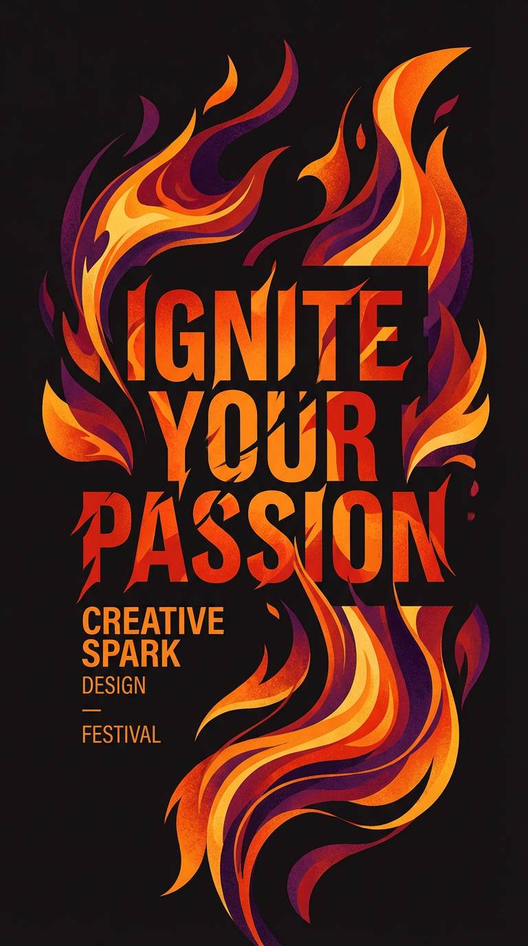
- fire eater ember
- ferris night lights
- ticket booth teal
- confetti burst
- strongman steel
- magic lantern glow
- midway arcade
- balloon animal brights
- retro circus print
- grand finale stars
- spotlight neutral pop
- confident ringleader
- What Colors Go Well with Circus?
- How to Use a Circus Color Palette in Real Designs
- Create Circus Palette Visuals with AI
Why Circus Palettes Work So Well
Circus colors succeed because they’re designed around instant readability: high-contrast pairings (like red/yellow on deep navy) that hold up from across a room or in a fast scroll.
They also mix “heritage” cues (ticket-cream, ink-charcoal, brass gold) with modern pops (neons, bright cyans, electric purples), which makes them flexible for both retro posters and contemporary UI.
Most importantly, circus palettes create emotional momentum—playful, dramatic, celebratory—so even simple layouts feel like an event.
20+ Circus Color Palette Ideas (with HEX Codes)
1) Big Top Primary
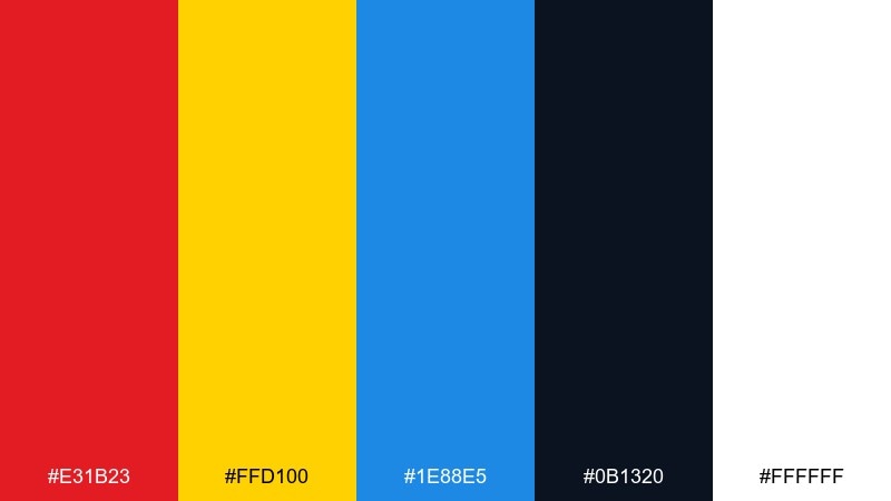
HEX: #e31b23 #ffd100 #1e88e5 #0b1320 #ffffff
Mood: bold, classic, high-energy
Best for: event posters and headline graphics
Bold, classic energy with a big-top feel, like painted tent panels and bright spotlights. Use it for posters, hero banners, and punchy headlines where contrast matters. Pair the red and yellow for calls to action, then let deep navy ground the layout. Tip: keep body text in navy or black and reserve red for the single strongest emphasis.
Image example of big top primary generated using media.io
Media.io is an online AI studio for creating and editing video, image, and audio in your browser.

2) Carnival Marquee
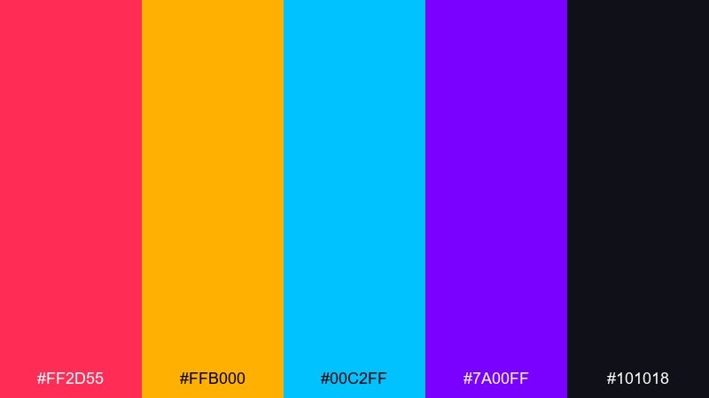
HEX: #ff2d55 #ffb000 #00c2ff #7a00ff #101018
Mood: electric, playful, night-show
Best for: festival branding and social ads
Electric and playful, like marquee bulbs glowing against a night sky. These circus color combinations shine in social ads, festival branding, and motion graphics where you want instant pop. Keep the dark base for readability, then rotate the bright accents for variety across a campaign. Tip: use one neon as the primary accent and limit the rest to small highlights to avoid visual noise.
Image example of carnival marquee generated using media.io

3) Juggler Jubilee
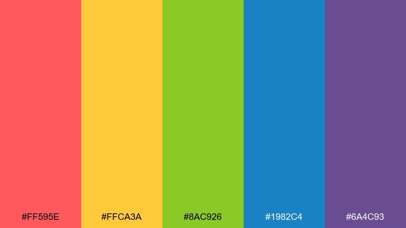
HEX: #ff595e #ffca3a #8ac926 #1982c4 #6a4c93
Mood: cheerful, youthful, kinetic
Best for: kids party invitations and stickers
Cheerful and kinetic, like juggling pins in midair and confetti in motion. The mix balances warm and cool tones, so it works well for kids invitations, sticker packs, and playful packaging. Let yellow carry the background, then layer coral and blue for key elements and headings. Tip: add plenty of white space so the palette reads fun rather than frantic.
Image example of juggler jubilee generated using media.io
4) Cotton Candy Spotlight
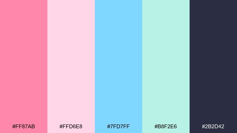
HEX: #ff87ab #ffd6e8 #7fd7ff #b8f2e6 #2b2d42
Mood: sweet, airy, friendly
Best for: beauty promos and pastel UI
Sweet and airy, like cotton candy under a soft spotlight. Pastels here are ideal for beauty promos, onboarding screens, or gentle app UI where the vibe should feel welcoming. Anchor the layout with the deep charcoal for text and icons to keep contrast accessible. Tip: use the pink as a primary brand accent and the mint as a secondary state color for tags and chips.
Image example of cotton candy spotlight generated using media.io
5) Ringmaster Velvet
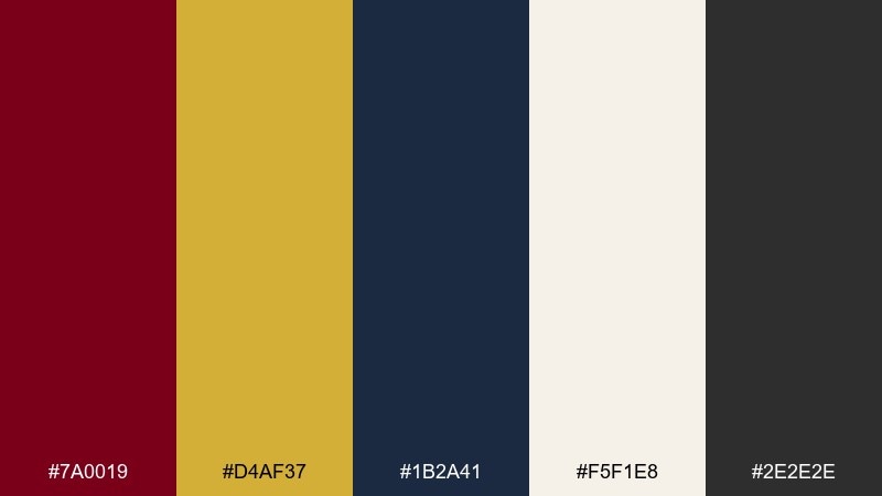
HEX: #7a0019 #d4af37 #1b2a41 #f5f1e8 #2e2e2e
Mood: luxurious, theatrical, confident
Best for: premium branding and editorial covers
Luxurious and theatrical, like velvet curtains and gold trim before the show begins. This circus color palette fits premium branding, book jackets, and editorial covers that need drama without neon. Use gold sparingly as a foil stamp style accent, and let the cream carry negative space. Tip: keep typography classic and high-contrast to match the regal mood.
Image example of ringmaster velvet generated using media.io
6) Circus Tent Stripes
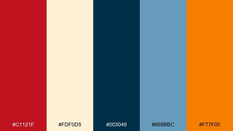
HEX: #c1121f #fdf0d5 #003049 #669bbc #f77f00
Mood: nostalgic, crisp, graphic
Best for: brand patterns and packaging labels
Nostalgic and crisp, like striped canvas and printed tickets. The warm cream softens the strong red and navy, making it great for brand patterns, labels, and merch tags. Use navy for type and outlines, then bring orange in as a modern accent. Tip: try thin stripe patterns with plenty of cream space to keep it timeless.
Image example of circus tent stripes generated using media.io
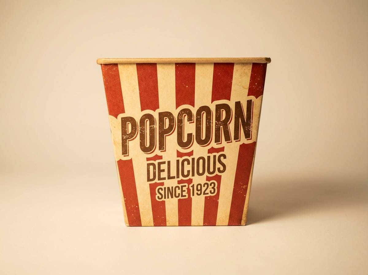
7) Popcorn and Brass
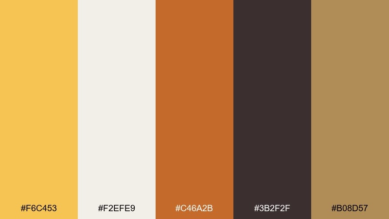
HEX: #f6c453 #f2efe9 #c46a2b #3b2f2f #b08d57
Mood: warm, cozy, vintage
Best for: snack packaging and menu design
Warm and cozy, like buttered popcorn, wooden counters, and brass details. These tones work beautifully for snack packaging, menu design, and storefront graphics with a vintage twist. Pair the cream as your background and use the deep brown for readable type. Tip: add subtle paper grain and keep the brass color to small highlights so it feels intentional.
Image example of popcorn and brass generated using media.io
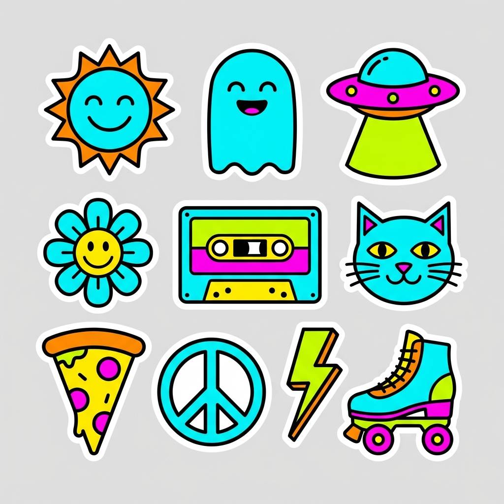
8) Acrobatic Neon
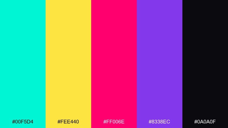
HEX: #00f5d4 #fee440 #ff006e #8338ec #0a0a0f
Mood: energetic, futuristic, bold
Best for: stream overlays and promo banners
Energetic and futuristic, like acrobats under blacklight and laser beams. The palette is ideal for stream overlays, promo banners, and gaming events where bold contrast sells the mood fast. Keep the background near-black and push one bright color as the primary UI highlight. Tip: use glow effects sparingly on headings and icons, not on long text.
Image example of acrobatic neon generated using media.io
9) Vintage Poster Ink
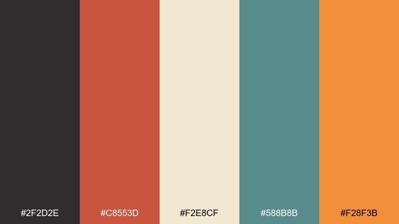
HEX: #2f2d2e #c8553d #f2e8cf #588b8b #f28f3b
Mood: retro, handmade, artsy
Best for: print flyers and retro branding
Retro and handmade, like screen-printed inks on textured paper. This circus color scheme is a strong fit for flyers, coffee-shop posters, and branding that nods to the past without feeling dusty. Use charcoal for type, teal for supporting blocks, and save the orange for badges or price bursts. Tip: simulate misregistration with tiny offsets to make the design feel authentically printed.
Image example of vintage poster ink generated using media.io
10) Clown Parade Pastels
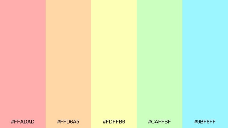
HEX: #ffadad #ffd6a5 #fdffb6 #caffbf #9bf6ff
Mood: light, joyful, friendly
Best for: baby shower invites and gentle branding
Light and joyful, like a parade of soft balloons and pastel face paint. These tones fit baby showers, wellness branding, and cheerful packaging that needs a gentle touch. Because contrast is low, pair with dark gray type and use the pastels for backgrounds and highlights. Tip: choose one pastel as the dominant field color and keep the rest for small shapes and icons.
Image example of clown parade pastels generated using media.io
11) Fire Eater Ember
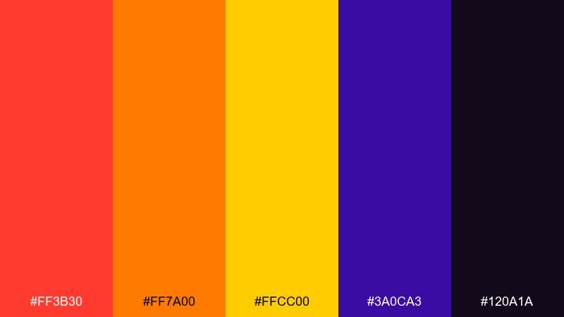
HEX: #ff3b30 #ff7a00 #ffcc00 #3a0ca3 #120a1a
Mood: intense, dramatic, fiery
Best for: night event promos and album art
Intense and dramatic, like embers spinning in a dark arena. The hot reds and oranges are perfect for night event promos, album art, and limited-edition drops. Use the deep plum as a background to keep the warm tones blazing without overpowering the layout. Tip: reserve yellow for the smallest highlights, like date stamps or button states.
Image example of fire eater ember generated using media.io
12) Ferris Night Lights
HEX: #0b1026 #1f6feb #22c55e #f97316 #f9fafb
Mood: nighttime, lively, modern
Best for: app UI accents and event landing pages
Nighttime and lively, like rotating lights reflecting on glossy paint. It works well for landing pages and app UI that needs crisp contrast with playful accents. Keep the navy as the main canvas, then use blue for links and green for success states. Tip: use orange only for primary calls to action so the interface stays focused.
Image example of ferris night lights generated using media.io
13) Ticket Booth Teal
HEX: #0f766e #14b8a6 #f97316 #fde68a #111827
Mood: fresh, friendly, trustworthy
Best for: checkout UI and ticketing dashboards
Fresh and friendly, like a painted ticket booth with bright signage. The teal pair feels trustworthy for checkout UI, ticketing dashboards, and membership flows. Use the dark slate for text, teal for navigation, and orange for the key purchase button. Tip: keep the pale yellow to background panels so the interface stays clean.
Image example of ticket booth teal generated using media.io
14) Confetti Burst
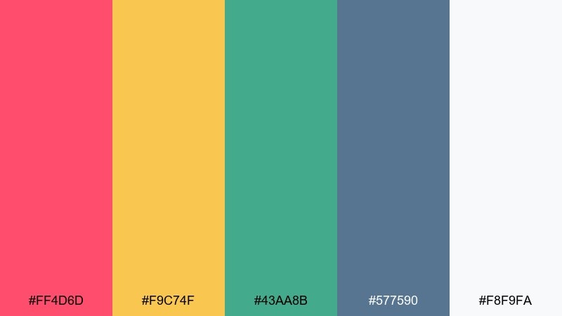
HEX: #ff4d6d #f9c74f #43aa8b #577590 #f8f9fa
Mood: festive, upbeat, welcoming
Best for: email headers and celebration graphics
Festive and upbeat, like confetti popping across a bright stage. Use these colors for email headers, celebration graphics, and seasonal promos that should feel friendly and clear. Let the off-white background breathe, then choose one strong accent for buttons and badges. Tip: repeat small confetti dots in just two colors to keep the design cohesive.
Image example of confetti burst generated using media.io
15) Strongman Steel
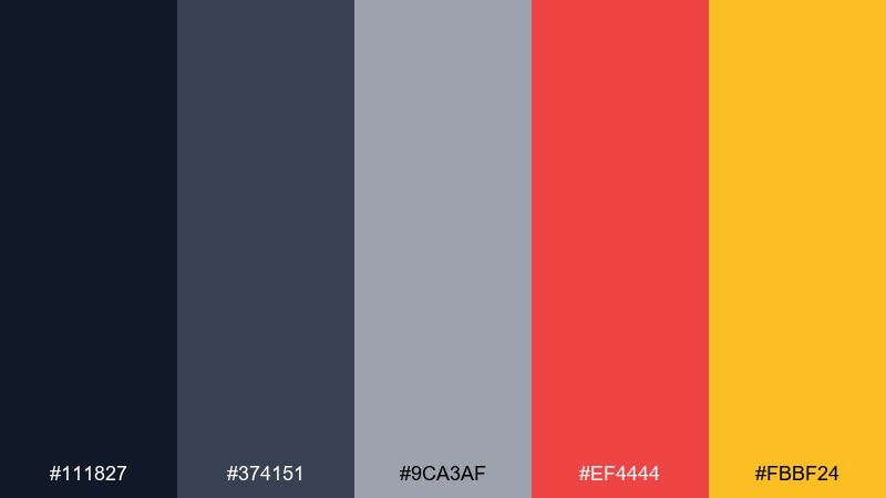
HEX: #111827 #374151 #9ca3af #ef4444 #fbbf24
Mood: tough, grounded, bold accents
Best for: sports promos and rugged product pages
Tough and grounded, like steel weights with bright painted labels. The grays create a solid base for sports promos, rugged product pages, and bold typography systems. Use red for urgency and yellow for highlight tags, but keep them minimal against the neutral core. Tip: try a mostly grayscale layout with a single red focal element for maximum impact.
Image example of strongman steel generated using media.io
16) Magic Lantern Glow
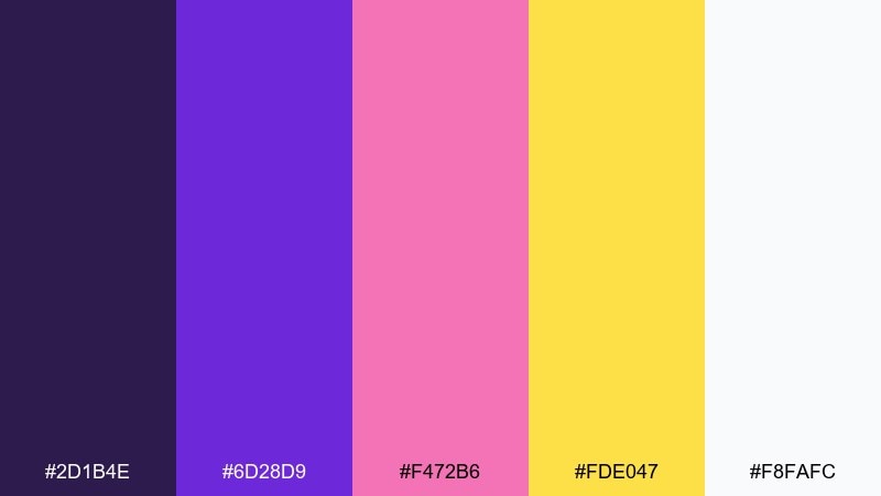
HEX: #2d1b4e #6d28d9 #f472b6 #fde047 #f8fafc
Mood: whimsical, dreamy, luminous
Best for: storybook covers and creative workshops
Whimsical and dreamy, like lantern light spilling over velvet drapes. It suits storybook covers, creative workshop promos, and playful landing pages that need a little magic. Use purple as the main field, then let yellow act as a tiny glow accent around icons or badges. Tip: pair with rounded display type to reinforce the soft, enchanting mood.
Image example of magic lantern glow generated using media.io
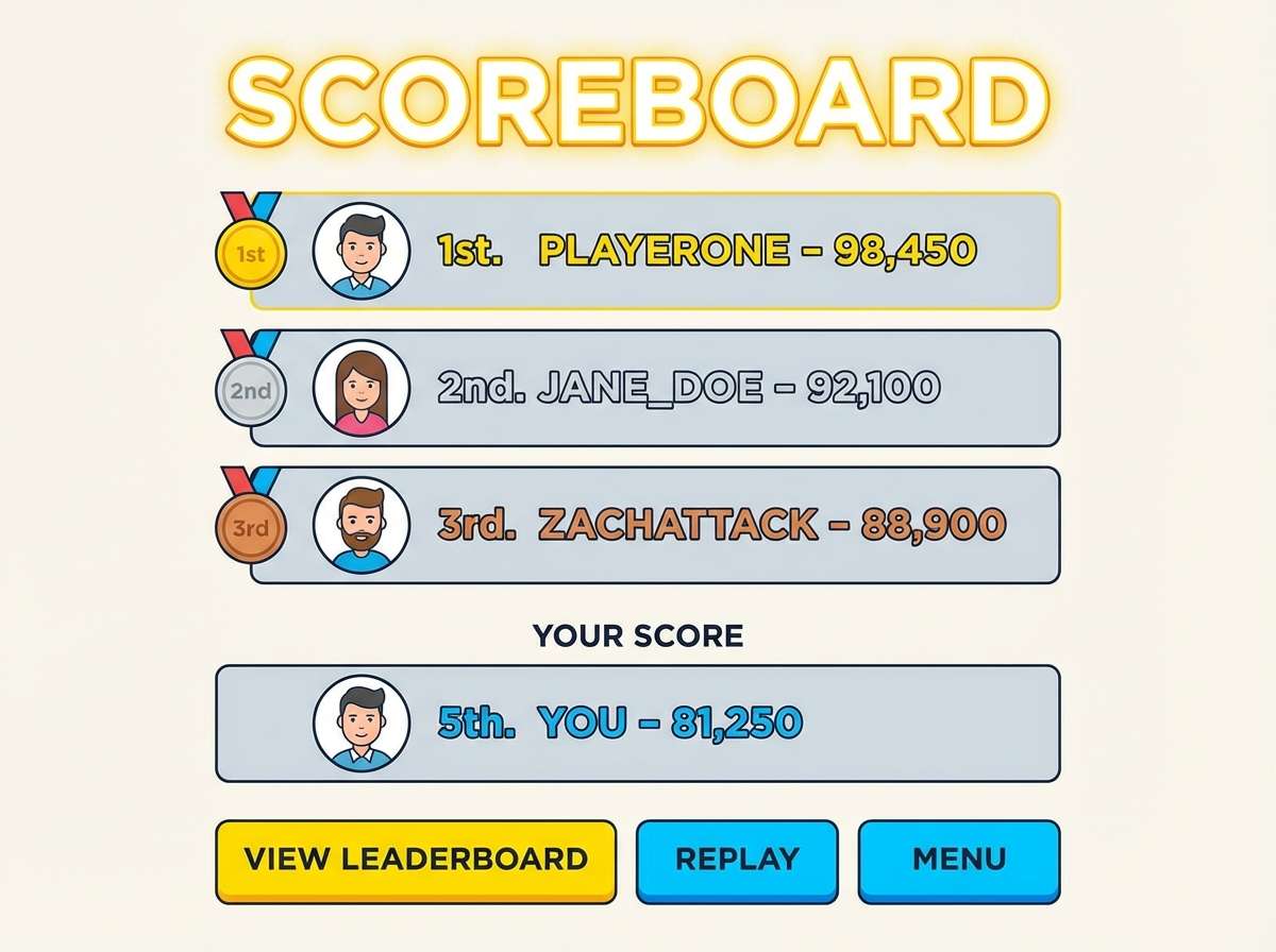
17) Midway Arcade
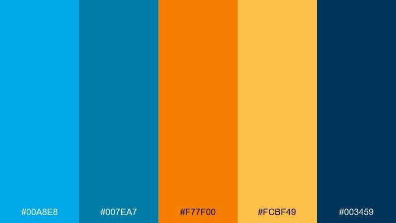
HEX: #00a8e8 #007ea7 #f77f00 #fcbf49 #003459
Mood: playful, competitive, bright
Best for: game UI and scoreboards
Playful and competitive, like arcade booths and prize counters. The blues keep the system readable for game UI, scoreboards, and interactive widgets. Use orange for primary actions and yellow for secondary highlights like points or badges. Tip: keep backgrounds in the deeper blue and reserve the bright cyan for hover and focus states.
Image example of midway arcade generated using media.io
18) Balloon Animal Brights
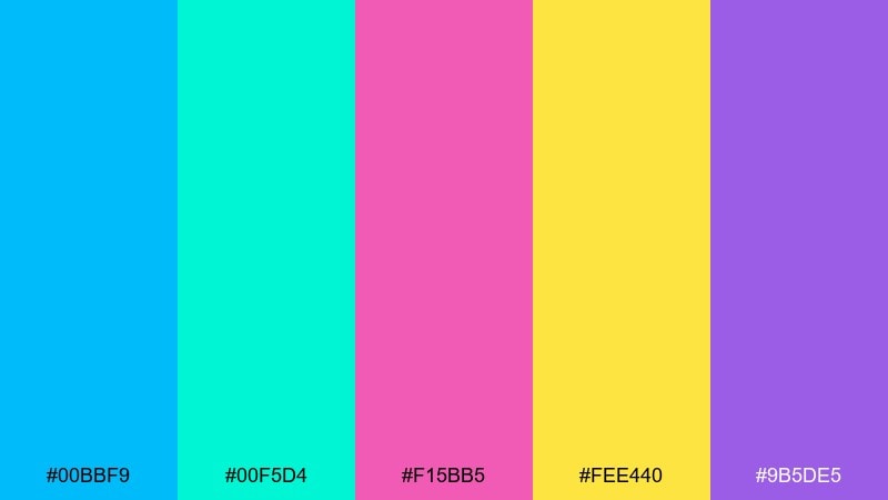
HEX: #00bbf9 #00f5d4 #f15bb5 #fee440 #9b5de5
Mood: bouncy, fun, candy-like
Best for: merch graphics and playful icons
Bouncy and fun, like glossy balloon animals twisting into shape. These colors are great for merch graphics, playful icon sets, and bold sticker designs. Use yellow as a warm highlight and keep cyan for larger areas to balance the pink and purple. Tip: add thick outlines or simple drop shadows so the bright hues stay legible on light backgrounds.
Image example of balloon animal brights generated using media.io
19) Retro Circus Print
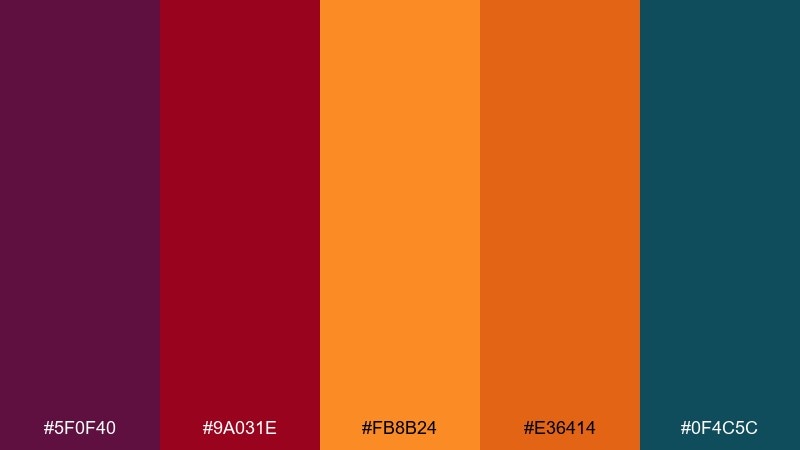
HEX: #5f0f40 #9a031e #fb8b24 #e36414 #0f4c5c
Mood: heritage, bold, print-like
Best for: logo marks and vintage merch
Heritage and bold, like a well-worn print pulled from an old trunk. The warm reds and oranges feel grounded by the deep teal, making it strong for logo marks and vintage merch. Use teal for backgrounds and keep the warm colors for type and badges. Tip: try a two-color version first, then add the third accent only if the design needs extra hierarchy.
Image example of retro circus print generated using media.io
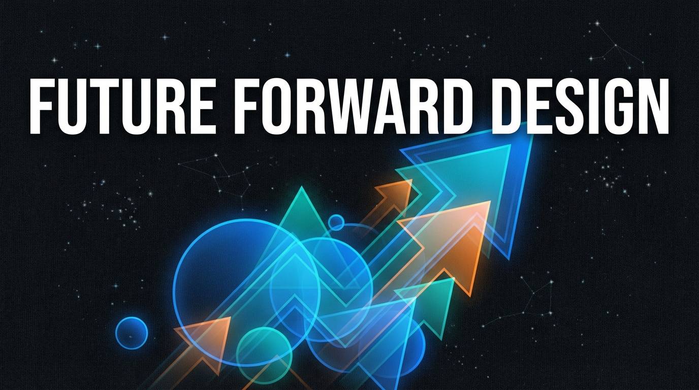
20) Grand Finale Stars
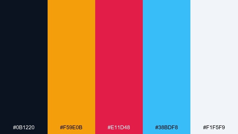
HEX: #0b1220 #f59e0b #e11d48 #38bdf8 #f1f5f9
Mood: celebratory, cinematic, crisp
Best for: closing slides and campaign hero sections
Celebratory and cinematic, like a starry finale with sparks and applause. This circus color palette works for campaign hero sections, closing slides, and announcement graphics that need a clear focal point. Keep the midnight base dominant, then place gold as the star element and use blue for supporting UI cues. Tip: build a simple star pattern at low opacity so the background adds texture without stealing attention.
Image example of grand finale stars generated using media.io
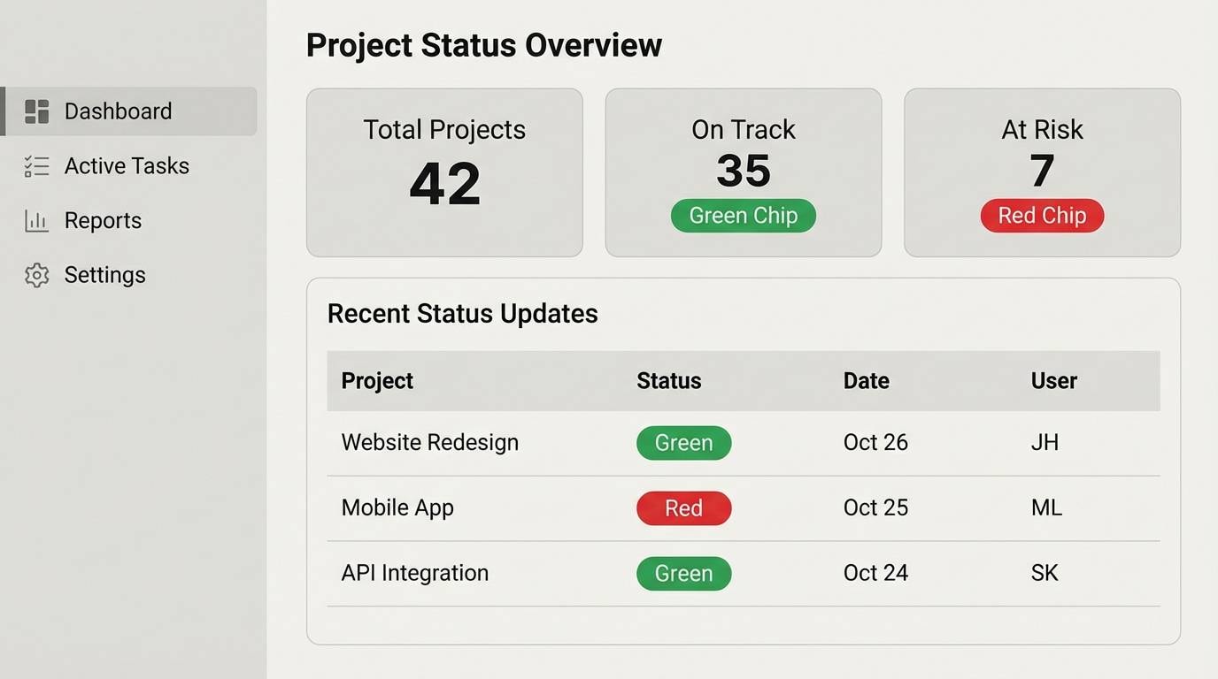
21) Spotlight Neutral Pop
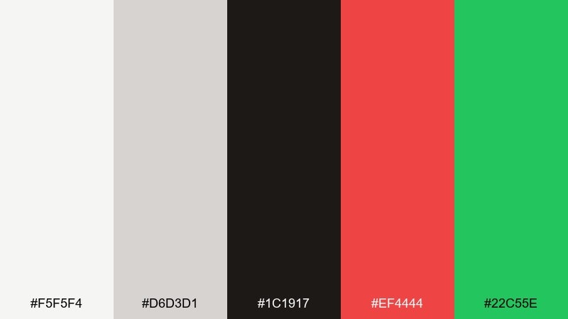
HEX: #f5f5f4 #d6d3d1 #1c1917 #ef4444 #22c55e
Mood: clean, modern, punchy accents
Best for: minimal UI with bold alerts
Clean and modern, like a bright spotlight on a simple stage. The neutrals keep layouts calm, while red and green deliver clear states for alerts, success, and key actions. Use the off-white as the main background and keep black for typography and dividers. Tip: limit accent usage to buttons and status chips so the minimal look stays intact.
Image example of spotlight neutral pop generated using media.io
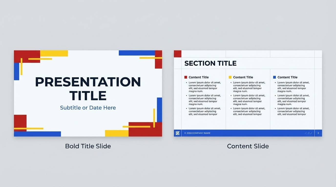
22) Confident Ringleader
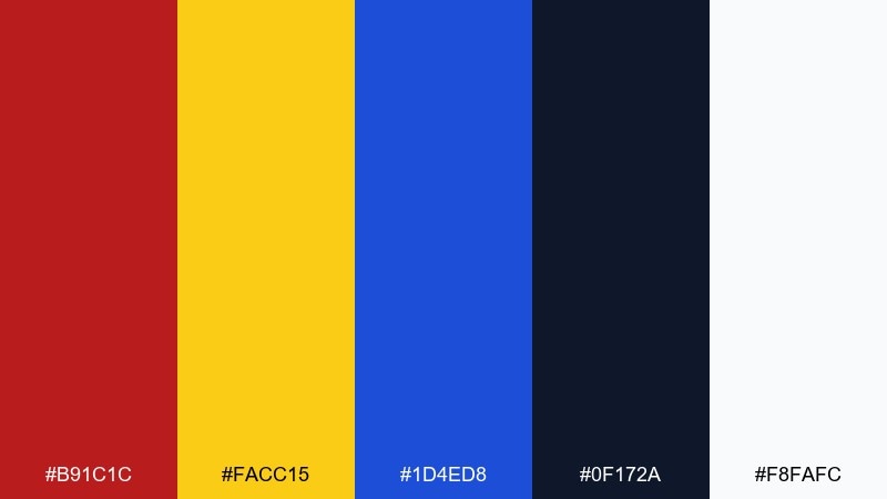
HEX: #b91c1c #facc15 #1d4ed8 #0f172a #f8fafc
Mood: confident, sharp, high-contrast
Best for: brand kits and presentation templates
Confident and sharp, like a ringleader jacket under bright stage lights. These circus color combinations are ideal for brand kits and presentation templates where strong hierarchy matters. Use navy for the majority of slides, then bring in red for headings and yellow for key callouts. Tip: keep charts consistent by assigning each accent to a single data category across the deck.
Image example of confident ringleader generated using media.io
What Colors Go Well with Circus?
Circus palettes pair best with strong neutrals and stage-like darks: deep navy, charcoal, and near-black make bright reds, yellows, and cyans feel intentional instead of chaotic.
For a modern twist, add one “clean” light tone (white or ticket-cream) to create breathing room, then use one warm accent (orange or gold) for calls to action and badges.
If you want a softer feel, pastel pinks and mints work well with a dark text anchor—just make sure your typography contrast stays readable.
How to Use a Circus Color Palette in Real Designs
Start with hierarchy: choose one dominant base (often navy/charcoal or cream), one primary accent (red, cyan, or purple), and keep the remaining colors for small highlights like icons, labels, and borders.
For posters and flyers, push contrast by placing warm colors against dark grounds and reserving yellow for the highest-priority information (dates, prices, or “Buy Tickets”).
For UI, assign meaning: blue for links, green for success, red for error/urgent, and keep decorative brights out of body text so the interface stays calm.
Create Circus Palette Visuals with AI
If you already have HEX codes, you can turn them into on-brand visuals fast by prompting for clean vector posters, landing headers, sticker sheets, or UI mockups that match your circus theme.
Use the palette mood as your creative direction (classic big-top, neon night-show, retro ink, or pastel celebration), then specify layout and typography for more consistent results.
Media.io makes it simple to generate and iterate designs in your browser—perfect for exploring multiple circus color combinations before you lock a final brand look.
Circus Color Palette FAQs
-
What are classic circus colors?
Classic circus colors usually center on bold red and bright yellow, supported by strong blues (often navy) and clean neutrals like white or ticket-cream for contrast. -
How do I modernize a circus color scheme?
Use a darker base (charcoal or midnight navy), pick one neon or one clean accent as the primary highlight, and leave more negative space so the palette feels designed rather than busy. -
Which circus colors are best for branding?
High-contrast sets like red/yellow/navy with white are strong for logos and brand kits because they reproduce well and keep hierarchy clear across print and digital. -
What background color works best with bright circus palettes?
Near-black, deep navy, or warm cream backgrounds work best. Dark backgrounds make neons and primaries glow, while cream backgrounds create a vintage ticket/poster feel. -
Are circus palettes good for UI design?
Yes—if you keep the brights as accents. Use a neutral base for readability, then map one or two circus colors to UI states (CTA, hover, success, warning) consistently. -
How can I keep a circus palette from looking chaotic?
Limit the number of large color areas, choose one dominant color, and use the remaining hues only for small elements like badges, icons, stripes, and confetti details. -
Can I generate circus-themed posters or graphics with AI using HEX codes?
Yes. Include your desired vibe (retro, neon, premium velvet, pastel), layout type (poster, banner, UI), and your HEX colors in the prompt to steer the output toward your palette.
Next: Music Color Palette


