

An aesthetic color palette is less about one “look” and more about a feeling: soft light, clean contrast, and intentional restraint. The right mix can make branding, UI, posters, and interiors feel curated without looking overdesigned.
Below are 20+ aesthetic color palette ideas with HEX codes, plus practical pairing tips and AI prompts you can use to generate matching visuals fast.
In this article
- Why Aesthetic Palettes Work So Well
-
- vanilla sage mist
- blush latte
- coastal linen
- soft lilac dusk
- terracotta whisper
- midnight plum velvet
- neon peach pop
- rainy day minimal
- retro mint soda
- warm clay studio
- iced blueberry milk
- olive ink editorial
- cherry mocha night
- sunlit apricot
- dusty rose typography
- graphite sand ui
- forest bath botanica
- citrus cream poster
- coral reef packaging
- arctic lavender gradient
- oat milk matcha
- champagne smoke
- candy sky
- What Colors Go Well with Aesthetic?
- How to Use a Aesthetic Color Palette in Real Designs
- Create Aesthetic Palette Visuals with AI
Why Aesthetic Palettes Work So Well
Aesthetic colors tend to balance softness and structure: light neutrals for breathing room, mid-tones for mood, and a deep anchor shade for readability. That hierarchy makes designs feel calm while staying functional.
They also translate across mediums. The same palette can look premium on packaging, clean in UI, and cohesive in social templates because the values (light-to-dark contrast) are thoughtfully spaced.
Most importantly, aesthetic palettes reduce visual noise. By limiting loud saturation and using intentional accents, you get a modern, curated look that supports content instead of competing with it.
20+ Aesthetic Color Palette Ideas (with HEX Codes)
1) Vanilla Sage Mist
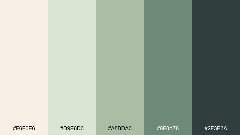
HEX: #F6F0E6 #D9E6D3 #A8BDA3 #6F8A78 #2F3E3A
Mood: calm, airy, natural
Best for: brand board for wellness and skincare
Calm, airy tones that feel like morning light over linen and fresh herbs. It works beautifully for wellness branding, skincare labels, and minimalist websites where softness matters. Pair it with warm paper textures, subtle grain, and plenty of whitespace to keep it breathable. Usage tip: use the deep green as your anchor for headings and CTAs, and reserve the light cream for backgrounds.
Image example of vanilla sage mist generated using media.io
Media.io is an online AI studio for creating and editing video, image, and audio in your browser.

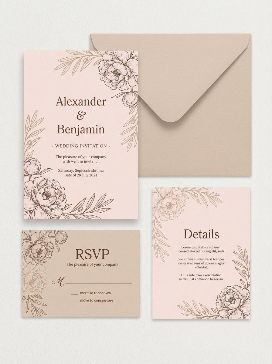
2) Blush Latte
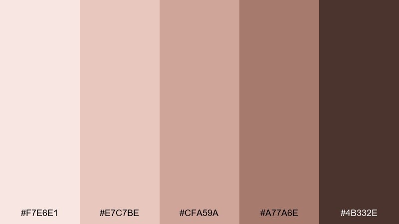
HEX: #F7E6E1 #E7C7BE #CFA59A #A77A6E #4B332E
Mood: romantic, cozy, warm
Best for: wedding invitation suite
Romantic, cozy warmth like blush petals beside a creamy latte. Ideal for wedding stationery, beauty promos, and soft lifestyle social posts that need an inviting glow. Pair with delicate serif typography, light emboss effects, and a hint of chocolate brown for contrast. Usage tip: keep the darkest shade for names and key details so the blush tones stay gentle, not muddy.
Image example of blush latte generated using media.io
3) Coastal Linen
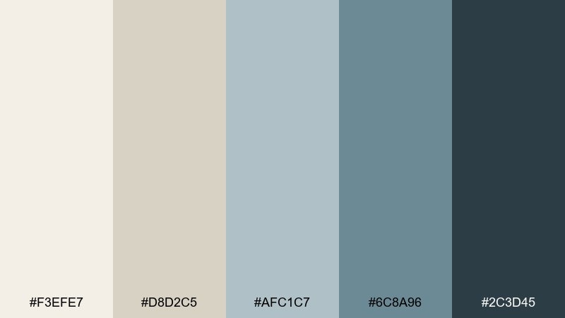
HEX: #F3EFE7 #D8D2C5 #AFC1C7 #6C8A96 #2C3D45
Mood: fresh, breezy, understated
Best for: modern living room interior styling
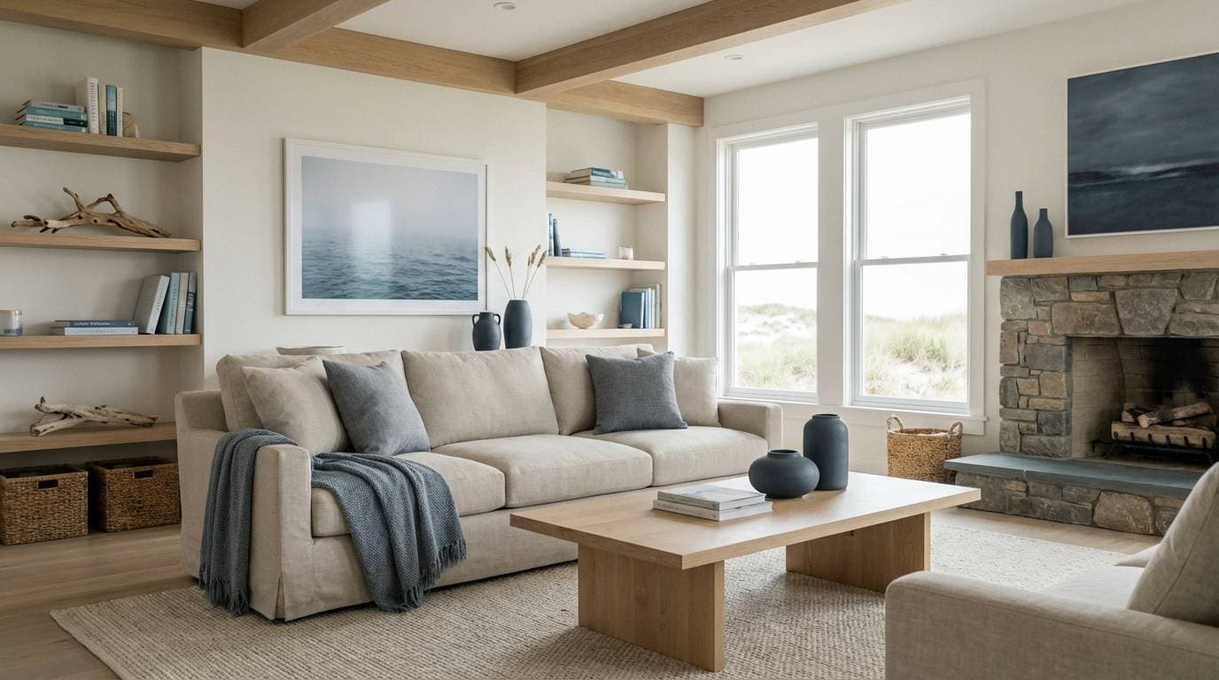
Fresh, breezy neutrals that evoke driftwood, linen curtains, and sea air. Great for interior mood boards, boutique hotel visuals, and calm hero sections on websites. Pair with natural wood textures, matte black hardware, and soft daylight photography. Usage tip: let the blue-gray sit in large blocks, then use the deep slate only for edges, frames, and small high-contrast text.
Image example of coastal linen generated using media.io
4) Soft Lilac Dusk
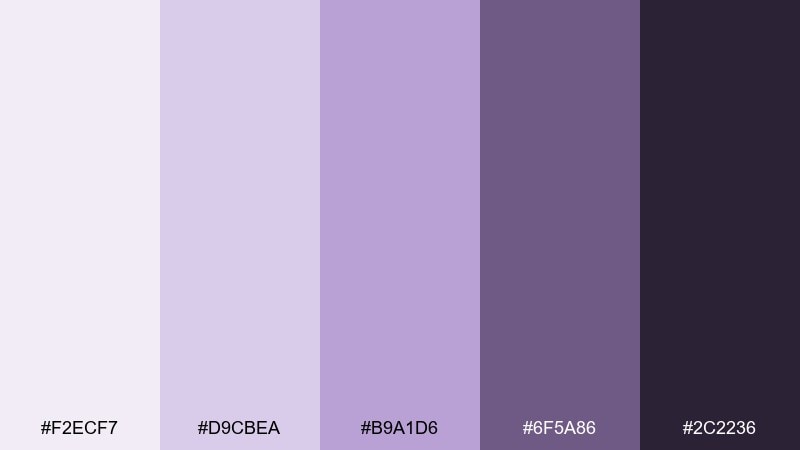
HEX: #F2ECF7 #D9CBEA #B9A1D6 #6F5A86 #2C2236
Mood: dreamy, gentle, cinematic
Best for: music playlist cover art
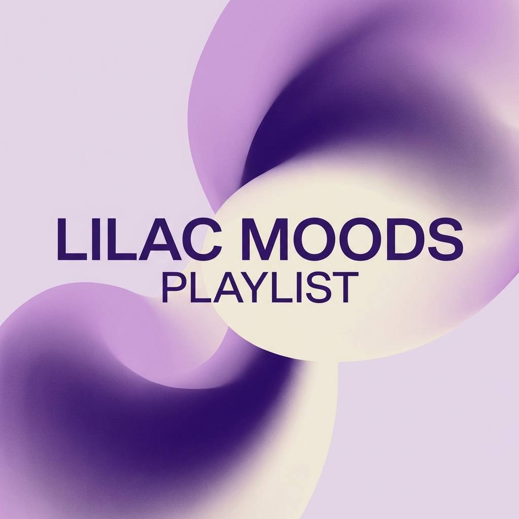
Dreamy lilac dusk tones that feel like twilight fog and quiet synths. Perfect for playlist covers, creator branding, and mood-led social graphics that lean soft but modern. Pair with thin sans typography, subtle gradients, and a touch of dark plum for depth. Usage tip: keep the light lavender as the main field color and use the near-black violet sparingly for crisp type.
Image example of soft lilac dusk generated using media.io
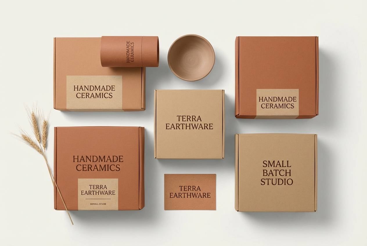
5) Terracotta Whisper
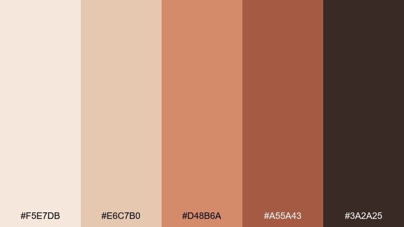
HEX: #F5E7DB #E6C7B0 #D48B6A #A55A43 #3A2A25
Mood: earthy, artisanal, warm
Best for: ceramic product packaging
Earthy, artisanal warmth that calls to mind clay studios and sun-baked walls. It suits pottery brands, handmade packaging, and editorial product shots with a grounded feel. Pair with kraft textures, simple line icons, and a clean cream base so the terracotta stays vibrant. Usage tip: use the mid terracotta for the primary label block, then balance it with plenty of light beige negative space.
Image example of terracotta whisper generated using media.io
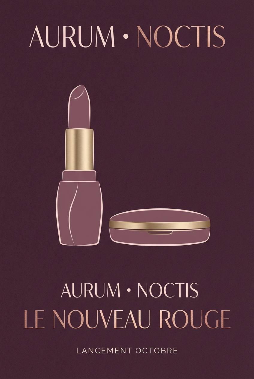
6) Midnight Plum Velvet
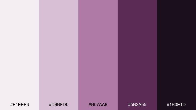
HEX: #F4EEF3 #D9BFD5 #B07AA6 #5B2A55 #1B0E1D
Mood: luxurious, moody, elegant
Best for: cosmetics launch poster
Luxurious, moody tones like velvet curtains and plum lipstick under spotlight. A strong choice for cosmetics launches, premium event posters, and dramatic landing pages. Pair with metallic foil effects, high-contrast photography, and restrained typography so it feels upscale. Usage tip: keep the near-black violet for headlines and logos, and use the dusty mauve as a soft backdrop to avoid harsh contrast.
Image example of midnight plum velvet generated using media.io
7) Neon Peach Pop
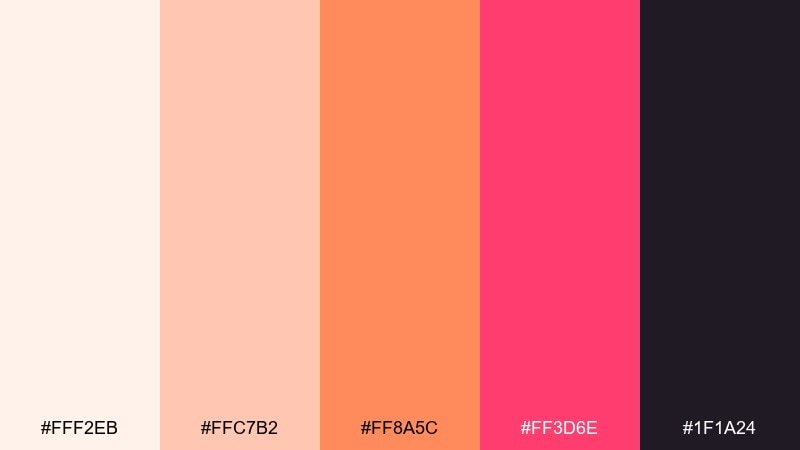
HEX: #FFF2EB #FFC7B2 #FF8A5C #FF3D6E #1F1A24
Mood: bold, playful, energetic
Best for: app promo social ad
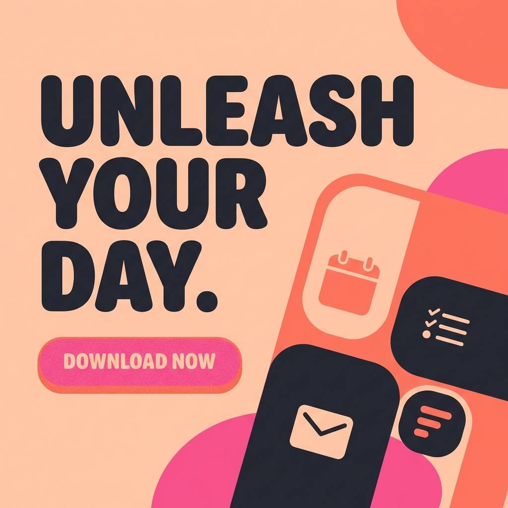
Bold, playful color energy that feels like neon signage reflected on glossy peach soda. Great for app promos, youth-oriented campaigns, and punchy callouts that need instant contrast. Pair with chunky typography, rounded UI shapes, and a dark base to make the coral and pink glow. Usage tip: limit the hot pink to one focal element per layout, such as a badge or button.
Image example of neon peach pop generated using media.io
8) Rainy Day Minimal
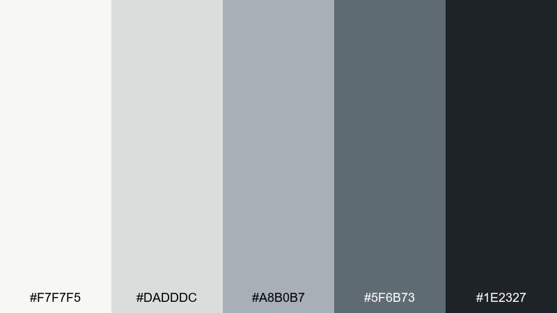
HEX: #F7F7F5 #DADDDC #A8B0B7 #5F6B73 #1E2327
Mood: minimal, quiet, professional
Best for: SaaS dashboard UI mockup
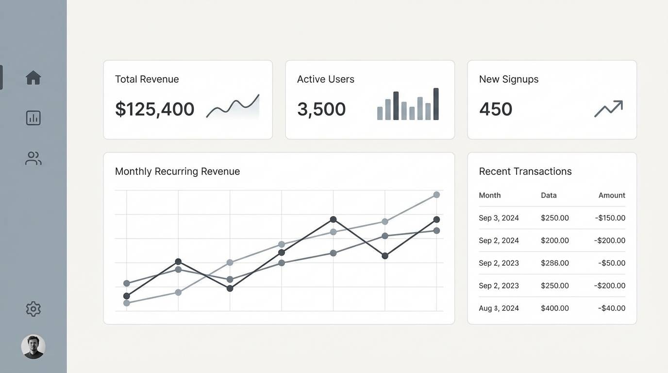
Minimal, quiet grays that evoke rainy sidewalks and clean architecture. For product teams, this is an aesthetic color scheme that keeps dashboards focused and readable without feeling sterile. Pair with subtle shadows, thin dividers, and one restrained accent color if you need status indicators. Usage tip: reserve the darkest charcoal for text and key controls, and keep large surfaces in the warm off-white for comfort.
Image example of rainy day minimal generated using media.io
9) Retro Mint Soda
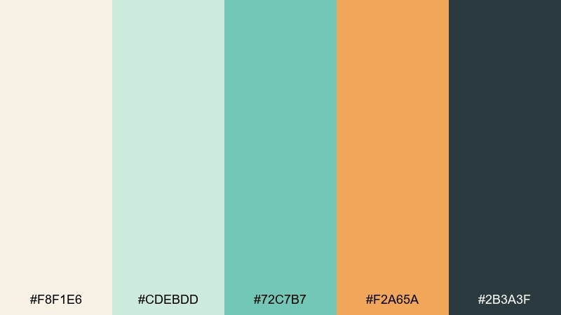
HEX: #F8F1E6 #CDEBDD #72C7B7 #F2A65A #2B3A3F
Mood: retro, cheerful, friendly
Best for: cafe menu design
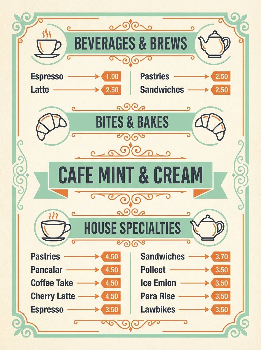
Retro cheer with mint soda fizz, creamy paper, and a splash of orange zest. It shines on cafe menus, vintage-inspired flyers, and playful brand assets that feel approachable. Pair with rounded sans fonts and simple iconography to keep the nostalgia light, not kitschy. Usage tip: use mint and cream for the layout base, then pop the orange only on prices or highlights.
Image example of retro mint soda generated using media.io
10) Warm Clay Studio
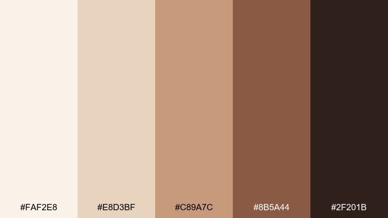
HEX: #FAF2E8 #E8D3BF #C89A7C #8B5A44 #2F201B
Mood: warm, grounded, craft-forward
Best for: handmade workshop flyer
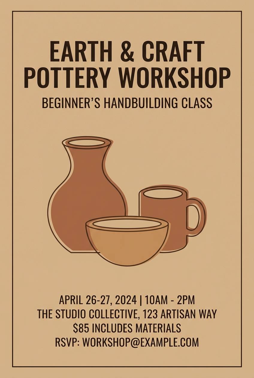
Warm clay tones that feel like a quiet studio, aprons, and dusted ceramics. Use it for workshop flyers, maker markets, and community events where you want a handcrafted vibe. Pair with textured paper backgrounds and simple illustrations in deep brown for authenticity. Usage tip: keep body text in the darkest shade, and let the lighter tans carry the larger blocks to maintain contrast.
Image example of warm clay studio generated using media.io
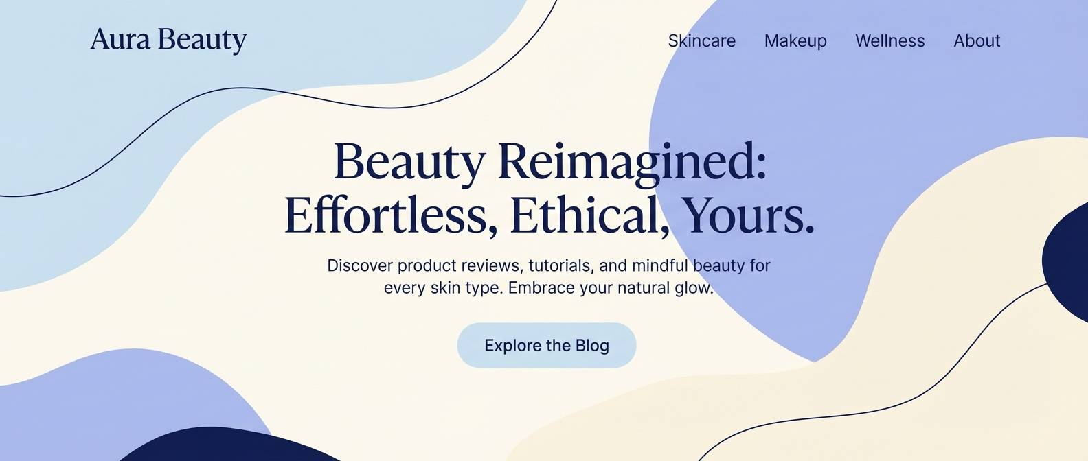
11) Iced Blueberry Milk
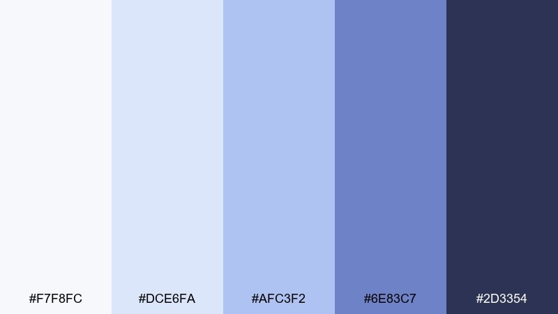
HEX: #F7F8FC #DCE6FA #AFC3F2 #6E83C7 #2D3354
Mood: cool, sweet, soothing
Best for: beauty blog header and hero
Cool, sweet blues that resemble blueberry milk over ice with a soft, creamy finish. A clean choice for beauty blogs, gentle lifestyle branding, and calm hero banners. Pair with airy photography, thin line dividers, and subtle gradients to keep it modern. Usage tip: use the darkest navy for navigation and buttons, while keeping the pale blue for large background panels.
Image example of iced blueberry milk generated using media.io
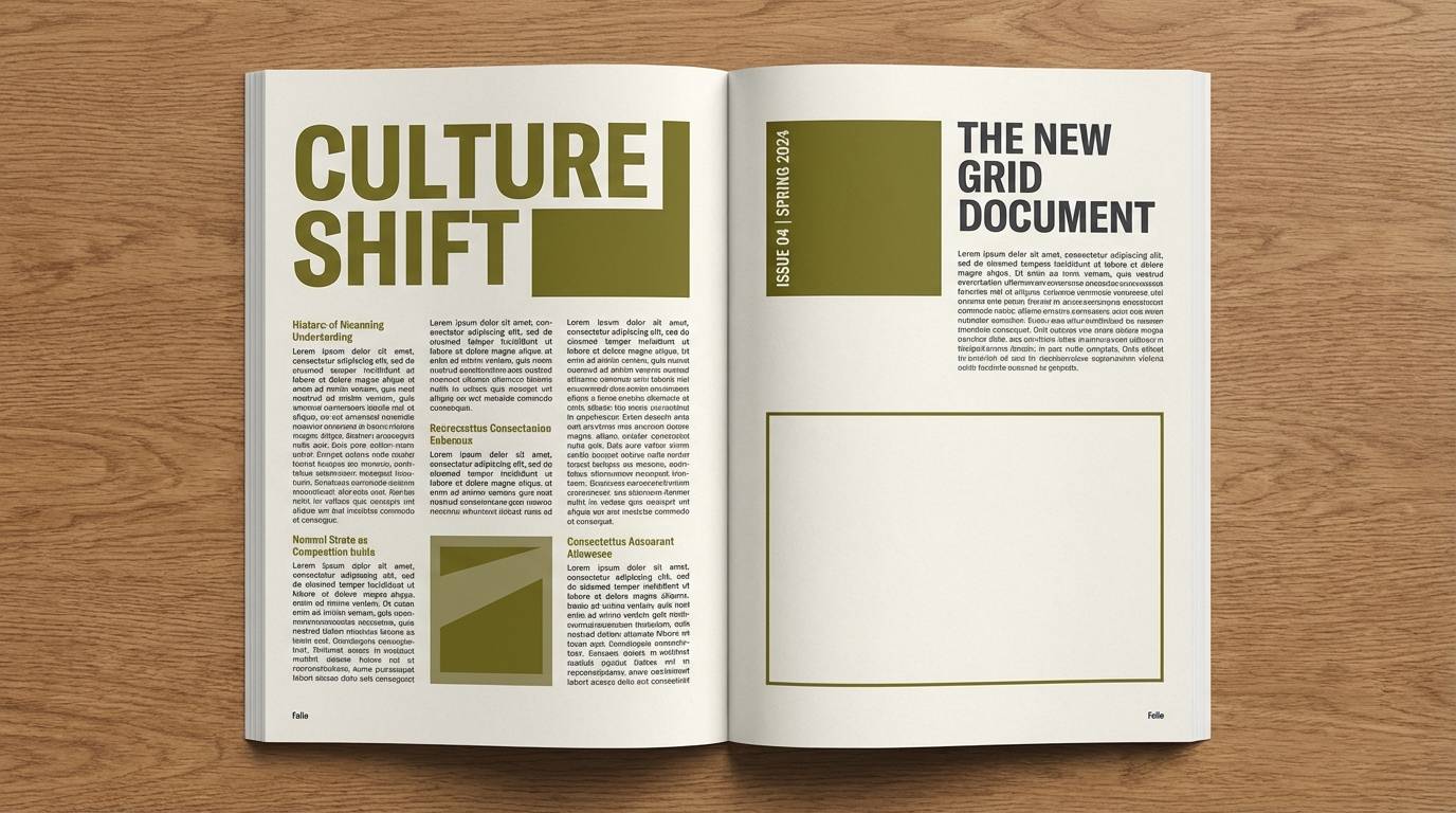
12) Olive Ink Editorial
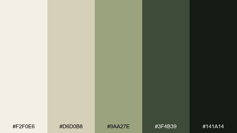
HEX: #F2F0E6 #D6D0B8 #9AA27E #3F4B39 #141A14
Mood: editorial, earthy, refined
Best for: magazine spread layout
Editorial earthiness with olive ink and soft, worn paper. These tones give long-form layouts a grounded feel, making them great for magazines, portfolios, and lookbooks. Pair with strong grids, generous margins, and monochrome photography to keep it sophisticated. Usage tip: use olive as a section marker color, and let the off-white dominate for readability.
Image example of olive ink editorial generated using media.io
13) Cherry Mocha Night
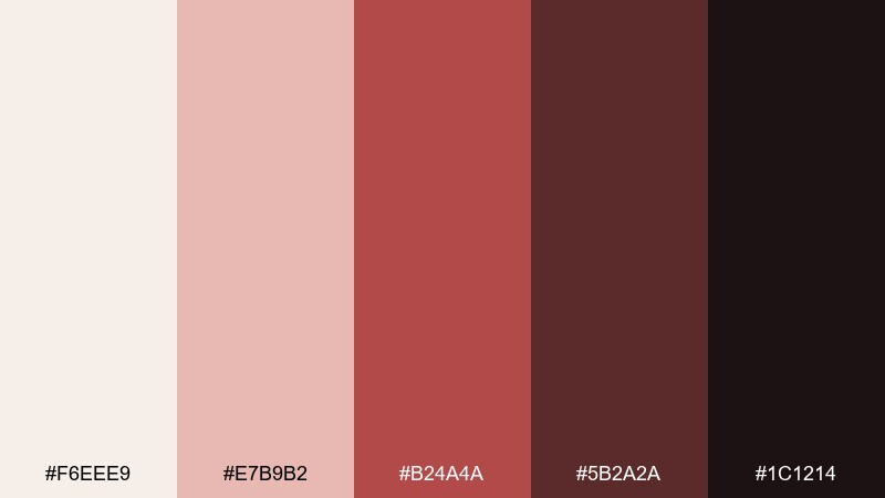
HEX: #F6EEE9 #E7B9B2 #B24A4A #5B2A2A #1C1214
Mood: rich, intimate, dramatic
Best for: coffee shop promotional poster
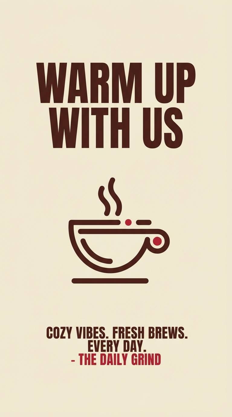
Rich, intimate reds and browns that feel like cherry syrup stirred into a late-night mocha. Ideal for coffee promos, seasonal menus, and bold typography posters with a cozy edge. Pair with cream backgrounds and deep brown type to keep the red from overpowering the layout. Usage tip: treat the cherry tone as a spotlight color for one headline or badge, not the whole page.
Image example of cherry mocha night generated using media.io
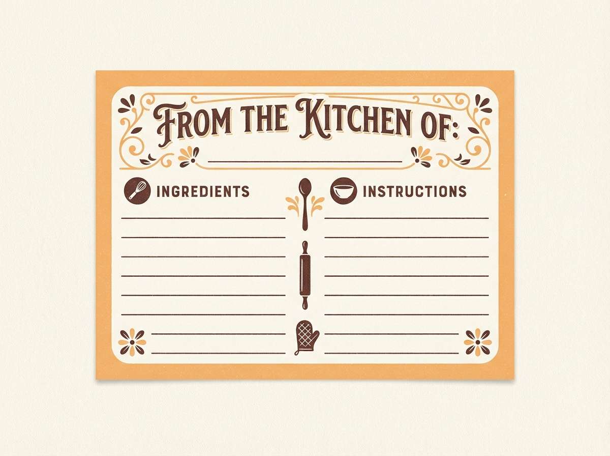
14) Sunlit Apricot
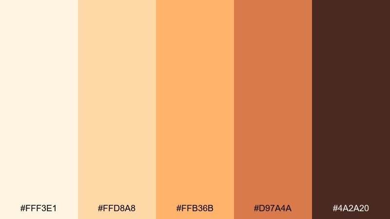
HEX: #FFF3E1 #FFD8A8 #FFB36B #D97A4A #4A2A20
Mood: sunny, optimistic, friendly
Best for: food blog recipe card template
Sunny apricot glow that reads like golden hour on citrus slices. It fits recipe cards, food blog templates, and cheerful newsletters where warmth equals appetite. Pair with clean white space and dark cocoa text for legibility, plus simple food icons for structure. Usage tip: keep the brightest orange for small accents like ratings, tags, or key ingredients.
Image example of sunlit apricot generated using media.io
15) Dusty Rose Typography
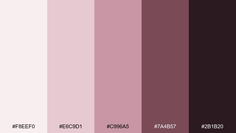
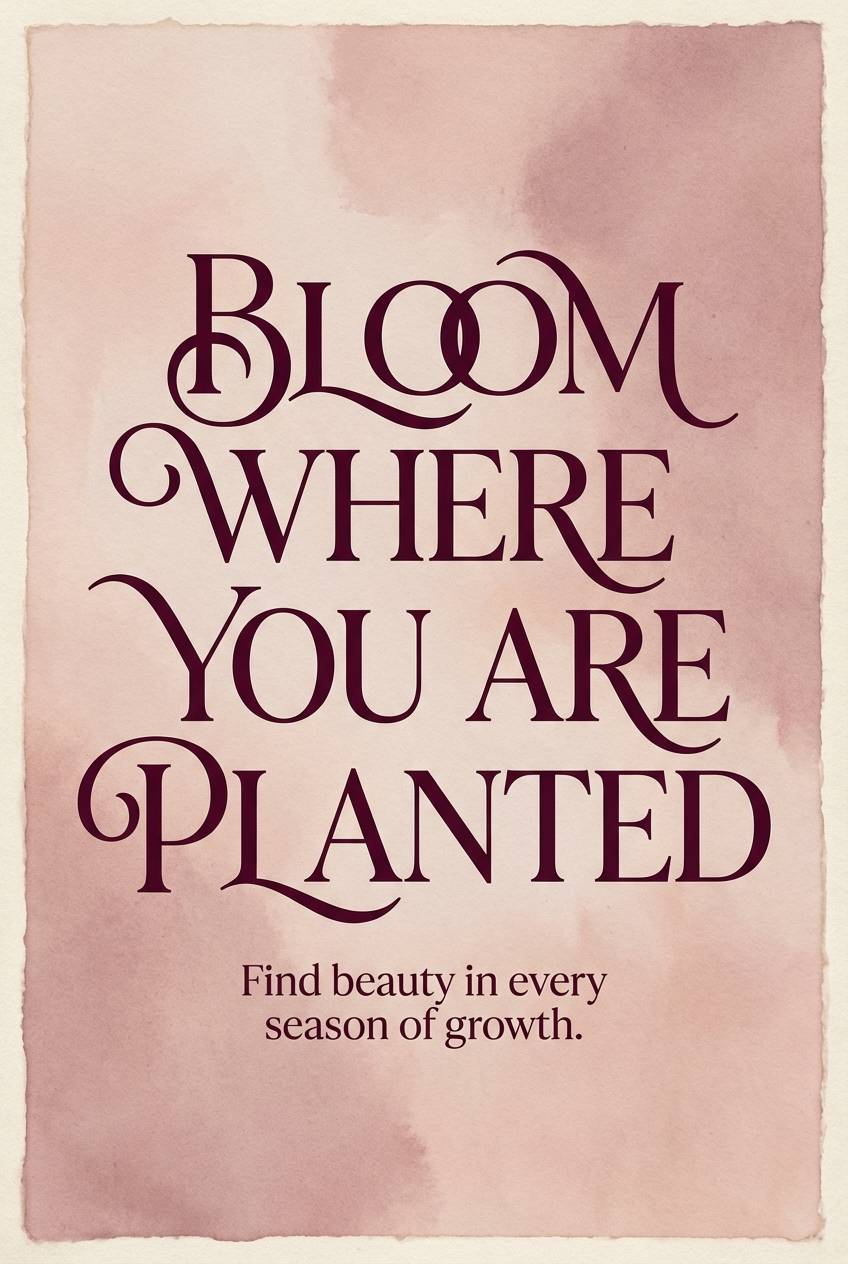
HEX: #F8EEF0 #E6C9D1 #C996A5 #7A4B57 #2B1B20
Mood: soft, poetic, modern classic
Best for: quote poster series
Soft, poetic rose tones that feel like pressed flowers tucked into a book. For creators, these are aesthetic color combinations that make typography-led designs feel warm and intentional. Pair with high-contrast serif headlines and subtle texture to avoid flatness. Usage tip: set large text in the deep wine shade, and keep the background in the palest blush for a clean reading field.
Image example of dusty rose typography generated using media.io
16) Graphite Sand UI
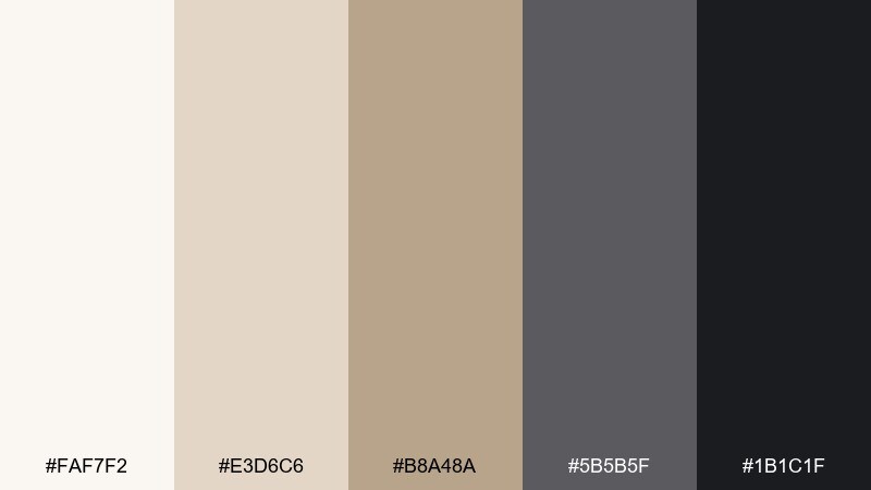
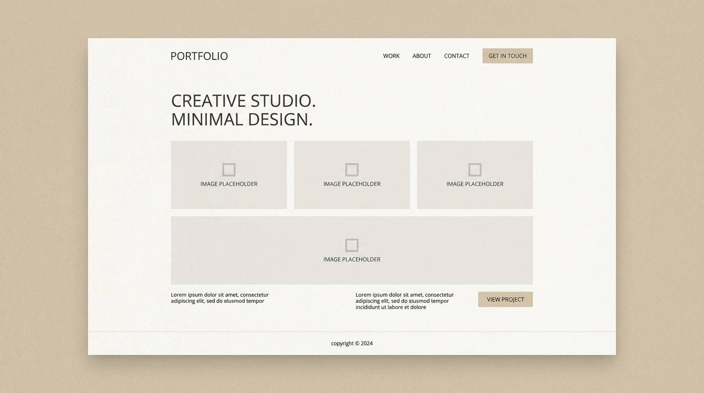
HEX: #FAF7F2 #E3D6C6 #B8A48A #5B5B5F #1B1C1F
Mood: sleek, modern, neutral
Best for: portfolio website UI mockup
Sleek neutrals that evoke graphite sketches on warm sand paper. They are reliable for portfolios, architecture sites, and storefront UI where imagery needs to lead. Pair with monochrome photos, thin borders, and a single warm accent if you want more personality. Usage tip: keep buttons and nav in graphite, and reserve the sandy beige for cards and section dividers.
Image example of graphite sand ui generated using media.io
17) Forest Bath Botanica
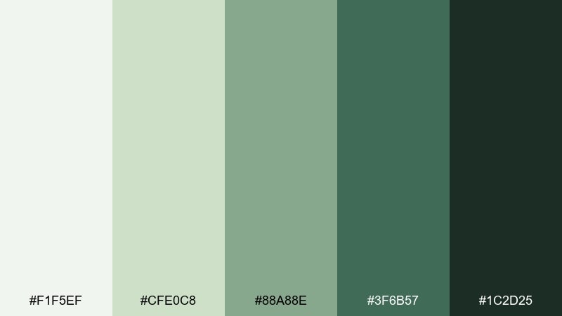
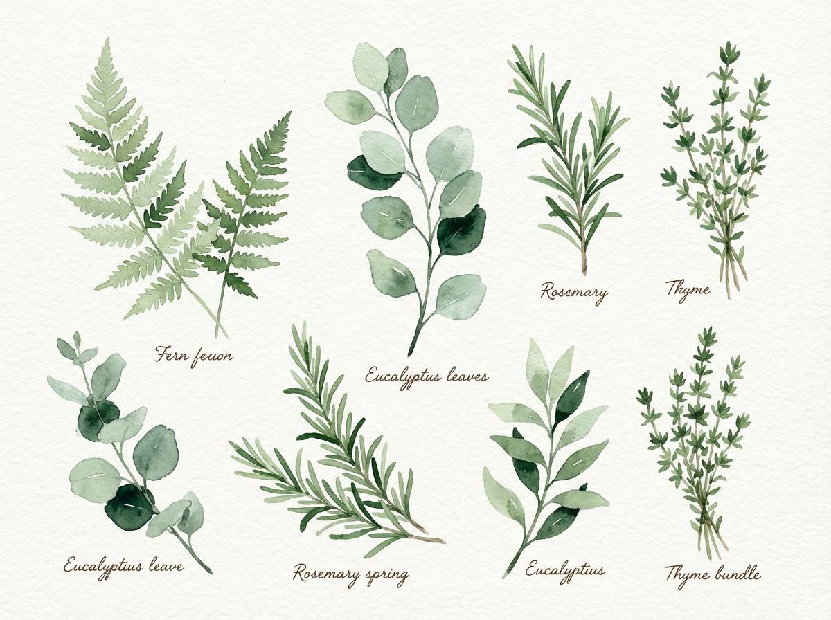
HEX: #F1F5EF #CFE0C8 #88A88E #3F6B57 #1C2D25
Mood: fresh, restorative, botanical
Best for: watercolor botanical illustration set
Fresh, restorative greens that feel like a forest bath after rain. Perfect for botanical prints, eco brand assets, and packaging illustrations that need a natural story. Pair with hand-drawn linework and soft paper grain for an organic finish. Usage tip: paint large leaf shapes in the mid green, then add depth with the darker evergreen only in shadows.
Image example of forest bath botanica generated using media.io
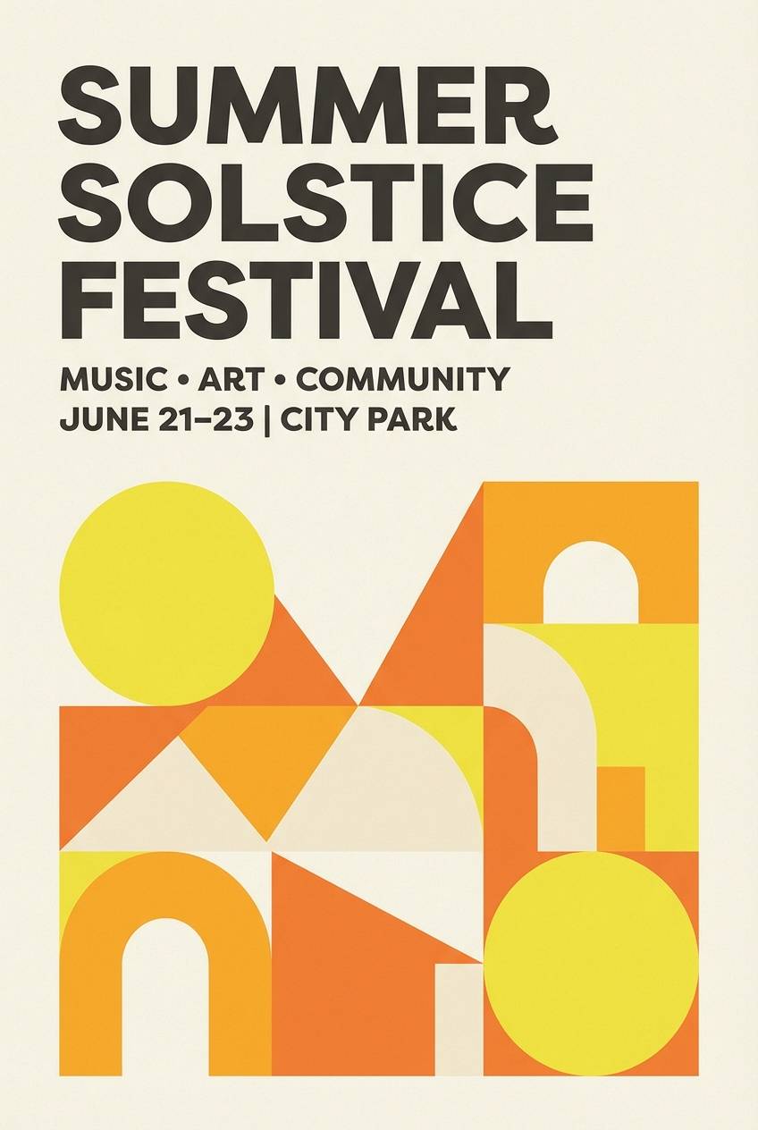
18) Citrus Cream Poster
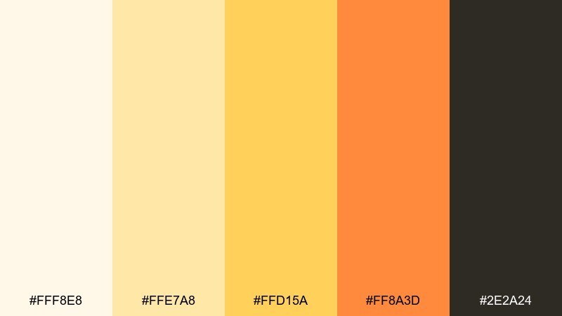
HEX: #FFF8E8 #FFE7A8 #FFD15A #FF8A3D #2E2A24
Mood: bright, zesty, upbeat
Best for: summer event poster
Bright, zesty citrus tones that read like lemonade, sun umbrellas, and warm sand. Great for summer events, pop-up announcements, and playful posters that need instant visibility. Pair with bold type, simple geometric shapes, and a dark neutral for readability. Usage tip: use the strongest orange for one focal shape behind the headline, and keep everything else lighter for balance.
Image example of citrus cream poster generated using media.io
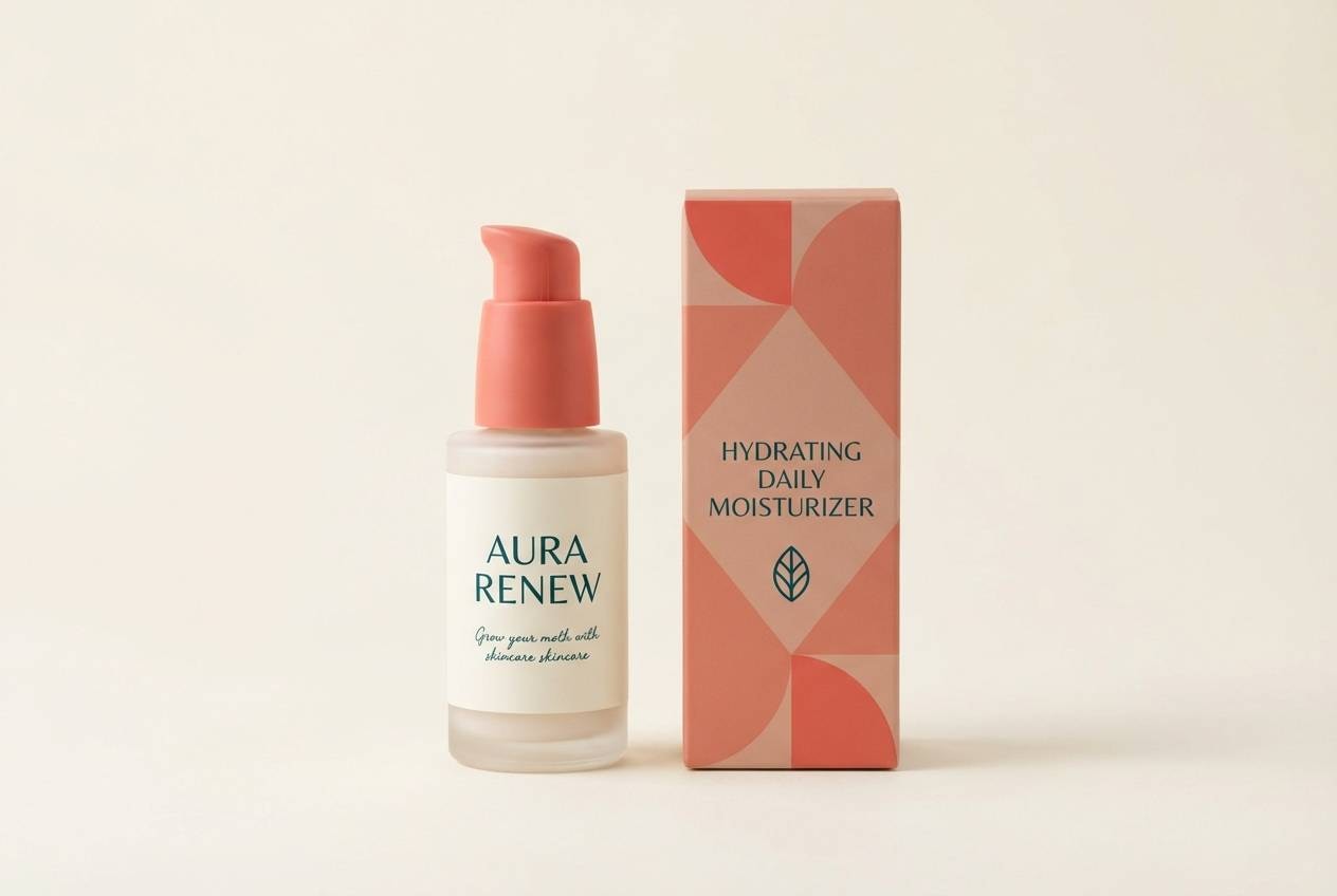
19) Coral Reef Packaging
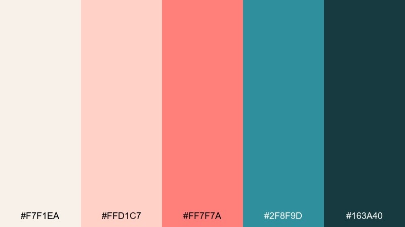
HEX: #F7F1EA #FFD1C7 #FF7F7A #2F8F9D #163A40
Mood: fresh, modern, coastal pop
Best for: skincare bottle label and box
Fresh coral and teal that evoke reef colors against warm, sandy neutrals. These aesthetic color combinations work especially well for skincare packaging that wants to feel clean but lively. Pair with minimal label layouts, fine line icons, and a cream base to keep it premium. Usage tip: let teal carry the brand mark or cap color, while coral highlights one key benefit callout.
Image example of coral reef packaging generated using media.io
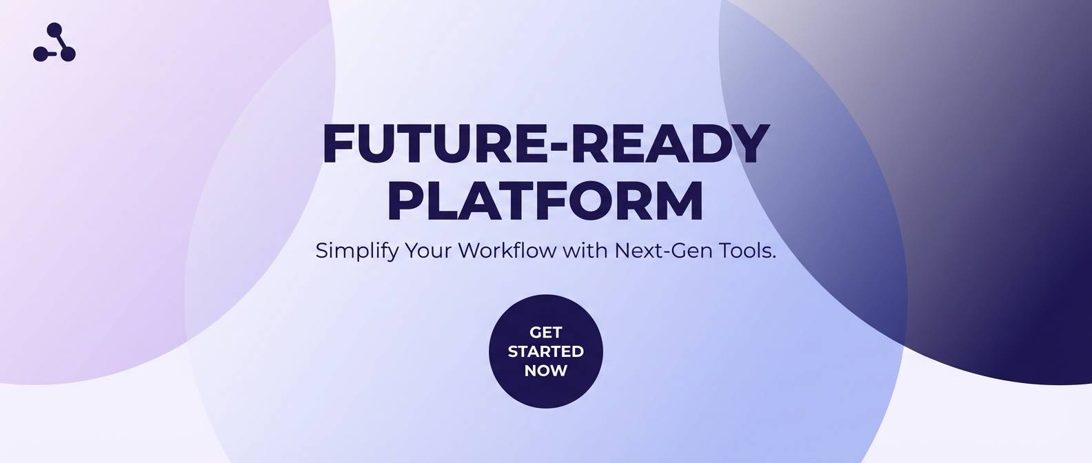
20) Arctic Lavender Gradient
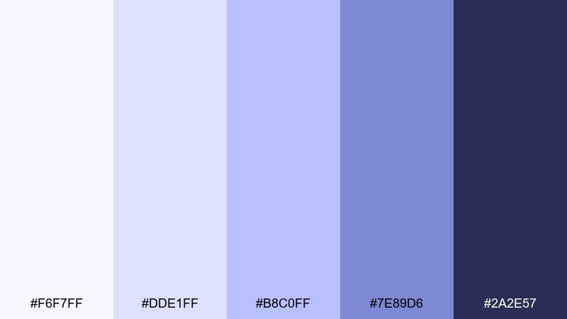
HEX: #F6F7FF #DDE1FF #B8C0FF #7E89D6 #2A2E57
Mood: cool, futuristic, serene
Best for: tech landing page hero section
Cool, futuristic lavender-blue that feels like polar light and clean glass. Use it for tech landing pages, gradient hero sections, and product reveals that need calm confidence. Pair with crisp sans typography and simple icon sets to keep the look sharp. Usage tip: blend the two lightest tones for backgrounds, then use the deep indigo for primary buttons and key metrics.
Image example of arctic lavender gradient generated using media.io
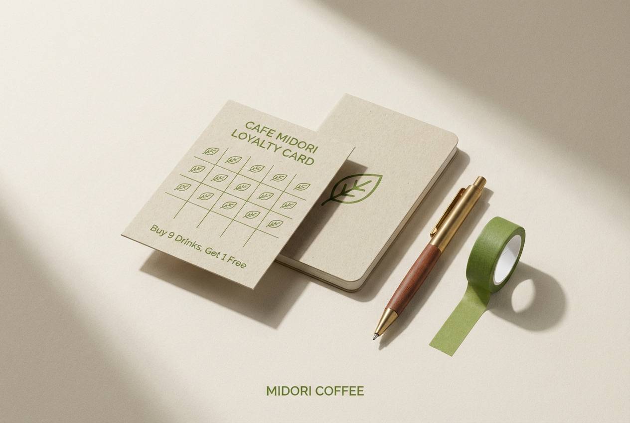
21) Oat Milk Matcha
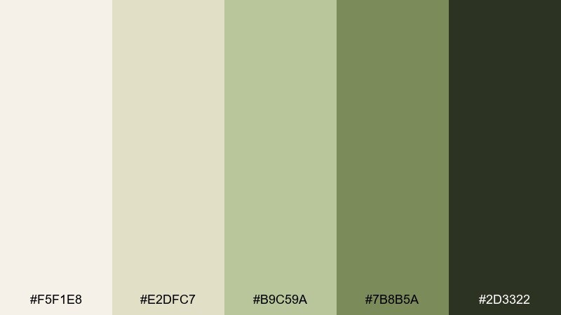
HEX: #F5F1E8 #E2DFC7 #B9C59A #7B8B5A #2D3322
Mood: cozy, organic, balanced
Best for: cafe loyalty card design
Cozy, organic tones that feel like oat milk foam and matcha powder. This mix is a smart aesthetic color combination for cafes, natural food brands, and calm social templates. Pair with hand-drawn stamps, rounded type, and plenty of cream space for a friendly look. Usage tip: keep the darkest green for punch stamps and key text, and let the pale oat tone hold the background.
Image example of oat milk matcha generated using media.io
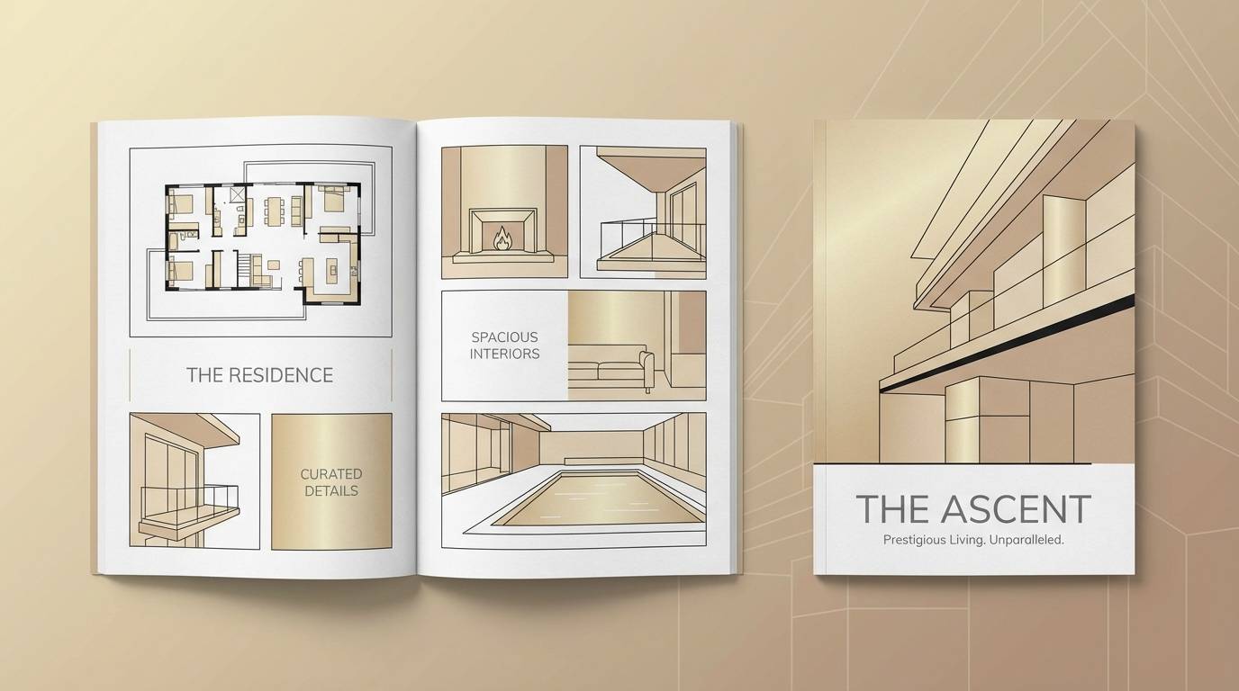
22) Champagne Smoke
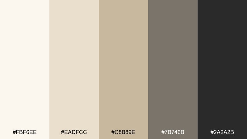
HEX: #FBF6EE #EADFCC #C8B89E #7B746B #2A2A2B
Mood: elegant, muted, timeless
Best for: luxury real estate brochure
Elegant champagne neutrals with a smoky edge, like candlelight in a quiet gallery. Ideal for luxury brochures, premium service brands, and understated corporate decks. Pair with high-end photography, thin rules, and refined serif headings for a timeless finish. Usage tip: keep backgrounds in the lightest champagne and use smoke gray for captions and secondary text to maintain hierarchy.
Image example of champagne smoke generated using media.io
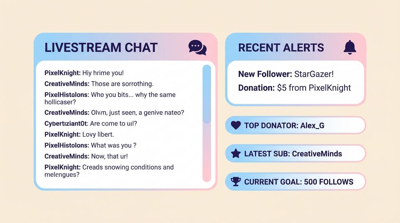
23) Candy Sky
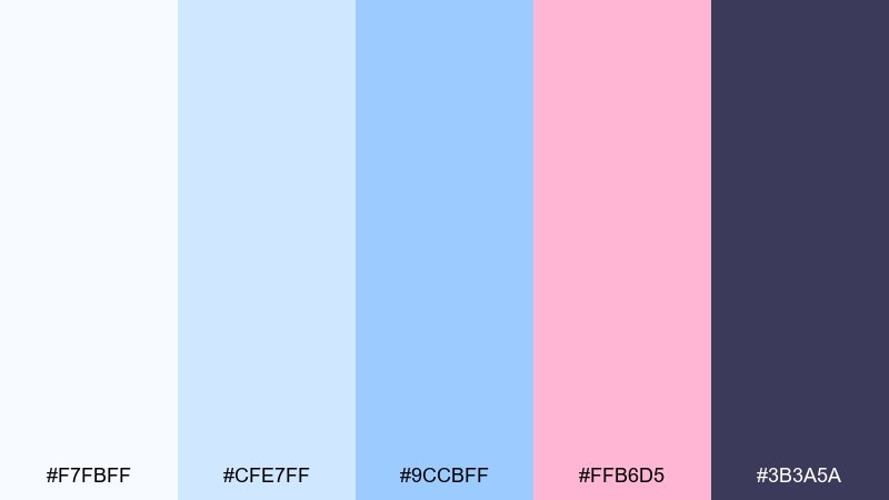
HEX: #F7FBFF #CFE7FF #9CCBFF #FFB6D5 #3B3A5A
Mood: sweet, airy, youthful
Best for: stream overlay UI panels
Sweet, airy tones that look like cotton-candy clouds over a clear sky. Great for stream overlays, creator panels, and playful UI elements where clarity still matters. Pair with rounded rectangles, subtle glow effects, and a deep indigo for text contrast. Usage tip: keep pink as a highlight color for alerts, while blues handle the main panel backgrounds.
Image example of candy sky generated using media.io
What Colors Go Well with Aesthetic?
Aesthetic color combinations typically start with a soft neutral base (cream, off-white, fog gray) so layouts feel open and modern. Then a muted mid-tone (sage, dusty rose, periwinkle, sand) sets the mood without overwhelming the design.
To keep it usable, add one deep anchor shade (charcoal, espresso, deep slate, indigo) for text, icons, and key UI controls. This creates clarity and prevents pastel-heavy designs from looking washed out.
For accents, choose a single “pop” color (coral, citrus, hot pink, teal) and use it sparingly for CTAs, badges, or highlights. The restraint is what makes the palette feel aesthetic rather than chaotic.
How to Use a Aesthetic Color Palette in Real Designs
Start by assigning roles, not just colors: background, surface/card, border/divider, primary text, and accent. When each shade has a job, your design stays consistent across pages and assets.
Prioritize contrast early. Use the darkest tone for typography and UI states (active, hover, selected), and keep large areas in the lightest tones to avoid a heavy, muddy look.
If you’re combining photos with aesthetic colors, pull one mid-tone from imagery and match it to your palette, then use neutrals to frame the content. This is especially effective for branding, posters, and interior mood boards.
Create Aesthetic Palette Visuals with AI
If you already have HEX codes, you can quickly turn them into brand boards, UI mockups, posters, and packaging-style visuals using AI prompts. This helps you validate mood and readability before committing to final design work.
In Media.io, you can iterate faster by generating multiple compositions with the same palette direction, then refining typography, layout, and contrast based on what looks best in real contexts.
Use the sample prompts above as a template, then swap subjects (landing page, invitation, label, overlay) while keeping your palette consistent.
Aesthetic Color Palette FAQs
-
What makes a color palette “aesthetic”?
An aesthetic color palette usually combines soft neutrals, muted mid-tones, and one deep anchor shade for contrast. The overall effect feels curated, calm, and modern rather than overly saturated or busy. -
How do I choose an accent color for aesthetic designs?
Pick one accent that contrasts clearly with your base (for example, coral, citrus, teal, or hot pink), then use it sparingly on CTAs, badges, or highlights. Keeping accents limited is key to the aesthetic look. -
Are pastel colors required for an aesthetic palette?
No. Many aesthetic palettes are pastel-leaning, but you can also build an aesthetic scheme with warm neutrals, olive tones, smoky grays, or moody plums—so long as the balance and contrast stay intentional. -
What’s the best text color for muted aesthetic backgrounds?
Use the darkest shade in your palette (charcoal, deep slate, espresso, or indigo) for body text and navigation. This preserves readability while keeping the overall tone soft. -
How many colors should an aesthetic palette have?
Five is a practical sweet spot: two lights (background/surfaces), two mid-tones (mood and supporting elements), and one dark (text/CTAs). You can expand later with tints/shades, but keep the core consistent. -
How do I apply an aesthetic color palette to UI design?
Assign colors by function: background, card, border, primary text, secondary text, and a single action color. Test states (hover/active/disabled) using tints and shades of the same palette to stay cohesive. -
Can I generate aesthetic mockups from these palette ideas?
Yes. Use Media.io’s text-to-image tool with prompts that describe the layout type (brand board, poster, landing hero, packaging) and specify the dominant palette direction. Generate a few options, then pick the most readable composition.


