Neutral color palettes are the quiet backbone of great design: flexible, calming, and easy to adapt across web, print, and interiors. With the right balance of light and dark tones, neutrals can feel minimal, cozy, editorial, or even luxurious.
Below are 20 neutral palette ideas with HEX codes, plus practical guidance for pairing neutrals with accents and generating on-brand visuals fast.
In this article
Why Neutral Palettes Work So Well
Neutral tones create instant clarity. Because they sit outside strong hue “opinions,” they give typography, layout, and imagery more room to lead without competing for attention.
They also scale beautifully across products and surfaces: the same beige-to-brown range can look premium on packaging, calm in UI, and timeless in interiors. That versatility makes neutrals a reliable foundation for systems like branding kits and design libraries.
Finally, neutrals make accent colors more effective. When your base is quiet, a single bold highlight (for CTAs, charts, or key details) reads as intentional instead of noisy.
20+ Neutral Color Palette Ideas (with HEX Codes)
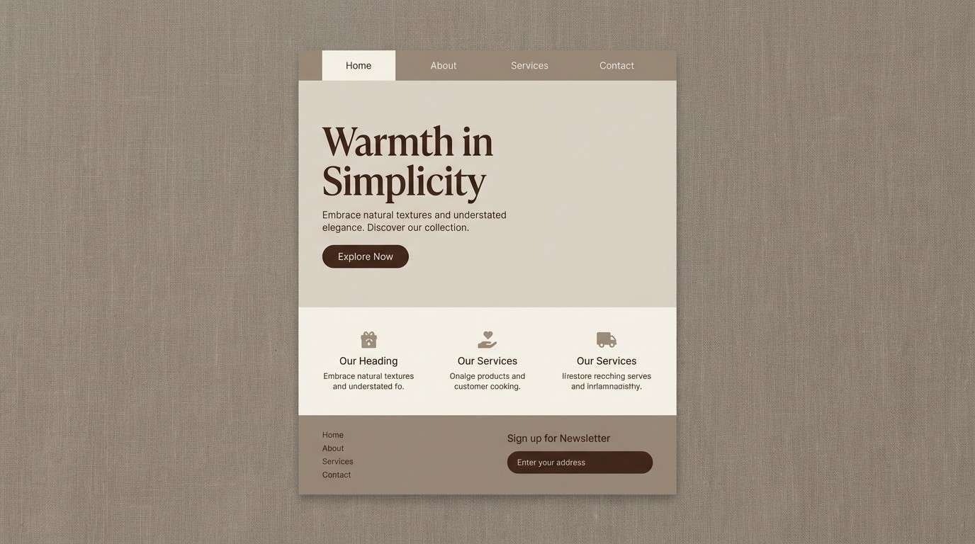
1) Linen Loft

HEX: #f5f0e8 #e6dccf #cbbba6 #a8957e #6e5f50
Mood: airy, warm
Best for: Lifestyle brand homepage UI
Airy linen and sun-warmed wood tones bring a calm, lived-in feel. Use it for lifestyle sites, wellness brands, or minimalist ecommerce where softness matters. Pair with crisp black type and plenty of whitespace to keep everything readable. Tip: reserve the deepest brown for buttons and key links to avoid a washed-out interface.
Image example of linen loft generated using media.io
Media.io is an online AI studio for creating and editing video, image, and audio in your browser.

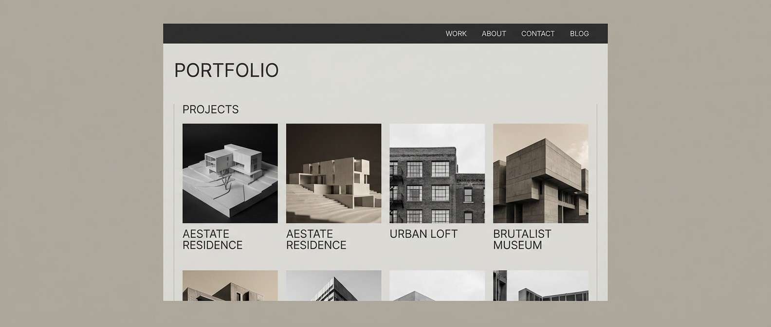
2) Stone Harbor
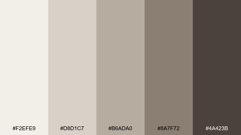
HEX: #f2efe9 #d8d1c7 #b6ada0 #8a7f72 #4a423b
Mood: grounded, coastal-stone
Best for: Architecture portfolio website
Cool stone, drifted sand, and weathered timber create a steady, professional atmosphere. It fits architecture portfolios, construction studios, and case-study heavy sites that need clarity without harsh contrast. Combine the pale gray-beige for sections with the charcoal-brown for headings and nav. Tip: keep imagery slightly desaturated so the palette stays in control.
Image example of stone harbor generated using media.io
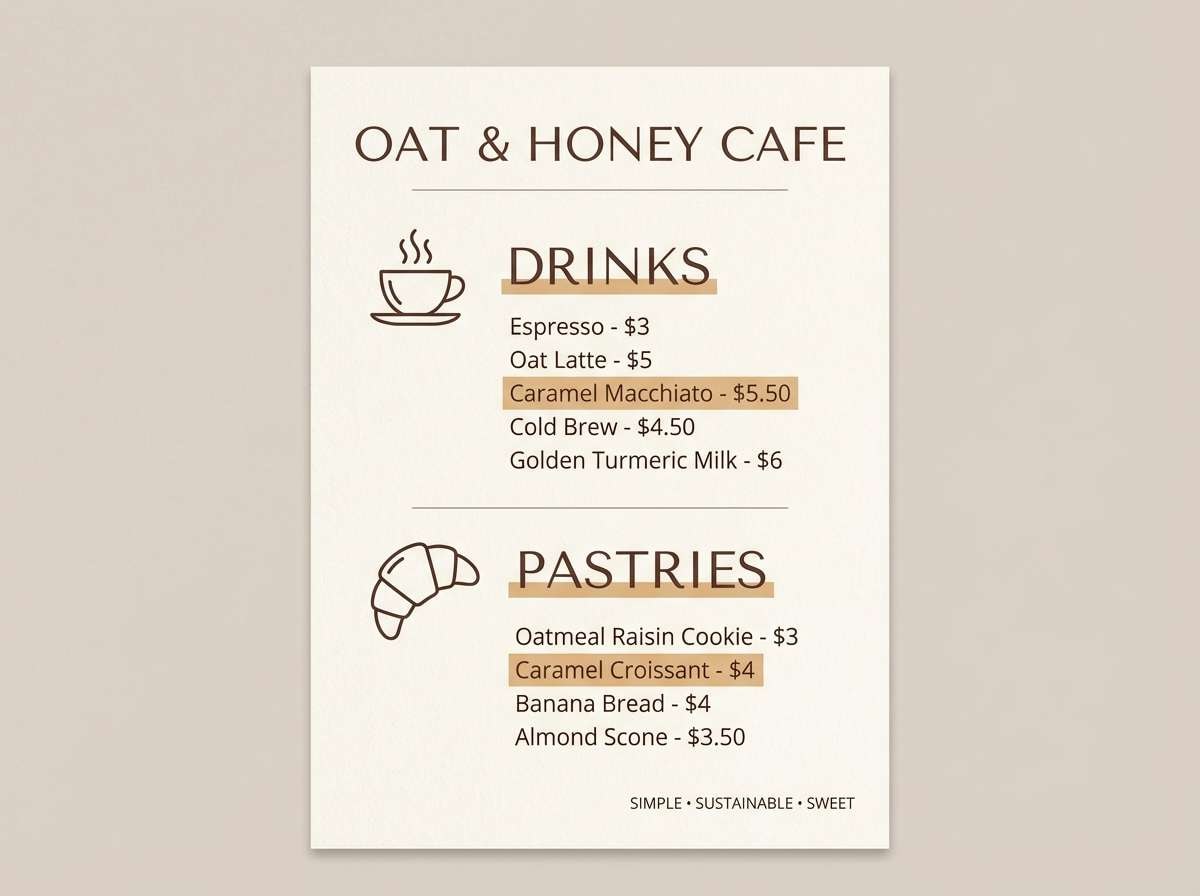
3) Oat Milk Minimal
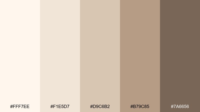
HEX: #fff7ee #f1e5d7 #d9c6b2 #b79c85 #7a6656
Mood: soft, creamy
Best for: Cafe menu flyer
Creamy oat tones and gentle caramel notes feel cozy and unhurried, like a quiet morning at a corner cafe. These neutral color combinations work beautifully for menus, bakery labels, and small-batch coffee branding. Pair with a dark cocoa text color and simple line icons for a modern look. Tip: use the mid-tan for pricing callouts so they stand out without shouting.
Image example of oat milk minimal generated using media.io
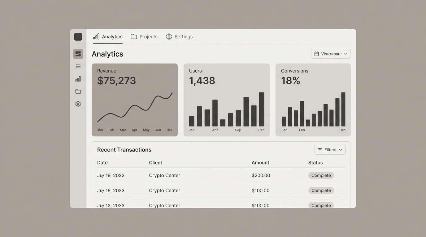
4) Warm Concrete
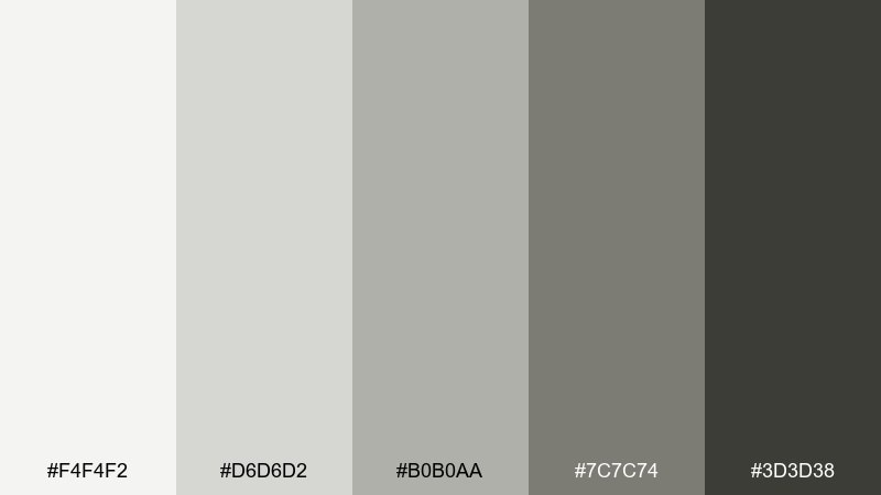
HEX: #f4f4f2 #d6d6d2 #b0b0aa #7c7c74 #3d3d38
Mood: industrial, clean
Best for: SaaS dashboard UI
Brushed concrete grays with a warm undertone feel modern and efficient. Ideal for SaaS dashboards and data-heavy products where contrast and hierarchy matter more than decoration. Use the lightest gray for panels, mid gray for dividers, and charcoal for charts and active states. Tip: introduce subtle elevation and spacing so the similar tones do not blur together.
Image example of warm concrete generated using media.io
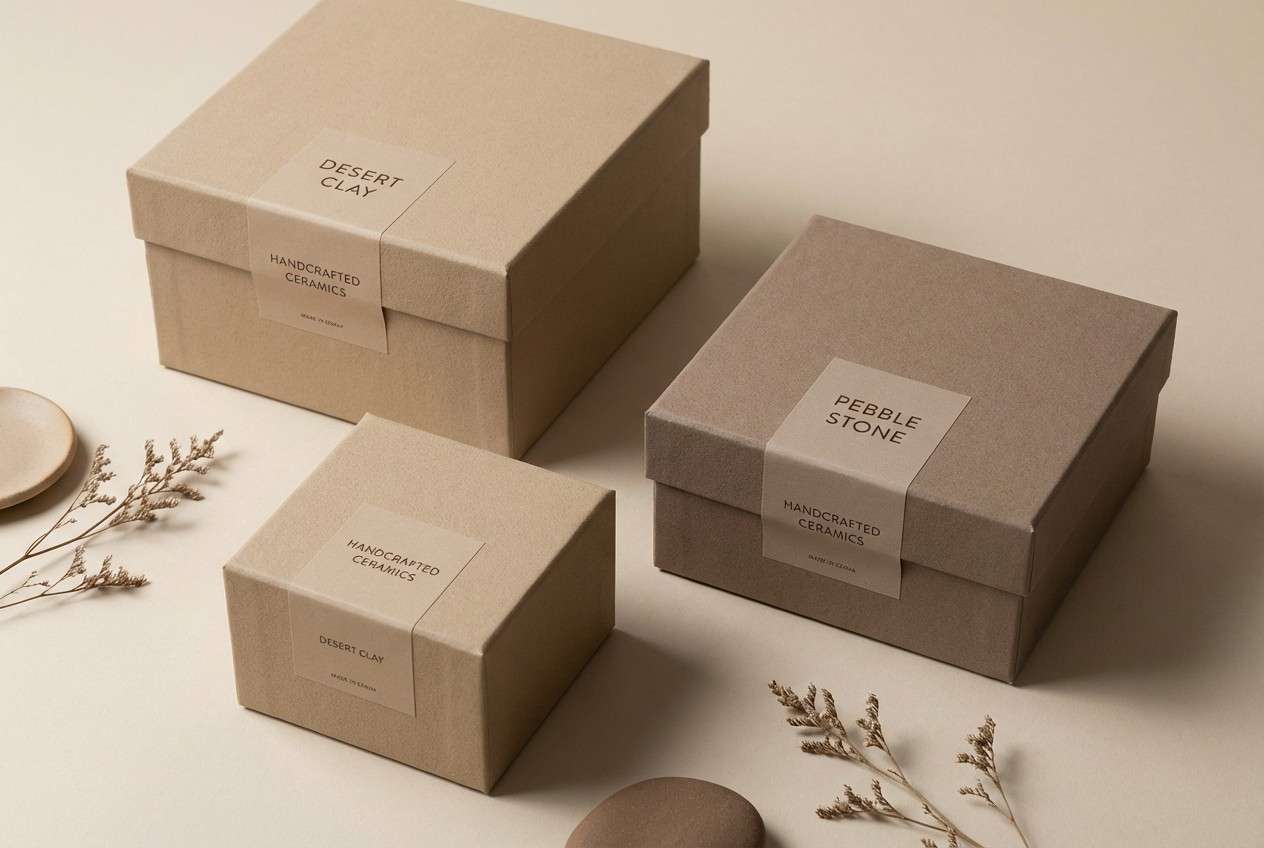
5) Desert Pebble
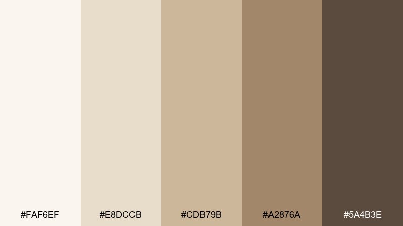
HEX: #faf6ef #e8dccb #cdb79b #a2876a #5a4b3e
Mood: earthy, sunbaked
Best for: Ceramics product packaging
Sunbaked sand and river-pebble browns give a handcrafted, grounded vibe. It suits ceramics, natural skincare, and artisan goods that want to feel tactile and honest. Pair with uncoated paper textures and a simple stamp-style logo. Tip: keep the darkest brown for small details like ingredient lists and barcodes to preserve the airy look.
Image example of desert pebble generated using media.io
6) Cashmere Studio
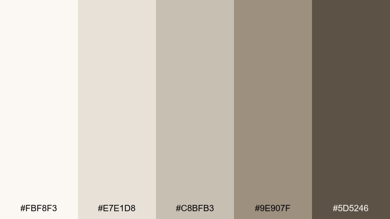
HEX: #fbf8f3 #e7e1d8 #c8bfb3 #9e907f #5d5246
Mood: cozy, refined
Best for: Interior design mood board
Cashmere-like creams and warm taupes feel quietly luxurious and comforting. Use it for interior design decks, boutique hotel concepts, or high-end service brands that want softness without sweetness. Pair with brushed metal accents and plenty of negative space. Tip: keep imagery warm-balanced so the neutrals stay creamy, not gray.
Image example of cashmere studio generated using media.io
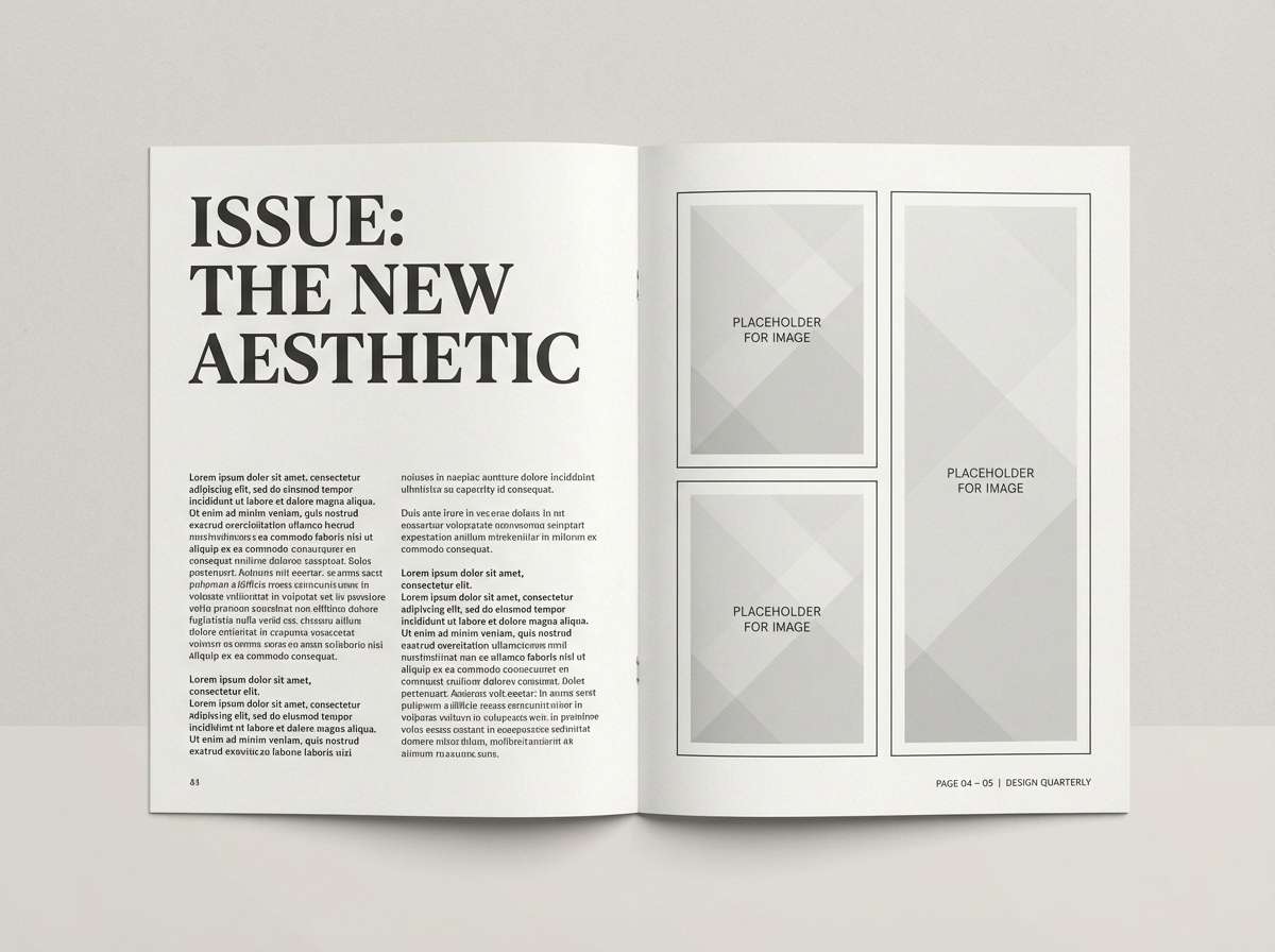
7) Paper & Ink
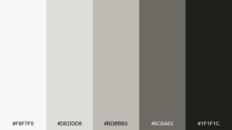
HEX: #f8f7f5 #deddd8 #bdbbb3 #6c6a63 #1f1f1c
Mood: editorial, crisp
Best for: Magazine layout design
Clean paper whites and inky charcoals evoke fresh print pages and sharp typography. Perfect for editorial layouts, portfolios, and brand guidelines where structure and legibility lead. Use near-black for headlines, the mid gray for captions, and off-white for generous margins. Tip: add one bold photo per spread to keep the monochrome feel dynamic.
Image example of paper & ink generated using media.io
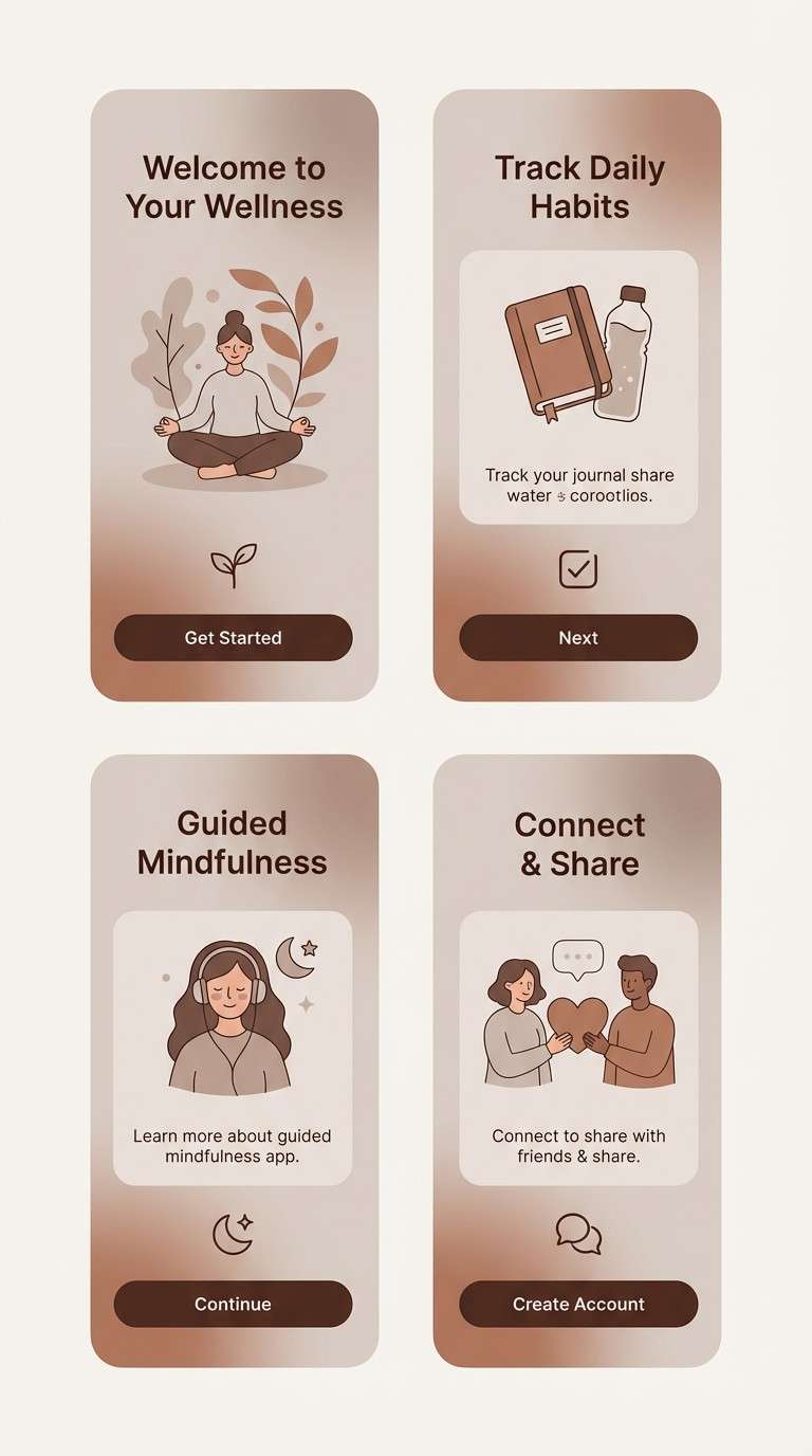
8) Mushroom Modern
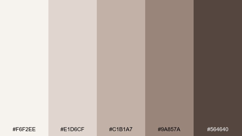
HEX: #f6f2ee #e1d6cf #c1b1a7 #9a857a #564640
Mood: organic, modern
Best for: Wellness app onboarding screens
Mushroom taupes and soft clay browns feel grounded, gentle, and human. This neutral color palette is a strong fit for wellness apps, coaching sites, and mindful products that avoid stark black-and-white. Pair with warm illustrations and rounded UI shapes for an inviting tone. Tip: use the darker brown sparingly for progress indicators and primary actions.
Image example of mushroom modern generated using media.io
9) Driftwood Dune

HEX: #f7f3ea #e3d7c5 #c8b08f #9c7f5f #5a4636
Mood: beachy, rustic
Best for: Travel blog hero banner
Driftwood browns and dune sands conjure slow walks, salt air, and sun-faded textures. Great for travel blogs, outdoor brands, and storytelling pages that rely on big photography. Pair with creamy backgrounds and a darker brown overlay for readable text on images. Tip: keep your accent elements minimal so the natural warmth stays the hero.
Image example of driftwood dune generated using media.io

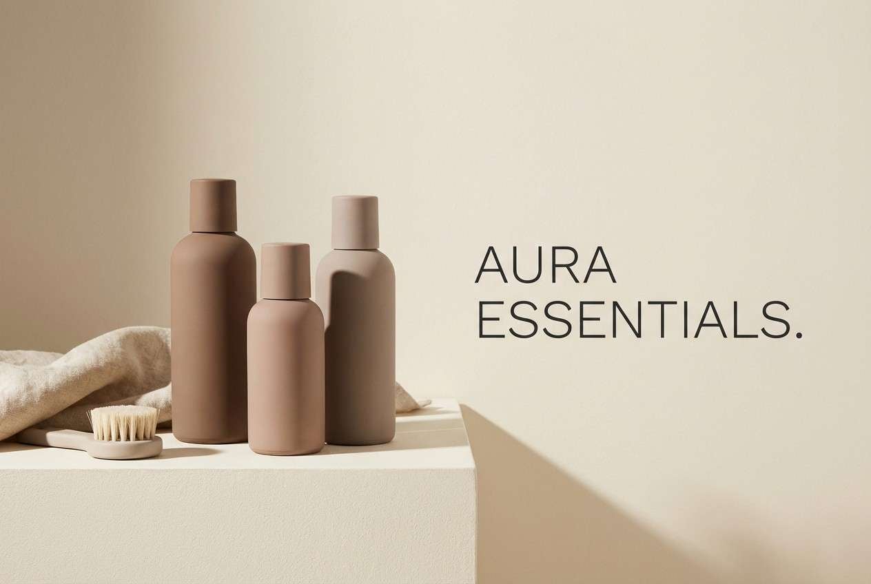
10) Cappuccino Clay
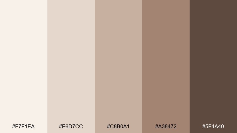
HEX: #f7f1ea #e6d7cc #c8b0a1 #a38472 #5f4a40
Mood: warm, approachable
Best for: Beauty product ad
Cappuccino creams and clay browns feel flattering, soft, and approachable. Use it for beauty ads, skincare landing pages, or creator brands that want warmth without heavy saturation. Pair with glossy product renders and minimal sans-serif type for a clean finish. Tip: let the mid-tone clay be your dominant color and keep the deep brown for shadows and small type.
Image example of cappuccino clay generated using media.io
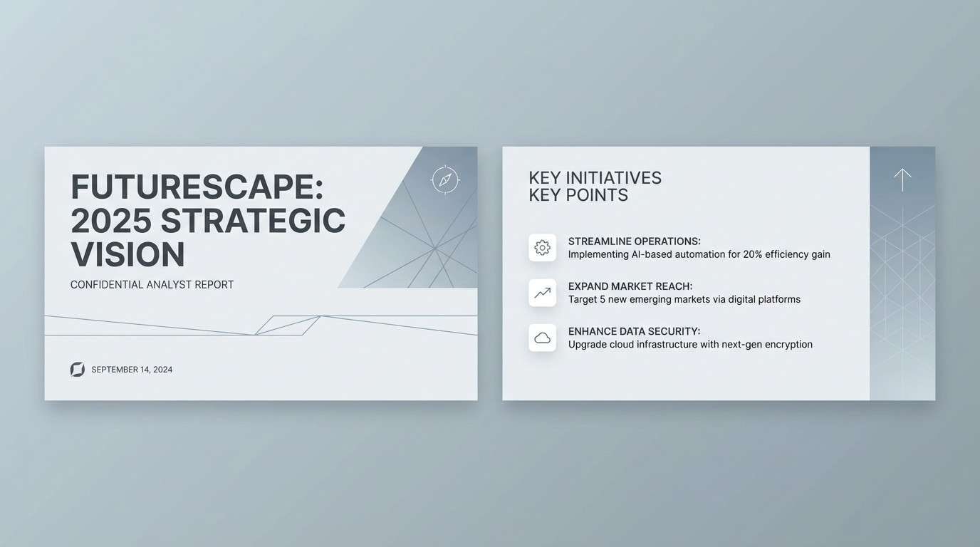
11) Foggy Terrace
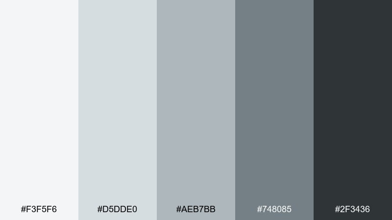
HEX: #f3f5f6 #d5dde0 #aeb7bb #748085 #2f3436
Mood: cool, serene
Best for: Corporate slide deck
Foggy blues and cool grays suggest calm focus, like a quiet city terrace after rain. Ideal for corporate decks, reports, and B2B presentations that need a polished, trustworthy tone. Pair with one bold chart color only if you truly need emphasis, otherwise let contrast do the work. Tip: use the darkest charcoal for headings and the pale gray for section breaks.
Image example of foggy terrace generated using media.io
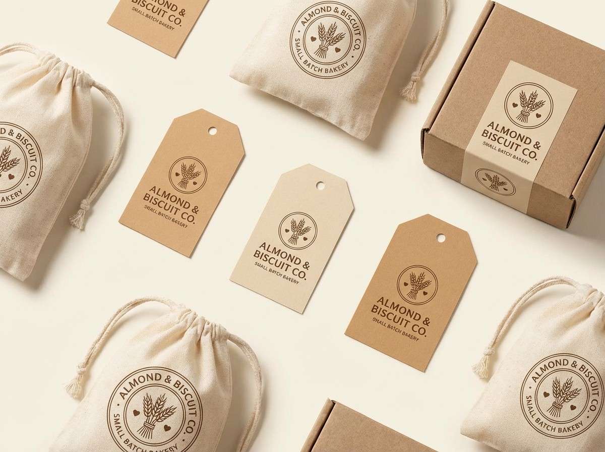
12) Almond Biscuit
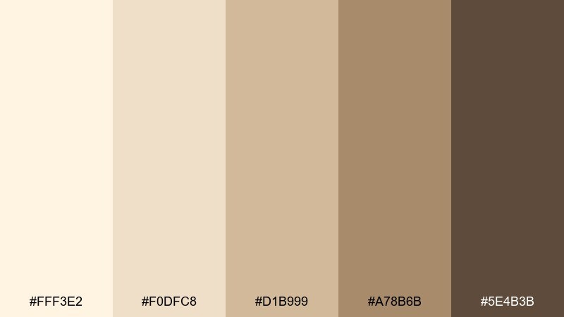
HEX: #fff3e2 #f0dfc8 #d1b999 #a78b6b #5e4b3b
Mood: sweet, nostalgic
Best for: Bakery brand logo and labels
Almond cream and toasted biscuit browns feel nostalgic and homemade. It works for bakery branding, jam jars, and cozy food packaging where warmth sells the story. Pair with hand-drawn flourishes and a dark chocolate brown for text. Tip: keep backgrounds creamy and let the mid-tan carry most label blocks for easy readability.
Image example of almond biscuit generated using media.io
13) Charcoal Sand
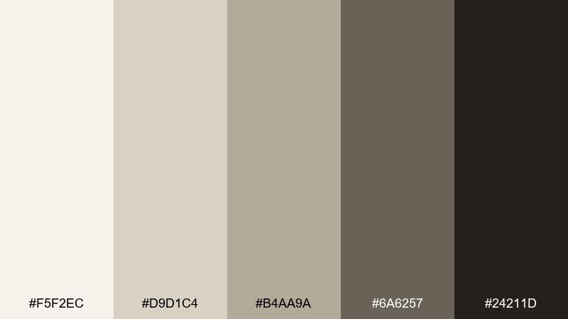
HEX: #f5f2ec #d9d1c4 #b4aa9a #6a6257 #24211d
Mood: bold, minimal
Best for: Luxury brand social posts
Sandy beiges with a sharp charcoal base feel confident and elevated. Great for luxury social posts, fashion lookbooks, and premium announcements where negative space is part of the message. Pair with high-contrast photography and tight typography for a gallery-like effect. Tip: keep the near-black for frames and captions so the sand tones stay luminous.
Image example of charcoal sand generated using media.io
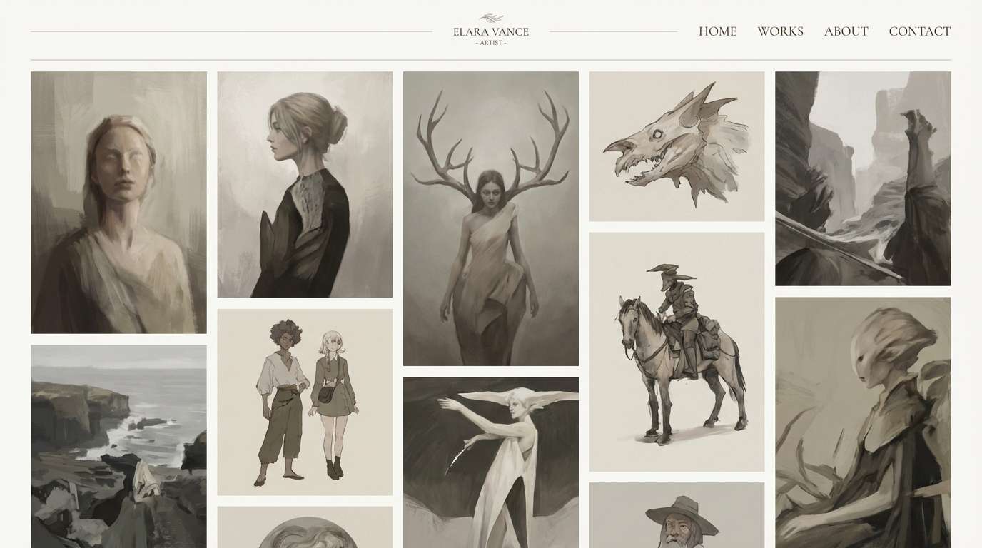
14) Porcelain Gallery
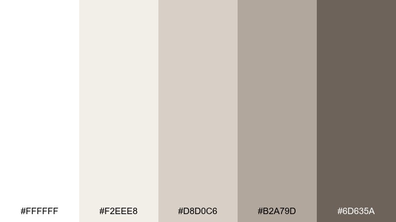
HEX: #ffffff #f2eee8 #d8d0c6 #b2a79d #6d635a
Mood: clean, gallery-white
Best for: Art portfolio landing page
Porcelain whites and soft stone neutrals feel like a quiet gallery wall under perfect lighting. Use it for art portfolios, photography pages, and museum-style layouts that need the work to lead. Pair with subtle shadows and thin dividers rather than heavy borders. Tip: set body text in the deeper gray-brown to reduce eye strain on pure white.
Image example of porcelain gallery generated using media.io
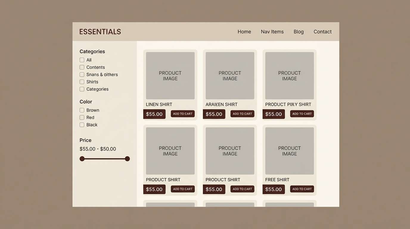
15) Taupe Atelier
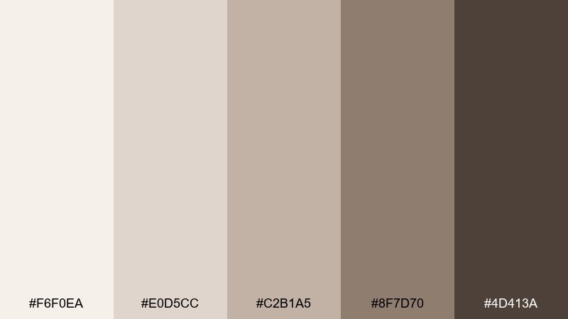
HEX: #f6f0ea #e0d5cc #c2b1a5 #8f7d70 #4d413a
Mood: craft, studio-warm
Best for: Handmade shop product listings
Studio taupes and warm browns evoke kraft paper, clay, and handmade detail. These neutral color combinations are ideal for product listing pages where photos need a consistent, flattering backdrop. Pair with warm-white backgrounds and simple icons to keep it modern. Tip: use the mid taupe for tags like new or best seller so they feel cohesive, not loud.
Image example of taupe atelier generated using media.io
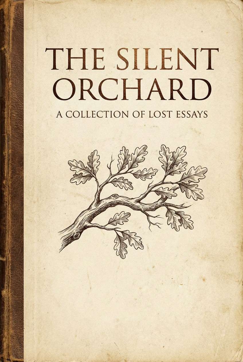
16) Sepia Notebook
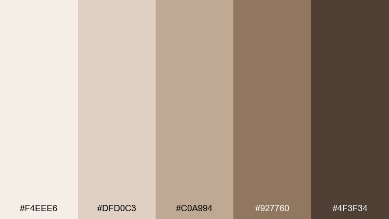
HEX: #f4eee6 #dfd0c3 #c0a994 #927760 #4f3f34
Mood: vintage, thoughtful
Best for: Book cover design
Sepia paper and worn leather browns feel reflective, like notes in a well-loved notebook. It suits memoirs, poetry, and editorial book covers that lean timeless rather than trendy. Pair with classic serif type and subtle grain to add authenticity. Tip: keep the darkest brown for the title only, and let the mid-tones carry the rest of the layout.
Image example of sepia notebook generated using media.io
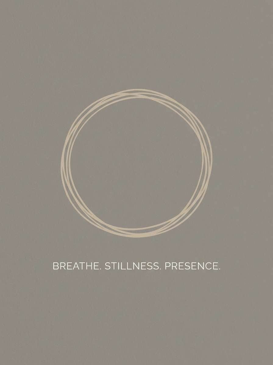
17) Pebble Path
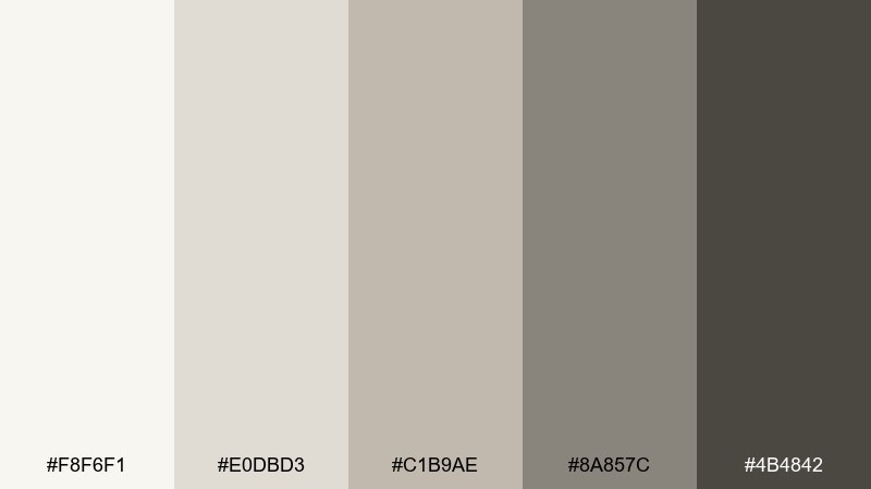
HEX: #f8f6f1 #e0dbd3 #c1b9ae #8a857c #4b4842
Mood: calm, balanced
Best for: Meditation poster
Soft pebble grays and warm stone tones create a steady, balanced calm. Great for meditation posters, studio signage, and quiet-spoken wellness print. Pair with simple line art and generous spacing to keep the message light. Tip: choose one mid-gray as your primary text color to avoid a too-stark look.
Image example of pebble path generated using media.io
18) Antique Lace
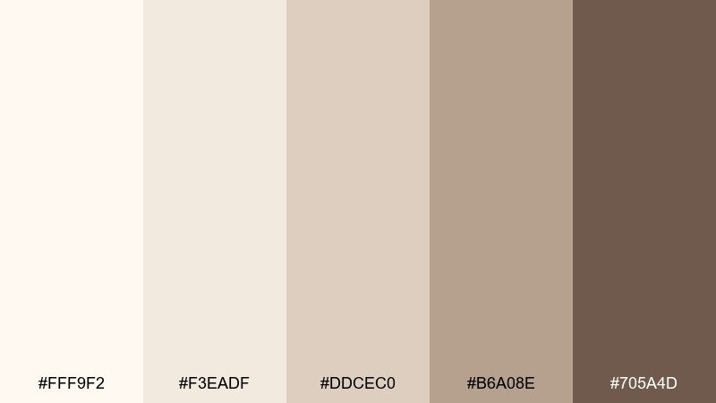
HEX: #fff9f2 #f3eadf #ddcec0 #b6a08e #705a4d
Mood: romantic, soft
Best for: Wedding invitation suite
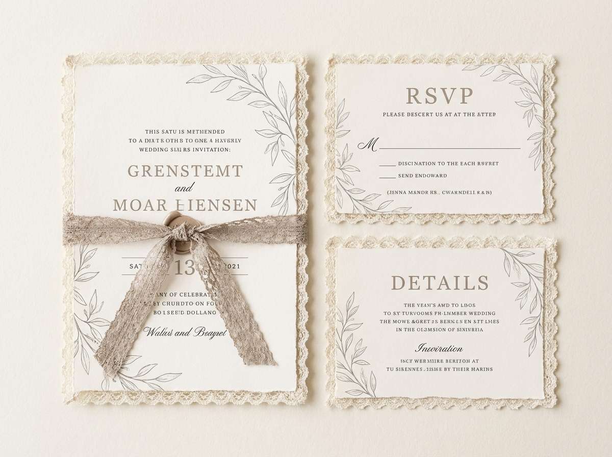
Antique lace creams and dusty taupes feel romantic and quietly traditional. Ideal for wedding invitations, vow booklets, and event stationery that wants warmth over bright white. Pair with delicate serif type and subtle botanical flourishes. Tip: use the deeper brown only for names and key details to keep the suite airy.
Image example of antique lace generated using media.io
19) Ironwood Accent
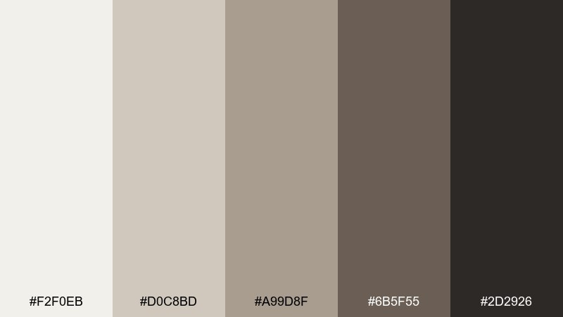
HEX: #f2f0eb #d0c8bd #a99d8f #6b5f55 #2d2926
Mood: moody, masculine
Best for: Whiskey label design
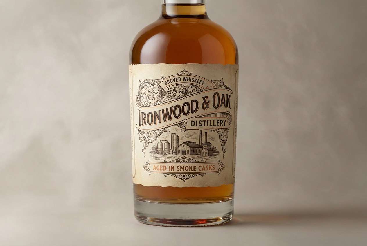
Smoky neutrals with ironwood depth feel bold, mature, and slightly mysterious. It suits whiskey labels, bar menus, and heritage-style branding where contrast and texture matter. Pair with engraved-style type and subtle foil accents for a premium finish. Tip: keep the label background light and push darkness into borders and emblems for better shelf readability.
Image example of ironwood accent generated using media.io
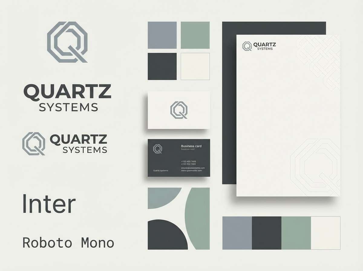
20) Quiet Quartz
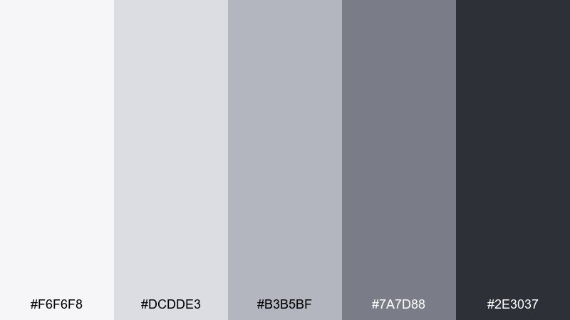
HEX: #f6f6f8 #dcdde3 #b3b5bf #7a7d88 #2e3037
Mood: cool, modern
Best for: Tech startup branding kit
Quiet quartz grays feel sleek and contemporary, like polished stone under cool light. Great for tech branding kits, pitch decks, and product pages that need a refined, future-facing baseline. Pair with one vivid accent color only when needed for CTAs or data highlights. Tip: test contrast early, especially for small UI labels on mid-gray backgrounds.
Image example of quiet quartz generated using media.io
What Colors Go Well with Neutral?
Neutrals pair well with almost any accent, but the best matches depend on temperature. Warm neutrals (beige, tan, taupe) love warm accents like terracotta, rust, olive, and muted gold, while cool neutrals (stone gray, quartz) work beautifully with steel blue, teal, and crisp cobalt.
If you want a modern, minimal look, add just one high-contrast accent (like black, deep navy, or a single vivid CTA color) and let spacing do the rest. For softer, lifestyle vibes, stick to dusty accents and keep saturation low so your neutral tones stay in control.
How to Use a Neutral Color Palette in Real Designs
Start by assigning roles: choose one light neutral for backgrounds, one mid-tone for surfaces (cards, sections, label blocks), and one dark neutral for text and key UI states. This prevents “everything looks the same” even when the colors are close.
Use contrast intentionally for accessibility and hierarchy. Neutrals can get muddy if you stack mid-grays on mid-taupes, so test small text, buttons, and form fields early, especially on mobile and in dark mode variants.
Add texture rather than extra color: paper grain, subtle shadows, linen patterns, or matte material cues can make neutral schemes feel rich without breaking the calm.
Create Neutral Palette Visuals with AI
If you need quick mockups for a brand board, landing page, packaging concept, or social post, AI can help you visualize neutral color schemes before you commit to production.
Reuse the prompts above and swap subject details (product, layout type, typography style) while keeping your neutral tone direction consistent. This makes it easier to compare options and pick a cohesive system.
Neutral Color Palette FAQs
-
What is considered a neutral color palette?
A neutral color palette is built from low-saturation, low-chroma colors such as white, cream, beige, taupe, greige, gray, brown, and charcoal. Neutrals can be warm or cool, but they generally stay understated and easy to pair. -
How do I keep neutral designs from looking boring?
Increase contrast (light backgrounds + darker text), add texture (grain, paper, soft shadows), and use one controlled accent color for emphasis. Strong typography and spacing also make neutrals feel intentional. -
Which neutral shades are best for websites and UI?
Use slightly off-white backgrounds (not pure white) with a deep gray/charcoal for text, plus a mid-tone neutral for dividers and surfaces. This improves readability and reduces eye strain while keeping a clean, modern look. -
What accent colors pair best with beige and taupe?
Olive, terracotta, rust, dusty rose, and warm gold complement beige/taupe well. For a sharper modern edge, try near-black, deep navy, or a single saturated accent like cobalt used sparingly. -
How do I choose warm vs cool neutrals?
Warm neutrals (cream, tan, warm taupe) feel cozy and organic, while cool neutrals (stone gray, quartz gray) feel sleek and professional. Match the undertone to your imagery and lighting so the palette doesn’t shift unexpectedly. -
How many neutral colors should I use in one design?
Five is a practical set: one background light, one surface light, one mid-tone for UI elements, one darker tone for headings, and one deepest tone for primary actions. This keeps hierarchy clear without adding extra hues. -
Can I generate neutral palette mockups with AI?
Yes. Use an AI text-to-image tool and describe the design type (UI, packaging, poster), the neutral mood (warm, cool, earthy, editorial), and include your layout constraints. Then iterate by adjusting one variable at a time for consistent results.
Next: Coastal Color Palette
