

Music design lives in contrast: loud vs. quiet, warm vs. cool, vintage vs. futuristic. A strong music color palette helps you visualize that energy instantly—before anyone presses play.
Below are 20+ music color scheme ideas for posters, album art, merch, and UI, each with HEX codes plus quick direction on where they work best.
In this article
Why Music Palettes Work So Well
Music visuals need to communicate genre, mood, and intensity at a glance. The right music color scheme gives your audience a “sound preview” through tone—like neon for electronic energy or warm neutrals for acoustic intimacy.
Color also builds hierarchy fast: a dark base for structure, a bright accent for the hook, and a soft neutral for breathing room. That makes posters more readable, album covers more iconic, and interfaces easier to scan.
Most importantly, consistent music color combinations help your branding stay recognizable across formats—from thumbnails and stories to merch tags and stage screens.
20+ Music Color Palette Ideas (with HEX Codes)
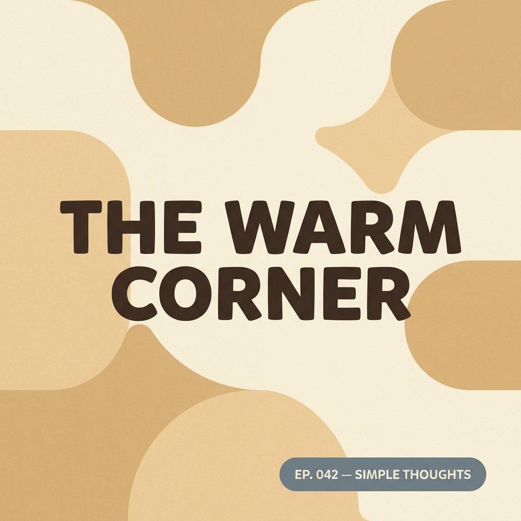
1) Vinyl Noir
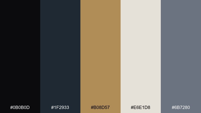
HEX: #0B0B0D #1F2933 #B08D57 #E6E1D8 #6B7280
Mood: moody, classic, premium
Best for: record store branding and packaging
Moody shadows and warm brass details evoke late-night spins and vintage hi-fi gear. Use the deep near-black as your anchor, then let the gold-brown act like a foil-stamp accent for logos or badges. Cream keeps labels readable while the steel gray supports secondary text and panels. Tip: reserve the metallic tone for small highlights so the premium feel stays intentional.
Image example of vinyl noir generated using media.io
Media.io is an online AI studio for creating and editing video, image, and audio in your browser.

2) Stage Spotlight
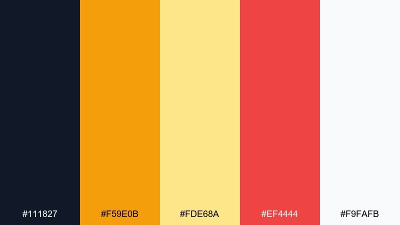
HEX: #111827 #F59E0B #FDE68A #EF4444 #F9FAFB
Mood: energetic, bold, showtime
Best for: concert poster design
Bright spotlights and warm haze bring the feeling of a packed venue right to the page. Pair the amber and pale gold for headline glow, then use the red as a punchy call-to-action or tour-date highlight. The ink-dark base keeps everything grounded and improves contrast on white. Tip: keep red to one key element per layout so it reads as the loudest beat.
Image example of stage spotlight generated using media.io
3) Jazz Lounge
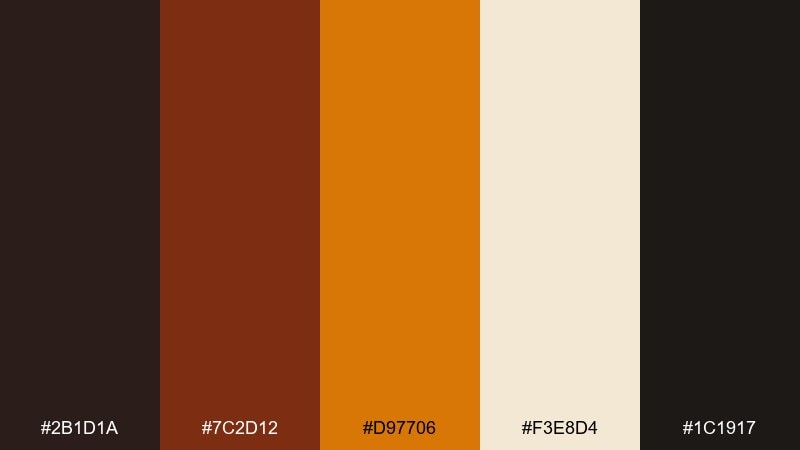
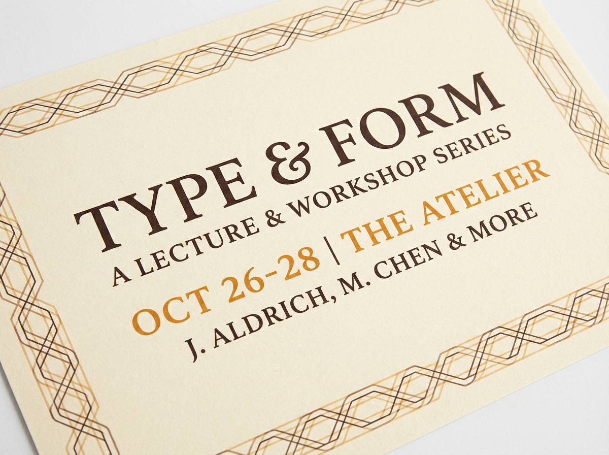
HEX: #2B1D1A #7C2D12 #D97706 #F3E8D4 #1C1917
Mood: smoky, intimate, sophisticated
Best for: cocktail bar menu and event flyer
Smoky browns and toasted amber feel like velvet booths, brushed brass, and soft horn riffs. For a refined music color palette, set body text in the deep espresso tones and let the amber handle section headers or prices. The warm cream reads like aged paper and keeps the design inviting rather than heavy. Tip: add thin divider lines in the amber to structure long menus without harsh contrasts.
Image example of jazz lounge generated using media.io
4) Synth Neon
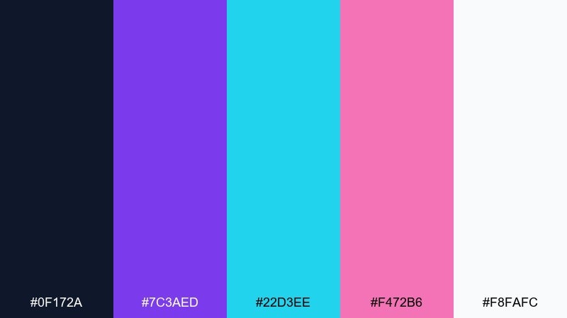
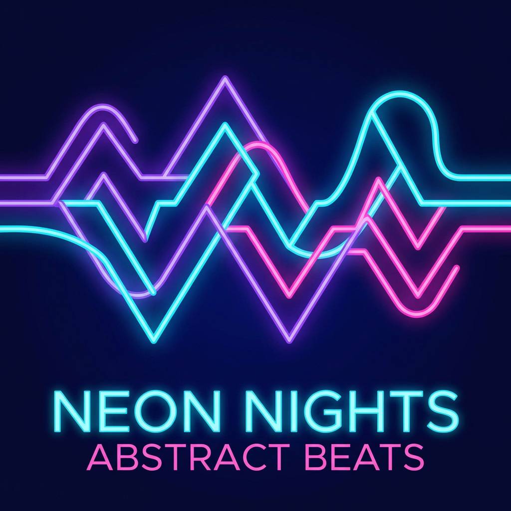
HEX: #0F172A #7C3AED #22D3EE #F472B6 #F8FAFC
Mood: futuristic, electric, playful
Best for: playlist cover art
Electric neons against a deep midnight base evoke retro synth lines and glowing city signs. Use violet for the main title block, then bring in cyan for icons or waveform shapes so the composition feels crisp. Pink works best as a secondary accent for a single focal element, like a badge or corner tag. Tip: keep the background mostly dark to make the neon tones look brighter without oversaturating the design.
Image example of synth neon generated using media.io
5) Acoustic Sunrise
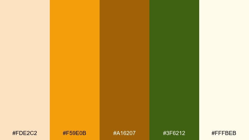
HEX: #FDE2C2 #F59E0B #A16207 #3F6212 #FFFBEB
Mood: warm, earthy, optimistic
Best for: folk album artwork
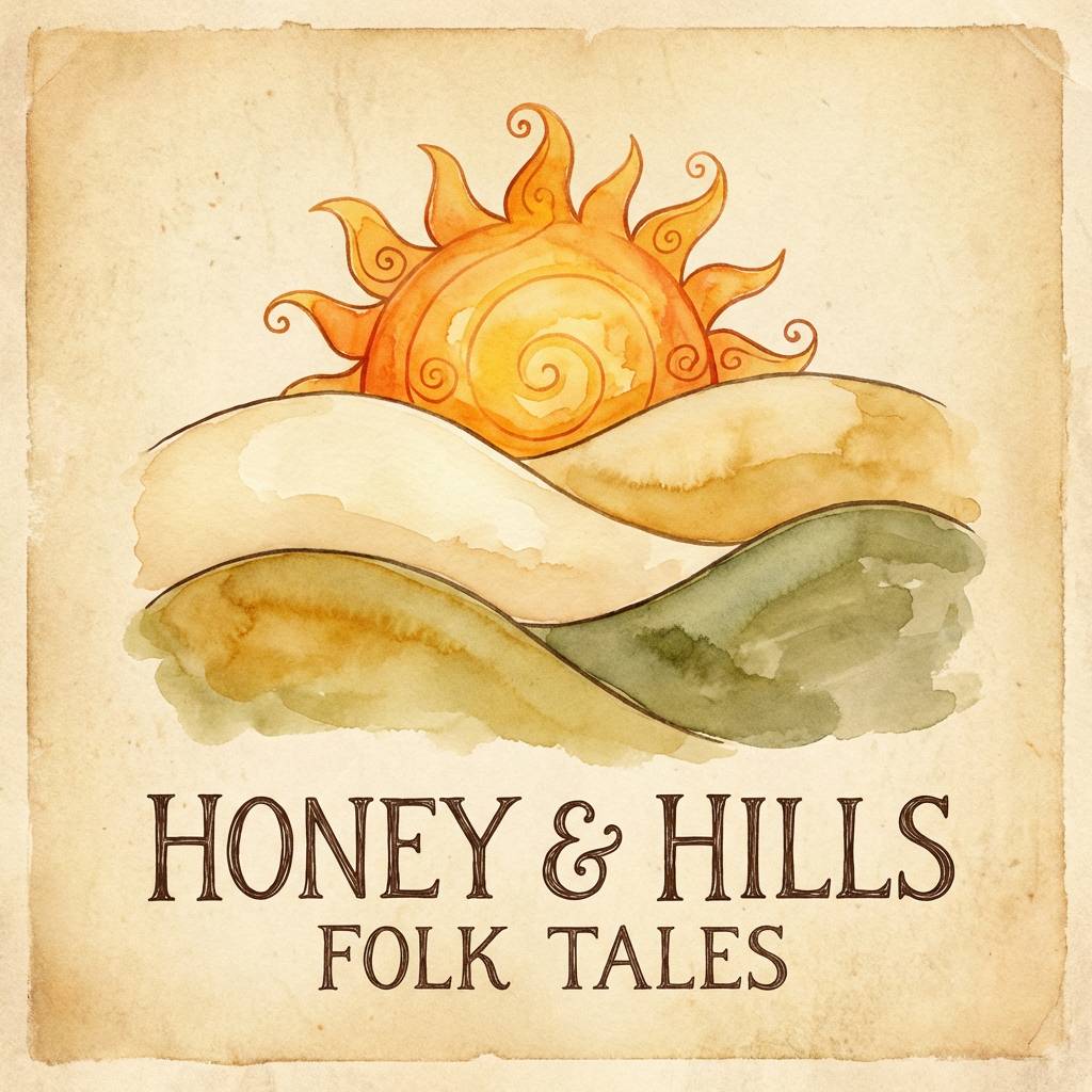
Warm sunrise tones and grounded greens feel like wooden guitars, open fields, and an easy first verse. Let the light cream carry the negative space, then build warmth with honey and amber for titles and shapes. The olive green gives a natural counterbalance and prevents the palette from leaning too sweet. Tip: try a subtle paper-grain texture so the colors feel hand-made instead of glossy.
Image example of acoustic sunrise generated using media.io
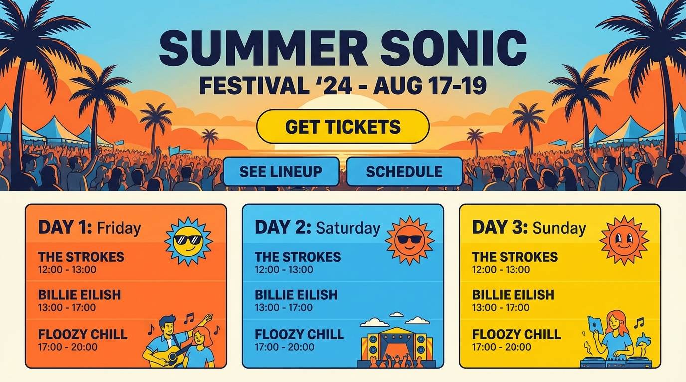
6) Festival Citrus
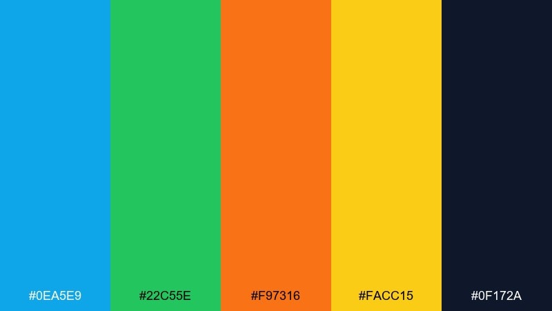
HEX: #0EA5E9 #22C55E #F97316 #FACC15 #0F172A
Mood: bright, outdoorsy, high-energy
Best for: summer festival landing page UI
Bright citrus pops and sky-blue freshness evoke open-air stages and sunlit crowds. These music color combinations work best when you choose one dominant warm (orange or yellow) and let the blue handle navigation and links. The deep navy is your accessibility hero for text and sticky headers. Tip: keep gradients subtle and use flat blocks for buttons to avoid a chaotic, over-saturated UI.
Image example of festival citrus generated using media.io
7) Indie Dusk
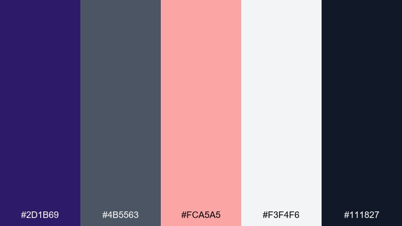
HEX: #2D1B69 #4B5563 #FCA5A5 #F3F4F6 #111827
Mood: dreamy, understated, contemporary
Best for: indie band social posts
Soft dusk violet with powdery pink feels like a hazy chorus and city lights after rehearsal. Use the pale gray as your canvas, then drop in violet for headers and frames so everything stays calm but distinct. Black and slate keep captions readable across photo overlays. Tip: try thin line art or minimal shapes in pink for a signature mark that stays consistent across posts.
Image example of indie dusk generated using media.io
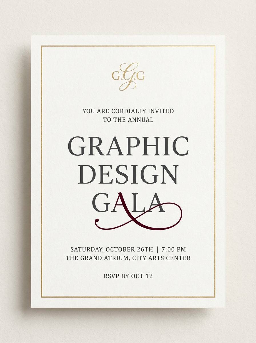
8) Opera Velvet
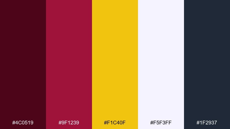
HEX: #4C0519 #9F1239 #F1C40F #F5F3FF #1F2937
Mood: dramatic, luxurious, theatrical
Best for: gala invitation design
Velvet reds with a gold flourish call up grand curtains, spotlit arias, and a formal dress code. Keep the light lavender-white for breathing room, then set the main typography in charcoal for a modern edge. Gold works best as a border, monogram, or small icon rather than a full block. Tip: increase letter spacing slightly on titles to make the layout feel more premium.
Image example of opera velvet generated using media.io
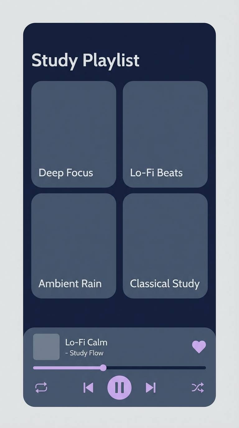
9) Lo Fi Rain
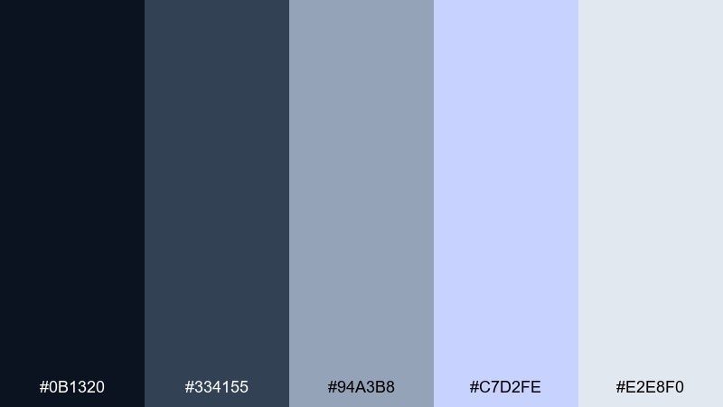
HEX: #0B1320 #334155 #94A3B8 #C7D2FE #E2E8F0
Mood: calm, introspective, cozy
Best for: study playlist app UI
Cool rainy blues and soft lavender-gray feel like window drizzle, headphones, and quiet focus. For a dependable music color scheme, keep the darkest navy for navigation and player controls while the misty tones fill cards and backgrounds. The lavender accent is ideal for active states, progress bars, and subtle highlights. Tip: avoid pure black and lean on the navy to keep the UI soft on the eyes.
Image example of lo fi rain generated using media.io
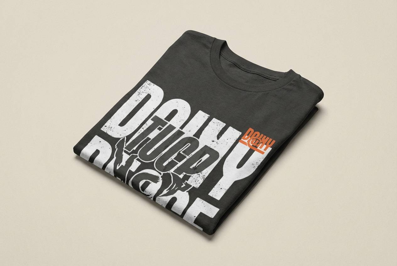
10) Drumline Concrete
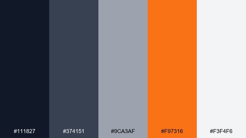
HEX: #111827 #374151 #9CA3AF #F97316 #F3F4F6
Mood: urban, punchy, confident
Best for: streetwear merch graphics
Concrete grays with a sharp orange hit feel like snare cracks, city blocks, and clean typography. Use the darker grays for big type and shapes, then let orange handle small tags, numbers, or a single emblem. The near-white keeps prints from looking muddy on tees and hoodies. Tip: test the orange at small sizes so it stays readable in embroidery and screen print.
Image example of drumline concrete generated using media.io
11) Choir Pastel
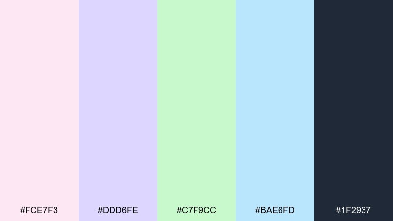
HEX: #FCE7F3 #DDD6FE #C7F9CC #BAE6FD #1F2937
Mood: gentle, uplifting, airy
Best for: community concert program
Soft pastels and clean contrast evoke harmonies, bright halls, and a welcoming audience. Use the charcoal for all text and staff listings, then rotate the pastel blocks for sections so the layout stays organized. The mint and sky tones are especially good for schedules and small callouts. Tip: keep plenty of white space so the pastel mix reads calm rather than sugary.
Image example of choir pastel generated using media.io
12) Bassline Ember
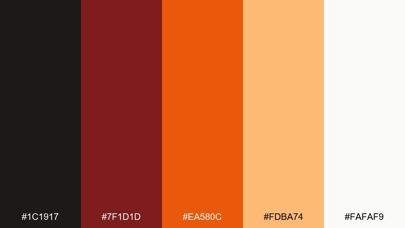
HEX: #1C1917 #7F1D1D #EA580C #FDBA74 #FAFAF9
Mood: hot, gritty, intense
Best for: club event poster
Hot embers and dark shadows feel like heavy bass, warm air, and pulsing lights. For a high-impact music color palette, push the charcoal and deep red as the base, then use orange for the headline and key details like date and venue. The pale peach makes a great backdrop for secondary info blocks. Tip: try a distressed texture on the dark areas to add grit without hurting legibility.
Image example of bassline ember generated using media.io

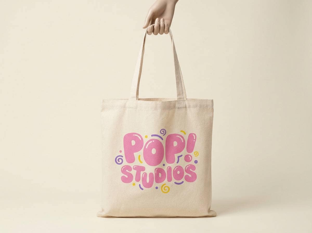
13) Pop Bubblegum
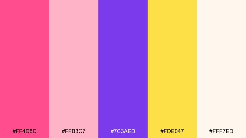
HEX: #FF4D8D #FFB3C7 #7C3AED #FDE047 #FFF7ED
Mood: fun, sweet, upbeat
Best for: merch product ad
Bubblegum pinks and sunny yellow feel like catchy hooks, confetti, and bright stage outfits. Use pink as the hero color, then add violet for contrast in headings or sticker-like shapes. The pale cream keeps the look clean and helps product photos feel more polished. Tip: keep yellow to highlights and small badges so it stays cheerful instead of overpowering.
Image example of pop bubblegum generated using media.io
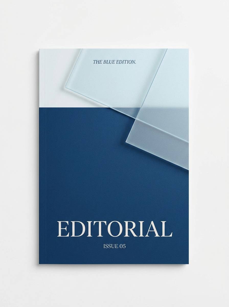
14) Orchestral Ice
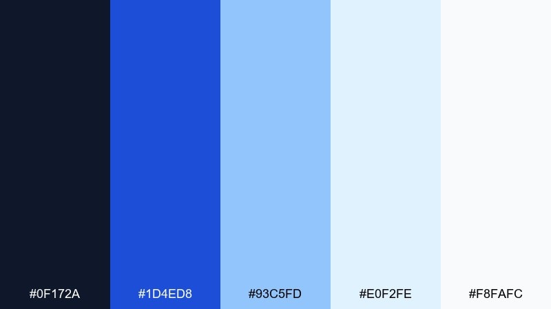
HEX: #0F172A #1D4ED8 #93C5FD #E0F2FE #F8FAFC
Mood: clean, elegant, crisp
Best for: classical music season brochure
Crisp blues and airy whites evoke a polished hall, sharp strings, and bright winter light. Use the deep blue for titles and section dividers, with the mid-blue as an accent for icons and page numbers. The pale tones keep spreads feeling spacious and premium. Tip: pair with a high-contrast serif for titles and a simple sans for details to maintain clarity.
Image example of orchestral ice generated using media.io
15) Garage Grunge
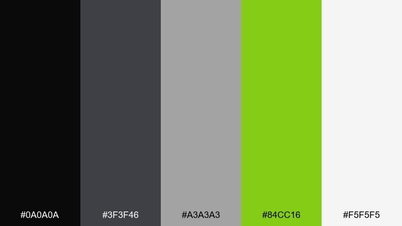
HEX: #0A0A0A #3F3F46 #A3A3A3 #84CC16 #F5F5F5
Mood: raw, loud, DIY
Best for: band logo and stickers
Rough blacks and dusty grays with an acid-lime hit feel like rehearsal rooms, ripped flyers, and loud amps. Keep the logo mostly monochrome, then use the lime as a single slash, underline, or icon for instant recognition. The off-white works well for sticker stock and helps fine details print cleanly. Tip: test the design at tiny sizes so the lime accent still reads from a distance.
Image example of garage grunge generated using media.io
16) Disco Mirrorball
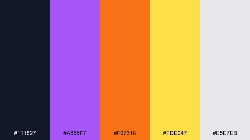
HEX: #111827 #A855F7 #F97316 #FDE047 #E5E7EB
Mood: glam, retro, celebratory
Best for: party flyer design
Glam purple with warm gold and orange evokes mirrorball sparkle and a confident dance floor. These music color combinations shine when you set a dark base and build neon-like accents with yellow and violet. Use the light gray for small text blocks so details stay readable without breaking the vibe. Tip: add simple starburst shapes in yellow for energy, but keep them sparse to avoid visual noise.
Image example of disco mirrorball generated using media.io
17) Ambient Moss
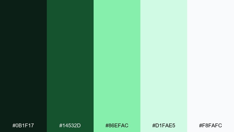
HEX: #0B1F17 #14532D #86EFAC #D1FAE5 #F8FAFC
Mood: quiet, organic, restorative
Best for: meditation audio app UI
Deep forest greens and soft mint feel like slow pads, fresh air, and steady breathing. Use the dark green for navigation and key labels, then let the pale mint carry cards and backgrounds for a calm rhythm. Bright mint works best for active toggles and progress indicators. Tip: keep animations subtle and rely on contrast changes rather than flashy color swaps.
Image example of ambient moss generated using media.io
18) K Pop Candy
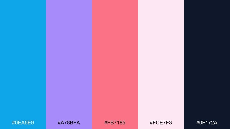
HEX: #0EA5E9 #A78BFA #FB7185 #FCE7F3 #0F172A
Mood: cute, glossy, trend-forward
Best for: fan event banner
Candy pinks and lilac with bright sky blue feel bubbly, polished, and camera-ready. Use the navy for crisp type and outlines, then layer pink and lilac for big shapes and gradients. The light blush background keeps the banner friendly while still legible from afar. Tip: choose one dominant accent per section so the layout stays clean even with playful tones.
Image example of k pop candy generated using media.io
19) Studio Sandalwood
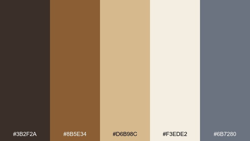
HEX: #3B2F2A #8B5E34 #D6B98C #F3EDE2 #6B7280
Mood: warm, calm, grounded
Best for: podcast cover branding
Warm wood and soft linen neutrals evoke quiet studios, acoustic panels, and a steady speaking voice. These music color combinations feel especially mature on covers where you want warmth without loud color. Use the dark brown for the title, the tan for shapes and borders, and the cream for negative space. Tip: add a small slate-gray tag for episode numbers so they stay distinct from the warm tones.
Image example of studio sandalwood generated using media.io
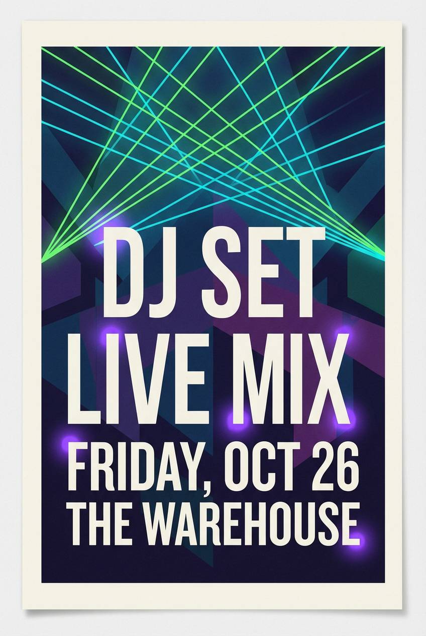
20) EDM Laser
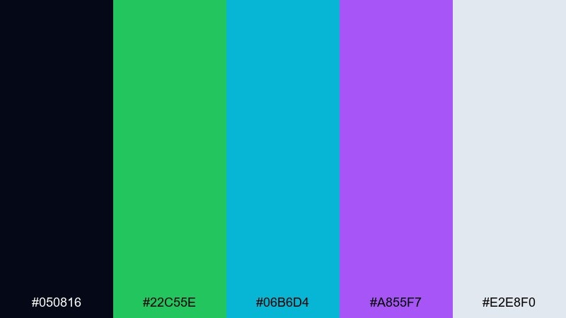
HEX: #050816 #22C55E #06B6D4 #A855F7 #E2E8F0
Mood: high-tech, intense, nightlife
Best for: DJ set promo poster
Laser greens and cyber cyan over deep night tones feel like a packed club and sharp drops. Push the dark background and use neon accents for the headline, venue, and time to build a clear hierarchy. Music color combinations like these work best with clean, geometric typography and plenty of breathing room. Tip: keep neon elements large enough for print so they do not turn into muddy darks.
Image example of edm laser generated using media.io
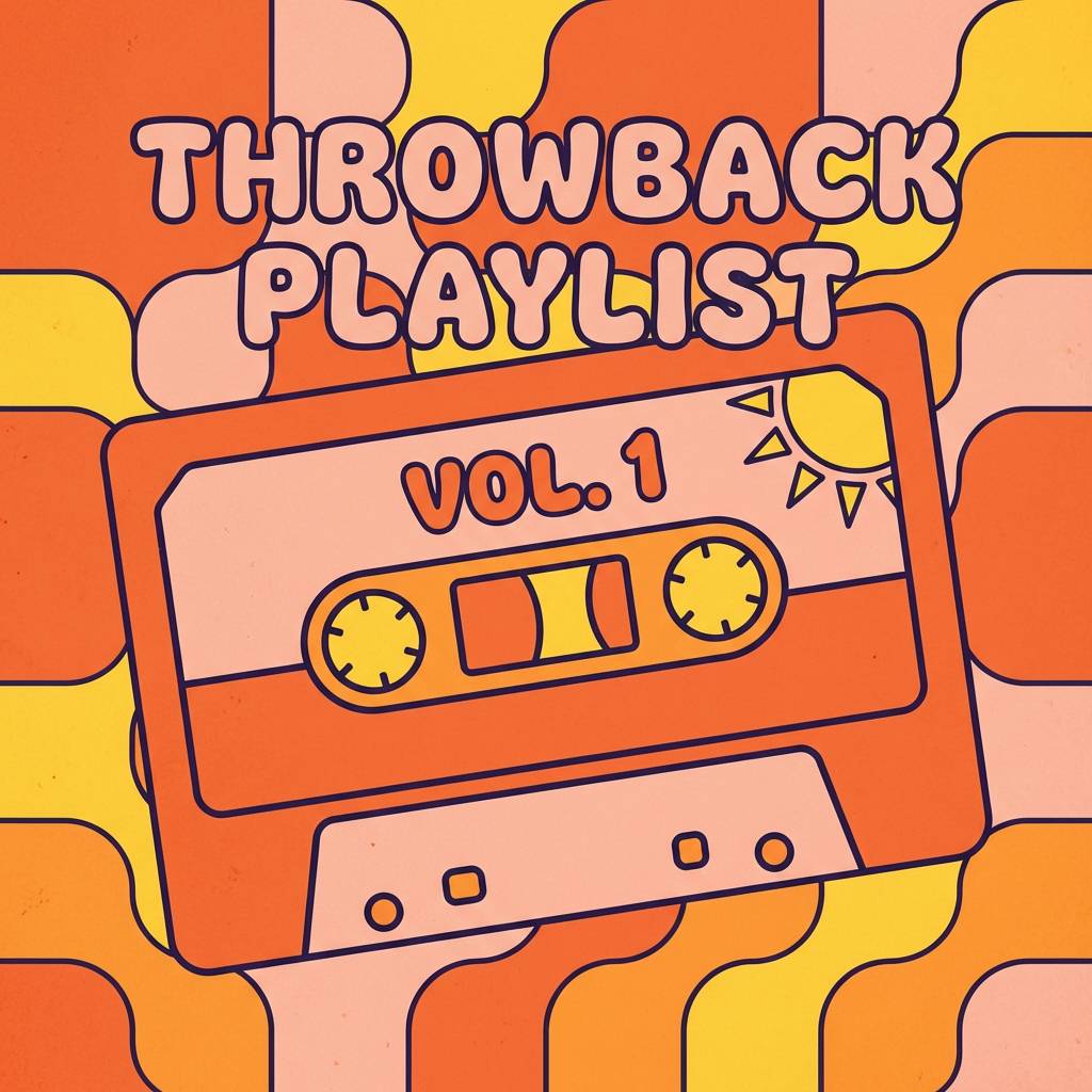
21) Retro Cassette
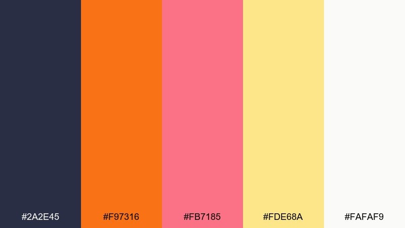
HEX: #2A2E45 #F97316 #FB7185 #FDE68A #FAFAF9
Mood: nostalgic, sunny, friendly
Best for: throwback playlist thumbnails
Warm orange and peachy pink with butter yellow feels like mixtapes, handwritten tracklists, and weekend drives. Use the dark indigo as a framing color so the warm tones look intentional, not random. The pale background helps small text stay crisp at thumbnail sizes. Tip: combine rounded shapes with a simple grid to reinforce the retro vibe without clutter.
Image example of retro cassette generated using media.io
What Colors Go Well with Music?
Music palettes pair best when you balance an “anchor” (near-black, deep navy, charcoal) with one or two expressive accents (neon cyan, hot pink, amber, red). This creates an instant rhythm: stable structure plus a memorable hook.
Warm neutrals (cream, tan, paper-white) are especially useful for album art and posters because they make typography feel intentional and readable. Cool grays and muted blues are great for UI because they keep long sessions comfortable.
If your visuals need to feel genre-specific, try mapping energy to saturation: higher saturation for EDM/pop, lower saturation for lo-fi/jazz/ambient, and high contrast for rock or streetwear.
How to Use a Music Color Palette in Real Designs
Start with a dominant base color for backgrounds and framing, then assign one accent color to the primary callout (title, date, play button). Use the remaining colors for supporting elements like dividers, badges, and secondary text blocks.
For posters and flyers, keep your highest-contrast pairing for the key information (artist + venue + date). For album covers and thumbnails, simplify shapes and limit accents so the palette still reads at small sizes.
For UI, test contrast early: use your darkest tone for text and navigation, and reserve bright accents for active states (progress bars, toggles, primary buttons).
Create Music Palette Visuals with AI
If you already have HEX codes, you can turn them into finished visuals by describing the layout, texture, and genre vibe—then iterating quickly. This is ideal for exploring album cover directions, poster compositions, or consistent social templates.
With Media.io, you can generate image examples that match your palette mood (neon, vintage, premium, gritty) and refine prompts until the design looks stage-ready.
Music Color Palette FAQs
-
What is a music color palette?
A music color palette is a set of coordinated colors used to represent a song, artist, genre, or audio product visually—commonly for album art, concert posters, playlist covers, and music app UI. -
How do I choose colors for album art?
Pick one dark or neutral base for structure, then add 1–2 accent colors that match the genre’s energy. Keep contrast high for the title so it stays readable at thumbnail size. -
What colors work best for concert posters?
High-contrast combinations work best: a deep base (black/navy) plus a bright accent (amber/red/neon). Use the accent for the headline or date so the poster is scannable from a distance. -
Which music color schemes are best for UI design?
Muted bases (navy, slate, soft grays) with a single bright accent (lavender, cyan, mint) are ideal. They reduce eye strain while keeping interactive states clear. -
How many colors should a branding palette for a band include?
Usually 3–5 colors: one primary, one secondary, one accent, plus light/dark neutrals. This gives enough flexibility for merch, social templates, and stage visuals without looking inconsistent. -
Can I generate music-themed palette images with AI?
Yes—use a text-to-image tool and describe the genre, layout, and materials (e.g., “neon waveform,” “matte record sleeve,” “print-ready poster”). Then iterate until the visuals match your HEX palette mood. -
How do I keep neon music palettes from looking messy?
Use a dark background, limit neon to a few large elements, and keep plenty of negative space. Assign one neon as the main focal color and use the others only for supporting highlights.
Next: Sand Color Palette


