

A bohemian color palette blends warm earth tones, sun-faded neutrals, and expressive jewel accents to create a look that feels collected, creative, and lived-in.
Whether you’re building a brand kit, styling an interior mood board, or designing social graphics, boho colors help you layer texture and personality without looking overly polished.
In this article
Why Bohemian Palettes Work So Well
Bohemian palettes feel effortless because they’re rooted in nature: clay, sand, wood, stone, and plant greens. These hues are easy to layer, so designs look textured and intentional rather than overly “matched.”
Another reason boho colors work is contrast without harshness. You can pair muted neutrals with richer accents (teal, indigo, berry, marigold) to create personality while keeping the overall mood warm and approachable.
Finally, bohemian color schemes naturally support storytelling. They evoke places, objects, and materials—woven textiles, pottery, market posters—so your visuals feel curated instead of generic.
20+ Bohemian Color Palette Ideas (with HEX Codes)
1) Desert Macrame
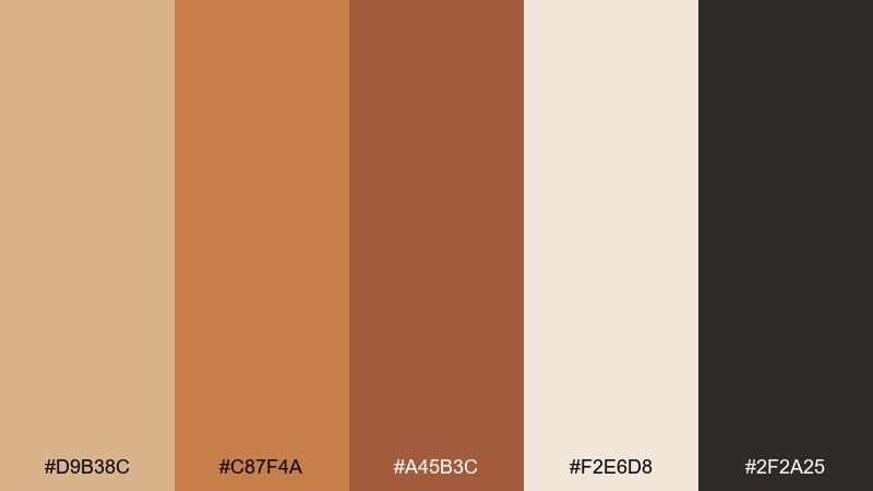
HEX: #D9B38C #C87F4A #A45B3C #F2E6D8 #2F2A25
Mood: sunbaked, cozy, handmade
Best for: artisan packaging, lifestyle branding, home decor mood boards
Sunbaked clay and woven fibers come to mind, like macrame hanging near a warm window. The sandy neutrals keep it grounded while the terracotta and cocoa add depth. Use it for packaging, brand mood boards, and cozy interior visuals where texture matters. Pair with kraft paper, linen patterns, and matte finishes, then reserve the dark brown for type and small details.
Image example of desert macrame generated using media.io
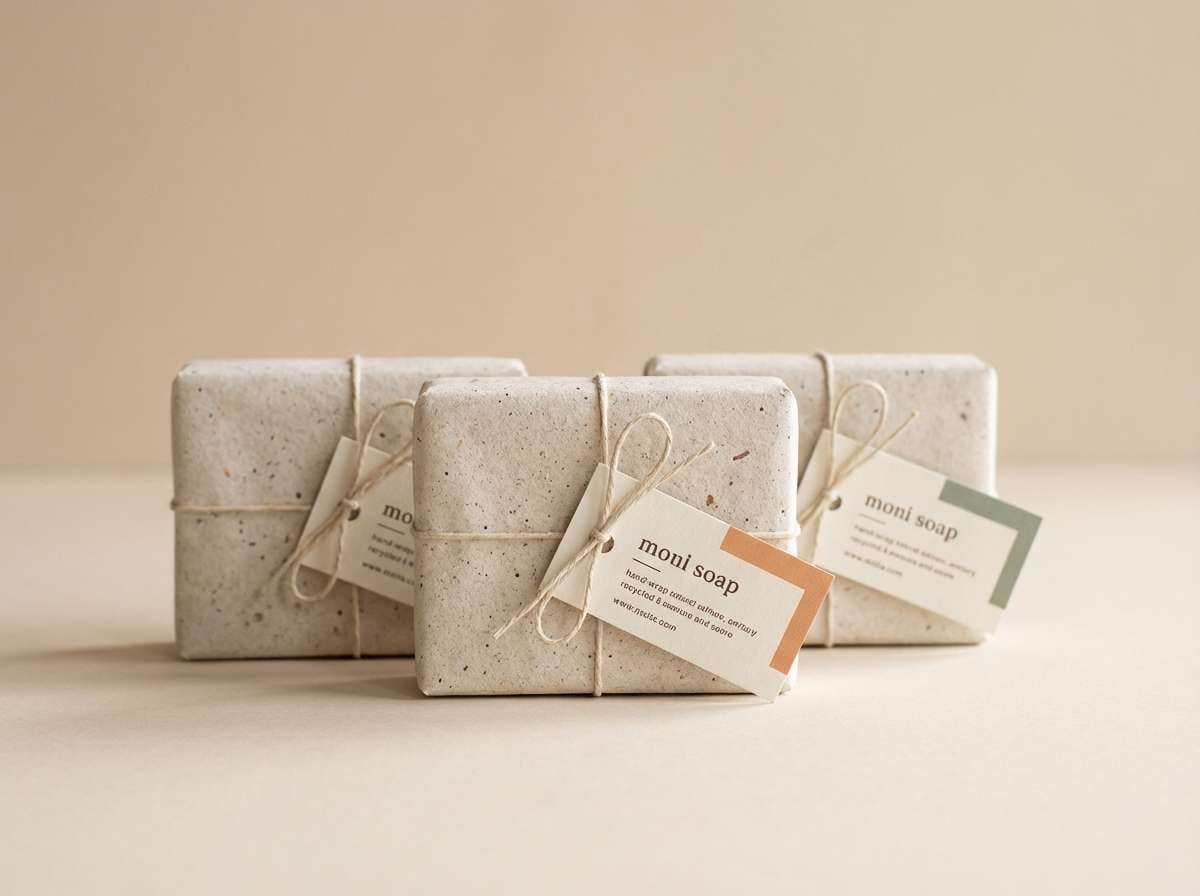
Media.io is an online AI studio for creating and editing video, image, and audio in your browser.

2) Vintage Bazaar
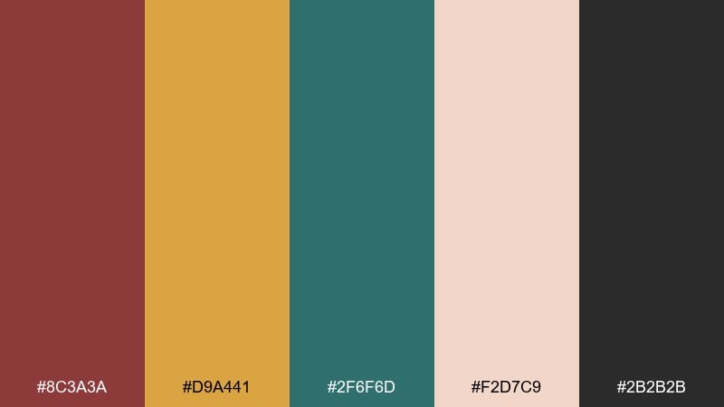
HEX: #8C3A3A #D9A441 #2F6F6D #F2D7C9 #2B2B2B
Mood: eclectic, worldly, story-rich
Best for: market posters, boutique branding, editorial accents
Spiced reds, aged brass, and teal pottery feel like stalls in a bustling bazaar. These bohemian color combination notes work best when you balance the bold hues with the blush base. Try it on posters, boutique branding, or editorial pull quotes where you want instant character. Keep black for headlines and let teal act as the main accent for a curated, collected look.
Image example of vintage bazaar generated using media.io

3) Sage Sunroom
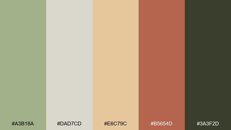
HEX: #A3B18A #DAD7CD #E6C79C #B5654D #3A3F2D
Mood: airy, calm, sunlit
Best for: interior mood boards, wellness brands, calm web sections
Soft sage and linen neutrals evoke a quiet sunroom with plants and worn ceramics. The warm wheat tone keeps it bright while terracotta adds a grounded touch. Use it for wellness brands, interior mood boards, and calm website sections that need warmth without noise. Add natural texture photography and keep the deepest green for buttons and section headers.
Image example of sage sunroom generated using media.io
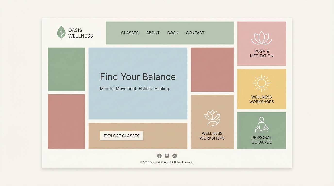
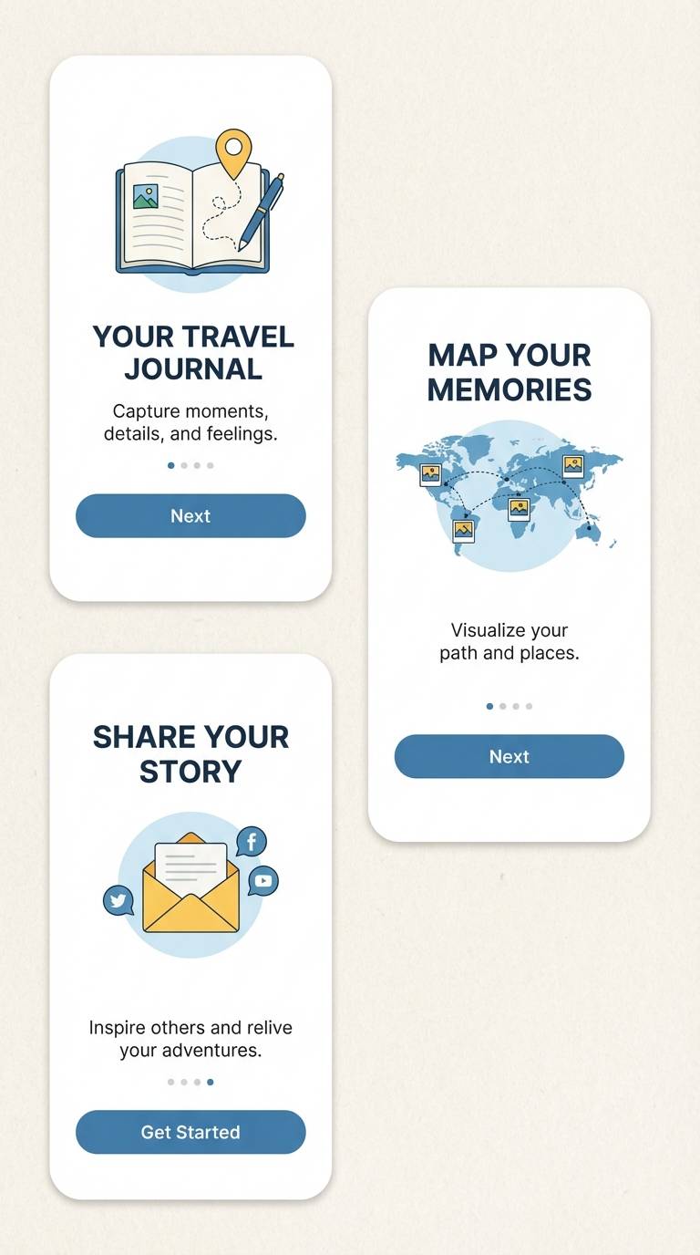
4) Indigo Nomad
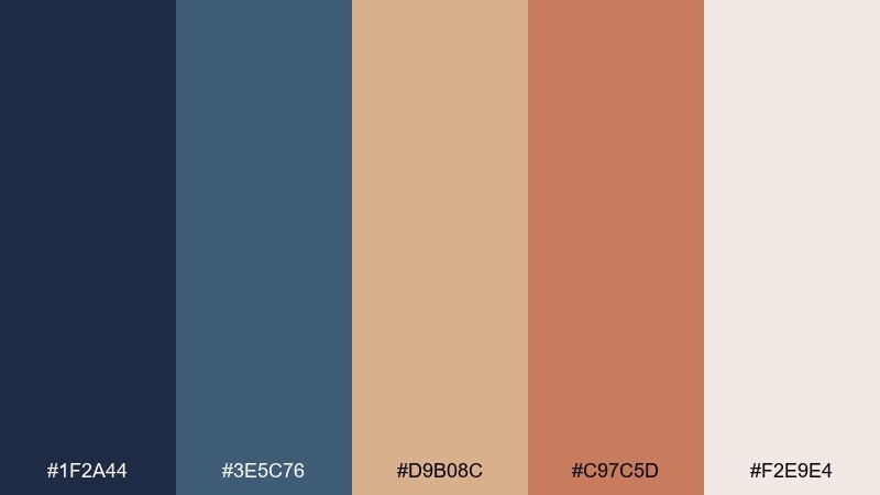
HEX: #1F2A44 #3E5C76 #D9B08C #C97C5D #F2E9E4
Mood: wanderlust, denim-cool, grounded
Best for: travel content, denim-inspired brands, app onboarding
Deep indigo and slate blues feel like worn denim and night skies on the road. Warm sand and clay tones keep the palette human and approachable instead of icy. It works well for travel content, onboarding screens, and brands that want a calm but adventurous edge. Use the light cream as your main background to keep the dark blues readable and crisp.
Image example of indigo nomad generated using media.io
5) Terracotta Tapestry
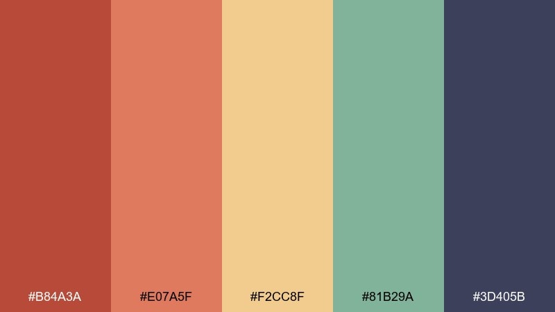
HEX: #B84A3A #E07A5F #F2CC8F #81B29A #3D405B
Mood: artful, layered, folk-inspired
Best for: textile patterns, brand illustrations, creative presentations
Layered terracotta and apricot tones evoke woven rugs and sun-faded tapestries. The soft gold brightens the mix, while sage and deep indigo give it structure. Use it for textile-inspired patterns, illustrated brand assets, and slide decks that need warmth with contrast. Tip: repeat the two warm reds as pattern anchors, then use indigo for text to keep everything legible.
Image example of terracotta tapestry generated using media.io
6) Mossy Pottery
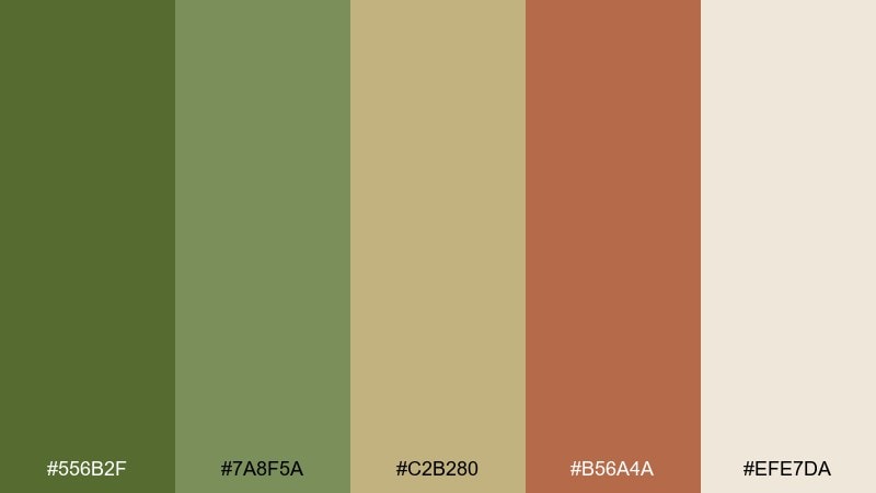
HEX: #556B2F #7A8F5A #C2B280 #B56A4A #EFE7DA
Mood: earthy, botanical, grounded
Best for: plant shops, ceramic brands, eco packaging
Moss greens and clay browns feel like handmade pottery on a rustic shelf. The creamy neutral keeps the tones soft and modern, not muddy. This bohemian color palette suits plant shops, ceramic brands, and eco packaging where natural materials lead the story. Pair it with uncoated paper and a single-line illustration style, and use the darkest green for stamps and logos.
Image example of mossy pottery generated using media.io
7) Amber Lantern
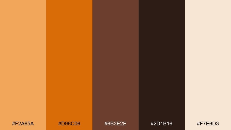
HEX: #F2A65A #D96C06 #6B3E2E #2D1B16 #F7E6D3
Mood: glowing, intimate, spice-warm
Best for: coffee branding, cozy newsletters, autumn promos
Amber light and toasted spice tones evoke lantern glow and late-night chai. The creamy base keeps the palette welcoming, while espresso-dark accents add drama. Use it for coffee branding, autumn promos, or warm newsletters where you want a tactile feel. Tip: set backgrounds in the cream, then use the deep brown for type and the bright amber for calls to action.
Image example of amber lantern generated using media.io
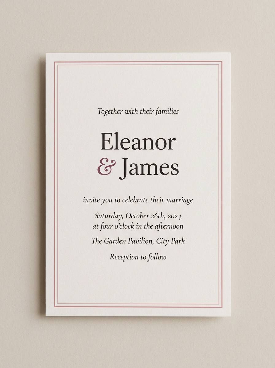
8) Blush Kilim
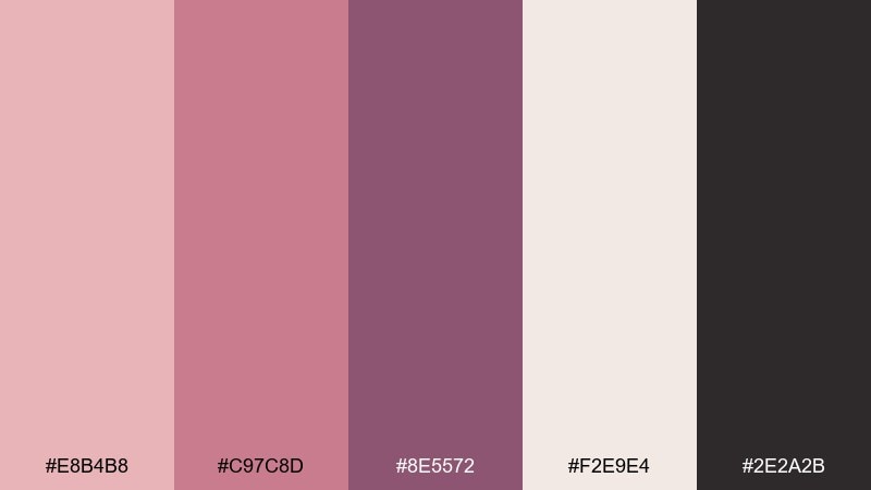
HEX: #E8B4B8 #C97C8D #8E5572 #F2E9E4 #2E2A2B
Mood: romantic, soft, vintage-textile
Best for: beauty branding, wedding stationery, social templates
Dusty blush and berry tones bring to mind a faded kilim rug with delicate patterning. The creamy neutral keeps it airy, while near-black adds a clean edge for modern layouts. It fits beauty branding, wedding stationery, and social templates that need softness without feeling sugary. Use the darkest tone sparingly for text and thin borders, and let blush dominate large areas.
Image example of blush kilim generated using media.io
9) Ocean Driftwood

HEX: #2A9D8F #264653 #E9C46A #F4A261 #EDEDE9
Mood: coastal, sun-warmed, relaxed
Best for: resort branding, beach event flyers, summer ads
Sea glass teal and deep ocean blue feel breezy, like driftwood and salt air. Golden sand and soft coral warm the mix so it never turns cold. Use it for resort branding, summer ads, or beach event flyers where you want clarity and charm. Tip: keep the background off-white and let teal be your primary brand color, saving coral for highlights.
Image example of ocean driftwood generated using media.io

10) Marigold Market
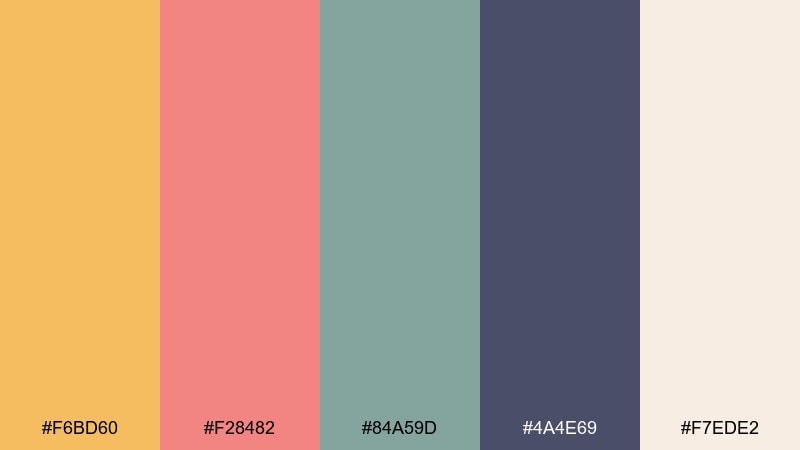
HEX: #F6BD60 #F28482 #84A59D #4A4E69 #F7EDE2
Mood: cheerful, creative, sunlit
Best for: small business branding, maker fairs, Instagram carousels
Marigold and soft coral evoke cheerful stalls, fresh blooms, and painted signage. The muted mint keeps it modern, while the inky violet gives structure for text and UI elements. This bohemian color scheme is great for maker brands, Instagram carousels, and cheerful landing pages. Use marigold for buttons or price tags, and keep the violet for headlines to maintain contrast.
Image example of marigold market generated using media.io
11) Copper Canyon
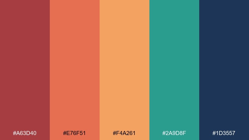
HEX: #A63D40 #E76F51 #F4A261 #2A9D8F #1D3557
Mood: bold, adventurous, high-contrast
Best for: outdoor brands, travel posters, energetic hero sections
Copper reds and canyon oranges feel punchy and expansive, like desert cliffs at golden hour. Teal and navy keep the warmth balanced with a confident, modern contrast. Use it for outdoor brands, travel posters, and hero sections that need energy without neon. Tip: set navy as the foundation for type, then let copper and orange carry the emotion in large blocks.
Image example of copper canyon generated using media.io
12) Twilight Caravan
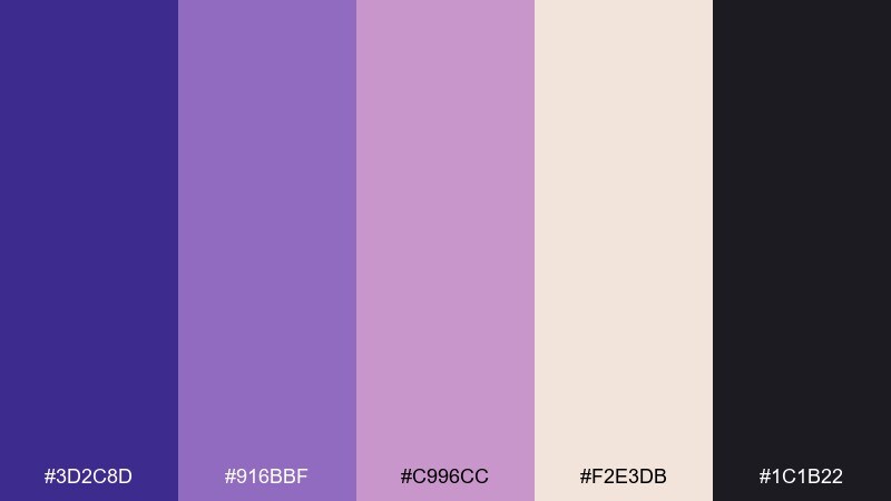
HEX: #3D2C8D #916BBF #C996CC #F2E3DB #1C1B22
Mood: mystic, dreamy, night-market
Best for: music events, creative studios, gradient-led UI
Velvet purples and soft mauves evoke twilight skies and strings of lights. The pale blush base keeps it airy, while near-black gives it a sleek, modern anchor. Use it for music events, creative studio branding, or gradient-led UI where you want a little mystery. Tip: blend the two purples into a subtle gradient and keep text in the darkest tone for clarity.
Image example of twilight caravan generated using media.io
13) Clay and Linen
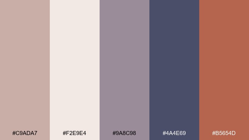
HEX: #C9ADA7 #F2E9E4 #9A8C98 #4A4E69 #B5654D
Mood: minimal, warm, studio-clean
Best for: portfolio sites, editorial layouts, modern interiors
Powdery clay and linen neutrals feel quiet and intentional, like a calm studio space. The dusty violet tones add sophistication, while terracotta brings a gentle pulse of warmth. Use it for portfolio sites, editorial layouts, and modern interior presentations where whitespace is part of the design. Keep terracotta to small accents like buttons, links, or page markers for a refined look.
Image example of clay and linen generated using media.io
14) Peacock Patio
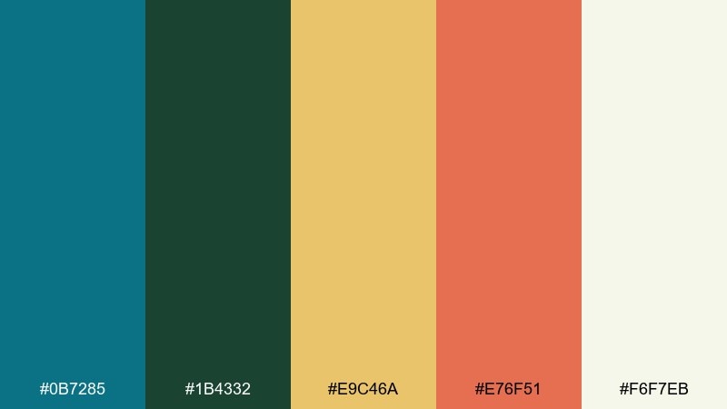
HEX: #0B7285 #1B4332 #E9C46A #E76F51 #F6F7EB
Mood: vibrant, garden-party, confident
Best for: restaurant branding, patio menus, bold social ads
Peacock teal and deep green feel like tiled patios and lush potted plants. Warm gold and coral add a festive, sunlit kick without looking loud. Use it for restaurant branding, patio menus, and bold social ads where color needs to carry the vibe. Tip: let the light neutral handle big backgrounds and use teal as the hero color, with coral reserved for highlights and badges.
Image example of peacock patio generated using media.io
15) Autumn Rattan
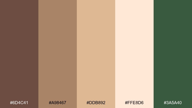
HEX: #6D4C41 #A98467 #DDB892 #FFE8D6 #3A5A40
Mood: rustic, comforting, autumnal
Best for: home goods branding, fall campaigns, product labels
Rattan browns and creamy peachy neutrals evoke cozy throws and woven baskets. The muted forest green adds a grounded counterpoint that feels timeless. Use it for home goods branding, fall campaigns, and labels where you want warmth with a natural edge. Tip: print on textured stock and keep green for small marks like seals, icons, and secondary headings.
Image example of autumn rattan generated using media.io
16) Coastal Boho
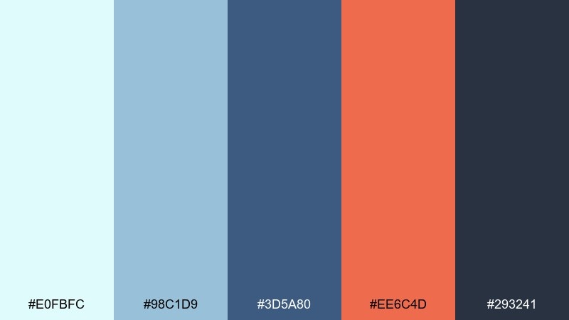
HEX: #E0FBFC #98C1D9 #3D5A80 #EE6C4D #293241
Mood: fresh, breezy, modern-coastal
Best for: summer UI kits, surf brands, clean posters
Cool seafoam and sky blue feel crisp and open, like a bright shoreline morning. Coral adds a modern spark, and the deep navy keeps the palette sharp for typography. These bohemian color combinations work especially well for clean posters and summer UI kits where you want contrast without heaviness. Tip: use the palest aqua as the main canvas and keep coral strictly for calls to action.
Image example of coastal boho generated using media.io
17) Rosewood Ritual
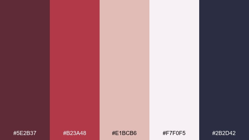
HEX: #5E2B37 #B23A48 #E1BCB6 #F7F0F5 #2B2D42
Mood: moody, romantic, refined
Best for: beauty campaigns, boutique hotel branding, luxe invites
Rosewood and berry tones feel intimate, like velvet curtains and soft candlelight. The pale blush and near-white keep the mood elegant rather than heavy. Use it for beauty campaigns, boutique hospitality branding, and luxe invites that need a romantic edge. Tip: set backgrounds in the lightest tint and reserve the deepest navy for small, high-contrast type.
Image example of rosewood ritual generated using media.io
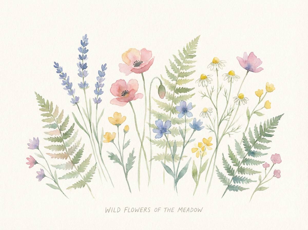
18) Wildflower Meadow
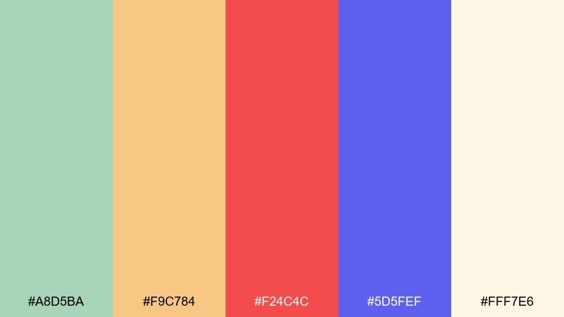
HEX: #A8D5BA #F9C784 #F24C4C #5D5FEF #FFF7E6
Mood: playful, sunny, floral
Best for: spring illustrations, kids brands, cheerful posters
Fresh meadow greens and buttery peach feel like wildflowers scattered in soft sunlight. A punchy red and lively periwinkle keep it energetic and youthful. Use it for spring illustration sets, kids brands, or cheerful posters where bright accents are welcome. Tip: keep the cream background dominant, then place red only on focal elements so the design stays friendly, not hectic.
Image example of wildflower meadow generated using media.io
19) Smoky Incense
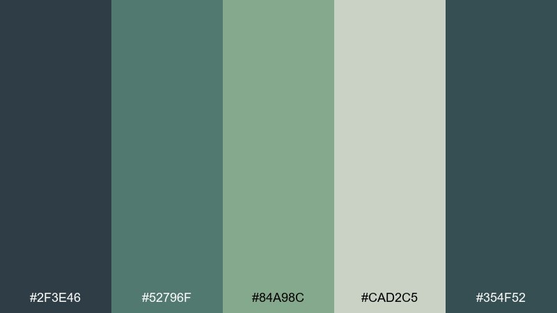
HEX: #2F3E46 #52796F #84A98C #CAD2C5 #354F52
Mood: quiet, smoky, spa-like
Best for: wellness packaging, meditation apps, minimalist branding
Smoky greens and soft stone neutrals feel like incense curling through a calm room. The tonal range stays cohesive, making it perfect for minimal, modern layouts. Use it for wellness packaging, meditation apps, and understated branding that relies on calm color transitions. Tip: choose one deep green for navigation and use the lightest gray-green as your primary background to keep screens soothing.
Image example of smoky incense generated using media.io
20) Festival Night
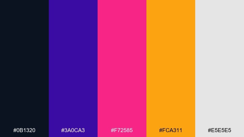
HEX: #0B1320 #3A0CA3 #F72585 #FCA311 #E5E5E5
Mood: electric, bold, after-dark
Best for: concert posters, nightlife branding, punchy ads
Inky midnight and neon brights feel like a festival crowd under stage lights. The hot pink and amber create high-impact contrast, while light gray keeps layouts readable. Use it for concert posters, nightlife branding, or punchy ads that need instant energy. Tip: keep dark navy as the base, then use pink for the main accent and amber for secondary highlights to avoid visual overload.
Image example of festival night generated using media.io
What Colors Go Well with Bohemian?
Bohemian style plays best with warm earth tones like terracotta, clay, sand, camel, and cocoa. These shades create a grounded base that instantly feels natural and tactile.
To keep boho from looking flat, add a few deeper accents such as indigo, teal, forest green, or berry. A soft off-white or linen neutral helps everything breathe and keeps layouts clean.
If you want a slightly more modern bohemian look, include one “structured” dark (near-black, deep navy, or charcoal) for typography and UI elements, then let the warm hues do the storytelling.
How to Use a Bohemian Color Palette in Real Designs
Start with a calm background (cream, linen, blush, or light stone), then layer 1–2 warm focal colors like terracotta or marigold. This keeps the composition airy while still feeling rich.
Use darker tones (navy, deep green, espresso) for text, icons, and small contrast details. Boho palettes often look best with matte finishes, paper textures, and natural materials that reinforce the handmade vibe.
For brand systems, keep one signature accent (teal, indigo, coral) consistent across buttons and highlights, and rotate the supporting earth tones across campaigns to maintain variety without losing recognition.
Create Bohemian Palette Visuals with AI
If you have HEX codes but need finished visuals, generate quick mockups that match a bohemian vibe—packaging, posters, UI blocks, or stationery—so you can test the palette in context.
Media.io makes it simple to turn a short prompt into on-brand imagery. Describe the style (boho, handmade, sun-faded), the subject (menu, product label, landing page), and the lighting/texture you want.
Once you have a few options, refine by adjusting keywords like “matte paper,” “woven texture,” “earthy tones,” or “jewel accents” to push the mood warmer, moodier, or more modern.
Bohemian Color Palette FAQs
-
What is a bohemian color palette?
A bohemian color palette is a mix of warm earth tones (terracotta, sand, camel, browns), soft washed neutrals (linen, cream), and a few expressive accents (teal, indigo, berry, marigold) for a layered, collected feel. -
Are boho colors always warm?
Mostly, but not always. Many boho schemes are warm-led, yet cool shades like sage, teal, and indigo are common—especially when balanced with cream or clay neutrals to keep the mood inviting. -
What are the best bohemian colors for branding?
Start with a neutral base (cream/linen), pick one recognizable hero color (teal, terracotta, or indigo), then add 2–3 supporting earth tones. This creates consistency while still feeling organic and handmade. -
How do I keep a bohemian palette from looking muddy?
Use a light neutral as the main background, limit the number of mid-tone browns in the same area, and add one deep shade (navy/espresso/charcoal) for clean contrast in text and edges. -
What’s a good modern boho color combination?
Try sage + linen + terracotta with a deep green or navy for structure. The neutral space makes it modern, while the warm accent keeps the bohemian personality. -
Can I use bohemian palettes for websites and UI?
Yes. Use cream or soft gray-green as the canvas, keep a single dark tone for text, and reserve your brightest accent (coral, marigold, teal) for buttons and key highlights to maintain readability. -
How can I generate bohemian-style images to match my palette?
Use a text-to-image tool and include cues like “sun-faded textiles,” “matte paper,” “handmade,” “warm natural light,” and your subject (packaging, poster, landing page). Generate a few variations and refine the prompt toward more earthy or more jewel-toned results.


