

Lilac lavender palettes sit right in the “soft but memorable” zone—gentle enough for backgrounds and UI surfaces, yet colorful enough to feel like a signature.
From romantic stationery to calm app screens, lilac lavender tones pair easily with blush, cream, slate, mint, and deep plum for contrast that still feels smooth.
In this article
- Why Lilac Lavender Palettes Work So Well
-
- wisteria mist
- lilac gelato
- lavender linen
- amethyst dusk
- orchid breeze
- violet macaron
- heirloom lilac
- lavender fog ui
- lilac and oat milk
- purple plum accent
- pastel garden party
- moonlit lavender
- frosted lilac glow
- cozy cashmere
- lavender lemonade
- modern mauve grid
- lilac ink editorial
- sakura lavender bloom
- dusty lavender clay
- lavender night sky
- What Colors Go Well with Lilac Lavender?
- How to Use a Lilac Lavender Color Palette in Real Designs
- Create Lilac Lavender Palette Visuals with AI
Why Lilac Lavender Palettes Work So Well
Lilac lavender is naturally calming: it carries the softness of pastel purple without feeling childish, which makes it a strong choice for modern branding, wellness, and lifestyle visuals.
It also scales well across mediums. On screens, lilac lavender reads clean and airy for cards, sections, and gradients; in print, it looks refined when paired with warm neutrals like cream, oat, or beige.
Most importantly, lilac lavender is easy to balance: use deep plum or near-black for type and hierarchy, then bring in mint, blush, or slate accents for contrast that stays elegant.
20+ Lilac Lavender Color Palette Ideas (with HEX Codes)
1) Wisteria Mist
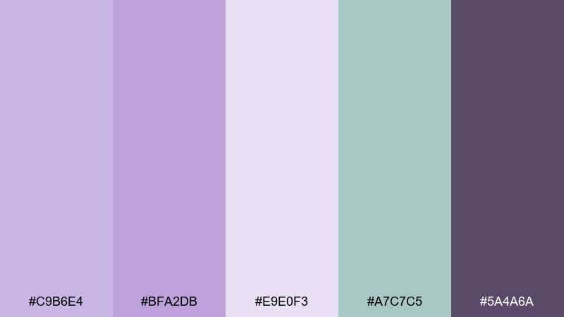
HEX: #C9B6E4 #BFA2DB #E9E0F3 #A7C7C5 #5A4A6A
Mood: airy, calm, botanical
Best for: watercolor spring botanical illustration
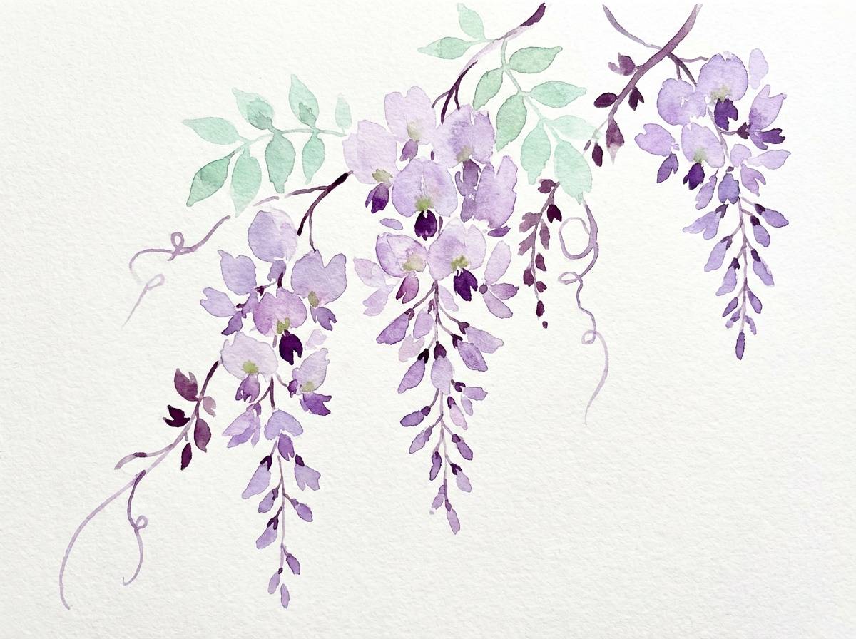
Airy, calm tones that feel like wisteria petals drifting through morning fog. The soft purples stay gentle, while the misty mint adds fresh contrast without stealing the spotlight. Use it for spring artwork, stationery, or light lifestyle branding where you want softness with clarity. Tip: keep the darkest plum for fine outlines and type so the pale lilacs can stay luminous.
Image example of wisteria mist generated using media.io
Media.io is an online AI studio for creating and editing video, image, and audio in your browser.

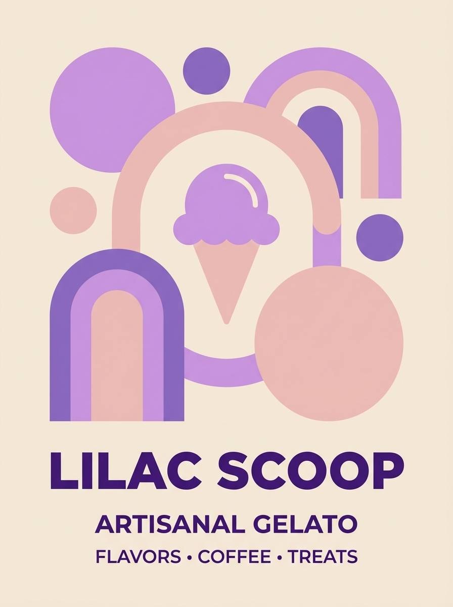
2) Lilac Gelato
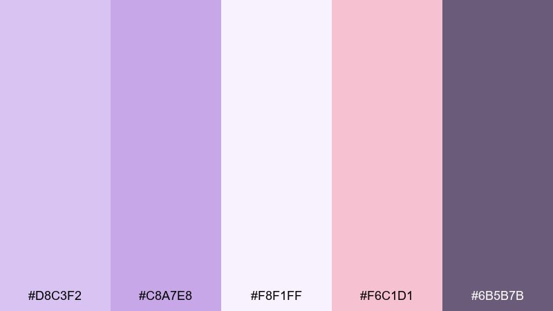
HEX: #D8C3F2 #C8A7E8 #F8F1FF #F6C1D1 #6B5B7B
Mood: sweet, playful, dreamy
Best for: ice cream shop brand poster
Sweet and playful, like gelato swirled into a pastel sunset. The soft blush makes the purples feel friendly, while the deeper violet anchors headlines and pricing. This lilac lavender color palette works beautifully for dessert brands, playful packaging, or social ads aimed at a younger audience. Tip: set body copy on the creamy off white to keep readability high and the mood light.
Image example of lilac gelato generated using media.io
3) Lavender Linen
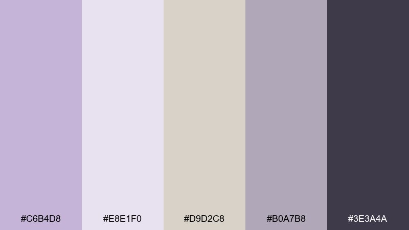
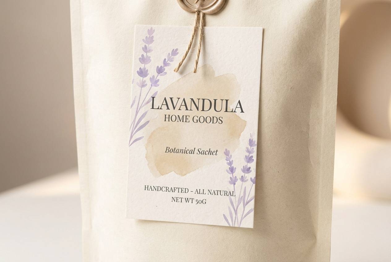
HEX: #C6B4D8 #E8E1F0 #D9D2C8 #B0A7B8 #3E3A4A
Mood: minimal, cozy, organic
Best for: home goods packaging label
Minimal and cozy, like sun-warmed linen with a lavender tint. The warm beige keeps the purples from turning icy, and the charcoal gives you a reliable type color. Use it for home goods, candles, or sustainable packaging where texture and restraint matter. Tip: print the mid lavender as a large block color and reserve charcoal for small text and barcodes.
Image example of lavender linen generated using media.io
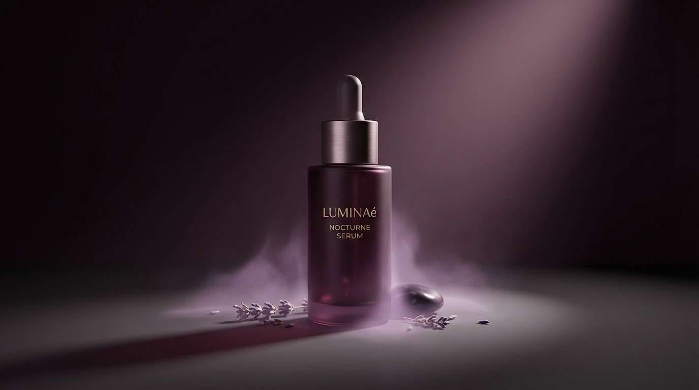
4) Amethyst Dusk
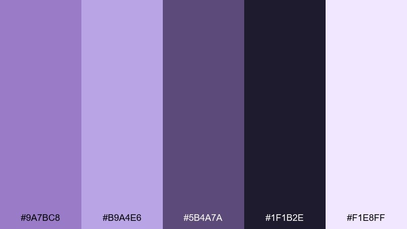
HEX: #9A7BC8 #B9A4E6 #5B4A7A #1F1B2E #F1E8FF
Mood: moody, luxe, cinematic
Best for: beauty product ad
Moody and luxe, like amethyst catching the last light of day. The deep near-black makes the lilacs feel richer and more premium, ideal for dramatic contrast. Choose it for beauty ads, fragrance pages, or high-end landing sections that need depth without going neon. Tip: use the palest tint as a spotlight glow behind the product to add dimension.
Image example of amethyst dusk generated using media.io
5) Orchid Breeze
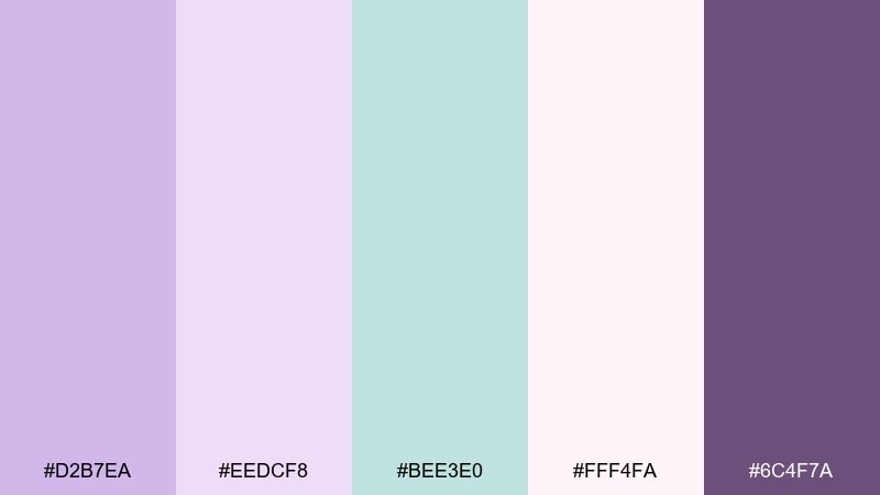
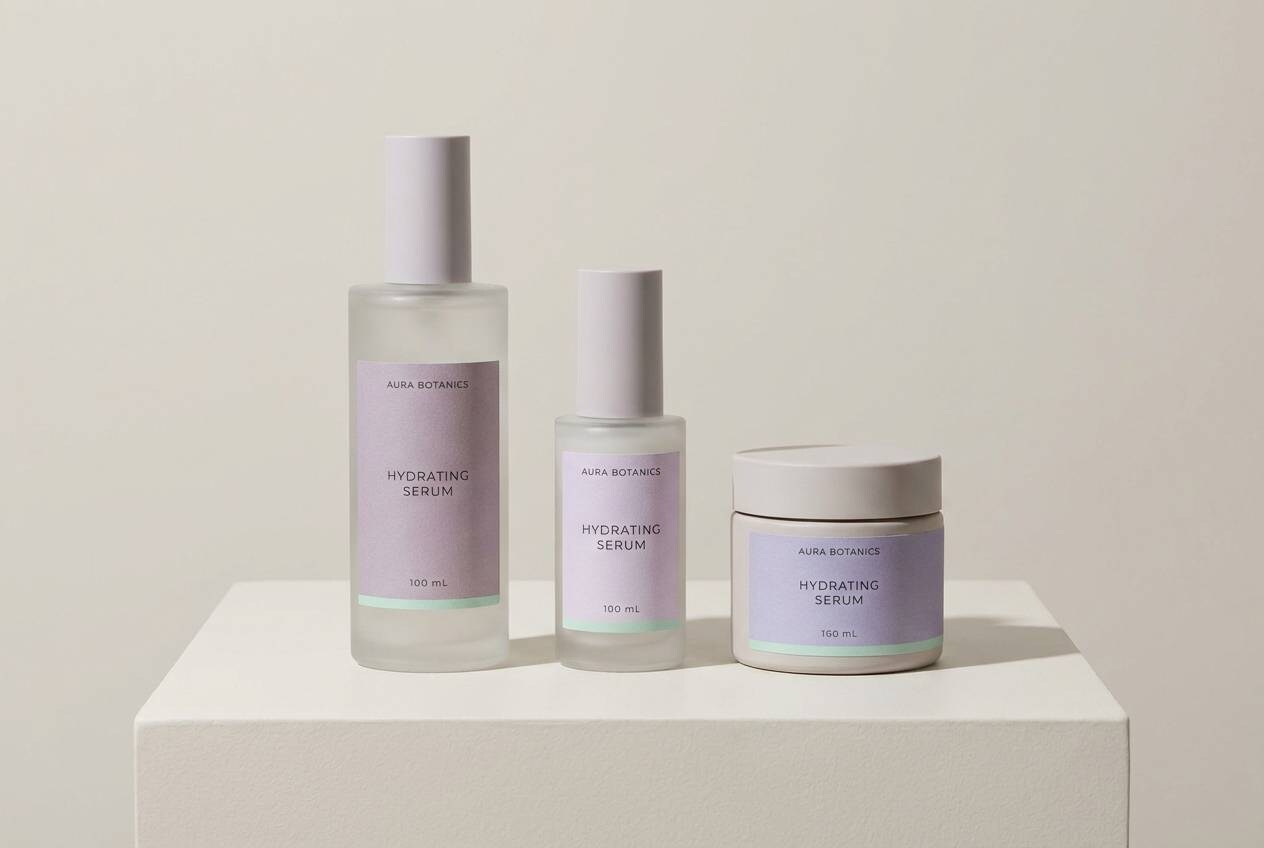
HEX: #D2B7EA #EEDCF8 #BEE3E0 #FFF4FA #6C4F7A
Mood: fresh, spa-like, soft
Best for: skincare packaging and website hero
Fresh and spa-like, with pastel orchid tones softened by clean, airy light. The minty aqua adds a crisp lift that feels modern and hygienic for wellness brands. Use it on skincare packaging, calm website heroes, and product highlight cards with plenty of whitespace. Tip: keep the deep purple only for key claims so the overall look stays gentle.
Image example of orchid breeze generated using media.io
6) Violet Macaron
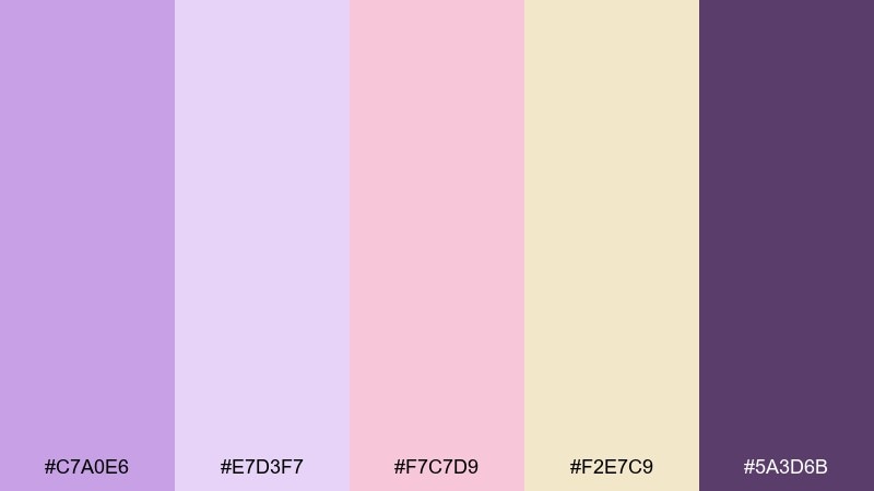
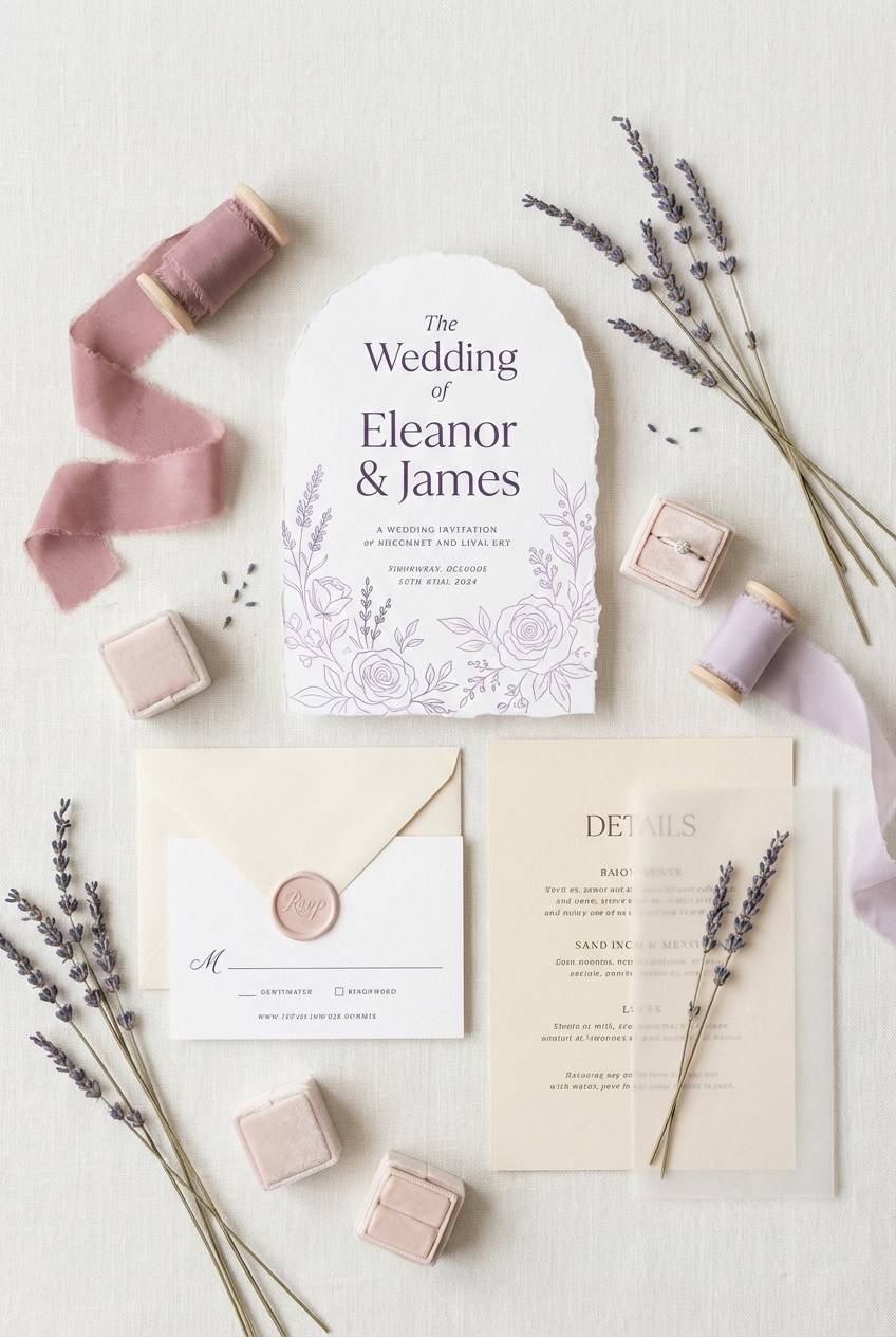
HEX: #C7A0E6 #E7D3F7 #F7C7D9 #F2E7C9 #5A3D6B
Mood: romantic, sweet, Parisian
Best for: wedding invitation suite
Romantic and sweet, like a patisserie window with lavender macarons and blush frosting. The creamy vanilla warms up the purple tones so the whole set feels welcoming. These lilac lavender color combinations shine on wedding invitations, bridal shower suites, and RSVP cards with delicate typography. Tip: foil or emboss the deepest violet for names and monograms to elevate the stationery.
Image example of violet macaron generated using media.io
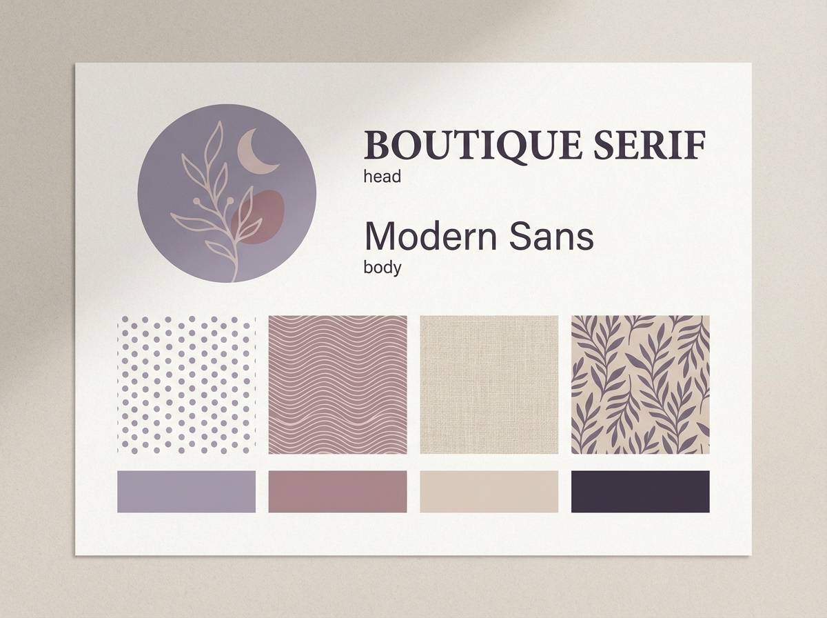
7) Heirloom Lilac
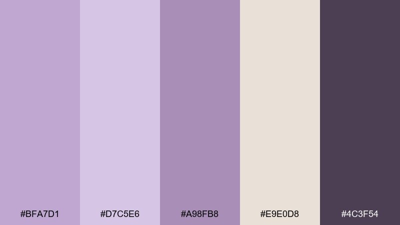
HEX: #BFA7D1 #D7C5E6 #A98FB8 #E9E0D8 #4C3F54
Mood: vintage, refined, comforting
Best for: boutique brand identity
Vintage and refined, like pressed lilac petals in an old book. The dusty midtones feel nostalgic, while the soft beige gives your layouts breathing room. Use it for boutique logos, artisanal labels, and brand boards that lean classic rather than trendy. Tip: pair with a warm off-white background and let the muted mauve do most of the work.
Image example of heirloom lilac generated using media.io
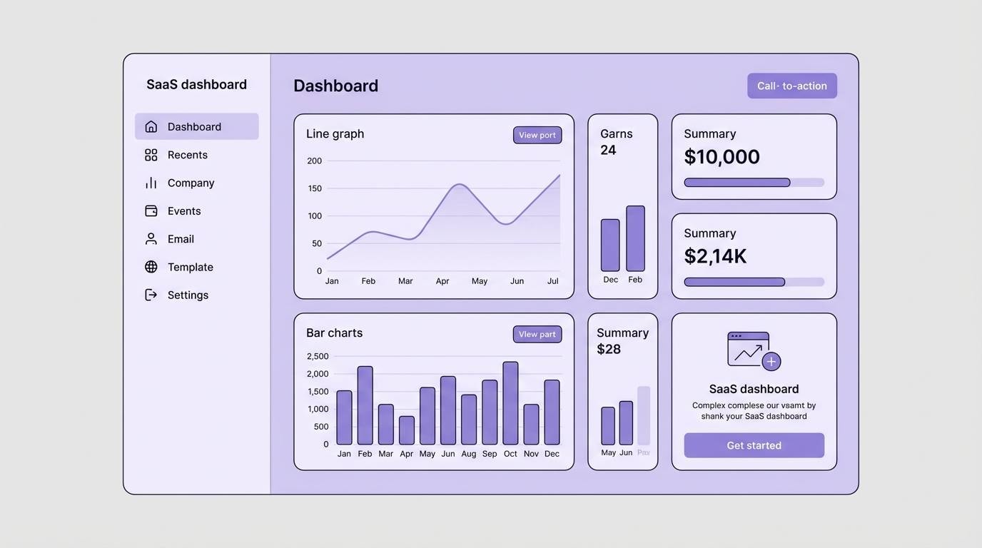
8) Lavender Fog UI
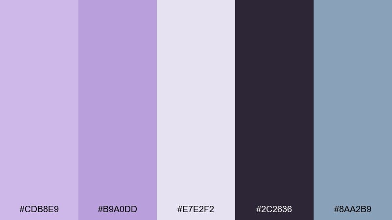
HEX: #CDB8E9 #B9A0DD #E7E2F2 #2C2636 #8AA2B9
Mood: modern, calm, tech-friendly
Best for: 2D SaaS dashboard UI mockup
Modern and calm, like a quiet interface seen through a soft morning haze. The cool slate accent keeps the purples from feeling too cute, and the near-black adds strong contrast for navigation. This lilac lavender color palette is ideal for SaaS dashboards, wellness apps, and settings screens where clarity matters. Tip: use the lightest tint for surfaces and cards, and keep the mid lavender for primary buttons only.
Image example of lavender fog ui generated using media.io
9) Lilac and Oat Milk
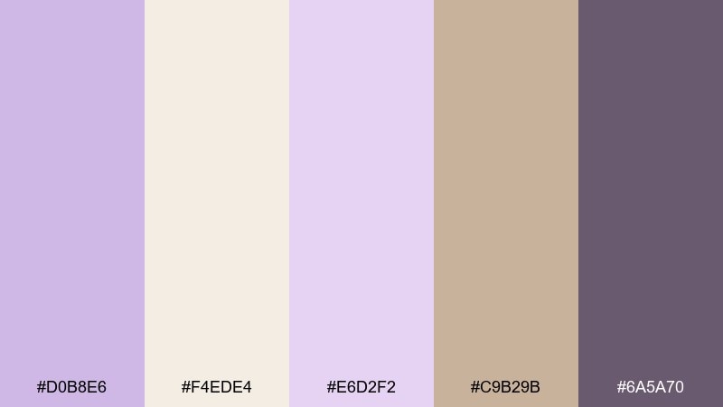
HEX: #D0B8E6 #F4EDE4 #E6D2F2 #C9B29B #6A5A70
Mood: soft, cozy, cafe-chic
Best for: coffee shop menu design
Soft and cozy, like an oat milk latte with a hint of floral syrup. The warm tan and cream make the lilac feel grounded and easy to read in print. Use it for cafe menus, loyalty cards, and calm lifestyle flyers where you want gentle color without losing legibility. Tip: set headings in the deeper gray-purple and keep large backgrounds creamy to avoid a washed look.
Image example of lilac and oat milk generated using media.io
10) Purple Plum Accent
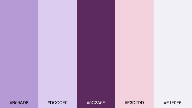
HEX: #B59AD6 #DCCCF0 #5C2A5F #F3D2DD #F1F0F6
Mood: bold, feminine, editorial
Best for: fashion sale poster
Bold and feminine, with a plum punch that feels runway-ready. The soft lavender tints keep the look airy, while the deep plum delivers instant hierarchy for discounts and CTAs. Use it for fashion sale posters, lookbook covers, or social carousel ads that need a confident accent. Tip: limit the plum to one or two elements per layout so it reads as intentional, not heavy.
Image example of purple plum accent generated using media.io
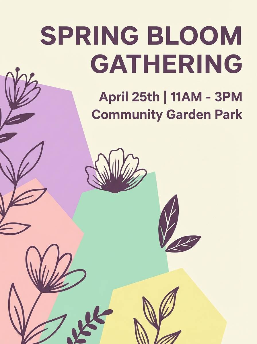
11) Pastel Garden Party
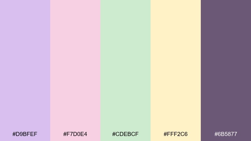
HEX: #D9BFEF #F7D0E4 #CDEBCF #FFF2C6 #6B5877
Mood: cheerful, light, celebratory
Best for: spring event flyer
Cheerful and light, like a backyard party with fresh flowers and pastel confetti. The mint and buttery yellow brighten the purples, making the mix feel social and sunny. Use it for spring event flyers, community announcements, and playful newsletters that need multiple accent blocks. Tip: assign each section a single accent color so the layout stays organized.
Image example of pastel garden party generated using media.io
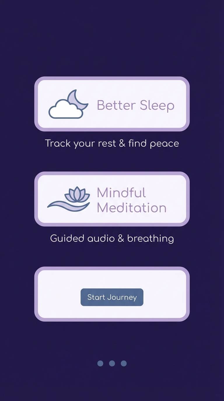
12) Moonlit Lavender
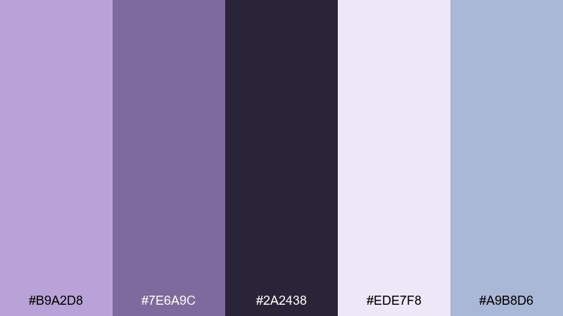
HEX: #B9A2D8 #7E6A9C #2A2438 #EDE7F8 #A9B8D6
Mood: quiet, nocturnal, serene
Best for: meditation app onboarding screens
Quiet and nocturnal, like lavender fields under a cool moon. The deep night tone adds focus and helps light elements feel calm rather than sugary. Use it for meditation onboarding, sleep features, or reflective storytelling sections with minimal copy. Tip: keep text in the near-white tint and use the slate blue only for secondary icons to maintain softness.
Image example of moonlit lavender generated using media.io
13) Frosted Lilac Glow
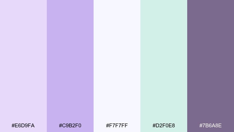
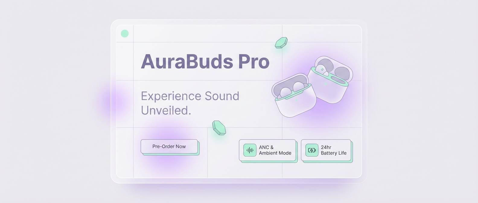
HEX: #E6D9FA #C9B2F0 #F7F7FF #D2F0E8 #7B6A8E
Mood: clean, luminous, airy
Best for: tech product landing page
Clean and luminous, like frosted glass catching a lilac reflection. The near-white and mint keep the palette feeling fresh, perfect for modern layouts with lots of spacing. Use it for tech landing pages, feature grids, and announcement banners where you want lightness without blandness. Tip: add subtle gradients between the two light purples for depth while keeping contrast accessible.
Image example of frosted lilac glow generated using media.io
14) Cozy Cashmere
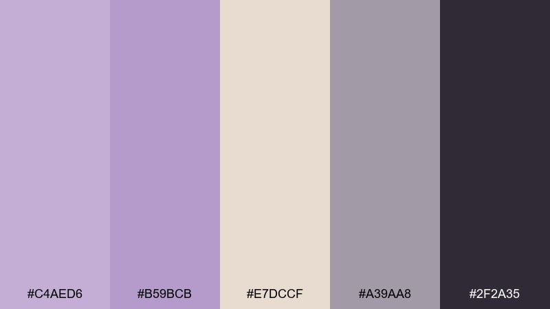
HEX: #C4AED6 #B59BCB #E7DCCF #A39AA8 #2F2A35
Mood: warm, cozy, understated
Best for: knitwear lookbook layout
Warm and understated, like a cashmere sweater in a softly lit boutique. The beige brings comfort, and the muted gray keeps the purple from feeling overly romantic. Use it for knitwear lookbooks, seasonal email headers, or product grids that need warmth and restraint. Tip: keep photography neutral and let lavender show up in buttons, tags, and section dividers.
Image example of cozy cashmere generated using media.io
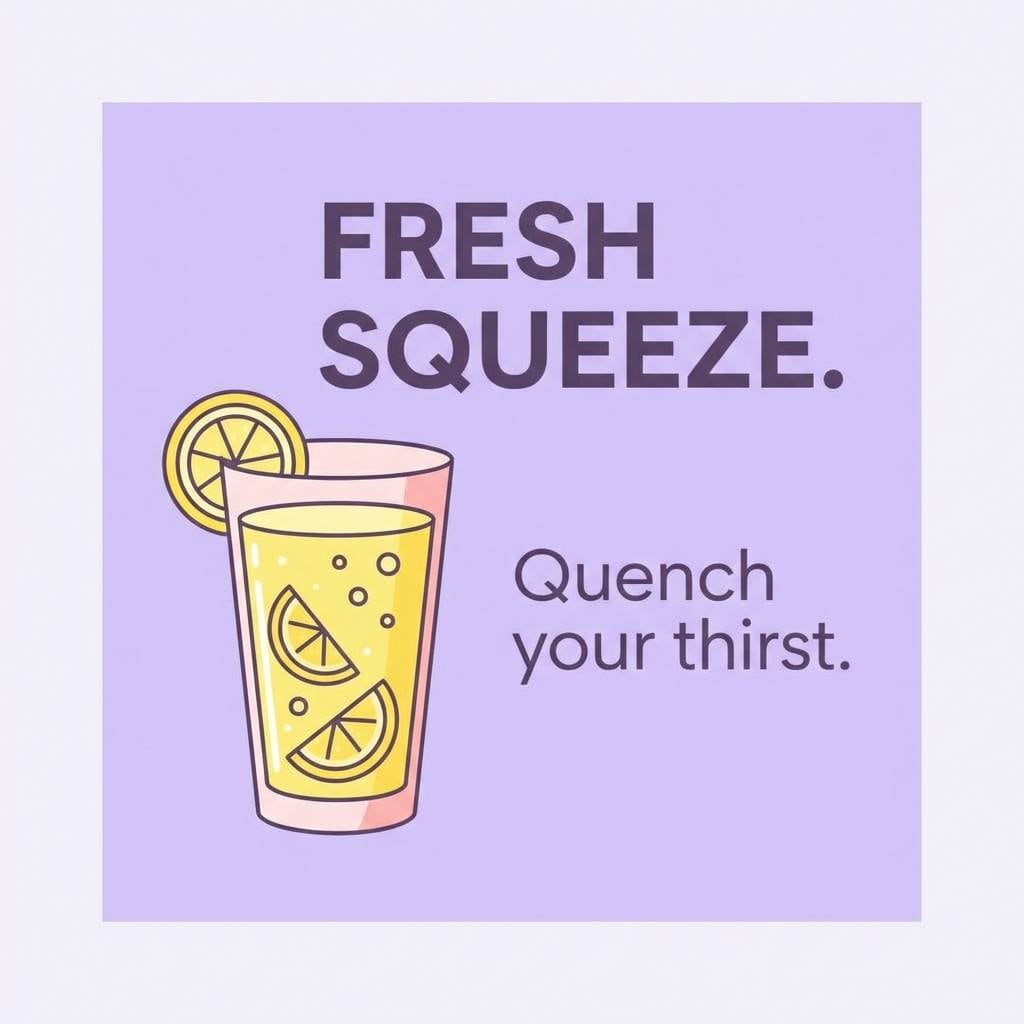
15) Lavender Lemonade
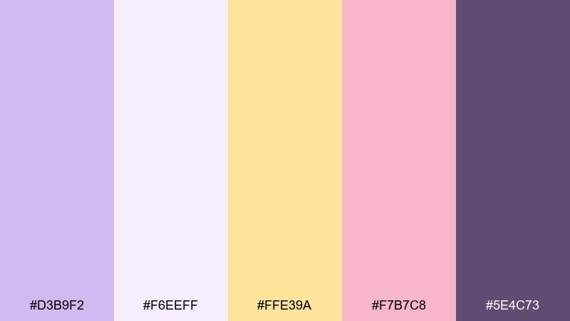
HEX: #D3B9F2 #F6EEFF #FFE39A #F7B7C8 #5E4C73
Mood: bright, optimistic, bubbly
Best for: summer drink social ad
Bright and optimistic, like sparkling lemonade with a lavender twist. The sunny yellow turns the purples into something energetic instead of sleepy, while blush keeps it friendly. Use it for summer drink promos, limited edition launches, or cheerful story templates. Tip: treat yellow as a highlight color for price tags and icons so it stays punchy, not overwhelming.
Image example of lavender lemonade generated using media.io
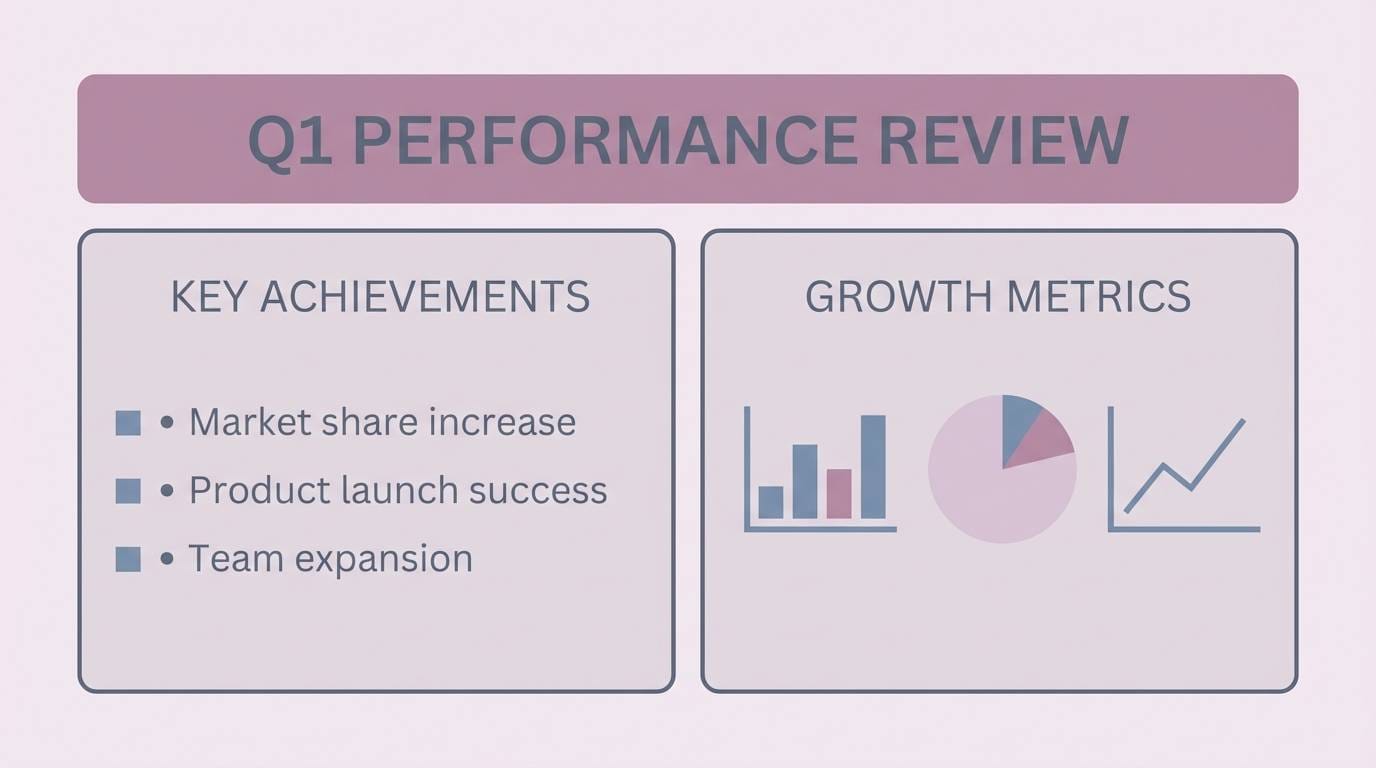
16) Modern Mauve Grid
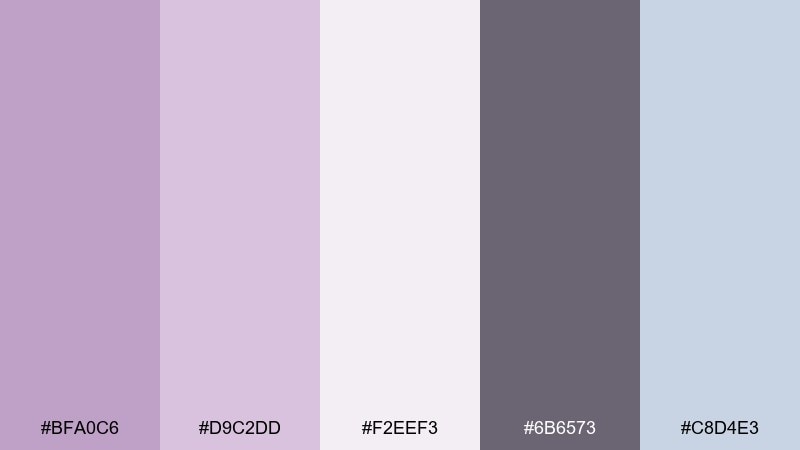
HEX: #BFA0C6 #D9C2DD #F2EEF3 #6B6573 #C8D4E3
Mood: modern, structured, soft-neutral
Best for: presentation template slides
Modern and structured, like a soft mauve grid on crisp stationery. The pale neutrals keep the deck professional, while the lavender tones add personality without distracting. Use it for pitch decks, workshop slides, and brand strategy presentations that need a gentle color system. Tip: apply the slate gray to headings and reserve the cool blue-gray for charts and callouts.
Image example of modern mauve grid generated using media.io
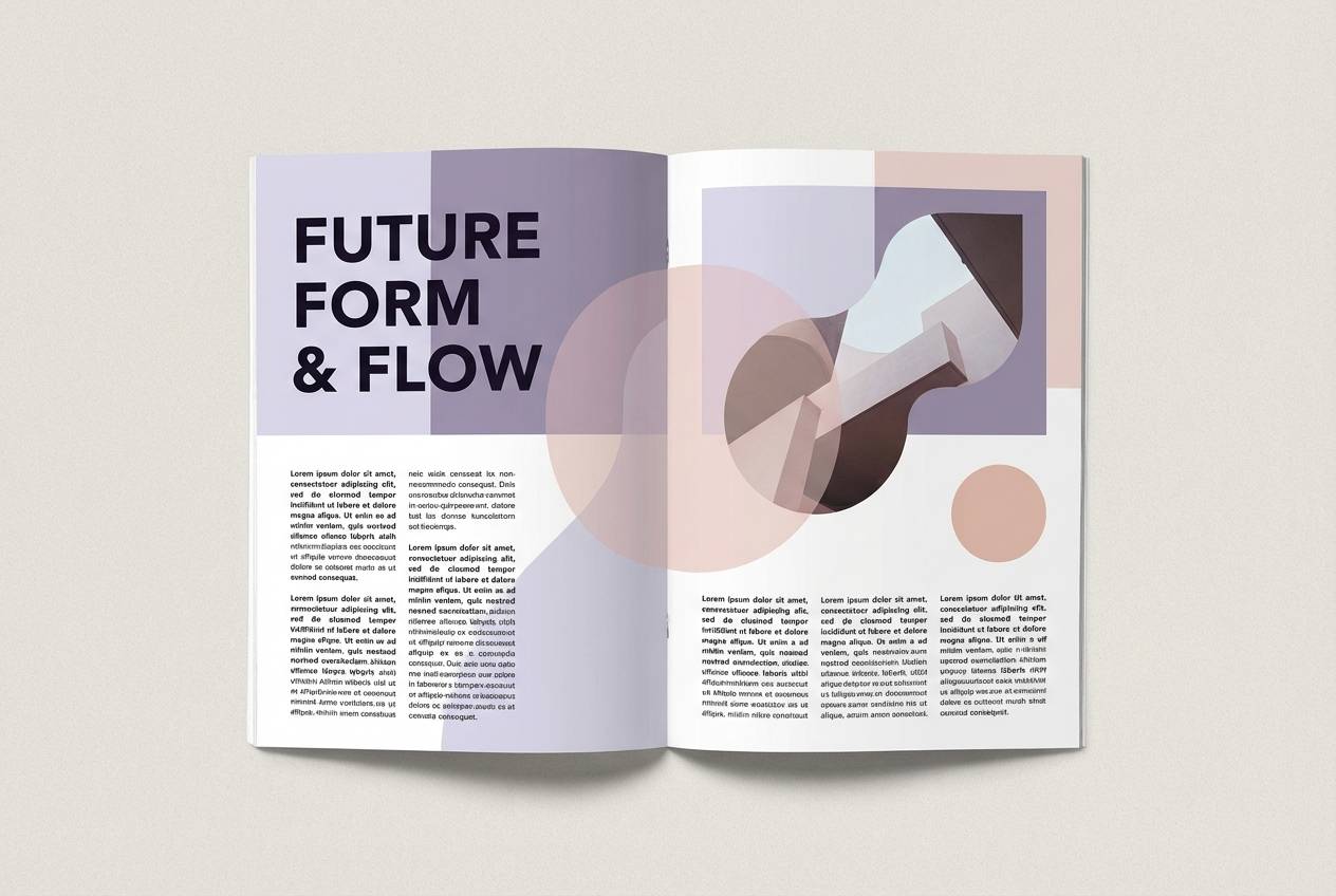
17) Lilac Ink Editorial
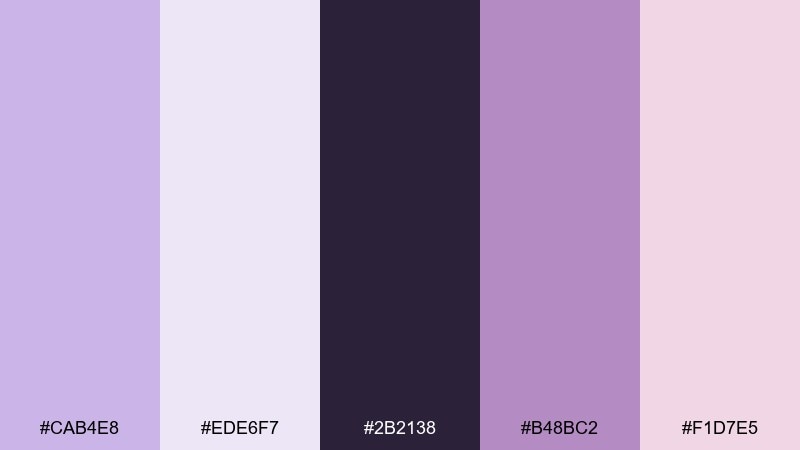
HEX: #CAB4E8 #EDE6F7 #2B2138 #B48BC2 #F1D7E5
Mood: editorial, artistic, high-contrast
Best for: magazine layout spread
Editorial and artistic, like lilac ink on textured paper with a bold black headline. The deeper purple and near-black create confident contrast, while blush keeps the page approachable. These lilac lavender color combinations are great for magazine spreads, portfolio pages, and culture posters with strong typography. Tip: use the darkest tone for title and pull quotes, and keep body text on the palest lavender for an airy read.
Image example of lilac ink editorial generated using media.io
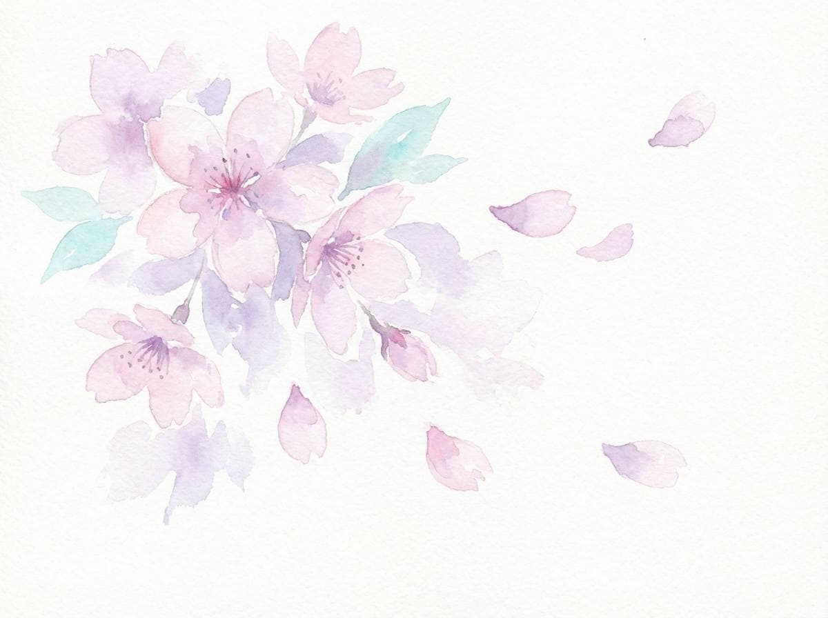
18) Sakura Lavender Bloom
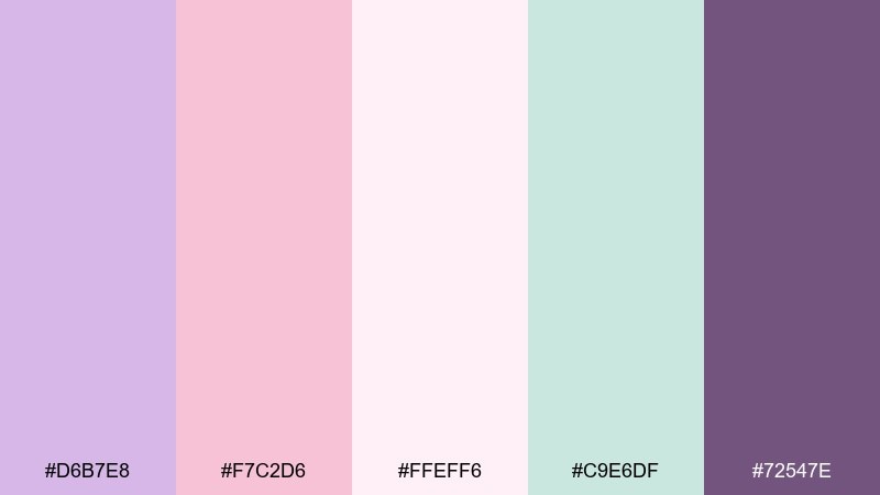
HEX: #D6B7E8 #F7C2D6 #FFEFF6 #C9E6DF #72547E
Mood: soft, romantic, springtime
Best for: watercolor floral greeting card
Soft and romantic, like cherry blossoms drifting into a lavender haze. The blush and pale pink lighten the purples, while the gentle aqua adds a fresh spring lift. Use it for greeting cards, floral stickers, and seasonal campaign art where you want a tender mood. Tip: keep most petals in pale tones and add the dark purple only in tiny centers and stems.
Image example of sakura lavender bloom generated using media.io
19) Dusty Lavender Clay
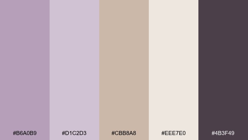
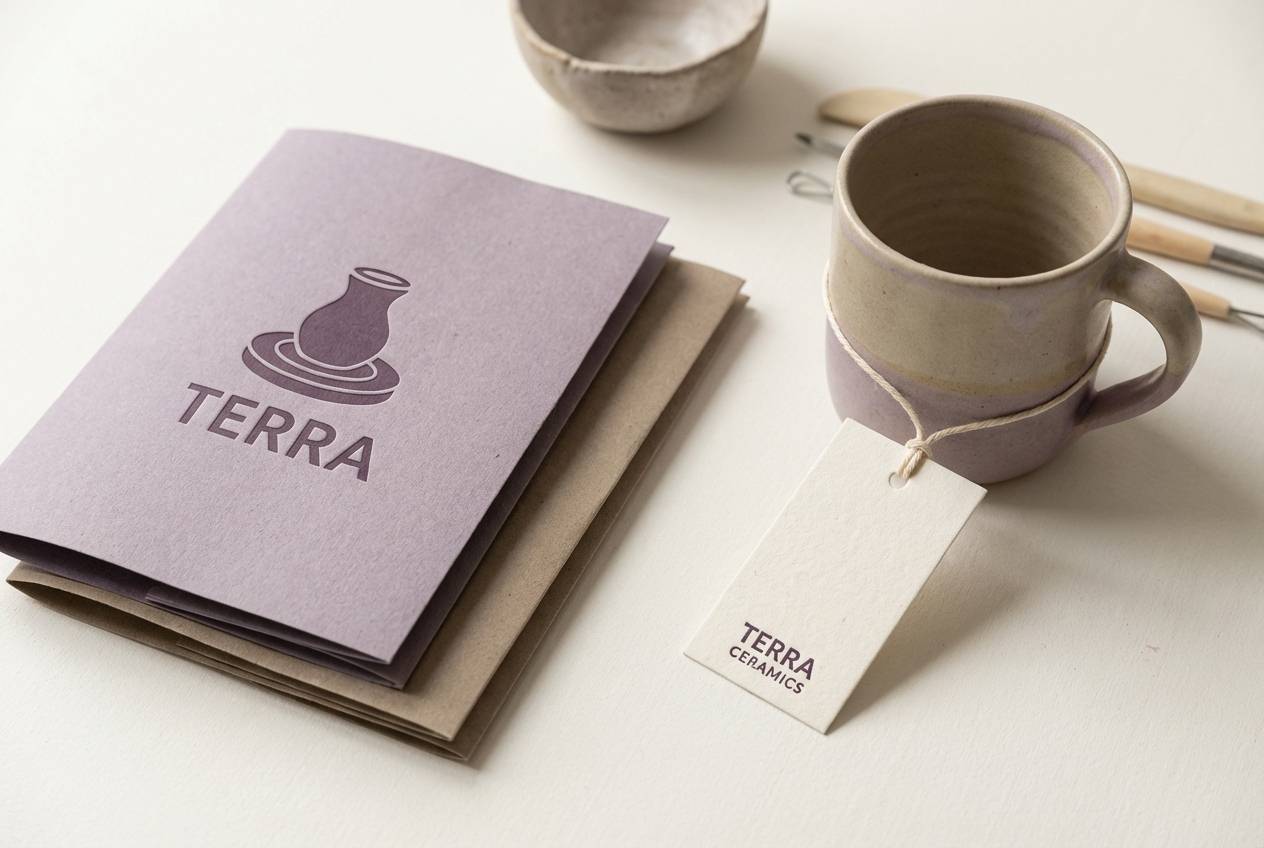
HEX: #B6A0B9 #D1C2D3 #CBB8A8 #EEE7E0 #4B3F49
Mood: earthy, muted, artisan
Best for: ceramics studio branding
Earthy and muted, like lavender dust settled over handmade clay. The warm taupe keeps the purple grounded, perfect for craft-forward brands that want softness without sparkle. Use it for ceramics studio branding, workshop signage, and simple e-commerce product pages. Tip: choose uncoated paper stocks or subtle grain textures to make the muted tones feel intentional and tactile.
Image example of dusty lavender clay generated using media.io
20) Lavender Night Sky
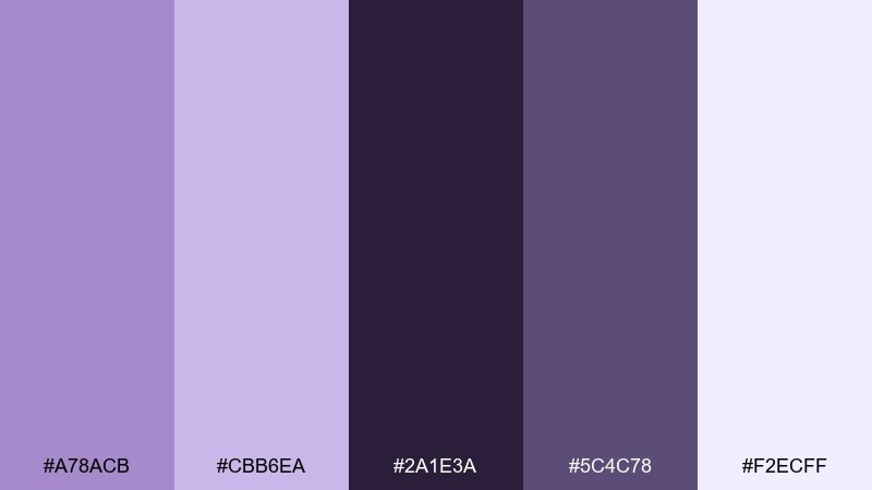
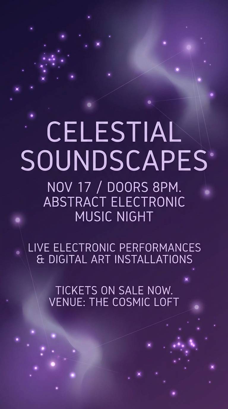
HEX: #A78ACB #CBB6EA #2A1E3A #5C4C78 #F2ECFF
Mood: mysterious, modern, cosmic
Best for: music event poster
Mysterious and modern, like a night sky tinted violet with distant starlight. The deep base color gives you drama, while the pale lavender reads like a glow layer for shapes and type. Use it for music event posters, DJ lineups, or dark-mode brand moments that still feel elegant. Tip: add soft halos or grain around the lightest tint to simulate neon-like glow without harsh saturation.
Image example of lavender night sky generated using media.io
What Colors Go Well with Lilac Lavender?
Lilac lavender pairs beautifully with warm neutrals like cream, oat, sand, and soft beige—these keep the palette cozy and print-friendly, especially for packaging and invitations.
For fresher, modern contrast, add mint, aqua, or a cool teal-leaning accent. These hues sit far enough from purple to feel crisp, while still staying soft and “clean.”
When you need structure and readability, anchor lilac lavender with deep plum, charcoal purple, or near-black. Dark accents sharpen typography and help pastel surfaces feel intentional rather than washed out.
How to Use a Lilac Lavender Color Palette in Real Designs
Start with roles: use the lightest lilac for backgrounds and surfaces, mid lilac for primary UI elements (buttons, tabs), and deep plum/charcoal for text. This keeps contrast predictable across pages and screens.
In branding, treat lilac lavender as the “signature” and choose one supporting accent (blush, mint, or yellow). Restrict the accent to highlights—badges, icons, price tags, or small shapes—so it stays premium.
For print, test on the actual stock. Lilac lavender can shift cooler on bright white paper and warmer on uncoated or cream stocks, so adjust your darkest tone for legibility before final export.
Create Lilac Lavender Palette Visuals with AI
If you already have HEX codes, the fastest way to validate a palette is to see it applied: posters, packaging labels, UI cards, and social templates. A quick visual mock can reveal contrast issues and whether the mood reads as intended.
With Media.io’s text-to-image tool, you can generate lilac lavender design examples from prompts (like the ones above), then iterate by swapping accents (mint vs blush) or boosting contrast with deeper plum.
Lilac Lavender Color Palette FAQs
-
What’s the difference between lilac and lavender in design?
Lilac usually leans slightly pinker and brighter, while lavender often reads cooler and more blue-toned. In practice, combining both creates a soft gradient range that feels richer than using a single pastel purple. -
What are good accent colors for a lilac lavender palette?
Top accents include blush pink (romantic), mint/aqua (fresh and modern), buttery yellow (cheerful), and slate/blue-gray (more professional). Choose one main accent to avoid a “too many pastels” look. -
Which text color works best on lilac lavender backgrounds?
For readability, use deep plum, charcoal purple, or near-black for body text and navigation. If you use white text, reserve it for large headings on darker purple areas and check contrast. -
Is lilac lavender good for UI and app design?
Yes—especially for wellness, lifestyle, and modern SaaS themes. Use very light lilac tints for surfaces, keep mid lilac for primary actions only, and rely on dark neutrals for type to maintain clarity. -
Does lilac lavender print well?
It can print beautifully, but it’s sensitive to paper and ink. On uncoated or cream stocks it often looks softer/warmer; on bright white it can skew cooler. Always run a proof and ensure your darkest tone stays dark enough for small text. -
How do I make a lilac lavender palette feel more “grown up”?
Add structure with charcoal, deep plum, and warm neutrals (linen, beige, oat). Keep saturation low, reduce the number of accents, and use generous whitespace and clean typography. -
Can I generate lilac lavender palette visuals from a prompt?
Yes. Describe the design type (UI, packaging, poster), the mood (airy, luxe, cozy), and include lilac/lavender with your chosen accents (mint, blush, cream, plum). Then iterate by adjusting lighting, contrast, and composition.


