

Light yellow is a go-to base when you want warmth without visual weight. It reads bright, clean, and welcoming across web, print, and packaging.
Below are 20+ light yellow color palette ideas with HEX codes, plus practical tips for contrast, accents, and real design use-cases.
In this article
- Why Light Yellow Palettes Work So Well
-
- lemon chiffon breeze
- buttercream minimal
- sunlit sage kitchen
- marigold and ink
- vanilla rose quartz
- citrus and clay
- daffodil sky
- honeyed neutrals
- pale gold and pine
- custard lavender haze
- champagne citrus pop
- sunflower studio
- linen and lemon zest
- primrose botanical wash
- soft sun and stone
- golden hour coastal
- pollen and charcoal
- apricot cream pop
- mimosa wedding suite
- candlelight cocoa
- citrus noir contrast
- soft neon citrus mix
- What Colors Go Well with Light Yellow?
- How to Use a Light Yellow Color Palette in Real Designs
- Create Light Yellow Palette Visuals with AI
Why Light Yellow Palettes Work So Well
Light yellow brings positivity and clarity while staying softer than saturated yellows. It’s especially effective as a background or “canvas” color because it adds warmth without stealing attention from typography or product imagery.
In branding and UI, pale yellow can reduce the starkness of pure white and help layouts feel more human. Pair it with cool grays, navy, or charcoal to keep readability strong and the tone modern.
For print and packaging, light yellow also plays nicely with natural materials (kraft, linen textures, off-whites). It can feel premium, nostalgic, or fresh depending on the accent colors you choose.
20+ Light Yellow Color Palette Ideas (with HEX Codes)
1) Lemon Chiffon Breeze
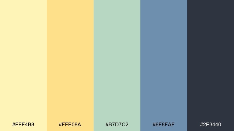
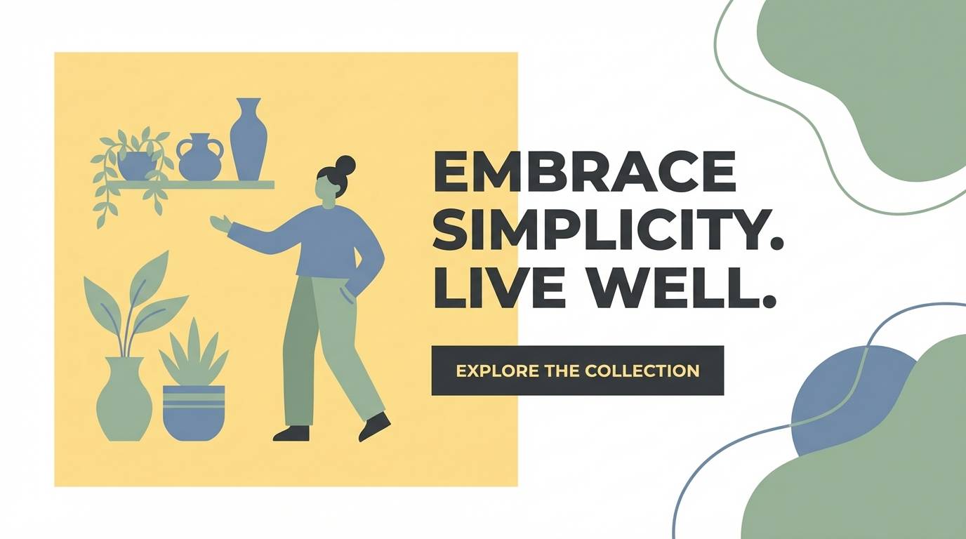
HEX: #FFF4B8 #FFE08A #B7D7C2 #6F8FAF #2E3440
Mood: fresh, airy, optimistic
Best for: homepage hero banner for a lifestyle brand
Fresh, airy optimism comes through like morning sun on linen curtains. Use the pale yellow tones for big, breathable areas, then anchor the layout with deep charcoal for headlines and buttons. Sage and soft steel blue keep the look modern without turning sugary. Tip: keep contrast high on CTAs by pairing the charcoal with the lightest yellow.
Image example of lemon chiffon breeze generated using media.io
Media.io is an online AI studio for creating and editing video, image, and audio in your browser.

2) Buttercream Minimal
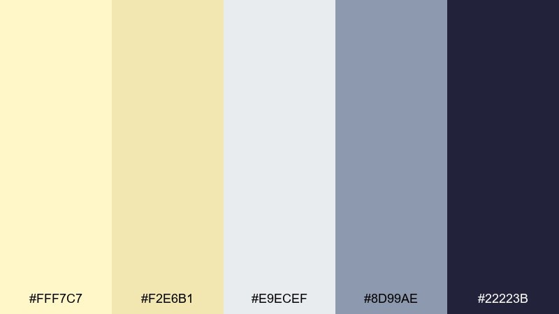
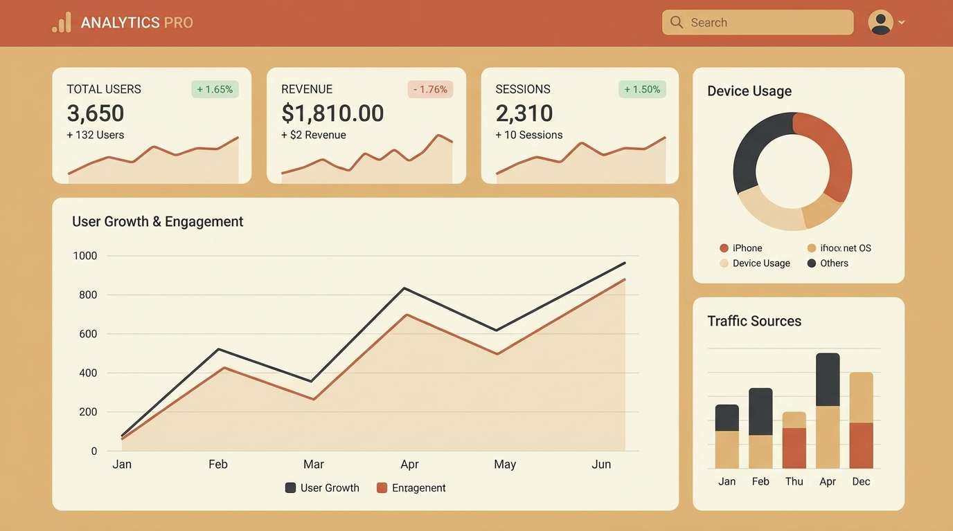
HEX: #FFF7C7 #F2E6B1 #E9ECEF #8D99AE #22223B
Mood: clean, calm, understated
Best for: 2d ui dashboard for finance or analytics
Clean calmness, like a tidy desk in warm daylight, makes this set feel instantly organized. Let the buttercream act as the main canvas while the cool grays shape cards, dividers, and subtle states. Use the near-black for key numbers and active navigation so the interface stays readable. Tip: reserve the mid gray for secondary metrics to keep hierarchy crisp.
Image example of buttercream minimal generated using media.io
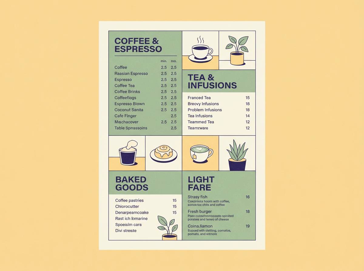
3) Sunlit Sage Kitchen
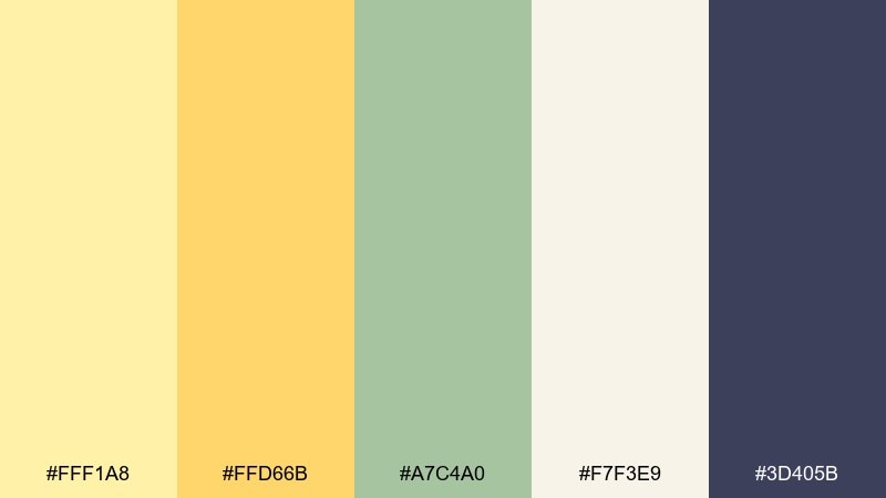
HEX: #FFF1A8 #FFD66B #A7C4A0 #F7F3E9 #3D405B
Mood: warm, homey, welcoming
Best for: cafe menu poster on a plain background
Warm, homey light feels like a sunbeam hitting herb jars on a kitchen shelf. The creamy off-white gives breathing room while sage builds a natural, appetizing frame. Use the deep indigo for pricing and section headers so the menu reads fast from a distance. Tip: add small amber highlights for best-seller badges without overwhelming the layout.
Image example of sunlit sage kitchen generated using media.io
4) Marigold and Ink
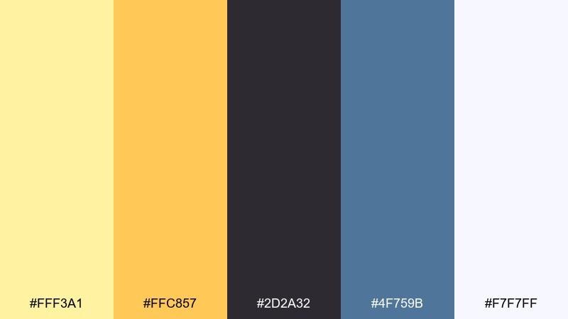
HEX: #FFF3A1 #FFC857 #2D2A32 #4F759B #F7F7FF
Mood: bold, punchy, contemporary
Best for: startup brand kit and logo background options
Bold energy lands like streetlight glow against wet asphalt. This light yellow color scheme works best when you treat the dark ink tone as the foundation and use marigold as a confident highlight. The cool blue adds tech polish without feeling icy. Tip: keep the yellow in small, repeatable motifs for consistency across brand touchpoints.
Image example of marigold and ink generated using media.io
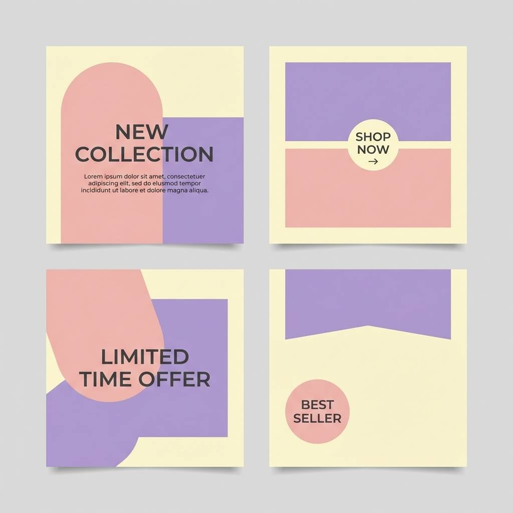
5) Vanilla Rose Quartz
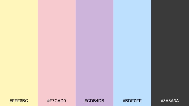
HEX: #FFF6BC #F7CAD0 #CDB4DB #BDE0FE #3A3A3A
Mood: soft, romantic, dreamy
Best for: beauty social media post templates
Soft romance reads like petals scattered on a warm windowsill. These light yellow color combinations pair beautifully with blush and lavender for a gentle, premium beauty vibe. Use charcoal for short, confident copy so the pastel field stays legible in feeds. Tip: limit text to one or two lines and let the color blocks do the storytelling.
Image example of vanilla rose quartz generated using media.io
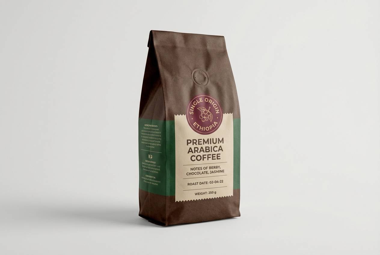
6) Citrus and Clay
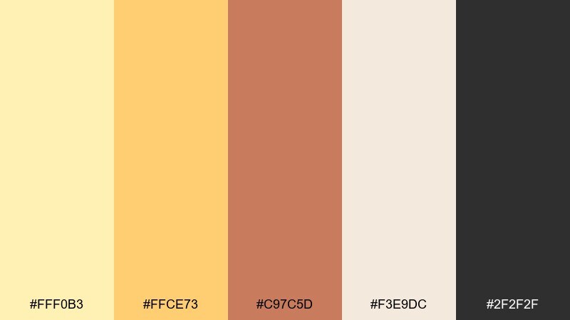
HEX: #FFF0B3 #FFCE73 #C97C5D #F3E9DC #2F2F2F
Mood: earthy, warm, handcrafted
Best for: coffee bag packaging and label design
Earthy warmth feels like glazed pottery and citrus peel on a cutting board. The clay tone brings craft credibility, while the soft yellow keeps the pack approachable on shelf. Pair the deepest charcoal with simple typography for origin notes and roast details. Tip: use the cream as a label panel so regulatory text stays clean and readable.
Image example of citrus and clay generated using media.io
7) Daffodil Sky
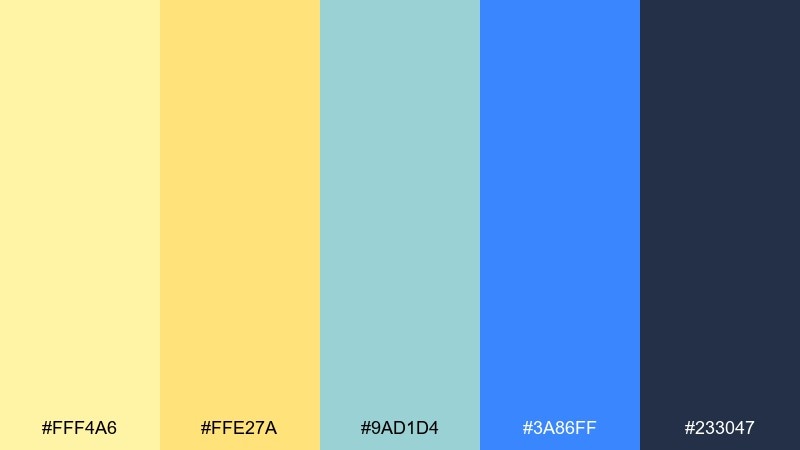
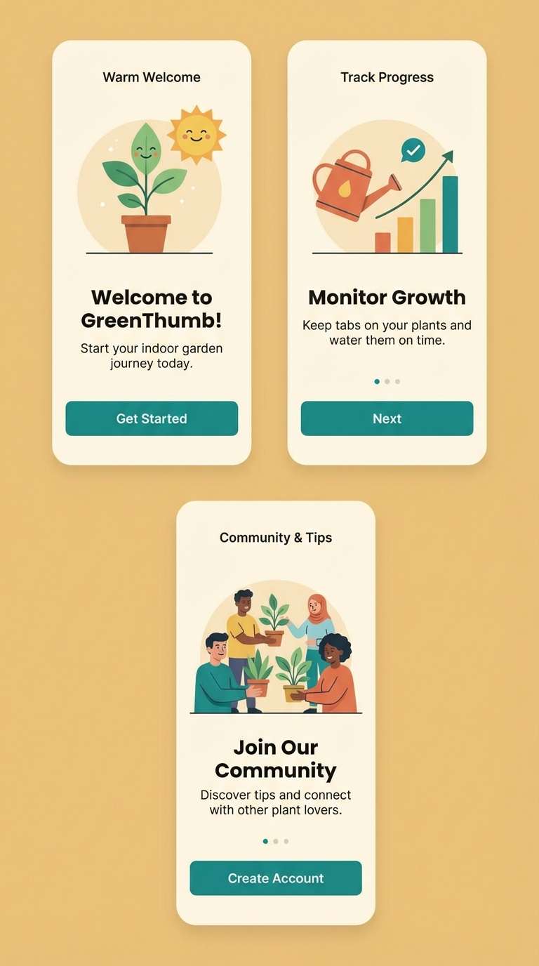
HEX: #FFF4A6 #FFE27A #9AD1D4 #3A86FF #233047
Mood: bright, playful, upbeat
Best for: app onboarding screens in 2d ui
Playful brightness feels like a picnic under a clear spring sky. Use the pale yellows for welcoming screens, then bring in the blue for progress indicators and friendly illustrations. The navy keeps headings sharp and prevents the palette from drifting into childish territory. Tip: apply the strongest blue only to interactive elements to reduce visual noise.
Image example of daffodil sky generated using media.io
8) Honeyed Neutrals
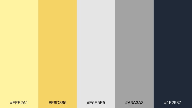
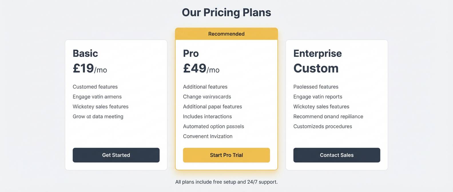
HEX: #FFF2A1 #F6D365 #E5E5E5 #A3A3A3 #1F2937
Mood: modern, balanced, professional
Best for: saas landing page sections and pricing table
Modern balance shows up like warm honey over cool concrete. This light yellow color palette is a strong choice for SaaS pages where you want friendliness without losing authority. Keep grays for structure and let the deeper slate handle pricing emphasis and button text. Tip: use the honey tone to highlight the recommended plan badge and repeat it in small icons.
Image example of honeyed neutrals generated using media.io
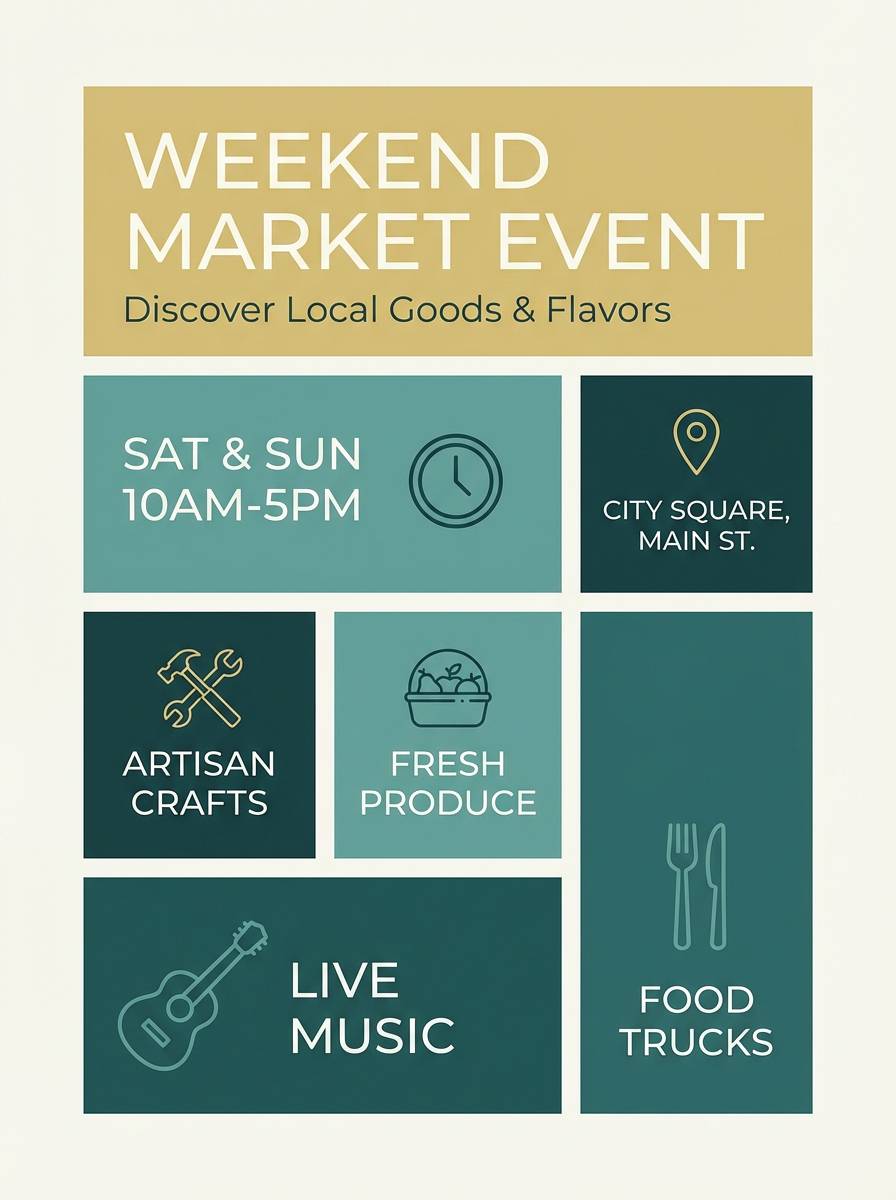
9) Pale Gold and Pine
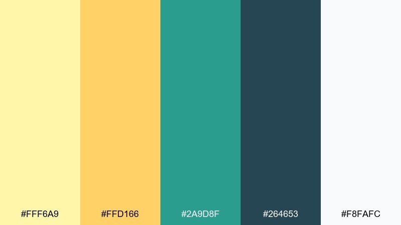
HEX: #FFF6A9 #FFD166 #2A9D8F #264653 #F8FAFC
Mood: outdoorsy, confident, grounded
Best for: event flyer for a weekend market
Grounded confidence feels like late-afternoon sun in a pine forest. The teal and deep green-blue create a sturdy frame, while pale gold keeps the message inviting. Use the near-white as breathing space around dates, location, and a simple map icon. Tip: keep decorative elements minimal and let the strong contrast sell readability from afar.
Image example of pale gold and pine generated using media.io
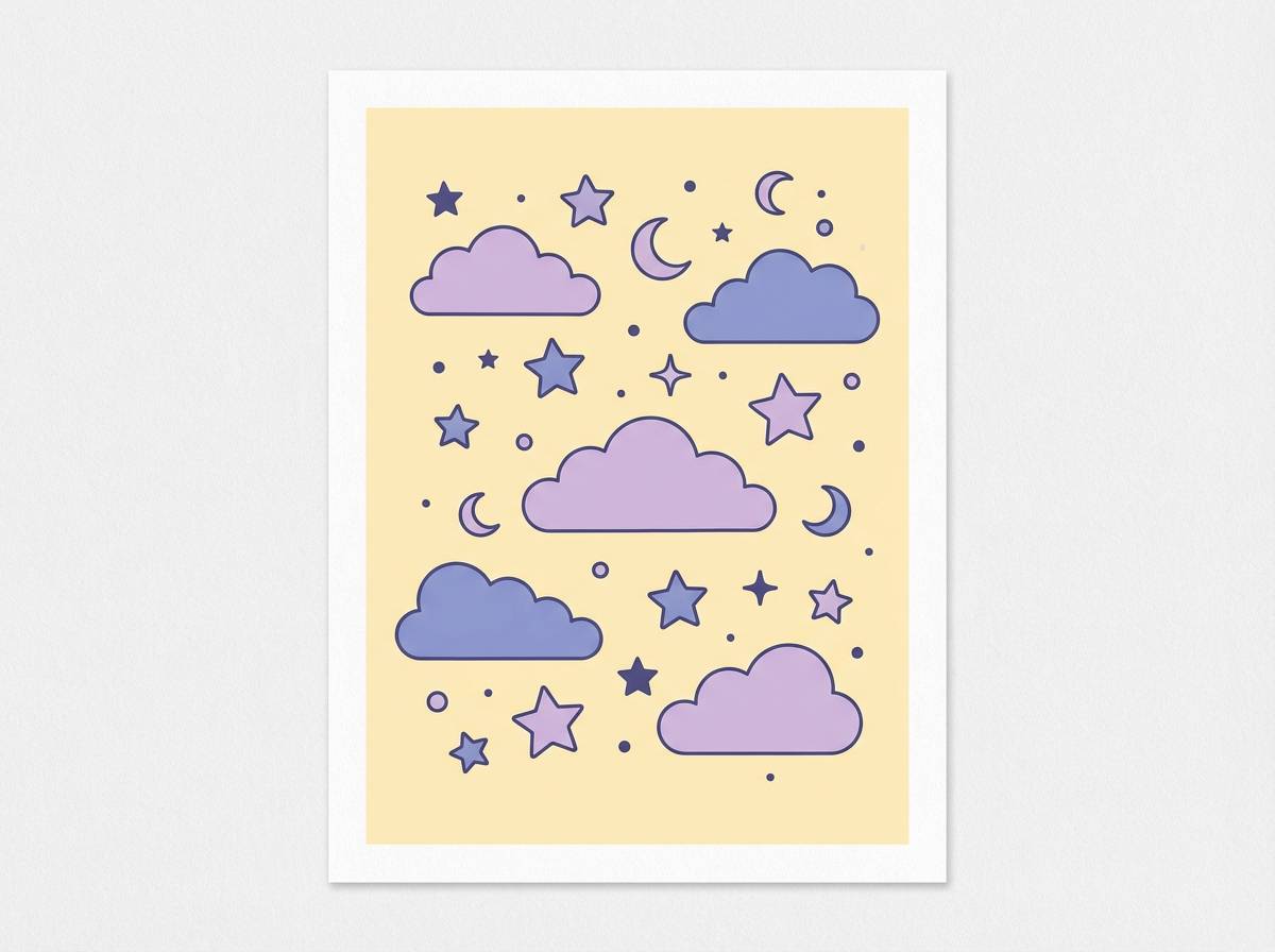
10) Custard Lavender Haze
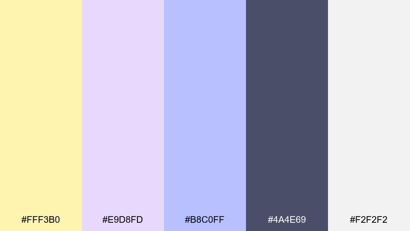
HEX: #FFF3B0 #E9D8FD #B8C0FF #4A4E69 #F2F2F2
Mood: gentle, whimsical, soothing
Best for: nursery wall art print
Gentle whimsy feels like a lullaby drifting through soft curtains. The custard and lavender tones keep the vibe comforting, while the muted indigo adds just enough definition for line art. Pair with off-white paper textures or a light grain for a handcrafted feel. Tip: print with the indigo slightly softened so the palette stays calm in a small room.
Image example of custard lavender haze generated using media.io
11) Champagne Citrus Pop
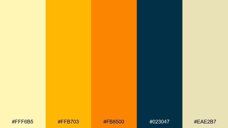
HEX: #FFF6B5 #FFB703 #FB8500 #023047 #EAE2B7
Mood: energetic, sunny, high-contrast
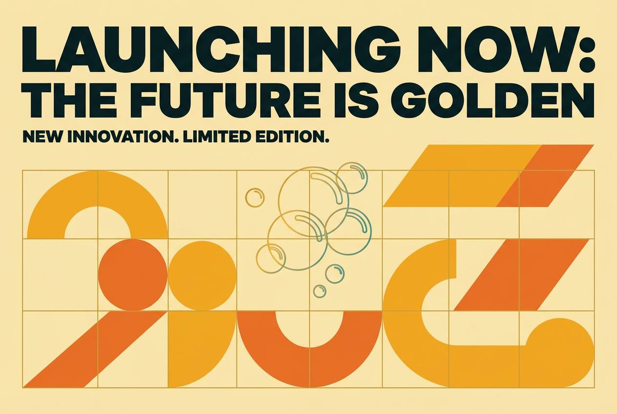
Best for: product launch poster for a beverage
Sunny punch hits like sparkling citrus in a tall glass. The amber and orange give you instant focal points, while the deep teal-black brings premium contrast for bold type. Keep the pale champagne tone as your base to avoid oversaturation. Tip: use orange only for one hero element, like the product name or a launch date.
Image example of champagne citrus pop generated using media.io
12) Sunflower Studio
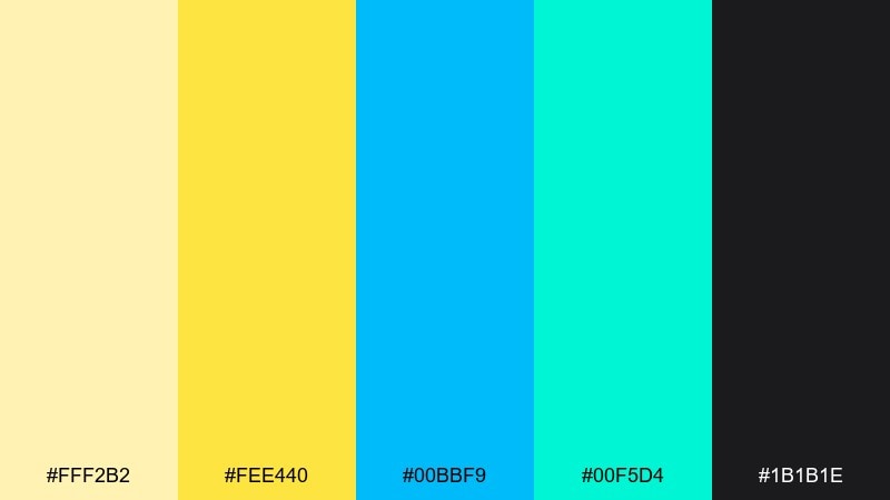
HEX: #FFF2B2 #FEE440 #00BBF9 #00F5D4 #1B1B1E
Mood: creative, youthful, vibrant
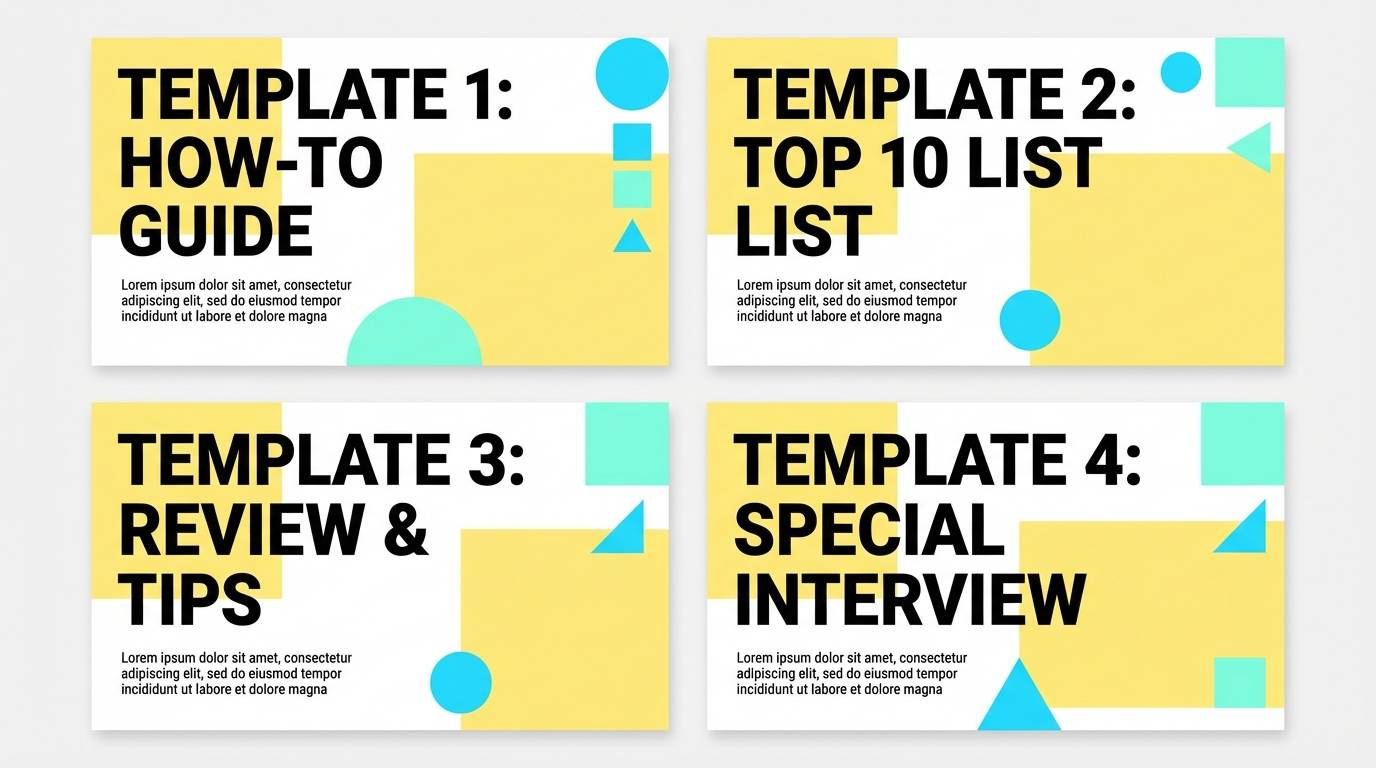
Best for: creator thumbnail template set
Creative energy feels like neon markers on a sunlit desk. The punchy cyan and aqua bring motion, while the soft yellow prevents the set from looking too harsh. Use near-black for big, readable text that holds up on small screens. Tip: keep accent shapes chunky and consistent so thumbnails stay recognizable in a grid.
Image example of sunflower studio generated using media.io
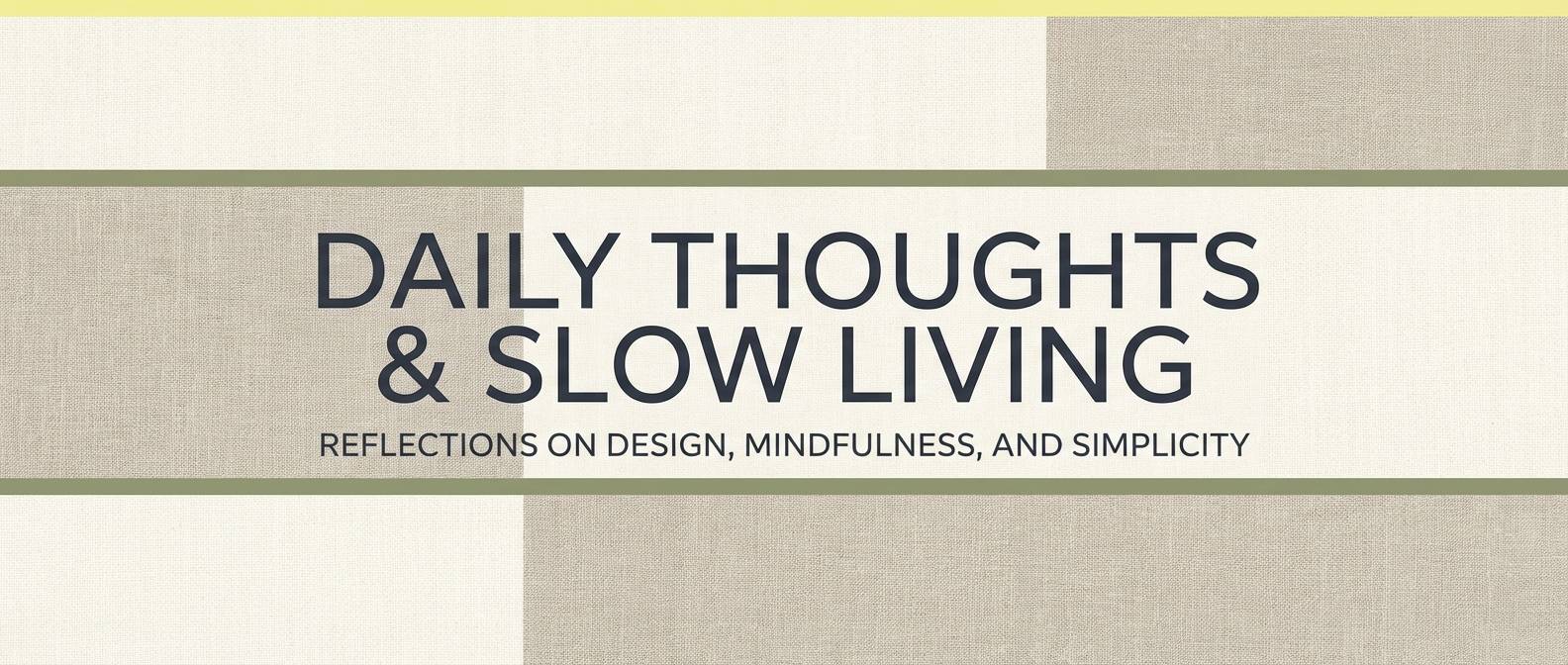
13) Linen and Lemon Zest
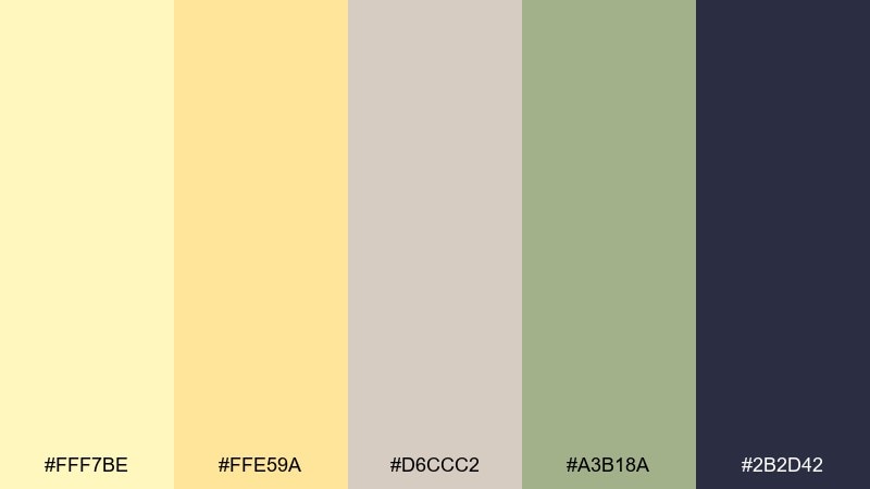
HEX: #FFF7BE #FFE59A #D6CCC2 #A3B18A #2B2D42
Mood: cozy, natural, understated
Best for: blog header and section dividers
Cozy natural tones feel like linen fabric and fresh zest on a cutting board. These light yellow color combinations pair especially well with warm taupe and muted olive for an organic editorial look. Use the deep navy-gray for titles and small UI elements like tags or category chips. Tip: add plenty of whitespace so the soft neutrals do not turn muddy.
Image example of linen and lemon zest generated using media.io
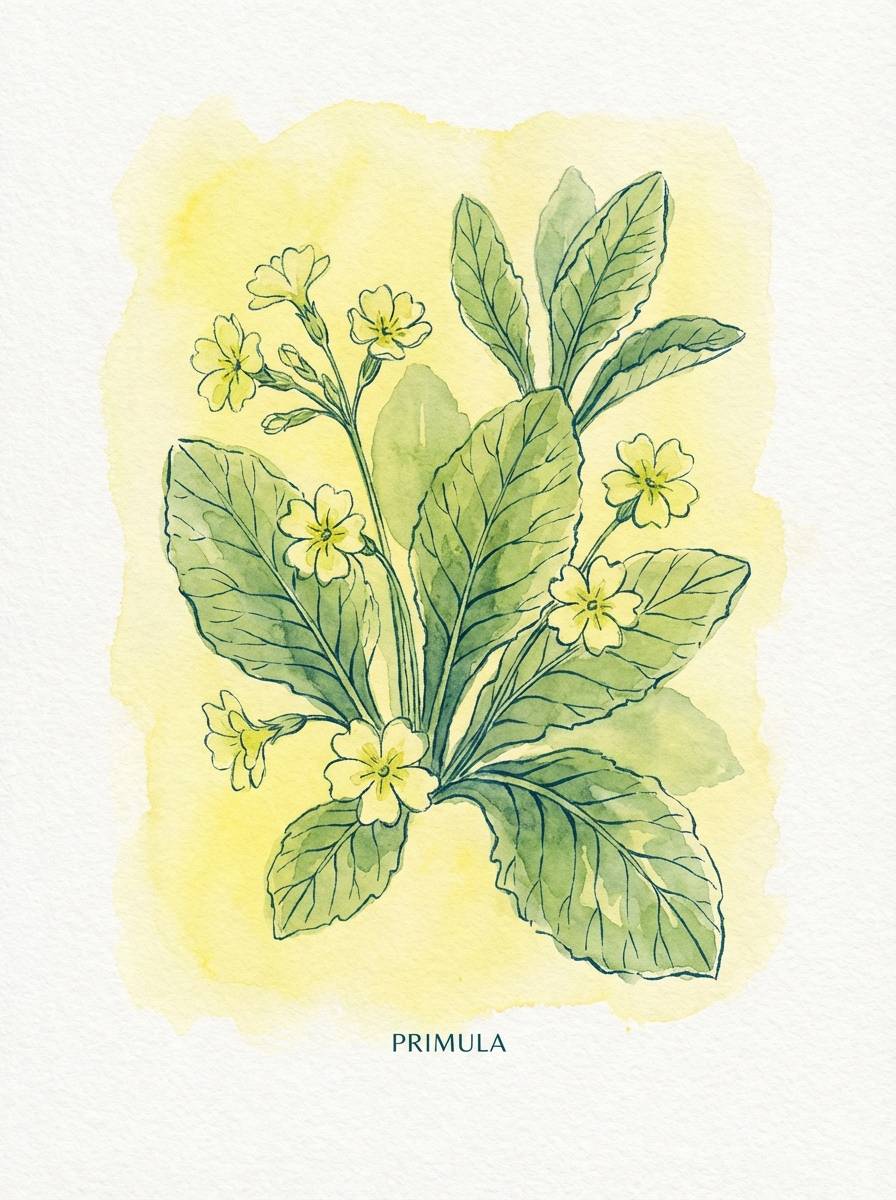
14) Primrose Botanical Wash
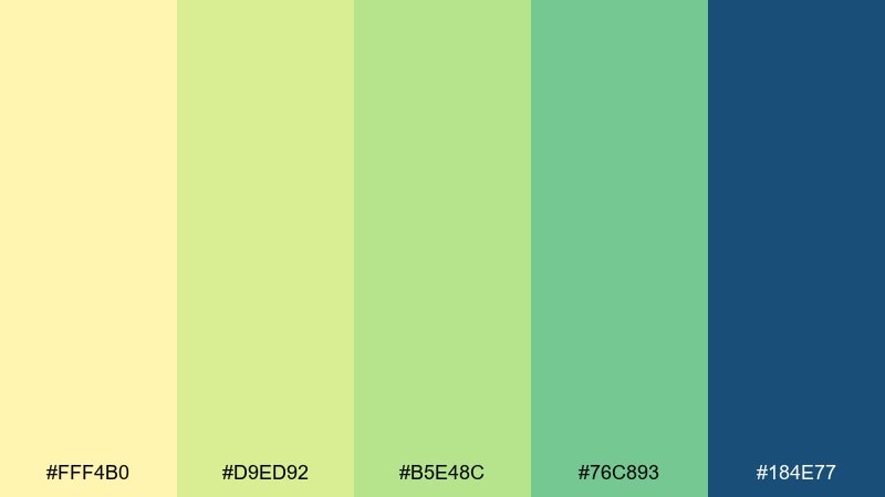
HEX: #FFF4B0 #D9ED92 #B5E48C #76C893 #184E77
Mood: fresh, botanical, springlike
Best for: watercolor botanical illustration for stationery
Fresh spring air comes through like watercolor leaves drying in the sun. The green run from soft to rich gives depth for vines, stems, and small floral accents. Use the deep blue-green for linework or a monogram to keep the stationery feeling elevated. Tip: keep the yellow mostly as a wash so the botanicals stay the main focus.
Image example of primrose botanical wash generated using media.io
15) Soft Sun and Stone
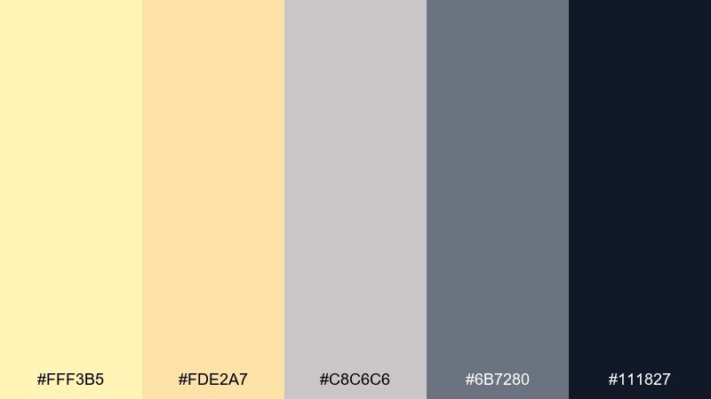
HEX: #FFF3B5 #FDE2A7 #C8C6C6 #6B7280 #111827
Mood: quiet, elegant, modern
Best for: editorial magazine spread layout
Quiet elegance reads like sunlight on polished stone. The warm yellows add a gentle glow behind photography, while the layered grays create a refined typographic system. Use the near-black for pull quotes and captions to maintain print-ready clarity. Tip: keep body text on the lightest gray or cream to avoid harsh contrast across long reads.
Image example of soft sun and stone generated using media.io
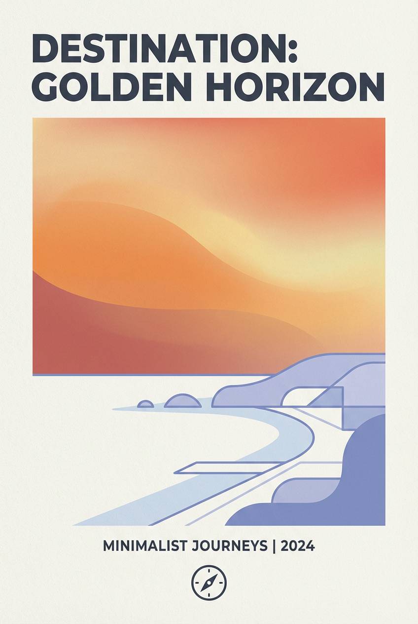
16) Golden Hour Coastal
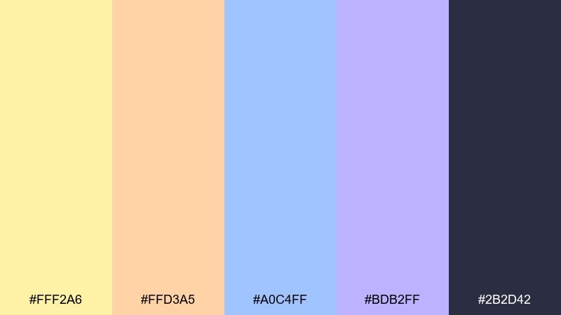
HEX: #FFF2A6 #FFD3A5 #A0C4FF #BDB2FF #2B2D42
Mood: dreamy, coastal, uplifting
Best for: travel poster for a seaside town
Dreamy coastal light feels like a shoreline at golden hour. Peach and periwinkle soften the mood and make the yellow feel more atmospheric than loud. Use the deep navy-gray for place names and a crisp date line. Tip: add a subtle gradient from yellow to peach behind the headline for a sun-fade effect.
Image example of golden hour coastal generated using media.io
17) Pollen and Charcoal
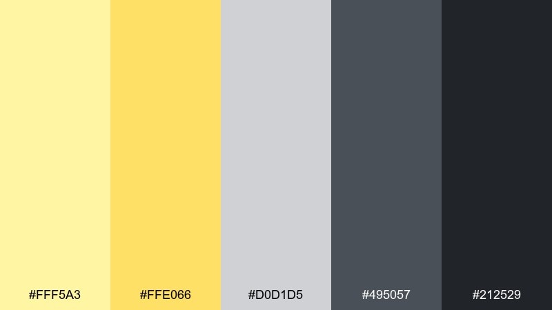
HEX: #FFF5A3 #FFE066 #D0D1D5 #495057 #212529
Mood: industrial, sharp, contemporary
Best for: ui component library and buttons
Sharp modern contrast feels like pollen dust on a graphite sketch. This light yellow color palette shines in UI systems when you need a friendly highlight without sacrificing structure. Use charcoal for default states and the brighter yellow for hover, focus rings, and small status badges. Tip: keep disabled elements in mid gray so the yellow retains its meaning as an action cue.
Image example of pollen and charcoal generated using media.io
18) Apricot Cream Pop
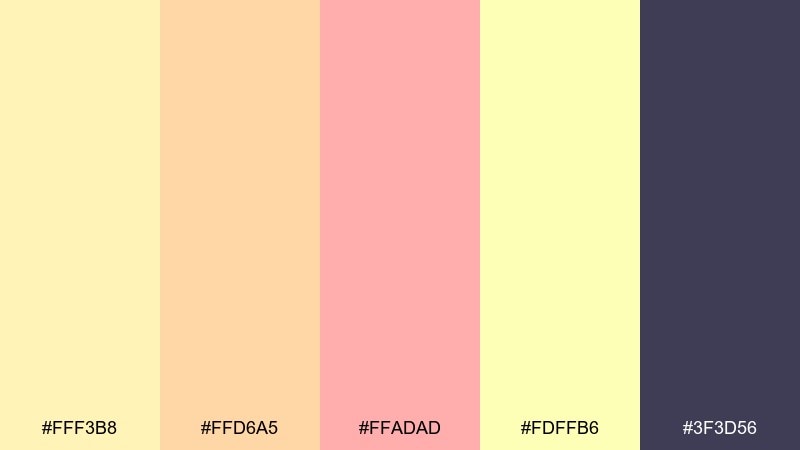
HEX: #FFF3B8 #FFD6A5 #FFADAD #FDFFB6 #3F3D56
Mood: sweet, playful, friendly
Best for: kids learning app splash screen in 2d ui
Sweet playfulness feels like sticker sheets and fruit sorbet. The warm pinks and apricot tones keep the palette friendly, while the deep purple-gray adds needed structure for labels. Use the soft yellows as wide background panels so icons pop without clashing. Tip: stick to one dominant warm tone per screen to avoid visual overload.
Image example of apricot cream pop generated using media.io
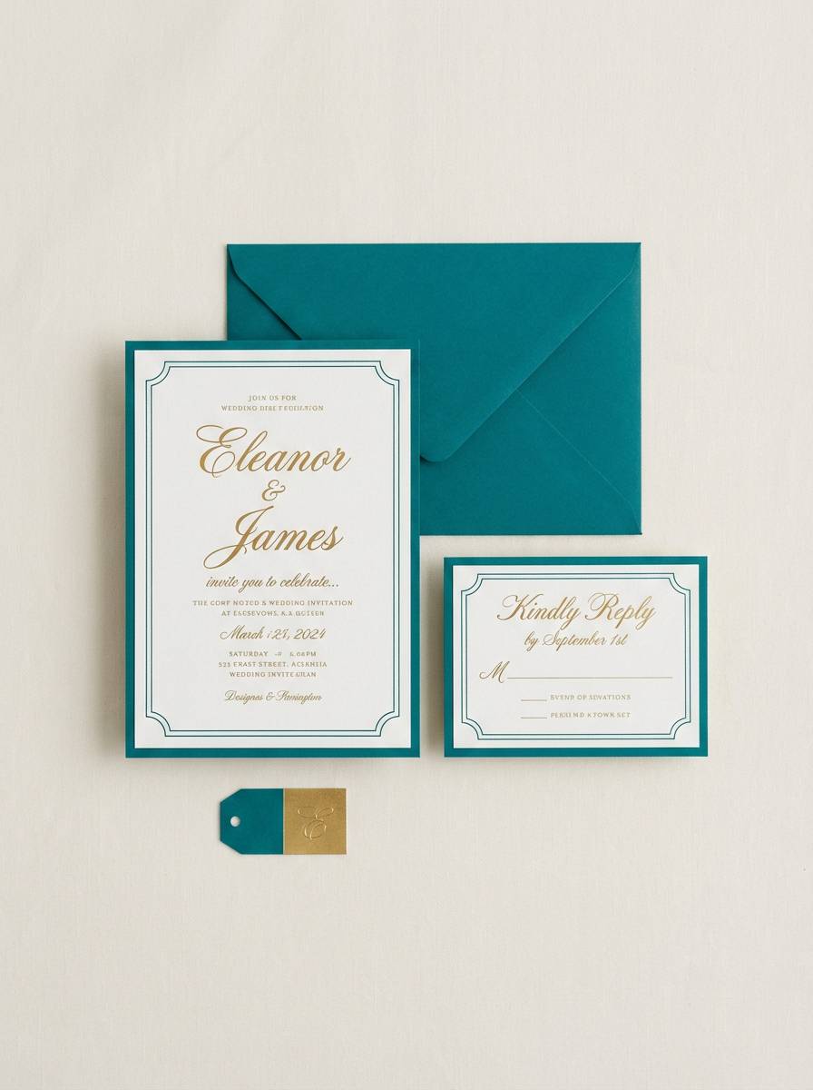
19) Mimosa Wedding Suite
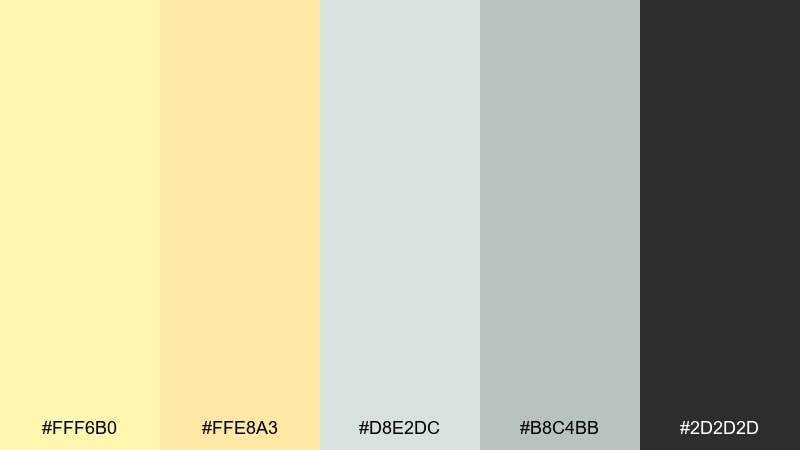
HEX: #FFF6B0 #FFE8A3 #D8E2DC #B8C4BB #2D2D2D
Mood: soft, celebratory, elegant
Best for: wedding invitation and rsvp card set
Soft celebration feels like a mimosa toast under gentle daylight. Creamy yellows set a warm tone, while the dusty greens add a botanical, timeless edge. Use deep charcoal for names and dates so the suite prints cleanly on textured stock. Tip: keep floral elements thin and airy, and let the spacing do the luxury work.
Image example of mimosa wedding suite generated using media.io
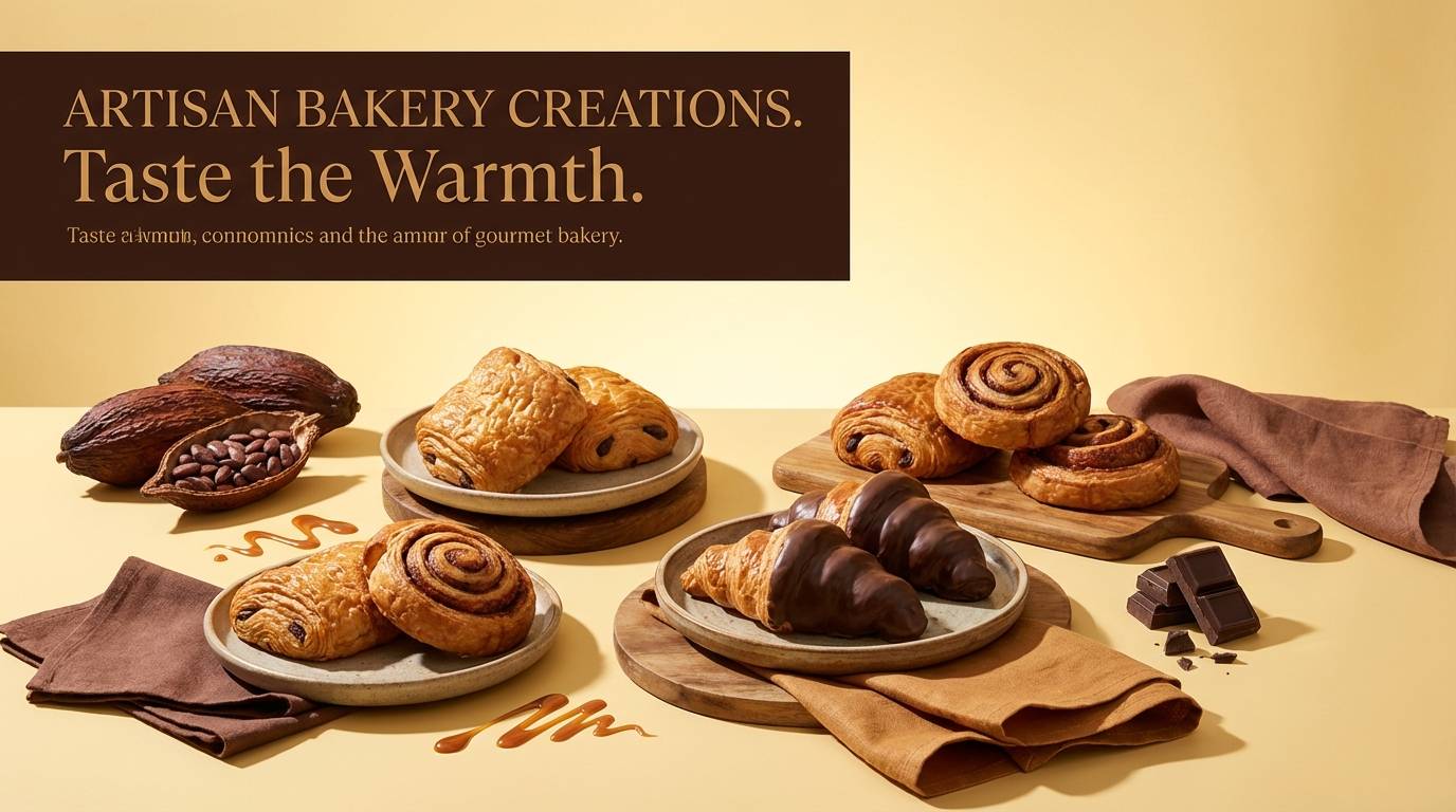
20) Candlelight Cocoa
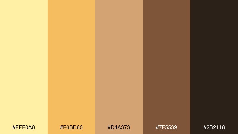
HEX: #FFF0A6 #F6BD60 #D4A373 #7F5539 #2B2118
Mood: cozy, rich, intimate
Best for: bakery product ad banner
Cozy richness feels like candlelight reflecting off caramel glaze. The cocoa browns add depth and appetite appeal, while the soft yellow keeps the mood welcoming instead of heavy. Pair the darkest brown with clear, bold pricing and short flavor notes. Tip: use the mid caramel tone as a backdrop for product badges like fresh baked or limited batch.
Image example of candlelight cocoa generated using media.io
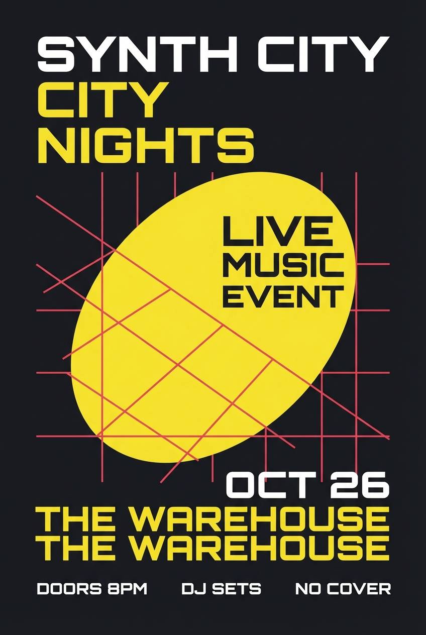
21) Citrus Noir Contrast
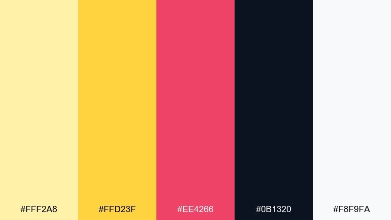
HEX: #FFF2A8 #FFD23F #EE4266 #0B1320 #F8F9FA
Mood: dramatic, trendy, high-impact
Best for: music event poster on plain background
Dramatic contrast feels like a spotlight cutting through a dark venue. Light yellow color combinations like this work best when you let noir take over the background and use citrus as the beam of attention. A hot pink-red adds a modern edge for lineup details and small separators. Tip: keep text blocks aligned to a tight grid so the bold colors feel intentional, not chaotic.
Image example of citrus noir contrast generated using media.io
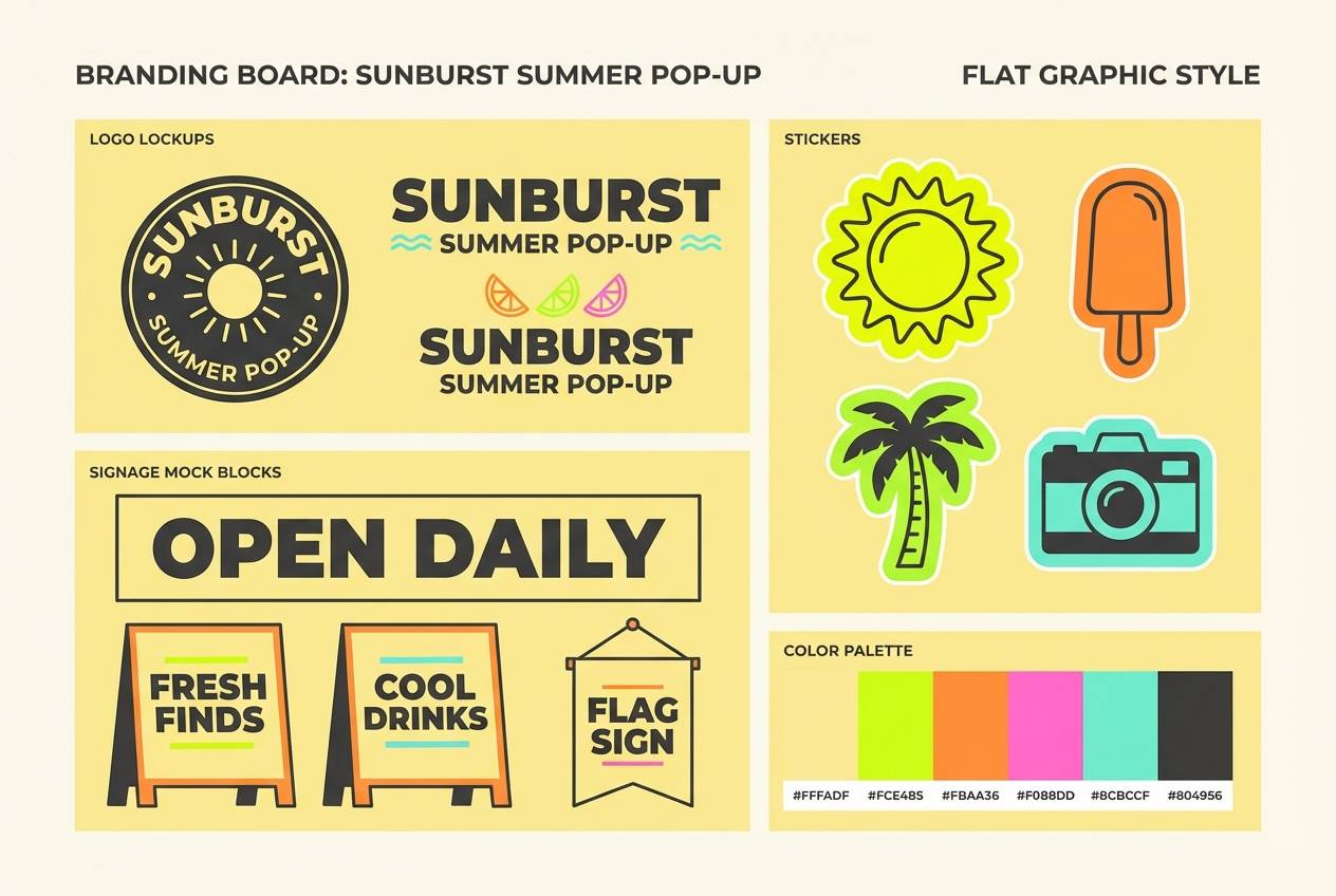
22) Soft Neon Citrus Mix
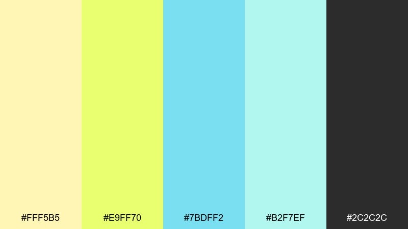
HEX: #FFF5B5 #E9FF70 #7BDFF2 #B2F7EF #2C2C2C
Mood: fun, modern, upbeat
Best for: branding for a summer pop-up shop
Fun modern energy feels like a pop-up sign glowing at sunset. These light yellow color combinations lean lively, so use the soft neon green sparingly as a hype accent. Cool aqua shades balance the warmth and help signage feel fresh rather than retro. Tip: keep the dark gray for logos and wayfinding so everything stays readable outdoors.
Image example of soft neon citrus mix generated using media.io
What Colors Go Well with Light Yellow?
Light yellow pairs beautifully with charcoal, near-black, and deep navy when you need crisp readability. Those darker anchors keep soft yellow from feeling washed out, especially in UI and editorial layouts.
For a calmer, modern vibe, combine light yellow with cool grays, pastel gray, and dusty blues. This adds structure and avoids the “too sweet” look that can happen with warm-only palettes.
If you want a more natural or handcrafted feel, add sage, olive, clay, or cocoa browns. These earth tones make pale yellow feel organic and premium on packaging and print.
How to Use a Light Yellow Color Palette in Real Designs
Use the lightest yellow as a background or large block color, then pick one dark shade for typography and primary buttons. This simple hierarchy usually gives the best accessibility and the cleanest visual rhythm.
Keep your strongest accent (amber, bright blue, neon lime, or hot pink) reserved for a single job: CTAs, badges, or key highlights. When every element is “highlighted,” light yellow loses its quiet sophistication.
For print, test on the actual paper stock (coated vs. uncoated) because pale yellows can shift. A slightly deeper outline color (charcoal/indigo) can help fine text stay sharp.
Create Light Yellow Palette Visuals with AI
If you want to see how a light yellow palette looks on a landing page, poster, packaging, or UI, generate fast mockups with an AI prompt. This helps you validate contrast, mood, and accent balance before committing to production.
Start with the palette’s “best for” idea, then describe layout, typography style, and where the darkest color should be used (headlines, buttons, labels). Keep it specific and you’ll get more consistent results.
Light Yellow Color Palette FAQs
-
Is light yellow a good background color for websites?
Yes—light yellow can reduce the harshness of pure white and add warmth. For readability, pair it with dark charcoal or deep navy text and keep link/CTA colors high-contrast. -
What text color works best on light yellow?
Charcoal, near-black, and deep navy are safest for legibility. Mid-grays can look low-contrast on pale yellow, especially on smaller font sizes. -
What accent colors make light yellow feel modern (not pastel-cute)?
Cool grays, slate blue, steel blue, teal, and ink/navy accents keep the palette contemporary. Use brighter accents (amber, orange, cyan) sparingly for focal points. -
How do I keep a light yellow palette from looking “washed out”?
Add a strong dark anchor color for structure, and include one mid-tone (like taupe, sage, or slate) to create depth. Avoid using only pale tints across every element. -
Does light yellow print well?
It can, but pale yellows may shift depending on paper and lighting. Use a darker ink color for small text and consider proofing to ensure the yellow doesn’t fade into the paper tone. -
Is light yellow good for branding?
Light yellow works well for brands that want approachable, optimistic, or clean positioning. It’s especially strong when combined with a distinctive dark base color and a consistent accent. -
How can I preview these palettes on real designs quickly?
Use Media.io’s text-to-image tool to generate quick layout concepts (UI, posters, packaging) from a prompt, then iterate by adjusting contrast and accent placement.


