

Light sky blue is one of those rare colors that feels both calming and energetic—like fresh air, open space, and clear direction. It’s a dependable base for modern UI, branding, print, and seasonal graphics that need a clean, optimistic tone.
Below are 20+ light sky blue color palette ideas with HEX codes, plus real-use tips and AI prompts you can copy to generate matching visuals fast.
In this article
Why Light Sky Blue Palettes Work So Well
Light sky blue communicates openness, clarity, and ease. Because it sits in a high-lightness range, it naturally creates “breathing room” in layouts—making interfaces, posters, and packaging feel less crowded.
It also pairs smoothly with both cool neutrals (white, gray, navy) and warm accents (peach, yellow, terracotta). That flexibility is why a light sky blue color palette can look minimal and corporate, or playful and seasonal, with just one or two swaps.
Most importantly, light sky blue supports readable hierarchy when anchored with a dark text color. Use it as the atmosphere, not the ink—then bring in deeper tones for typography, icons, and CTAs.
20+ Light Sky Blue Color Palette Ideas (with HEX Codes)
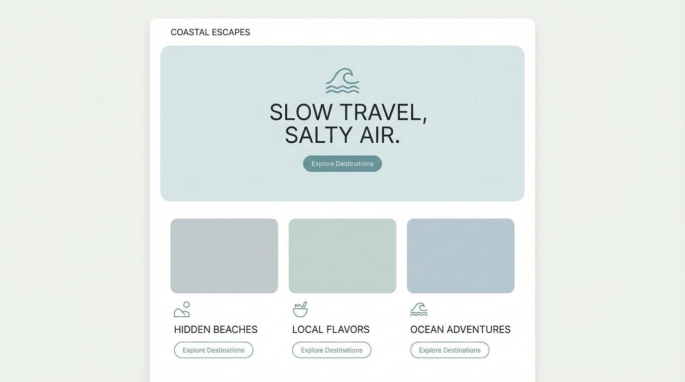
1) Cloudy Coast
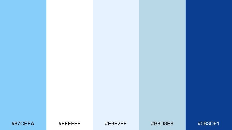
HEX: #87CEFA #FFFFFF #E6F2FF #B8D8E8 #0B3D91
Mood: breezy, coastal, clean
Best for: travel website landing page UI
Breezy and sunlit like morning haze over the ocean, these tones feel open and optimistic. Use the pale blues for spacious sections and the navy for headlines, buttons, and navigation. Pair with white space and subtle gradients to keep it airy rather than flat. Tip: reserve the darkest blue for one primary CTA style to maintain clarity.
Image example of cloudy coast generated using media.io
Media.io is an online AI studio for creating and editing video, image, and audio in your browser.

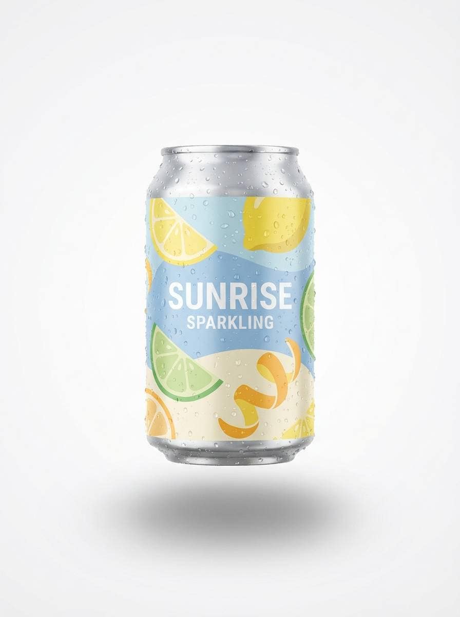
2) Ice Lemonade
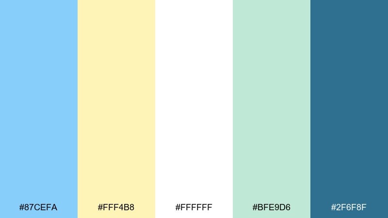
HEX: #87CEFA #FFF4B8 #FFFFFF #BFE9D6 #2F6F8F
Mood: refreshing, playful, bright
Best for: sparkling drink can packaging
Refreshing and fizzy like a cold lemonade by the pool, this mix balances cool blue with sunny citrus. These light sky blue color combinations work best when yellow is used as a small accent for flavor cues. Keep the background mostly white or pale blue, then add teal for nutrition info and small type. Tip: test yellow text only on dark teal, not on light blue, for readability.
Image example of ice lemonade generated using media.io
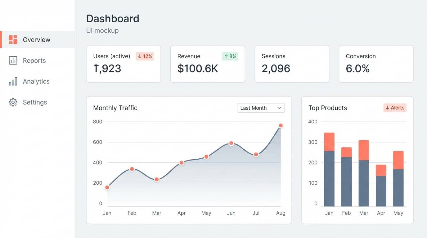
3) Skyline Studio
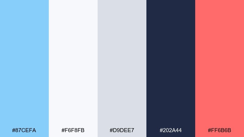
HEX: #87CEFA #F6F8FB #D9DEE7 #202A44 #FF6B6B
Mood: modern, crisp, energetic
Best for: analytics dashboard UI
Modern and city-sharp, this set feels like glass towers under a clear sky with a punch of neon energy. Use the light sky blue color palette for background panels and highlights, then lean on deep navy for charts, labels, and contrast. Coral works best for alerts and key metrics, not as a large fill. Tip: keep cards light gray so blue accents stay noticeable without overpowering.
Image example of skyline studio generated using media.io
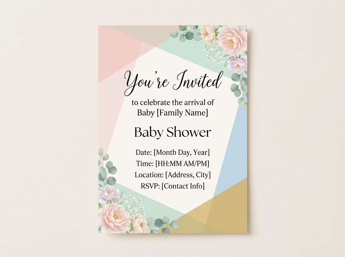
4) Bluebell Brunch
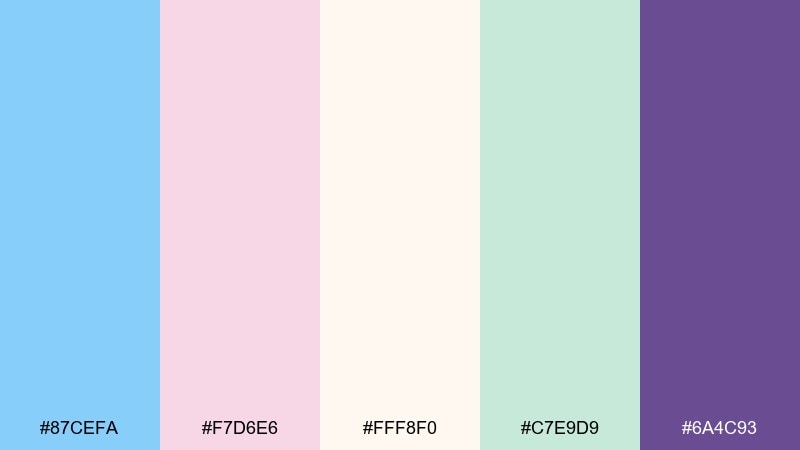
HEX: #87CEFA #F7D6E6 #FFF8F0 #C7E9D9 #6A4C93
Mood: soft, charming, romantic
Best for: baby shower invitation design
Soft and sweet like pastel florals on a brunch table, these tones read friendly and celebratory. Put cream as the base, then layer sky blue and blush in small shapes, borders, and icons. Violet adds a refined anchor for names and dates without feeling harsh. Tip: limit each section to two pastels so the layout stays calm and legible.
Image example of bluebell brunch generated using media.io
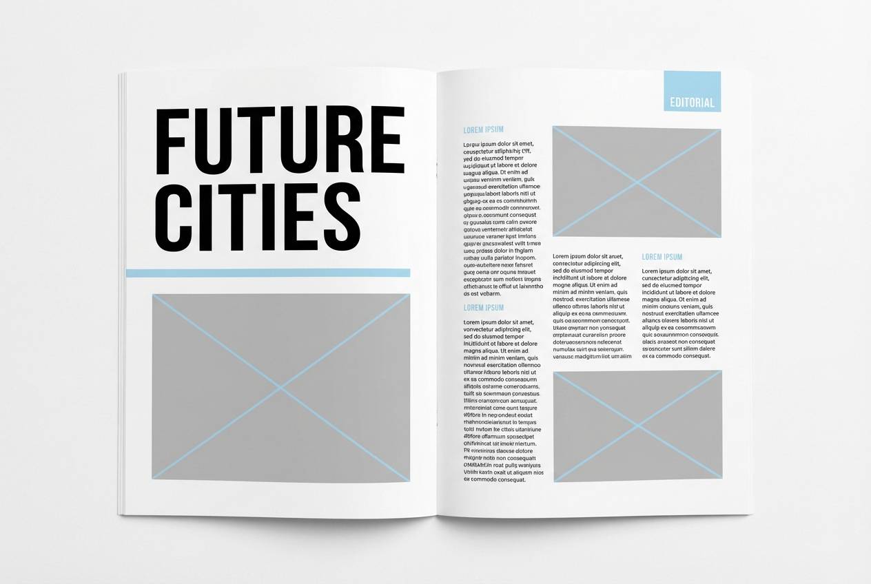
5) Winter Cotton
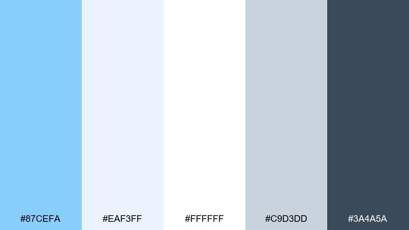
HEX: #87CEFA #EAF3FF #FFFFFF #C9D3DD #3A4A5A
Mood: calm, minimal, wintry
Best for: clean editorial magazine layout
Calm and powdery like fresh snow and soft knitwear, this palette feels minimal but not sterile. Use the pale blues for pull quotes and section dividers, then rely on slate for body text and captions. Plenty of white space makes the design feel premium and breathable. Tip: use the gray-blue as a consistent baseline grid color for rules and separators.
Image example of winter cotton generated using media.io
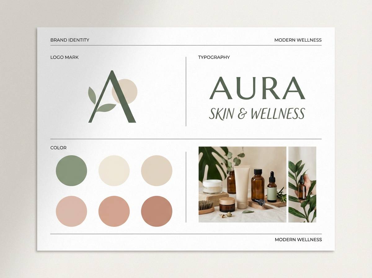
6) Mint Horizon
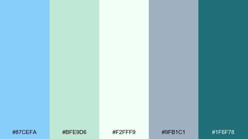
HEX: #87CEFA #BFE9D6 #F2FFF9 #9FB1C1 #1F6F78
Mood: fresh, wellness, balanced
Best for: spa and skincare brand identity
Fresh and restorative like a quiet morning walk near water, these tones feel clean and trustworthy. This light sky blue color combination pairs especially well with mint for wellness brands that want a modern, natural vibe. Use teal for logos and product names, while the softer shades support backgrounds and packaging textures. Tip: add a subtle paper grain to prevent large pale areas from looking too clinical.
Image example of mint horizon generated using media.io
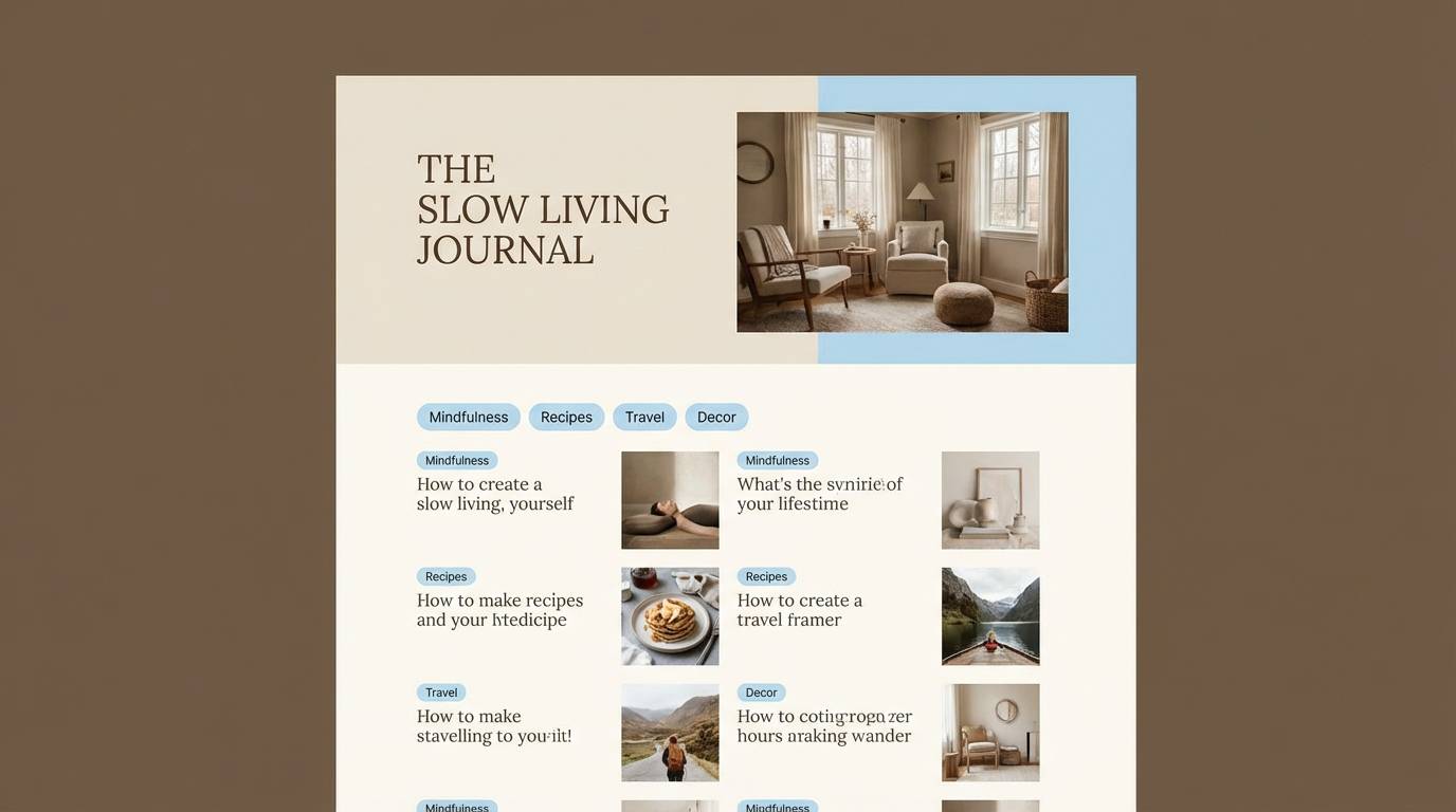
7) Sea Glass Neutrals
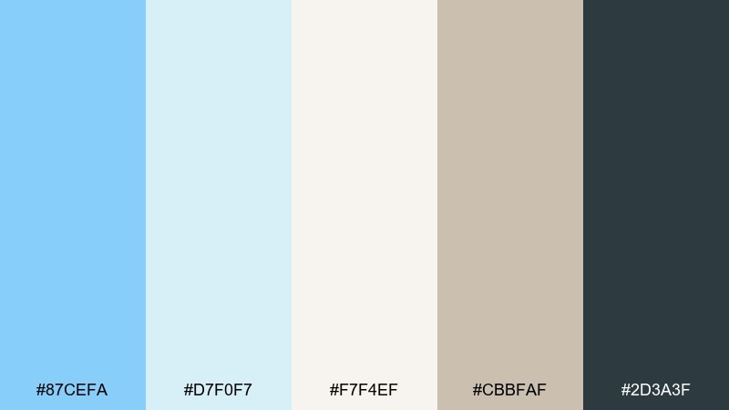
HEX: #87CEFA #D7F0F7 #F7F4EF #CBBFAF #2D3A3F
Mood: relaxed, earthy, coastal
Best for: lifestyle blog theme and headers
Relaxed and beachy like sea glass found in warm sand, these colors feel gentle and lived-in. Use the warm beige as your main background to keep pages cozy, then bring in sky blue for links and highlights. Charcoal grounds headings and long-form text without looking heavy. Tip: choose one accent style for links and buttons so the interface feels consistent.
Image example of sea glass neutrals generated using media.io
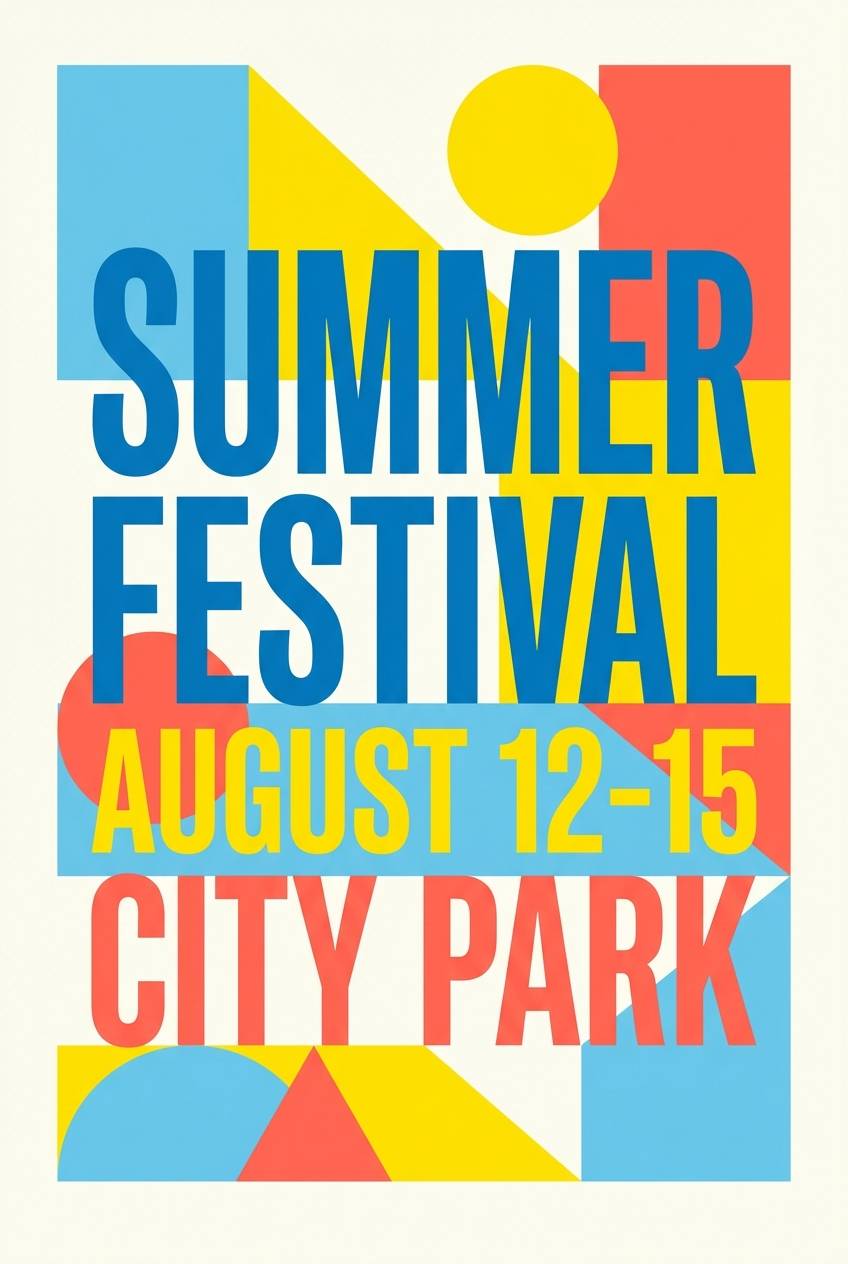
8) Solar Pop
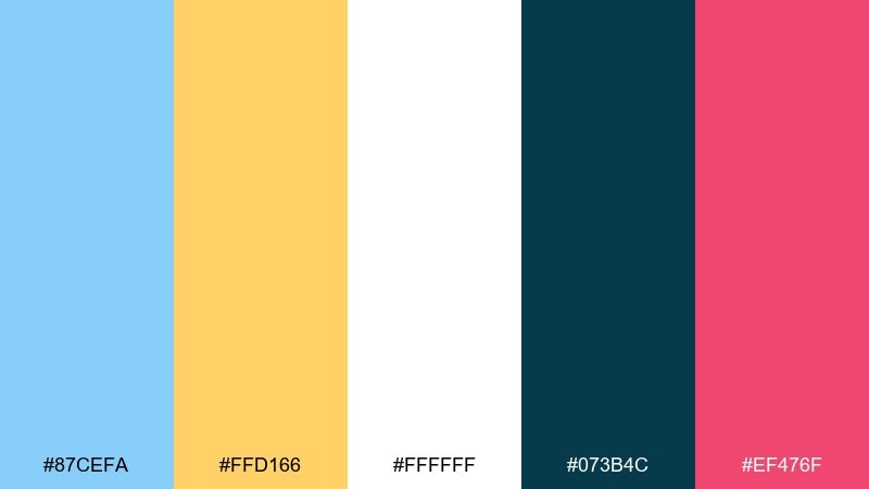
HEX: #87CEFA #FFD166 #FFFFFF #073B4C #EF476F
Mood: bold, upbeat, youthful
Best for: summer festival poster design
Bold and upbeat like sunshine cutting through blue skies, this set brings instant energy. These light sky blue color combinations shine when the warm accents are used for big type and key dates. Keep the background white for a clean print look, and use deep teal for supporting details and small copy. Tip: use coral for one focal element only, like the headliner name, to avoid visual noise.
Image example of solar pop generated using media.io
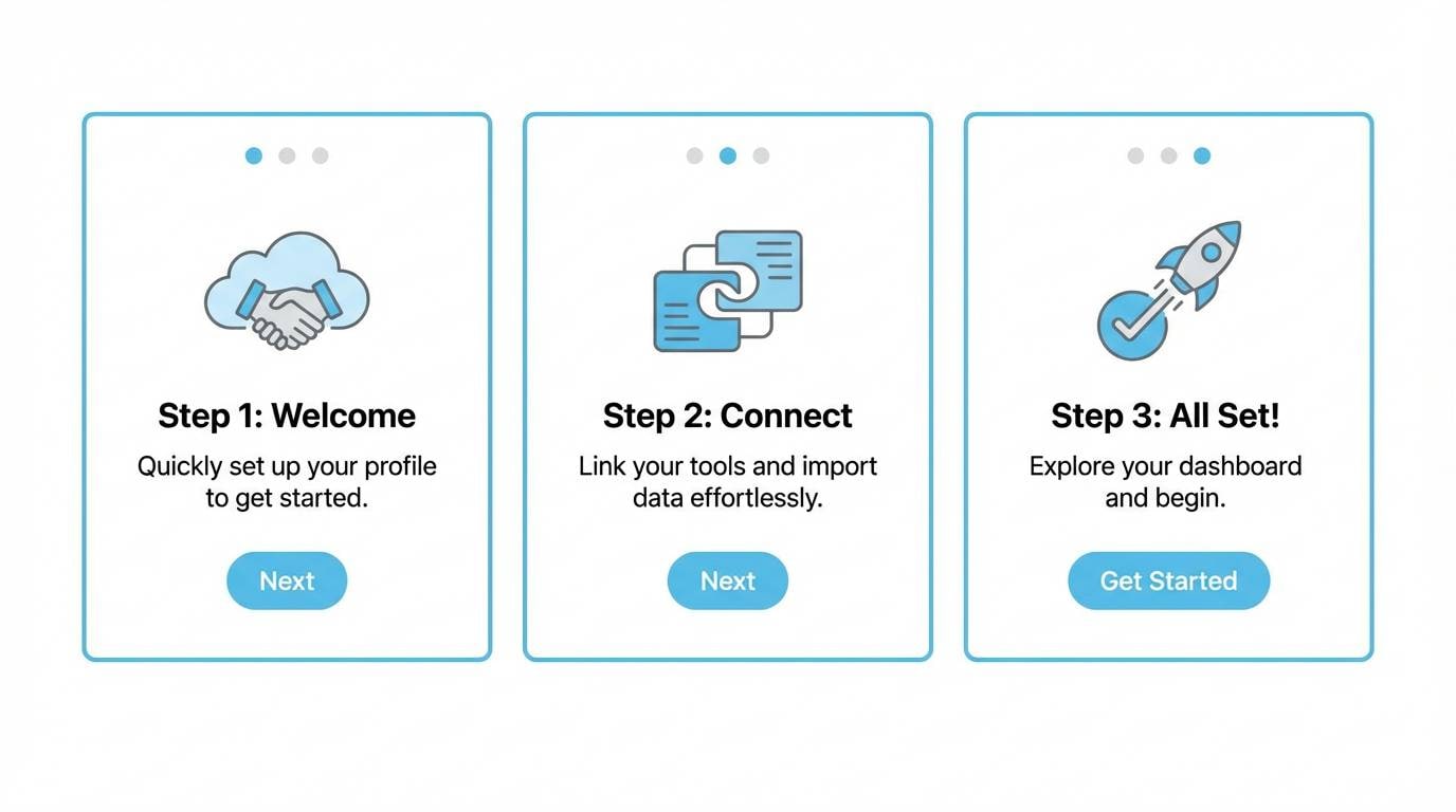
9) Ink and Air
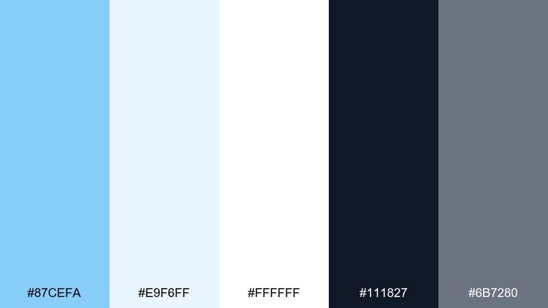
HEX: #87CEFA #E9F6FF #FFFFFF #111827 #6B7280
Mood: professional, sharp, tech
Best for: SaaS onboarding screens
Professional and sharp like ink on crisp paper, this mix keeps interfaces clean and confident. Use the near-black for primary text, then let sky blue guide users through progress states and active elements. The mid-gray is ideal for secondary labels and helper copy. Tip: keep blue to action items and links so the onboarding flow feels intuitive.
Image example of ink and air generated using media.io
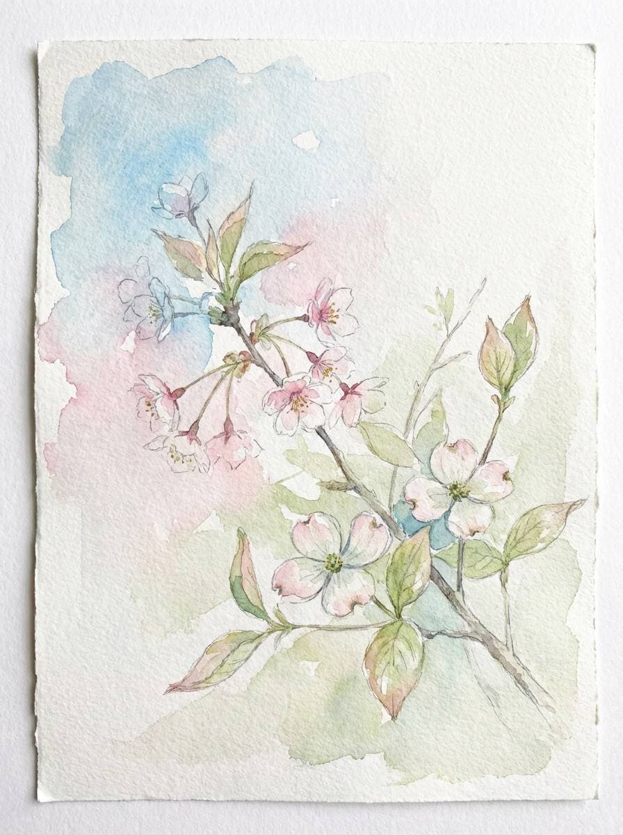
10) Sakura Breeze
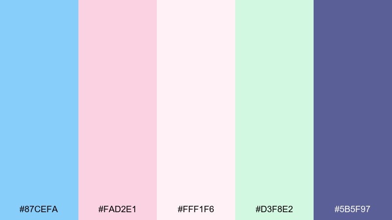
HEX: #87CEFA #FAD2E1 #FFF1F6 #D3F8E2 #5B5F97
Mood: dreamy, spring, gentle
Best for: spring botanical watercolor illustration
Dreamy and light like petals drifting in a soft breeze, these hues feel delicate and optimistic. Use sky blue and blush as washes, then bring in the deeper periwinkle for outlines and small details. Minty green keeps the composition fresh without stealing attention. Tip: paint large areas with low saturation and save the darkest tone for focal points like flower centers.
Image example of sakura breeze generated using media.io
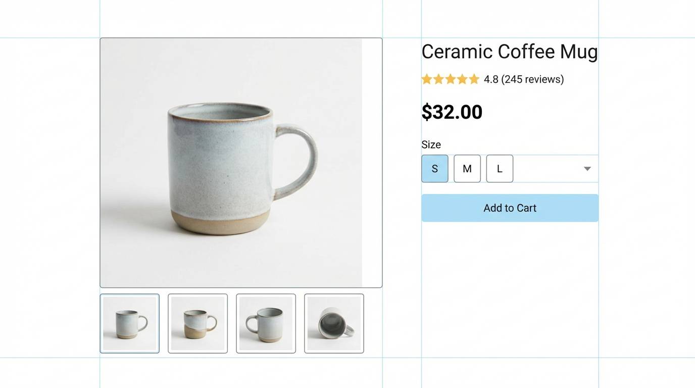
11) Nordic Powder
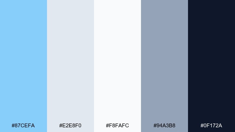
HEX: #87CEFA #E2E8F0 #F8FAFC #94A3B8 #0F172A
Mood: cool, structured, minimal
Best for: modern ecommerce product page UI
Cool and structured like Scandinavian interiors, these tones feel efficient and calm. The light sky blue color palette works well for filters, badges, and subtle highlights on product grids. Use slate shades for typography and pricing so the interface stays readable across devices. Tip: keep the deepest navy for one sticky element, like the add to cart button, to guide attention.
Image example of nordic powder generated using media.io
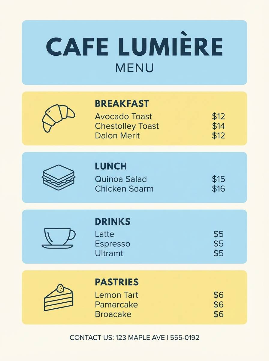
12) Citrus Sky
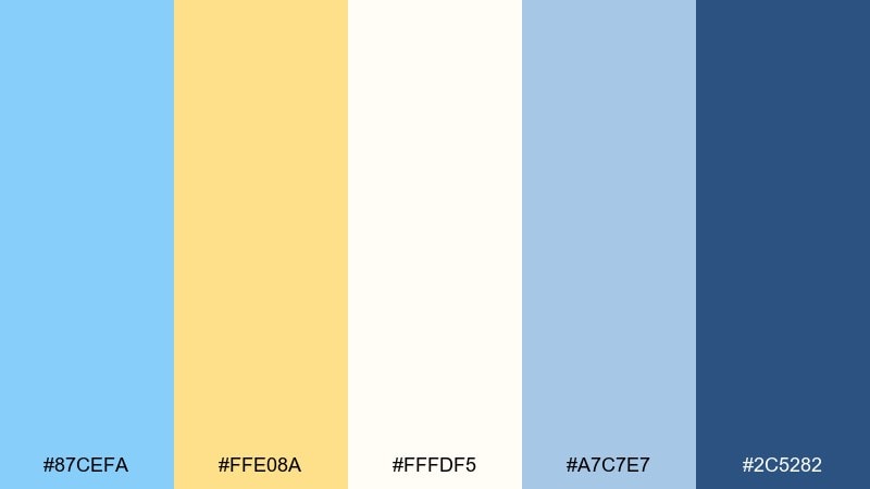
HEX: #87CEFA #FFE08A #FFFDF5 #A7C7E7 #2C5282
Mood: cheerful, light, inviting
Best for: cafe menu flyer design
Cheerful and inviting like a sunny patio, this mix feels friendly without getting loud. Use the creamy white for the menu base, then add sky blue for section headers and icons. Yellow is best as a small highlight for specials or callouts. Tip: keep body text in deep blue to avoid low contrast on pastel blocks.
Image example of citrus sky generated using media.io
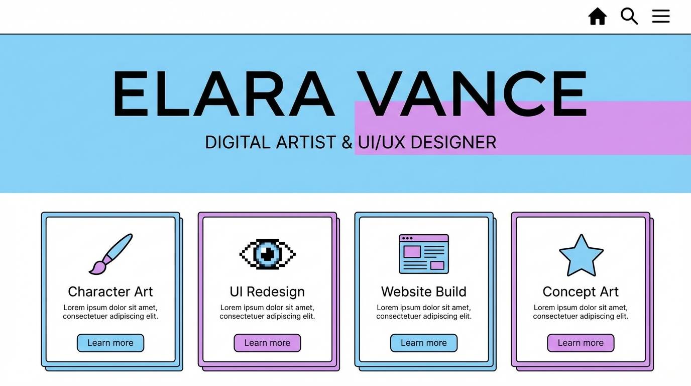
13) Denim Orchid
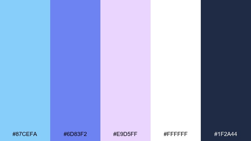
HEX: #87CEFA #6D83F2 #E9D5FF #FFFFFF #1F2A44
Mood: creative, stylish, modern
Best for: creator portfolio website UI
Creative and stylish like denim paired with soft florals, this set feels modern and personal. Use sky blue for hover states and subtle gradients, while orchid purple adds personality to headings and featured tags. Keep deep navy for navigation and long text for easy reading. Tip: limit purple to two components, such as buttons and section titles, to maintain a clean rhythm.
Image example of denim orchid generated using media.io
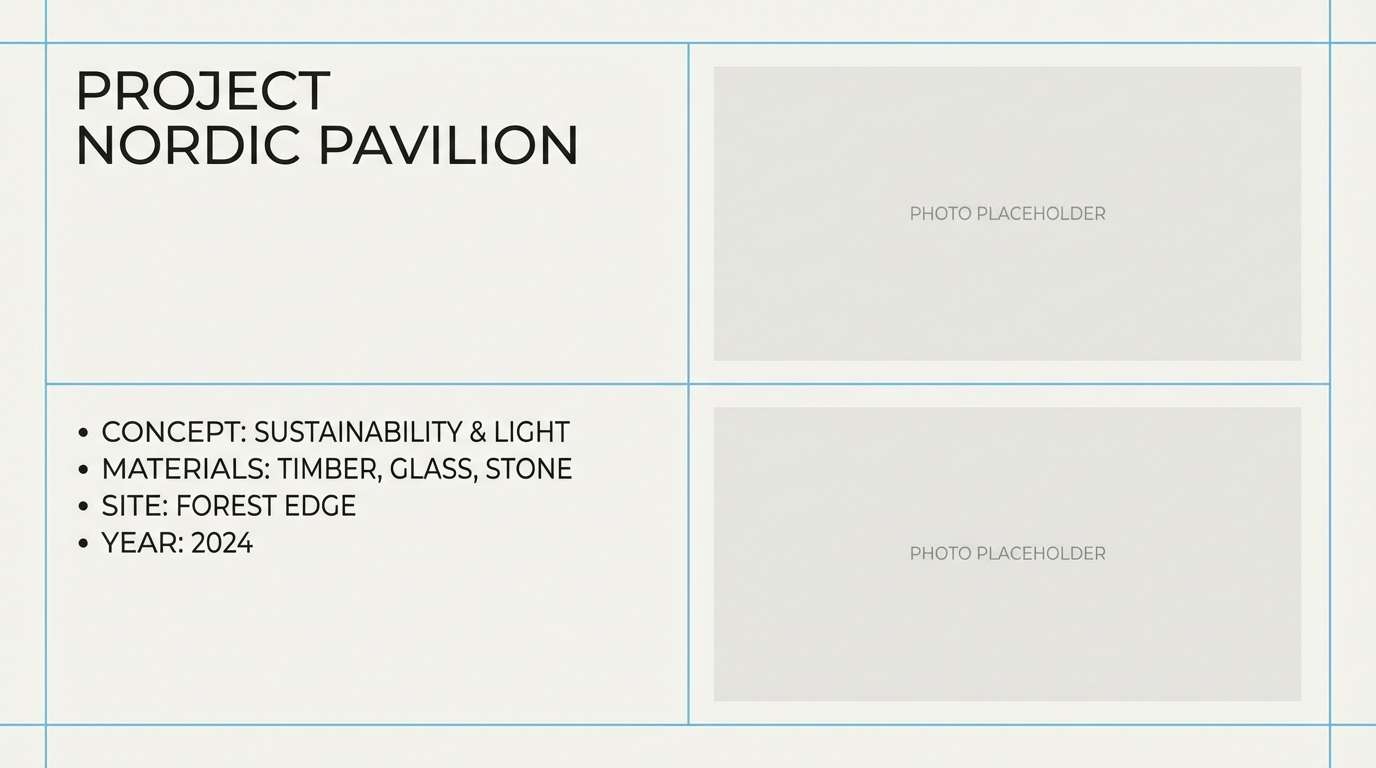
14) Pebble and Sky
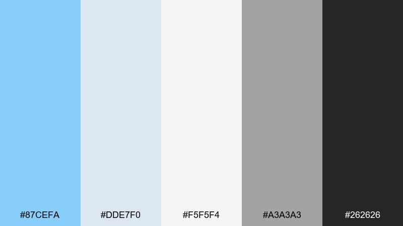
HEX: #87CEFA #DDE7F0 #F5F5F4 #A3A3A3 #262626
Mood: neutral, grounded, modern
Best for: architecture studio presentation slides
Grounded and modern like smooth pebbles under a bright sky, these tones feel refined and practical. Use off-white and light gray for slide backgrounds, then let sky blue mark key data points or section breaks. Charcoal works best for titles and annotations, keeping everything crisp on projectors. Tip: keep blue to a single line style or icon set so the deck stays cohesive.
Image example of pebble and sky generated using media.io
15) Glacier Rose
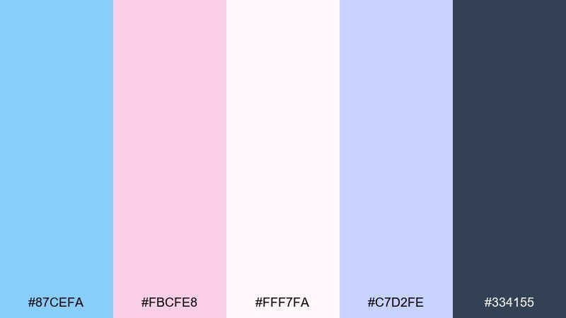
HEX: #87CEFA #FBCFE8 #FFF7FA #C7D2FE #334155
Mood: elegant, cool, romantic
Best for: wedding stationery set
Elegant and cool like rose petals on ice, these colors feel romantic but modern. Use the blush as a small flourish for monograms and borders, while sky blue supports backgrounds and envelope liners. The slate tone keeps typography crisp on print. Tip: choose one metallic ink option with slate rather than adding more colors to the set.
Image example of glacier rose generated using media.io
16) Clean Clinic
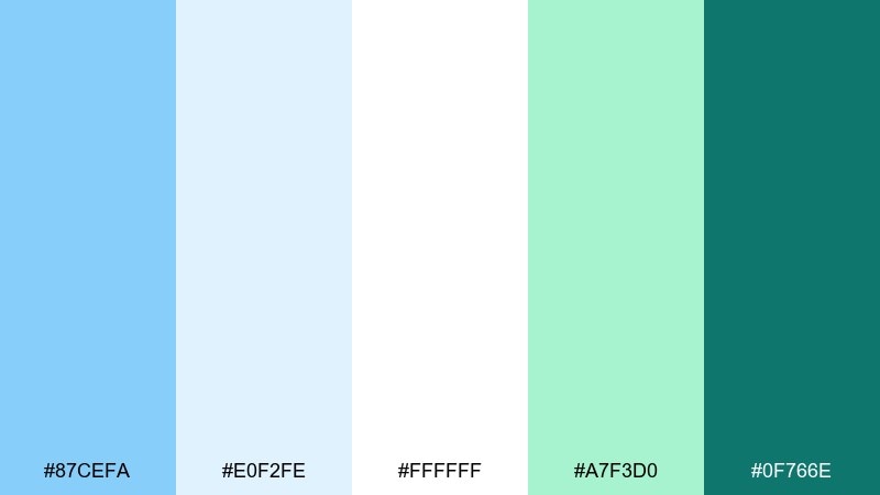
HEX: #87CEFA #E0F2FE #FFFFFF #A7F3D0 #0F766E
Mood: trustworthy, hygienic, calm
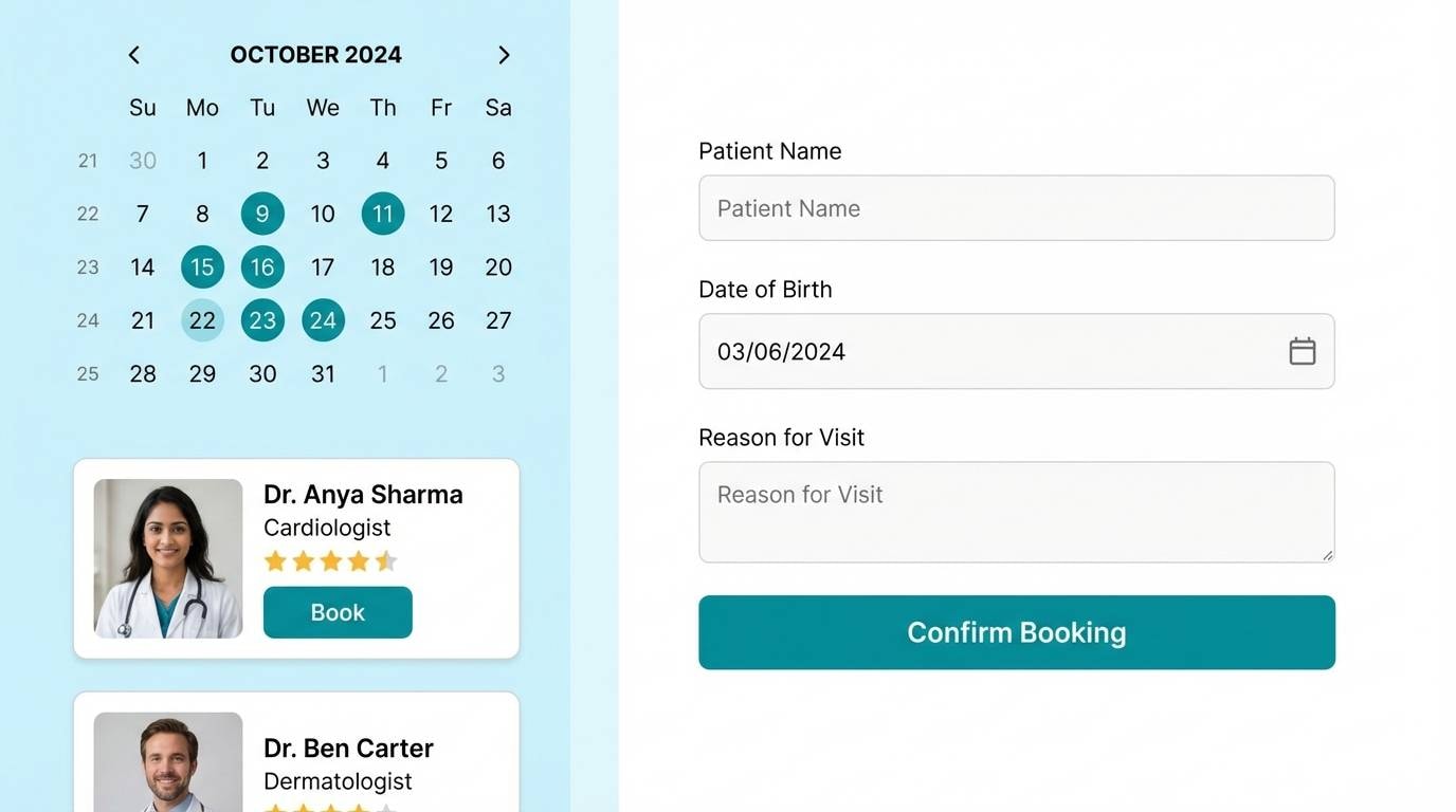
Best for: healthcare appointment booking UI
Trustworthy and hygienic like a bright clinic lobby, this mix signals care and clarity. Use pale blue for form fields and section backgrounds, then apply teal for confirmations and success states. Mint works well for supportive highlights, like availability badges or status pills. Tip: keep error states out of this set and use a dedicated warning color to avoid mixed signals.
Image example of clean clinic generated using media.io
17) Museum Label
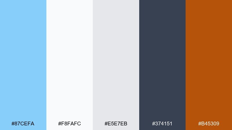
HEX: #87CEFA #F8FAFC #E5E7EB #374151 #B45309
Mood: curated, understated, smart
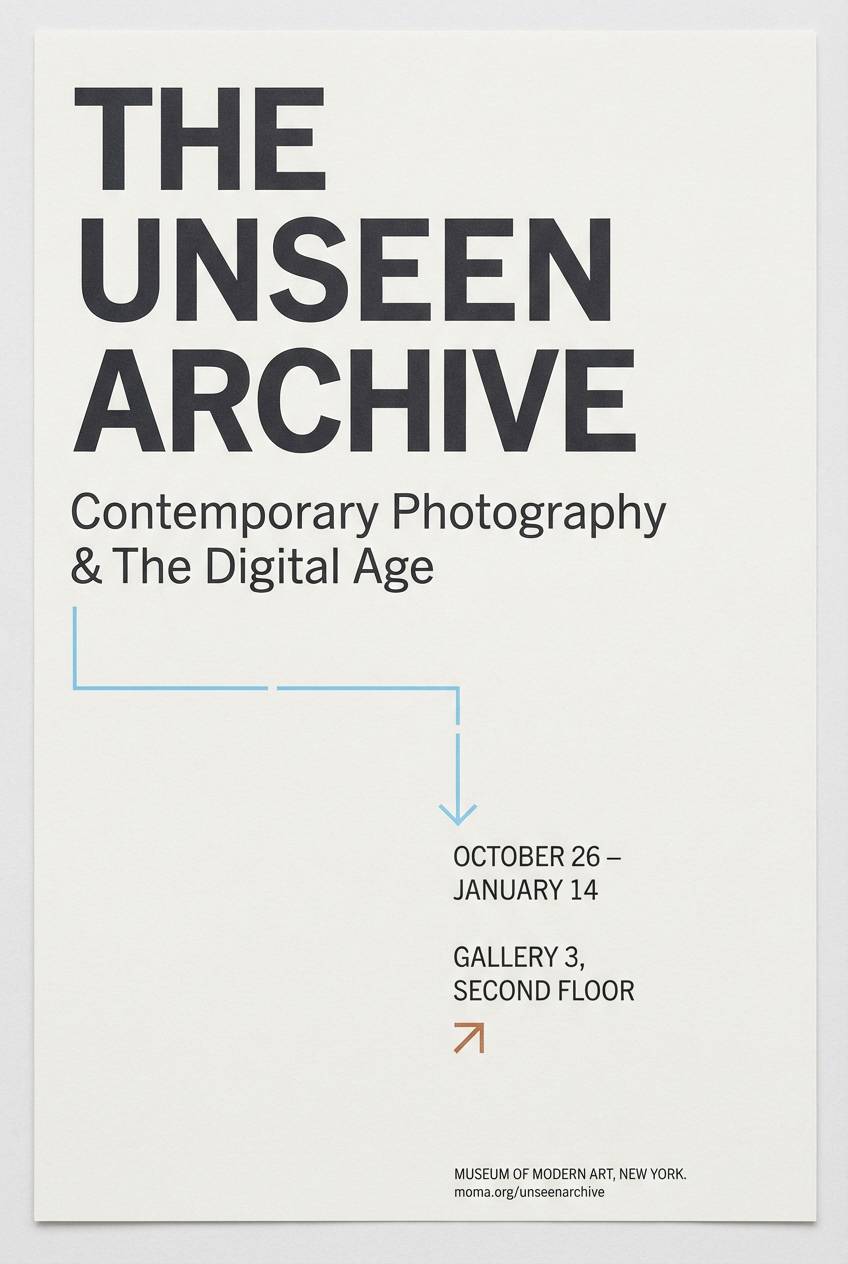
Best for: exhibition poster and label system
Curated and understated like a quiet gallery wall, these tones feel smart and timeless. Use light neutrals for spacious layouts, then add sky blue for wayfinding marks and section codes. Copper brings a warm, historical accent for titles or exhibit numbers. Tip: keep the accent to small blocks and rules so the system stays readable from a distance.
Image example of museum label generated using media.io
18) Playroom Pastels
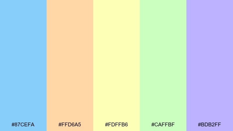
HEX: #87CEFA #FFD6A5 #FDFFB6 #CAFFBF #BDB2FF
Mood: kid-friendly, joyful, soft
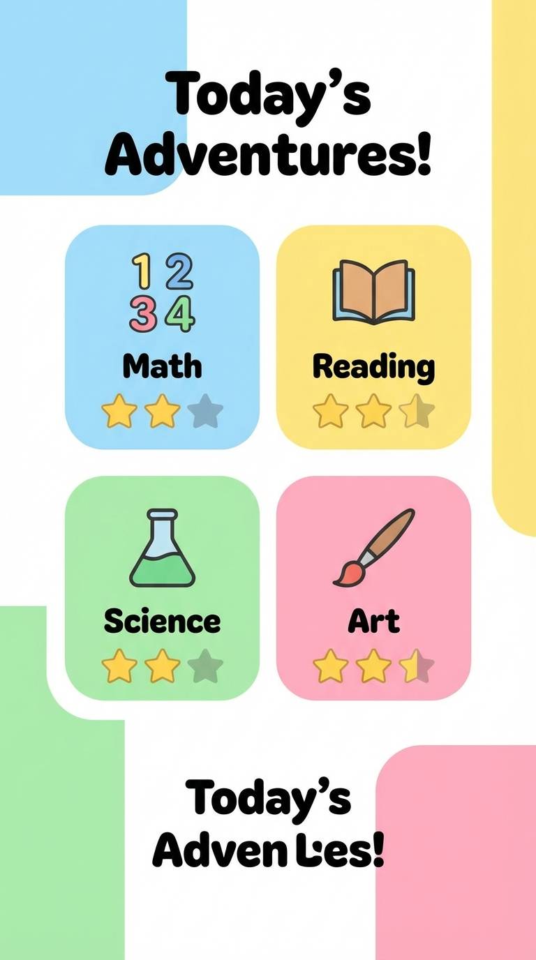
Best for: kids learning app UI
Joyful and bouncy like a bright playroom, these pastels feel friendly and approachable. Use sky blue as the primary base and rotate the other colors for level badges, rewards, and illustrations. Keep typography dark and simple so the cheerful accents do not reduce readability. Tip: assign one color to each feature area so kids learn the interface by color cues.
Image example of playroom pastels generated using media.io
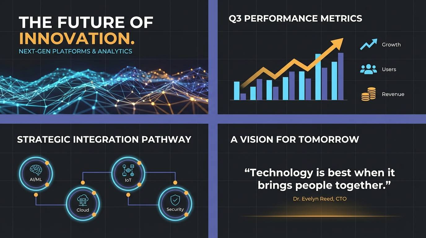
19) Stormlight Contrast
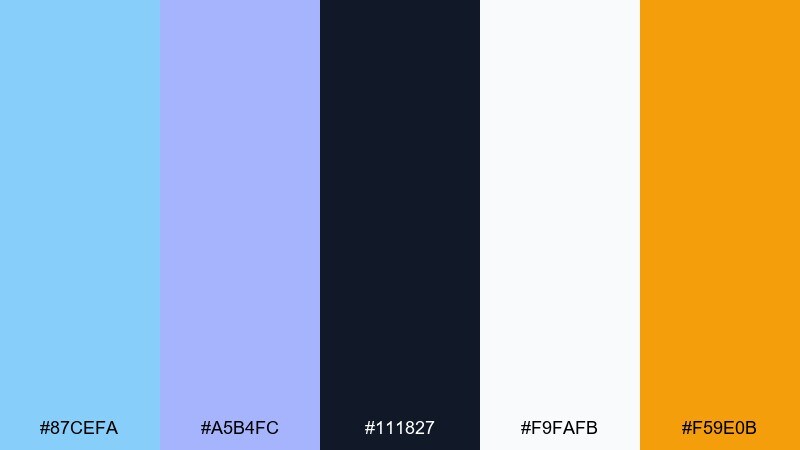
HEX: #87CEFA #A5B4FC #111827 #F9FAFB #F59E0B
Mood: dramatic, modern, high-contrast
Best for: tech keynote slide theme
Dramatic and modern like storm clouds breaking into clear light, this set is built for impact. Use the near-black for full-bleed sections, then let sky blue and indigo create sharp charts and callouts. Amber is ideal for a single emphasis layer, like milestones or highlights. Tip: avoid using amber in small text and keep it for shapes, badges, and key numbers.
Image example of stormlight contrast generated using media.io
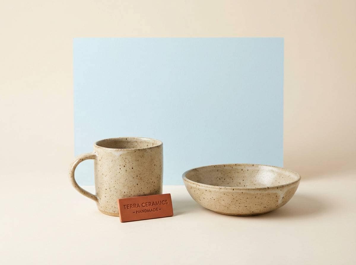
20) Aqua Clay
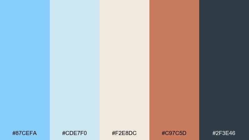
HEX: #87CEFA #CDE7F0 #F2E8DC #C97C5D #2F3E46
Mood: artisan, warm, natural
Best for: handmade ceramics product ad
Artisan and warm like glazed clay beside clear water, this palette feels handcrafted and honest. Use the sandy neutral as the base, then add sky blue as a soft backdrop for product details. Terracotta brings a tactile accent that looks great on labels and price tags. Tip: keep the background matte and the terracotta saturated so product edges remain defined.
Image example of aqua clay generated using media.io
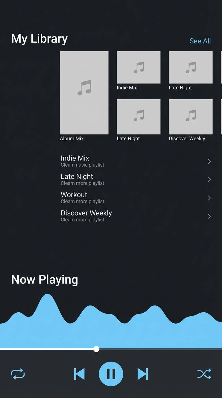
21) Stardust Night
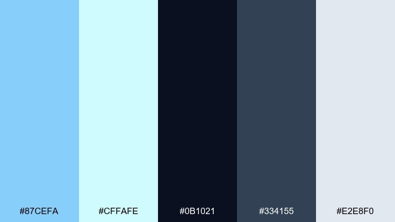
HEX: #87CEFA #CFFAFE #0B1021 #334155 #E2E8F0
Mood: sleek, futuristic, serene
Best for: music streaming app dark mode UI
Sleek and futuristic like stardust against a night sky, these tones feel calm but high-tech. Use the deep navy for backgrounds, then layer slate for cards and navigation. Sky blue and icy cyan work best for active states, toggles, and progress bars. Tip: keep highlights consistent across the app so users can spot interactive elements instantly.
Image example of stardust night generated using media.io
What Colors Go Well with Light Sky Blue?
Light sky blue pairs best with crisp neutrals for a clean, modern look—think white, off-white, cool grays, slate, and navy. These anchors keep your typography readable and your design feeling structured.
For more personality, add warm accents like soft yellow, peach, coral, copper, or terracotta. A small dose of warmth makes sky blue feel sunnier and more approachable without losing its calm vibe.
For a gentle, dreamy direction, pair it with lilac, blush pink, and mint. These pastel companions work well in invitations, seasonal illustration, and friendly product branding.
How to Use a Light Sky Blue Color Palette in Real Designs
Use light sky blue as the “space” color: backgrounds, large panels, and subtle gradients. Then reserve deeper tones (navy, charcoal, slate) for text, icons, and key UI components so contrast stays accessible.
When you add accents, keep them purposeful. Pick one accent for actions (buttons, links, key numbers) and a second accent for status or secondary emphasis; too many bright notes can make pastel designs feel noisy.
For print, test your palette on the actual paper stock or a realistic mockup. Light blues can shift cooler on bright white paper, while warm or textured stocks can make them feel softer and more muted.
Create Light Sky Blue Palette Visuals with AI
If you already have HEX codes, the fastest way to see them in action is to generate a few themed mockups—UI screens, posters, invitations, or packaging concepts—using consistent prompts and a fixed aspect ratio.
Start by describing the layout and subject first (e.g., “dashboard UI mockup” or “wedding stationery set”), then specify the palette vibe (airy sky blue + navy contrast, or pastel sky blue + blush), and finish with lighting/style cues.
With Media.io’s text-to-image tool, you can iterate quickly: generate 3–5 variations, keep what works, and refine the prompt until the colors and composition match your brand direction.
Light Sky Blue Color Palette FAQs
-
What is the HEX code for light sky blue?
A common, widely used HEX for light sky blue is #87CEFA. It’s the base color used across the palettes in this guide. -
Is light sky blue good for UI backgrounds?
Yes—light sky blue works well for backgrounds, sections, and highlight states because it feels airy and non-intrusive. Just anchor text and key UI controls with dark neutrals (navy/charcoal) to maintain strong contrast. -
What accent colors look best with light sky blue?
Warm accents like soft yellow, coral, copper, and terracotta create an upbeat contrast. For softer looks, blush pink, mint, and lilac keep the palette pastel and gentle. -
How do I keep light sky blue designs from looking washed out?
Add one deep anchor color (navy, slate, near-black) for typography and primary CTAs, and use light sky blue mostly as a supporting tone. Subtle texture or gradients also help large pale areas feel less flat. -
Can I use light sky blue for branding?
Yes—light sky blue is popular for wellness, travel, tech, and healthcare brands because it signals clarity and trust. Pair it with a distinctive accent (coral, orchid, copper) to make the identity feel unique. -
What colors should I avoid pairing with light sky blue?
Avoid using very light yellow or white text directly on light sky blue, since contrast can drop quickly. Also be cautious with too many saturated neons at once; they can overpower the calm tone of sky blue. -
How can I generate light sky blue palette images quickly?
Use an AI generator and specify your scene (UI, poster, packaging), then describe the palette using “light sky blue” plus your anchor and accent colors. Keep the same prompt structure and aspect ratio to compare variations consistently.


