

Green and tan is a naturally balanced color combination: green brings freshness and stability, while tan adds warmth and an easy, lived-in feel.
Below are 20 curated green tan color palette ideas (with HEX codes) you can use for branding, interiors, UI, and print—plus AI prompts to generate matching visuals.
In this article
Why Green Tan Palettes Work So Well
Green and tan feel “right” together because they mirror what we see in nature—leaves, grass, bark, sand, stone, and linen. That familiarity makes designs feel grounded and instantly approachable.
Practically, the pairing is also very flexible: greens can move from soft sage to deep pine, while tans can shift from creamy oat to richer caramel. This range lets you build both minimal and high-contrast layouts without changing the overall vibe.
In branding and UI, green tan palettes are especially useful for creating calm clarity. You can keep backgrounds warm and readable (tan/cream) while using green for structure, navigation, and emphasis.
20+ Green Tan Color Palette Ideas (with HEX Codes)
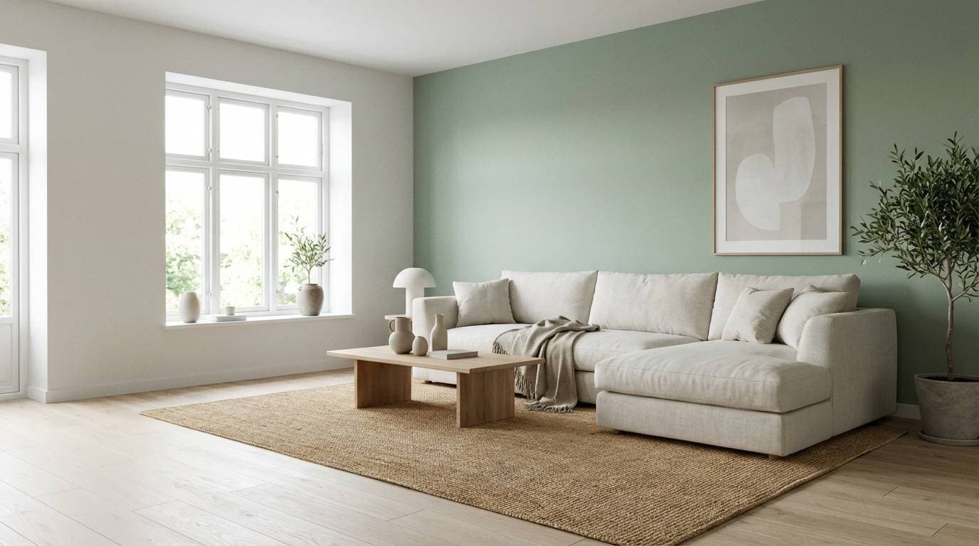
1) Sage Dune
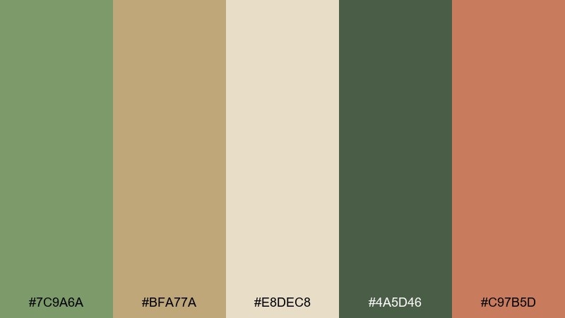
HEX: #7C9A6A #BFA77A #E8DEC8 #4A5D46 #C97B5D
Mood: calm, airy, grounded
Best for: scandinavian living room interiors
Calm sage meets sun-warmed dune tones, like linen curtains and potted herbs in soft daylight. Use it for interiors that need warmth without going yellow. Pair with matte black hardware, pale oak, and woven textures to keep it modern. Tip: use the deep green for anchors like cabinets, and keep the cream as your largest surface color.
Image example of sage dune generated using media.io
Media.io is an online AI studio for creating and editing video, image, and audio in your browser.

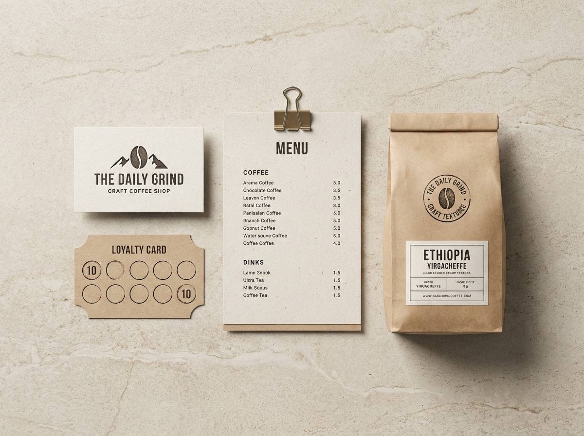
2) Olive Linen
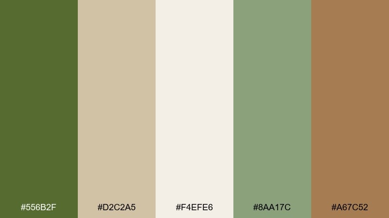
HEX: #556B2F #D2C2A5 #F4EFE6 #8AA17C #A67C52
Mood: heritage, cozy, refined
Best for: craft coffee shop branding
Heritage olive and milky linen evoke vintage menus, brass lamps, and a well-worn leather notebook. It works beautifully for cafe branding, loyalty cards, and packaging where you want a handcrafted feel. Pair with off-white paper stock and a single metallic accent like brass or copper. Tip: keep typography simple and let the olive act as the primary brand color.
Image example of olive linen generated using media.io
3) Mossy Sandstone
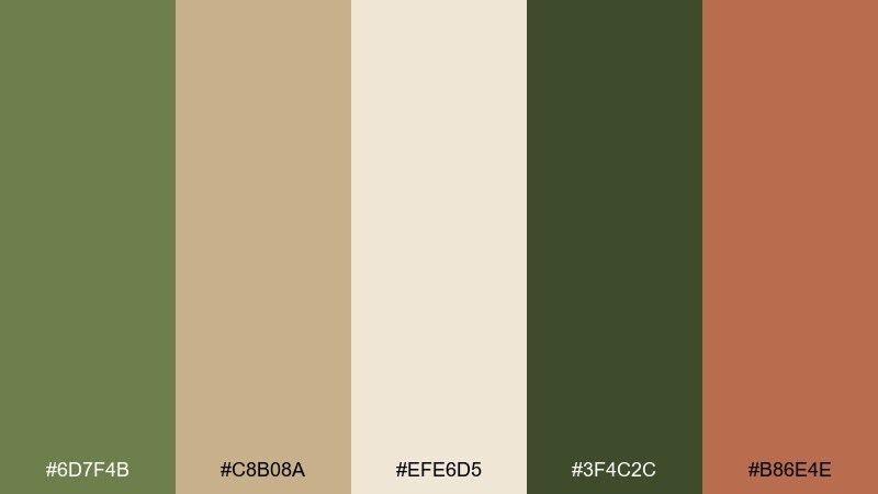
HEX: #6D7F4B #C8B08A #EFE6D5 #3F4C2C #B86E4E
Mood: outdoorsy, rustic, confident
Best for: hiking event poster design
Mossy greens and sandstone neutrals feel like trail markers, canyon walls, and sun-baked soil. Use it for posters and signage where readability matters but you still want an organic vibe. Pair with bold condensed type and plenty of negative space in the light beige. Tip: reserve the rust tone for dates, CTAs, or route highlights to guide the eye.
Image example of mossy sandstone generated using media.io

4) Eucalyptus Canvas
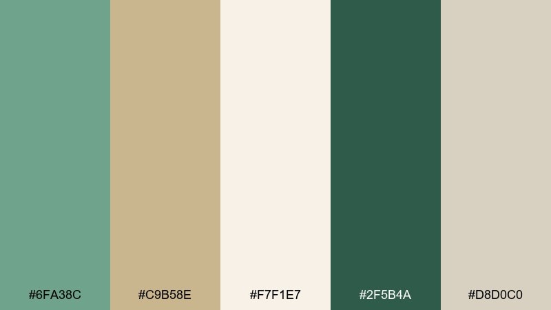
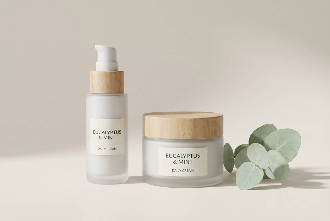
HEX: #6FA38C #C9B58E #F7F1E7 #2F5B4A #D8D0C0
Mood: fresh, spa-like, modern
Best for: skincare product packaging
Fresh eucalyptus tones with soft canvas neutrals bring to mind clean towels, steam, and quiet spa mornings. It is ideal for skincare packaging that needs to feel calming but premium. Pair with minimalist labels, soft shadows, and plenty of white space for a clinical-clean edge. Tip: use the deep teal-green sparingly for ingredient callouts or seals of quality.
Image example of eucalyptus canvas generated using media.io
5) Fern Clay
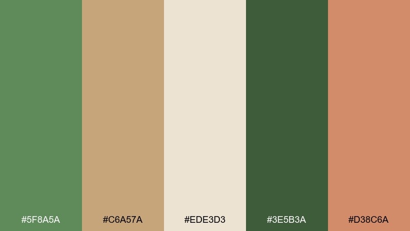
HEX: #5F8A5A #C6A57A #EDE3D3 #3E5B3A #D38C6A
Mood: warm, friendly, natural
Best for: artisan pottery ecommerce homepage
Warm fern greens and clay-tan tones feel like a studio shelf full of glazed mugs and fresh leaves. Use it on ecommerce pages where you want a handmade mood without sacrificing clarity. Pair with product photos on neutral backdrops and add the peachy clay as a subtle highlight color. Tip: keep buttons in the darker green so they stay accessible on the light base.
Image example of fern clay generated using media.io
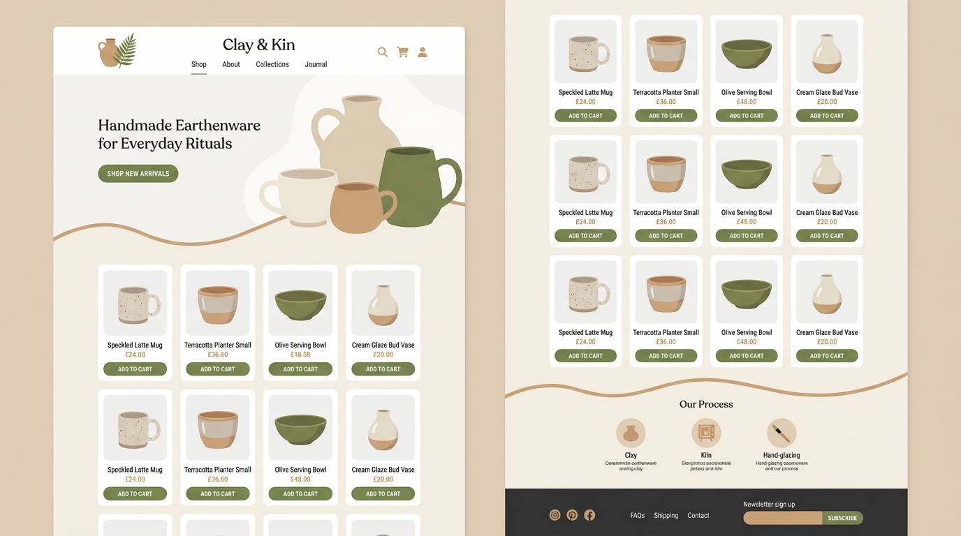
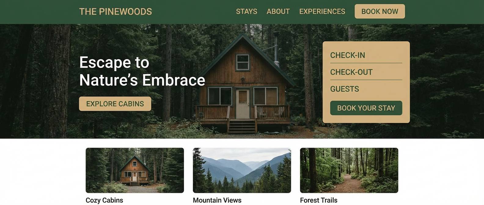
6) Pine Driftwood
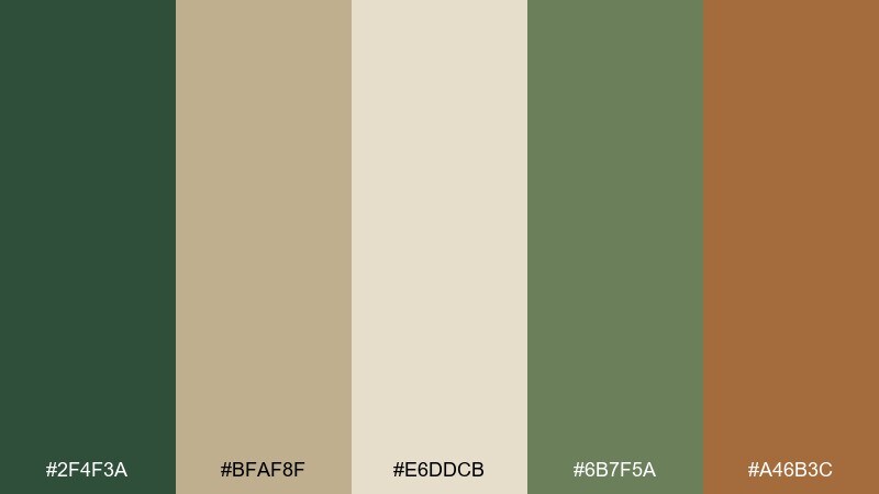
HEX: #2F4F3A #BFAF8F #E6DDCB #6B7F5A #A46B3C
Mood: grounded, woodsy, timeless
Best for: cabin rental website design
Woodsy pine with driftwood tans recalls a quiet cabin, wool blankets, and smoke from a distant fire pit. This green tan color palette fits travel sites and hospitality branding that want a rustic-luxe feel. Pair it with warm photography, simple icons, and a muted brown accent for links or badges. Tip: use the light beige as the page background to keep the design breathable.
Image example of pine driftwood generated using media.io
7) Matcha Khaki
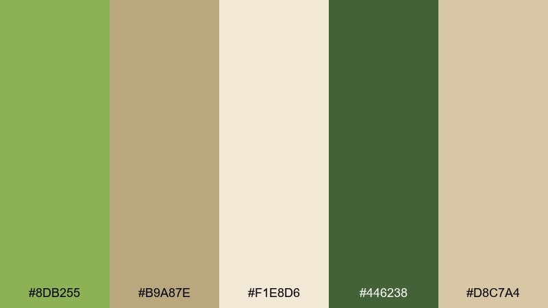
HEX: #8DB255 #B9A87E #F1E8D6 #446238 #D8C7A4
Mood: uplifting, youthful, clean
Best for: wellness app dashboard ui
Bright matcha and soft khaki feel like a morning smoothie and a fresh start. It is a great fit for dashboards where calm should still feel energetic and optimistic. Pair with rounded UI components, thin dividers in the pale beige, and clear data visuals in the darker green. Tip: keep the vivid matcha for progress states so it stays special and easy to scan.
Image example of matcha khaki generated using media.io
8) Meadow Burlap
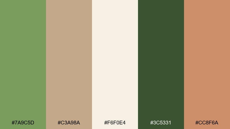
HEX: #7A9C5D #C3A98A #F6F0E4 #3C5331 #CC8F6A
Mood: sunny, rustic, welcoming
Best for: farmers market flyer
Meadow greens and burlap tans evoke wooden crates, fresh herbs, and late-summer sunshine. Use it for community flyers and social graphics where you want friendly, approachable energy. Pair with hand-drawn icons and a warm coral accent for headings or price tags. Tip: keep the darkest green for text to maintain contrast on the creamy background.
Image example of meadow burlap generated using media.io

9) Aloe Terracotta
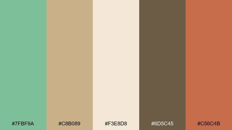
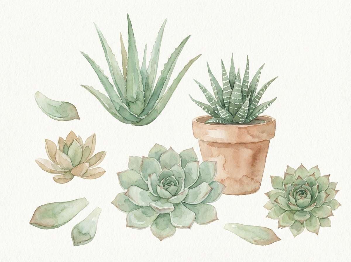
HEX: #7FBF9A #C8B089 #F3E8D8 #6D5C45 #C56C4B
Mood: fresh, earthy, artisanal
Best for: botanical watercolor wall art
Aloe green with terracotta warmth feels like succulents in clay pots on a sunny windowsill. It is perfect for botanical art prints and stationery that need both calm and character. Pair with textured paper, soft brush edges, and a restrained brown for stems or outlines. Tip: let terracotta appear in small touches so the greens stay dominant and soothing.
Image example of aloe terracotta generated using media.io
10) Juniper Wheat
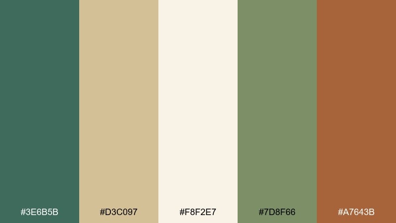
HEX: #3E6B5B #D3C097 #F8F2E7 #7D8F66 #A7643B
Mood: elegant, organic, editorial
Best for: magazine feature layout
Deep juniper and soft wheat read like a modern nature editorial, crisp but never cold. Use it for magazine spreads, lookbooks, and long-form articles that need an earthy sophistication. Pair with serif headlines, thin rules in the wheat tone, and a single warm accent for pull quotes. Tip: keep body text in the darkest green to avoid harsh black on creamy pages.
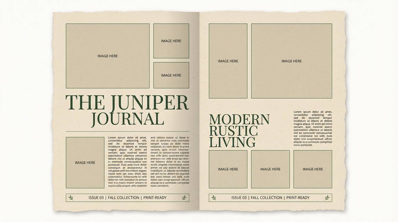
Image example of juniper wheat generated using media.io
11) Lichen Oat
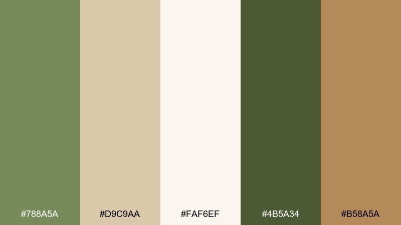
HEX: #788A5A #D9C9AA #FAF6EF #4B5A34 #B58A5A
Mood: soft, muted, minimal
Best for: minimalist brand style guide
Muted lichen and oat neutrals feel like quiet confidence, perfect for brands that want subtle warmth. It works well for style guides, logo systems, and presentation decks that need a calm baseline. Pair with simple geometric shapes and one strong typographic hierarchy to avoid visual noise. Tip: use the oat and off-white together for layered backgrounds that still feel clean.
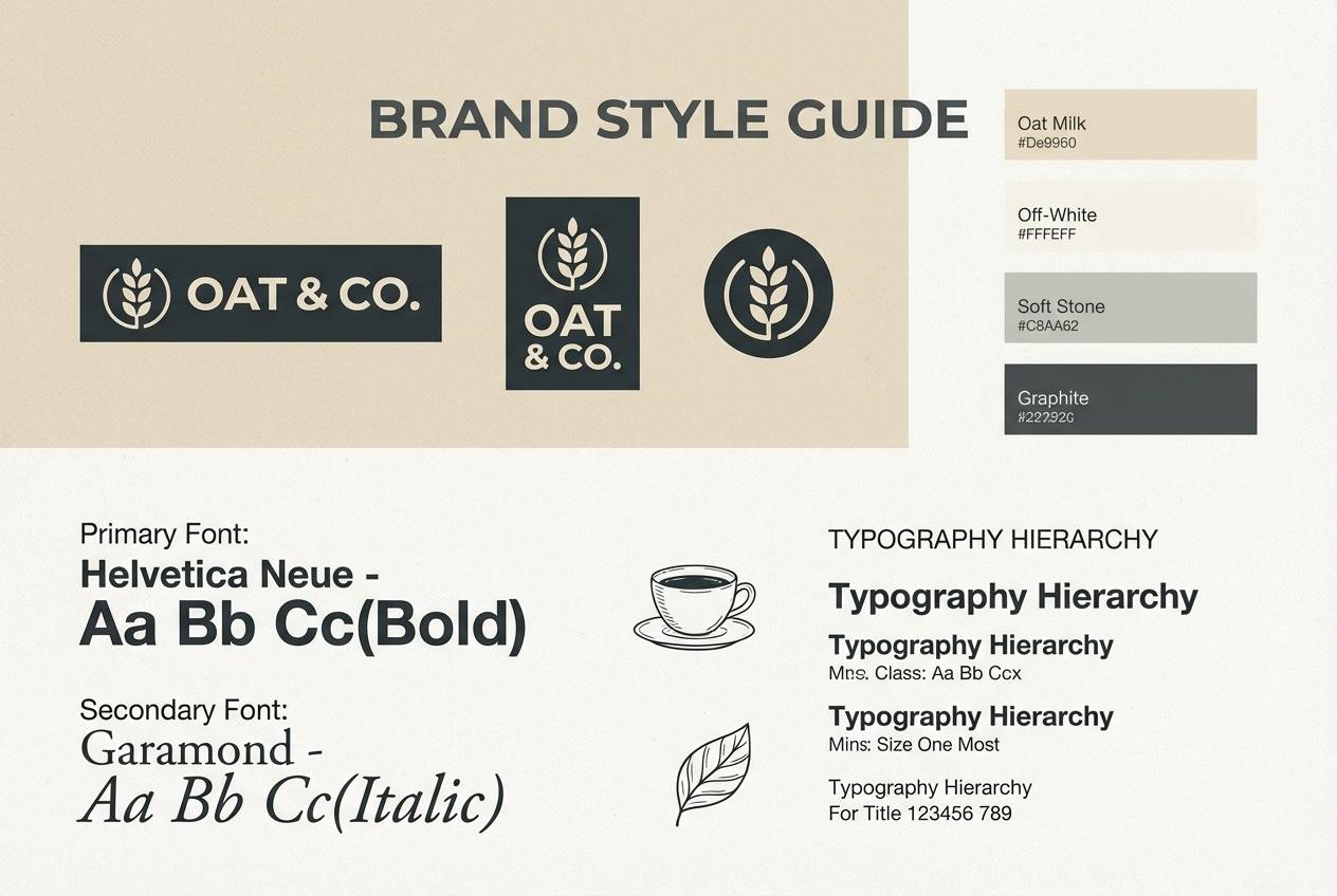
Image example of lichen oat generated using media.io
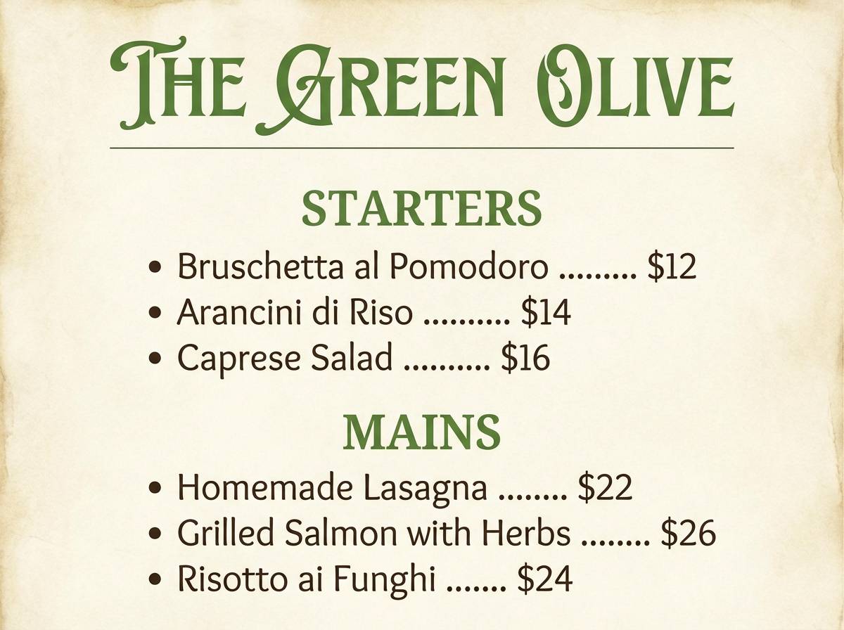
12) Basil Parchment
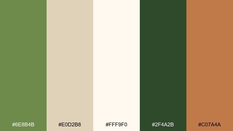
HEX: #6E8B4B #E0D2B8 #FFF9F0 #2F4A2B #C07A4A
Mood: classic, culinary, inviting
Best for: restaurant menu design
Basil greens on parchment neutrals evoke handwritten recipes and cozy bistro tables. These green tan color combinations shine on menus, table tents, and takeout inserts where a handcrafted look feels authentic. Pair with a serif for dish names and a clean sans for prices, keeping the background warm and readable. Tip: use the rich dark green for section headers so diners can scan quickly.
Image example of basil parchment generated using media.io
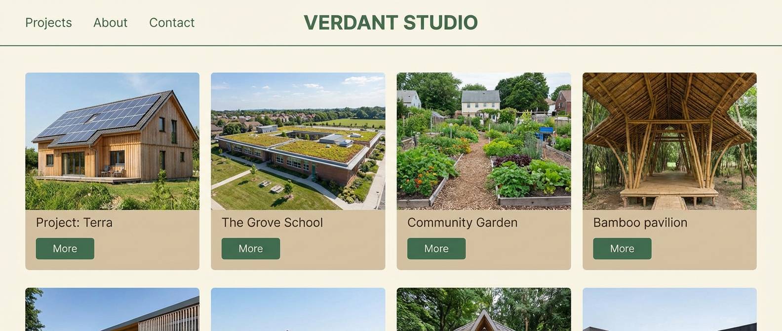
13) Cedar Greenstone
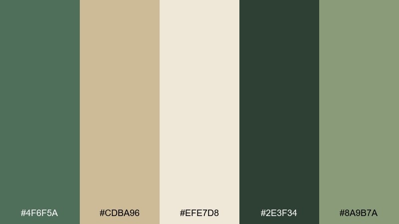
HEX: #4F6F5A #CDBA96 #EFE7D8 #2E3F34 #8A9B7A
Mood: architectural, steady, modern
Best for: eco architecture portfolio website
Cedar and greenstone tones suggest clean lines, natural materials, and quiet strength. Use it for architecture portfolios that want to feel sustainable and high-end at the same time. Pair with lots of white space, thin grid lines, and restrained iconography in the muted green. Tip: keep the darkest shade for navigation and captions to maintain crisp structure.
Image example of cedar greenstone generated using media.io
14) Sprout Suede
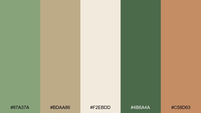
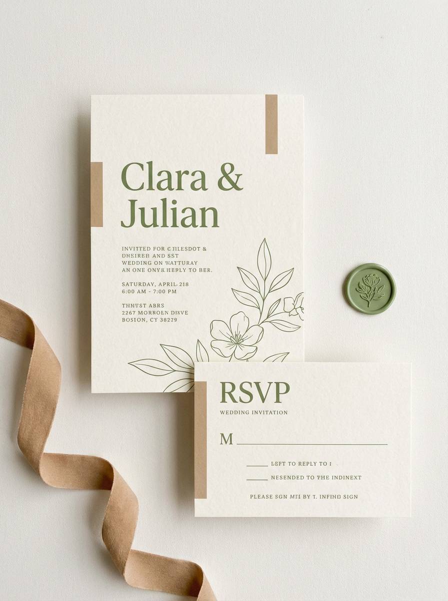
HEX: #87A37A #BDAA86 #F2EBDD #4B6A4A #C58D63
Mood: gentle, warm, approachable
Best for: wedding invitation suite
Gentle sprout greens with suede tans feel like a garden ceremony with linen details. It works beautifully for invitations, RSVP cards, and day-of signage when you want soft elegance. Pair with deckled edges, subtle florals, and warm neutrals rather than stark white. Tip: use the mid green for names and the tan for borders to keep the hierarchy clear.
Image example of sprout suede generated using media.io
15) Willow Macchiato
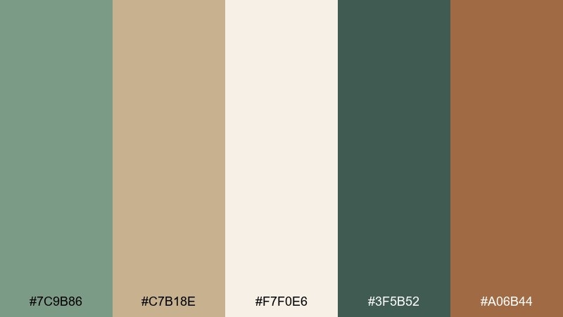
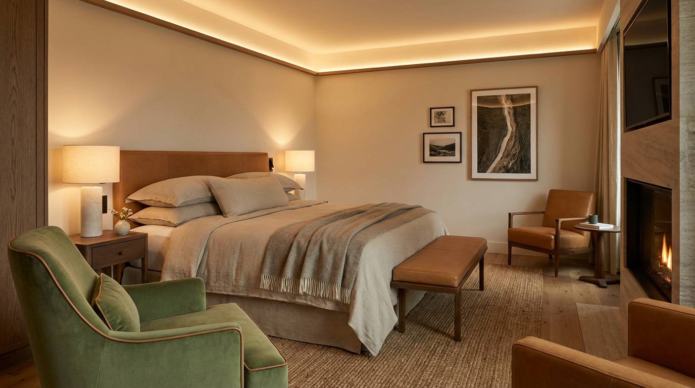
HEX: #7C9B86 #C7B18E #F7F0E6 #3F5B52 #A06B44
Mood: cozy, sophisticated, relaxed
Best for: boutique hotel room styling
Willow greens with macchiato tans feel like quiet luxury, soft textiles, and a warm espresso in hand. Use it for hospitality spaces and brochures that aim for calm sophistication. Pair with brushed metal fixtures, off-white bedding, and one darker green element for depth. Tip: repeat the tan in lampshades or upholstery to make the room feel intentionally layered.
Image example of willow macchiato generated using media.io
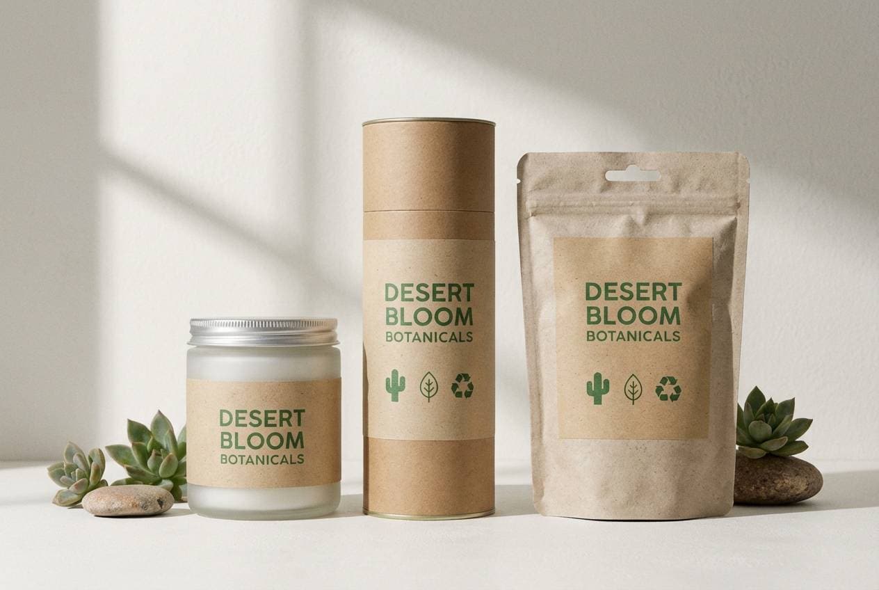
16) Cactus Paper
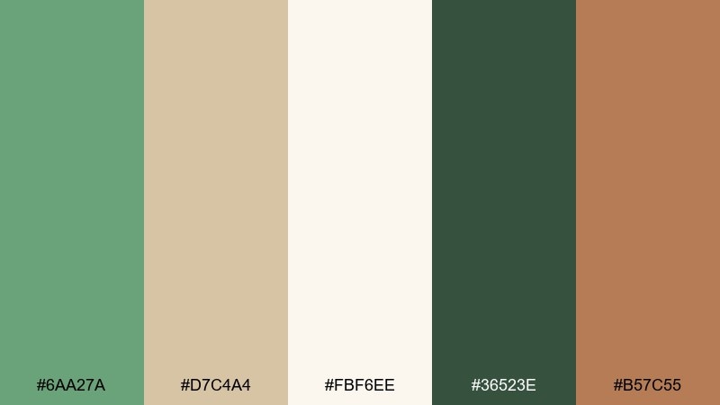
HEX: #6AA27A #D7C4A4 #FBF6EE #36523E #B57C55
Mood: clean, eco-friendly, optimistic
Best for: sustainable packaging label design
Cactus greens and paper tans evoke recycled stock, fresh air, and a modern eco mindset. It is ideal for labels and packs that need to feel responsible but still stylish. Pair with simple icons, a kraft-like texture, and a single warm accent for key claims. Tip: keep the background very light so small text stays readable on packaging.
Image example of cactus paper generated using media.io
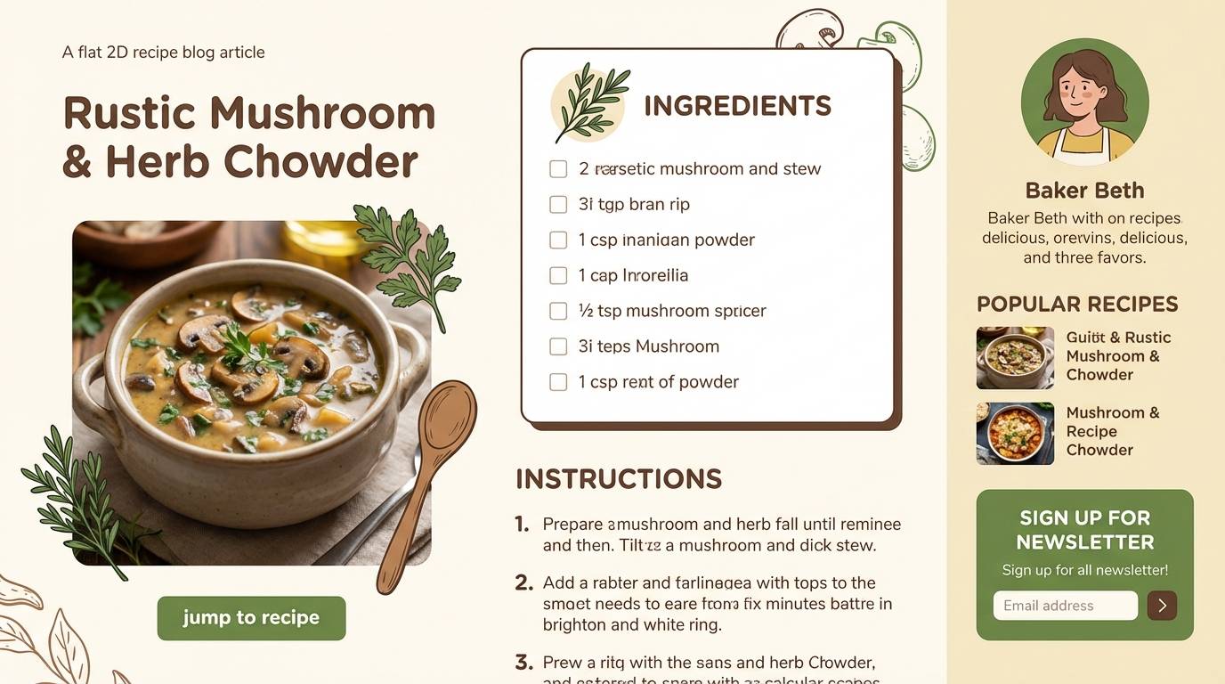
17) Garden Mocha
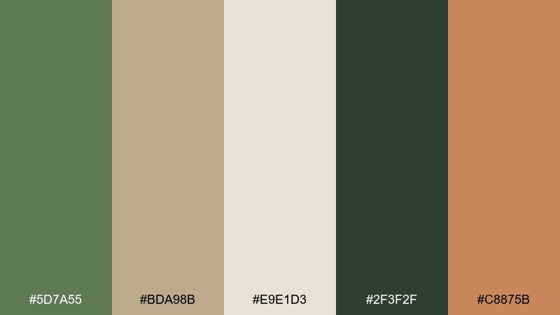
HEX: #5D7A55 #BDA98B #E9E1D3 #2F3F2F #C8875B
Mood: rich, earthy, comfortable
Best for: cozy recipe blog theme
Garden greens and mocha tans feel like wooden utensils, herb gardens, and warm kitchens. Use it for blogs and content sites where long reads should feel comfortable. Pair with creamy backgrounds, generous line height, and food photography with natural light. Tip: use the mocha as a hover color for links to add warmth without being too loud.
Image example of garden mocha generated using media.io
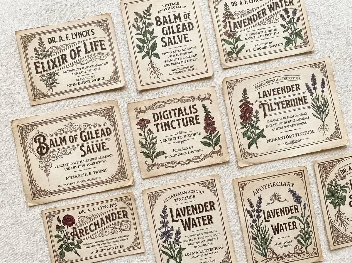
18) Vintage Herb
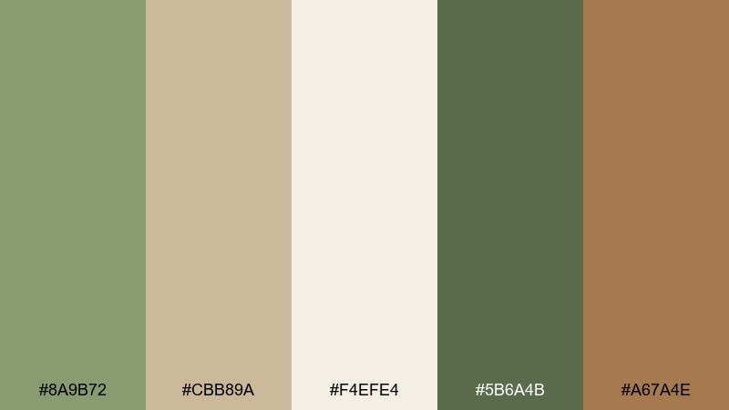
HEX: #8A9B72 #CBB89A #F4EFE4 #5B6A4B #A67A4E
Mood: nostalgic, soft, understated
Best for: retro apothecary label set
Vintage herb greens with mellow tans recall apothecary jars and aged paper labels. It suits label sets, stamp marks, and small batch products that lean nostalgic. Pair with engraved-style type, subtle borders, and a creamy base to keep everything legible. Tip: use the darker green for batch numbers and details so the design stays crisp.
Image example of vintage herb generated using media.io
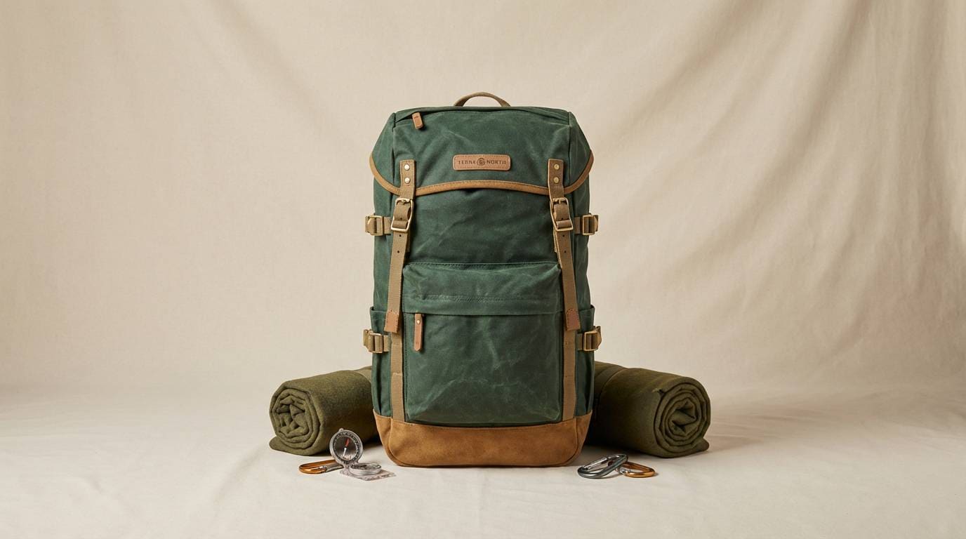
19) Forest Biscuit
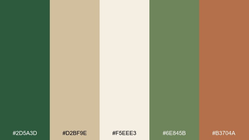
HEX: #2D5A3D #D2BF9E #F5EEE3 #6E845B #B3704A
Mood: bold, natural, premium
Best for: outdoor gear product ad
Deep forest green against biscuit neutrals feels rugged, capable, and a little premium. It works great for outdoor product ads where you want strong contrast without harsh neon. Pair with clean sans-serif type, simple feature icons, and a warm accent for highlights or price tags. Tip: keep the light tones dominant so the dark green reads as a powerful frame, not a heavy block.
Image example of forest biscuit generated using media.io
20) Soft Army Neutral
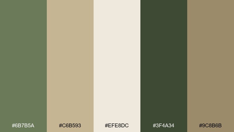
HEX: #6B7B5A #C6B593 #EFE8DC #3F4A34 #9C8B6B
Mood: neutral, modern, versatile
Best for: corporate presentation template
Soft army green with balanced neutrals evokes reliability, calm focus, and understated professionalism. Use this green tan color combination for presentations, reports, and proposals that should feel confident without being loud. Pair with simple charts, thin dividers, and plenty of whitespace to keep slides readable. Tip: apply the darkest shade to titles and axes, and save the mid green for data highlights.
Image example of soft army neutral generated using media.io

What Colors Go Well with Green Tan?
Green tan palettes pair easily with creamy whites, warm grays, and soft charcoals—these neutrals keep things calm while improving readability for text-heavy layouts.
For accents, try terracotta, rust, coral, or muted peach to add warmth and highlight CTAs without clashing. If you want a cooler contrast, dusty blue or deep teal can sharpen the green while still feeling natural.
Metallics also work well: brass and copper lean warm and cozy, while matte black adds modern structure—especially in interiors and brand systems.
How to Use a Green Tan Color Palette in Real Designs
Start with tan/cream as your base layer (backgrounds, large surfaces, whitespace), then use green for hierarchy—navigation, headings, and key UI components. This keeps designs breathable and reduces visual fatigue.
Control contrast by choosing one dark anchor (deep green or charcoal) for text and structure, one mid green for supporting elements, and one warm accent (rust/terracotta) for highlights like prices, badges, or buttons.
In interiors, repeat tan through textiles (rugs, upholstery, wood) and add green in larger blocks (walls, cabinetry, plants). The repetition makes the palette feel intentional rather than “randomly earthy.”
Create Green Tan Palette Visuals with AI
If you’re building a moodboard, pitch deck, or mockup, AI image generation can help you visualize how a green tan color scheme looks in real scenes—without hunting for stock photos.
Pick one palette above, reuse the included prompt, then tweak a few keywords (material, lighting, style) to match your brand or project. Consistent prompts make consistent visuals.
Generate a few variants, then choose the one with the cleanest composition and clearest color balance—greens should feel stable, and tans should stay warm but not overly yellow.
Green Tan Color Palette FAQs
-
What does a green tan color palette communicate?
Green and tan usually signals nature, reliability, and warmth. It’s a common choice for brands that want to feel grounded (tan) and fresh or sustainable (green). -
Which green works best with tan: sage, olive, or forest?
Sage creates a soft, airy look; olive feels heritage and rustic; forest reads bold and premium. Choose based on contrast needs—forest gives the strongest structure, while sage is the most subtle. -
How do I keep green and tan from looking dull?
Add one controlled accent color (like terracotta, rust, or coral) and use a darker anchor shade for typography. Texture also helps—linen, paper grain, wood, or subtle shadows add depth. -
Are green tan palettes good for UI design?
Yes—tan and cream backgrounds reduce glare, while greens work well for navigation, status states, and charts. Just ensure accessibility by using a dark green (or charcoal) for text and checking contrast ratios. -
What neutrals pair best with green tan schemes?
Off-white, oatmeal, warm gray, and soft charcoal are the easiest matches. They keep the palette cohesive and prevent green from feeling too saturated or too cold. -
What accent colors work with green and tan for branding?
Terracotta, copper, rust, coral, and muted peach add warmth; dusty blue or deep teal adds cooler contrast. Pick one accent and repeat it consistently in CTAs, badges, or key highlights. -
Can I use green tan palettes for modern, minimalist styles?
Absolutely—use off-white/tan as the main surface, limit the palette to 2–3 greens, and keep accents minimal. Clean typography and generous spacing will make the scheme feel contemporary.


