

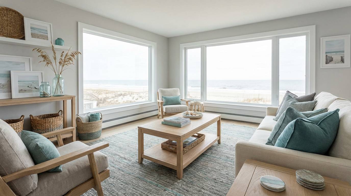
Gray turquoise blends cool ocean energy with modern gray neutrality, making it an easy choice for calm brands, airy rooms, and clean digital UI.
Below are ready-to-use gray turquoise color palette ideas with HEX codes, plus AI image prompts you can reuse to visualize each look fast.
In this article
Why Gray Turquoise Palettes Work So Well
Gray turquoise sits in a “quiet middle” between teal freshness and stone-like neutrality. That balance makes it feel calming without looking dull, and modern without feeling overly trendy.
Because the palette naturally includes both cool depth (teal-grays) and light breathing room (soft grays and off-whites), it creates strong hierarchy for UI and strong contrast control for interiors.
It’s also highly flexible: lean more gray to feel corporate and minimal, or lean more turquoise to feel coastal, wellness-focused, or energetic—without changing your overall visual identity.
20+ Gray Turquoise Color Palette Ideas (with HEX Codes)
1) Misty Harbor
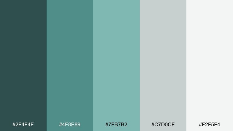
HEX: #2F4F4F #4F8E89 #7FB7B2 #C7D0CF #F2F5F4
Mood: calm, coastal, airy
Best for: coastal living rooms and hotel lounges
Calm and airy like sea mist rolling over a stone pier, these tones feel grounded yet fresh. Use the deeper slate-teal for sofas or feature walls, then layer the pale gray and off-white for light. Warm it up with oak, rattan, and linen, or sharpen it with matte black hardware. Tip: keep the brightest white on ceilings and trims to preserve the breezy look.
Image example of misty harbor generated using media.io
Media.io is an online AI studio for creating and editing video, image, and audio in your browser.

2) Pebble Lagoon
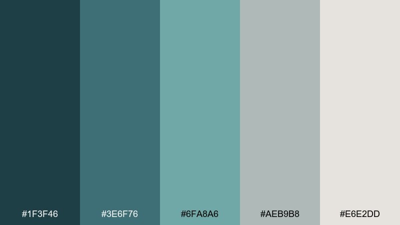
HEX: #1F3F46 #3E6F76 #6FA8A6 #AEB9B8 #E6E2DD
Mood: balanced, modern, understated
Best for: 2d saas dashboards and analytics ui
Balanced and modern, it reads like wet pebbles beside a quiet lagoon. Build hierarchy by reserving the darkest teal-gray for headers and side nav, with soft gray backgrounds to reduce glare. The muted turquoise works best as a state color for hover, selected, and info badges. Tip: pair the accent with subtle 1px borders in the mid-gray to keep the interface crisp without harsh contrast.
Image example of pebble lagoon generated using media.io

3) Nordic Spa
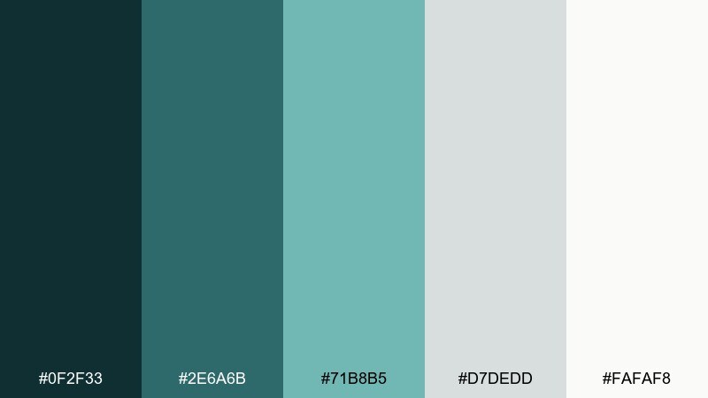
HEX: #0F2F33 #2E6A6B #71B8B5 #D7DEDD #FAFAF8
Mood: clean, restorative, serene
Best for: spa bathrooms and wellness brands
Clean and restorative, it feels like steam, stone, and cold plunge water in a Nordic retreat. This gray turquoise color palette shines in bathrooms, where the pale gray keeps tile and grout looking intentional. Use the deep teal for fixtures, mirror frames, or a vanity, then add plants for a soft organic edge. Tip: choose brushed nickel over shiny chrome to keep the calm, matte mood.
Image example of nordic spa generated using media.io
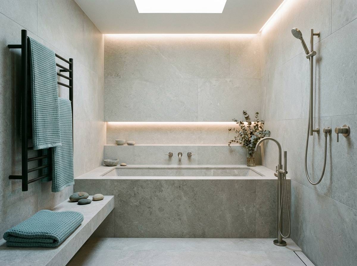
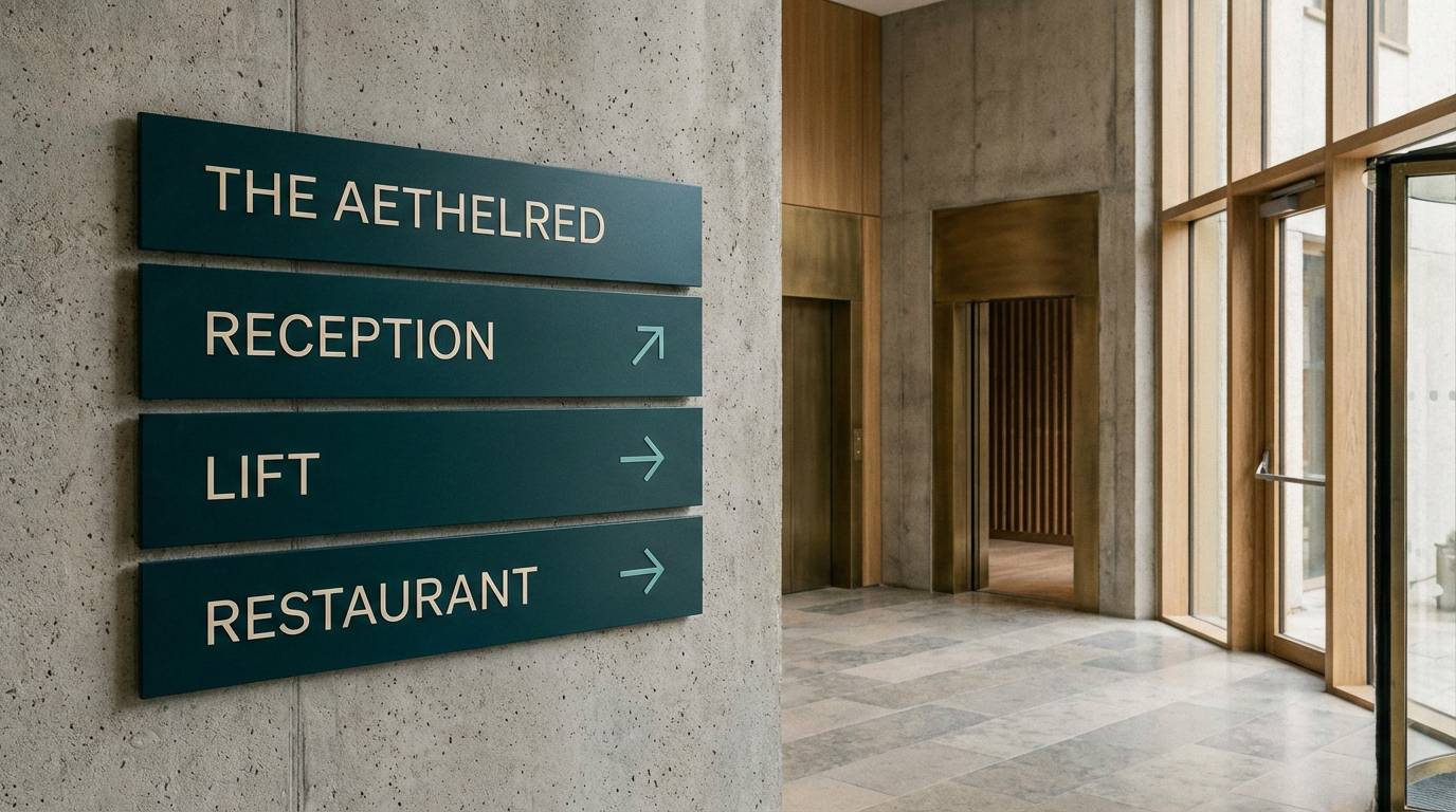
4) Urban Tide
HEX: #22363A #3B5A60 #5FA3A0 #B8C2C2 #EFEFEA
Mood: city-cool, sleek, polished
Best for: modern office interiors and coworking spaces
City-cool and sleek, it evokes glass buildings reflecting the sea at dusk. The mid-tone turquoise reads sophisticated on acoustic panels, meeting room doors, or wayfinding graphics. Anchor the space with charcoal flooring and let the warm off-white keep it inviting. Tip: repeat the turquoise in small doses across floors, like signage, chair piping, and planters, for cohesion.
Image example of urban tide generated using media.io
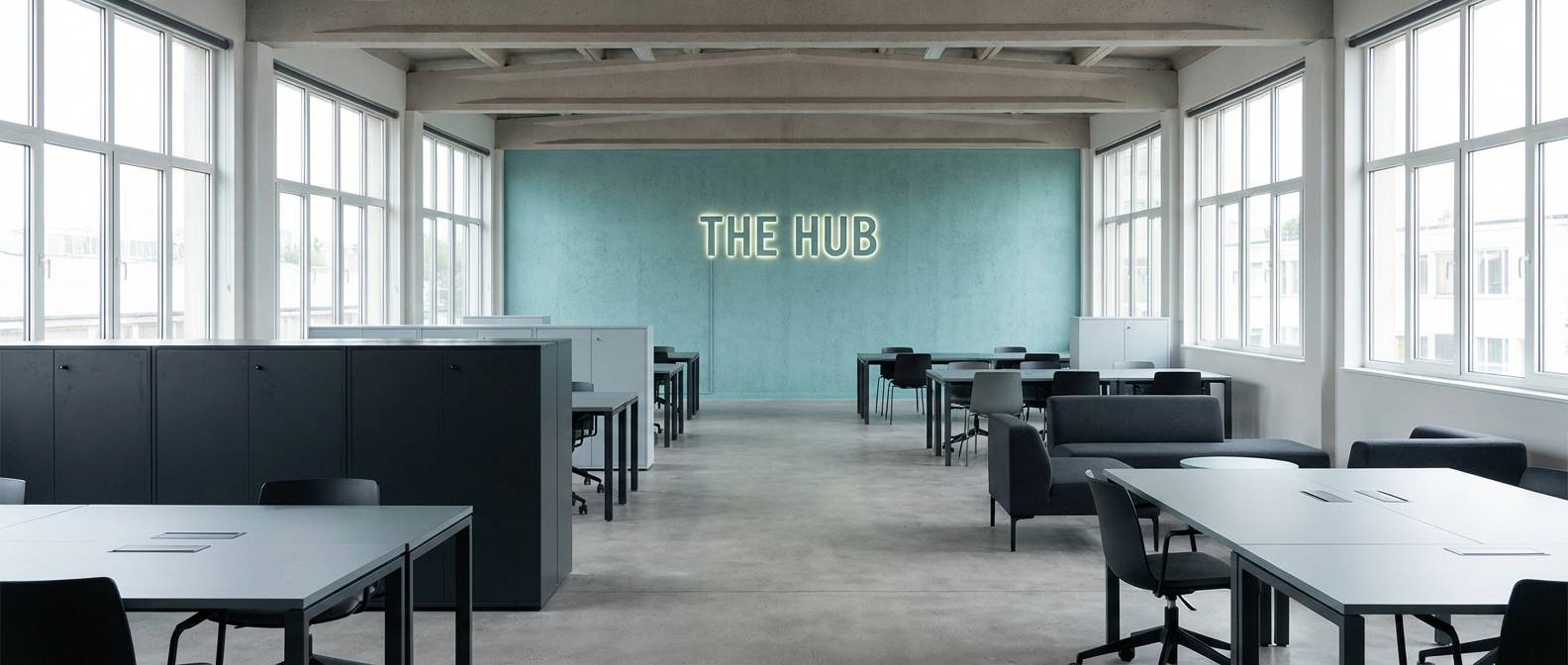
5) Silver Reef
HEX: #344B52 #4C7D83 #78BDB9 #C9D4D6 #F7F8F6
Mood: bright, coastal, refined
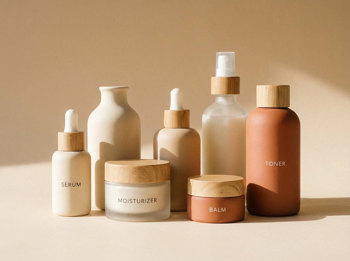
Best for: skincare packaging and product ads
Bright and refined, it suggests sunlight flickering on a reef just below the surface. Use the clean off-white and soft gray as the main label field, then bring in turquoise for product names and key benefits. The darker teal-gray works beautifully for premium finishes like foil stamping or embossed text. Tip: keep photography minimal and let the color blocks carry the brand story.
Image example of silver reef generated using media.io
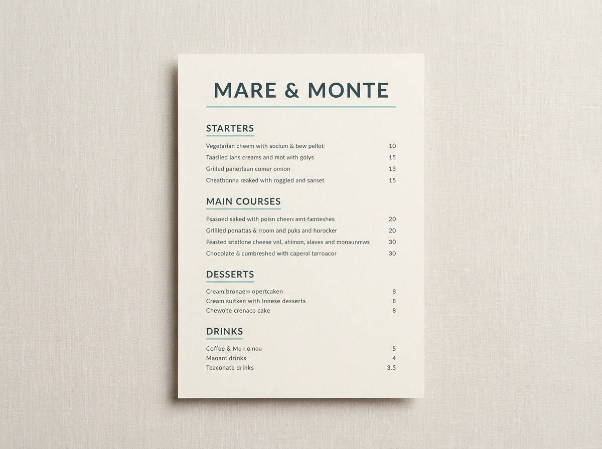
6) Coastal Concrete
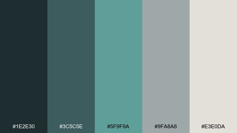
HEX: #1E2E30 #3C5C5E #5F9F9A #9FA8A8 #E3E0DA
Mood: industrial, grounded, contemporary
Best for: restaurant branding and menu design
Industrial and grounded, it feels like salt air meeting poured concrete. These gray turquoise color combinations work especially well for modern seafood or wine bars that want a clean, confident look. Use the charcoal-teal for headings and dividers, then keep body text on warm off-white for readability. Tip: add a single turquoise accent rule under section titles to guide the eye through long menus.
Image example of coastal concrete generated using media.io
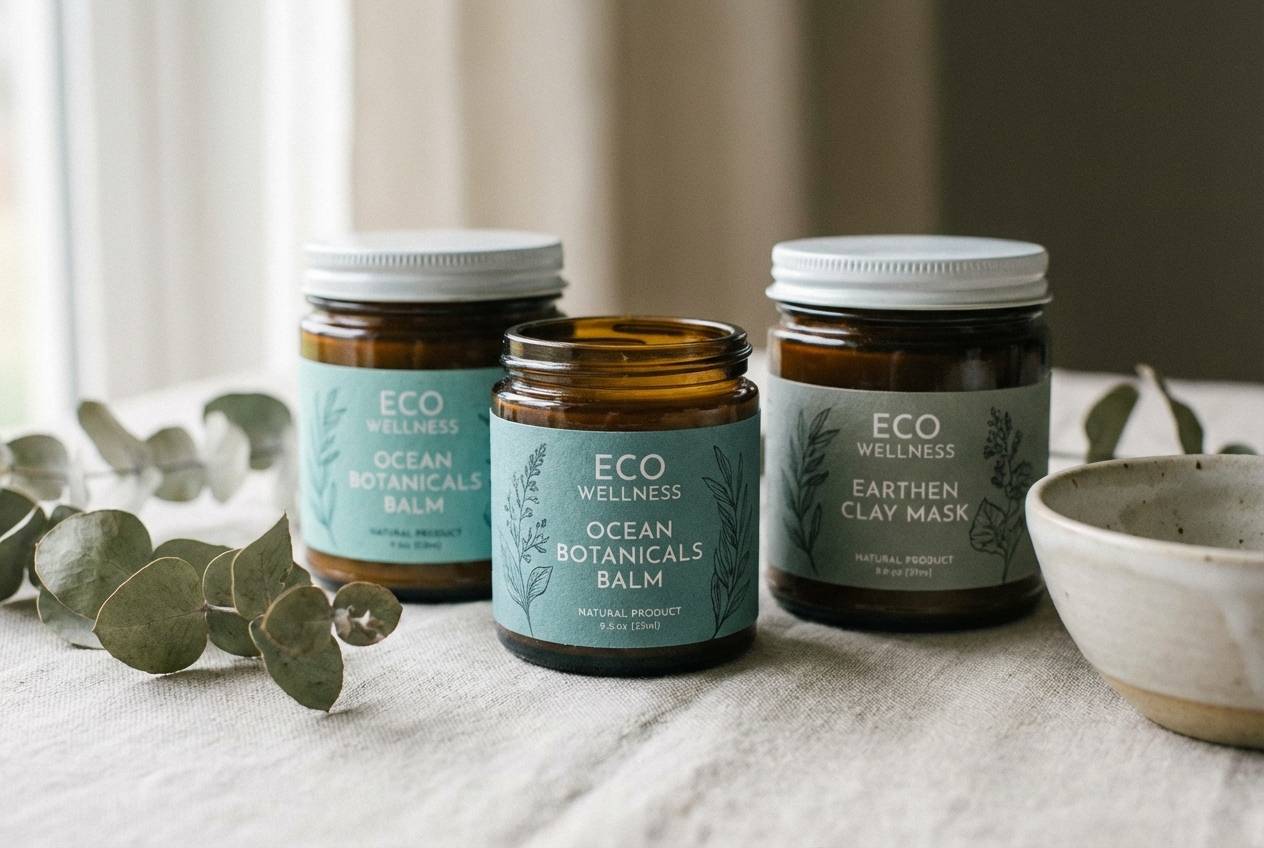
7) Eucalyptus Smoke
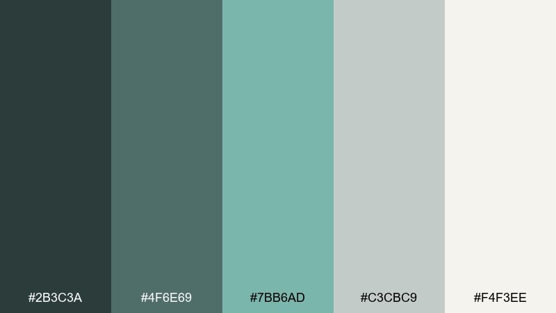
HEX: #2B3C3A #4F6E69 #7BB6AD #C3CBC9 #F4F3EE
Mood: herbal, soft, calming
Best for: eco product labels and natural wellness
Herbal and soft, it reads like eucalyptus leaves fading into morning fog. Let the smoky gray-green set a natural baseline, then use the muted turquoise as a freshness cue on icons and seals. Pair with recycled kraft textures or uncoated paper stock for an authentic feel. Tip: keep saturation low on supporting graphics so the accent color stays special.
Image example of eucalyptus smoke generated using media.io
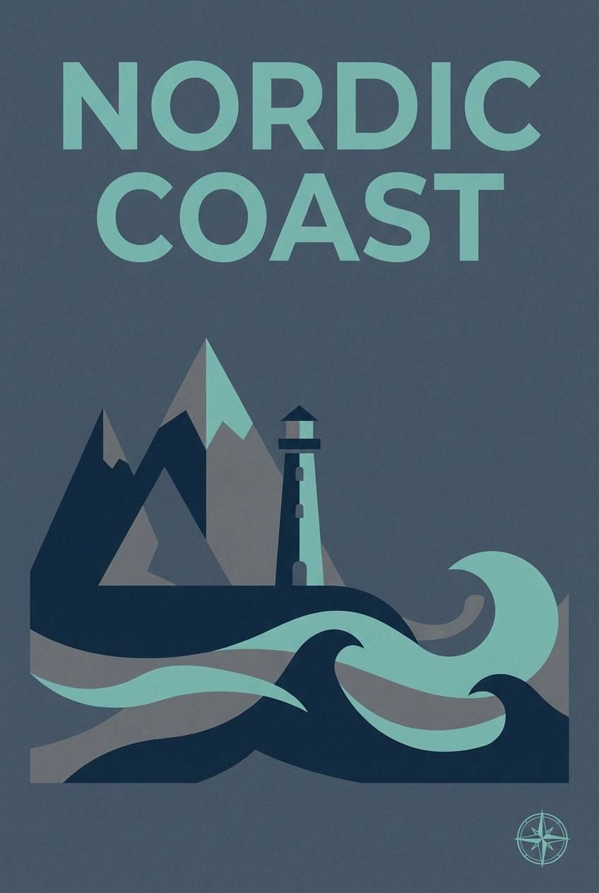
8) Rainy Boardwalk
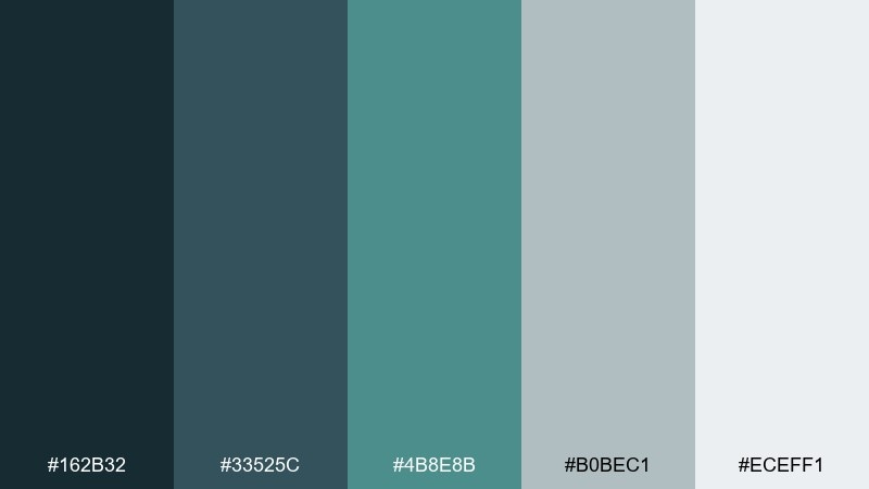
HEX: #162B32 #33525C #4B8E8B #B0BEC1 #ECEFF1
Mood: moody, cinematic, cool
Best for: travel posters and event flyers
Moody and cinematic, it evokes rain on wooden planks and ocean air after a storm. The deep blue-gray makes a strong backdrop for bold type, while the turquoise adds just enough lift for dates and calls to action. Keep the light gray for negative space to avoid a heavy, over-inked look. Tip: use grain or subtle texture overlays to enhance the rainy atmosphere without reducing legibility.
Image example of rainy boardwalk generated using media.io
9) Glacier Pool
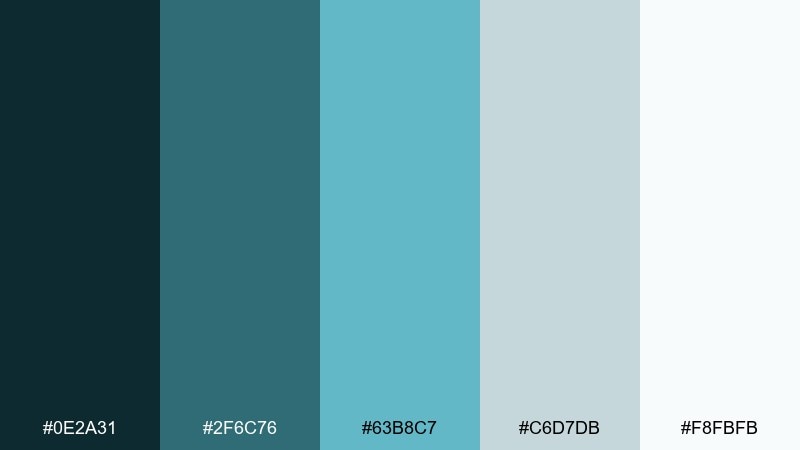
HEX: #0E2A31 #2F6C76 #63B8C7 #C6D7DB #F8FBFB
Mood: fresh, crisp, invigorating
Best for: fitness apps and hydration branding
Fresh and crisp, it feels like glacier water catching light in a mountain pool. Use the bright turquoise as a progress or achievement color, then keep the rest of the interface in soft grays to maintain clarity. This mix pairs well with condensed sans fonts and simple line icons. Tip: reserve the most saturated shade for one primary action so it stays motivating, not noisy.
Image example of glacier pool generated using media.io
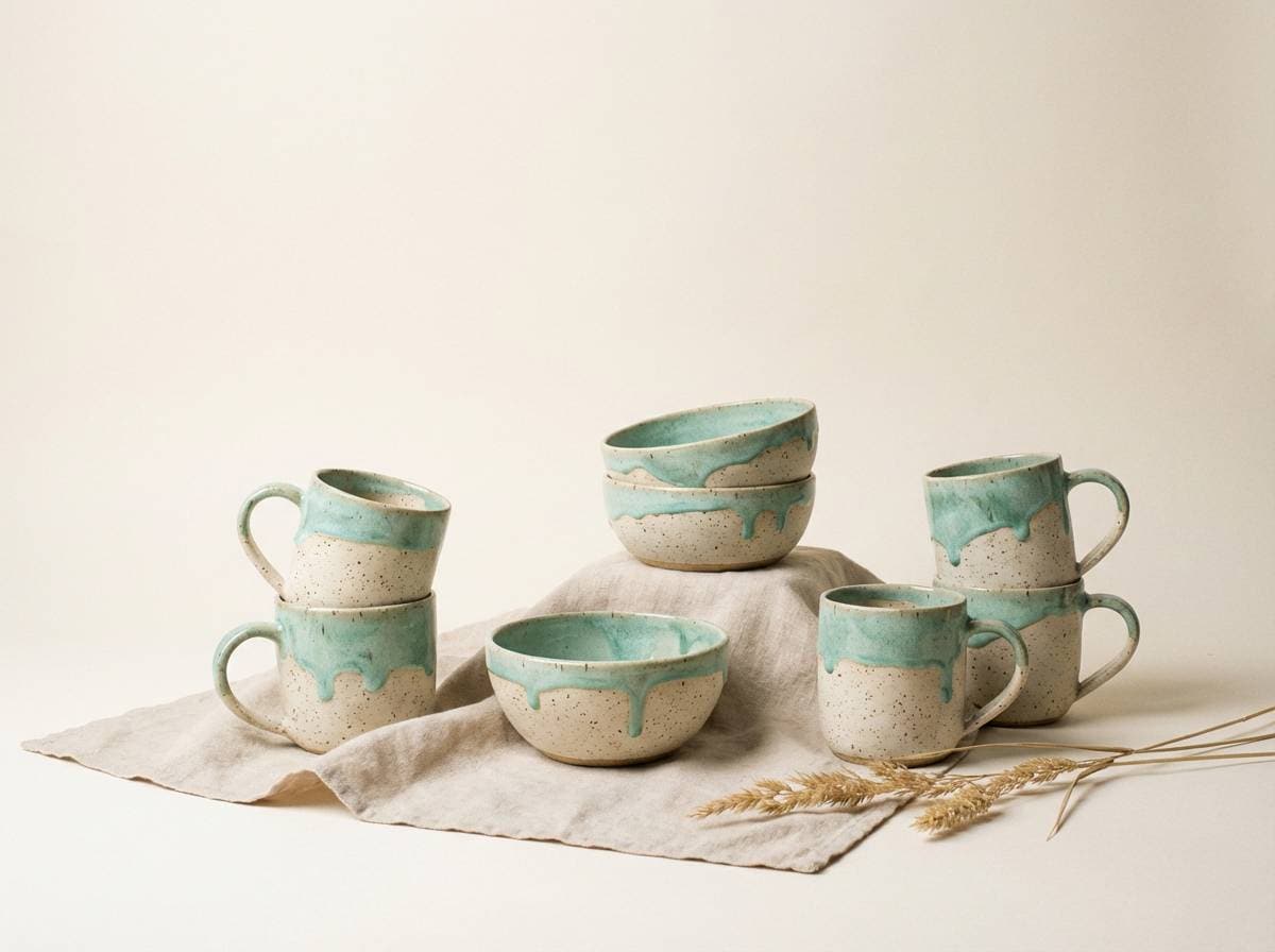
10) Ceramic Seafoam
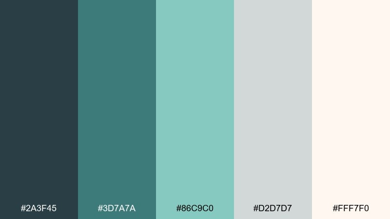
HEX: #2A3F45 #3D7A7A #86C9C0 #D2D7D7 #FFF7F0
Mood: handmade, light, welcoming
Best for: kitchen styling and pottery brands
Handmade and welcoming, it brings to mind seafoam glaze on warm ceramic. The creamy off-white keeps the palette friendly, while the turquoise feels artisanal on packaging, tags, and social templates. Pair with terracotta, brass, or light maple to emphasize the craft vibe. Tip: use imperfect, brushy shapes in the accent color to echo hand-thrown textures.
Image example of ceramic seafoam generated using media.io
11) Gallery Wall
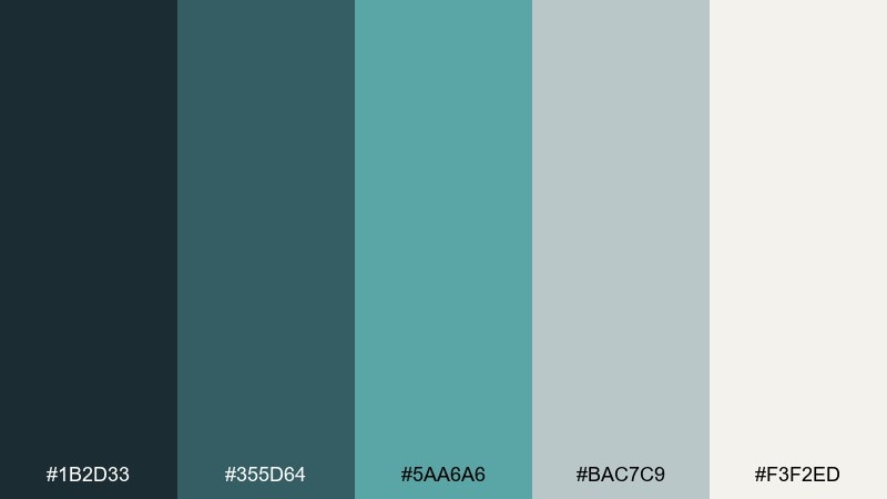
HEX: #1B2D33 #355D64 #5AA6A6 #BAC7C9 #F3F2ED
Mood: curated, artistic, modern
Best for: editorial layouts and lookbooks
Curated and modern, it feels like a quiet gallery with cool light on framed prints. As a gray turquoise color scheme, it supports strong photography while keeping typography refined and readable. Use the soft gray as the page canvas, then pull turquoise into pull quotes and section tabs. Tip: keep margins generous so the cooler tones have room to breathe.
Image example of gallery wall generated using media.io
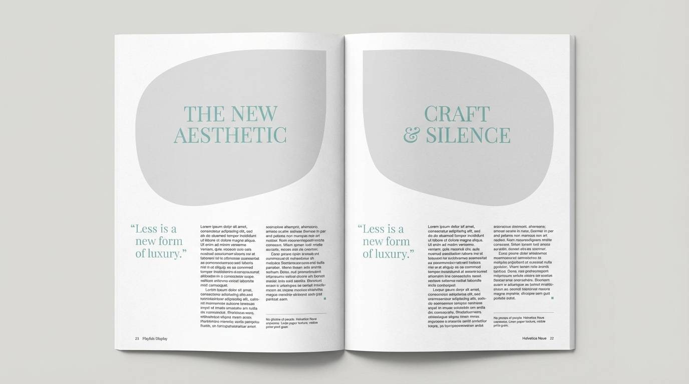
12) Retro Poolside
HEX: #14333A #2F6F7B #79C8C4 #BFC6C8 #FFE9DA
Mood: playful, retro, sun-washed
Best for: summer campaigns and social templates
Playful and sun-washed, it recalls vintage pool tiles and a pastel beach umbrella. The creamy peachy off-white adds warmth so the turquoise feels cheerful rather than cold. Use the mid teal for headlines and the lighter aqua for shapes, stickers, and highlights. Tip: add a tiny amount of warm accent, like coral or sand, when you want a more nostalgic vibe.
Image example of retro poolside generated using media.io

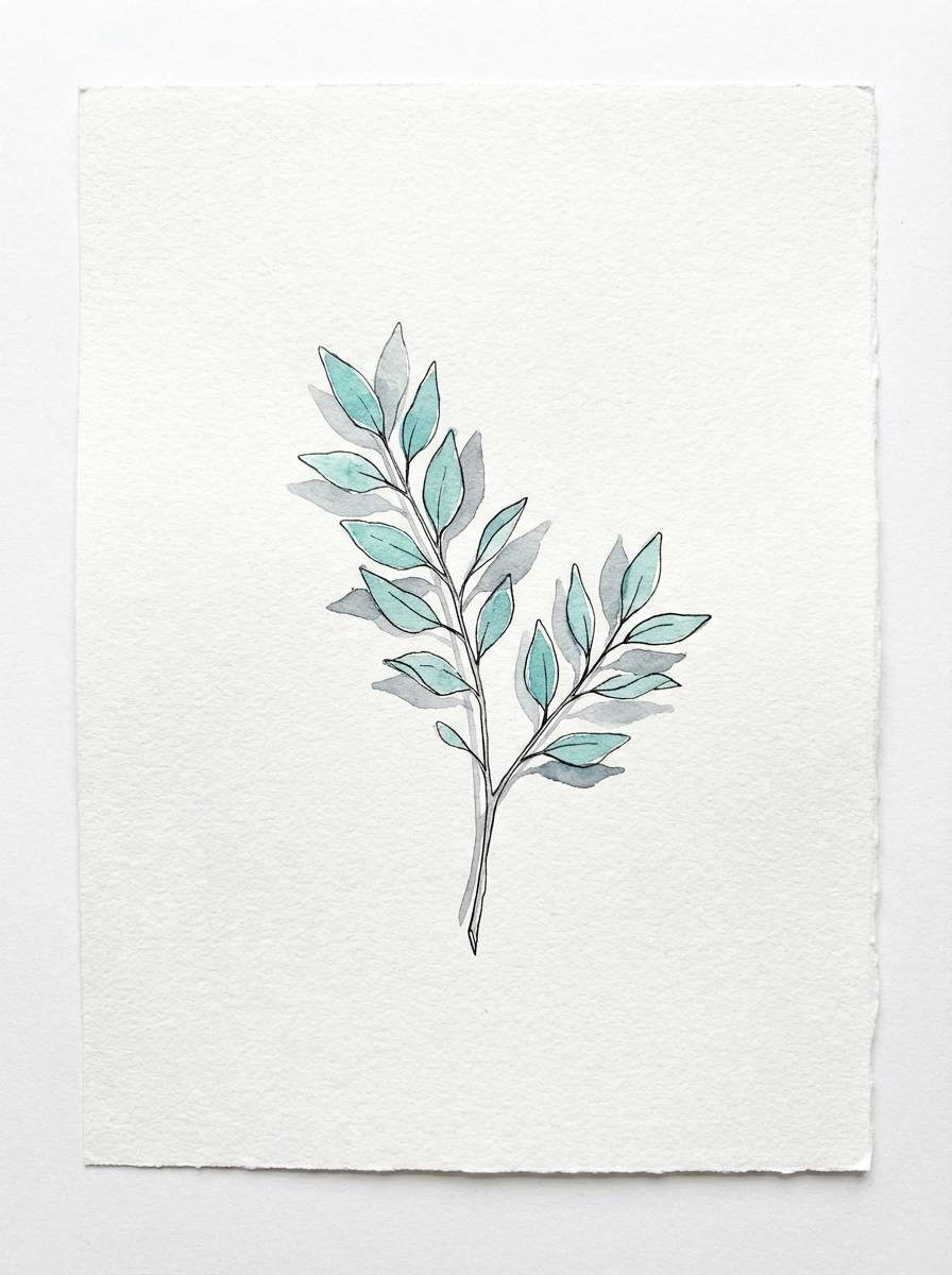
13) Mineral Spring
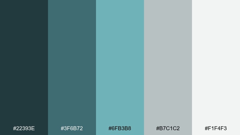
HEX: #22393E #3F6B72 #6FB3B8 #B7C1C2 #F1F4F3
Mood: natural, soothing, clean
Best for: botanical illustrations and stationery
Natural and soothing, it brings to mind minerals dissolving into clear spring water. These tones work beautifully in watercolor foliage, where the turquoise can tint leaves and the grays can shade stems and shadows. Pair with textured paper backgrounds and light pencil outlines for a delicate finish. Tip: keep the darkest shade only for fine details so the illustration stays airy.
Image example of mineral spring generated using media.io
14) Deep Dock
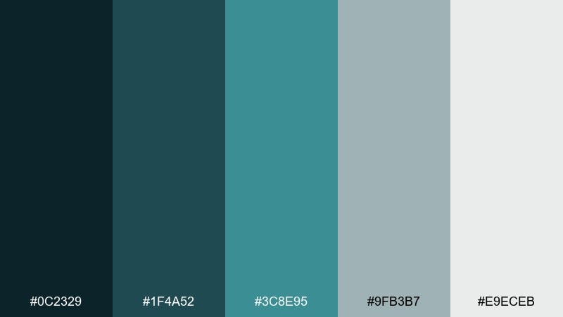
HEX: #0C2329 #1F4A52 #3C8E95 #9FB3B7 #E9ECEB
Mood: bold, nautical, dramatic
Best for: tech brand identities and hero sections
Bold and nautical, it feels like deep water beside a dock at night. A gray turquoise color combination like this is ideal for hero headers, where the near-black teal gives instant depth. Use the brighter teal for key metrics, icons, and link states, and keep the pale gray for breathing room. Tip: add subtle gradients within the dark tones to make flat sections feel premium.
Image example of deep dock generated using media.io

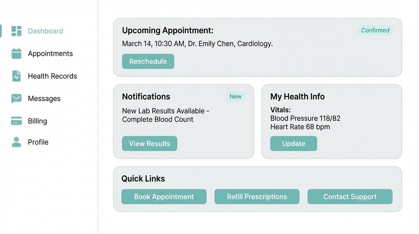
15) Quiet Clinic
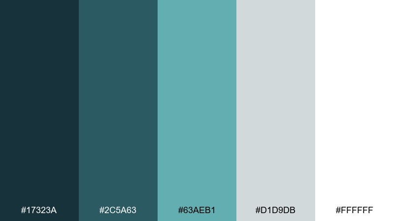
HEX: #17323A #2C5A63 #63AEB1 #D1D9DB #FFFFFF
Mood: trustworthy, hygienic, calm
Best for: healthcare ui and clinic signage
Trustworthy and calm, it suggests a quiet waiting room with clean lines and soft light. The white and pale gray make forms and charts easy to read, while the turquoise communicates care without feeling childish. Pair with simple pictograms and plenty of spacing for accessibility. Tip: use the mid-tone teal for focus states and error-free success confirmations, not for body text.
Image example of quiet clinic generated using media.io
16) Craft Studio
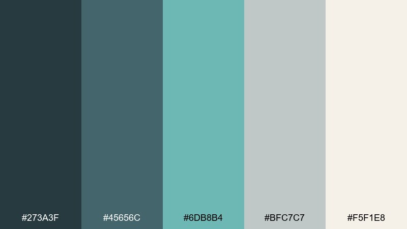
HEX: #273A3F #45656C #6DB8B4 #BFC7C7 #F5F1E8
Mood: creative, approachable, tidy
Best for: maker brands and workshop flyers
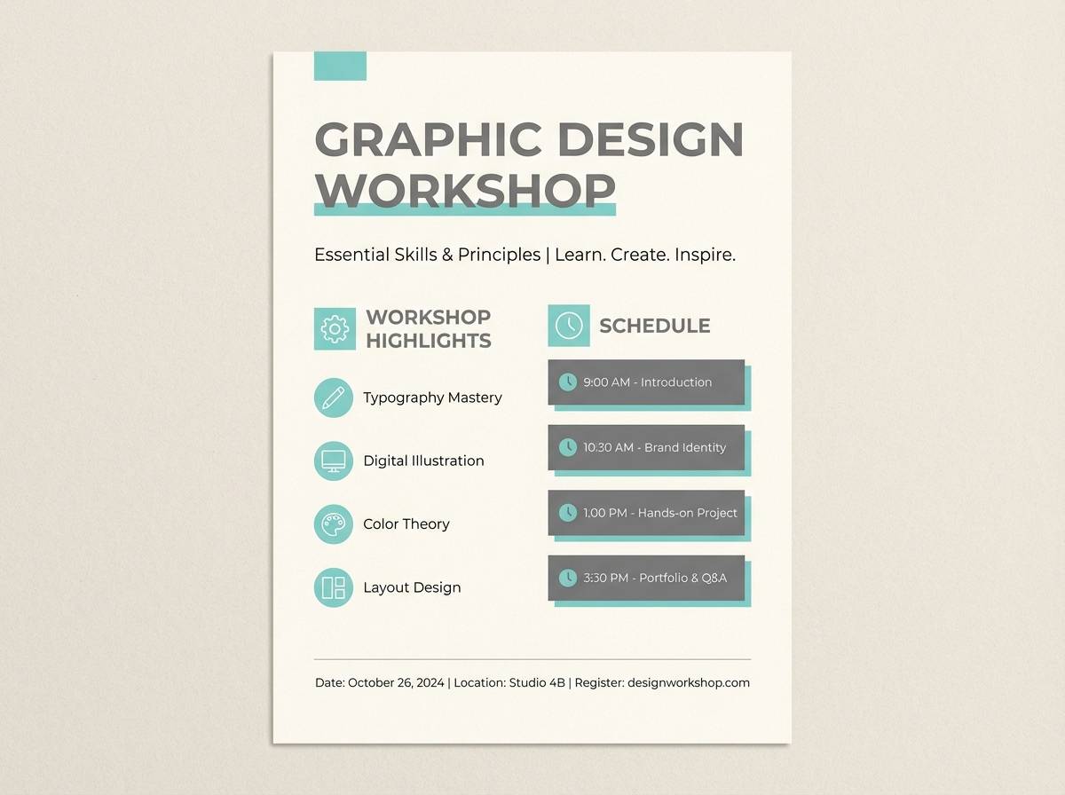
Creative and tidy, it feels like a sunlit studio with fabric swatches and neatly labeled drawers. The warm off-white keeps it friendly, while the turquoise adds a pop that still plays nicely with gray tools and metal surfaces. Use the darker shades for headers and outlines to keep layouts structured. Tip: add dashed lines or small icons in turquoise to guide steps in a workshop schedule.
Image example of craft studio generated using media.io
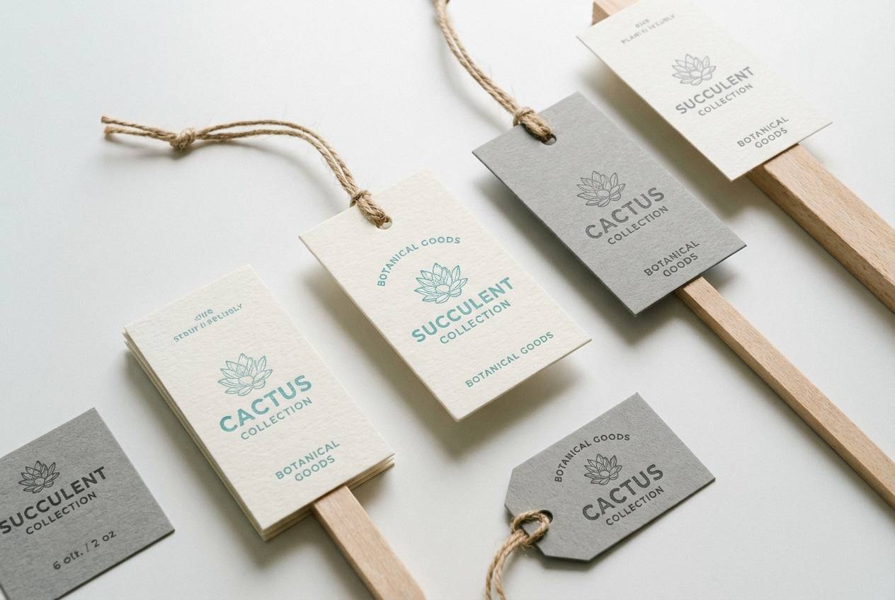
17) Winter Succulent
HEX: #203437 #3E6A6A #7DBDB2 #C8D0CE #F6F7F3
Mood: cool, botanical, soft
Best for: plant shop branding and labels
Cool and botanical, it brings to mind dusty succulents against frosted windows. The muted turquoise is perfect for accent stickers, price tags, and highlight banners without overwhelming product photos. Pair with natural kraft, soft beige, or sage for an earthy twist. Tip: keep the darkest tone for logo marks and small stamps so packaging stays light.
Image example of winter succulent generated using media.io
18) Luxe Hotel Lobby
HEX: #122A2F #2E535B #4F9B9C #AEBABC #F0ECE4
Mood: luxurious, mature, tranquil
Best for: hospitality branding and signage systems
Luxurious and tranquil, it evokes cool stone, velvet seating, and a soft turquoise glow at reception. Use the near-black teal for signage backgrounds and the mid turquoise for directional highlights and floor numbers. The warm off-white keeps wayfinding readable and prevents the scheme from feeling cold. Tip: choose brass or champagne metal accents to instantly elevate the cool tones.
Image example of luxe hotel lobby generated using media.io
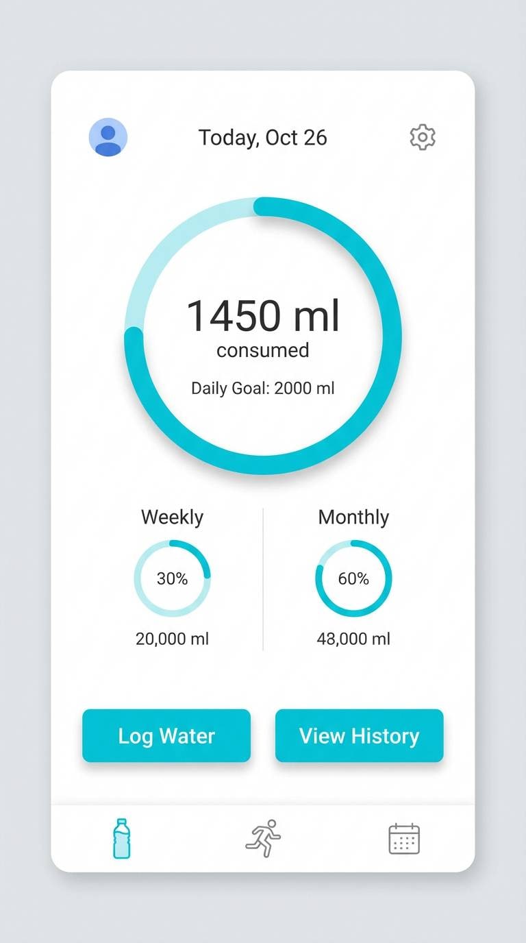
19) Minimal Dashboard

HEX: #1A2E33 #2E5961 #55A9A8 #C4CED0 #FBFBFA
Mood: minimal, sharp, efficient
Best for: fintech ui and admin panels
Minimal and sharp, it feels like a clean dashboard lit by cool monitor glow. This gray turquoise color palette is strong for fintech, where the turquoise can signal info and the grays keep the experience serious. Use the dark teal for navigation, then keep content cards near-white for clarity. Tip: pair turquoise accents with subtle shadow tokens instead of heavy borders to stay modern.
Image example of minimal dashboard generated using media.io

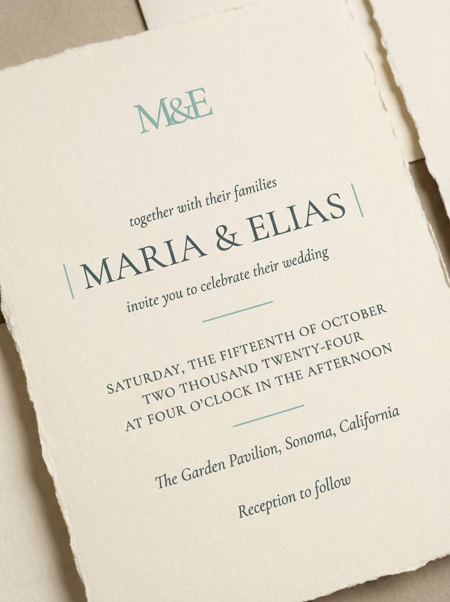
20) Sunset Over Bay
HEX: #223237 #3E646D #6AB7B2 #B9C0C1 #FFEFE0
Mood: soft, romantic, coastal
Best for: wedding invitations and save the dates
Soft and romantic, it suggests a pastel sunset reflected on calm bay water. Use the warm cream as the paper base, then set typography in deep teal-gray for elegance. The light turquoise works best for monograms, thin rules, and small icons like waves or shells. Tip: choose letterpress or subtle embossing to make the cool tones feel tactile and special.
Image example of sunset over bay generated using media.io
What Colors Go Well with Gray Turquoise?
Gray turquoise pairs naturally with clean neutrals like soft white, warm off-white, and light gray, which keep the look airy and reduce visual noise in rooms and interfaces.
For warmth and contrast, add sandy beige, terracotta, blush-peach, or light oak tones. These warm notes prevent the palette from feeling too cold while staying calm and modern.
For a sharper, more premium edge, combine gray turquoise with matte black, charcoal, brushed nickel, or brass accents—especially effective in signage systems, packaging, and UI headers.
How to Use a Gray Turquoise Color Palette in Real Designs
In interiors, use the deepest teal-gray for anchoring surfaces (feature wall, cabinetry, upholstery), then let pale gray and off-white carry the larger planes like walls, tile, and ceilings. Add turquoise in smaller repeats (pillows, towels, art) to keep it cohesive.
In branding, keep the lightest tone as your main background, use mid turquoise for highlights (icons, seals, benefits), and reserve the darkest shade for typography or logo marks. This creates a calm premium feel without sacrificing readability.
In UI, treat turquoise as an accent/state color: primary actions, progress, selected states, and info badges. Use grays for scaffolding (cards, borders, backgrounds) so the turquoise stays meaningful instead of decorative.
Create Gray Turquoise Palette Visuals with AI
If you already have HEX codes, you can generate consistent mockups by describing the scene and calling out where gray turquoise should appear (walls, UI buttons, labels, signage). The prompts above are designed to be copy-paste friendly.
To keep results on-brand, reuse the same prompt structure and only swap the palette name, context (room/UI/packaging), and the ratio tag. This helps you compare variations quickly before committing to a final direction.
When you like a result, generate a few alternatives with different lighting (soft daylight vs. studio) or materials (linen, concrete, brushed metal) to test how the palette behaves across real-world surfaces.
Gray Turquoise Color Palette FAQs
-
What is a gray turquoise color palette?
A gray turquoise color palette mixes muted turquoise/teal tones with neutral grays and whites, creating a calm, modern scheme that works well for rooms, branding, and UI. -
Is gray turquoise the same as teal?
Not exactly. Teal is often more saturated; gray turquoise is typically softened with gray, so it reads quieter, cooler, and more “neutral-friendly.” -
What undertones should I watch for with gray turquoise?
Some gray turquoises lean green (spa/eucalyptus) while others lean blue (glacier/nautical). Match undertone to your materials: warm woods like greener teals; chrome/steel often suits bluer teals. -
What’s the best accent color to pair with gray turquoise?
Warm accents like sand, beige, peach-cream, or brass add balance and keep the palette from feeling too cold. For a sharper look, use black or charcoal. -
How do I use gray turquoise in a UI without hurting accessibility?
Use turquoise mainly for buttons, focus states, and highlights, and keep body text in dark charcoal on light backgrounds. Always check contrast ratios for text and critical UI elements. -
Which gray turquoise palettes are best for bathrooms?
Nordic Spa and Quiet Clinic are strong choices because they combine clean whites and pale grays with muted turquoise, making tile, fixtures, and lighting feel fresh and intentional. -
Can I generate mockups for these palettes with AI?
Yes. Use Media.io’s text-to-image tool, paste one of the prompts, and adjust scene details (materials, lighting, layout) to match your brand or space.
Next: Sea Blue Color Palette


