

A beige blue color palette blends warm, comforting neutrals with clean, calming blues—making it one of the easiest combinations to live with and design around.
Below you’ll find 20 ready-to-use beige and blue palettes with HEX codes, plus practical tips for branding, interiors, and UI.
In this article
- Why Beige Blue Palettes Work So Well
-
- coastal linen
- misty harbor
- porcelain denim
- sandstone bay
- calm studio
- bluebell oat
- nordic shore
- vintage nautical
- cloudy riviera
- minimal museum
- soft tech ui
- desert sky
- lakehouse quiet
- winter dune
- modern heritage
- seaside wedding suite
- paper & ink editorial
- boutique packaging
- spring botanical wash
- kids room daydream
- What Colors Go Well with Beige Blue?
- How to Use a Beige Blue Color Palette in Real Designs
- Create Beige Blue Palette Visuals with AI
Why Beige Blue Palettes Work So Well
Beige brings warmth and approachability, while blue adds clarity and trust—so together they feel balanced instead of overly cool or overly creamy.
This pairing also gives you natural hierarchy: light beiges create breathable backgrounds, mid blues highlight actions and focal points, and deep navy tones anchor type and structure.
Because both colors appear constantly in nature (sand + sky, stone + water), beige blue tones read familiar and timeless across interiors, branding, and digital UI.
20+ Beige Blue Color Palette Ideas (with HEX Codes)
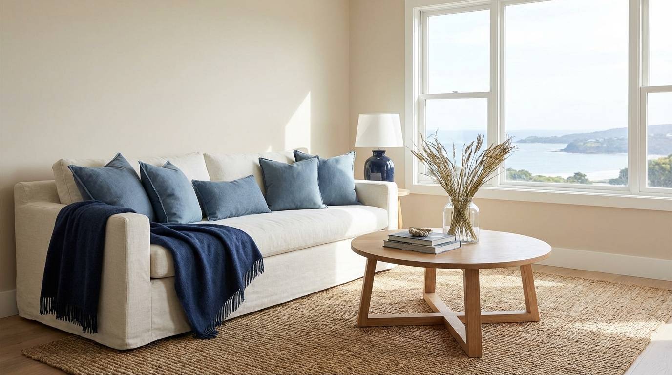
1) Coastal Linen
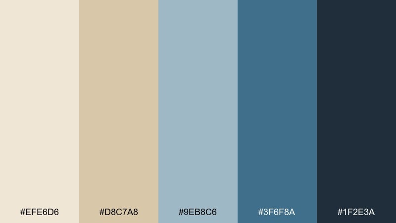
HEX: #EFE6D6 #D8C7A8 #9EB8C6 #3F6F8A #1F2E3A
Mood: airy, coastal, relaxed
Best for: living room interiors and beachy home decor
Airy and sun-washed, these tones feel like linen curtains and a breeze off the water. Use the light beiges for walls and large surfaces, then layer dusty blue in textiles and rugs. Bring in the deep navy for hardware, frames, or a single statement chair to keep it grounded. Usage tip: repeat the mid blue twice in the room for a cohesive, intentional look.
Image example of coastal linen generated using media.io
Media.io is an online AI studio for creating and editing video, image, and audio in your browser.

2) Misty Harbor
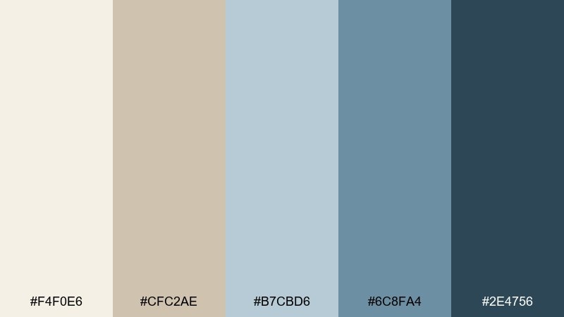
HEX: #F4F0E6 #CFC2AE #B7CBD6 #6C8FA4 #2E4756
Mood: misty, calm, reflective
Best for: branding for wellness, hotels, and spa retreats
Misty and quiet, it reads like fog over water and soft stone underfoot. Let the warm beige set the base, then use the pale blue as an open, breathable background for type. The slate blue works well for icons and dividers, while the deep blue-gray adds trust and structure. Usage tip: pair with uncoated paper textures and minimal line art for a premium feel.
Image example of misty harbor generated using media.io
3) Porcelain Denim
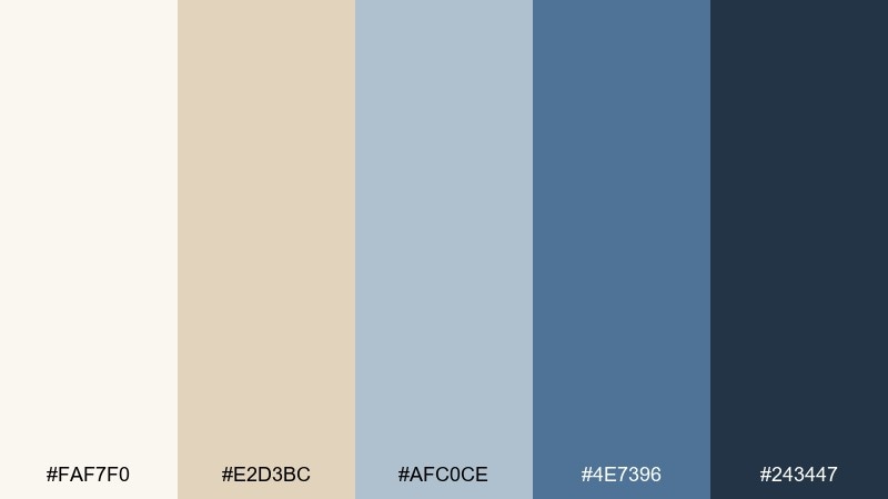
HEX: #FAF7F0 #E2D3BC #AFC0CE #4E7396 #243447
Mood: clean, polished, quietly modern
Best for: website headers and elegant product landing pages
Clean and polished, it evokes porcelain surfaces paired with well-worn denim. As a beige blue color scheme, it shines when you keep layouts spacious and let the mid blue carry interactive elements. Use the dark ink tone for headings and navigation to maintain contrast without harsh black. Usage tip: set buttons in #4E7396 and reserve #243447 for hover states and key labels.
Image example of porcelain denim generated using media.io
4) Sandstone Bay
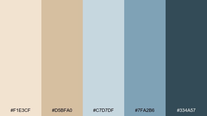
HEX: #F1E3CF #D5BFA0 #C7D7DF #7FA2B6 #334A57
Mood: sunlit, grounded, welcoming
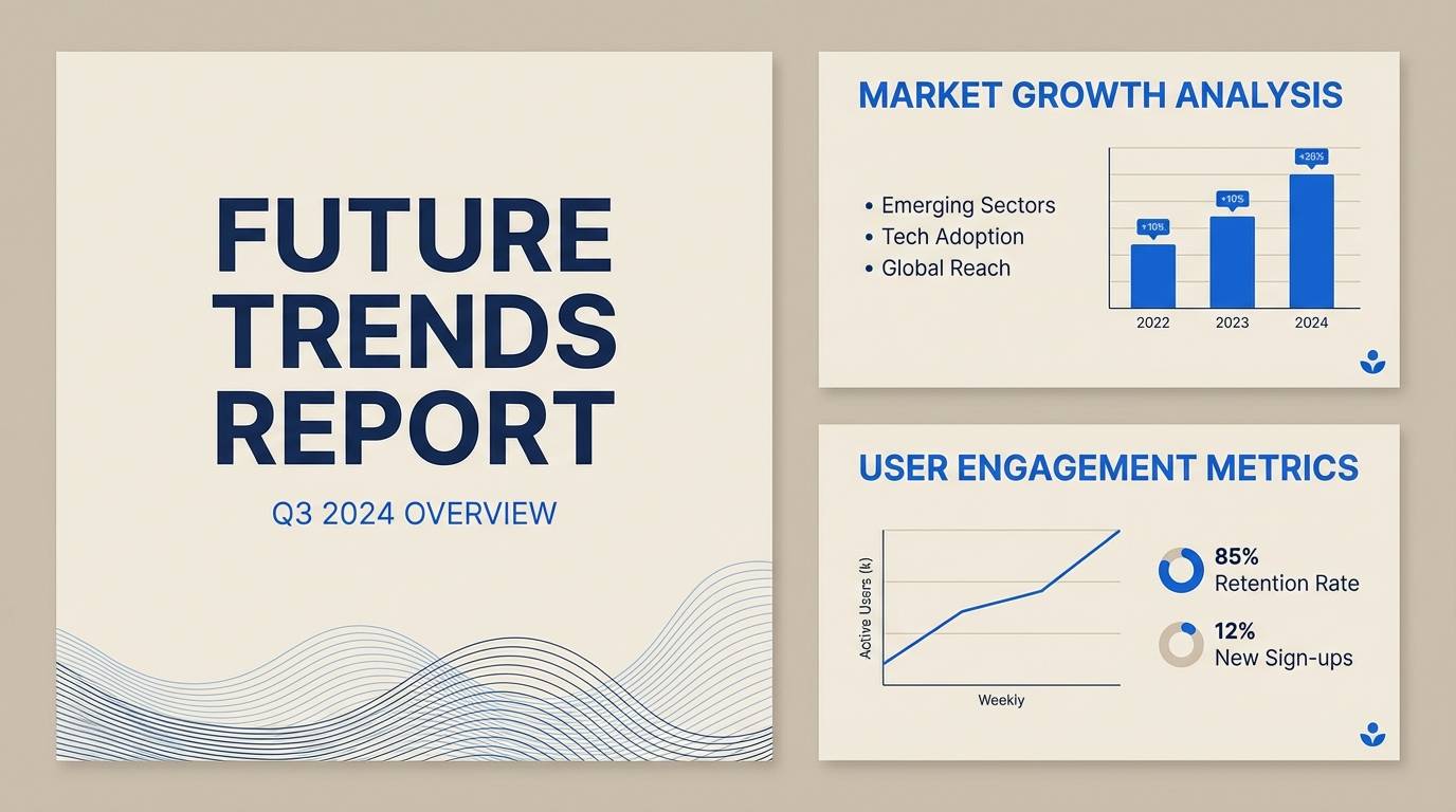
Best for: presentation templates and pitch decks
Sunlit and grounded, it feels like warm sandstone meeting a cool shoreline. Use the pale beige as the main slide canvas, then bring in soft blue for section breaks and charts. The deeper teal-blue is ideal for titles and data highlights without looking overly corporate. Usage tip: keep charts to two blues and use beige tones for gridlines to reduce visual noise.
Image example of sandstone bay generated using media.io
5) Calm Studio
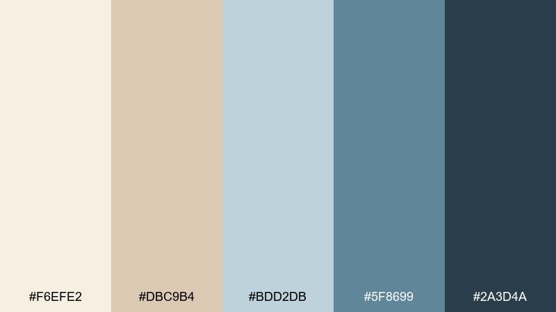
HEX: #F6EFE2 #DBC9B4 #BDD2DB #5F8699 #2A3D4A
Mood: soft, balanced, uncluttered
Best for: instagram templates and creator social posts
Soft and balanced, it brings to mind a tidy studio with daylight and neutral textiles. These beige blue color combinations work best with generous margins, simple shapes, and one bold accent per tile. Use the mid blue for headings and the deep blue-gray for small, high-contrast text. Usage tip: keep photos slightly warm so the beige stays cozy rather than gray.
Image example of calm studio generated using media.io

6) Bluebell Oat

HEX: #F7F1E6 #E0D0BA #D0DEE6 #8DB1C4 #3E5C6C
Mood: gentle, fresh, approachable
Best for: fashion lookbooks and boutique e-commerce
Gentle and fresh, it suggests oat milk neutrals with a hint of bluebell petals. The lighter tones create a soft backdrop for product photography, while the powder blue adds a clean editorial edge. Use the deeper steel tone for prices, links, and size selectors to keep everything legible. Usage tip: choose warm whites for backgrounds so the beige reads creamy, not yellow.
Image example of bluebell oat generated using media.io
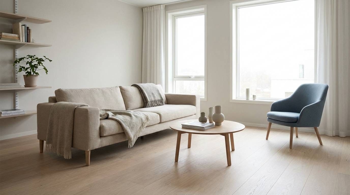
7) Nordic Shore
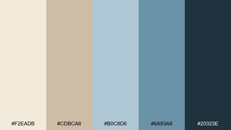
HEX: #F2EADB #CDBCA6 #B0C8D6 #6A93A8 #20323E
Mood: cool, minimal, serene
Best for: scandinavian interiors and minimalist decor
Cool and serene, it captures nordic light, pale timber, and a cold-blue horizon. A beige blue color palette like this feels best when you keep materials matte and textures subtle. Use the dark tone sparingly for contrast: lamp bases, picture rails, or a single built-in shelf. Usage tip: add one natural wood tone to prevent the blues from feeling too chilly.
Image example of nordic shore generated using media.io
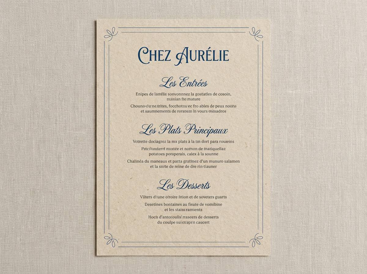
8) Vintage Nautical
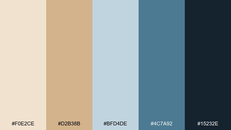
HEX: #F0E2CE #D2B38B #BFD4DE #4C7A92 #15232E
Mood: classic, maritime, confident
Best for: restaurant menus and cafe identity
Classic and maritime, it feels like aged rope, brass details, and deep ocean ink. Use the sandy tones for menu backgrounds to keep lighting-friendly readability, then place the mid blue on section headers and rules. The near-black navy is perfect for body text and small icons without looking harsh. Usage tip: pair with a serif headline font for a timeless nautical vibe.
Image example of vintage nautical generated using media.io
9) Cloudy Riviera
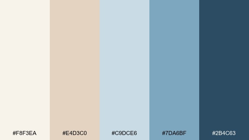
HEX: #F8F3EA #E4D3C0 #C9DCE6 #7DA6BF #2B4C63
Mood: romantic, breezy, sun-faded
Best for: travel posters and event promos
Romantic and breezy, it brings up cloudy mornings on the riviera and faded seaside signage. Let the pale beige dominate so the design stays light, then use the sky blue for big shapes and type highlights. The deep ocean blue anchors the composition and works well for dates, locations, and fine print. Usage tip: add grain or subtle halftone to make the palette feel vintage rather than sterile.
Image example of cloudy riviera generated using media.io

10) Minimal Museum
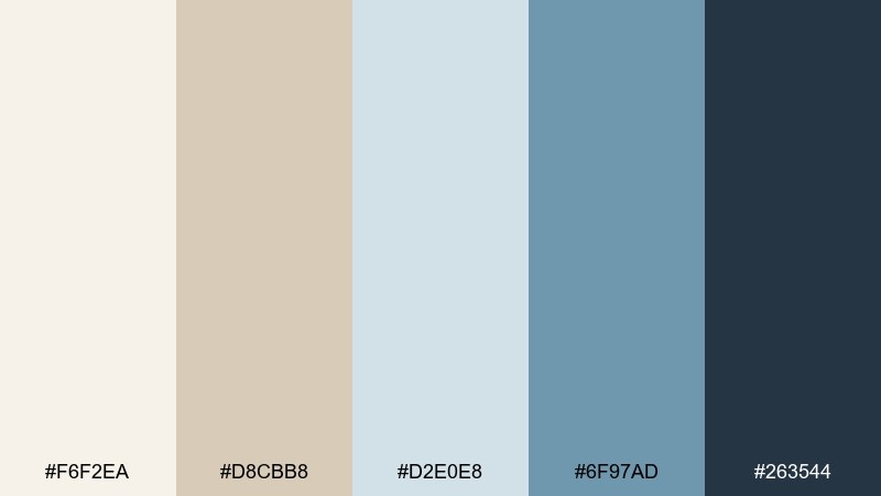
HEX: #F6F2EA #D8CBB8 #D2E0E8 #6F97AD #263544
Mood: quiet luxury, curated, spacious
Best for: portfolio sites and gallery-style web design
Quiet and curated, it resembles a museum wall with cool daylight spilling across frames. Use the warm beige for breathing room, then bring in the pale blue for panels and subtle hover areas. The darker blue-gray should carry navigation, captions, and thin rules to keep the grid crisp. Usage tip: limit accent usage to one key action per page for a premium, editorial feel.
Image example of minimal museum generated using media.io
11) Soft Tech UI

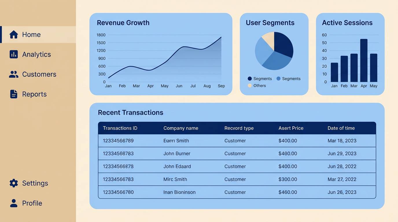
HEX: #F3EBDD #D7C6B0 #C2D7E6 #5D88A6 #223241
Mood: modern, friendly, reliable
Best for: saas dashboards and mobile-free web apps
Modern and friendly, it feels like a calm workspace where data is easy to scan. Use the pale tones for surfaces and cards, then reserve the mid blue for active states, selected tabs, and primary buttons. The dark blue is strong enough for headings and table text without jumping off the screen. Usage tip: keep error and success colors muted so they do not fight the blues.
Image example of soft tech ui generated using media.io
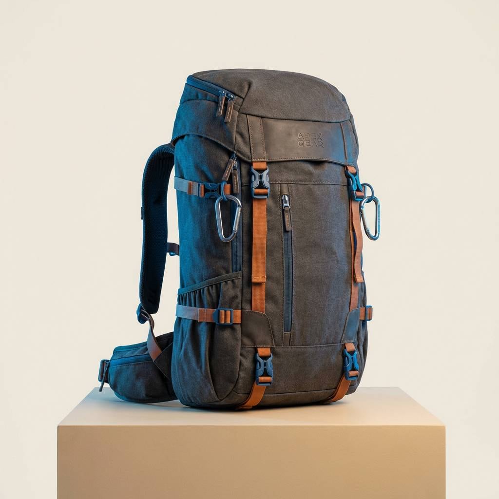
12) Desert Sky
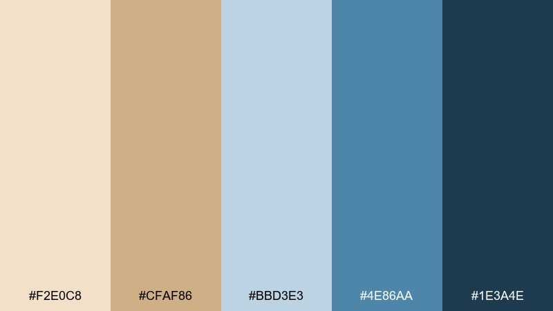
HEX: #F2E0C8 #CFAF86 #BBD3E3 #4E86AA #1E3A4E
Mood: adventurous, open-air, sunbaked
Best for: outdoor brand campaigns and product ads
Adventurous and open-air, it looks like desert sand under a clear blue sky. A beige blue color combination like this works well when you set beige as the hero background and use the brighter blue to pull attention to the product. Deep navy adds a rugged finish for logos, specs, and price callouts. Usage tip: keep the tan (#CFAF86) on secondary elements so the blues stay crisp.
Image example of desert sky generated using media.io
13) Lakehouse Quiet
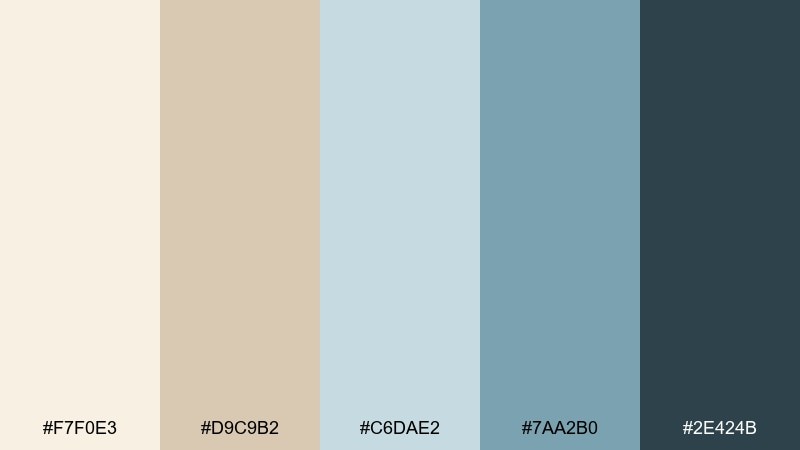
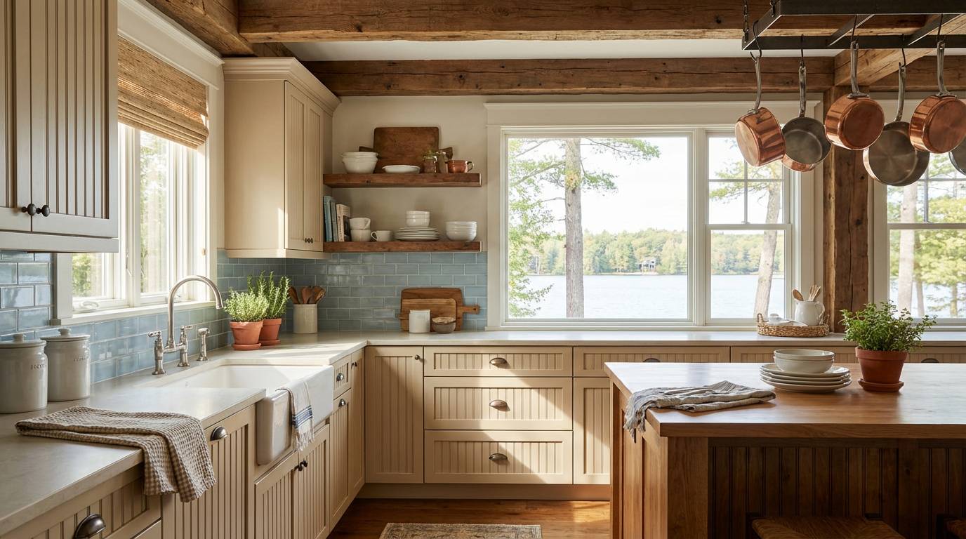
HEX: #F7F0E3 #D9C9B2 #C6DAE2 #7AA2B0 #2E424B
Mood: cozy, natural, slow
Best for: kitchen styling and cabin interiors
Cozy and slow, it evokes a lakehouse morning with warm wood and cool water outside the window. Use the creamy beige for cabinetry or backsplash surroundings, and bring in the gentle blues through paint, dishware, or textiles. The deep blue-gray is ideal for lighting fixtures or a small island to add depth. Usage tip: choose brushed metals over chrome to keep the mood soft.
Image example of lakehouse quiet generated using media.io
14) Winter Dune

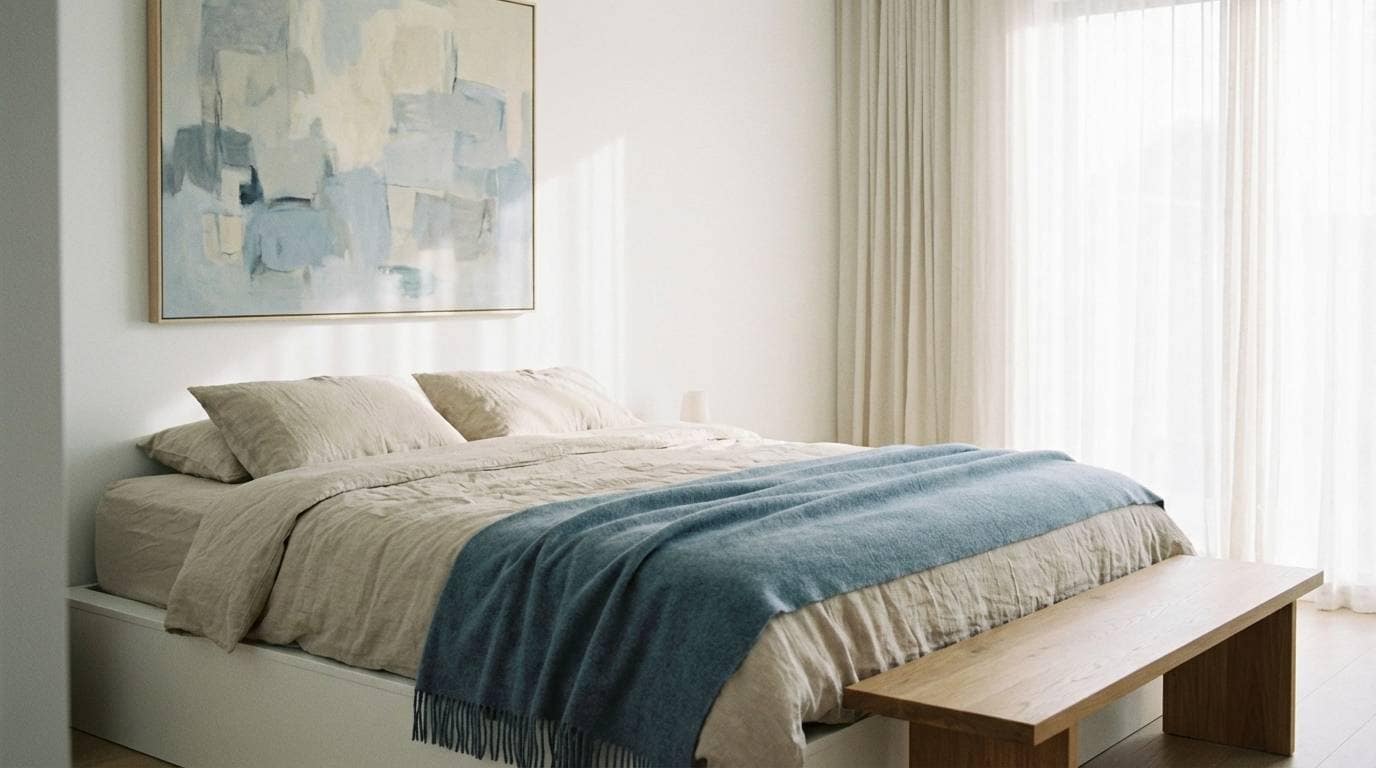
HEX: #F3EFE6 #D6CBBE #D3E1EA #8FB0C3 #2C3E4F
Mood: wintery, soft-focus, calming
Best for: bedroom palettes and serene interior refreshes
Wintery and calm, it feels like pale dunes under a cold, bright sky. Keep the lightest beige on walls and bedding to maximize softness, then add blue through throws, curtains, or artwork. The darker blue is best for a headboard, bedside table, or minimal wall trim to frame the room. Usage tip: introduce a single warm lamp glow so the blues do not read icy.
Image example of winter dune generated using media.io
15) Modern Heritage
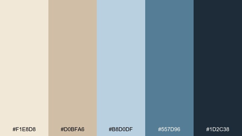
HEX: #F1E8D8 #D0BFA6 #B8D0DF #557D96 #1D2C38
Mood: heritage, tailored, refined
Best for: brand guidelines and corporate identity systems
Tailored and refined, it hints at heritage stationery with a contemporary edge. A beige blue color palette like this is strong for guidelines because it offers clear hierarchy from soft neutrals to confident navy. Use the mid blue for secondary headers and diagrams, and keep the deepest tone for logos and body copy. Usage tip: define one accent ratio, such as 70 beige, 25 light blue, 5 navy, and stick to it.
Image example of modern heritage generated using media.io
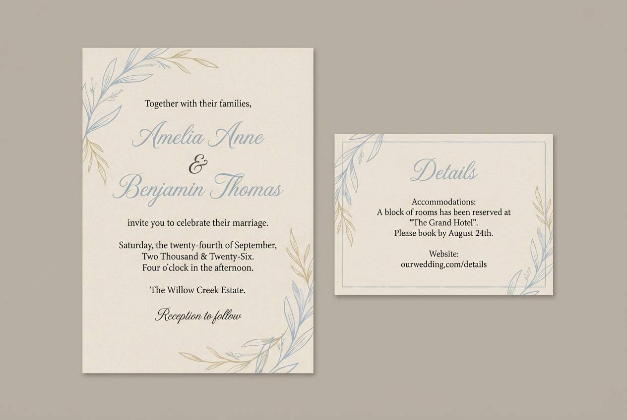
16) Seaside Wedding Suite
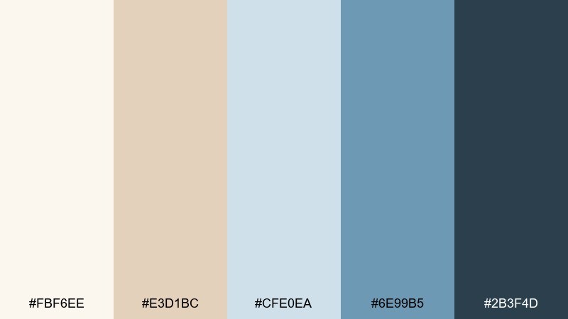
HEX: #FBF6EE #E3D1BC #CFE0EA #6E99B5 #2B3F4D
Mood: romantic, airy, elegant
Best for: wedding invitations and stationery sets
Romantic and airy, it brings up seashell neutrals and watercolor blue details. Use the light beige as the invitation base, then add pale blue for borders, monograms, or soft illustration fills. The deeper blue works beautifully for names and key info while staying gentler than black. Usage tip: print the beige on textured stock and keep blue ink slightly desaturated for a refined finish.
Image example of seaside wedding suite generated using media.io
17) Paper & Ink Editorial
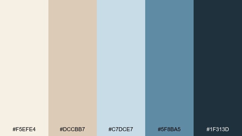
HEX: #F5EFE4 #DCCBB7 #C7DCE7 #5F8BA5 #1F313D
Mood: editorial, thoughtful, premium
Best for: magazine spreads and blog layouts
Editorial and premium, it resembles warm paper with cool ink washes. Use the cream and sand tones for columns and margins, then let the lighter blue support pull quotes and section markers. The deep ink shade keeps long-form text comfortable to read while feeling more bespoke than pure black. Usage tip: pair with a high-contrast serif for headlines and a simple sans for captions.
Image example of paper & ink editorial generated using media.io
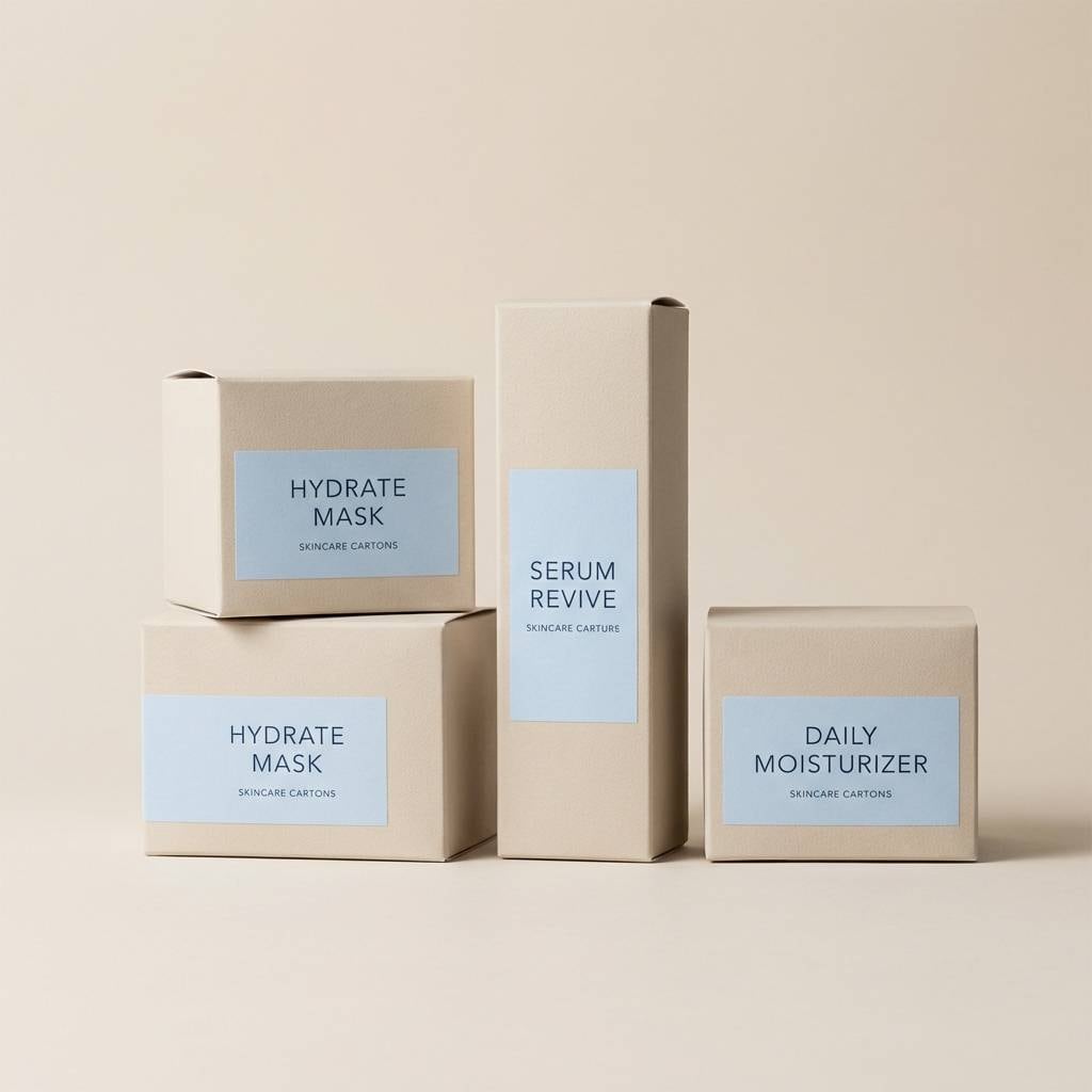
18) Boutique Packaging
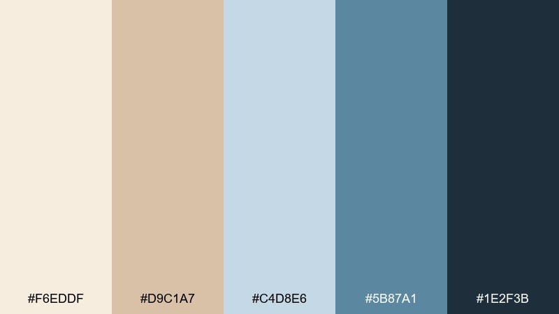
HEX: #F6EDDF #D9C1A7 #C4D8E6 #5B87A1 #1E2F3B
Mood: boutique, clean, trustworthy
Best for: skincare packaging and ecommerce product pages
Boutique and clean, it suggests soft-touch packaging with crisp blue labeling. These beige blue color combinations are especially effective for skincare because the palette reads gentle yet clinical enough to trust. Use beige for the carton base, light blue for ingredient panels, and the darkest tone for product names and dosage details. Usage tip: add a small metallic foil stamp only on the darkest blue to keep the look minimal.
Image example of boutique packaging generated using media.io
19) Spring Botanical Wash
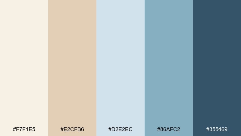
HEX: #F7F1E5 #E2CFB6 #D2E2EC #86AFC2 #355469
Mood: fresh, delicate, nature-led
Best for: botanical prints and seasonal campaign art
Fresh and delicate, it feels like a spring watercolor wash on textured paper. Use the pale beige as negative space, then layer the light blues as gentle shadows and petals. The deeper blue provides definition for stems, outlines, or small type without overpowering the illustration. Usage tip: keep edges soft and let colors overlap slightly for a natural painted look.
Image example of spring botanical wash generated using media.io
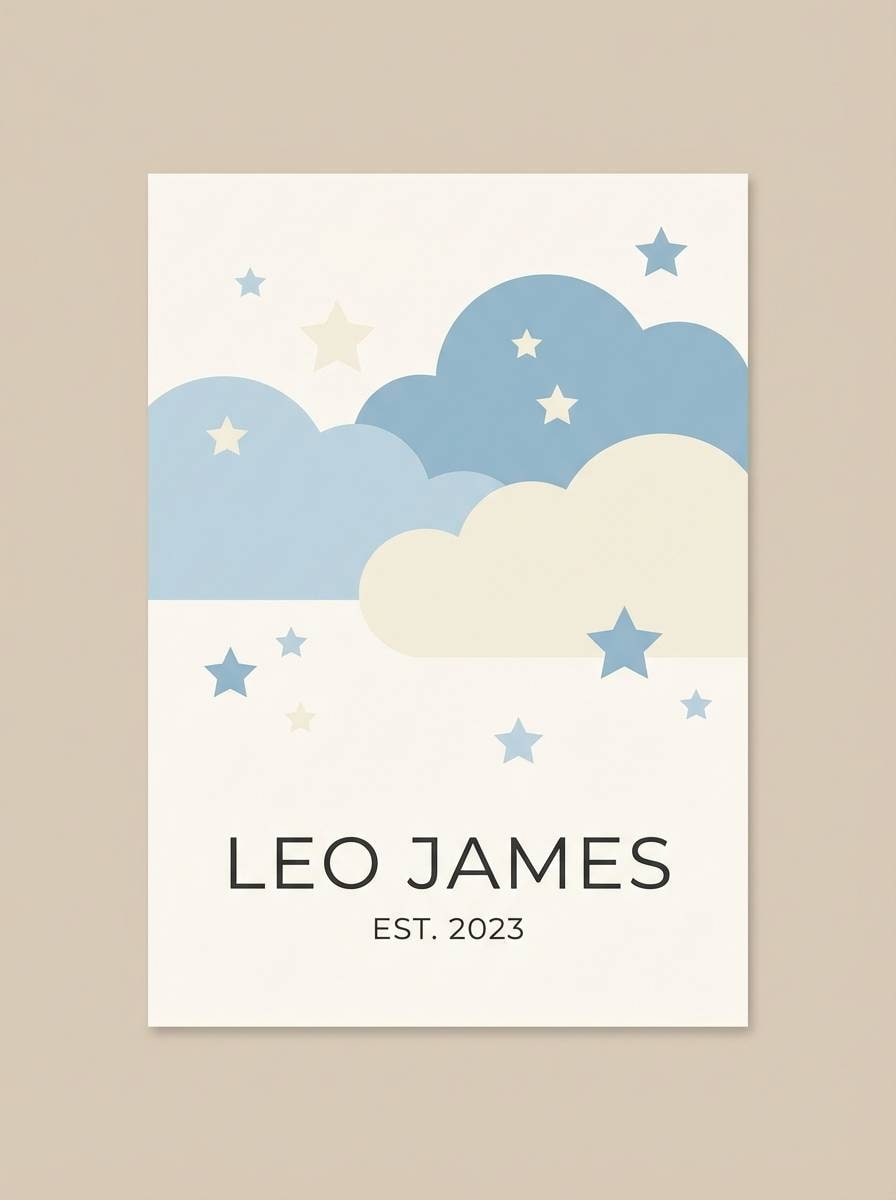
20) Kids Room Daydream
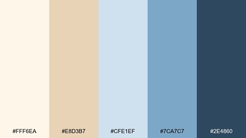
HEX: #FFF6EA #E8D3B7 #CFE1EF #7CA7C7 #2E4860
Mood: playful, soothing, storybook
Best for: nursery wall art and kids room decor
Playful and soothing, it reads like storybook clouds with sandy warmth underneath. Use the warm beige as the main background so the room stays cozy, then bring in the soft blues for stars, shapes, or name lettering. The darker blue adds clarity for outlines and small details that need to hold up from a distance. Usage tip: keep contrast high for readability while keeping illustrations simple and rounded.
Image example of kids room daydream generated using media.io
What Colors Go Well with Beige Blue?
Beige and blue pair beautifully with warm whites, natural wood tones, and soft grays—these keep the palette airy and prevent the blues from feeling too cold.
For a more elevated look, add muted metallics like brushed brass or champagne gold; they echo beige warmth while complementing deeper navies.
If you want a modern contrast, introduce a small amount of terracotta, clay, or caramel. Used sparingly, these warm accents make neutral blue colors feel more dynamic.
How to Use a Beige Blue Color Palette in Real Designs
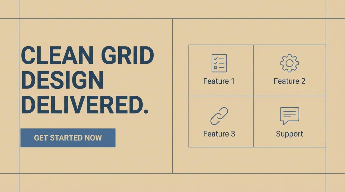
Start with beige as your primary surface color (backgrounds, walls, large UI containers), then use light blue for secondary areas like cards, panels, or soft sections.
Assign mid blues to functional emphasis—buttons, links, icons, and chart highlights—so the interface or layout feels clear without relying on harsh black accents.
Reserve the darkest blue-gray or navy for structure: headings, navigation, dividers, and key frames. This creates readable contrast while keeping the overall mood calm and cohesive.
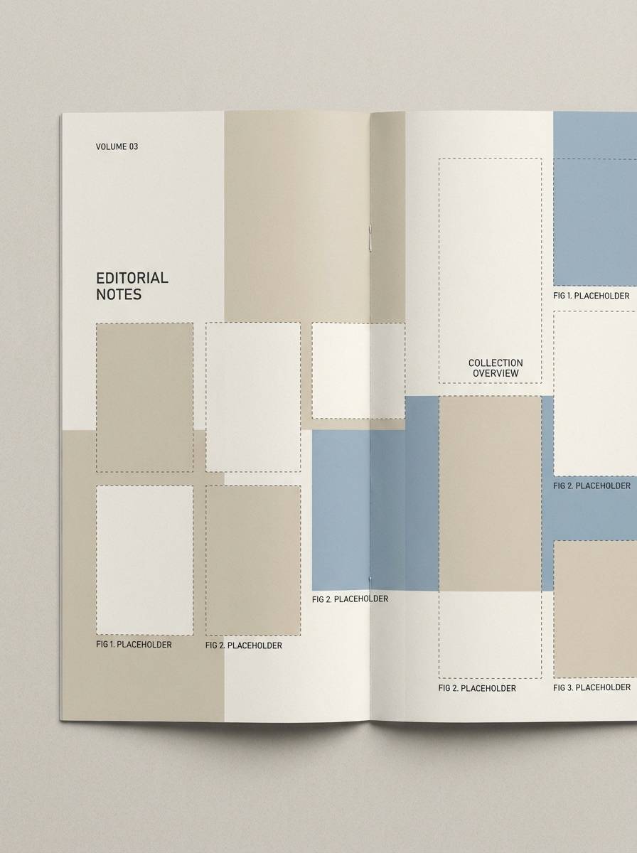
Create Beige Blue Palette Visuals with AI
If you need quick mockups for a mood board, a landing page hero, or an interior concept, generating visuals from a prompt is a fast way to test how beige blue tones behave in real scenes.
With Media.io’s Text to Image, you can paste a prompt (like the examples above), adjust aspect ratio, and iterate until the lighting and textures match your project.
Once you have a look you like, reuse the same palette in multiple scenes to keep brand and design consistency across your set.
Beige Blue Color Palette FAQs
-
What does a beige blue color palette communicate?
It typically communicates calm, reliability, and comfort. Beige adds warmth and softness, while blue adds clarity and trust—so the overall feel is balanced and approachable. -
Is beige and blue a good combination for websites and UI?
Yes. Beige works well as a low-glare background, and mid-to-deep blues can define buttons, links, and navigation with strong readability and a modern, friendly tone. -
How do I keep beige from looking yellow next to blue?
Use creamy, slightly desaturated beiges (not saturated golden tones), and pair them with muted or dusty blues. Testing the combo on different screens and lighting conditions also helps. -
What accent colors work best with beige blue?
Great accents include terracotta/clay, caramel, sage/olive, and brushed brass. Keep accents small (often 5–10%) so they enhance the palette rather than compete with the blues. -
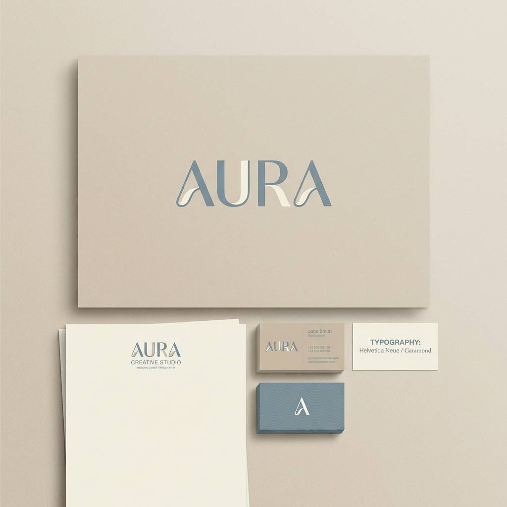
Which beige blue palette is best for branding?
Options like Misty Harbor or Modern Heritage are strong for branding because they offer clear hierarchy: soft neutrals for backgrounds, mid blues for secondary elements, and dark blue-gray for logos and typography. -
Can I use beige blue tones for interiors without making a room feel cold?
Yes—choose warm beiges for large surfaces, add natural textures (linen, jute, wood), and use blue mainly in textiles or smaller painted areas. Warm lighting also keeps the mood cozy. -
What’s the easiest way to preview a beige blue palette in real scenes?
Generate quick concept images (rooms, posters, UI mockups) using AI prompts, then refine the prompt and ratio until the colors and materials match your intended style.


