

Gray and maroon is a modern classic: cool neutrals keep layouts clean, while wine-red depth adds emotion, focus, and brand character.
Below are gray maroon color palette ideas with ready-to-use HEX codes, plus real design prompts you can run in Media.io to generate matching visuals.
In this article
- Why Gray Maroon Palettes Work So Well
-
- slate vineyard
- foggy merlot
- heritage library
- concrete rosewood
- winter wine
- modern bistro
- dusty garnet
- ash and plum
- charcoal cranberry
- misty burgundy
- boutique velvet
- industrial cabernet
- stonewall sangria
- soft hearth
- gallery night
- linen and claret
- urban brick and smoke
- minimal marsala ui
- rustic cellar
- bridal mauve gray
- What Colors Go Well with Gray Maroon?
- How to Use a Gray Maroon Color Palette in Real Designs
- Create Gray Maroon Palette Visuals with AI
Why Gray Maroon Palettes Work So Well
Gray brings structure, balance, and readability, making it a dependable base for backgrounds, typography, and UI surfaces. Maroon adds contrast and sophistication without the harshness of bright red.
Together, they create a “premium but approachable” look that works across branding, print, and digital. You can go dramatic with charcoal + wine, or airy with misty grays + muted burgundy.
This pairing is also easy to scale: keep grays dominant for calm, then reserve maroon for focal points like headlines, buttons, labels, and hero accents.
20+ Gray Maroon Color Palette Ideas (with HEX Codes)
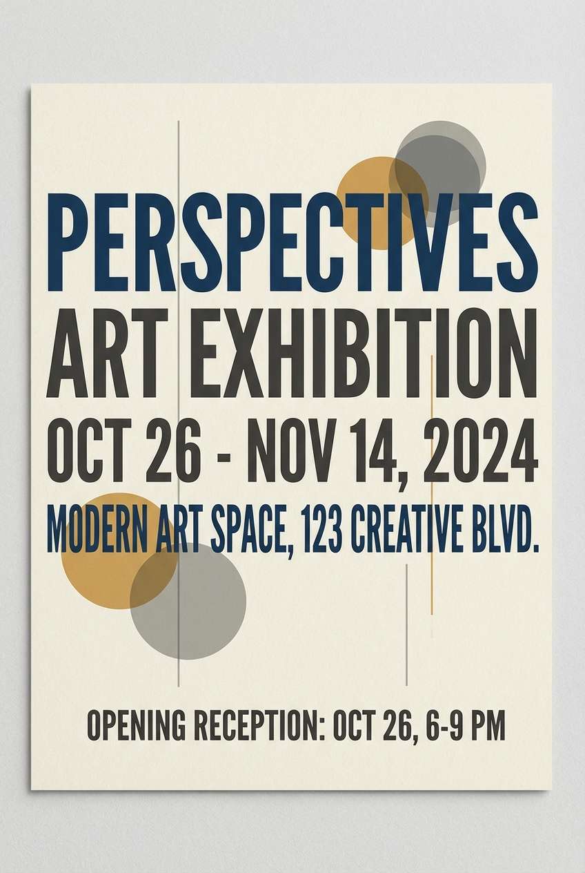
1) Slate Vineyard
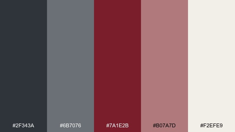
HEX: #2f343a #6b7076 #7a1e2b #b07a7d #f2efe9
Mood: moody, refined, editorial
Best for: fashion lookbooks, premium branding, editorial layouts
Moody slate and deep wine tones feel like dusk over a vineyard and a well-worn leather chair. Use the maroon as a headline or hero accent, then let the grays carry the structure. Pair with off-white space to keep the design breathable and upscale. Tip: reserve the blush tone for small highlights like pull quotes or badges.
Image example of slate vineyard generated using media.io
Media.io is an online AI studio for creating and editing video, image, and audio in your browser.

2) Foggy Merlot
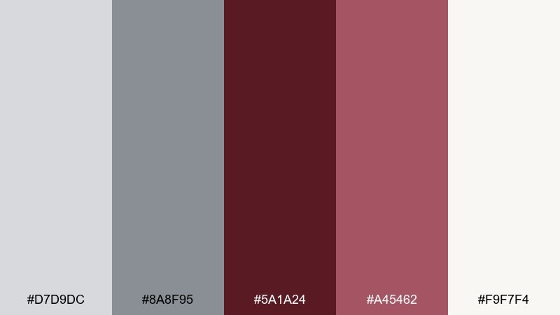
HEX: #d7d9dc #8a8f95 #5a1a24 #a45462 #f9f7f4
Mood: soft, romantic, calm
Best for: wedding stationery, beauty packaging, lifestyle blogs
Soft fog grays with merlot and rose read like a quiet morning and a glass of red at brunch. Lean on the pale neutrals for backgrounds and keep the dark wine for type and fine lines. Pair with warm paper textures or subtle grain to make it feel tactile. Tip: use the muted rose as a unifying color for icons and dividers.
Image example of foggy merlot generated using media.io
3) Heritage Library
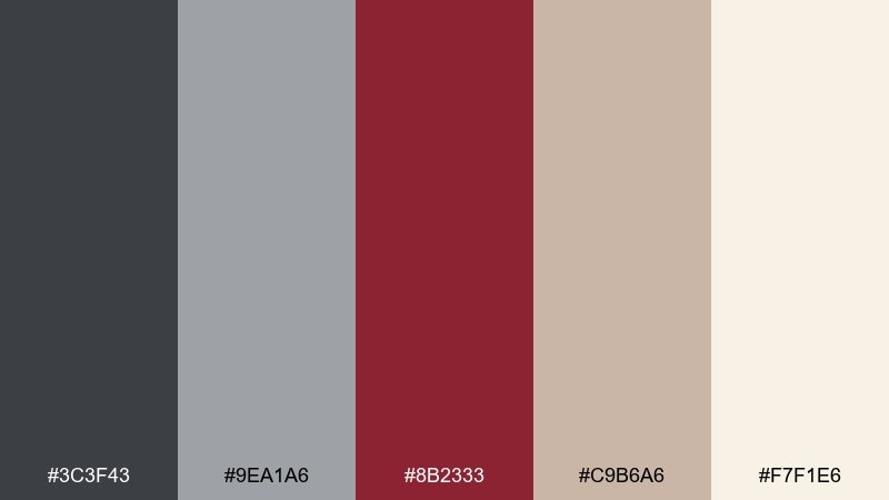
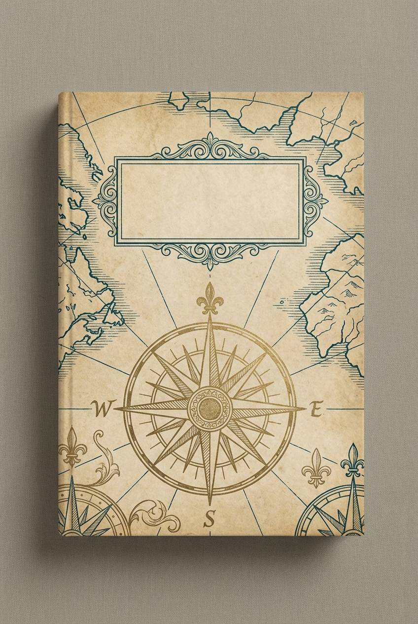
HEX: #3c3f43 #9ea1a6 #8b2333 #c9b6a6 #f7f1e6
Mood: classic, scholarly, warm
Best for: book covers, museums, boutique cafés
Classic and bookish, these tones evoke mahogany shelves, aged paper, and quiet reading rooms. A gray maroon color palette like this shines in typography-heavy designs where contrast matters. Pair the parchment-like cream with textured backgrounds and keep the maroon for titles, seals, or crest elements. Tip: use the tan as a soft bridge between the cool gray and rich wine.
Image example of heritage library generated using media.io
4) Concrete Rosewood
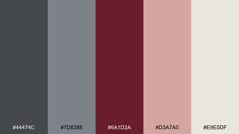
HEX: #44474c #7d8288 #6a1d2a #d3a7a0 #e9e5df
Mood: urban, grounded, modern
Best for: architecture portfolios, interior moodboards, product landing pages
Grounded grays and rosewood maroon feel like concrete walls warmed by wood grain. Use the deep red-brown for key CTAs or section headers, while the mid-grays keep layouts clean and architectural. Pair with matte black icons for a crisp, modern edge. Tip: keep the blush tone to one or two components so it reads intentional, not sweet.
Image example of concrete rosewood generated using media.io
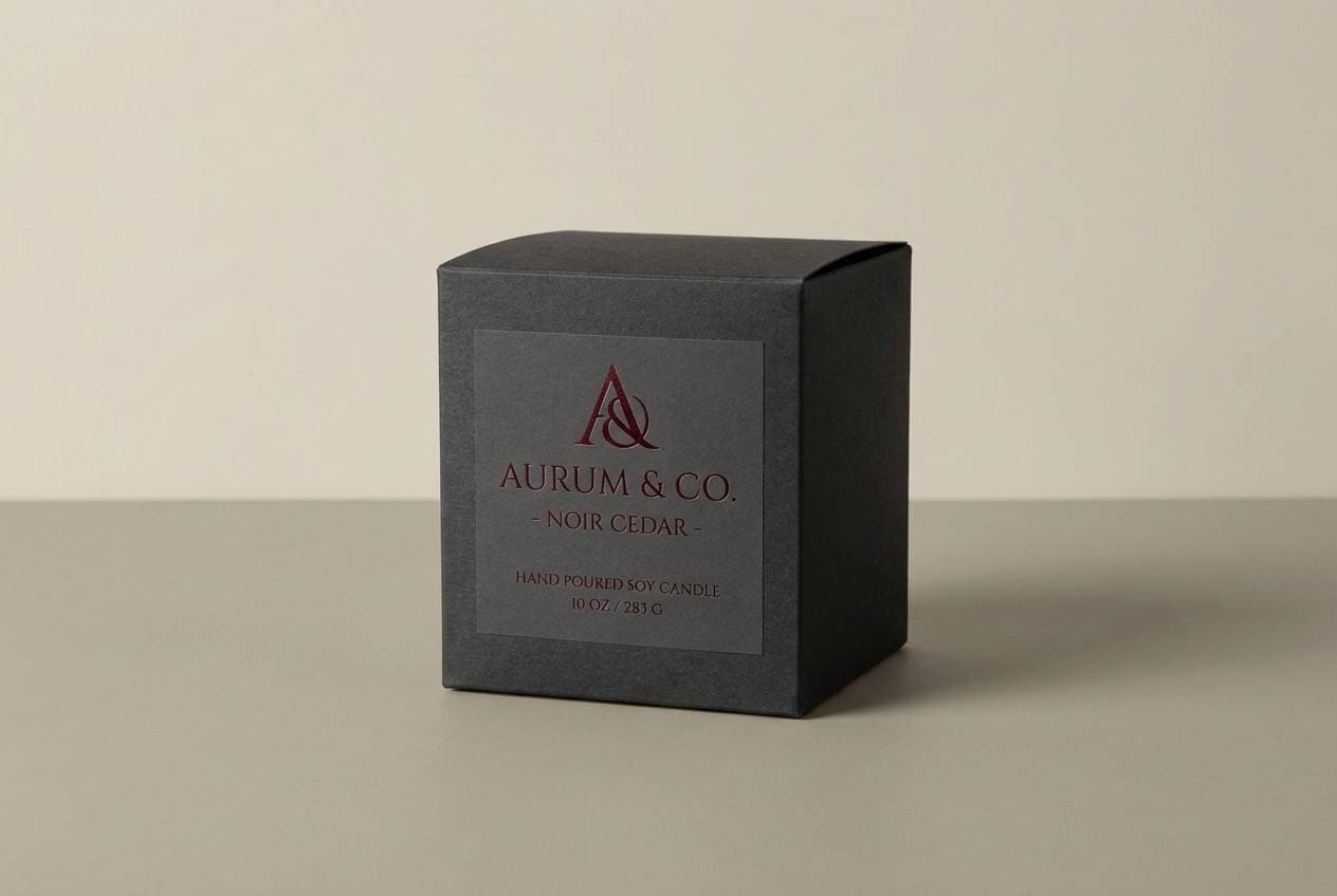
5) Winter Wine
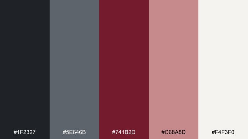
HEX: #1f2327 #5e646b #741b2d #c68a8d #f4f3f0
Mood: dramatic, cozy, premium
Best for: holiday campaigns, candle labels, upscale events
Dark charcoal and winter wine tones evoke a cozy night with velvet curtains and soft candlelight. Let the near-black shade handle backgrounds or hero sections, then layer maroon for focal points. Pair with warm off-white to keep text readable and elegant. Tip: add the dusty pink only as a secondary accent for ribbons, tags, or small illustrations.
Image example of winter wine generated using media.io
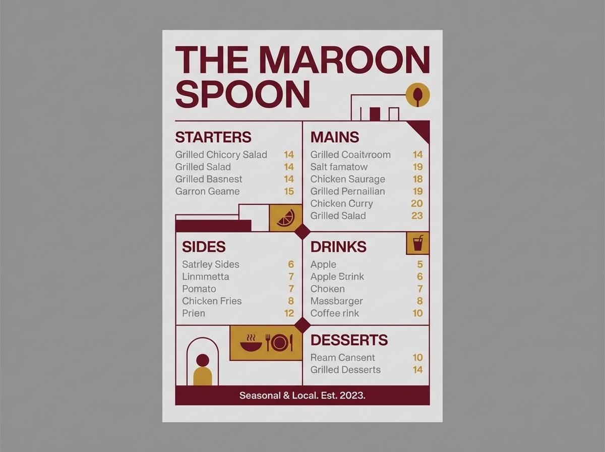
6) Modern Bistro
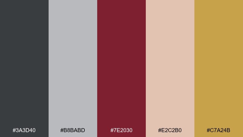
HEX: #3a3d40 #b8babd #7e2030 #e2c2b0 #c7a24b
Mood: inviting, stylish, energetic
Best for: restaurant menus, food brands, social promos
Inviting and stylish, this mix feels like a modern bistro with brushed metal, warm lighting, and a bold wine list. The mustard accent adds snap to gray maroon color combinations, especially for prices, icons, and callouts. Pair the blush with food photography to soften the contrast and keep the layout approachable. Tip: use mustard at under 10 percent so it stays a signature accent, not the main act.
Image example of modern bistro generated using media.io
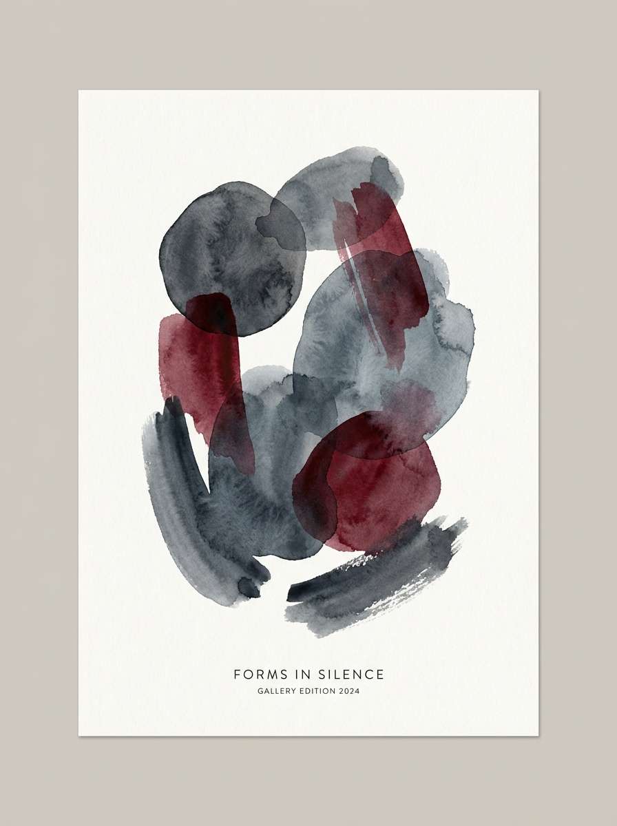
7) Dusty Garnet
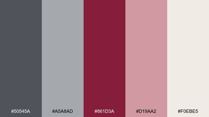
HEX: #50545a #a5a8ad #861d3a #d19aa2 #f0ebe5
Mood: soft, artistic, balanced
Best for: portfolio sites, art prints, handmade goods
Soft grays with dusty garnet and blush evoke watercolor washes and muted florals. Use garnet for anchors like buttons or headings, then let the pale neutrals do the heavy lifting in the background. Pair with natural paper textures or subtle brush patterns for an artisanal feel. Tip: keep body text in the darker gray for comfort and readability.
Image example of dusty garnet generated using media.io
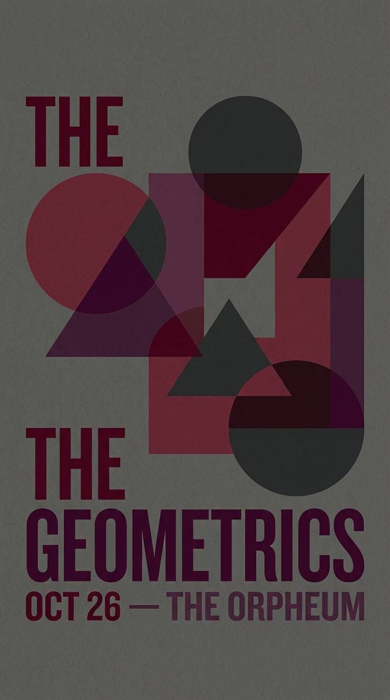
8) Ash and Plum
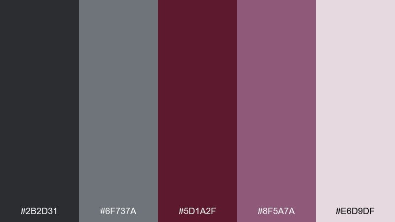
HEX: #2b2d31 #6f737a #5d1a2f #8f5a7a #e6d9df
Mood: mysterious, luxe, creative
Best for: music posters, boutique branding, nightlife promos
Mysterious ash and plum tones feel like backstage lights and satin fabric. Use the plum shade for secondary accents when maroon feels too direct, especially in gradients or overlays. Pair with charcoal backgrounds to make typography pop without harsh contrast. Tip: try a subtle plum-to-maroon gradient for headers to add depth without clutter.
Image example of ash and plum generated using media.io
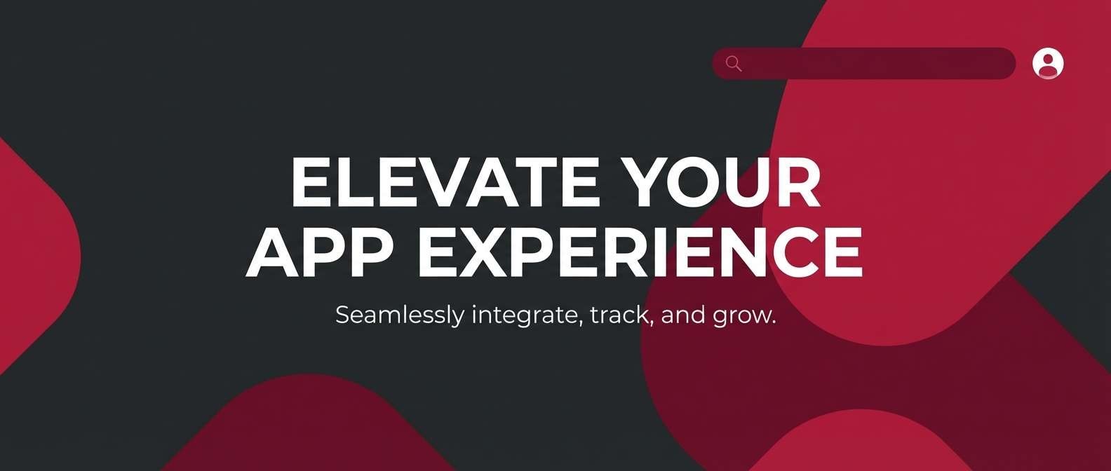
9) Charcoal Cranberry
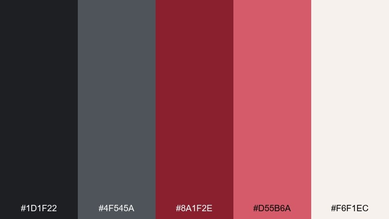
HEX: #1d1f22 #4f545a #8a1f2e #d55b6a #f6f1ec
Mood: bold, cinematic, confident
Best for: app marketing, sports branding, statement web headers
Bold charcoal and cranberry evoke cinematic title cards and crisp winter air. A gray maroon color scheme works best here when cranberry is treated as a punchy accent against deep neutrals. Pair with lots of cream space to keep the palette from feeling heavy. Tip: use cranberry for hover states and micro-interactions to create a premium feel.
Image example of charcoal cranberry generated using media.io
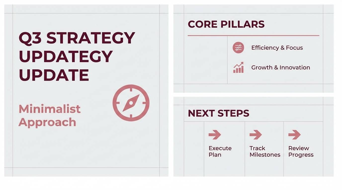
10) Misty Burgundy
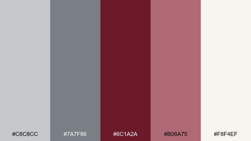
HEX: #c6c8cc #7a7f86 #6c1a2a #b06a75 #f8f4ef
Mood: airy, polished, contemporary
Best for: wellness brands, minimalist presentations, blog themes
Airy grays with burgundy and muted rose feel like mist over stone and a soft cashmere scarf. Use the light gray as a primary background to keep pages bright, then add burgundy for structure and emphasis. Pair with clean sans-serif typography and generous spacing for a calm, modern look. Tip: keep rose for subtle charts, tags, or secondary buttons.
Image example of misty burgundy generated using media.io
11) Boutique Velvet
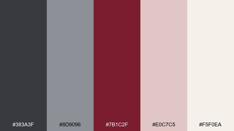
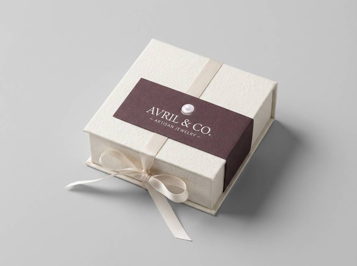
HEX: #383a3f #8d9096 #7b1c2f #e0c7c5 #f5f0ea
Mood: elegant, soft, luxurious
Best for: boutique logos, jewelry packaging, beauty UI
Elegant velvet tones suggest a boutique fitting room, soft lighting, and refined details. The gray maroon color palette feels especially premium when maroon is used for logomarks and the blush becomes a background wash. Pair with thin lines, small caps, and minimal ornamentation to keep it modern. Tip: foil or spot-gloss effects on maroon elements elevate the look instantly.
Image example of boutique velvet generated using media.io
12) Industrial Cabernet
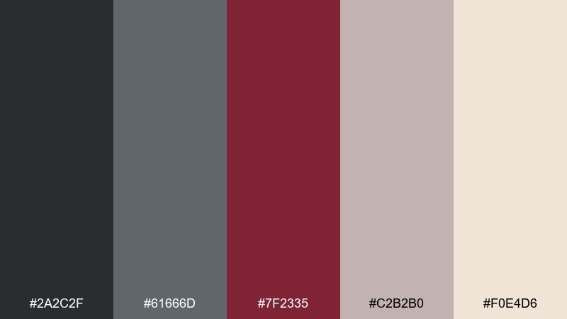
HEX: #2a2c2f #61666d #7f2335 #c2b2b0 #f0e4d6
Mood: industrial, serious, confident
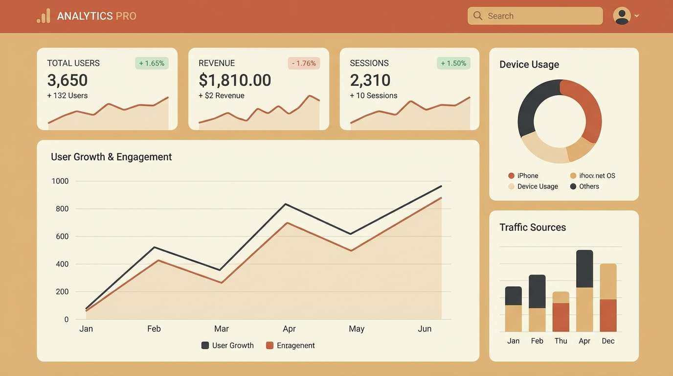
Best for: tech case studies, B2B sites, data dashboards
Industrial grays with cabernet feel like brushed steel and a confident red accent on machinery. Use the darkest gray for navigation and the maroon for active states so users always know where to look. Pair with warm cream backgrounds for long-form readability and less glare. Tip: keep charts mostly neutral and reserve maroon for one key series to avoid visual noise.
Image example of industrial cabernet generated using media.io
13) Stonewall Sangria
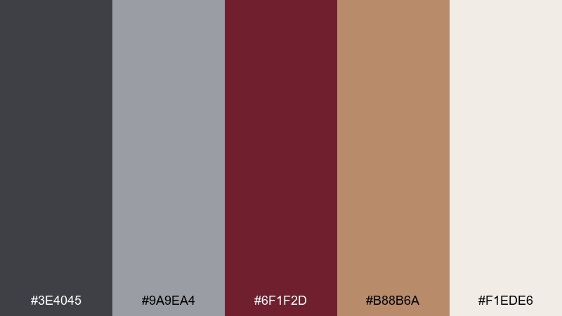
HEX: #3e4045 #9a9ea4 #6f1f2d #b88b6a #f1ede6
Mood: earthy, mature, welcoming
Best for: home decor brands, furniture catalogs, artisan goods
Earthy stone grays with sangria and tan evoke limestone walls, clay pottery, and a warm kitchen table. Use tan for supporting blocks and captions to soften the overall contrast. Pair with natural photography and warm lighting to keep the palette feeling human. Tip: use sangria on small labels and category chips for a subtle, upscale cue.
Image example of stonewall sangria generated using media.io
14) Soft Hearth
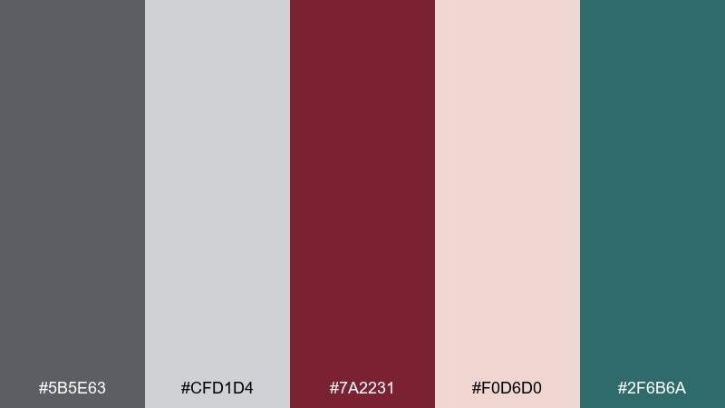
HEX: #5b5e63 #cfd1d4 #7a2231 #f0d6d0 #2f6b6a
Mood: cozy, modern, inviting
Best for: interior design moodboards, cozy brands, seasonal promos
Cozy hearth vibes come through with warm maroon, soft blush, and a surprising teal ember. This gray maroon color combination benefits from using teal as a tiny accent in icons, stitches, or small illustrations. Pair the light gray with lots of negative space for a calm, hygge-inspired layout. Tip: keep maroon for the largest color blocks to anchor the palette and prevent the teal from stealing focus.
Image example of soft hearth generated using media.io
15) Gallery Night
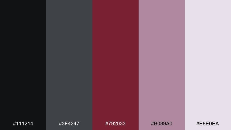
HEX: #111214 #3f4247 #792033 #b089a0 #e8e0ea
Mood: dramatic, artistic, upscale
Best for: art gallery posters, event tickets, luxury newsletters
Dramatic and artistic, these tones feel like a gallery opening after dark with spotlit frames. Use the near-black for bold backgrounds and let maroon carry titles and key details. Pair with pale lavender-gray for breathing room and a contemporary edge. Tip: try oversized typography in cream to keep the composition readable from a distance.
Image example of gallery night generated using media.io
16) Linen and Claret
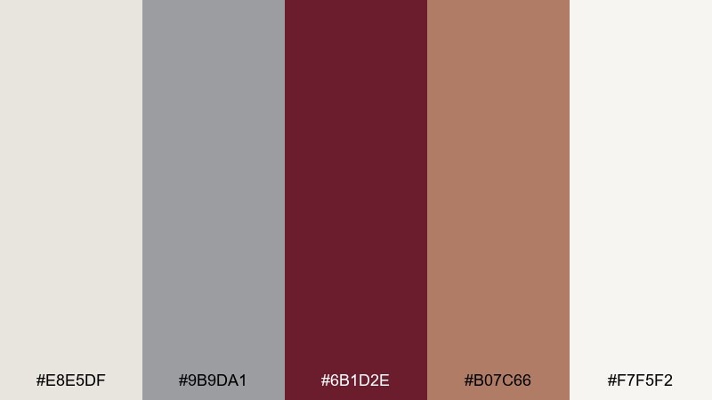
HEX: #e8e5df #9b9da1 #6b1d2e #b07c66 #f7f5f2
Mood: light, natural, sophisticated
Best for: skincare brands, minimalist packaging, calm websites
Light linen neutrals with claret and warm clay feel like a sunlit studio and natural textiles. Use claret sparingly on labels and buttons for a refined, not heavy, look. Pair with subtle shadows and soft corners to keep layouts gentle. Tip: keep the warm clay for secondary sections so the palette stays airy.
Image example of linen and claret generated using media.io
17) Urban Brick and Smoke
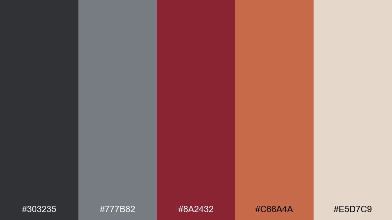
HEX: #303235 #777b82 #8a2432 #c66a4a #e5d7c9
Mood: gritty, warm, street-smart
Best for: coffee roasters, streetwear, creative studios
Gritty smoke grays with brick and wine tones evoke city alleys, warm neon, and handmade signage. Gray maroon color combinations get extra character here thanks to the brick accent, which works well for badges and secondary CTAs. Pair with bold condensed fonts and simple iconography for a street-smart finish. Tip: use the cream as a calm buffer between heavy blocks of dark gray.
Image example of urban brick and smoke generated using media.io
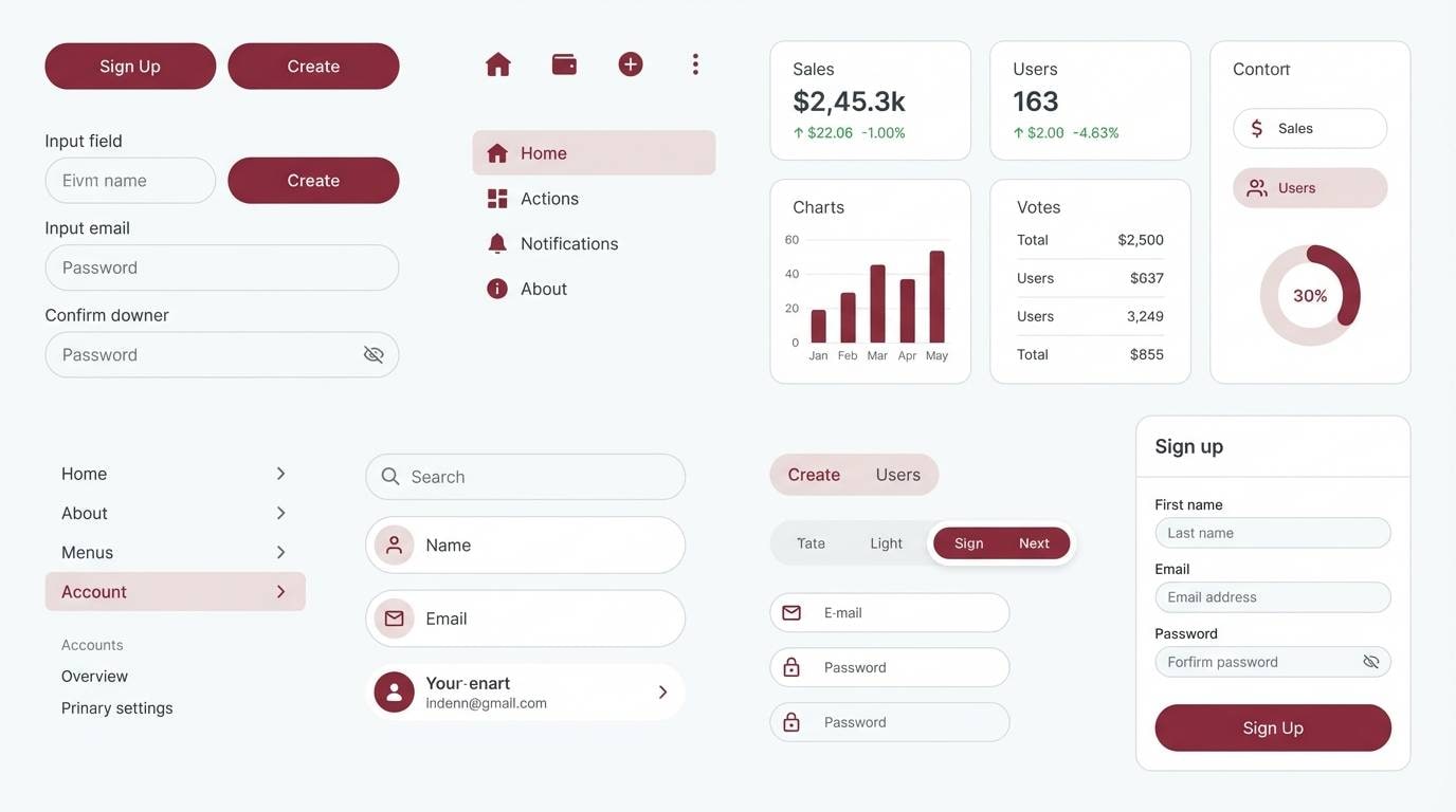
18) Minimal Marsala UI
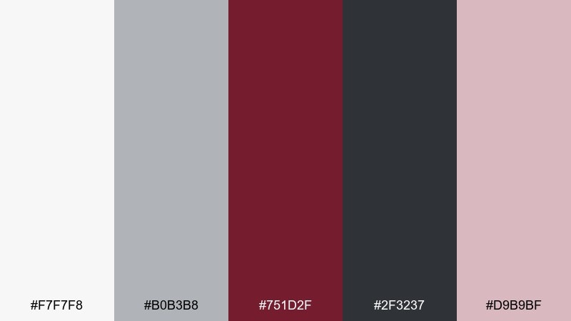
HEX: #f7f7f8 #b0b3b8 #751d2f #2f3237 #d9b9bf
Mood: clean, modern, focused
Best for: SaaS UI kits, dashboards, onboarding flows
Clean neutrals with marsala and ink-gray feel focused, like a tidy workspace and a crisp interface. Use marsala for primary buttons and key status highlights while keeping surfaces nearly white. Pair with the darker gray for text and nav so the UI remains accessible. Tip: apply the blush tint to selected states or cards to add softness without sacrificing clarity.
Image example of minimal marsala ui generated using media.io
19) Rustic Cellar
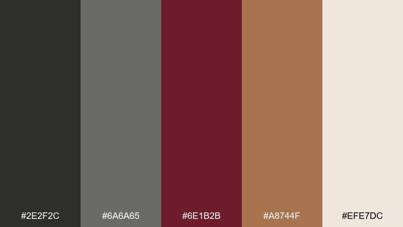
HEX: #2e2f2c #6a6a65 #6e1b2b #a8744f #efe7dc
Mood: rustic, warm, heritage
Best for: wine labels, farm-to-table brands, craft packaging
Rustic and warm, these tones evoke a cellar door, oak barrels, and handwritten labels. Use the warm brown as an earthy supporting accent for borders and emblems. Pair with textured paper stocks or vintage engraving illustrations to lean into heritage. Tip: keep the light cream for negative space so details on the label stay sharp.
Image example of rustic cellar generated using media.io
20) Bridal Mauve Gray
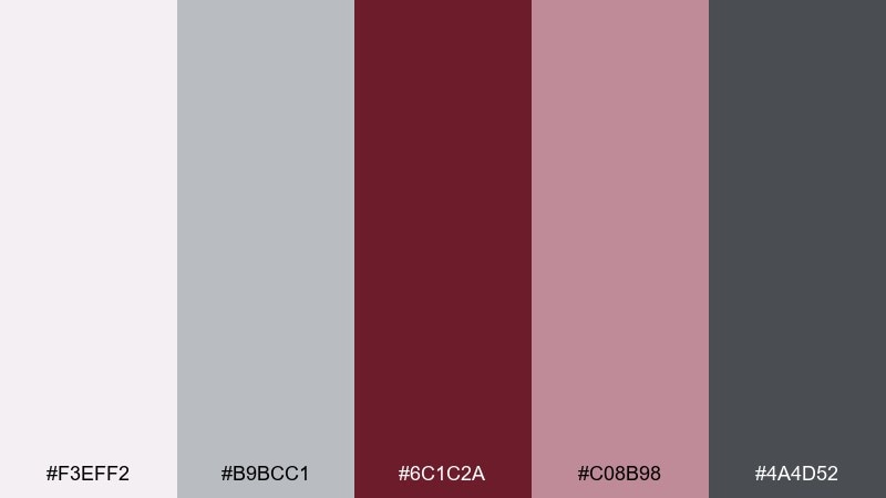
HEX: #f3eff2 #b9bcc1 #6c1c2a #c08b98 #4a4d52
Mood: romantic, soft, timeless
Best for: bridal brands, invitations, photo album covers
Romantic mauve and soft gray feel timeless, like silk ribbon and delicate florals. Use the deep maroon for names, monograms, and key lines, while the pale tones keep everything airy. Pair with subtle floral illustrations or embossing to enhance the premium feel. Tip: keep the darker gray for small-print details so maroon stays reserved for the hero moments.
Image example of bridal mauve gray generated using media.io
What Colors Go Well with Gray Maroon?
Warm off-whites and creams are the easiest companions for maroon and gray, adding lightness without shifting the palette’s refined feel. They also improve readability for text-heavy layouts and UI screens.
For accent colors, muted blush, dusty pink, and warm tan keep things soft and premium. If you want extra pop, try a controlled contrast like mustard gold or a deep teal used sparingly.
To keep the scheme cohesive, choose accents with similar “muted” saturation so maroon remains the hero rather than fighting with a bright, high-chroma partner.
How to Use a Gray Maroon Color Palette in Real Designs
Start with a neutral ratio: let gray and off-white handle most surfaces (backgrounds, cards, spacing), then assign maroon to the most important elements like headings, CTA buttons, price highlights, or key UI states.
Use multiple grays to create hierarchy—dark gray for text and nav, mid-gray for dividers, and light gray for panels. This keeps the design structured so maroon can act as a confident accent instead of an all-over fill.
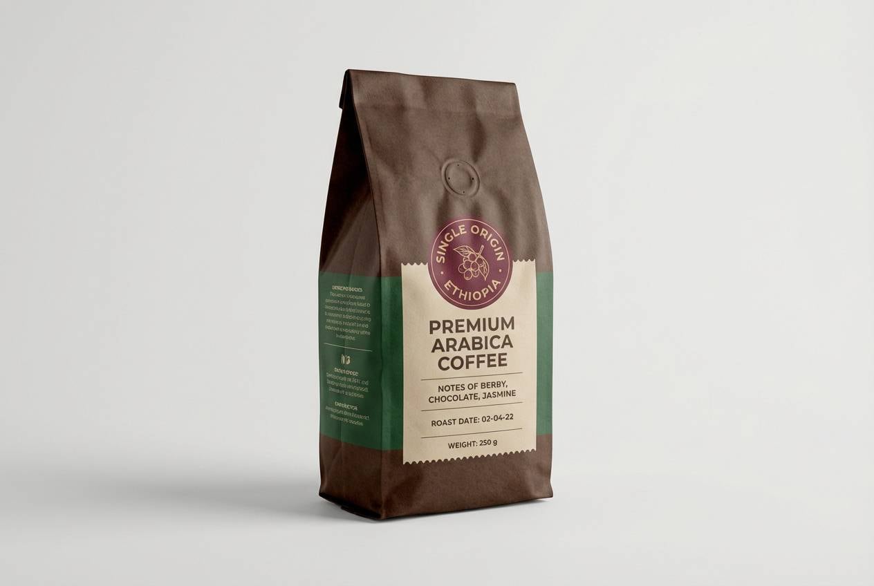
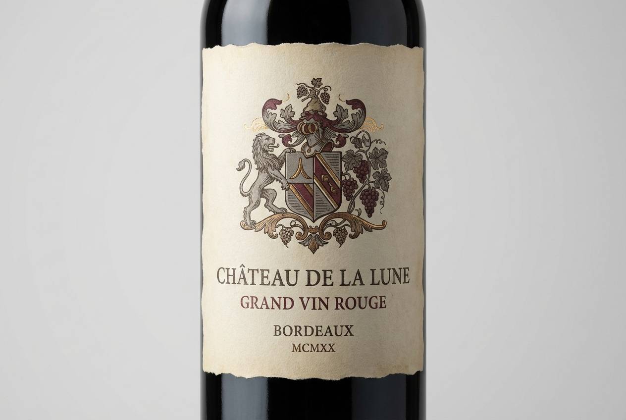
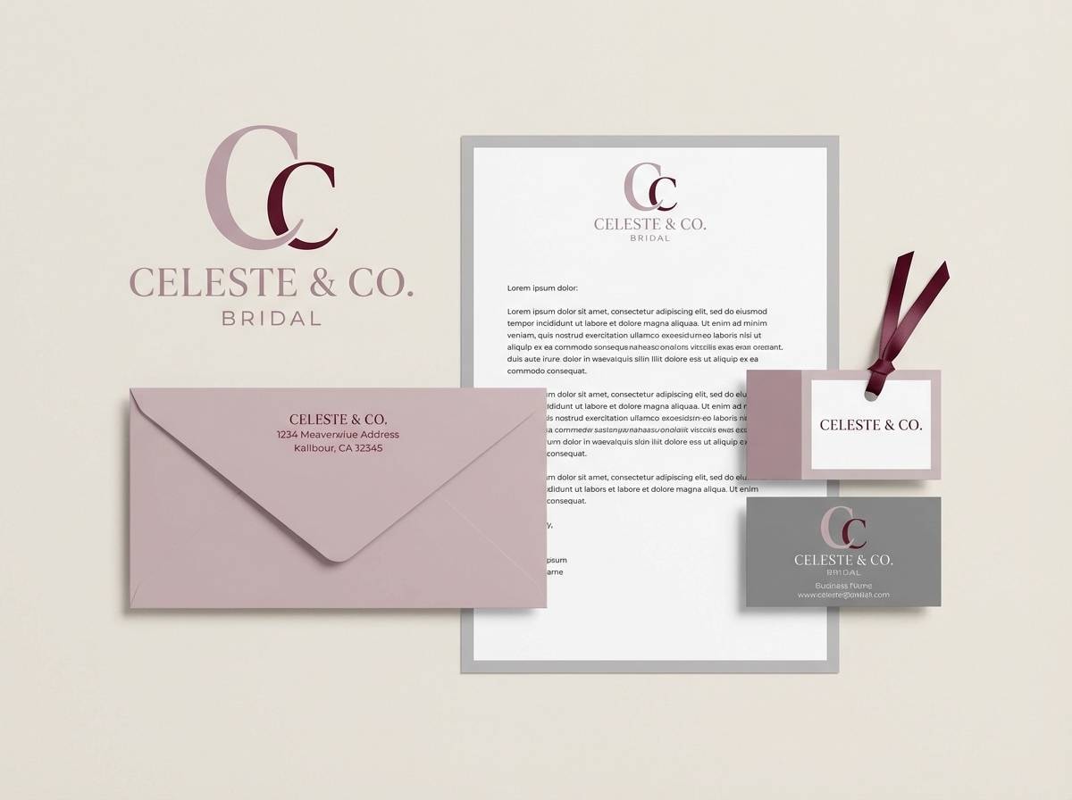
For print and branding, maroon works beautifully for seals, monograms, and premium packaging, while grays keep everything modern and clean. Add texture (paper grain, subtle noise) to make muted tones feel richer.
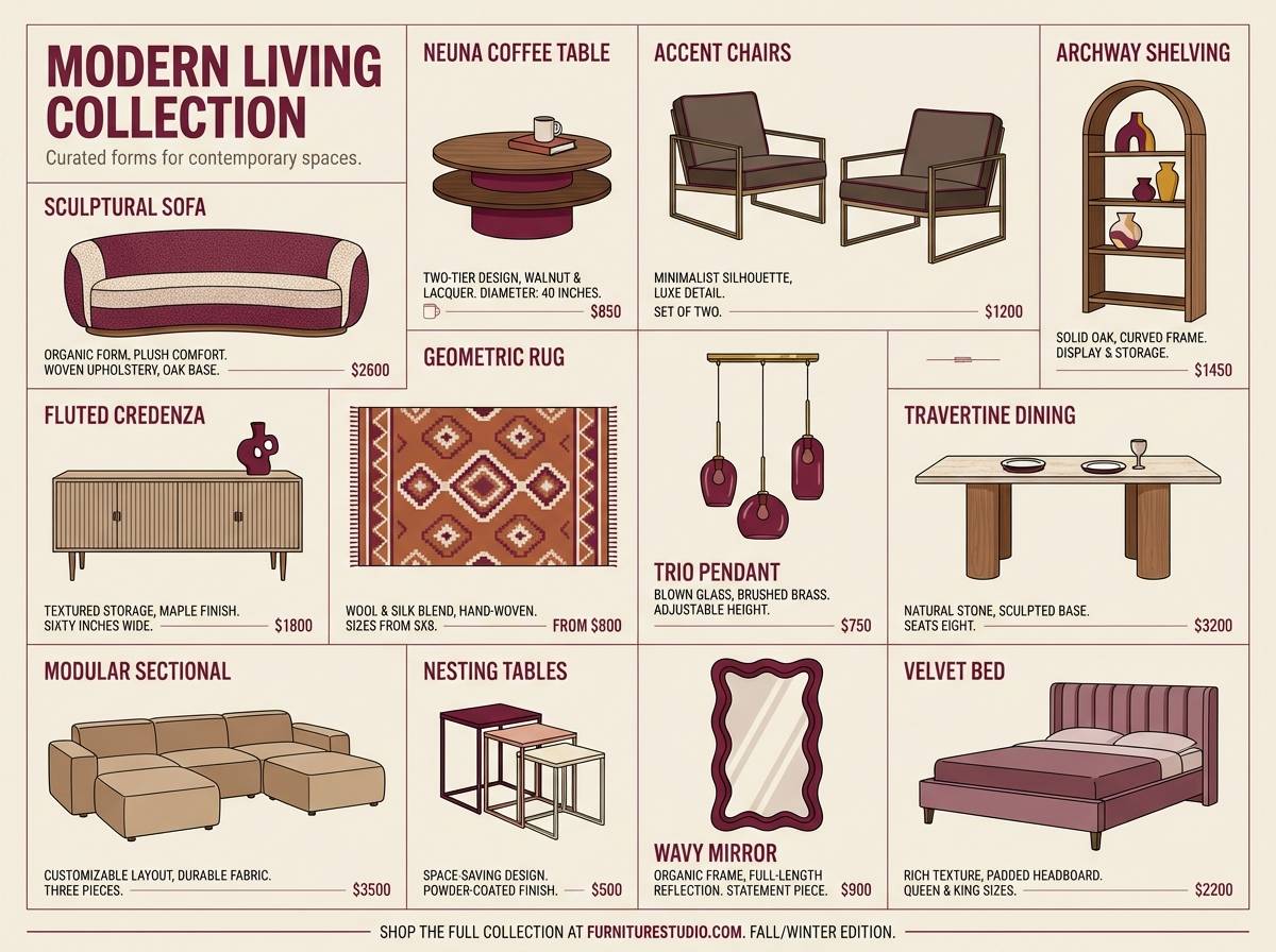
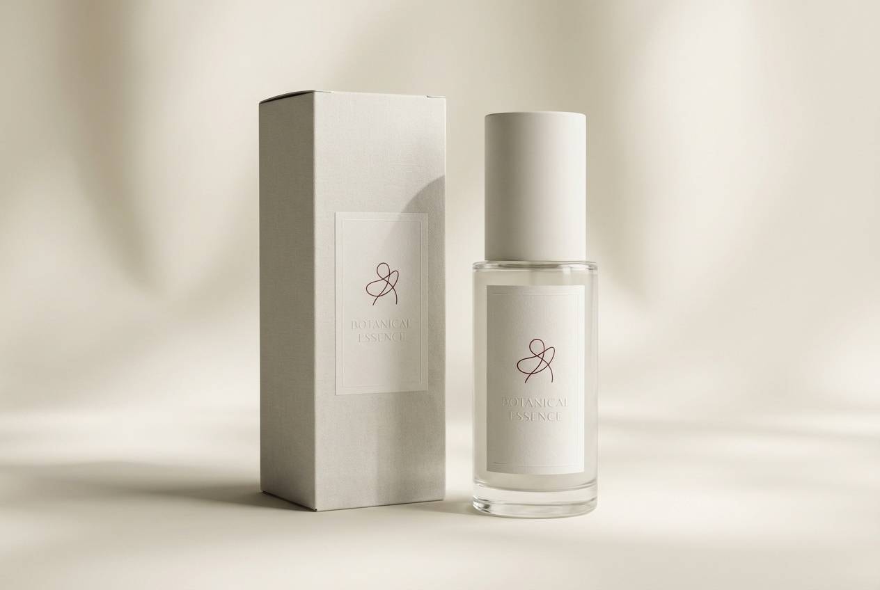
Create Gray Maroon Palette Visuals with AI
If you already have HEX codes, you can turn them into on-brand visuals by generating mockups like menus, UI kits, packaging, posters, and moodboards. This helps you see how maroon behaves as an accent versus a primary color.
In Media.io, paste or describe your palette, then specify the design type, typography style, and layout (minimal, editorial, vintage, etc.). Keep prompts clear about “flat graphic design” versus “realistic studio shot” depending on the result you need.
Once you have a few candidates, iterate by adjusting one variable at a time (background brightness, maroon saturation, or accent color percentage) to keep the look consistent across a full brand system.
Gray Maroon Color Palette FAQs
-
What vibe does a gray maroon color scheme create?
Most gray maroon palettes feel refined, grounded, and premium. Gray provides calm structure, while maroon adds warmth and emotion without looking overly loud. -
Is maroon and gray a good combination for branding?
Yes—especially for premium, classic, or editorial brands. Use gray for the primary system (backgrounds, typography) and maroon for distinctive brand moments like logos, badges, and CTAs. -
How do I keep a gray and burgundy palette from feeling too dark?
Add an off-white or cream as a major background color and limit maroon to accents. You can also introduce a light gray for surfaces and spacing to keep pages airy. -
What accent colors pair well with gray maroon?
Muted blush, warm tan, mustard gold, and deep teal can work well. The key is using accents sparingly so maroon remains the focal color. -
Which gray maroon palette is best for UI design?
Try cleaner sets like Minimal Marsala UI or Concrete Rosewood. They provide strong contrast for buttons and headings while keeping most surfaces neutral for readability. -
Can I use these palettes for interiors?
Yes—gray walls or textiles pair nicely with maroon accents in rugs, cushions, or artwork. Add warm neutrals (cream, tan) and natural materials (wood, linen) for balance. -
How can I generate matching images for my palette quickly?
Use Media.io’s text-to-image generator and include your layout type (menu, poster, UI, packaging) plus “gray and maroon accents” in the prompt. Then iterate by tweaking one color or contrast setting at a time.


