

Gray blue is one of those rare “neutral-but-not-boring” colors: it feels calm like gray, yet carries the clarity and trust of blue. That’s why it shows up everywhere from modern UI to serene interiors.
Below are 20 gray blue color palette ideas with HEX codes, plus quick guidance on where each combination works best and how to visualize it with AI.
In this article
Why Gray Blue Palettes Work So Well
Gray blue sits between cool neutrality and emotional color, so it feels professional without being sterile. It’s a go-to for modern brands that want trust, clarity, and a softer edge than pure navy.
In UI and product design, gray blue creates natural hierarchy: pale tints read as clean surfaces, midtones become navigation and states, and deep shades provide contrast for text and CTAs without harsh black.
For interiors, gray blue is calm and flexible. It pairs easily with wood, stone, linen, and metals, making it ideal for spaces that should feel airy, composed, and lived-in.
20+ Gray Blue Color Palette Ideas (with HEX Codes)
1) Misty Harbor
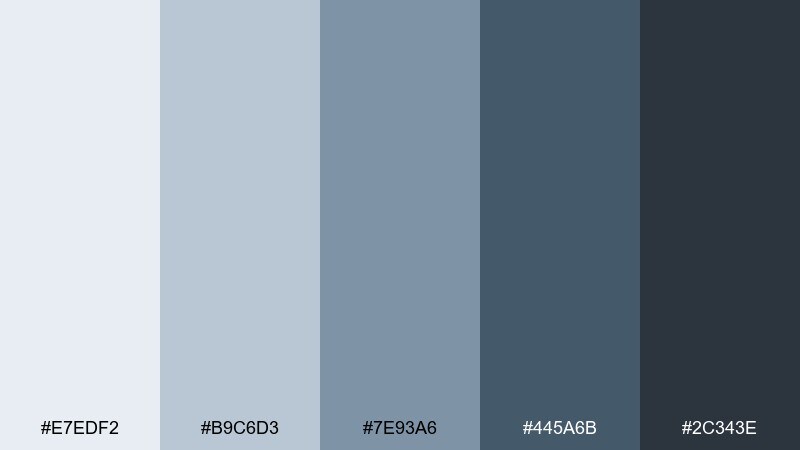
HEX: #E7EDF2 #B9C6D3 #7E93A6 #445A6B #2C343E
Mood: airy, calm, coastal
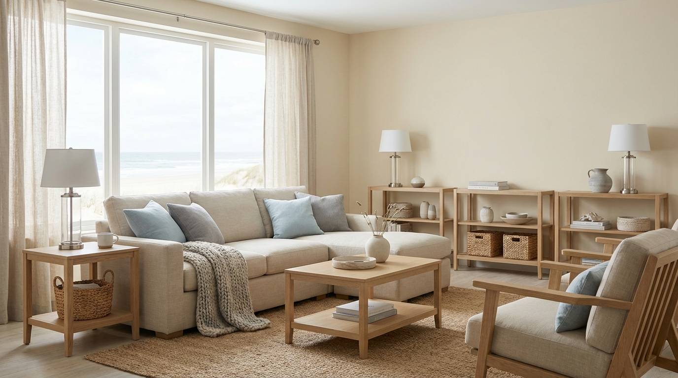
Best for: coastal living room interiors
Airy and calm like morning fog over a quiet marina, these tones feel clean without turning cold. They work beautifully on walls, upholstery, and built-ins where you want a soft contrast. Pair with warm oak, linen textures, and brushed nickel for balance. Usage tip: keep the deepest shade for trim or one anchor piece to avoid flattening the room.
Image example of misty harbor generated using media.io
Media.io is an online AI studio for creating and editing video, image, and audio in your browser.

2) Steel and Sky
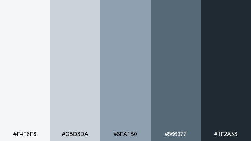
HEX: #F4F6F8 #CBD3DA #8FA1B0 #566977 #1F2A33
Mood: modern, structured, professional
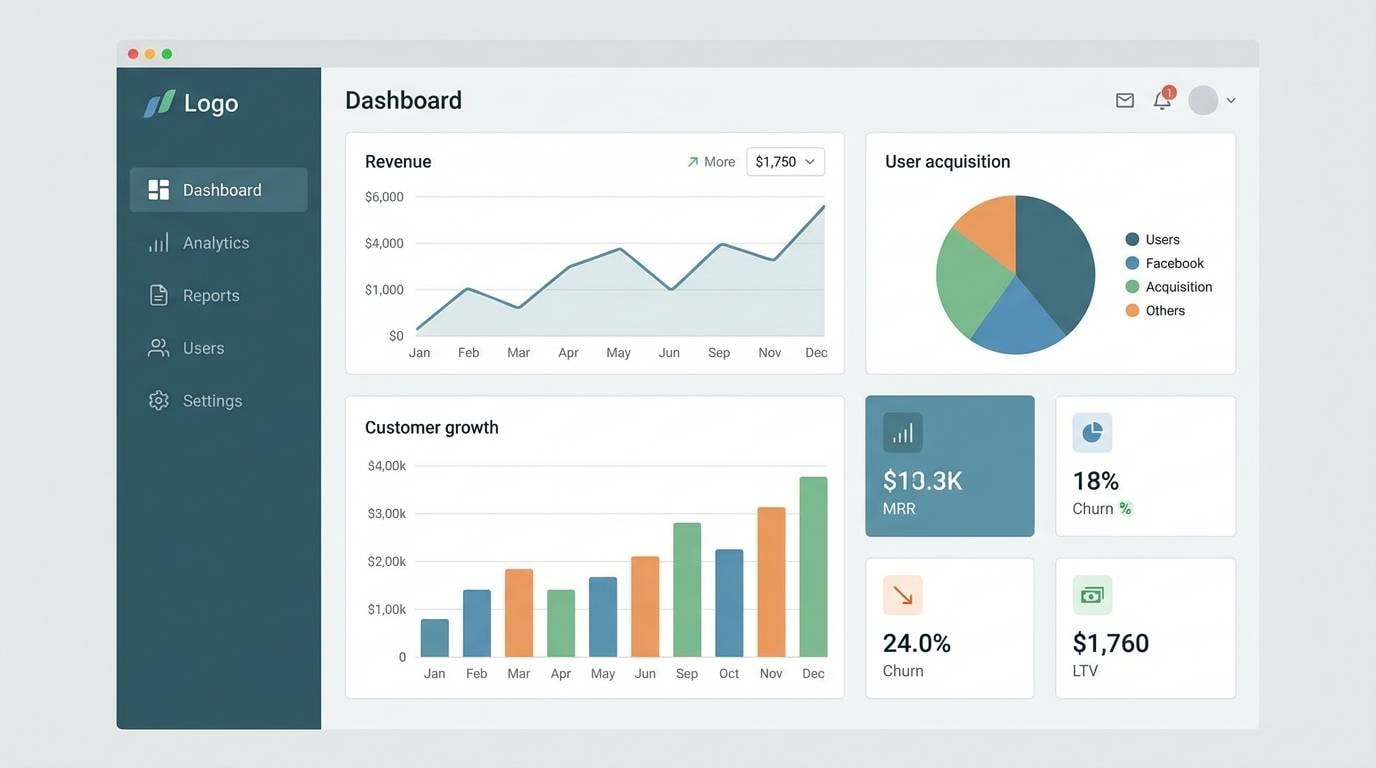
Best for: saas dashboard ui
Modern and structured like glass towers under a pale sky, the contrast here reads crisp and reliable. Use the light tones for surfaces and cards, then reserve the mid blues for navigation and active states. The darkest shade makes text and icons feel sharp without pure black harshness. Usage tip: add a subtle 5 to 10 percent tint background to reduce glare on large layouts.
Image example of steel and sky generated using media.io
3) Coastal Fog
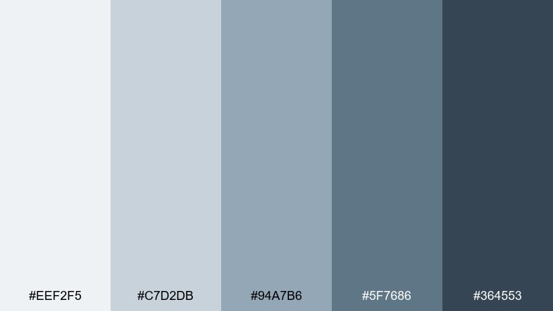
HEX: #EEF2F5 #C7D2DB #94A7B6 #5F7686 #364553
Mood: soft, understated, breezy
Best for: wellness brand identity
Soft and understated like a shoreline disappearing into haze, these hues feel soothing and premium. They suit wellness branding where you want clarity, not clinical brightness. Mix with off-white paper, matte finishes, and a small sand or clay accent for warmth. Usage tip: pick one midtone for the logo and keep the rest as supporting neutrals for consistency.
Image example of coastal fog generated using media.io
4) Denim Drift
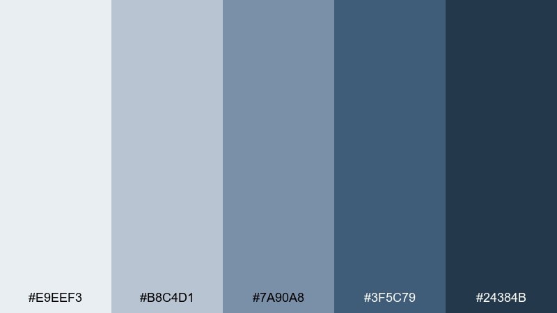
HEX: #E9EEF3 #B8C4D1 #7A90A8 #3F5C79 #24384B
Mood: casual, confident, approachable
Best for: ecommerce fashion banner
Casual and confident like broken-in denim, this set brings friendly contrast with a slightly rugged edge. It works well for fashion and lifestyle creatives, especially when paired with crisp white space. Add a warm tan or brass accent to keep it from feeling too cool. Usage tip: use the deepest blue for headlines and buttons to make CTAs feel grounded.
Image example of denim drift generated using media.io
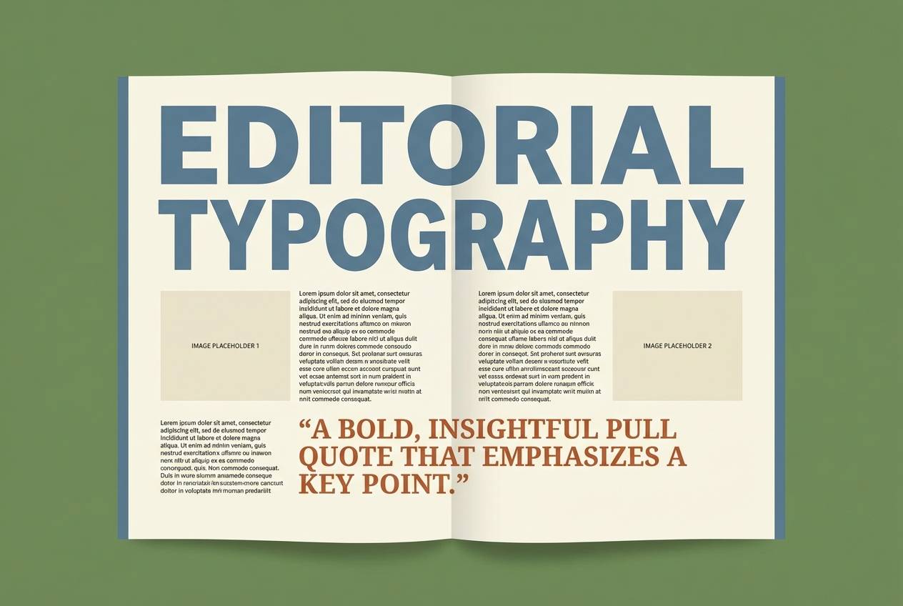
5) Rainy Window
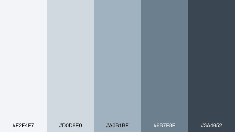
HEX: #F2F4F7 #D0D8E0 #A0B1BF #6B7F8F #3A4652
Mood: reflective, gentle, mellow
Best for: editorial magazine layout
Reflective and mellow like raindrops on glass, these tones create a quiet reading experience. They shine in editorial layouts where hierarchy matters more than loud color. Combine with warm grayscale photography, thin rules, and a serif headline for sophistication. Usage tip: keep body text on the lightest shade and use the mid blues for pull quotes and section labels.
Image example of rainy window generated using media.io
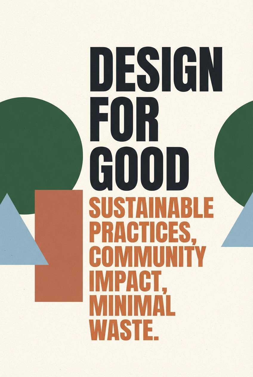
6) Graphite Tide
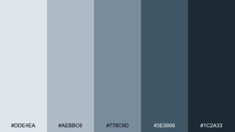
HEX: #DDE4EA #AEBBC6 #778C9D #3E5666 #1C2A33
Mood: moody, grounded, cinematic
Best for: movie poster typography
Moody and grounded like a dark tide under cloud cover, this mix feels cinematic and bold. It is ideal for typographic posters and campaigns that need drama without neon. Pair with a single metallic accent or soft off-white to keep legibility high. Usage tip: set the background in the darkest shade and build type contrast with the two lightest tones.
Image example of graphite tide generated using media.io
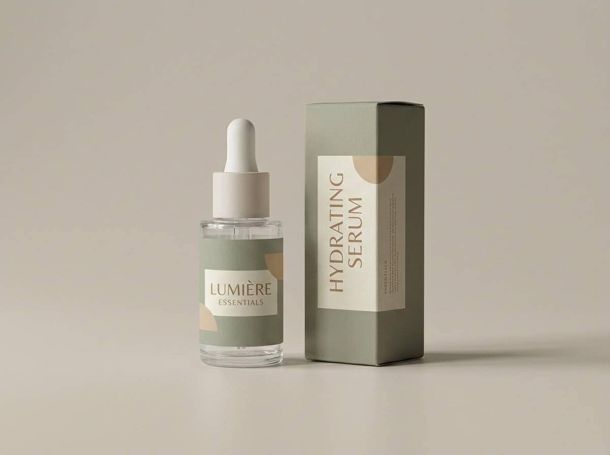
7) Winter Seaglass
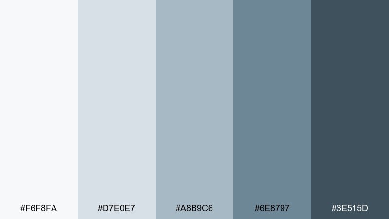
HEX: #F6F8FA #D7E0E7 #A8B9C6 #6E8797 #3E515D
Mood: fresh, quiet, minimalist
Best for: skincare packaging design
Fresh and quiet like frosted seaglass, these shades read clean, soft, and trustworthy. They are a strong fit for skincare packaging where you want a clinical hint without harshness. Pair with matte white, subtle embossing, and a small silver foil detail for a premium finish. Usage tip: keep the label mostly light and use the midtone for key claims so the pack stays airy.
Image example of winter seaglass generated using media.io
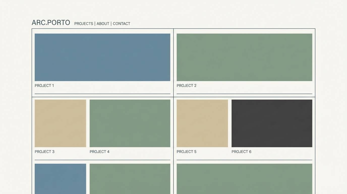
8) Urban Blueprint
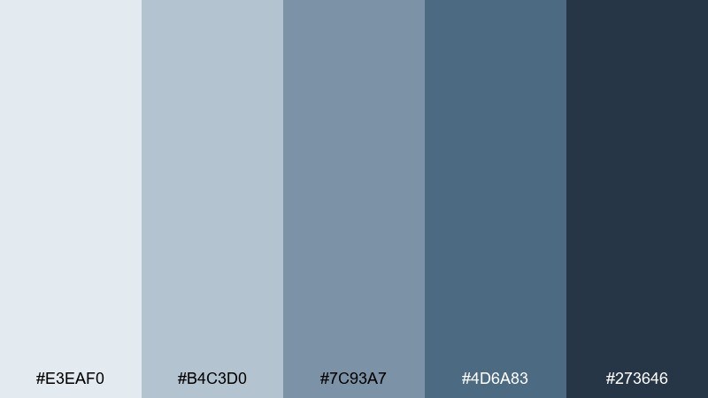
HEX: #E3EAF0 #B4C3D0 #7C93A7 #4D6A83 #273646
Mood: smart, technical, contemporary
Best for: architecture portfolio website
Smart and technical like a blueprint on a drafting table, this set feels precise and contemporary. It works well for architecture portfolios where images need clean framing and text must stay crisp. Add warm concrete, light maple, or terracotta accents to soften the technical vibe. Usage tip: use the mid blue for links and hover states so navigation remains subtle but clear.
Image example of urban blueprint generated using media.io
9) Quiet Lagoon
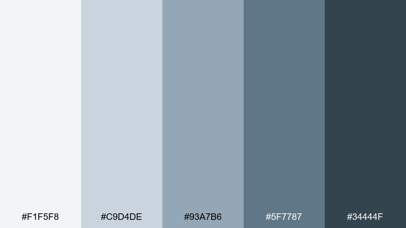
HEX: #F1F5F8 #C9D4DE #93A7B6 #5F7787 #34444F
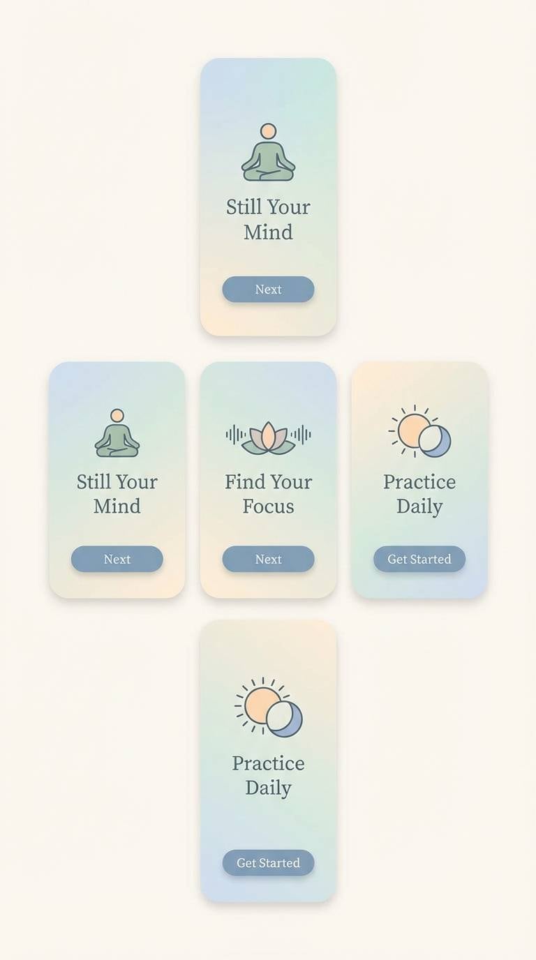
Mood: serene, balanced, spa-like
Best for: meditation app ui
Serene and balanced like still water at dusk, these tones create an easy, spa-like rhythm. As a gray blue color palette for apps, it keeps screens calm while still supporting clear hierarchy. Pair with soft gradients, rounded components, and a gentle cream highlight to avoid feeling sterile. Usage tip: reserve the darkest shade for primary actions and keep everything else low-contrast for restfulness.
Image example of quiet lagoon generated using media.io
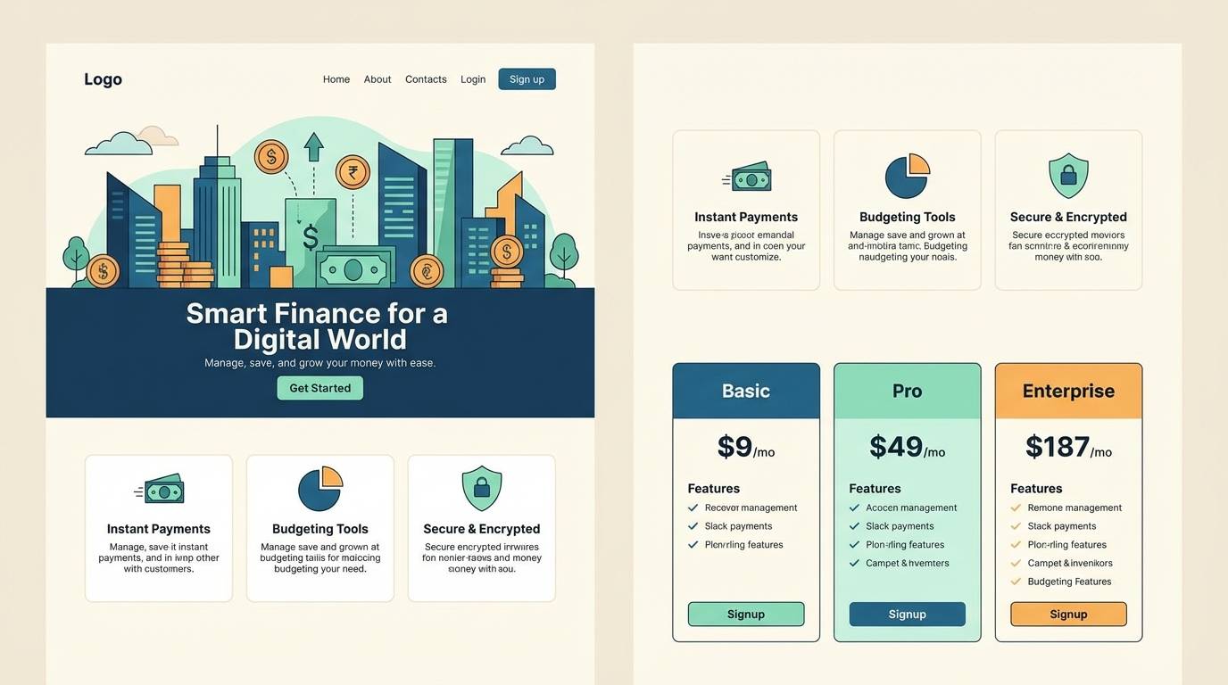
10) Silverline Night
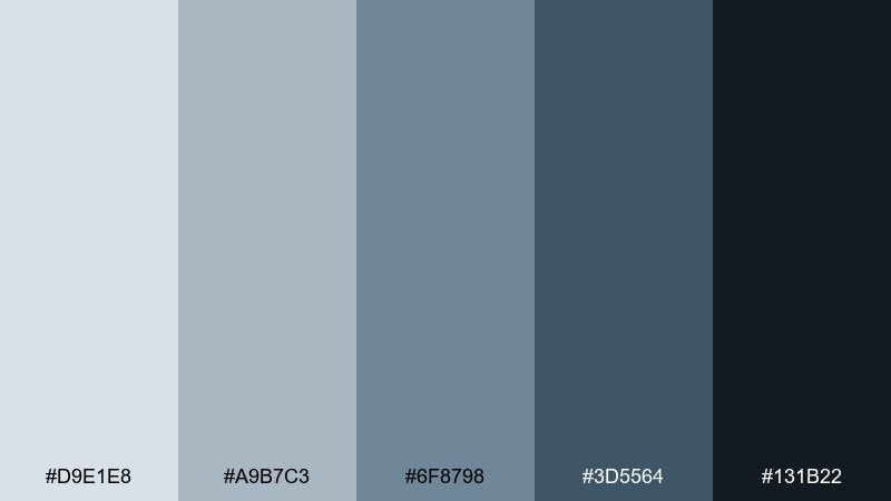
HEX: #D9E1E8 #A9B7C3 #6F8798 #3D5564 #131B22
Mood: sleek, nocturnal, premium
Best for: fintech landing page
Sleek and nocturnal like city lights on wet pavement, this palette feels premium and secure. It is a strong gray blue color combination for fintech brands that want confidence without aggressive color. Pair with crisp white typography, thin line icons, and a restrained cyan accent for highlights. Usage tip: keep the darkest shade for the hero section and fade to the lightest tones as users scroll.
Image example of silverline night generated using media.io
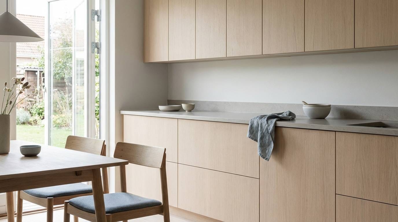
11) Nordic Slate
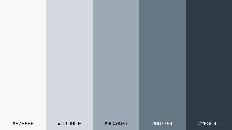
HEX: #F7F8F9 #D3D9DE #9CAAB5 #667784 #2F3C45
Mood: scandinavian, clean, cozy
Best for: minimal kitchen styling
Clean and cozy like a Scandinavian winter morning, these shades feel soft but purposeful. They are great for minimalist kitchens with pale wood, matte ceramics, and simple hardware. Add a muted sage plant or warm brass pull to bring life to the cool base. Usage tip: repeat the mid gray-blue twice in the space to make the look intentional rather than accidental.
Image example of nordic slate generated using media.io
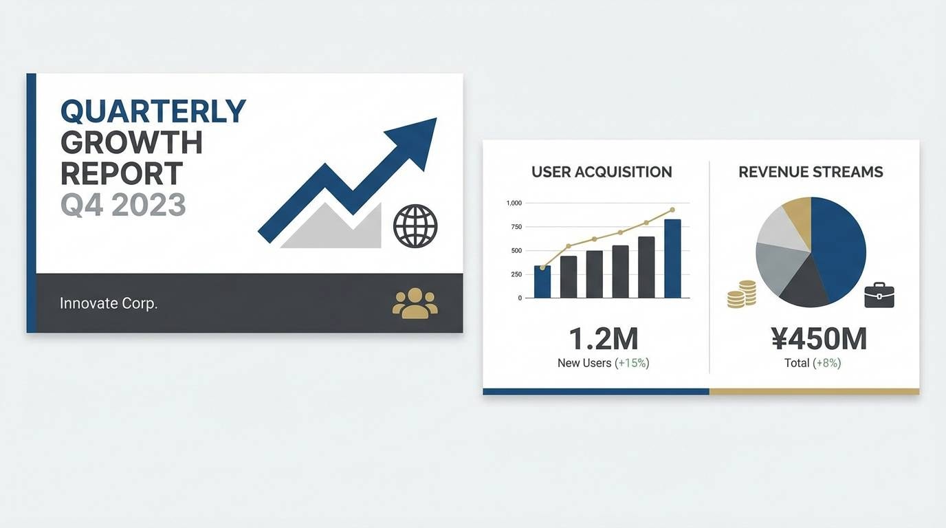
12) Glacier Ink
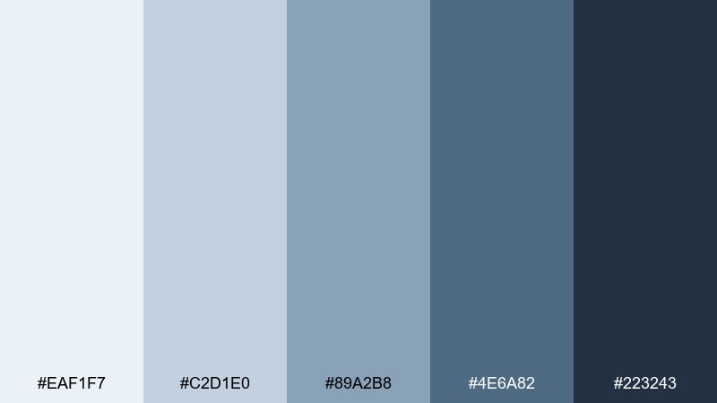
HEX: #EAF1F7 #C2D1E0 #89A2B8 #4E6A82 #223243
Mood: crisp, bright, high-contrast
Best for: presentation slide deck
Crisp and bright like light on glacier ice, this set keeps content sharp and modern. It works especially well for slide decks where charts, callouts, and headings need clear contrast. Pair with a single warm accent like coral or amber for emphasis on key numbers. Usage tip: keep chart grids very light and use the darkest shade only for data labels and totals.
Image example of glacier ink generated using media.io
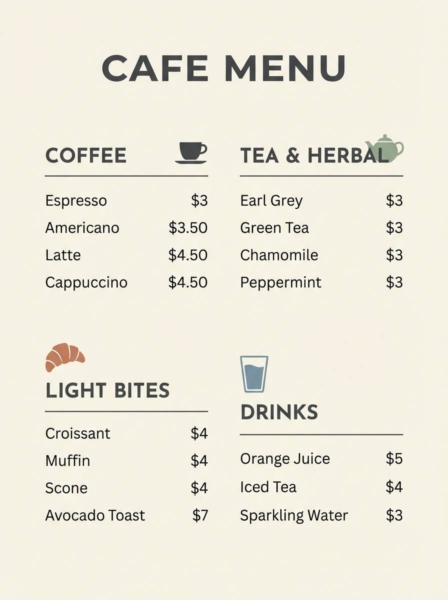
13) Cloudy Pier
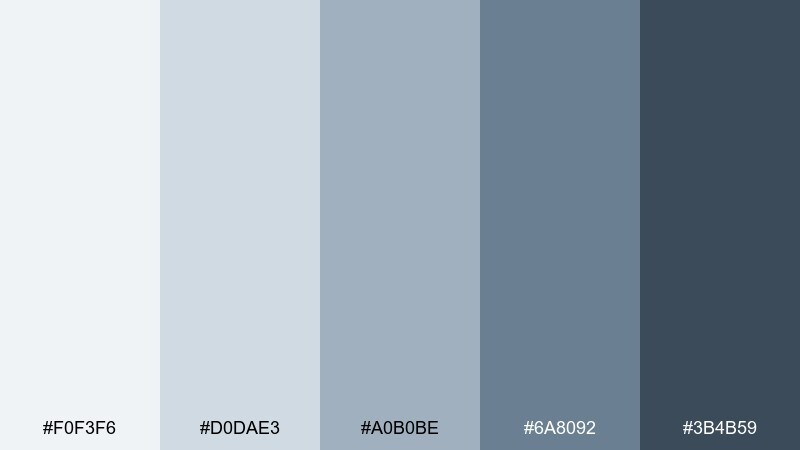
HEX: #F0F3F6 #D0DAE3 #A0B0BE #6A8092 #3B4B59
Mood: soft, nautical, relaxed
Best for: cafe menu design
Soft and nautical like a quiet pier under overcast skies, these colors feel relaxed and inviting. They fit cafe menus where you want readability with a gentle coastal vibe. Pair with creamy paper, simple line illustrations, and a touch of warm brown for coffee notes. Usage tip: use the midtone for section headers and keep item text on the lightest background for clarity.
Image example of cloudy pier generated using media.io
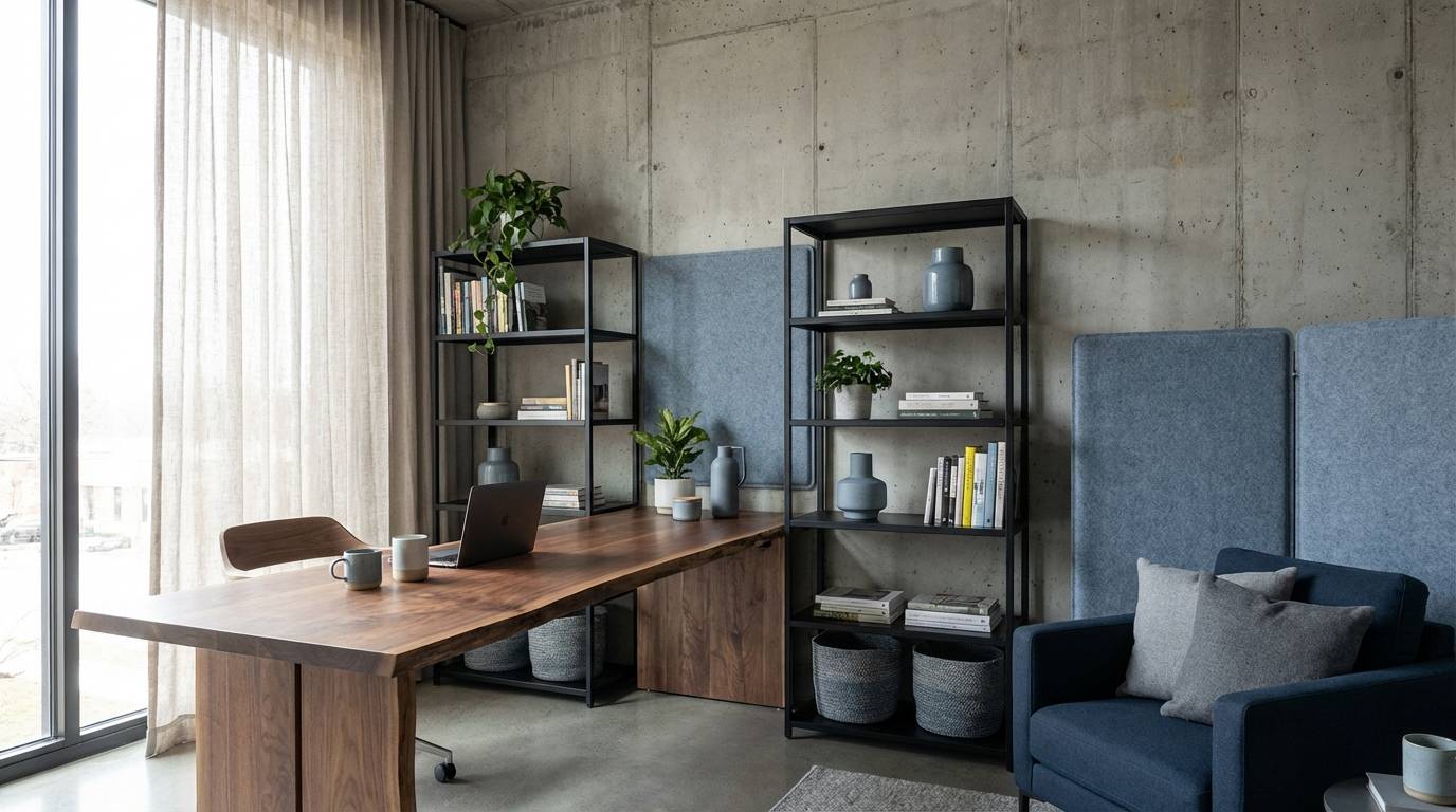
14) Ocean Concrete
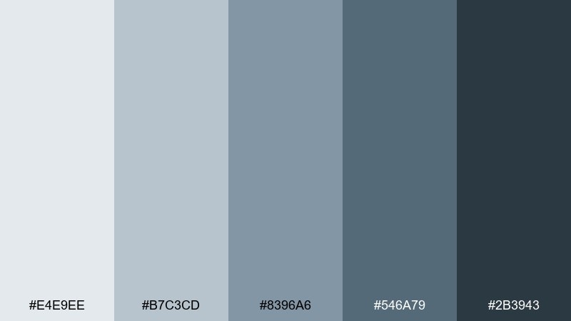
HEX: #E4E9EE #B7C3CD #8396A6 #546A79 #2B3943
Mood: industrial, balanced, contemporary
Best for: modern office interiors
Industrial yet calm, like ocean air cutting through concrete, this mix feels contemporary and livable. It is ideal for offices that need focus, especially with black steel, walnut, and textured textiles. Use the lightest two shades for walls and large surfaces, then bring in the deeper tones through rugs or acoustic panels. Usage tip: add one warm light source to prevent the space from reading too cool.
Image example of ocean concrete generated using media.io
15) Blue Ash Minimal
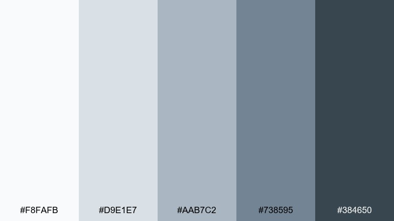
HEX: #F8FAFB #D9E1E7 #AAB7C2 #738595 #384650
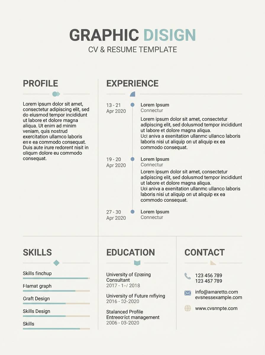
Mood: minimal, gentle, uncluttered
Best for: resume and cv template
Minimal and gentle like ash-tinted paper, these tones keep layouts uncluttered and confident. They work well for resumes where you want structure without heavy boxes or loud color. Pair with a clean sans-serif and a touch of warm gray for section dividers. Usage tip: use the midtone for headings and keep body text on near-white for maximum legibility.
Image example of blue ash minimal generated using media.io
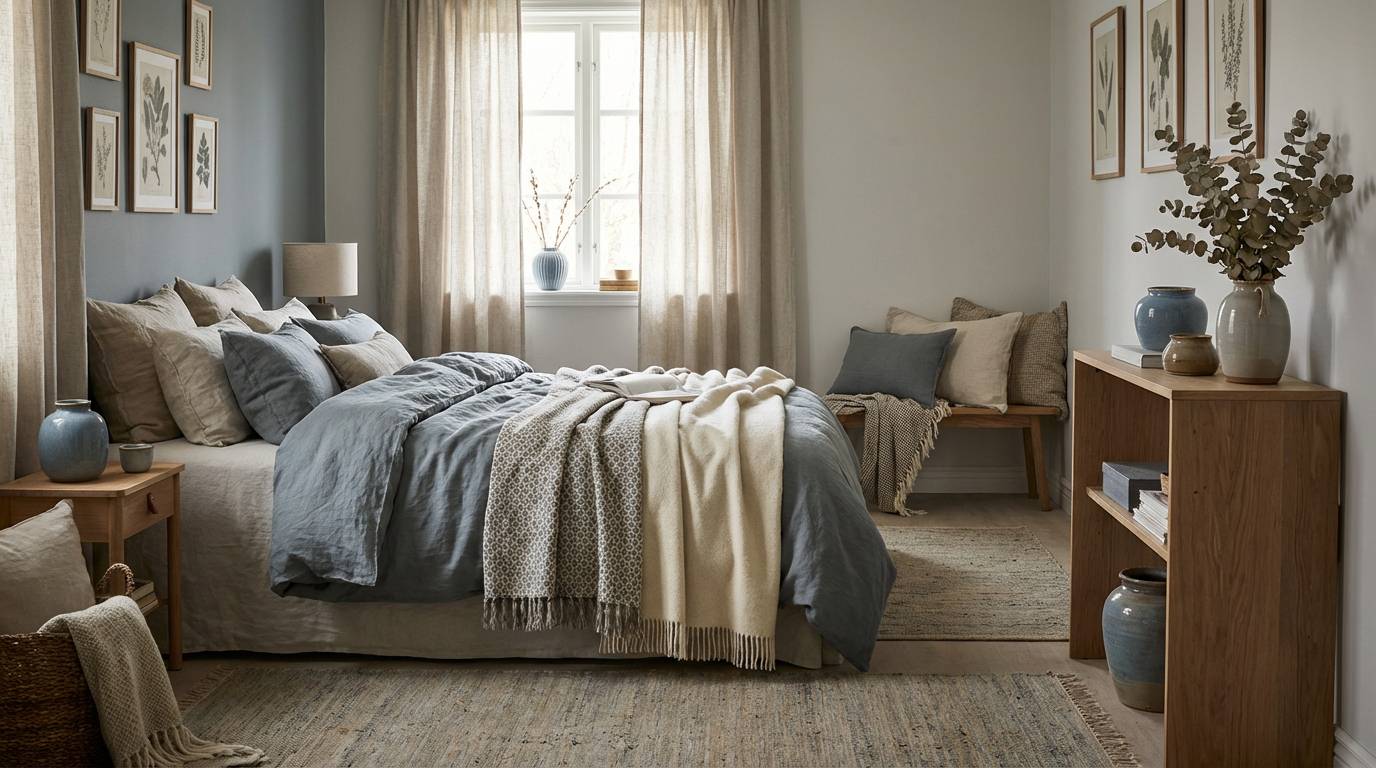
16) Stormy Linen
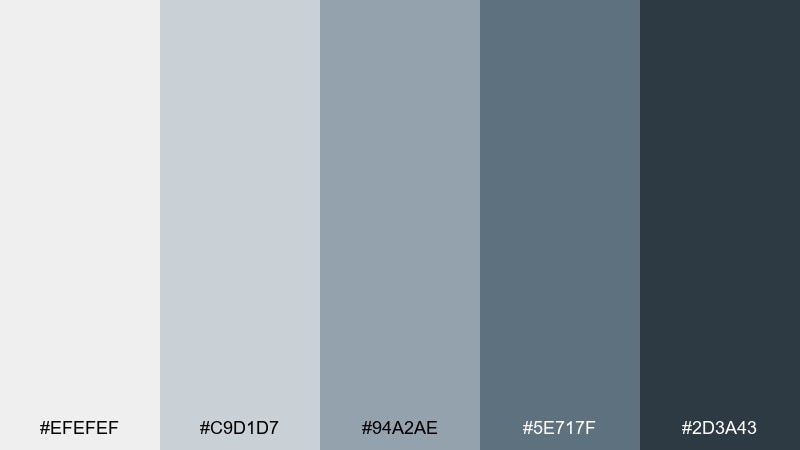
HEX: #EFEFEF #C9D1D7 #94A2AE #5E717F #2D3A43
Mood: textured, warm-cool, timeless
Best for: bedroom color styling
Textured and timeless like storm clouds over rumpled linen, this mix feels restful and grown-up. It suits bedrooms where you want cool calmness but still crave warmth. Pair with oatmeal bedding, natural jute, and soft black accents for definition. Usage tip: layer two midtones in textiles so the room looks intentional, not monochrome.
Image example of stormy linen generated using media.io
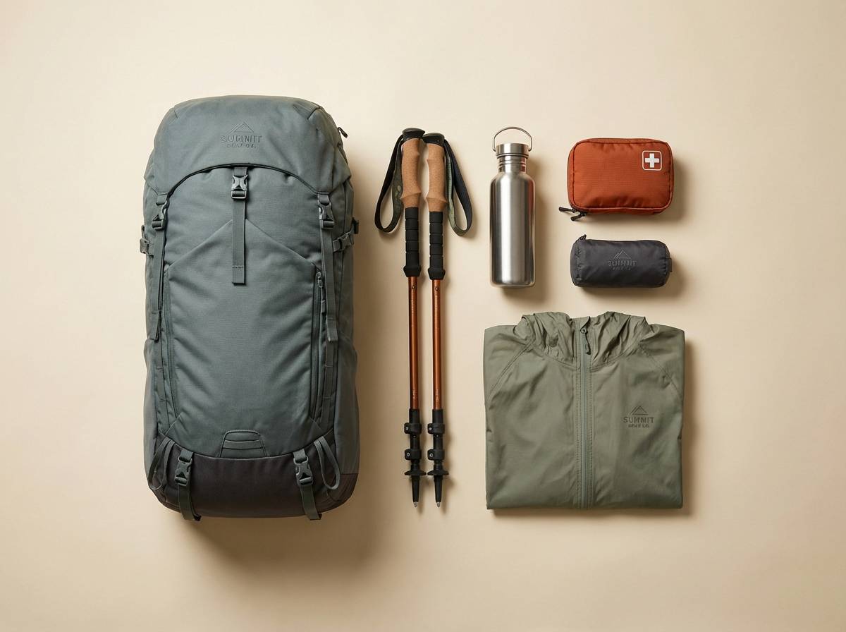
17) Pebblewave
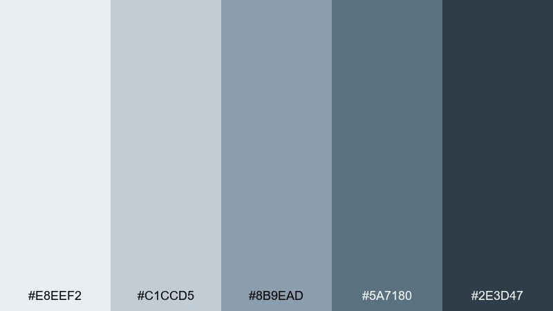
HEX: #E8EEF2 #C1CCD5 #8B9EAD #5A7180 #2E3D47
Mood: natural, balanced, quietly energetic
Best for: outdoor gear product ad
Natural and steady like smooth pebbles under moving water, these hues feel quietly energetic. They make a reliable backdrop for outdoor gear ads where product details should stand out. Pair with a single pop of safety orange or lime for functional highlights. Usage tip: keep the background mid-light and push shadows with the two deepest tones for depth.
Image example of pebblewave generated using media.io
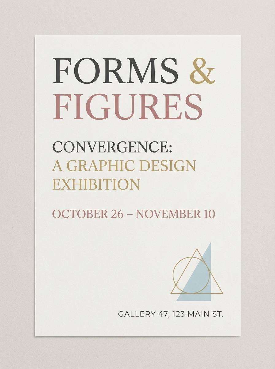
18) Museum Wall
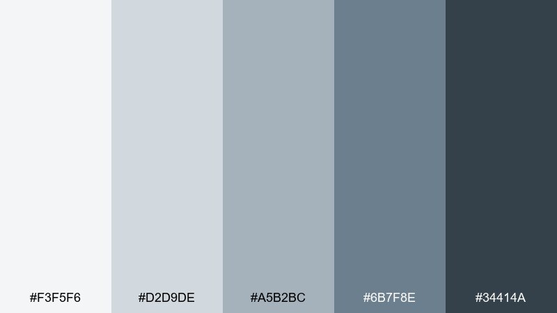
HEX: #F3F5F6 #D2D9DE #A5B2BC #6B7F8E #34414A
Mood: quiet, curated, sophisticated
Best for: gallery event invitation
Quiet and curated like a museum wall under soft track lights, this set feels sophisticated and intentional. It is perfect for elegant invites where typography is the hero. Pair with plenty of negative space, a refined serif, and one small metallic detail for polish. Usage tip: print the background light and let the darkest shade handle names, dates, and hierarchy.
Image example of museum wall generated using media.io
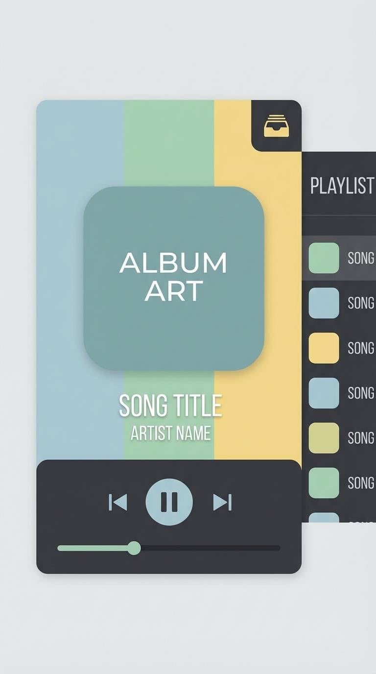
19) Midnight Haze
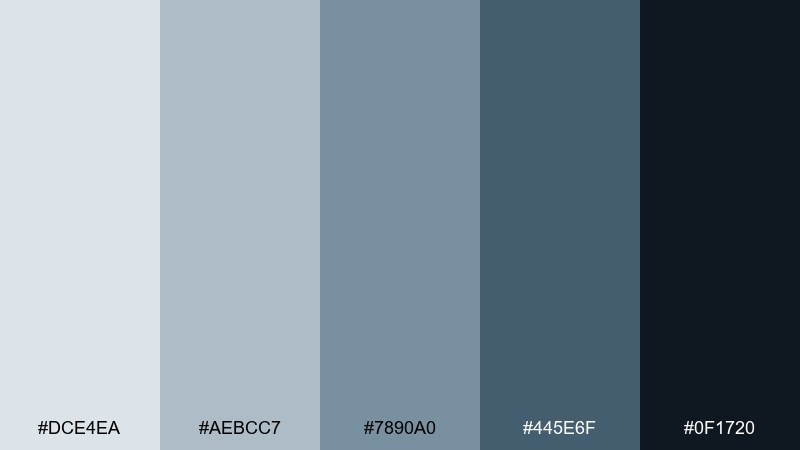
HEX: #DCE4EA #AEBCC7 #7890A0 #445E6F #0F1720
Mood: dramatic, sleek, modern
Best for: music app now playing ui
Dramatic and sleek like midnight haze over neon-free streets, these tones set a modern mood. The gray blue color combinations here make album art pop while keeping controls readable. Pair with subtle gradients and a single accent color for the play state, such as soft teal or magenta. Usage tip: use the near-black for the player background and keep text on the lightest shade for contrast.
Image example of midnight haze generated using media.io
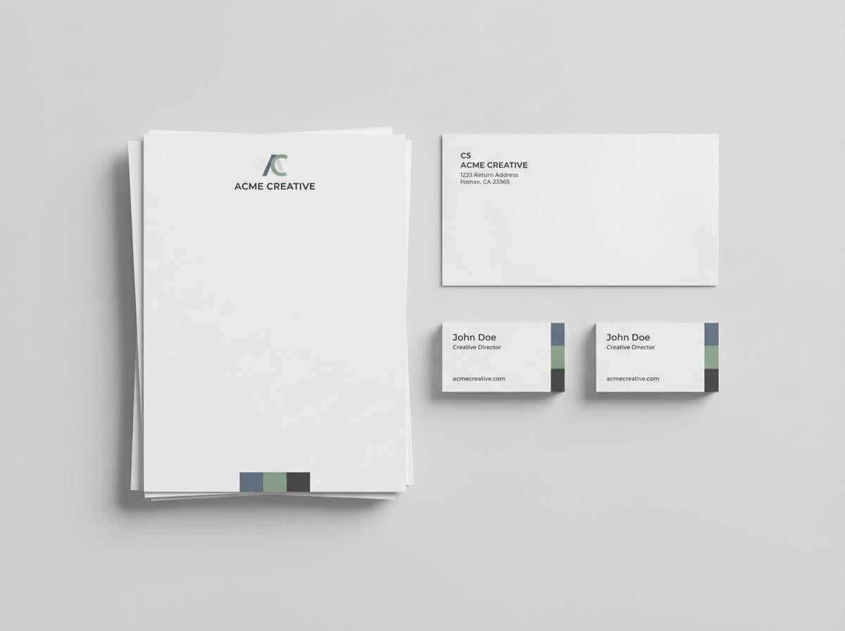
20) Nautical Paper
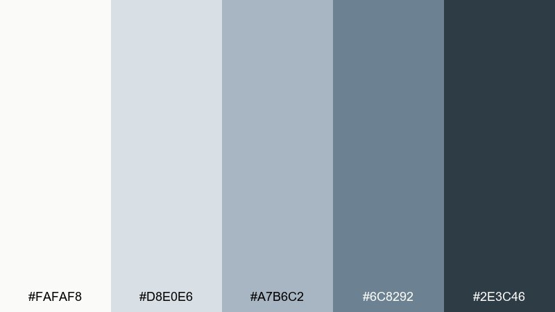
HEX: #FAFAF8 #D8E0E6 #A7B6C2 #6C8292 #2E3C46
Mood: classic, clean, print-friendly
Best for: stationery and letterhead
Classic and clean like crisp stationery with a maritime hint, these colors feel trustworthy and timeless. As a gray blue color palette, it fits letterheads, invoices, and brand stationery that need to look polished in print. Pair with textured off-white stock and a deep ink-like tone for signatures and stamps. Usage tip: keep logos in one dark shade and avoid using more than two colors per page for a premium finish.
Image example of nautical paper generated using media.io
What Colors Go Well with Gray Blue?
Warm neutrals are the easiest match: ivory, oatmeal, beige, and warm gray keep the scheme inviting while letting gray blue stay calm and modern. In interiors, add natural wood tones (oak, walnut) to soften the cool cast.
For contrast, use deep charcoal or near-black for typography and structure, then introduce a small bright accent (coral, amber, or turquoise) for focal points like CTAs and key numbers.
For a more organic look, try muted greens (sage, eucalyptus) or clay-like terracotta. These create a balanced warm-cool tension that feels contemporary but not clinical.
How to Use a Gray Blue Color Palette in Real Designs
Start with roles, not just “pretty colors”: assign the lightest shade to backgrounds, the second-lightest to surfaces/cards, midtones to navigation and borders, and the darkest shade to text, icons, and primary actions.
Keep saturation restrained to avoid “cold corporate” vibes. If your layout feels too icy, warm it up with materials (paper texture, linen, wood) or a single warm accent used consistently across states and highlights.
In print and branding, limit your active palette to 2–3 tones and use the rest as supporting tints. That discipline is what makes gray blue schemes feel premium and intentional.
Create Gray Blue Palette Visuals with AI
If you want to see these gray blue tones in a real context (a dashboard, a bedroom, packaging, or an invite), generate fast concept visuals with text prompts. This helps you validate contrast, mood, and material pairing before committing to production.
With Media.io, you can turn a prompt into clean mockups and styled scenes in minutes, then iterate by swapping accents (like coral vs. turquoise) while keeping the same neutral base.
Try describing your format (UI, poster, interior), lighting, and materials, then add “colors matched to the palette” to keep results cohesive.
Gray Blue Color Palette FAQs
-
What is a gray blue color palette?
A gray blue color palette is a set of colors built around blue hues that are muted with gray, resulting in calmer, more neutral tones that still feel modern and trustworthy. -
Is gray blue warm or cool?
Most gray blues read as cool because of the blue base, but they can feel more balanced when paired with warm neutrals (ivory, beige, oak) or warm accents (terracotta, amber). -
What accent colors work best with gray blue?
Coral, amber, terracotta, sage, and turquoise are popular accents. Use accents sparingly (often 5–10% of the design) so the palette stays clean and cohesive. -
Are gray blue tones good for UI and dashboards?
Yes—gray blue works well for UI because it supports hierarchy with low visual fatigue. Use light tints for surfaces, midtones for states, and deep shades for text and primary actions. -
How do I keep gray blue from looking too cold?
Add warmer materials and textures (linen, paper grain, wood), introduce warm lighting in interiors, or choose one warm accent color for highlights and CTAs. -
What’s a good text color on light gray blue backgrounds?
Deep charcoal or near-black gray blue (instead of pure black) typically offers strong readability while keeping the look soft. Always double-check contrast for accessibility. -
Can I generate palette-based mockups with AI?
Yes—use a text-to-image tool and specify the design type (e.g., “SaaS dashboard,” “skincare packaging”) plus “colors matched to the palette” to keep outputs aligned with your chosen HEX tones.


