

Gold and silver are a classic pairing: one warm, one cool, both instantly associated with quality. Together, they create contrast that feels premium without needing loud color.
Below are refined gold silver color palette ideas with HEX codes and practical tips you can apply to branding, UI, print layouts, packaging, and interiors.
In this article
Why Gold Silver Palettes Work So Well
Gold and silver balance each other naturally: gold adds warmth and prestige, while silver adds clarity and modern restraint. That warm/cool tension gives designs depth without relying on saturated hues.
They also create flexible hierarchy. Silver and soft grays can carry backgrounds, grids, and secondary UI, while gold becomes a high-impact accent for CTAs, highlights, and “premium” cues.
Because both metals read as neutrals, they play nicely with everything from deep navies to creamy whites. The result is a palette that can shift from minimal to dramatic just by changing contrast and finish.
20+ Gold Silver Color Palette Ideas (with HEX Codes)
1) Gilded Frost
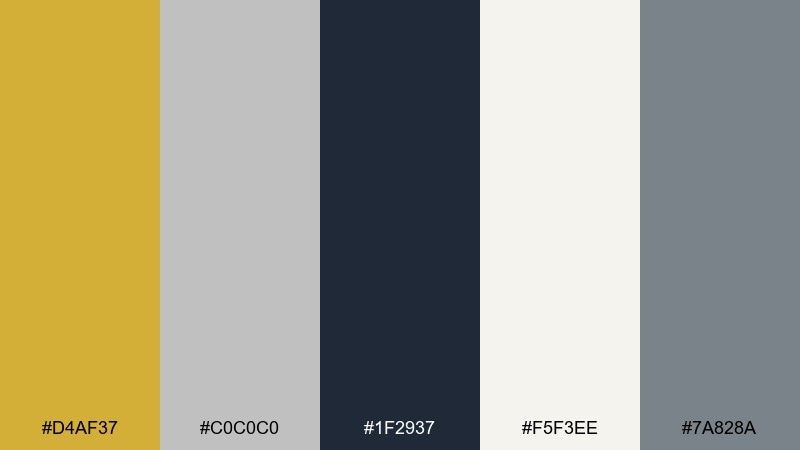
HEX: #D4AF37 #C0C0C0 #1F2937 #F5F3EE #7A828A
Mood: luxe, crisp, modern
Best for: luxury brand landing page UI
Luxe and icy, like sunlight on fresh snow with a metallic shimmer. This gold silver color scheme feels premium without getting heavy, thanks to the charcoal anchor and soft ivory space. Use it for hero headers, pricing sections, and high-end product highlights, then pair it with clean sans-serif type and subtle gradients. Tip: keep the gold to small UI accents (buttons, badges) so the interface stays breathable.
Image example of gilded frost generated using media.io
Media.io is an online AI studio for creating and editing video, image, and audio in your browser.

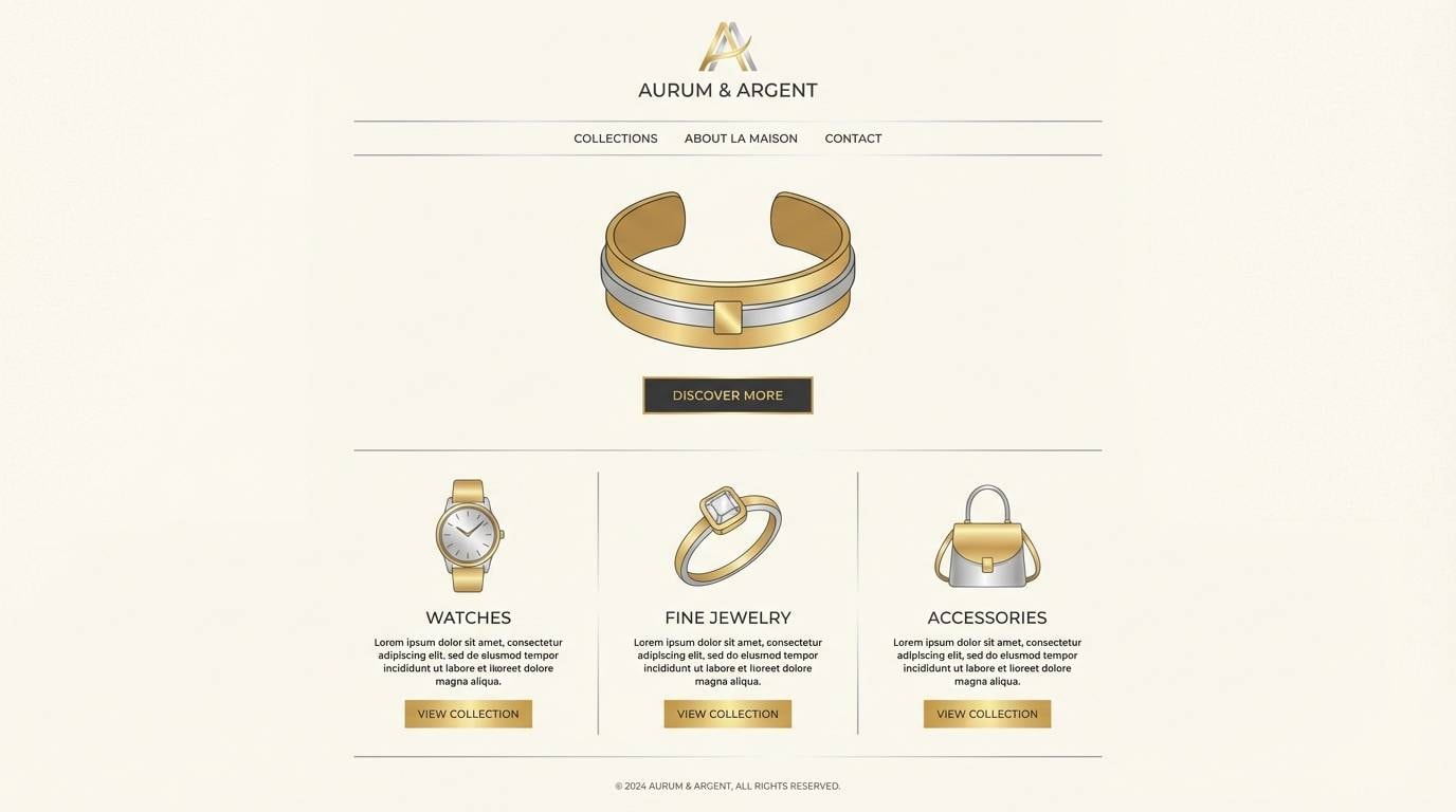
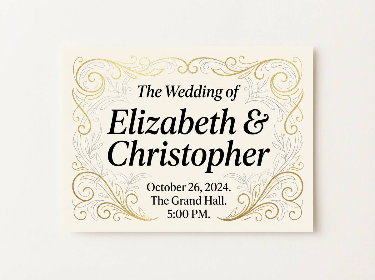
2) Champagne Steel
HEX: #E6C27A #BFC6CF #2B2B2B #FFF7E6 #8A6F3D
Mood: romantic, polished, warm
Best for: wedding invitation design
Romantic and polished, like champagne bubbles against a brushed-metal tray. The warm gold notes keep the pairing welcoming, while steel gray and black text make details easy to read. It works beautifully for invitations, RSVP cards, and save-the-dates when you want elegance without a glitter overload. Tip: print the gold as foil or a soft metallic ink, and keep backgrounds creamy for a refined finish.
Image example of champagne steel generated using media.io
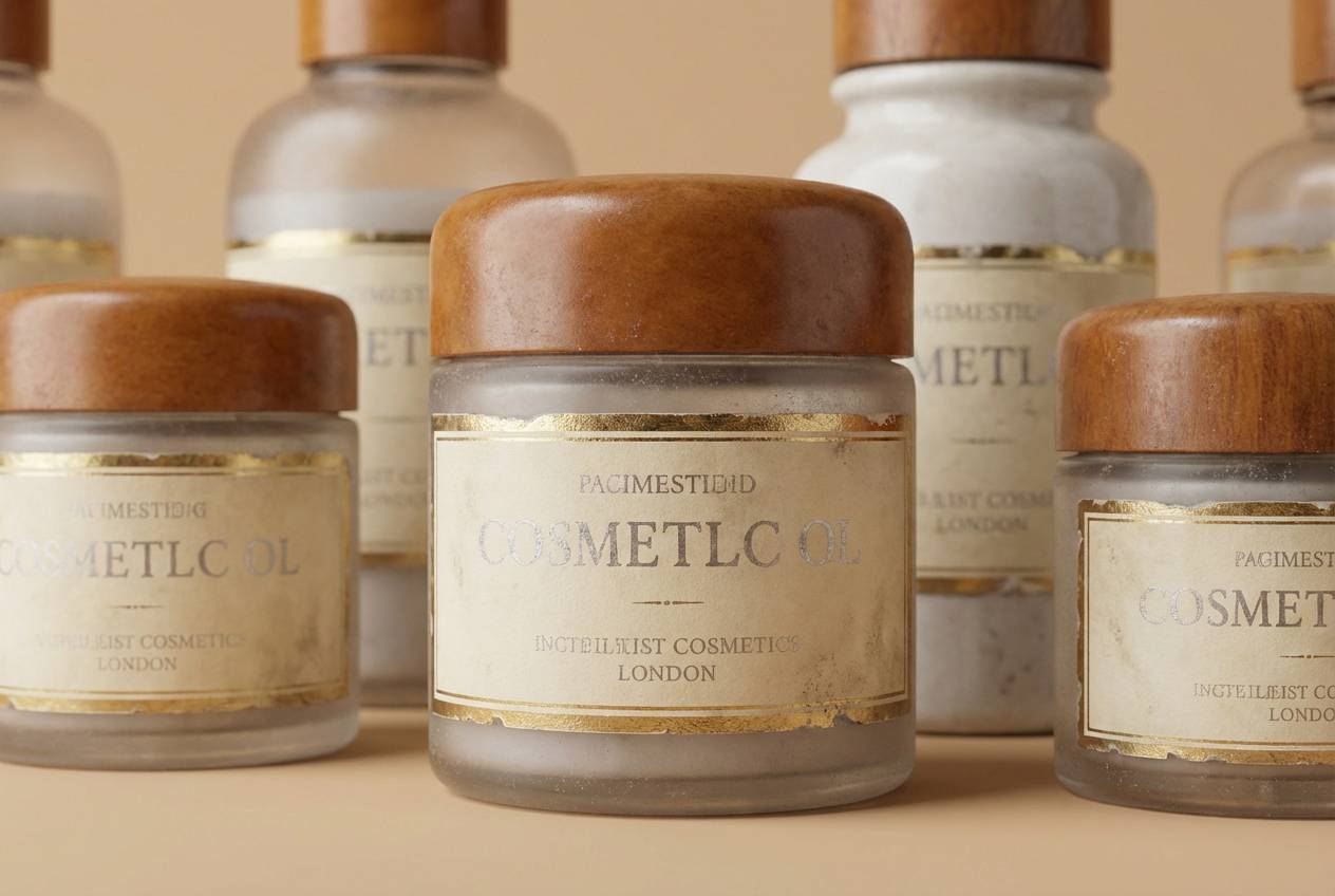
3) Antique Mirror
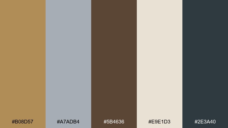
HEX: #B08D57 #A7ADB4 #5B4636 #E9E1D3 #2E3A40
Mood: vintage, earthy, curated
Best for: vintage cosmetics packaging
Vintage and curated, like an old mirror frame found in a boutique hotel. The muted gold and dusty silver read sophisticated rather than flashy, especially with the warm brown base. Use it on labels, boxes, and hang tags, then pair with serif typography and small ornamental borders. Tip: add texture (paper grain or emboss-style shading) to make the palette feel authentically heritage.
Image example of antique mirror generated using media.io
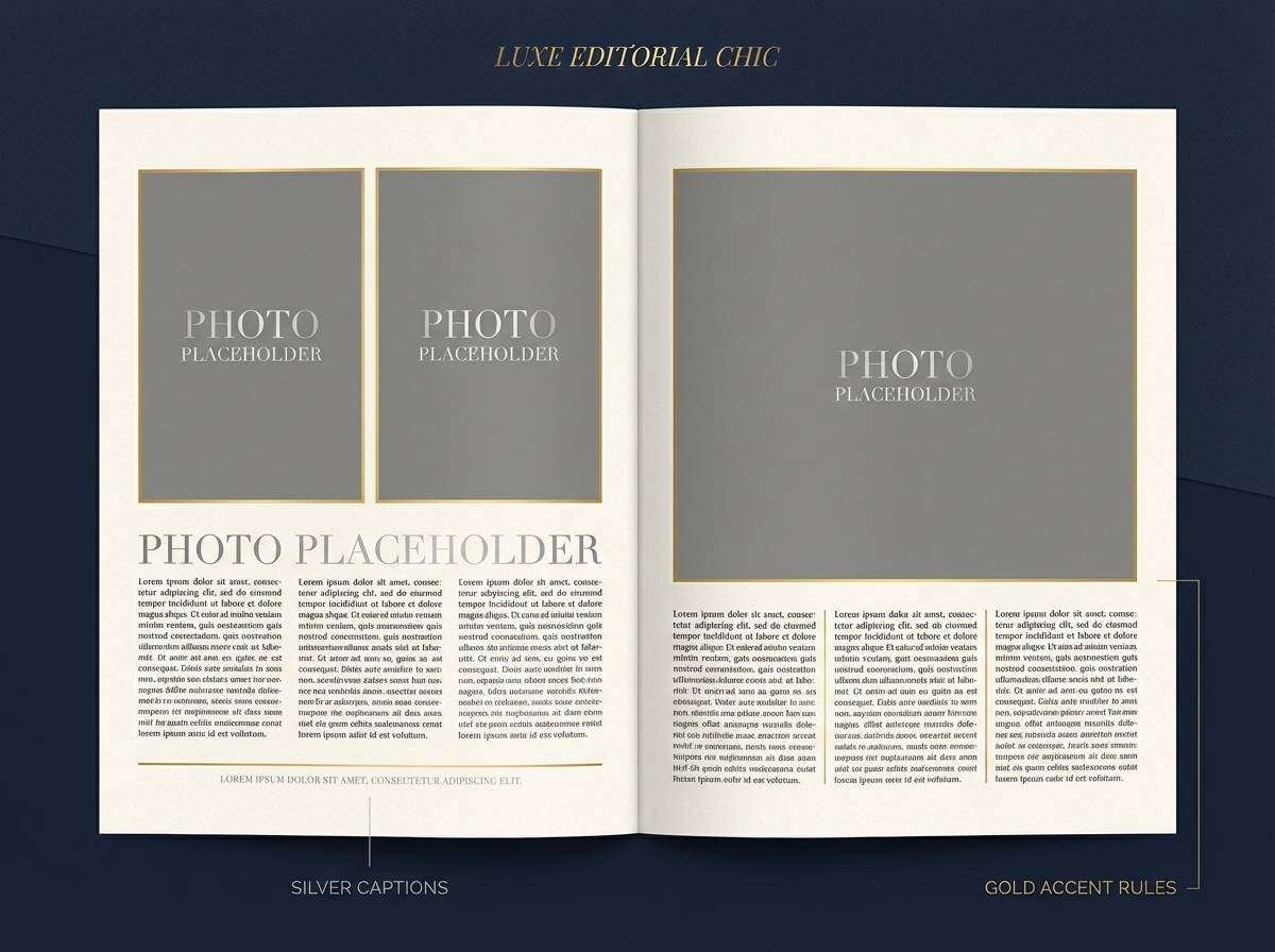
4) Lunar Baroque
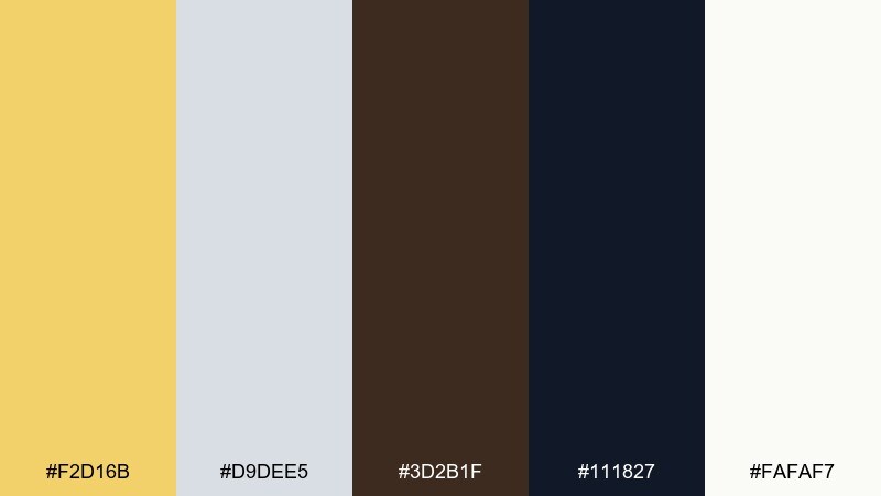
HEX: #F2D16B #D9DEE5 #3D2B1F #111827 #FAFAF7
Mood: dramatic, ornate, night luxe
Best for: editorial magazine spread
Dramatic and ornate, like moonlight catching gilded details in a dark gallery. The deep ink and espresso shades make the metallic tones glow, while the off-white keeps layouts readable. Use this for fashion editorials, culture features, or premium product stories with strong photography. Tip: reserve the brightest gold for pull quotes and section headers so the page feels intentional, not busy.
Image example of lunar baroque generated using media.io
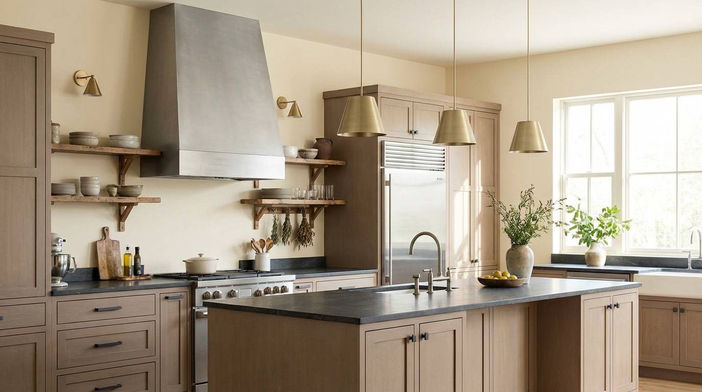
5) Sunlit Pewter
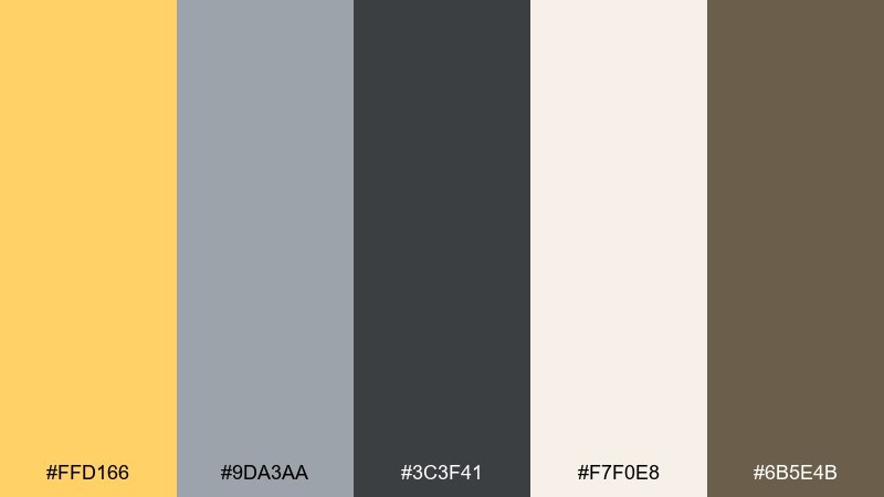
HEX: #FFD166 #9DA3AA #3C3F41 #F7F0E8 #6B5E4B
Mood: cozy, practical, softly radiant
Best for: kitchen interior color planning
Cozy and practical, like late-afternoon light on stainless steel and warm stone. The pewter gray keeps the gold from feeling too formal, while the cream and taupe add a homey softness. It suits kitchens, cafés, and modern rustic interiors where you want warmth without orange undertones. Tip: choose matte finishes for the walls and save metallics for hardware and lighting fixtures.
Image example of sunlit pewter generated using media.io
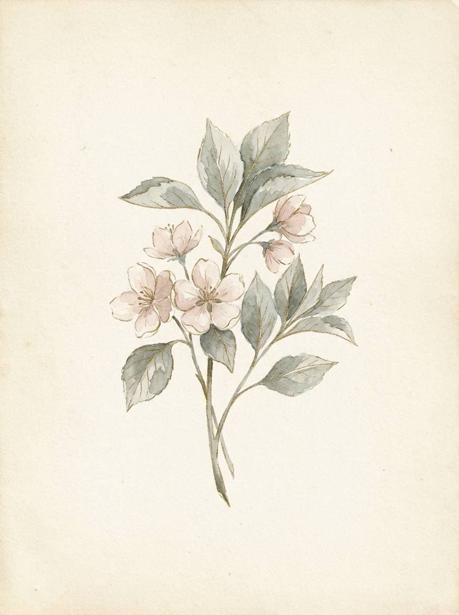
6) Metallic Blossom
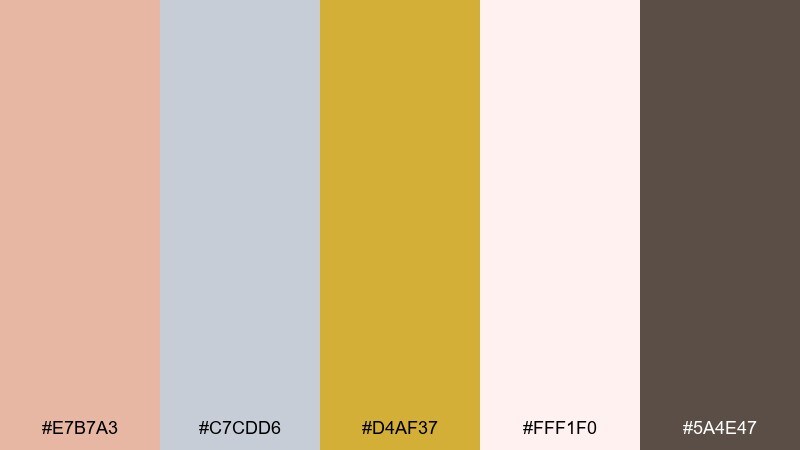
HEX: #E7B7A3 #C7CDD6 #D4AF37 #FFF1F0 #5A4E47
Mood: soft, floral, modern romantic
Best for: spring botanical illustration
Soft and floral, like blush petals with a faint metallic sheen. The gentle pink and airy silver make the gold feel delicate, while the cocoa shade grounds the whole mix. Use it for spring collections, stationery, or social posts that need warmth and clarity. Tip: paint gold as a thin highlight line rather than a filled block to keep the look light.
Image example of metallic blossom generated using media.io
7) Urban Trophy
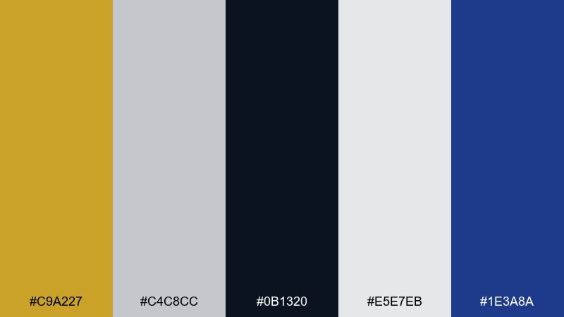
HEX: #C9A227 #C4C8CC #0B1320 #E5E7EB #1E3A8A
Mood: bold, competitive, street-modern
Best for: sports club logo and merch
Bold and competitive, like stadium lights bouncing off a trophy in the city at night. The deep navy and near-black give the metallic tones real punch, while the pale gray keeps the contrast sharp. It works for team identities, esports branding, and merch where you need instant recognition. Tip: use the navy as the primary field and let gold lead in the emblem for maximum impact.
Image example of urban trophy generated using media.io
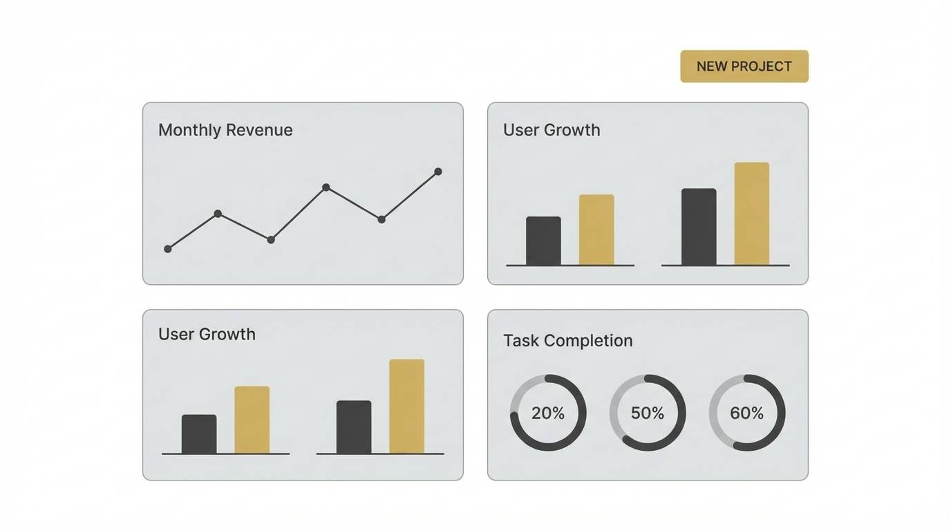
8) Minimal Alloy
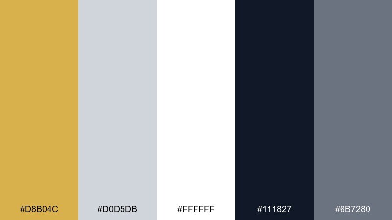
HEX: #D8B04C #D0D5DB #FFFFFF #111827 #6B7280
Mood: minimal, airy, product-first
Best for: SaaS dashboard UI
Minimal and airy, like brushed metal against white studio walls. Silver-gray neutrals carry the layout, while a single warm gold brings just enough personality to key actions. Use it for dashboards, analytics tools, and settings pages where clarity comes first. Tip: apply gold only to one interaction state (primary button or active tab) to keep hierarchy consistent.
Image example of minimal alloy generated using media.io
9) Royal Filigree
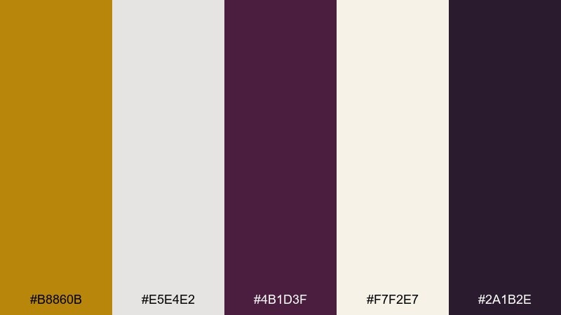
HEX: #B8860B #E5E4E2 #4B1D3F #F7F2E7 #2A1B2E
Mood: opulent, theatrical, jewel-toned
Best for: luxury event poster
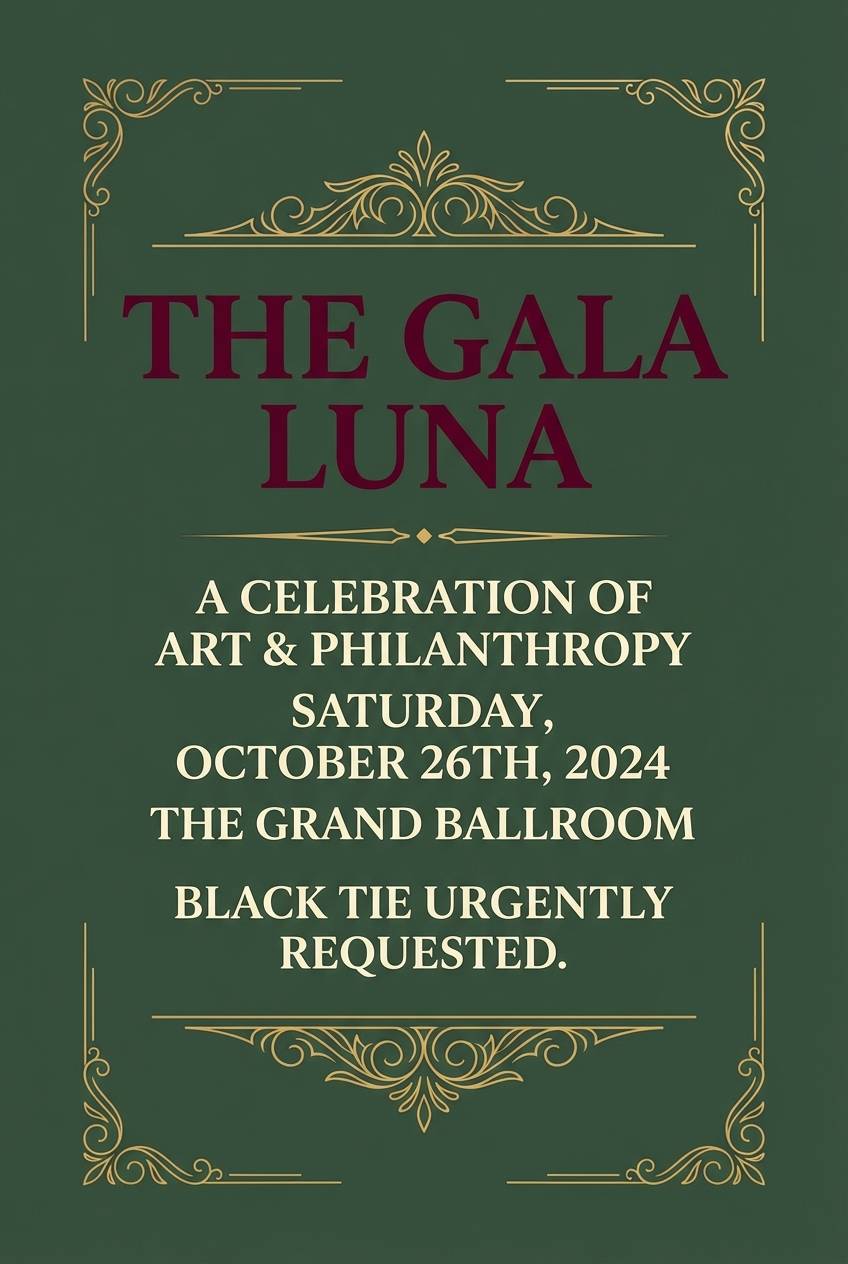
Opulent and theatrical, like velvet curtains trimmed with gilded filigree. The plum and deep aubergine make the metallic notes feel richer and more dramatic than a neutral-only mix. These gold silver color combinations shine on gala posters, concert announcements, and premium nightlife promos. Tip: keep background blocks dark and use silver for small supporting text so the headline can own the spotlight.
Image example of royal filigree generated using media.io
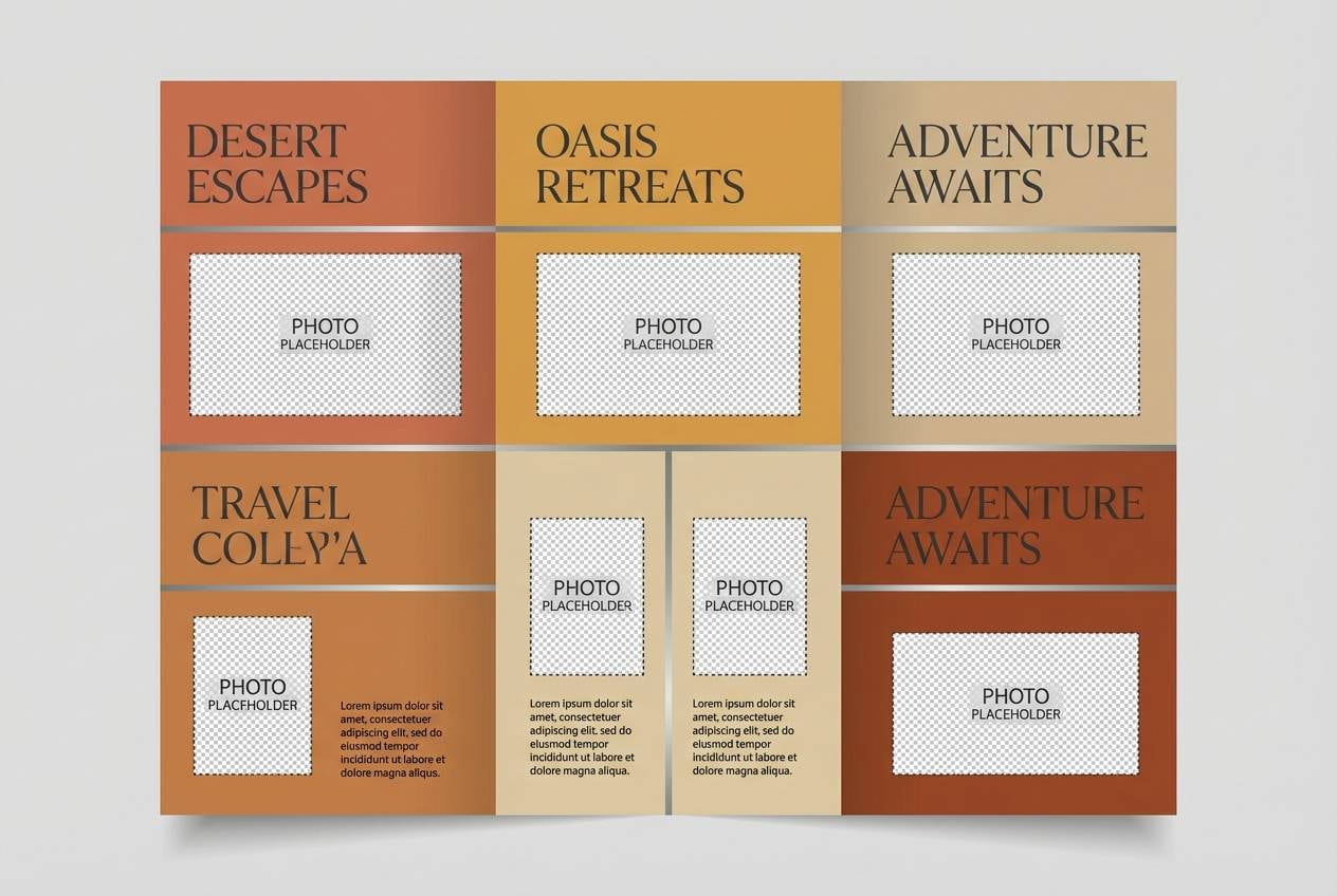
10) Desert Nickel
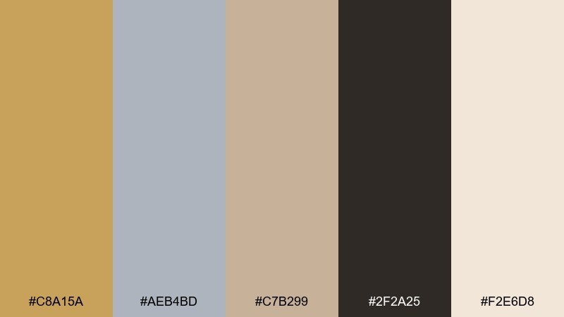
HEX: #C8A15A #AEB4BD #C7B299 #2F2A25 #F2E6D8
Mood: sun-baked, calm, worldly
Best for: travel brochure layout
Sun-baked and calm, like dunes, stone, and a hint of metal on well-worn gear. The sandy neutrals soften the silver, making the overall look grounded and approachable. Use it for travel brochures, tour one-pagers, and hospitality collateral that needs warmth without looking dated. Tip: pair with warm photography and use the dark brown for body copy to avoid harsh contrast.
Image example of desert nickel generated using media.io
11) Iced Caramel
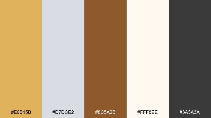
HEX: #E0B15B #D7DCE2 #8C5A2B #FFF8EE #3A3A3A
Mood: sweet, cozy, contemporary
Best for: coffee shop menu design
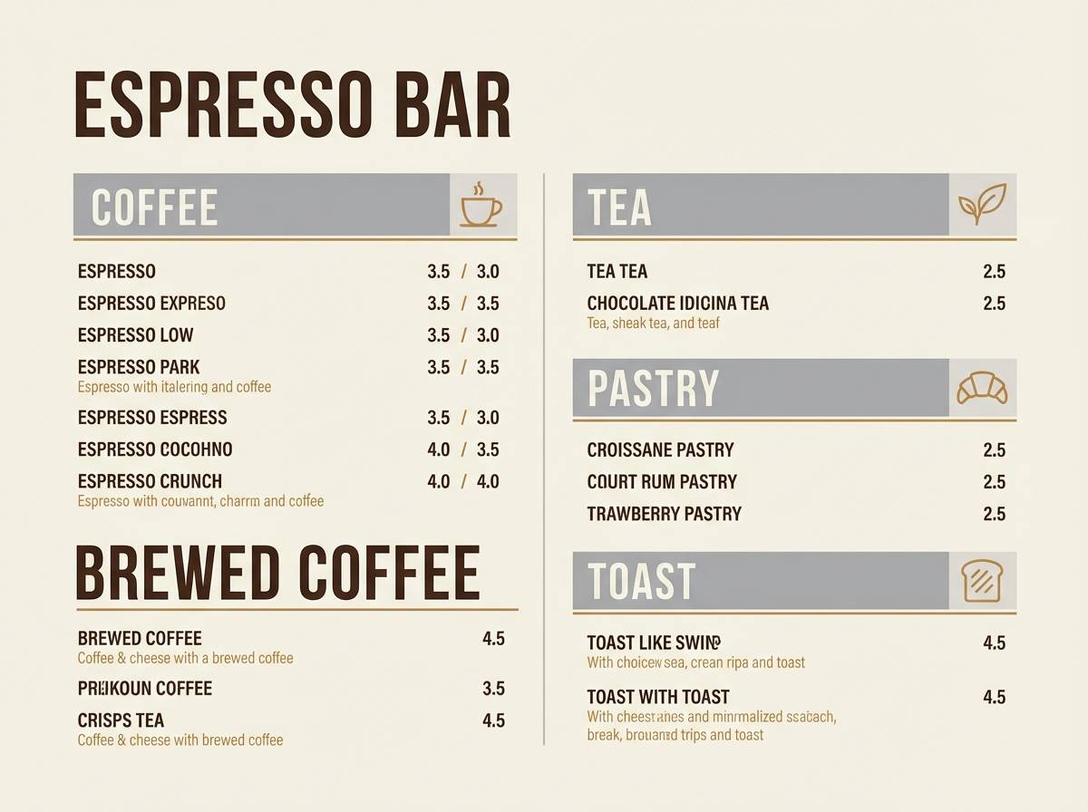
Sweet and cozy, like caramel drizzle over a cold latte in a modern café. The silver-gray cools the warmth, while espresso brown and charcoal keep menus readable under varied lighting. It fits café menus, loyalty cards, and seasonal promo boards that want a premium-but-friendly feel. Tip: use the cream as the base and let gold appear in small icons or price highlights for subtle emphasis.
Image example of iced caramel generated using media.io
12) Neon Bullion
HEX: #FFCC00 #C0C0C0 #0F172A #00D1B2 #F8FAFC
Mood: high-energy, futuristic, techy
Best for: tech product ad
High-energy and futuristic, like neon reflections on a metal chassis. The teal adds a modern jolt that turns classic metals into something unmistakably tech-forward. Use these gold silver color combinations for product ads, launch banners, and campaign visuals where you want speed and confidence. Tip: keep the background deep navy and let teal be the only competing accent so gold stays the hero.
Image example of neon bullion generated using media.io
13) Silver Lining Studio
HEX: #CDA434 #E2E8F0 #334155 #F1F5F9 #94A3B8
Mood: clean, editorial, trustworthy
Best for: photography portfolio website UI
Clean and editorial, like a bright studio with chrome stands and warm reflectors. Soft silvers create a calm canvas, while the gold gives navigation and CTAs a confident lift. It works for portfolio sites, agency pages, and personal brands that want polish without loud color. Tip: use slate for text and captions, and keep gold limited to hover states and small badges.
Image example of silver lining studio generated using media.io
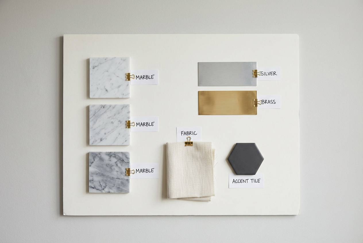
14) Gala Marble
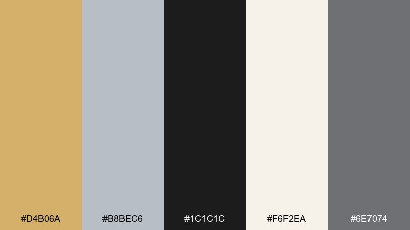
HEX: #D4B06A #B8BEC6 #1C1C1C #F6F2EA #6E7074
Mood: formal, architectural, timeless
Best for: interior decor moodboard
Formal and architectural, like marble floors with warm brass lighting. The near-black adds gallery-level drama, while cream keeps the palette timeless and livable. Use it for living rooms, entryways, and moodboards where you want a refined neutral base with metallic elegance. Tip: balance shiny finishes (frames, lamps) with soft textiles so the room stays inviting.
Image example of gala marble generated using media.io
15) Arctic Goldleaf
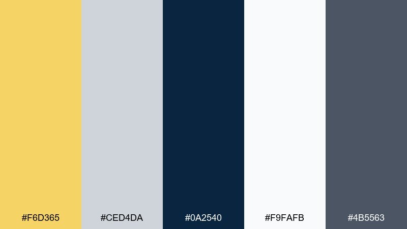
HEX: #F6D365 #CED4DA #0A2540 #F9FAFB #4B5563
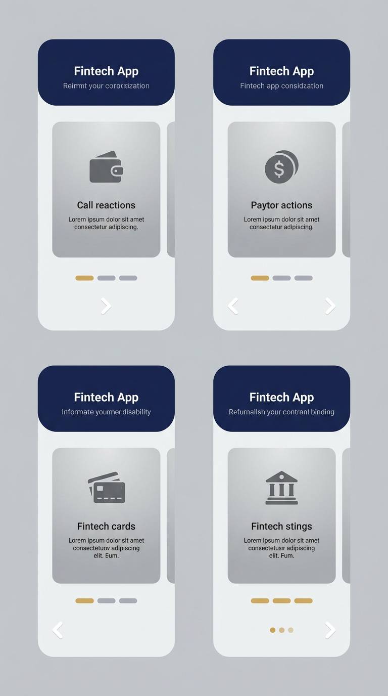
Mood: cool, premium, confident
Best for: fintech app onboarding UI
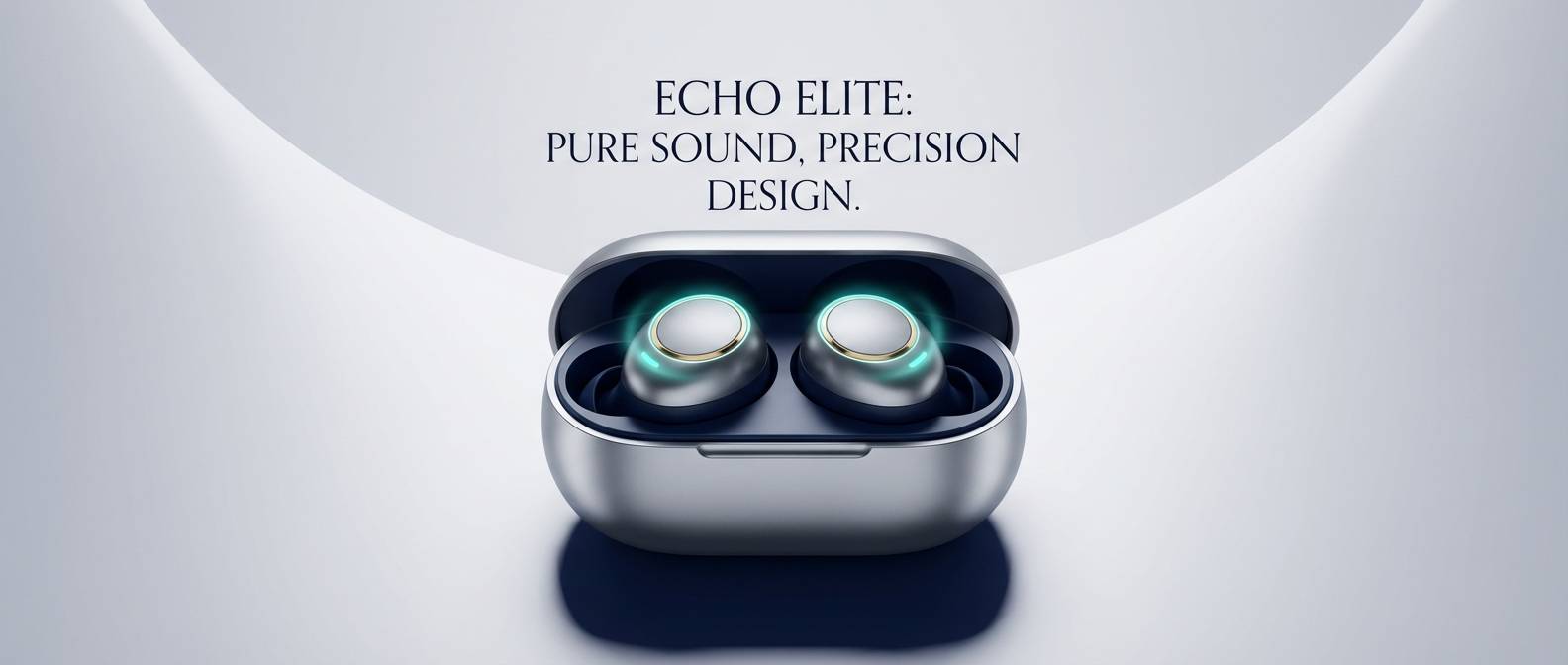
Cool and premium, like goldleaf against icy air and deep ocean tones. The navy creates trust, while silver neutrals keep screens clear and modern. This gold silver color palette is a strong fit for fintech onboarding, rewards screens, and premium account tiers. Tip: keep illustrations minimal and use gold only for progress states or reward markers so the experience feels earned.
Image example of arctic goldleaf generated using media.io
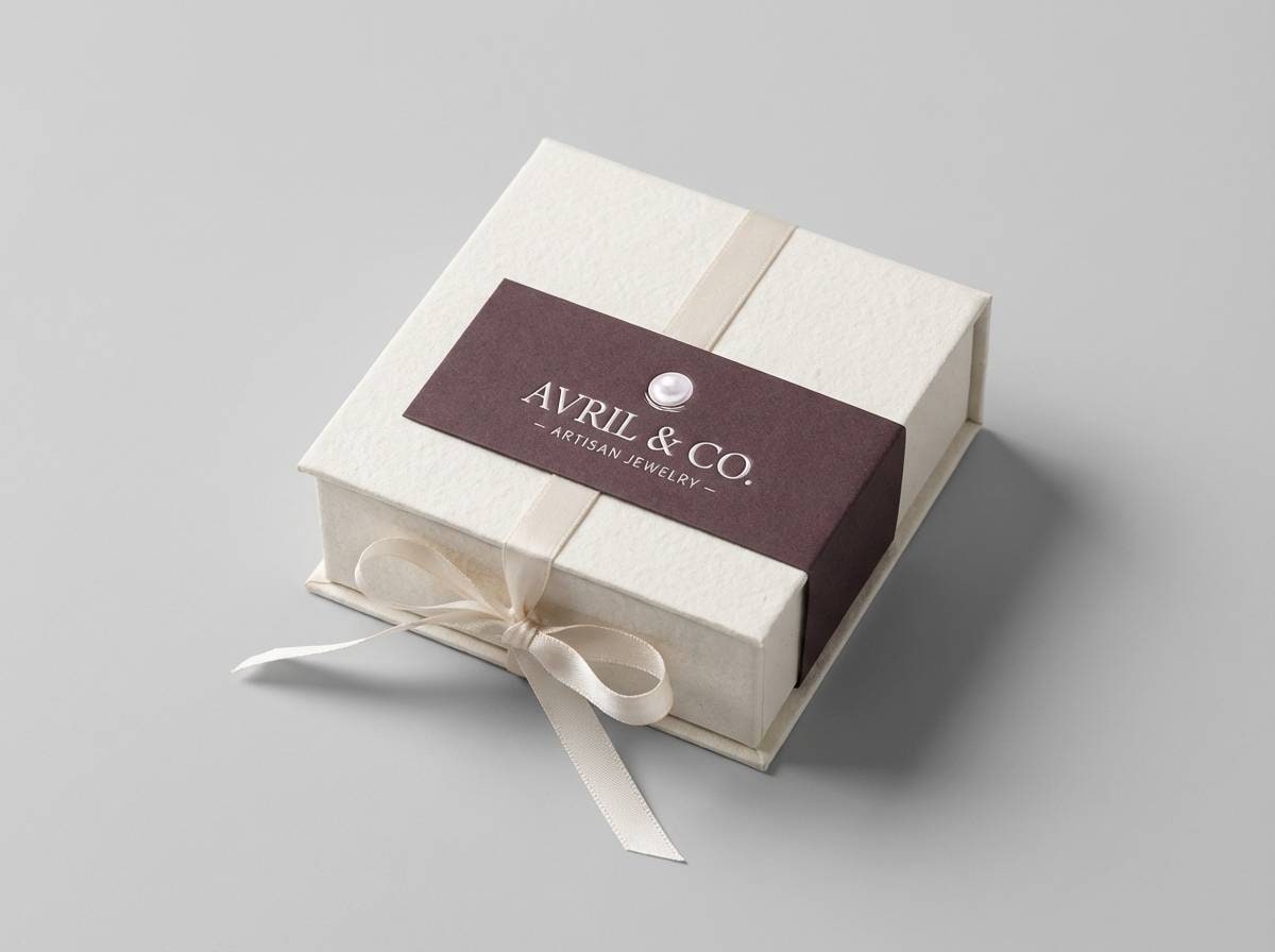
16) Velvet Coin
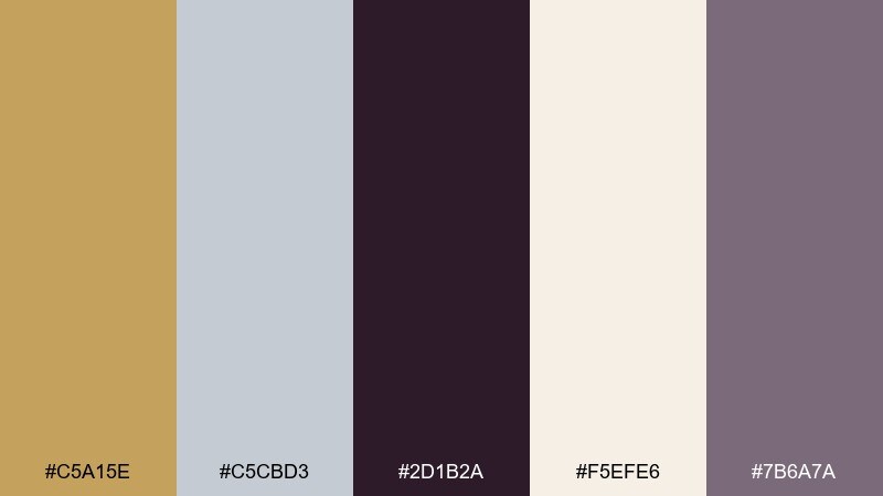
HEX: #C5A15E #C5CBD3 #2D1B2A #F5EFE6 #7B6A7A
Mood: soft luxe, intimate, boutique
Best for: jewelry packaging
Soft luxe and intimate, like jewelry nestled in velvet under warm boutique lighting. The dusty purple-gray adds romance without turning overly feminine, and the cream keeps it gift-ready. Use it for jewelry boxes, tissue wraps, and premium thank-you cards. Tip: pair matte paper with a spot-UV or foil detail on the gold to create a tactile unboxing moment.
Image example of velvet coin generated using media.io
17) Museum Brass
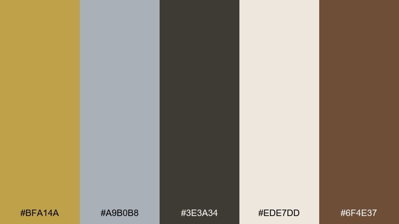
HEX: #BFA14A #A9B0B8 #3E3A34 #EDE7DD #6F4E37
Mood: scholarly, warm, heritage
Best for: museum exhibit signage system
Scholarly and warm, like aged brass plaques and quiet gallery walls. The browns add heritage character, while the silver-gray supports legibility for long-form text. A gold silver color scheme like this is ideal for wayfinding, exhibit labels, and printed guides that need to feel authoritative. Tip: use cream as the primary background and keep gold for section numbers to make navigation effortless.
Image example of museum brass generated using media.io
18) Pearl & Nugget
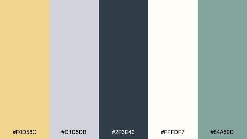
HEX: #F0D58C #D1D5DB #2F3E46 #FFFDF7 #84A59D
Mood: fresh, gentle, spa-like
Best for: skincare label design
Fresh and gentle, like pearly light with a soft botanical breeze. The muted green adds a clean-care cue that keeps the metallic notes from feeling too formal. Use it for skincare labels, ingredient cards, and minimalist ecommerce banners. Tip: keep typography dark and simple, then use gold as a thin border or seal to suggest quality.
Image example of pearl & nugget generated using media.io
19) Skyline Medal
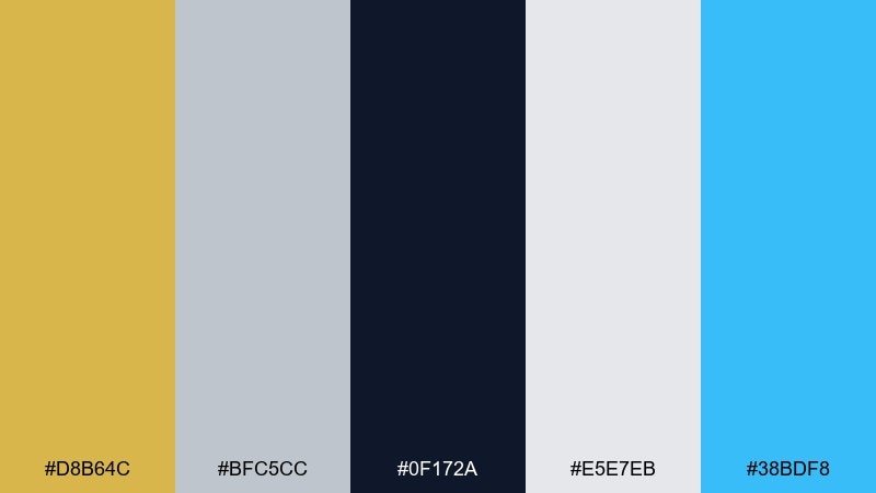
HEX: #D8B64C #BFC5CC #0F172A #E5E7EB #38BDF8
Mood: sharp, corporate, modern
Best for: corporate presentation template
Sharp and modern, like a city skyline reflected on chrome with a clear blue sky overhead. The icy blue brings clarity and energy, while the metallics keep the tone premium and professional. These gold silver color combinations work well for pitch decks, quarterly reports, and keynote templates where you want authority with a modern edge. Tip: use blue for charts and data highlights, reserving gold for key metrics or awards.
Image example of skyline medal generated using media.io
20) Hearthside Chrome
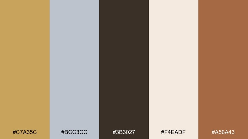
HEX: #C7A35C #BCC3CC #3B3027 #F4EADF #A56A43
Mood: rustic-modern, welcoming, grounded
Best for: rustic restaurant branding
Rustic-modern and welcoming, like candlelight on copper cookware with a hint of chrome. The warm browns bring comfort, while silver keeps the identity contemporary and clean. Use it for restaurant logos, menu systems, and signage where you want premium warmth rather than stark minimalism. Tip: pair with textured paper stocks and simple iconography to keep the brand feeling handcrafted but polished.
Image example of hearthside chrome generated using media.io
What Colors Go Well with Gold Silver?
Gold and silver pair easily with deep neutrals like charcoal, near-black, and navy. Those darker anchors make metallic accents look brighter, sharper, and more intentional.
For a softer feel, add creamy whites, warm taupes, and gentle grays. These keep the palette airy and “design-forward,” especially in UI, print, and interiors where readability matters.
If you want a modern twist, introduce one controlled accent color—like teal, icy blue, or muted sage. Keeping it to a small percentage prevents the metallics from losing their premium focus.
How to Use a Gold Silver Color Palette in Real Designs
In branding, treat gold as a signal color: logos, seals, badges, or key highlights. Let silver and soft grays handle the supporting system (backgrounds, dividers, secondary marks) so the identity doesn’t look over-embellished.
In UI design, prioritize accessibility and hierarchy. Use dark text (charcoal/navy) on light neutrals, then apply gold to one primary interaction element (CTA button, active tab, progress state) to keep behavior consistent.
For print and packaging, think in finishes as much as HEX. Foil, metallic ink, emboss, and spot UV can elevate gold/silver, but you’ll get the cleanest result by pairing those effects with calm backgrounds and strong typography.
Create Gold Silver Palette Visuals with AI
Want to see these gold silver color combinations in context before committing to a design? Generate quick mockups—posters, UI screens, packaging, or moodboards—so you can evaluate contrast, balance, and vibe.
With Media.io’s text-to-image, you can reuse the prompts above or write your own, then iterate fast by swapping backgrounds, adding an accent color, or changing the finish from matte to metallic.
Gold Silver Color Palette FAQs
-
What HEX codes are considered “gold” and “silver” in digital design?
Common digital golds include #D4AF37, #C9A227, and #FFCC00, while silvers often sit around #C0C0C0, #D1D5DB, or #CED4DA. For a more premium look, use gold as an accent and rely on darker anchors (navy/charcoal) to create contrast. -
How do I make gold look metallic if I only have flat HEX colors?
Use gradients and subtle highlights/shadows: pick a darker gold and a lighter gold, then create a gentle linear gradient. Adding a soft specular highlight band (lighter stripe) can sell the metal effect even without true 3D rendering. -
Do gold and silver work for modern UI, or do they feel too “luxury”?
They can feel very modern when paired with clean neutrals (white, slate, cool grays) and used sparingly. A minimal layout with one gold action color and silver dividers often reads “premium SaaS” rather than ornate luxury. -
What’s the best background color for gold and silver accents?
It depends on the mood: deep navy/charcoal makes metallics pop and feel dramatic, while ivory/cream keeps things airy and editorial. If readability is critical, keep body text on light neutrals and reserve dark backgrounds for hero sections. -
How can I keep a gold silver palette from looking gaudy?
Limit gold to small, purposeful elements (CTA, badge, key metric, border) and let silver/gray do most of the “system” work. Also avoid using multiple bright metallic tones at once—pick one hero gold and keep the rest muted. -
What accent colors pair well with gold and silver?
Teal, icy blue, and muted sage are strong accents because they add freshness without overpowering the metals. Use the accent for data, icons, or small highlights, and keep gold for premium signals and calls to action. -
How do I prepare gold/silver designs for print (foil, metallic ink)?
Plan finishes early: keep metallic areas as separate layers/spot colors, and use creamy or dark bases for maximum contrast. Ask your printer about foil coverage limits and proof with a swatch so the gold doesn’t shift too yellow or too brown.


