

A blue green brown color palette is one of the easiest ways to blend “fresh” and “grounded” in the same design. Teal and ocean tones bring clarity, while wood and earth neutrals add warmth and trust.
From modern rustic branding to calm UI screens and cozy interiors, these combinations stay versatile because they balance cool and warm temperature, plus light and dark contrast.
In this article
- Why Blue Green Brown Palettes Work So Well
-
- coastal cedar
- riverbank hike
- vintage study
- alpine lake cabin
- mossy terracotta
- surf and saddle
- botanical courier
- museum patina
- campfire denim
- quiet library
- pacific workshop
- garden shed
- espresso coastline
- rustic sea glass
- modern lodge
- teal bronze minimal
- rainy boardwalk
- autumn reef
- field journal
- harbor workshop
- canyon tide
- fern and walnut
- copper spruce night
- What Colors Go Well with Blue Green Brown?
- How to Use a Blue Green Brown Color Palette in Real Designs
- Create Blue Green Brown Palette Visuals with AI
Why Blue Green Brown Palettes Work So Well
Blue-green shades (teal, seafoam, deep blue-green) naturally signal freshness, water, and calm—so they’re perfect for interfaces and brands that want clarity without feeling sterile. They also tend to look “clean” in both digital and print.
Brown tones add the human, tactile layer: wood, leather, clay, coffee, or earth. That warmth makes teal feel more approachable and premium, especially when you anchor the palette with a deep near-black for typography.
Together, blue green and brown create a reliable warm-cool balance that works across seasons and styles—from coastal minimal to modern lodge—while keeping enough contrast for accessible design.
20+ Blue Green Brown Color Palette Ideas (with HEX Codes)
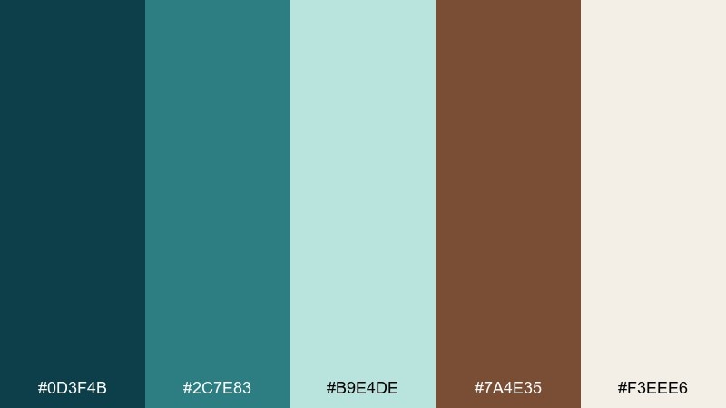
1) Coastal Cedar
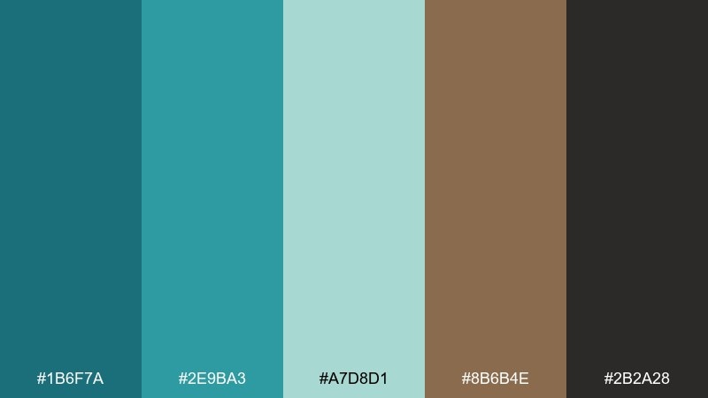
HEX: #1B6F7A #2E9BA3 #A7D8D1 #8B6B4E #2B2A28
Mood: fresh, grounded, coastal
Best for: brand identity for an outdoor lifestyle company
Fresh sea air meets sun-warmed cedar, balancing crisp blue-greens with confident wood tones. It works beautifully for outdoor brands, cafes, and packaging that wants a clean but earthy feel. Pair it with warm white and a restrained sans serif to keep it modern. Usage tip: use the dark charcoal for type, and reserve the lighter aqua for highlights and badges.
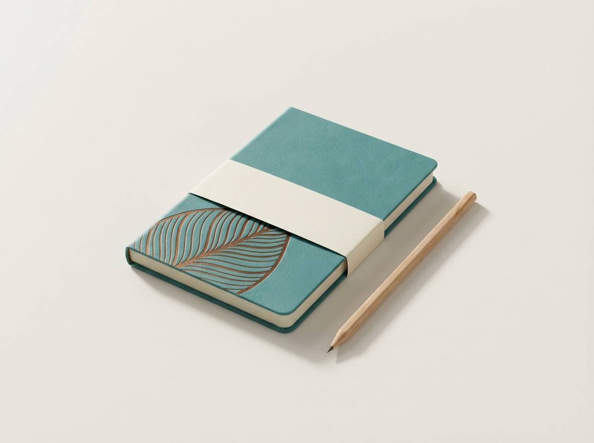
Image example of coastal cedar generated using media.io
Media.io is an online AI studio for creating and editing video, image, and audio in your browser.

2) Riverbank Hike
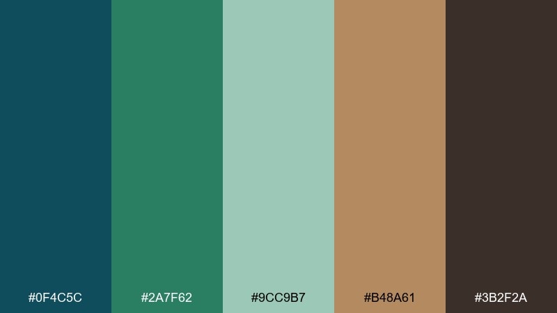
HEX: #0F4C5C #2A7F62 #9CC9B7 #B48A61 #3B2F2A
Mood: adventurous, natural, calm
Best for: website hero and section styling for a travel blog
Adventurous and calm, like a shaded river trail with clay banks and deep water. These tones hold up well in web layouts because the dark blue-green anchors headings while the soft mint supports spacious sections. Pair with off-white backgrounds and warm gray dividers to avoid harsh contrast. Usage tip: keep photos slightly desaturated so the palette stays in control.
Image example of riverbank hike generated using media.io
3) Vintage Study
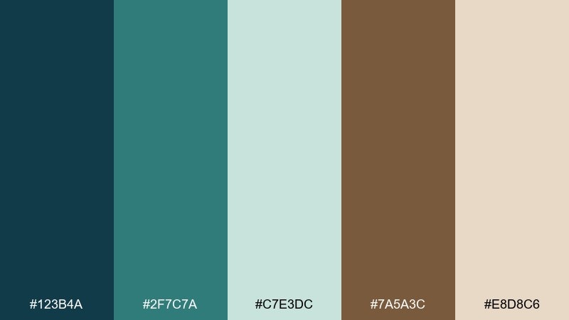
HEX: #123B4A #2F7C7A #C7E3DC #7A5A3C #E8D8C6
Mood: classic, scholarly, cozy
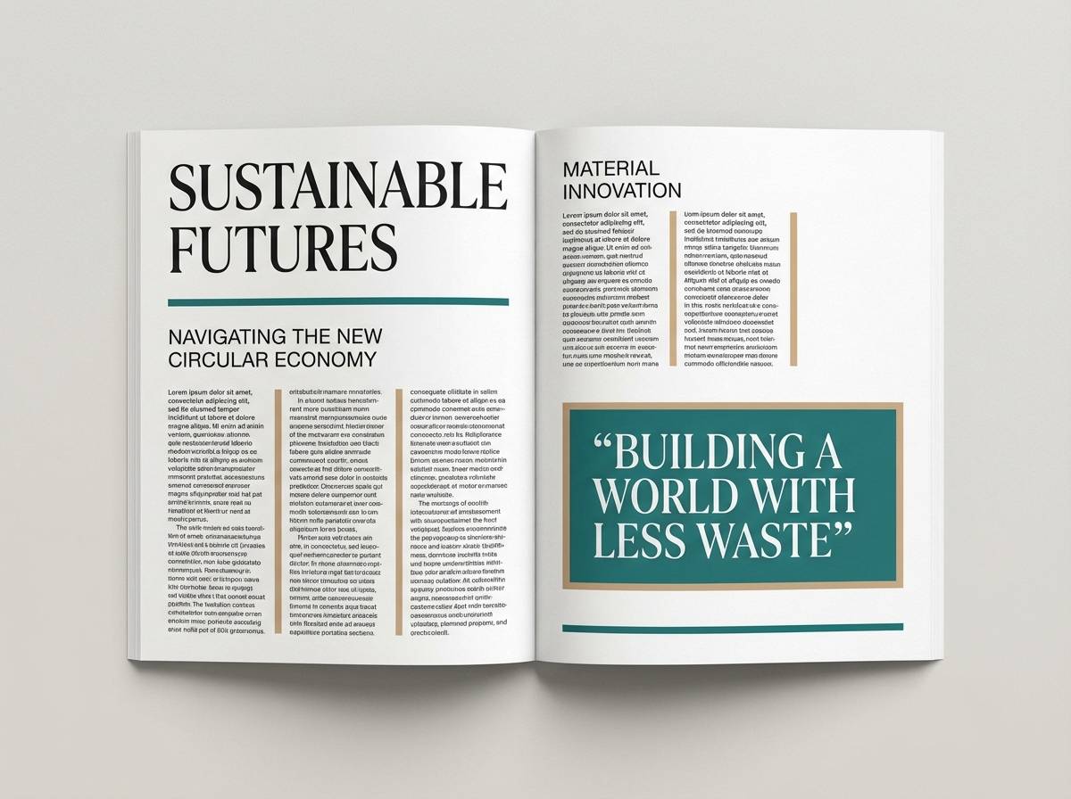
Best for: editorial magazine feature layout
Classic and scholarly, like a vintage study with teal book cloth and worn leather. This blue green brown color palette shines in editorial design where you want authority without feeling cold. Pair the cream as your paper base, then use the darker teal for section headers and pull quotes. Usage tip: keep body text in a near-black and use brown sparingly as a premium accent.
Image example of vintage study generated using media.io
4) Alpine Lake Cabin
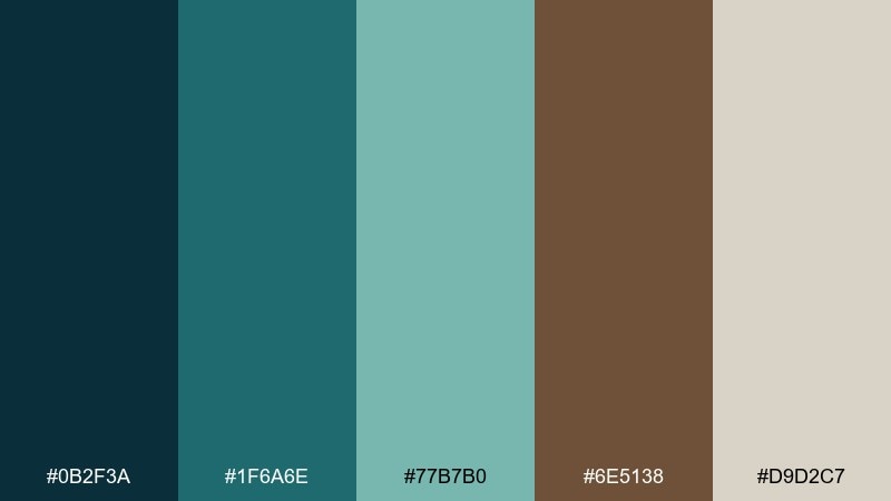
HEX: #0B2F3A #1F6A6E #77B7B0 #6E5138 #D9D2C7
Mood: quiet, crisp, rustic
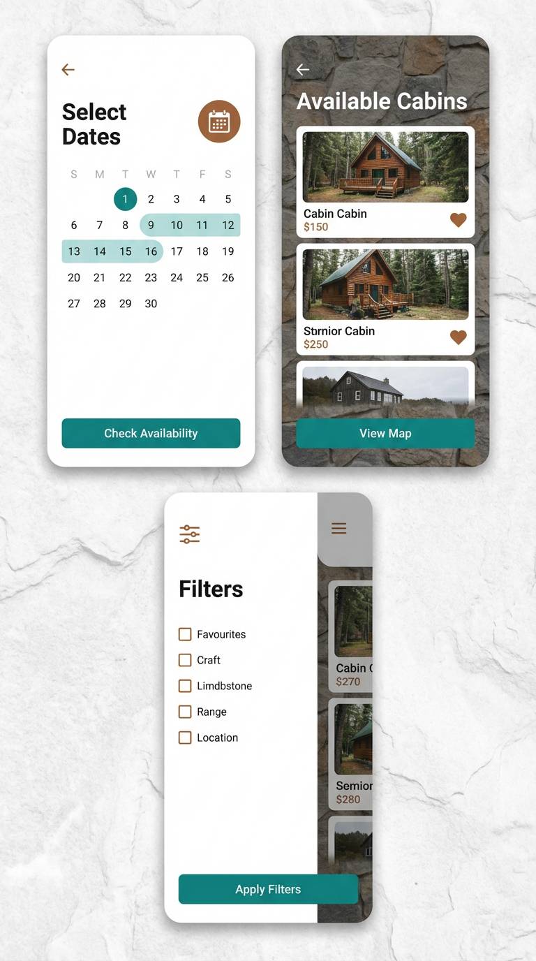
Best for: cabin rental listing UI and booking screens
Quiet and crisp, like an alpine lake outside a timber cabin at dawn. The muted teal range keeps interfaces calm, while the browns add warmth and trust for booking flows. Pair with generous whitespace and soft rounded corners to keep it welcoming. Usage tip: use the light stone tone for backgrounds and keep primary buttons in the mid teal for clarity.
Image example of alpine lake cabin generated using media.io
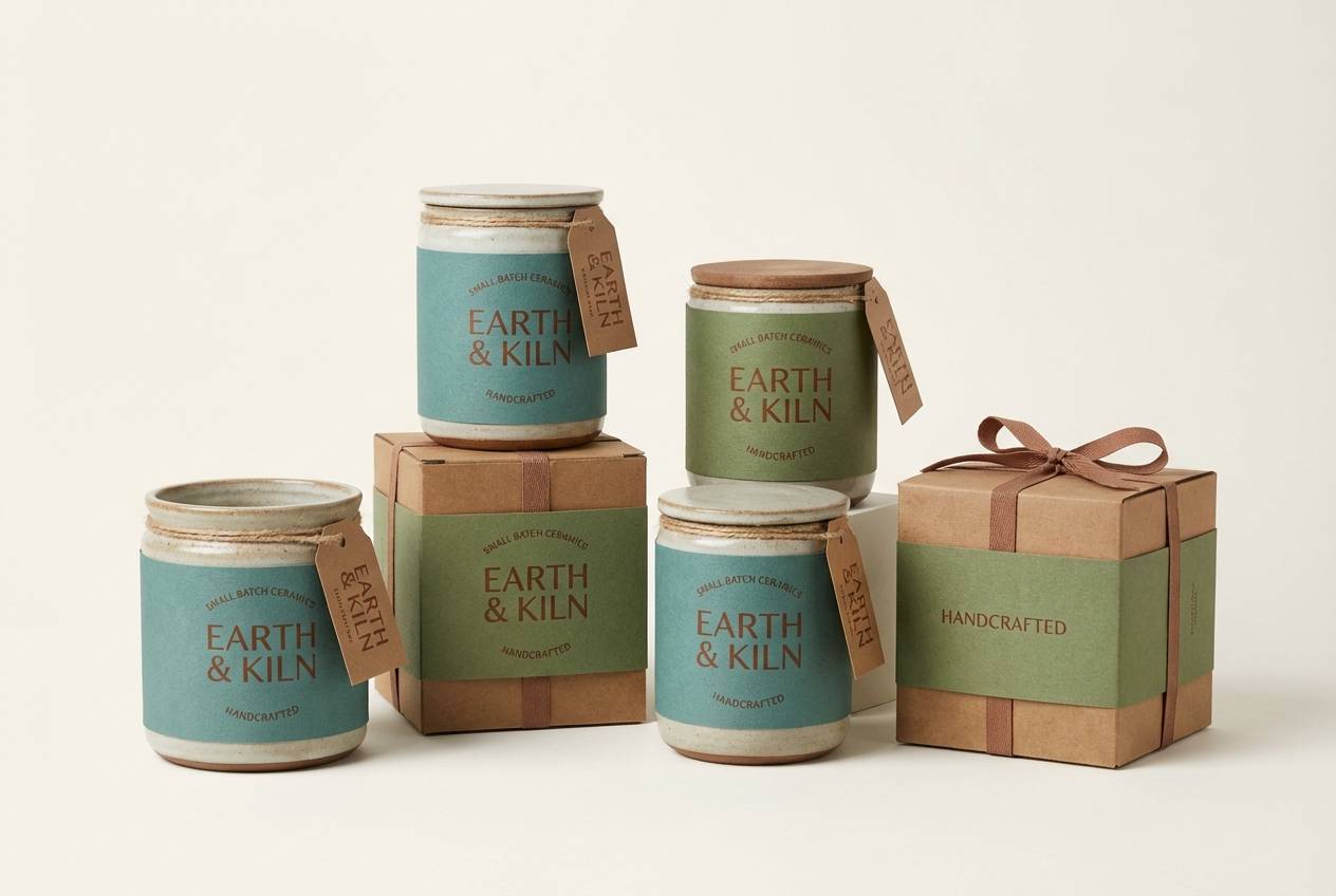
5) Mossy Terracotta
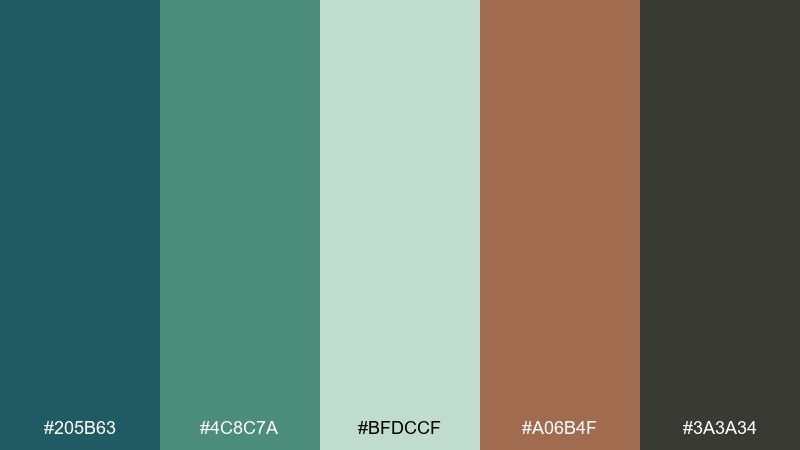
HEX: #205B63 #4C8C7A #BFDCCF #A06B4F #3A3A34
Mood: earthy, artisan, warm
Best for: ceramics product packaging and labels
Earthy and artisan, like moss on clay pots after a light rain. The green-blue notes make the warm terracotta feel more refined, not rustic kitsch. Pair with textured paper stock and a simple stamp-style mark for an authentic look. Usage tip: print the darkest tone for small text so labels stay legible on kraft materials.
Image example of mossy terracotta generated using media.io
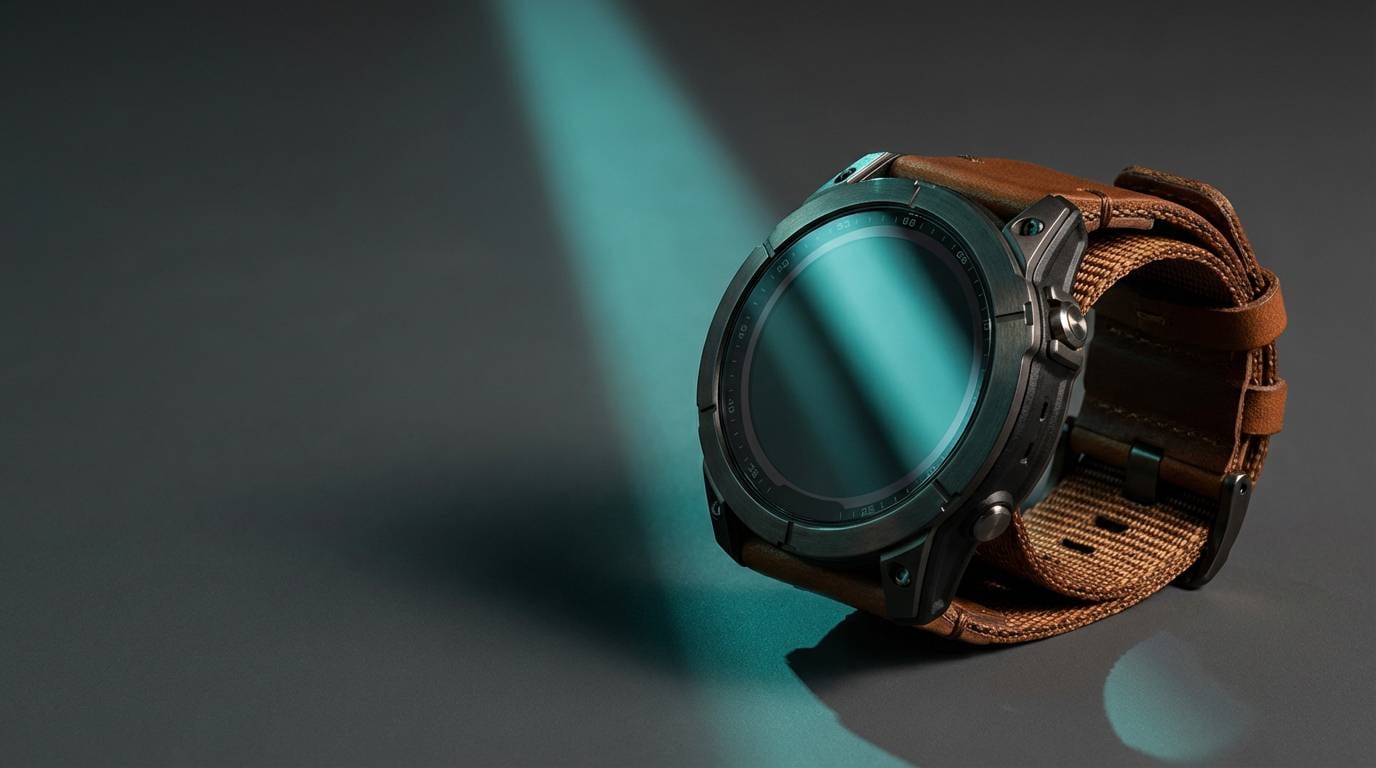
6) Surf and Saddle
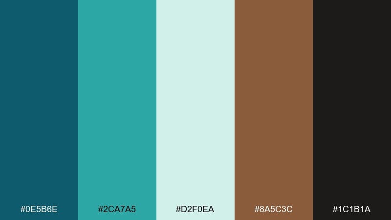
HEX: #0E5B6E #2CA7A5 #D2F0EA #8A5C3C #1C1B1A
Mood: bold, sporty, confident
Best for: product ad for a rugged smartwatch
Bold and sporty, like surf spray over worn leather gear. The vivid teal delivers energy, while the saddle brown keeps the look rugged and premium. Pair with high-contrast photography and minimal copy to let color do the work. Usage tip: use the pale aqua as a glow or UI highlight, not as a full background, to avoid washing out the ad.
Image example of surf and saddle generated using media.io
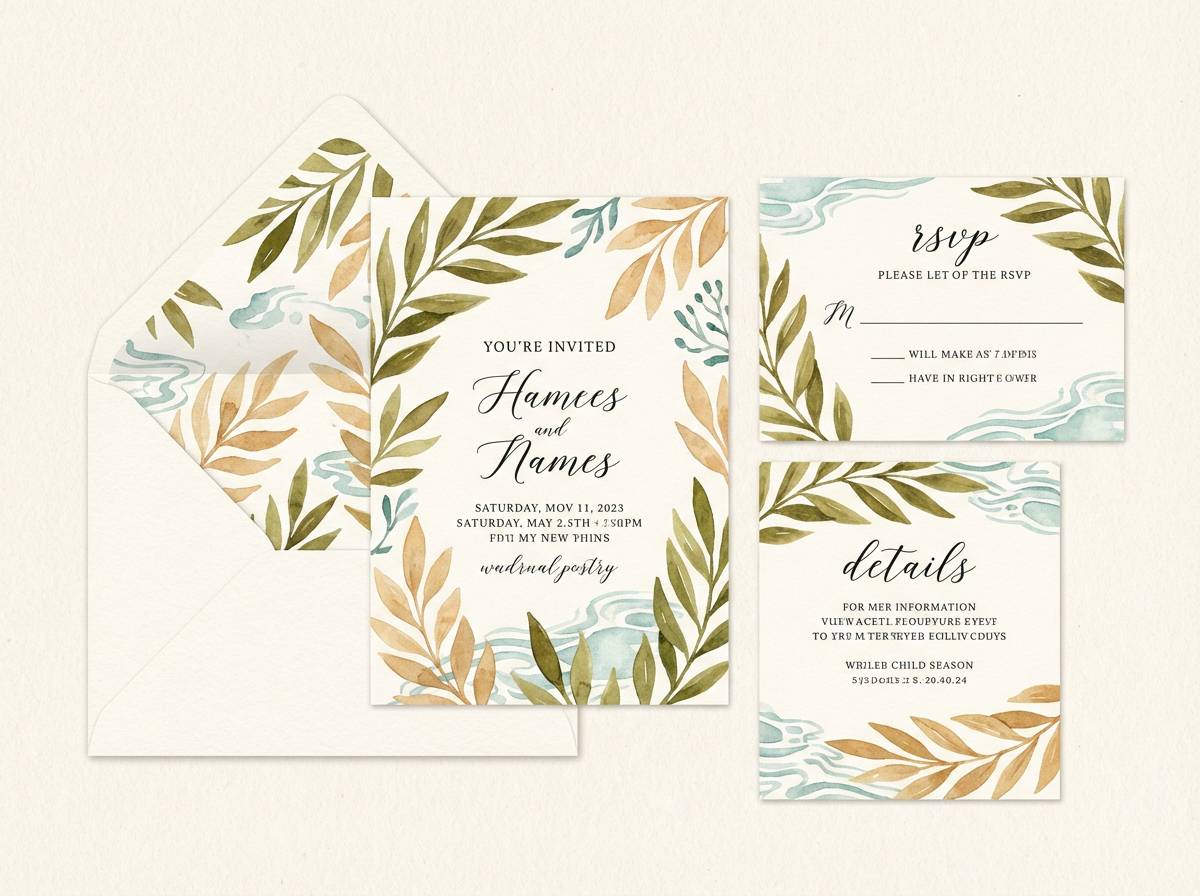
7) Botanical Courier
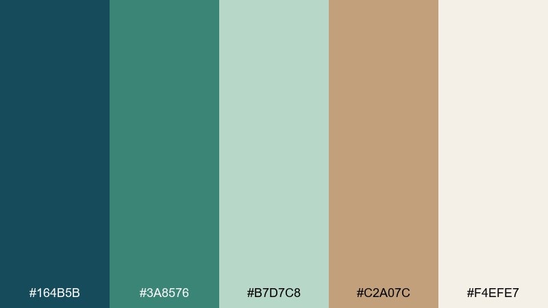
HEX: #164B5B #3A8576 #B7D7C8 #C2A07C #F4EFE7
Mood: botanical, gentle, vintage
Best for: watercolor botanical invitation suite
Botanical and gentle, like pressed leaves tucked into an old envelope. These blue green brown color combinations feel especially graceful when used with watercolor florals and soft paper tones. Pair with a serif headline and light script for names, keeping contrast subtle and elegant. Usage tip: let the cream lead as negative space, and use the tan for borders and small motifs.
Image example of botanical courier generated using media.io
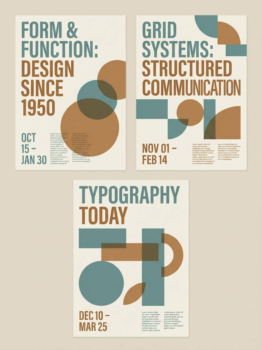
8) Museum Patina
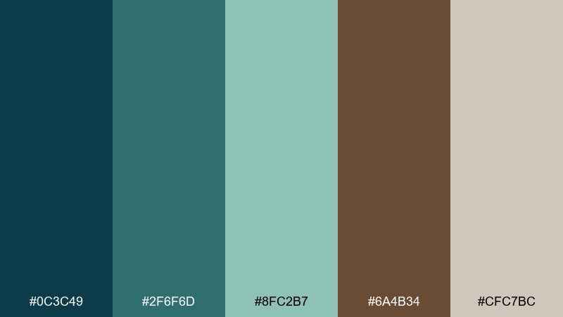
HEX: #0C3C49 #2F6F6D #8FC2B7 #6A4B34 #CFC7BC
Mood: timeless, refined, muted
Best for: museum exhibition poster series
Timeless and refined, like aged bronze beside polished wood in a quiet gallery. The muted teal reads sophisticated and lets typography take center stage. Pair with a strong grid, generous margins, and a single accent color used consistently across the series. Usage tip: keep background tones matte and avoid bright whites for a more archival feel.
Image example of museum patina generated using media.io
9) Campfire Denim
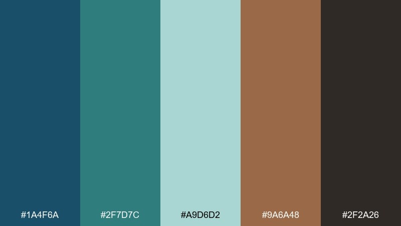
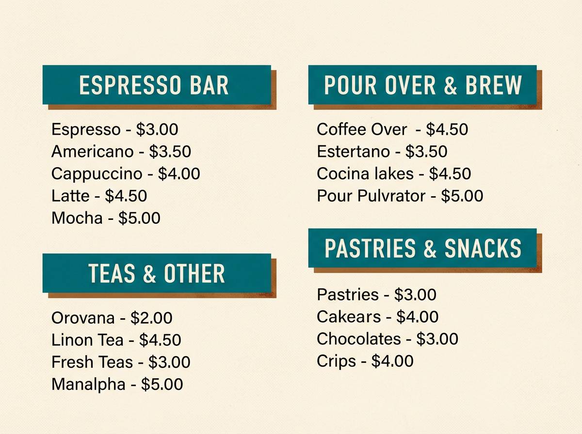
HEX: #1A4F6A #2F7D7C #A9D6D2 #9A6A48 #2F2A26
Mood: cozy, outdoorsy, rugged
Best for: coffee shop menu board and signage
Cozy and rugged, like denim jackets around a campfire and steam from a fresh pour-over. The deep blue keeps menus readable, while the warm brown supports appetizing highlights. Pair with chalky textures or subtle grain for a handcrafted vibe. Usage tip: use the light aqua only for small callouts so the board does not turn pastel.
Image example of campfire denim generated using media.io
10) Quiet Library
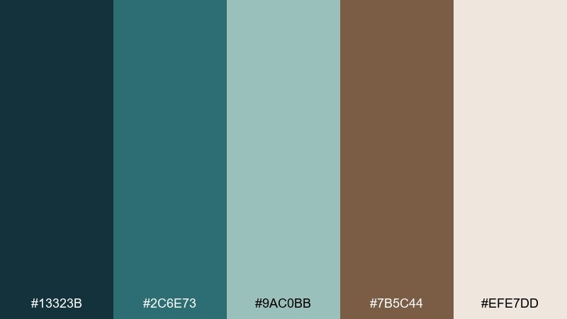
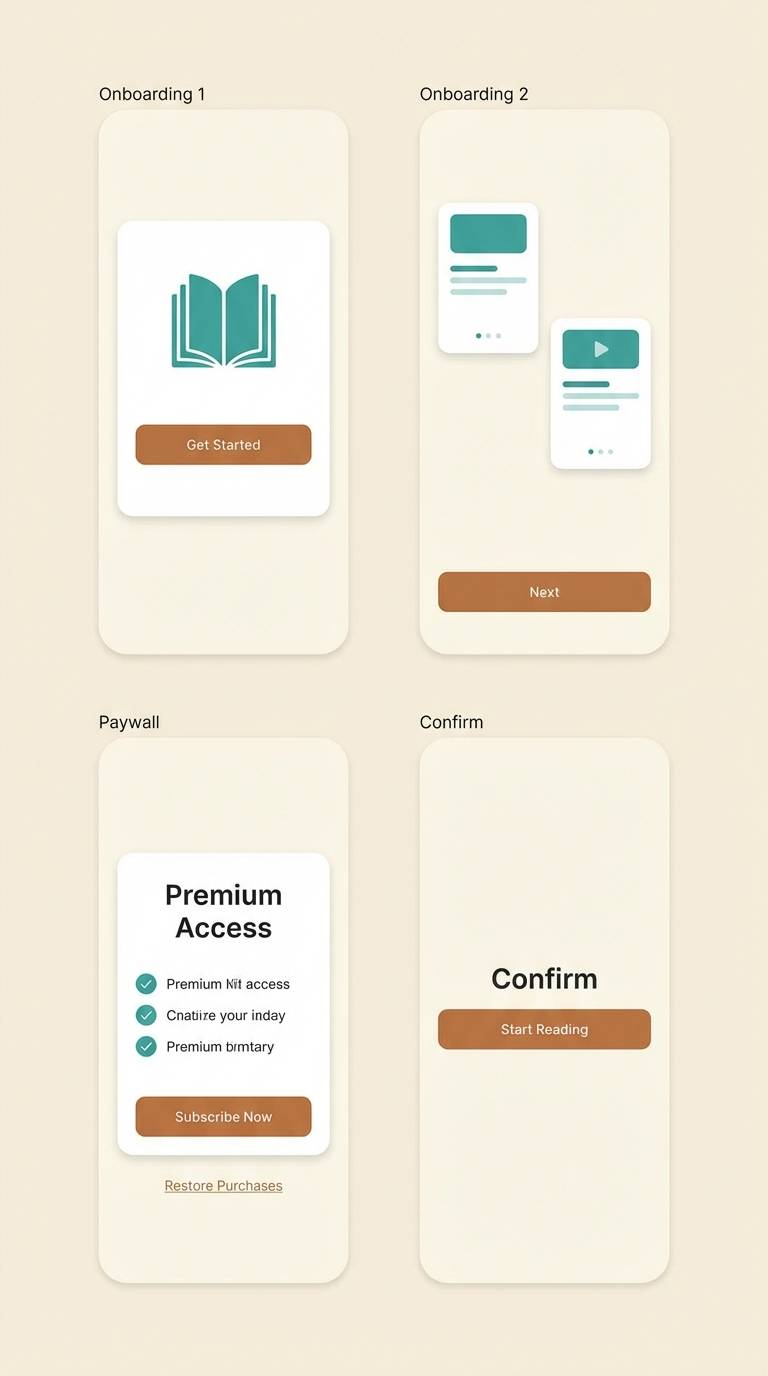
HEX: #13323B #2C6E73 #9AC0BB #7B5C44 #EFE7DD
Mood: calm, intellectual, comforting
Best for: reading app onboarding and paywall UI
Calm and intellectual, like soft light on old shelves and a silent reading room. The teal tones give digital screens a restful quality, while the brown adds warmth that feels human. Pair with creamy backgrounds and plenty of line height for easy reading. Usage tip: reserve the darkest tone for primary text and icons to keep contrast accessible.
Image example of quiet library generated using media.io
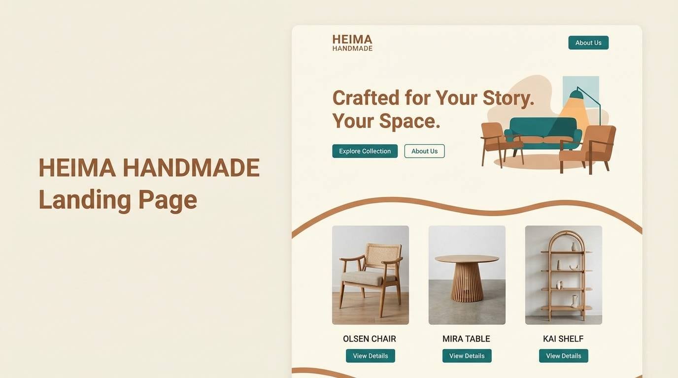
11) Pacific Workshop
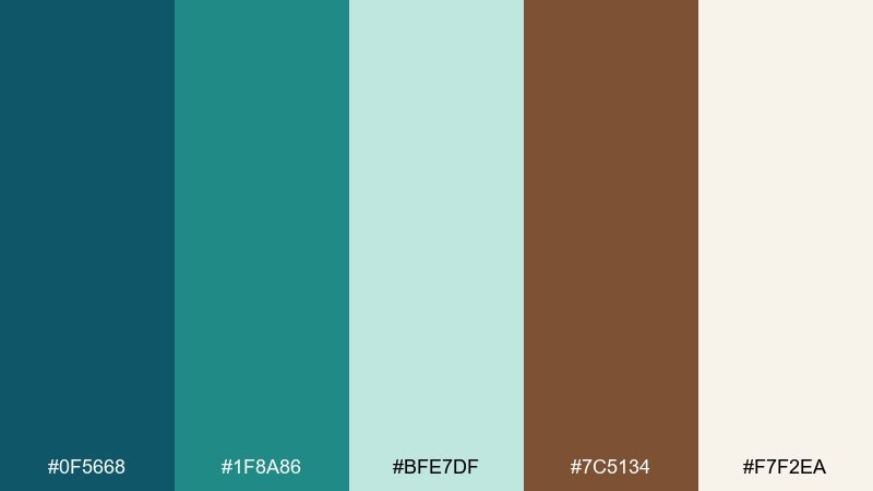
HEX: #0F5668 #1F8A86 #BFE7DF #7C5134 #F7F2EA
Mood: clean, maker, modern
Best for: landing page for a handmade furniture studio
Clean and maker-focused, like a Pacific workshop with sawdust, sea air, and neatly stacked boards. This blue green brown color combination feels modern when paired with simple product photography and strong whitespace. Let teal handle interactive elements while brown stays as a quiet nod to real wood. Usage tip: keep the accent mint for hover states and subtle section breaks.
Image example of pacific workshop generated using media.io
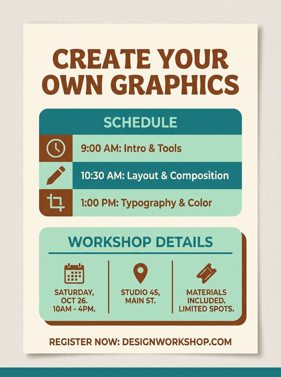
12) Garden Shed
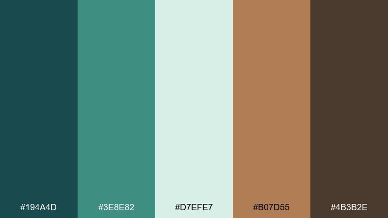
HEX: #194A4D #3E8E82 #D7EFE7 #B07D55 #4B3B2E
Mood: practical, sunny, homey
Best for: DIY workshop poster and class flyer
Practical and sunny, like a tidy garden shed with painted tools and warm timber shelves. The teal brings clarity to headings, while the caramel brown keeps it friendly and approachable. Pair with bold icons and a simple two-column layout for quick scanning. Usage tip: use the pale mint as negative space so the flyer stays breathable.
Image example of garden shed generated using media.io
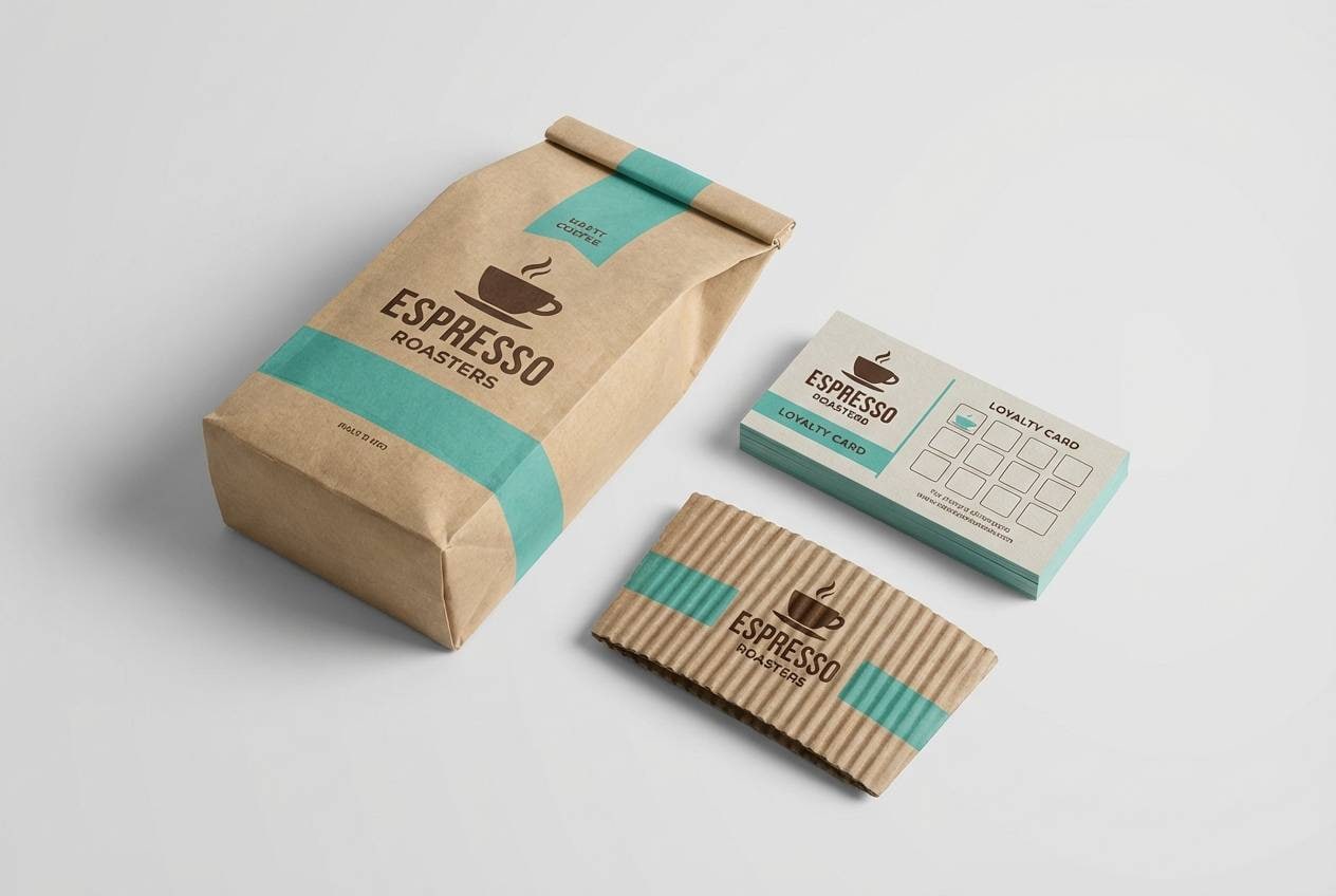
13) Espresso Coastline
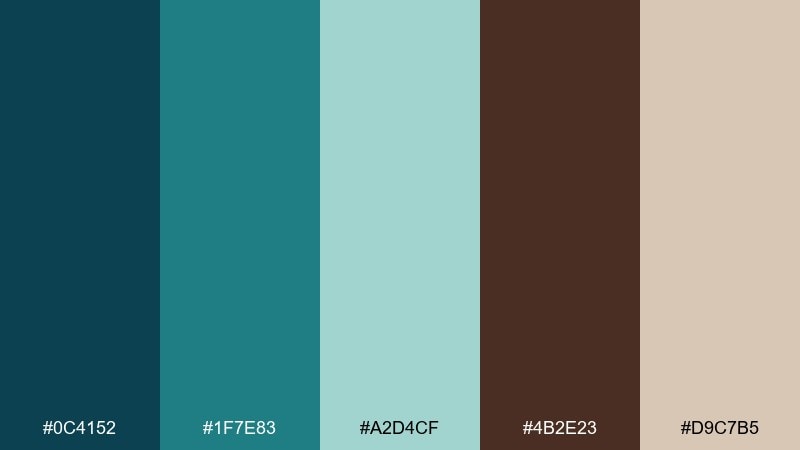
HEX: #0C4152 #1F7E83 #A2D4CF #4B2E23 #D9C7B5
Mood: moody, premium, coastal
Best for: cafe brand packaging and loyalty cards
Moody and premium, like espresso crema against a rainy coastline. The deep brown gives instant richness, while the blue-green keeps it fresh and contemporary. Pair with matte finishes and minimal line art to elevate the brand without looking fussy. Usage tip: keep the light tan for backgrounds and reserve the espresso tone for logos and stamps.
Image example of espresso coastline generated using media.io
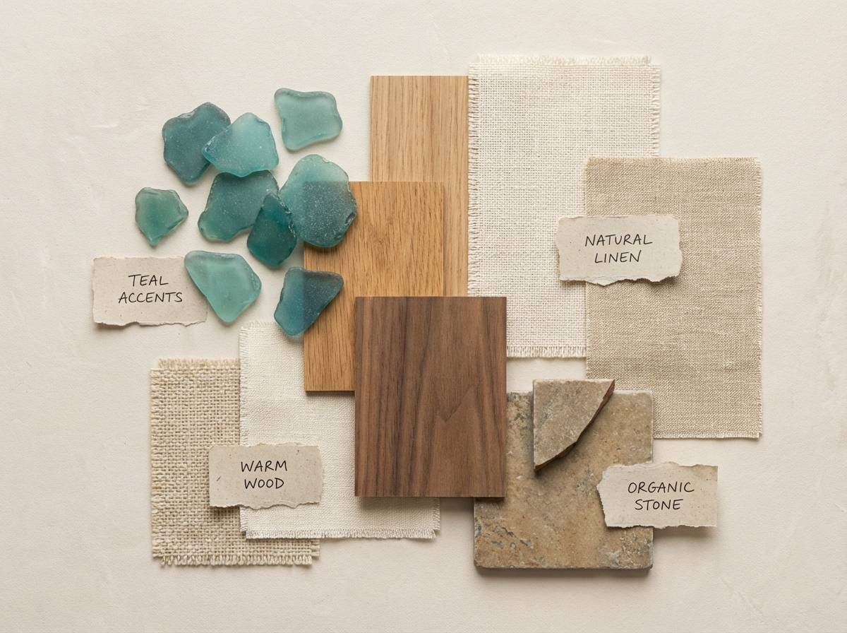
14) Rustic Sea Glass
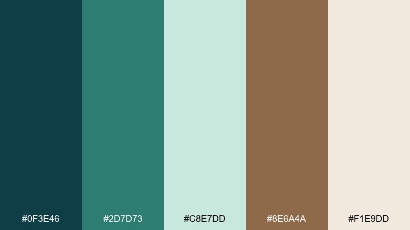
HEX: #0F3E46 #2D7D73 #C8E7DD #8E6A4A #F1E9DD
Mood: relaxed, weathered, welcoming
Best for: bathroom interior mood board and styling guide
Relaxed and weathered, like sea glass collected in a woven basket beside driftwood. This blue green brown color palette is an easy win for interiors that need spa calm without going icy. Pair with natural stone, brushed brass, and linen textiles for a layered look. Usage tip: repeat the mid teal in two or three small decor elements to make the scheme feel intentional.
Image example of rustic sea glass generated using media.io
15) Modern Lodge
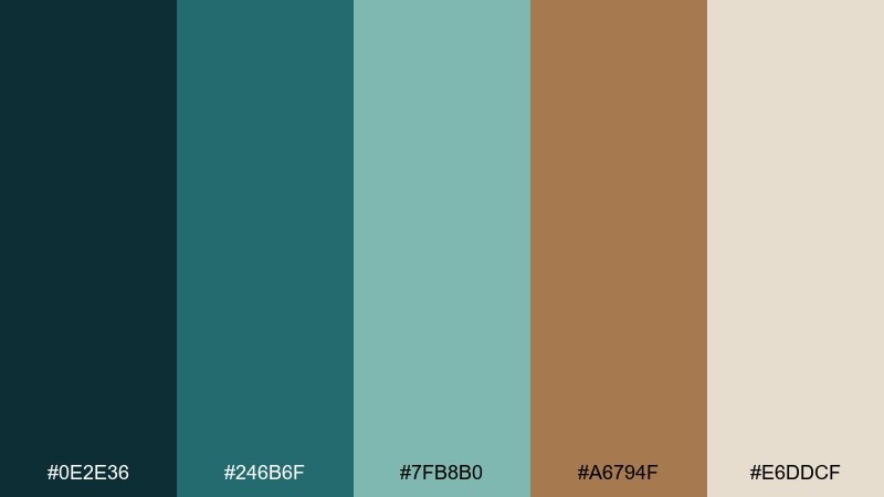
HEX: #0E2E36 #246B6F #7FB8B0 #A6794F #E6DDCF
Mood: modern rustic, calm, confident
Best for: hotel booking website UI kit
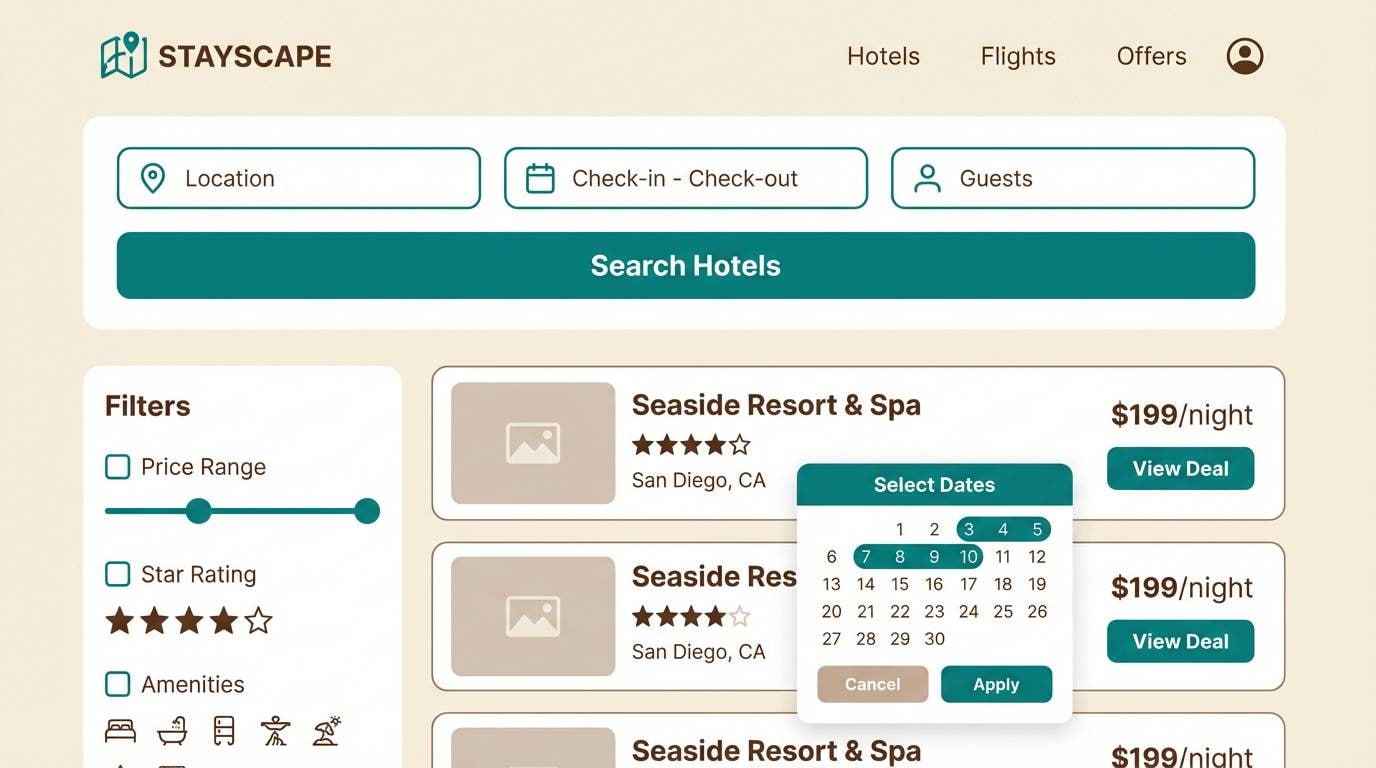
Modern rustic and calm, like a lodge lobby with clean lines, wool throws, and polished timber. The darker tones make CTAs and navigation feel solid, while the soft teal keeps the atmosphere light. Pair with warm neutrals and subtle shadows for a premium UI kit. Usage tip: limit accent browns to pricing, ratings, and key icons to avoid a muddy layout.
Image example of modern lodge generated using media.io
16) Teal Bronze Minimal
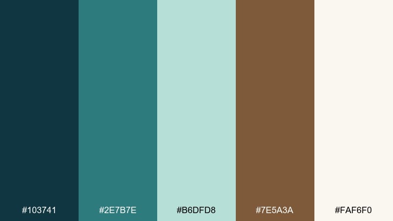
HEX: #103741 #2E7B7E #B6DFD8 #7E5A3A #FAF6F0
Mood: minimal, elegant, balanced
Best for: saas dashboard UI with analytics cards
Minimal and elegant, like brushed bronze next to cool teal glass. The palette stays readable in dashboards because it gives you a clear dark, a clear light, and two controlled accents. Pair with thin dividers, simple charts, and a neutral gray for secondary text. Usage tip: use the teal for active states and the bronze-brown only for warnings or standout KPIs.
Image example of teal bronze minimal generated using media.io

17) Rainy Boardwalk
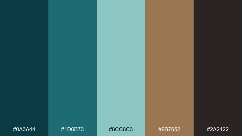
HEX: #0A3A44 #1D6B73 #8CC6C3 #9B7652 #2A2422
Mood: moody, cinematic, urban-coastal
Best for: album cover and social promo tiles
Moody and cinematic, like wet planks on a boardwalk under teal streetlights. The dark base gives drama, while the mid teal and warm brown keep it from feeling monotone. Pair with grain, high-contrast type, and minimal geometric shapes for a modern music aesthetic. Usage tip: keep text in the lightest tone and avoid pure white so the mood stays intact.
Image example of rainy boardwalk generated using media.io
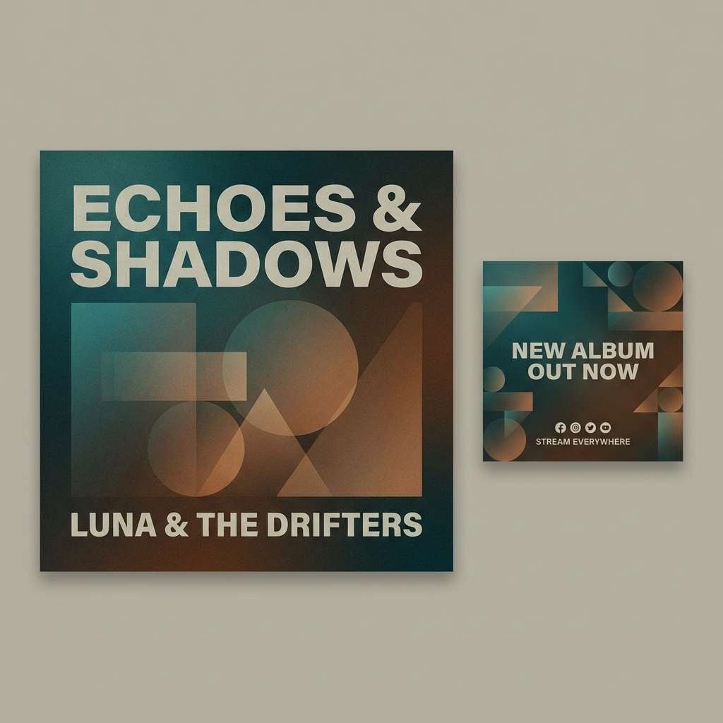
18) Autumn Reef
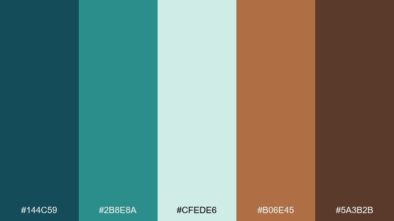
HEX: #144C59 #2B8E8A #CFEDE6 #B06E45 #5A3B2B
Mood: vibrant, seasonal, playful
Best for: seasonal email newsletter header and illustrations
Vibrant and seasonal, like coral shapes drifting through clear teal water with a hint of autumn spice. These blue green brown color combinations are great for newsletters because they feel lively without screaming neon. Pair with simple illustrated icons and a warm off-white background for easy reading. Usage tip: keep the spice brown for buttons and key links so clicks feel intentional.
Image example of autumn reef generated using media.io
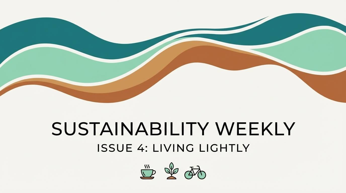
19) Field Journal
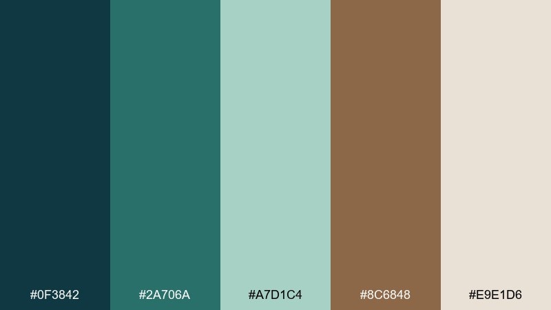
HEX: #0F3842 #2A706A #A7D1C4 #8C6848 #E9E1D6
Mood: thoughtful, earthy, organized
Best for: notebook cover design and stationery set
Thoughtful and earthy, like a field journal filled with sketches and trail notes. The cool greens keep it focused, while the brown reads handcrafted and tactile. Pair with minimal line drawings, dot grids, and recycled paper textures. Usage tip: print the teal as the main cover color and use the brown for spine details and small marks.
Image example of field journal generated using media.io
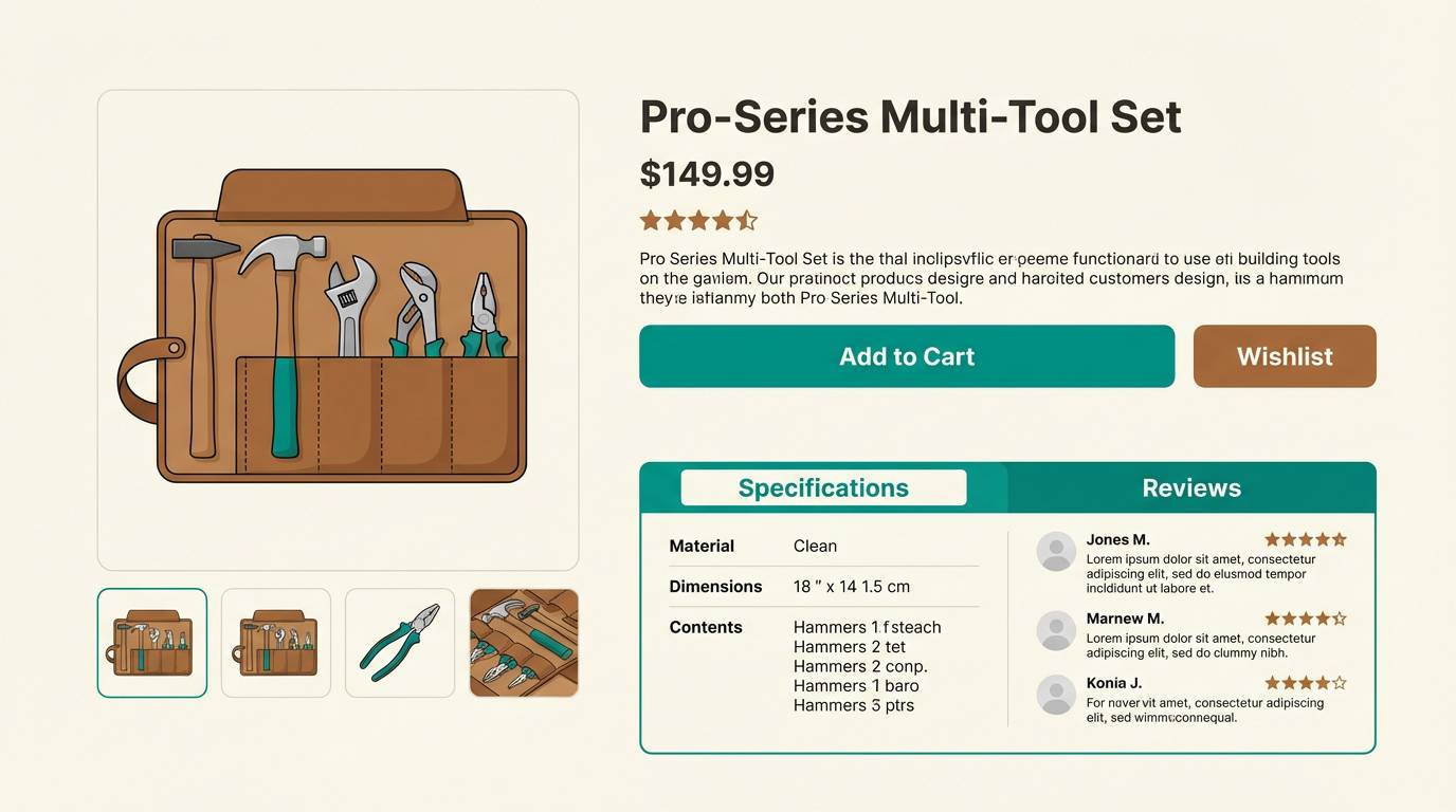
20) Harbor Workshop
HEX: #0D3F4B #2C7E83 #B9E4DE #7A4E35 #F3EEE6
Mood: industrial, clean, dependable
Best for: tool brand ecommerce product page
Industrial and dependable, like a harbor workshop with painted steel and oiled handles. The teal supports a modern, trustworthy feel, while the brown signals durability and craft. Pair with sharp product photography, clear spec tables, and restrained iconography. Usage tip: use the darkest tone for headings and the mid teal for selection states and tabs.
Image example of harbor workshop generated using media.io
21) Canyon Tide
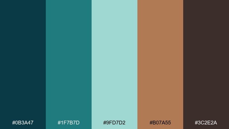
HEX: #0B3A47 #1F7B7D #9FD7D2 #B07A55 #3C2E2A
Mood: dynamic, outdoors, energetic
Best for: sports event poster for a trail run
Dynamic and outdoorsy, like tide pools meeting canyon rock after a storm. The contrast between cool teal and sandy brown makes headlines pop and keeps the layout sporty. Pair with bold condensed type and simple route icons for quick comprehension. Usage tip: place the light teal behind key info blocks to boost readability without using white.
Image example of canyon tide generated using media.io

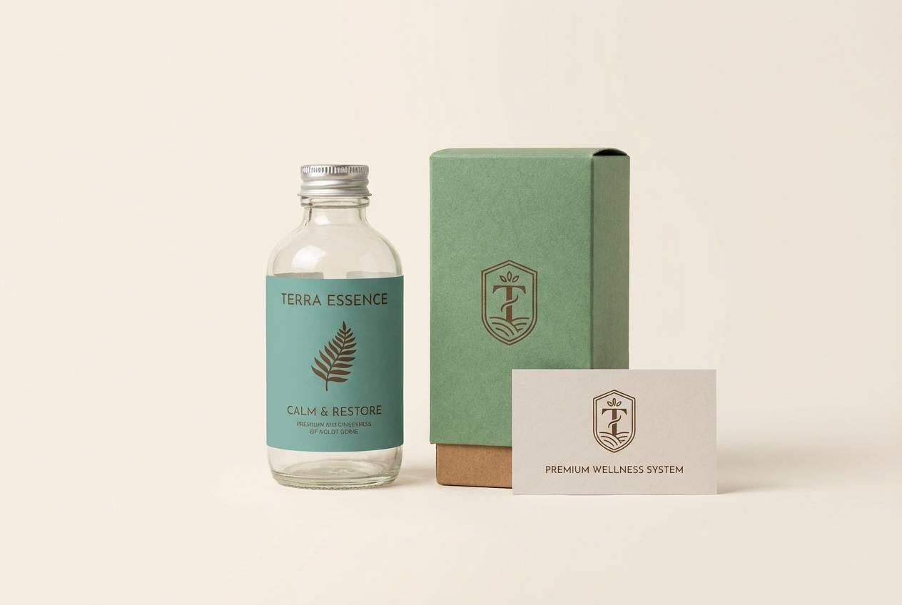
22) Fern and Walnut
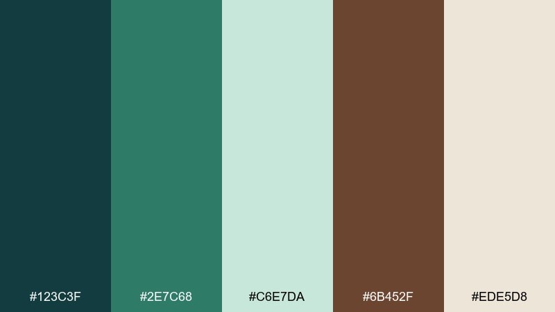
HEX: #123C3F #2E7C68 #C6E7DA #6B452F #EDE5D8
Mood: natural, premium, serene
Best for: wellness brand logo and packaging system
Natural and serene, like fern fronds against smooth walnut furniture. This blue green brown color palette feels premium for wellness brands when you keep the layout airy and the typography quiet. Pair with minimal line icons and plenty of cream space to suggest calm and care. Usage tip: make the walnut tone your logo mark and let green-blue carry supporting elements and patterns.
Image example of fern and walnut generated using media.io
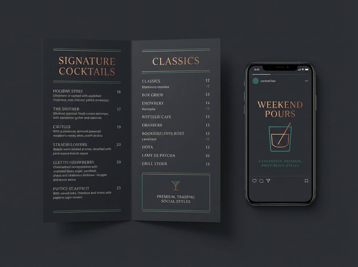
23) Copper Spruce Night
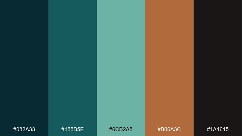
HEX: #082A33 #155B5E #6CB2A5 #B06A3C #1A1615
Mood: dark, luxurious, dramatic
Best for: luxury cocktail bar menu and social graphics
Dark and luxurious, like spruce needles at night with a copper glow from candlelight. The inky base creates drama, while the teal keeps it modern and the copper-brown adds appetite appeal. Use it for menus, social promos, and signage where you want richness without clutter. Usage tip: add metallic print for the copper tone and keep teal as a thin accent line to avoid visual noise.
Image example of copper spruce night generated using media.io
What Colors Go Well with Blue Green Brown?
Warm off-whites and creams are the most reliable companions for teal-and-brown palettes because they keep layouts bright without turning stark. Think ivory, warm white, oatmeal, and light stone.
For depth and readability, add near-black charcoals instead of pure black, especially for body text and UI icons. If you want a softer “heritage” feel, a warm gray can replace harsh dividers and borders.
As accents, brushed brass/gold, muted coral, or terracotta can lift the palette when you need emphasis—just keep accents limited so the teal stays the hero and the browns don’t go muddy.
How to Use a Blue Green Brown Color Palette in Real Designs
In UI design, pick one teal as the primary action color and let browns act as secondary highlights (prices, badges, icons) rather than large background fills. Use a light cream or stone tone for surfaces to maintain a calm, modern feel.
For branding and packaging, teal communicates freshness and trust, while walnut/espresso browns signal craft and premium quality. Pair with clean typography and plenty of whitespace to avoid a “rustic clutter” look.
In interiors, repeat the mid teal in small elements (tile, towels, art) and anchor the room with wood tones (oak, walnut, cedar). Keep metals and textiles natural (linen, brushed brass) to preserve the grounded vibe.
Create Blue Green Brown Palette Visuals with AI
If you’re pitching a concept or building a mood board, AI-generated visuals help you preview how teal-and-brown palettes behave across materials, lighting, and layouts. You can quickly test “coastal” versus “lodge” styling without redesigning from scratch.
Start with a clear subject (poster, UI, packaging, interior swatches), then describe materials (kraft paper, matte label, linen, wood grain) and keep the palette consistent in the prompt. Export a few variations to compare contrast and hierarchy.
Media.io makes it simple to generate palette-based mockups, then iterate until the tones feel balanced and readable.
Blue Green Brown Color Palette FAQs
-
Is blue green brown a good palette for modern brands?
Yes. Teal/blue-green reads clean and contemporary, while brown adds warmth and authenticity—great for outdoor, wellness, food, and craft-focused brands that want to feel premium but approachable. -
How do I keep teal and brown from looking muddy together?
Use a light neutral (cream, warm white, stone) as breathing room, and keep browns as accents rather than big background areas. Also rely on a deep charcoal for text to maintain crisp contrast. -
What’s the best background color for a blue green brown UI?
Warm off-white, light stone, or creamy beige backgrounds usually work best. They reduce glare versus pure white and help teal buttons and brown accents stand out cleanly. -
Can I use blue green brown for minimalist dashboards?
Absolutely. Choose one primary teal for active states, one dark tone for text, and one light surface color. Reserve brown/bronze for selective highlights like standout KPIs or warnings. -
What accent colors pair well with blue green and brown?
Brass/gold, muted coral, terracotta, or clay tones work well for small highlights. For a calmer look, stick to warm grays and creams instead of adding another saturated accent. -
How do I make a blue green brown palette feel more coastal than rustic?
Shift teal toward brighter aqua/mint, keep browns lighter (cedar/sand), and increase negative space with warm white. Avoid overly dark espresso tones and heavy textures if you want an airy coastal vibe. -
How can I preview this palette on posters, packaging, or UI quickly?
Generate a few mockups with consistent palette instructions using Media.io’s text-to-image tool, then compare readability and contrast across different lighting and materials before finalizing your design system.


