

A gold dark green color palette blends warmth and authority in one look: gold adds a refined glow, while deep green brings stability and depth.
From luxury branding to wedding suites and modern UI, these gold and dark green combinations stay readable, premium, and easy to extend with neutrals and accents.
In this article
- Why Gold Dark Green Palettes Work So Well
-
- gilded forest luxe
- olive brass minimal
- emerald auction night
- sunlit canopy neutrals
- art deco conservatory
- heritage library
- botanical goldleaf
- dark green bistro menu
- modern dashboard glow
- autumn orchard
- regal wedding suite
- night market poster
- premium skincare box
- midcentury living room
- classic sports crest
- eco finance report
- candlelight dinner invitation
- museum exhibit wayfinding
- winter pine gift wrap
- sage and gold social tiles
- What Colors Go Well with Gold Dark Green?
- How to Use a Gold Dark Green Color Palette in Real Designs
- Create Gold Dark Green Palette Visuals with AI
Why Gold Dark Green Palettes Work So Well
Gold and dark green feel “expensive” because they echo real-world materials: brass, gold leaf, velvet, marble, leather, and evergreen foliage. That association makes designs feel established and intentional rather than trendy.
This pairing is also naturally high-contrast. Deep greens provide strong structure for typography and UI components, while gold functions best as a controlled highlight for calls to action, borders, badges, and key numbers.
Most importantly, gold dark green palettes scale easily: add creams for airy layouts, charcoals for crisp readability, or a single rich accent (burgundy, terracotta, plum) for editorial energy without losing the premium tone.
20+ Gold Dark Green Color Palette Ideas (with HEX Codes)
1) Gilded Forest Luxe
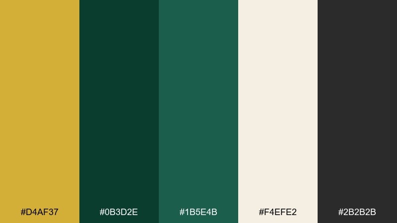
HEX: #d4af37 #0b3d2e #1b5e4b #f4efe2 #2b2b2b
Mood: luxurious, grounded, classic
Best for: premium brand identity and logo systems
Luxurious and grounded like sunlight catching a deep evergreen canopy. The warm gold reads as metallic even in flat print, while the dark green keeps everything mature and steady. Use the off-white as your primary background and reserve the charcoal for crisp type and icons. For a premium feel, keep gold to small highlights like rules, monograms, and seals.
Image example of gilded forest luxe generated using media.io
Media.io is an online AI studio for creating and editing video, image, and audio in your browser.

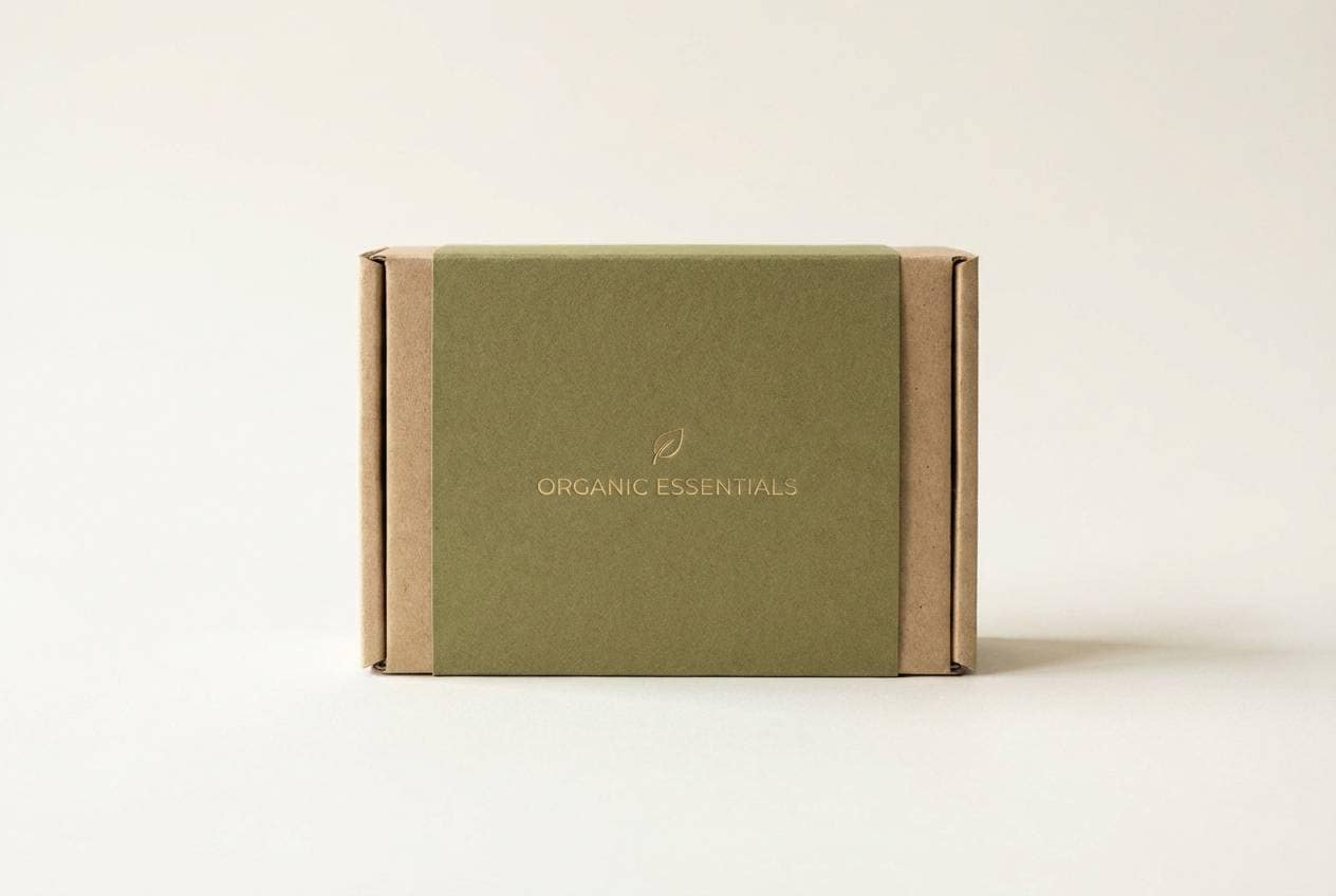
2) Olive Brass Minimal
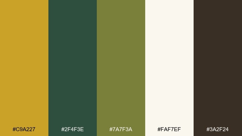
HEX: #c9a227 #2f4f3e #7a7f3a #faf7ef #3a2f24
Mood: earthy, modern, calm
Best for: eco-friendly packaging and labels
Earthy and modern, like brass hardware against olive canvas. The muted greens help the gold feel sophisticated rather than flashy, especially on a warm off-white stock. Pair it with kraft textures or uncoated paper looks and keep typography simple to let the tones breathe. A good tip is to use the olive as the main label field and the gold for small certification badges.
Image example of olive brass minimal generated using media.io
3) Emerald Auction Night
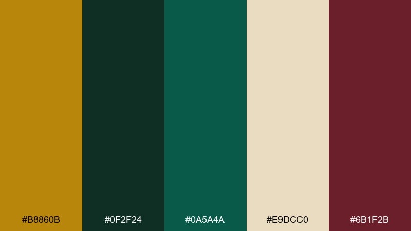
HEX: #b8860b #0f2f24 #0a5a4a #e9dcc0 #6b1f2b
Mood: dramatic, refined, vintage
Best for: event posters and gala invitations
Dramatic and refined, like velvet drapes and spotlit frames at an evening auction. These gold dark green color combinations gain depth with a burgundy accent that feels formal and editorial. Use the cream as the paper tone and keep the darkest green for big, confident headers. For legibility, set body copy in near-black or the deep green and leave gold for borders and key details.
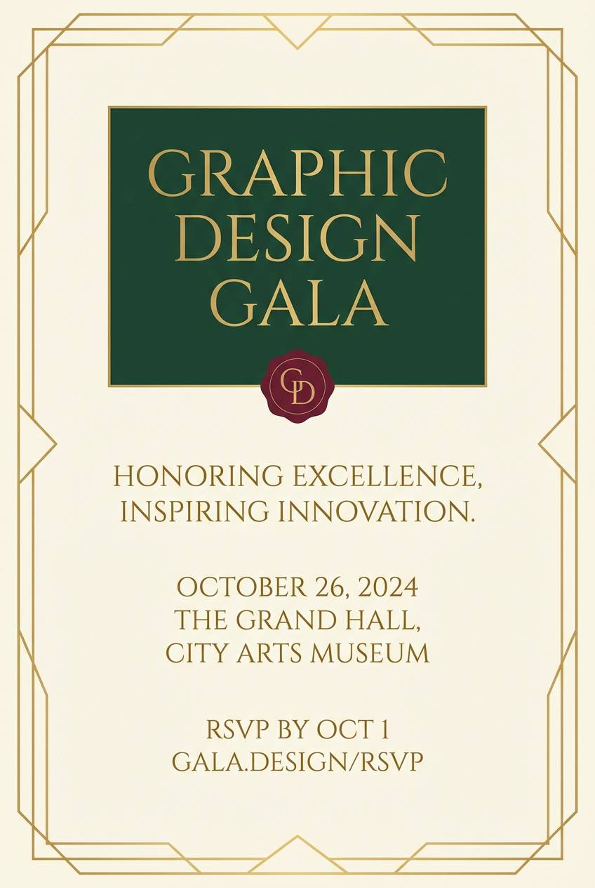
Image example of emerald auction night generated using media.io
4) Sunlit Canopy Neutrals
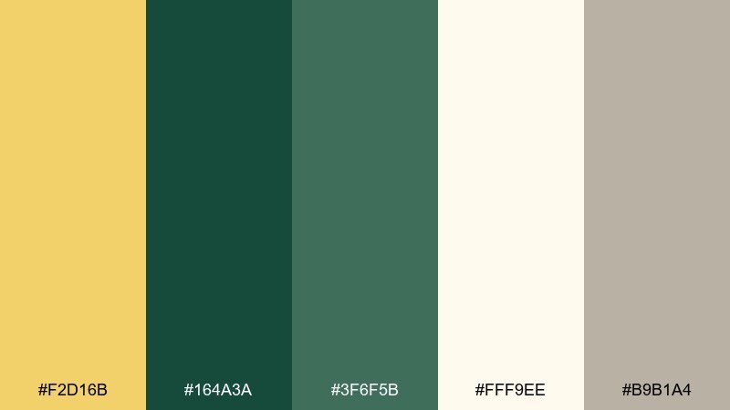
HEX: #f2d16b #164a3a #3f6f5b #fff9ee #b9b1a4
Mood: airy, warm, natural
Best for: lifestyle blogs and landing pages
Airy and warm, like sun filtering through leaves onto linen. The lighter gold works beautifully for friendly call-to-action buttons, while the greens keep the layout trustworthy. Pair it with soft photography, plenty of white space, and rounded UI components for a modern look. A simple tip: use the gray-beige for dividers and cards so the greens do not feel heavy.
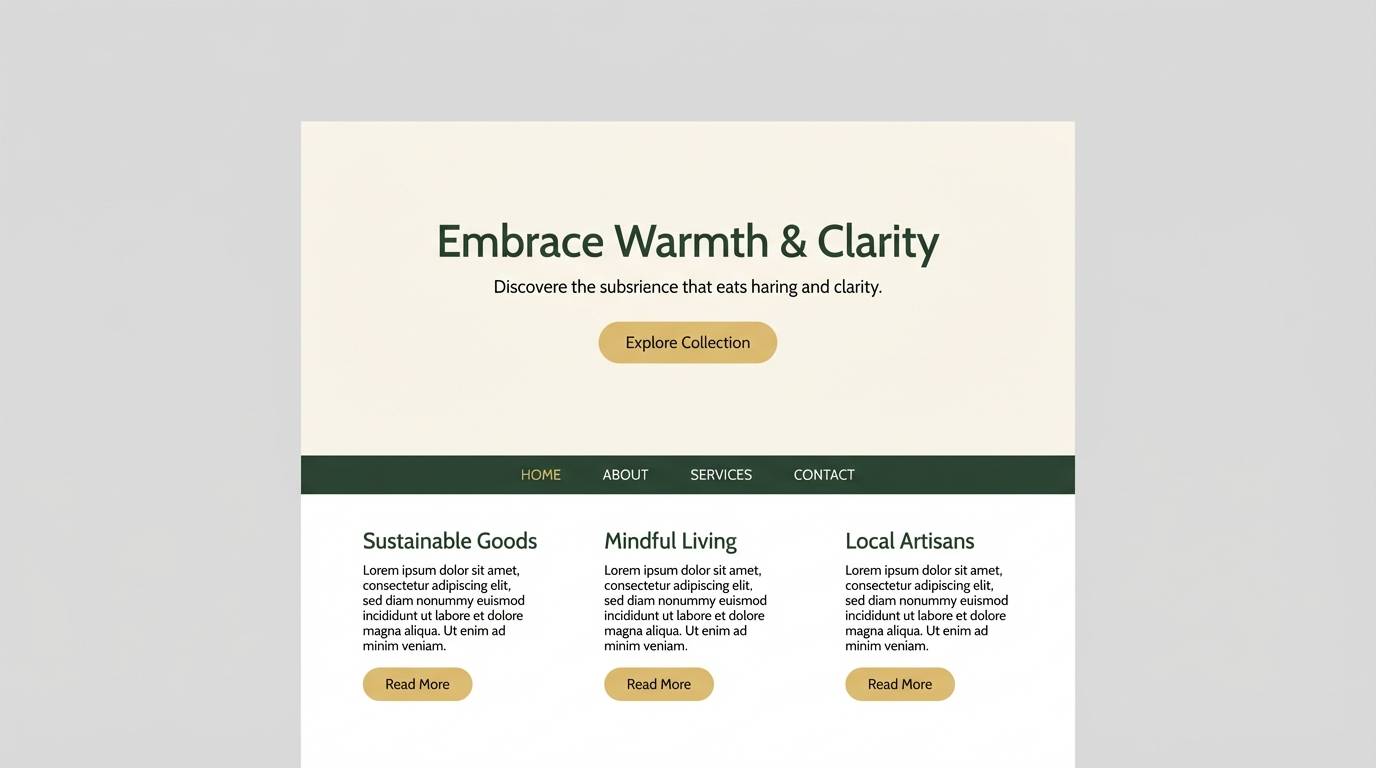
Image example of sunlit canopy neutrals generated using media.io
5) Art Deco Conservatory
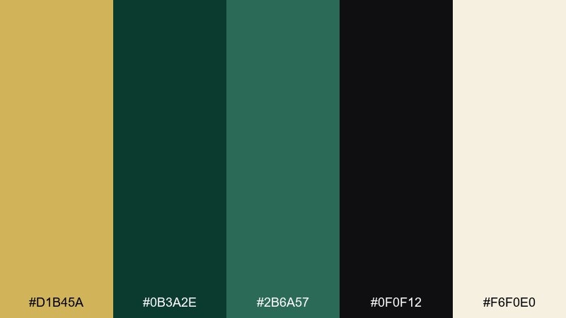
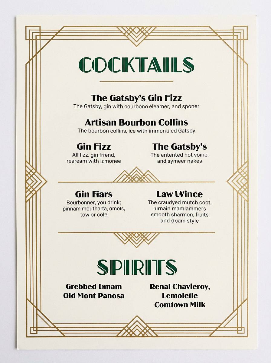
HEX: #d1b45a #0b3a2e #2b6a57 #0f0f12 #f6f0e0
Mood: art deco, bold, polished
Best for: restaurant menus and cocktail lists
Bold and polished, like a deco conservatory lit by brass sconces. The near-black adds instant drama and makes the gold feel like foil, especially when used in thin linework. Pair with geometric patterns, high-contrast type, and generous margins. Keep green as the main field color and use gold only for section dividers to avoid visual noise.
Image example of art deco conservatory generated using media.io
6) Heritage Library
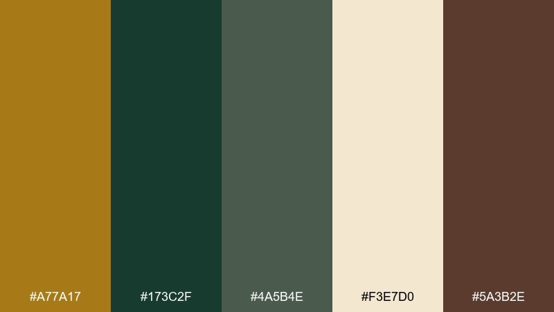
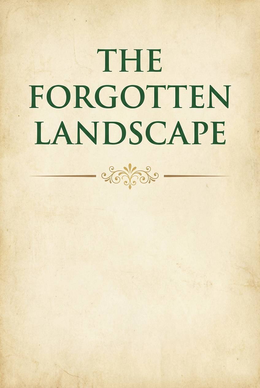
HEX: #a77a17 #173c2f #4a5b4e #f3e7d0 #5a3b2e
Mood: heritage, cozy, scholarly
Best for: book covers and editorial headers
Cozy and scholarly, like leather spines and aged paper in a quiet reading room. The brown undertone adds warmth so the greens feel less cold and more traditional. Use the parchment tone for large backgrounds and bring in gold for chapter marks and small ornaments. For print, choose slightly textured stock to make the palette feel tactile.
Image example of heritage library generated using media.io
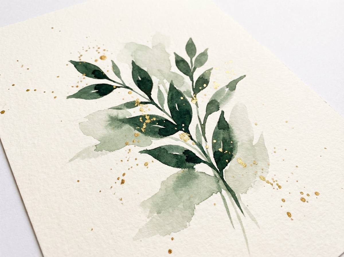
7) Botanical Goldleaf
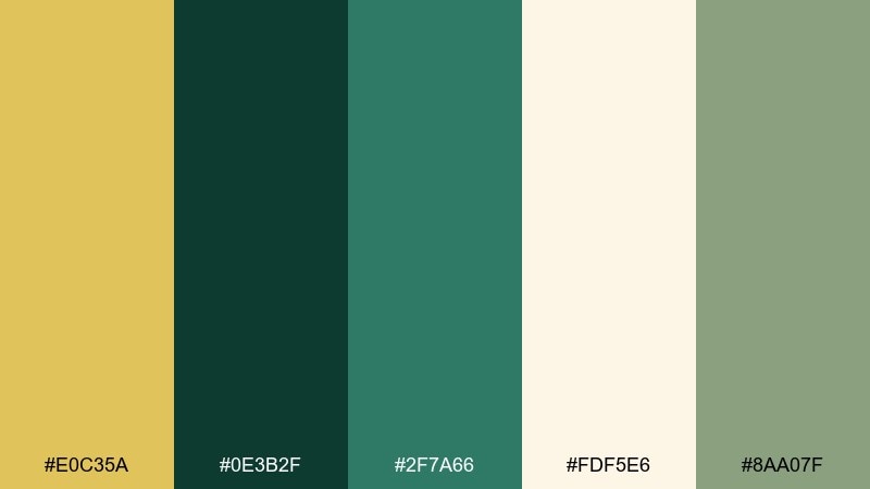
HEX: #e0c35a #0e3b2f #2f7a66 #fdf5e6 #8aa07f
Mood: fresh, botanical, elegant
Best for: botanical illustrations and stationery
Fresh and elegant, like pressed leaves edged with a hint of gilding. The soft sage keeps the darker green from feeling too heavy, making it ideal for delicate layouts and light backgrounds. Pair it with fine-line botanical drawings, minimal type, and lots of breathing room. A practical move is to reserve the gold for small leaf veins or monograms so it stays special.
Image example of botanical goldleaf generated using media.io
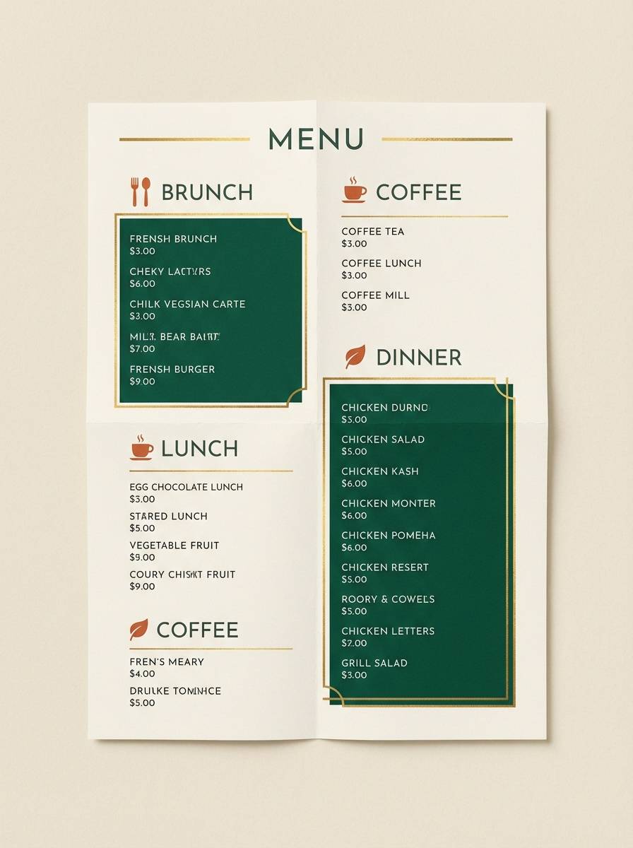
8) Dark Green Bistro Menu
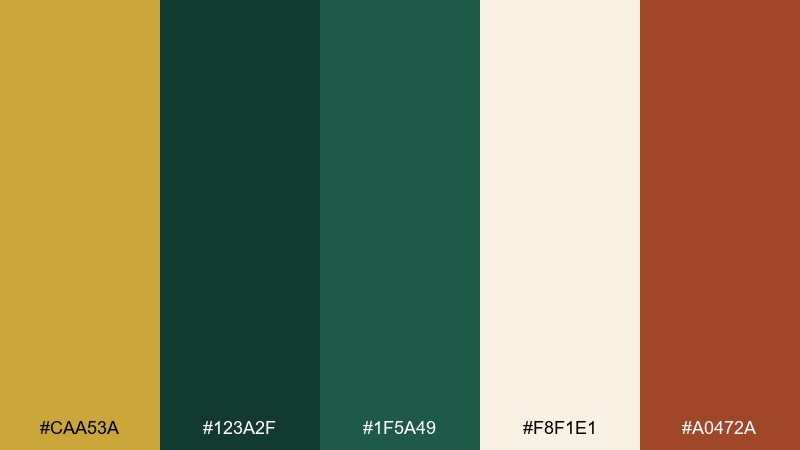
HEX: #caa53a #123a2f #1f5a49 #f8f1e1 #a0472a
Mood: inviting, appetizing, classy
Best for: restaurant menus and food promos
Inviting and classy, like a small bistro with warm lights and dark painted walls. The coppery accent adds appetite appeal without fighting the gold, making specials and callouts pop. Pair with creamy backgrounds and a mix of serif headers with clean sans body copy. Tip: keep the darkest green for menu sections and use the warm accent for pricing or spice indicators.
Image example of dark green bistro menu generated using media.io
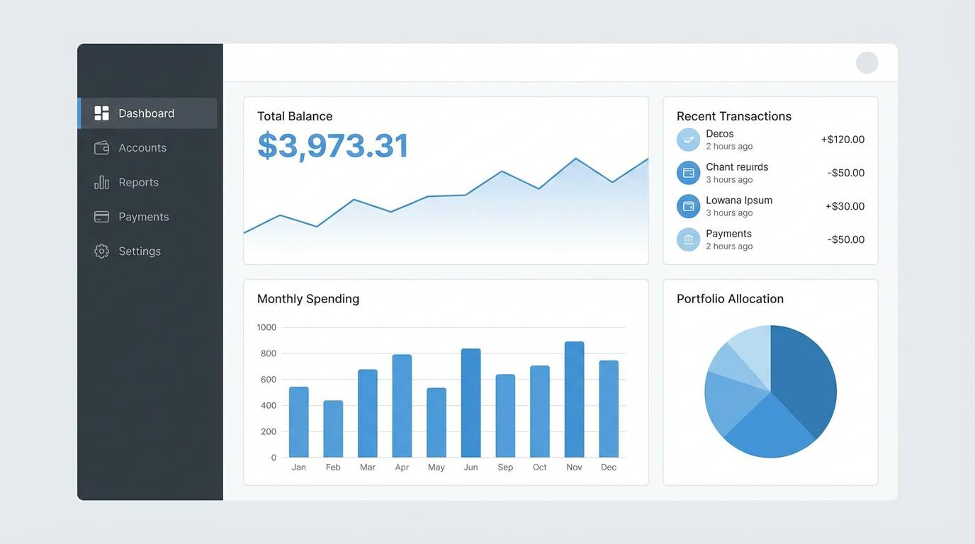
9) Modern Dashboard Glow
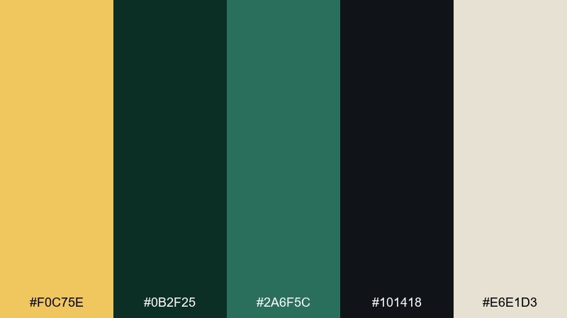
HEX: #f0c75e #0b2f25 #2a6f5c #101418 #e6e1d3
Mood: sleek, techy, confident
Best for: finance dashboards and SaaS UI
Sleek and confident, like a low-light control room with crisp status indicators. This gold dark green color palette is ideal when you want luxury energy without sacrificing readability in data-heavy screens. Pair it with thin line icons, subtle shadows, and warm neutrals for table backgrounds. Usage tip: treat gold as the success or highlight state, not as a default button color everywhere.
Image example of modern dashboard glow generated using media.io
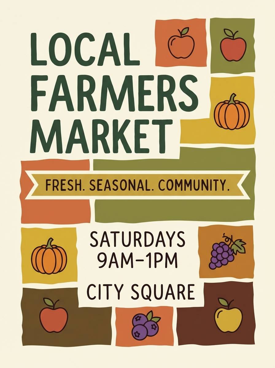
10) Autumn Orchard
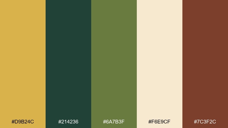
HEX: #d9b24c #214236 #6a7b3f #f6e9cf #7c3f2c
Mood: seasonal, wholesome, rustic
Best for: farmers market signage and labels
Seasonal and wholesome, like an orchard stand at golden hour. The olive-green bridge tone helps the palette move smoothly between dark foliage and warm harvest accents. Pair with hand-drawn icons, simple patterns, and friendly typography for a local feel. One easy tip is to use the cream as the main sign color for readability from a distance.
Image example of autumn orchard generated using media.io
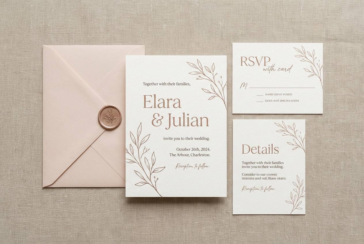
11) Regal Wedding Suite
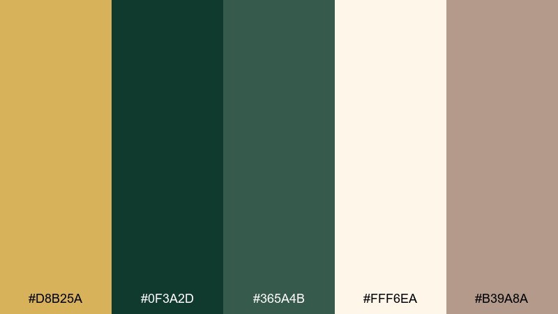
HEX: #d8b25a #0f3a2d #365a4b #fff6ea #b39a8a
Mood: romantic, formal, timeless
Best for: wedding invitations and RSVP cards
Romantic and formal, like candlelit vows in a garden venue. The warm blush-beige softens the greens, keeping the set elegant instead of heavy. Pair with classic serif type, delicate line florals, and generous spacing for a high-end look. Tip: print gold as foil only on names or a monogram for the most refined result.
Image example of regal wedding suite generated using media.io
12) Night Market Poster
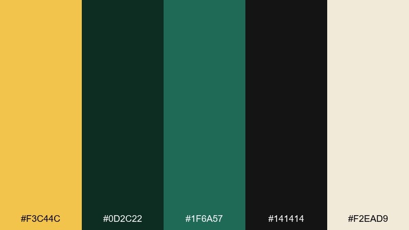
HEX: #f3c44c #0d2c22 #1f6a57 #141414 #f2ead9
Mood: energetic, urban, bold
Best for: festival posters and social promos
Energetic and urban, like neon signage reflecting off dark storefronts. The bright gold becomes your attention-grabber for dates, tickets, and key headlines, while the greens hold the composition together. Pair with condensed type, big blocks of color, and simple iconography for fast readability. Keep the cream for small text areas so details do not disappear on dark fields.
Image example of night market poster generated using media.io

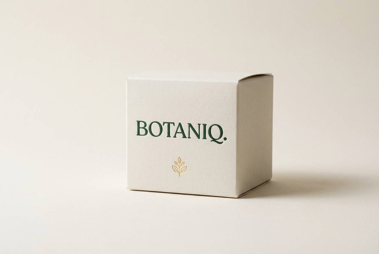
13) Premium Skincare Box
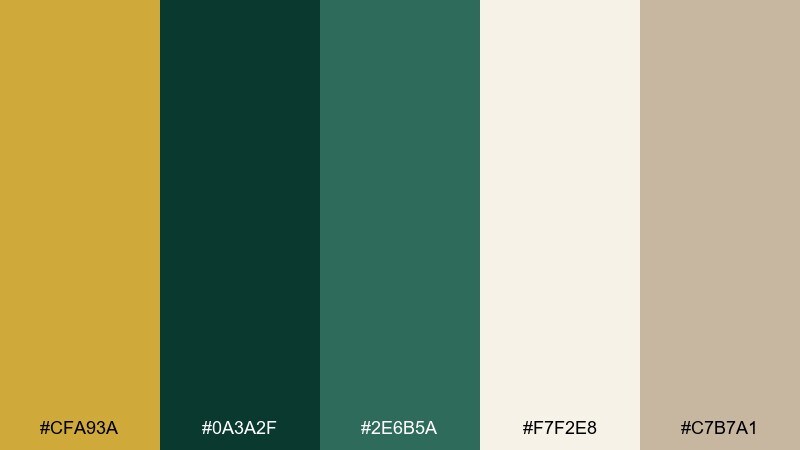
HEX: #cfa93a #0a3a2f #2e6b5a #f7f2e8 #c7b7a1
Mood: clean, upscale, soothing
Best for: skincare packaging and product ads
Clean and upscale, like a spa robe paired with polished brass fixtures. The neutral background keeps the gold from overwhelming, and the green reads as botanical without turning playful. Pair it with minimal sans-serif type, lots of negative space, and subtle emboss textures. Tip: use the mid green for secondary panels so the darkest green stays reserved for the logo.
Image example of premium skincare box generated using media.io
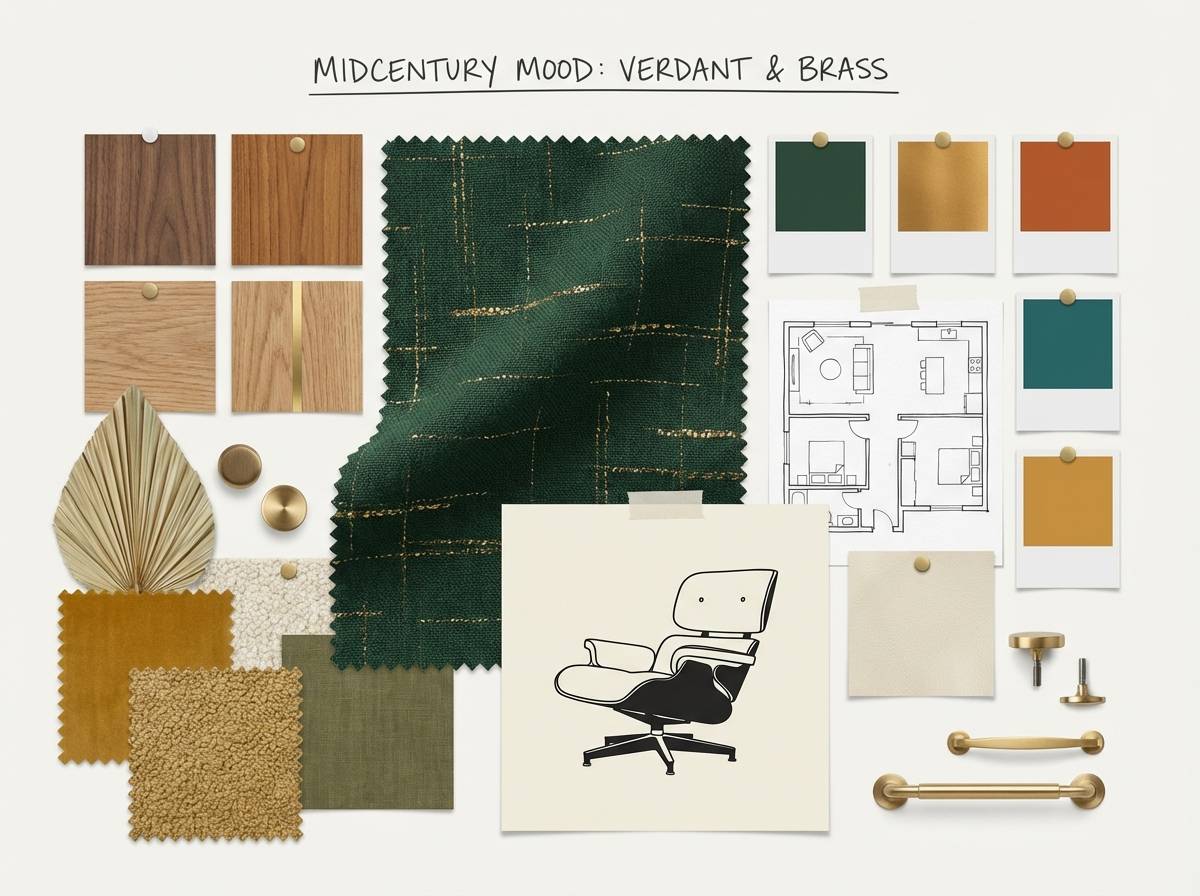
14) Midcentury Living Room
HEX: #d2ad53 #143a2f #4b6f61 #efe6d6 #8b6b4f
Mood: warm, retro, comfortable
Best for: interior mood boards and decor guides
Warm and comfortable, like walnut furniture against deep painted walls. This gold dark green color scheme feels especially at home with midcentury textures such as tweed, boucle, and matte ceramics. Pair the cream with natural wood tones and use gold in lighting fixtures or frames. Tip: keep the darkest green to one statement wall so the room stays bright.
Image example of midcentury living room generated using media.io
15) Classic Sports Crest
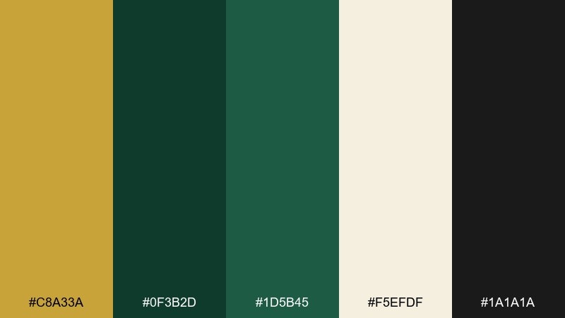
HEX: #c8a33a #0f3b2d #1d5b45 #f5efdf #1a1a1a
Mood: proud, traditional, athletic
Best for: team crests and club merchandise
Proud and traditional, like an embroidered crest on a vintage jacket. The strong contrast between the dark green and cream makes emblems and patch designs read clearly at small sizes. Pair with bold serif or slab fonts and simple shapes for instant recognition. Tip: test the crest in one-color green first, then add gold as a premium trim.
Image example of classic sports crest generated using media.io

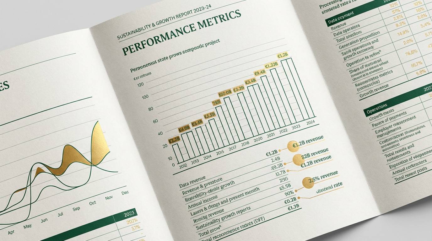
16) Eco Finance Report
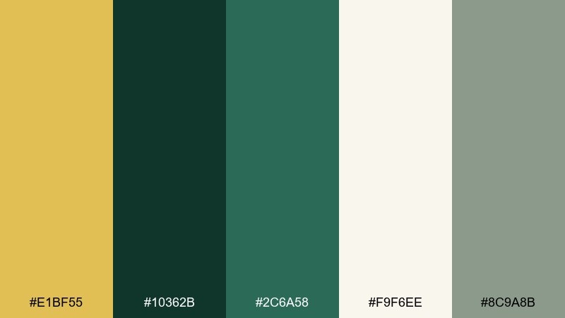
HEX: #e1bf55 #10362b #2c6a58 #f9f6ee #8c9a8b
Mood: trustworthy, calm, professional
Best for: annual reports and pitch decks
Trustworthy and calm, like a well-lit boardroom with a view of trees. The palette balances authority and sustainability, making it strong for data, charts, and long-form reading. Pair it with light grid lines, simple infographics, and a restrained icon set. Tip: keep gold to section dividers and key metrics so it highlights what matters most.
Image example of eco finance report generated using media.io
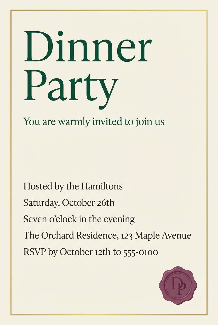
17) Candlelight Dinner Invitation
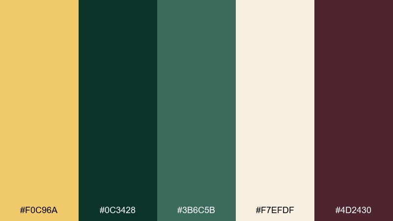
HEX: #f0c96a #0c3428 #3b6c5b #f7efdf #4d2430
Mood: intimate, romantic, elegant
Best for: dinner party invitations and menus
Intimate and romantic, like candlelight reflecting on polished glassware. The plum accent adds a discreet hint of drama that elevates the overall look for evening events. Pair with creamy paper tones, fine-line borders, and a mix of script and serif type. Tip: use the gold for date and time details so guests spot the essentials instantly.
Image example of candlelight dinner invitation generated using media.io
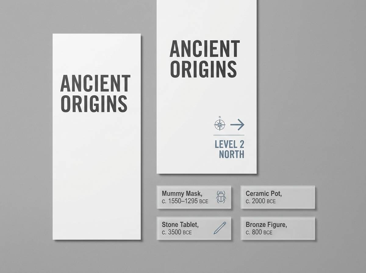
18) Museum Exhibit Wayfinding
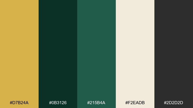
HEX: #d7b24a #0b3126 #215b4a #f2eadb #2d2d2d
Mood: curated, quiet, high-end
Best for: wayfinding signage and exhibit panels
Curated and quiet, like a gallery label beside a spotlighted sculpture. Gold dark green color combinations work well for navigation because they feel premium yet readable when used with clear hierarchy. Pair with plenty of whitespace, strong sans-serif type, and consistent icon sizing across signs. Tip: set directional arrows in the charcoal while using gold only for section numbers.
Image example of museum exhibit wayfinding generated using media.io
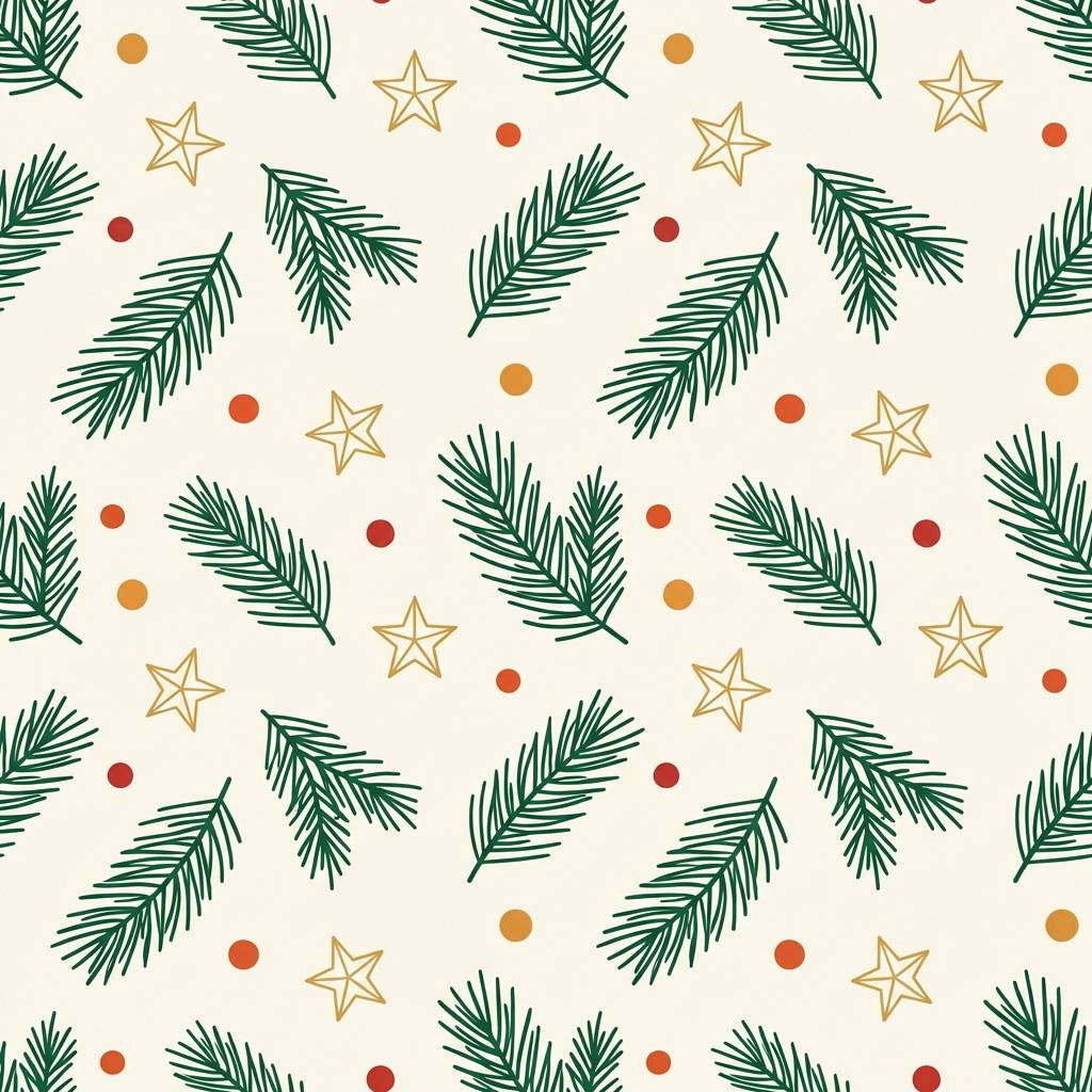
19) Winter Pine Gift Wrap
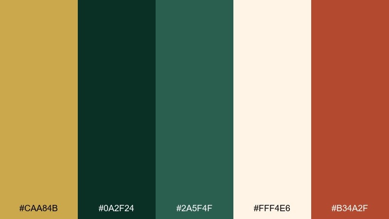
HEX: #caa84b #0a2f24 #2a5f4f #fff4e6 #b34a2f
Mood: festive, cozy, seasonal
Best for: holiday gift wrap and tag designs
Festive and cozy, like pine needles and warm lights on a winter night. The bright cream keeps patterns from feeling too dark, while the warm red-orange makes tags and ribbons feel cheerful. Pair it with simple repeating motifs such as stars, sprigs, or stripes for an easy-to-print wrap. Tip: use gold as the pattern ink and keep the background cream for a crisp, premium look.
Image example of winter pine gift wrap generated using media.io
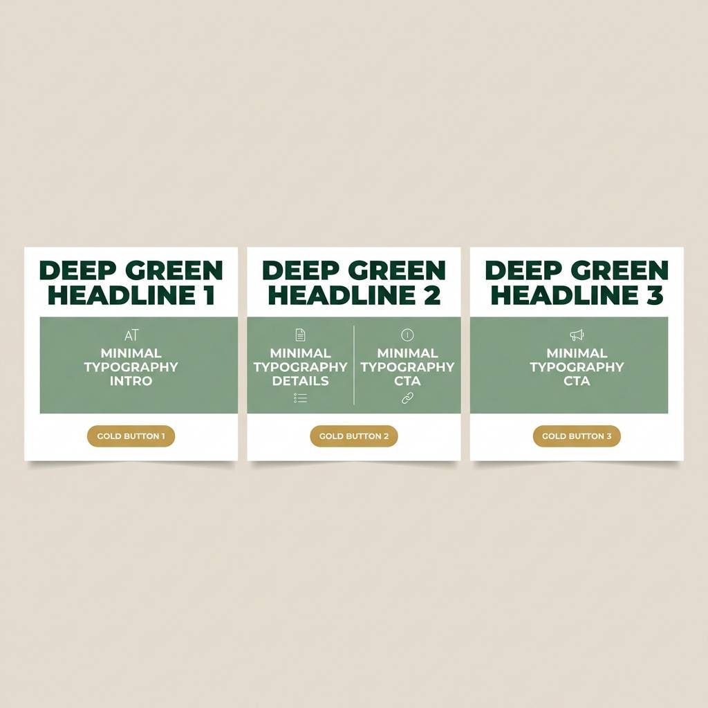
20) Sage and Gold Social Tiles
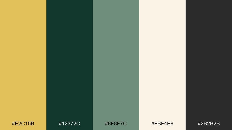
HEX: #e2c15b #12372c #6f8f7c #fbf4e6 #2b2b2b
Mood: friendly, polished, contemporary
Best for: instagram carousels and social templates
Friendly and polished, like a modern studio with soft textiles and warm light. This gold dark green color palette stays readable on small screens when you use sage for large blocks and keep the deep green for headlines. Pair with simple shapes, bold numbers, and consistent margins across tiles. Tip: set your primary button or link chip in gold, but keep most text in dark green for clarity.
Image example of sage and gold social tiles generated using media.io
What Colors Go Well with Gold Dark Green?
Warm neutrals are the easiest match: cream, parchment, ivory, and oatmeal keep the palette elevated and give gold space to glow. Charcoal and near-black add crisp structure for typography, icons, and high-contrast layouts.
For richer accents, try burgundy, plum, terracotta, or cognac brown to create a formal, editorial feel that still reads natural next to green. If you want a fresher direction, soft sage, gray-beige, and muted teal can lighten the overall mood without breaking the “luxury” impression.
When in doubt, treat gold as a highlight rather than a base color: pair dark green with a neutral background, then add gold sparingly for hierarchy and premium details.
How to Use a Gold Dark Green Color Palette in Real Designs
Start with roles: use dark green for primary surfaces (headers, nav, section blocks), off-white or cream for backgrounds, and charcoal for text. Then reserve gold for emphasis—badges, separators, thin borders, key metrics, or a single primary CTA.
For print, gold can look “metallic” even when flat if the surrounding colors are deep and neutral. Use generous whitespace, avoid overusing gold fills, and consider textured paper to make greens and warm neutrals feel more tactile.
For UI, test contrast early. Dark greens usually support readable light text, but gold-on-cream can fail contrast if the gold is too light—use gold for icons and highlights, and keep body text in deep green or charcoal.
Create Gold Dark Green Palette Visuals with AI
If you already have HEX codes, the fastest way to validate a gold dark green color scheme is to generate a few mock visuals: a landing page hero, a packaging label, and a poster layout. You’ll immediately see whether gold is working as a highlight or overpowering the composition.
With Media.io’s text-to-image, you can paste a prompt (like the examples above) and iterate quickly on style—minimal, art deco, botanical, or modern dark-mode UI—without rebuilding designs from scratch.
Gold Dark Green Color Palette FAQs
-
What does a gold dark green color palette communicate?
It usually signals luxury, heritage, and trust. Gold brings prestige and warmth, while dark green adds stability and a grounded, “established” feel. -
Is gold and dark green a good combination for branding?
Yes—especially for premium, eco-luxe, finance, hospitality, and heritage brands. Use green as the main brand color and treat gold as a controlled accent for marks, trims, and key highlights. -
What background color works best with dark green and gold?
Cream, off-white, parchment, and warm gray-beige are the most reliable backgrounds. They keep pages bright, improve readability, and prevent gold accents from feeling harsh. -
How do I keep gold from looking “too yellow” on screen?
Pair it with deep green, charcoal, or near-black, and avoid large gold fills. Using gold for thin lines, icons, borders, or small UI states helps it read more like “metal” than flat yellow. -
What accent colors pair well with a gold dark green palette?
Burgundy, plum, terracotta, and cognac add a formal, editorial vibe; sage and muted teal add a fresher botanical direction; charcoal sharpens contrast for type and UI. -
Can I use a gold dark green color scheme in UI design?
Absolutely. Use dark green for primary surfaces, neutrals for cards and tables, and gold for highlight states (success, key metrics, active tabs). Always run contrast checks for text on gold or light backgrounds. -
What’s the easiest way to preview these palettes in real layouts?
Generate quick mockups (posters, packaging, landing pages, menus) with AI using consistent prompts, then adjust the gold usage ratio until the hierarchy feels clear and premium.


