

A brown turquoise color palette blends earthy warmth with a clean, water-like accent. The result feels grounded and fresh at the same time, which is why it works for both branding and interiors.
Below you’ll find ready-to-use brown and turquoise palette ideas with HEX codes, plus practical tips for using them in web layouts, packaging, and room styling.
In this article
- Why Brown Turquoise Palettes Work So Well
-
- desert oasis
- copper lagoon
- walnut tide
- clay and sea glass
- canyon pool party
- antique map harbor
- cocoa mint studio
- riverstone kitchen
- mocha reef
- rustic teal wedding
- sienna surfboard
- forest creek ledger
- terracotta aquarium
- espresso seaside
- driftwood and jade
- bronze tropics
- pebble cove
- chestnut glacier
- mahogany lagoon nights
- cocoa and caribbean
- What Colors Go Well with Brown Turquoise?
- How to Use a Brown Turquoise Color Palette in Real Designs
- Create Brown Turquoise Palette Visuals with AI
Why Brown Turquoise Palettes Work So Well
Brown brings familiarity, stability, and a natural “material” feel (wood, leather, stone), while turquoise adds clarity and energy (water, glass, sky). Together, they create contrast without feeling harsh or overly trendy.
This pairing also supports strong hierarchy: browns are excellent for typography and foundations, while turquoise naturally pulls the eye for buttons, highlights, and focal objects.
Because both colors exist in many shades—from espresso to sand, from deep teal to sea-glass—brown turquoise color combinations scale easily from minimal UIs to richly layered interiors.
20+ Brown Turquoise Color Palette Ideas (with HEX Codes)
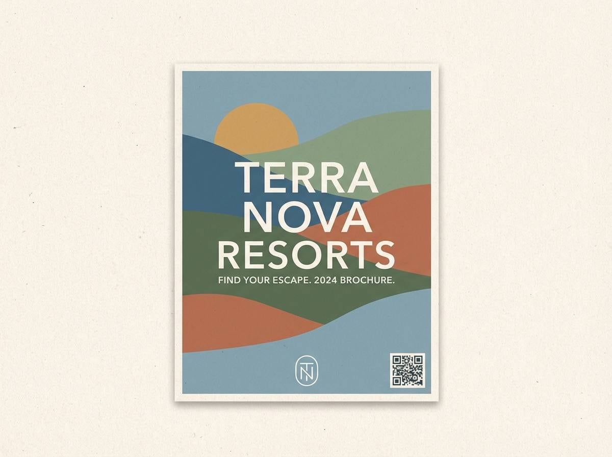
1) Desert Oasis
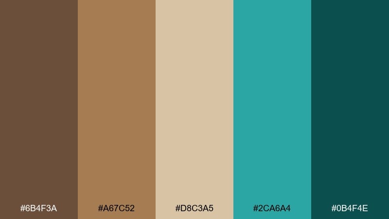
HEX: #6B4F3A #A67C52 #D8C3A5 #2CA6A4 #0B4F4E
Mood: sunbaked, refreshing, grounded
Best for: resort branding, travel brochures, hospitality websites
Sun-warmed sand and a cool pool edge come to mind, balancing earthy comfort with a clean splash of water. Use the deeper brown for headlines and the dark teal for buttons or key icons. Creamy beige keeps layouts airy and prevents the palette from feeling heavy. Pair with plenty of white space and one bold turquoise accent per section for a polished, resort-like rhythm.
Image example of desert oasis generated using media.io
Media.io is an online AI studio for creating and editing video, image, and audio in your browser.

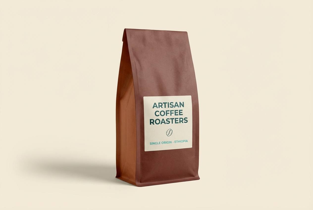
2) Copper Lagoon
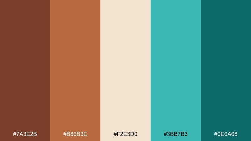
HEX: #7A3E2B #B86B3E #F2E3D0 #3BB7B3 #0E6A68
Mood: craft, cozy, modern
Best for: coffee packaging, artisan goods, product ads
Roasted warmth meets a bright lagoon tint, like copper cookware beside a tiled bar. Let the copper-brown lead on packaging panels while turquoise appears as a seal, stripe, or label border. The soft cream keeps text readable and premium. For a tidy hierarchy, reserve the darkest teal for small type and barcodes so it feels intentional rather than loud.
Image example of copper lagoon generated using media.io
3) Walnut Tide
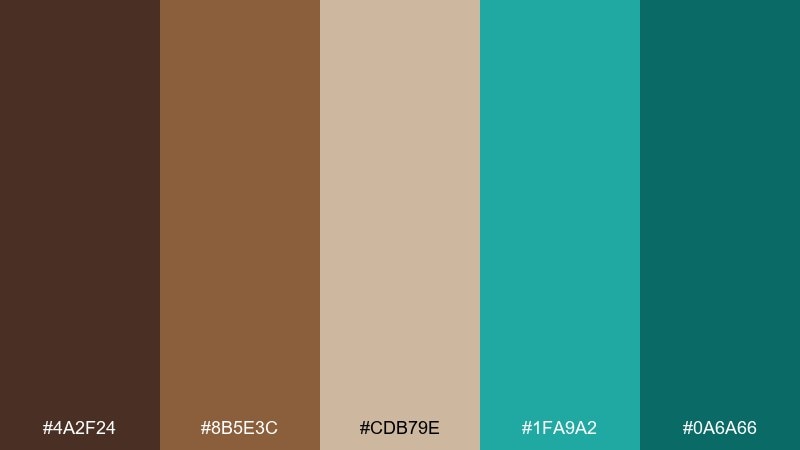
HEX: #4A2F24 #8B5E3C #CDB79E #1FA9A2 #0A6A66
Mood: moody, coastal, refined
Best for: living room styling, boutique hotel interiors, mood boards
Deep walnut tones and cool tidewater teal feel like driftwood on a rainy coastline. These brown turquoise color combinations work best when you anchor a room with the darkest brown and sprinkle teal through textiles and art. Keep the tan and beige as the main wall or upholstery base to soften contrast. Tip: choose matte finishes for the browns and a subtle sheen for the teal to add depth without adding clutter.
Image example of walnut tide generated using media.io
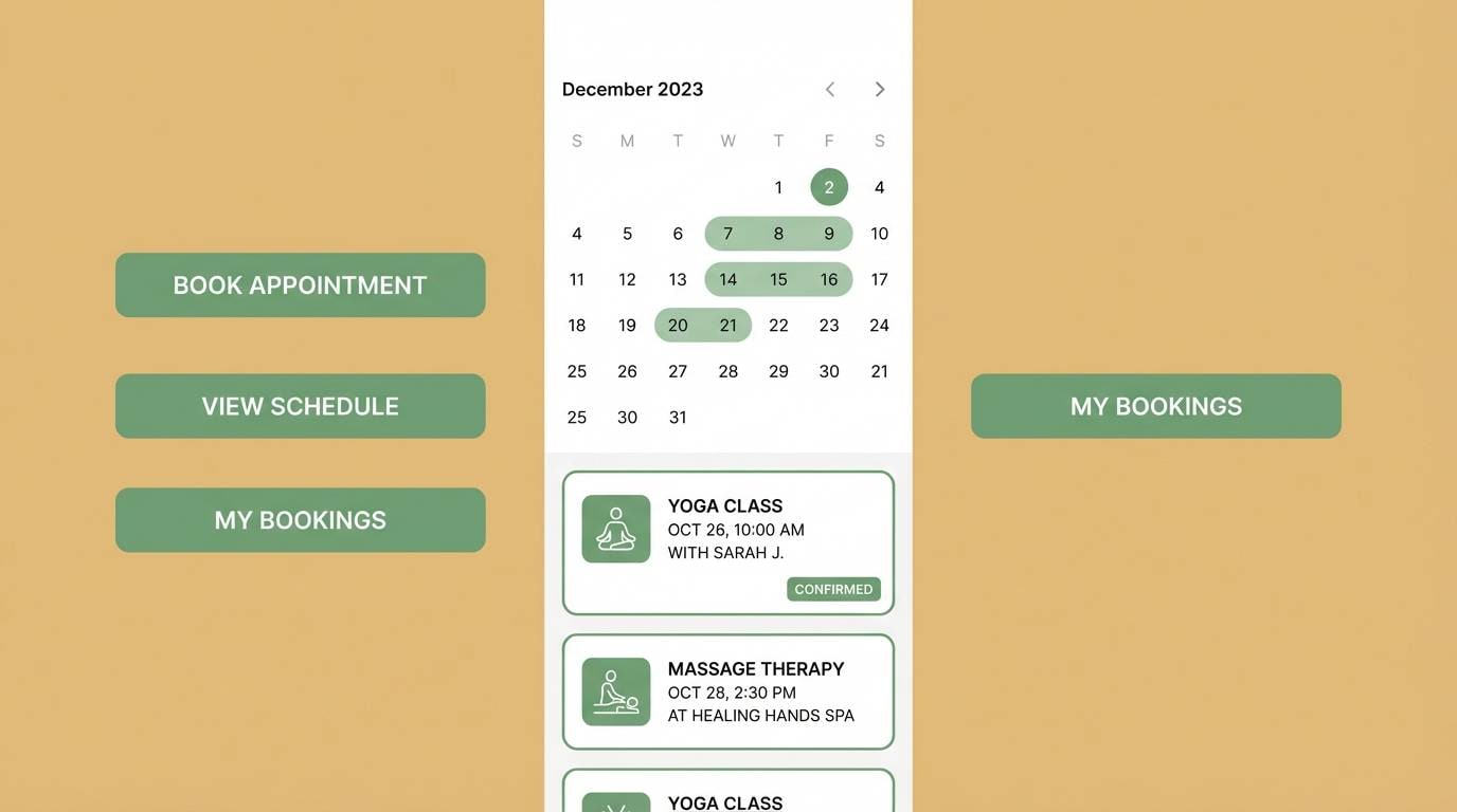
4) Clay and Sea Glass
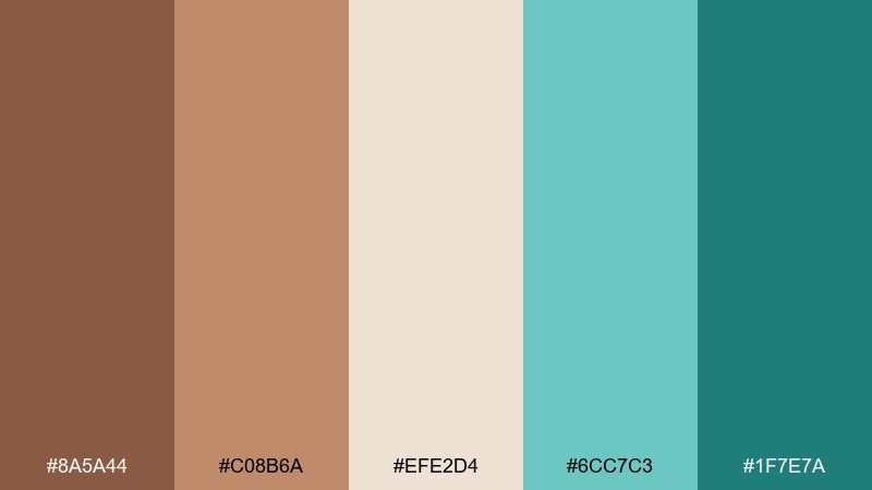
HEX: #8A5A44 #C08B6A #EFE2D4 #6CC7C3 #1F7E7A
Mood: calm, clean, spa-like
Best for: wellness apps, spa websites, booking UI
Soft clay and sea-glass teal create a gentle, rinsed-clean feeling that suits calm digital experiences. Use the palest cream as the main canvas, then set clay for navigation and labels so content stays warm. Teal shades are perfect for progress states and confirmation messages without looking neon. Keep icon strokes thin and let one teal shade dominate to avoid a busy interface.
Image example of clay and sea glass generated using media.io
5) Canyon Pool Party
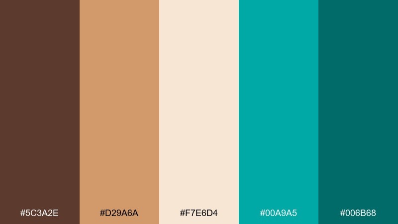
HEX: #5C3A2E #D29A6A #F7E6D4 #00A9A5 #006B68
Mood: playful, sunny, energetic
Best for: summer event posters, pool parties, festival flyers
Bright turquoise splashes against sunlit canyon browns, like towels drying on warm stone. Use turquoise for the headline or date to grab attention instantly. Balance the vibrancy with creamy peach and light tan so the layout still feels inviting. Tip: add a simple geometric border in the dark teal to frame the poster and keep the energy controlled.
Image example of canyon pool party generated using media.io

6) Antique Map Harbor
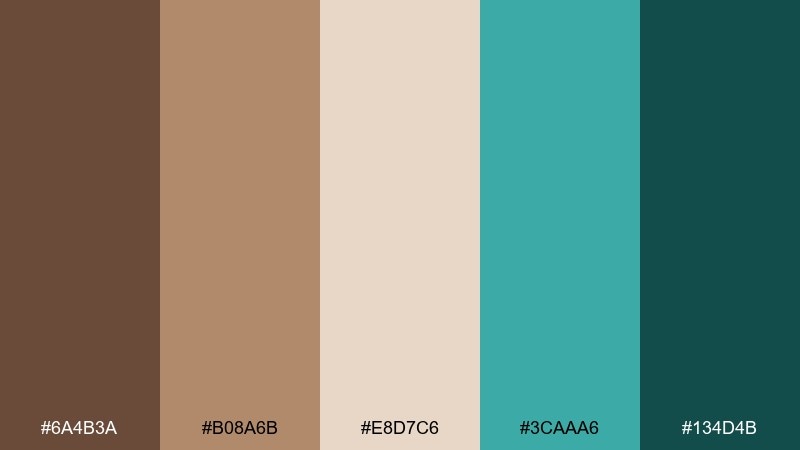
HEX: #6A4B3A #B08A6B #E8D7C6 #3CAAA6 #134D4B
Mood: vintage, thoughtful, worldly
Best for: editorial design, travel magazines, storytelling layouts
Aged paper browns with harbor-water teal feel like an old map annotated with modern ink. Use the mid tan for section headers and pull quotes, letting the darkest teal handle body text accents and rules. The light parchment shade keeps spreads readable and soft. Tip: combine with serif typography and thin teal lines to create structure without losing the nostalgic mood.
Image example of antique map harbor generated using media.io
7) Cocoa Mint Studio
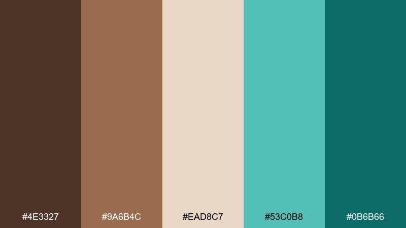
HEX: #4E3327 #9A6B4C #EAD8C7 #53C0B8 #0B6B66
Mood: creative, modern, confident
Best for: agency branding, logo systems, portfolio sites
Velvety cocoa and fresh mint-teal evoke a studio that feels both craft-driven and digitally sharp. As a brown turquoise color palette, it shines when you pick one brown for typography and keep teal for highlights, links, and micro-interactions. The pale neutral works as a reliable background for case studies and grids. Tip: apply teal only to the most important CTAs so the brand stays premium rather than playful.
Image example of cocoa mint studio generated using media.io
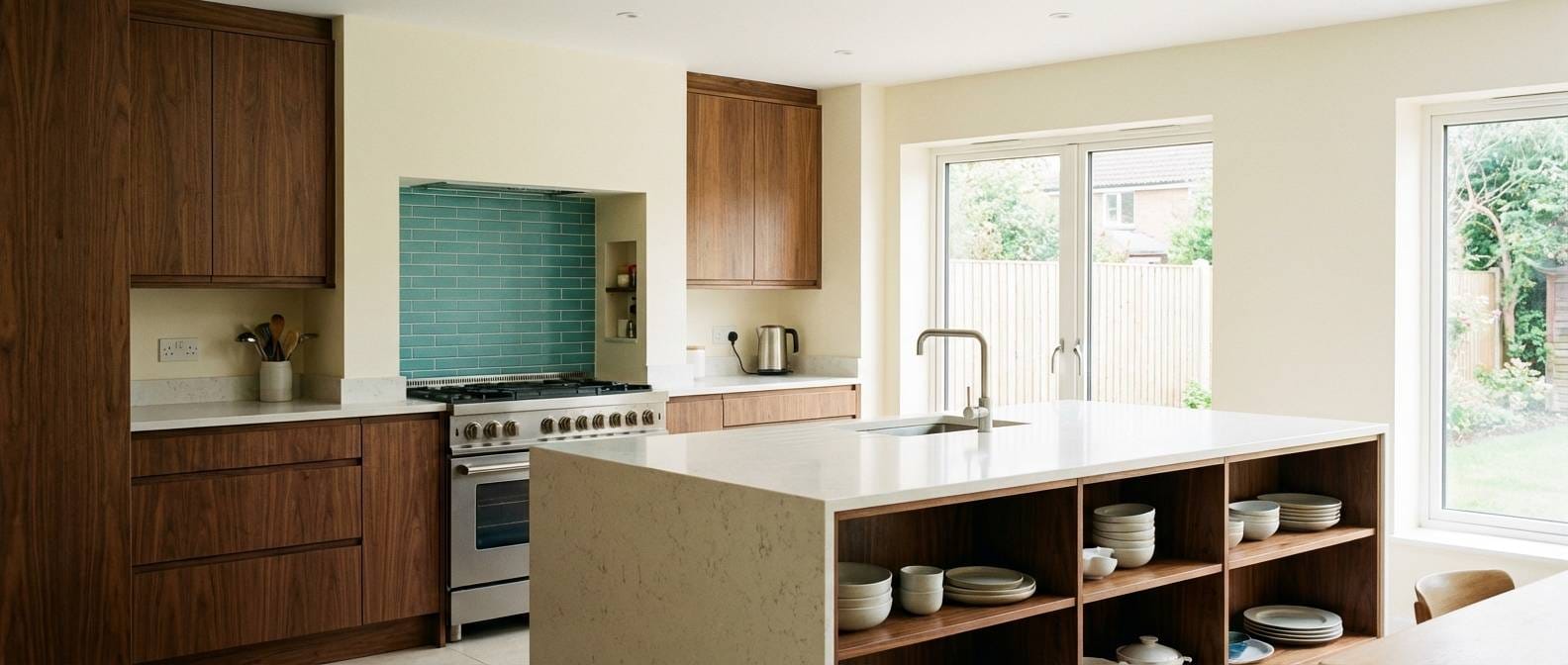
8) Riverstone Kitchen
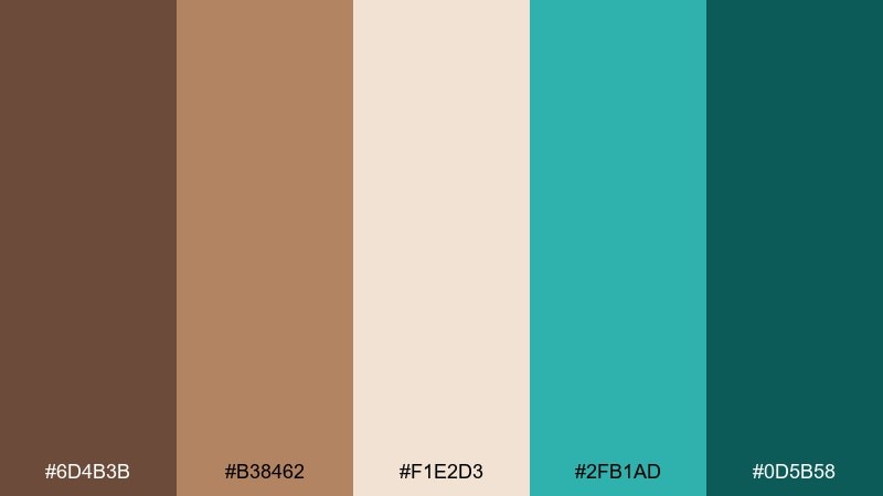
HEX: #6D4B3B #B38462 #F1E2D3 #2FB1AD #0D5B58
Mood: homey, clean, upscale
Best for: kitchen remodel concepts, cabinetry selections, backsplash planning
Riverstone browns with crisp turquoise hints feel like a warm wood kitchen with a glazed tile backsplash. Use the medium brown on cabinetry or flooring, then bring teal in through tile, bar stools, or small appliances. The creamy neutral keeps countertops and walls bright and timeless. Tip: repeat teal in at least two zones, like backsplash and textiles, so it looks designed rather than accidental.
Image example of riverstone kitchen generated using media.io
9) Mocha Reef
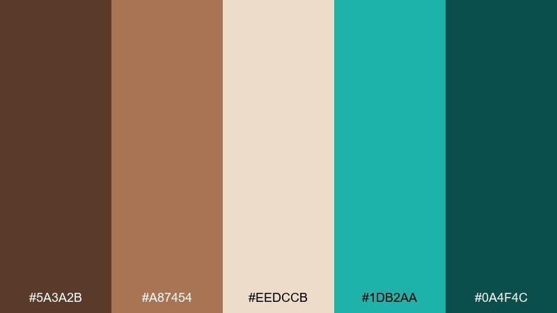
HEX: #5A3A2B #A87454 #EEDCCB #1DB2AA #0A4F4C
Mood: sleek, techy, warm
Best for: ecommerce UI, checkout flows, product pages
Dark mocha and reef teal create a confident contrast that feels fast and trustworthy. Keep backgrounds in the pale neutral and reserve the darkest brown for primary text for maximum readability. Use teal for price highlights, toggles, and success states so users quickly learn what is clickable. Tip: avoid using both teal shades in the same component; pick one per module to keep the UI crisp.
Image example of mocha reef generated using media.io
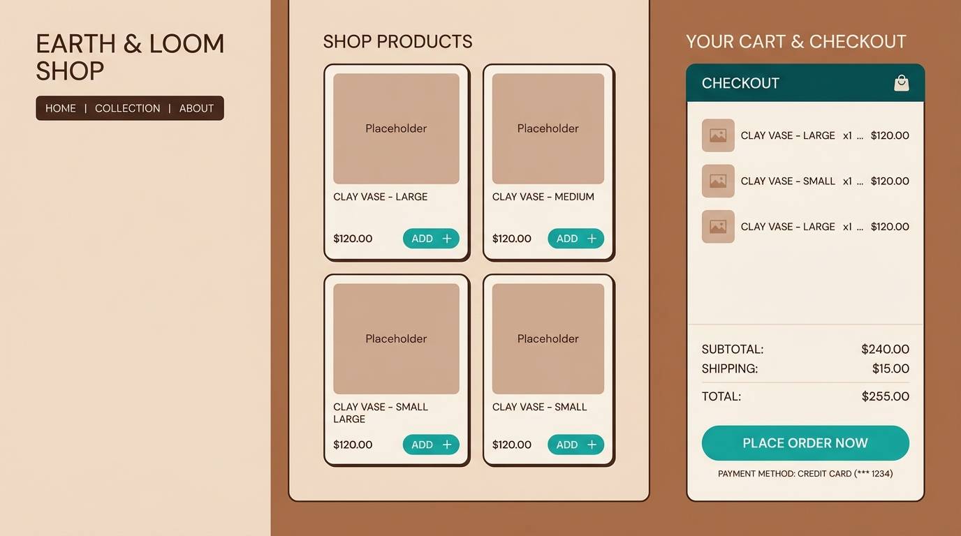
10) Rustic Teal Wedding
HEX: #704A3A #C19A7A #FFF1E4 #4ABBB5 #1C6C68
Mood: romantic, rustic, airy
Best for: wedding invitations, save-the-dates, ceremony signage
Rustic wood tones with soft teal feel like a barn venue dressed with fresh greenery and linen. Use the creamy shade as the paper base, then set brown for names and typography to keep it classic. Teal works beautifully for monograms, small florals, or border lines. Tip: print teal as a spot accent and keep most text in brown for a calm, readable invitation set.
Image example of rustic teal wedding generated using media.io
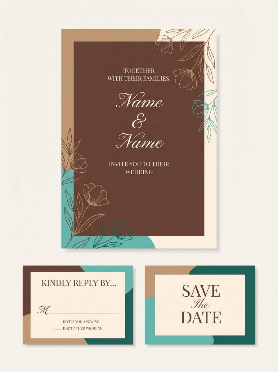
11) Sienna Surfboard
HEX: #7B4B34 #D08A5A #F4E5D6 #19B4AE #0B5E5B
Mood: sporty, adventurous, sunny
Best for: sportswear ads, outdoor lifestyle brands, merch drops
Hot sienna and bright turquoise bring a beach-athletic vibe, like sunlit boards and ocean spray. Use the darker teal for logos and the brighter teal for callouts such as limited drop or new colorway. Keep the pale neutral for negative space so product details stand out. Tip: pair with bold sans-serif type and clean blocks of color to maintain a modern, performance feel.
Image example of sienna surfboard generated using media.io
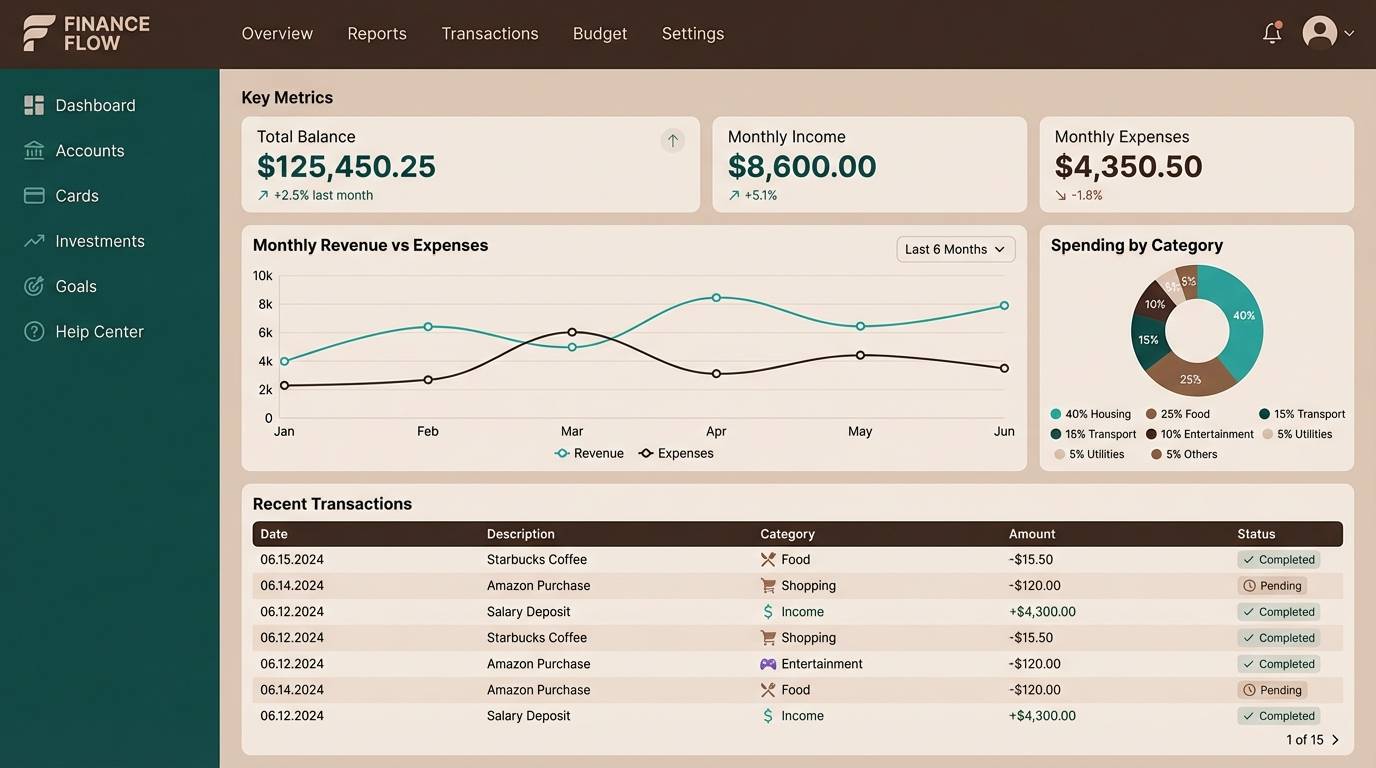
12) Forest Creek Ledger
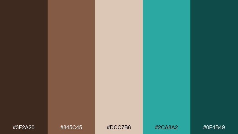
HEX: #3F2A20 #845C45 #DCC7B6 #2CA8A2 #0F4B49
Mood: trustworthy, steady, sophisticated
Best for: finance dashboards, analytics tools, SaaS UI
Deep bark browns with creek-water teal feel stable and quietly premium. A brown turquoise color scheme like this works well for dashboards where you need contrast without harshness. Use the dark brown for primary text and navigation, then teal for data highlights and selected states. Tip: keep charts mostly neutral and reserve teal for one key metric so insights read instantly.
Image example of forest creek ledger generated using media.io
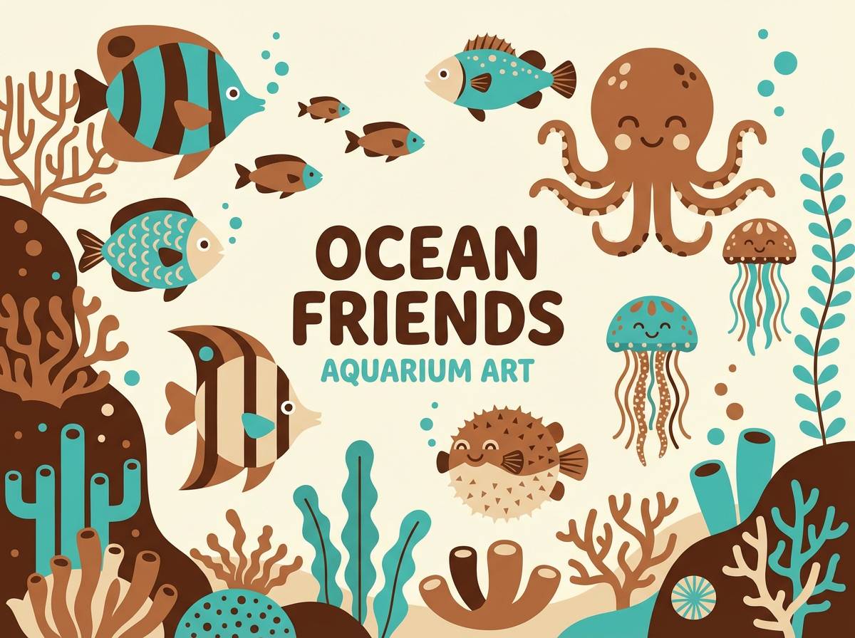
13) Terracotta Aquarium
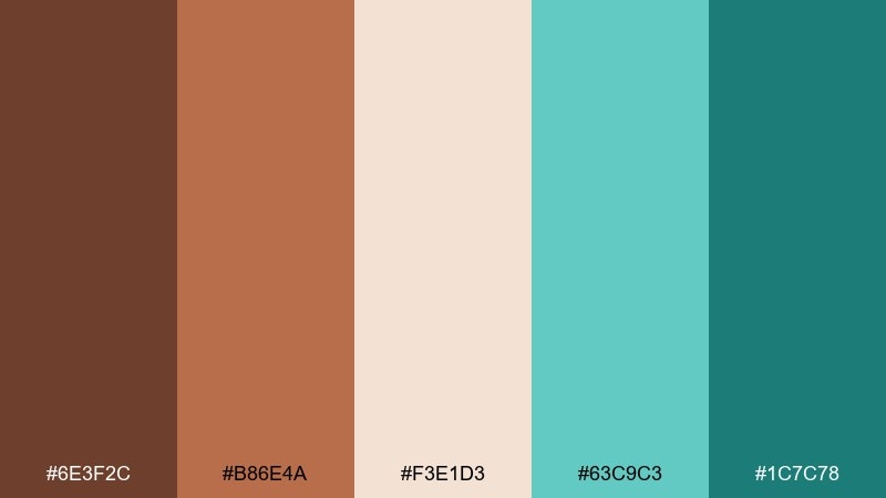
HEX: #6E3F2C #B86E4A #F3E1D3 #63C9C3 #1C7C78
Mood: cheerful, gentle, family-friendly
Best for: kids room decor, educational prints, playful illustrations
Friendly terracotta warmth and bubbly turquoise feel like an aquarium poster in a sunny playroom. Use the lighter peachy neutral as the base so the teal stays bright without overpowering. The darker teal works well for outlines and titles, keeping artwork readable at a distance. Tip: repeat the terracotta in small details, like coral shapes or lettering, to tie the whole scene together.
Image example of terracotta aquarium generated using media.io
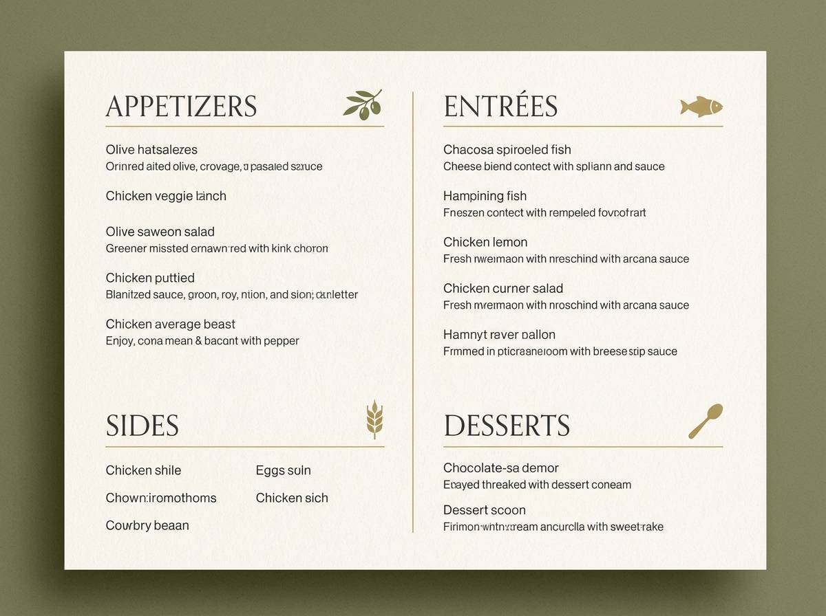
14) Espresso Seaside
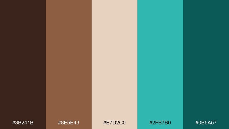
HEX: #3B241B #8E5E43 #E7D2C0 #2FB7B0 #0B5A57
Mood: bistro, elegant, inviting
Best for: restaurant menus, cafe branding, table tent designs
Espresso browns with a seaside teal accent feel like a cozy cafe near the water. Use the dark brown for menu item names and the lighter brown for descriptions to build clear hierarchy. Teal is ideal for section dividers, icons, and a single featured dish highlight. Tip: keep teal to under 15 percent of the layout so the menu stays classic and readable.
Image example of espresso seaside generated using media.io
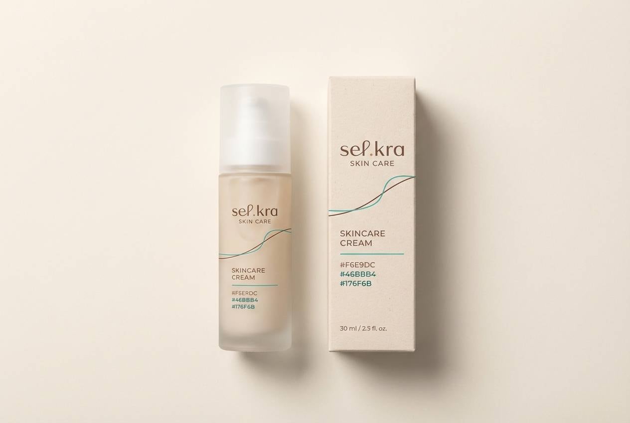
15) Driftwood and Jade
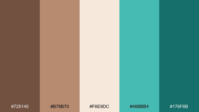
HEX: #725140 #B78B70 #F6E9DC #46BBB4 #176F6B
Mood: natural, premium, soothing
Best for: skincare packaging, wellness product lines, label design
Driftwood browns and jade-teal accents suggest clean ingredients and spa-day calm. Use the cream as the bottle base and let the teal carry the brand mark for a fresh, modern signal. Warm browns are perfect for ingredient callouts and secondary text, adding a grounded, botanical feel. Tip: emboss the brown typography and keep teal flat for a subtle tactile contrast on shelf.
Image example of driftwood and jade generated using media.io
16) Bronze Tropics
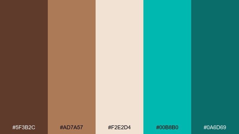
HEX: #5F3B2C #AD7A57 #F2E2D4 #00B8B0 #0A6D69
Mood: bold, sunny, promotional
Best for: social media ads, campaign banners, promo graphics
Bronze warmth with punchy turquoise feels like tropical shade meeting bright water. These brown turquoise color combinations are ideal for promos where you need both energy and credibility. Use the bright teal for the main CTA and the dark teal for supporting badges or discount tags. Tip: set long copy in brown on the light neutral and keep teal for short, high-impact phrases only.
Image example of bronze tropics generated using media.io

17) Pebble Cove
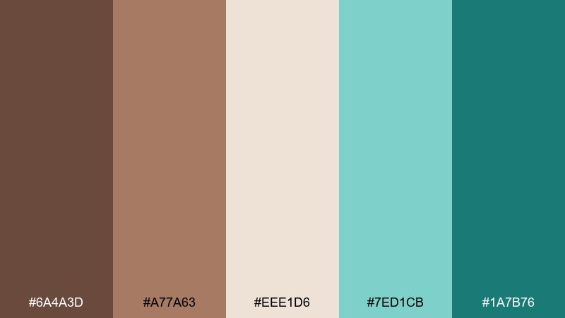
HEX: #6A4A3D #A77A63 #EEE1D6 #7ED1CB #1A7B76
Mood: minimal, friendly, light
Best for: app onboarding screens, product tours, microcopy UI
Soft pebble browns and airy turquoise read clean and approachable, like a quiet cove at low tide. Use the light neutral as the main screen background to keep onboarding calm. Teal is perfect for progress dots and primary buttons, while the browns can handle headlines and supportive text. Tip: keep illustrations monochrome in brown and reserve turquoise for interaction cues.
Image example of pebble cove generated using media.io
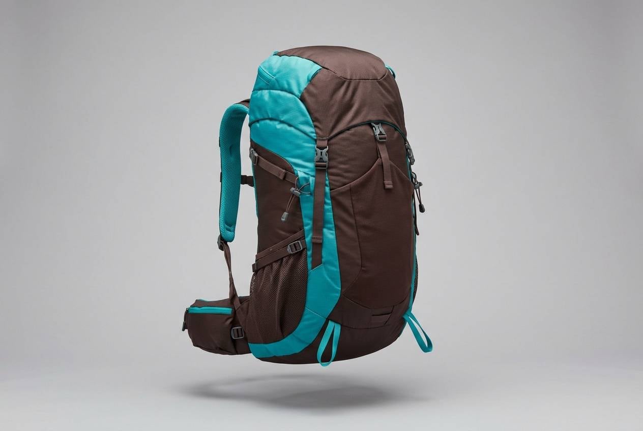
18) Chestnut Glacier
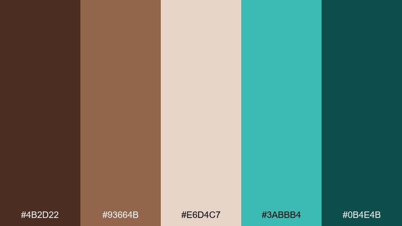
HEX: #4B2D22 #93664B #E6D4C7 #3ABBB4 #0B4E4B
Mood: rugged, crisp, dependable
Best for: outdoor gear branding, camping product pages, labels
Chestnut browns with glacial teal feel like a sturdy pack against cold air. Use the darkest brown for wordmarks and product names to communicate durability. Teal works well for technical feature bullets and zipper-pull accents in visuals. Tip: pair with textured materials like canvas or recycled paper, and keep teal as a single repeating indicator for performance features.
Image example of chestnut glacier generated using media.io
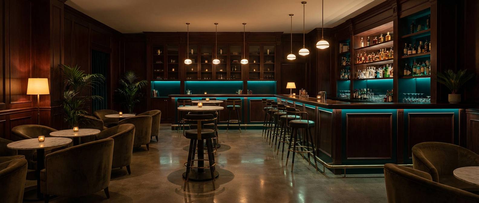
19) Mahogany Lagoon Nights
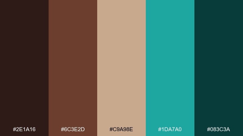
HEX: #2E1A16 #6C3E2D #C9A98E #1DA7A0 #083C3A
Mood: dramatic, intimate, luxe
Best for: cocktail bar interiors, lounge branding, nightlife posters
Dark mahogany and deep lagoon teal set a late-night mood, like low lighting bouncing off polished wood. A brown turquoise color combination like this works best when the darkest shades dominate and the tan appears only as a warm highlight. Use teal in neon-style signage, bar menus, or velvet seating for a controlled pop. Tip: add brass or smoked glass finishes to bridge the warmth and coolness elegantly.
Image example of mahogany lagoon nights generated using media.io
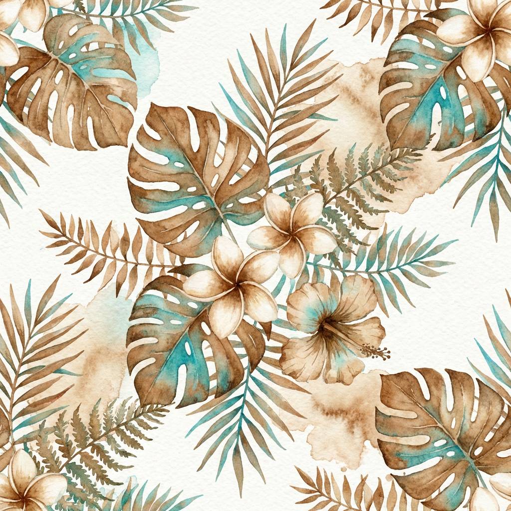
20) Cocoa and Caribbean
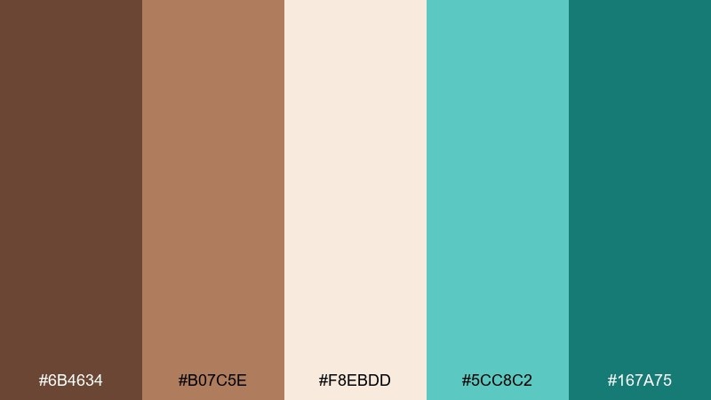
HEX: #6B4634 #B07C5E #F8EBDD #5CC8C2 #167A75
Mood: fresh, botanical, breezy
Best for: watercolor patterns, stationery, spring campaign artwork
Cocoa warmth with Caribbean turquoise feels like tropical leaves against sandy ground. Let the light cream act as paper tone, then layer teal washes for a breezy focal point. Browns are ideal for stems, shadows, and hand-lettered details that keep the illustration grounded. Tip: keep turquoise edges soft and watery while using sharper brown linework for contrast and clarity.
Image example of cocoa and caribbean generated using media.io
What Colors Go Well with Brown Turquoise?
Clean neutrals make brown and turquoise easier to use: ivory, cream, warm white, and soft greige keep layouts breathable and help turquoise look intentional instead of noisy.
Metallics and warm accents also pair naturally—think brass, bronze, terracotta, and caramel. They reinforce the earthy side of brown while letting turquoise stay crisp.
If you want a deeper, more dramatic direction, add charcoal or near-black for contrast, and use a single teal shade as your “signal” color for links, icons, or highlights.
How to Use a Brown Turquoise Color Palette in Real Designs
For branding and UI, treat brown as the structural color (type, nav, dividers) and turquoise as the action color (CTAs, active states, key metrics). This creates a clear hierarchy users understand instantly.
For interiors, anchor the room with wood tones, tan textiles, or warm walls, then repeat turquoise in at least two places (pillows + art, tile + rug) so the accent feels designed, not accidental.
Across print, packaging, and social graphics, keep turquoise usage concentrated—small but high impact—while neutrals handle most of the background for better readability.
Create Brown Turquoise Palette Visuals with AI
If you already have HEX codes, you can generate fast, on-brand visuals by describing the layout (poster, UI screen, packaging) and the mood (rustic, premium, playful). The key is to specify where turquoise should appear (CTA button, border, label stripe) so the balance stays controlled.
Use short, specific prompts and iterate: first lock composition and typography, then refine materials (paper texture, matte wood, glossy tile) to match the brown/turquoise contrast you want.
With Media.io’s text-to-image tool, you can quickly create examples for pitch decks, mood boards, and client options—without starting from a blank canvas.
Brown Turquoise Color Palette FAQs
-
Is turquoise a good accent color for brown?
Yes. Turquoise adds a cool, clean contrast to brown’s warmth, making headlines, buttons, or decor accents stand out without feeling as sharp as pure blue. -
What shade of turquoise works best with dark brown?
Deep teal or muted turquoise usually looks most premium with dark browns because both colors share a “rich” depth and avoid a neon look. -
How do I keep a brown and turquoise palette from looking too busy?
Use a light neutral as your main background, pick one dominant teal, and limit turquoise to key elements (CTAs, icons, a single pattern) while browns carry the structure. -
Which neutrals match brown turquoise color combinations?
Ivory, cream, warm white, parchment, and soft beige are the safest choices. They keep contrast readable and help turquoise feel crisp. -
Can I use brown turquoise in a modern website UI?
Absolutely. Use brown for primary text and navigation, keep the canvas light, and apply turquoise to interactive states (links, toggles, progress, success) for a clean modern hierarchy. -
What finishes work best for brown and turquoise in interiors?
Matte or natural textures (wood, linen, stone) work well for browns, while a subtle sheen (glazed tile, satin paint, glass) can make turquoise accents feel fresh and dimensional. -
How much turquoise should I use compared to brown?
A practical rule is to keep turquoise under 10–20% of the design and let browns and neutrals handle most surfaces. Increase turquoise only when you need a louder, more energetic look.
Next: Wine Red Color Palette


