

Beige gray (often called greige) is the shortcut to designs that feel calm, modern, and easy to live with. It blends beige warmth with gray structure, so spaces and screens read soft without turning bland.
Below are 20 ready-to-use beige gray color palette ideas with HEX codes, plus practical pairing tips for interiors, branding, and UI.
In this article
- Why Beige Gray Palettes Work So Well
-
- warm greige loft
- pebble linen ui
- cashmere concrete
- misty sandstone
- gallery plaster
- espresso beige trim
- quiet meadow neutrals
- rainy day minimal
- nordic clay kitchen
- soft suiting
- desert fog branding
- stonewashed denim accent
- antique paper editorial
- winter birch
- ceramic studio
- metro beige grid
- hearthside neutral comfort
- coastal dune
- museum label
- smoky beige nightfall
- What Colors Go Well with Beige Gray?
- How to Use a Beige Gray Color Palette in Real Designs
- Create Beige Gray Palette Visuals with AI
Why Beige Gray Palettes Work So Well
Beige gray sits in the “comfort zone” of color: warm enough to feel welcoming, but neutral enough to support bold typography, photography, and materials like wood, stone, or metal.
Because the contrast can be tuned from creamy off-white to charcoal, greige palettes make hierarchy easy. You can keep surfaces soft while still reserving deep tones for navigation, headings, trim, and calls-to-action.
They also adapt across lighting and screens. A well-built beige gray color scheme stays consistent from daylight interiors to warm bulbs, and from web UI to print—without the harshness of pure grays.
20+ Beige Gray Color Palette Ideas (with HEX Codes)
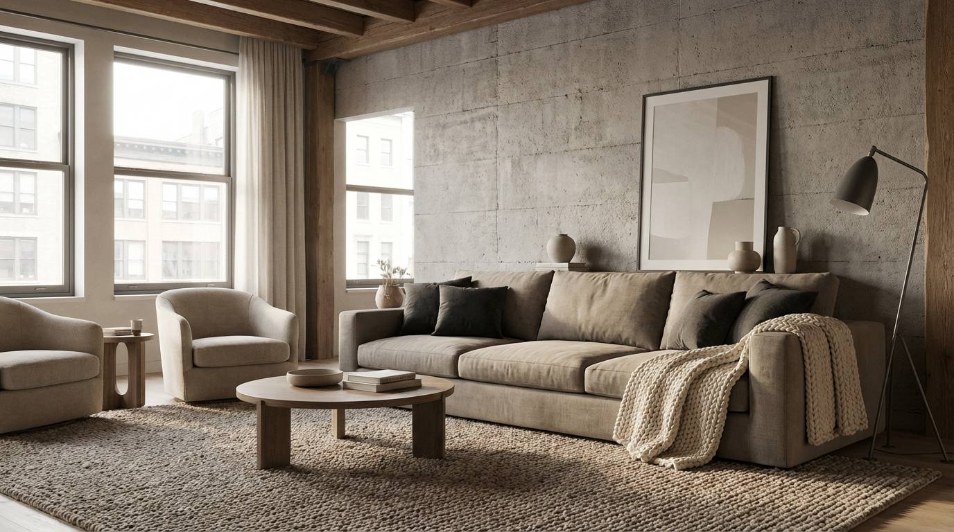
1) Warm Greige Loft
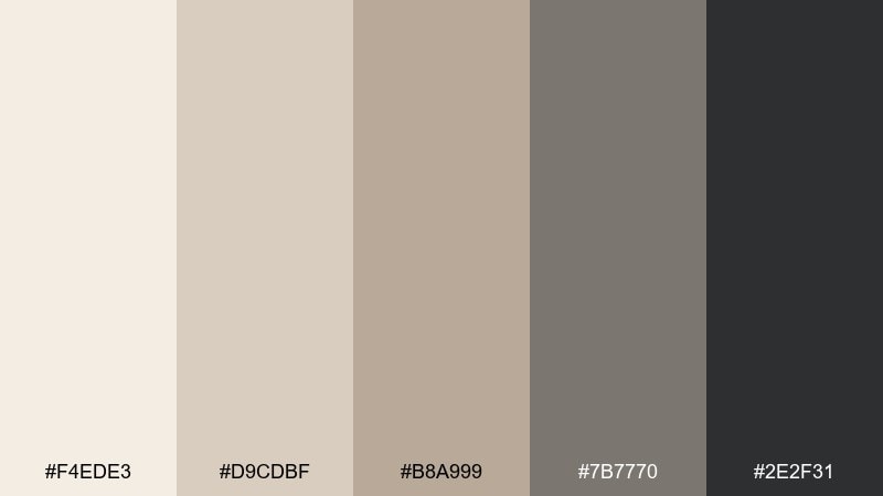
HEX: #f4ede3 #d9cdbf #b8a999 #7b7770 #2e2f31
Mood: warm, modern, grounded
Best for: loft living room interior styling
Warm and grounded like sun hitting concrete and linen at golden hour. The mix of creamy beige, soft greige, and charcoal creates a balanced beige gray color palette that feels modern without going cold. Use it for walls, textiles, and metal finishes, then add matte black details to sharpen the edges. Tip: keep the darkest tone for legs, frames, and lighting to anchor the room.
Image example of warm greige loft generated using media.io
Media.io is an online AI studio for creating and editing video, image, and audio in your browser.

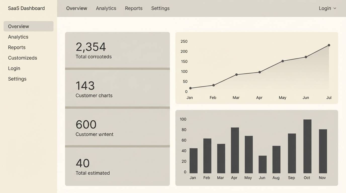
2) Pebble Linen UI
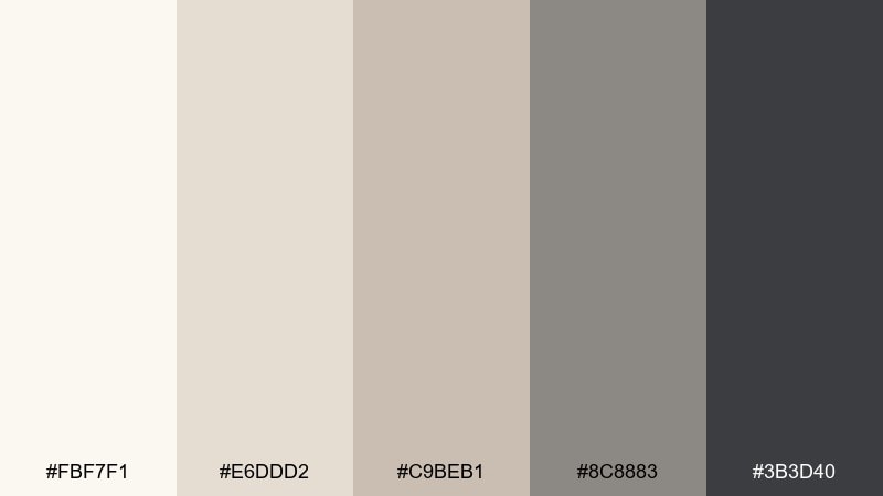
HEX: #fbf7f1 #e6ddd2 #c9beb1 #8c8883 #3b3d40
Mood: clean, calm, professional
Best for: minimal SaaS dashboard UI
Clean and quiet like pebbles and crisp linen under soft daylight. These neutrals make content feel organized, with deeper gray reserved for hierarchy and navigation. It works especially well for analytics dashboards, finance tools, and settings-heavy products. Tip: use the mid-tone greige for card borders so the UI stays structured without looking boxed in.
Image example of pebble linen ui generated using media.io
3) Cashmere Concrete
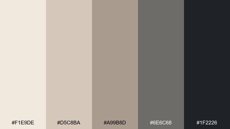
HEX: #f1e9de #d5c8ba #a99b8d #6e6c68 #1f2226
Mood: luxurious, architectural, cozy
Best for: boutique hotel lobby concept
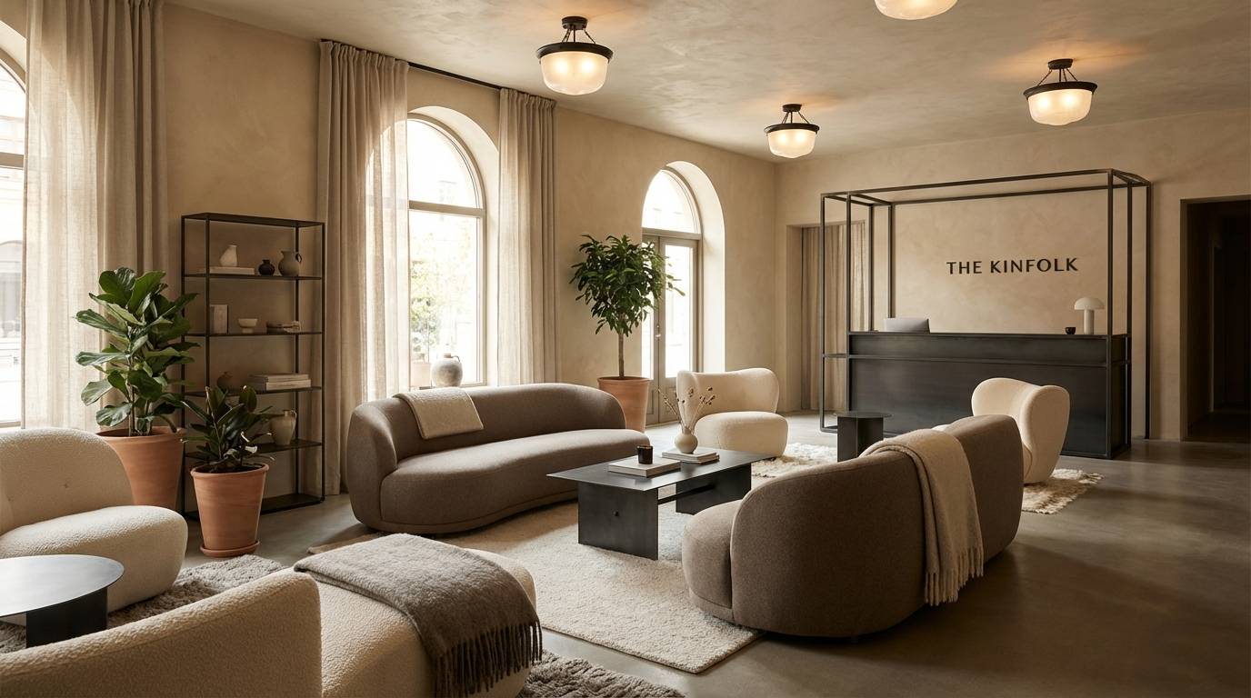
Luxurious and architectural, like cashmere draped over polished concrete. The warm beiges soften the grays, while near-black adds a high-end edge for signage and trim. Use it in hospitality spaces where you want calm sophistication without feeling sterile. Tip: repeat the warmest beige in large surfaces and keep the darkest shade for wayfinding and metalwork.
Image example of cashmere concrete generated using media.io
4) Misty Sandstone
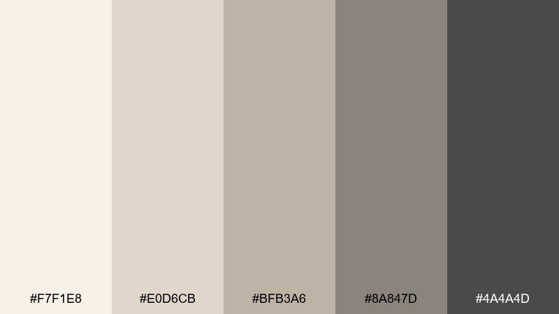
HEX: #f7f1e8 #e0d6cb #bfb3a6 #8a847d #4a4a4d
Mood: soft, airy, understated
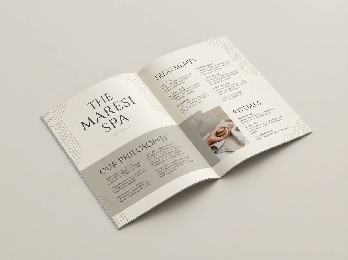
Best for: spa brochure and service menu
Soft and airy like mist rolling over pale sandstone. The gentle contrast keeps typography readable while maintaining a soothing, premium feel. It suits spa menus, wellness brochures, and calm service branding where whitespace matters. Tip: set headlines in the darkest gray and reserve the lightest cream for generous margins.
Image example of misty sandstone generated using media.io
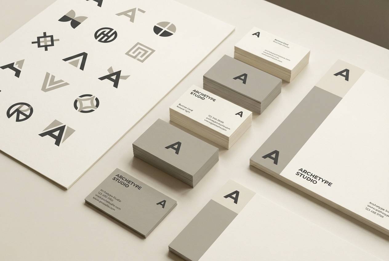
5) Gallery Plaster
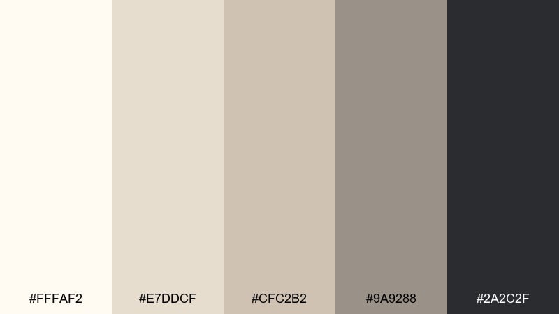
HEX: #fffaf2 #e7ddcf #cfc2b2 #9a9288 #2a2c2f
Mood: artful, minimal, curated
Best for: art gallery brand identity
Artful and minimal, like fresh plaster walls in a quiet gallery. The pale base gives room for photography, while the darker grays feel deliberate and editorial. Use it for identity systems, wall labels, and print collateral where subtlety signals confidence. Tip: keep the palette mostly light, then use charcoal only for titles and small marks.
Image example of gallery plaster generated using media.io
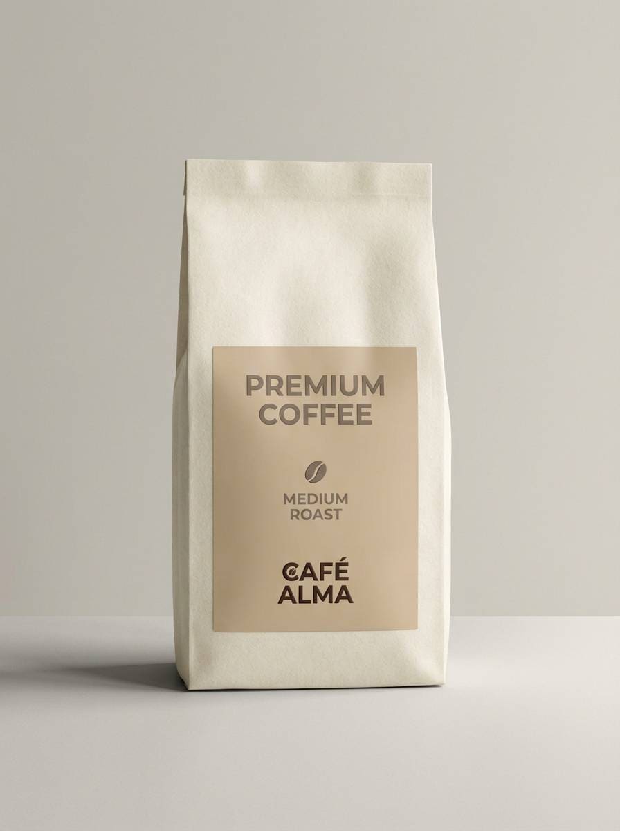
6) Espresso Beige Trim
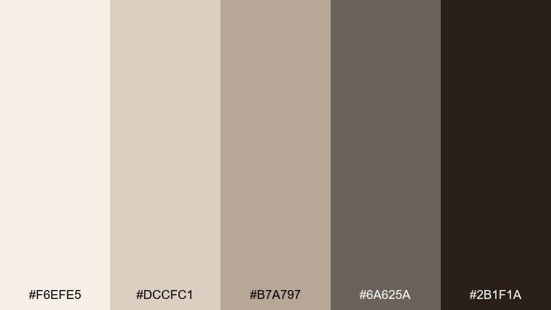
HEX: #f6efe5 #dccfc1 #b7a797 #6a625a #2b1f1a
Mood: rich, cozy, refined
Best for: coffee packaging and product ads
Rich and cozy, like steamed milk swirling into espresso. Warm beige and taupe keep it inviting, while the deep brown delivers a crafted, premium finish. It works great for coffee bags, labels, and lifestyle product ads that need warmth without bright colors. Tip: use the darkest tone for the logo and roast details so the pack reads clearly at shelf distance.
Image example of espresso beige trim generated using media.io
7) Quiet Meadow Neutrals
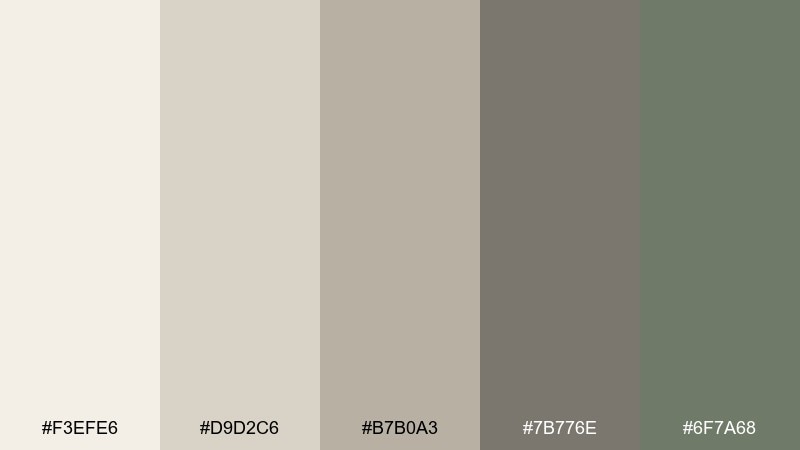
HEX: #f3efe6 #d9d2c6 #b7b0a3 #7b776e #6f7a68
Mood: natural, gentle, restorative
Best for: spring botanical illustration
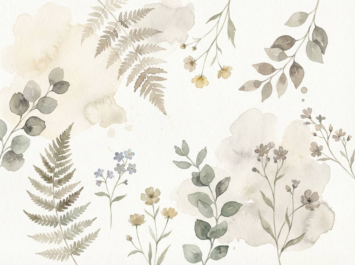
Natural and restorative, like a quiet meadow seen through morning haze. The muted sage note adds life to otherwise neutral beige gray color combinations, making the set feel fresh instead of flat. Use it for botanical prints, wellness social posts, or packaging with a plant-forward story. Tip: let the cream and greige dominate, then add sage only as stems, leaves, or small stamps.
Image example of quiet meadow neutrals generated using media.io
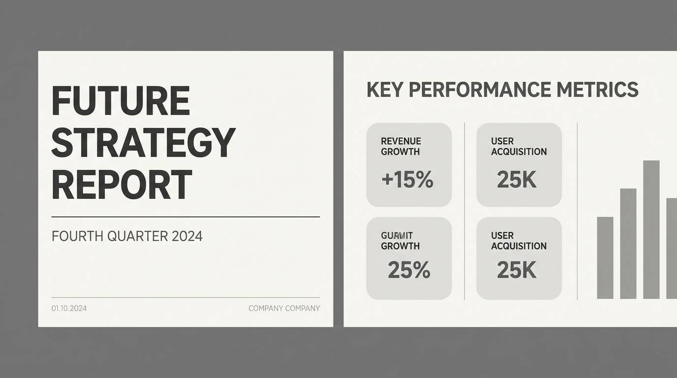
8) Rainy Day Minimal
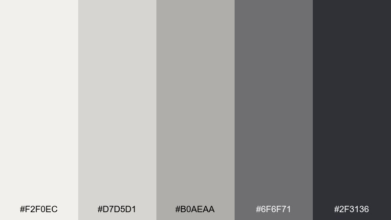
HEX: #f2f0ec #d7d5d1 #b0aeaa #6f6f71 #2f3136
Mood: cool, minimal, focused
Best for: presentation slide deck theme
Cool and focused, like a rainy day seen through clean glass. The tonal grays make charts and tables look sharp, while the soft off-white keeps pages from feeling heavy. It fits business decks, research reports, and keynote templates that need clarity. Tip: keep the darkest shade for headings only and rely on mid-gray for body text to reduce fatigue.
Image example of rainy day minimal generated using media.io
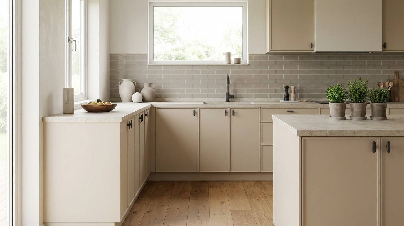
9) Nordic Clay Kitchen
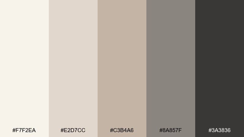
HEX: #f7f2ea #e2d7cc #c3b4a6 #8a857f #3a3836
Mood: homey, modern, clean
Best for: kitchen cabinet and countertop pairing
Homey and modern, like Nordic clay and pale wood in a bright kitchen. The gentle beige layers flatter natural materials, and the deeper neutrals help hardware and grout lines stand out. Use it when choosing cabinets, backsplash tile, and stone counters with warm undertones. Tip: test the lightest shade under both daylight and warm bulbs to avoid surprise yellowing.
Image example of nordic clay kitchen generated using media.io
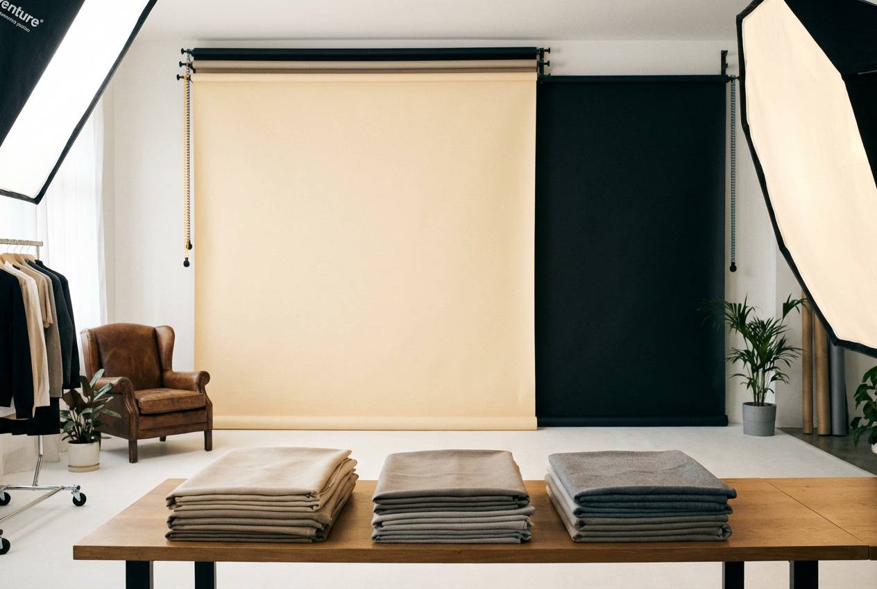
10) Soft Suiting
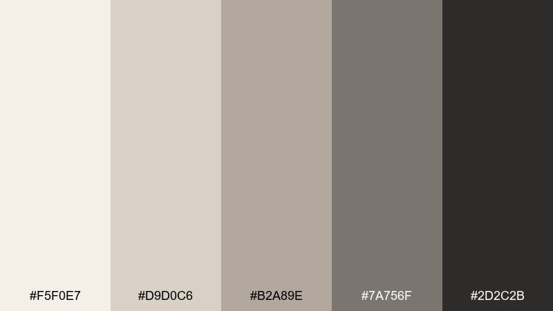
HEX: #f5f0e7 #d9d0c6 #b2a89e #7a756f #2d2c2b
Mood: polished, calm, professional
Best for: corporate headshot backdrop and wardrobe guide
Polished and calm, like tailored suiting in a softly lit studio. These tones keep skin tones natural and reduce harsh contrast on camera. Use it for wardrobe guidelines, backdrop selection, and brand photography that needs consistency across teams. Tip: place the mid greige behind the subject and save the deepest shade for text overlays and logos.
Image example of soft suiting generated using media.io
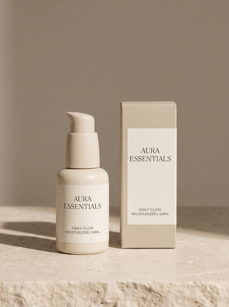
11) Desert Fog Branding
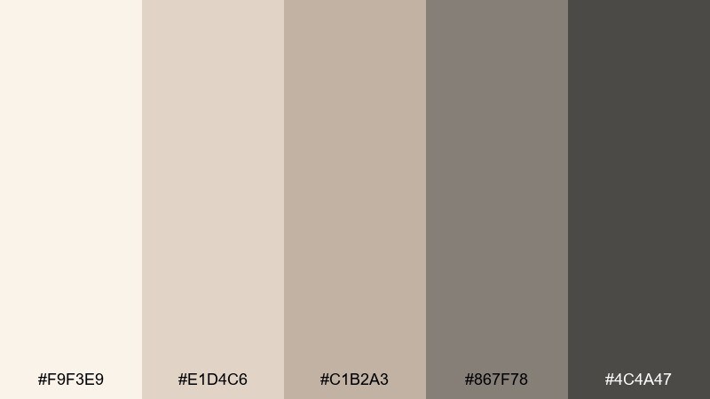
HEX: #f9f3e9 #e1d4c6 #c1b2a3 #867f78 #4c4a47
Mood: warm, airy, premium
Best for: skincare label design
Warm and airy, like desert fog lifting off sand at dawn. The soft neutrals feel clean and trustworthy, perfect for ingredient-first brands. Use it for labels, cartons, and web product pages where you want a quiet premium look. Tip: print a test on uncoated stock so the lightest cream does not disappear into the paper.
Image example of desert fog branding generated using media.io
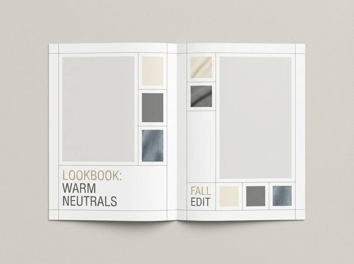
12) Stonewashed Denim Accent
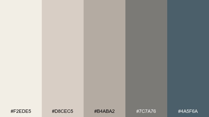
HEX: #f2ede5 #d8cec5 #b4aba2 #7c7a76 #4a5f6a
Mood: relaxed, contemporary, balanced
Best for: casual fashion lookbook layout
Relaxed and contemporary, like stonewashed denim paired with oatmeal knits. The cool blue-gray accent lifts the neutrals and keeps pages from feeling monochrome, creating a beige gray color combination that still reads modern. Use it for fashion lookbooks, lifestyle blogs, and ecommerce category pages. Tip: reserve the denim tone for callouts and section headers so it stays special.
Image example of stonewashed denim accent generated using media.io
13) Antique Paper Editorial
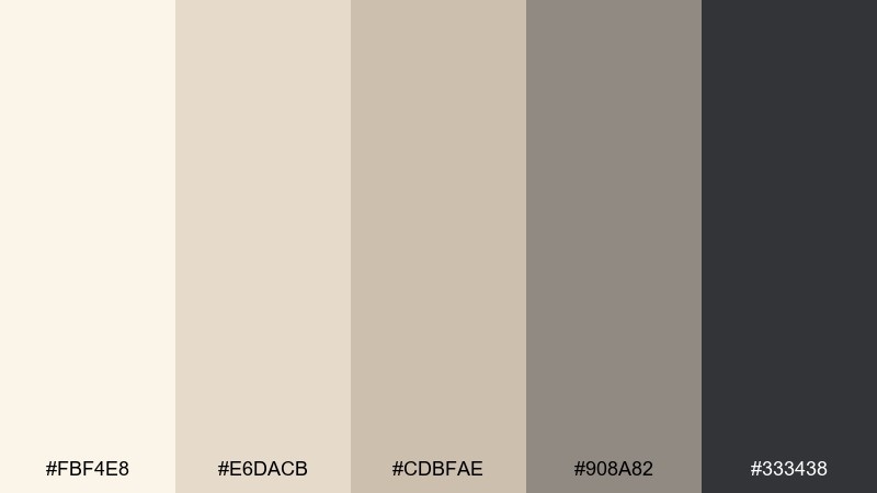
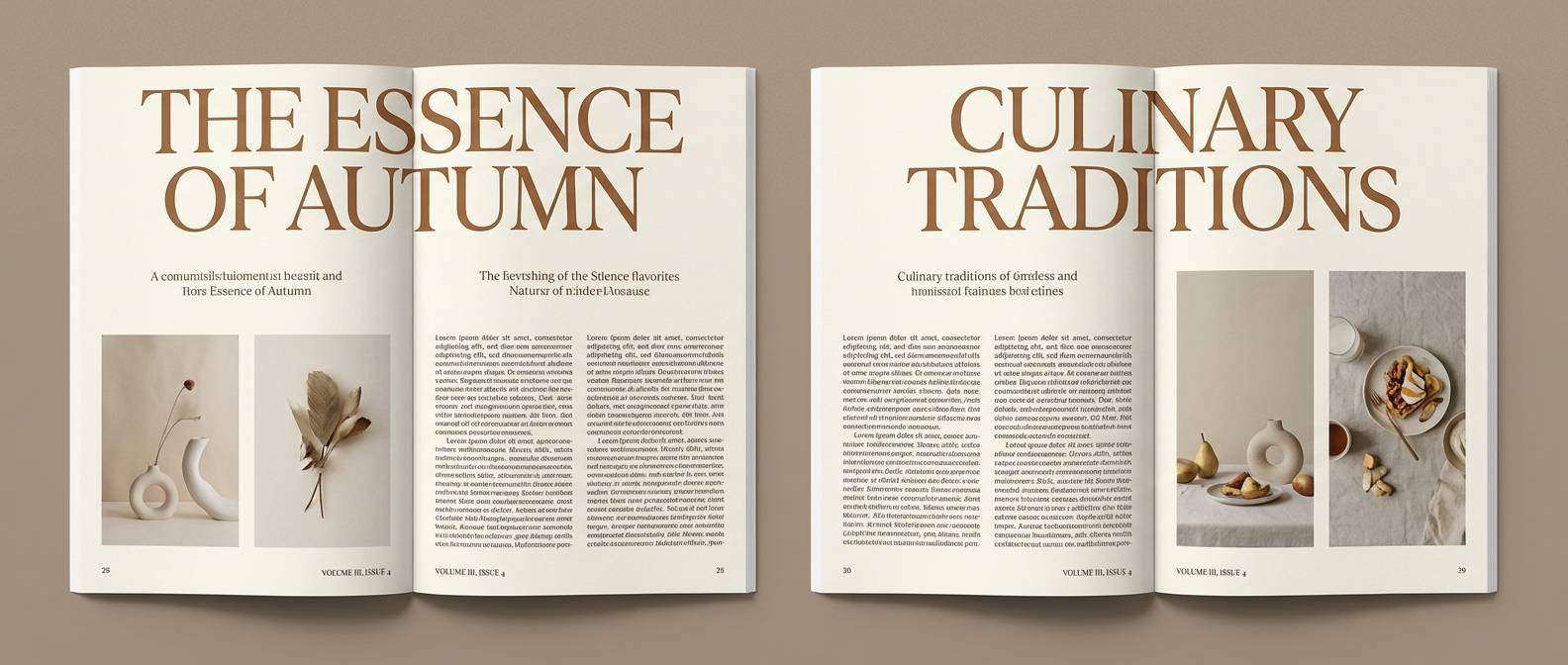
HEX: #fbf4e8 #e6dacb #cdbfae #908a82 #333438
Mood: vintage, literary, refined
Best for: magazine feature spread
Vintage and literary, like antique paper and graphite sketches. The warm off-white base feels archival, while the darker grays deliver crisp readability for long-form text. It suits magazine features, essays, and portfolio case studies that need a classic tone. Tip: pair with subtle grain textures and keep margins generous for a true editorial finish.
Image example of antique paper editorial generated using media.io
14) Winter Birch
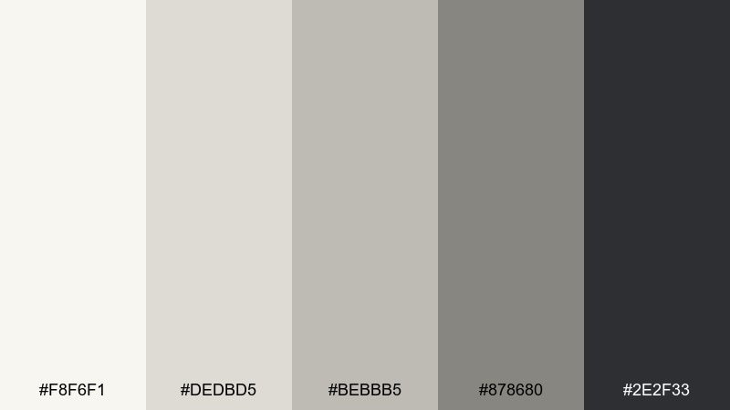
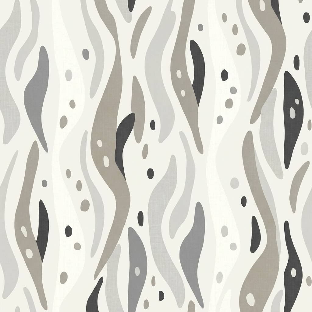
HEX: #f8f6f1 #dedbd5 #bebbb5 #878680 #2e2f33
Mood: cool, serene, crisp
Best for: minimal wallpaper pattern design
Cool and serene, like winter birch bark against a cloudy sky. The subtle steps between light and mid gray make patterns feel dimensional without shouting. Use it for wallpapers, textile repeats, and background graphics that should stay calm behind content. Tip: increase contrast slightly by outlining shapes in the darkest tone when viewing at a distance.
Image example of winter birch generated using media.io
15) Ceramic Studio
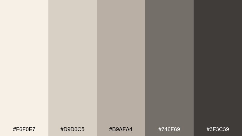
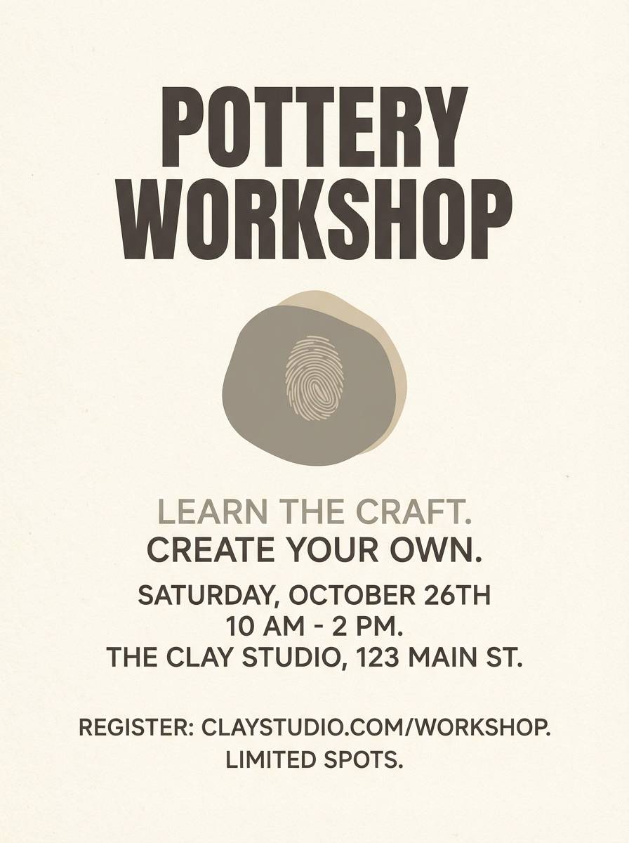
HEX: #f6f0e7 #d9d0c5 #b9afa4 #746f69 #3f3c39
Mood: handmade, earthy, calm
Best for: pottery workshop flyer
Handmade and earthy, like clay dust on an apron in a quiet studio. The warm neutrals feel tactile and inviting, ideal for community classes and artisan events. Use it for flyers, social graphics, and small posters where typography needs to stay simple and strong. Tip: set the background in the lightest cream and use the deepest brown-gray for the schedule block.
Image example of ceramic studio generated using media.io
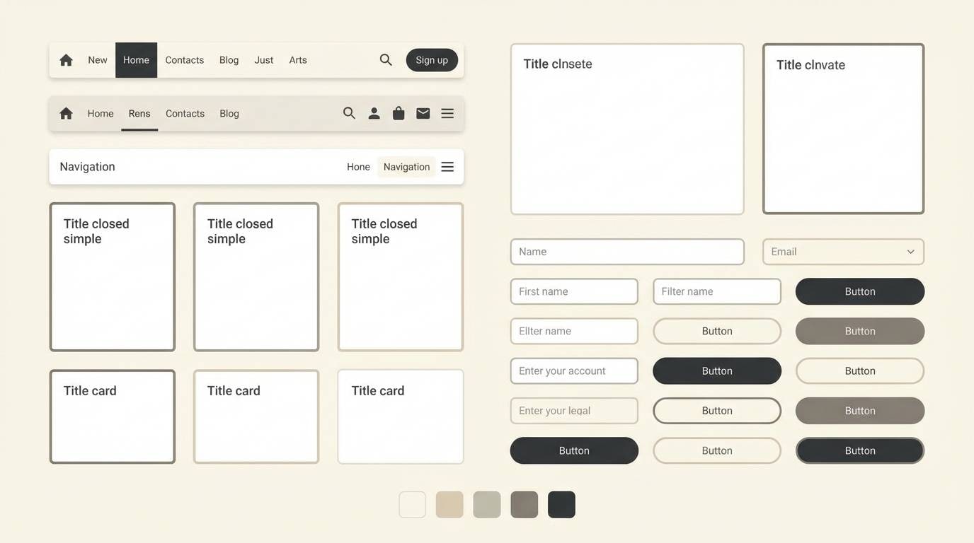
16) Metro Beige Grid
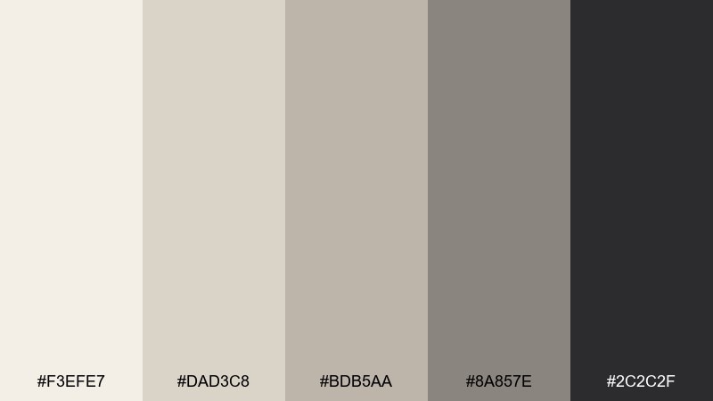
HEX: #f3efe7 #dad3c8 #bdb5aa #8a857e #2c2c2f
Mood: structured, modern, urban
Best for: mobile-first website UI kit
Structured and modern, like an urban grid softened by warm stone. The neutral steps create clear layers for components, making a beige gray color scheme that stays readable across light surfaces. Use it for UI kits, design systems, and product marketing pages that need consistency. Tip: apply the darkest shade to primary buttons only, and use the mid tones for secondary states and borders.
Image example of metro beige grid generated using media.io
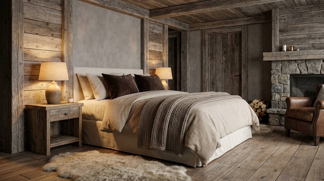
17) Hearthside Neutral Comfort
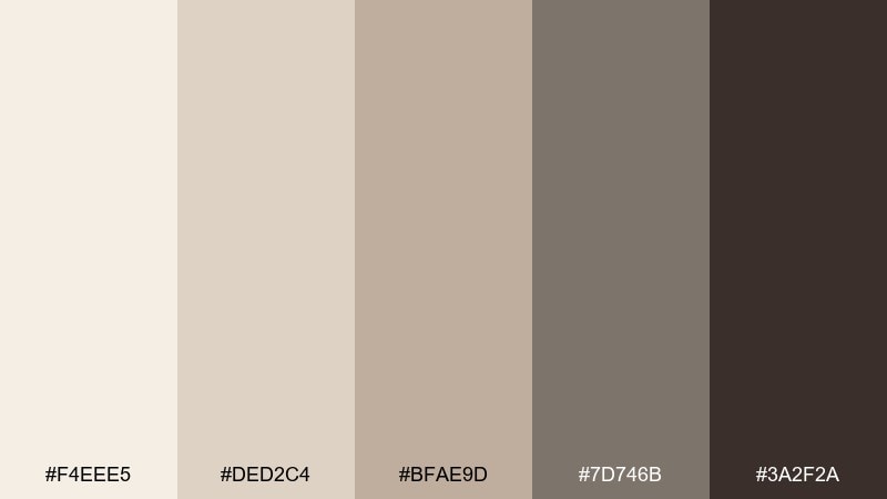
HEX: #f4eee5 #ded2c4 #bfae9d #7d746b #3a2f2a
Mood: cozy, rustic, welcoming
Best for: cabin bedroom decor plan
Cozy and welcoming, like a wool blanket near a quiet hearth. The warm taupes and browns add comfort to gray undertones, making the room feel relaxed rather than formal. Use it for bedrooms, reading nooks, and rustic-modern cabins with natural wood. Tip: add texture first, then use the darkest shade sparingly on handles, frames, or a single accent wall.
Image example of hearthside neutral comfort generated using media.io
18) Coastal Dune
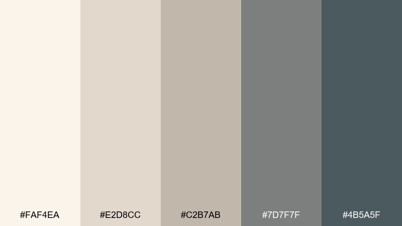
HEX: #faf4ea #e2d8cc #c2b7ab #7d7f7f #4b5a5f
Mood: breezy, relaxed, coastal
Best for: resort landing page hero
Breezy and relaxed, like dunes and driftwood under a cloudy coast sky. The blue-gray notes keep the neutrals feeling airy, perfect for travel and hospitality pages. Use it for resort websites, booking funnels, and email headers that need calm trust. Tip: place the blue-gray as a single strong CTA color to guide the eye without breaking the mood.
Image example of coastal dune generated using media.io

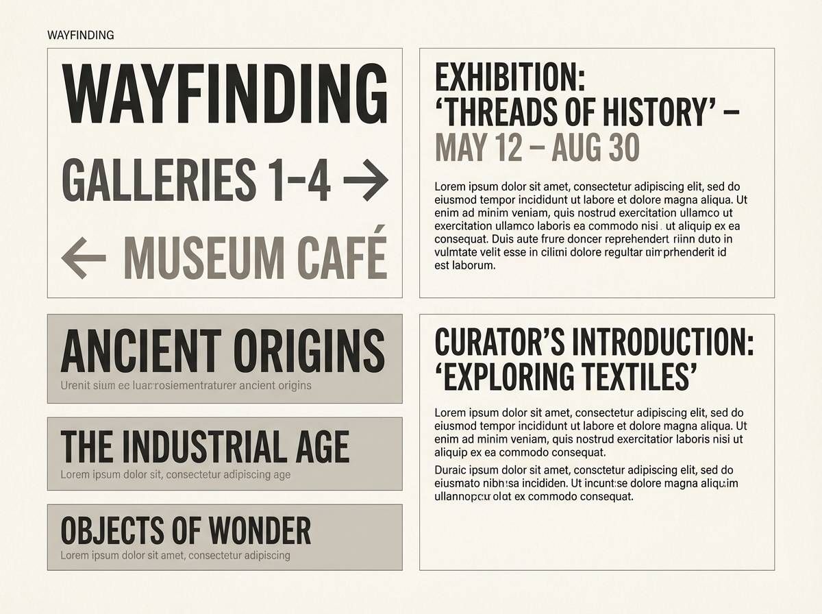
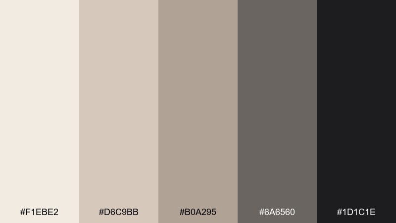
19) Museum Label
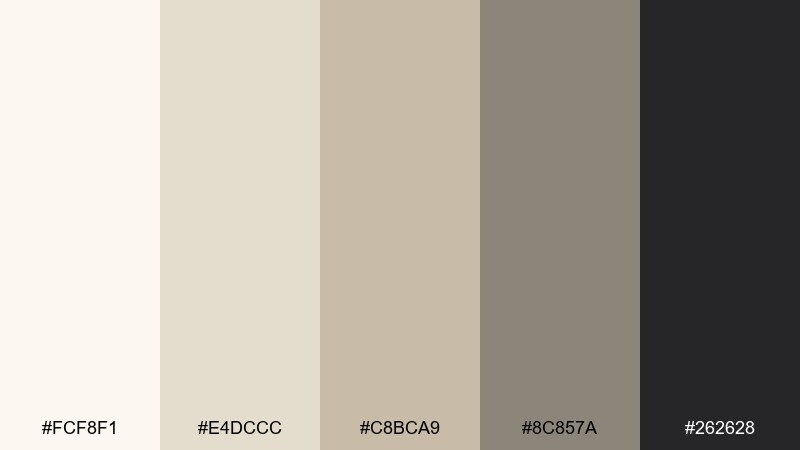
HEX: #fcf8f1 #e4dccc #c8bca9 #8c857a #262628
Mood: quiet, precise, scholarly
Best for: exhibition signage and labels
Quiet and precise, like a museum label set beside a sculpture. The warm light base feels curated, while the charcoal keeps small type crisp at close range. Use it for wayfinding, placards, and exhibition catalogs where legibility is non-negotiable. Tip: print test labels under the venue lighting so the mid greige does not read too flat on matte stock.
Image example of museum label generated using media.io
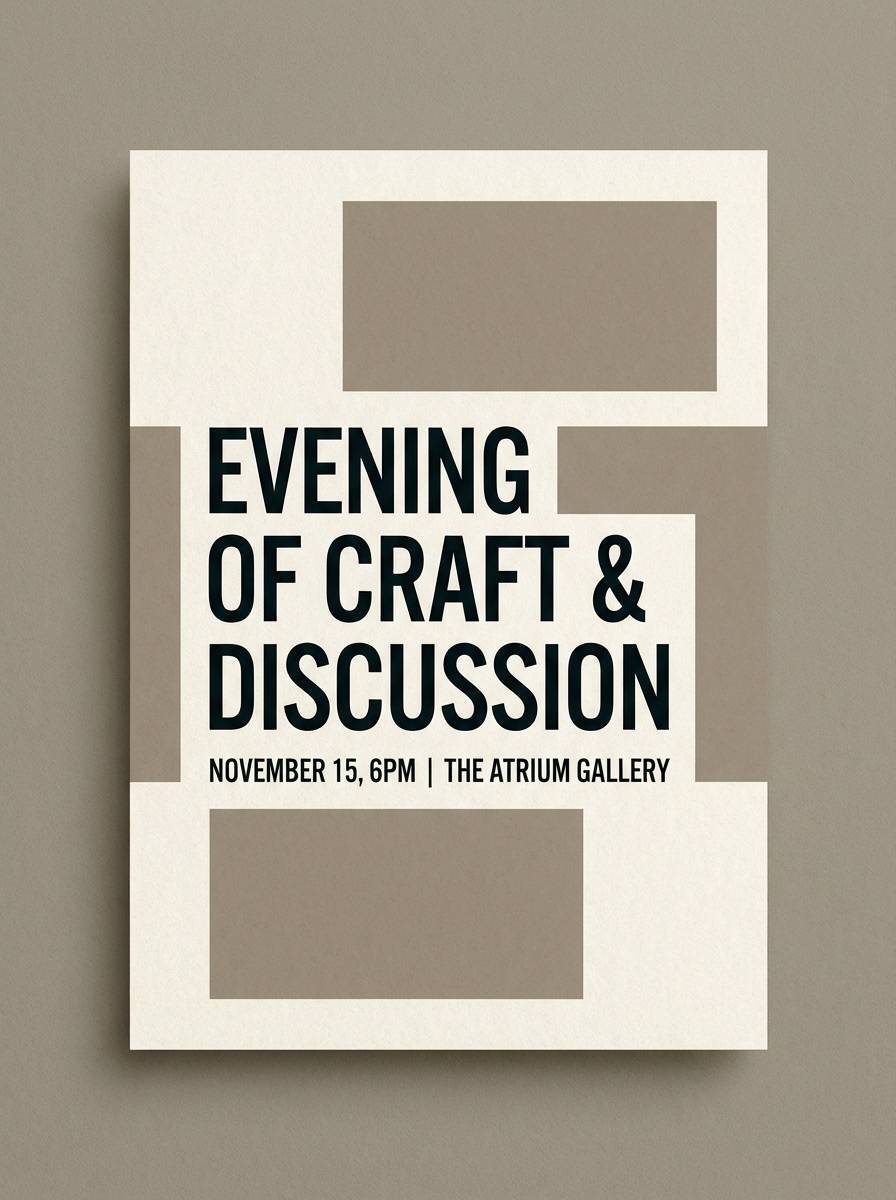
20) Smoky Beige Nightfall
HEX: #f1ebe2 #d6c9bb #b0a295 #6a6560 #1d1c1e
Mood: moody, elegant, cinematic
Best for: evening event invitation design
Moody and elegant, like nightfall settling over warm stone. The darker grays add drama to the soft neutrals, creating a beige gray color palette that feels dressed up and modern. Use it for evening invitations, gallery openings, and understated luxury announcements. Tip: foil or spot-gloss the darkest elements so the design stays high-contrast without adding extra colors.
Image example of smoky beige nightfall generated using media.io
What Colors Go Well with Beige Gray?
Beige gray pairs beautifully with crisp blacks and charcoals for contrast, or with soft off-whites for a layered monochrome look. If you want the palette to feel more premium, introduce near-black only in small, intentional areas (logos, type, trim, hardware).
For a touch of color, muted accents work best: sage/olive greens, denim blue-grays, and dusty browns. These tones keep the calm greige foundation while adding identity and a clear focal point.
Warm metals (brass, champagne gold) and natural materials (oak, travertine, linen) also complement beige and gray tones, reinforcing the cozy-modern feel without needing saturated hues.
How to Use a Beige Gray Color Palette in Real Designs
Start with a “surface stack”: use the lightest cream as the background, then apply a light greige for cards, panels, or large interior areas. Reserve mid tones for borders, dividers, and secondary elements so the design stays structured without heavy lines.
Keep readability in mind: use the darkest shade for headings and key UI actions, while body text can sit in a softer dark gray to reduce glare. In print, always test the lightest tones on your paper stock—creams can vanish on uncoated white.
Finally, add one controlled accent (sage, denim, espresso) and repeat it consistently. In branding and UI, this repetition is what makes neutral color palettes feel intentional rather than unfinished.
Create Beige Gray Palette Visuals with AI
If you’re building a mood board, UI concept, or packaging draft, generating quick visuals helps you test whether your beige gray color combinations feel warm or too cool. The fastest workflow is turning a palette into a few styled scenes and comparing results side by side.
With Media.io, you can generate on-theme examples (interiors, layouts, product shots) from text prompts, then iterate on lighting, materials, and contrast while keeping the same neutral palette direction.
Use the palettes above as a starting point, then tweak prompts with words like “linen,” “plaster,” “concrete,” “matte,” or “warm daylight” to steer the beige-gray balance.
Beige Gray Color Palette FAQs
-
What is a beige gray (greige) color palette?
A beige gray (greige) palette blends warm beige undertones with neutral grays, creating a balanced scheme that feels soft, modern, and easy to pair with natural materials and dark accents. -
Is beige gray warm or cool?
It can be either. If the mix leans toward beige, it reads warm; if it leans toward gray/blue-gray, it reads cool. Testing under your actual lighting (or device theme) helps confirm the undertone. -
What accent colors work best with beige gray?
Muted accents are most reliable: sage/olive green, denim blue-gray, espresso brown, and dusty terracotta. They add personality without fighting the calm neutral base. -
How do I keep a beige gray UI from looking flat?
Use at least three surface levels (background, cards, elevated panels) and reserve the deepest tone for typography and primary actions. Subtle borders in a mid greige also help define components without heavy contrast. -
Which beige gray shades should I use for text?
For readability, use a dark gray/charcoal for headings and key labels, and a slightly softer dark gray for body text. Avoid light gray text on cream backgrounds unless contrast is verified. -
Do beige gray palettes print well?
Yes, but light creams can disappear on bright or uncoated paper. Always run a proof: small shifts in stock and ink can change whether the palette feels warm, neutral, or slightly yellow. -
How can I generate beige gray palette mockups quickly?
Use an AI text-to-image tool to create interiors, packaging, or UI mockups from prompts that specify materials (linen, plaster, concrete) and lighting (soft daylight, warm bulbs), then iterate while keeping your HEX direction consistent.


