

Looking for a Christmas color palette that feels festive without looking dated? The right mix of reds, greens, and neutrals can instantly set a holiday mood while keeping your design clean and readable.
Below are 20+ ready-to-use Christmas color palette ideas with HEX codes, plus practical tips and AI-ready prompts you can reuse for banners, invites, packaging, and UI.
In this article
- Why Christmas Palettes Work So Well
-
- north pole classic
- evergreen and cranberry
- frosted sugarplum
- cozy cabin plaid
- gingerbread market
- midnight mass
- nordic minimal
- candy cane pop
- winterberry velvet
- snowy eucalyptus
- champagne tinsel
- holly and ivory
- mistletoe matte
- nutcracker stage
- rustic wreath
- icy peppermint
- fireside storybook
- modern ornament
- pine and poinsettia
- silent night pastels
- velvet garland
- What Colors Go Well with Christmas?
- How to Use a Christmas Color Palette in Real Designs
- Create Christmas Palette Visuals with AI
Why Christmas Palettes Work So Well
Christmas palettes are memorable because they rely on high-contrast pairings (red/green, deep tones/light neutrals) that read instantly, even at a distance. That clarity is useful for everything from sale banners to invitation typography.
They also carry built-in seasonal meaning: evergreen greens suggest nature and warmth, reds feel celebratory, and creamy neutrals bring a cozy “paper + candlelight” vibe. Adding gold or charcoal gives the palette a premium, modern edge.
Most importantly, Christmas color combinations are flexible. You can push them traditional, rustic, pastel, or cinematic just by swapping saturation levels and choosing the right neutral base.
20+ Christmas Color Palette Ideas (with HEX Codes)
1) North Pole Classic
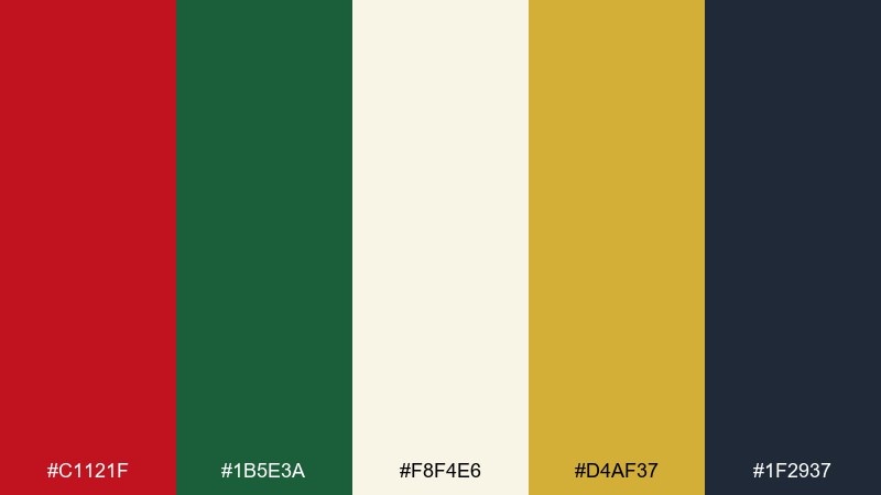
HEX: #C1121F #1B5E3A #F8F4E6 #D4AF37 #1F2937
Mood: classic, festive, confident
Best for: holiday branding and storefront signage
Classic and festive, like red ribbons on evergreen with a hint of golden sparkle. Use the deep red and pine green as primaries, then let warm ivory carry the negative space for readability. The gold works best as a small accent for icons, borders, or foil-like highlights. Tip: keep the charcoal for text so the reds stay vibrant without eye strain.
Image example of north pole classic generated using media.io

Media.io is an online AI studio for creating and editing video, image, and audio in your browser.

2) Evergreen and Cranberry
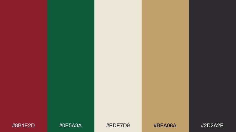
HEX: #8B1E2D #0E5A3A #EDE7D9 #BFA06A #2D2A2E
Mood: rich, elegant, traditional
Best for: wedding invitations and formal holiday cards
Rich and elegant, like cranberry velvet beside fresh-cut pine. This christmas color palette shines on premium print pieces where texture and contrast matter. Pair the cream with the darker tones to keep type sharp, and reserve the muted gold for linework or monograms. Tip: use cranberry for headings and pine for supporting details to avoid heavy blocks of dark color.
Image example of evergreen and cranberry generated using media.io
3) Frosted Sugarplum
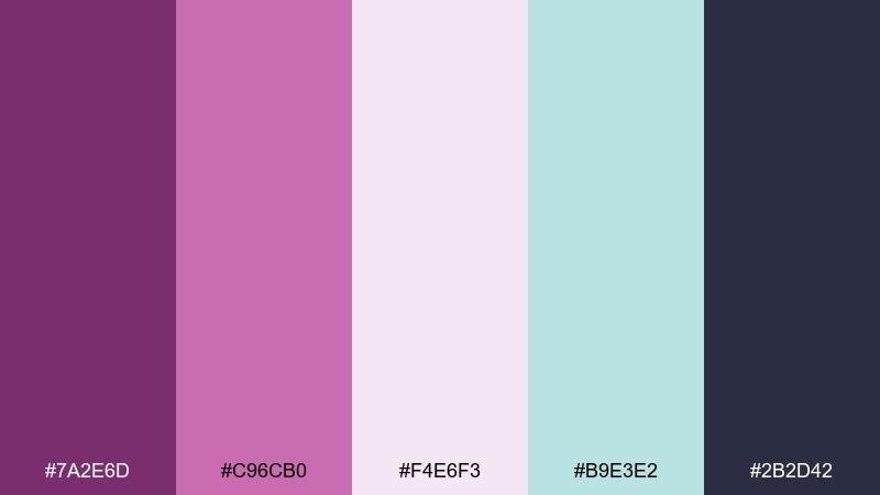
HEX: #7A2E6D #C96CB0 #F4E6F3 #B9E3E2 #2B2D42
Mood: whimsical, dreamy, sweet
Best for: kids party flyers and playful social posts
Whimsical and dreamy, like sugared plums and snowy frosting with a cool mint breeze. Let lavender and blush do the heavy lifting, then ground the layout with the deep midnight ink for text. The mint reads best as a secondary accent in stickers, icons, and doodles. Tip: keep backgrounds pale so the purple tones stay airy rather than heavy.
Image example of frosted sugarplum generated using media.io

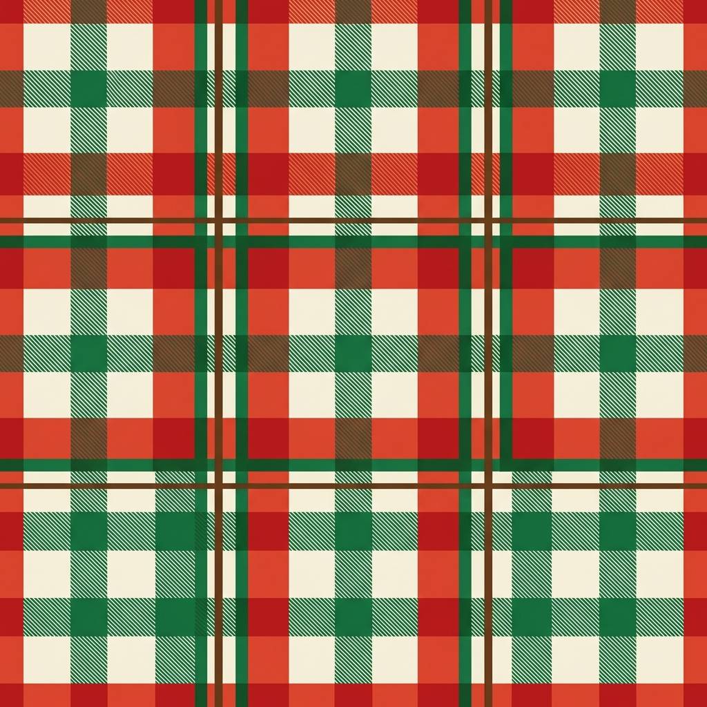
4) Cozy Cabin Plaid
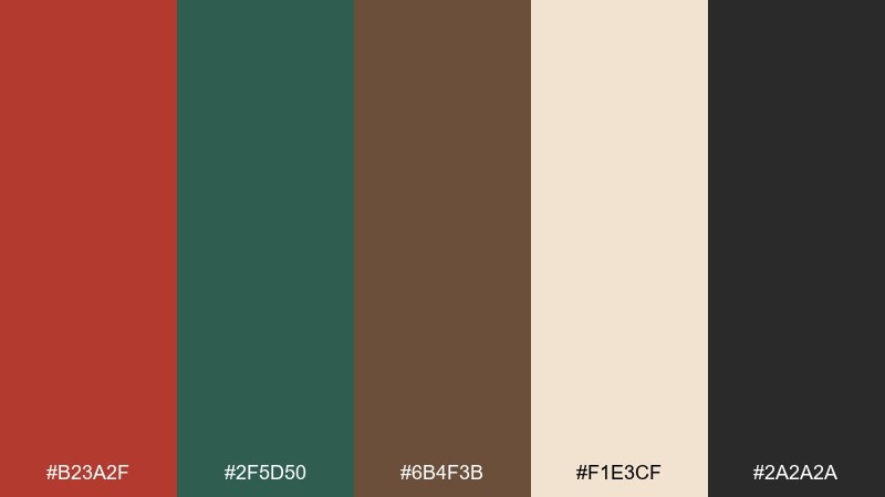
HEX: #B23A2F #2F5D50 #6B4F3B #F1E3CF #2A2A2A
Mood: cozy, rustic, outdoorsy
Best for: wrapping paper patterns and gift tags
Cozy and rustic, like plaid blankets, woodsmoke, and warm cocoa by the window. Use the cream as your base, then layer red and forest green in clean stripes for an instant heritage feel. Brown adds a natural craft-paper note that keeps the design grounded. Tip: limit dark charcoal to small text so the pattern stays soft and giftable.
Image example of cozy cabin plaid generated using media.io
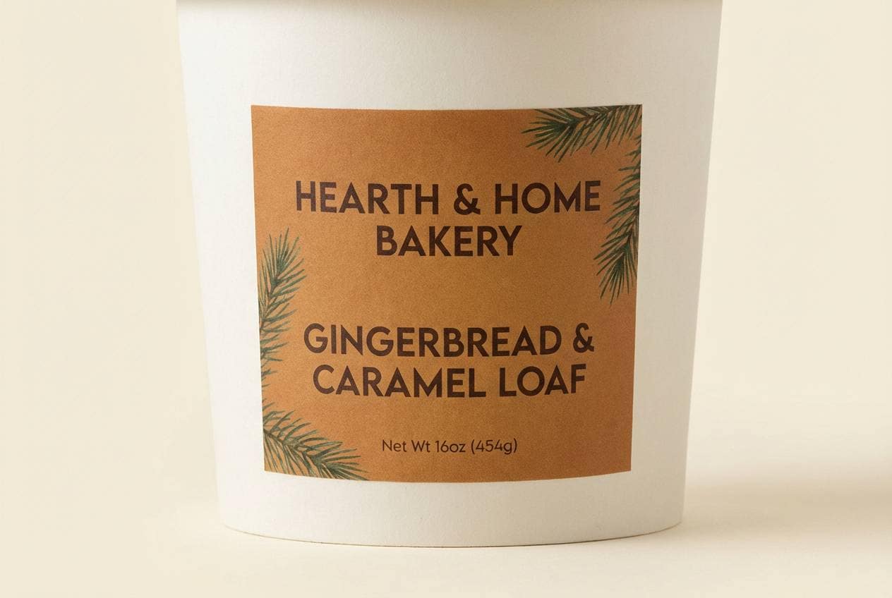
5) Gingerbread Market
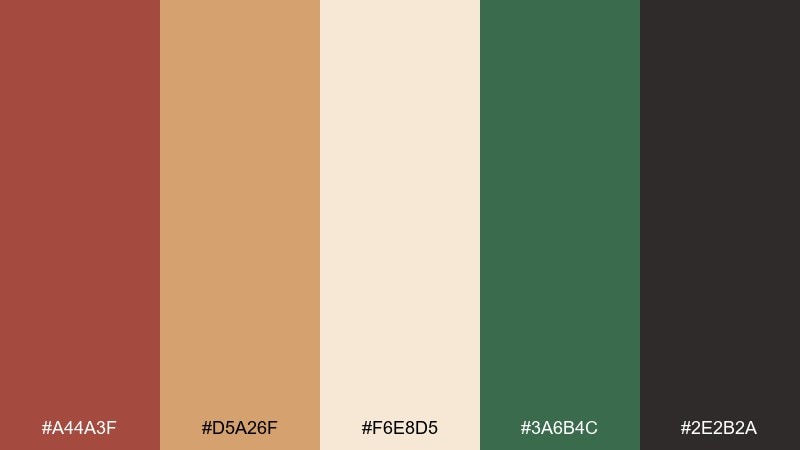
HEX: #A44A3F #D5A26F #F6E8D5 #3A6B4C #2E2B2A
Mood: warm, cozy, handmade
Best for: bakery packaging and seasonal product labels
Warm and handmade, like gingerbread stalls lit by soft lanterns. These christmas color combinations work especially well for food brands because the caramel and cream feel delicious on sight. Pair the green as a small freshness cue on badges or ingredient icons, and keep the near-black for legal text. Tip: try a cream label background so the brown headline feels like baked spice, not mud.
Image example of gingerbread market generated using media.io
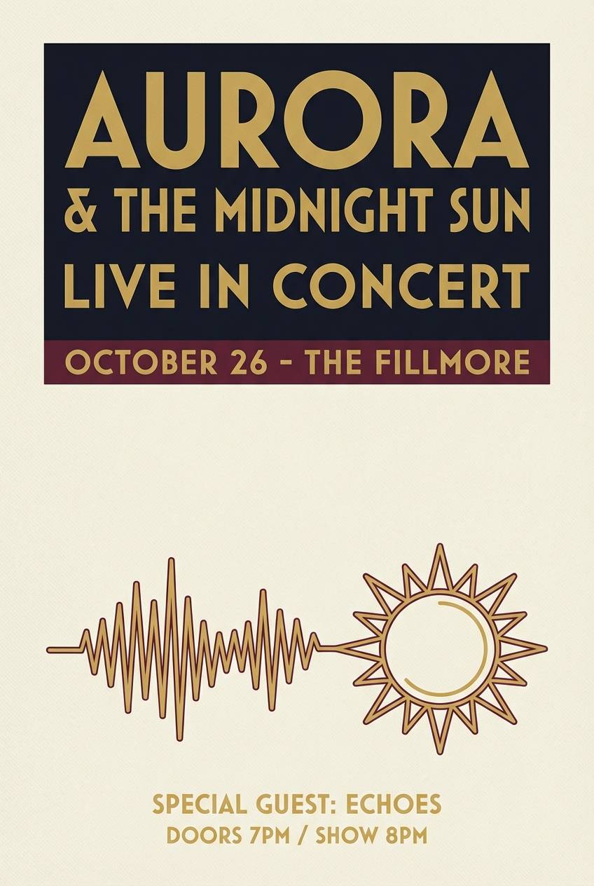
6) Midnight Mass
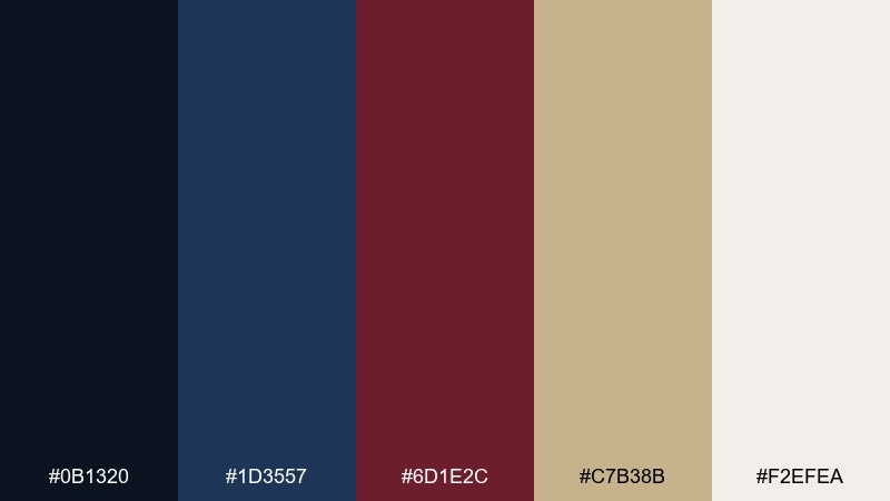
HEX: #0B1320 #1D3557 #6D1E2C #C7B38B #F2EFEA
Mood: moody, solemn, cinematic
Best for: event posters and concert programs
Moody and cinematic, like candlelight in a dark cathedral with velvet shadows. Use the deep navy and ink as the main field color, then let champagne gold carry titles and dividers for a premium look. The burgundy reads as a dramatic accent for dates or key calls to action. Tip: give gold plenty of breathing room so it feels luminous instead of busy.
Image example of midnight mass generated using media.io
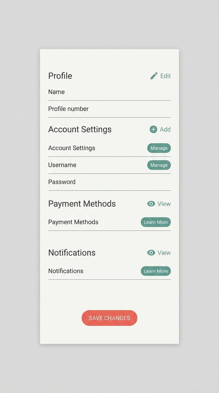
7) Nordic Minimal
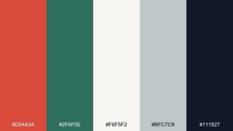
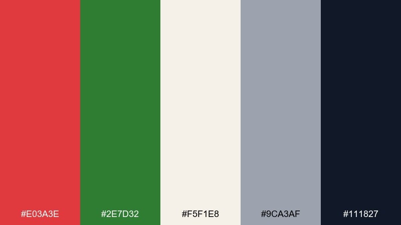
HEX: #D94A3A #2F6F5E #F6F5F2 #BFC7C9 #111827
Mood: clean, modern, airy
Best for: mobile app UI and ecommerce banners
Clean and modern, like Scandinavian decor with a single bright ornament. This christmas color scheme works best when the off-white stays dominant and the red appears in small, intentional moments. Use the teal-green for secondary buttons and the cool gray for dividers and cards. Tip: keep icon strokes dark so the interface stays crisp on light backgrounds.
Image example of nordic minimal generated using media.io
8) Candy Cane Pop
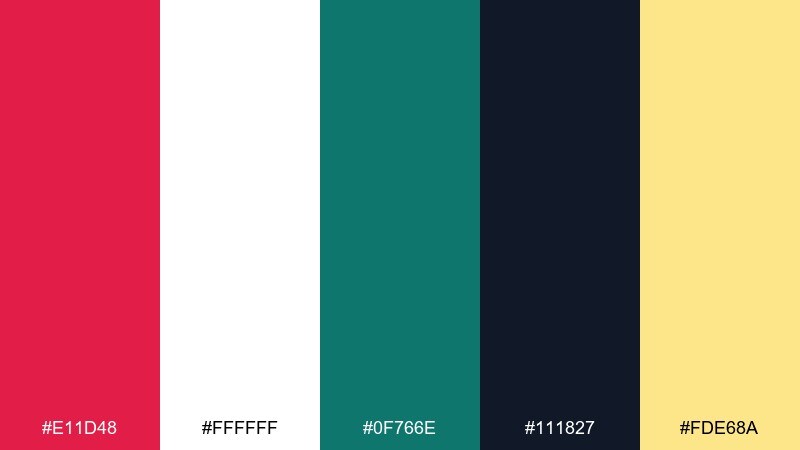
HEX: #E11D48 #FFFFFF #0F766E #111827 #FDE68A
Mood: bright, punchy, playful
Best for: social ads and sale banners
Bright and punchy, like peppermint stripes with a tiny burst of sunshine. Let hot red and clean white create the contrast, then bring in teal for a modern twist that avoids looking too traditional. The pale yellow is perfect for price tags, stickers, or sparkles without turning neon. Tip: use the near-black sparingly for legibility on white blocks.
Image example of candy cane pop generated using media.io

9) Winterberry Velvet
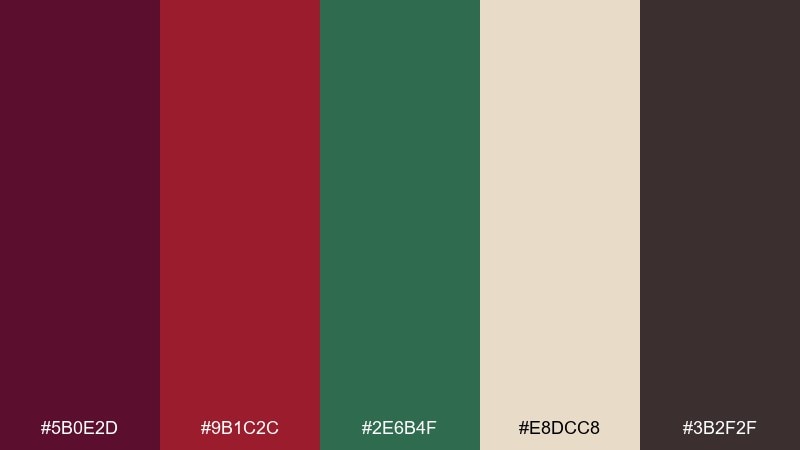
HEX: #5B0E2D #9B1C2C #2E6B4F #E8DCC8 #3B2F2F
Mood: luxurious, deep, romantic
Best for: premium gift boxes and ribbon labels
Luxurious and deep, like winter berries against dark velvet and pine needles. Use the plum and berry reds as the hero tones, with cream as a quiet backdrop for product names. The green reads best as a supporting accent on seals or ribbon bands. Tip: add tiny cream borders around dark blocks to keep edges sharp in print.
Image example of winterberry velvet generated using media.io
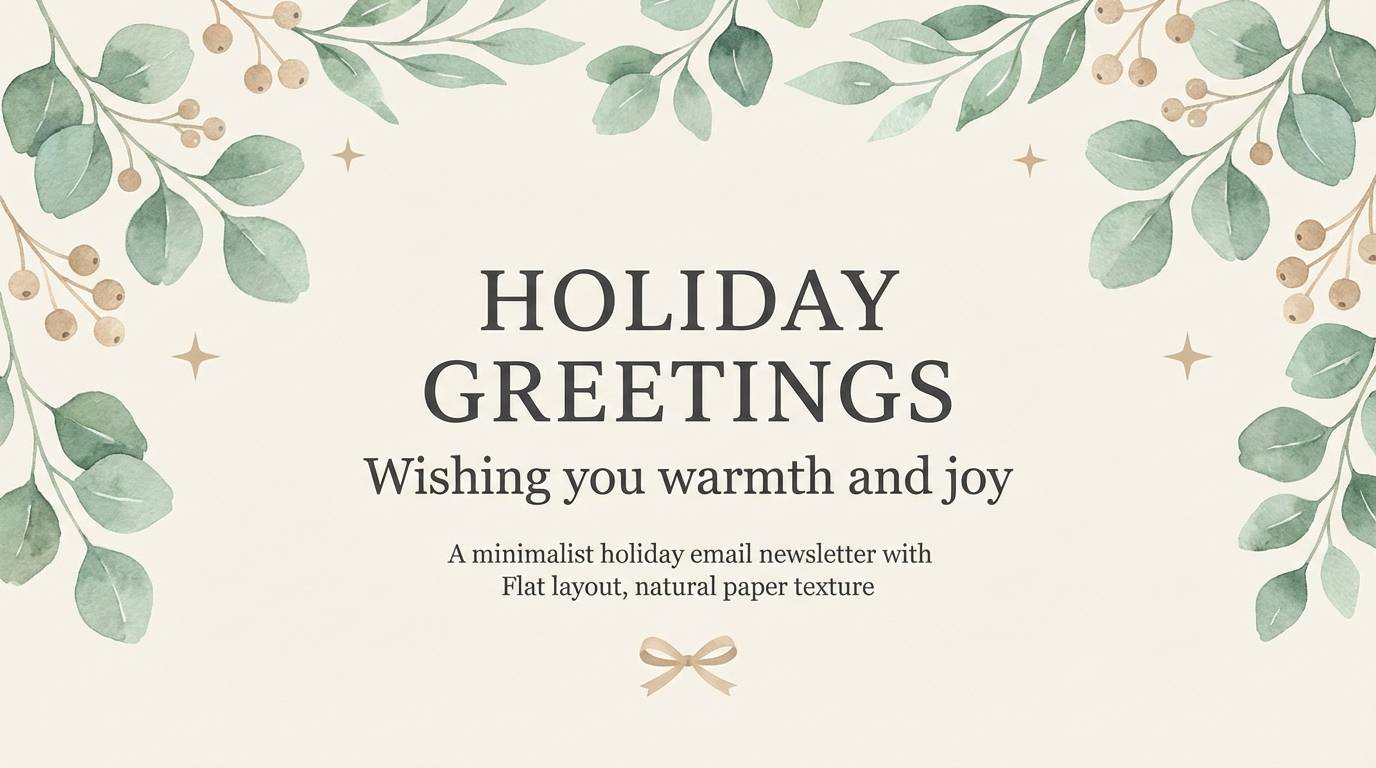
10) Snowy Eucalyptus
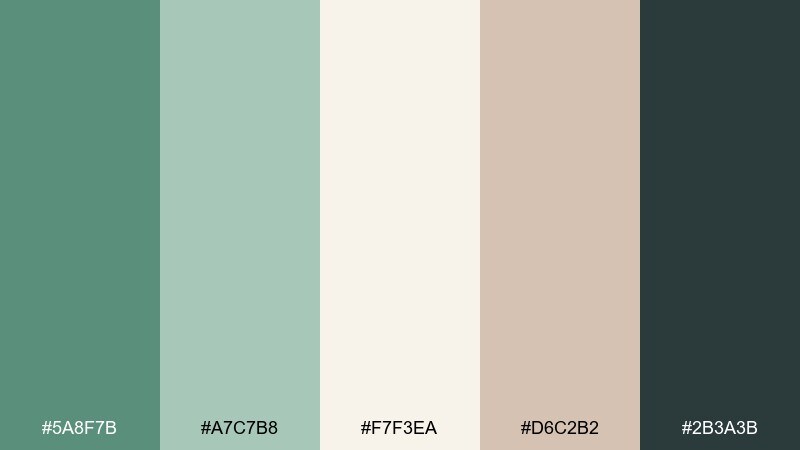
HEX: #5A8F7B #A7C7B8 #F7F3EA #D6C2B2 #2B3A3B
Mood: calm, natural, spa-like
Best for: wellness promos and minimalist holiday emails
Calm and natural, like eucalyptus leaves dusted with soft snow. Keep the cream dominant for a clean canvas, then layer sage and minty green as gentle sections and buttons. The warm beige adds a cozy paper note that pairs well with serif headings. Tip: choose charcoal for body text to avoid harsh black on pale greens.
Image example of snowy eucalyptus generated using media.io
11) Champagne Tinsel
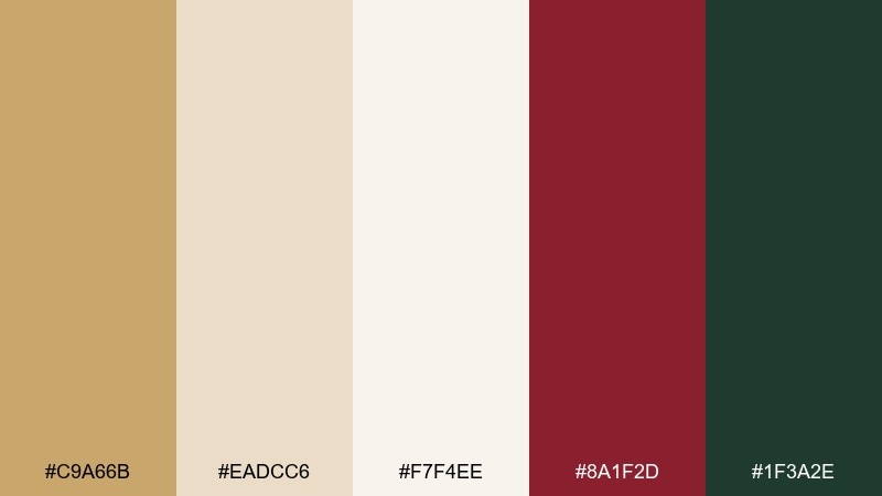
HEX: #C9A66B #EADCC6 #F7F4EE #8A1F2D #1F3A2E
Mood: glam, warm, celebratory
Best for: new year crossover invites and upscale promos
Glam and celebratory, like champagne bubbles caught in golden tinsel. Let the light neutrals handle most of the space, then use metallic gold tones for frames, starbursts, and subtle gradients. Burgundy and deep green make excellent contrast accents for headlines or RSVP buttons. Tip: keep gold elements thin and consistent so the layout feels luxe, not heavy.
Image example of champagne tinsel generated using media.io

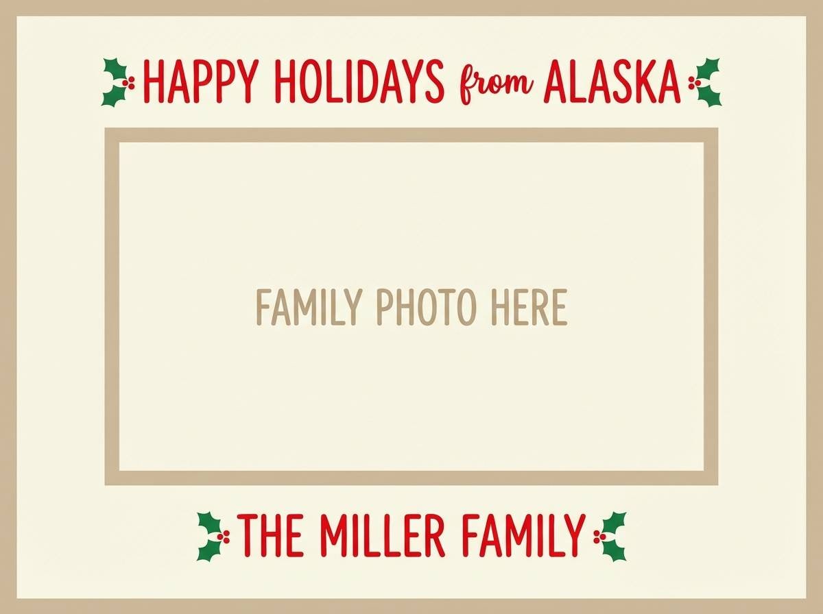
12) Holly and Ivory
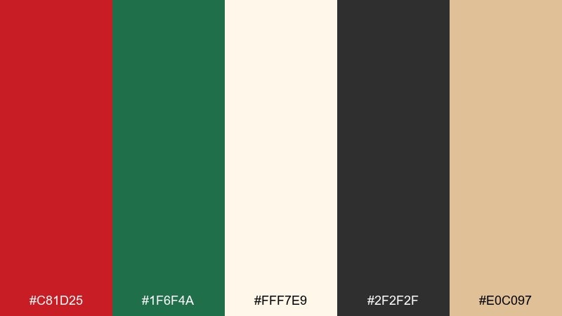
HEX: #C81D25 #1F6F4A #FFF7E9 #2F2F2F #E0C097
Mood: bright, tidy, timeless
Best for: family photo cards and stationery
Bright and tidy, like holly leaves on crisp ivory paper. Use red for names and key greetings, then rely on green for small flourishes and borders to keep the page balanced. The warm sand tone helps soften the contrast for a more printed, heirloom feel. Tip: stick to one dominant accent color per side of the card so it reads clean from a distance.
Image example of holly and ivory generated using media.io
13) Mistletoe Matte
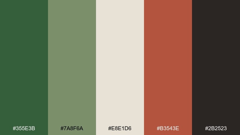
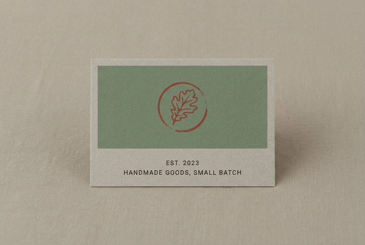
HEX: #355E3B #7A8F6A #E8E1D6 #B3543E #2B2523
Mood: earthy, understated, modern rustic
Best for: artisan craft branding and handmade labels
Earthy and understated, like mistletoe greenery against linen and clay. Let the matte greens handle backgrounds and pattern work, while the clay red warms up stamps and callouts. The greige base keeps everything soft and tactile, especially on uncoated paper. Tip: use the dark espresso for small type and keep it away from large fills to avoid a heavy look.
Image example of mistletoe matte generated using media.io
14) Nutcracker Stage
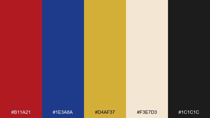
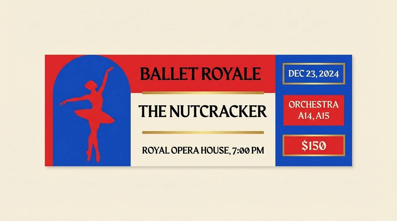
HEX: #B11A21 #1E3A8A #D4AF37 #F3E7D3 #1C1C1C
Mood: dramatic, theatrical, bold
Best for: ballet posters and event tickets
Dramatic and theatrical, like a spotlight on a Nutcracker stage curtain. Use the royal blue and rich red as bold blocks, then let gold act as the spotlight accent for dates and badges. Cream keeps the composition from feeling too heavy and gives a premium paper vibe. Tip: keep backgrounds simple so the primary colors read like costumes, not noise.
Image example of nutcracker stage generated using media.io
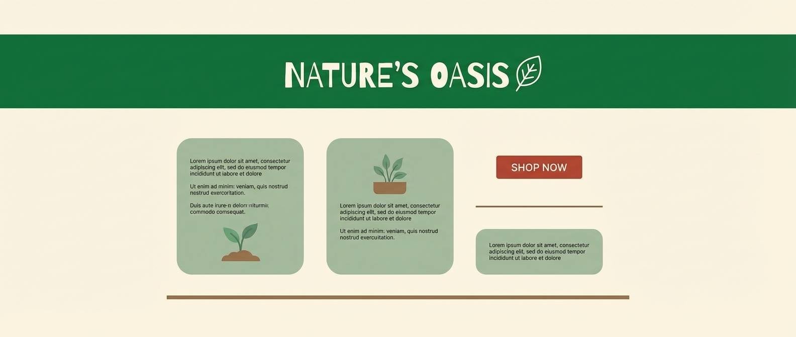
15) Rustic Wreath
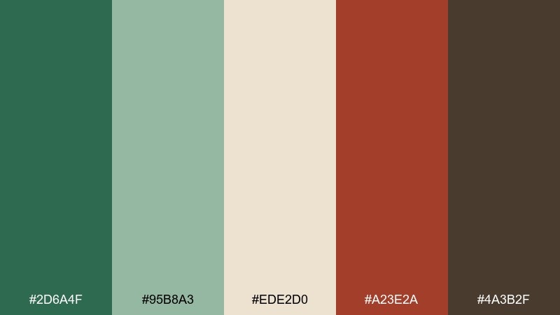
HEX: #2D6A4F #95B8A3 #EDE2D0 #A23E2A #4A3B2F
Mood: natural, welcoming, farmhouse
Best for: home decor ads and seasonal landing pages
Natural and welcoming, like a grapevine wreath with dried berries and pine sprigs. Use the deep green for headers and navigation, then soften sections with sage and warm cream. The brick red is best as a small call-to-action accent that feels handmade, not flashy. Tip: add brown only in photography overlays or thin rules so the palette stays light.
Image example of rustic wreath generated using media.io
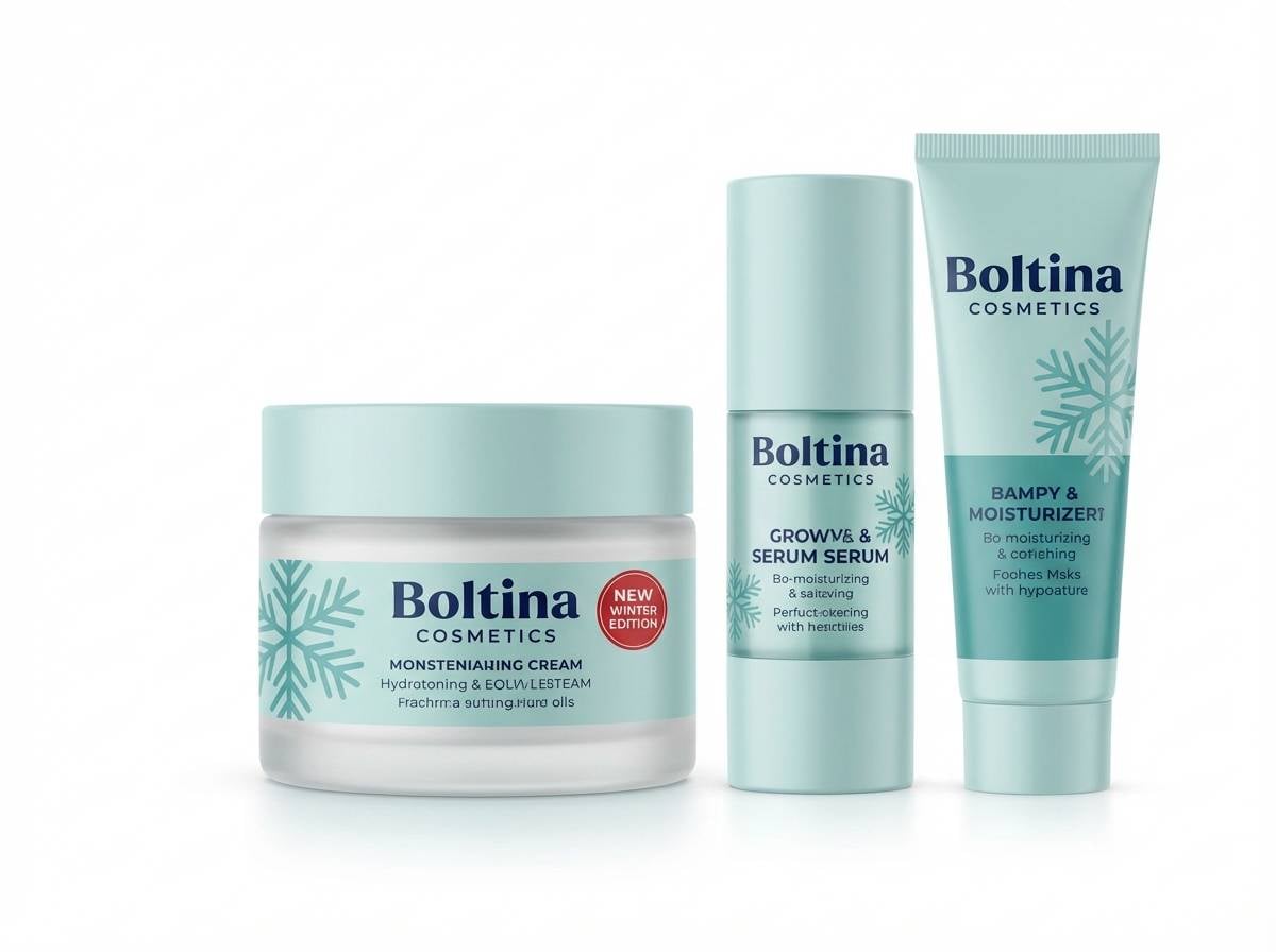
16) Icy Peppermint
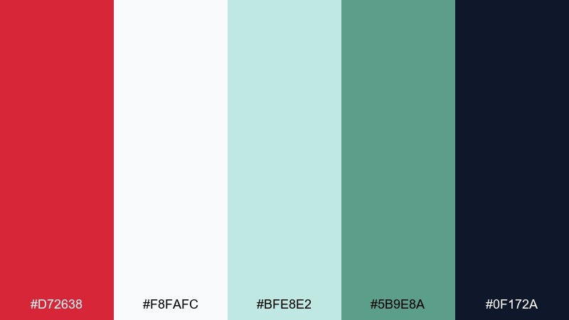
HEX: #D72638 #F8FAFC #BFE8E2 #5B9E8A #0F172A
Mood: fresh, cool, crisp
Best for: beauty promos and winter skincare ads
Fresh and crisp, like peppermint chilled on clean ice. Use snowy white and soft aqua as the base to create a spa-cool atmosphere, then punch in red for small focal points like discount bubbles. The deep navy keeps typography sharp without overpowering the airy feel. Tip: keep red to under 10 percent of the layout for a clean, premium finish.
Image example of icy peppermint generated using media.io
17) Fireside Storybook
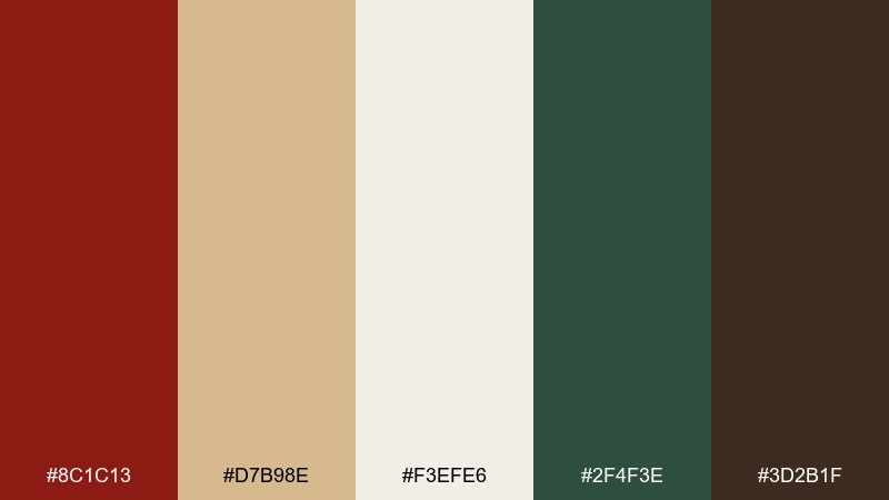
HEX: #8C1C13 #D7B98E #F3EFE6 #2F4F3E #3D2B1F
Mood: nostalgic, warm, cozy
Best for: book covers and holiday editorial layouts
Nostalgic and cozy, like a storybook read by the fire with mulled spice in the air. Let parchment and cream build the page, then use evergreen for ornaments and section markers. The deep red works beautifully for titles, while chestnut adds a binding-like richness. Tip: try a subtle cream texture to make the warm tones feel printed and timeless.
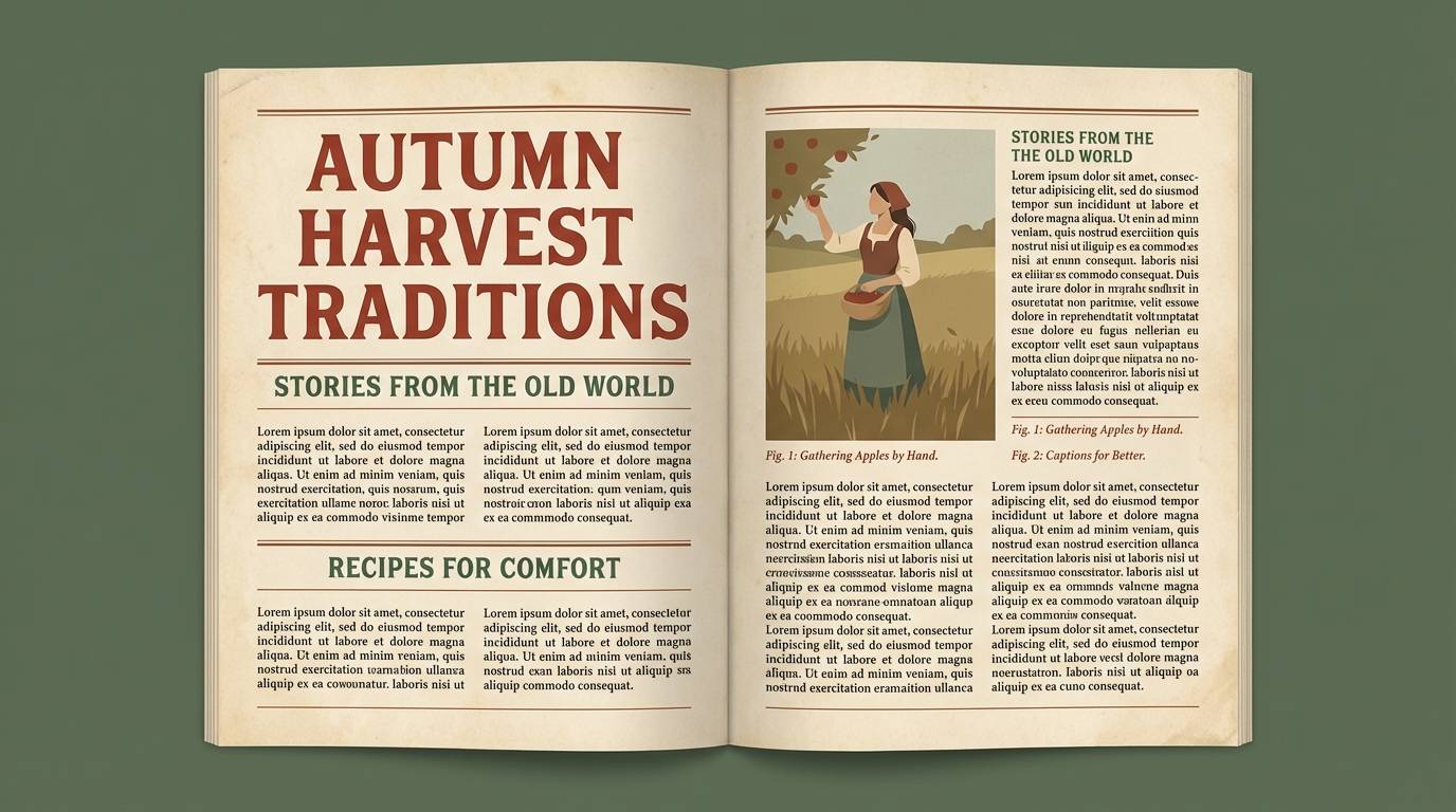
Image example of fireside storybook generated using media.io
18) Modern Ornament
HEX: #E03A3E #2E7D32 #F5F1E8 #9CA3AF #111827
Mood: modern, balanced, versatile
Best for: startup holiday campaigns and email banners
Modern and balanced, like matte ornaments on a minimal tree with clean lines. These christmas color combinations are easy to scale across headers, buttons, and small icon systems without looking busy. Use red for primary calls to action, green for secondary states, and keep warm off-white as the core background. Tip: lean on the cool gray for borders and disabled UI so the palette stays polished.
Image example of modern ornament generated using media.io

19) Pine and Poinsettia
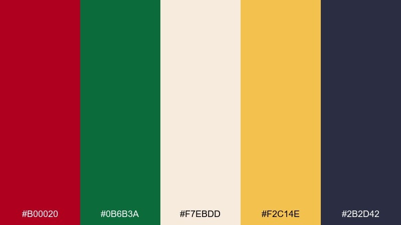
HEX: #B00020 #0B6B3A #F7EBDD #F2C14E #2B2D42
Mood: vibrant, cheerful, festive
Best for: community event flyers and church announcements
Vibrant and cheerful, like poinsettias popping against glossy pine branches. Use the creamy background to keep layouts bright, then place red and green in clear, confident blocks for quick readability. A warm yellow accent adds a friendly glow for badges or highlights. Tip: use the deep slate for body text so your red headlines stay the star.
Image example of pine and poinsettia generated using media.io

20) Silent Night Pastels
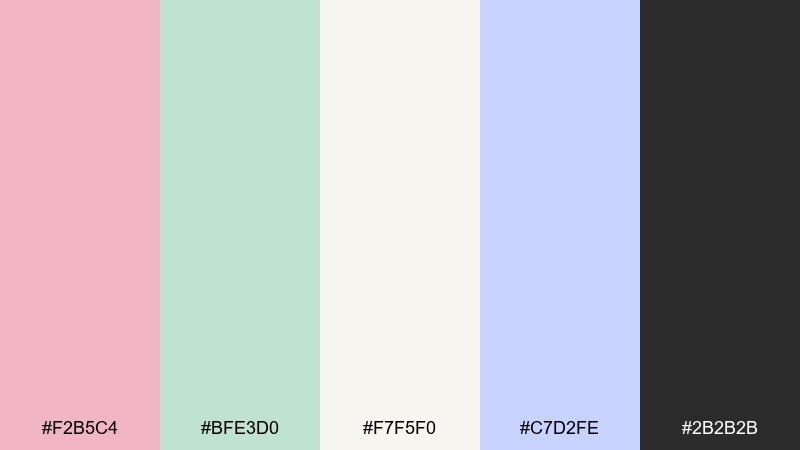
HEX: #F2B5C4 #BFE3D0 #F7F5F0 #C7D2FE #2B2B2B
Mood: soft, peaceful, modern pastel
Best for: baby first holiday cards and gentle gift guides
Soft and peaceful, like a quiet winter evening with pastel lights and calm snow. This christmas color palette is perfect when you want holiday cues without the usual high-contrast red and green. Pair blush and mint as the main duo, then use periwinkle as a supporting accent for icons and links. Tip: keep text in a gentle charcoal and avoid pure black to preserve the calm tone.
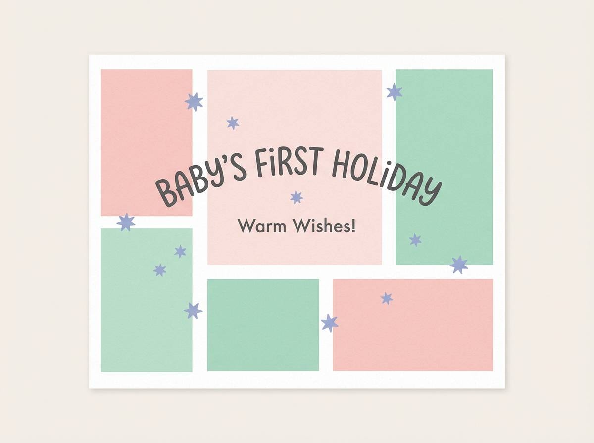
Image example of silent night pastels generated using media.io
21) Velvet Garland
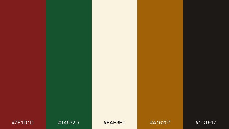
HEX: #7F1D1D #14532D #FAF3E0 #A16207 #1C1917
Mood: heritage, warm, upscale
Best for: restaurant menus and holiday dinner promos
Heritage and upscale, like velvet garland draped over candlelit tables. Use cream for the menu body, then set section titles in deep wine for a classic dining feel. Forest green works beautifully for small ornaments, rules, and category labels, while amber-gold adds warmth to icons. Tip: keep the darkest tone for text only so the page stays inviting.
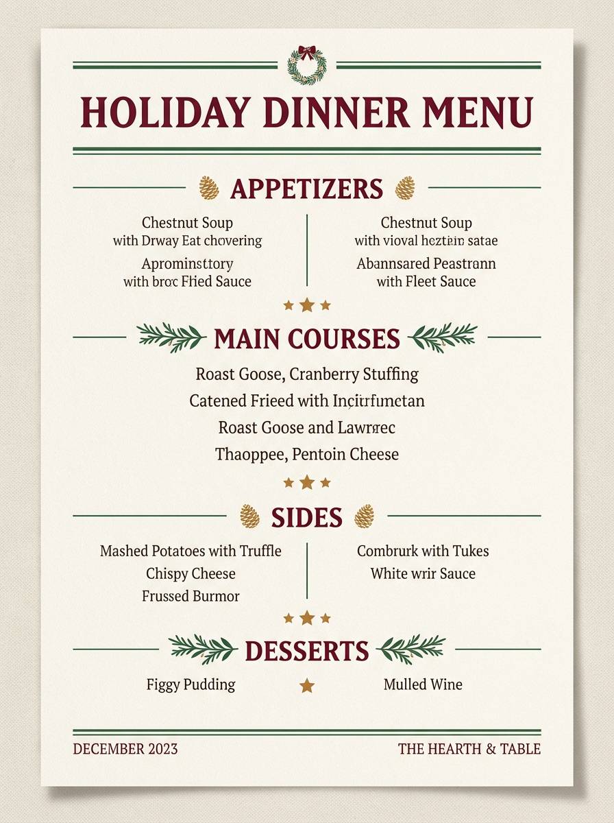
Image example of velvet garland generated using media.io
What Colors Go Well with Christmas?
Beyond classic red and green, Christmas palettes pair beautifully with warm neutrals like ivory, cream, and parchment to keep layouts readable and “giftable.” Charcoal or deep navy often works better than pure black for softer contrast and a more premium feel.
Gold (or champagne beige) is a reliable accent for borders, icons, and festive highlights—especially when used sparingly. For modern designs, teal-green, cool grays, and winter aquas can replace traditional greens while still feeling seasonal.
If you want a quieter holiday look, try pastels like blush, mint, and periwinkle with gentle charcoal text. These combos still signal “winter holiday” without shouting red-and-green.
How to Use a Christmas Color Palette in Real Designs
Start with a dominant neutral background (cream, off-white, or pale gray), then choose one hero color for calls to action (often red) and one supporting color for structure (green, teal, or navy). This keeps your design from turning into a busy holiday collage.
For print, keep dark fills limited and let texture do the work—thin gold linework, small holly accents, and warm paper-like neutrals read more “premium” than large saturated blocks. For digital UI, use cool grays for dividers and reserved teal/green for secondary buttons.
When in doubt, control the ratio: 60–70% neutral, 20–30% secondary color, and 5–10% bright accent. Your Christmas palette will feel intentional and easier to scan.
Create Christmas Palette Visuals with AI
If you already have HEX codes, the fastest way to validate a festive color scheme is to see it on real-looking mockups—posters, packaging, email headers, and app screens. That’s where AI visuals help: you can test contrast, hierarchy, and “holiday vibe” before committing.
With Media.io Text-to-Image, you can paste a prompt (like the examples above), specify a layout ratio, and generate multiple variations in minutes. It’s a practical way to explore traditional, modern, rustic, or pastel Christmas palettes without starting from scratch.
Generate a few options, then pick the one with the clearest typography and the most balanced color distribution.
Christmas Color Palette FAQs
-
What are the traditional Christmas colors?
Traditional Christmas colors are red and green, often supported by white/ivory and metallic gold. Red signals celebration and warmth, while green references evergreen trees and winter nature. -
What neutral colors work best with red and green?
Warm neutrals like ivory, cream, and parchment keep red/green palettes readable and less harsh. Charcoal or deep navy is also a strong “neutral” for text and headers without using pure black. -
How do I make a Christmas palette look modern?
Use off-white as the main background, reduce saturation, and introduce cool grays for spacing and structure. Swap traditional greens for teal-green or sage, and keep bright red as a small, intentional accent. -
What are good Christmas colors for luxury branding?
Deep berry/burgundy, pine green, champagne gold, and cream create a premium holiday feel. Use gold as a thin accent (rules, icons, borders) and avoid large metallic blocks so it stays elegant. -
Are pastel Christmas color palettes still “holiday” enough?
Yes—pastels like blush, mint, and periwinkle feel holiday when paired with winter whites and subtle seasonal motifs (stars, ornaments, snow). Keep text in soft charcoal to preserve the calm, modern look. -
How many colors should a Christmas palette include?
Five is a practical set: one background neutral, one text neutral, two primary/secondary accents (often red + green), and one highlight (gold, warm beige, or pale yellow). This supports consistent design across print and digital. -
Where can I quickly preview Christmas colors on real designs?
You can generate mockups with Media.io by using a short prompt (banner, invite, packaging, UI) and iterating variations. This helps you check contrast, color balance, and seasonal mood before production.


